
Investment app design for a first deposit
Blackstar is a Ghana-focused app for investing and managing portfolios.We redesigned it in light and dark, then designed its responsive website.
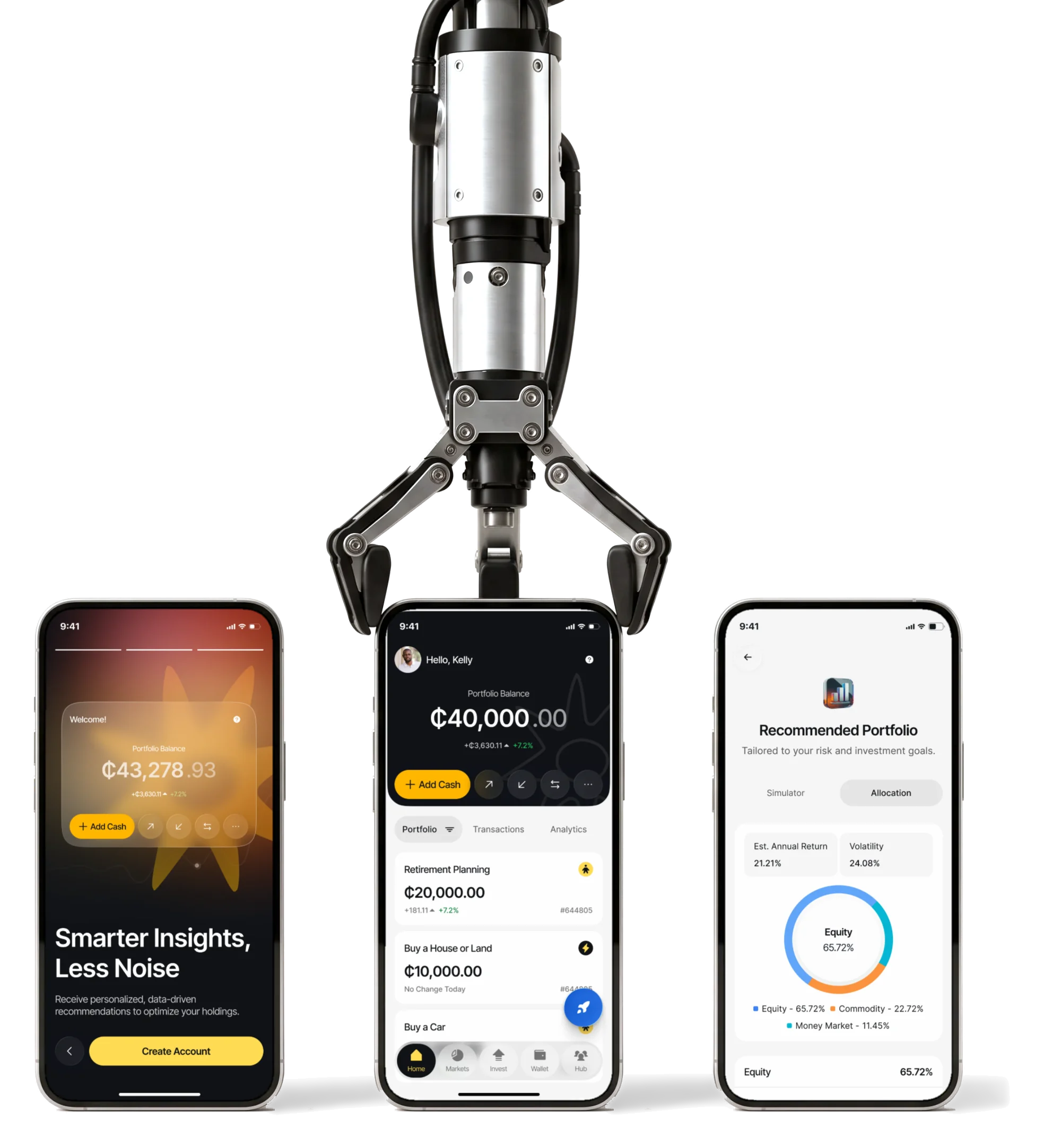
- 2
- ways to invest Active Invest and Auto Invest in one navigation
- 2
- modes every mobile flow in light and dark
- App + web
- the mobile app first, then the responsive website
Project summary
We redesigned Blackstar’s investment app around a clear path from opening an account to funding a portfolio. We connected Active and Auto Invest, simplified navigation and built one design system for light and dark modes. The client then returned to ANODA for a responsive website and brand book extension built around the same product.
How we worked together
- Client
- Black Star Group Ltd, Ghana
- Our part
- Research, the new structure, flows and wireframes, the light and dark mobile UI, design systems, the responsive website, prototypes, Lottie specifications and the brand book extension
- Their part
- The app’s and the website’s code, hosting and operation, and the corporate logo, which we vectorised and adapted
- Rhythm
- The mobile app first, then a return engagement for the website and the brand book
- Tools
- Figma, FigJam, Zeplin
From a first account to a funded portfolio
A Blackstar customer opens an account, picks how to invest, funds it and keeps an eye on it. Every step needed its own depth:
-
Start
- Sign-up and login
- Identity and financial details
-
Choose
- Active Invest
- Auto Invest
-
Invest
- Markets by category
- A security, buy and sell
-
Fund
- Wallet in GHS and USD
- Mobile money, bank, withdrawals
-
Track
- Portfolio home
- Analytics and notifications
- A first-time investor and A self-directed one
- Explanations where a beginner needs them, and markets and actions one tap away for everyone else.
- Active Invest and Auto Invest
- Two models of control that share one navigation and one system language.
- Ghana and Global markets
- Mobile money and Ghana treasury bills in the same app as US stocks and ETFs.
A portfolio home that explains wealth at a glance
- Found
- The balance, every goal, its change and the next action all competed for the first screen, and the old app made people dig for them.
- Decided
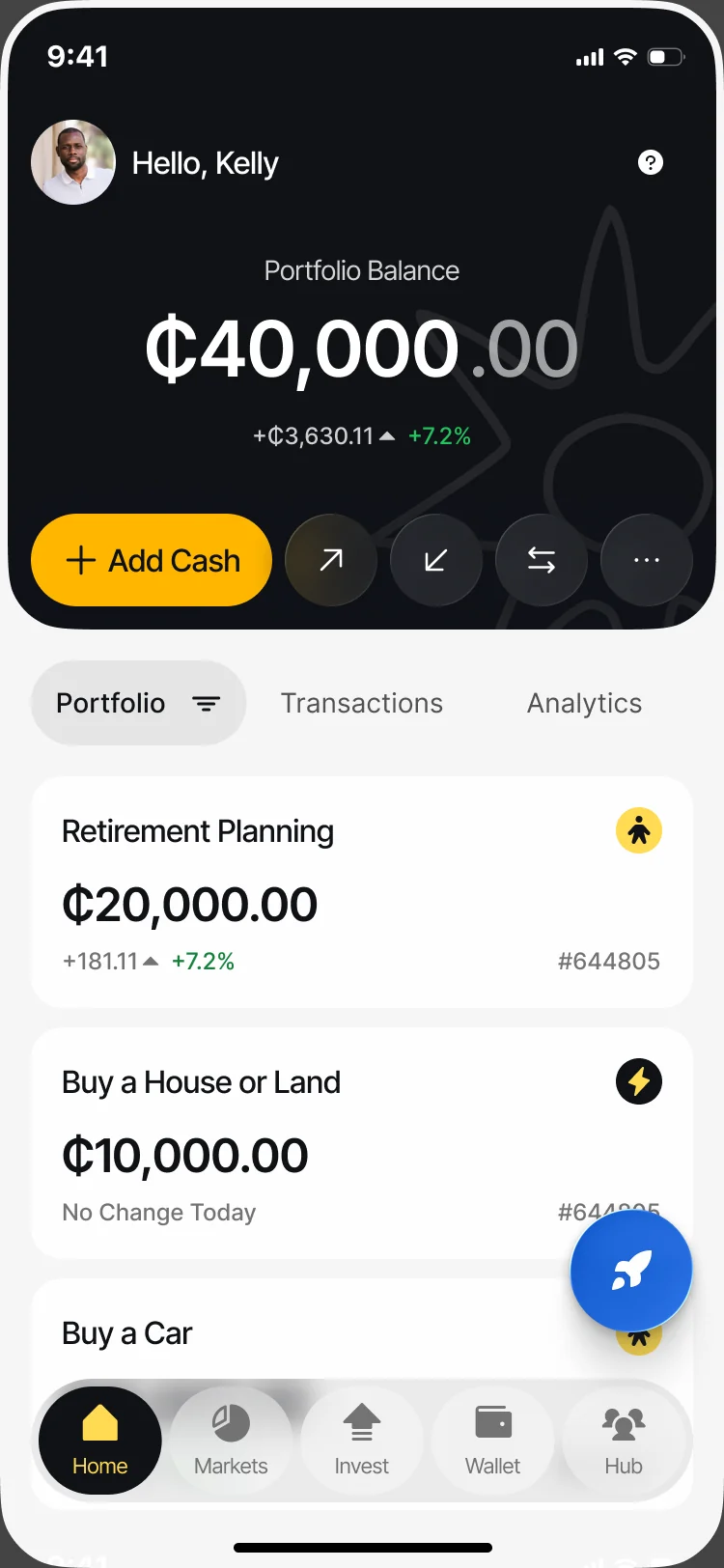
The total and its actions on a dark card, three views of the same money under it, then one card per goal with its value, change and type.
UI design starts with the decision each screen supports. ANODA turns that flow into clear hierarchy your engineers can build.
- For the user
- An investor sees what they own, how it moved and how to add cash before scrolling at all.
-
The balance and what to do with it
The total, today’s change, Add Cash and the quick actions, on one dark card.
-
Three views of the same money
Portfolio, Transactions and Analytics, without leaving home.
-
Goals, not accounts
One card per goal with its value, change and investing type.
How the work progressed
Research and structure first, then the app in both modes, then the website the client came back for.
-
Research
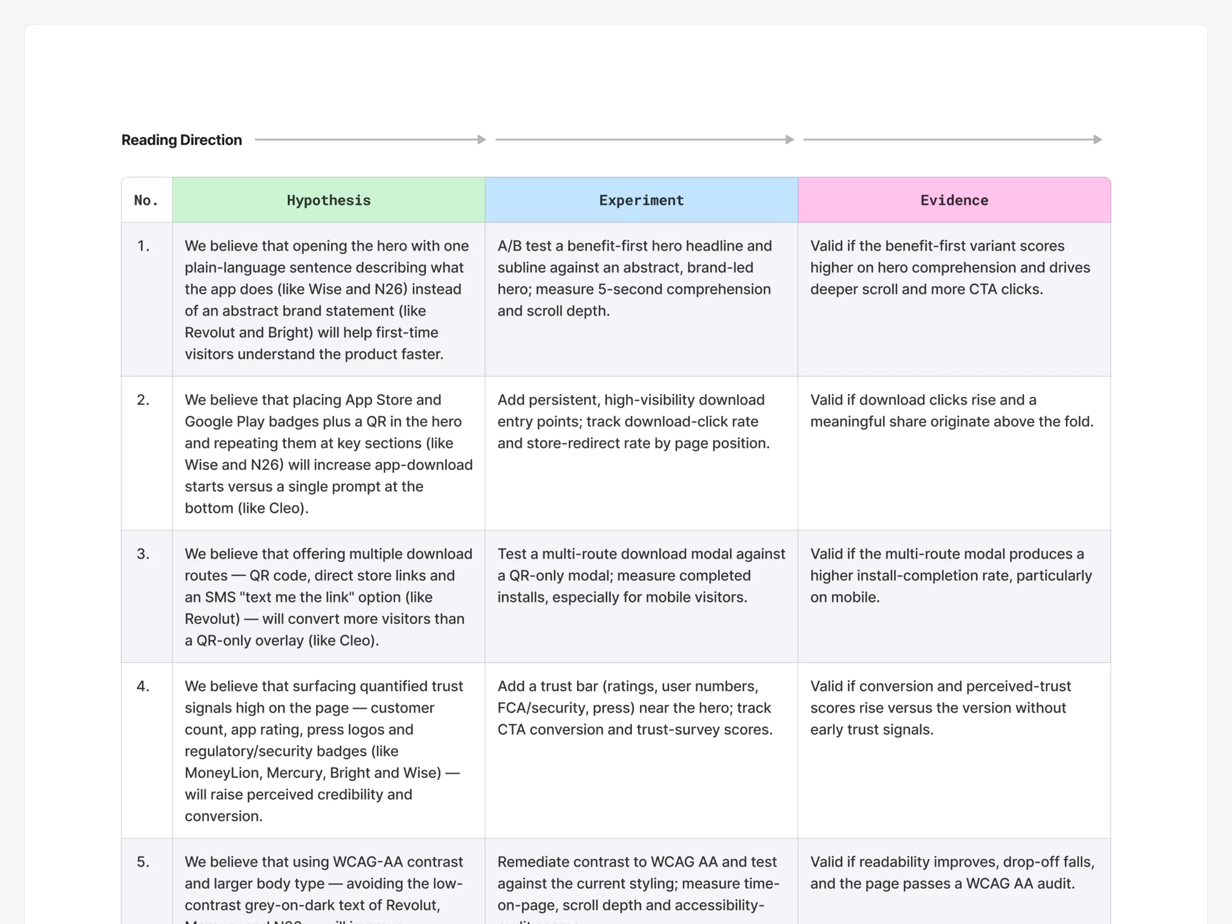
What other investment apps and sites do well, and what Blackstar should test
Artifact Competitor research and product hypotheses
-
Structure
Where everything lives, and how Active and Auto Invest branch from one start
Artifact Information architecture, user flows, wireflows and wireframes
-
Direction
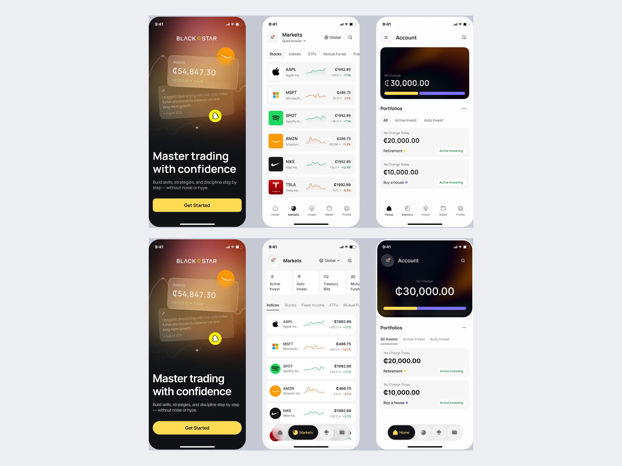
A look that feels like a regulated product and still welcomes a beginner
Artifact Moodboards and visual styles on the same screens
-
Light and dark UI
Every flow, from sign-up to withdrawals, in both modes
Artifact The high-fidelity mobile UI in light and dark
-
System and motion
One set of parts for every financial state, and how they move
Artifact The design system, UI kit, icons, illustrations and Lottie specifications
-
Website
How to explain the app to someone who has not installed it
Artifact The responsive website, its design system and the brand book extension
-
Handoff
What the developers needed to build both without guessing
Artifact Screen maps, app and web prototypes, exports and Zeplin handoff
Choose, fund, invest
- Found
- The old app made people search for basic actions, and two ways of investing could easily become two separate apps.
- Decided
- One start for both models, one funding path behind them, and a tab bar of five places a customer returns to.
-
Active Invest
A goal, how to invest, a first deposit and a linked mobile money account.
Open the full map
-
Auto Invest
Five profile questions, a review, a recommended portfolio and an investment plan.
Open the full map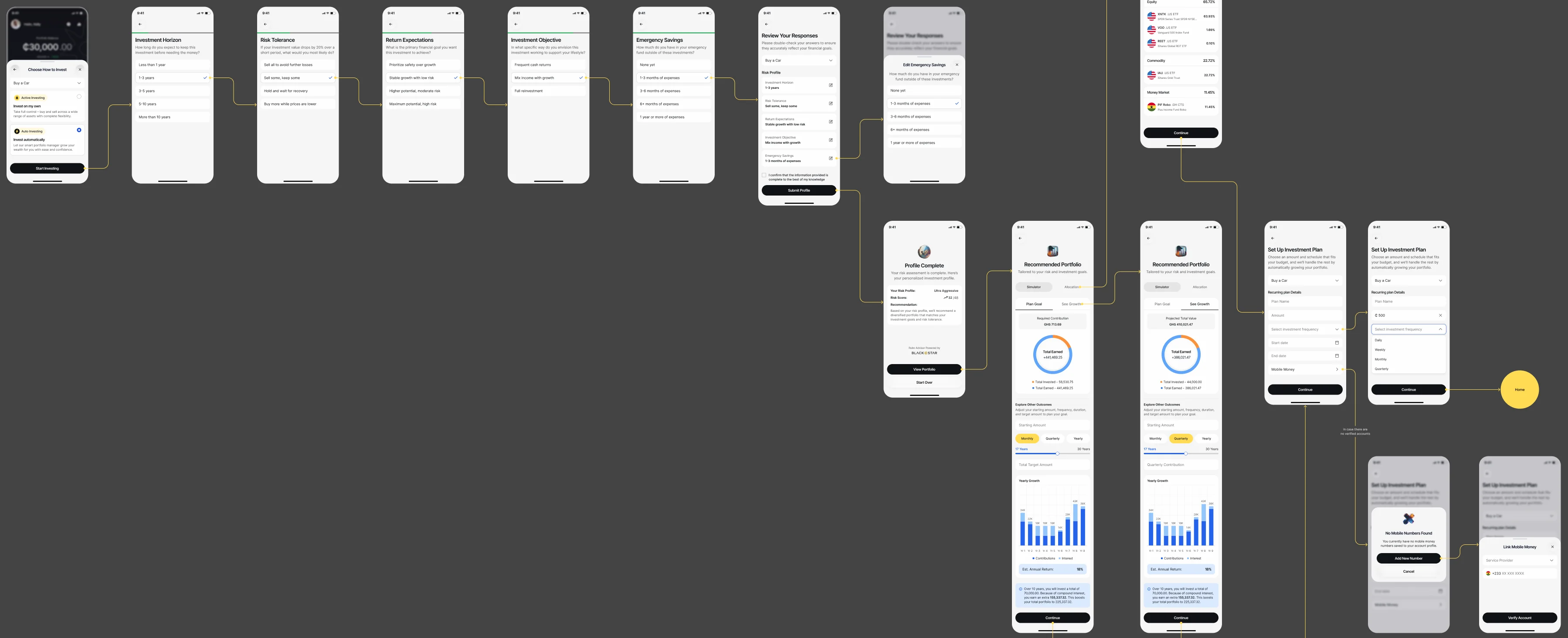
-
Wallet
Cash in two currencies, linked accounts, transfers between goals and withdrawals.
Open the full map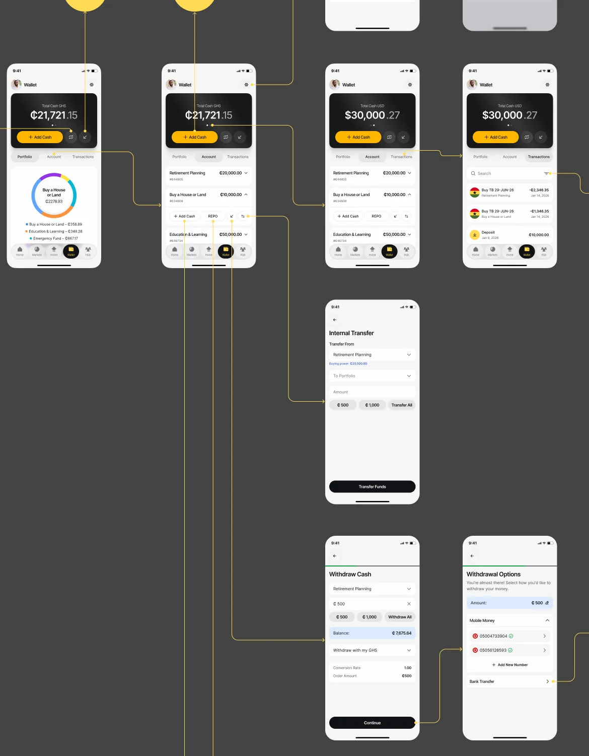

What a Blackstar investor does
In the order they meet it.
A first account that feels safe
- Found
- Someone about to deposit real money for the first time meets identity questions before they have seen any value.
- Decided
-
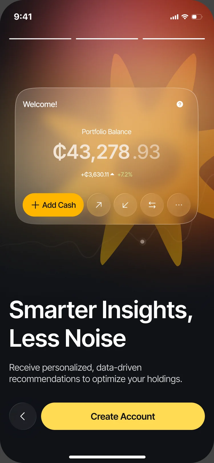
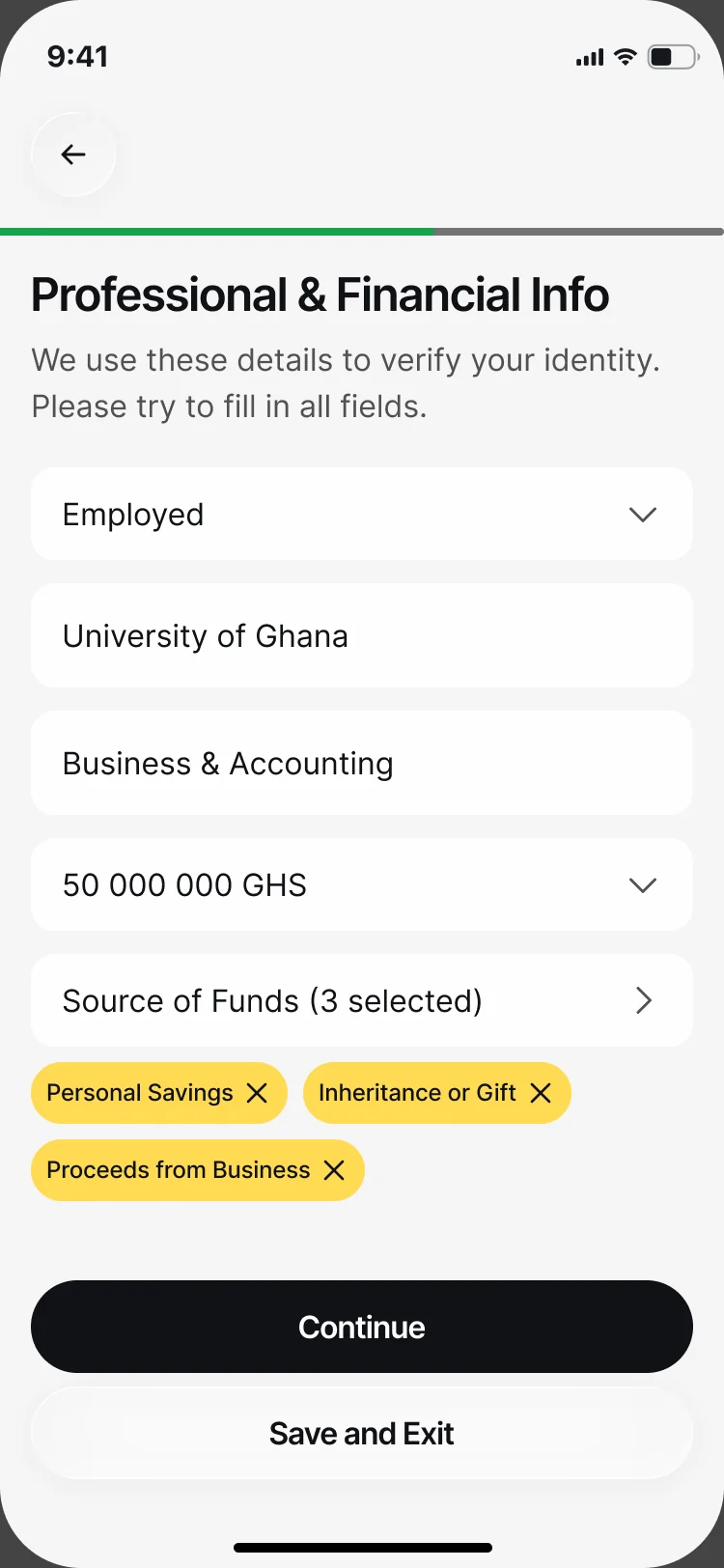
Onboarding says what the app does first; identity and financial details come in short steps, with a way to save and come back.
Our financial onboarding guide connects the value promise, checks, saved progress and funding so an eligible investor can finish after an interruption.
Two ways to invest, one choice
- Found
- Choosing your own investments and letting a portfolio manager choose are different promises, and a beginner can’t tell them apart by name.
- Decided
- The choice is a single sheet: each model with its badge, one line of what it means and who stays in control.
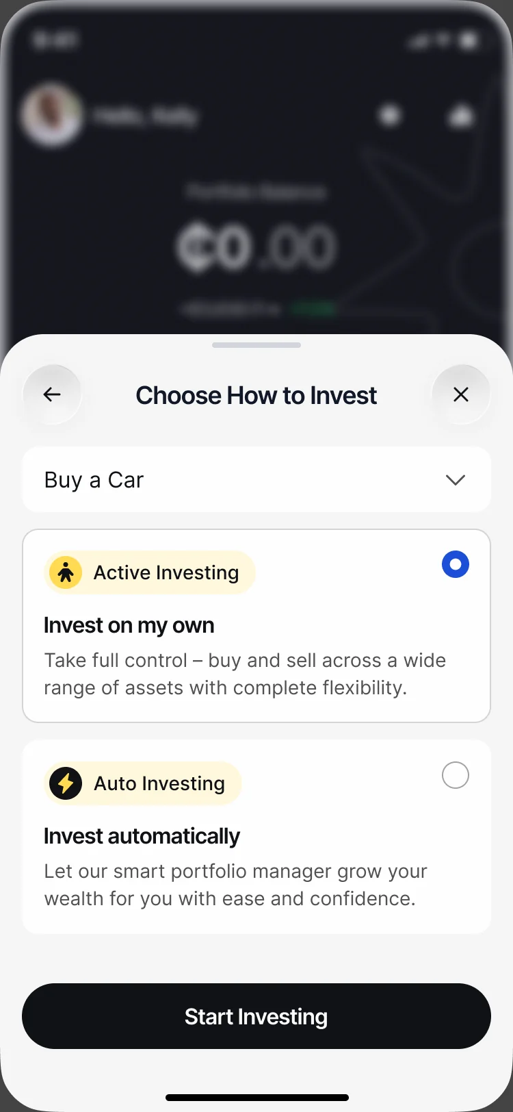
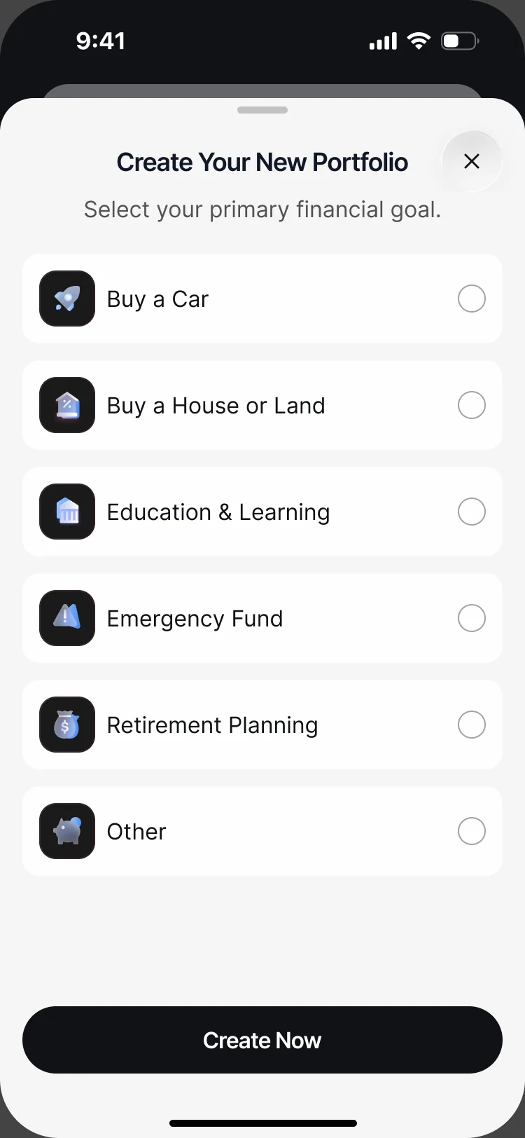
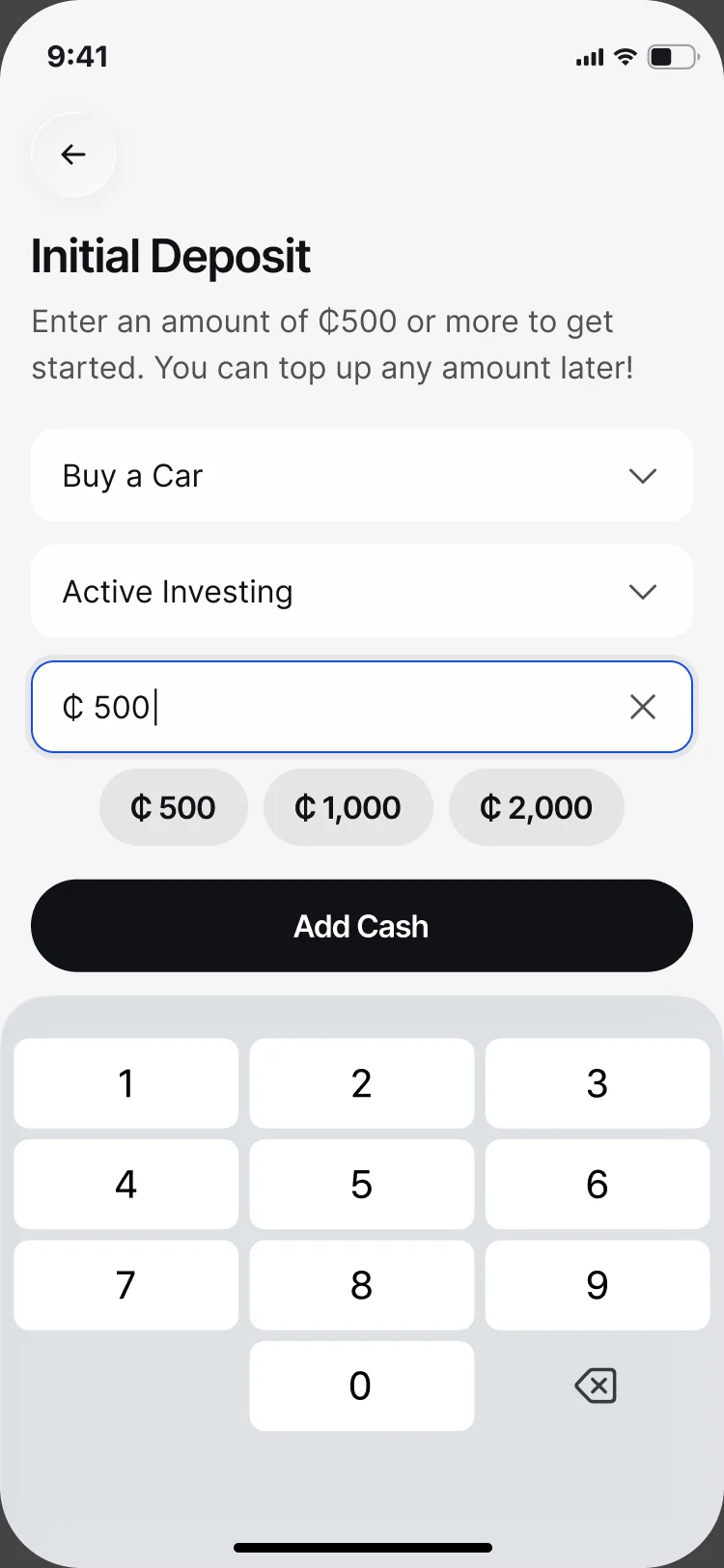
Active Invest: a goal, then a first deposit
- Found
- An empty account gives a new investor nothing to aim at.
- Decided
- Every portfolio starts from a goal, and the first deposit names the goal, the model and the minimum.
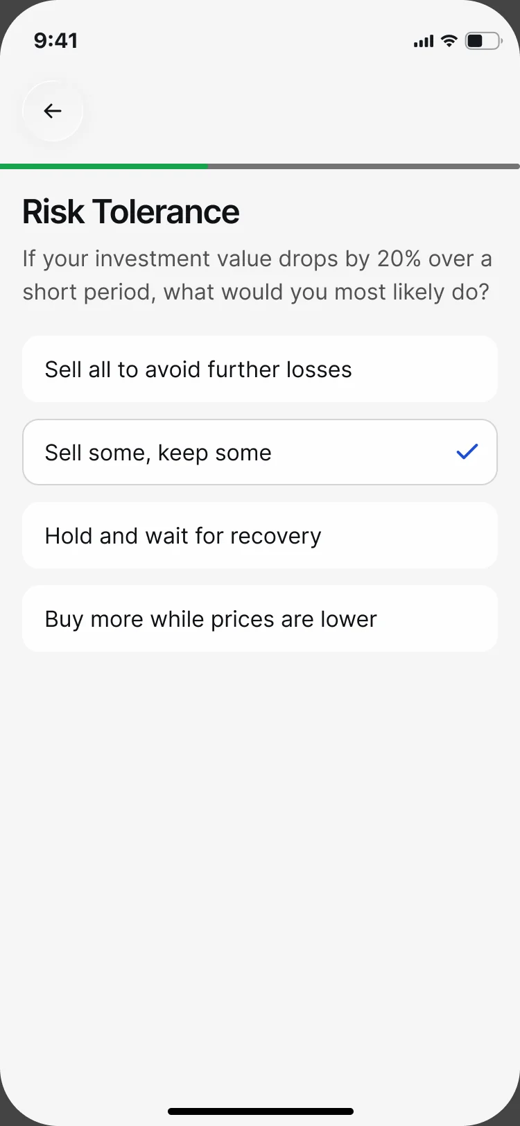
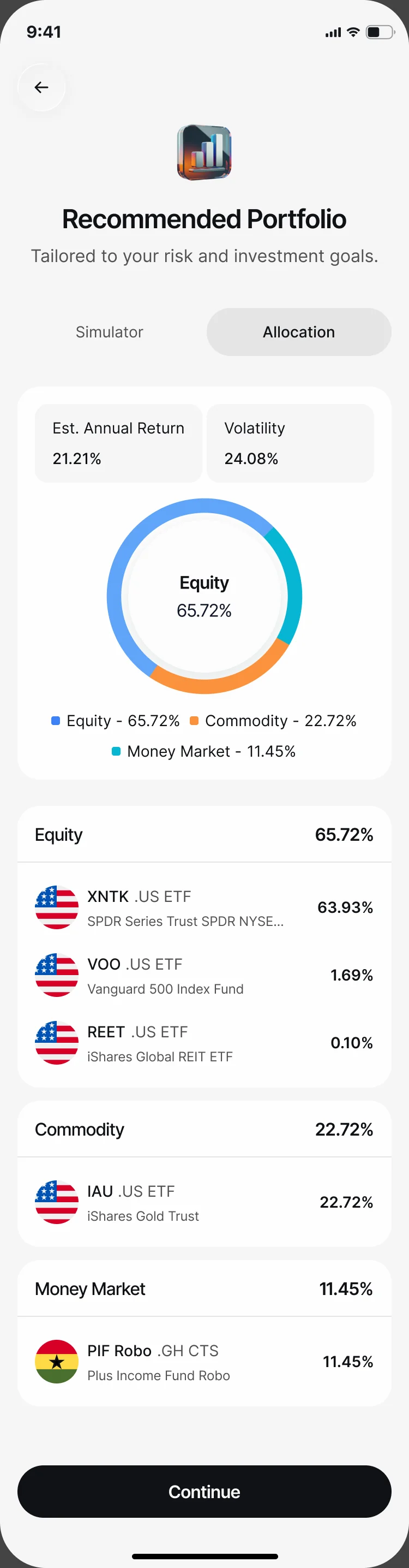
Auto Invest: a profile, then a portfolio
- Found
- A recommended portfolio means little unless the investor sees what it was built from and what is in it.
- Decided
- Short risk-profile questions one per screen, then the recommendation with its expected return, volatility and every holding by asset class.
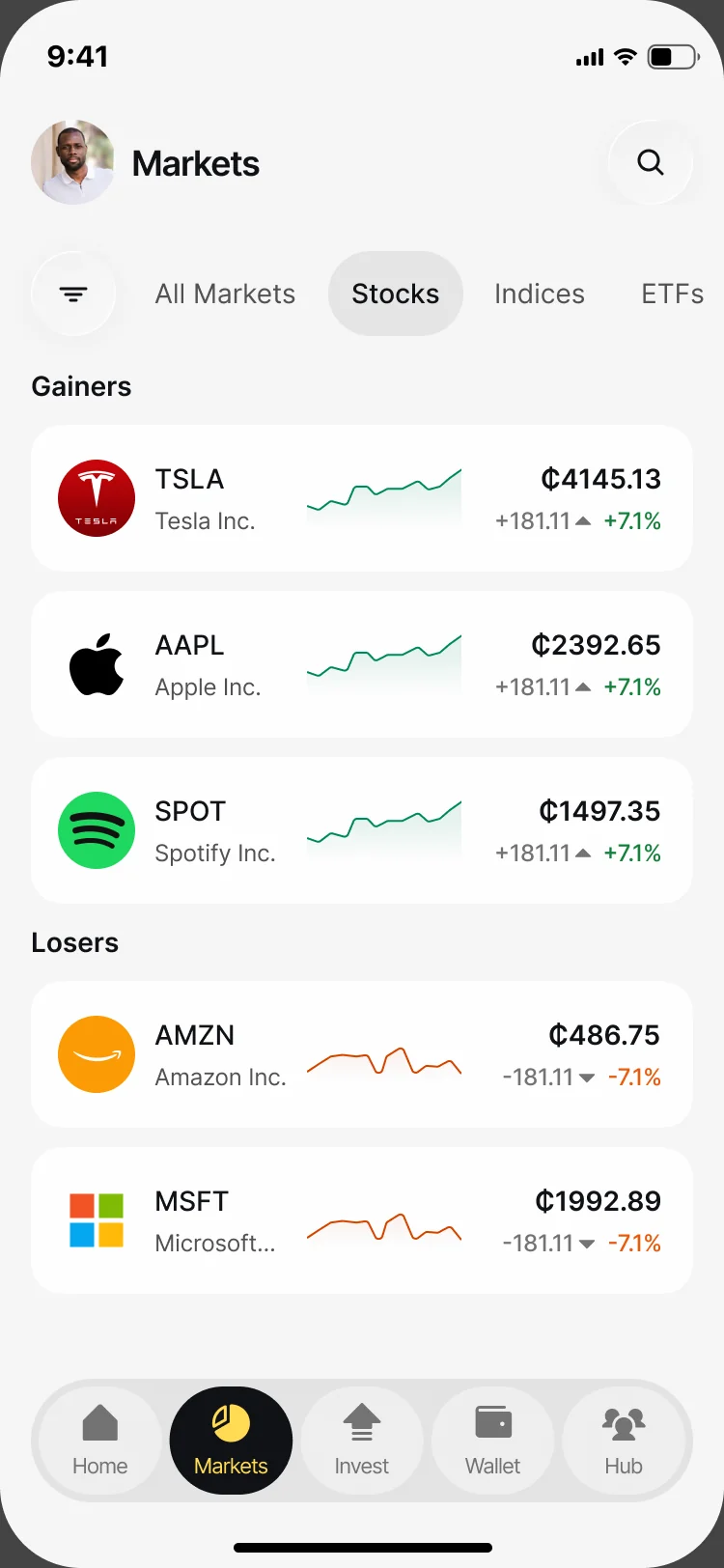
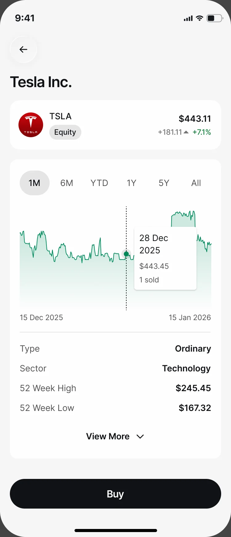
Markets and a security
- Found
- Local and global instruments, gainers and losers, and a company’s details all compete for a phone screen.
- Decided
- Markets by category with gainers and losers apart; a security’s page keeps its price, chart and facts above a single Buy.
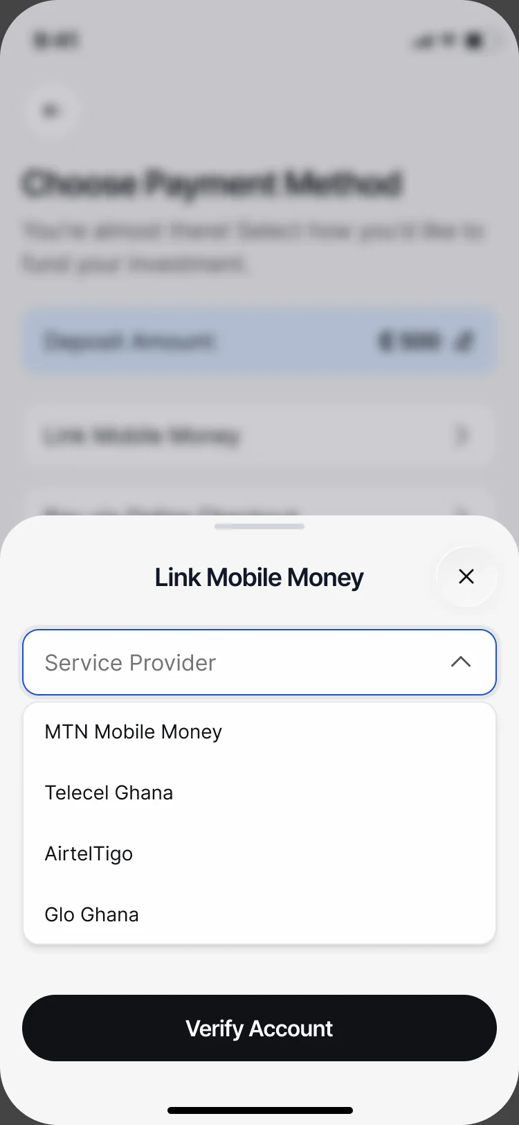
Money in and out
- Found
- Funding has to work the way customers in Ghana pay, mobile money included, and a deposit that hangs leaves them guessing.
- Decided
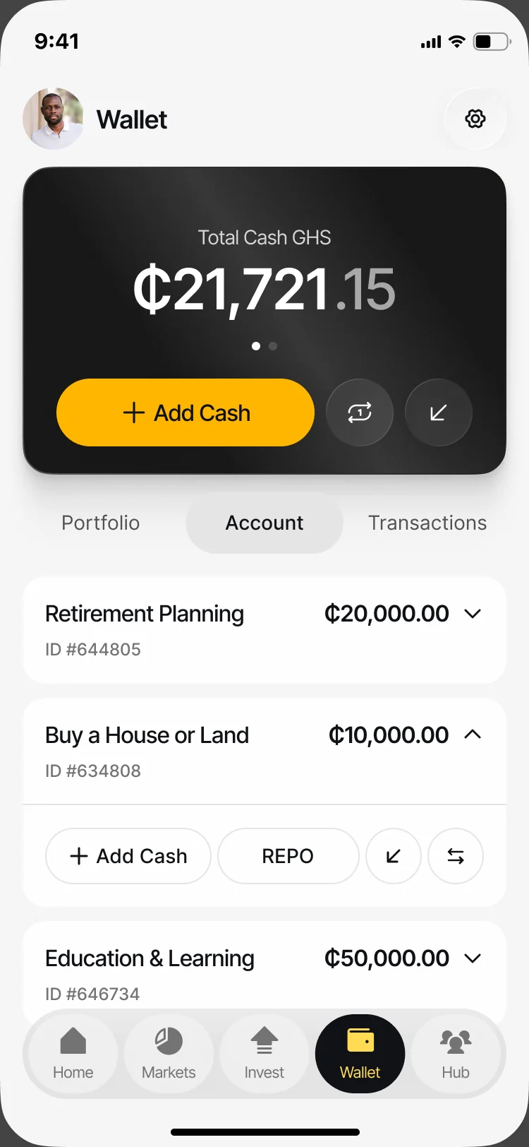
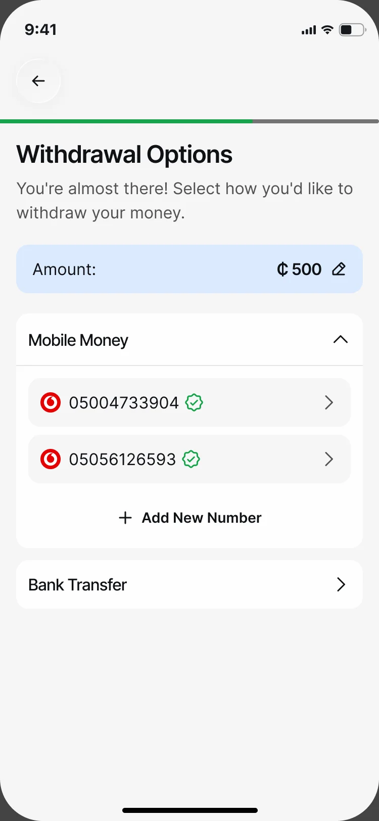
- Mobile money providers sit beside bank transfer, the wallet shows cash by goal, and withdrawals reuse the same verified accounts.
Analytics a portfolio owner can read
- Found
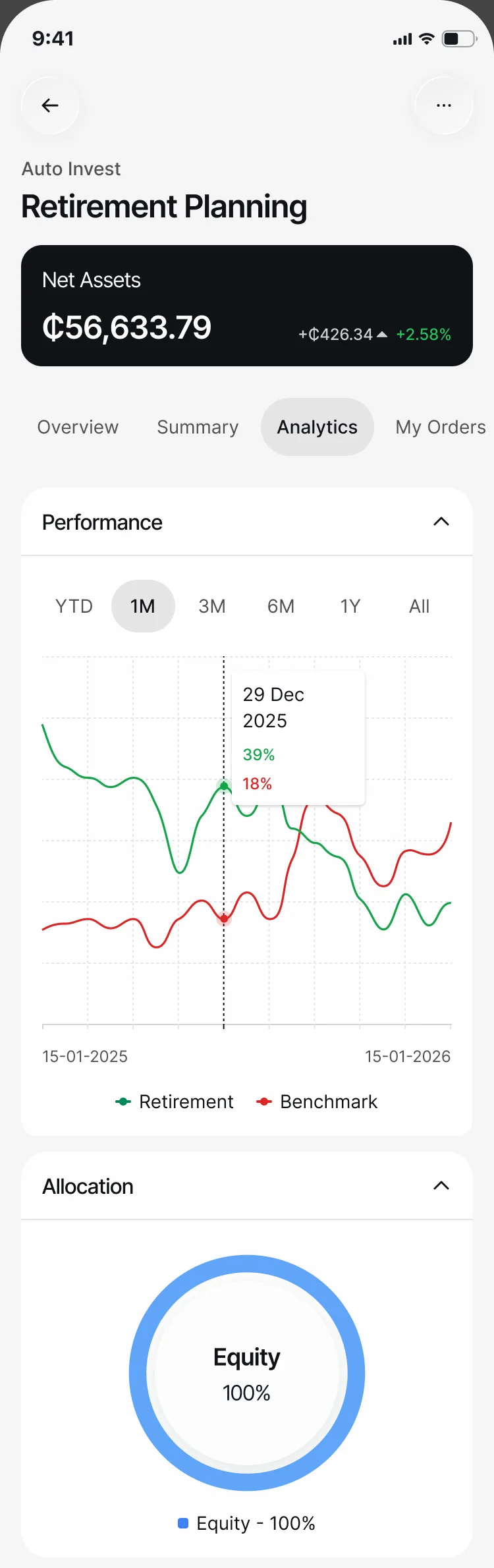
- Performance, allocation and exposure are easy to show and hard to read on a phone.
- Decided
- One portfolio’s analytics in folding sections: its return against a benchmark, then what it holds.
One system for every financial state
- Found
- A demo balance hides the screens real customers see: no money yet, data still loading, a payment the bank hasn’t confirmed.
- Decided
The same parts cover the empty, loading, waiting and filled states, in light and dark, and new customers get one short sheet per area.
Our accessibility guide covers readable controls, labels and handoff requirements alongside the product’s complete states.
A first-visit sheet for each area
Each area explains itself once, with one action.
-
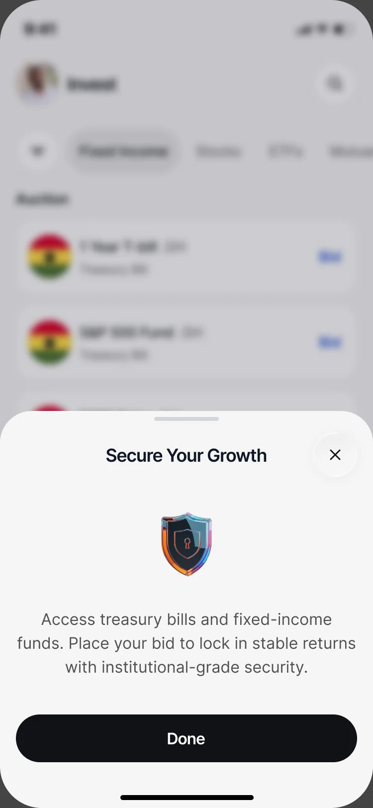
Invest: Treasury bills and fixed income, explained. -
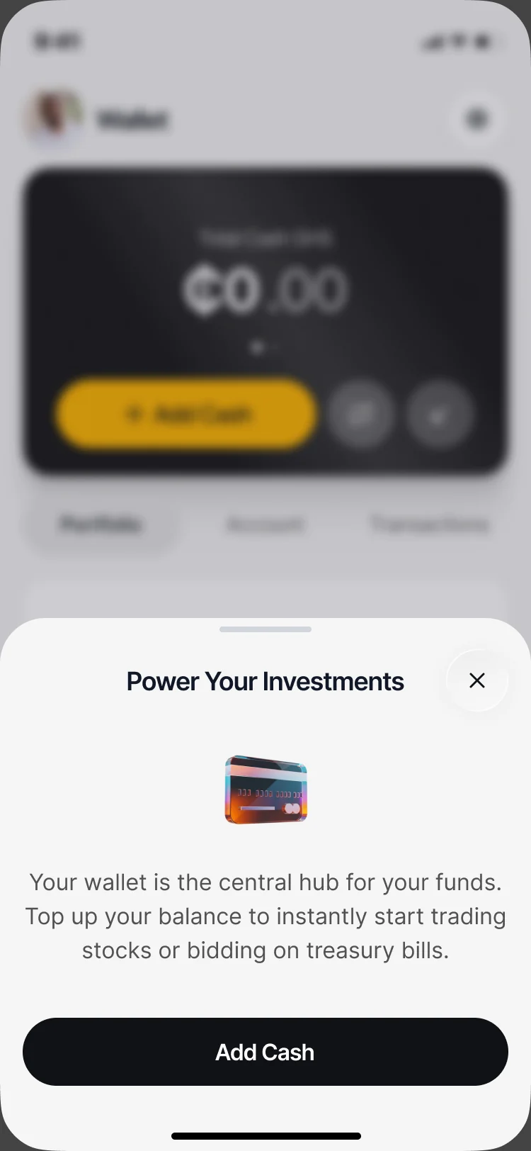
Wallet: What the wallet is for, and Add Cash.
Before the data, and when there is none
Loading, an empty result and a payment still processing.
-
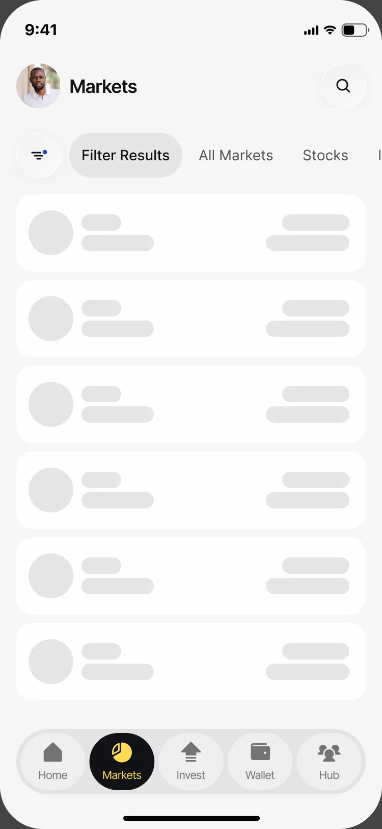
Loading -
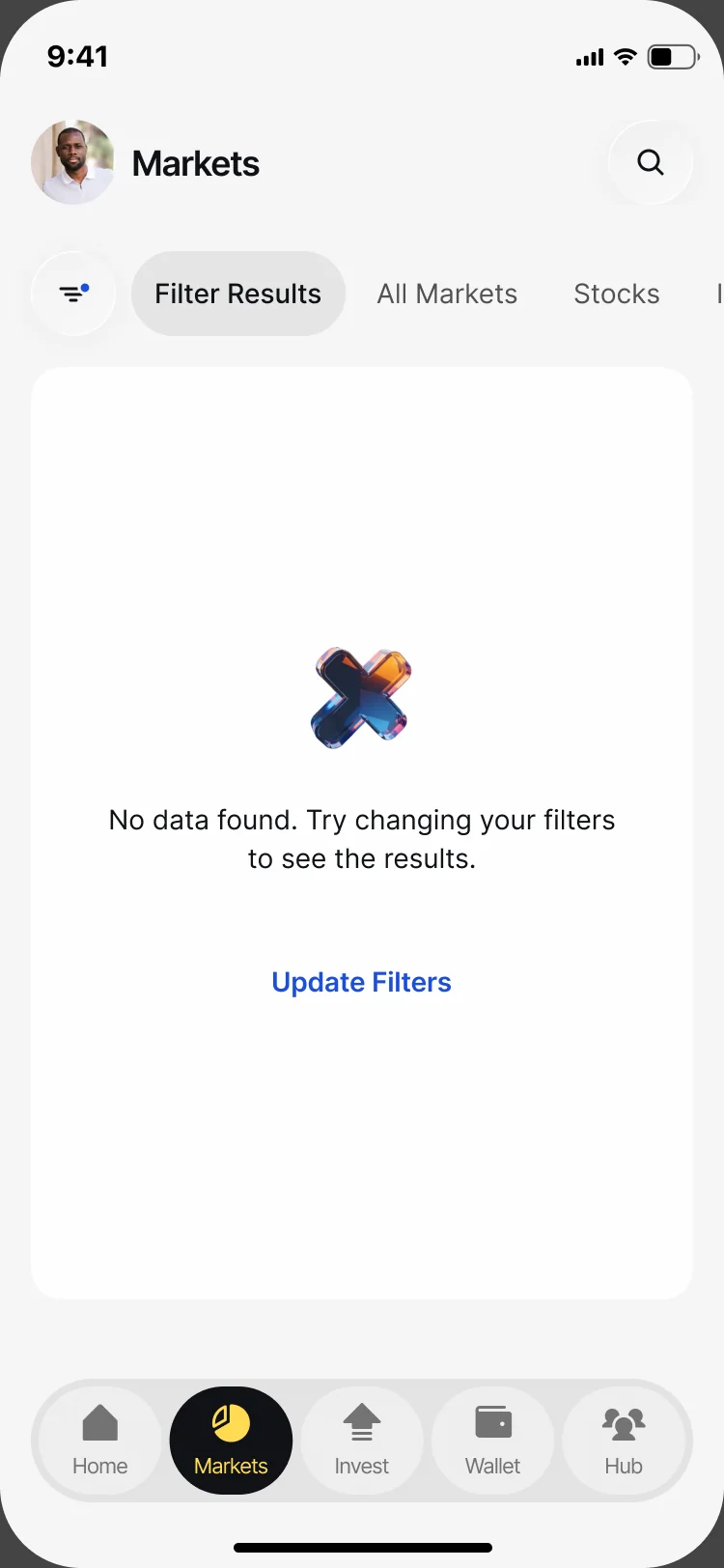
No results -
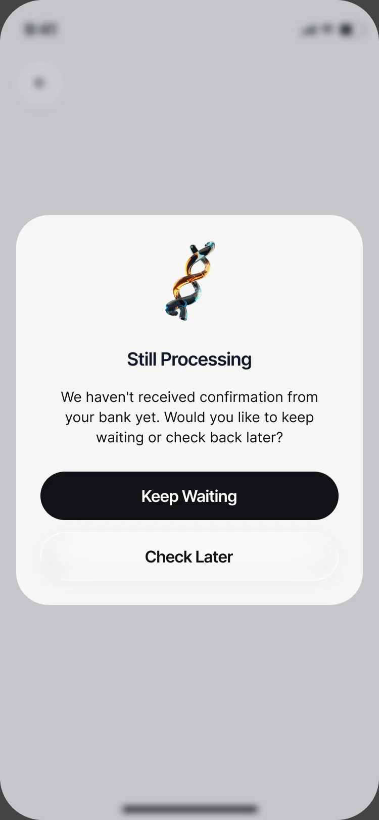
Still processing
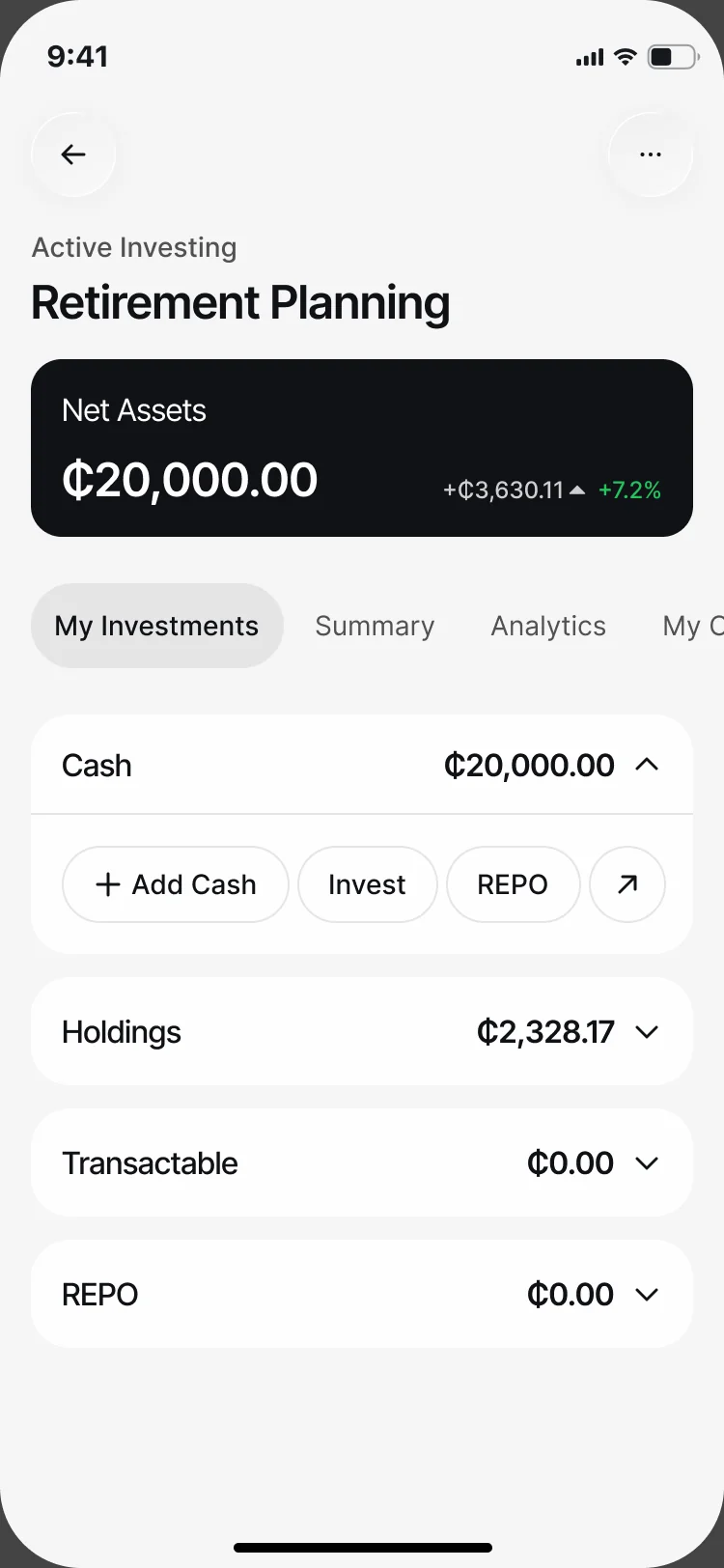
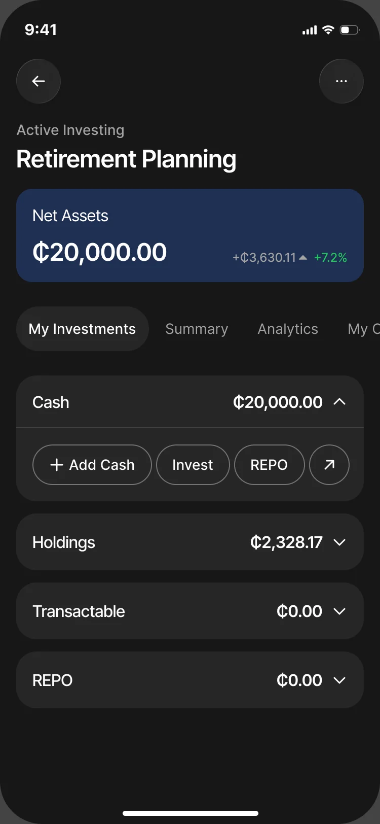
The same portfolio, light and dark
Net assets, cash, holdings and the actions read the same in both modes.
The client came back for the website
- Found
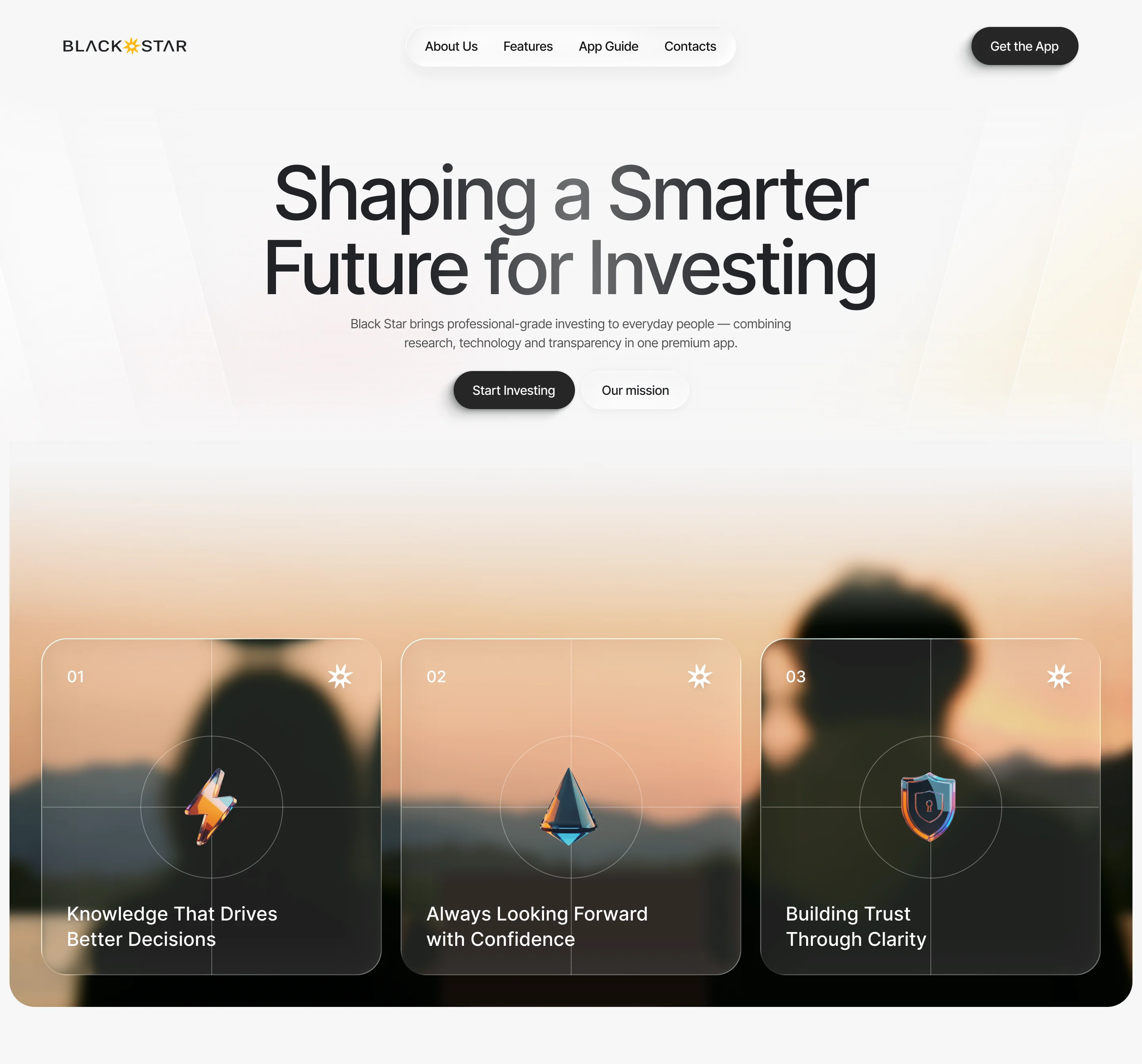
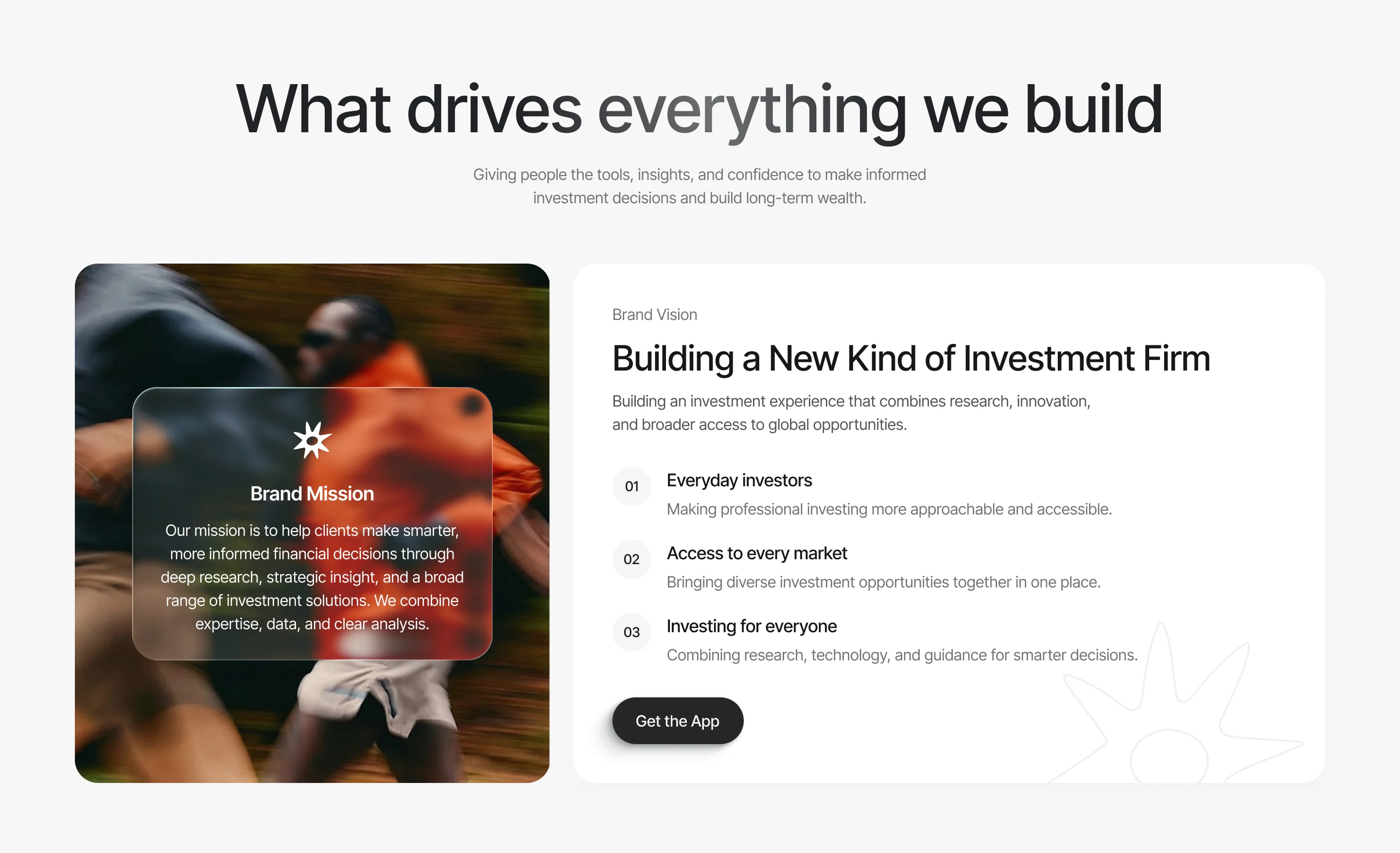
- Someone who hasn’t installed the app has to understand Active Invest, Auto Invest and the depth behind them from a web page.
- Decided
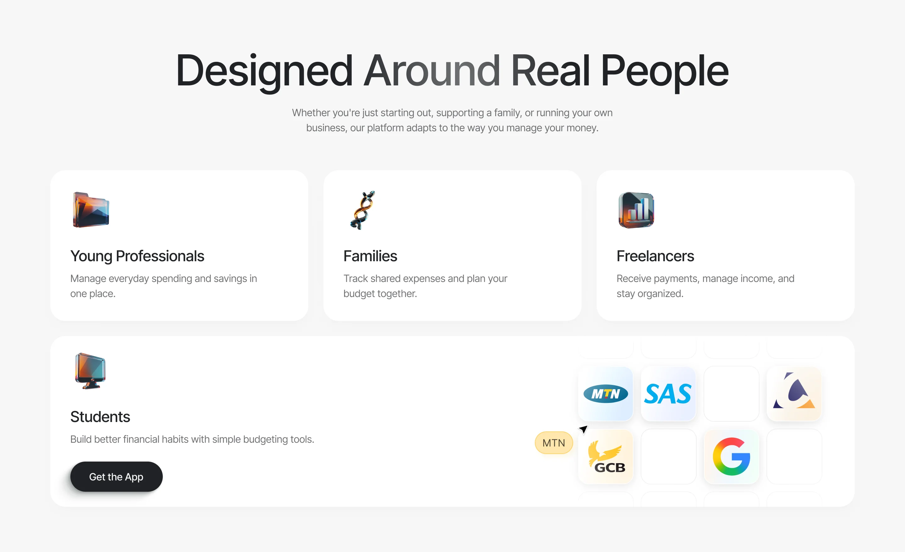
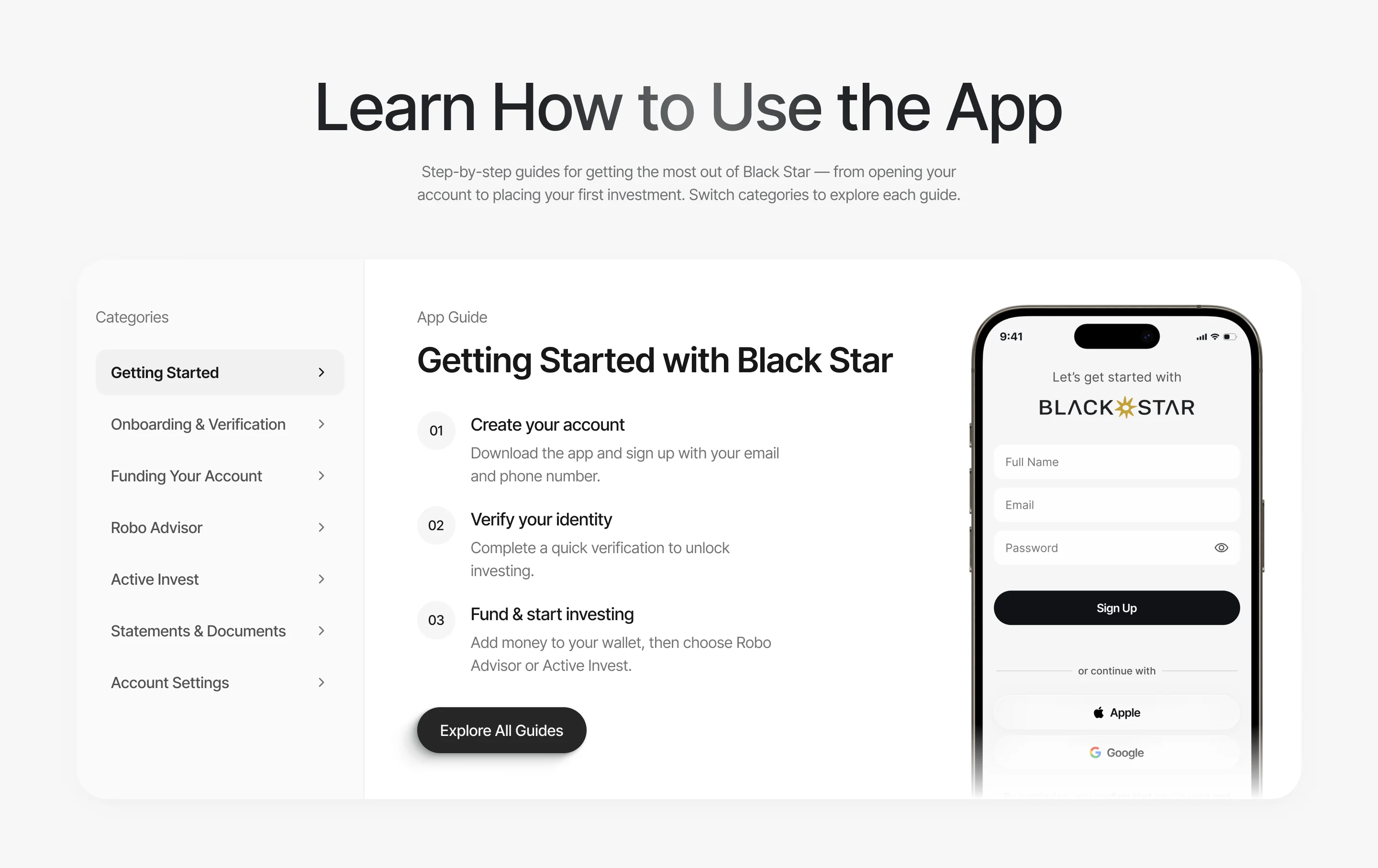
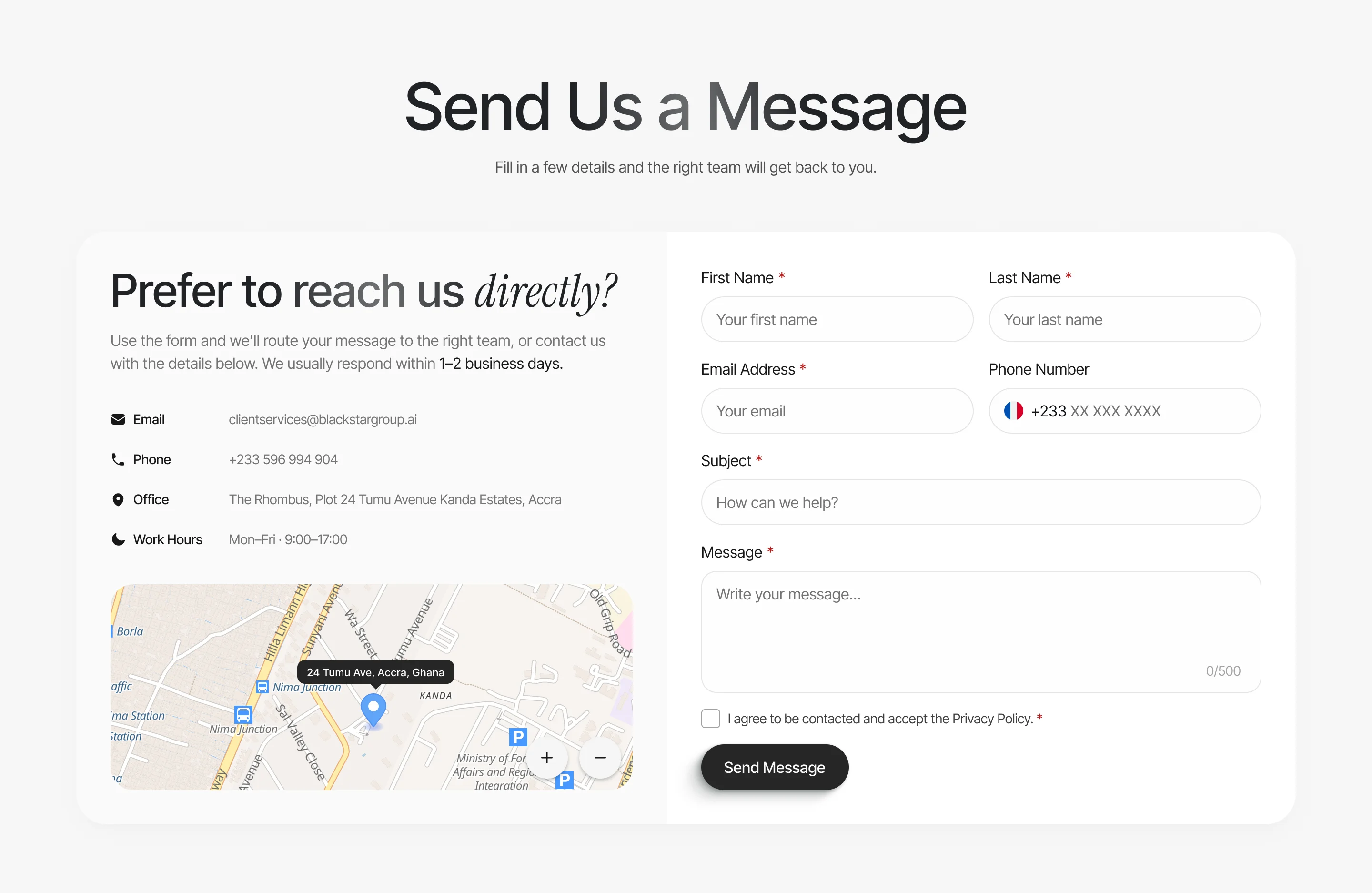
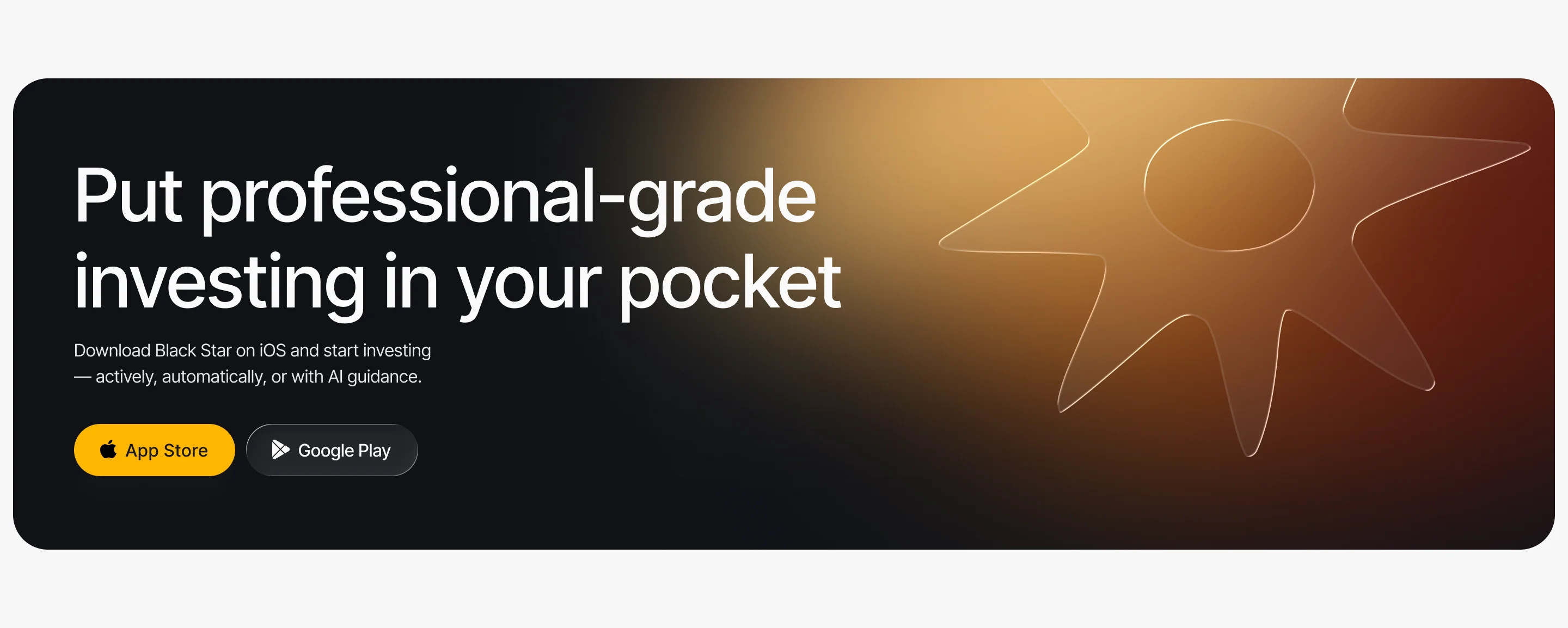
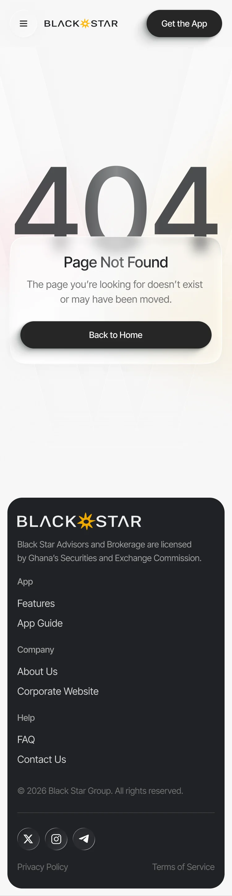
A responsive site built from the app’s own logic and brand: each feature explained in plain words, at every breakpoint. We designed and handed it off; building it was not part of our work.
Our responsive design guide explains how the app’s story, navigation and calls to action stay clear across breakpoints.
-
The pages
Home, App Guide, Features, Active Invest, Auto Invest, About, Contact, legal, privacy and error pages
-
Website design system
The components the pages are built from, at every breakpoint
-
Web prototype and motion
A clickable prototype and the website’s animation package
-
Brand book extension
The brand rules for the website, with the existing logo vectorised and adapted
Where the product ended up
A mobile investment app redesigned end to end, from onboarding and identity checks to Active and Auto Invest, markets, the wallet and analytics, in light and dark on one design system. Then a responsive website and brand book from the same logic, handed to the developers with screen maps, prototypes, motion specifications and Zeplin.
- ways to invest, Active and Auto, in one app
- 2
- modes, light and dark, across the mobile app
- 2

Would a first-time investor trust your app with a deposit?
A demo balance always looks good. Then a real customer opens an empty portfolio, a payment that hasn’t cleared and a security with a long name. Send us your app; we’ll show where a new investor stalls before the first deposit.
More work like this
More products where money changes hands and trust has to be earned.
-
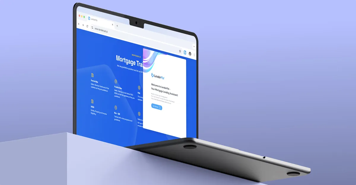
Chrome extension · Real Estate
LenderPal
Fitted a loan officer’s property, cost and rate checks into a Chrome extension, with an Admin product behind it.
- 150+ Screens designed
- 4 Experts on the pod
-
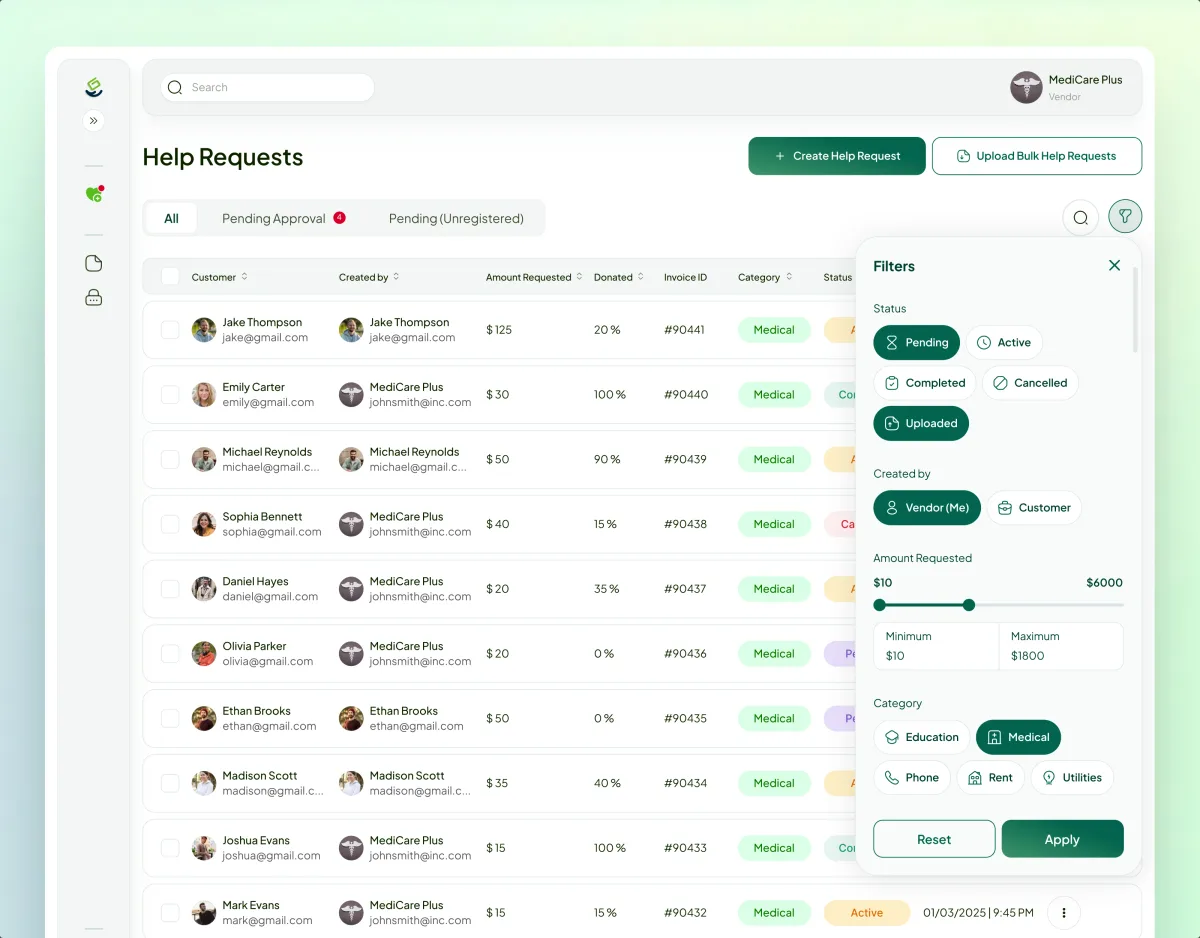
FinTech · Charity · Web platform
Payyro
Audited, redesigned and now builds a four-role platform that pays a family’s overdue bill straight to whoever sent it.
- 400+ Unique screens
- 5 Experts on the team
-
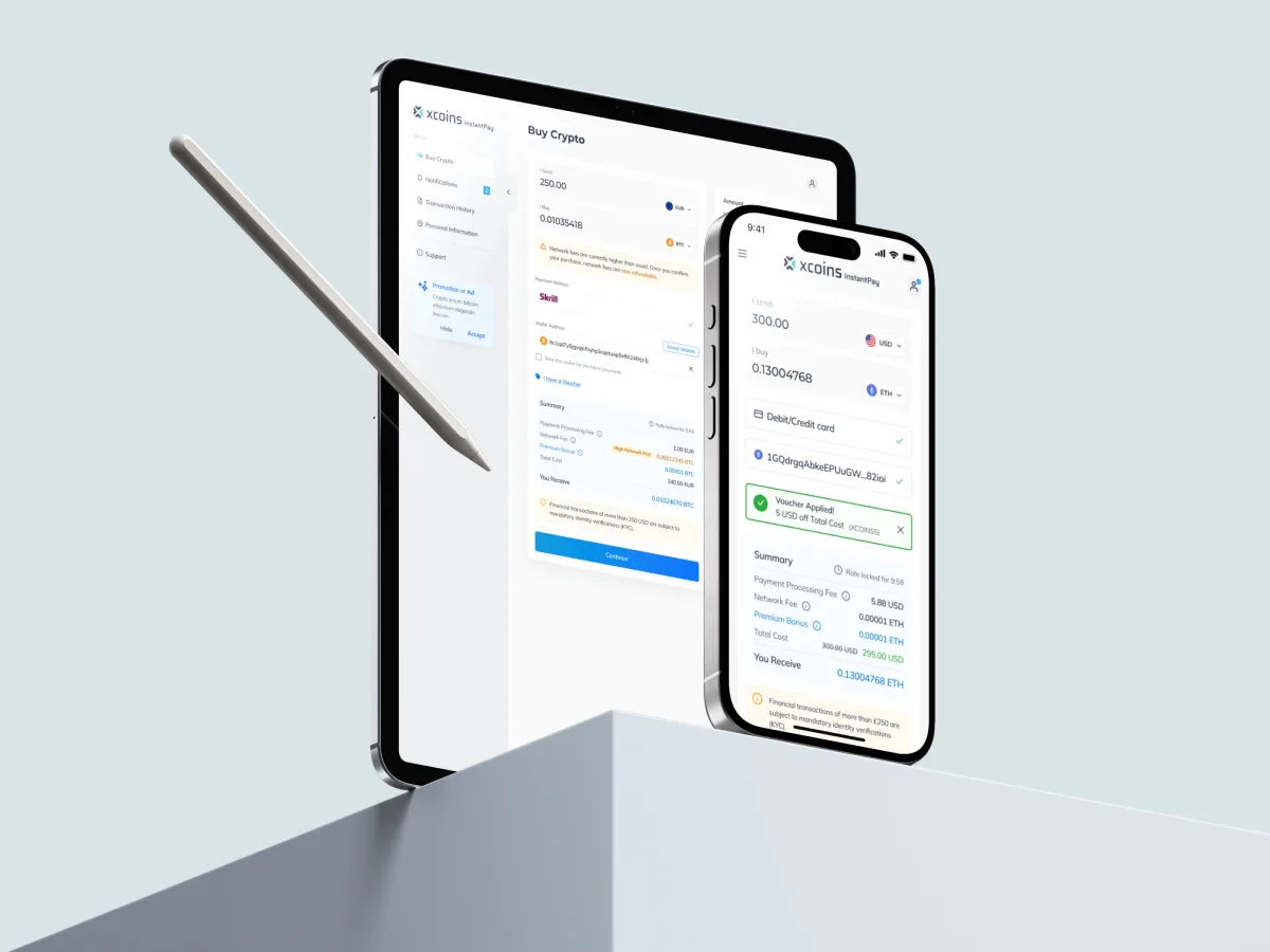
Crypto · FinTech · Web + Mobile
Xcoins
Redesigned a crypto buy journey so the whole price is in view before payment, with a design system.
What we brought to Blackstar
The product
The work
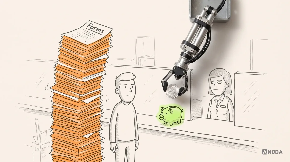
Financial App Onboarding from First Promise to Verified Value
Stop losing acquired users during verification. Learn how ANODA connects financial onboarding, saved progress and the first useful action.
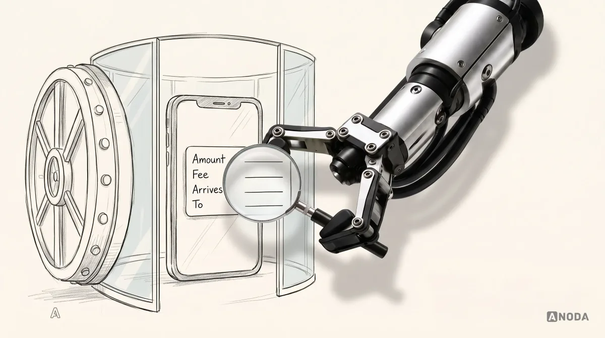
Fintech UX Design for High-Stakes Financial Decisions
Earn trust at the moment money moves. Learn how ANODA designs clear fintech onboarding, payment decisions, transaction states and recovery.
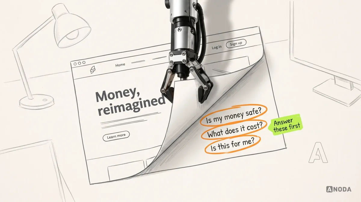
Best Fintech Website Design Examples and UX Lessons
Explore fintech website design examples and the UX choices behind them—from trust to product explanation, conversion, accessibility, and responsive journeys.
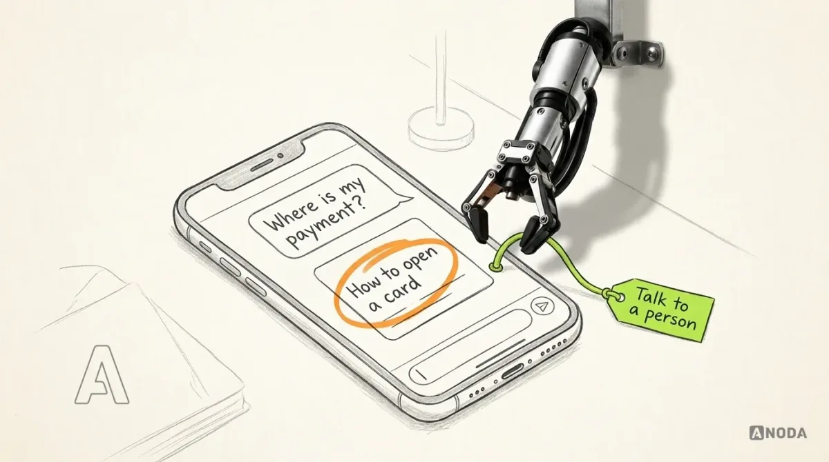
Banking App Design Trends Shaping UX in 2026
Explore the banking app design trends shaping UX in 2026: agentic assistance, personalisation, authentication, explainability and cross-channel continuity.
Android App Design Tools: Choose for Graphics, UI and Prototypes
Choose Android design tools for graphics, reusable UI, prototypes and handoff. Check adaptive layouts, accessibility and interface states.