In short
Most “responsive” websites are desktop pages squeezed until they fit, and phones are where they lose the visitors you paid for. Responsive web is neither a shrunken desktop nor a native app: it lives inside a browser that eats your screen, reloads your page and forgets your session. Here is how we decide what the mobile web keeps, what it drops, how it adapts, and how to test it on the devices people actually hold.
In this article
- What responsive web design is, and what it isn’t
- Decide what the phone keeps before you decide how it looks
- Design for the viewport people actually get
- Let the content set the breakpoints
- Components need their own small-screen behaviour
- Images and media: size, crop and weight
- Touch, gestures and input
- Tables, long flows and the desktop escape hatch
- Rotate the phone: landscape and in-between widths
- A browser is not an app
- Test the settings people actually use
- Performance is part of the layout
- Test on real devices, with a checklist
- Who owns responsive decisions
- Why unfinished responsive states cost trust
- When another breakpoint won’t save you
- Why ANODA designs the mobile task before the breakpoint
Responsive web design best practices start with an uncomfortable fact: most “responsive” websites are desktop pages squeezed until they technically fit a phone. The layout reflows, nothing overlaps, the team ticks the box. Then a visitor on a small phone scrolls past nine sections, loses the button behind the browser bar and leaves. You paid for that visit. The ad click, the SEO work, the email that brought them in. The page just didn’t want them badly enough.
Our experience designing and rebuilding web products keeps showing us this, and the pattern has not changed since the first media query: teams treat responsive as a CSS task that happens after design. It is a product decision. Which content earns a place on a small screen, which actions must survive, which parts need a different flow, and which job should never have been a website in the first place.
This guide covers what responsive web design is and isn’t, how to decide content and breakpoints, how components, media, touch and forms change, and how to test on the devices and settings people actually use.
What responsive web design is, and what it isn’t
Responsive web design is one website that adapts its layout, content and interaction to the space and conditions it runs in: screen width, orientation, input method, user settings and the browser around it. The goal is not that the page fits. The goal is that the job still gets done.
Two misunderstandings cause most of the damage.
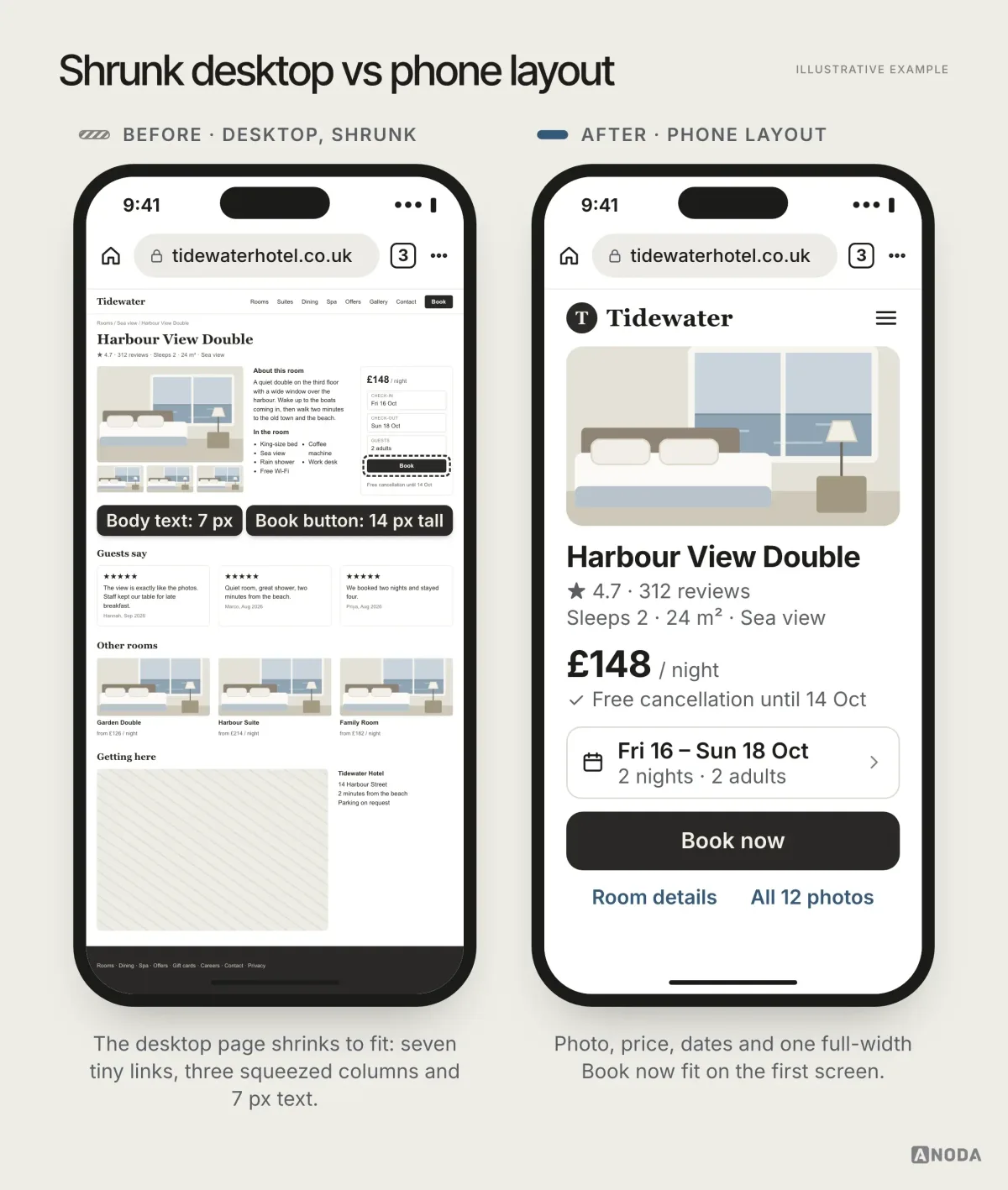
It is not a desktop site shrunk into a phone. Scaling a desktop layout down gives you three squeezed columns, 12-pixel links and a “Book” button nobody can hit. It is a poster photocopied onto a postage stamp: every word is technically still there, and nobody can read any of them.
It is not a native app either. A responsive website runs inside a browser. It shares the screen with the browser’s own controls, it doesn’t own the gestures, it gets reloaded, and it can’t count on notifications or background work. Borrowing app patterns without the app’s powers is how teams build pull-to-refresh into a page that the browser will simply reload. If you are designing an actual iOS or Android product, you need the platform rules in our mobile app design guidelines, not this article. And if you are still deciding between a separate mobile site and one responsive build, that comparison has its own guide.
Oksana Kovalchuk, ANODA’s founder, puts the starting point bluntly:
We are not simply inserting a website into a phone. Tiny buttons don’t work — you need different components. There is a browser bar taking up space, phones come in different sizes, and gestures are reserved. Don’t think this is a mobile application. It isn’t.
 Oksana KovalchukFounder & CEO, ANODA
Decide what the phone keeps before you decide how it looks
The most useful responsive decision is made before any layout work: which content, actions and components genuinely belong in the mobile experience. Not everything does, and that is fine.
Desktop pages accumulate. A logo wall for the investors, a comparison table for the procurement team, three testimonial carousels because marketing had them. On a large screen this is clutter. On a phone it is a commute. Oksana’s line for it: a visitor shouldn’t need three business days to scroll to the end of your site. Anyone who has thumbed through a nine-section landing page on a small phone knows the cost of hiding the action.
Mobile is about compactness. The essence of the page, and ideally its main action, should fit on one screen. If it doesn’t, something above it is taking space it hasn’t earned.
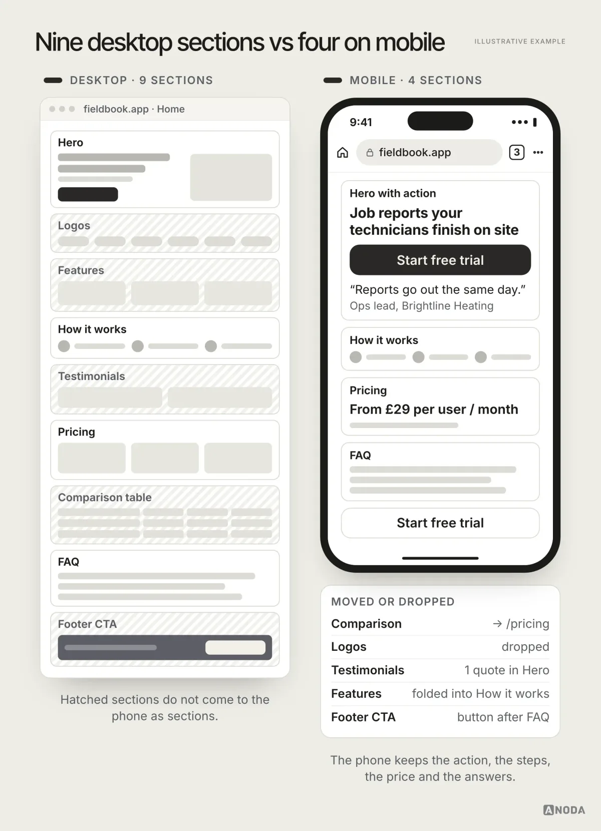
Packing for a weekend with your whole wardrobe doesn’t make you better prepared. It makes you the person dragging a suitcase up the station stairs. For each section, ask whether it helps a phone visitor do the job they came for. If it doesn’t, it can be shortened, moved to another page, collapsed, or dropped from mobile entirely. Write the decision down, so nobody “restores parity” next quarter because the page looked emptier.
You don’t have to guess. Scroll-depth and click data by device show which sections phone visitors actually reach and use. Session recordings show where they stop. If a section gets almost no attention on mobile and doesn’t support the main task, that is your evidence. If the data is thin, a handful of moderated sessions with target visitors will tell you the same thing faster than a month of debate.
Mobile-first design helps here, because it forces the priority question early. But mobile-first is a working order, not a guarantee. A team can start on a phone canvas and still cram the desktop’s content into it. Content-first is the part that matters: decide what the page is for, then design each width around that.
Audit check
List every section and action on your key pages and mark which ones a phone visitor needs to complete the main task.
Failure evidence
The primary action sits below four or more screens of content. Scroll-depth data shows most mobile visitors never reach it.
Correction pattern
Keep the main action on the first screen, cut or move sections that don’t serve the mobile job, and log each decision.
Design for the viewport people actually get
Your design file shows a clean 390-by-844 rectangle. The visitor gets something smaller. The browser’s address bar and toolbar take a slice of the screen, and in some browsers people choose whether that bar sits at the top or the bottom. The bars also grow and shrink as the page scrolls. Then there is the notch, the home indicator and the on-screen keyboard, which can swallow half the screen the moment a field is focused.
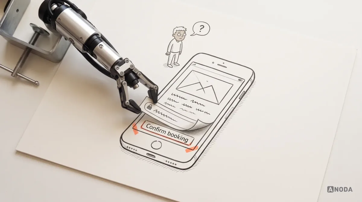
It is renting a flat from the floor plan and finding the landlord’s piano in the living room. The square metres were real; you just can’t use them. A sticky “Confirm” bar at the bottom of the layout can end up hidden behind the browser toolbar, or jumping around as the toolbar collapses.
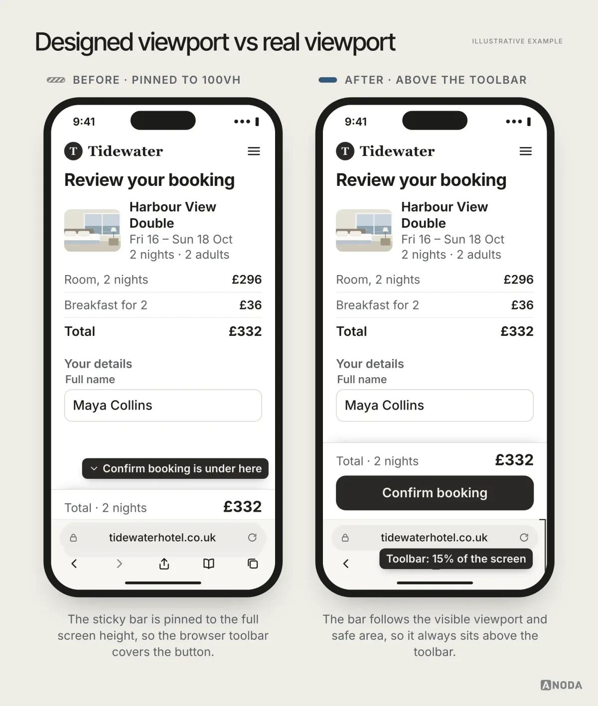
Modern CSS gives you the tools: the small, large and dynamic viewport units (svh, lvh, dvh) describe the viewport with and without the browser bars, and safe-area insets keep content clear of notches and home indicators. The design side of the job is deciding what must stay visible when the viewport is at its smallest, and checking it with the bar at the top and at the bottom.
The keyboard deserves its own check. When a field is focused, the keyboard can cover the field itself, the error message under it and the submit button. Forms should scroll the active field into view, keep errors next to the field and never trap the only way forward under the keyboard.
Screen sizes vary more than your team’s phones suggest. Designers and product managers tend to carry large flagship phones; plenty of customers don’t. Design and test the smallest realistic widths too: compact iPhones and small, inexpensive Android phones at 360 pixels or less. Designing only on the biggest phone in the office is dressing for another city’s weather forecast.
Let the content set the breakpoints
A breakpoint is the width at which the layout needs to change because the content stops working. It is not a device.
Breakpoint lists built from device models go stale every autumn when new phones ship, and they describe the hardware rather than your layout. It is planning a bus route around the models of bus in the depot instead of where passengers need to get off. The better method is to start narrow, widen the window slowly and add a breakpoint exactly where something breaks: the navigation wraps, a price table becomes unreadable, a two-column form gets cramped, cards finally have room for three across.
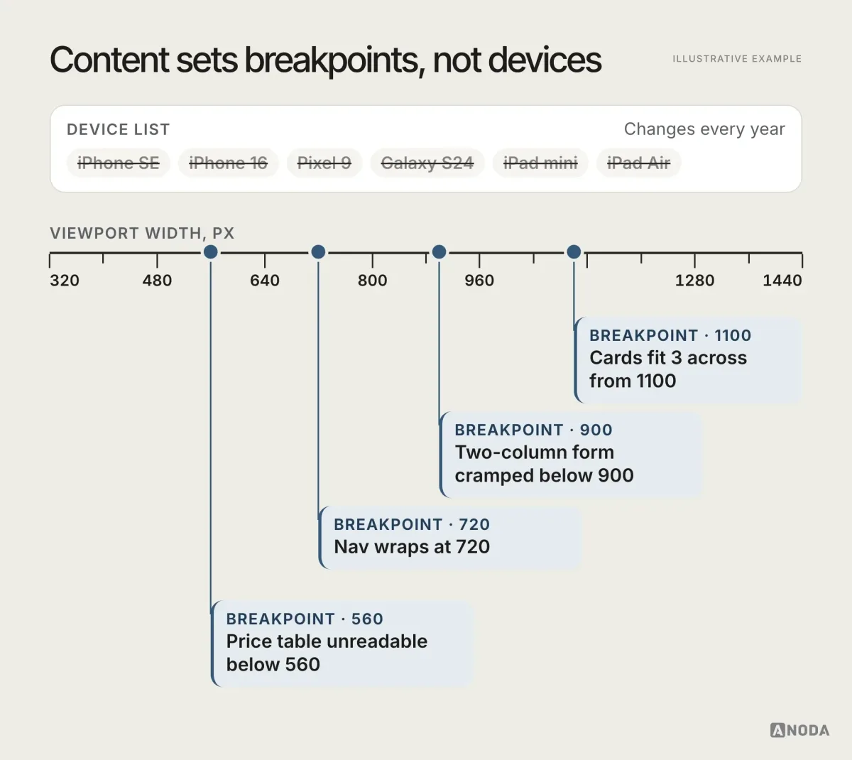
Between breakpoints, the layout should flex rather than jump. Fluid grids with relative units handle most of that. Flexbox is the tool for one-dimensional rows and columns that wrap; CSS Grid handles two-dimensional page layouts. Container size queries, supported across current major browsers, let a component respond to the space it has rather than the whole screen, which is exactly what a card needs when it appears in a wide main column and a narrow sidebar. Fluid typography with clamp() lets type scale between sensible minimums and maximums instead of jumping at each breakpoint.
None of those tools decides anything for you. They make your decisions cheaper to implement. Adding a breakpoint every time something looks off is kicking the can down the road; the underlying layout decision still hasn’t been made.
In the design files, this means fewer frozen screens and more written behaviour. Design the key pages at a narrow, a middle and a wide width, then annotate what happens in between: which elements stack, which collapse, which disappear, which change component. Developers build the annotations, not the three pictures.
Components need their own small-screen behaviour
Scaling a component is not adapting it. A desktop button at 70% size is a smaller desktop button. A mega-menu squeezed to 360 pixels is a mega-menu nobody can open. A bicycle is not a scaled-down car, and a phone component is not a scaled-down desktop one.
Each component needs a defined behaviour per context: what it shows, how it lays out, how big its targets are and what it does when space runs out. Navigation collapses into a short list with the one or two actions that matter. Filters move into a sheet. Cards stack. Long text gets tighter headings and shorter paragraphs, not smaller type. These decisions belong in the component library, not in one designer’s head, which is why responsive rules should live in a design system that design and frontend both use.
A few rules we apply on almost every project. Modals become full-screen sheets on phones, with the close and main actions always visible. Custom dropdowns often give way to the browser’s native select, which phones already handle well. Tabs with more than three or four items turn into a scrollable row or a menu. Sticky elements are kept to one: a sticky header plus a sticky promo bar plus a sticky chat button leaves a letterbox for the content.
UI/UX design
Decide what the phone keeps before anyone writes CSS.
We define content priority, component behaviour and the mobile flow around the tasks your visitors come for.
A responsive template also has to survive the next editor update. Our Webflow development service turns the approved component behaviour into shared templates, CMS collections and connected forms. ANODA checks the published phone journey and the editor’s task together, so adding a campaign page does not mean copying a layout and breaking it at the next width.
Images and media: size, crop and weight
Images are where responsive sites lose both performance and meaning. A 2,400-pixel hero delivered to a 360-pixel phone wastes data and slows the page. A wide landscape photo squeezed into a narrow column turns into a thin strip where the product is a smudge.
Three separate decisions are involved:
- Resolution.
srcsetandsizeslet the browser pick a file that matches the displayed size and pixel density, instead of downloading the desktop file everywhere. - Art direction. The
<picture>element lets you serve a different crop for narrow screens, so the product stays the subject instead of a speck in a panorama. - Stability. Set width and height or an aspect ratio on every image and embed, so the page doesn’t jump as media loads.
Then there is scale. Some fashion ecommerce sites are the classic case: full-screen photos and giant display type that look editorial on a desktop monitor and turn the phone into an endless magazine with no visible price, size or button. Huge images and huge headings are rarely what a phone visitor needs. A billboard folded into a wallet is still a billboard, just harder to read.
Video and embeds need the same care. Autoplaying background video burns mobile data for decoration; embedded maps and third-party widgets often arrive at fixed widths that break the page. Load below-the-fold media lazily, give embeds a responsive wrapper, and ask whether each one earns its weight on a phone.
Touch, gestures and input
The pointer changes on a phone, and so does everything built on it.
Touch interactions cannot depend on hover. Menus that open on hover, tooltips that hold critical information, controls that appear only when a cursor passes: none of them exist for a thumb. Anything important has to be visible or reachable by tap.
Targets must fit fingers. WCAG 2.2 sets a minimum target size of 24 by 24 CSS pixels at level AA, with spacing and other defined exceptions; Apple and Google recommend 44 points and 48 density-independent pixels for their platforms, and those remain the more comfortable targets for primary actions. Spacing matters as much as size: two small links close together will be mis-tapped however big each one is.
Gestures belong to the browser. Pulling down at the top of the page usually reloads it. Swiping from the screen edge usually goes back. Building your own pull-to-refresh or edge-swipe on a web page means fighting the browser, and the browser wins: a half-filled form reloads into an empty one. Pulling a drawer and bringing the whole cabinet down is not a feature.
Inputs choose the keyboard. The right type and inputmode on each field open the right keyboard — numbers for a phone field, email layout for an email — and autocomplete lets the browser fill what it already knows. On a phone, every avoided keystroke is a reason not to give up.
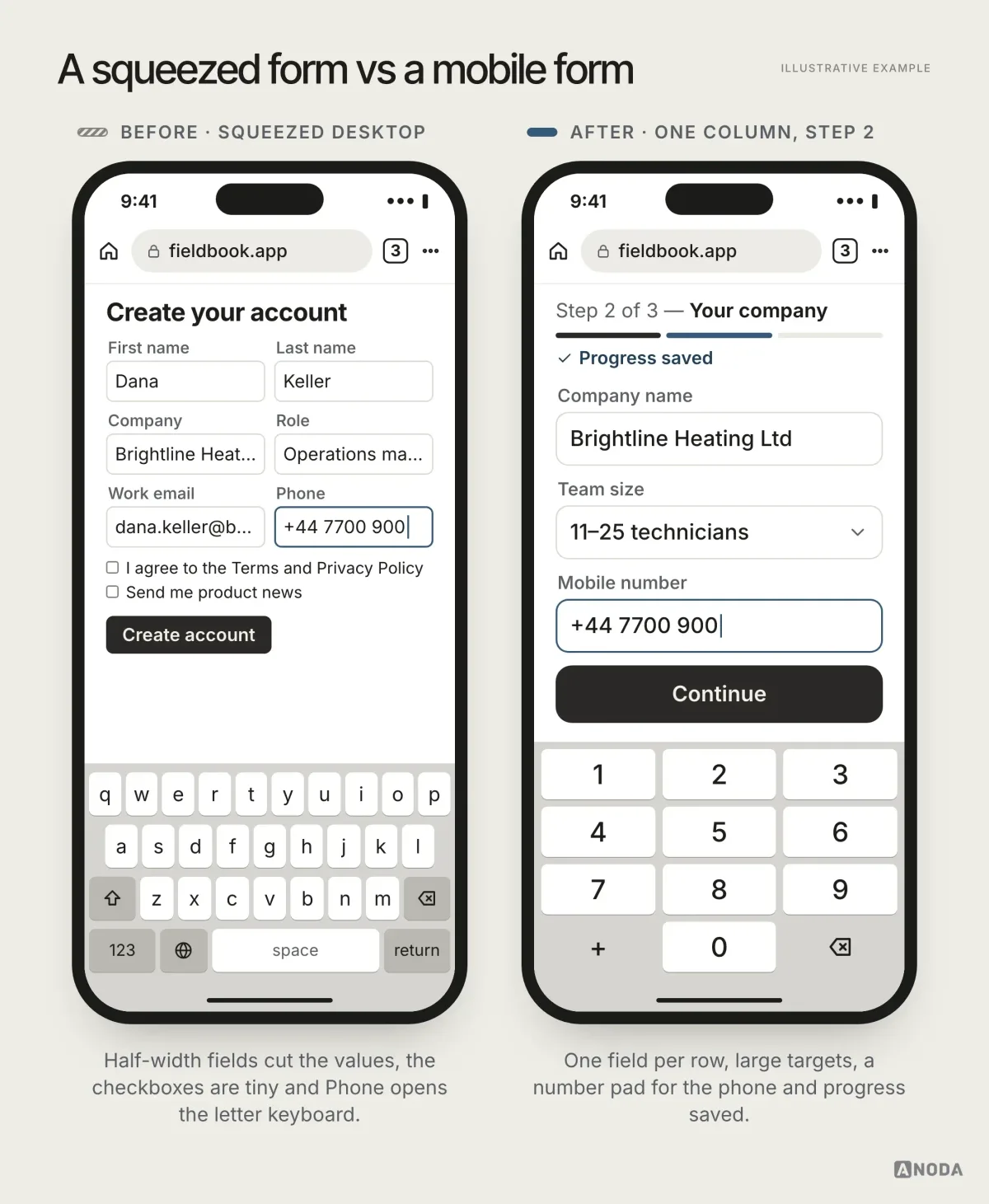
Forms are where these rules pay off most directly. On a phone, a sign-up or checkout form should be a single column with labels above fields, validation next to the field as the visitor goes, and progress saved at every step. Multi-column desktop forms squeezed onto a phone are one of the most common reasons we see mobile conversion trail desktop on the same product, and one of the cheapest to fix.
Tables, long flows and the desktop escape hatch
Wide tables are the hardest content on a phone. A six-column table with horizontal scrolling technically works and practically hides everything past column two. Unplanned horizontal scroll is a strong warning sign; if content genuinely needs it, the scrolling area must be obvious and deliberate, never the whole page sliding sideways because one element overflowed.
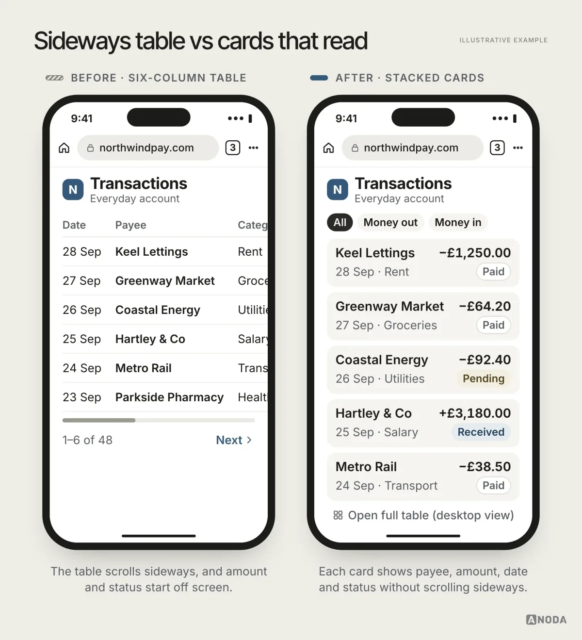
The usual answer is to show what most phone visitors need, as cards or a shortened list, with a clear path to the full data. For genuinely complex tasks, give people a deliberate escape hatch: an option to open the desktop view. They will zoom and scroll, and that is their choice. What doesn’t work is forcing the full desktop complexity on everyone, or hiding the action entirely. Booking and account flows are notorious for burying the confirmation or account button far down the page. The one action people came to complete should never be the hardest thing to find.
Rotate the phone: landscape and in-between widths
Teams often skip tablet layouts because tablets are a sliver of their analytics. Then someone turns a large phone sideways to look at a photo or a table, and a tablet-width screen appears out of nowhere.
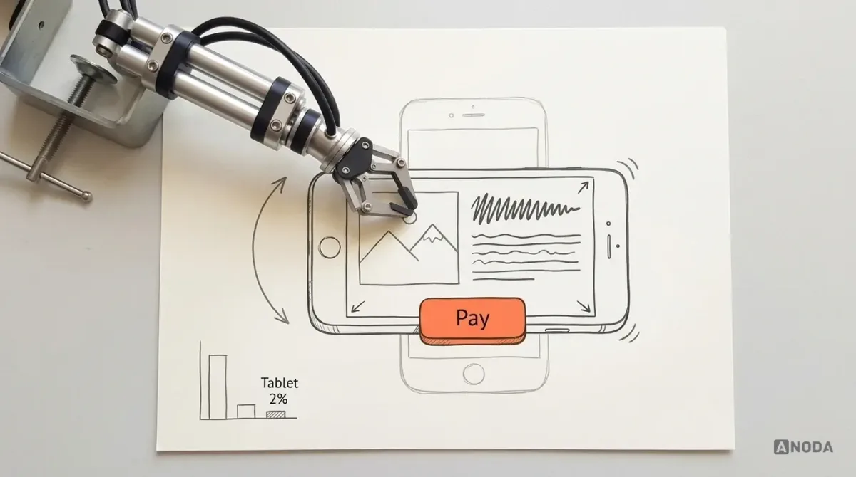
As Oksana puts it: your tablet just appeared. In landscape, an unplanned mobile layout usually means a giant image filling the screen and the main button pushed below the fold on a screen that is now very short.
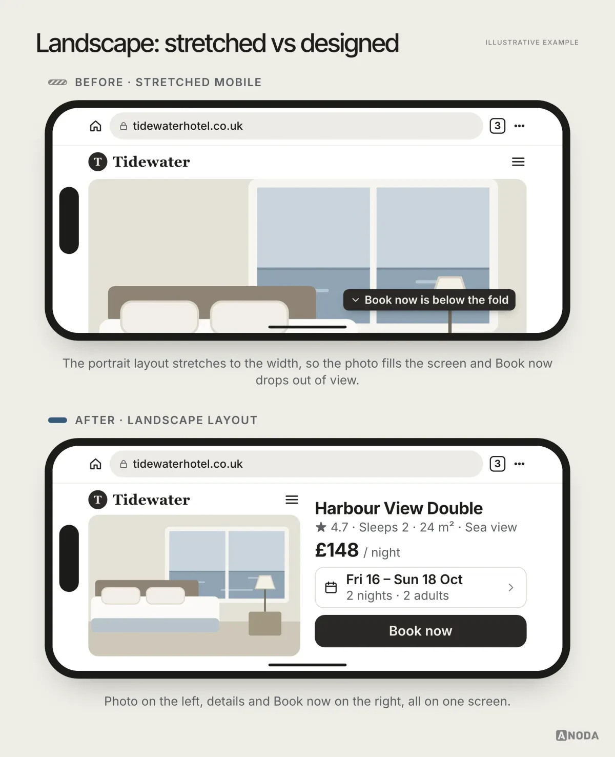
Intermediate widths deserve a decision, not an accident: short-and-wide landscape phones, small tablets, split-screen windows on laptops. Container queries help components cope; the page layout still needs someone to say what should happen there.
A browser is not an app
Responsive web runs inside someone else’s software, and that sets hard limits. Think of a rented car: you can drive it anywhere, but the seat and mirrors reset every time you pick it up, and you can’t install a tow bar.
Some things work well in the browser. Uploading a photo or using the camera through a file input is simple and often smoother than an app’s permission dance. Other things don’t:
- Sessions get lost. Browsers discard background tabs, reload pages and clear storage. Long forms need saved progress, and returning users need their place restored.
- Notifications are limited. Web push works in most browsers, but on iPhone it requires the site to be added to the home screen first, which most visitors never do.
- Offline work needs an explicit design. Service workers can support offline experiences; saved data, retry states and sync conflicts still need to be designed and tested for the field task.
- System integration depends on the platform. Check the required background work, widgets and device APIs against the browsers and operating systems your users actually have.
So when the job depends on push notifications, reliable offline work, deep system integration or continuity across sessions, stop adding breakpoints and ask whether the product needs a native app or a dedicated mobile flow instead. Responsive web is a great default. It is not a universal answer.
Progressive web apps sit in between: a website that can be installed to the home screen, cache content for offline use and, once installed, receive notifications. For some products that is enough. For others, the install step alone loses most of the audience. Decide based on the job, not on which technology the team finds more interesting.
Test the settings people actually use
Real visitors don’t browse with factory settings. They enlarge text, turn on browser translation, switch to dark mode, increase contrast and zoom in. Each of these can break a layout that looked perfect in the design review.
- Zoom and larger text. WCAG requires text to resize up to 200% without loss of content, and content to reflow at 320 CSS pixels wide without two-way scrolling, except content that requires a two-dimensional layout such as a data table or map. Fixed-height containers and truncated labels fail first.
- Translation. German and Finnish strings run much longer than English; a translated page is a free stress test for every button and heading.
- Dark and light appearance. If you support
prefers-color-scheme, check every state; if you don’t, check what forced dark modes in some browsers do to your images and logos. - Contrast and motion. Increased-contrast settings and reduced-motion preferences should be respected, not ignored.
How much of this you test depends on how polished the product must look. For a trust-sensitive business, the answer is: all of it.
Performance is part of the layout
On phones, speed is design. Google’s Core Web Vitals give workable “good” thresholds: Largest Contentful Paint within 2.5 seconds, Interaction to Next Paint within 200 milliseconds, Cumulative Layout Shift at most 0.1. Heavy hero images, web fonts that block text, carousels that load everything at once and layout shifts from late-loading media all show up here.
Treat these as acceptance criteria for the mobile layout, not as an afterthought for the frontend team. Measure them on real mobile traffic, not only on a developer’s laptop over office Wi-Fi: field data from real visitors regularly tells a different story from the lab score. A page that scores well on the team’s machines and poorly for customers is fast for the wrong audience. A page that fits perfectly and takes six seconds to show its main content on a mid-range phone over a mobile connection hasn’t finished being designed.
Test on real devices, with a checklist
Browser developer tools are good for first passes. They don’t reproduce real browser bars, real touch, real keyboards, real fonts or the mid-range processor in your customer’s pocket. Test-driving a car on a simulator tells you where the pedals are, not how it brakes on a wet road.
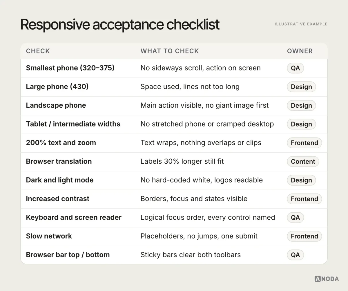
Run the key tasks — find, compare, book, pay, sign up — on a small Android phone, a current iPhone, a landscape phone and a mid-width window, with larger text and translation switched on at least once. Then watch real people do the same tasks: moderated usability testing across devices shows where they hesitate, mis-tap or give up, which no checklist can.
When the site is moving to another platform, responsive behaviour belongs in the migration scope beside the URL map, content and form destinations. Framer migration rebuilds the approved layouts, motion and publishing workflow in the destination stack; Webflow migration carries reusable exports forward and rebuilds the CMS and connected actions where needed. For a WordPress migration, ANODA also maps the archive, media and plugin jobs. We test representative phone journeys before extending the move, so a platform change does not reopen the responsive decisions your team already made.
Who owns responsive decisions
Responsive failures usually live in the gaps between teams. Design delivers a desktop file and a phone file, frontend fills the widths in between with guesses, content writes headlines that fit only the desktop hero, and QA checks the two sizes it was given. Everyone did their job. The page still breaks at 412 pixels in landscape.
The fix is shared ownership with clear lines. Design owns content priority and component behaviour at every width, written down. Frontend owns the implementation and the performance budget. Content owns copy that survives short screens and translation. QA owns the acceptance checklist on real devices. Someone, usually the product lead, owns the decision about what the mobile experience is for. Without that last role, each team optimises its own piece, and the visitor gets the sum of four compromises nobody chose.
Why unfinished responsive states cost trust
Visitors read your website as evidence of how your company works. A broken layout on their phone doesn’t feel like a minor CSS issue. It feels like a company that doesn’t finish things.

If you’re fintech, you have to account for everything, because any unfinished detail undermines trust immediately. If you can’t make your own site work properly, how will you keep my money safe? The site is a question of competence — of management, and of a team that can finish a project.
Oksana KovalchukFounder & CEO, ANODAThe more trust a product asks for, the less tolerance people have for rough edges: finance, health, insurance, anything that handles money or personal data. For those products, the checklist above is not optional polish. It is the storefront.
When another breakpoint won’t save you
Some responsive problems are signs of a structural issue, not a missing media query. Stop patching and rethink the mobile experience when you see these:
- The main action is several screens down on every phone size, and moving it breaks the page.
- Each new breakpoint fixes one width and breaks another.
- Key tasks need a table, editor or multi-panel workspace that no phone layout can hold.
- Mobile visitors abandon the same step no matter how the layout changes.
- The job needs notifications, offline work or reliable sessions the browser can’t provide.
The first four call for a different mobile flow: fewer steps, different components, maybe a different entry point. The last one calls for a native app. Neither is solved by another breakpoint.
Don’t shrink the desktop interface until it fits. Build the mobile web around the real viewport, the browser’s limits, touch, and the shortest useful path to the thing your visitor came for. Everything you don’t decide for the small screen, your visitors decide for you, with the back button.
Why ANODA designs the mobile task before the breakpoint
A narrower layout still loses customers when the keyboard hides the action, a modal traps them, or a checkout asks them to repeat information. Another CSS breakpoint cannot repair a flow built around the desktop.
ANODA connects the mobile task order, navigation, forms and component states before handing off the responsive system. In Xcoins, we designed the cryptocurrency purchase journey across desktop, tablet and mobile, including payment, wallet and confirmation states. Bring us the journey losing people; we turn it into a clear mobile experience and a consistent system your team can build.
In easyStorage NL, the responsive website’s location pages lead into an inherited booking journey, where customers choose a unit, dates and details. ANODA planned the site structure and responsive pages alongside that handoff, instead of treating the phone layout as a smaller desktop. For a new public site, our website design service connects the offer, page hierarchy and next action. For an existing site losing enquiries between its pages and forms, our website redesign service rebuilds that journey around the customers and content you already have. Send us the page people leave before they book or enquire; we will show you what needs to change.
For a content-led site, the implementation should preserve these responsive rules without adding an application-sized JavaScript bundle to every page. Our Astro development service builds the page templates, content model and focused interactive components around the buyer journey, so editors can publish and phone visitors can reach the action.

Frontend development
Your layout fits. Does it work?
We turn responsive rules into tested frontend behaviour, from the smallest phone to landscape, larger text and slow connections, so the page does its job on every screen.
Written by