In short
Good design feedback names the goal, points to what you see, says what it breaks and for whom, and admits whether it rests on evidence or taste. Here is how to frame a review, filter feedback by who is speaking, use AI without inventing problems, decide who decides, and stop moving buttons when the real work is a launch.
In this article
- Start with the goal, the stage and the context
- What useful design feedback looks like
- Rewriting the comments everybody writes
- Filter feedback by who is speaking
- Match the claim to the evidence
- Using AI to review design without fooling yourself
- Decide who decides
- A review workflow that actually ends
- How to receive design feedback
- Failure modes to watch for
- Feedback that matters is feedback that affects the outcome
- The decision rule
To give design feedback that improves the product, name the user or business goal, point to the specific thing you see, explain what it breaks and for whom, say whether you have evidence or just a preference, and leave the solution to the designer. Then make sure one person owns the decision. That is the whole method. The rest of this guide is about why teams keep failing at it, and how to stop.
Our experience reviewing design with clients shows that the worst reviews are never the rude ones. They are the long ones. We once opened a client’s design file and found roughly seven pages of comments nested inside comments inside comments, with the previous agency’s designers replying in exactly the same style. It looked like a very engaged review. Then we read it closely. The client had been pasting screens into an AI tool and posting whatever came out. The designers, it seemed, were pasting those comments into a chatbot and posting the replies. Two machines politely arguing, for weeks, on the client’s invoice.
It is a family group chat with two hundred messages about which restaurant to book, after which everybody eats at home. Lots of activity. No decision.
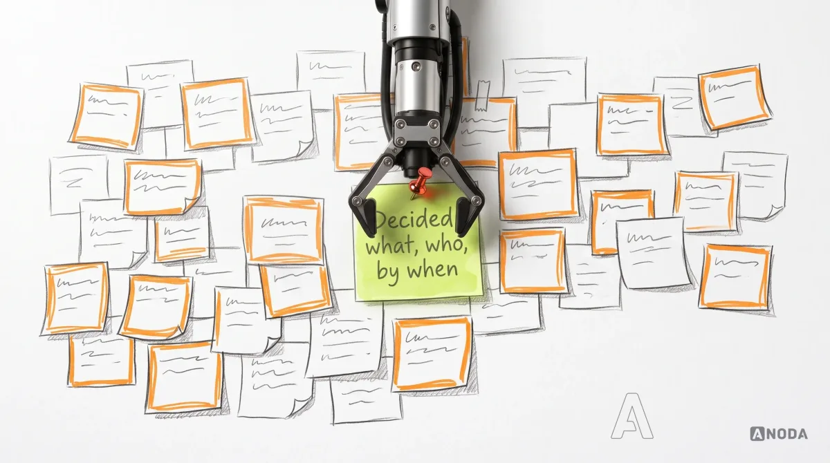
That is where the money goes in bad design feedback. Not into the redesign itself, but into rounds of revisions that change things without anyone deciding what the product needs, while the launch, the marketing and the users who were supposed to arrive keep waiting.
ANODA turns that activity into decisions. We connect each review to the user flow and business goal, resolve conflicting requests with the accountable owner and protect the design choices that move the product toward launch. You get a clear revision brief and a team that can finish the work instead of billing another round of comments.
Start with the goal, the stage and the context
Most unhelpful feedback is not wrong. It is unanchored. “I don’t like the colours” might be a real problem or a personal taste. Without knowing what the screen is for, who it is for and what stage the work is at, nobody can tell.
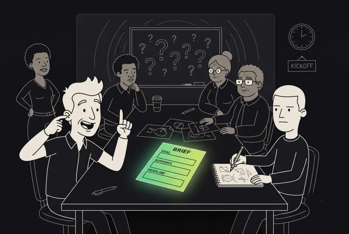
Before anyone comments, the review needs a short frame:
- What is being reviewed. One screen, a flow, a set of concepts, a component.
- The fidelity. A sketch, a wireframe, a first visual direction, near-final UI. Commenting on font weights in a wireframe is like critiquing the paint in a house that still has no walls.
- The open decision. What needs to be decided in this round: the direction, the structure, the content, the details.
- What is already fixed. Brand colours, legal text, a technical constraint, a budget line. No point relitigating these every round.
- The target user. Who this screen is for, in one sentence.
- The kind of feedback useful now. “We’re choosing a direction, so big-picture reactions please, not pixel notes” saves everyone a lot of typing.
If the brief behind the design is unclear, fix that first. We cover how to set goals, constraints and expectations before the design starts in our guide to writing a brief for your agency.
What useful design feedback looks like
Useful feedback has a shape. It does not have to be long, but it has to carry enough information for the designer to act on it without guessing what you meant.

The parts are:
- Context and goal. Which screen, which stage, and what the screen is meant to achieve.
- Observation. What you see, specifically. Not “the layout is weird” but “the main button sits below six form fields”.
- Consequence. What that does to the user or the business. “People on phones may not see the button without scrolling.”
- Evidence or uncertainty. What your concern is based on: data, research, a support ticket, a heuristic, or your own gut. Saying “this is just my feeling” is not weakness. It is useful information.
- Priority. Whether this blocks the goal, matters a lot, or is a detail for later.
- Question or requested decision. “Can we cut fields or move the button up?” leaves room for a better answer than the one you had in mind.
- Owner and next step. Who acts on it, and by when.
Notice what is missing: the solution. “Make the button red and put it at the top” is a design instruction, not feedback. Sometimes the instruction is right. Often it fixes the wrong thing, or fixes the right thing in a way that breaks two others. Describe the problem well and a good designer will usually find a better fix than the one you would have dictated. If they don’t, you have learned something about the designer.
Rewriting the comments everybody writes
Here are the comments we see most often, and what they could say instead.
| What gets written | What it could say |
|---|---|
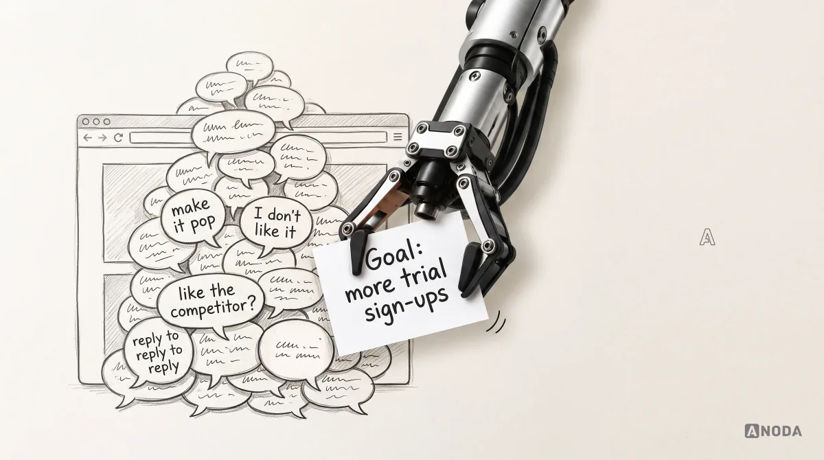
| “Make it pop.” | “On the pricing page, the plan we want people to choose doesn’t stand out from the other two. Can it be the obvious choice?” |
| “I don’t like it.” | “The dark background feels heavy to me for a meditation app. Is that the mood we want for tired users at night, or should we test it?” |
| “Copy what the competitor does.” | “Their onboarding gets people to a first result in two steps. Ours takes five. Which of ours can we cut?” |
| “Users won’t understand this.” | “I’m worried people won’t know what ‘workspace’ means here. Do we have any evidence either way, or can we check with five users?” |
| “Marketing wants it bigger, sales wants it smaller.” | “Marketing and sales disagree on the hero image size. The goal is demo requests. Who decides, and can we look at the numbers?” |
The rewritten versions are longer. They are also shorter in total, because they save the three rounds of back-and-forth it takes to find out what the first version meant.
Praise needs the same treatment. “Looks great!” tells the designer nothing about what to keep. “The empty state is really clear, keep that tone everywhere” protects the thing that works when the next round of changes comes along.
Filter feedback by who is speaking
Not all feedback carries the same weight, and pretending it does is how products end up designed by whoever spoke last. Before acting on any comment, ask who it comes from:
- A target user. Someone the product is actually for. Their reaction is evidence, though one person is still one person.
- A relevant domain expert. A doctor on a health product, an accountant on a finance tool. Their knowledge counts even if they are not the typical user.
- The accountable decision-maker. The person who owns the outcome. Their view settles trade-offs, whether or not it is evidence.
- Someone with a personal preference. A comment based on taste alone, regardless of the speaker’s seniority. Check whether the comment identifies an observable issue before classifying it as preference.
Oksana Kovalchuk, ANODA’s founder, has an example she has not forgotten. A founder building an app for women’s menstrual health asked her husband for honest feedback on it, and he duly suggested changes. He was not the target audience and not a medical expert. It was a perfectly fine opinion to discuss over dinner. It was not a product requirement.
Her own comparison is blunter: she would not ask an aeronautical engineer to look at her sprained ankle. Brilliant person, wrong expertise.
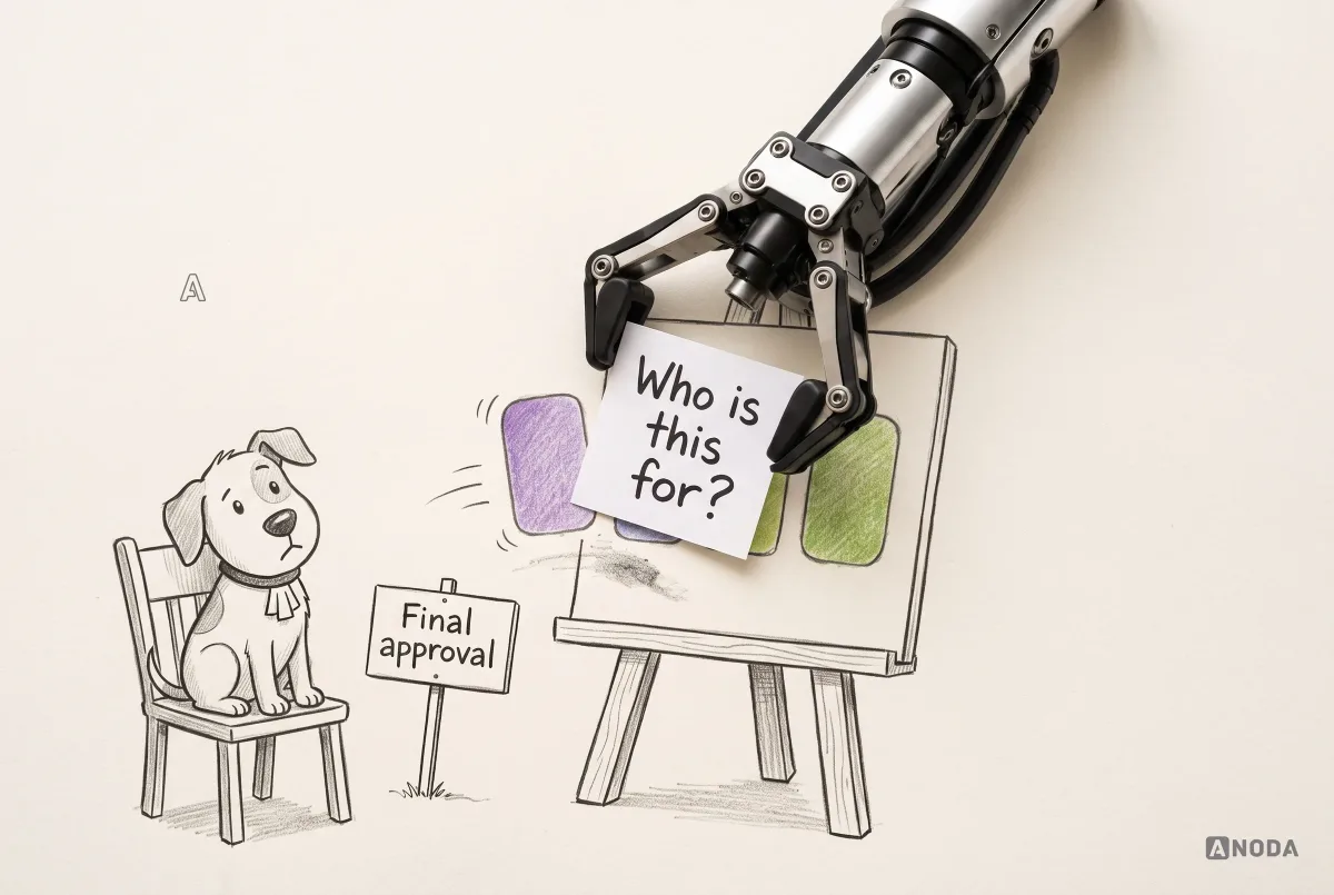
Her other line on the subject comes from a podcast, and it has stuck:
Don’t design for your dog.
 Oksana KovalchukFounder & CEO, ANODA
The point is not to ignore people close to you. It is to know which of their reactions are data about your users and which are data about them.
Match the claim to the evidence
The next filter is how much evidence a comment rests on. Stronger claims need stronger evidence. “I’d prefer blue” needs none. “Users will abandon this flow” needs quite a lot.
Different inputs answer different questions; they are not a universal ranking:
- Personal preference. “I like it better this way.” Fine to say, as long as it is labelled as taste.
- Heuristic concern. “This breaks a common usability principle.” A reason to look closer, not proof.
- Analytics signal. “Most visits to this screen are on mobile.” A fact about behaviour, not about why.
- Support evidence. “We get tickets every week from people who can’t find this.” Real users, real pain.
- User-research observation. “Four of the five people we tested with missed the button.” Direct evidence of the problem.
- Technical or legal constraint. “The payment provider requires this wording.” Confirm the applicable requirement with its owner; distinguish it from a changeable implementation choice.
This does not mean every review needs a research study. Most decisions are small, and taste is often good enough for small things. It means the more expensive the change, or the bigger the claim, the more the team should ask “how do we know?” before acting.
Heuristics deserve a special note. There are many usability frameworks, each with long checklists, and they contradict each other in places. A design cannot satisfy all of them at once. Oksana’s way of putting it: you cannot build a flying, lightweight, petrol-powered electric truck on two wheels. The principles are recommendations. Somebody has to think about which ones matter for this product and in which order.
| Review input | What it helps decide | What to do with it |
|---|---|---|
| Preference | Visual direction or a small trade-off | Name it as preference and let the decision owner choose. |
| Heuristic concern | A potential interaction problem | Check it against the actual task and constraints. |
| Analytics | Where behavior changes or work stops | Inspect the relevant journey and audience. |
| Support and user observation | What people struggle with and why | Connect the issue to a specific revision and check it afterward. |
| Technical or legal constraint | Which solutions are permitted or feasible | Verify the requirement with its owner and design within it. |
Feedback can also be an operational workflow rather than a meeting about a design file. In Concussion’s creative-management product, reviewers inspect creative assets, discuss changes and make approval decisions in the campaign context. The important interface questions are concrete: which asset is under review, whose decision is needed, what comment refers to it, and whether the asset is ready for the next stage.
When those approvals stay in chat, the team keeps losing the asset, its decision and the campaign it belongs to. Our creative-management design brings the review queue, asset context, comments and approval states into one working flow. ANODA designs the route from a creative awaiting review to an approved asset ready for the next stage, so feedback moves the work forward instead of reopening the same decision.
Using AI to review design without fooling yourself
AI review is the newest way to generate a lot of feedback very fast, and the easiest way to generate a lot of the wrong feedback.
A common pattern: someone drops two or three screens into an AI tool and asks it to “find ten problems”. The requested quota can encourage a model to produce weak or speculative points alongside useful ones. It has not been asked whether those problems are real, whether they matter for this product, or whether the screen is the right screen in the first place.
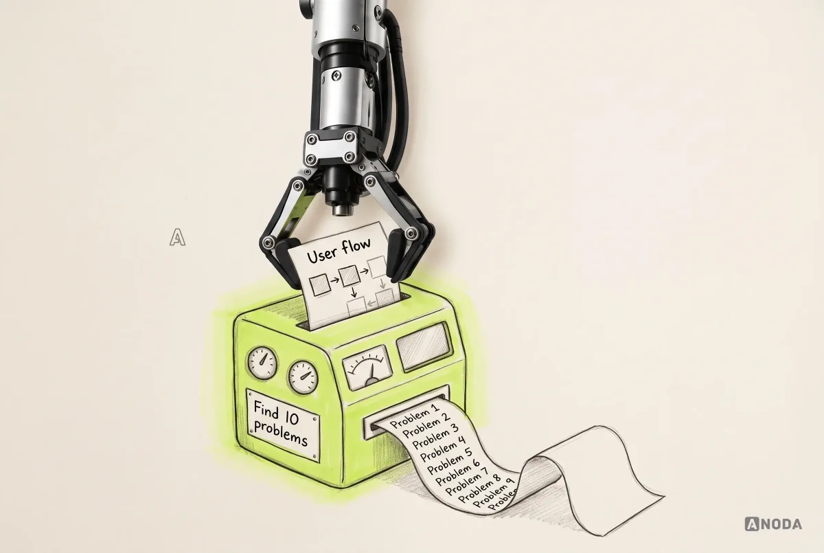
Worse, when the screens arrive without context, the model may fill the gaps with assumptions about the users, the flow and the business goal, then critique those assumptions rather than the actual product. Many teams also keep the prompt short to save tokens, which makes the problem bigger, not smaller.
AI can genuinely help, if you treat it like a reviewer who has just joined the project:
- Give it the user flow first, so it knows where each screen sits and what comes before and after.
- Tell it who the audience is, what the product is for and what goal this screen serves.
- Say what stage the design is at and which constraints are fixed.
- Ask specific questions instead of quotas: “Where might a first-time gym owner get stuck on this sign-up flow?” rather than “list ten issues”.
- Read every point critically. Treat the output like comments from a new colleague: some sharp, some confidently wrong.
The failure is not using AI. It is treating a list the machine was forced to produce as the truth about your product.
Decide who decides
The hardest reviews are not the ones with harsh comments. They are the ones with many stakeholders and no agreed decision-maker. Marketing wants one thing, sales wants the opposite, the CTO has a third idea, and the designer is asked to “find a compromise” that pleases everyone and works for nobody.
Choosing between these by counting comments is design by committee. It is picking a football team’s tactics by letting the crowd vote on every pass. Everyone feels involved. Nobody scores.

Different people should own different kinds of decisions:
- Product goals: the founder or product lead.
- Constraints and budget: the accountable client or sponsor.
- Content and facts: the content owner.
- Brand: the brand owner.
- UX flow and structure: the lead designer, together with product.
- UI craft: the designer.
- Technical feasibility: the engineering lead.
- The final trade-off: one named person.
At the start of every project we ask a simple question: whose opinion is final? If the client has not named anyone, our working default is the person accountable for the invoice. That is not a universal law of governance. It is a practical way to make sure contradictory requests get resolved instead of piling up in the file.
When a disagreement comes up, go back to the goal and the evidence, not the seniority or the volume. “Which option is more likely to get owners through sign-up, and how would we know?” is a question a team can answer. “Whose taste wins?” usually is not.
If the same review fights repeat on every project, the problem is not one screen. It is how your team runs decisions, and that is a job for UX consulting rather than another round of comments.
A review workflow that actually ends
Good feedback needs a process around it, or the good comments get lost among the bad ones. This is the sequence we use:
- Prepare the review. Share the frame: what, which stage, the open decision, fixed constraints, the target user.
- Collect comments in one place. Not in the file, the chat, three email threads and a hallway conversation. One place.
- Clarify the ambiguous ones. Ask what “this feels off” means before trying to fix it.
- Group duplicates and conflicts. Five people saying the same thing is one point, stated five times. Two people saying opposite things is a decision for the owner.
- Decide what changes now. Against the goal and the evidence, with the decision-maker in the loop.
- Record what was rejected or deferred, and why. Otherwise the same comment comes back next round, and the round after.
- Check the revision against the original goal. Not “did we address every comment?” but “does this now do what it was supposed to do?”
Recording rejected and deferred comments keeps the next review from reopening settled decisions without new information. A written “we’re not changing this because the test showed people found it fine” ends a discussion that would otherwise restart every week.
For recurring reviews, connect this process to the working agreement in our design operations workflow guide: name the reviewer, the decision owner and the acceptance criteria before opening comments.
For larger groups or bigger decisions, a facilitated session often works better than a comment thread. Our guide to running a UX design workshop covers how to structure one.
How to receive design feedback
The other half of the conversation belongs to the designer, and it goes wrong just as often.
- Ask before you answer. “When you say it’s too busy, is it the number of options or how they look?” Most feedback that sounds wrong is just unclear.
- Restate the underlying concern. “So the worry is that owners won’t see the trial button on a phone?” If they say yes, you now know what to solve.
- Don’t defend every choice in real time. Some comments deserve a reasoned response later, with evidence, rather than a reflex in the meeting.
- Explain trade-offs when a request conflicts with the goal. “We can move it up, but then the price explanation drops below the fold. Which matters more here?”
- Separate “I disagree” from “this is out of scope”. Both are fine answers. Mixing them up makes everyone suspicious.
A designer who argues with every comment trains the client to stop commenting. A designer who agrees with every comment trains the client to design the product themselves. Neither ends well.
Failure modes to watch for
The same problems come up in almost every stuck review:
- Feedback without context. Comments on screens nobody has framed.
- Solution-first commands. “Make it red” instead of “people don’t notice it”.
- Design by committee. Counting comments instead of deciding.
- Comments after approval. Moving the goalposts once the design has already been signed off.
- Mixing levels. Arguing about the strategy and the icon size in the same thread.
- Hidden decision-makers. The person who can overrule everything appears in round four.
- Vague praise. Nothing tells the designer what to protect.
- Untracked verbal decisions. Agreed on a call, forgotten by Monday.
There is also a quieter failure, and it is the most expensive. Endless iteration on buttons, colours and spacing can become a safe way to avoid harder decisions. Oksana sees it most with single and bootstrapped founders: round after round of small visual changes, while the positioning, the launch and the marketing wait. Moving a button is not scary. Launching is.
It is Parkinson’s law of triviality in action: the committee that approves a nuclear power station in five minutes and spends an hour on the colour of the bike shed. The bike shed is easy to have an opinion about. The reactor is not.
Feedback that matters is feedback that affects the outcome
Visual choices matter when they affect readability, recognition, accessibility or trust. Reliability, price and unmet expectations also deserve attention. Ask which user task or business outcome a comment affects before prioritizing it.
“Affects the outcome” is broader than direct revenue. It includes usability, accessibility, trust, risk, adoption, retention and whether the product matches what people were promised. A comment that touches any of those deserves attention and, if it’s a big claim, evidence. A comment that touches none of them is a preference.
Preferences are allowed. If the CEO would genuinely feel better with a different shade and it costs an hour, change it. Just call it what it is. The important distinction, the one that keeps a product honest, is between “I want this” and “this is better for the user”. Once a team can tell those apart out loud, most review fights get much shorter.
When feedback keeps circling because nobody is sure what the product should be, you may not need better comments. You may need someone to design it with you. Our UI/UX design team turns goals, evidence and constraints into a product people can use. And if the same review problems repeat across teams and releases, look at how your design work is organised: review stages, ownership and handoff are what DesignOps is for.
The decision rule
Before you act on a piece of design feedback, yours or anyone else’s, run it through these questions:
- Do we know what this screen is for, who it is for and what stage it is at?
- Is the person giving it a target user, a relevant expert or the accountable decision-maker? If none of those, inspect the substance: the comment can still identify an observable defect or a useful question. Do not classify it by seniority alone.
- What does the comment say breaks, and for whom?
- What is it based on, and is that strong enough for the size of the change?
- Who owns this decision?
- Will we change it now, later or not at all, and have we written down why?
- After the change, does the design do what it was supposed to do?
Separate personal preference from user and product evidence. Know who owns each decision. Give people, and machines, the user flow before asking what’s wrong. Say what breaks and why it matters, test the claims that matter, and stop moving buttons when what you are really avoiding is a launch.

UX consulting
Seven pages of comments and still no decision?
We sort out who decides what, which feedback is evidence and which is taste, and bring the team back to the goal the design is meant to reach.
Written by