In short
A UX design pattern is a reusable answer to a recurring user problem — not a law, not a decoration and not a component you drag onto the canvas. Patterns work because people have learned them elsewhere, which is exactly why copying one without its assumptions breaks things. Name the user problem first, compare nearby patterns, design every state, check accessibility and input types, test the pattern inside the real flow, and document why you chose it — and every place you deliberately broke it.
In this article
- What a UX design pattern is
- Pattern versus component, convention, template and flow
- Why patterns work — and why that’s also the risk
- Define the recurring problem before choosing a pattern
- Navigation and wayfinding patterns
- Input, selection and form patterns
- Disclosure and progressive-complexity patterns
- Search, filter and comparison patterns
- Feedback, status and recovery patterns
- Onboarding and permission patterns
- High-risk confirmation and interruption patterns
- Compare nearby solutions before you commit
- Adapting a pattern without breaking it
- Responsive and cross-input variants
- Accessibility requirements for every pattern
- When familiar patterns still fail
- Dark patterns and deceptive interaction
- Prototype and test the pattern in context
- Document patterns in a design system
- Pattern evaluation checklist
- Who decides which patterns are approved
- Why ANODA chooses the pattern for the job
- Where patterns end and product design begins
- Name the problem, then pick the pattern
A UX design pattern is a reusable interaction approach for a recurring user problem: how people find their way, enter data, narrow a list, recover from an error or confirm a risky action. A pattern is valuable because users have already learned it somewhere else. But it only works when it is adapted to the task, the content, the platform, the risk and the people in front of it — and then tested in context.
Every product team loves patterns until one of them fails in production. Then the post-mortem says the same thing every time: “but everyone does it this way”. Everyone does. Everyone also has a different problem.
Patterns are accumulated expectations, not laws or decorations. They save users from learning something new, and they save teams from reinventing the wheel. They also carry hidden assumptions — about the amount of content, the device, the stakes, the user’s knowledge — and when you copy the pattern without its assumptions, you inherit the failure without the fit.
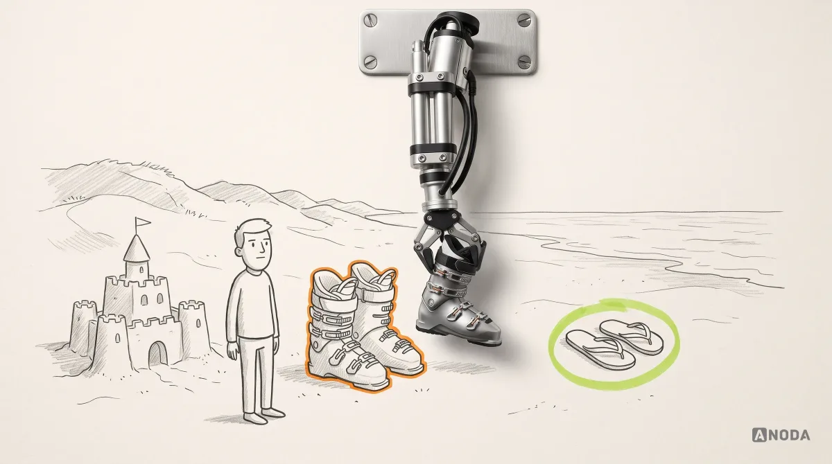
We have been designing products and design systems for 15 years, and the most expensive pattern mistakes we see are rarely exotic. They are familiar solutions dropped into the wrong context: a wizard for a task people need to jump around in, a date picker for a date of birth, a confirmation dialog on an action that should simply be undoable. This guide shows how to choose, adapt, test and document patterns so they solve your users’ problems rather than someone else’s.
What a UX design pattern is
A pattern describes a solution to a problem that keeps coming back, in a form general enough to reuse and specific enough to apply. The idea comes from architecture: Christopher Alexander’s A Pattern Language (1977) described building solutions — a window place, a light on two sides of every room — as problem-context-solution triples. Software and interface designers borrowed the format, and it still works because it forces you to write down why, not just what.
A usable pattern has more fields than a picture. At minimum:
- Problem: the recurring user problem, in the user’s terms.
- Context: when the problem appears — device, task frequency, content volume, user expertise.
- Forces: the tensions the solution must balance, such as speed versus accuracy or discoverability versus space.
- Solution: the interaction approach, not a pixel-perfect layout.
- Consequences: what you gain and what you give up.
- States: default, focus, loading, empty, error, success, disabled, permission denied.
- Accessibility: keyboard behaviour, screen reader semantics, focus order, target size, contrast.
- Evidence: what supports using it here — platform conventions, research, your own testing.
- Examples and counter-examples: where it fits and where it doesn’t.
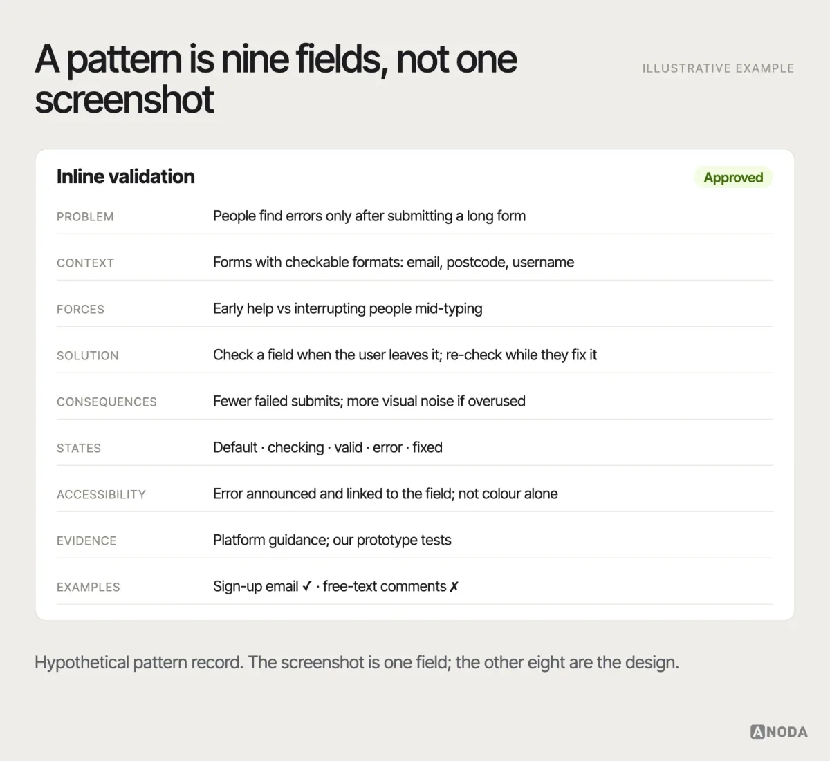
Most “pattern libraries” in the wild are only the solution field and a screenshot. That is why teams copy them blindly: there is nothing on the page to tell them when to stop.
Take inline validation. The screenshot shows a red message under a field. The full pattern says much more: the problem is people discovering errors only after submitting a long form; the context is forms with fields that have checkable formats; the forces are early help versus interrupting people mid-typing; the consequence is fewer failed submissions but more visual noise; the states include “checking” for server-side checks such as a username; and the accessibility notes say the error must be announced and linked to the field. The screenshot is one line of that. The other eight are where the design decisions live.
UX patterns and UI patterns
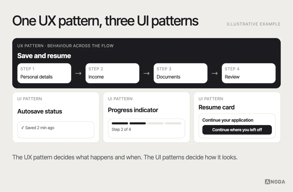
The terms overlap, and the difference is useful. A UX pattern describes behaviour across a task or flow: progressive disclosure, save-and-resume, undo instead of confirm, asking for permission in context. A UI pattern describes a smaller interface solution on a screen: a card, a tab bar, a breadcrumb, a toast. UX patterns decide what happens and when; UI patterns decide what it looks like where it happens. A single UX pattern is usually implemented with several UI patterns.
Pattern versus component, convention, template and flow
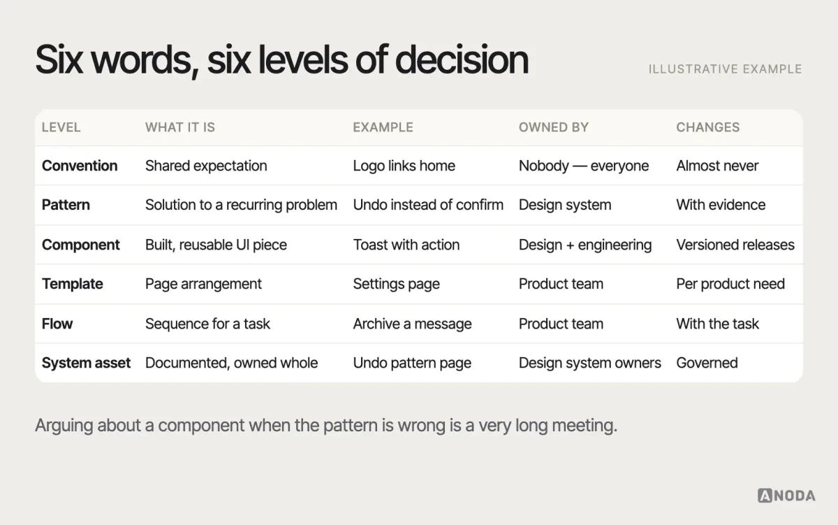
Teams mix these words constantly, then argue about the wrong thing in design review. They are different levels of decision:
- Convention: a widely shared expectation, such as a logo linking to the home page or a magnifying glass meaning search. You rarely document it; you simply don’t break it without a reason.
- Pattern: a reusable solution to a recurring problem, with context and consequences. It is technology-agnostic.
- Component: a built, reusable piece of interface — a date input, a modal, a table — with defined properties and states. A pattern is usually implemented with one or more components.
- Template: a page-level arrangement of components for a type of screen, such as a settings page or a search results page.
- Flow: the sequence of screens and decisions a user goes through to complete a task. Patterns live inside flows.
- Design-system asset: the documented, versioned, owned combination of all of the above — the place where a pattern becomes an approved way of working.
The practical difference shows up in a simple case: asking for a date.
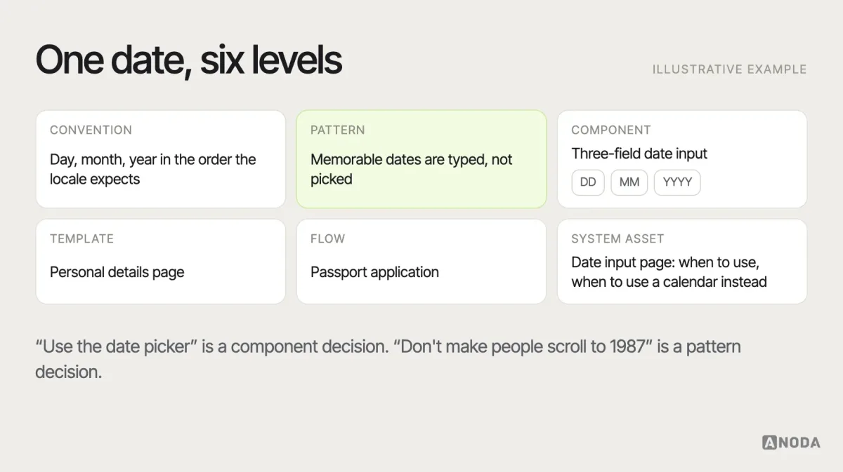
If a team only has components, every designer decides the pattern alone. That is how one product ends up with four ways to enter a date.
Why patterns work — and why that’s also the risk
Patterns work because of learned expectations. Jakob Nielsen’s often-quoted observation, known as Jakob’s Law, is that users spend most of their time on other sites and apps, so they expect yours to work the same way. Every familiar pattern you use is a lesson your users don’t have to take again. The behavioural reasoning behind that — recognition over recall, cognitive load, habit — is covered in our guide to UX design psychology principles.
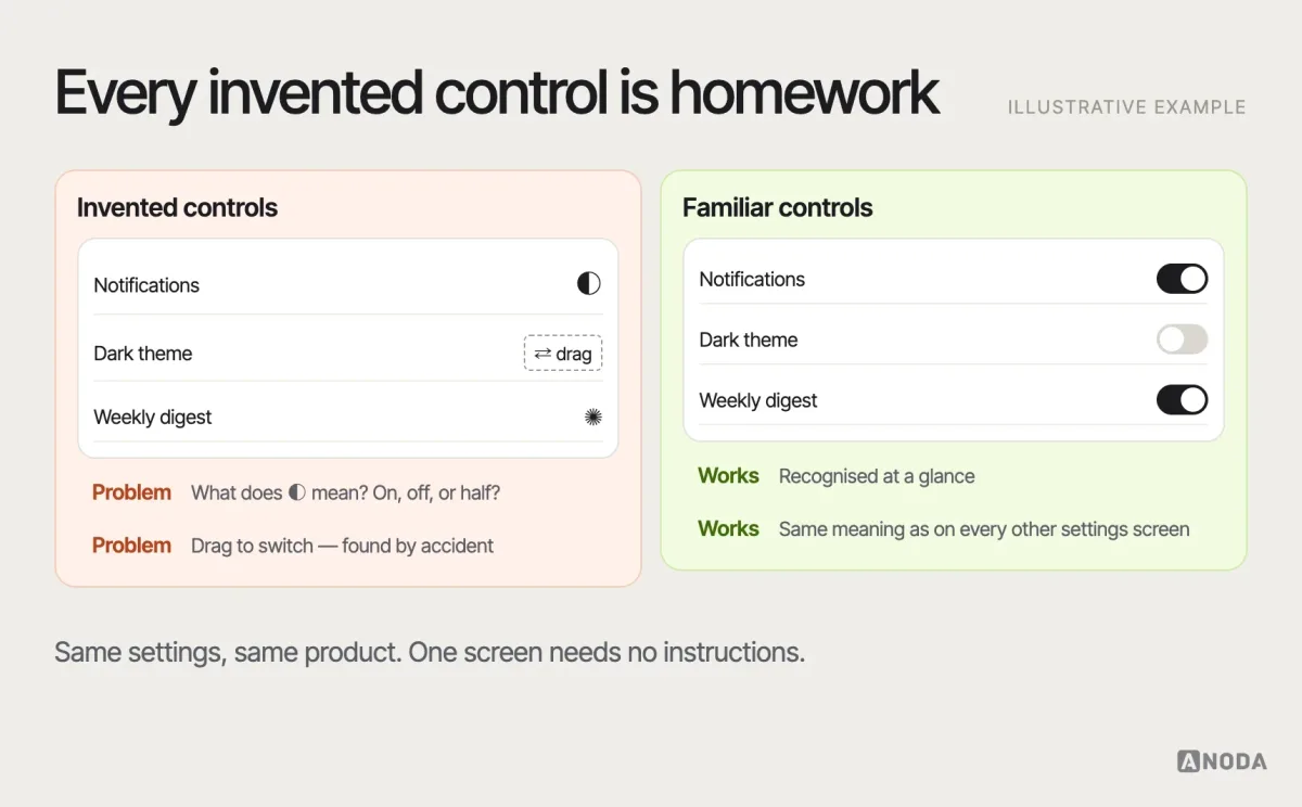
The same mechanism is the risk. A familiar pattern creates an expectation, and if your version behaves differently, the familiarity works against you. A swipe that deletes in one app and archives in another. A “back” that leaves the form instead of the step. A heart icon that saves in one product and buys in the next. Users don’t read your pattern; they assume it. That is why a mismatched pattern is worse than an unfamiliar one: an unfamiliar control makes people slow down, while a familiar-looking control makes them confidently wrong.
Borrowing from public pattern libraries
Public design systems are the best free pattern education available. The GOV.UK Design System publishes patterns with the reasoning behind them and notes from research with real users; Material Design and Apple’s Human Interface Guidelines describe platform behaviour your users already know; systems such as IBM’s Carbon document patterns for dense enterprise interfaces.
Borrow the right layer. Take the reasoning, the states, the accessibility notes and the research findings — they transfer. Be careful with the visual layer and the specifics: a pattern tuned for a government service used once a year by the whole population is not automatically right for a trading tool used all day by specialists. And never borrow a pattern because of the brand whose library it lives in. A famous logo on the page is not evidence that the pattern fits your users.
Define the recurring problem before choosing a pattern
Choosing a pattern by browsing a gallery is like copying the answers from the kid next to you — who was sitting a different test. The screenshots look right. The questions were different.
Start with a problem statement, not a component name. “We need a dropdown” is a solution. “Users need to choose one shipping country out of 190, on mobile, usually their own, sometimes a gift address abroad” is a problem, and it immediately rules some patterns out.
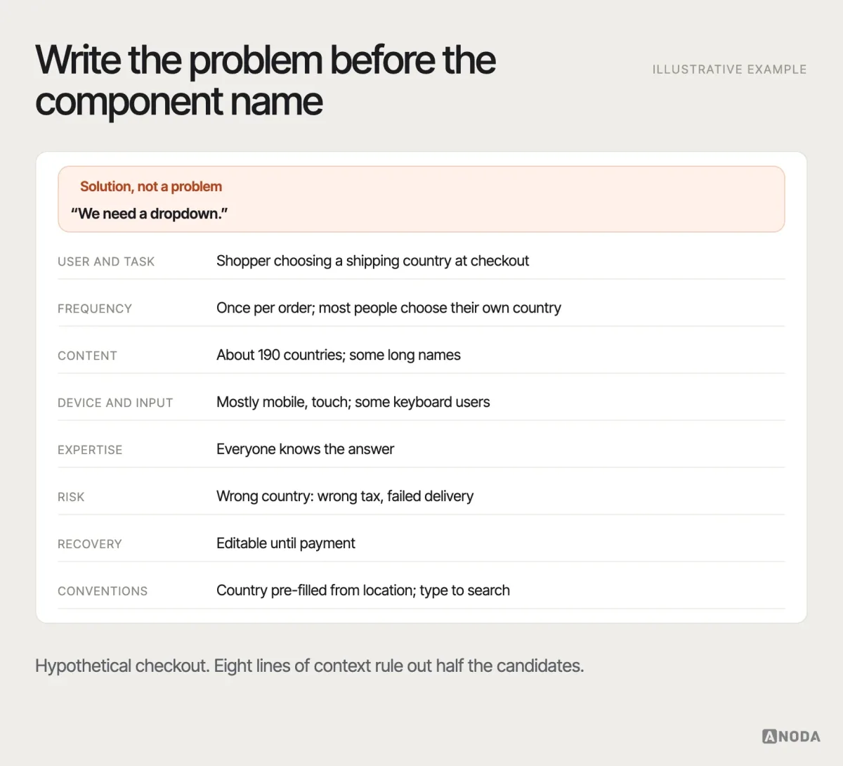
Record five things before you pick anything:
- The task and its frequency. Daily expert work and once-a-year setup need opposite solutions. Experts want density and shortcuts; first-timers want guidance.
- The content. Three options, thirty or three thousand? Short labels or long names? Content volume kills more patterns than anything else. A segmented control that looks elegant with three short options collapses with five long ones, and a card grid designed around perfect product photos looks broken the day the first item arrives without an image.
- The platform and input. Touch, mouse, keyboard, screen reader, voice — and whether the platform has its own convention for this job.
- The risk. What happens if the user gets it wrong, and can they undo it?
- The surrounding flow. Where did the user come from, what do they need next, and what patterns are already used nearby?
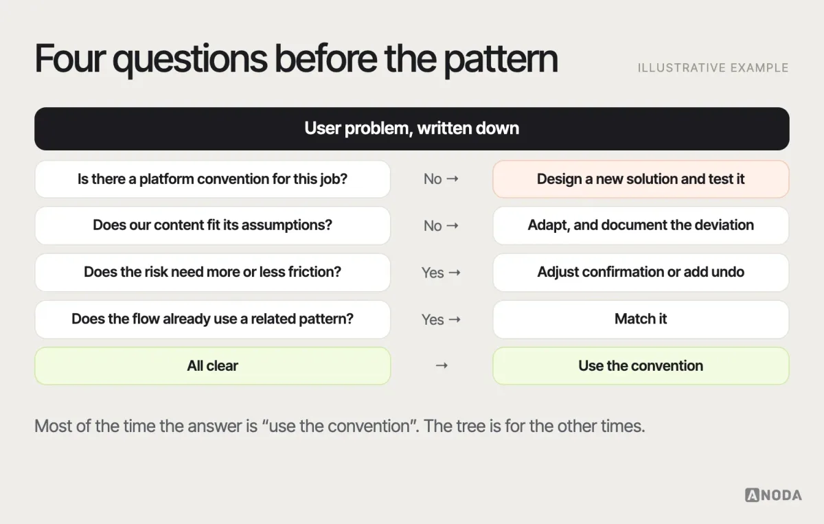
Then walk a short decision path: is there a platform convention? Does the content fit it? Does the risk require more friction or less? Does the flow already use a similar pattern you should match?
Navigation and wayfinding patterns
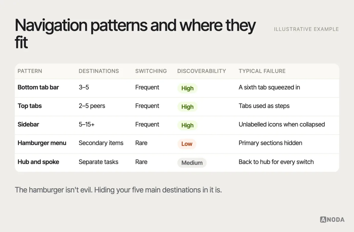
Navigation patterns answer three questions: where am I, where can I go, and how do I get back. The choice depends on how many destinations you have, how often people switch between them and how deep the hierarchy goes — which is an information architecture decision before it is a visual one. If the structure itself is unclear, start with information architecture, not the menu style.
A few rules that hold across products:
- Primary destinations should be visible. If people switch between four or five sections daily, a tab bar or sidebar beats a hidden menu. Hidden navigation is fine for secondary items.
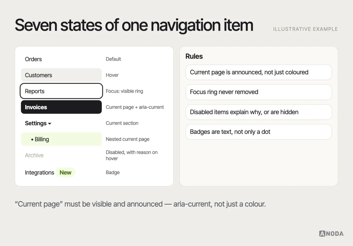
- Show the current location. A selected state in the navigation, a page title that matches the menu label and, in deep hierarchies, breadcrumbs.
- Keep back predictable. On mobile, the platform’s back behaviour must work; in web apps, the browser’s back button must not destroy work.
- Follow the platform where it has an answer. Apple’s Human Interface Guidelines describe a tab bar for top-level sections of an iOS app; Material Design describes a navigation bar, rail or drawer depending on screen size and the number of destinations. Users of each platform have learned those answers. A cross-platform app that imposes one platform’s navigation on the other asks half its users to relearn.
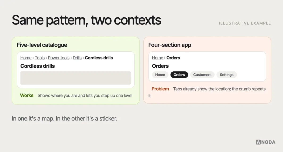
Breadcrumbs are a good example of a pattern with narrow context. They help in deep, hierarchical content — catalogues, documentation, admin areas. In a flat app with four sections, they are decoration that costs a line of screen space.
Input, selection and form patterns
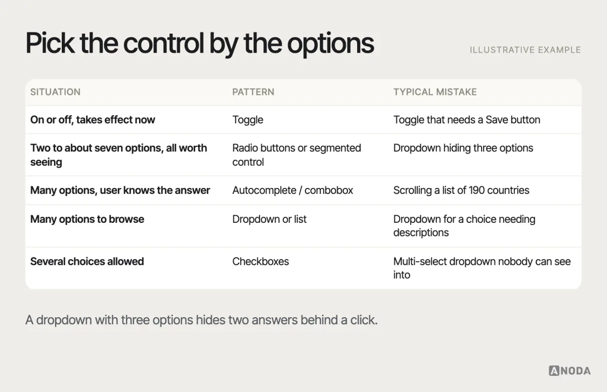
Forms are where pattern choices turn into money: every wrong control is an error, a support ticket or an abandoned sign-up. The first choice is usually which selection control to use, and it depends on the number of options and whether they need to be visible at once.
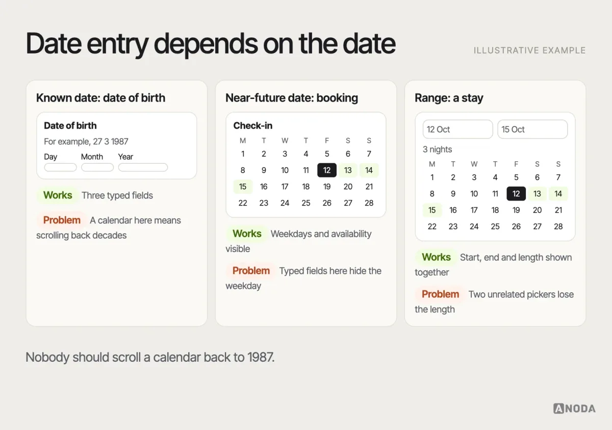
Dates show how context changes the pattern. For a date of birth or a passport expiry, people know the answer; typing day, month and year into three labelled fields is faster and less error-prone than scrolling a calendar back decades. The GOV.UK Design System recommends exactly this for memorable dates. For booking a hotel, people need to see weekdays and availability, so a calendar picker is the right pattern.
Every input pattern also needs a full set of states. The design file usually shows one — filled in, perfectly — and engineering invents the rest.
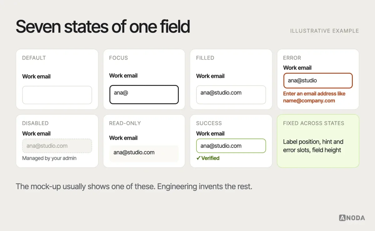
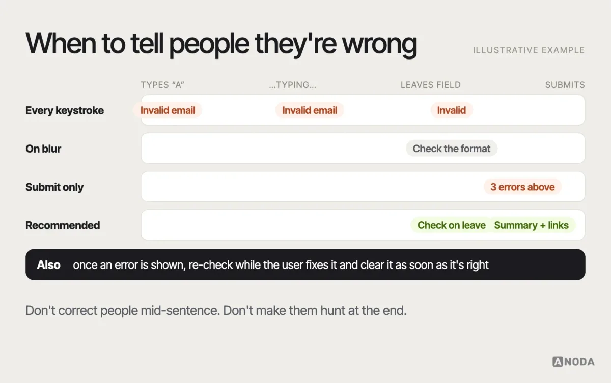
Validation timing is a pattern decision too. Validate too early and you shout at people who haven’t finished typing. Validate only on submit and you send them hunting through a long page. A reasonable default: validate a field when the user leaves it, re-validate while they fix it, and on submit, show an error summary at the top that links to each field.
Smaller input patterns carry the same weight. Labels above fields, not placeholder text that vanishes. The right keyboard on mobile — numeric for card numbers, email for email. Autocomplete attributes, so the browser and password managers can fill known data. Input masks only where the format is fixed and familiar, and never ones that fight people who paste. Each is a tiny pattern; together they decide whether the form feels like help or homework.
Disclosure and progressive-complexity patterns
Progressive disclosure shows the essentials first and reveals the rest when needed: “advanced settings”, accordions, “show more”, expandable rows. It is one of the most useful patterns in complex products — and one of the most abused, because hiding things is easier than deciding which things matter.
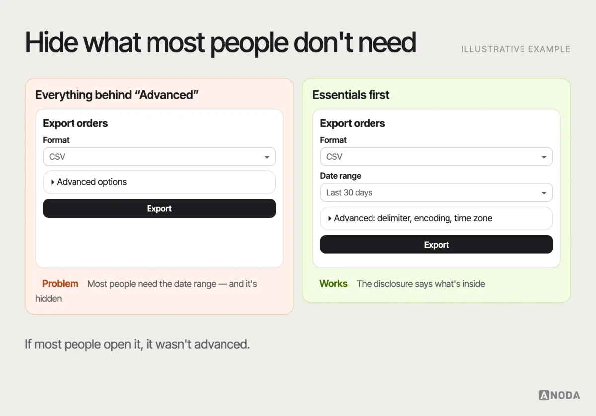
The rule of thumb: if more than a small share of users need the hidden content on a typical visit, it shouldn’t be hidden. And whatever you hide must be findable, labelled with what’s inside, and keyboard-accessible.
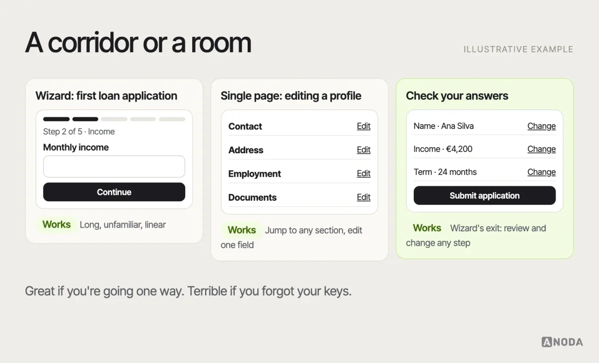
Wizards are the same trade-off at flow level. A step-by-step wizard helps with long, unfamiliar, linear tasks — an insurance application, a first-time setup. It hurts when users need to jump between sections, compare answers or edit one field later. For those, a single page with sections, or a summary page with “change” links, works better.
Search, filter and comparison patterns
Search, filtering and comparison are three different jobs that often get squashed into one search bar. Search is for people who know what they want. Filtering is for narrowing a set by attributes. Comparison is for choosing between a few finalists. When one control tries to do all three, it usually does none of them well.
Search needs more states than most teams design: an empty field with recent or suggested queries, suggestions while typing, results with the query highlighted, no results with a way out, and a slow-network state.
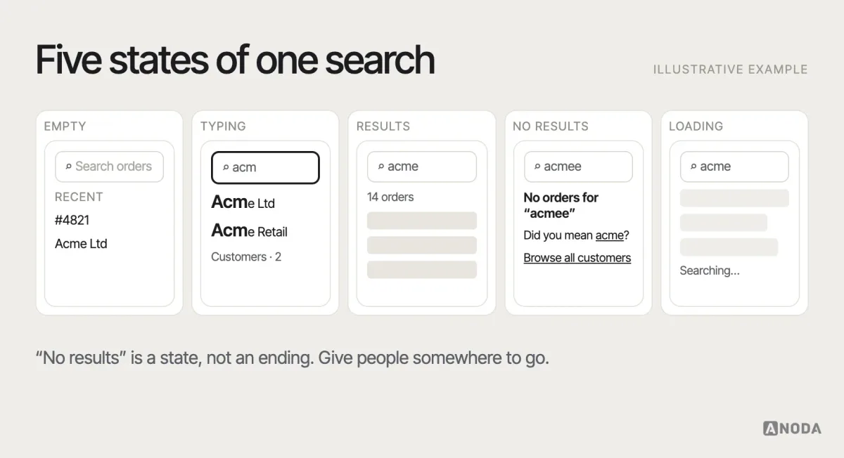
Two details separate a search that helps from one that merely exists. Tolerance: people misspell, use synonyms and paste product codes with spaces, and a search that demands the exact word is a search that fails. Scope: if the product has several kinds of content — orders, customers, documents — show which kind each result is, or let people choose the scope before they search.
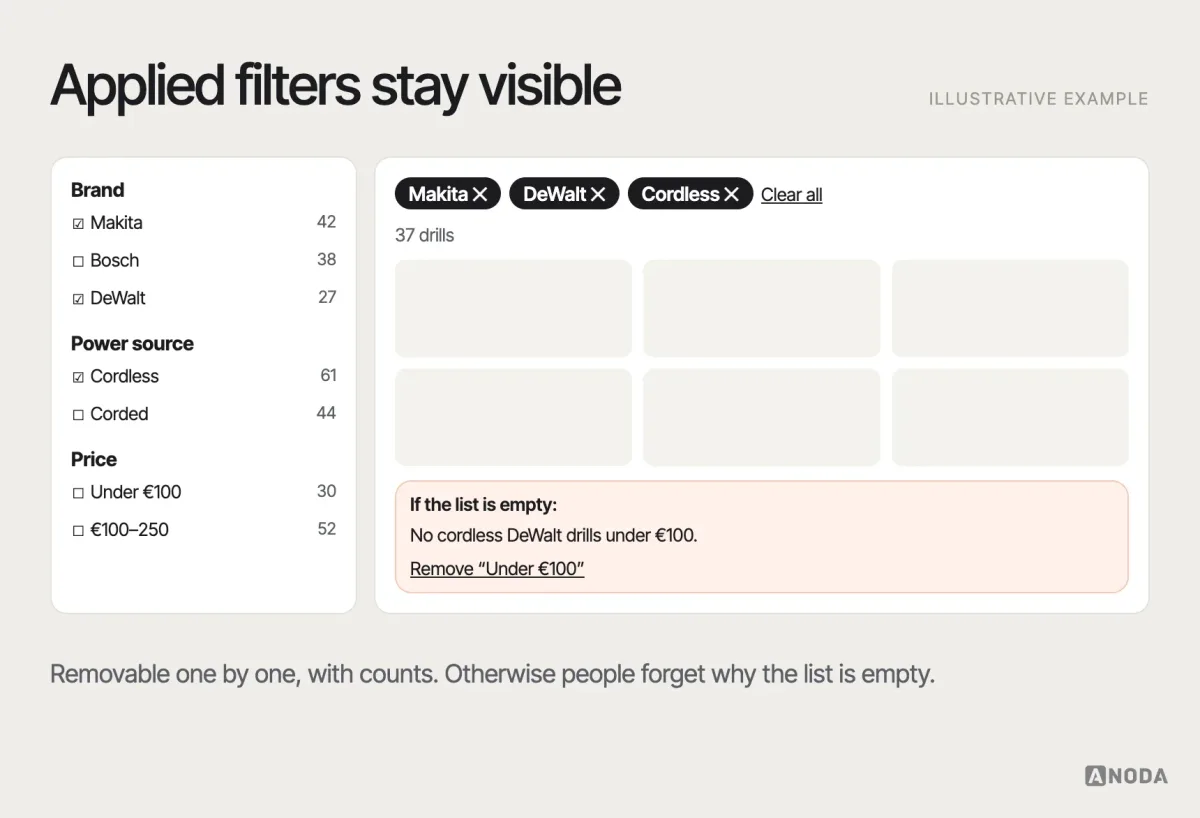
Faceted filters work when the attributes are clear and the list is long. The details decide whether they help: show which filters are applied, let people remove one without resetting all, show result counts where they are reliable, and don’t reload the page and scroll the user to the top after every tick.
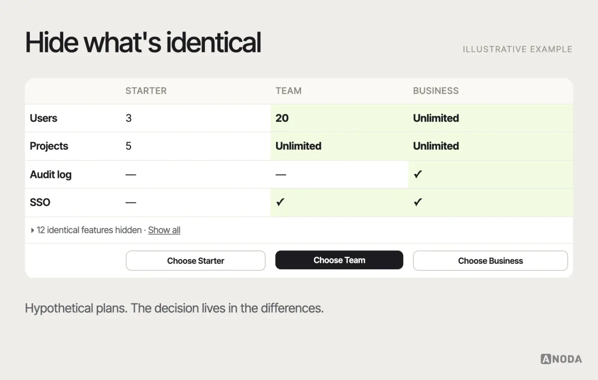
Comparison patterns — side-by-side tables, “compare” trays — help at the final step. Keep the same attributes in the same order, highlight differences, allow hiding identical rows, and keep the action for each option within reach.
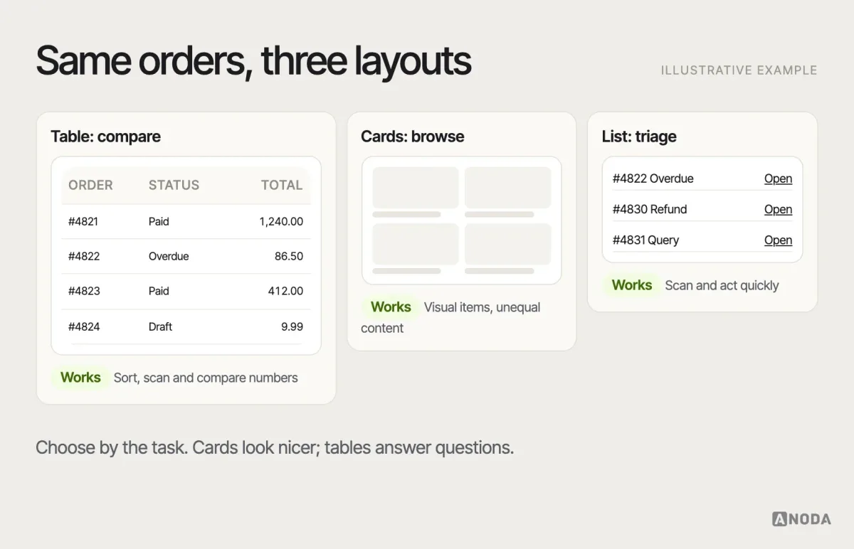
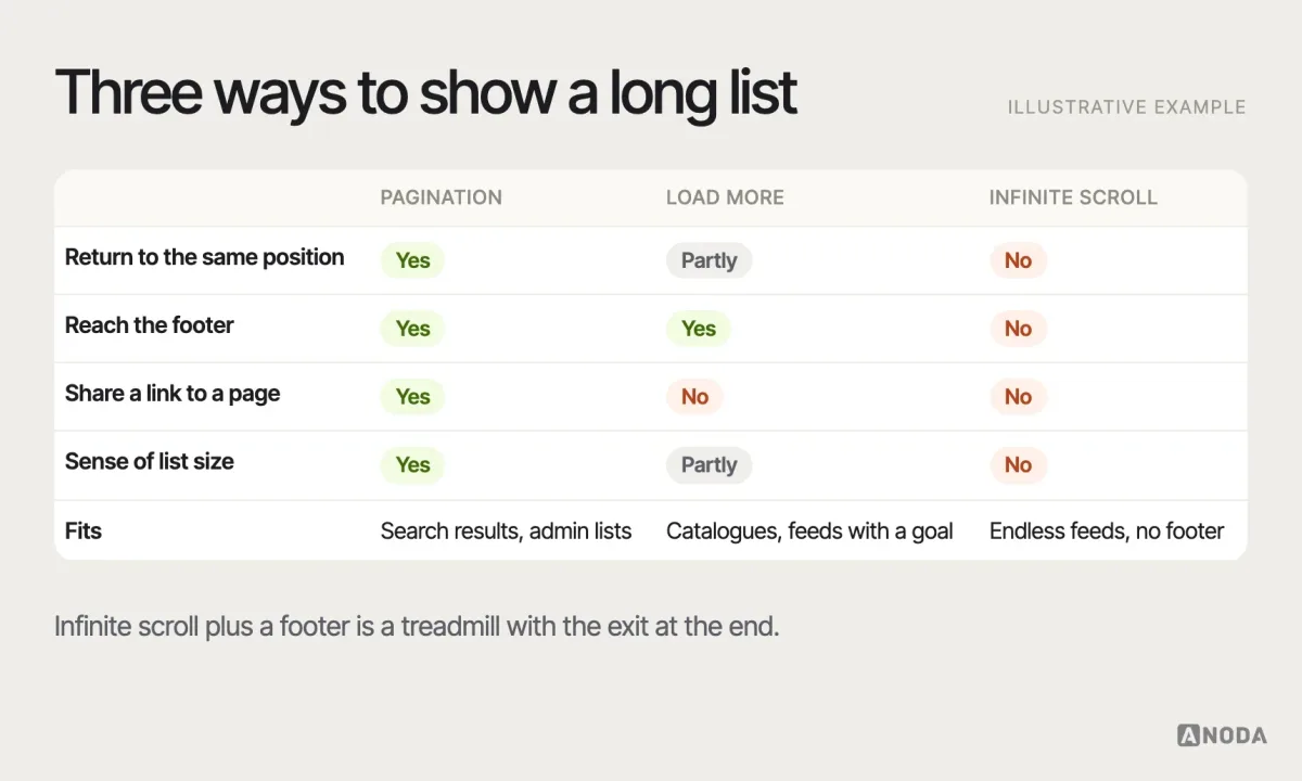
Data display follows the same logic. Tables are for comparing many items by several attributes; cards are for browsing items that are mostly visual or unequal in content; lists are for scanning and acting quickly. Pagination, “load more” and infinite scroll each fit a different job — and infinite scroll on a page with an important footer is a classic self-inflicted wound.
Dense data needs its own set of small patterns: a sticky header so people don’t lose the column names, right-aligned numbers so they can be compared, sorting that shows its direction, row actions that don’t appear only on hover, and a way to choose columns. Each one is minor. Leave them out, and the table becomes the part of the product people export to a spreadsheet to escape.
Feedback, status and recovery patterns
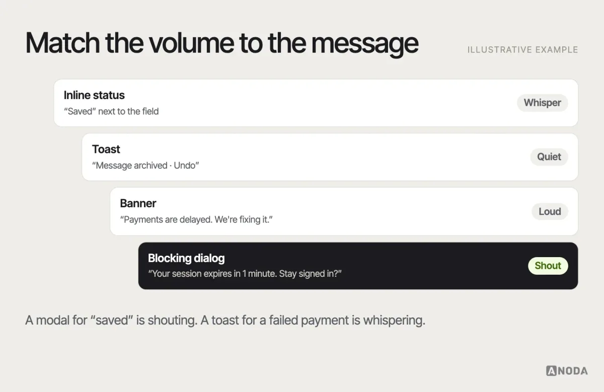
Every action needs an answer: did it work, is it still working, what went wrong and what can I do now. The pattern depends on how important the message is and whether the user must act.
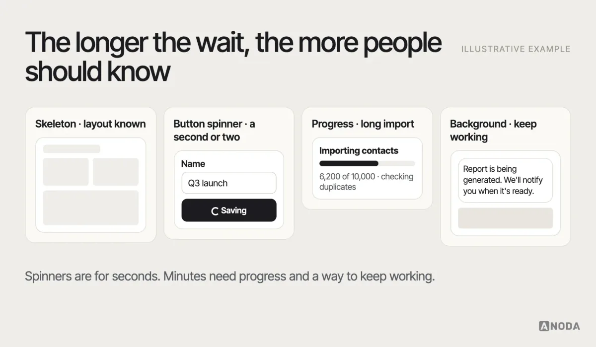
Loading is its own family. A skeleton screen works when the layout is predictable. A spinner is fine for a second or two. For longer operations, show progress and what’s happening, and let people keep working if they can.
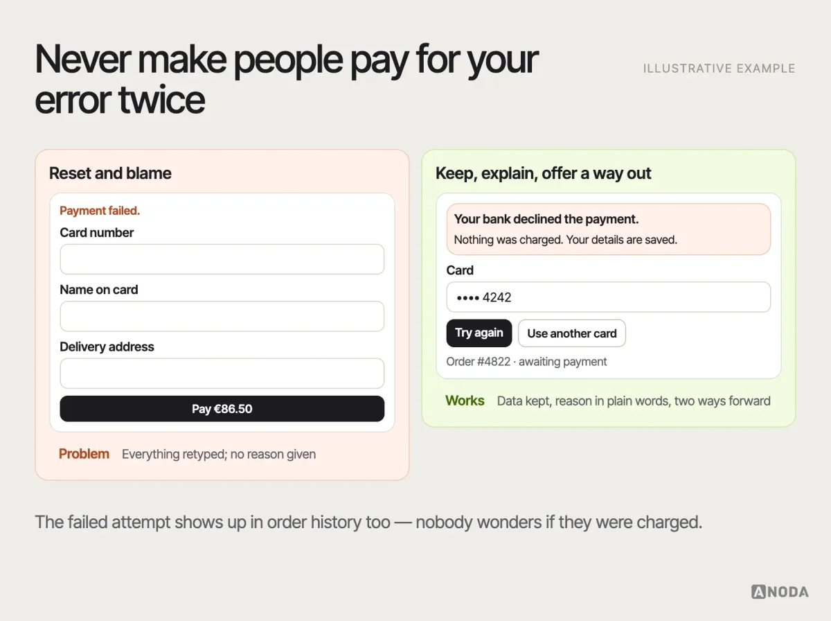
A related pattern is optimistic UI: showing the result of an action immediately — the like, the moved card, the sent message — and reconciling with the server in the background. It makes products feel fast, but it has a hidden state: what happens when the server says no. The pattern is only complete when the failure is designed too — the item marked as not sent, the change rolled back visibly, and a way to retry.
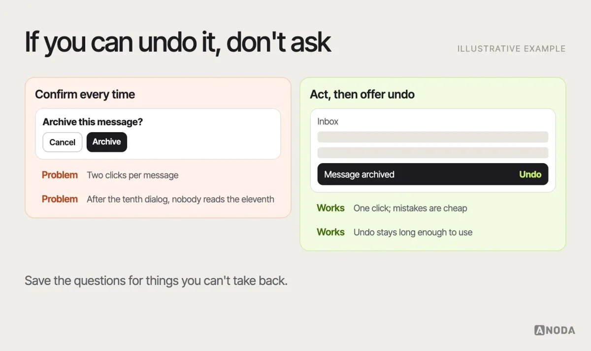
One of the most useful recovery patterns is undo instead of confirm. A confirmation dialog on every delete trains people to click “Yes” without reading. An undo option after the action — “Message archived. Undo” — keeps the flow fast and makes mistakes cheap. Confirmation still has a place, but for high-risk actions, covered below.
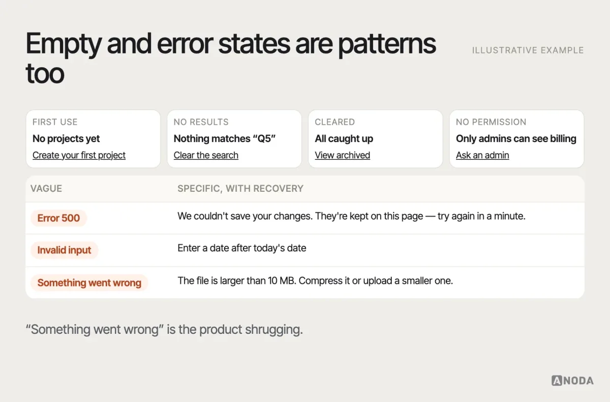
Empty and error states are patterns, not leftovers. An empty state should say why it’s empty and what to do next. An error message should say what happened, in plain language, and how to fix it — not “Something went wrong”.
Onboarding and permission patterns
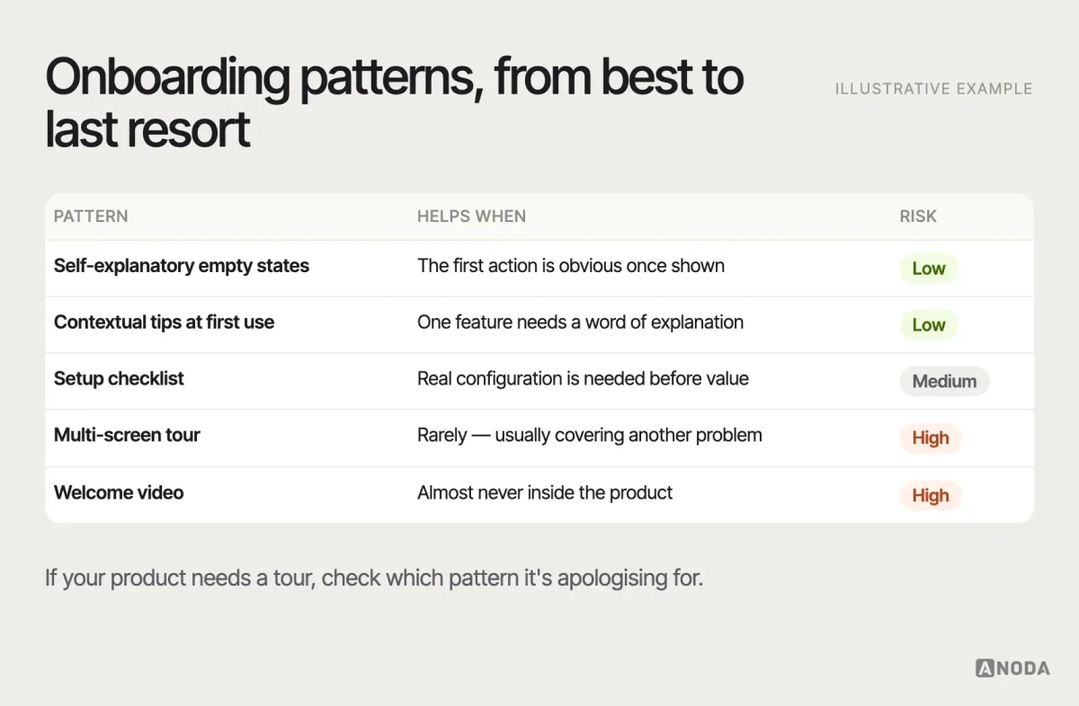
Onboarding patterns range from none at all to multi-screen tours. The honest ranking: an interface that explains itself beats contextual hints, which beat a tour, which beats a video nobody watches. Tours are often a pattern chosen to compensate for another pattern that failed.
Setup checklists are a useful middle ground for products that genuinely need configuration before they deliver value — connect a data source, invite the team, create the first project. They work when each item is a real step towards value, shows its status and can be done in any order. They fail when they become a to-do list of the company’s goals, such as “follow us” or “rate the app”, dressed up as the user’s.
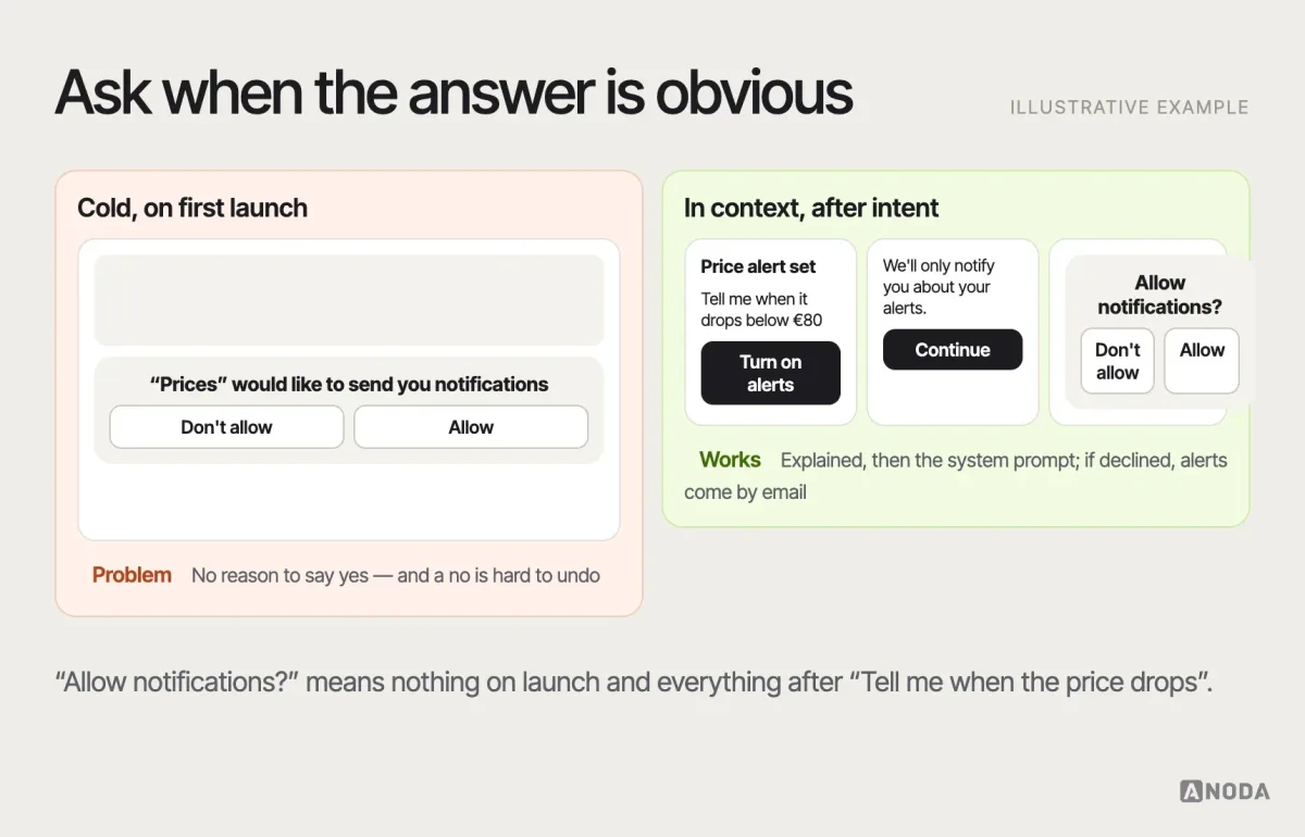
Permission requests — location, notifications, camera, contacts — follow a well-established pattern on both iOS and Android: ask in context, at the moment the feature needs it, after explaining the benefit. A cold system prompt on first launch gets refused, and on mobile platforms a refusal is hard to undo because the user must go to system settings.
High-risk confirmation and interruption patterns
Some actions can’t be undone: deleting an account, sending money, publishing to thousands of people, dropping a production database. Here friction is a feature. The pattern scales with risk: the more irreversible and the wider the blast radius, the more deliberate the confirmation.
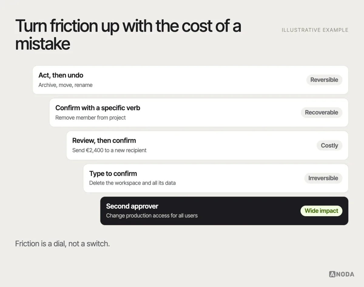
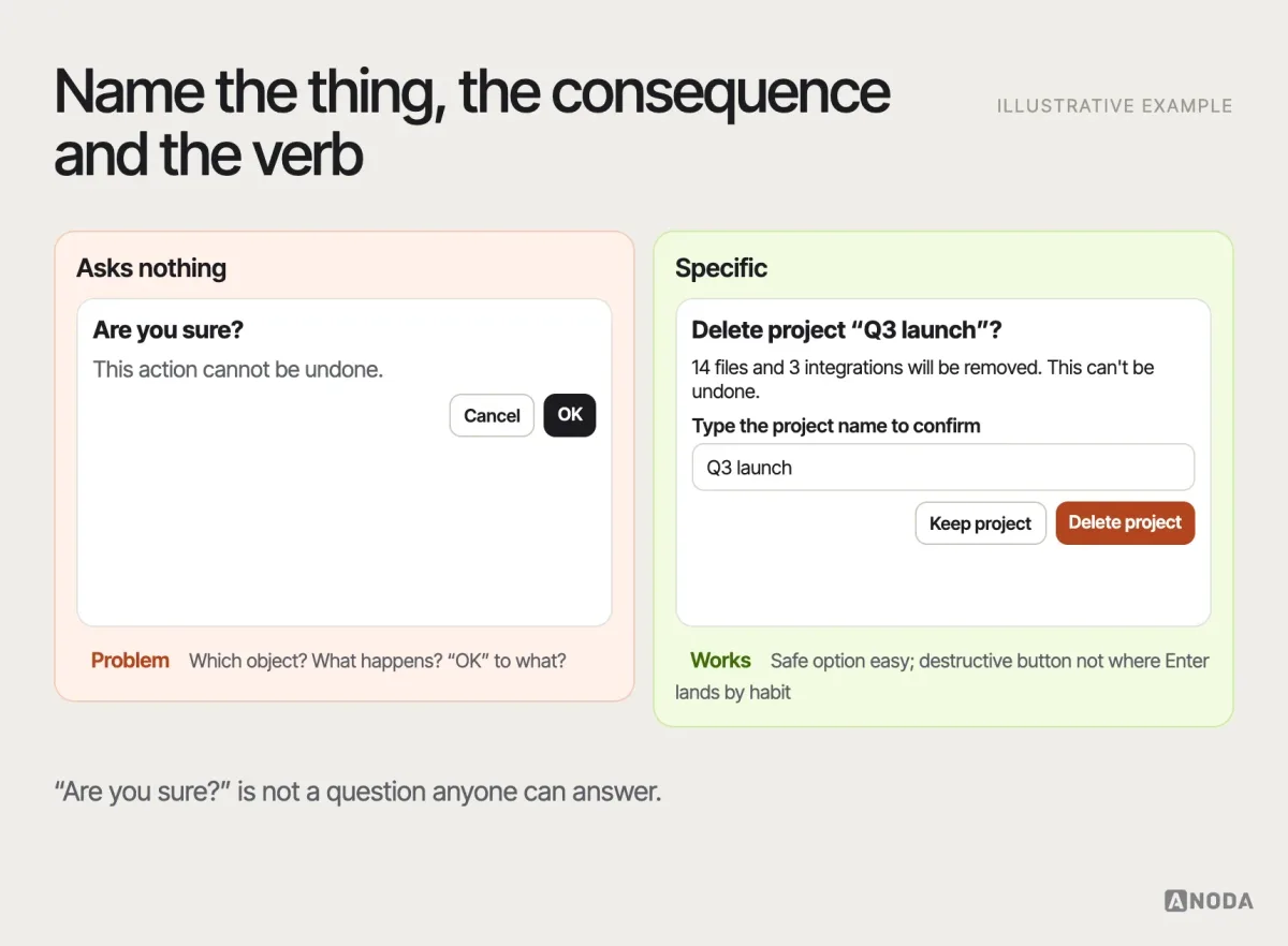
A good destructive confirmation names the object and the consequence, uses a specific verb on the button (“Delete project”, not “OK”), makes the safe option easy to choose, and never puts the destructive button where the user’s thumb or Enter key goes by habit.
Interruptions — modals, full-screen prompts, forced updates — deserve the same discipline. Interrupt only for something the user must know or decide now. Everything else can wait in a banner or an inbox. A product that interrupts for everything teaches people to dismiss everything, including the one message that mattered. That is the same mechanism as confirmation fatigue: overuse the loud pattern and it stops working when you need it.
Compare nearby solutions before you commit
Most interface problems have two or three plausible patterns. The mistake is picking the first one that looks right. Put the candidates side by side and score them against your problem statement: task speed, error risk, learnability, content fit, accessibility, platform fit and implementation cost.
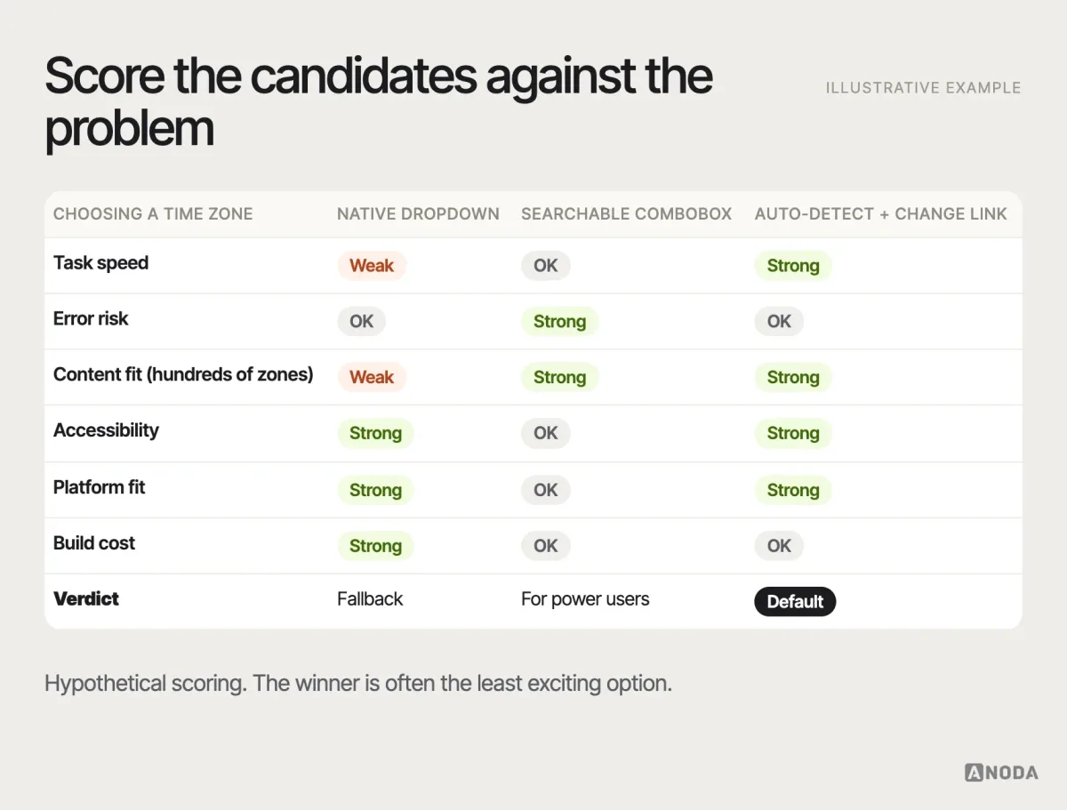
This comparison is where product context matters most: the same matrix can produce a different winner for a consumer app and for an internal tool used eight hours a day. Selecting and adapting patterns inside complete user flows — not screen by screen — is the core of our UI/UX design work.
UI/UX design
Familiar patterns, unfamiliar product?
We map your users’ real tasks, pick the patterns that fit, adapt the ones that don’t and design every state — across complete flows, not isolated screens.
Adapting a pattern without breaking it
Adapting a pattern is not the same as redesigning it. The point of using a familiar pattern is that people already know how it behaves, so adaptation should change the parts users don’t rely on and protect the parts they do.
What can usually change: visual style, density, labels and content, the number of items, the placement within the product’s layout, and additional states your context needs. What should stay: the core behaviour users expect, the position and meaning of key controls, the keyboard and screen reader semantics, and the relationship between the action and its result. A tab bar with your colours and icons is still a tab bar. A tab bar where one tab opens a modal and another logs you out is a new pattern wearing an old costume.
A useful habit: when you adapt, write one sentence explaining what changed and why, and put it in the pattern’s documentation. If you can’t write the sentence, you’re not adapting — you’re improvising.
Responsive and cross-input variants
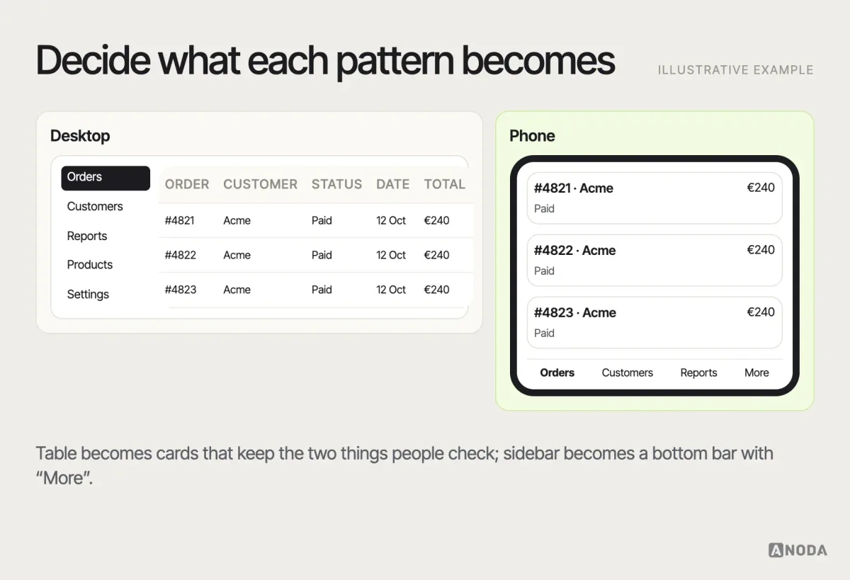
A pattern is not one layout. It is a behaviour that has to survive a phone, a tablet, a desktop with a mouse, a keyboard-only user and a screen reader. Many patterns change shape between breakpoints — a sidebar becomes a bottom bar or a drawer, a table becomes stacked cards, a hover menu becomes a tap — and each change is a design decision, not something the browser does for you.
Input type breaks more patterns than screen size does. Hover doesn’t exist on touch. Swipe gestures are invisible and hard for some users to perform. Drag-and-drop needs an alternative for keyboard and assistive technology users. Small targets that work with a mouse fail under a thumb.
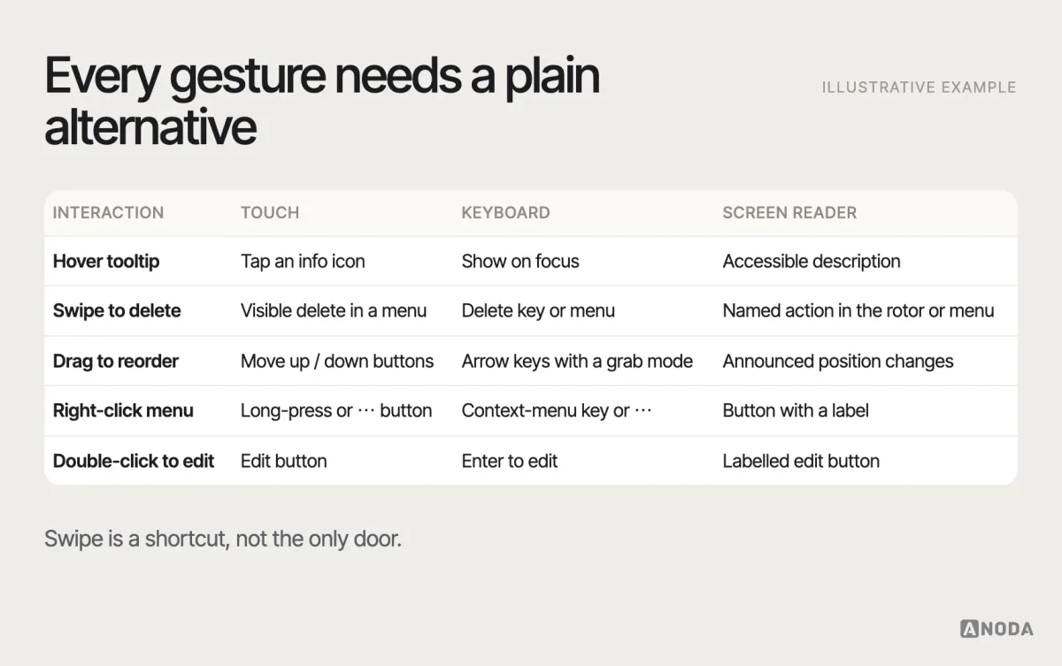
Test the variants, not only the desktop version. It is common for a pattern to be reviewed at one breakpoint with a mouse, and shipped to a majority of users who meet it on a phone with a thumb.
Accessibility requirements for every pattern
Accessibility is part of the pattern, not a review step at the end. The Web Content Accessibility Guidelines, WCAG 2.2 (a W3C Recommendation since October 2023), added several criteria that land directly on common patterns: a minimum target size of 24 by 24 CSS pixels at level AA, focused elements not being hidden behind sticky headers or banners, an alternative to dragging movements, not asking users to re-enter information they already gave in the same process, and authentication that doesn’t rely on memorising or transcribing.
For each pattern family, a minimum set of checks:
- Navigation: keyboard reachable in a logical order, current location announced, skip link to main content.
- Forms: visible labels, errors tied to fields and announced, no information conveyed by colour alone.
- Disclosure: expanded and collapsed state exposed to assistive technology, focus handled when content opens.
- Dialogs: focus moves into the dialog and returns to the trigger when it closes, Escape closes it, background inert.
- Feedback: status messages announced without stealing focus; toasts that stay long enough to read, or don’t carry anything essential.
- Gestures: a single-pointer alternative for drag and swipe.
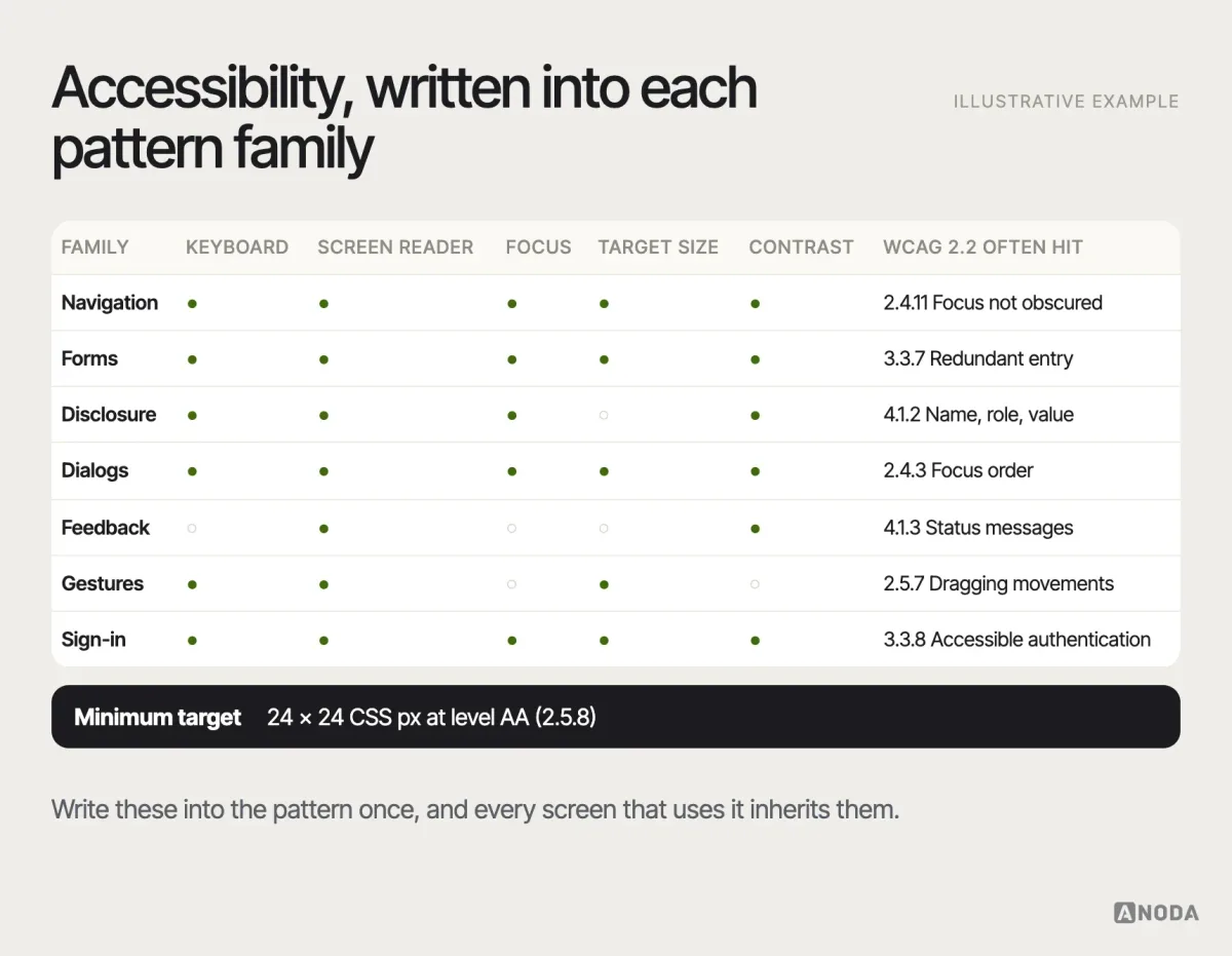
The cheapest place to fix accessibility is in the pattern definition. Fix it there, and every screen that uses the pattern is fixed. Fix it screen by screen, and you’re painting over the same crack in every room.
When familiar patterns still fail
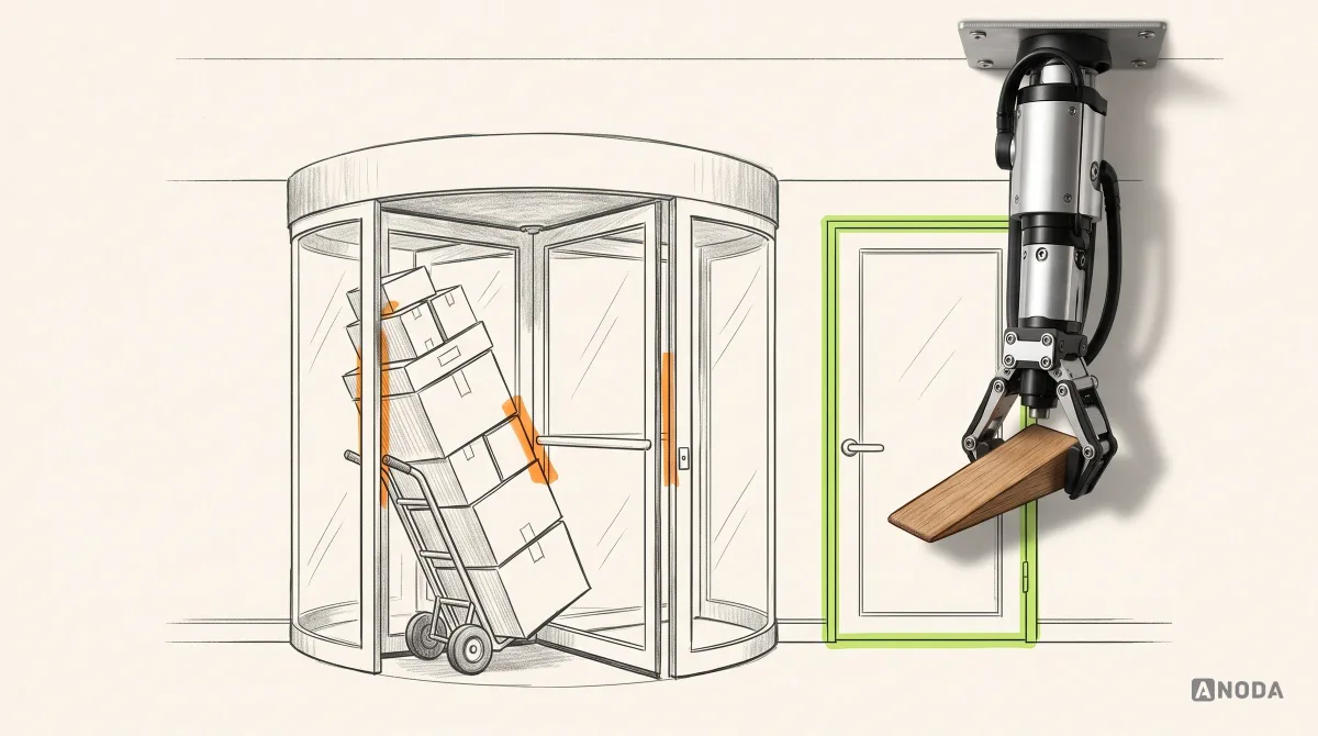
A pattern can be familiar, well-built and still wrong. The classic example is off-screen: a door with a pull handle that you have to push. The handle is a perfect pull handle. It is also a lie.
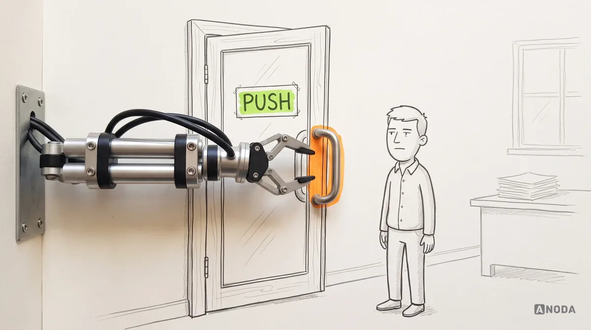
The same happens in interfaces when a pattern’s assumptions don’t hold:
- The hamburger menu on desktop hides primary navigation that had plenty of room to be visible.
- Carousels hide most of their content behind slides people rarely advance.
- Infinite scroll in a product where users need to return to a position or reach the footer.
- A wizard for a task people need to revisit and edit in any order.
- A date picker for a date of birth.
- A toast for an error the user must act on — gone before they’ve read it.
- Placeholder text as a label, which disappears the moment someone starts typing.
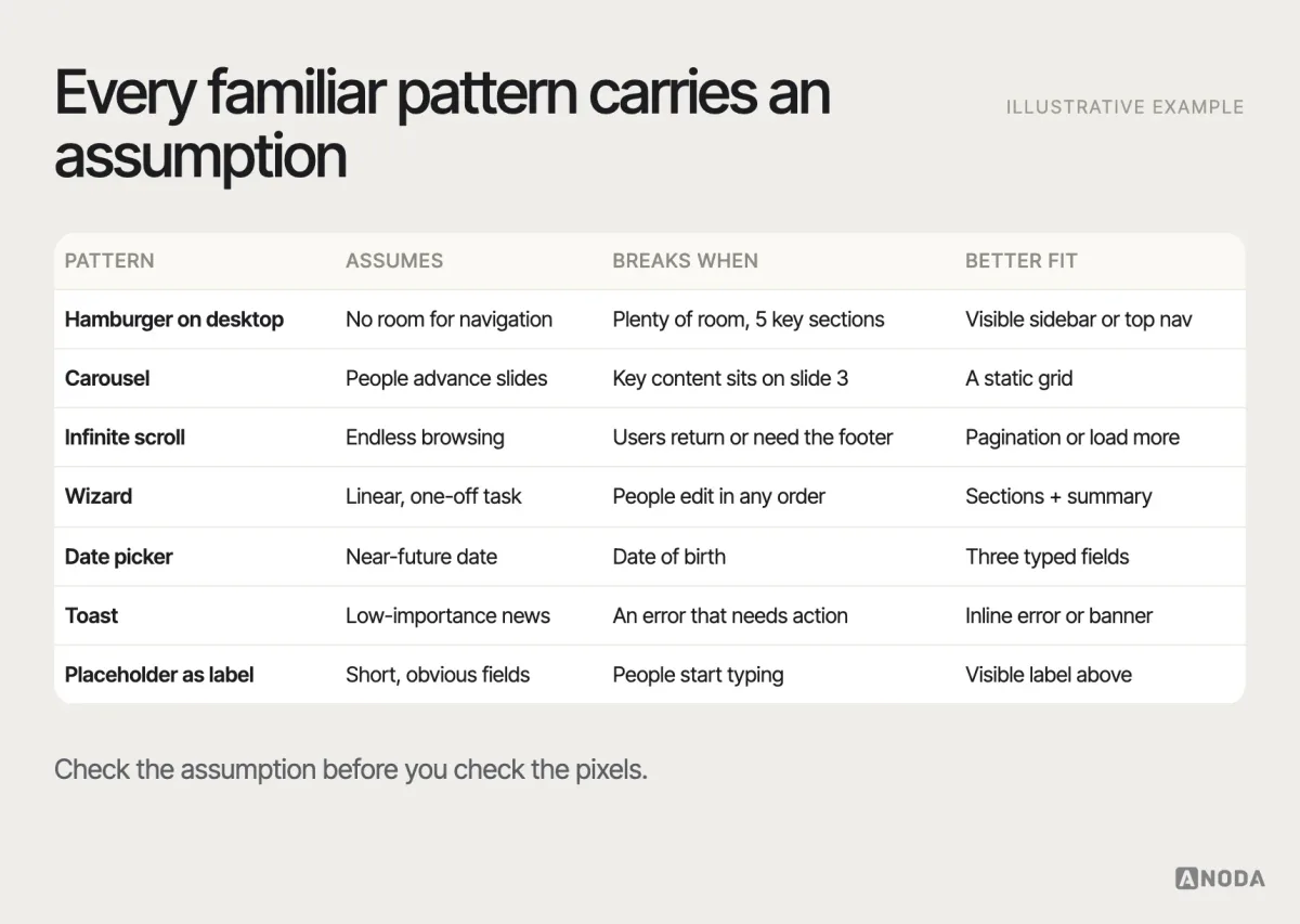
The fix is not to avoid familiar patterns. It is to check their assumptions against your problem statement. Use the familiar pattern when it reduces learning for a known task; break it only for a documented reason — and then make the new behaviour look different enough that nobody expects the old one.
Here is how that plays out in an illustrative example, not a specific client. A team building a B2B reporting tool copies the filter panel from a popular e-commerce site: a collapsible sidebar with checkboxes and instant updates. On an e-commerce site, that works — products have a few well-known attributes and shoppers browse. In the reporting tool, users filter by dozens of fields, combine conditions with “and” and “or”, and need to save and share the exact filter. The copied panel can’t express “status is overdue and owner is not me”, instant updates hammer a slow database, and nobody can see which of forty checkboxes are ticked. The pattern was fine. Its assumptions — few attributes, simple combinations, browsing rather than analysis — were wrong for this product. A query-builder pattern with visible conditions, an explicit “apply” and saved views fitted the job.
Dark patterns and deceptive interaction
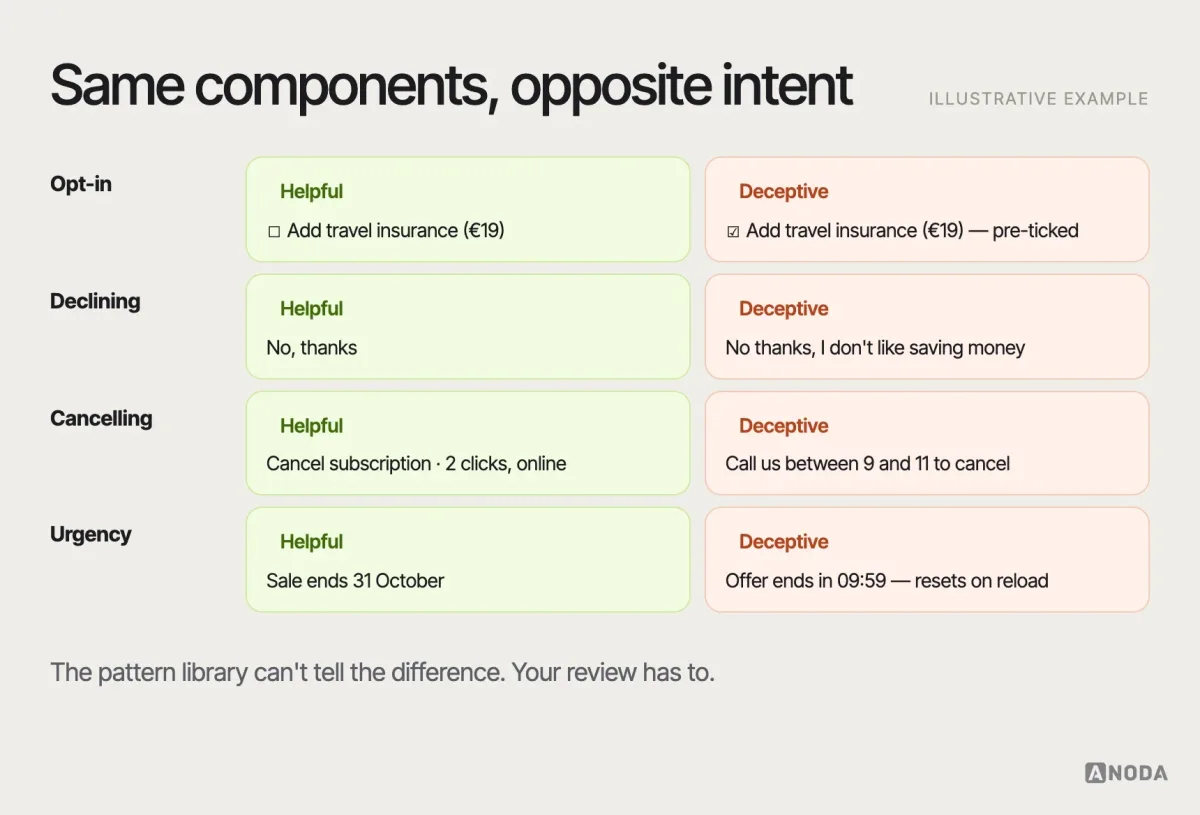
Dark patterns are interaction designs that push people into choices they didn’t intend: a pre-ticked box that adds insurance, a “No thanks, I don’t like saving money” link, a subscription you can start in one tap and cancel only by phone, a countdown timer that resets on reload. They often reuse familiar patterns precisely because familiarity lowers people’s guard.
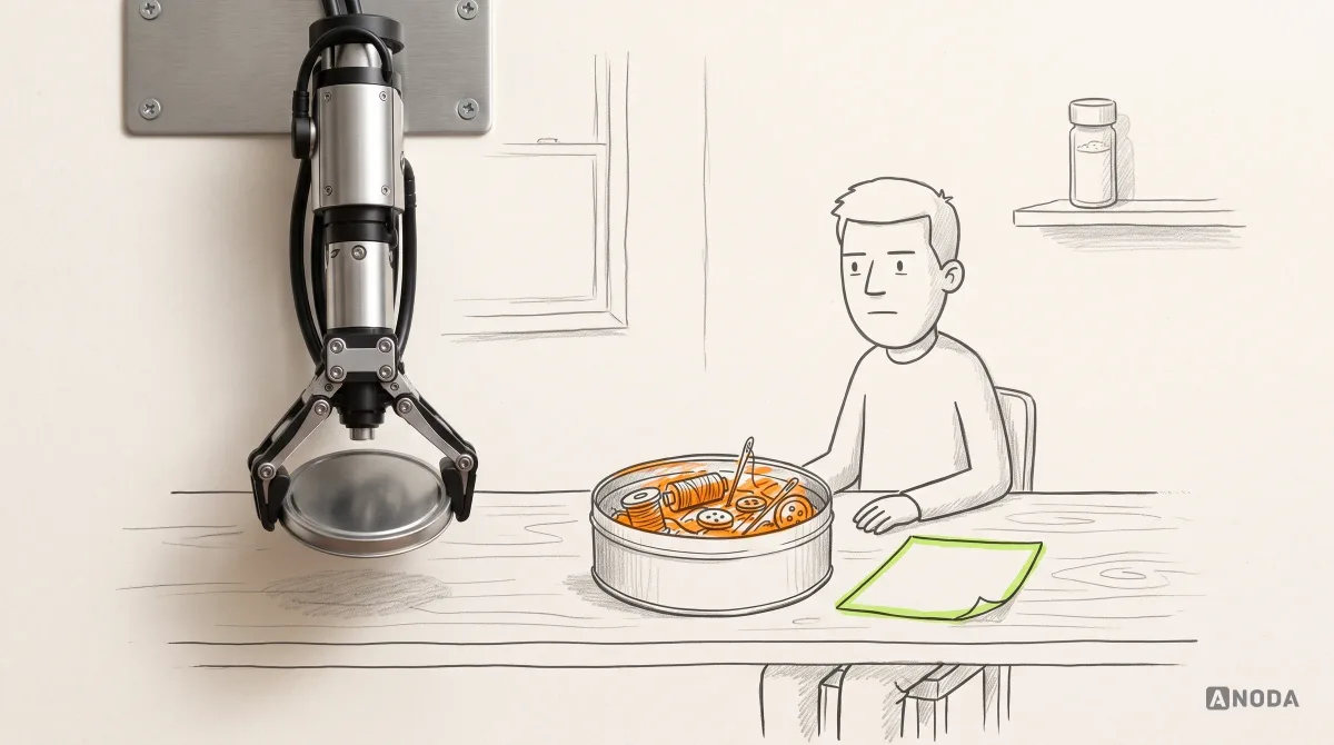
They are not just an ethical problem. Regulators increasingly treat them as a legal one: the EU’s Digital Services Act prohibits online platforms from designing interfaces that deceive or manipulate users (Article 25), and the US Federal Trade Commission published a staff report on dark patterns in 2022 and has brought enforcement actions over deceptive sign-up and cancellation flows. Whatever the jurisdiction, the business case is simple: a conversion you tricked out of someone comes back as a refund, a chargeback, a complaint or a churned customer.
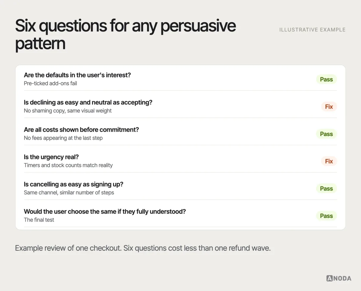
A quick test for any persuasive pattern: would the user make the same choice if they fully understood the screen? Would you be comfortable showing the design to the customer who complained? If the answer is no, the pattern is working against the people it serves.
Prototype and test the pattern in context
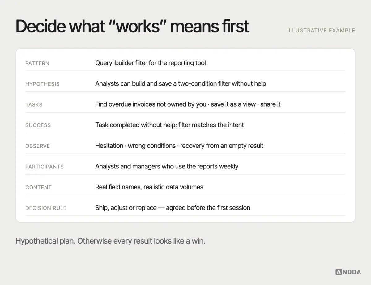
A pattern that tested well somewhere else hasn’t been tested on your users, with your content, in your flow. Validation doesn’t need to be heavy, but it needs to happen in context: a prototype of the real flow with realistic data, not the pattern alone on a blank screen.
Decide in advance what “works” means for this pattern. For a filter: can people narrow the list to what they need and understand why the list looks the way it does? For a destructive confirmation: do people read it, and do they choose the safe option when they meant to? Observe completion, hesitation, errors and recovery — the things a pattern is supposed to improve.
After launch, product evidence continues the test: task completion rates, error rates, support tickets about the feature, drop-off at the step, use of the undo. Combine what people do (analytics) with why they do it (observation) — each alone misleads.
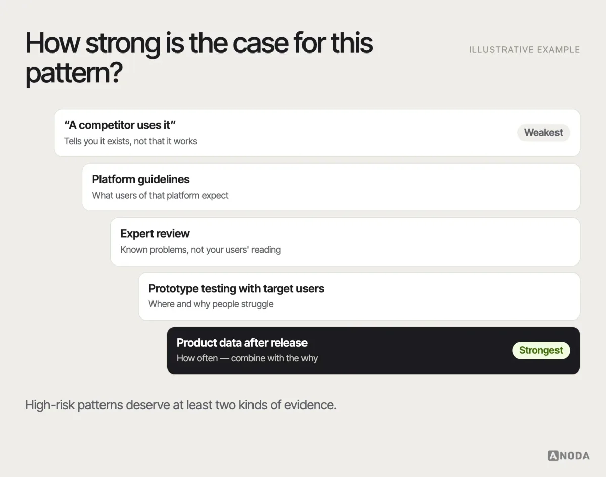
Be honest about what each rung can support. A platform guideline tells you what users of that platform expect; it doesn’t know your content. An expert review catches known problems; it can’t predict how your users read your wording. A handful of usability sessions shows where people struggle and why; it isn’t a measurement of how often. Product data shows how often; it rarely shows why. Decisions about high-risk patterns deserve at least two kinds of evidence.
If you have already shipped a pattern and aren’t sure it works, that’s exactly the situation usability testing is built for.
Usability testing
Shipped the pattern, not sure it works?
We watch your target users complete the critical tasks and show where they hesitate, make errors or fail to recover — with evidence your team can act on.
Document patterns in a design system
A pattern that exists only in one designer’s head will be reinvented by the next one. Documentation turns a good decision into a shared one. The documentation belongs in the design system, next to the components that implement it, and it should answer the same questions as the anatomy at the top of this article.
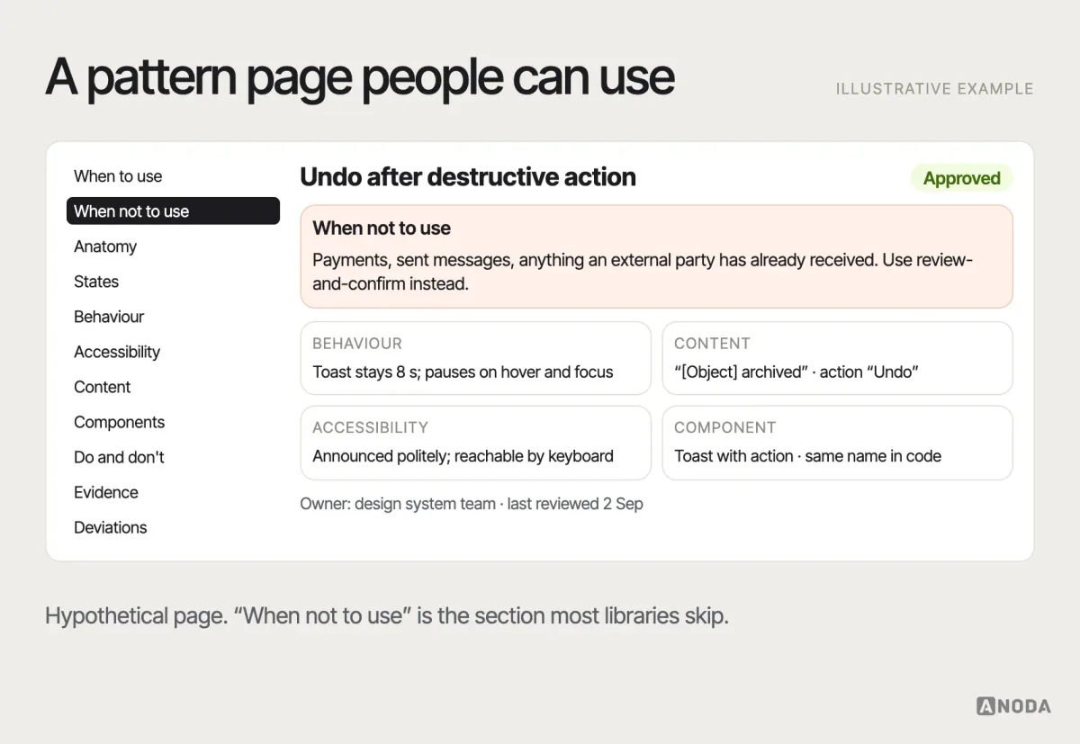
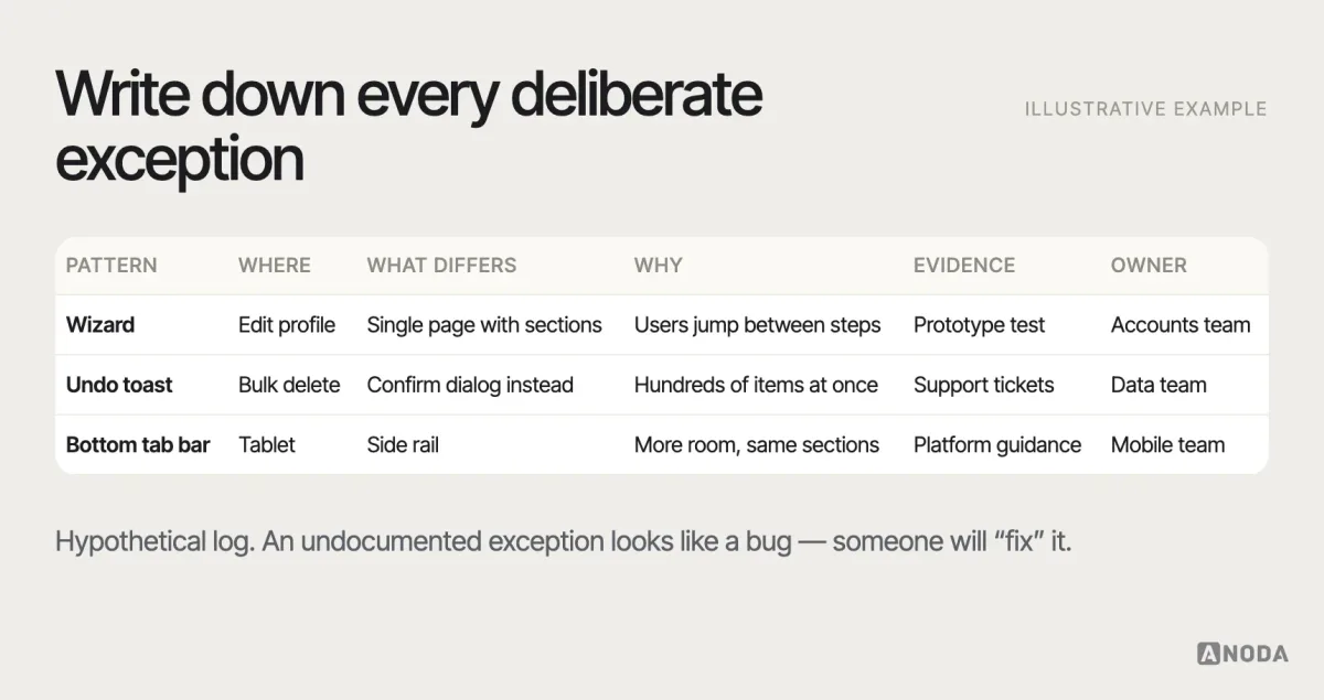
Two parts of pattern documentation get skipped most often, and both are where the value is. The first is when not to use the pattern — the boundaries that stop the next team from copying it into the wrong context. The second is a deviation record: every place the product deliberately breaks the pattern, and why. Without it, intentional exceptions look like mistakes, and someone “fixes” them.
Keep design and code speaking the same language. If the documentation calls it “undo toast”, the component in code should not be called “snackbar-v2-final”. Names are how teams find the pattern the next time; different names in design and code are how they end up building it again. Content belongs in the documentation too: the pattern’s standard wording, such as “Undo” rather than a mix of “Revert”, “Cancel” and “Go back”, is as much part of the pattern as its layout.
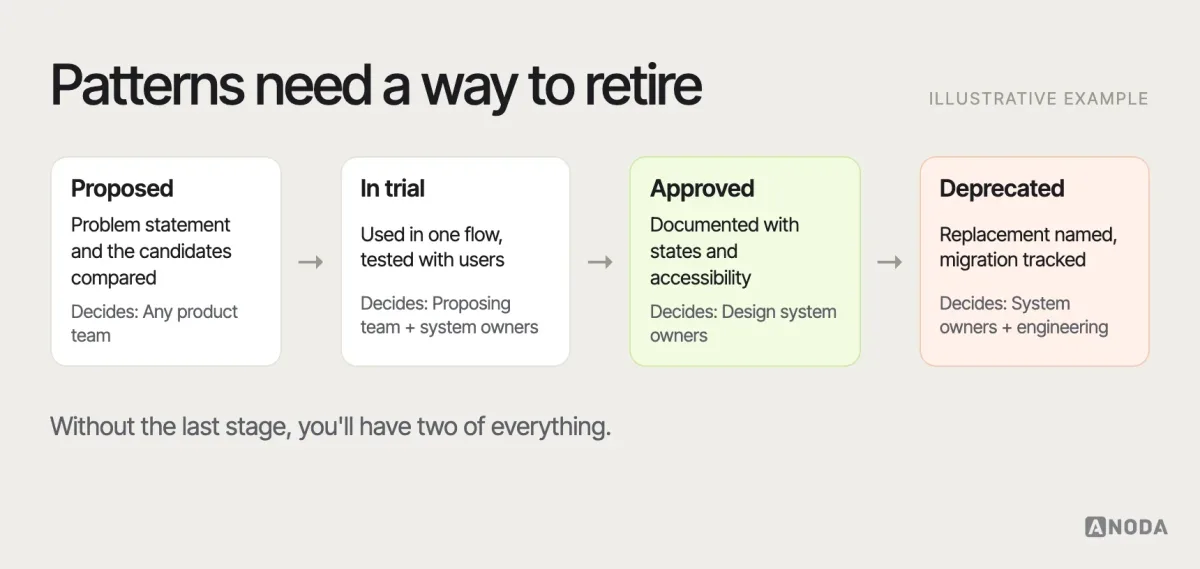
Patterns also need a lifecycle: proposed, in trial, approved, deprecated. A pattern that no longer fits — because the platform changed, the product grew or testing showed a better alternative — should be deprecated with a migration path, not left to linger next to its replacement. How patterns and reusable components connect in practice is covered in our guide to design system components.
Design systems
Five ways to do the same thing?
We turn the interaction solutions scattered across your product into documented patterns, states and components your teams can reuse — with an owner and a way to change them.
Pattern evaluation checklist
Before a pattern goes into a flow — or into the design system — run it through the same questions. If you can’t answer one, that’s the next thing to find out.
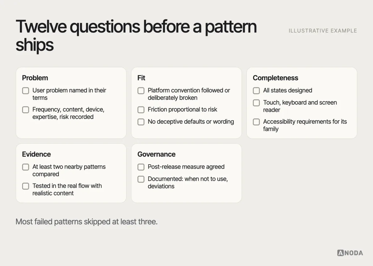
- Have we named the user problem in the user’s terms?
- Have we recorded task frequency, content volume, device, expertise and risk?
- Is there a platform convention, and are we following it — or deliberately breaking it?
- Did we compare at least two nearby patterns?
- Are all states designed: empty, loading, error, success, disabled, no permission?
- Does it work with touch, keyboard and a screen reader?
- Does it meet the accessibility requirements for its family?
- Is the level of friction proportional to the risk?
- Is it free of deceptive defaults and wording?
- Did we test it in the real flow with realistic content?
- Do we know what we’ll measure after release?
- Is it documented with when-not-to-use and any deviations?
Who decides which patterns are approved
Patterns drift for the same reason templates do: nobody owns them. Governance doesn’t need a committee, but it needs answers to three questions. Who can propose a new pattern or a change? Usually any product team, with a problem statement and the candidates they compared. Who approves it? Usually the design system owners, together with engineering and accessibility. And how does the rest of the organisation hear about it? A changelog people actually read, and a migration plan for screens using the old version.
The goal is not to stop teams from solving new problems. It is to make sure that when one team solves a problem well, the next team inherits the solution instead of inventing a fifth version of it.
Why ANODA chooses the pattern for the job
A component library can make every button match while users still struggle with the task. Copying a competitor’s filter or onboarding wizard transfers their assumptions into your product, and your team pays for the mismatch in support tickets and abandoned work. ANODA starts with the job, chooses the interaction that fits it and carries that decision through the states and reusable system.
In Vecna Robotics, dense warehouse data and a compact handheld needed different layouts for the same shift. Our work unified Console navigation, tables, filters and charts, while mapping alert handling and designing the scan-first handheld experience. UI kits and clickable prototypes carried those decisions to Vecna’s team.
That is the difference between a library of matching controls and a product that works consistently. ANODA gives your teams patterns they can reuse with the context understood, so growth stops creating a new interaction language in every module.
Where patterns end and product design begins
Pattern libraries are a starting point, not finished UX. A library can tell you what a good filter looks like. It can’t tell you which attributes your users filter by, what they do when the list comes back empty, or whether the filter belongs on this screen at all. That is product design: understanding the users and the domain well enough to choose, adapt and sometimes break the pattern — and then govern that decision so the product stays consistent as it grows.
This is where we usually help. We select patterns within complete flows, adapt them to the product’s users, risks and constraints, test the critical ones and document them in a design system your team can maintain.
A new product needs more than approved controls: it needs the roles, complete tasks and handoffs that decide where those controls belong. Our product design agency shapes that experience before a component library turns an unresolved idea into matching screens. In AispireMe, ANODA connected education-domain research, student, parent, counsellor and organisation flows, desktop screens, a prototype and a reusable kit. The program offer, application and confirmation form one enrollment task. Bring us the new product area; we will turn its working logic into flows and interface patterns your engineers can carry into the build.
Name the problem, then pick the pattern
Patterns are one of the most useful tools in interface design, precisely because they’re shared. That also makes them easy to misuse: a pattern copied without its assumptions brings its failures with it. Name the user problem, understand what the pattern assumes, compare the alternatives, design every state, test it in context and document every deliberate deviation. Familiar is good. Familiar and right is the job.

Stop rebuilding the same decision in every module
ANODA will connect critical flows, interaction states and reusable patterns into a design system your teams can use as the product grows. Bring us the modules where consistency keeps breaking.
Frequently asked questions
What is a UX design pattern?
A UX design pattern is a reusable interaction approach for a recurring user problem — such as navigating, entering data, filtering a list, recovering from an error or confirming a risky action. A useful pattern records the problem, the context, the solution, its consequences, its states and its accessibility requirements, not just a screenshot.
How is a pattern different from a UI component?
A pattern is a technology-agnostic solution to a recurring problem, with context and trade-offs. A component is a built, reusable piece of interface with defined properties and states, such as a date input or a modal. Patterns are usually implemented with one or more components; the same component can serve different patterns.
How should teams choose between similar interaction patterns?
Start from a problem statement: the task and its frequency, content volume, device and input, user expertise, risk of error and the surrounding flow. Check whether a platform convention exists, compare two or three nearby patterns against those criteria, then prototype the strongest option in the real flow and test it with target users.
When can a familiar UX pattern fail?
When its assumptions don't hold in your context: too much or too little content, a different device or input, higher stakes, expert rather than first-time users, or a flow that needs a different order. A familiar-looking control that behaves differently is especially risky, because users act on what they expect rather than what they see.
What is a dark pattern?
A dark pattern is an interaction design that pushes people into choices they didn't intend — pre-ticked add-ons, shaming decline links, hidden costs, fake urgency or cancellation that is much harder than sign-up. Beyond the ethical problem, regulators in the EU and the US increasingly treat such designs as unlawful.
How should patterns be documented in a design system?
Document when to use the pattern and when not to, its anatomy and states, behaviour, accessibility requirements, content guidelines, related components, do and don't examples, the evidence behind it and an owner. Keep a record of intentional deviations and give each pattern a lifecycle, from proposed to deprecated.
Written by