
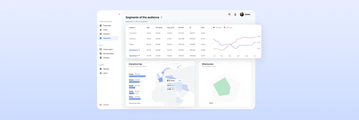
The Ultimate Guide to Dashboard Design UI: Best Practices and Principles
Learn the best dashboard UI design practices to enhance user experience. Improve data visualization and usability. Get expert insights at ANODA UX Agency today!
Turn workflows your team has already agreed into clear, complete screens — hierarchy, responsive layouts, component states and accessibility — specified so engineers build them without guessing.

Your agreed workflows as clear, complete screens, ready to build without guesswork.
Designs the workflows and the product's structure.
UI Design
Designs the interface for workflows already agreed.
Not included
Each part is built from the one before, so the specs always match the screens.
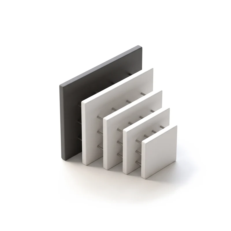
Hierarchy, type, spacing and colour for your flows.
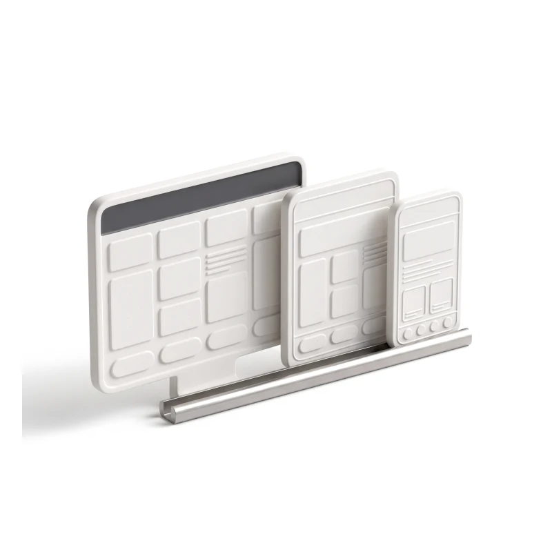
Every agreed flow, from a phone to a wide desktop.
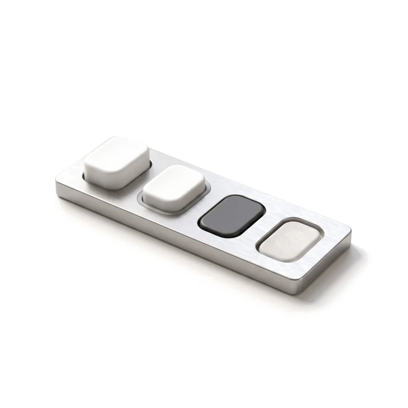
Each control in every state it can reach.
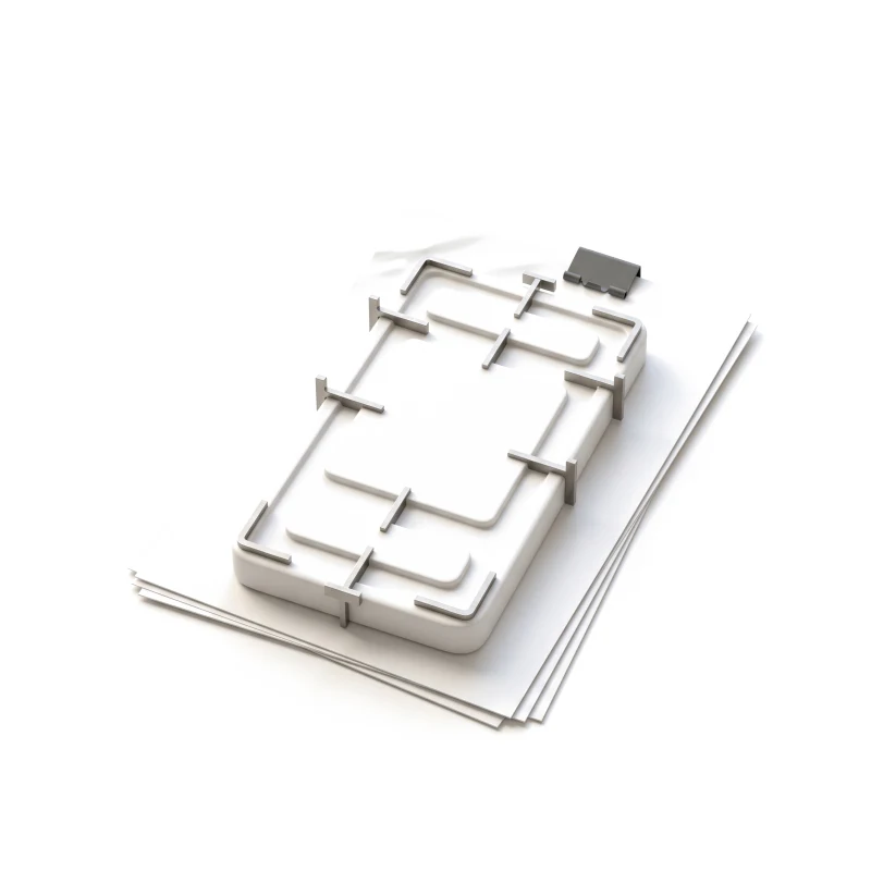
Behaviour, spacing and accessibility notes for the build.
You receive
User interface design is judged in the moments around the ideal screen: real data, a keyboard, a slow response, a narrow window.
What stays
What changes
A dense bug tracker given a calmer surface, with the detail its users rely on kept.
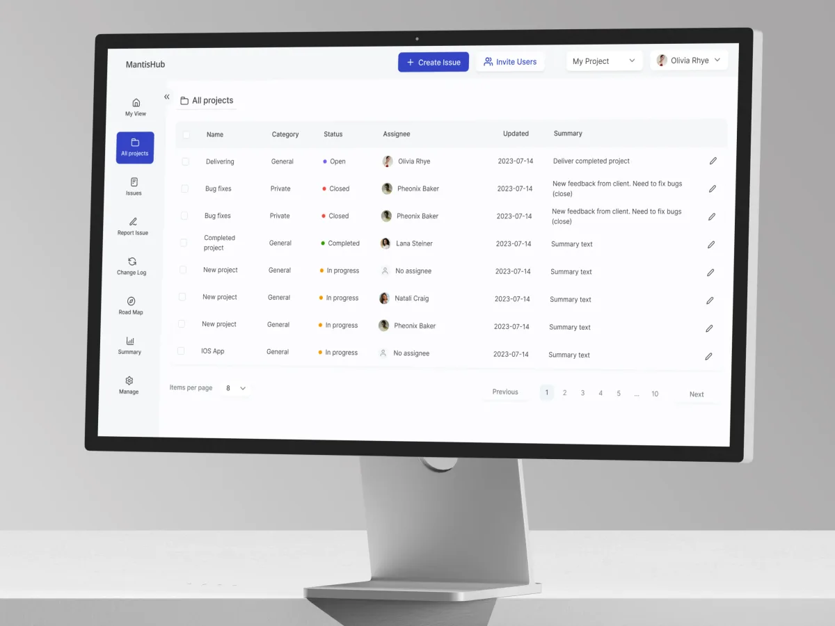
DevTools · Bug tracking · Web SaaS
Redesigned selected MantisHub workflows — type, spacing, colour and hierarchy — so dense issue lists read in order.
It fits when the workflows are settled and the interface is what holds the product back. Four signs it is the right step now.
Wireframes, a spec or a live product already show what each screen must do.
Dense data, crowded forms, or everything on the screen carries the same weight.
Errors, empty screens and loading are decided by engineers, one at a time.
An in-house or partner team will build the interface from the design.
Tell us which workflows need an interface and what already exists. We will come back with a useful scope and a realistic next step.
Scope, deliverables and the review rhythm are agreed before we start.
The design direction focused on making the interface clearer while respecting familiar working patterns. We appreciated the attention to spacing, hierarchy and consistency, rather than introducing change for its own sake.
Tell us about the workflows, what already exists — flows, wireframes or a live product — and who will build it.
Message received.
Within 15 minutes, we’ll email you initial feedback and follow-up questions.
Learn the best dashboard UI design practices to enhance user experience. Improve data visualization and usability. Get expert insights at ANODA UX Agency today!
Learn fintech UI design with ANODA UX Agency. Create secure, user-friendly apps featuring personalization, gamification, and intuitive navigation.
Ask for more than polished screens. A strong team can show one dense screen before and after, the empty, loading and error states around it, how the layout changes from phone to desktop, and the specs engineers built from. Ask who on the team did the work, how accessibility was checked, and what the redesign deliberately left alone — our MantisHub case shows one example.
Interface rules for hierarchy, type, spacing and colour; responsive screens for every agreed flow; components with all their states; interaction and accessibility notes; and a handoff engineers can build from. Cost and timeline depend on the number of flows and screens, the platforms and widths to cover, whether a component library already exists, how dense the data is, and how many review rounds your team needs. A dashboard full of tables takes more work per screen than a settings page.
The detailed interface of workflows you have already agreed: what people see first on each screen, how layouts behave at each width, how every control looks and behaves in each state, and how the interface works with a keyboard, zoom and a screen reader. Components you already have are reused where they work; new ones are added only where a flow needs them. We start by walking through your flows with you and flag any gaps before the screens are drawn. A clickable prototype of the finished screens is then used for reviews with your team.
Choose UI design when the workflows are settled and the interface is what needs work. It can cover the whole product or one area of it, such as a dashboard or the settings. If the workflows themselves still need shaping, start with UI/UX & Product Design. If a live product needs its structure and flows reworked as well, Product Redesign fits better. If it is not yet clear what is wrong, a UX Audit comes first; for a native iOS and Android app, Mobile App Design.
Whatever defines the workflows — flows, wireframes, a specification or access to the live product — plus brand guidelines and any component library you already use. We also need a product owner who can approve screens and settle trade-offs, and early contact with the engineers, so their stack and constraints shape the specs. If analytics or support tickets point to screens people struggle with, share them: they help decide where the hierarchy matters most.
An organised design file with the interface rules, screens and components; every state of each component; spacing, responsive and interaction notes; accessibility notes such as focus order and contrast; a clickable prototype; and walkthrough sessions to answer questions before they turn into assumptions. Engineers review the specs while the screens are still in design, so questions about behaviour and edge cases are settled before a sprint starts. The design belongs to your team at handoff.
By the flows and screens in scope, the platforms and widths to cover, the state of your existing design and components, and the review rhythm. We set a custom scope and estimate in the proposal, fixed or phased, and agree the timeline once scope, access and dependencies are clear. There is no fixed package price, because two interfaces with the same number of screens can differ a lot in the states and data they must handle.
Designing new workflows or the product's structure, user research, brand identity and development. Product copy and marketing content are not included either. Nor do we promise conversion or revenue figures — the interface is one part of those. Each of these can be scoped separately, with us or with your own partners.