In short
Accessibility is not a checker you run before release. Most barriers are visible in an ordinary review: small grey text, weak contrast, colour-only meaning, tiny targets, onboarding nobody understands. Build the baseline into every product, then take the process as deep as your audience, reach and risk require, from a quick pass for a wallpaper app to full evidence for a national bank.
In this article
- What accessibility means in UX — and how it differs from usability and inclusive design
- Whose barriers are you designing for?
- Depth follows audience, reach and risk
- Most barriers are visible before you run a single tool
- Onboarding: beautiful is not the same as understandable
- Build accessibility into every stage, not the last one
- Content and media are interface too
- Forms, errors and states deserve extra care
- Targets, keyboard and focus
- Hand off requirements, not just pictures
- When the form is somebody’s only route to a service
- Make the clearer interface part of the product
- Testing: automated checks, manual review and real people
- Prioritise and document like any other product risk
Accessibility in UX design means making sure the people your product is for — including people with visual, hearing, motor and cognitive impairments, and anyone in a temporary or situational limit — can perceive the interface, operate it, understand it and finish their task. It is not a checker you run before release. It is a set of decisions made across research, flows, interaction, content, handoff and testing, with a depth that should match who uses the product and what happens when they cannot.
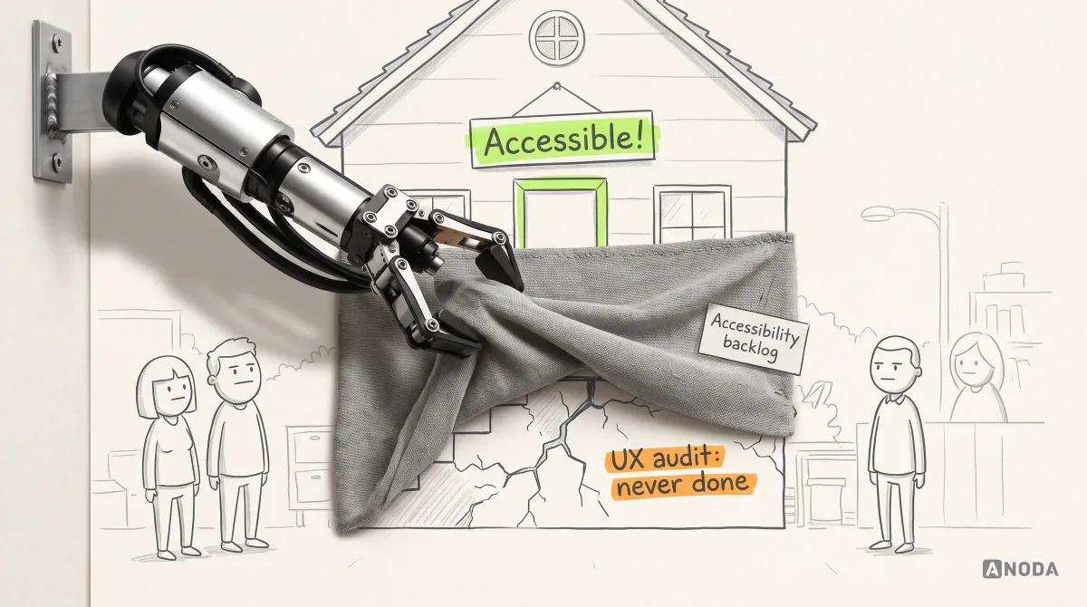
Here is the uncomfortable part: most accessibility failures we find are not exotic. The text is too small. The contrast is weak. The colours do not say anything. The layout is cramped and confusing. The controls are hard to hit. Those are the same failures that make a product harder for everyone, and they are visible in an ordinary review, long before anyone opens an audit tool. In our work fixing products, the phrase “accessibility backlog” has far too often been a polite name for UX work that was never done.
What accessibility means in UX — and how it differs from usability and inclusive design
Three terms get used as if they were one. They overlap, but they answer different questions, and mixing them up is how teams end up with the wrong plan.
- Usability asks whether people can use the product efficiently and without confusion. A product can be usable for most people and still impossible for someone who cannot see the screen or use a mouse.
- Accessibility asks whether people with disabilities — permanent, temporary or situational — can perceive, operate and understand the product and complete its tasks. It has testable technical standards behind it.
- Inclusive design is the broader practice of designing for the full range of human diversity: ability, age, language, culture, device, connection, confidence. Accessibility is one essential part of it, not a synonym for it.
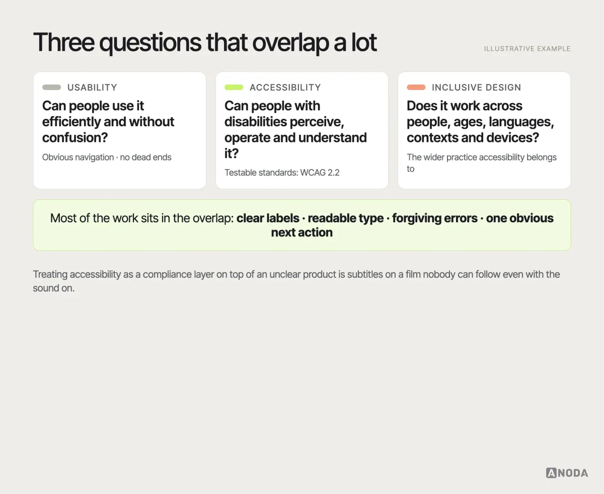
The practical point is that most of the work sits in the overlap. Readable type, clear labels, visible focus, forgiving errors and one obvious next action help a screen-reader user, a tired commuter and a 70-year-old customer at the same time. When a team treats accessibility as a separate compliance layer on top of an unclear product, it is putting subtitles on a film nobody can follow even with the sound on.
Whose barriers are you designing for?
“Users with disabilities” is not one audience. Barriers differ, and so do the fixes:
- Vision: blindness, low vision, colour-vision deficiency, glare on a phone outside. Needs sufficient contrast, scalable text, meaning that does not depend on colour alone, and interfaces a screen reader can describe.
- Hearing: deaf and hard-of-hearing users, or anyone on a silent train. Needs captions, transcripts and visual alternatives to sound cues.
- Motor: tremor, limited dexterity, one hand holding a child, a keyboard instead of a mouse. Needs large enough targets, keyboard operation and no gestures that are the only way to do something.
- Cognitive and learning: attention, memory, reading difficulties, stress, unfamiliar language. Needs plain wording, predictable patterns, clear steps and time to act.
- Temporary and situational: a broken wrist, a cracked screen, bright sunlight, a slow connection, age-related changes that nobody would call a disability.
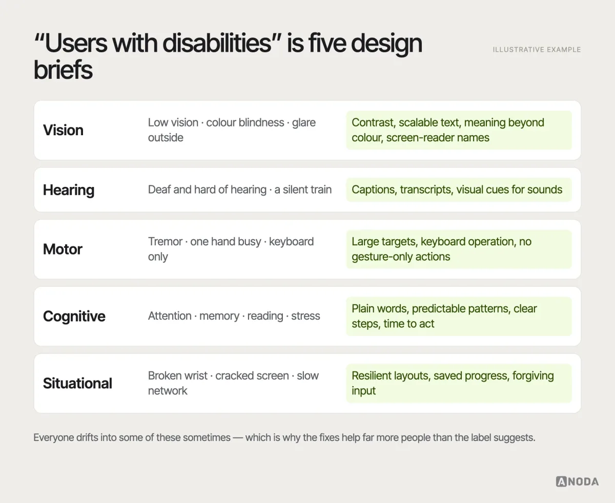
Knowing your audience changes the priorities. A product for older adults needs large, calm, obvious screens far more than it needs clever gestures. A tool used all day by professionals needs full keyboard operation. A public service used by an entire country needs all of it, and evidence that it works.
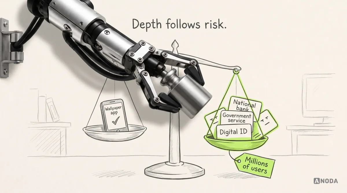
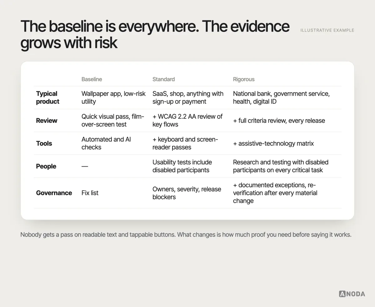
Depth follows audience, reach and risk
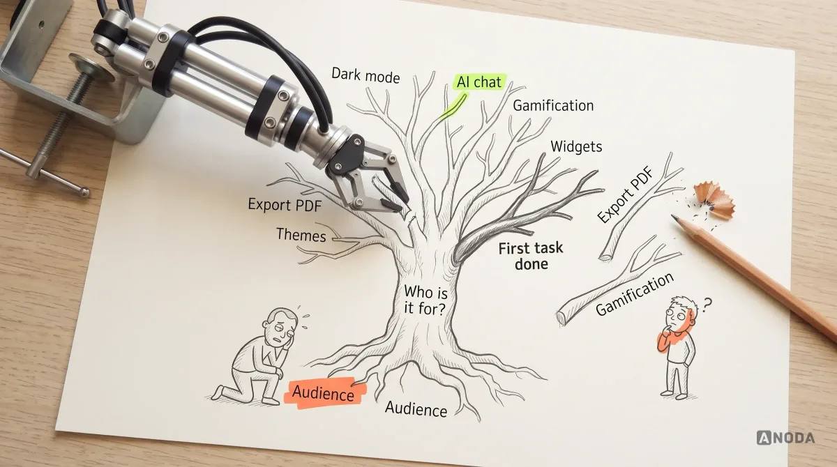
Every product needs a solid baseline of usability and accessibility. Not every product needs the same depth of process, and pretending otherwise is how accessibility turns into a tick-box exercise nobody takes seriously. Oksana Kovalchuk, ANODA’s founder, puts the priority question bluntly:
If we need to make an absolutely accessible application, that makes sense for a government app, a national bank or a virtual passport on the phone of every citizen — where we are talking about millions of users. If it is a small app for downloading wallpapers, a basic pass is enough, and AI can help check it.
 Oksana KovalchukFounder & CEO, ANODA
That is not permission to ignore anyone. A wallpaper app still needs readable text and tappable buttons. It is a statement about proportion. A digital identity app, a national bank or a government service carries essential tasks for huge populations, including people with every kind of barrier, and a failure there locks people out of things they cannot do any other way. That product needs standards-based requirements, assistive-technology testing, research with disabled participants and re-verification with every material change. A low-risk entertainment utility needs a clean baseline, a quick review and a fix list.
Branding and positioning belong in this decision too, because they define the audience and the visual language used to reach it. A product aimed at older adults cannot borrow the thin grey type and low-contrast chic of a design-award portfolio and call it a style choice.
Most barriers are visible before you run a single tool
Here is the cheapest accessibility test we know, in Oksana’s words:
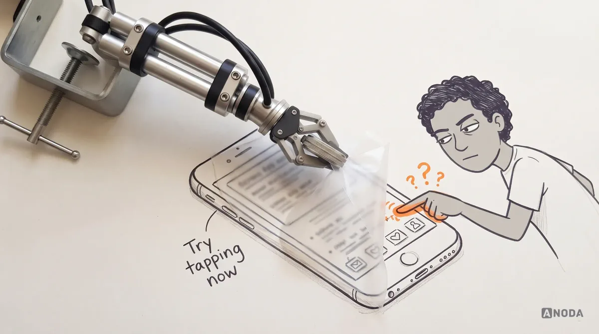
Accessibility testing is actually easy: put a film over your phone screen and try tapping. Good luck tapping, good luck seeing what is happening on the screen. Most accessibility problems are on the surface — the type is small, the contrast is weak, the colours are wrong, the composition is cramped and unclear.
Oksana KovalchukFounder & CEO, ANODAA scratched screen protector, sunglasses or a phone held at arm’s length on a bright day can expose fragile interfaces in minutes: text that disappears, icons that blur into one another, buttons too small to hit when your view is imperfect. Use what you find to repair the basics, then verify the critical journey with keyboard, assistive technology and the people who use it.
AI tools and automated checkers are useful at exactly this stage: they flag low contrast, missing labels and unlabeled images quickly, and for a low-risk product a baseline pass with them is a reasonable start. What they cannot tell you is whether the people you are building for understand what the product does. That depends on branding, positioning, audience and basic UX — which is why Oksana always comes back to the same question before any tool: who are we making this for, and do they get it?
The usual surface failures, and what the current W3C Web Content Accessibility Guidelines (WCAG 2.2) use as testable references:
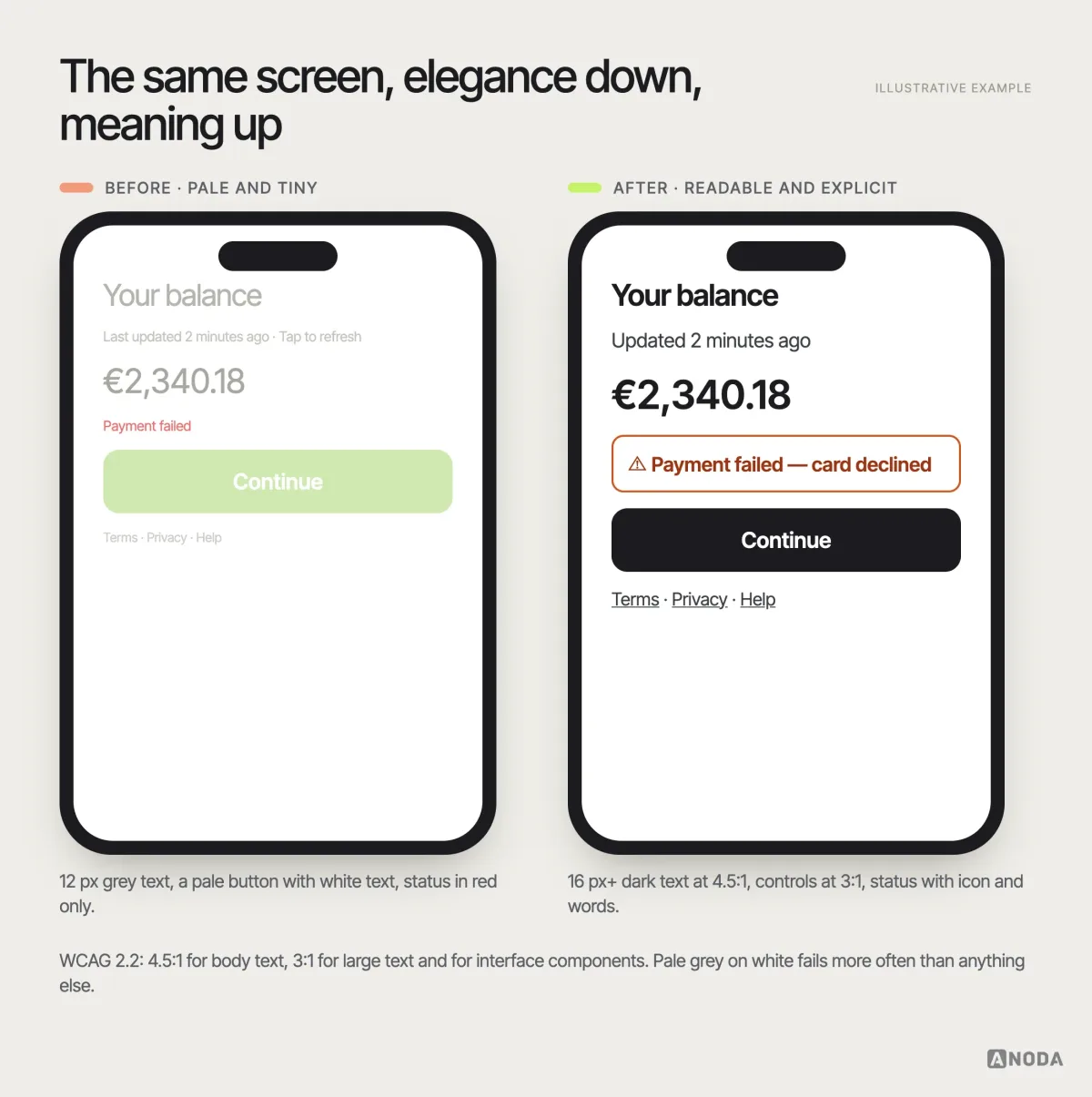
- Contrast. Body text should reach at least 4.5:1 against its background, large text 3:1. Interface components and meaningful graphics — input borders, icons, focus indicators — need at least 3:1 against what surrounds them. Pale grey on white is the most common failure we see, usually introduced for “elegance”.
- Type size and resizing. Small text is a barrier on its own. Content must remain usable when text is enlarged to 200% and when the viewport is narrow, without text overlapping or content disappearing.
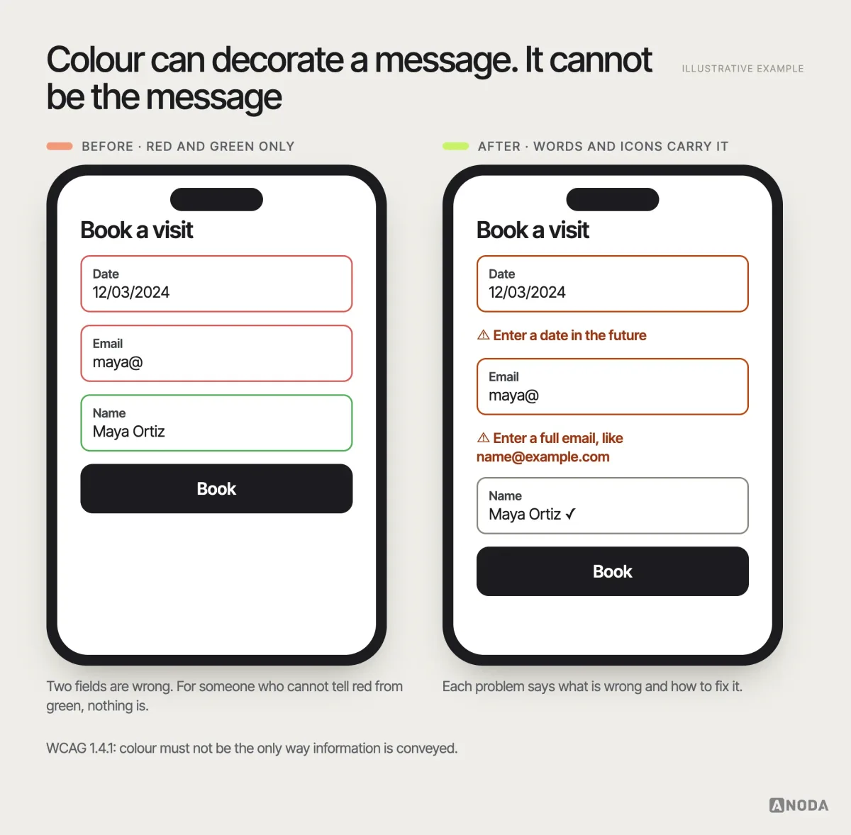
- Colour as the only signal. Red for error and green for success tell nothing to someone who cannot distinguish them. Pair colour with text, icons or shape.
- Mobile text settings. Many people run their phones with larger system text. Interfaces that break, truncate or overlap when that setting is on have failed a large part of their audience before the first tap.
- Composition. Crowded, low-hierarchy screens are hard for everyone and nearly impossible for people with low vision or attention difficulties. One clear primary action per screen is an accessibility decision.
Weak contrast dressed up as elegance is a wedding invitation printed in pale gold script on cream card. Very beautiful. Half the guests turn up on the wrong day.
Onboarding: beautiful is not the same as understandable
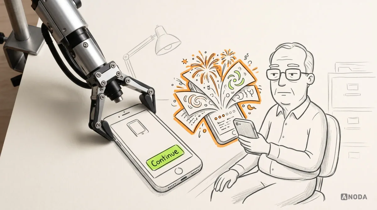
We see the same request again and again in mobile products: a gorgeous, colourful, animated onboarding carousel. Five slides, particles, playful illustrations, tiny progress dots. For some audiences it is charming. For others it is a wall.
Oksana has turned this request down more than once when the product’s users are older: there, you simply need to explain visually what the app does and give one button — continue. Animation that looks delightful in a design review can be a moving target for someone with low vision, a distraction for someone with attention difficulties, and simply confusing for someone who wanted to know what the app does before they give it their data.
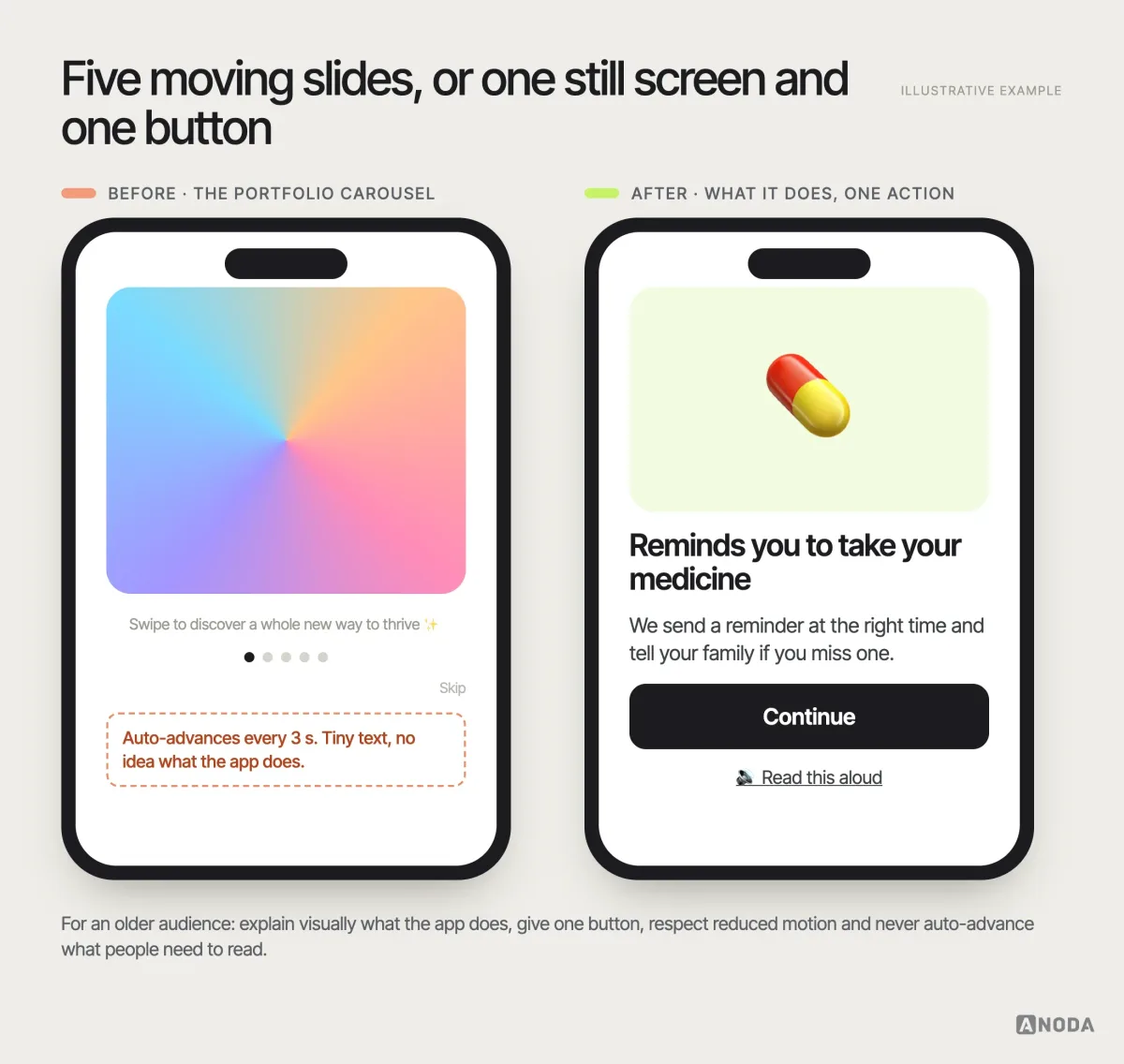
The rule is not “never animate”. It is: never let motion, decoration or brand ambition stand between the intended user and the single action they need next. Offer reduced motion, never auto-advance content people need to read, and test the first screen with people who resemble your audience, not your design team.
Build accessibility into every stage, not the last one
Accessibility added at the end is like fitting a ramp to a building whose only entrance is a spiral staircase: technically there is a ramp, practically nobody gets in. An ounce of prevention is worth a pound of cure — and in software the cure often means redesigning components already shipped across fifty screens. Here is where the decisions actually happen:
- Product context and standards. Decide who the product is for, which tasks are critical and which standards apply. For most web products, WCAG 2.2 at level AA is the practical technical reference; whether it is also a legal requirement depends on the jurisdiction and the product, and that is a question for legal advice, not for a blog.
- Research. Include disabled people and people who use assistive technology among your participants, especially for critical tasks. Their barriers will not show up in sessions with the design team’s colleagues. Planning that kind of study is part of any serious UX research engagement.
- Flows and failure states. Map critical tasks end to end, including errors, timeouts and recovery. Where can someone get stuck without sight, without a mouse, without time pressure?
- Interaction and content requirements. Specify semantics, keyboard behaviour, focus order, labels, error messages, alternative text and motion rules while designing, not after.
- Prototype and implementation testing. Test with keyboard and screen reader on real builds, not only on static mock-ups.
- Record risks and owners. Every known issue gets a severity, an owner and a decision: fix before release, fix later, or accept with a documented reason.
- Verify before release and after material changes. Accessibility regresses quietly. A redesign, a new component or a new vendor widget can undo years of work in one sprint.
A practical note on research: recruiting disabled participants takes more lead time than a standard panel, sessions may need more time, and participants should use their own devices and assistive technology set up the way they use it every day. A screen-reader user on an unfamiliar laptop tells you about the laptop. Pay people properly for their expertise; they are finding the problems your team could not.
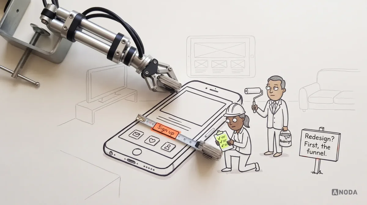
Oksana’s warning belongs here: do not use poor accessibility to cover up the fact that quality UX and a UX audit were never done. If the product’s basic flows are confusing, calling the problem “accessibility” sweeps it under the rug and hands it to a specialist who cannot fix a product strategy.
UX audit
Is it accessibility, or UX nobody finished?
We review the live product, separate the barriers that stop people finishing tasks from the ones that can wait, and give each one an owner.
Content and media are interface too
Accessibility is not only a design and engineering job. A surprising share of barriers are written.
- Plain language. Short sentences, familiar words, one idea per paragraph. Legal and financial products especially tend to write for their lawyers; users with cognitive or reading difficulties, and users reading in a second language, pay the price.
- Headings and structure. Screen-reader users navigate by headings the way sighted users scan. A page of bold paragraphs with no real headings is a book with no chapters and the page numbers torn out.
- Link and button text that makes sense out of context. “Download statement (PDF, 2 pages)” beats “Click here” for everyone, and it is essential for people who hear links read out as a list.
- Alternative text that carries the meaning, not the file name — and empty alternative text for images that are purely decorative, so they are skipped.
- Captions and transcripts for video and audio, and no information carried by sound alone.
Content has an owner in every product team, even when nobody has written that down. Make it explicit, and make accessible wording part of the definition of done.
Forms, errors and states deserve extra care
Forms are where most tasks succeed or fail, and they concentrate accessibility risk:
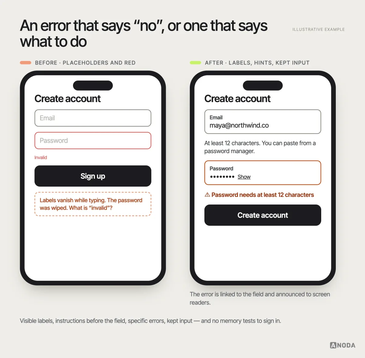
- Visible labels, not placeholder text that disappears when people start typing.
- Instructions before the field, not after an error: formats, required documents, character limits.
- Specific, linked error messages that say what went wrong and how to fix it, announced to screen readers and shown next to the field — without wiping the user’s input.
- No memory tests to log in. Allow password managers and pasting; avoid puzzles as the only way through.
- Time limits that can be extended, and states — loading, empty, error, success — that are announced as well as shown.
Targets, keyboard and focus
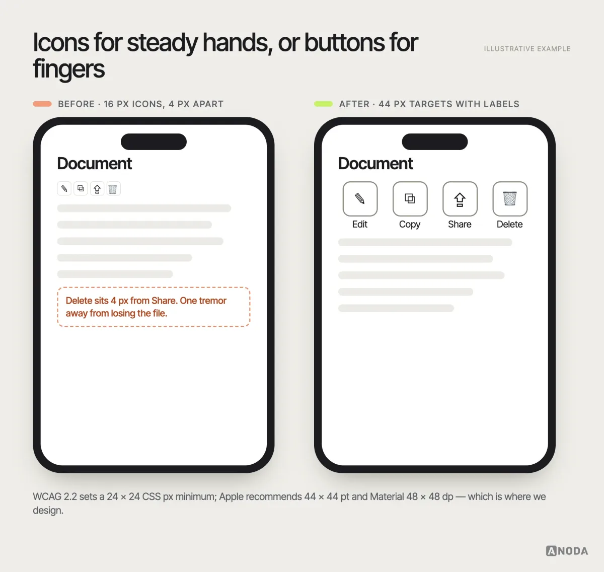
A control that is hard to hit is a control that does not exist for some of your users. WCAG 2.2 sets 24 by 24 CSS pixels as a minimum target size, with exceptions for adequate spacing; Apple’s guidance recommends 44 by 44 points and Android’s Material guidance 48 by 48 dp, which is where we usually design. Keep small icon buttons apart, and never make a gesture the only way to perform an action.
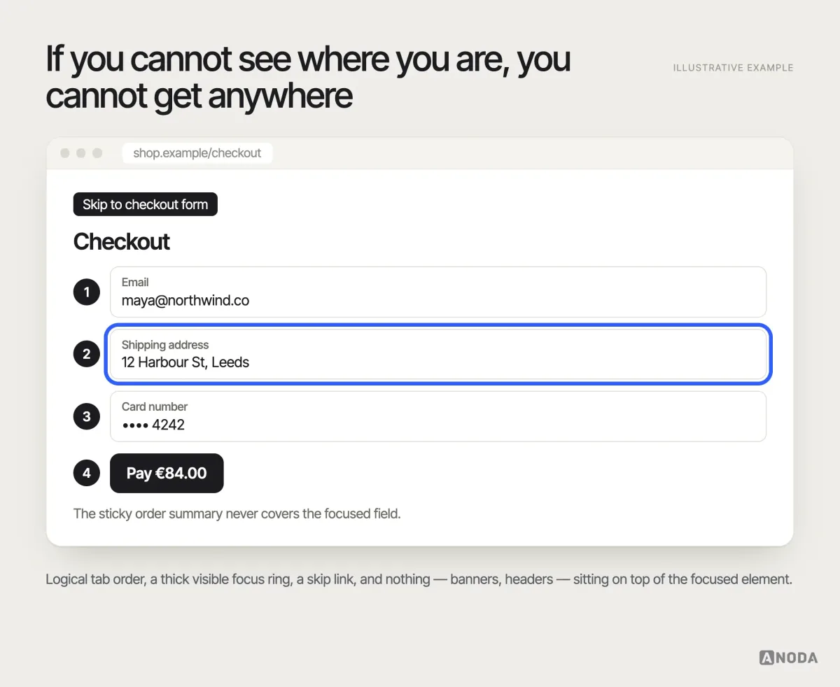
Everything must work with a keyboard alone, in a logical order, with a focus indicator that is clearly visible and never hidden behind a sticky header or a cookie banner. Provide a way to skip repeated navigation. People who rely on keyboards, switches or voice control travel through your interface one step at a time; if the focus disappears, so does the product.
Hand off requirements, not just pictures
Engineers cannot implement accessibility that the design file does not describe. A static screen shows what the interface looks like; it says nothing about what a screen reader announces, where focus goes after a dialog closes or what the error message says. Annotate it.
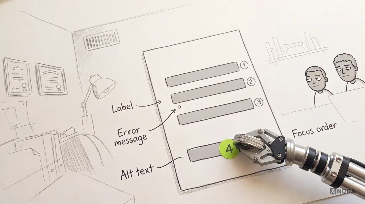
A useful accessibility handoff includes, for each screen and component:
- Role and accessible name — what the element is and what assistive technology calls it.
- States — expanded, selected, disabled, invalid, loading — and how each is announced.
- Focus order and focus management — where focus starts, where it goes after actions and dialogs.
- Content — labels, instructions, error messages, alternative text and captions, written, not left to “we’ll add it later”.
- Target sizes, contrast values and motion rules, including the reduced-motion alternative.
- Acceptance criteria — what QA will check, and which failures block release.
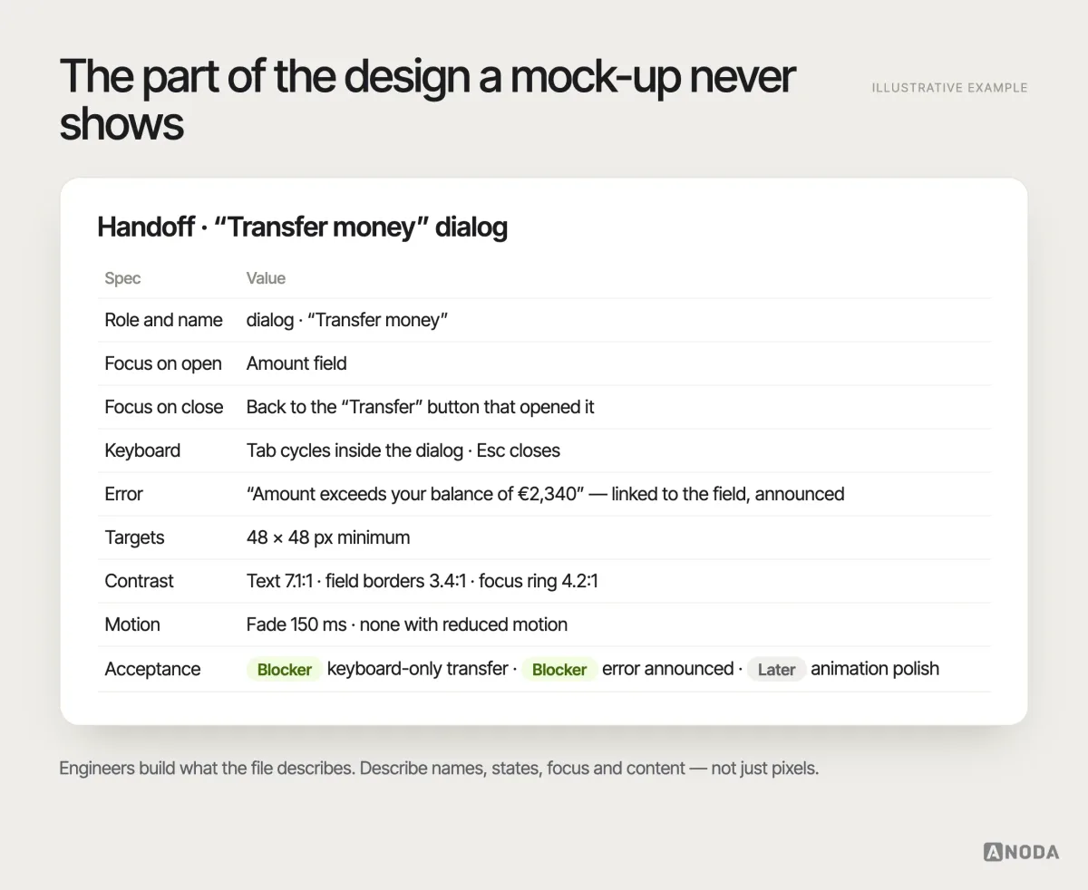
The design system is the multiplier here. Accessible components, with these specifications built in, spread good decisions to every screen; one inaccessible date picker spreads the problem just as efficiently. A chain is only as strong as its weakest link, and in a product the weakest link is usually the component nobody reviewed.
When the form is somebody’s only route to a service
A resident applying for a service or a person seeking legal help may visit once, under stress, without knowing your terminology. A new palette leaves the same cost running when labels, documents and recovery paths still force them to call. ANODA connects the readable question, saved progress, useful error and status after submission, so the person can finish and staff receive a request they can act on.
For a public-service portal or a legal-help product, bring us the intake people abandon or the status they call to understand. We design the public journey and the staff handoff together; your policy or legal team supplies the rules.
Make the clearer interface part of the product
A checker will not settle which control leads the screen, what a failed action says or how the next step fits the task. Our UI design service connects those decisions to the defined flow: readable hierarchy, clear labels, usable controls and states your engineers can implement. You stop sending customers to support for answers the interface should give them.
When the product is already in use, product redesign carries that clarity into the existing journeys and constraints. In Forever Beauty, ANODA audited the live app, reworked its information architecture and redesigned iOS and Android interfaces around the existing backend, with light and dark UI and a kit for the client’s engineers. That shows the task and interface work behind a redesign; accessibility requirements and implementation checks remain part of the scope we agree for your product. Bring us the journey customers struggle to finish, and we will turn those barriers into a clearer experience your team can build.
Testing: automated checks, manual review and real people
Different methods find different problems, and no single one is enough:
| Method | What it finds | What it misses |
|---|---|---|
| Automated checks and AI assistants | Missing alt text, contrast failures, missing labels, some structural errors | Whether content makes sense, whether tasks can be completed, most interaction problems |
| Manual keyboard review | Focus order, traps, invisible focus, unreachable controls | Screen-reader output, cognitive barriers |
| Screen-reader and assistive-technology testing | What is announced, missing names and states, confusing structure | Whether real users with those tools can finish the task |
| Research and usability testing with disabled participants | Whether real people complete real tasks, and why they fail | Nothing replaces it for critical tasks |
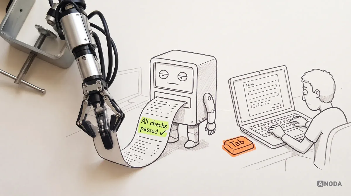
The decision rule is simple. Standards give you testable requirements, and automated tools are a useful first pass — they catch a real share of problems quickly and cheaply. But a passed checklist or a clean scan is not proof that a real person can complete the task. Passing the driving theory test does not mean you can parallel park. Combine standards-based checks with human evaluation in proportion to the product’s risk: a baseline review for low-risk utilities, keyboard and screen-reader passes for mainstream products, and task-based usability testing with disabled participants for anything people depend on.
Prioritise and document like any other product risk
An accessibility review that produces two hundred findings and no decisions has not helped anyone. Treat barriers the way you treat any product risk:
- Severity by task impact. Can someone not complete a critical task at all? That is a release blocker. Is it harder but possible? Plan it. Is it cosmetic? Batch it.
- Owners, not lists. Product owns priority and exceptions; design owns patterns and specifications; content owns wording and alternatives; engineering owns implementation; QA owns verification. Everyone owns the acceptance criteria.
- Documented exceptions. If something cannot be fixed now — a third-party widget, a legacy flow — record why, who decided, what the workaround is and when it will be revisited.
- Acceptance criteria in the ticket. “The transfer dialog can be completed with a keyboard alone; focus returns to the Transfer button on close; the balance error is announced by the screen reader” is testable. “Make it accessible” is a wish, and wishes do not pass QA.
- Re-verification. After material changes, check again. The devil is in the details, and details are exactly what redesigns change.
If a live product already has a long, unprioritised pile of accessibility and usability concerns, the fastest route to a plan is a structured UX audit that separates the barriers that block tasks from the ones that merely annoy, and puts owners next to both. And if you want the wider argument for setting priorities before applying any design rule, it is in our guide to UI/UX design principles and best practices.
Accessibility decisions must survive the component implementation: names, focus, validation and state announcements belong in the working interface as well as the design system. Our React development service turns those requirements into shared components and tests the key journeys with keyboard and assistive technology, so each new screen inherits usable behaviour.
For a marketing website, those behaviours belong in the reusable page template and the editor’s fields. Our Webflow development service connects the templates, CMS and forms; our WordPress development service builds the blocks, content types and editor roles. In either scope, ANODA carries labels, headings, keyboard behaviour and clear error messages through the working journey, so the next page inherits the usable foundation. If the platform is changing, website migration preserves those content and form requirements while the templates and integrations move.
Build a usable product first, then take accessibility as far as your people, tasks and consequences require. Start with the obvious — readable type, real contrast, clear composition, targets a finger can hit, onboarding that explains itself and one visible next action. Use quick stress tests and automated checks to catch the baseline failures, then add standards-based review, assistive-technology testing and research with representative users as the product’s reach and risk grow. And never call unfinished UX an accessibility backlog.

Accessible product design
Accessibility that starts in the flow, not in the bug tracker.
ANODA turns the accessibility backlog into a better product: clear flows, readable content, usable components and explicit handoff requirements. We connect the barrier to the task it blocks, so your team fixes what stops customers and carries those improvements across the interface.
Written by