In short
Most UX deliverables are bought by the kilo and read by nobody. Each one is a product decision recorded at a price, and the price rises from research to flows, wireframes, prototypes, UI and handoff. Skip the structure and the open questions land in code. Produce everything and you get documentation theatre. How to pick the cheapest artefact for each risk, why the user flow anchors the rest, and which documents deserve to outlive the project.
In this article
- What UX deliverables actually are
- Choose each deliverable by the decision it has to enable
- Research deliverables: evidence, not a pedigree certificate
- The user flow is the reference everyone builds from
- What skipping structure really costs
- Wireframes and prototypes: taste before you plate
- UI design and the design system: the expensive layer
- Handoff: a build plan, not a gallery
- Documentation theatre: when the pack becomes the product
- Full package or a bounded subset
- How to scope UX deliverables for your next project
- What to buy, and what to keep
UX deliverables are not what you pay a design team for. They are receipts for decisions: who the product is for, which path a person takes through it, what each screen must say and do, and what engineers will build. Choose each one by the decision it has to enable, at the cheapest level of detail that can settle that decision. Buy them by the kilo instead and you get a very thick folder, a very thin product and an invoice for both.
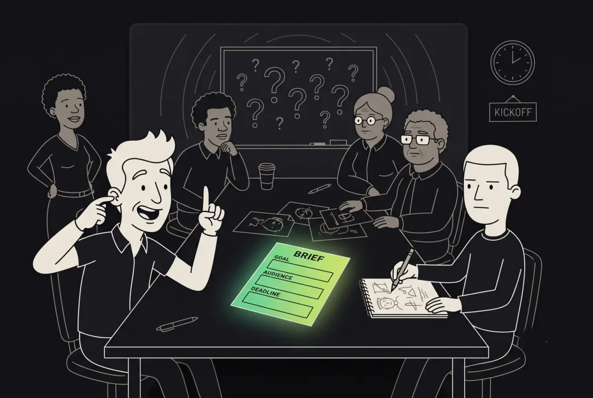
At ANODA, we design and fix products around the decisions that matter, and the most common mess we inherit is not a shortage of deliverables. It is a surplus. Persona posters on the wall of a company that still can’t say who churns. A journey map printed at A1 size and last opened at the kickoff. Seventy polished screens for a flow nobody drew, so each screen quietly contradicts the next. The client paid for all of it. Then engineers built from the screens, filled the gaps with guesses, and the users the company paid good ad money to acquire walked straight into those guesses in week one.
Most companies buy UX deliverables the way tourists buy souvenirs: by weight, to prove they were there. Here is what each one is actually for, what it costs to get wrong, and how to tell a working document from documentation theatre.
What UX deliverables actually are
A UX deliverable is a product decision written down at a particular level of detail. Research findings record what is true about users. A user flow records the path and the states. Wireframes record priority and layout. A prototype records behaviour. UI design records the final look and wording. Handoff artefacts record exactly what gets built and how everyone will know it is done.
Remember the maths teacher who refused to mark an answer without the working. The answer alone earns nothing when it is wrong, because nobody can see where it went off the rails. Deliverables are the product team’s working. When a feature flops, they show whether the mistake was in who you built for, in the path, in the screen or in the build, and so whether the fix costs a conversation or a quarter.
Each level is also dearer to change than the one before it. Moving a step in a flow takes an eraser. Moving it in a wireframe means redrawing a few boxes. Moving it in finished UI means redrawing every state that touched it. Moving it in shipped code means a ticket, a regression test and a release note explaining why the button moved again. The deliverables are not a checklist. They are a ladder, and every rung you skip is a rung you fall from later, with your engineering budget underneath.

So the useful question is never “which deliverables should a UX project include?” It is “which decisions are still open, and what is the cheapest thing that can close each one?”
Choose each deliverable by the decision it has to enable
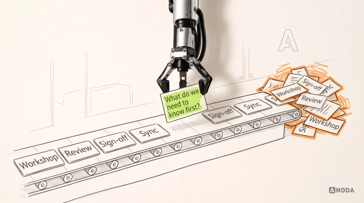
Every artefact should answer a question somebody is about to act on. If nobody can name the decision a document will change, the document is decoration, however nicely it is kerned.
You would not order an MRI for a splinter, and you would not treat a suspected fracture with a plaster and a lollipop. Good scoping works like a sensible doctor: the examination matches the risk. A question about the order of steps needs a flow, not a clickable prototype. A question about whether people trust the price needs real copy on a realistic screen, not a grey box. Spend above the level the risk needs and you pay for certainty you don’t need yet. Spend below it and you are guessing on a question that deserved an answer.
This is the mapping we use when a client asks which deliverables their project needs:
| Decision still open | Risk if you get it wrong | Cheapest artefact that can settle it |
|---|---|---|
| Who has the problem, and how badly | Building for a user who doesn’t exist | Interviews and a short findings summary |
| Which path gets a person to value | Dead ends, missing steps, orphan screens | User flow with states |
| What matters most on each screen | Right features, wrong priority | Low-fidelity wireframes |
| Whether people understand the interaction | Confusion that only shows up in use | Clickable prototype, tested with users |
| Whether people trust it enough to act | Hesitation at price, data or commitment | High-fidelity screens with real content |
| What exactly gets built | Guesses in code, rework after release | Annotated states and acceptance criteria |
Read the right-hand column as a ceiling as well as a floor. Anything more elaborate is money spent early. Anything less is money spent twice.

Audit check
For every deliverable in the proposal or the plan, write the one decision it enables and who makes that decision.
Failure evidence
Items described by format (“persona set”, “journey map”, “UI kit”) with no question attached. Nobody can say what would change if the item were dropped.
Correction pattern
Drop or defer anything without a decision. For the rest, start at the lowest fidelity that can settle the question and move up only when it can’t.
Research deliverables: evidence, not a pedigree certificate
Research is the cheapest place to be wrong, which is exactly why teams skip it and then pay to be wrong somewhere more expensive. But the research deliverable itself is also where plenty of budget goes to die.
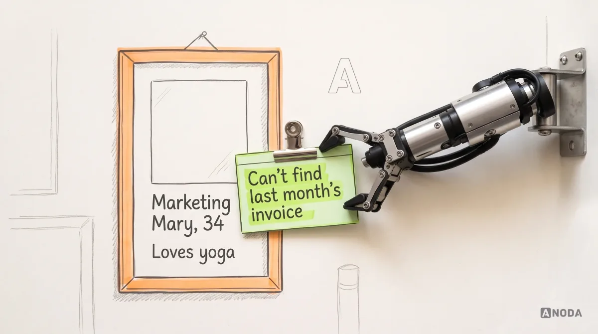
The classic case is the persona poster: an invented name, an age, a hobby, a favourite coffee order and a quote nobody ever said. It is a dog’s pedigree certificate. Impressive paper, a proud family tree, and not one word about whether the dog bites. Nobody has ever made a product decision because a fictional marketing manager likes yoga. Teams make decisions because they know which job the user is trying to finish, what stops them today and what they do instead.

A research deliverable earns its fee when it turns into instructions. A finding is useful only in the form “we saw this, so we will do that”: the evidence, the pattern, what it means for the product and the decision it changes. Ten of those on two pages beat an 80-page report with a lovely cover, because a product manager can act on the first page without booking a meeting to interpret it.
The same test applies to journey maps, empathy maps and every other research format with a pleasant template. Keep it if it drives a decision. Retire it if its main audience is the steering committee.
Audit check
Take each research artefact and list the product decisions it changed in the last quarter.
Failure evidence
Personas nobody quotes in planning. Findings with no implication. A report everyone praised and nobody reopened.
Correction pattern
Rewrite findings as evidence, implication and decision, keep them short enough to read before the meeting, and retire any format that changed nothing.
What ANODA makes buildable
A handoff full of screens still leaves engineers paying to rediscover the decisions between them. ANODA connects the research finding to the user flow, the component states and the release file, so the next person can build the intended behaviour without reopening the whole project.
For SEOSpace, our work covered the web app and Chrome extension: onboarding wireframes included invalid-URL states, and the handoff combined Figma files, Loom walkthroughs and design QA of each release. Those deliverables answer different questions in one product workflow. See how we designed SEOSpace, then plan the deliverables your team actually needs.
The user flow is the reference everyone builds from
If we could keep only one artefact on a project, it would be the user flow. Not the prettiest one. The one that holds the product together.
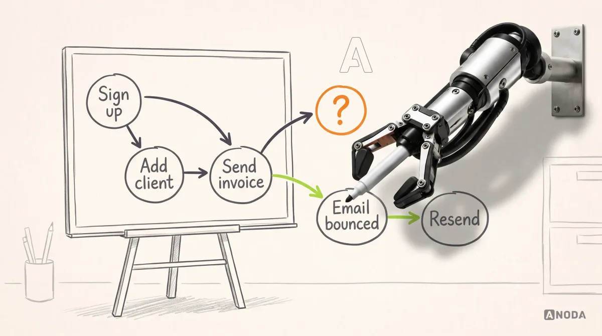
A user flow is a coach’s whiteboard before the big game: circles, crosses and arrows showing who passes to whom, and what happens when the pass is intercepted. Nobody argues about the kit until the play works. A flow does the same for a product. It shows the trigger that starts a task, every step and decision, every state a person can land in, and the way out when something fails: an empty account, a declined card, a missing permission, an email that bounced.

It is also the one artefact everyone reads for their own reasons. The product manager reads scope. Designers read which screens and states must exist. Engineers read the logic, the data and the edge cases. QA reads the test cases. When all four look at one flow, disagreements surface as arrows on a whiteboard, which cost nothing. When they look at four different documents, disagreements surface in production, where they cost you the users you were paying to activate.

That is why we make the flow the shared structural reference and hang every other deliverable off it. Wireframes illustrate its steps. Prototypes test its riskiest paths. UI covers its states. Handoff specifies them. A screen that is not on the flow is a question in disguise: either the flow is missing something, or the screen shouldn’t exist.
Audit check
Pick your most important journey, from signup to first value, and ask product, design and engineering to draw it separately.
Failure evidence
Three different drawings. Screens nobody can place. States that exist only in the code.
Correction pattern
Agree one flow with its states and failures, keep it where all three teams can find it, and treat it as the source every other deliverable must match.
What skipping structure really costs
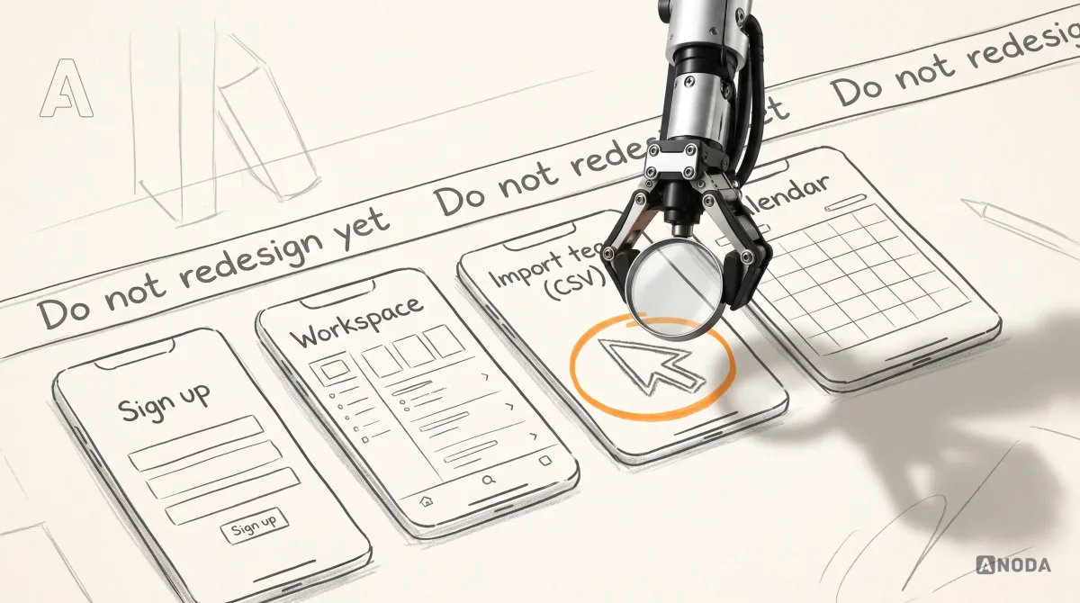
Teams skip flows and wireframes for a very human reason: they look like nothing. The client sees boxes and arrows and asks when the design starts, so the team jumps to polished screens and every unresolved decision quietly moves up a floor, to where it is dearer.
It is finding out that the staircase doesn’t reach the second floor after the carpet has been laid. The fix exists. It just costs far more than it would have on the drawing, and now it involves the carpet fitter, the electrician and a very tense conversation about who pays.
Take one ordinary question in a subscription product: what happens when a customer’s card is declined at renewal?
- Answered in the flow: one branch and one note, settled in a few minutes of a workshop.
- Answered in the UI: three screens redrawn and the design review rescheduled.
- Answered in code: a developer invents a behaviour, QA finds it matches nothing and the sprint slips.
- Answered in production: customers lose access with no explanation, support tickets pile up, and some of the accounts you fought to win quietly don’t renew.

Nobody picks the last option. It gets picked by default, on the day someone decides the flow is a formality. That is the real bill for skipping structure: not a missing document, but decisions made by whoever happens to be holding the keyboard when the question finally comes up.
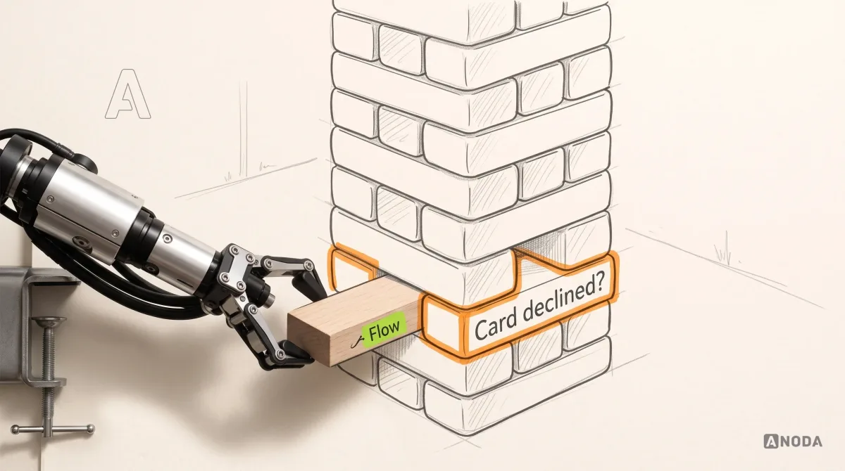
Every decision you don’t make in the flow, a developer makes in the code: at developer rates, under deadline, with no user in the room.
Audit check
Take the last ten design-related tickets reopened after development and trace where each question should have been answered.
Failure evidence
Engineers asking “what happens when…” in chat. Behaviour decided in pull requests. Rework after QA on cases no screen covered.
Correction pattern
Before UI starts, walk the flow through every failure and empty state. Every unanswered case becomes a decision with an owner, not a guess with a deadline.
Wireframes and prototypes: taste before you plate
Wireframes and prototypes exist to be wrong cheaply. Most teams sabotage that by making them too nice.
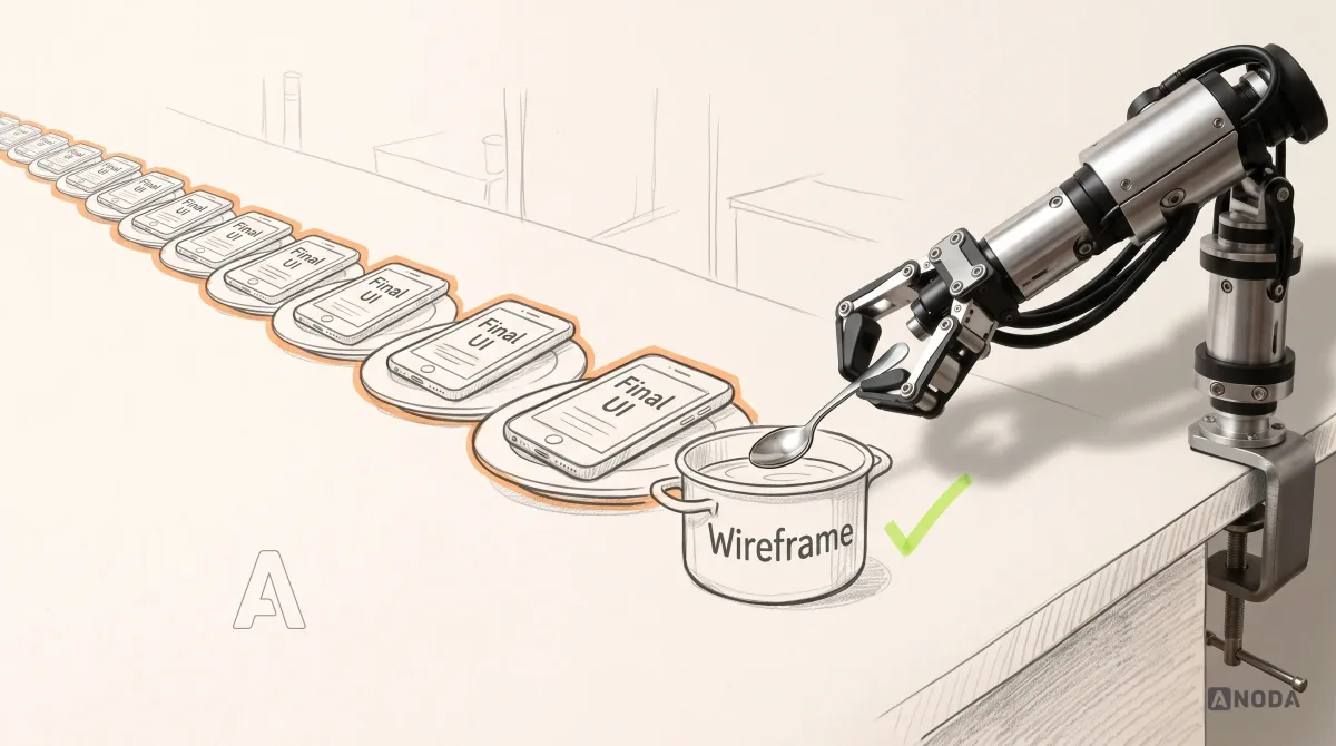
A chef tastes the sauce from a spoon before plating two hundred portions for a wedding. Nobody garnishes the spoon. A wireframe is the spoon: grey boxes, real words, the right order of things, rough enough that nobody minds throwing it away. A prototype is the proper tasting: a clickable path real users can try, so you watch where they hesitate instead of guessing in a meeting. The proof of the pudding is in the eating, and it is much cheaper to find out before the wedding.
The mistake runs both ways. Polish a wireframe and the review turns into a debate about button corners while the missing step walks past unnoticed. Test a real trust question, such as whether people will send an invoice from here or believe this total, with grey boxes and placeholder copy, and users react to the grey boxes. Match the fidelity to the question:
- Order of steps and what’s missing: the flow or a rough wireframe.
- Can people find it and understand it: a clickable wireframe prototype, tested with a handful of target users.
- Do people trust it and act on it: high-fidelity screens with real copy and realistic data.
- Does a chart or a table read at a glance: high fidelity with real data volumes, not three tidy rows.

A prototype that answers a question you’ve already answered is a very expensive screenshot. A usability test with no question written down beforehand is a demo with a stopwatch.
Audit check
For each planned prototype or test, write down the question it answers and what you will change depending on the result.
Failure evidence
High-fidelity prototypes of flows nobody agreed on. Test reports that describe what happened and change nothing.
Correction pattern
Start at the lowest fidelity that can answer the question, move up only when it needs real content or behaviour, and decide the follow-up before the test.
UI design and the design system: the expensive layer
UI is where the product becomes real to users and where every change costs the most, so it should arrive late and carry decisions, not make them. When UI is the first artefact, the screens become the place where scope, logic and priorities get argued out in pixels. That is the most expensive meeting room you can book.
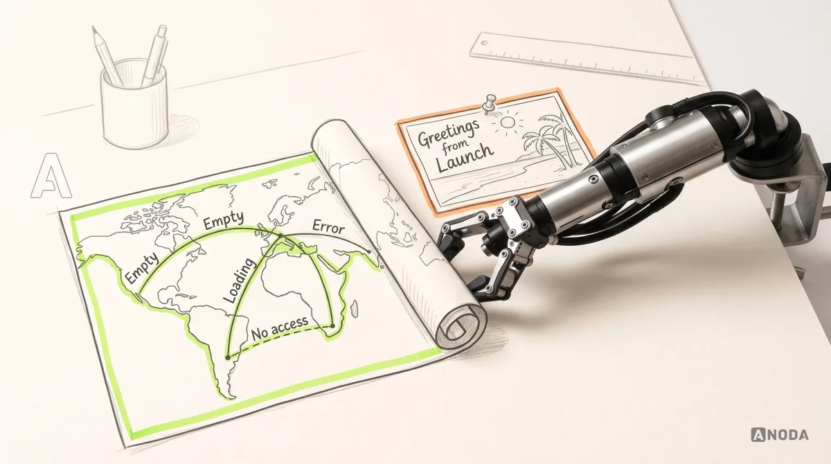
Final UI should cover what the flow promised: every state of every screen, not just the flattering one with perfect data. The empty dashboard on a new customer’s first day. The table with four thousand rows. The client name too long for its column. The error that tells a person what to do next. A handsome happy path is window dressing if the other states are left for engineers to improvise.

The empty state is the first screen every new account sees. It stands between your acquisition spend and your activation rate, and left undesigned it shows zeros to the people you just paid to bring in.
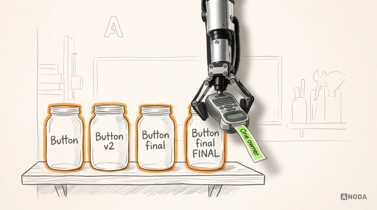
Design systems deserve their own warning. A shared set of tokens and components pays for itself when several teams or products build from it and someone owns it. Without an owner it is a label maker in a house where nobody puts anything back: lovely labels, the same mess, and now a drawer full of labels too. Components drift from the code, the documentation describes buttons that no longer exist, and engineers stop trusting it and build their own. You paid for one source of truth and got two, which is a white elephant with a changelog.
Size the system to the product:
- One product, one team: tokens and a few core components, in step with the code.
- Several teams on one product: a documented library with a named owner and a regular release.
- Several products: a full programme, once enough teams use it to fund its upkeep.

Audit check
Compare five core components in the design file with the same five in production.
Failure evidence
Different spacing, colours or states. Documentation nobody updated after the last release. Engineers who never open the library.
Correction pattern
Name one owner, cut the system back to what the code actually uses, and add a component only when a second place needs it.
Handoff: a build plan, not a gallery
Handoff is where design money is cashed in or written off. If an engineer can’t answer “what happens when…” from the file, the answer gets invented at the keyboard, and invented answers ship.
Handing engineers a set of happy-path screens is like handing a pilot a holiday postcard of the destination. Lovely weather, great beach, no route, no altitude and no plan for the storm. What engineers need is closer to a flight plan: every screen in every state, the rules behind each one, the edge cases, and a shared definition of done.
A useful handoff usually contains:
- The flow the screens belong to, with its failure and empty states.
- Each screen in every state it can reach: loading, empty, partial, error, no permission and very long content.
- Behaviour notes where a picture can’t carry it: what is validated, when, and what the message says.
- Acceptance criteria written with engineering and QA, so “done” means the same thing to all three.
- Components mapped to the design system instead of redrawn screen by screen.

Notice what isn’t on the list: a 40-page specification repeating what the design file and the code already show. Engineers can inspect the padding in any modern design tool. They need the decisions the picture can’t carry, not someone reinventing the wheel in a PDF nobody opens.

Handoff is also not an event. Design stays with the build to answer questions, check what’s implemented against the states and fix the gaps before users find them. A designer who disappears after the handoff meeting is a builder who leaves the keys under the mat and switches his phone off.
UI/UX design
Paying for screens your engineers still have to guess around?
We map the flow, design every state that matters and stay with the build until what ships matches what was decided. The full package, or only the piece your team is missing.
Audit check
Ask an engineer to build one screen from the file alone and list every question they had to ask.
Failure evidence
Questions about empty, error and permission states. Behaviour settled in chat threads nobody links back to the design.
Correction pattern
Add the missing states and acceptance criteria to the file, link decisions made during the build back to the flow, and keep a designer on the build until release.
Documentation theatre: when the pack becomes the product
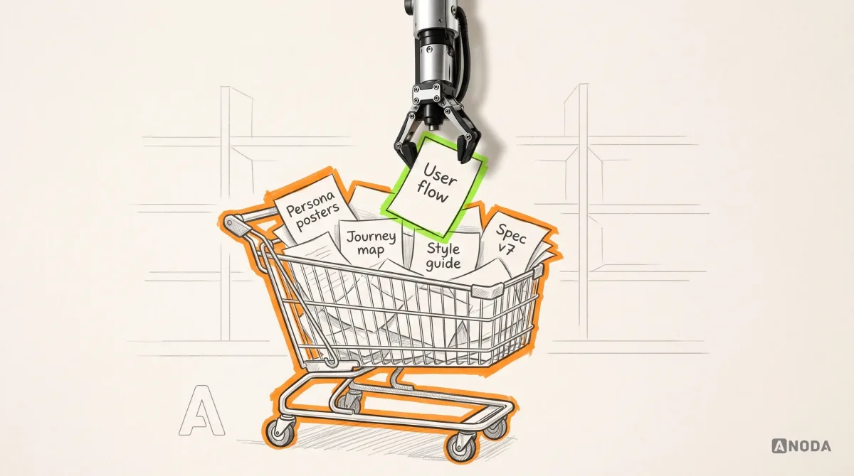
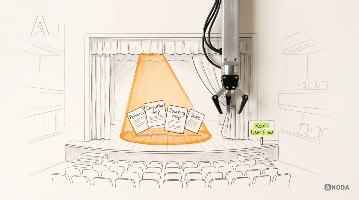
The opposite failure is just as expensive: producing every possible artefact because the proposal template listed them all. Personas, empathy maps, journey maps, service blueprints, mood boards, three rounds of wireframes, a style guide and a 60-page spec. Everything a design project could deliver, delivered.
It is the wedding china. Chosen with enormous care, admired once, then boxed up in the loft while everyone eats off the everyday plates.
Documentation theatre has two costs. The first is obvious: the time and fees spent producing it. The second arrives later and is worse. Documents nobody maintains go stale, and stale documents lie. A new designer follows last year’s journey map. An engineer builds to a spec that was overruled in a meeting nobody minuted. The company pays twice: once to write the document and again to undo what people did because they believed it.
The rule we use is short. A document survives the project only if it has an owner and a maintenance path. The owner is a named person, not “the team”. The maintenance path is the event that triggers an update: a release touching that journey, a new customer segment, a pricing change. No owner and no trigger means you archive it the day the project ends and say so out loud, so nobody mistakes it for current.
Don’t throw the baby out with the bathwater, though. A good journey map can live on inside the flows. A good style guide can live on inside the design system. Merging beats deleting when the thinking was sound and only the format was the problem.

Audit check
List every design document the team links to today, with its owner, its last update and the last decision it informed.
Failure evidence
“Owner: design team”. Last updated before the last major release. Onboarding pages linking to files that contradict the product.
Correction pattern
Give the few that matter an owner and an update trigger, merge duplicates into the flows or the design system, and archive the rest with a visible “not maintained” label.
Full package or a bounded subset
Not every project needs every deliverable. Some teams have strong product thinking and no interaction designer. Some have designers and no structure. Some have a live product and one broken journey. Buying the full package to fix one journey is trading in the car because a wiper squeaks.
ANODA can take a product from research to handoff, or deliver the bounded piece a team is missing: flows and wireframes for an engineering-led team, UI and states on top of an existing structure, or a handoff rebuilt so engineers stop guessing. Either way, we judge the result by one test: can your team make the right product decisions and build them? A beautiful file that leaves the team guessing is a failed deliverable, however many pages it runs to.
Technical teams often have a specific fear here: explaining a complex product to designers will cost more than doing the work themselves. That fear is fair when an agency opens with a template pack. It fades when the work starts from your flows, because the flow is where your domain knowledge lives, and it is where we ask our questions once instead of in every review.
Our recommendation, by situation:
| Where your team is | What usually pays off | What you can usually skip |
|---|---|---|
| New product, no users yet | Research on the core problem, the flow, wireframes, a tested prototype, then UI and handoff | A full design system, detailed persona sets |
| Live product, one journey losing users | Evidence from that journey, a corrected flow, its states and UI | A brand refresh, research on journeys that already work |
| Strong engineering team, no designer | Flows with states, wireframes, acceptance criteria, a small component set | Pixel-perfect specs for screens your team already builds well |
| Several teams building one product | A shared set of flows, an owned design system, handoff standards | A new persona deck every quarter |
This is a starting point, not a price list. The right subset depends on which decisions are still open in your product. A clear brief helps; our guide on how to write a design brief for an agency covers what to put in it.
How to scope UX deliverables for your next project
The order we scope in, and recommend to teams doing it themselves:
- List the decisions ahead, not the documents. Who to build for, which journey to fix, what goes into the first release.
- Rank them by the cost of being wrong. A wrong call on whether people trust your checkout costs more than a wrong icon. Spend where mistakes are expensive.
- Pick the cheapest artefact that can settle each one. Move up in fidelity only when the question demands it.
- Start from the flow. Draw the core journey with its states before any UI, and make every other deliverable match it.
- Give every surviving document an owner and a trigger. If nobody will maintain it after launch, plan to archive it at launch.
- Define done as a decision made and built. A deliverable is finished when the team has acted on it, not when the file link lands in the channel.

A deliverable that nobody acted on was not delivered. It was only sent.
What to buy, and what to keep
Research, flows, wireframes, prototypes, UI and handoff artefacts are the same decisions written down at rising levels of detail and cost. Skip the structure and the unresolved logic lands in UI and code, where it is dearest to fix. Produce everything and you get documentation theatre: a heavy folder and a stale truth. Use the cheapest artefact that can test the current risk, make the user flow the reference everyone builds from, and keep only the documents someone owns and maintains.
For more on flows, audits and the product decisions around them, browse the rest of our product and UX design guides.

Work with ANODA
Stop paying for documents. Start paying for decisions.
Tell us where your product is and which decisions are stuck. We’ll turn that into a scoped design plan: the flow first, the deliverables that settle your real risks, and nothing your team won’t use.
Written by