In short
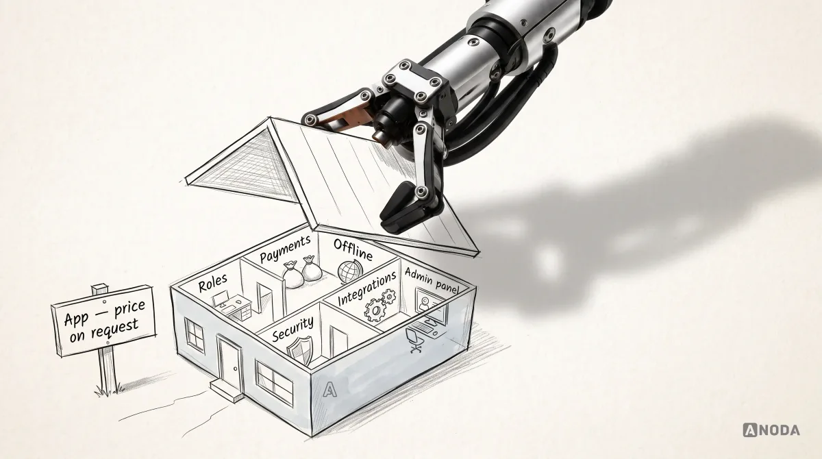
A marketplace is several products that have to succeed together around one transaction: buyers, sellers and the operator team. Here is how to pick the side that reaches value first, design discovery, listings, onboarding, trust, payments, status, reviews and disputes for everyone involved, and measure whether both sides are getting what they came for.
In this article
- Why marketplaces are different
- Marketplace types, and what changes between them
- A real exchange across three roles: Wildcast
- Start with the critical exchange
- Which side first: the cold start
- Discovery and search that match
- Listings people can trust
- Listing creation for sellers
- Tools that help sellers grow
- Onboarding both sides differently
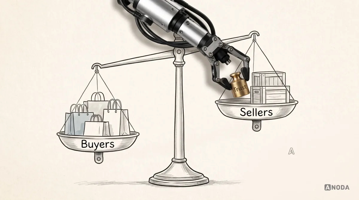
- Trust is the product
- Booking and payment, seen from both sides
- Pricing, fees and who sets the price
- Cancellations and changes
- Handover, delivery and fulfilment
- Payouts and seller finances
- Status everyone can follow
- Messaging with guardrails
- Reviews that mean something
- When things go wrong: disputes
- Operator tools: the invisible third product
- Fraud and safety
- Web or mobile for each side
- Research with two sides
- AI in marketplaces, with boundaries
- Accessibility and inclusion
- Notifications for both sides
- What to measure
- Repeat use: the second transaction
- Policies written for people
- Going into new markets
- How priorities change as a marketplace grows
- Common marketplace UX mistakes
- How we approach marketplace design
- The decision rule
Marketplace UX design is the design of a product where at least two groups of people have to succeed together: buyers who want to find and buy, sellers who want to list and earn, and usually an operator team that keeps the whole thing safe and running. Its job is to get both sides to a completed transaction they trust, again and again. That means deciding which side has to reach value first, what creates enough trust for the first exchange, and making every status, cost and responsibility visible to everyone involved. A marketplace where one side is happy and the other is leaving is not half-working. It is on its way to not working at all.
Most marketplace projects start with the buyer’s interface. It is the visible part: search, listings, checkout. The seller tools get whatever time is left, and the operator tools, the admin panel for disputes, verification and payouts, get a spreadsheet. Then the launch arrives, buyers search, find almost nothing, and leave. Sellers list, get no bookings, and leave. The team redesigns the homepage.
The cost is double. The marketing budget brings buyers to an empty shelf, and the sales effort brings sellers to a shop with no customers. Both sides churn, and each one who leaves makes the marketplace less useful for the rest. Marketplaces don’t fail gradually; they unravel.
We have designed products with several sides for years, and the pattern is always the same: the problem is rarely the look of the search page. It is that the marketplace was designed as one product for one user, when it is really several products that have to work together around one transaction. Copying a well-known marketplace’s screens doesn’t help either. You get their interface without their supply, their demand or their operating team, which is like copying the floor plan of a busy restaurant and wondering why yours is empty.
This guide covers how marketplace UX differs from ordinary product design, which side to start with, how to design discovery, listings, onboarding, trust, messaging, payments, reviews and disputes for both sides, what to measure, and how the priorities change as a marketplace grows.
ANODA designs the exchange from every seat, not just the buyer homepage. In Wildcast, that meant keeping one campaign understandable across the advertiser, podcaster and operator portals—from the brief and offer to publication confirmation and payout information. We apply that same discipline to your marketplace so supply, demand and operations support the transaction instead of pulling it apart.
Why marketplaces are different
A marketplace must coordinate an exchange between independent participants as well as the operator. That adds a design problem beyond serving several roles within one organisation: each side must have a reason to participate, and the exchange must work for all of them.
- Buyers or renters want to find the right thing quickly, trust that it’s as described, pay safely and get help if something goes wrong.
- Sellers, hosts or providers want to reach buyers, list easily, get paid reliably and be protected from bad actors.
- The operator, the company running the marketplace, wants transactions to happen, fraud to stay low, disputes to be resolved fairly and the business to earn its fee.
These goals overlap, but they also conflict. Buyers want low prices and generous cancellation; sellers want high prices and firm rules. Buyers want to message sellers freely; the operator needs payments to stay on the platform, both for revenue and for protection. Good marketplace UX doesn’t pretend these tensions away. It makes the rules clear, fair and visible to everyone.
There is also the problem of liquidity: the marketplace only works when there is enough supply for buyers to find something and enough demand for sellers to make it worthwhile. UX alone can’t create liquidity, but bad UX can destroy it, and good UX can make the most of limited supply and demand while the marketplace grows.
Marketplace types, and what changes between them
The principles apply to every marketplace, but the hardest design problems depend on what is being exchanged.
Goods marketplaces connect buyers with sellers of physical items. The critical moments are the listing (photos, condition, description), payment, shipping or collection, and returns. Trust depends heavily on accurate descriptions and on what happens when an item doesn’t match them.
Rental marketplaces add time and return. Availability calendars, deposits, pick-up and return, condition checks before and after, and late returns all need design. Every rental is two handovers, and each one can go wrong.
Service marketplaces connect customers with people who do work: cleaners, tutors, tradespeople, freelancers. The product is a person’s time and skill, so trust in the provider matters most: verification, qualifications, reviews, and clear scope and pricing. Scheduling, rescheduling and quality disputes are the hard parts.
Booking marketplaces for spaces and experiences sell access at a time: rooms, venues, events. Availability, cancellation policies, capacity and the difference between the listing and the reality on the day are the main risks.
B2B marketplaces connect businesses: wholesale goods, industrial equipment, professional services, advertising inventory. Buying often involves several people, approvals, quotes, contracts and invoices rather than a card payment. The interface has to support negotiation and paperwork, not only a checkout button.
Digital and advertising marketplaces trade things like ad placements, sponsorships or licences. Matching, pricing, performance reporting and proof of delivery become central.
Maturity changes things as much as type. A new marketplace in one city needs different design priorities from an established one in twenty countries. The rest of this guide covers the patterns they share, and notes where type and stage change the answer.
A real exchange across three roles: Wildcast
Wildcast’s podcast advertising marketplace connects advertisers, podcasters and the operator team around a campaign. An advertiser specifies the campaign; operators review relevant podcast matches; podcasters receive an offer with the information needed to accept and deliver it. Publication confirmation and payout are further stages of the same exchange, not independent dashboards with unrelated statuses.
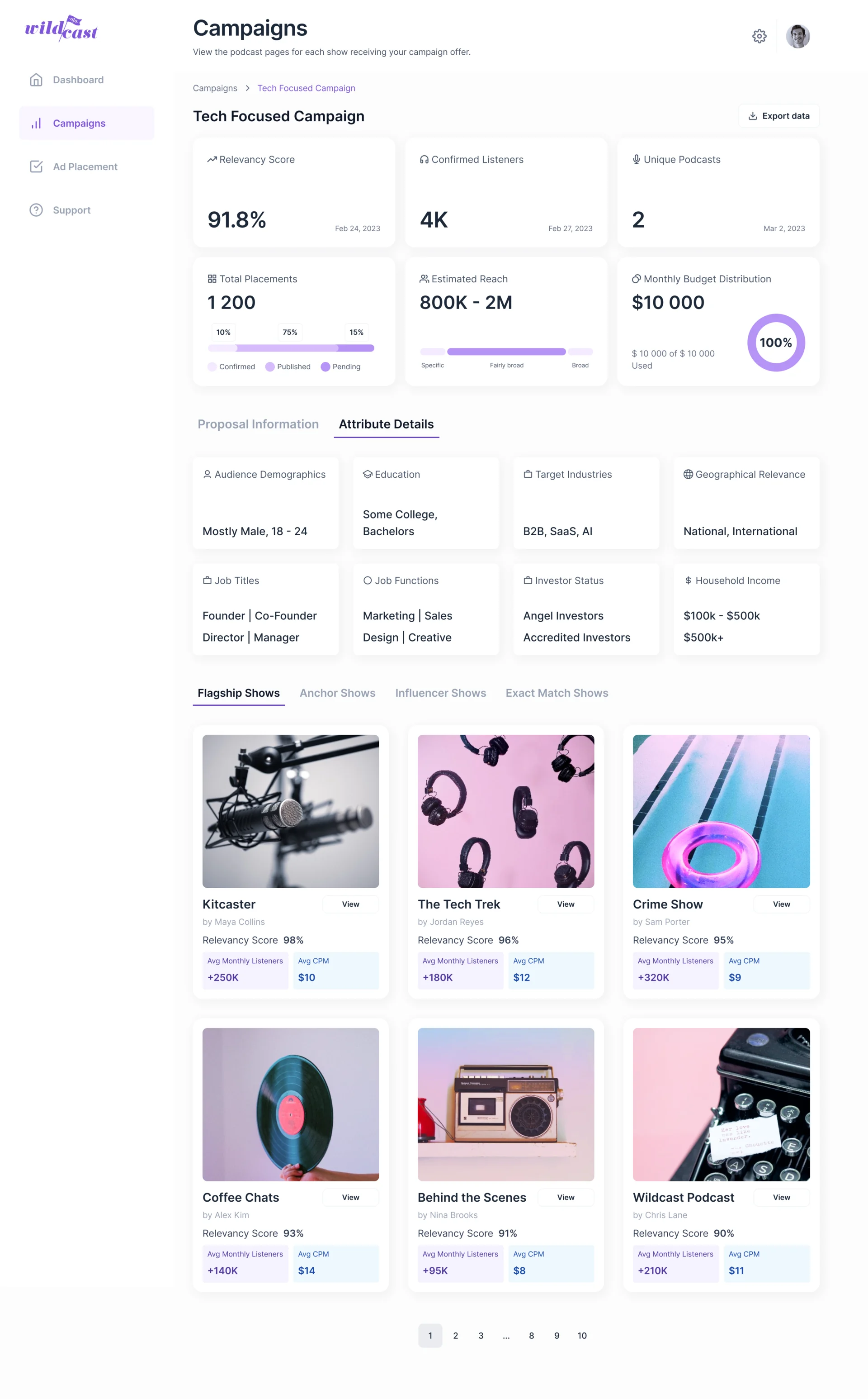
The UX job is to preserve the campaign’s identity across those roles while changing what each role can see and do. A podcaster needs the deliverable and deadline; an advertiser needs progress against the brief; an operator needs exceptions and the next intervention. This connects marketplace design with the specific operating context of AdTech product design, without treating every marketplace as an advertising platform.
Start with the critical exchange
Before designing any screen, answer one question: what is the smallest transaction that proves the marketplace works? For an equipment-rental marketplace, it might be “someone nearby rents a tool for a weekend, picks it up, uses it, returns it, and both people would do it again”.
That exchange tells you what matters most. The renter needs to find something available on their dates and near them, trust the owner and the item, and understand the total cost. The owner needs to trust the renter, get paid and get the item back undamaged. The operator needs verification, a deposit mechanism and a way to handle problems. Everything in the first version should serve that exchange. Everything else can wait.

Mapping all three sides around the exchange also reveals the shared objects: the listing, the booking, the payment, the message thread, the review, the dispute. Each is seen differently by each side, and the design has to show each party the right view of the same thing.
Which side first: the cold start
Every new marketplace faces the chicken-and-egg problem. Buyers won’t come without supply; sellers won’t list without buyers. The design question is which side must reach value first.
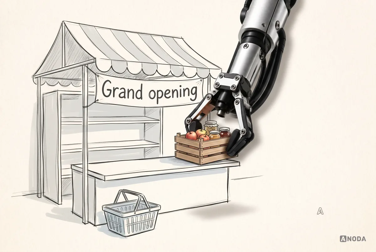
For most marketplaces, supply comes first, and it comes narrow: one category, one area, one type of customer. A rental marketplace with a few dozen well-described items in one neighbourhood is more useful than one with a handful of items spread across a country. Buyers who search there find something; sellers there get bookings; the loop starts.

This affects UX directly. Early on, listing creation for sellers has to be exceptionally easy, and often assisted. Search for buyers has to handle thin supply gracefully: suggest nearby areas, alternative dates, similar items, or a way to be notified when something appears, rather than a blank “no results”.
Discovery and search that match
For buyers, the marketplace is only as good as what they can find. Search and discovery have to reflect how people actually choose in your category.
For rentals, that means dates and distance come first: an item that isn’t available this weekend or is fifty miles away doesn’t matter, however good it is. For services, it might be availability and specialisation. For goods, it might be condition, price and delivery time.
- Filters that matter for the decision, not every attribute you happen to store.
- Availability shown on the results, so people don’t click into listings they can’t book.
- Clear total price, or at least a clear price per unit and a hint at extra fees.
- Sorting that people understand: nearest, cheapest, best-rated, and a clear explanation if you use a “recommended” order.
- Empty and thin results handled well: widen the area, change the dates, save the search.

Discovery also includes browsing, categories and recommendations. In early marketplaces, curated collections (“Tools for garden clearance”) often work better than algorithmic recommendations, because there isn’t enough data for the algorithm yet.
Ranking and fairness
How results are ordered shapes the whole marketplace. It decides which sellers get bookings and which disappear. Sellers notice quickly if the ranking seems arbitrary, and buyers notice if the “best” results are simply the ones that pay the most.
Be clear about what drives the order: relevance to the search, distance, availability, quality signals like reviews and response time, and any paid placement, which should be labelled as such. Give new sellers a fair chance to appear, or supply never grows beyond the first few who got in early. And explain ranking to sellers in plain terms, with things they can do to improve, rather than leaving them to guess.
Making the most of thin supply
Early on, and in new categories or areas, there won’t be much to show. Design can make limited supply go further:
- Widen gracefully: suggest a larger area or different dates instead of showing nothing.
- Show near matches: similar items or providers, clearly marked as alternatives.
- Let people ask: a “request an item” or “notify me” option captures demand you can show to potential sellers.
- Be honest: a marketplace that pretends to have more than it does loses trust faster than one that says “we’re new here, and growing”.
Listings people can trust
A listing is where a buyer decides. It has to answer every question that would otherwise stop them: what exactly is it, what condition is it in, what’s included, when is it available, who is offering it, what does it cost in total, and what happens if something goes wrong.
- Real photos, ideally several, taken by the seller, with guidance on how to take good ones.
- Condition and what’s included, in plain words.
- Availability, shown as a calendar or clear dates.
- The seller’s reputation: reviews, response time, how long they’ve been on the platform, verification.
- The rules: deposit, cancellation, pick-up and return, all before booking.
- The total for the chosen options, including fees.

A listing with missing information doesn’t only lose that booking. It creates messages, cancellations and disputes that cost the operator money and wear down both sides.
Listing creation for sellers
Sellers are users too, and in many marketplaces they are the scarcer side. If listing an item is tedious, unclear or intimidating, supply stays thin, and buyers find nothing.
Good listing creation:
- Breaks the task into a few clear steps, with progress saved.
- Shows a live preview of how buyers will see the listing, so sellers understand why details matter.
- Guides photos and descriptions with examples and prompts.
- Suggests pricing, clearly labelled as a suggestion, based on similar listings.
- Explains rules and fees before the listing goes live, not after the first booking.
- Lets sellers publish quickly and improve later, rather than demanding perfection first.

Tools for managing listings matter just as much once sellers have several: availability calendars, bulk edits, booking requests, messages, earnings and payouts. Sellers who can’t manage their listings easily stop updating them, and stale listings frustrate buyers.
Tools that help sellers grow
Once sellers are listing, the marketplace’s success depends on them doing well. Sellers who understand how their listings perform improve them; sellers who don’t, give up.
Useful seller tools include simple performance data (views, requests, bookings, earnings), tips based on what works on the platform, alerts for missed requests or expiring availability, and easy ways to respond, adjust prices or block dates. Keep it practical. A seller renting out three tools doesn’t need a business intelligence dashboard; they need to know why nobody booked last month and what to change.
Onboarding both sides differently
Buyers and sellers need different onboarding, because they carry different risks and need different information.
Buyers usually benefit from browsing first: let them see what’s available before asking them to sign up, and ask for verification at the moment it matters, such as the first booking. Forcing account creation and identity checks before someone has seen a single listing loses people who were never going to trust an empty promise.
Sellers usually need more up front, because they will receive money and interact with strangers. Identity verification and payout details are often required before a listing goes live, and that is reasonable, as long as each step is explained and progress is saved.

Some people will be both buyer and seller. Design for role transitions: a buyer who wants to start listing should be able to do so without a separate account, and should find their seller tools clearly separated from their buyer view.
Trust is the product
In a marketplace, strangers exchange money and goods or services. Trust is what makes that possible, and it has to be designed at every step.
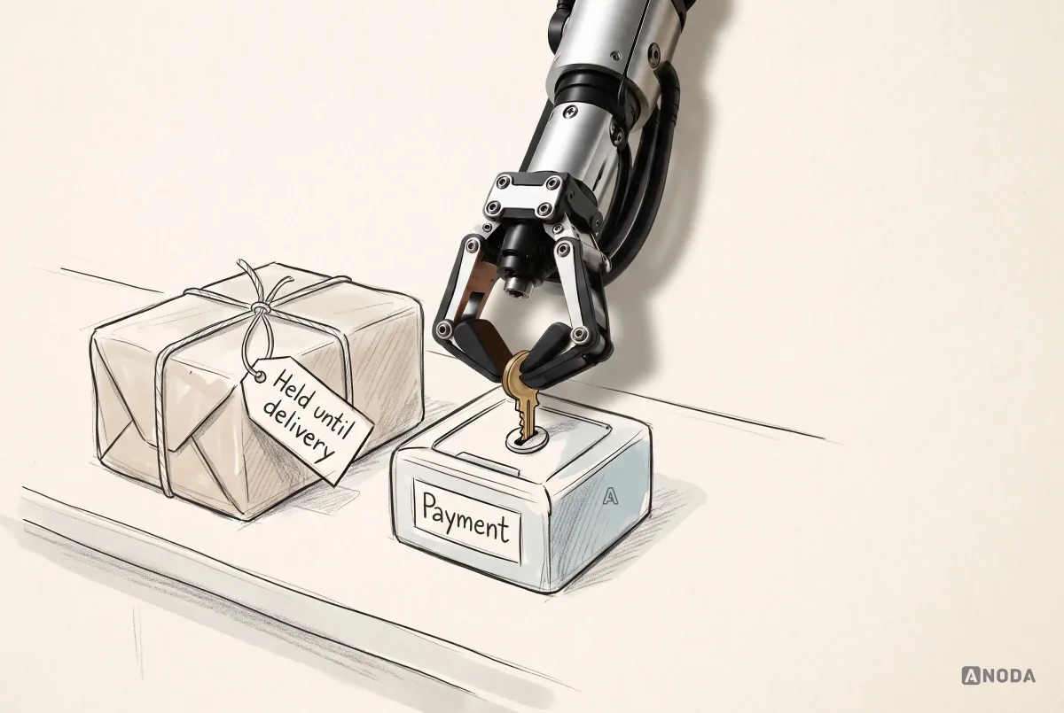
Trust comes from several sources working together:
- Verification: identity, payment methods, sometimes background checks, shown clearly without exposing private details.
- Reputation: reviews and ratings that are specific and hard to game.
- Protection: payment held until the service is delivered, deposits, insurance or guarantees, explained in plain words.
- Clear rules: cancellation, damage, refunds, what the operator will do if things go wrong.
- Responsiveness: visible response times and a real operator team when needed.
Where the payment model permits a hold, explain when funds are taken, what releases them and what happens during a dispute. Show the actual protection and its conditions; holding a payment alone does not guarantee either side is protected.
Booking and payment, seen from both sides
Checkout in a marketplace has two audiences. The buyer needs to see exactly what they pay: the price, any service fee, any deposit, taxes, and the total, before they commit. The seller needs to see what they’ll receive: the price minus the operator’s commission, and when the payout arrives.

Showing both sides clearly avoids the classic marketplace confusion: the buyer thinks the seller got the full amount, the seller thinks the buyer paid less, and both feel cheated when they compare notes. Be explicit about who pays which fee and why.
Deposits and payment holds need their own explanation: when the hold is placed, how much, when it is released and what could cause it to be kept.
Pricing, fees and who sets the price
Pricing in a marketplace has more moving parts than in a normal product. Who sets the price: the seller, the platform, or both? Is there a service fee for the buyer, a commission for the seller, or both? Are there discounts, dynamic prices, minimums?
Whatever the model, the design has to make it transparent:
- Buyers see the total before committing, with fees broken down, not added at the last step.
- Sellers see what they’ll receive before they set a price, so they can price sensibly.
- Suggested prices are labelled as suggestions, with the basis explained.
- Changes in fees are announced clearly and in advance to both sides.
Hidden or surprising fees are one of the fastest ways to lose both sides at once: buyers abandon at checkout, and sellers feel the platform is taking more than it said.
Cancellations and changes
Plans change, and every marketplace needs rules for cancellations, reschedules and changes to a booking. These rules are often the source of the most bitter disputes, because both sides lose something when a transaction falls through.
Make cancellation policies clear before booking, in plain words rather than a tier name nobody remembers. Show what happens at each point in time: full refund until this date, partial after, none after that. Let buyers and sellers request changes through the platform, with the other side able to accept or decline. And treat cancellations by sellers seriously: a buyer who is let down at the last minute rarely comes back, and the seller’s reliability should show in their profile.
Handover, delivery and fulfilment
Many marketplace transactions end in a physical handover: shipping, collection, a visit, a pick-up and return. This is where the online experience meets the real world, and where many problems start.
- Make the arrangements explicit: address, time, who brings what, contact details released at the right moment.
- Support condition checks: photos at handover protect both sides if something is disputed later.
- Send reminders before handovers, with the details people need.
- Track shipping where it applies, inside the platform rather than by copying numbers between apps.
- Handle no-shows with a clear process, not an argument in the message thread.
Payouts and seller finances
For sellers, getting paid is the moment of truth. Unclear or slow payouts drive them away faster than almost anything else.
Show each seller what they’ve earned, what’s pending and why, when the next payout will arrive, and what fees were deducted. Explain holds, for example on new accounts or while a dispute is open, and when they’ll be released. Provide statements they can use for tax and accounting. And when something goes wrong with a payout, a missing bank detail or a failed transfer, say so immediately and clearly, with the fix, rather than letting the seller discover it weeks later.
Status everyone can follow
A marketplace transaction has many steps, and different people act at each one. The booking is requested, accepted, paid, picked up, returned; the deposit is released; the payout is sent. At every step, both sides should know where things stand and who needs to do what next.

Clear status reduces the most common marketplace messages: “Did you get my request?”, “When will I be paid?”, “Has the deposit been released?”. Making the next action and its owner visible answers these questions before they turn into another support ticket.
Notifications should follow the same timeline, and tell each side only what they need: the owner needs to know about a new request; the renter needs to know it was accepted; both need a reminder before pick-up.
Messaging with guardrails
Messaging lets buyers and sellers sort out details: pick-up times, questions about the item, small changes. It also creates risks: taking payment off the platform, sharing personal details too early, harassment and scams.
Good marketplace messaging:
- Keeps booking context visible, so conversations stay tied to the transaction.
- Offers quick replies for common messages.
- Nudges gently when someone shares contact details or suggests paying outside the platform, explaining the actual payment and protection terms, including any limits on off-platform transactions.
- Makes reporting easy for abusive or suspicious messages.
- Shows response times, which sets expectations and encourages sellers to reply.

The goal is not to police every word. It is to make the safe path the easy one.
Reviews that mean something
Reviews are the memory of a marketplace. They help buyers choose and help good sellers stand out. They also degrade easily: inflated ratings where everyone gets five stars, retaliation reviews, and vague praise that says nothing.
Several design choices help:
- Two-way reviews, so both sides are accountable.
- Released at the same time, so neither side can retaliate after seeing the other’s review.
- Specific questions: condition, communication, punctuality, rather than only a star rating.
- Clear guidance on what reviews are for and what isn’t allowed.
- Operator moderation for abuse, with transparency about removals.

When things go wrong: disputes
Every marketplace will have disputes: damaged items, no-shows, items not as described, late returns. How they are handled decides whether both sides stay.
A good dispute flow:
- Starts from the booking itself, with a clear “report a problem” option.
- Collects evidence at the right moment: photos, messages, times.
- Gives the other side a chance to respond.
- Shows the status and timeline at every step.
- Explains the outcome and what happens to the deposit or payment.
- Offers a human for anything the rules don’t cover.

Prevention helps too. Photos at pick-up and return, clear condition descriptions and reminders of the rules before the transaction reduce disputes before they start.
Operator tools: the invisible third product
Behind every marketplace is an operator team: verifying users, reviewing listings, handling disputes, managing payouts, responding to support and fighting fraud. Their tools are often an afterthought, and it shows in slow resolutions, inconsistent decisions and a team that can’t scale.
Operator tools need their own design: queues, clear case views with all the context in one place, actions with the right permissions, records of every decision, and reporting. When the operator team is efficient and consistent, both sides of the marketplace feel it as fairness and speed. When it isn’t, they feel it as silence.
Fraud and safety
Where money and strangers meet, fraud follows: fake listings, stolen payment details, fake reviews, scams that move conversations and payments off the platform. Safety issues, harassment, unsafe meetings, damaged property, need attention too.
The design response combines prevention and response. Verification at the right moments, payment on the platform, holds on payouts for new sellers, limits on new accounts, and clear warnings about common scams all reduce risk. Easy reporting, fast operator review and visible consequences for bad actors make both sides feel protected. The balance matters: too much friction drives away legitimate users, too little lets fraud spread. Tie the friction to risk, just as a bank would.
Web or mobile for each side
Different sides of a marketplace often use it in different ways. Buyers might browse on phones in spare moments. Sellers with many listings might manage them on a laptop. Service providers might need a mobile app to accept jobs on the move. Operators almost always work at desks.
Choose platforms for each side based on how they actually work. A mobile app for buyers and providers with a web dashboard for sellers and operators is a common, sensible split. Building every feature for every side on every platform is how marketplace budgets disappear.
Research with two sides
Research for a marketplace has to include every side, because a change that helps one can hurt another. A lower cancellation fee pleases buyers and costs sellers; more photos on listings help buyers and burden sellers.
Talk to buyers, sellers and the operator team separately, then together look at the transaction from each angle. Test the critical flows with both sides: a buyer booking and a seller receiving that booking, in the same study where possible. Watch the operator team handle a real dispute. The insight usually lies in the gaps between the sides, not within any one of them.
AI in marketplaces, with boundaries
AI is increasingly used in marketplaces: matching buyers with listings, suggesting prices, writing listing descriptions from photos, translating messages, flagging fraud, summarising reviews. Used well, it removes effort for both sides. Used carelessly, it produces generic listings, misleading suggestions and decisions nobody can explain.
Keep a few boundaries. Let sellers review and edit anything AI writes for them, because the listing is their promise to buyers. Label AI-generated summaries and suggestions as such. Make automated decisions that affect people, like blocking an account or holding a payout, explainable and open to appeal by a human. And don’t let AI matching quietly favour the platform’s interests over what the buyer searched for.
Accessibility and inclusion
A marketplace only reaches its full market if everyone can use it. That includes buyers and sellers using screen readers, larger text or keyboard navigation, people with limited digital confidence, and people using the product in a second language.
Pay particular attention to the areas where marketplaces are complex: filters and date pickers, image-heavy listings that need alternative text, messaging, maps and payment flows. Sellers need accessible tools too; a listing form that only works with a mouse excludes people who could be excellent providers. Accessible marketplace components remove barriers in buyer and seller journeys. Test both journeys to find where people still cannot complete the exchange.
Notifications for both sides
Notifications keep a marketplace moving: a new request for a seller, an acceptance for a buyer, a reminder before a handover, a payout confirmation, a review request. They also become noise quickly if every event triggers a message.
Send each side what they need to act, when they need it, through the channel they chose. Sellers often need timely alerts for new requests, because response time affects bookings. Buyers need confirmation and reminders. Both need to control what they receive. And every notification should lead straight to the relevant booking or message, not to a home screen where they have to search for it.
What to measure
Marketplaces need metrics for both sides and for the balance between them. Conversion alone doesn’t tell you whether the marketplace is healthy.
- Search-to-booking rate: how often a search leads to a transaction.
- Share of searches with results: a direct signal of supply gaps.
- Seller acceptance rate and response time.
- Time to first booking for new listings: whether new supply gets demand.
- Repeat buyers and repeat sellers: whether people come back.
- Dispute and cancellation rates: trust and quality signals.
- Supply and demand by area or category: where the marketplace is thin.

Read the metrics together. High search volume with few results means supply is the bottleneck. Many listings with few bookings means demand, pricing or listing quality is the problem. Rising disputes mean trust is eroding somewhere in the transaction.
Repeat use: the second transaction
The first transaction proves the marketplace works. The second proves it is worth coming back to. Many teams pour effort into the first visit and then send returning buyers to the same generic home page.
Returning people need shortcuts: book again with the same seller, reorder, see saved searches and favourites, pick up an unfinished listing, return to a conversation. Sellers need the same: a quick way to renew a listing, repeat last season’s availability, or reply with a saved answer. Make the second transaction faster than the first, and watch whether it happens. Repeat rate on both sides tells you more about the marketplace’s health than any spike in new sign-ups.
Policies written for people
Every marketplace runs on rules: what can be listed, cancellation terms, damage, refunds, fees, reviews, account suspensions. Usually they live in long terms of service nobody reads, until a dispute, when both sides discover rules they never knew existed.
Put the rules that matter where they apply, in plain words: the cancellation terms on the listing and the checkout, the damage rules at pick-up, the review guidelines in the review form, the reasons for a payout hold on the payout screen. Keep the full legal text, but don’t make it the only place people can learn what will happen to them. A rule that surprises someone in a dispute feels unfair even when it is written down.
Going into new markets
Expanding a marketplace to new cities or countries is not only translation. Supply has to be seeded again, locally. Payment methods, currencies, taxes, regulations, addresses, phone formats and trust signals differ. What counts as a reasonable cancellation policy or a normal response time varies by culture and category.
Design for local variation in the model, not only in the language: prices and fees per market, local payment options, local verification, local categories. And launch each new market with the same discipline as the first: narrow supply, a clear critical exchange, and close attention to the metrics for both sides.
How priorities change as a marketplace grows
A marketplace’s UX priorities shift with its maturity.
At launch, everything serves the critical exchange: easy listing creation, useful search on thin supply, clear pricing and trust, and a simple way to handle problems, often manually.
While growing, the focus moves to efficiency and quality: better seller tools, smarter search, stronger reviews, faster dispute handling, and operator tools that let a small team keep up.
At scale, the marketplace needs personalisation, fraud prevention, more categories and markets, and governance for policies and rules. The risk here is complexity: features added for each segment until nobody can find anything.
At every stage, keep asking which side is struggling and what would help them complete the next transaction.
Common marketplace UX mistakes
- Designing only for buyers and treating sellers and operators as an afterthought.
- Launching wide instead of seeding supply narrowly.
- Empty search results with no alternatives.
- Hidden fees that appear at checkout.
- Unclear rules for cancellation, deposits and damage.
- Messaging without guardrails, leading payments off the platform.
- Reviews that inflate until they mean nothing.
- Disputes handled by email with no status or timeline.
- Copying a competitor’s flows without their supply, demand and operating model.
How we approach marketplace design
When we work on a marketplace, we start with the critical exchange and map every side around it: buyers, sellers and the operator team. We design the shared objects, listings, bookings, payments, messages, reviews and disputes, and the role-specific views of each, while keeping the product’s own value proposition visible rather than borrowing someone else’s. We test the highest-risk flows with both sides and design the operator tools alongside the customer-facing ones.
If your marketplace is still being shaped, product discovery helps validate the value exchange and which side comes first. If you need evidence from buyers, sellers or operators, UX research resolves competing needs. If a live marketplace is losing people, a UX audit finds which side, state or handoff is breaking the transaction. And for the full design, our marketplace design team takes it from model to interface. You can also talk to us about your marketplace model and its riskiest flow.
The decision rule
Before you design or redesign a marketplace, answer these in order:
- What is the critical exchange that proves the marketplace works?
- Which side has to reach value first, and how will you seed it?
- Can buyers find something useful even when supply is thin?
- Do listings answer every question that would stop a buyer?
- Is it easy for sellers to list and manage their supply?
- Is every cost, fee, deposit and payout clear to both sides?
- Can everyone follow the status of a transaction?
- Are trust, reviews and disputes designed, not improvised?
- Do your metrics show the balance between both sides?
Map both sides, identify the critical exchange, expose trust and status, and measure the path from discovery to a completed transaction. A marketplace isn’t one product with two audiences. It’s several products that have to succeed together.

Marketplace design
Two sides, one transaction, and both need to trust it.
We map buyers, sellers and operators around your critical exchange and design the journeys, trust and status that get both sides to a completed transaction.
Frequently asked questions
Which marketplace journey should you design first?
Start with the critical exchange and the side that must reach value first. Trace discovery, commitment, delivery, confirmation and payout across buyer, seller and operator roles.
How should marketplace trust be communicated?
Explain verification, payment timing, dispute handling and the protection actually provided. Show conditions and exceptions at the decision where they matter.
Can one interface serve every marketplace role?
Share a consistent transaction or campaign model while giving each role the information and actions needed for its own work. Operators also need tools for exceptions.
Written by