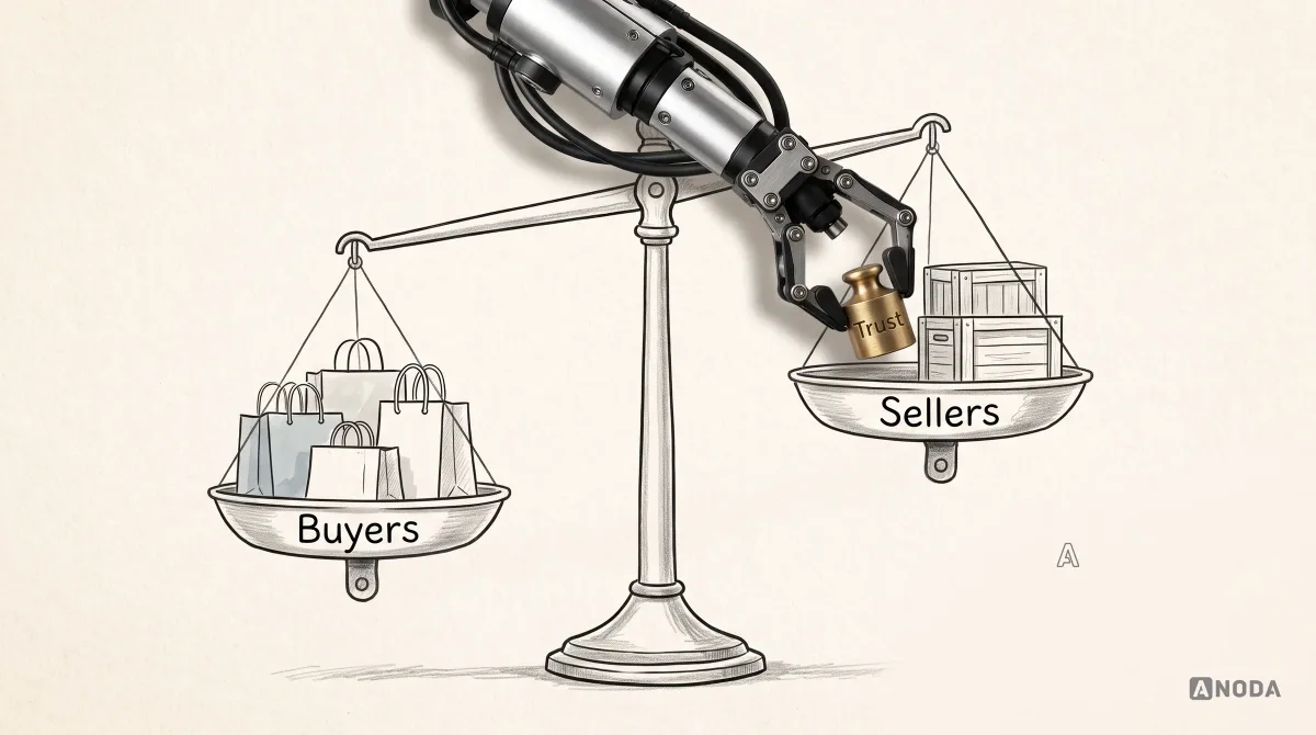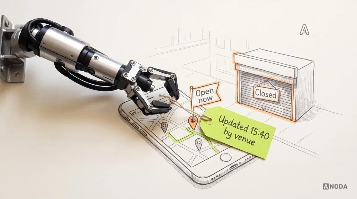
In short
A restaurant discovery app lives or dies on one question: is what it says about this venue still true? Guests decide on hours, location, photos and reviews long before any booking or order, and venue teams are responsible for keeping their facts current. Design both sides around the same listing: open, closed and unknown states with a source and an update time, clear edit rights, honest review states and a saved venue that explains what changed.
In this article
- Discovery is the job before the transaction
- The example we will follow
- Maps and filters: open, closed and “we don’t know”
- The venue page: one place, every source labelled
- Owner edits: who may change the hours, and how guests find out
- Reviews, replies and ratings are not a safety certificate
- The saved venue, reopened: what changed and what to do next
- Test both roles, and the failures that matter
- What we did on Glimix, and what this example is not
- The decision rule
Guest discovery and owner edits should share one listing, and every fact on it should say where it came from and when. The map and filters show open, closed and “we don’t know” as three different states. The venue page names the source of its hours, photos and menu. The owner side decides who may change the hours and how a guest sees that they changed. Reviews show whether they are pending, published or answered. And a venue the guest saved earlier explains what changed since, with a next step. Booking and ordering come later, and belong to their own flows.
A restaurant app that says “Open now” about a place that closed an hour ago is not a discovery product. It is a very confident liar with a map.
The guest drives across town, finds the shutters down, leaves a one-star review for a venue that did nothing wrong and stops trusting your pins. You paid to acquire that guest. You paid again in the owner’s patience. Nobody files a bug report for this. They just open a different app next Friday.
Discovery is the job before the transaction
Venue discovery answers one question: is this place worth the trip right now, or on the evening I have in mind? It is not delivery, not ordering, not kitchen operations and not booking mechanics. Those start after the guest has chosen, and each has its own owner and rules.
Mixing them up is how discovery gets neglected. A library catalogue has one job: tell you whether the book exists, where it is and whether it is on the shelf. The checkout desk is a separate job. If the catalogue says “on shelf” and the book has been out since March, the nicest checkout desk in the world will not win that reader back.
The listing is your catalogue: location, hours, photos, menu, reviews. Guests read it in a hurry. Owners maintain it between everything else they do. Serve only one of them and the listing rots: guests stop believing it, owners stop updating it, and each blames the other.
If your product is a broader exchange with payments, seller tools and disputes, our marketplace UX guide covers that ground. This article stays with the step before any transaction.
The example we will follow
One illustrative sequence runs through the rest of this article. The venue, the times and every rule in it are invented to show the mechanics. They are not client data and not a description of any delivered product.
It is Friday. At 13:00 a guest filters the map to venues open tonight near them, with “Include unconfirmed hours” switched on, finds a small bistro listed as open until 23:00 and saves it. The 23:00 comes from last season’s hours, which nobody has touched in months. At 15:40 the owner learns the venue will close early tonight and changes the closing time to 21:00. At 20:15 the guest reopens the saved venue, ready to leave.
What the guest saw at 13:00, what the owner could change at 15:40 and what the guest sees at 20:15 decide how that evening ends.
Maps and filters: open, closed and “we don’t know”
Most discovery screens offer two states: open and closed. Reality offers at least three. The third one, “we don’t know”, is where the money leaks.
A fuel gauge stuck on full is worse than no gauge at all. Without a gauge you would at least check. A green “Open now” badge built on hours nobody has confirmed in months is that gauge: it removes the doubt the guest should still have.
So the map needs states the guest can tell apart at a glance, each with a source and an age:
| State | What the guest sees | What the pin and filter do (illustrative rule) |
|---|---|---|
| Open, confirmed | “Open until 21:00 · updated by the venue today” | Full pin, included in “Open now” |
| Open, not recently confirmed | “Usually open until 23:00 · hours not confirmed since May” | Muted pin; included only if the guest turns on “Include unconfirmed hours” |
| Closed | “Closed · opens tomorrow at 12:00” | Hollow pin, excluded from “Open now” |
| Unknown | “Hours not available” | Neutral pin, never counted as open |
The “not recently confirmed” threshold is a policy decision the client owns: thirty days and a season are both defensible examples. Pretending the question does not exist is not.
In our example, the honest 13:00 card says “usually open until 23:00” and “last confirmed months ago”. The guest may still save it, now with their eyes open.
Two practical details. First, filters must say what they assume: if “Open now” quietly includes unconfirmed hours, the filter itself is the liar. Second, location precision varies. Both iOS and Android let people share an approximate location instead of a precise one, so “near you” can mean a few streets or a whole district. Let the map work from a searched area, not only from a blue dot.
The venue page: one place, every source labelled
A museum would never hang a painting without a label saying what it is, who made it and where it came from. Most venue pages hang twenty facts with no label at all.
Owner hours, guest photos, a menu file from two summers ago: on screen they all look equally official. The guest cannot tell a fact from an opinion from an archaeological find.
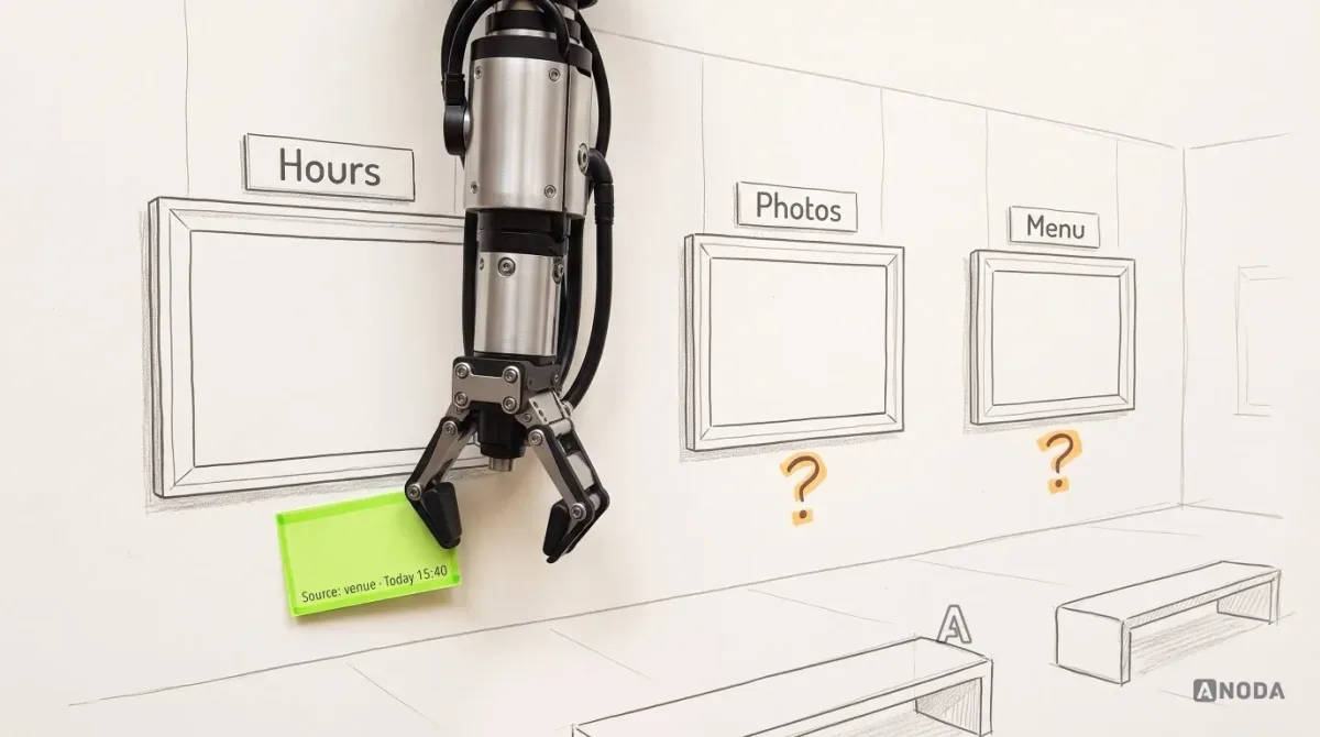
For each block on the venue page, decide what the source can establish:
- Hours: set by the venue, with the last update time. A guest can suggest a correction, and the suggestion stays a suggestion until the venue or the platform’s moderation team confirms it.
- Photos: label venue photos and guest photos separately, with dates. A guest photo from last year shows what the place looked like last year, nothing more.
- Menu: show when it was uploaded and by whom, so an old file is not mistaken for tonight’s menu.
- Location and entrance: owner-confirmed. “Entrance from the courtyard” saves more evenings than any photo carousel.
Then protect the selection. The guest picked this venue out of thirty. After a phone call, a message to a friend or a lost signal on the tram, they should land on the same venue, tab and filters. An app that drops them on a fresh map throws away the work the guest just did.
Owner edits: who may change the hours, and how guests find out
The owner is the only person who knows tonight’s closing time. If updating it is a chore, the listing goes stale, and every flaw above comes back.
A garage keeps a service book: every job stamped, dated, with the name of whoever did it. When you buy the car, the service book is what you trust, not the shine on the bonnet. A listing needs the same thing: an edit history that is short, honest and partly visible to guests.
Start with who may change what. The table below is an illustrative starting point. The client owns the actual field and policy rules, which depend on how their venues are run.
| Field | Owner | Manager | Staff | Guest |
|---|---|---|---|---|
| Regular weekly hours | Edit | Edit | Read only | Suggest a correction |
| Today’s special hours | Edit | Edit | Edit, if the owner allows it | Suggest a correction |
| Address and entrance | Edit | Read only | Read only | Suggest a correction |
| Venue photos | Edit | Edit | Upload for approval | Add guest photos |
| Reply to reviews | Yes | Yes | No | No |
A common mistake on the owner side is subtle. An owner who needs to close early tonight edits the regular weekly hours, because that is the only field the editor offers. Next Friday the listing says the bistro closes at 21:00 again, and nobody remembers why. The fix is a separate “today only” or “special date” change that expires by itself, offered right next to the regular hours, so the quick edit is also the correct one.
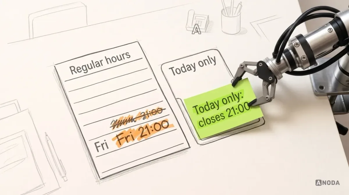
Guests should see that something changed without reading the whole service book. In our example, from 15:40 the venue page says: “Closing time changed today: now 21:00 (usually 23:00). Updated by the venue at 15:40.” That line does more for trust than any badge: it shows someone is looking after the listing.
Make that edit doable standing at the bar: venue, “Today’s hours”, time, confirm. If it needs a laptop and a login, it won’t happen, and the guest finds out at the shutters.
Mobile app design
Two roles, one listing, both on a phone?
We design guest and owner flows that share the same data without making either side feel like an afterthought.
Reviews, replies and ratings are not a safety certificate
Reviews are where guests and owners meet in public, and where state confusion hurts most.
Three states need to look different. In our example, all three are illustrative and the client’s moderation policy decides the details:
- Pending review: written, not yet published. Its author sees “Under review, only you can see this”. Nobody else sees it, and it does not move the rating.
- Published review: public, dated, counted in the rating.
- Owner reply: attached to one published review, labelled as the venue’s reply, dated.
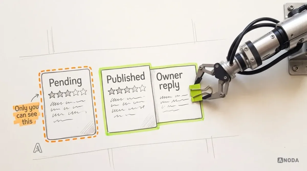
A guest whose review vanishes into “pending” without explanation assumes censorship. And when a review complaining about closed shutters at 22:00 lands on the bistro, the owner needs to answer it in the same place they fix the hours: “We changed our hours this afternoon. Sorry you missed us.” That reply only helps if the guest reading it can also see the update time on the hours.
Then the elephant in the room: a rating is not a verification. A 4.8 tells you people enjoyed their evening. It does not tell you the kitchen passed an inspection, that the allergen information is right or that the venue is safe for anyone with specific needs. A five-star rating is the paint job, not the roadworthiness certificate. Don’t blur the two with shields or “trusted” badges the product cannot back up. A real verification process gets its own label saying what it checked.
The saved venue, reopened: what changed and what to do next
Back to 20:15. The guest reopens the bistro they saved at 13:00.
A garage service book earns trust because every entry says what changed and when. A saved venue that silently shows new hours is a service book with the stamps torn out. The guest remembers 23:00, sees 21:00 and wonders which is the mistake.
The illustrative 20:15 screen does four things, top to bottom:
- Shows the change first: “Closes at 21:00 tonight, earlier than when you saved it. Updated by the venue at 15:40.”
- Gives the consequence in the guest’s terms: “45 minutes left.”
- Offers the next action that fits: directions if 45 minutes is enough, or “Similar places open later nearby” if it is not.
- Keeps the trust context in view: the newest published review and the owner’s reply to it, so the guest can see how the venue answers complaints.
If the venue takes reservations, the screen can offer “Book a table”. That button hands the guest over to the booking flow, which belongs to whoever owns availability, deposits and cancellation rules. Discovery should pass along the selected venue, date and party size, then step aside. Building booking logic into the venue card is how a discovery app ends up with two sources of truth about the same evening. If that next stage is your problem too, start with booking app design as its own job.
A saved venue that changes silently can teach the guest that saving is pointless, and a guest who stops saving has fewer reasons to come back.
Test both roles, and the failures that matter
A car inspected only on the showroom floor tells you about the showroom. Discovery has to be tested where it breaks: in time, between roles and with permissions.
Run the connected sequence with participants from both sides, not two separate studies: the interesting failures happen between them. An illustrative test plan:
| Scenario | Role | What to check |
|---|---|---|
| Hours change while the venue page is open | Guest | The change appears, with its time, without the guest losing their place |
| Hours not confirmed for a long time | Guest | The muted state is noticed and understood; “Open now” does not include it silently |
| Early closing for one day | Owner | The owner finds “today only” without help, and next week’s hours stay intact |
| Staff member tries to change regular hours | Staff | A clear “ask the owner” message instead of a dead button or a vague error |
| Review pending, then published, then answered | Guest, owner | Each party understands what the other can see at every step |
| Approximate location only | Guest | “Near you” still works by searched area; distances are not presented as exact |
What this testing proves is that people understand the states and can act on them. It does not prove more visits, more bookings or a verified listing, and nobody should report it as if it did. Those are measured after launch, not in a prototype.
What we did on Glimix, and what this example is not
On Glimix, ANODA redesigned a two-sided hospitality discovery product for diners and venue owners. The work covered domain and competitor research, information architecture and user flows for both roles, venue profiles, maps and filters, review journeys including owner responses to reviews, venue-owner analytics and visitor views, a new brand identity, landing page design, clickable prototypes and a UI kit, handed over to the client’s developers.
That was design work. ANODA did not develop the app or any of its web surfaces, and nothing above says how Glimix behaves today. The stale-hours sequence in this article is an illustrative example written for this guide. It is not a delivered Glimix flow, and the edit rights, thresholds and review states are placeholders for rules a client would set. The case shows the two-role foundation this kind of work starts from: how we designed Glimix for diners and venue owners.
The decision rule
Before you add another filter, another badge or a booking button to the venue card, answer these about one venue on one evening:
- Can a guest tell open, closed and unknown apart on the map, and see who said so and when?
- Can the owner change tonight’s hours from a phone, between two other jobs, without breaking next week’s?
- Do you know which roles may change which fields, and what a guest sees when they do?
- Are pending reviews, published reviews and owner replies three visibly different things?
- Does a saved venue explain what changed since it was saved, and offer a next step?
If any answer is “not really”, the problem is not the map. It is the listing, and both of the people who depend on it. A discovery app with gorgeous pins on top of stale facts spends its marketing budget sending guests to closed doors.

Foodtech product design
Your guests trust the listing until the first closed door
Bring us the guest journey, the owner side and the facts that keep going stale. We will map who owns each one and design both roles around the same listing.
Written by