
Venue discovery app, both sides of the table
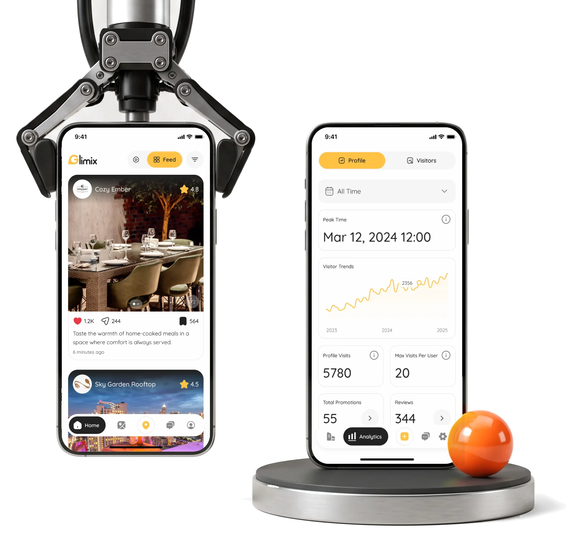
Glimix is a hospitality app for diners and venue owners.We redesigned it, designed its AI assistant and receipt scanner, and gave it a brand.
- 200+
- screens for two roles: the diner and the venue owner
- 300h+
- of design from the first audit to the handoff
- 5
- experts in one pod, design and brand together
- Brand
- from scratch the logo, a brand book and a landing page
Project summary
We redesigned Glimix’s hospitality app to connect diners’ discovery and visits with the venue team’s posts, promotions and reporting. The mobile app for both roles includes designed AI-assistant and receipt-scanning journeys. We also designed the Creator Platform, Admin Portal and a new brand with its landing page and store assets, handing the connected product to the client’s developers.
What a night out asks of the app
Both sides meet at the same venue. The diner’s path through the app, then what the venue answers with:
-
Discover
- Feed and live photos
- Filters
- Map and search
-
Decide
- Venue page
- Ratings
- Who is there now
-
Visit
- Check-in
- Camera
- Receipt
-
Share
- Rating and review
- Chat
- Loyalty rewards
-
Ask
- AI assistant
- Voice
- Past chats
-
Run the venue
- Posts and promotions
- Review replies
- Analytics
- Familiar and Distinctive
- An app people already know how to use, with a look they remember among the other discovery apps.
- Diners and Venues
- One product language, and neither side treated as the guest of the other.
- Social posting and Business rules
- Posting has to feel like a social app while the schedule and the limits stay exact.
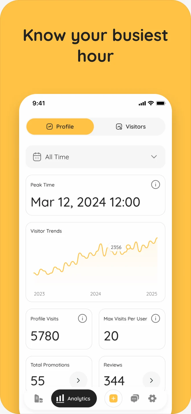
The venue’s numbers, in a reading order
- Found
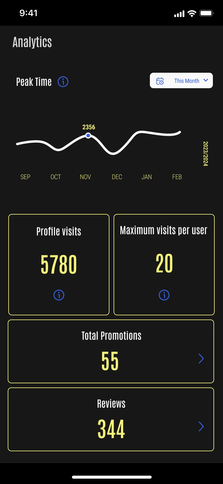
- Every figure sat in the same outlined box on a dark screen, and check-ins and reviews had no place of their own.
- Decided
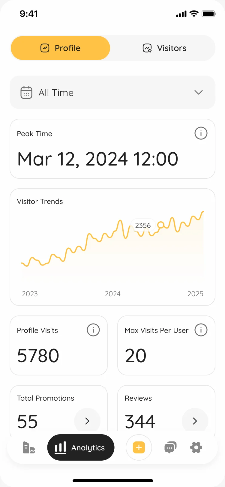
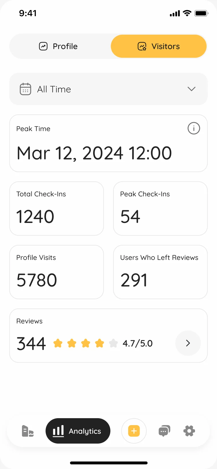
- One order down the screen: the period, the peak time as a plain date and hour, the visitor trend, then the counts, with promotions and reviews a tap deeper. Visitors got their own tab.
- For the user
- A manager checks the app between services and sees when the place is busiest, whether visits are growing and what to open next.
- In the way
- Light on dark in a condensed face, every number in an identical box: the eye had nowhere to start.
-
When
Profile or visitors, and the period every figure below follows.
-
The peak
The busiest hour as a date and a time, not a point on a line.
-
The trend
Visits over time, with the high point marked.
-
The counts
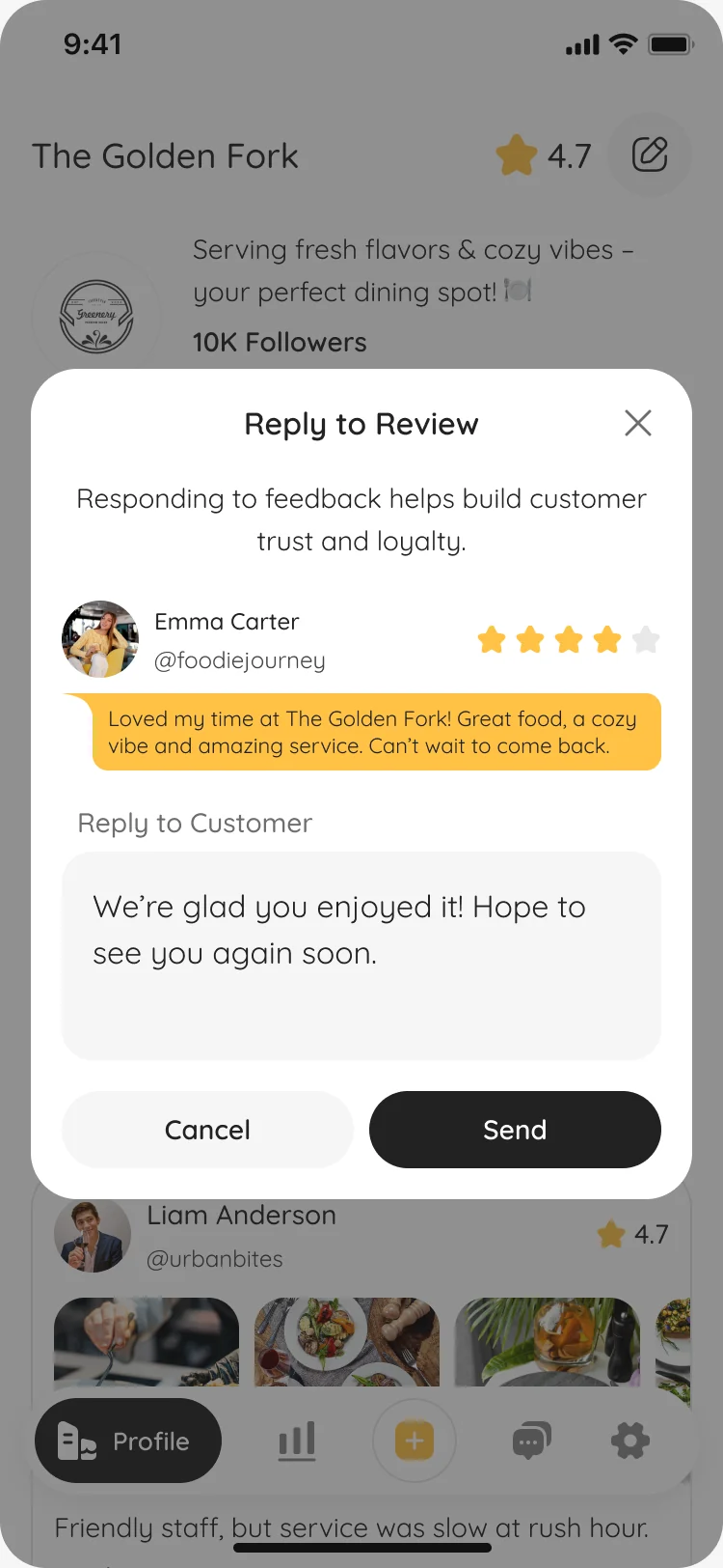
Visits, repeat visits, promotions and reviews; each explains itself, the last two open their lists.
How the work progressed
From the app the client came with to a brand, a system and a handoff, one question closed at a time.
-
Discovery
Where the existing app lost people, and what other discovery apps had already taught them to expect
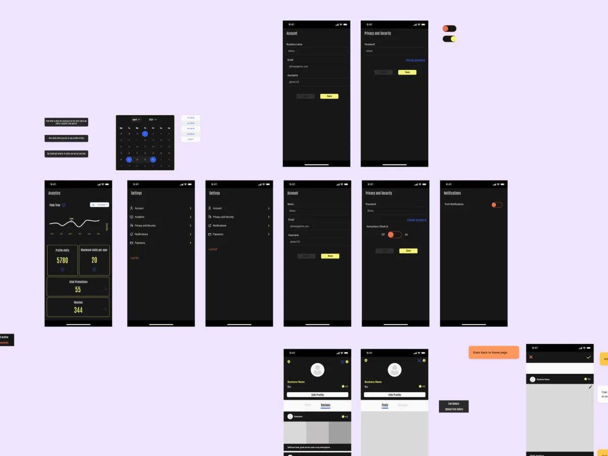
Artifact Competitor research and an audit of the app’s screens, role by role
-
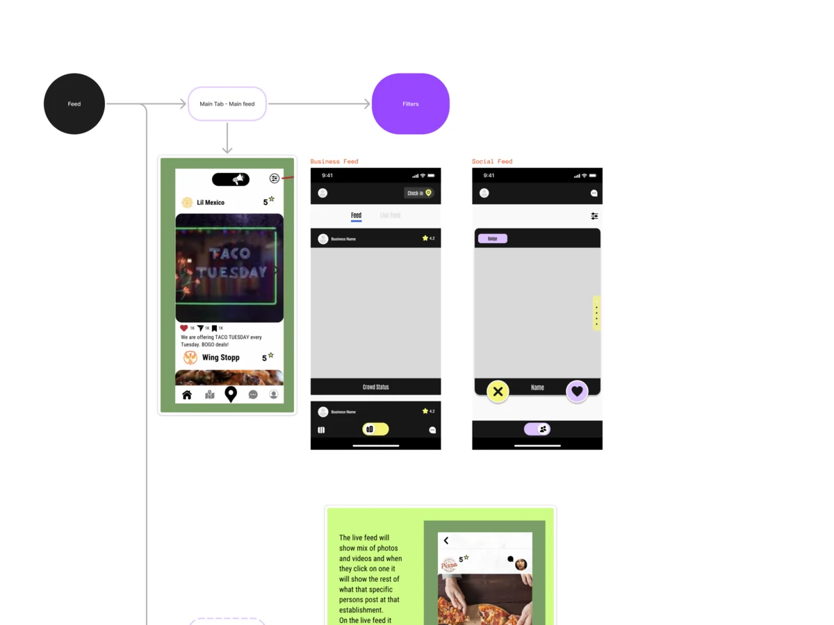
User Flow
What each role does from start to finish, including the ways in the app was missing
Artifact Information architecture and flows for diners and venues
-
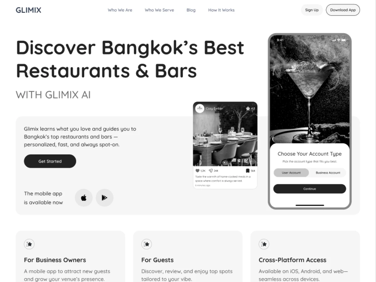
Wireframes
What goes on each screen, before colour and photos could hide a problem
Artifact Wireframes and clickable prototypes for both roles
-
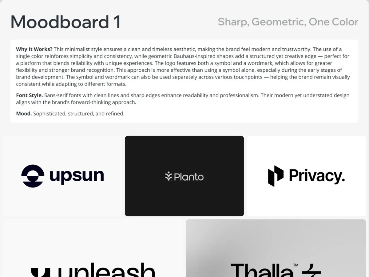
Branding & Logo
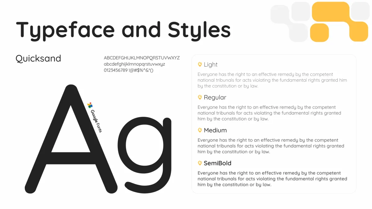
A face for the product: the mark, colour, type and imagery rules
Artifact Logo concepts, the chosen mark and a full brand book
-
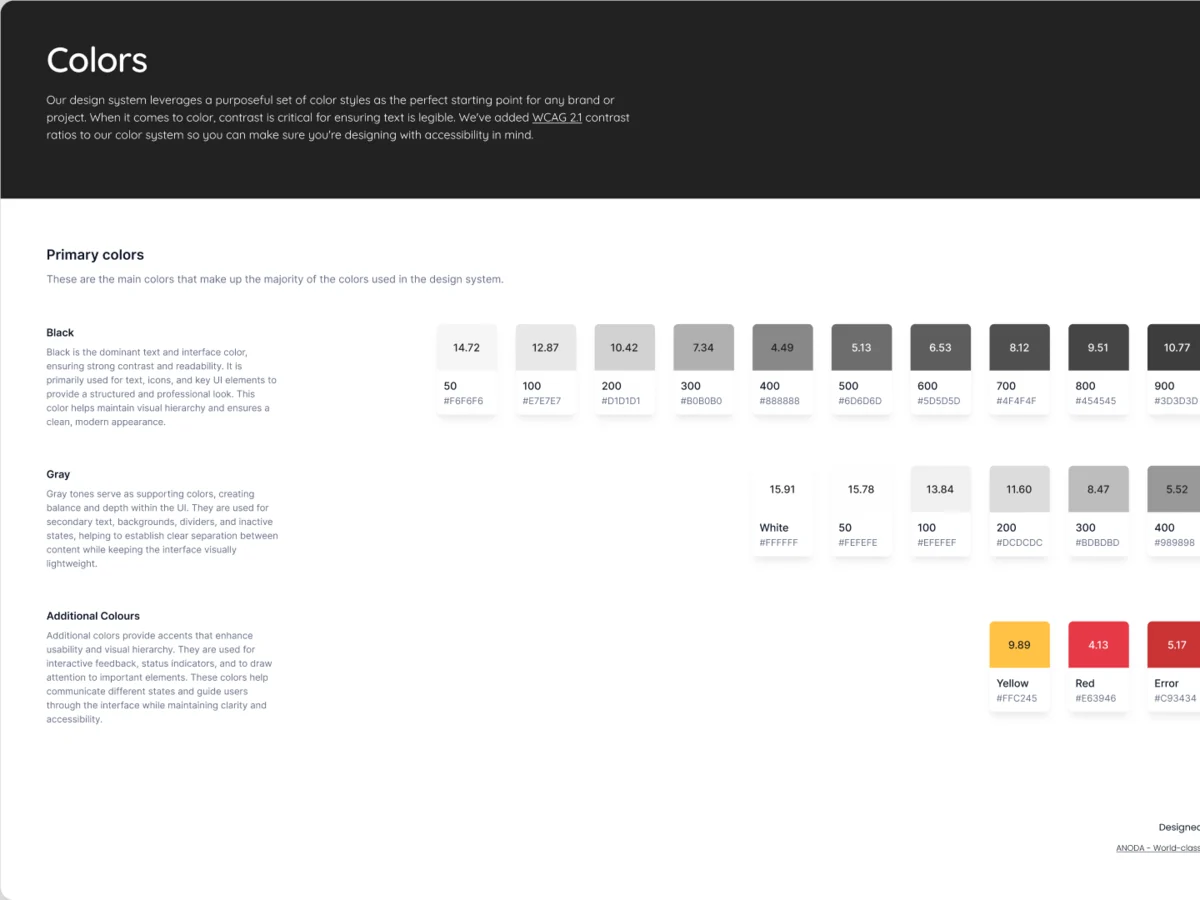
UI & Design System
One interface for both roles, in light and dark on the phone
Artifact The final UI with its states, and a UI kit
-
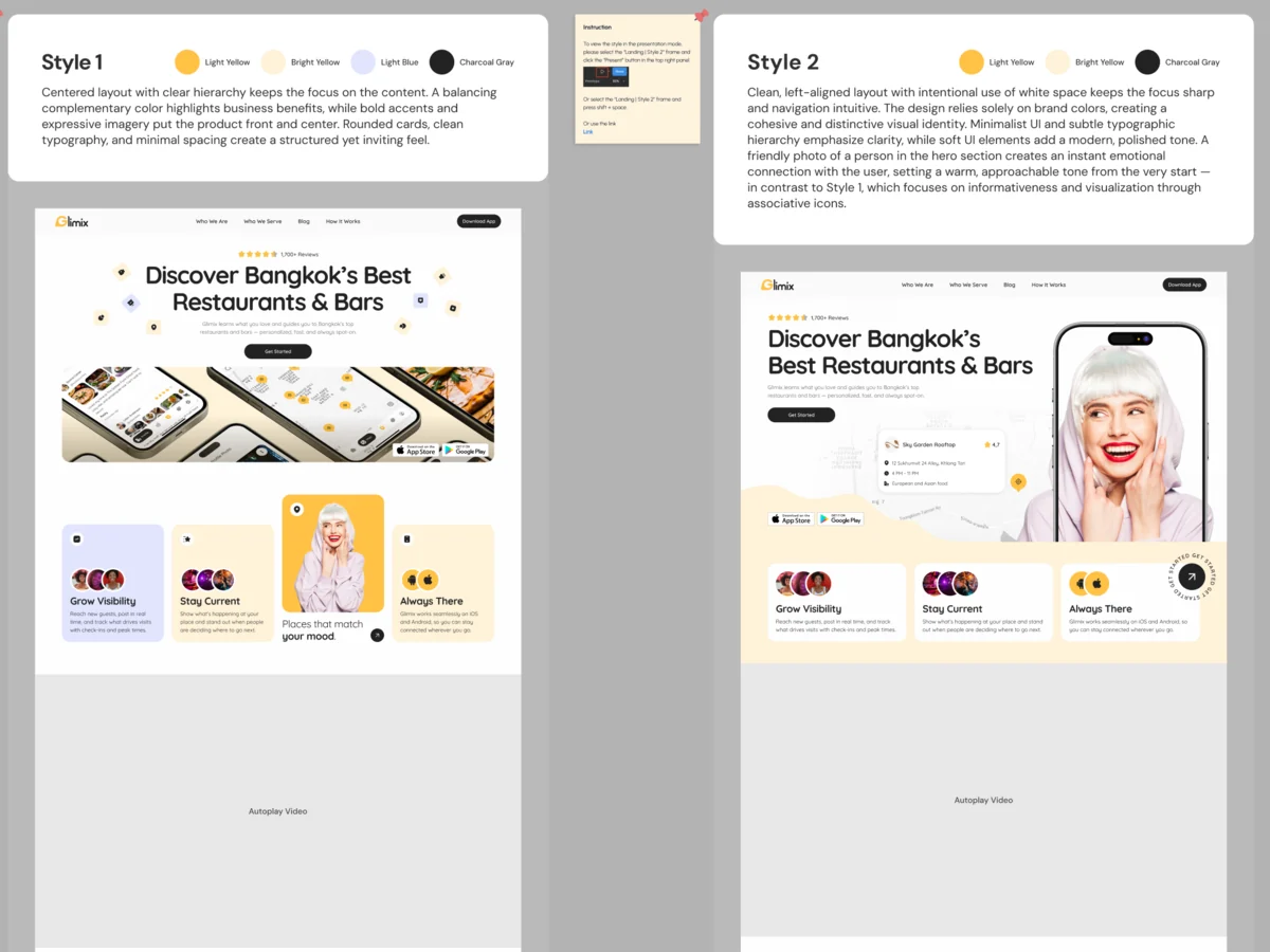
Landing & Adaptives
How the product explains itself to diners and to venues before either downloads it
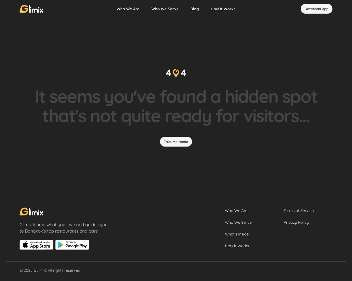
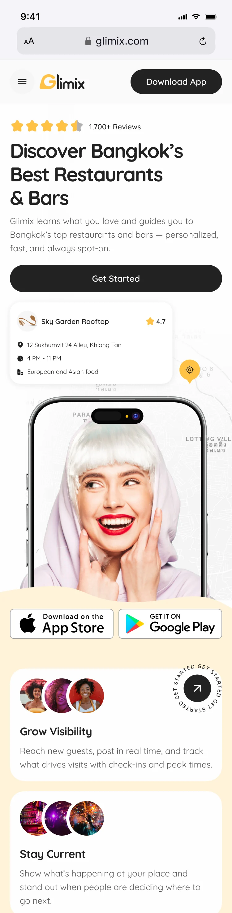
Artifact The landing page at desktop, tablet and mobile sizes, and its 404
-
Delivery
What the client’s developers needed to build it without guessing
Artifact Prototypes for both roles, the UI kit and an organised file
Two roles, mapped before they were drawn
- Found
- Sign-up and recovery had gaps for both roles, and a venue’s analytics sat inside its settings.
- Decided
- Every flow was mapped end to end first. Each role got its own tab bar in the same shell, with its main action in the middle.
-
Diner sign-up and login
Onboarding, sign-up, login and a two-step password reset, every branch drawn, social logins included.
Open the full map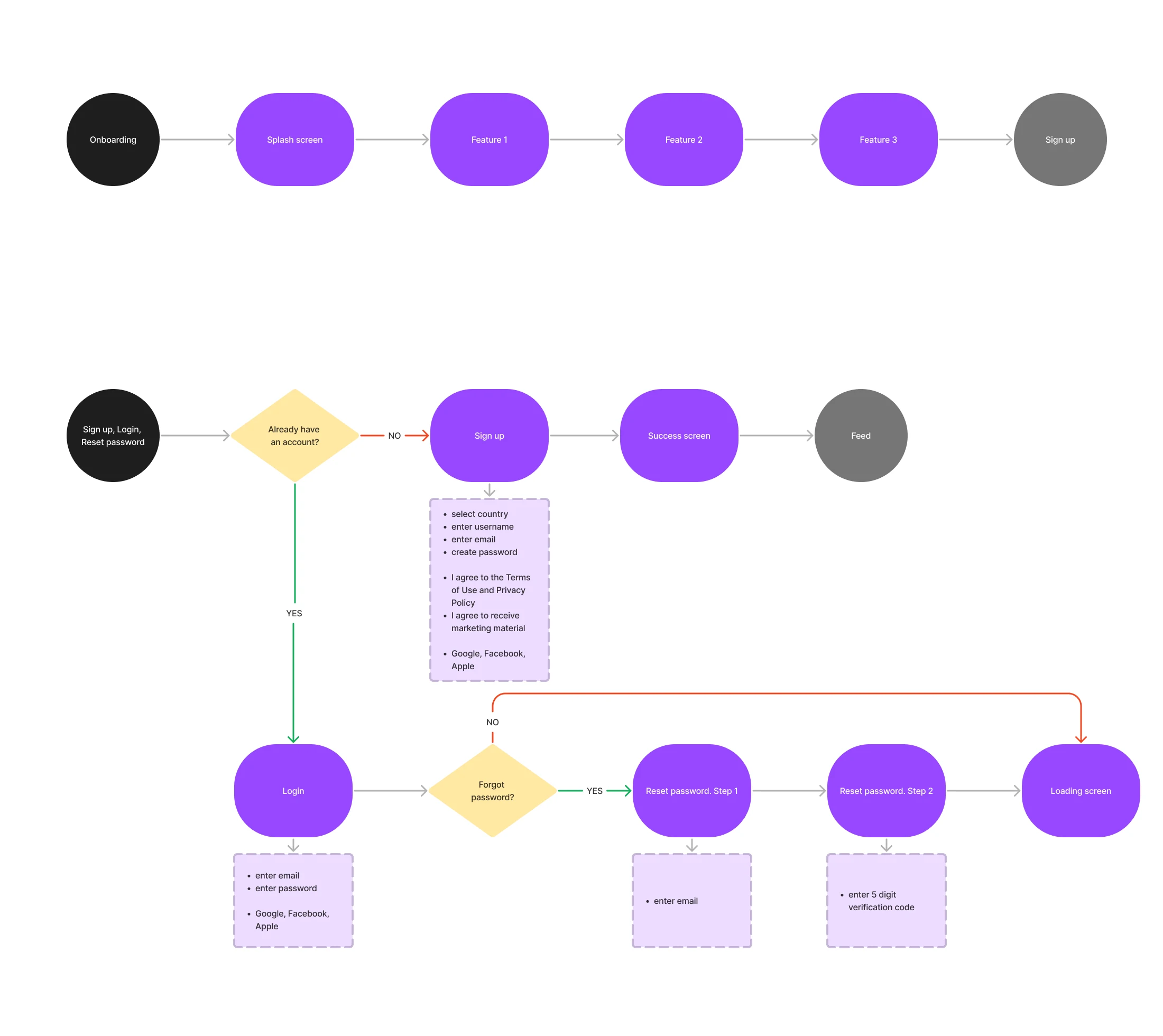
-
The venue’s profile and settings
The venue side mapped on the app the client came with, marking what each screen had to gain, from opening hours to a menu upload.
Open the full map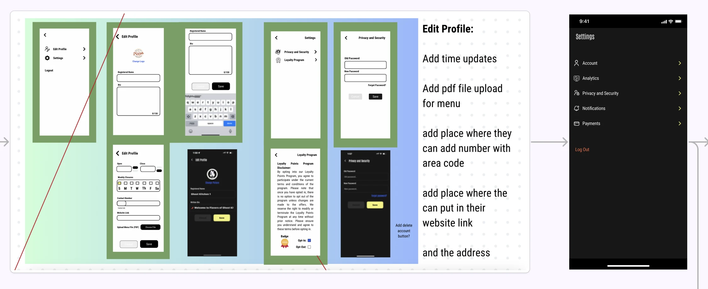
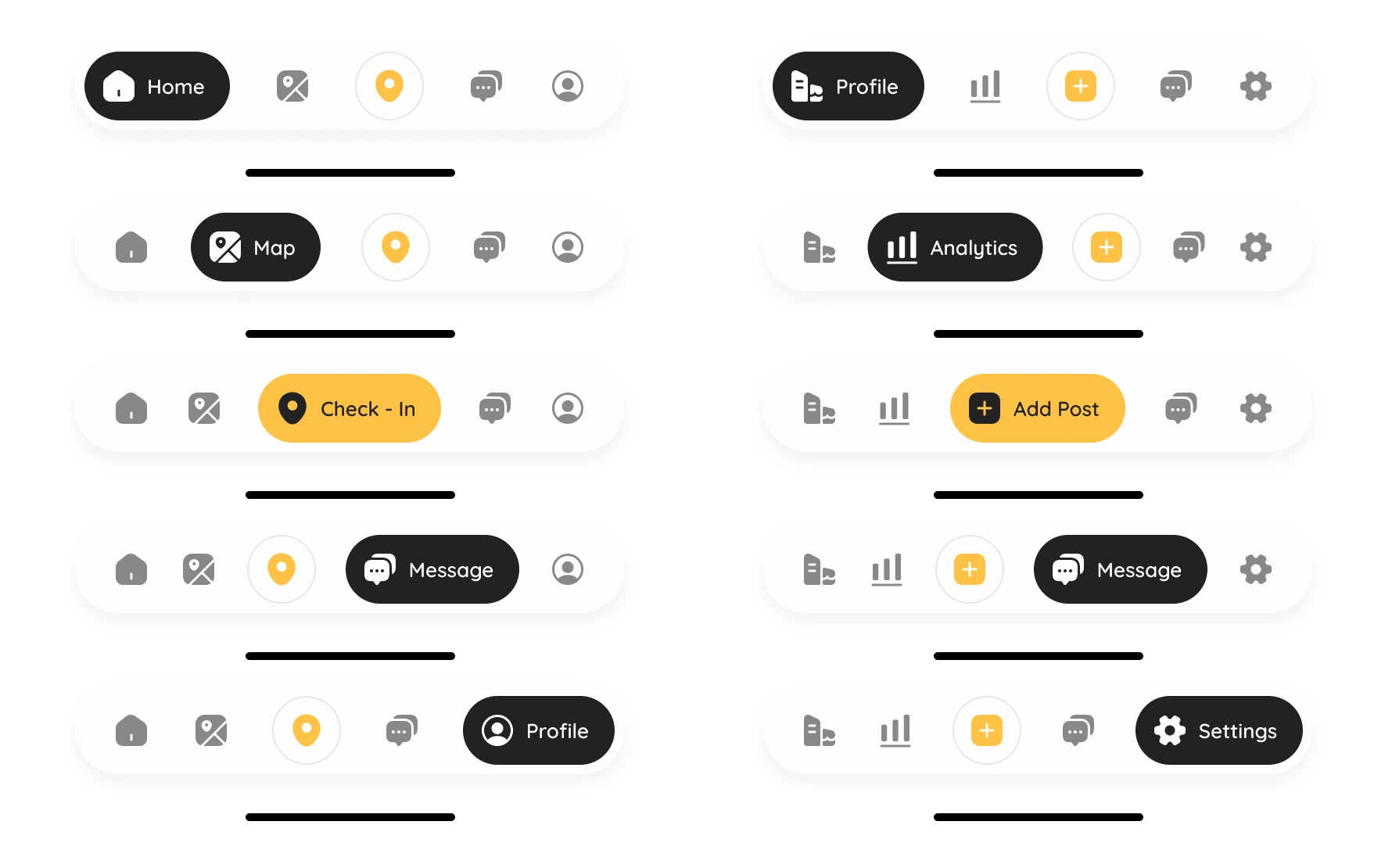
Five jobs the app does for both sides
The assistant and the receipt first, then finding a place, the visit itself, and the venue’s side of it.
Our mobile engagement guide connects repeat visits to useful tasks. Bring our foodtech design team the diner or venue journey that stalls before another app refresh.
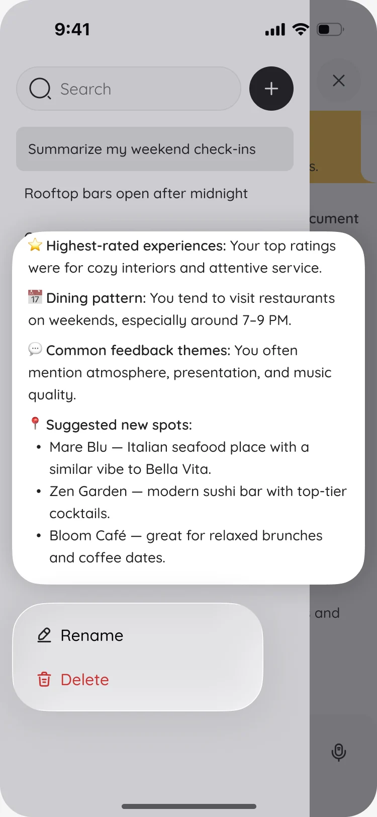
An assistant that reads the diner’s own history
- Found
- Diners already keep a record of where they eat: check-ins, photos, notes. None of it helped them choose the next place.
- Decided
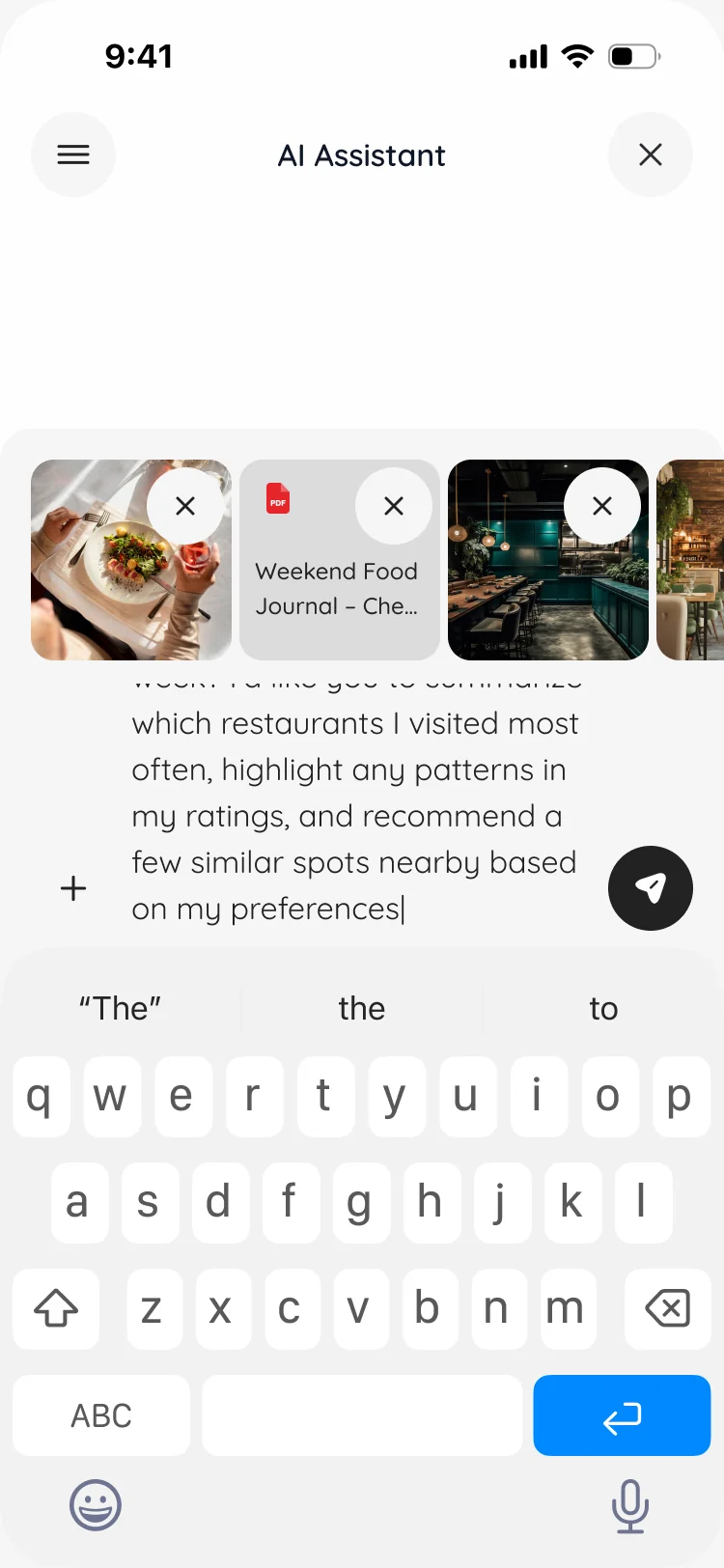
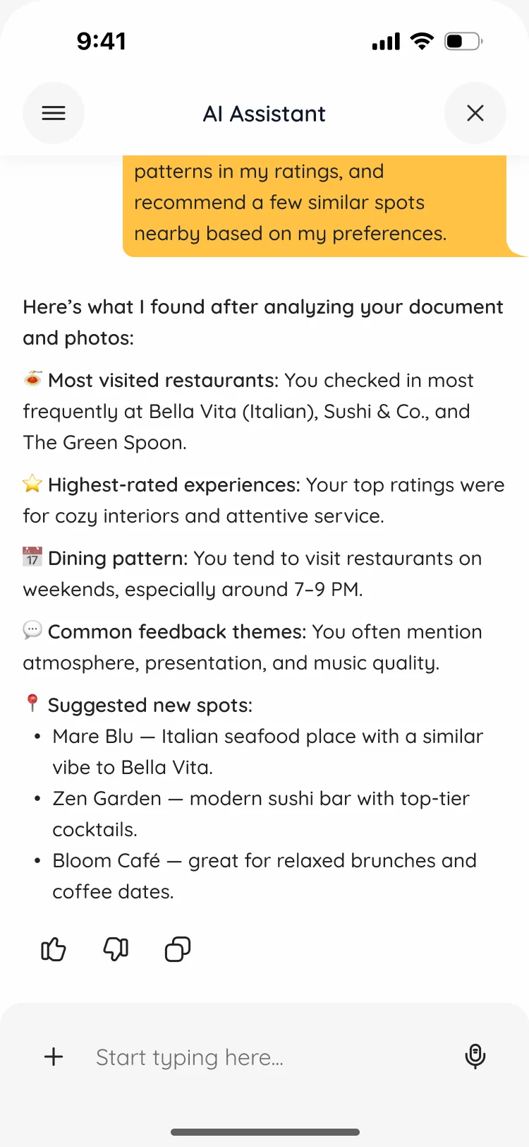
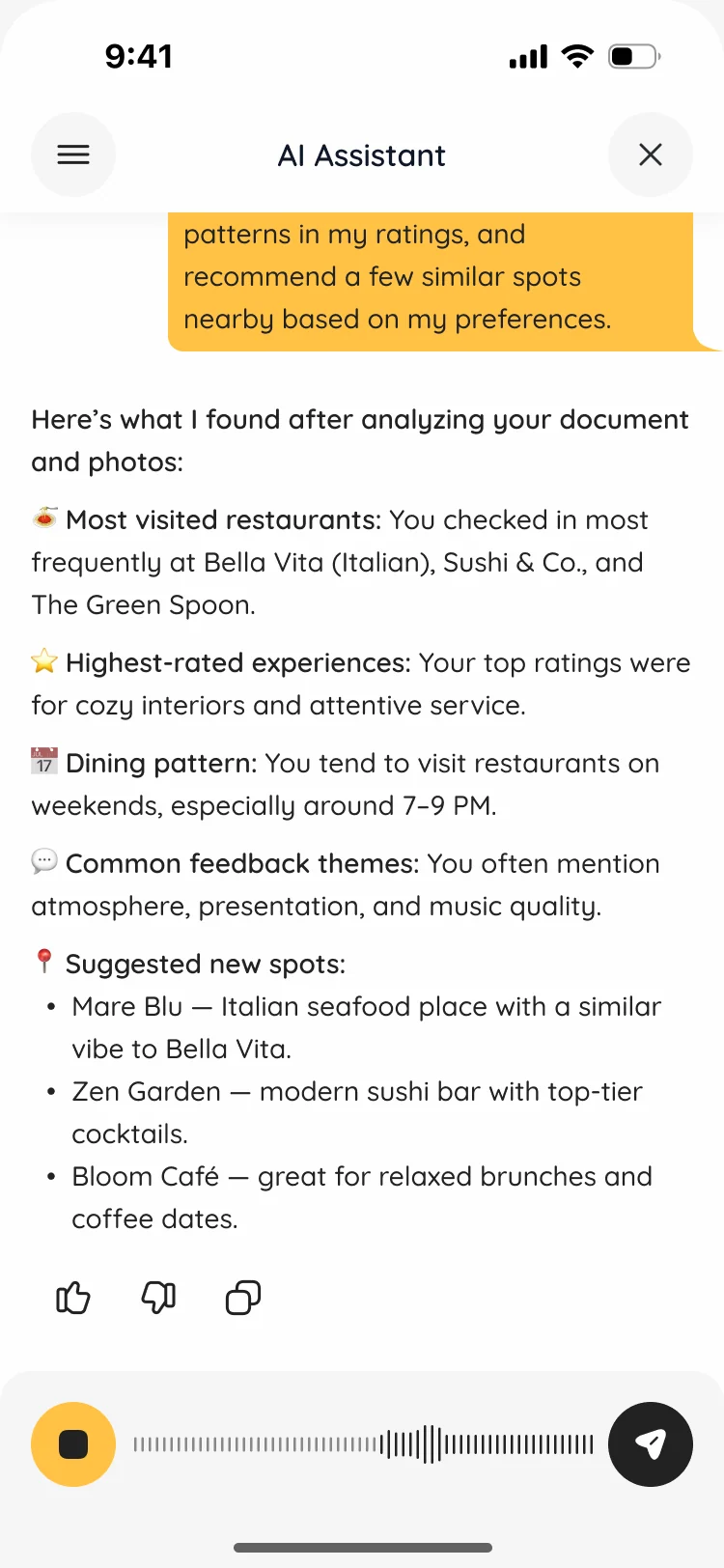
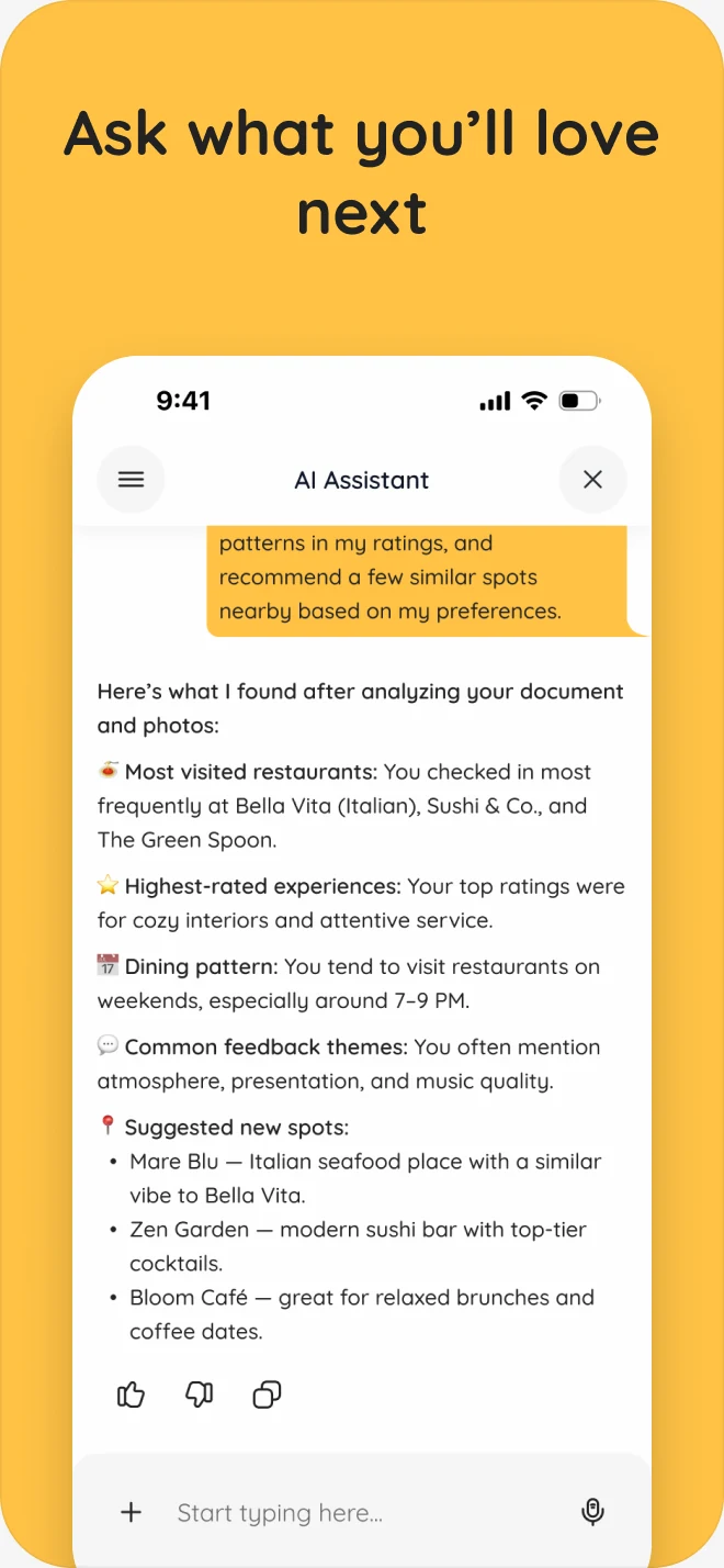
- An assistant inside the app: attach photos or a document and ask; get visits, favourite experiences, habits and new places to try; talk instead of typing; come back to past chats, rename or delete them.
Receipts that turn a visit into points
- Found
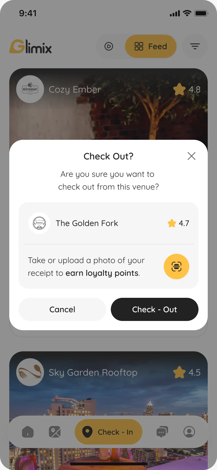
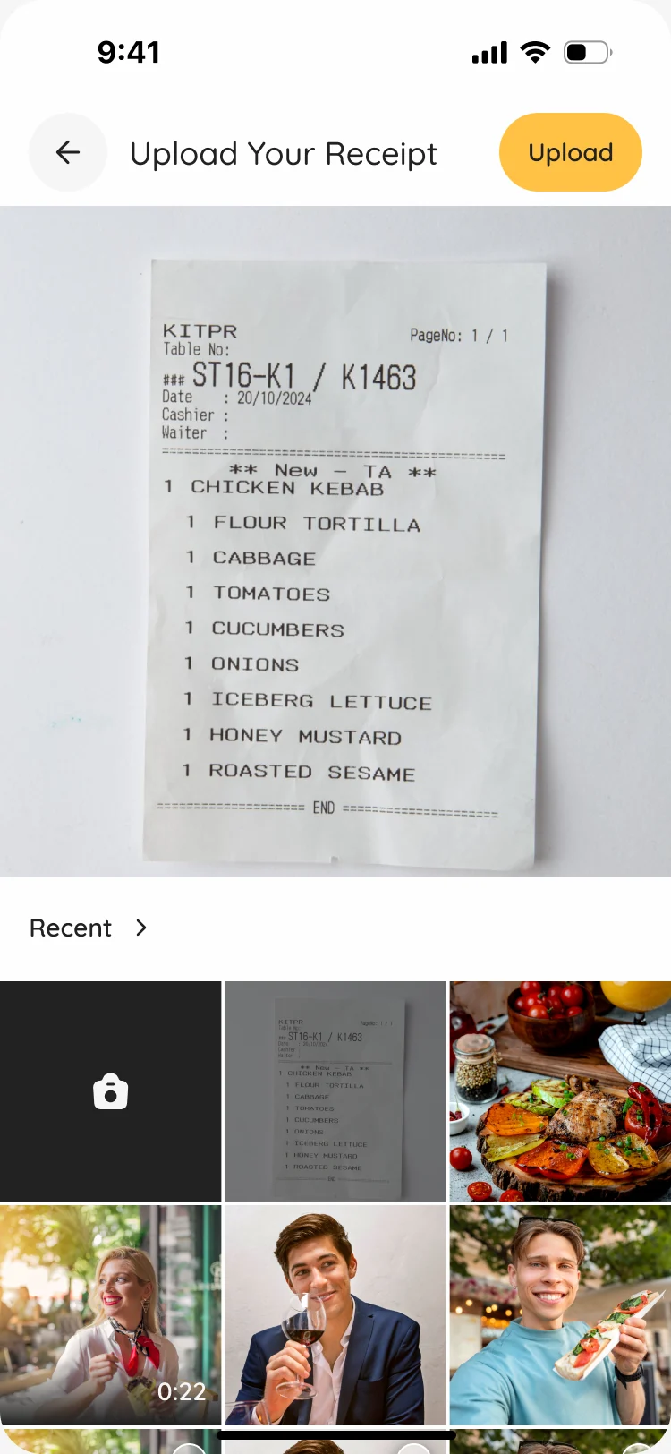
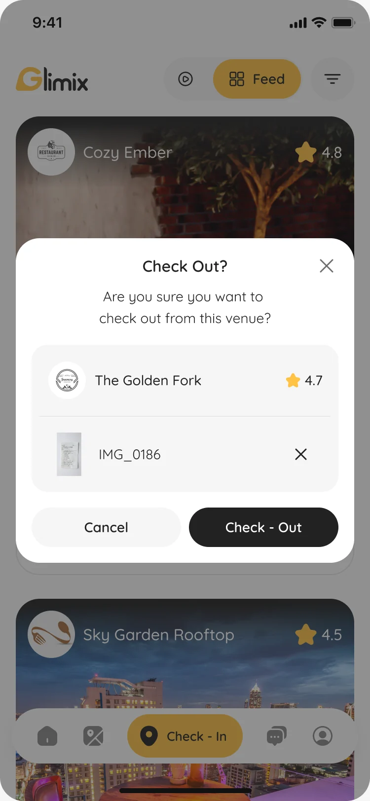
- Loyalty points depend on a receipt, but a diner who lost it, or checks out the next day, would hit a dead end.
- Decided
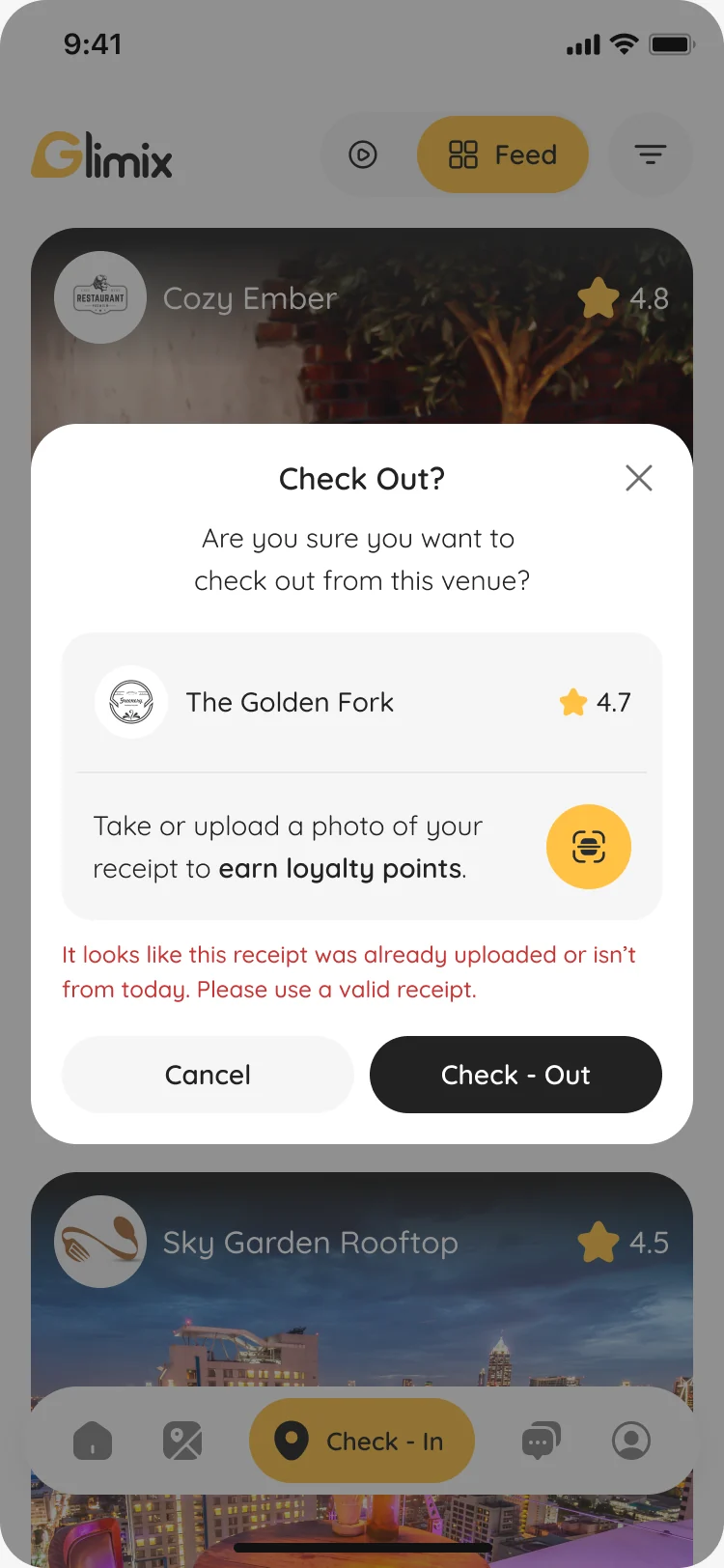
- The receipt is optional at check-out: snap or upload it to earn points, or skip it and still check out. A receipt already used, or not from today, is flagged in place with a way to try again.
Finding a place for tonight
- Found
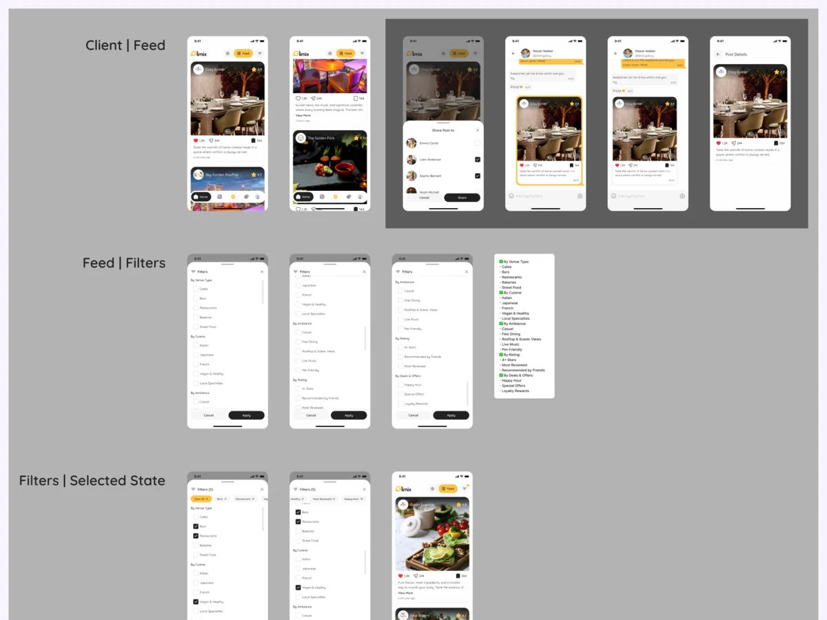
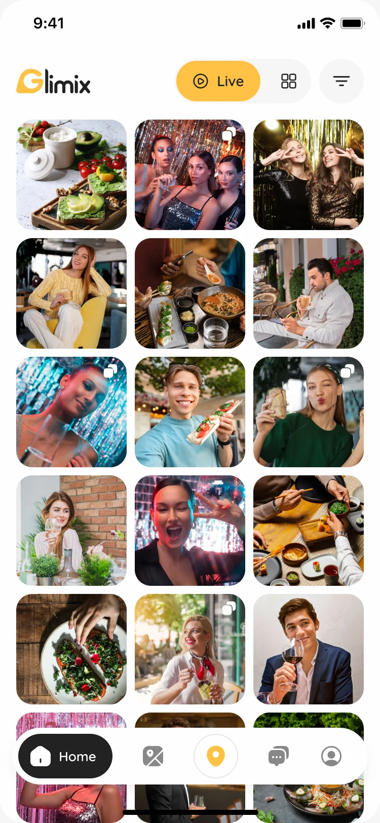
- Deciding where to go weighs the type of place, the food, the mood, the rating and the deals, and people want to see the place as it is right now.
- Decided
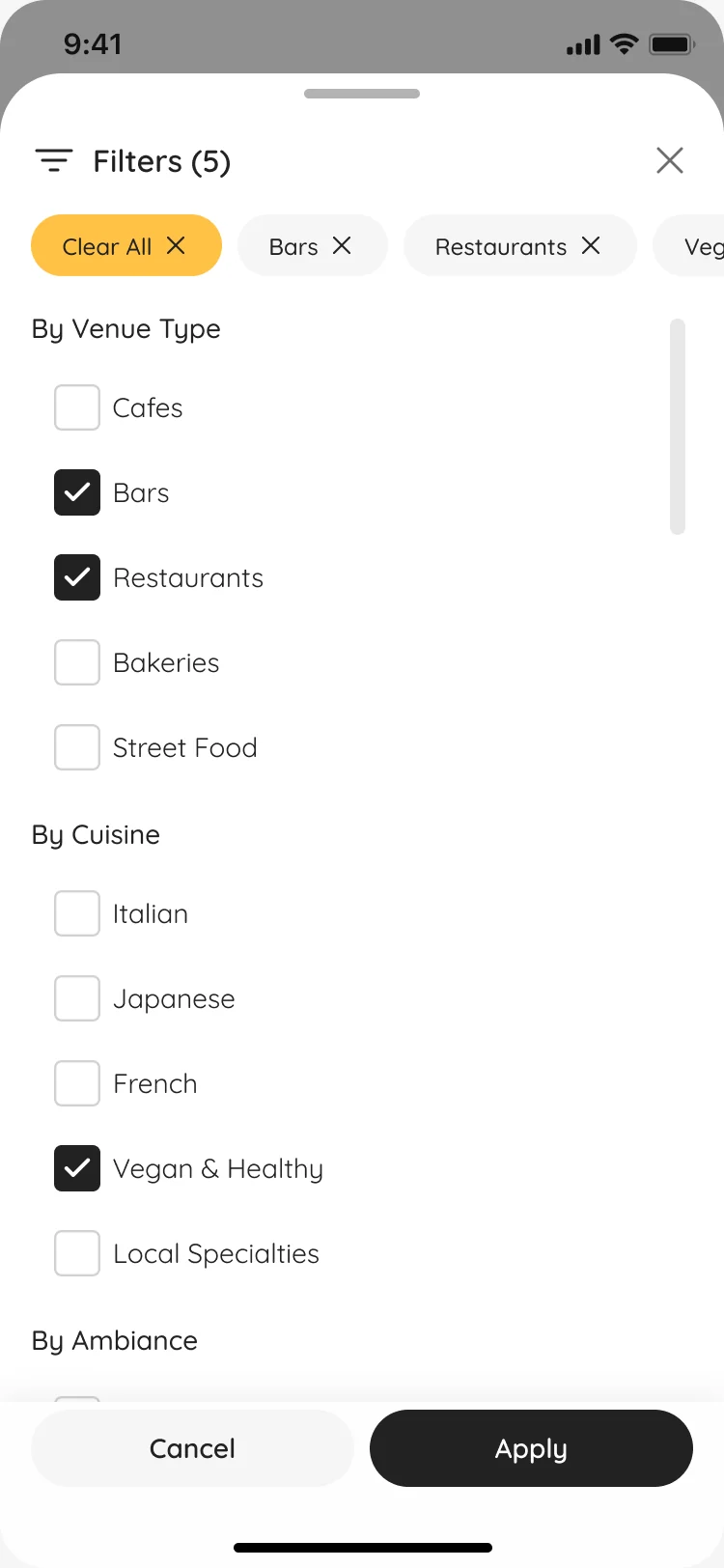
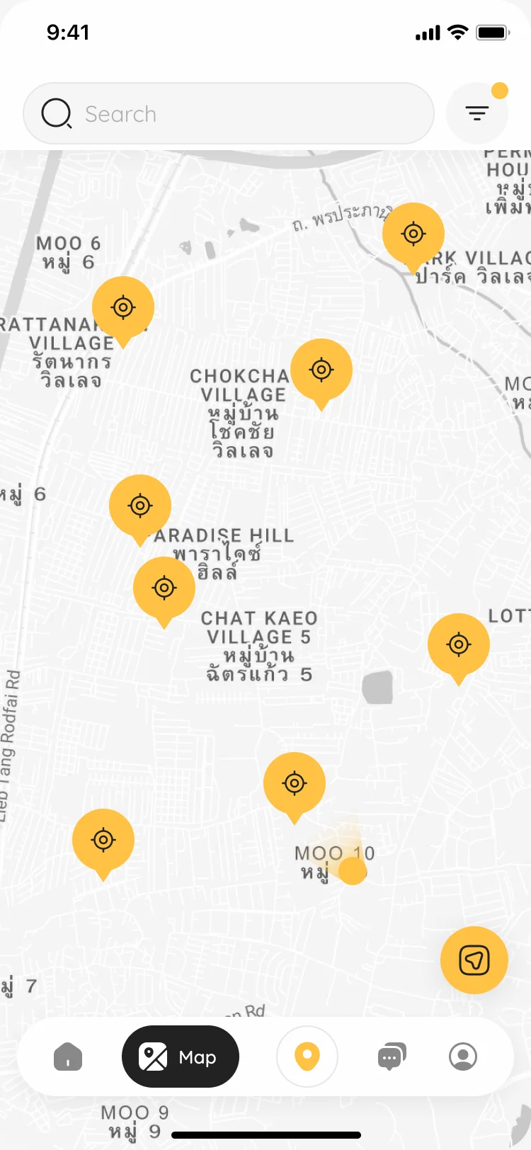
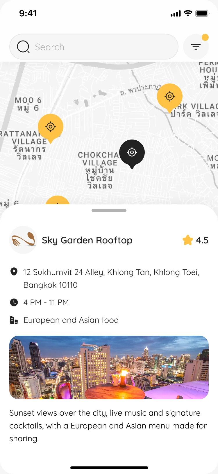
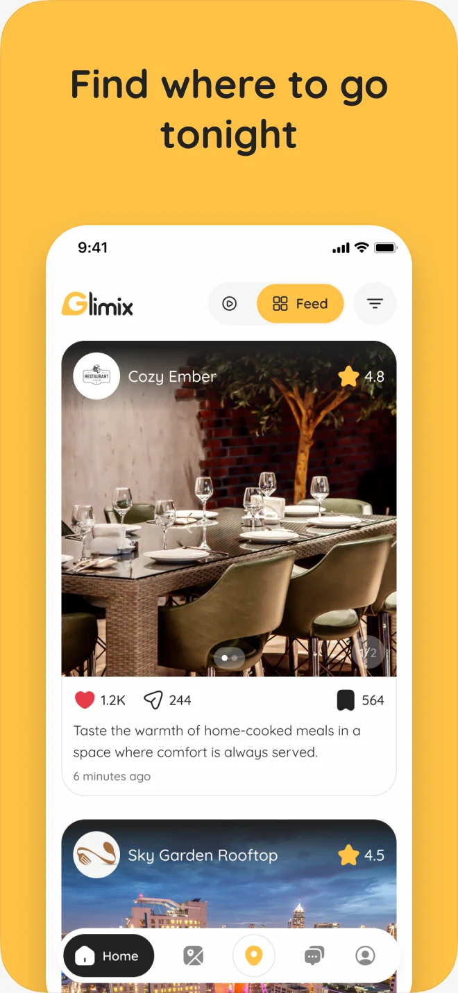
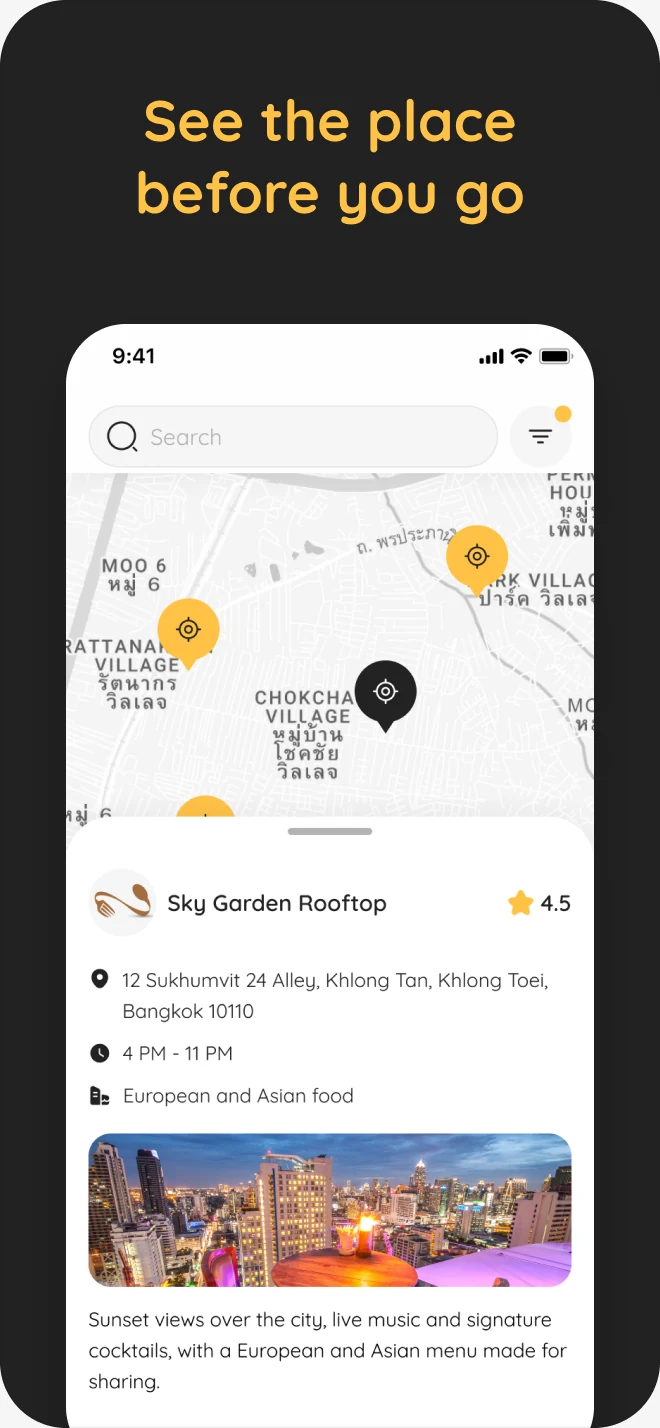
- Filters grouped the way people decide, a map of the results with a venue card one tap away, and a live tab of photos people have just posted from inside.
Check in, rate, come back
- Found
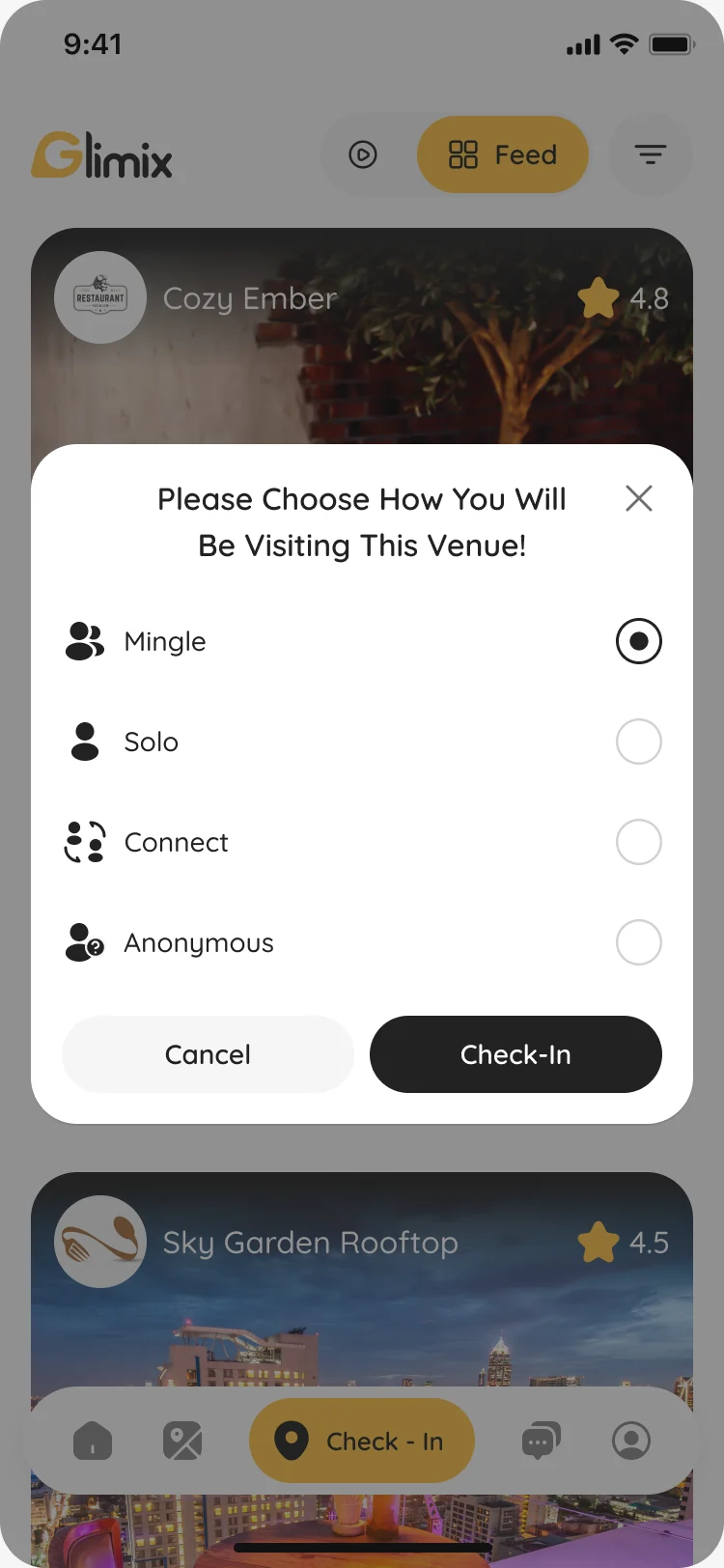
- A review helps only if it comes from a real visit, and a check-in matters only if it leads somewhere.
- Decided
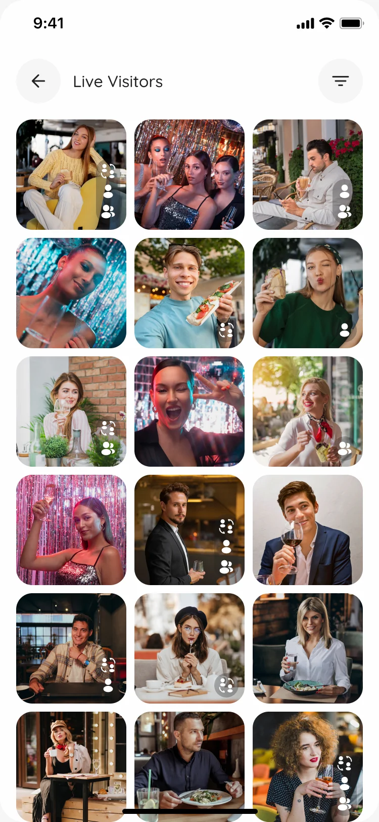
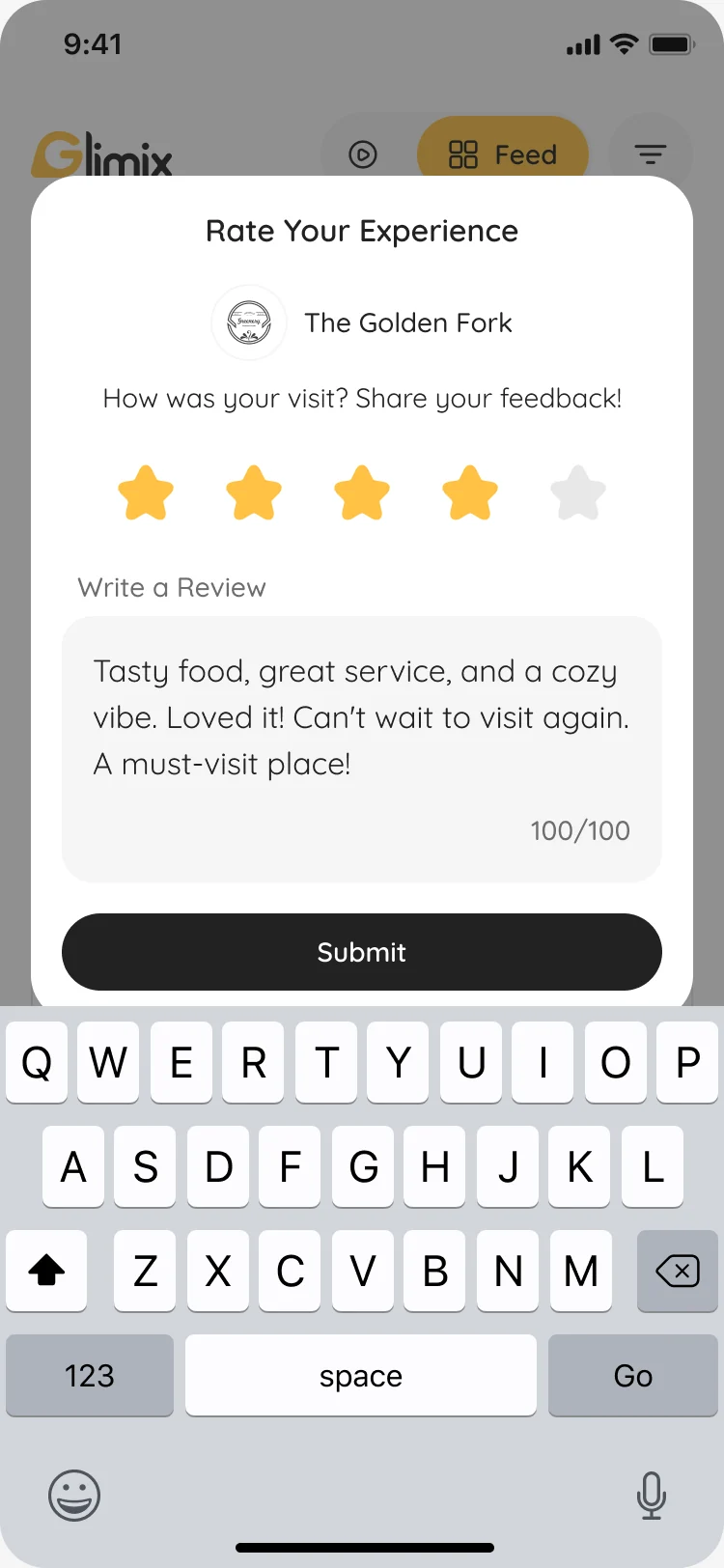
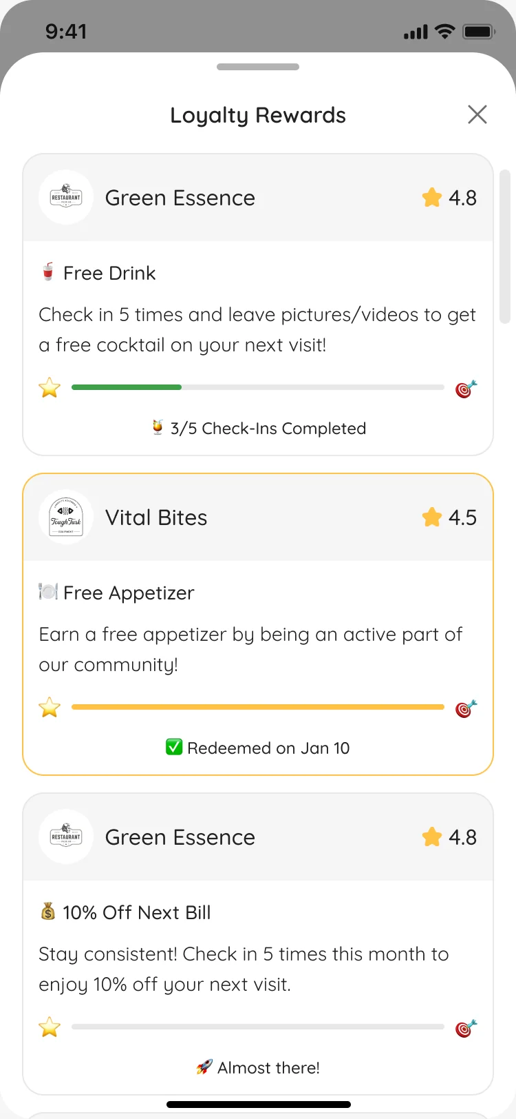
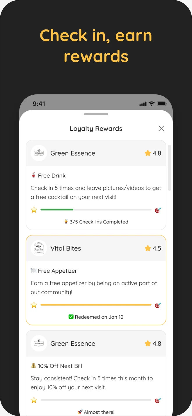
- A check-in that asks how you’re visiting: to mingle, solo, to connect or anonymously. Then who else is there, a rating and review at check-out, and rewards that show every step to the next perk.
Promoting a venue without a marketing team
- Found
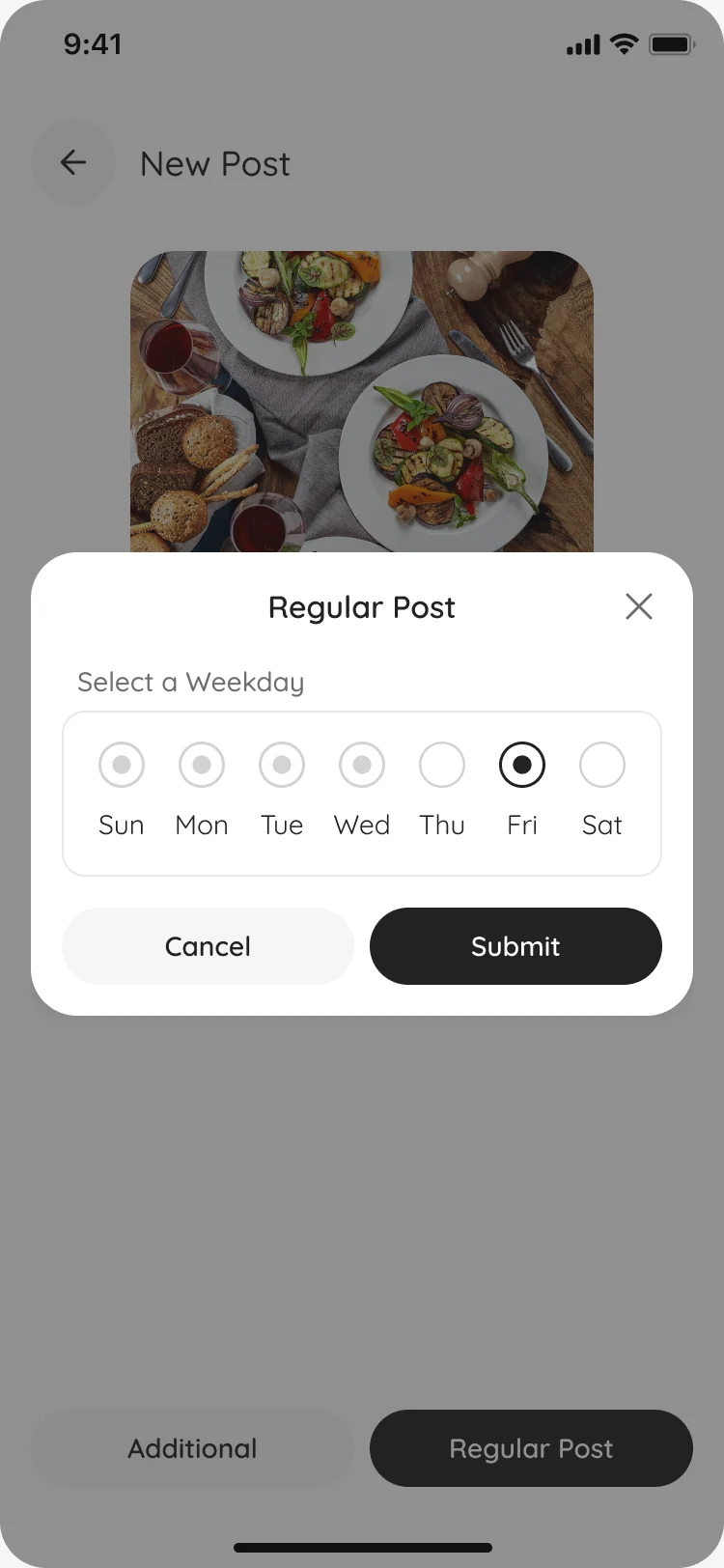
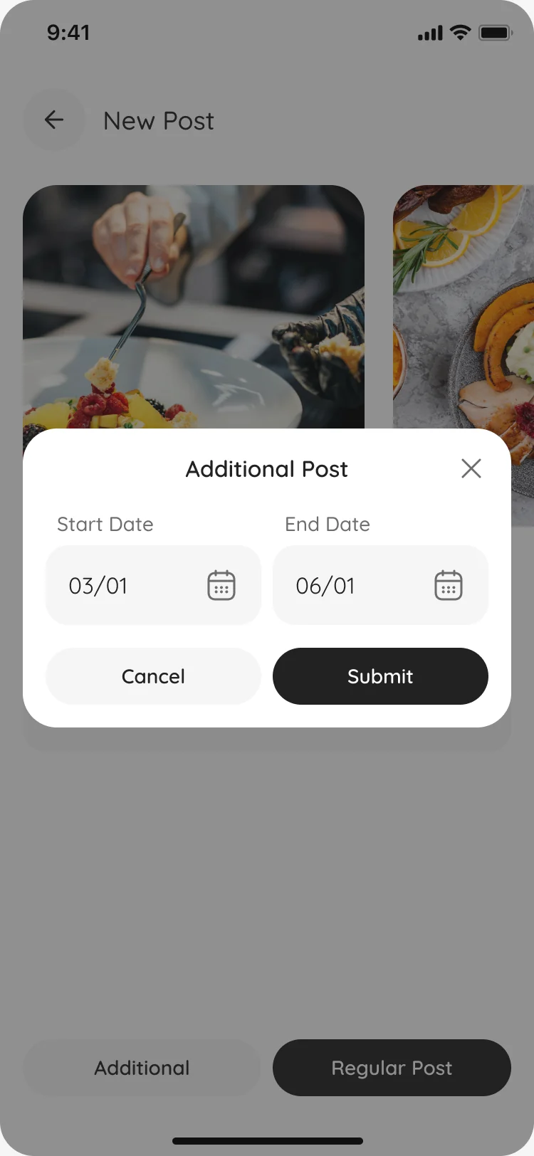
- Venue owners know Instagram, not scheduling tools, yet their posts run on rules: every week on a set day, or between two dates, within a limit.
- Decided
- Posting that feels like a social app: photos and a description, then one choice, a regular post on a weekday or an extra one between two dates. Review replies and the venue’s numbers are a tab away.
A brand drawn for the app it lives in
- Found
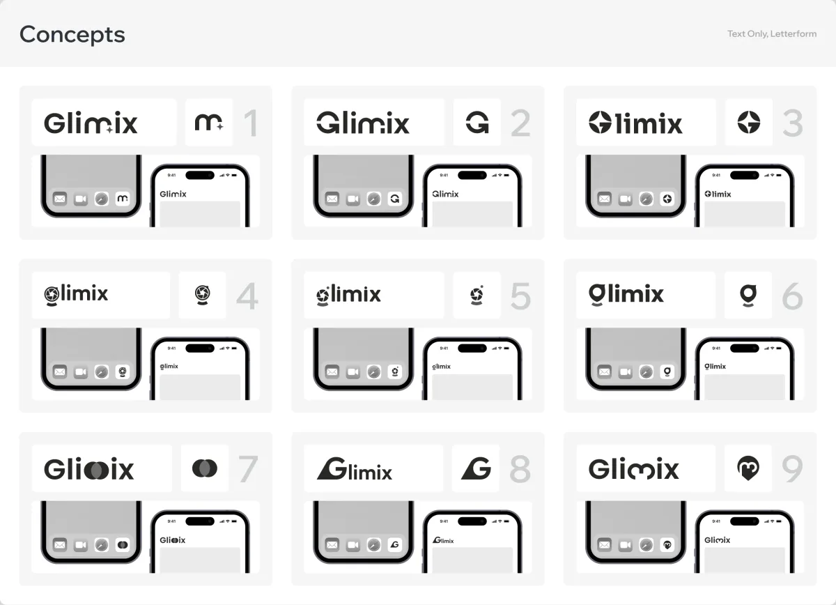
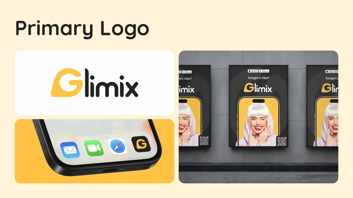
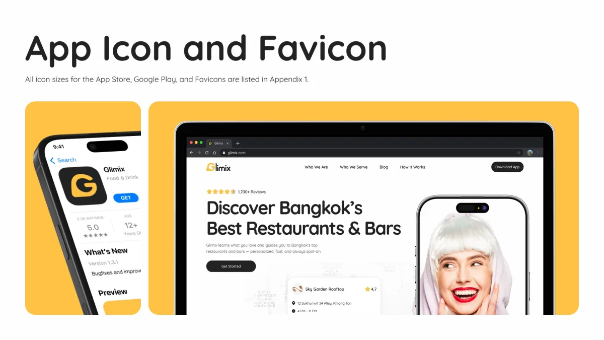
- The product needed a face that works at icon size on a home screen, beside food photography in the feed and on a poster in the street.
- Decided
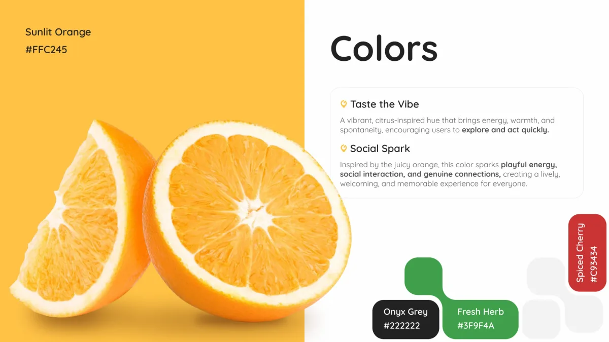
- Every logo concept was tried where it would live, as an app icon and in the app’s header, before one was refined. The brand book then set the colour, type, imagery and store assets the product uses.
One system for both sides of the app
- Found
- A venue shows up in the feed, on the map, on its own page and in its owner’s tools; if it looked different in each, neither side would trust what it saw.
- Decided
- One kit for both roles: the same venue card, rating, buttons and sheets everywhere, each drawn for its empty and error states, in light and dark on the phone.
A venue reads the same everywhere
Its logo, name and rating sit in the same place on a feed post and on a map card.
-
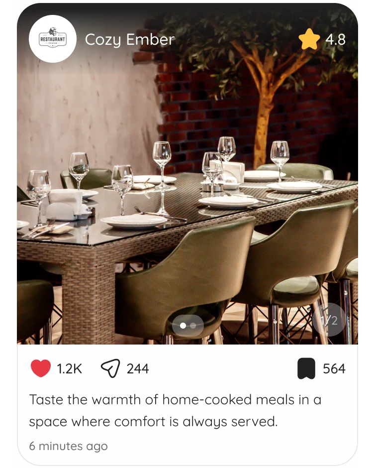
Feed: A venue’s post. -
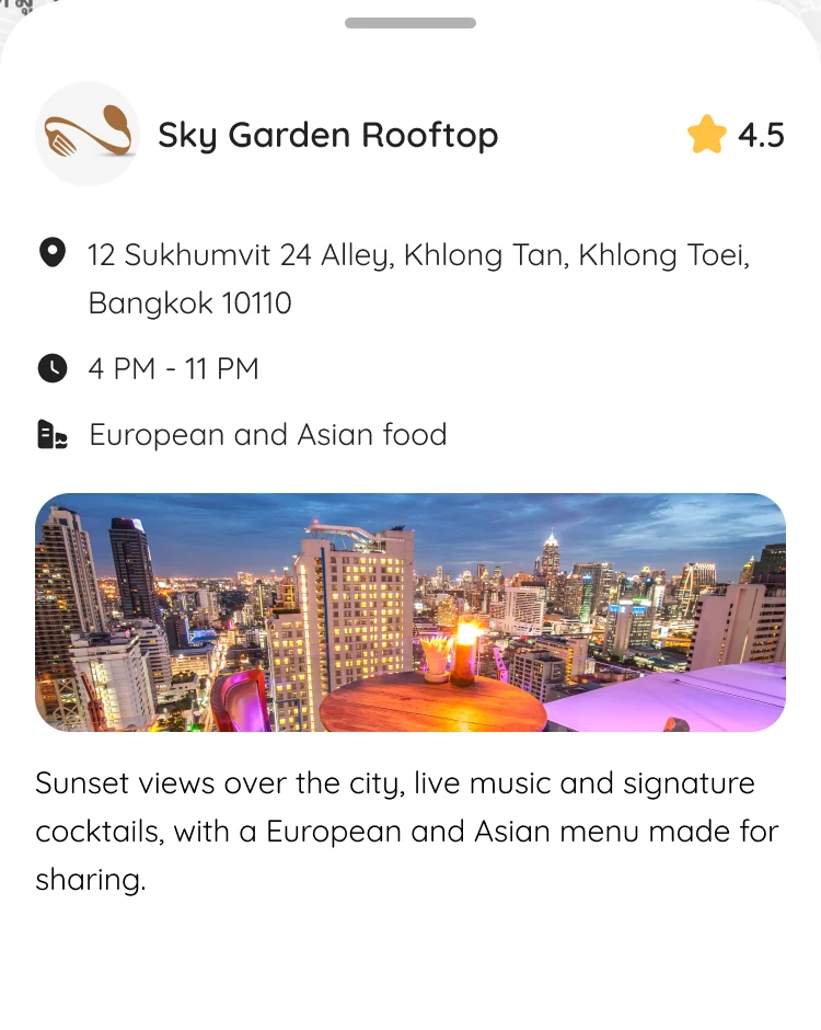
Map: The same venue identity on a map card.
Drawn for the moments that go wrong
No results, no reviews yet, a check-in without a venue: each says what happened and what to do next.
-
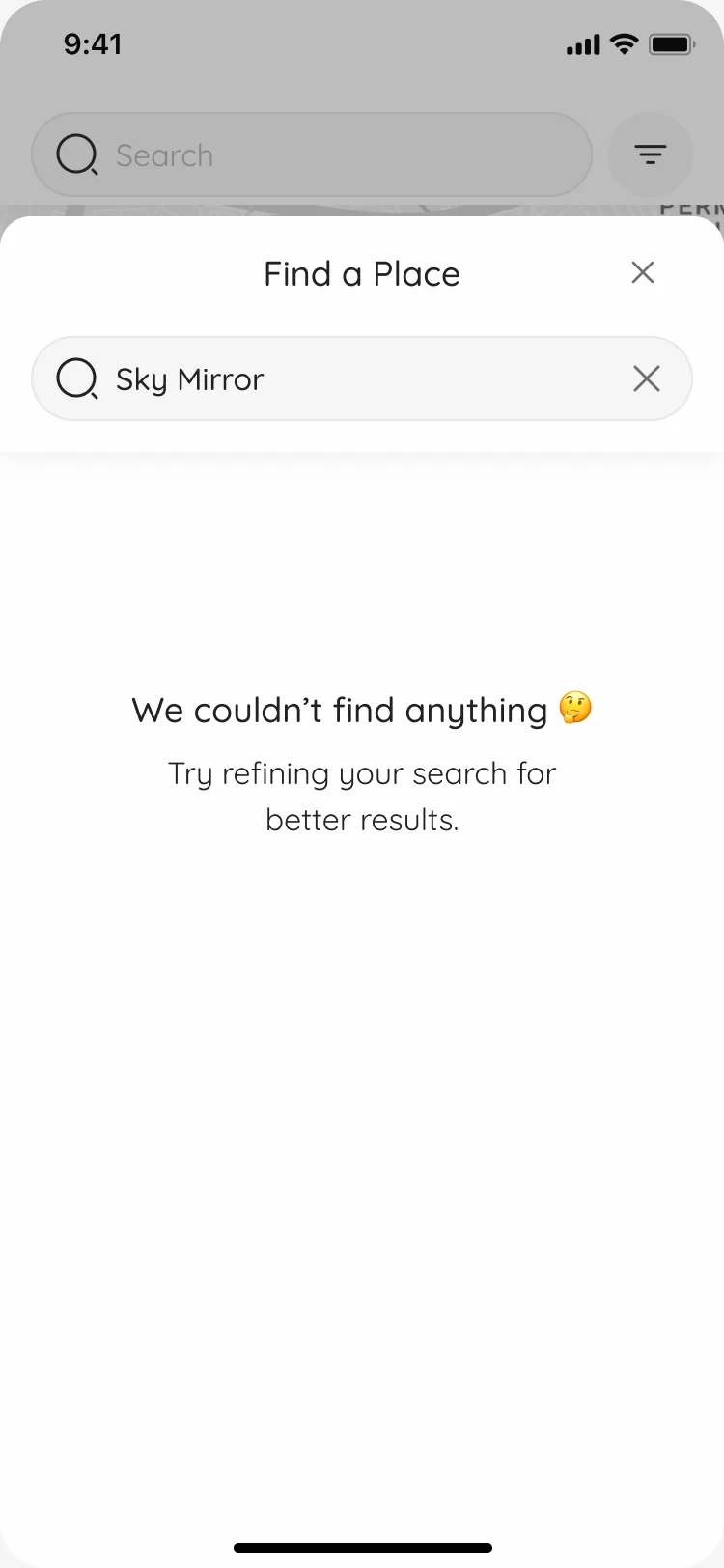
Nothing found -
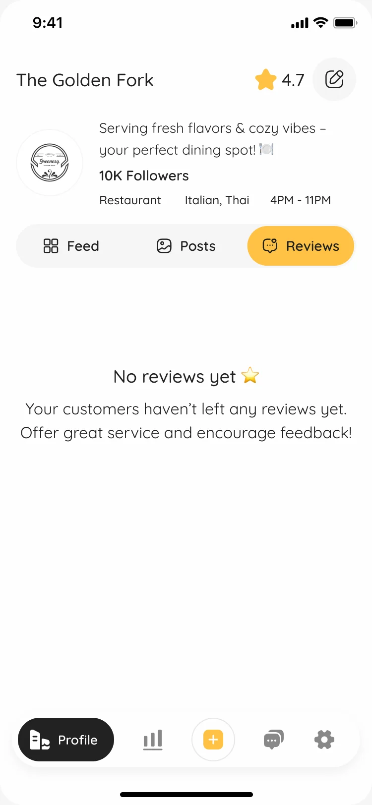
No reviews yet -
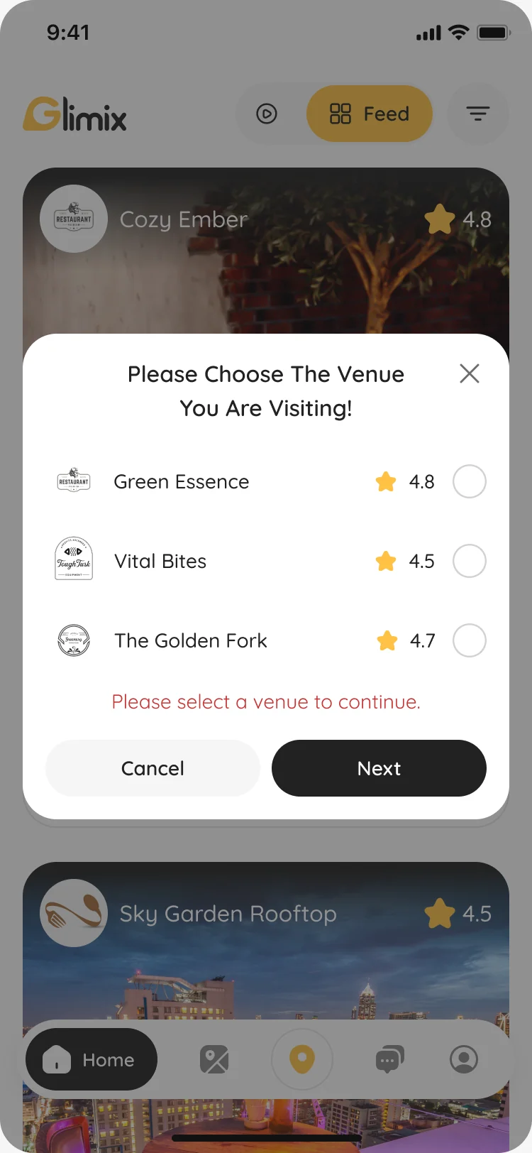
No venue chosen
Everything around the app, in the same voice
- Found
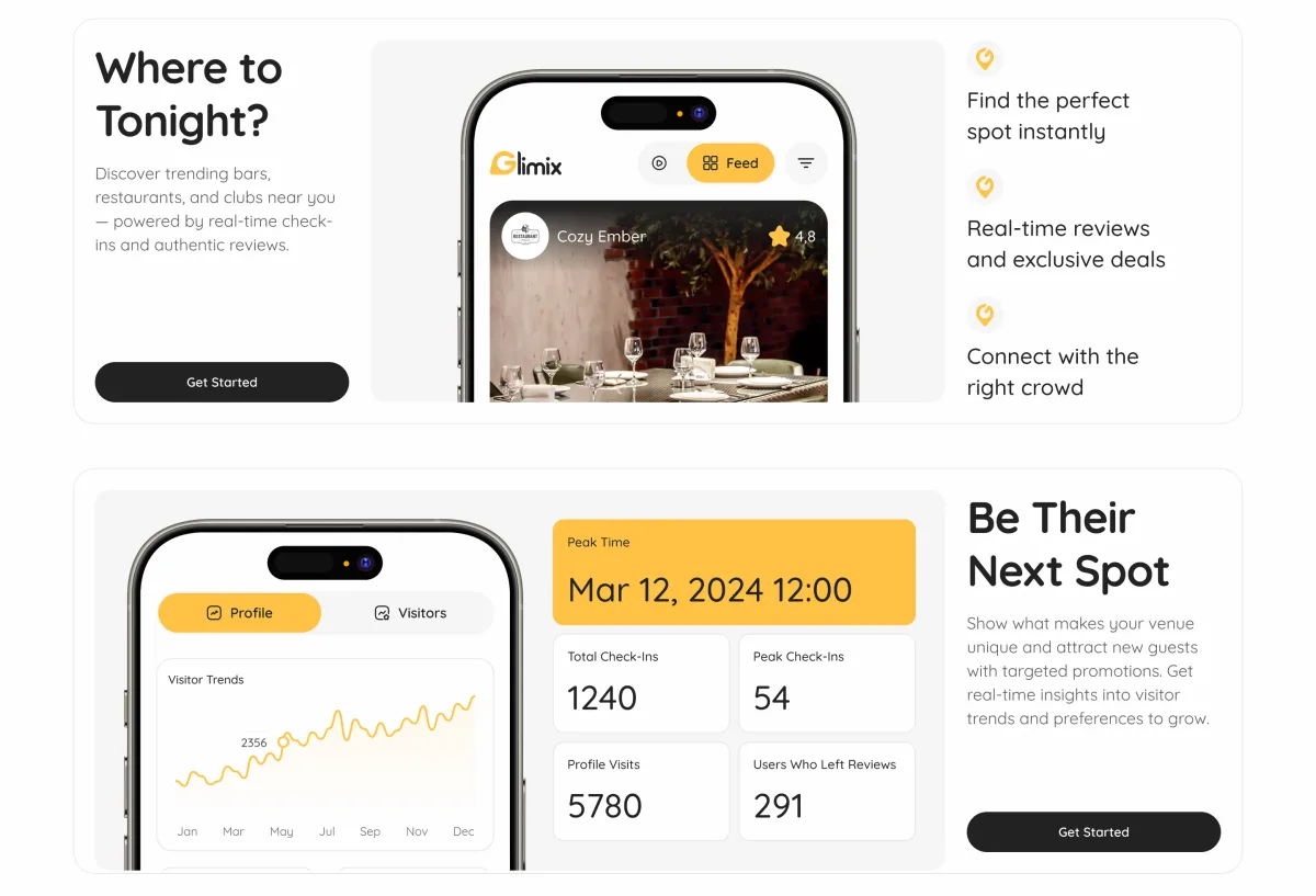
- The landing page had to speak to diners and to venue owners at once, and the store listing and the deck had to look like the same product.
- Decided
One brand across the landing page at every size, its 404, the store assets and the pitch deck, and the landing shows the real app rather than illustrations.
Our marketing design guide shows how ANODA connects the brand code, message hierarchy and next action before the next campaign scales.
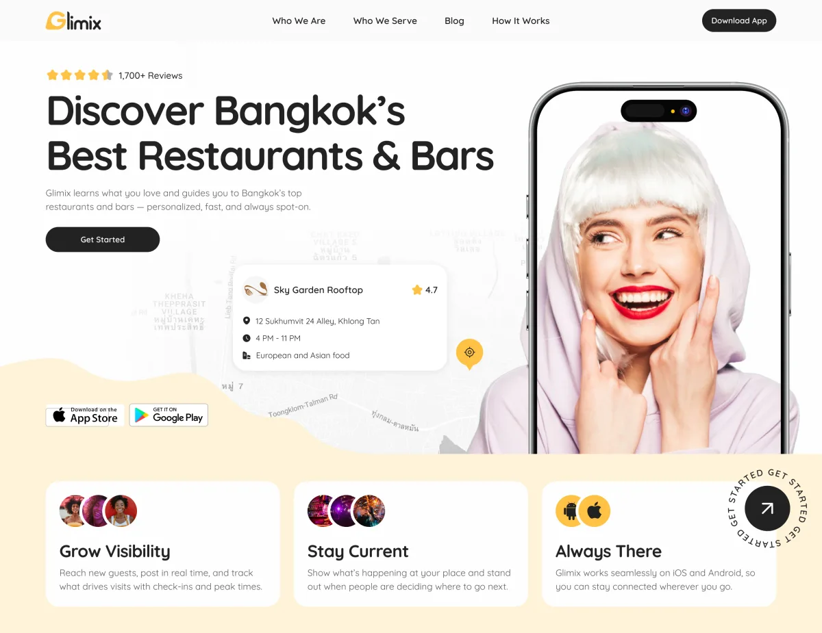
Store listing
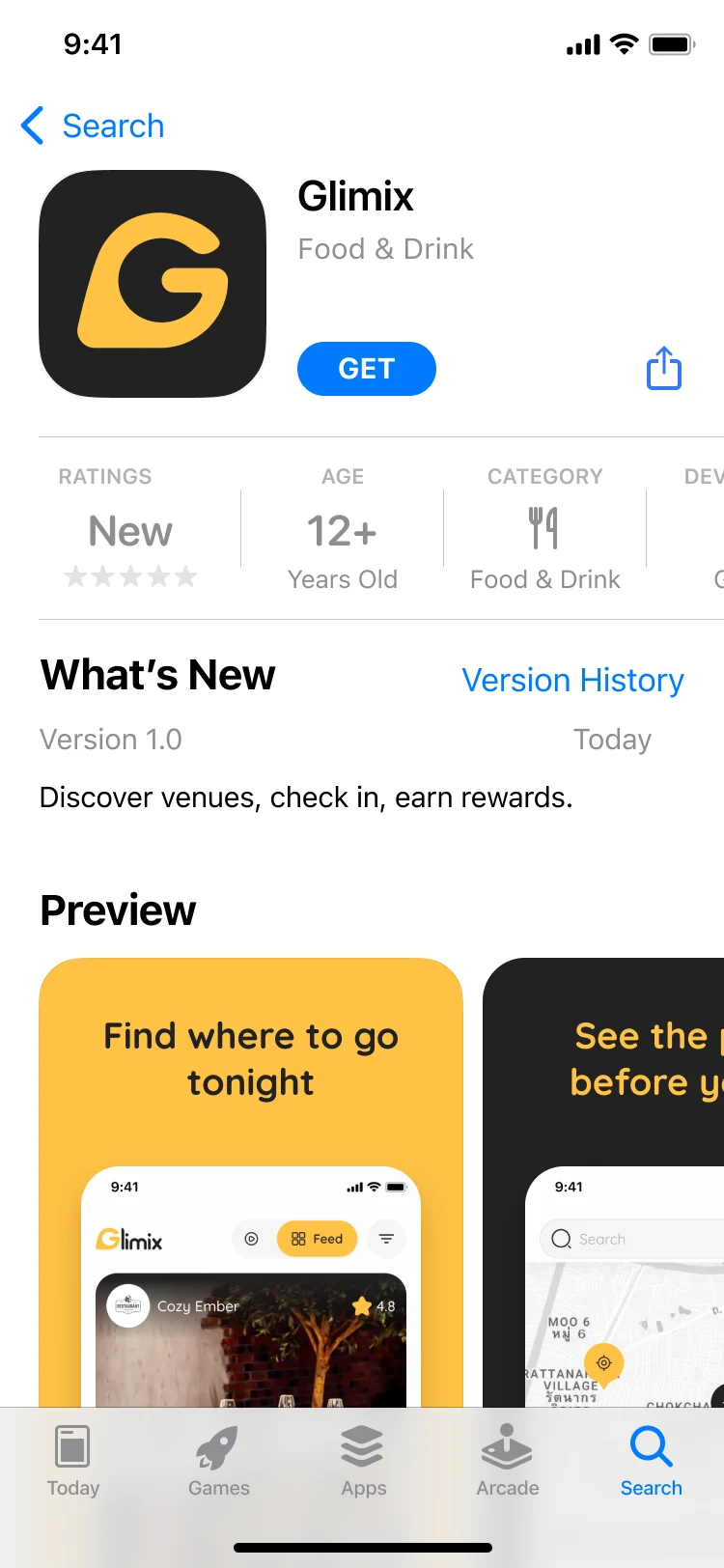
The App Store page and its screenshots, each a brand colour, a promise and the real screen behind it.
-
Pitch deck
Built on the brand book’s slide template, so the deck and the brand read as one.
-
Creator Platform and Admin Portal
Web products for creators and for the team running Glimix, designed in full.
-
Social media assets
Post and story templates in the brand’s voice.
Where the product ended up
One design for the whole product: diners find, visit and rate venues; venues post, promote and read their numbers; an AI assistant and a receipt scanner work inside both paths.
Around it, a brand from the logo up, a landing page, store assets, a pitch deck, and the Creator Platform and Admin Portal, handed to the client’s developers with prototypes and a UI kit.
- screens for diners and venue owners
- 200+
- experts in one pod
- 5
Worried one side of your app will feel second-best?
In Glimix, diners and venue owners share one product language and each side sees its own jobs first. Show us both sides of yours, and we’ll show you where they should meet.
More work like this
Three more products where two sides, or a live app, had to be redesigned at once.
-
Travel · Marketplace · Mobile-first web + Admin + Landing
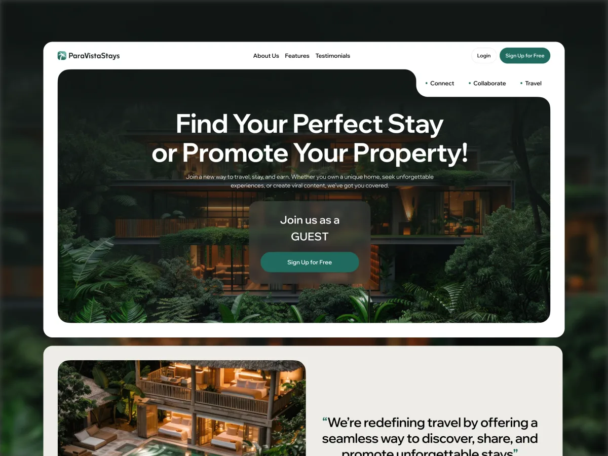
ParaVistaStays
Audited and redesigned a vacation-rental marketplace for guests, creators and hosts on the phone, with a desktop admin portal and a brand from scratch.
- 347 Unique screens
- 5 Experts on the team
-
Dating · Social · Mobile app
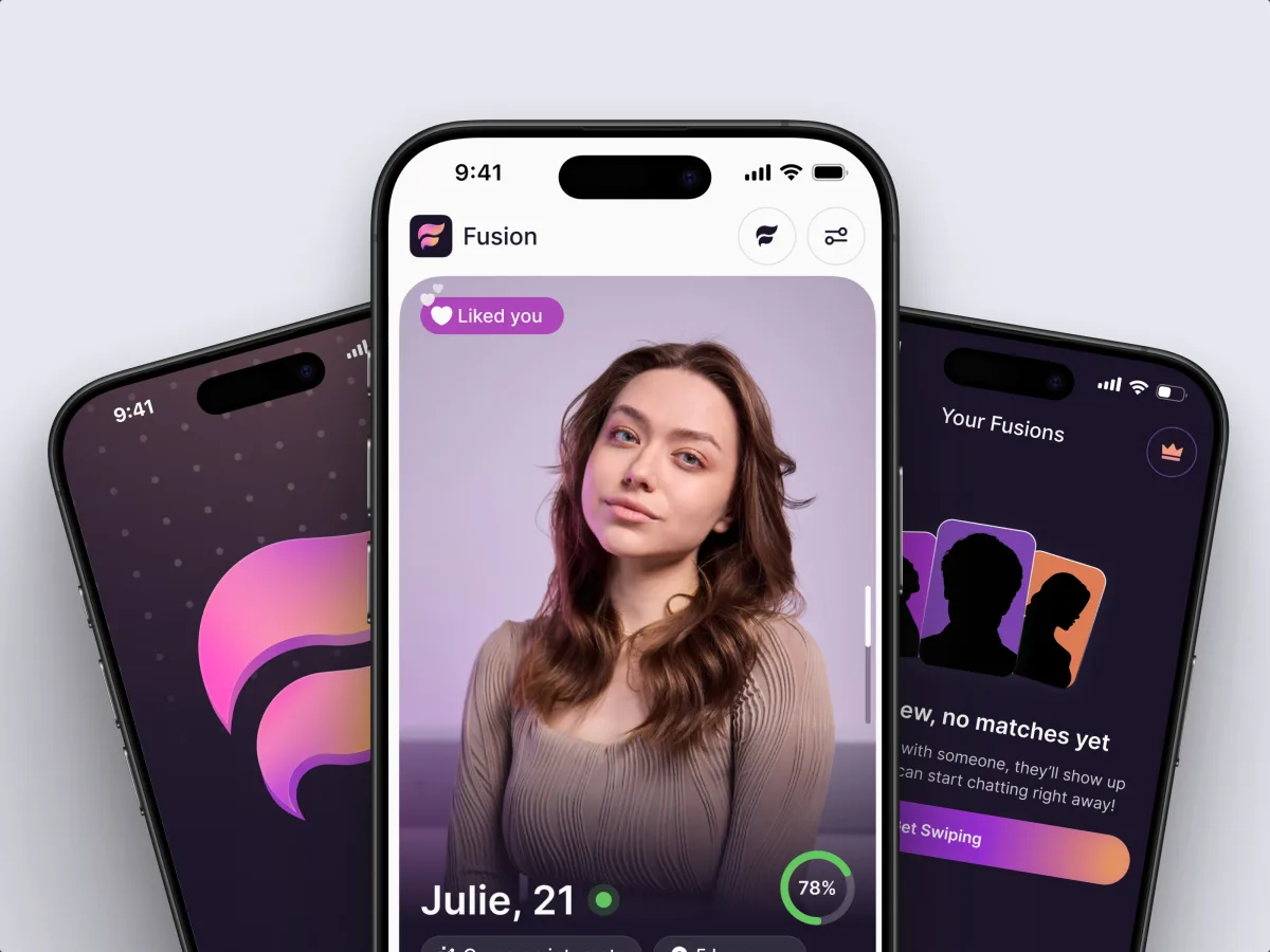
Fusion
Redesigned a dating app that matches on personality rather than photos, with a rebuilt onboarding, a compatibility-first feed and the brand it launched under.
- 4 Experts on the team
- 16 Personality types
-
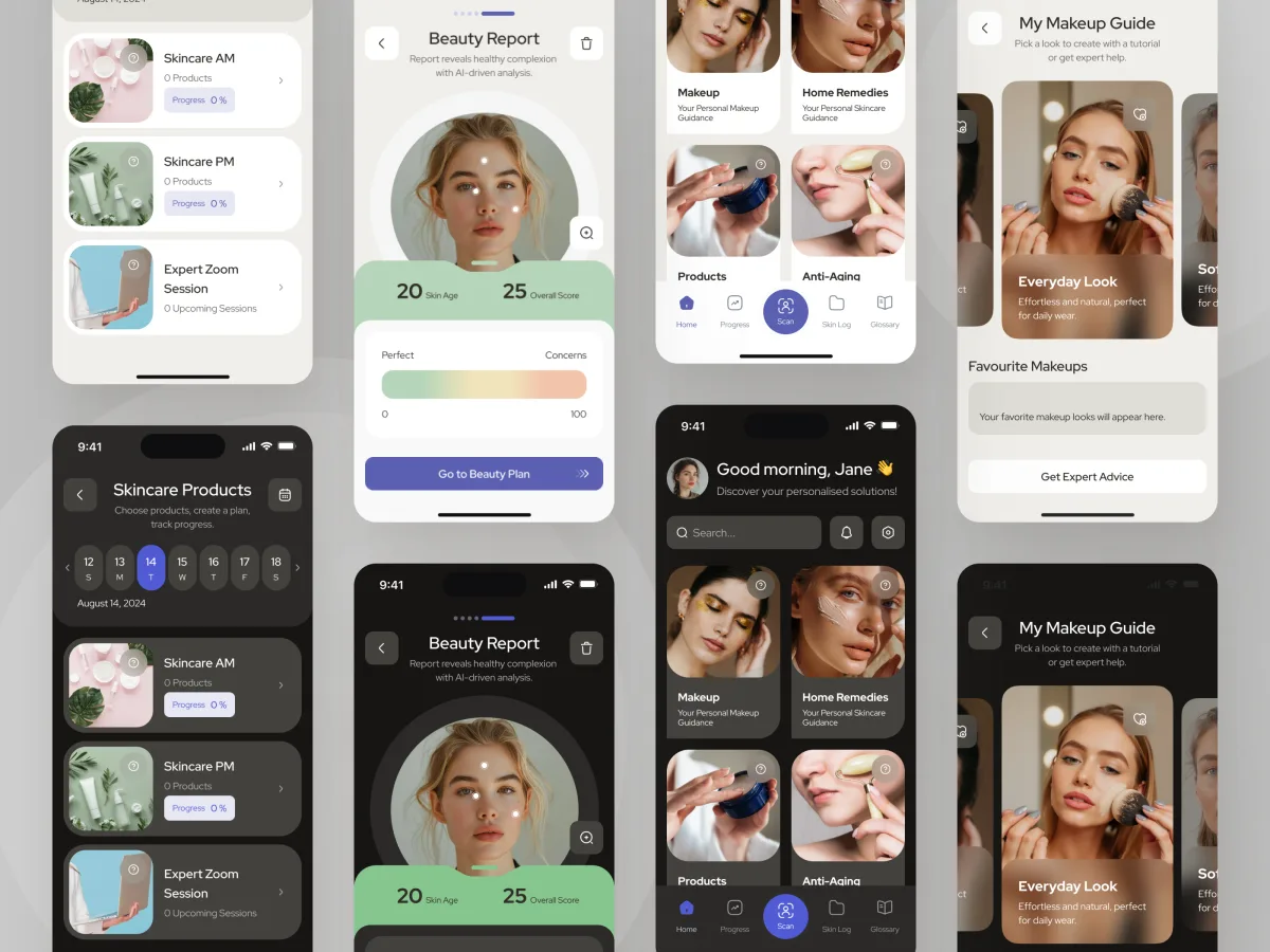
Beauty · Wellness · Mobile app
Forever Beauty
Audited and redesigned a live AI and AR beauty app screen by screen, inside the backend that was already running.
- AR Live-camera makeup steps
- 3 Visual styles explored
What we brought to Glimix
The product
How to Build a Cohesive Brand System
Stop paying six teams to reinvent your brand. ANODA connects character, product UI and usable brand rules into one company customers recognize.
AI UX Design Mistakes: Fix the Flow Before the Prompt
Stop funding AI features users abandon. ANODA fixes the scenario, context, controls and recovery before another sprint goes into the wrong prompt.