In short
Your AI feature is not failing because of the prompt. It is failing because nobody decided which job it does, for whom and when, so it offers everything and helps with nothing, while you keep paying for users who open it once and leave. Nine mistakes we keep finding, how to tell a product problem from a model problem, and the order we fix them in.
In this article
- An assistant and an agent need different controls
- What counts as an AI UX design mistake
- Diagnose the failure before you pay to fix it
- Automating a process that has no validated user flow
- Treating every possible AI action as equally important
- Ignoring the user’s role, object, permissions and project state
- Making the user invent the first prompt
- Presenting generated output as a finished answer
- Hiding uncertainty instead of supporting the decision
- Treating failure as a generic error state
- Using the same control pattern for every level of risk
- How Nexus makes an agent’s work visible
- Evaluating the response instead of the user’s task
- A practical method: from scenario to automated flow
- Where your problem belongs
- The decision rule
The most expensive AI UX design mistakes happen before anyone writes a prompt. The team automates a process nobody has mapped: no validated scenario, no decision about why this automation beats the others, and an interface that has no idea what the user is trying to do or what state their work is in. A better prompt makes the AI do a task better. It will never tell you which task was worth doing. That decision is where AI features make money or quietly burn it.
In our product work, AI has not changed the plot. It is old wine in a new bottle: a feature built around what the technology can do, not around a person who needs something done. The suit is just more expensive now.
It usually goes like this. A model gets wired in, a shiny panel appears, the demo is glorious. Real users open it once, look at the menu and go back to doing the work by hand. Another quarter of engineering salaries goes into prompt tweaks — good money after bad — and the users who left in week one — the ones you paid ads and sales calls to acquire — stay gone.
An assistant and an agent need different controls
Moka keeps student conversations inside the selected course, supports voice and file input and shows answer, history and error states. Glimix lets diners ask about their own visit history and recover a past conversation. These illustrate AI product design. Nexus goes further: people set a trigger and actions, authenticate connectors, inspect run history and watch, stop or take over a browser task. That is AI agent UX design: controls over work that continues beyond a chat answer. Audit the controls the product actually needs instead of labelling every assistant an autonomous agent.
What counts as an AI UX design mistake
An AI UX design mistake is any product decision around the model that stops a person from getting a useful result they can trust and act on: which job the feature is for, when it shows up, what it knows about the user’s situation, how it admits doubt, how it fails and who stays in control.
The model is the engine. Nobody buys an engine lying on the driveway. A model can give a brilliant answer in isolation and still be useless in the product, because it answered a question nobody on that screen was asking, or because the user had no way to check it, fix it or do anything with it. The reverse is also true, and it annoys the “we need the biggest model” crowd: a modest model pointed at the right moment, with a clear next step, makes money.
So AI feature design is product design first. Adoption hangs on the questions we asked long before anyone said “LLM”: who is it for, what are they trying to get done, what should happen next. AI changes the answers. It does not cancel the questions, whatever the keynote slides say.
Every AI failure we see falls into one of three buckets, and each one has a different owner and a different bill:
- The wrong scenario. The feature automates something users do not need automated, or not often enough to matter. You have built a heated driveway in a country where it never snows. No interface work and no model upgrade will make it pay.
- An undefined or context-blind flow. The scenario is worth automating, but nobody defined the steps, states and decisions around it, or the AI is not told what the user is looking at. This is where most AI UX design mistakes live, and where most of the money leaks.
- Weak model or data. The scenario is right, the flow is mapped, the context is there, and the AI still cannot do the job. Only here is model, data or prompt work the main fix.
Teams start at the bottom of this list because tuning a model feels like progress. Diagnosis starts at the top.
Diagnose the failure before you pay to fix it
Before you spend another sprint on prompts, take the symptoms you are seeing and ask where each one comes from. This table is the first pass we run in an AI UX audit. Each symptom points to a product question, a flow or context question, and the team that owns the fix.
| Symptom you observe | Product question | Flow and context question | Likely owner |
|---|---|---|---|
| People try the feature once and never return | Is this a job people need done often enough to change their habits? | Does the feature appear at the moment that job comes up? | Product |
| The feature offers a long list of possible actions | Which of these actions matters most, and to whom? | What does the product already know that would narrow the list? | Product and design |
| Answers are correct but ignored | Was this the question the user was asking? | Did the AI know which object, role and state the user was in? | Design and engineering |
| Users stare at an empty prompt field | What is the first useful thing this user could ask here? | Can the product suggest it from the current screen? | Design |
| Results are copied elsewhere and rewritten | Is the output meant to be final or a draft? | Can the user edit, refine or compare inside the product? | Design |
| Users stop trusting the feature after one bad result | What should happen when the AI is unsure? | Does the interface show what the answer is based on? | Design and engineering |
| Failures end the session | What is the fallback path for this job? | Does each failure state offer a next step? | Design and engineering |
| An automated action causes damage or cleanup | Which actions are risky enough to need approval? | Can the user preview, cancel and undo? | Product, design and engineering |
| Good evaluation scores, flat adoption | Are you measuring the answer or the task? | Do you track completion, correction and recovery? | Product |
If the scenario and flow are clear but the feature still returns incorrect or incomplete results from relevant inputs, model evaluation and data coverage belong in the diagnosis too. ANODA separates that engineering investigation from the product decisions so your team fixes the cause instead of spending another sprint on the wrong layer.
Automating a process that has no validated user flow
This is the big one, and the most expensive. A team decides to “add AI” to a corner of the product, picks a process that sounds like a good candidate and starts building. What is missing is a user flow: the trigger that starts it, the state the user is in, the outcome they want, the decisions on the way, and what happens when it goes wrong.
It is ordering the kitchen, the jacuzzi and a smart lock before anyone has drawn a floor plan. Everything arrives. Everything is expensive. Everything technically works. Nobody can live there. Without a flow, the AI automates something nobody has described — “help with reports”, “assist with onboarding”, “answer questions about the project” — and every design decision downstream inherits the fog.
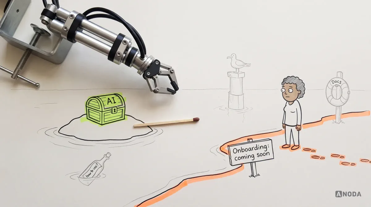
The scenarios are usually imaginable rather than validated. Someone pictures a user asking the AI to summarise their week, and it becomes a roadmap item. Would real users do it, how often, instead of what? Nobody checked. An AI feature is the most expensive way to test a hypothesis, and we have watched agencies happily bill for exactly that.
Oksana Kovalchuk, ANODA’s founder, puts it without anaesthetic:
The problem goes deeper. Teams are trying to automate a process with a prompt. An AI prompt automates software actions, but there is no user flow, no understanding of which flow is being automated, no validated user scenarios, no evidence that users need this automation more than another one, and no priorities.
 Oksana KovalchukFounder & CEO, ANODA
Audit check
For each AI entry point, write down the trigger, starting state, desired outcome and steps between, then find evidence that users need it: interviews, tickets, recordings, manual workarounds.
Failure evidence
The feature is described by what it can do, not the job it does. Nobody can name the moment a user would reach for it.
Correction pattern
Stop prompt and model work there. Map the flow, validate the scenario with a few target users, then decide how the AI should carry it out.
Treating every possible AI action as equally important
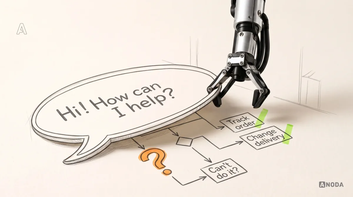
Once a model is plugged in, the list of things it could do grows faster than the backlog, and the temptation is to ship everything but the kitchen sink. The result is what Oksana calls a complete AI breakdown: a panel offering fifty actions, with no idea what the user wants or what state their project is in.
Handing a user fifty actions is handing a first-grader the entire textbook and saying “learn whatever you need”. The kid does not become a scholar. The kid opens page 212, gets confused and goes to play football. Your users do the same, except the football is your competitor’s product.
A list of fifty actions hands the product strategy back to the user — and the user did not sign up for your job.
A long list looks generous. It is a confession: we did not decide what matters. Most people pick at random, get something crap and close the panel. You paid to bring them there.
Underneath is a decision that never happened: competing automations were never compared. Some save more time, come up more often or carry less risk; some are useless. Treat them as equal and none is designed properly. A feature can be technically mighty and commercially dead precisely because it is mighty in every direction at once.
Audit check
List every action the feature offers and score each on frequency, effort saved, roles that need it and risk if wrong. Rank them.
Failure evidence
The same suggestion list on every screen. Usage spread thinly, with no action used consistently.
Correction pattern
Design the few actions that win on frequency, value and risk. Hide the rest until there is evidence they are needed.
Ignoring the user’s role, object, permissions and project state
The next useful action depends on the situation. A project manager staring at an overdue milestone needs something different from a finance lead looking at the same project’s budget. A draft needs different help from a document about to go to a client.
When the AI knows none of this, it behaves like a new subcontractor who arrives on site, ignores the drawings pinned to the wall and asks you to describe the building from scratch. It answers in generalities, suggests actions that make no sense for the thing on screen, and asks for information the product already has. Users call this the AI “not getting it”. They are being polite. It is the Chinese room with a nicer interface: fluent answers produced by something that has no idea what you are actually looking at.
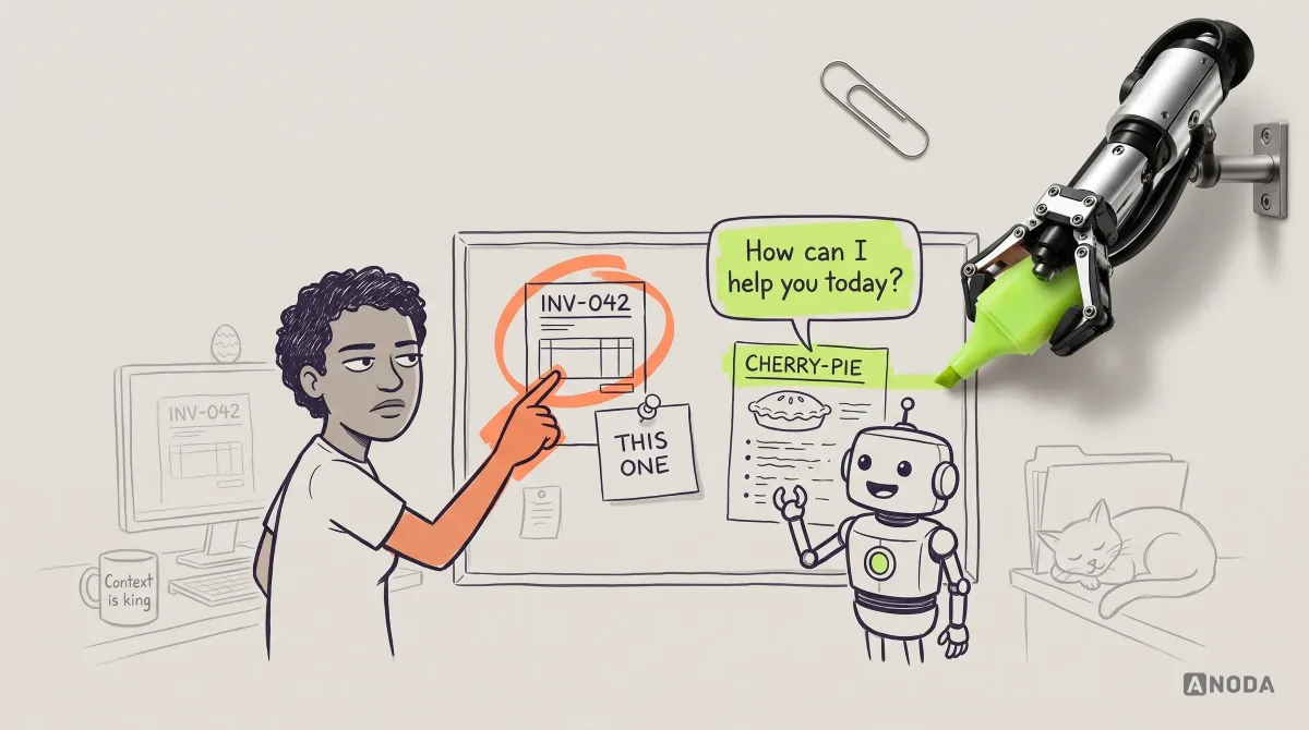
Garbage in, garbage out — and nothing in is worse. Context is a design decision, not plumbing. For every entry point someone decides what the AI receives — object, role, permissions, history, project state — and what it must not see. The interface shows that scope, so users know what the assistant can see before they trust it.
Project state matters most. “What should I do next?” has one answer at kickoff, another mid-delivery and a third the week before launch. A feature that reads the state can offer the one action that fits. A feature that does not can only offer everything, which is the fifty-action menu again, now with extra confusion.
Audit check
Compare what the product knows at each entry point — role, permissions, object, recent activity, project state — with what the AI receives.
Failure evidence
Users re-typing what is already on screen. Identical answers for very different roles or stages.
Correction pattern
Define a context contract per entry point, show its scope in the interface and let the current state decide which actions come first.
AispireMe: AI counsel beside the student’s plan
In AispireMe’s education-platform design, the AI counsellor sits beside the student’s status and recommendations, with chat history kept in view. The profile separates the roadmap, academics, activities and essays; readable answers can be copied as a plan. Parents and counsellors approach the same student through their own menus and controls. The design makes the conversation part of education planning, rather than a separate blank chat. ANODA designed the flows and desktop interface; the AI engineering belonged to the client’s team.
For a similar feature, start with the user’s current record and next decision. That is the scope of our AI product design work.
Making the user invent the first prompt
“Ask me anything” is the most common AI entry point and one of the laziest. It assumes the user knows what the feature can do, how to phrase it and what a good request looks like in your product. New users know none of that. Experienced users are not much better off, because the capabilities stay invisible until someone guesses the magic words.
It is a builder who turns up on site, hands in pockets, and asks the client, “So, what shall we build?” The client hired him precisely because they do not know. Users type “hi”, get a cheerful paragraph about how helpful the assistant is, and that is your activation moment gone.
The blank prompt is the fifty-action list in reverse. One shows everything, the other shows nothing. Both dump the same missing decision on the user.
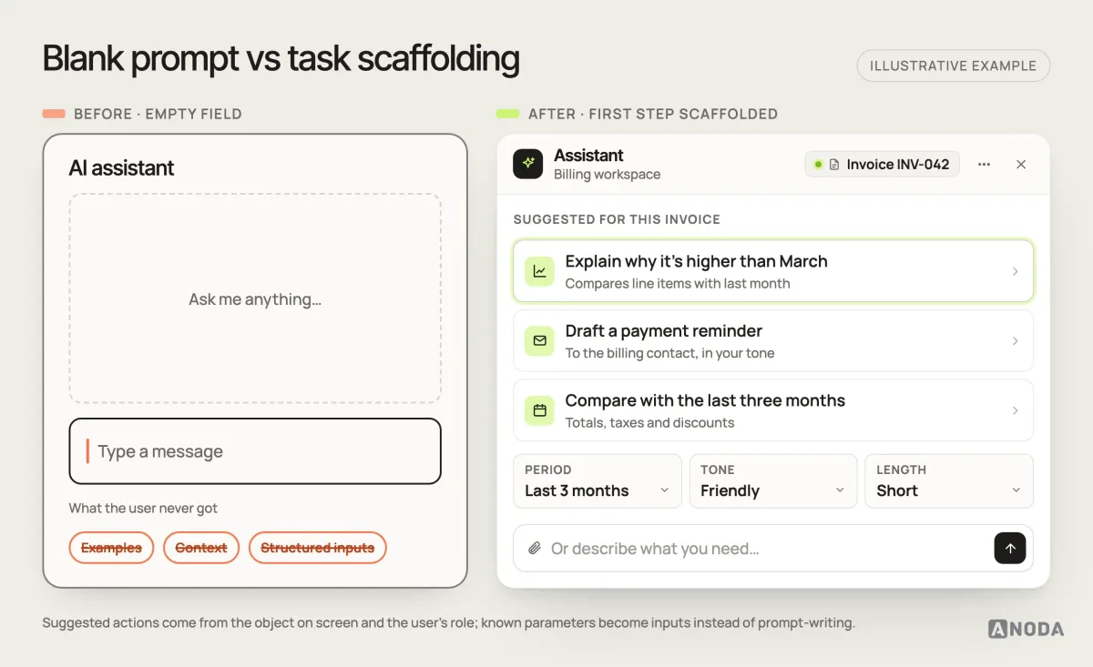
The fix falls out of the work above. Once the scenario is validated and the context is known, the product can offer the first step: two or three actions that fit this object, this role and this state, in the user’s own words. Where a task has known parameters — a period, a tone, a length, a recipient — make them inputs, not something to remember to type. We go deeper into task-specific starting actions for conversational interfaces in our guide to chatbot UX design and user-friendly AI interfaces.
Keep free text for people who know what they want. Just stop making it the front door.
Audit check
Open each entry point as a new user and compare the first requests real users send with the jobs the feature was designed for.
Failure evidence
Sessions that end without a request. First prompts that test what the feature can do.
Correction pattern
Replace the blank start with suggested first actions from the current screen and state, turn known parameters into inputs, and keep free text as a secondary path.
Presenting generated output as a finished answer
AI output is a draft. Often good, sometimes excellent, occasionally wrong in a small way that matters a lot. When the interface serves it as a finished answer — a slab of text and a copy button — the user gets two options: accept it whole, or start again with a new prompt explaining what was wrong.
Imagine a school where the only feedback on an essay is “rewrite it from scratch”. Nobody learns anything, and everybody hates Tuesdays. Users want to keep most of it, change one sentence, undo the regeneration that killed the only good paragraph. Without those controls they fix it in another tool — and the time the AI was meant to save leaks out through the clipboard.
Treat output as a draft: it lands where it will be used, it can be edited directly, refinements are one click, versions are kept, and feedback names the problem — wrong data, wrong tone, too long. A thumbs-down tells you about as much as a sigh.
Audit check
Try small changes inside the product — shorten a part, regenerate half, go back a version — and count the steps.
Failure evidence
Output copied into another editor. Follow-up prompts that only adjust tone or length.
Correction pattern
Put output where it is used, make it editable, and add targeted refinements, versions and specific feedback.
Hiding uncertainty instead of supporting the decision
AI is not always sure, and sometimes should not answer at all. Plenty of products hide it: every response arrives in the same confident voice, whether it rests on complete data or a coin toss. Users either trust everything until the first expensive mistake, or trust nothing and quietly stop using the feature you are paying to run.
A structural engineer who signs off every building with the same confident stamp — including the ones he never inspected — is not reassuring. He is a lawsuit with a clipboard. The goal is not a confidence percentage nobody knows how to read. It is to support the decision the user actually has to make: act on this, check it, or look elsewhere. Show what the answer is based on — which records, which documents, which period — and say plainly what is missing. “Based on two of five connected accounts” is useful. “I might be wrong” is a shrug in a speech bubble.
When the AI should not answer, it needs something better than a refusal. Say what is missing, suggest where to find it, narrow the question to something it can answer reliably, or hand off to a person. A refusal with a next step keeps the user moving. A refusal without one ends the session, and sessions that end do not renew subscriptions.
Audit check
Run questions the feature should not answer confidently — unseen data, out-of-scope judgement, ambiguous requests — and record what it shows.
Failure evidence
Confident answers the system could not know. Users double-checking everything elsewhere.
Correction pattern
Show the basis of each answer, define what to decline or narrow, and give each refusal a next step.
Treating failure as a generic error state
AI features fail in more creative ways than ordinary software: timeouts, empty or misunderstood results, missing permissions, rate limits, safety checks. Most products flatten all of that into one sentence: “Something went wrong. Please try again.”
That message is a contractor shrugging at a cracked wall. Something went wrong — thanks. The foundation or the paint? The user cannot tell whether it was their request, their data or your system, so they try twice, stop, and “the AI is broken” goes into the churn survey nobody reads.
Each failure deserves its own state, designed around the next step. A misunderstood request can show how it was interpreted and let the user correct it. Missing data can say which data and offer to connect it. A slow task can show real progress and a cancel button instead of a spinner praying for mercy. And every scenario needs a fallback: the manual path that gets the job done without AI, one click away.
If the flow was mapped at the start, the failure points and their exits are already on the map. If it was not, you find them in production, one support ticket at a time.
Audit check
List how each flow can fail, trigger as many failures as you can and check whether the user can continue.
Failure evidence
One message for every failure. Sessions that end at an error.
Correction pattern
Give each failure type its own state and next step, and link every AI-assisted job to a manual fallback.
Using the same control pattern for every level of risk
Some AI actions are harmless: a suggested title, a summary nobody else will read. Others change records, email customers, move money or cannot be undone. Many products treat them all the same: either everything runs immediately, or everything asks “Are you sure?”
Both are wrong, and expensively so. When everything runs immediately, you have hired a demolition crew with no floor plan and no insurance — one misunderstanding and hundreds of records are rewritten or a batch of emails is out the door. When everything asks for confirmation, users learn to click “Approve” the way everyone clicks “Accept cookies”, and the protection disappears exactly where it was needed.
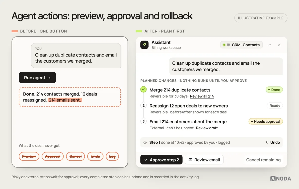
Control should match risk. Reversible actions run directly, with undo. Big data changes show a preview. Irreversible or external steps — sending, deleting, paying — need approval for that step, not a blanket “yes”. Let people cancel remaining steps where the operation permits it, and leave a readable record of completed work.
This is where the earlier work pays for itself. A team that prioritised its scenarios and mapped the flow already knows which steps are dangerous. A team that shipped fifty actions gets to find out, usually from a customer, usually in capital letters.
Audit check
Classify every AI action by reversibility and impact, then check its preview, approval, cancel, undo and log.
Failure evidence
Irreversible actions on one click. Confirmations dismissed unread. Cleanup with no record of what happened.
Correction pattern
Set a control level per risk class and require approval only for irreversible or external steps.
AI product design
Stop paying for an AI feature nobody knows what to do with.
We pick the scenario worth automating, map its states and context, and design the controls and the way back — before your team writes one more prompt.
How Nexus makes an agent’s work visible
In Nexus’s agent-builder and Computer Use design, an agent starts as a conversation but becomes an editable flow: its trigger, ordered actions and connected apps are visible together. A browser task runs in a live view with the steps beside it, plus Stop and Take over browser controls. Vault access is selected item by item rather than granted through an unexplained blanket permission.
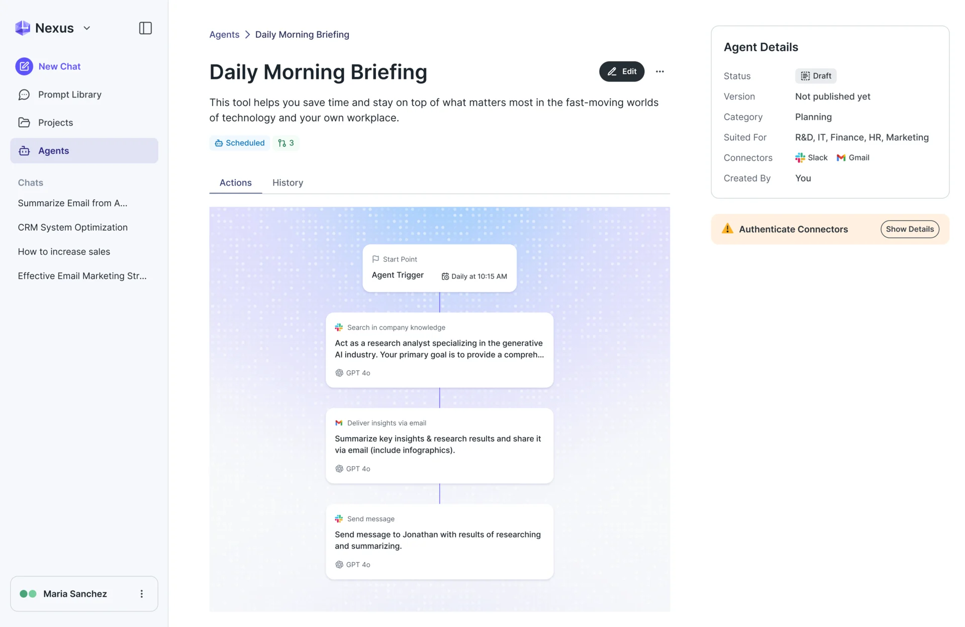
These screens show what AI agent UX design contributes: readable setup, visible execution and a way for people to intervene. ANODA delivered these flows, controls and interface designs for the client’s engineering team. A conversational assistant that only answers needs different proof; AI Gateway’s employee chat keeps model choice, sources and connected knowledge visible without making the same autonomous-action claim.
Evaluating the response instead of the user’s task
AI teams measure what is easy to measure: the quality of individual answers. Evaluation sets, rating scores, benchmarks — they all ask whether the answer was good. None of them asks whether the user got their job done.
It is marking a pupil’s handwriting and never checking whether the sum is right. The page looks lovely. The maths is still wrong. And you are still paying for the lesson. A feature can ace every evaluation and still fail its users, because the answers arrive at the wrong moment, answer the wrong question, need heavy editing or lead nowhere. A great benchmark on a feature nobody can use is lipstick on a pig.
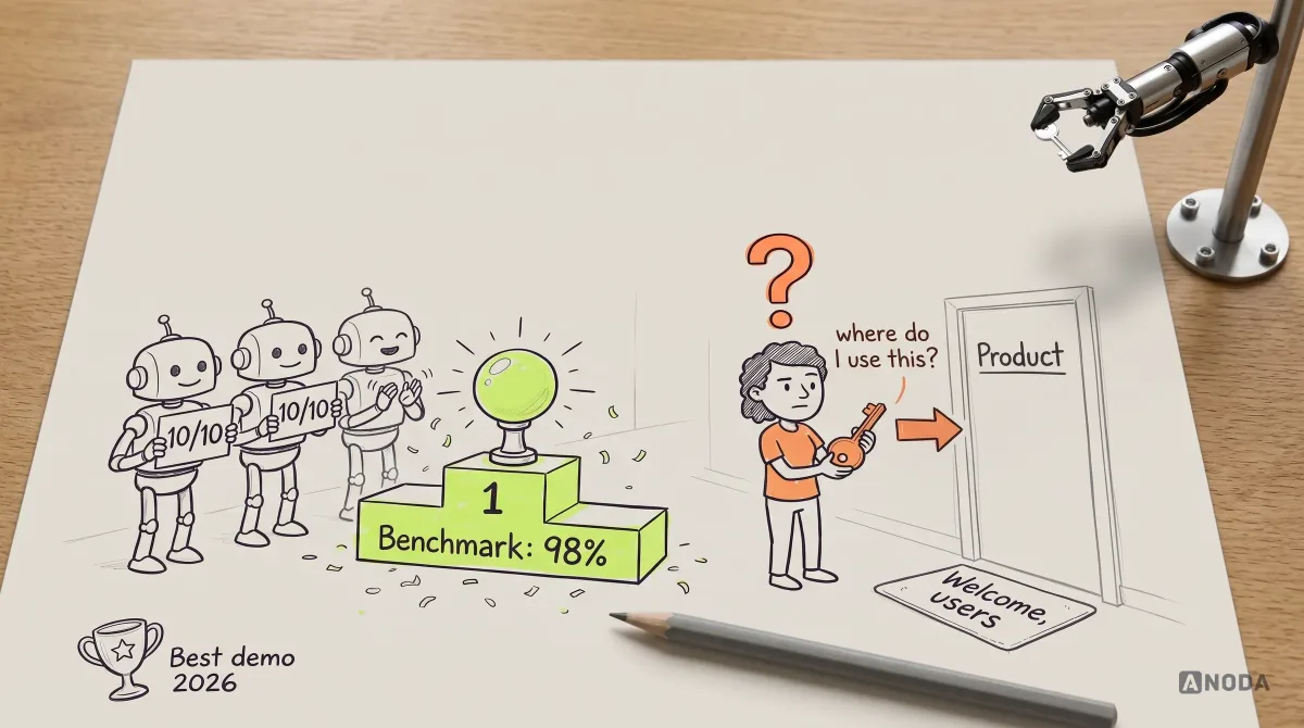
Task-level evaluation asks harder questions. Can the user tell the feature is relevant here? Can they finish the task they came for, spot a wrong result, fix it without starting over, recover when it fails?
That needs testing and measurement, not vibes. Moderated sessions with target users, each given a real task rather than a prompt to type, show where people hesitate and what they expect the AI to know. In the live product, track completion (the output was used and the task finished), correction (how much it was changed first), abandonment (the session ended without using it), reversal (automated actions undone) and return (whether people come back for the same job). These are the numbers that explain AI feature adoption. “Messages sent” explains nothing except your model bill.
Audit check
Define task completion for one key scenario and how to detect it, then run five to eight moderated sessions on that task.
Failure evidence
Rising usage with flat outcomes. Success reported as prompts sent.
Correction pattern
Measure completion, correction, abandonment, reversal and return, and let task outcomes decide what to improve.
A practical method: from scenario to automated flow
Every mistake above has the same root: the AI was bolted on before the product decisions were made. Our method puts the decisions back in the right order. It is the order a sane builder works in — survey, plans, foundations, walls, and only then the smart lighting — and each step produces something the next one depends on.
- Validate the scenario. Interviews, tickets, recordings and manual workarounds show which jobs are frequent, slow or error-prone. Output: a short list of scenarios with evidence behind them.
- Prioritise. Compare candidates on frequency, user value, business value and risk. Output: a ranked list and a written decision about what not to build yet.
- Map the states. Trigger, starting states, decisions, transitions and outcomes, failures included. Output: a flow product, design and engineering all recognise.
- Define the context. What the AI must know about the user, role, object and project state at each step, and what it must not see. Output: a context contract per entry point.
- Narrow the action set. For each state, the next useful action and a few alternatives, instead of catalogues and blank fields. Output: entry points and first steps.
- Design control and recovery. Control by risk, editable drafts, uncertainty states, a recovery for every failure. Output: the full interaction design, unhappy paths included.
- Measure the outcome. Completion, correction, abandonment and recovery, tested with users before and after launch. Output: a way to know whether the thing works.
Only then does prompt and model work begin in earnest, and now it has a real job: carry out a defined step, with defined context, in a defined state. Prompt quality matters a lot at that point. It was just never the first decision.
Where your problem belongs
The feature is not defined yet, or it is live and unfocused. The scenario, priorities, states and flow were never worked out, or the feature ticks every box in this article. That is product and interaction design work — what our AI product design service does.
One critical journey is not converting. The product is live, and new users do not reach first value or do not get what the AI feature is for. A focused Activation Audit is the faster route: one product, one primary segment, one critical journey from signup to first value, and exactly where people drop.
The problem is everywhere. The issues cross roles, modules and workflows, and the AI feature is one symptom. Then you need the broader UX Audit and improvement roadmap with a prioritised plan across the product.
Pick the right one. Rebuilding a whole product to fix one activation drop is renovating the house because a tap drips. Polishing one journey when the scenario itself is wrong is repainting a house with no foundation.
The decision rule
When an AI feature is not earning its keep, do not start with the prompt. Ask these questions in order, and stop at the first one without a clear answer:
- Do we know which user scenario this feature serves, and have we seen users need it?
- Do we know why this scenario matters more than the other things the AI could do?
- Have we mapped its states, and does the AI get the context it needs in each one?
- Does the interface offer the next useful action, rather than every possible one?
- Can users control, correct and recover from what the AI does?
- Are we measuring whether users complete the task?
Only when all six have honest answers is the model or the prompt the likeliest culprit. Everything above that line is a product decision, and no model will make it for you, however many parameters it has.
A prompt is an automation mechanism, not a product strategy. Validate and prioritise the user scenario, define its states and the next useful action, and only then use AI to automate the flow. Everything you do not decide, the user has to — and users who have to do your job tend to leave.
Work with ANODA
Your AI can do forty things. Your users need one, at the right moment.
Bring us the feature, the flow and the places people get stuck. You get a prioritised plan your team can build — not another prompt library.
Written by