
An edtech web app for four roles, one student’s plan
AispireMe helps K-12 students plan their school years and programs, with parents and counsellors alongside.We designed its MVP for desktop web.
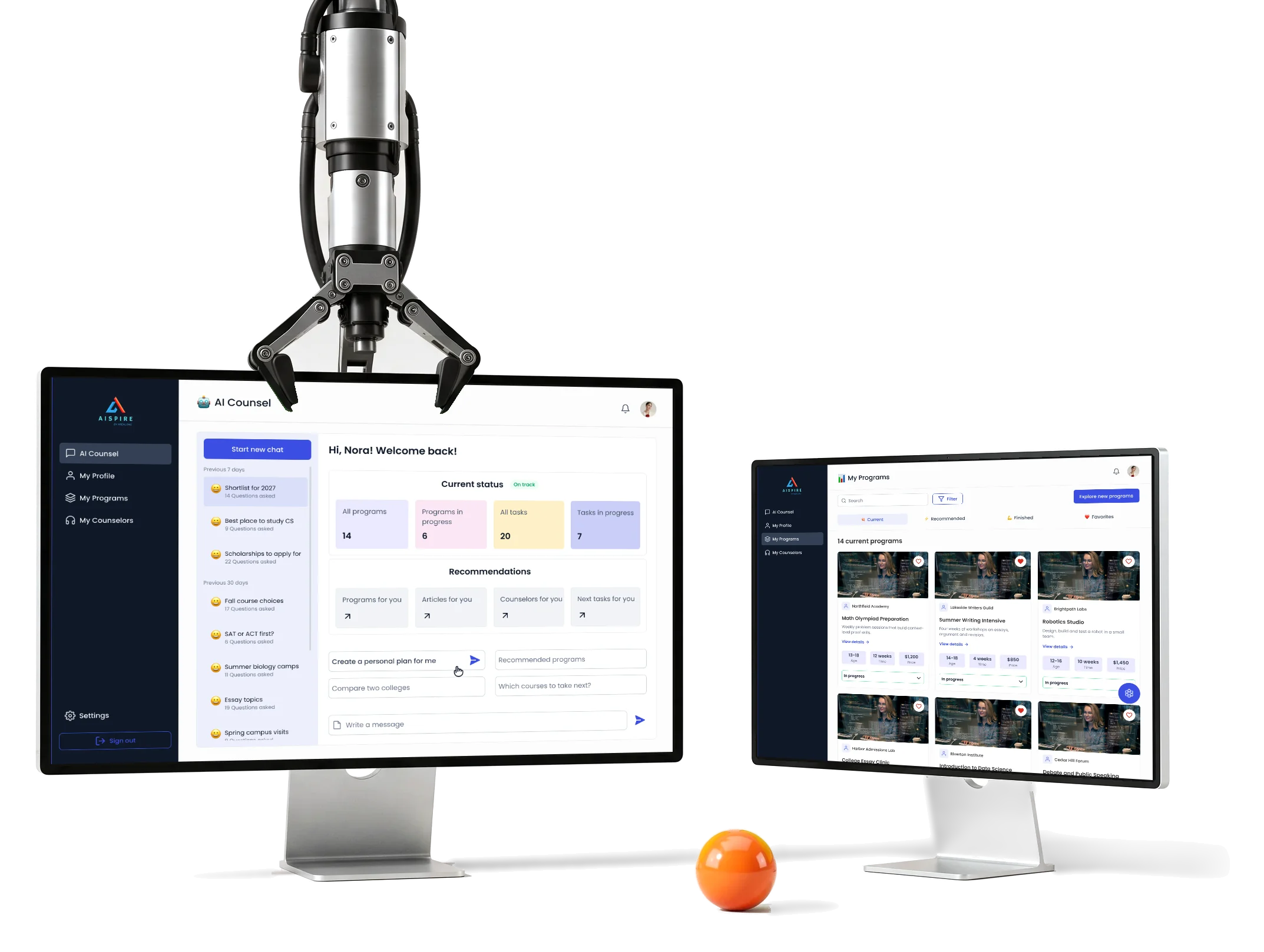

- Multi-role
- web app students, parents, counsellors and organisations
- AI
- Counsel a chat beside status, history and recommendations
- Research
- to UI kit flows, wireframes, screens, prototype and kit
Project summary
We designed AispireMe’s K-12 education-planning MVP around the path from choosing a program to completing an application. We connected students, parents, counsellors and organisations in one desktop web app , with UX and UI , a prototype and UI kit supporting the AI-counsellor experience. Our product design defined the journey; the client owned the AI and implementation.
What a family passes through
One chain, from signing up to a program:
-
Sign up
- Choose a role
- Enter details
- Log in
-
Profile
- Roadmap
- Academics
- Activities and essays
-
AI Counsel
- Chat and its history
- Current status
- Recommendations
-
Programs
- Recommended
- Program page
- Enrollment
-
People
- Counsellors
- Children
- Students and organisation
-
Settings
- Personal info
- Payments and billing
- PRO subscription
- A helpful AI and A student’s own plan
- The chat sits with the status and recommendations it speaks to, not on a page of its own.
- One student and Several roles
- Parents and counsellors see the plan through their own menu and their own controls.
- Planning and Paying
- Payment and subscription live in settings the student already knows.
One program page, read in the order of the decision
- Found
- A recommendation is only useful if a family can see what the program asks of them: the age, the length, the price, the start date.
- Decided
The offer first, with its three numbers and one action; then what the course is and who teaches it; then why it fits; then alternatives to compare without leaving the page.
Our UI/UX principles guide explains the priorities behind these screens; the MVP UX guide connects the first complete journey to its supporting roles.
- For the user
- A family sees what a program asks before they enroll, and what else they could pick.
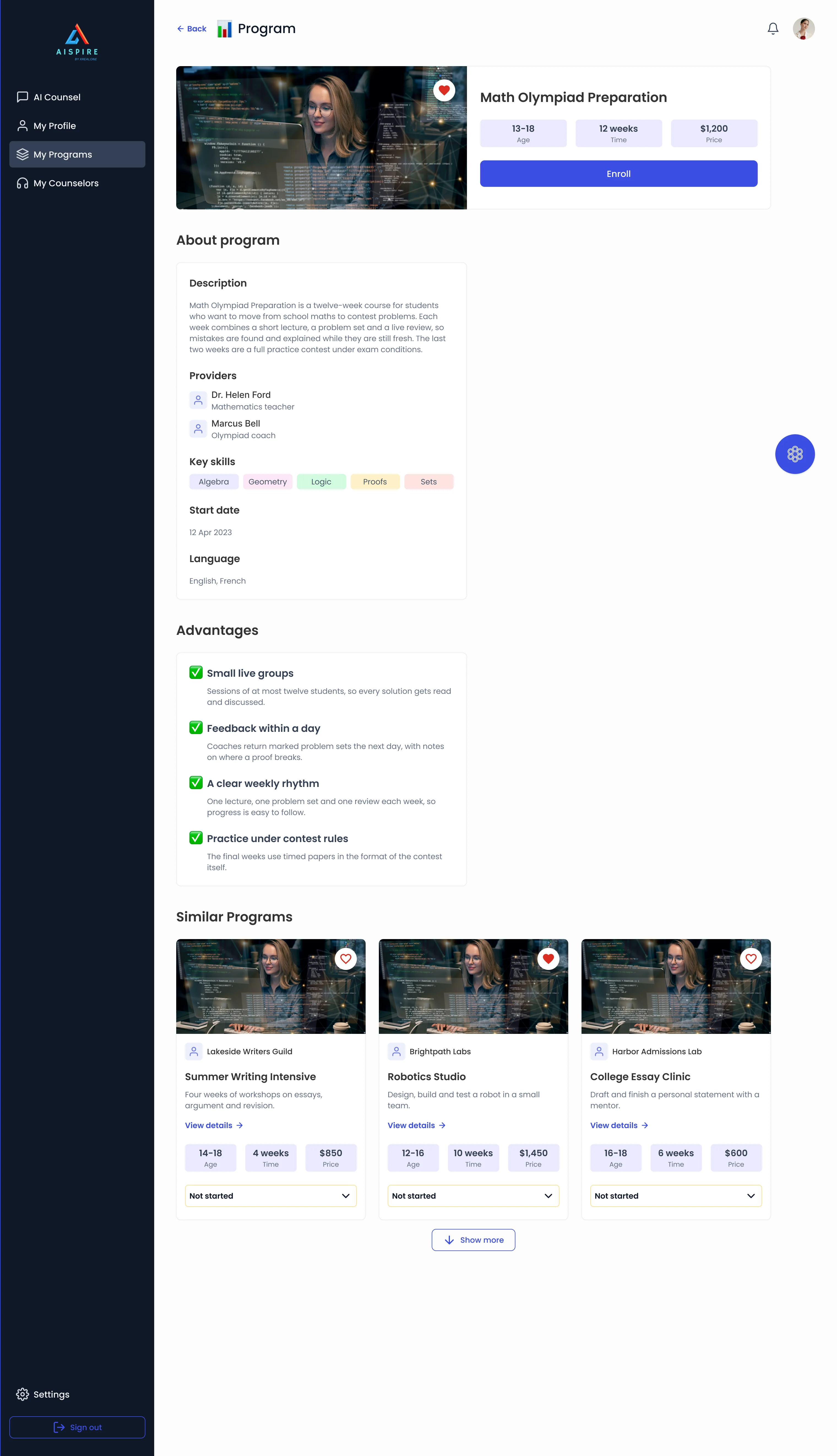
-
The offer
Title, age, length, price and Enroll.
-
What it is
Description, teachers, skills, start date.
-
Why it fits
Four reasons, each with its own line.
-
What else to compare
Three alternatives, one click away.
How the work progressed
From research on the field to a prototype and a kit that cover every role.
Before choosing what to build, product discovery settles the audience, alternatives and next question. product design carries that direction into the complete experience.
-
Research
What education-planning products offer today, and what a student, a parent and a counsellor each expect from one
Artifact Education-domain and competitor research
-
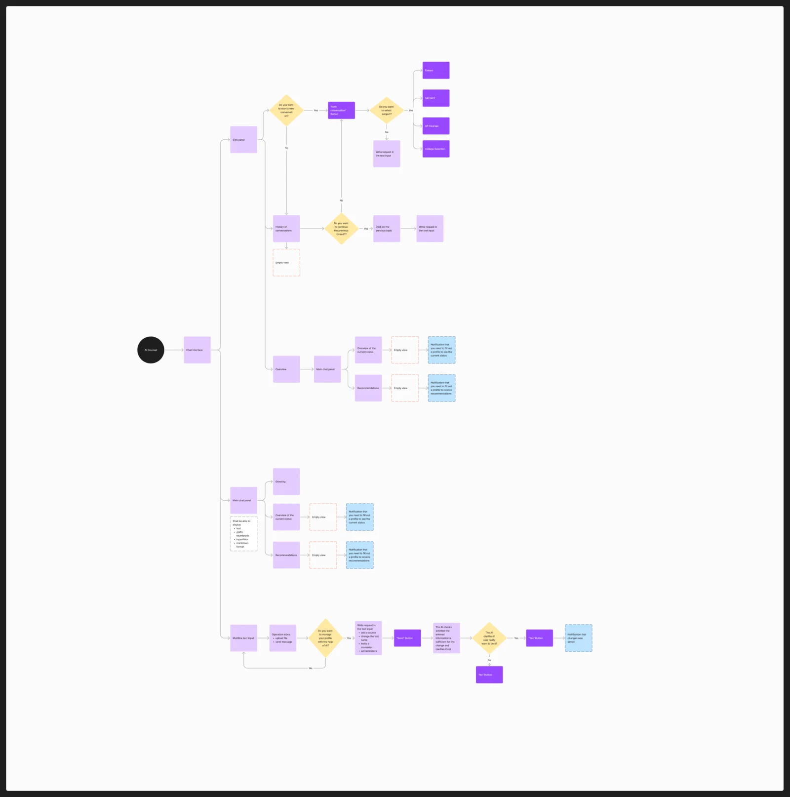
User flows
How each role gets from signing up to its main jobs, and where the AI chat joins them
Artifact Multi-role user flows
-
Information architecture
Which screens each role has, and how they connect to one another
Artifact Information architecture and a screen map
-
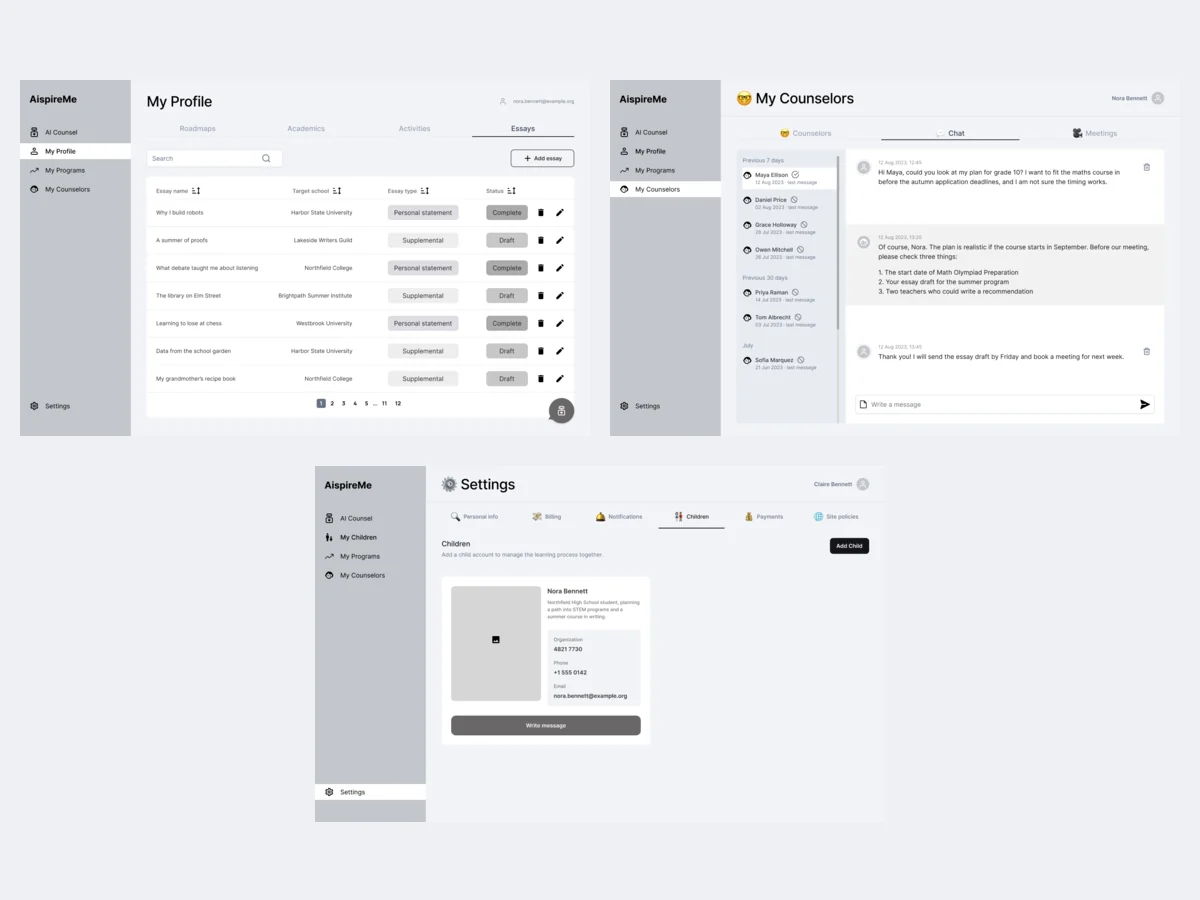
Wireframes
Where each role’s lists, chats and settings sit, before any styling
Artifact Wireframes, with a second pass
-
UI design
The finished look of every role’s screens, on one set of components
Artifact Desktop web UX/UI design
-
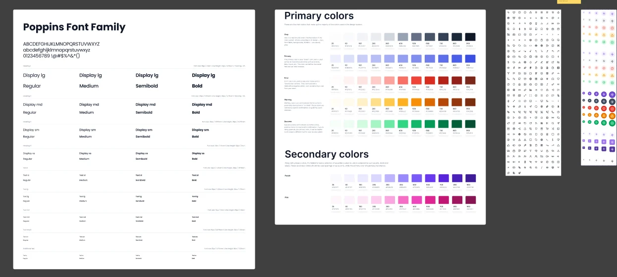
Prototype and UI kit
Which parts the screens share, and a way to click through them
Artifact A clickable prototype and a UI kit of reusable components
From signing up to a first plan
- Found
- Each role enters the product differently, and every step has states of its own: an error, an empty list, a wait.
- Decided
- Every step drawn with its states before the UI, as three runs of screens, and a menu whose items depend on who signed in.
-
Choosing a role
Student, parent or counsellor, then the details, then a short wait on the way into the profile.
Open the full map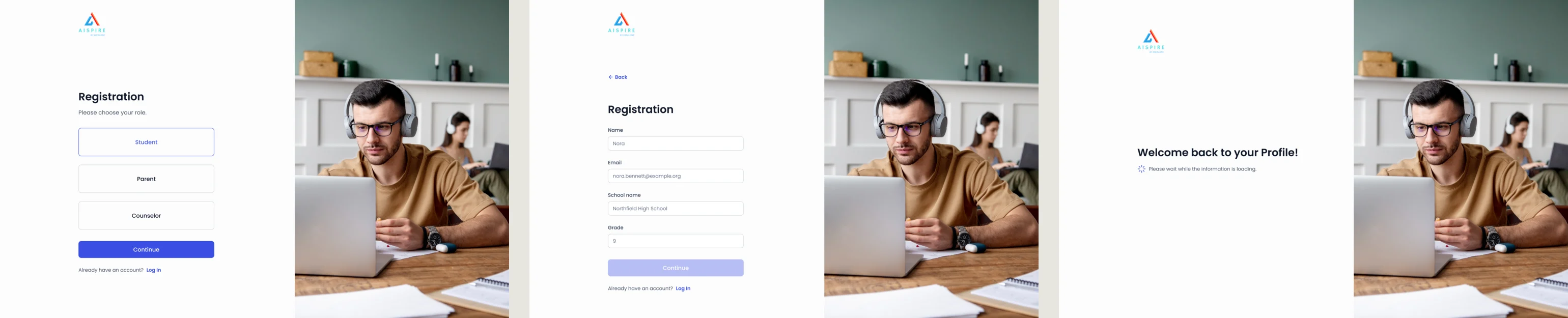
-
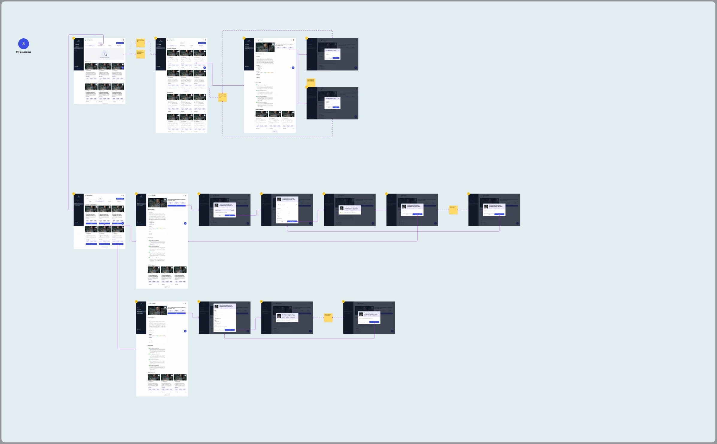
From a program to enrollment
A confirmation of the total, an application form, then a note that the request has been sent.
Open the full map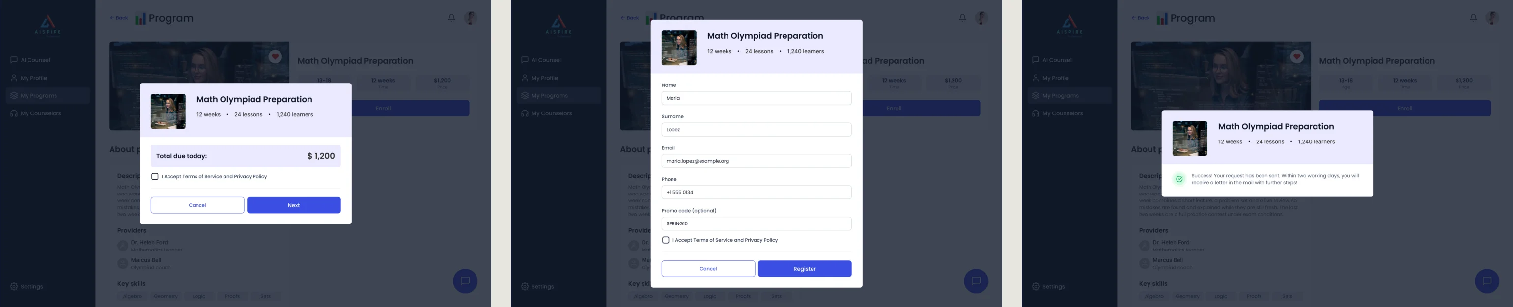
-
Bringing in a counsellor
An empty list, an invitation by email, then the connected counsellor with a chat one click away.
Open the full map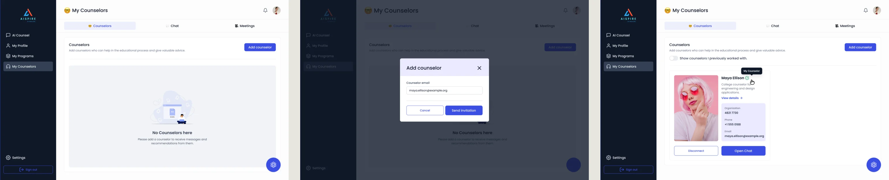
Five jobs a family needs done
In the order of the fears they arrive with.
An AI counsellor with its context
- Found
- An answer about someone’s education can sound sure and still be incomplete, and a student cannot tell the difference.
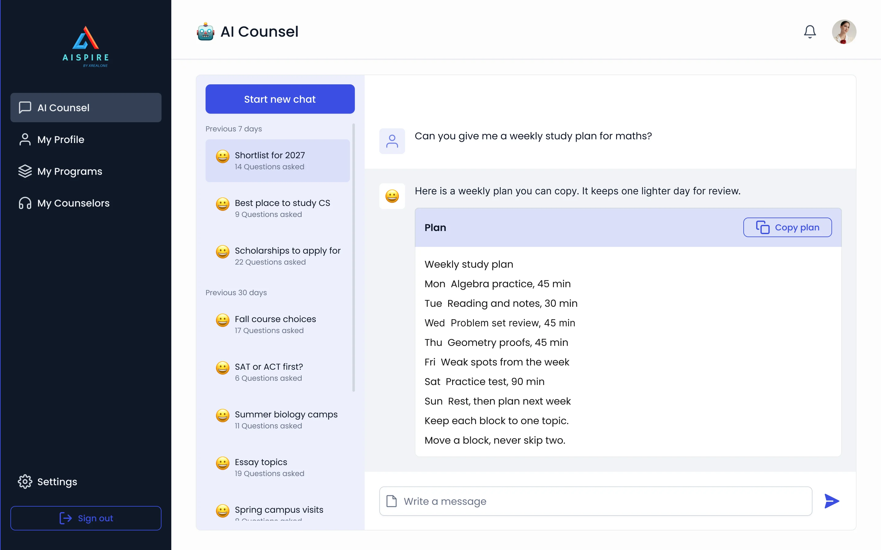
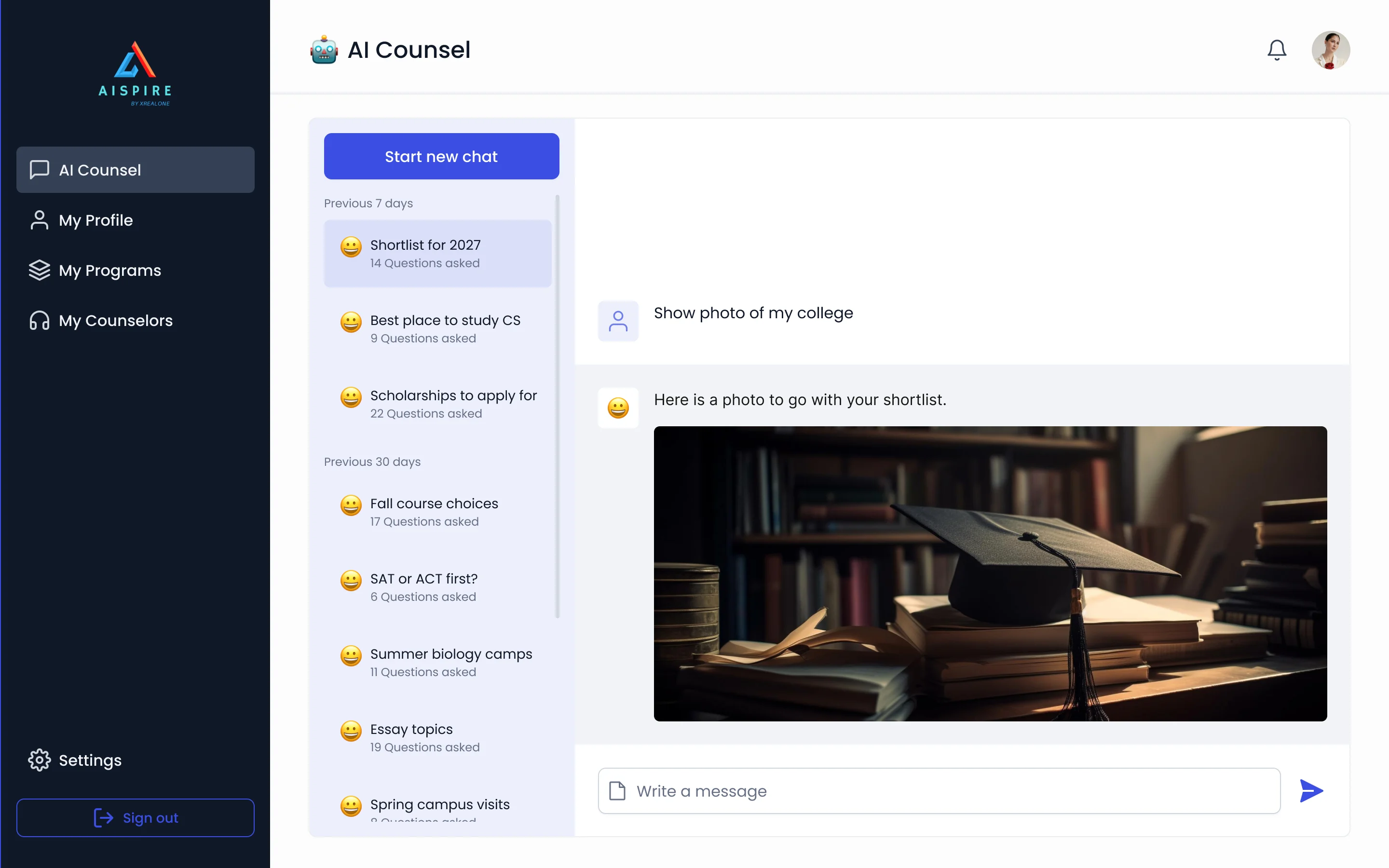
- Decided
- The chat lives inside the student’s plan, next to status and recommendations, with its history beside it; answers are set out as readable steps that can be copied.
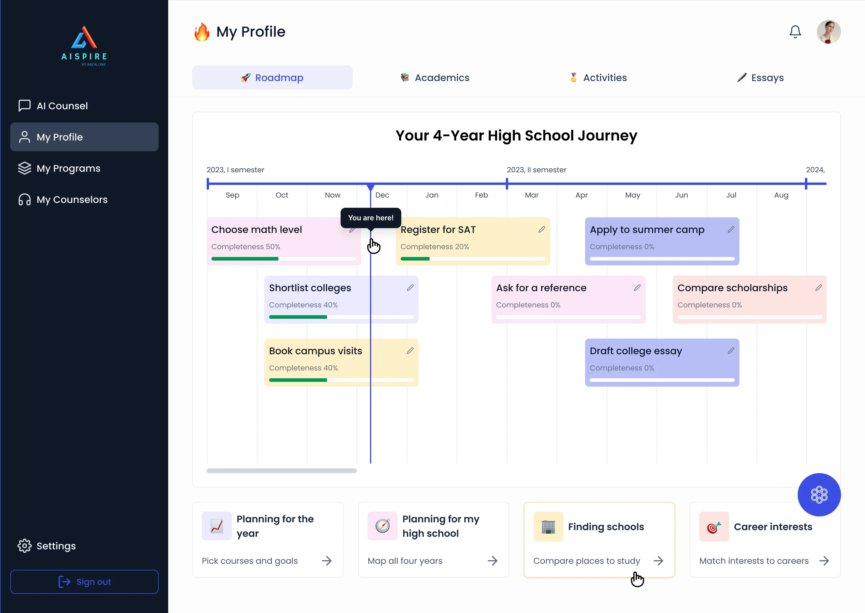
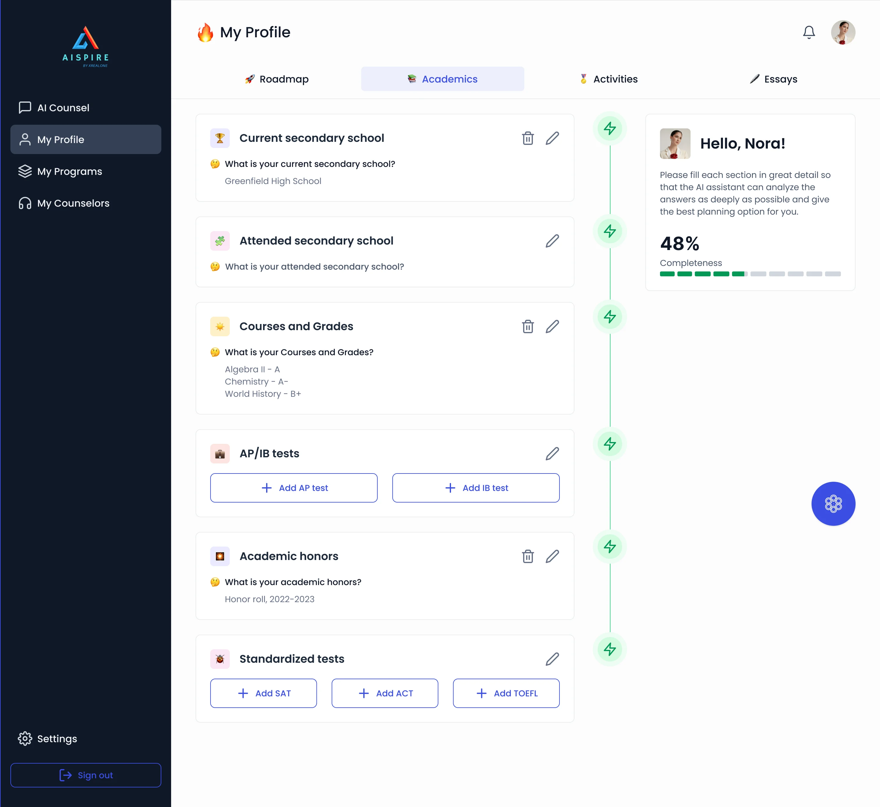
A profile the counsel can use
- Found
- Advice is only as good as what the system knows, and goals change while old recommendations stay behind.
- Decided
- A profile in four parts (roadmap, academics, activities, essays), with a completeness score that tells the student how much the AI has to go on.
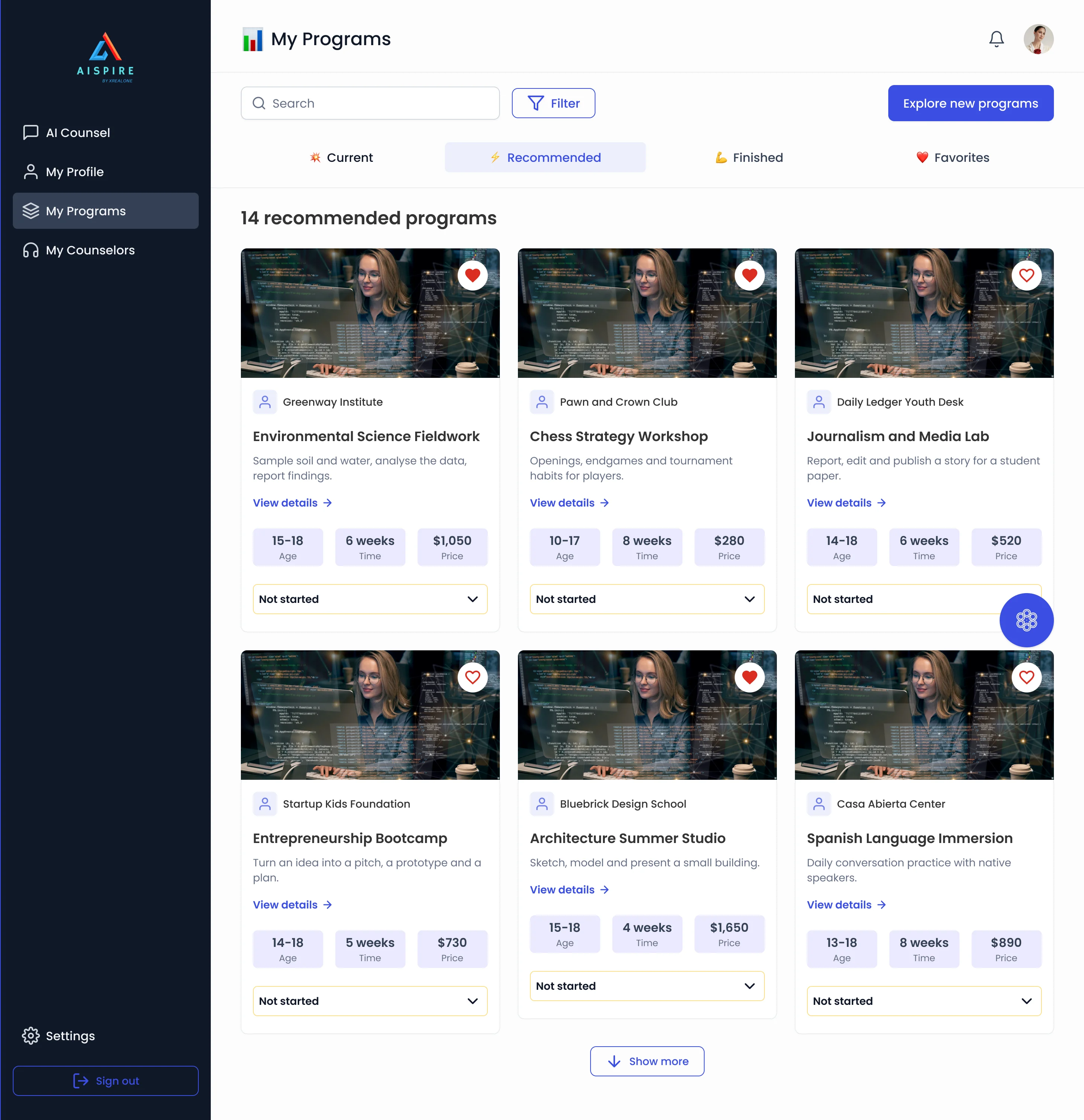
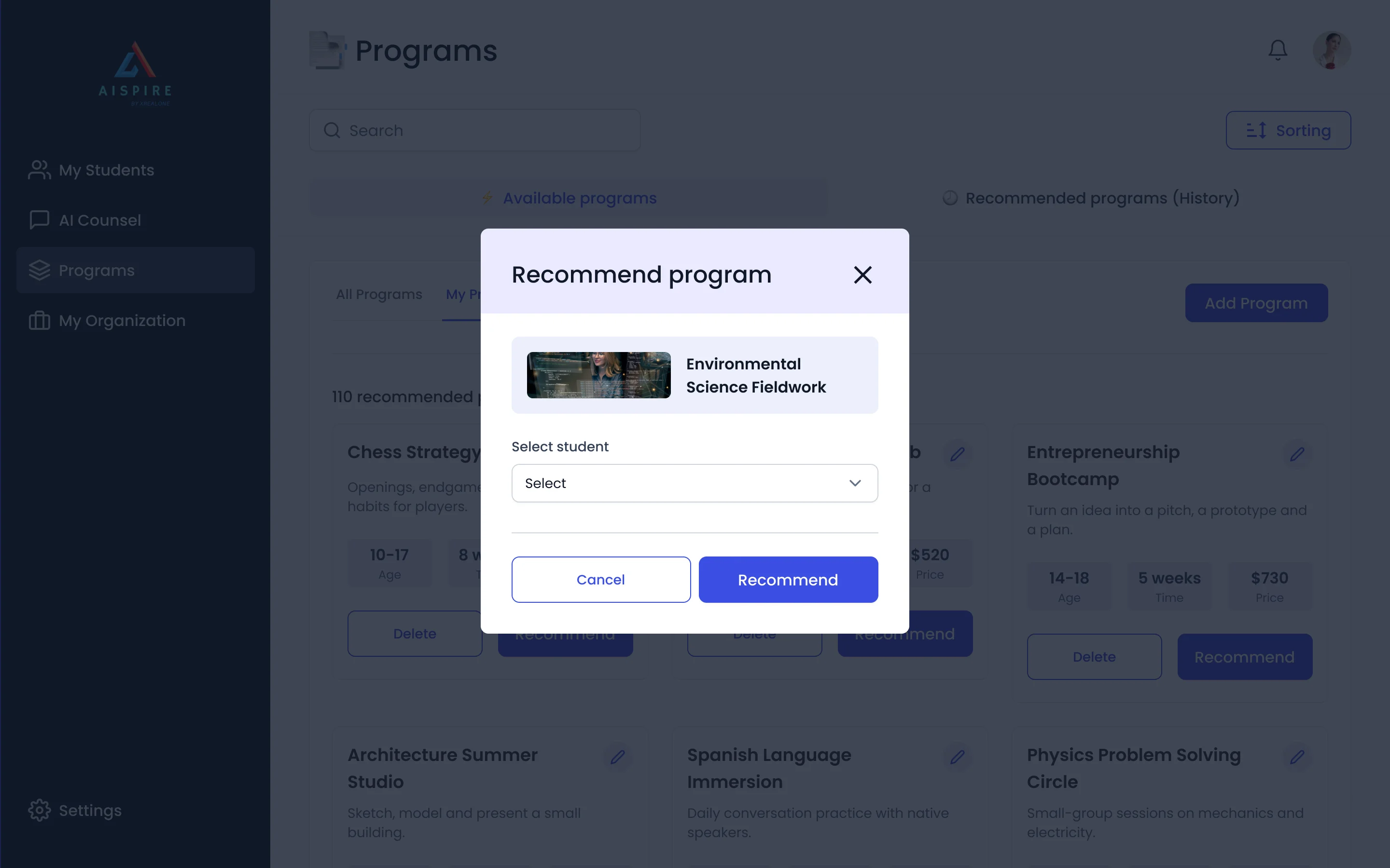
Program fit, with its numbers
- Found
- A list of attractive cards hides what a program asks of a family.
- Decided
- Every card carries age, length and price with a status; the counsellor sees the same cards and can recommend one to a student.
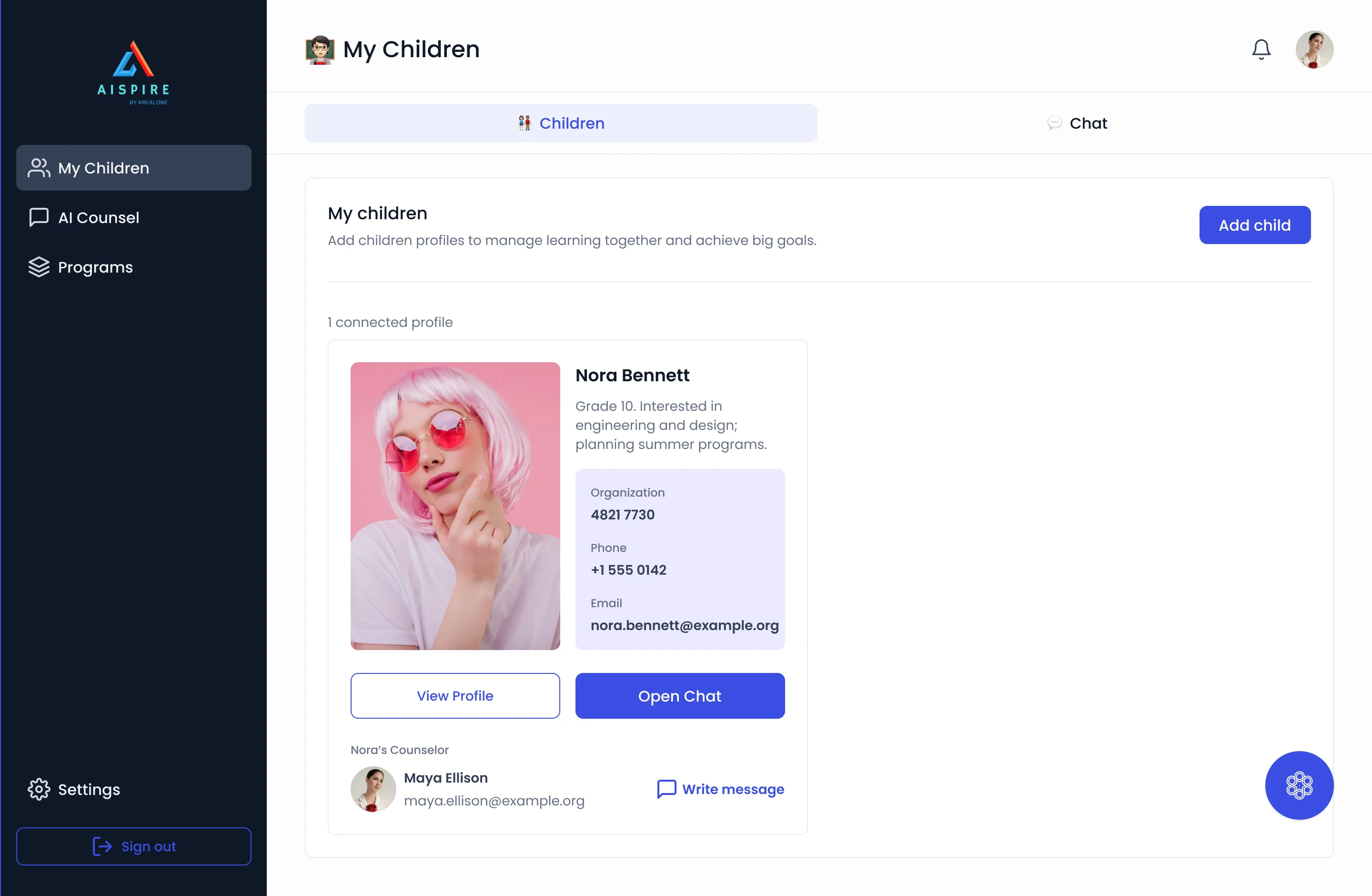
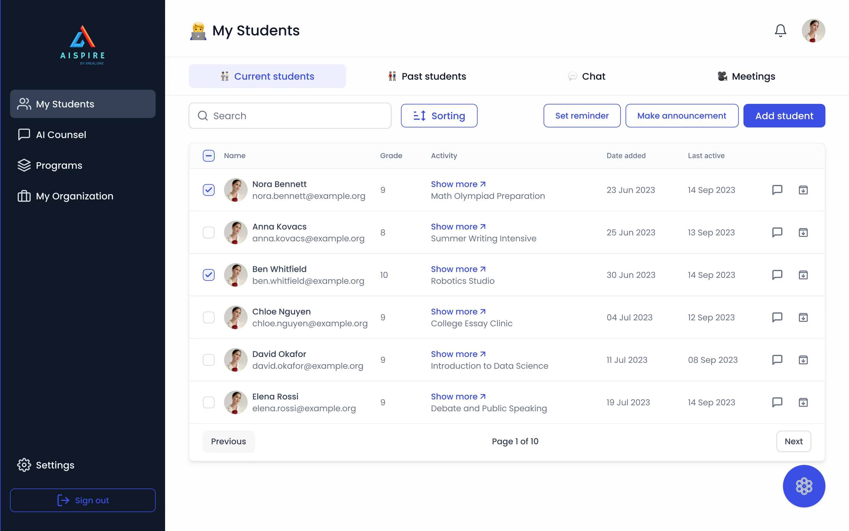
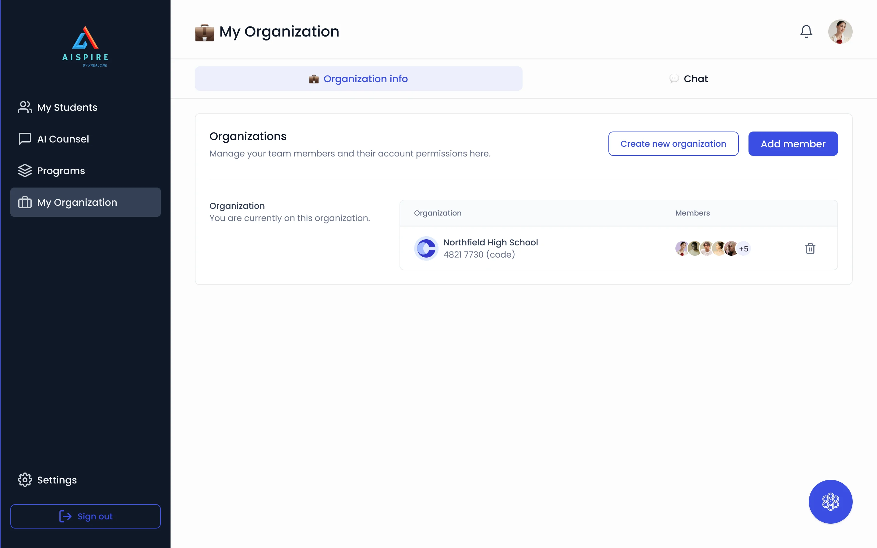
One student, three other views
- Found
- Parents, counsellors and organisations look at the same student, and none of them should see or do more than their part.
- Decided
- Each role gets its own menu and its own home: a parent’s children, a counsellor’s students, an organisation’s members.
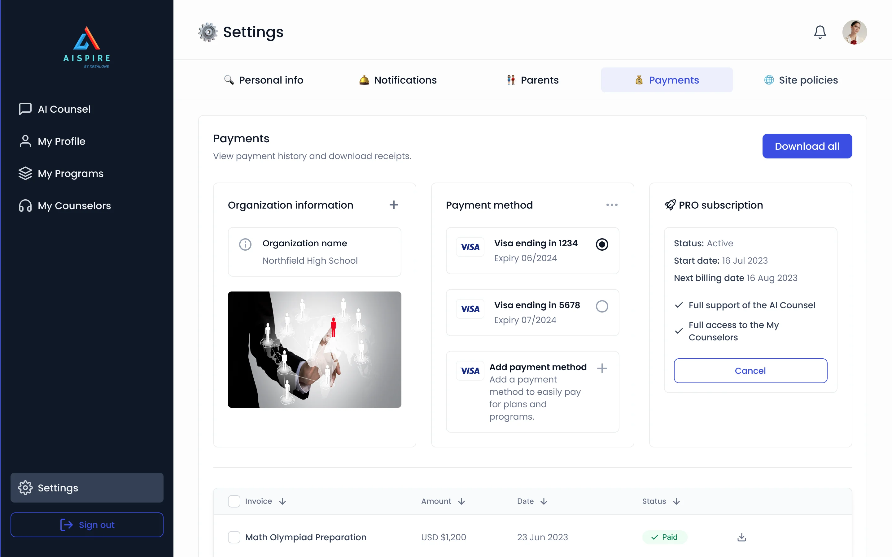
Who pays, and for what
- Found
- Payments and subscriptions feel bolted on when they sit away from the plan.
- Decided
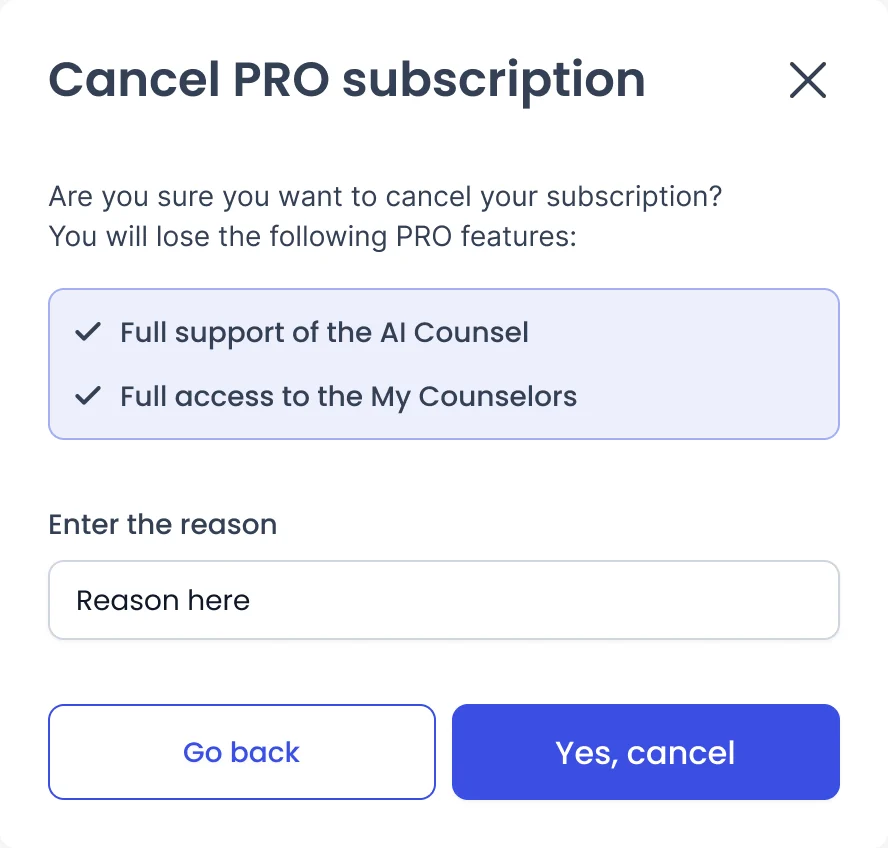
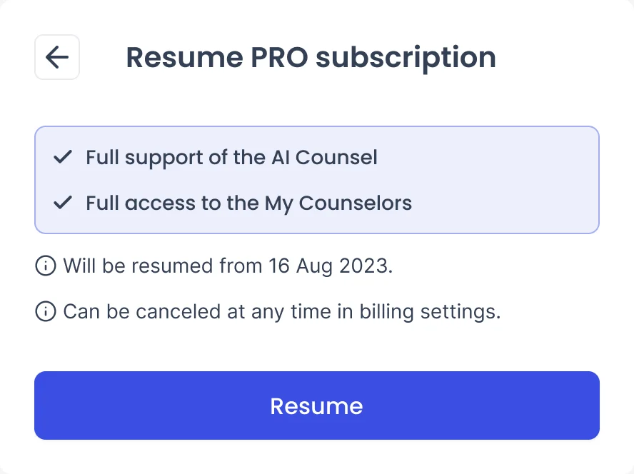
- Payment method, invoices and a PRO subscription in one settings page; cancelling and resuming each a short dialog that says what changes.
One kit under every role
- Found
- People, programs and their states repeat across four roles, and drawn one by one they drift apart.
- Decided
- A UI kit of reusable parts: a profile card for each role, program cards in three depths, inputs, badges, dialogs and icons, shared by every screen.
One profile card for each role
A child, a parent and a counsellor, built from the same parts.
-
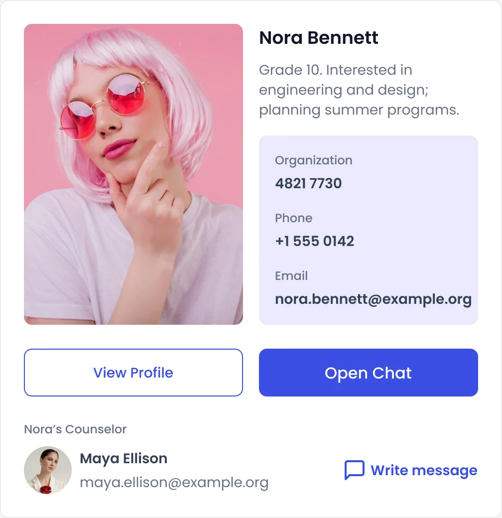
Child: Details, chat and the child’s counsellor. -
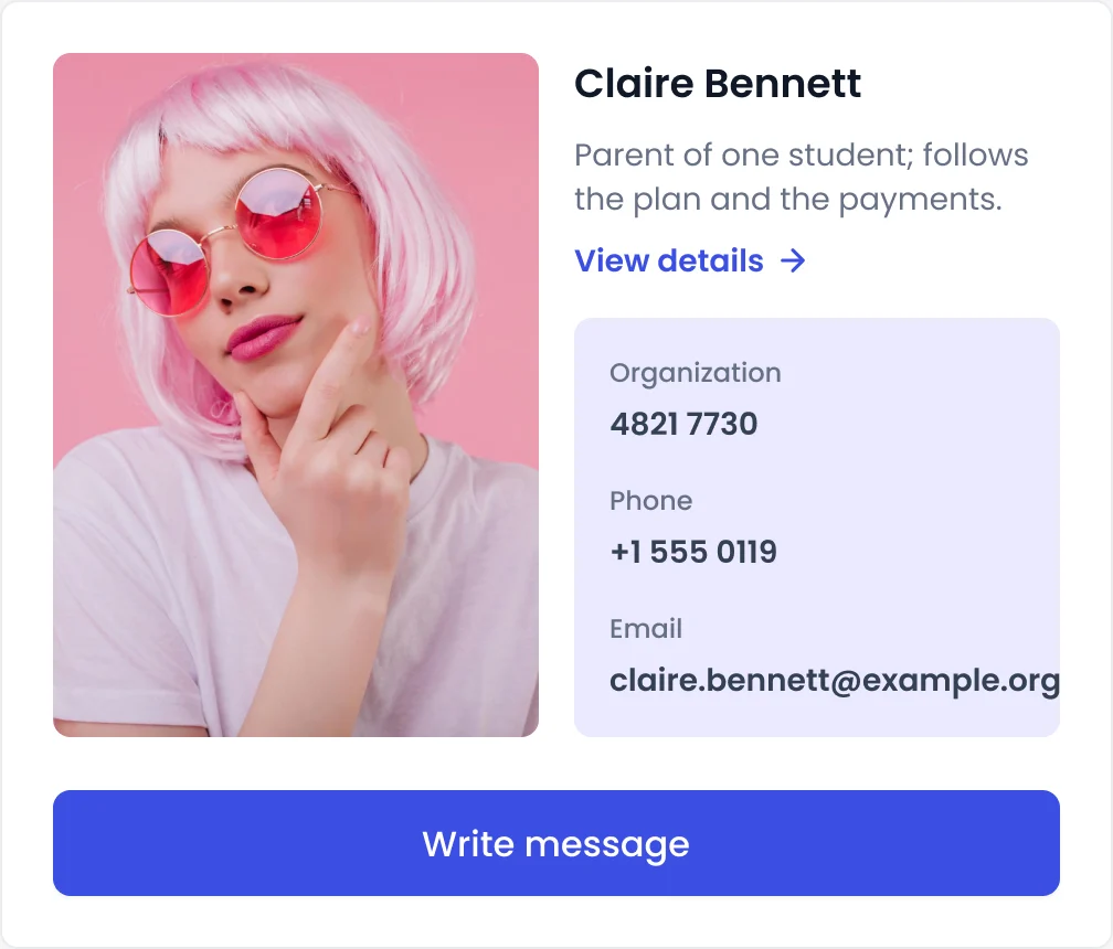
Parent: The same card, with one action. -
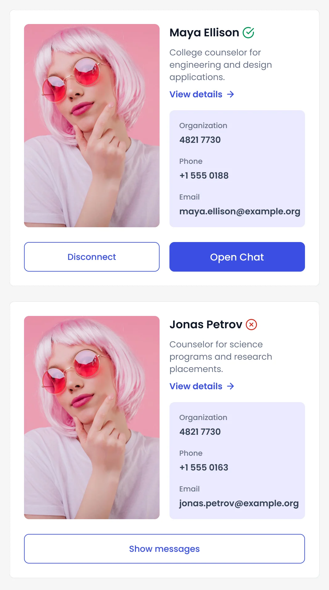
Counsellor: Two counsellors, connected and not.
One program card, three depths
The same card for browsing, for recommending and for managing.
-
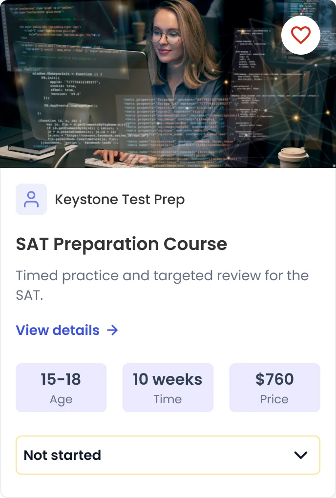
Browse -
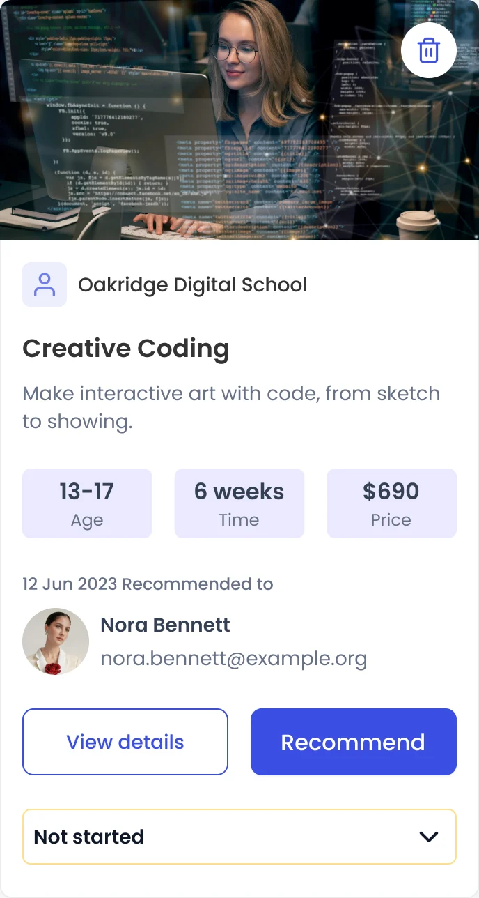
Recommended -
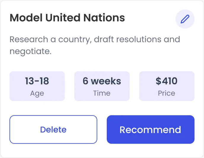
Manage
Where the design ended up
AispireMe’s MVP designed end to end for desktop web. We designed it; building it, the AI behind it and any launch were not part of our scope.
- every role’s path, drawn with its states
- Sign-up to enrollment
- the platform we designed for, in a light interface
- Desktop web
- billing and the PRO subscription in the same settings
- Plan + payments
- a clickable prototype and a UI kit
- Prototype + kit

Will your users trust what your AI says?
An AI answer, a shared plan and four roles that must not see each other’s data: we designed AispireMe around exactly that. Bring us your product, and we’ll show where that trust breaks first.
More work like this
Three more products we designed where a lot had to stay clear at a glance.
-
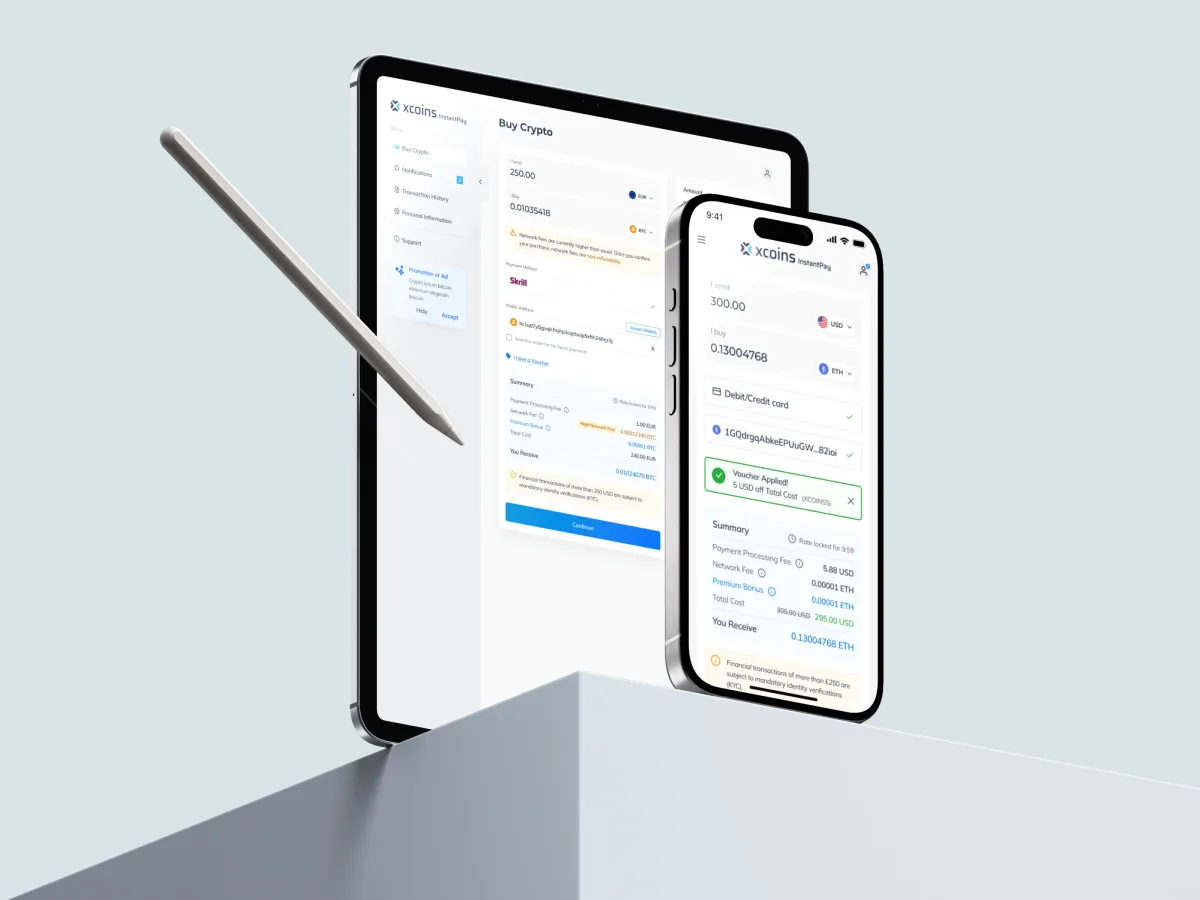
Crypto · FinTech · Web + Mobile
Xcoins
Redesigned a crypto buy journey so the whole price is in view before payment, with a design system.
-
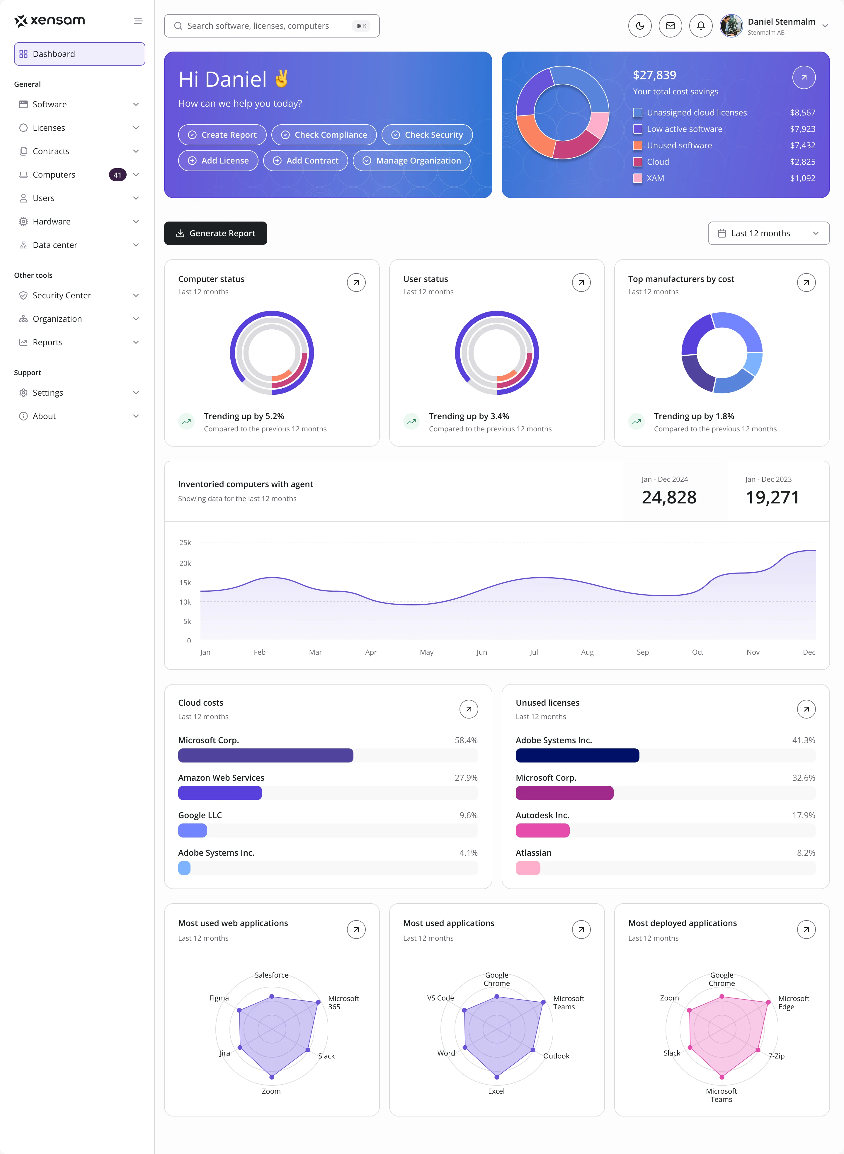
AI · SAM · Web SaaS
Xensam
Redesigned an enterprise software asset platform for two roles, in light and dark.
-
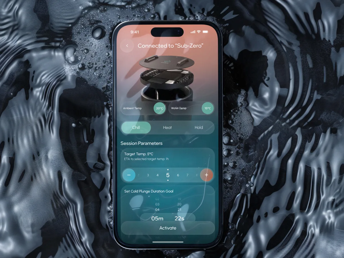
Wellness · Healthcare
Clearwater Wellness Co.
Designed a mobile app for booking and managing cold-therapy and wellness sessions, from scratch.
- 306 Screens designed
- 4 Experts on the team
What we brought to AispireMe
The product
The AI, the research and the kit

How to Design SaaS UX Around Workflows, Roles and Activation
Stop losing SaaS users after sign-up. See how ANODA connects onboarding, roles, data states and workflows into a product users understand and keep using.
How to Design an MVP That Tests a Product Assumption
Stop spending your MVP budget on an unfinished backlog. ANODA scopes a complete first journey, validates key decisions and designs a product users can use.
AI UX Design Mistakes: Fix the Flow Before the Prompt
Stop funding AI features users abandon. ANODA fixes the scenario, context, controls and recovery before another sprint goes into the wrong prompt.

Web App Design Trends: Choose Changes That Improve the Work
Evaluate web app design trends through real workflows: task-focused dashboards, responsive roles, AI controls, reusable components and useful feedback.