In this article
- Define roles, jobs and the account model
- Design first value before onboarding screens
- Make organizations, workspaces and invitations visible
- Keep navigation tied to repeated work
- Permissions need an explanation and real enforcement
- A dashboard should support a decision
- Specify the states around the data
- Long forms, bulk actions and recovery
- Billing, entitlements and usage limits are product states
- Collaboration, integrations and support
- Accessibility and keyboard-heavy work
- Measure meaningful work and investigate failures
- SaaS UX audit checklist
- Stop losing users between sign-up and useful work
SaaS UX design makes repeated work understandable: each role can reach useful results, read the true state of its data and recover when a permission, integration or payment interrupts the job. It covers the product after sign-in as well as the paths into it. A clear marketing website does not fix a workspace where people cannot tell what to do next.
The useful question is specific: can this person complete this job in this account, with the data and rights they actually have? Start there before adding a dashboard, a product tour or personalization. A team renewing a subscription needs dependable work, not more screens to visit.
Your team has already paid to bring users into the account. When they cannot finish setup, understand a restriction or recover from an error, that spend turns into support calls and abandoned subscriptions. A prettier dashboard or another feature leaves the same broken journey underneath.
ANODA designs the whole path from registration to useful work: roles, data, permissions and the states between screens. The HRIQ, Sail, Qarma and AispireMe examples below show how we turn that complexity into interfaces your users can understand and your engineers can build. The goal is a product people can confidently use, return to and keep paying for.
Define roles, jobs and the account model
Separate the buyer, the account administrator and the everyday operator. They may be the same person in a small account and different people in a larger one. Write a short matrix of the jobs each role performs, the records it can see, the actions it can take and the decisions it must delegate.
| Role in an illustrative operations product | Main job | First useful result | Common interruption |
|---|---|---|---|
| Account administrator | Set up the workspace and invite staff | A colleague can access the correct workspace | Invitation expired or sent to the wrong address |
| Operator | Complete assigned work | One valid record submitted | Missing data or a permission restriction |
| Reviewer | Approve or return work | A reviewed record with a clear decision | Evidence missing or newer changes available |
| Billing owner | Manage the subscription | Plan and renewal understood | Payment failed or seat limit reached |
Use the matrix to make your own role decisions explicit. Some products charge by usage, some by seats and some by organization. The model must match the actual contract and operating rules.
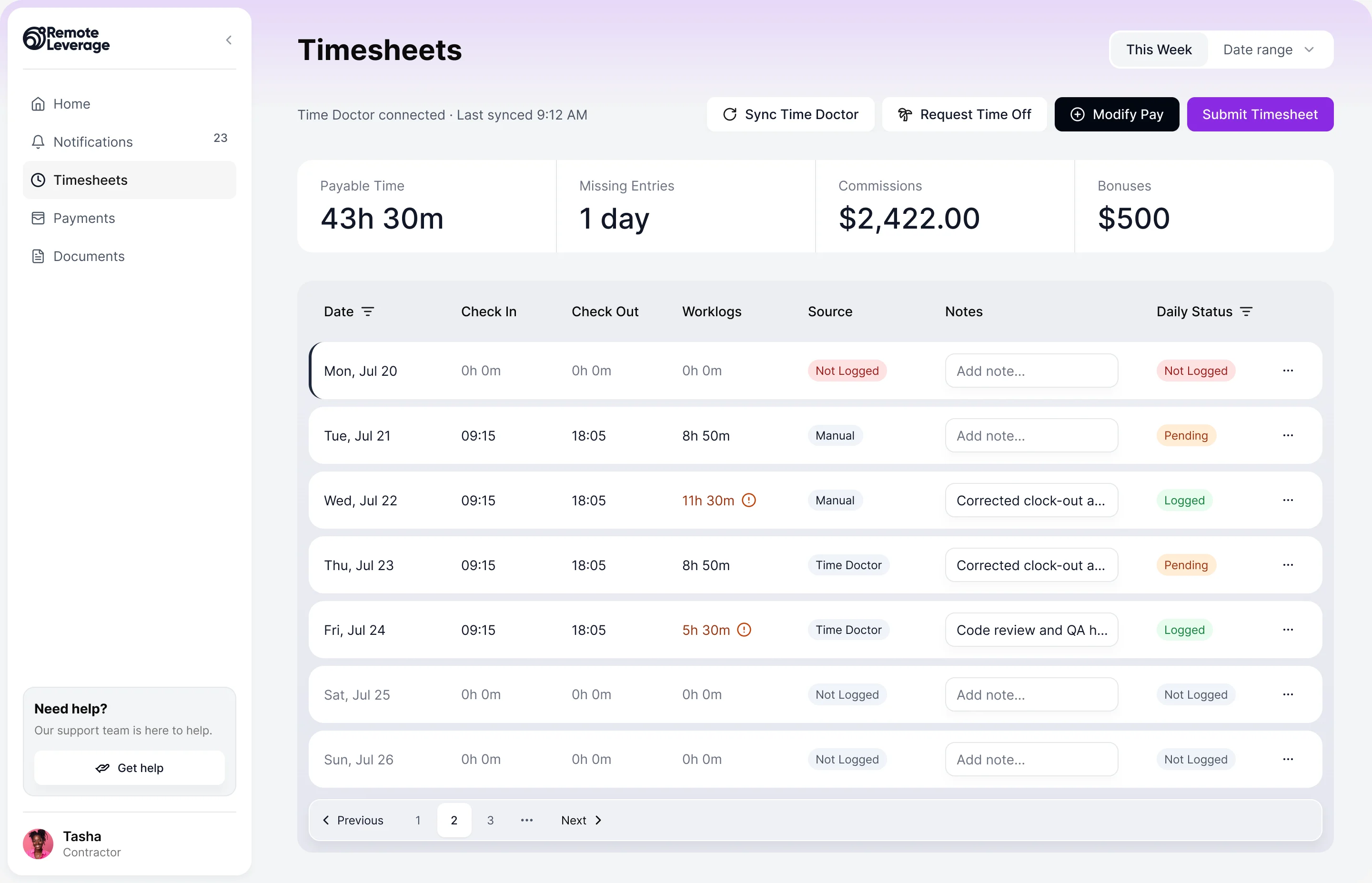
Remote Leverage’s HRIQ is concrete proof of role-specific design. ANODA designed Talent, Business Manager and Remote Leverage Manager experiences around onboarding, documents, time, payments and offboarding. ANODA delivered the design for those three roles, with plan- and agreement-specific rights documented for the client’s development team.
Design first value before onboarding screens
Choose a meaningful result the user can reach and a plausible path to it. For an operator it may be submitting a valid report. For an administrator it may be getting a teammate into the right workspace. For a reviewer it may be understanding and resolving the first exception. Registration is a prerequisite, not automatically the value event.
Map what the result needs: mandatory data, approval, imports, payment, another person’s action or an external service. Delay setup that the first job does not require. A product tour cannot compensate for an account that is empty and unable to accept real work.
When real data takes time to arrive, choose deliberately between a guided setup, an explicitly labeled sample workspace or a limited preview. Sample data should explain what the product will look like without appearing to be the customer’s actual result. Provide a clear way to leave the demo and begin real work.
An activation audit examines the gap between signing up and reaching that result. It should distinguish a confusing form from a legitimate dependency, such as a reviewer who must approve a document. Show who owns a necessary approval and what the user can do while waiting.
Make organizations, workspaces and invitations visible
Show where the user is working, especially when one identity belongs to several accounts. A workspace switch should preserve appropriate context without carrying private data into another organization. Make it clear which workspace an invitation grants access to and which role the recipient receives.
Design expired, already accepted, revoked and wrong-account invitations. If the person signs in with another email, explain the available routes rather than dropping them into an unrelated dashboard. An owner leaving the organization needs a transfer or escalation path before access disappears.
Account deletion, workspace closure and membership removal are different actions. State whose records and rights will change, who can authorize the action and what remains accessible afterward. Product and security owners decide the policy; the interface makes it understandable.
Keep navigation tied to repeated work
Navigation should reflect the user’s jobs and vocabulary. Group items by what people need to find and do, not by the engineering modules that produced them. Keep high-frequency destinations predictable and make the current record and workspace visible.
For deep workflows, preserve the path back to the filtered list. A reviewer moving through exceptions should not lose the search, sorting and selected row on every return. Search needs a scope: this workspace, this record type or the whole product. Empty search results should help distinguish no match from no accessible records without disclosing restricted information.
Keyboard shortcuts, saved views and bulk selection can help experienced operators. Add them to a coherent model rather than hiding the main task behind shortcuts that newcomers cannot discover.
Permissions need an explanation and real enforcement
An unavailable action can mean insufficient rights, the wrong record state, a plan restriction or a temporary service failure. Those reasons need different remedies. A disabled “Approve” button should not leave the reviewer guessing which one applies.
Choose when to hide an action and when to show it with an explanation, considering both task comprehension and information security. A safe explanation might say a workspace administrator must grant access; it should not expose the contents of a private record. Provide a request-access or contact-owner route when appropriate.
The server must enforce authorization. Hiding a button is a design choice, not a security control. Review permissions with engineering across direct links, exports, bulk actions and shared records, not only the menu.
A dashboard should support a decision
For every chart or number, name the question it answers and the next action it supports. “You have twelve overdue reviews” is useful when it leads to the relevant queue, explains the period and excludes completed work. A total without a definition or an actionable route can become decoration.
Show the unit, date range, source and freshness where they affect interpretation. Allow the user to investigate an exception without changing context. A dashboard for a manager and a task queue for an operator may share data while needing different hierarchy.
Sail mortgage CRM shows the design of income and closing figures, loan pipelines, long applications, pricing scenarios and documents inside an existing CRM. ANODA delivered information architecture, UX/UI, a UI kit and responsive mobile web for the existing CRM. Each figure and stage connects to the loan officer’s next job. Our dashboard UI guide develops that decision-first approach.
Specify the states around the data
A populated screen is one possible state. Design what the user sees when data is loading, absent, incomplete, stale or failed, and distinguish each from restricted access.
| State | What the interface should explain | Useful next step |
|---|---|---|
| First-use empty | No work has been created yet | Start the first relevant job |
| Filtered empty | Nothing matches this query | Adjust or clear the filters |
| Partial | Some records or sources are missing | Continue safely or inspect the missing part |
| Stale | Last confirmed data is from an earlier time | Refresh, with context preserved |
| Loading | Work is in progress, with realistic feedback | Wait or continue elsewhere when allowed |
| Error | The operation failed, or its result is uncertain | Recover without a duplicate action |
| Restricted | The current role cannot use this surface | Request access without private-data disclosure |
Keep the user’s input when a request fails. If a submission’s response is uncertain, check whether it succeeded before asking for a retry. Do not turn “request received” into “payment completed” or “approval granted.” Those differences matter most in money and compliance workflows.
Qarma connects mobile inspections, defect evidence, reports and corrective actions on a web platform. Inspector conclusions and approver decisions are separate states. ANODA designed the connected inspection and review surfaces and handed them to Qarma’s development team.
Long forms, bulk actions and recovery
Use real content to design long forms: missing values, international names, multiple units, conditional fields and errors that can occur after a server check. Save progress where the policy permits it and tell the user what has been saved. In collaborative work, explain conflicts instead of silently overwriting a newer version.
Bulk selection must define its scope. “Select all” could mean the visible page or every matching record. Show the count, exclusions and permission differences before a consequential action. Explain partial success: which records changed, which failed and what the user can do next.
Undo is valuable only when the operation can be reversed. For an irreversible action, give a clear consequence and appropriate confirmation. If an action submits work to another role, show who now owns it and how to track its progress.
Billing, entitlements and usage limits are product states
A billing screen should distinguish the plan, account seats, allowed features, metered usage, renewal and payment method. A limit reached needs a practical route: reduce usage, remove an unused seat, contact an owner or change the plan, according to the product’s real rules.
Explain when a change takes effect and what happens to existing work. Downgrading does not necessarily mean deleting data; if access or retention changes, say so before confirmation. Cancellation should make the effective date, remaining access and data consequences clear without forcing a support conversation merely to leave.
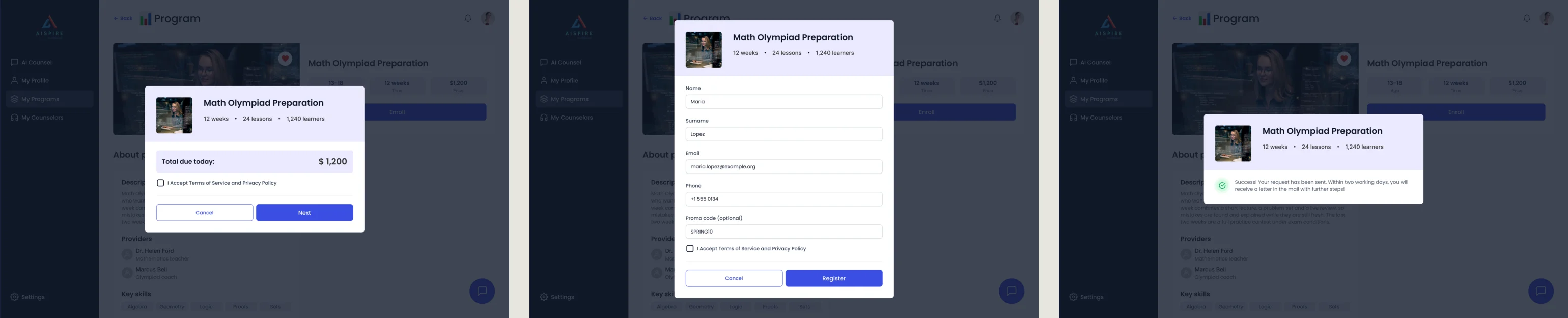
AispireMe illustrates another SaaS shape: students, parents, counsellors and organizations share education-planning journeys, with payments and subscription settings alongside the desktop product. ANODA designed the MVP and follow-on desktop flows, prototype and UI kit. The design connects program discovery, enrollment, payment and subscription decisions for the four desktop roles.
Collaboration, integrations and support
Notifications should name the changed object and the action required, with a destination that survives sign-in. Let people control message types and avoid duplicate alerts when the task was already completed. Activity history should explain who changed what and when; audit records and a lightweight notification feed may have different retention and access rules.
An integration needs more than a “Connected” badge. Show what it synchronizes, the last successful operation, the data that may be missing and who can fix authorization. Disconnecting, expired credentials, rate limits and partial sync need defined states. Design those interruptions alongside the connected state so users can keep working when a dependency fails.
Put help beside the decision that needs it. When support is required, make the affected record and safe diagnostic context easy to share, without exposing private data. A customer should know whether to retry, wait, ask an administrator or contact support.
Accessibility and keyboard-heavy work
Repeated business work often happens with a keyboard, assistive technology or a constrained device. Specify focus order, dialog focus recovery, table semantics, clear labels and status announcements with engineering. Test forms and bulk work without a mouse.
Large text, long translations and dense data can expose assumptions hidden by sample screenshots. Preserve access to the same jobs in compact layouts; do not remove important actions simply because the table no longer fits. Shared design systems can make states and controls consistent, but a reusable component still needs a meaningful label and context.
Measure meaningful work and investigate failures
Define eligible starts, confirmed results, failure and recovery events for the main jobs. Track the actor’s role, account stage and relevant product version without collecting sensitive record contents. Separate a user’s attempt from a server-confirmed submission and a later approval by another person.
Activation must match the product’s value and natural cadence. Retention can describe people or accounts; choose the unit and return window explicitly. A weekly review product should not judge success by daily opens, and a mandatory internal tool can be used frequently while still being painful.
Combine events with observation and support evidence. A funnel shows where work stops; a usability session can help explain whether the person misunderstood a label, lacked required material or reached a real policy boundary. Use comparable periods to see whether more users reach useful results and where the next improvement belongs.
SaaS UX audit checklist
- Each role’s main jobs, account membership and permissions are specified.
- The first meaningful result and its setup dependencies are clear.
- Invitations, expired sessions and workspace switches preserve the right destination.
- Navigation, search, dashboards and queues support actual decisions.
- Empty, partial, stale, failed and restricted states have different explanations.
- Forms preserve input; bulk actions explain scope, partial results and recovery.
- Billing and plan changes state timing, limits, access and data consequences.
- Notifications, history and sync failures show who owns the next action.
- Core work is tested with a keyboard, realistic content and appropriate accessibility checks.
- Analytics distinguishes attempts, confirmed results and work waiting on another role.
If these failures appear across the product, start with a UX audit and prioritize the jobs that matter to the account. If the product model itself needs designing, SaaS product design connects roles, workflows, states and a buildable system. B2B product design addresses the relationship between business buyers and daily operators.
Stop losing users between sign-up and useful work
A tour will not rescue a confusing account model. Bring ANODA the product and the journey users struggle to finish. We identify where the task breaks and design the roles, states and recovery around it, so your team can turn first use into a reason to return. Discuss your SaaS product design with ANODA.
Frequently asked questions
What makes SaaS UX different from website UX?
A marketing website helps a buyer decide. SaaS UX supports repeated work in an account: roles, records, permissions, states, collaboration, billing and recovery after sign-in.
How should SaaS onboarding define the first value moment?
Choose a useful result for the role, then map the setup, data, approval and integration dependencies needed to reach it. Registration or finishing a tour is not automatically first value.
Which empty and error states does a SaaS product need?
Distinguish first-use empty, no matches, loading, partial, stale, failed and restricted data. Each needs an accurate explanation and an appropriate recovery or next action.
How should roles and permissions appear in the interface?
Explain whether an action is unavailable because of rights, record state or a plan rule. Provide an appropriate request-access path and require engineering to enforce authorization beyond the interface.
What should a SaaS dashboard help users decide?
Each figure should answer a job-related question and support a next action, with its unit, period and freshness clear. Managers and operators may need different views of the same data.
How should SaaS teams measure activation and task failure?
Define eligible starts, confirmed useful outcomes, failures and recovery by role and account stage. Separate attempts from server confirmation and waiting on another person; investigate funnel drops with observation.
Written by