In short
Information architecture is the structural model underneath a product: what exists, how it relates, what it is called and how each role finds it. Here is how to build one from entities instead of menus, use the users' words, test with card sorts and tree tests, and keep the structure alive as the product grows.
In this article
- What information architecture is, and what it isn’t
- Why it matters, in money terms
- Start with entities, not navigation
- Take stock: the content and feature inventory
- Common structural patterns
- Labels: use the users’ words, not yours
- Research the mental model: card sorting
- Validate the structure: tree testing
- Then test it in context: usability testing
- How product objects shape real case interfaces
- Roles: one model, different views
- Where new features go
- Search, links and shortcuts
- Document the structure, and keep it alive
- How to tell whether the structure works after launch
- IA and content work together
- A practical order of work
- Common information architecture mistakes
- How we approach information architecture
- The decision rule
Information architecture is the structural model of a product: what things exist in it, how they relate to each other, what they are called, how different people find them, and how the structure grows as the product does. Navigation, menus and sitemaps are the visible part. The model underneath is what decides whether users can find anything at all. A product with a confused model can’t be rescued by a nicer menu. It just gets a nicer-looking maze.
Most teams meet information architecture when something has already gone wrong. The product has grown, feature by feature, and nobody can find anything. Support gets the same questions every week: where do I change my billing address, where did my reports go, why are there two places for customers? The instinct is to redesign the navigation. New icons, a new sidebar, maybe a search bar at the top.
It rarely works, because the problem isn’t the menu. It is that “customers” and “clients” are two different pages for the same thing, “invoices”, “billing” and “payments” live in three places, and a technician and an owner see exactly the same fourteen menu items though they do completely different jobs. Rearranging the menu of a product like that is repainting the signs in a supermarket where the cereal is in three different aisles.
This guide explains what information architecture is, how it relates to navigation, taxonomy, search and user flows, and how to build one that users can understand and your team can maintain: starting from the entities and relationships in your product, testing labels and paths with real people, and keeping the structure alive as the product changes.
ANODA fixes the model beneath the menu. We connect the objects, roles and recurring jobs, remove conflicting labels and test the routes before your team rebuilds the interface. MantisHub, Wildcast and VineView show why that work has to follow the product’s real structure: an issue, a campaign and a vineyard block each lead to different decisions. Your users find the work they came for; your team can add the next feature without another navigation rescue.
What information architecture is, and what it isn’t
Information architecture, IA for short, is the practice of organising, structuring and labelling content and functionality so people can find what they need and understand where they are. In a product, it answers a small set of big questions:
- What exists? The objects people work with: customers, jobs, invoices, reports, settings.
- How do those things relate? A customer has sites, a site has jobs, a job produces an invoice.
- How is it grouped? Which things belong together, and at what level.
- What is it called? The labels people see, and whether they match the words users actually use.
- How do different people get to it? Navigation, search, links, shortcuts, and how that changes by role.
- How does it grow? Where new features go, so the structure doesn’t collapse under the tenth addition.
IA is often confused with the things built on top of it.
- Navigation is the menus, tabs, breadcrumbs and links users click. It is how the structure is presented, not the structure itself.
- A sitemap is a diagram of pages. Useful, but it shows the result of IA decisions, not the reasoning behind them.
- Taxonomy is the classification scheme: categories, tags, types. It is one part of IA.
- Search is another way into the same structure, and it only works well when the content has consistent names and categories.
- User flows describe how people move through the product to complete a task. IA describes where things are; flows describe how people move between them. Each needs the other.
- UI is how all of this looks on screen.
A good way to hold the difference: IA is the floor plan. Navigation is the signs on the doors. You can repaint the signs as often as you like. If the kitchen is upstairs and the fridge is in the garage, people will still be annoyed.
Why it matters, in money terms
Poor information architecture doesn’t show up as a single bug. It shows up everywhere, quietly:
- Features nobody finds. You built it, you shipped it, and usage is low. Often the feature is fine. It is in the wrong place, under the wrong name.
- Support volume. “Where do I…?” questions are IA failures, answered one ticket at a time.
- Slow onboarding. New users have to learn your internal structure before they can do anything useful.
- Growing design and development cost. Every new feature has to be squeezed somewhere, and without a model, each squeeze makes the next one harder.
- Duplicate features. Teams build a second version of something because they couldn’t find the first.
That is money leaking through features users paid for and can’t reach. The fix is rarely a bigger menu. It is a clearer model.
There is also a cost you only notice later. Every screen, flow and permission is built on top of the structure. When the structure is wrong, fixing it means touching all of them. Getting the model right early is one of the cheapest decisions in a product’s life; getting it right after two years of features is one of the most expensive.
Start with entities, not navigation
The most useful thing you can do before touching any menu is to write down the objects in your product and how they relate. This is sometimes called a domain model or an object map. For a field-service tool, the list might be customers, sites, jobs, visits, technicians, invoices, payments and reports.
Then draw the relationships. A customer has one or more sites. A site has jobs. A job has visits. A visit is done by a technician. A job produces an invoice. An invoice has payments.

This simple exercise does three things. It reveals duplicates: two names for the same object (“customers” and “clients”) or one name for two different objects. It reveals relationships that the interface hides: if an invoice belongs to a job, users will expect to reach it from the job. And it gives the whole team, design, product and engineering, one shared picture of the product. Compare it with the backend model and the interface to find conflicting names and relationships.
Navigation cannot repair an incoherent model. If the model is confused, every menu built on it will be confused too, just in a different arrangement.
Take stock: the content and feature inventory
With the model drafted, look at what the product actually contains. A content inventory lists every page, screen, feature and major piece of content, where it lives now, what it is called, and who uses it. For a live product, also look at usage: which areas are visited, which are searched for, which generate support questions.
It is not glamorous work. It is also where most IA insight comes from. You find three pages that do the same thing. You find features that nobody visits because they are buried. You find labels that made sense to the team that built them and to nobody else.

From the inventory and the model, a proposed structure emerges: which items merge, which top-level areas the product really needs, and what moves where. Keep the top level short. People can scan a handful of areas quickly; a long menu makes priorities harder to scan, so group it around the tasks and objects users recognize.
Common structural patterns
Most product structures are built from a few familiar patterns. Knowing them helps you choose deliberately instead of by accident.
- Hierarchy. Top-level areas, each with sections inside. The most common pattern, and the easiest to understand, as long as it stays shallow and the groups are clear.
- Hub and spoke. A central home or dashboard from which users go out to specific tasks and come back. Good for products where people do one thing at a time, less good when they need to move between areas often.
- Object-centred. The structure follows the main objects: a list of customers, and inside each customer everything about them. Works well when users think in terms of “this customer” or “this project” rather than in terms of functions.
- Task-centred. The structure follows what people do: plan, dispatch, invoice, report. Works well when roles have clear, repeated jobs.
- Faceted. Users filter one large collection by several attributes at once: date, status, region, type. Common for lists, catalogues and search results.
Real products mix these. A field-service tool might be task-centred at the top (schedule, jobs, money), object-centred inside (each job with its visits and invoice) and faceted in lists (filter jobs by status and technician). What matters is that the mix is chosen for the users’ work, not accumulated one feature at a time.
Labels: use the users’ words, not yours
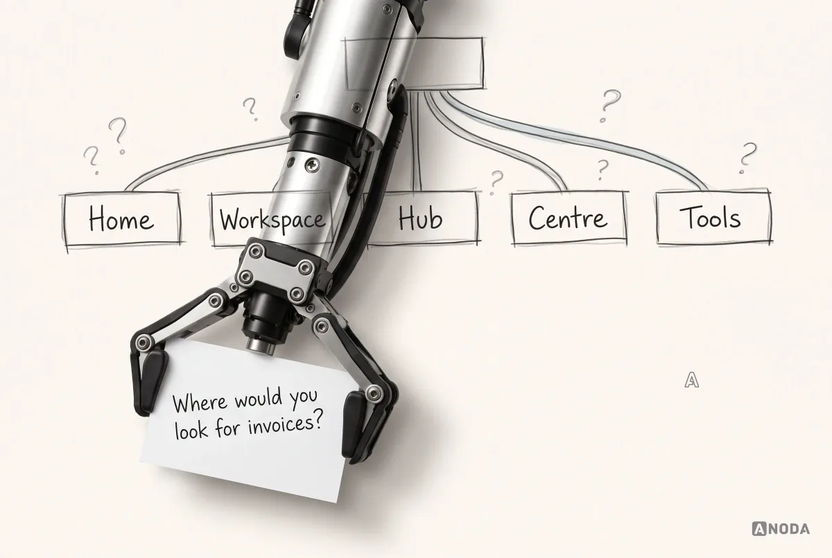
A structure can be right and still fail because of its labels. “Workspace”, “Hub”, “Centre”, “Tools” and “Resources” are the classic examples: words that sound organised and tell users nothing about what is inside.
Good labels are:
- In the users’ language. The words people use when they describe their work, not the words your team uses internally. If customers say “invoices”, don’t call it “billing documents”.
- Specific. “Reports” says more than “Insights”. “Team” says more than “People management”.
- Distinct. Two labels shouldn’t sound like they could contain the same thing.
- Consistent. One name for one thing, everywhere: menu, page title, buttons, search results, emails.
Where do you get users’ words? Support tickets, sales calls, interviews, reviews and search logs are full of them. If people keep searching for “timesheet” and your product calls it “activity log”, the search log has just told you the label.
Research the mental model: card sorting
Before committing to a structure, find out how your users naturally group things. Card sorting is the simplest method: give participants cards with the names of features or content and ask them to sort them into groups that make sense to them.

There are two main variants:
- Open card sort: participants create and name their own groups. Useful early, to discover how people think about the content and what they call the groups.
- Closed card sort: participants sort cards into groups you define. Useful to check whether a proposed structure matches how people think.
Card sorting doesn’t give you a finished structure. People disagree, and some items genuinely belong in more than one place. What it gives you is evidence: which items most people put together, which ones are ambiguous, and what words they use for the groups. Combined with your entity model and business needs, that is a strong basis for a structure. When you don’t yet know how users group or name your content, our UX research work starts exactly here.
Validate the structure: tree testing
Once you have a proposed structure, test whether people can find things in it, before any visual design exists. Tree testing does this by showing participants only the text hierarchy, with no design, and asking them to find specific things: “Where would you find an unpaid invoice?” “Where would you add a new technician?”
Because there is no visual design, tree testing measures the structure and labels alone. You see whether people find the right place, how directly they get there, where they go first and where they get lost.

The failures are the useful part. If most people look for unpaid invoices under “Customers” instead of “Money”, that tells you something: either the label is wrong, or invoices should also be reachable from customers, or both. Fix, and test again. Tree tests are cheap enough to run several rounds.
For deeper guidance on testing navigation choices and writing good test tasks, see our article on navigation testing questions.
Then test it in context: usability testing
A structure that works in a tree test still has to work in the real interface, with real screens, real content and real tasks. Usability testing with a prototype checks the whole experience: navigation, labels, page layouts and the flows between them.
This is where you catch the issues that pure structure tests can’t: a label that is right but visually easy to miss, a correct location that is two levels too deep for a task people do every day, a flow that jumps between areas in a way that makes sense on paper and not in practice. If you already have a proposed structure and prototype, usability testing is how you find out whether people can actually find, understand and complete the important tasks.
How product objects shape real case interfaces
The object model changes with the product. These cases show why copying the same sidebar across industries misses the work:
| Case | Objects the interface has to keep coherent | Practical navigation decision |
|---|---|---|
| Superstream | Clusters, optimization work and users | Keep technical configuration and its working context connected rather than burying them in unrelated menus. |
| Mantis | Projects, issues and filter criteria | Let people narrow an issue set without losing the project and saved working context. |
| Vixi | Submissions, moderation, playlists and outputs | Separate the review queue from the live output while keeping their relationship visible. |
| VineView | Properties, blocks, plans and field points | Preserve the geography and selected object when moving between planning and field work. |
| Wildcast | Campaigns, podcast matches, offers and delivery states | Use one campaign model across advertiser, podcaster and operator views. |
| Xensam | Software, licenses, contracts and machines | Make the relationships discoverable across an estate, with role-appropriate actions. |
For developer-tools design, the model needs to match the technical objects people actually operate. In a marketplace, one campaign or transaction needs to survive role changes. Neither problem is solved by adding another top-level menu item. Start with the object and relationship, then decide which view exposes it.
Wildcast’s host-read campaigns cross advertiser, operator and podcaster views: the request, match, proposal and placement must remain the same campaign as each person acts on it. Our influencer-platform design makes that shared model and its role-specific next actions the basis for discovery, offers, approvals and delivery. ANODA connects the deal across those views, so the operator is not left reconciling different versions of it in chat.
Role-specific navigation helps people focus, but hiding a menu is not access control. The implementation must enforce permissions when records and actions are requested.
A product website needs a clear structure too. In Arize, we separated three visitor paths: understand the limbwear, choose product options and buy, or stay in touch. Product information, color and size choices, cart and checkout form the purchase path; About, waitlist and contact serve visitors who need a different next step. The website design work connects these routes to the responsive page hierarchy.
At organisational scale, enterprise UX design connects that model across modules, access boundaries and the people responsible for the next step. In Xensam, Viewer and Admin views expose software, machines, licenses and contracts through one inventory structure, with role-appropriate actions. ANODA designed the desktop interface and its shared light and dark system for engineering handoff. You get an estate people can navigate by the work they need to do, instead of another menu organised around the database.
Roles: one model, different views
Many products serve different kinds of users. In a field-service tool, an owner cares about money and reports, a dispatcher about schedules and jobs, and a technician about today’s visits. Giving all three the same fourteen-item menu is a way to guarantee that none of them finds what they need quickly.

The answer is usually one underlying model with different views: each role sees the areas that matter for its job, in the order that matches its work. Be careful, though. Hiding items per role is not the same as restructuring. If the model underneath is confused, role-based views just hide the confusion from some people some of the time.
Permissions also shape IA. If a role can’t do something, it usually shouldn’t see a door to it. If a role can see something but not change it, the structure should make that obvious rather than let people discover it through error messages.
Where new features go
Structure problems usually start small. A new feature arrives, nobody is sure where it belongs, so it gets a new top-level menu item “for now”. A year later there are fourteen of them.
Decide the rule before the feature arrives. For each new capability, ask which entity it belongs to and which existing area users would look in first. If it belongs inside an existing area, put it there, even if the team is proud of it and wants it visible. If it genuinely creates a new kind of work, it may deserve a new area, and that is worth a deliberate decision and a quick test, not a quiet addition to the sidebar.
Visibility is a separate problem from structure. If a new feature needs attention, announce it, highlight it in context or add it to onboarding. Don’t promote it to the top level of the menu permanently just because it’s new this month.
Search, links and shortcuts
Navigation is not the only way in. Search, links between related objects, recent items and shortcuts all rely on the same structure, and they fail in the same way when the model is unclear.
- Search works well when things have consistent names and types. If “customer” and “client” are both used, search will return confusing results or miss things.
- Cross-links follow relationships. From a job, users expect to reach its customer, its site, its visits and its invoice. From a customer, its jobs and invoices. The entity map tells you which links should exist.
- Recent and favourites help frequent users skip navigation entirely. They are a supplement, not a fix for a structure people can’t use.
Document the structure, and keep it alive
An information architecture that lives in one designer’s head, or in a sitemap drawn once for a redesign, will drift as soon as the next feature ships. The structure has to be documented and maintained as part of the product.
Useful IA documentation includes:
- The entity model: objects and relationships.
- The structure: top-level areas and what belongs in each, with rules for where new things go.
- The vocabulary: approved labels, and words not to use.
- Role views: who sees what.
- Test results: what was tested, what changed and why.
Then treat changes as decisions. When a new feature arrives, ask where it belongs in the model before anyone designs a menu item for it. If it doesn’t fit anywhere, that is a signal worth discussing: either the feature is not what it seems, or the structure needs to evolve on purpose.
The same documentation becomes the source of truth for design, development and content, and it makes the product easier to explain to new team members, and increasingly to AI tools that help build it.
How to tell whether the structure works after launch
Testing before launch is essential, but the real test is how people use the product every day. A few signals point to structure problems:
- Search terms that should be navigation. If many people search for the same thing, they couldn’t find it by browsing.
- Searches that find nothing, because users use words the product doesn’t.
- Back-and-forth paths: people opening one area, leaving immediately, and trying another before finding what they need.
- Features with low use that user research says people want.
- Support questions that start with “where”.
Tag support tickets by where the confusion was, look at search logs regularly and watch a few recorded sessions each month. None of this requires a big analytics programme. It requires someone who owns the structure and looks.
IA and content work together
Information architecture decides where things go and what they are called. Content decides what people read when they get there. The two fail together more often than apart.
A page in the right place with a vague title, an empty state that doesn’t say what belongs here, a settings screen with fifty unlabelled toggles: these are content problems that feel like structure problems to users. When you redesign the structure, review the words at the same time: page titles, section headings, empty states, button labels and help text. They are the signposts inside the building.
A practical order of work
Whether you are designing a new product or untangling an old one, the order tends to be the same:
- Define the entities and relationships the product works with.
- Inventory what exists: pages, features, content, labels, usage, support questions.
- Research the mental model: interviews, support logs, search logs and card sorting.
- Draft the structure and labels, with the top level kept short.
- Tree test the structure and fix what fails.
- Design navigation, search and cross-links on top of the validated structure.
- Usability test with a prototype and real tasks.
- Document the model, structure, vocabulary and role views.
- Govern changes so new features fit the model instead of eroding it.
Common information architecture mistakes
- Starting with the menu instead of the model underneath.
- Organising by the company’s org chart instead of by users’ tasks.
- Internal jargon as labels.
- Vague labels that sound tidy and mean nothing.
- Duplicates with different names in different places.
- Too many top-level items, because everything feels important to someone.
- One structure for every role when roles do very different jobs.
- No testing before visual design, so structural problems are discovered after the UI is built.
- No owner, so the structure erodes with every release.
How we approach information architecture
When we work on a product’s structure, we don’t start with the navigation. We map the entities and relationships the product actually works with, inventory what exists and how it is used, and find where the structure contradicts itself. We research how users group and name things, draft the structure and labels, test them with card sorts and tree tests, and only then design the navigation, search and cross-links, testing again with real tasks in a prototype. The result is documented as a maintained source for design and development, so the next feature has a place to go.
Our UI/UX design team connects domain modelling, user flows, navigation testing and interface structure into one piece of work, instead of treating IA as a one-off sitemap.
The decision rule
Before you redesign the navigation, answer these questions in order:
- Have we written down the entities in our product and how they relate?
- Do we know what exists today, what it is called and how it is used?
- Do we know how our users group things and what words they use?
- Is the proposed structure tested, with evidence that people can find the key things?
- Do different roles get views that match their work?
- Are labels consistent everywhere the product talks?
- Is the structure documented, and does someone own it?
Inventory the content and entities, model the relationships, test the labels and paths, then make the structure a maintained source for design and development. A product people can’t find their way around is a product they don’t fully use, however good the features inside it are.

UI/UX design
People can’t find what you’ve built?
We model your product’s structure, test it with real users and design the navigation on top of it, so features get used instead of lost.
Frequently asked questions
Is information architecture the same as a sitemap?
A sitemap represents part of the structure. Information architecture also defines product objects, relationships, labels, navigation and the ways different roles find their work.
How do you test information architecture?
Use real tasks to check whether people understand labels and find the right destination. Card sorting explores grouping, tree testing checks structure and usability testing checks the interface in context.
Should every role have a separate product structure?
Keep shared objects and relationships consistent. Show appropriate views and actions for each role, and enforce access permissions in the implementation.
Written by