
In short
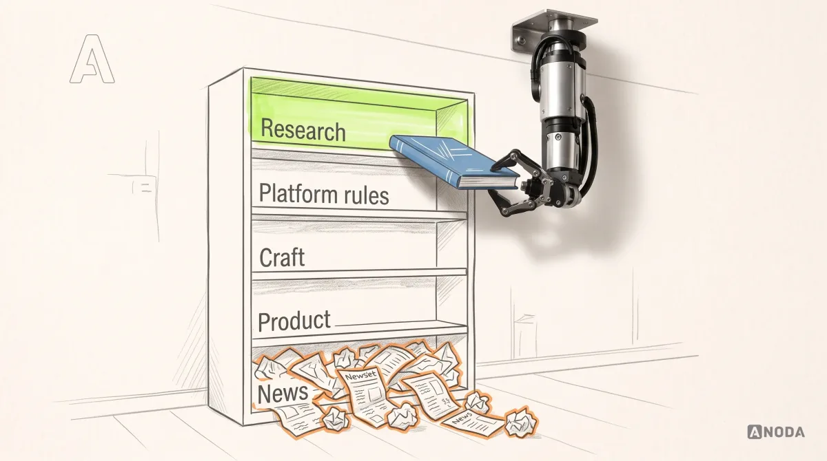
Most “best UI blogs” lists are graveyards: half the entries stopped publishing years ago. We checked every source on this list on 29 September 2026 — each one published within the last four months — and sorted them by what they teach: research and evidence, interface patterns, design systems, UI engineering, accessibility, platform guidance, industry thinking and curated inspiration. Follow a few from each group, read for decisions rather than screenshots, and prune the list twice a year.
In this article
- How we chose the twenty
- What we left out, and why
- Where to start, by role
- Research and evidence
- Interface patterns and craft
- Design systems
- UI engineering
- Accessibility
- Platform guidance
- Industry thinking
- Curated inspiration
- Where these sources disagree — and why that’s useful
- Reading AI coverage with a clear head
- Build a reading diet, not a feed
- References inform art direction — they don’t make decisions
- How to read a UI article critically
- Turn reading into team practice
- Keep the list alive
- From a reference folder to a product your team can ship
- When you need more than reading
- Follow fewer, read better
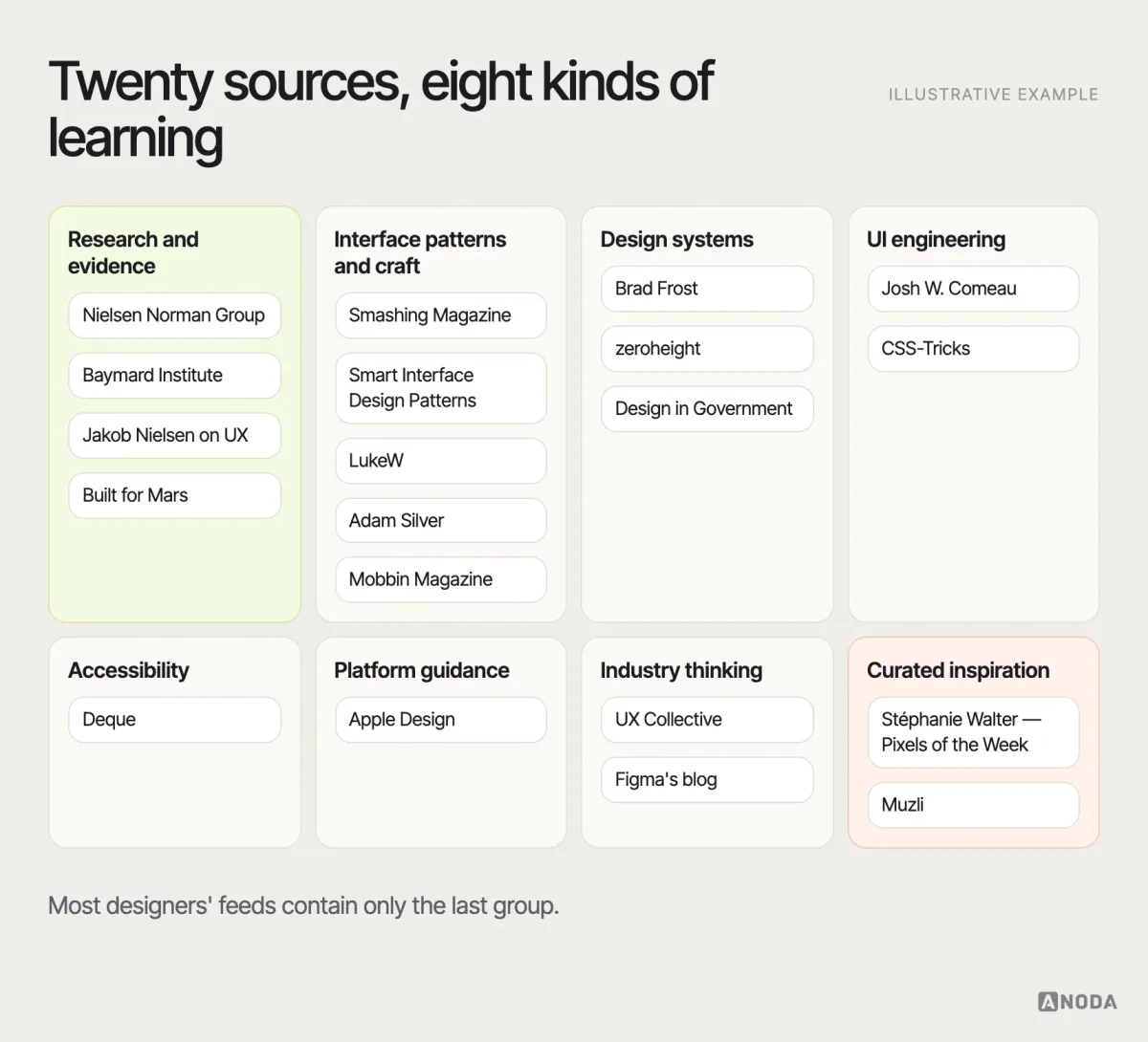
The best UI design blogs in 2026 are the ones that explain decisions, not just show screens. Our shortlist of twenty covers research and evidence (Nielsen Norman Group, Baymard Institute, Jakob Nielsen on UX, Built for Mars), interface patterns and craft (Smashing Magazine, Smart Interface Design Patterns, LukeW, Adam Silver, Mobbin Magazine), design systems (Brad Frost, zeroheight, GOV.UK’s Design in Government), UI engineering (Josh W. Comeau, CSS-Tricks), accessibility (Deque), platform guidance (Apple Design), industry thinking (UX Collective, Figma’s blog) and curated inspiration (Stéphanie Walter’s Pixels of the Week, Muzli). Every one of them published new work within four months of 29 September 2026.
Search for “best UI design blogs” and you’ll find lists that recommend blogs whose last post was written before the pandemic. Some point to domains that now sell something else entirely. Resource lists go stale faster than milk, and most of them are never checked again after the day they’re published.
The second problem is subtler. Even the live blogs are not all useful in the same way. Some teach you how research works. Some teach you CSS. Some are beautiful feeds of other people’s screens. A designer who reads only the last kind gets very good at recognising trends and no better at deciding what their own product should do.
So this list does two things differently. Every entry was checked for recent activity on a single date. And every entry is classified by what it teaches, so you can build a reading diet rather than an endless scroll.
We read a lot of these ourselves. In our product design work, the sources that have changed how we work are rarely the prettiest ones. They’re the ones that made us question a pattern we’d used for years, or gave us the evidence to win an argument we’d otherwise have lost on taste. That’s the bar we used here: would following this source make a designer’s next decision better?
How we chose the twenty
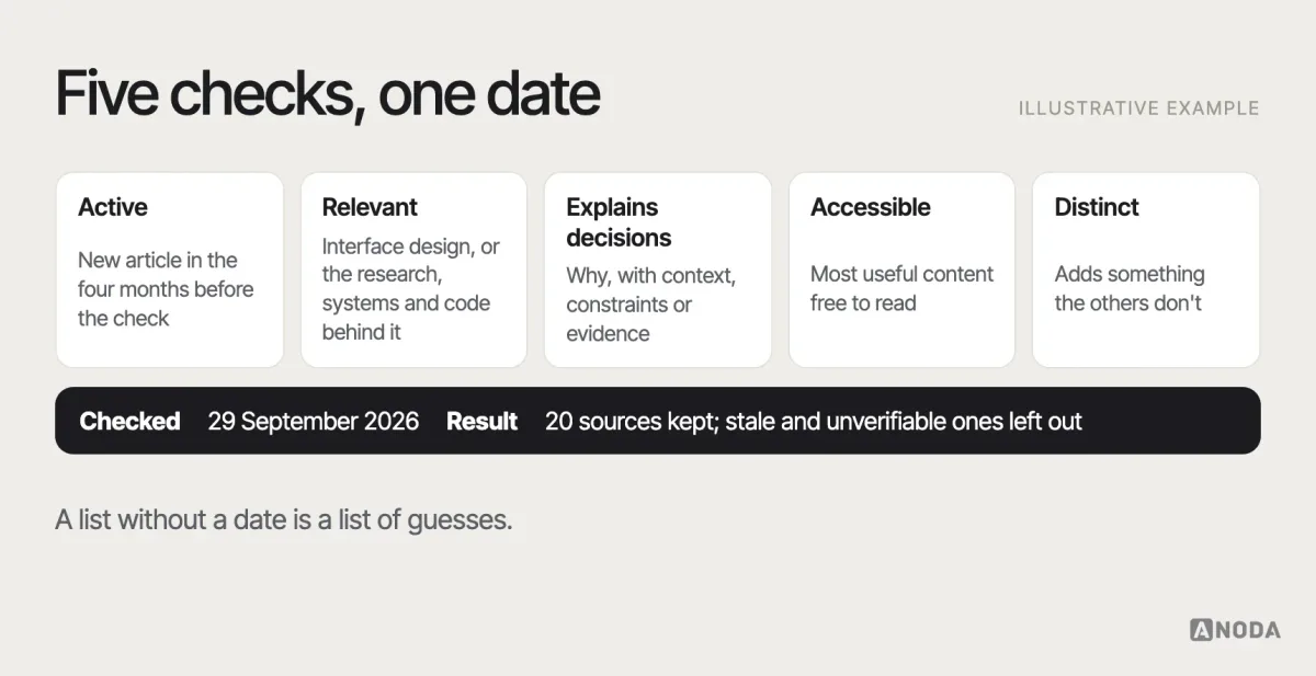
We started from the blogs and publications designers mention most often, plus the sources our own team reads, and applied five checks. All checks were made on 29 September 2026.
- Active: at least one new article in the four months before the check, confirmed from the publication’s own feed or article dates.
- Relevant: regularly covers interface design, the research behind it, or the systems and code that deliver it.
- Explains decisions: articles explain why, with context, constraints or evidence — not just galleries.
- Accessible: most of the useful content can be read without a paid subscription, or the free part is substantial.
- Distinct: each entry adds something the others don’t; we didn’t include five publications that cover the same ground.
The shortlist combines recent publishing with a distinct job for each source. UX Movement’s feed showed its last post in March 2025. UXmatters publishes practitioner essays and is included in our companion UX news and resources guide; its own site lists September 2026 editions. This shortlist keeps its focus on the twenty sources for the UI jobs below.
A note on what this list isn’t: it’s not a news roundup. If you want the channels that track the industry week to week — newsletters, podcasts, conferences — our companion guide to UI/UX news sources and resources covers those.
What we left out, and why
A few kinds of sources were deliberately excluded. Pure image galleries, such as portfolio platforms, are useful for visual exploration but rarely explain decisions, so they belong in your reference folders rather than your reading list. Generic listicle blogs that publish “top trends” articles without evidence failed the “explains decisions” check. Agency and tool blogs were included only where they publish practice articles of lasting value, not mainly marketing.
Some archives remain useful even when a publication slows down or stops; other active sources fit a different reading job. UX Movement’s archive of short articles on interface details remains useful. UXmatters belongs in the companion guide for longer practitioner essays; a focused UI reading list does not need to duplicate every source in a broader UX stack.
Where to start, by role
Twenty sources is too many to follow at once. As a recommendation, start with four or five that match your work and add others when a project calls for them.
- Junior or career-switching designer: Nielsen Norman Group for foundations, Smashing Magazine for practical depth, Smart Interface Design Patterns for components, Stéphanie Walter’s digest to discover more, and one inspiration source.
- Product designer in a SaaS team: NN/g, LukeW, Adam Silver, Mobbin Magazine for conventions, and Brad Frost or zeroheight once the product has a design system.
- E-commerce or transactional product designer: Baymard Institute first, then Adam Silver for forms, NN/g, and Built for Mars for flow critiques.
- Design-system lead: Brad Frost, zeroheight, Design in Government alongside the GOV.UK Design System, Deque for accessibility, and CSS-Tricks or Josh W. Comeau for the code side.
- Designer working on AI features: LukeW, Jakob Nielsen on UX, NN/g’s AI articles, and the UX Collective newsletter for the wider debate.
- Designer who prototypes in code: Josh W. Comeau, CSS-Tricks, Smashing Magazine, and Apple Design if you ship on Apple platforms.
Whatever your role, include at least one research source. It’s the group that most often changes what you would have done.
Research and evidence
These are the sources that tell you whether an interface works and why. If you read only one group on this list, read this one — it’s the antidote to designing from taste alone. Research sources are also the slowest to go out of date: a well-run study of how people use forms or navigation stays useful long after the visual style of the screens in it has aged.
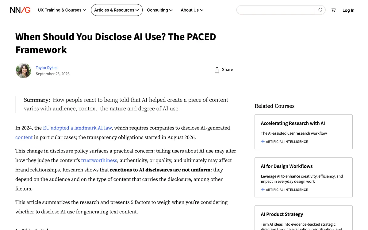
Nielsen Norman Group
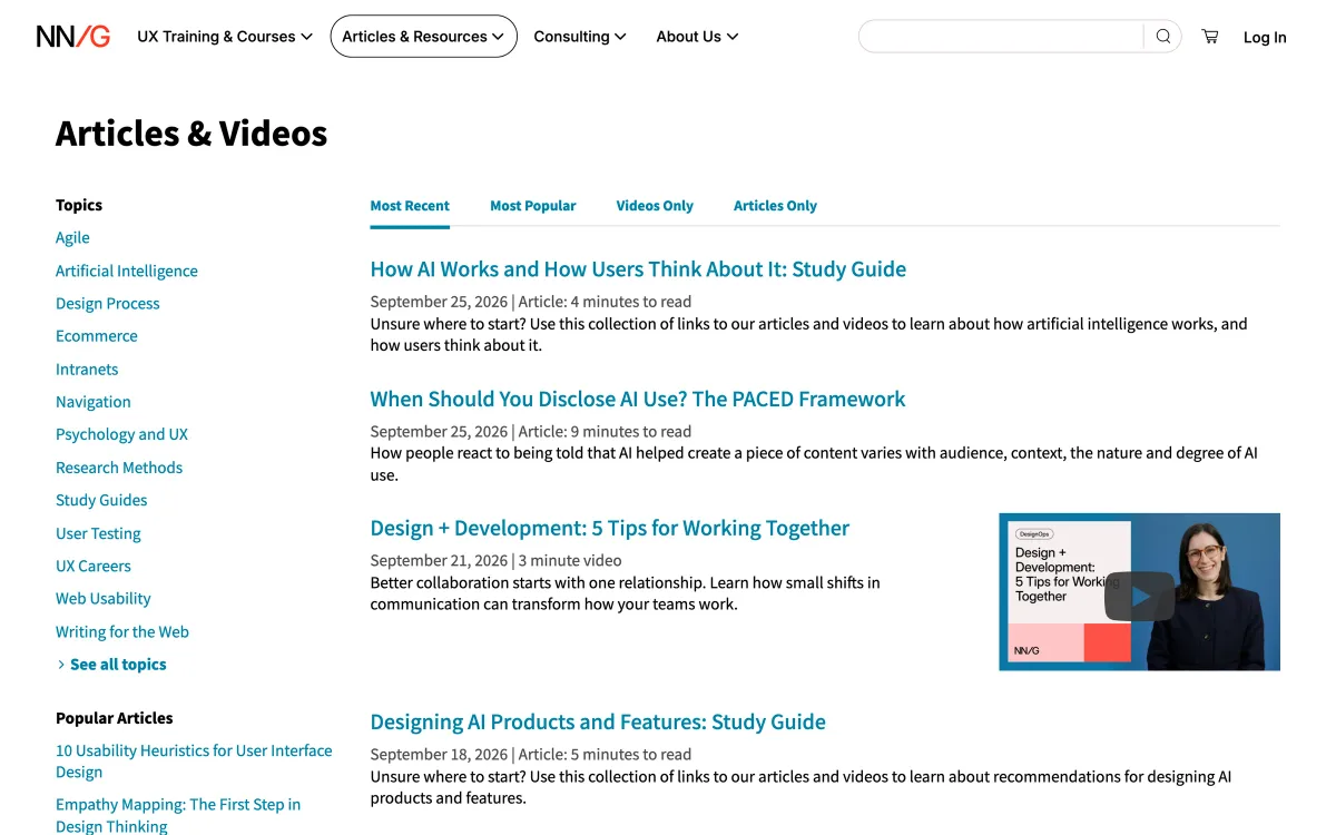
The research-based UX consultancy founded by Jakob Nielsen and Don Norman publishes articles and videos on usability, interaction design, research methods and, increasingly, AI products. Articles are usually grounded in the group’s own studies, with clear guidelines and the reasoning behind them. It is the closest thing the field has to a reference library.
- What it teaches: research-backed guidelines and research methods.
- Publishes: several articles and videos a month; late September 2026 brought pieces on disclosing AI use and on how users think about AI.
- Best for: settling arguments with evidence, learning methods, onboarding junior designers.
- Watch out for: guidelines are general by design — check them against your own users and context. Some depth sits behind paid training.
- Where: nngroup.com/articles
How to use it: when a debate in your team comes down to opinion — hamburger or tabs, inline validation or not, how long a form can be — search NN/g first. You’ll usually find a guideline, the study behind it and the conditions under which it holds. Then treat the guideline as a starting hypothesis for your product, not a ruling. The research-methods articles are equally valuable: they’re one of the best free introductions to interviews, usability testing and diary studies.
Baymard Institute
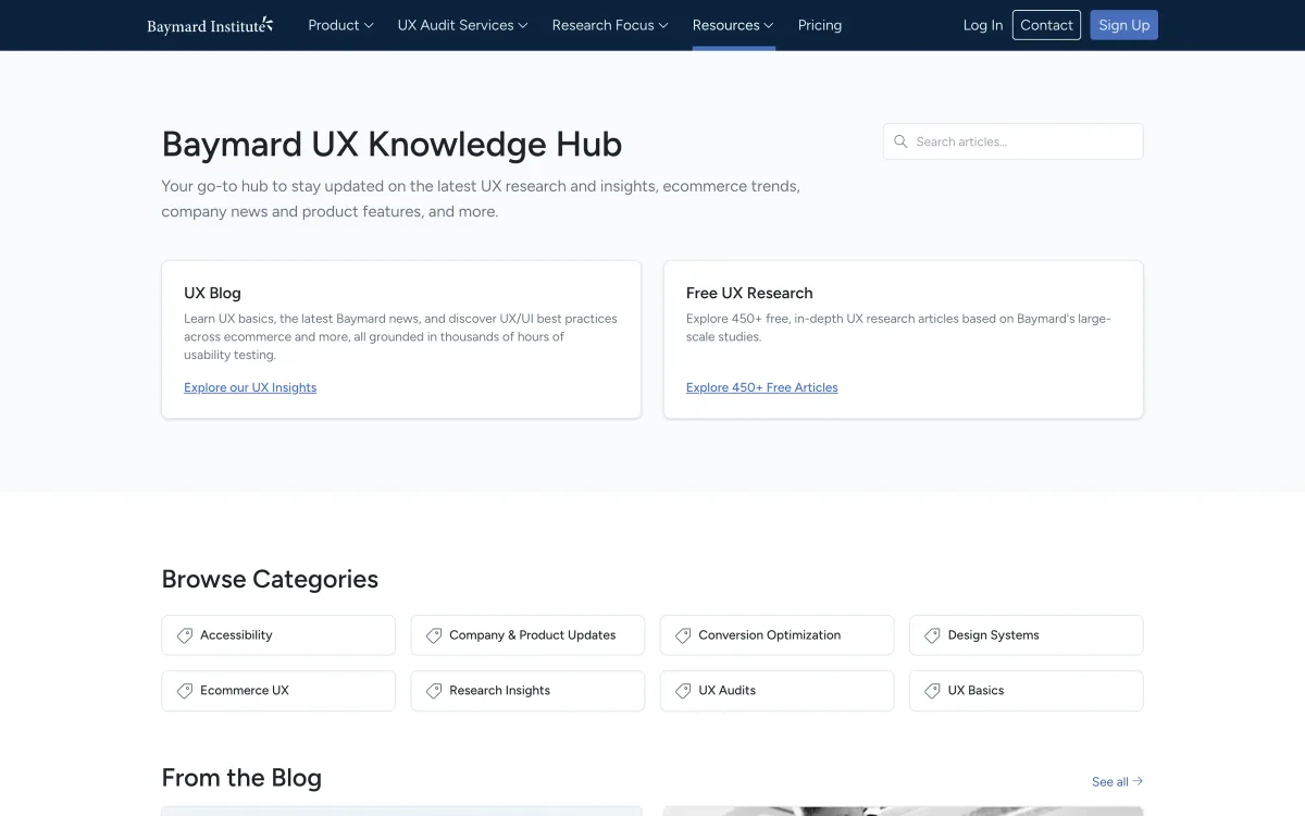
Baymard runs large-scale usability research on e-commerce — product pages, checkout, search, filtering, forms — and publishes findings on its blog and knowledge hub. The benchmarks and full guidelines are paid; the blog articles are free and often specific enough to act on directly.
- What it teaches: evidence-based e-commerce and form usability, research practice.
- Publishes: several posts a month; September 2026 included articles on presenting research findings and choosing research methods.
- Best for: anyone designing checkout, product listings, forms or search.
- Watch out for: the deepest material is part of a paid service; e-commerce findings don’t transfer to every product.
- Where: baymard.com/blog
How to use it: before designing or reviewing a checkout, product page or form, read Baymard’s articles on that step. They’re specific — which fields confuse people, where error messages go, how filters should behave — which makes them easy to turn into a review checklist. Their articles on research practice, such as presenting findings to stakeholders, are useful well beyond e-commerce.

Jakob Nielsen on UX
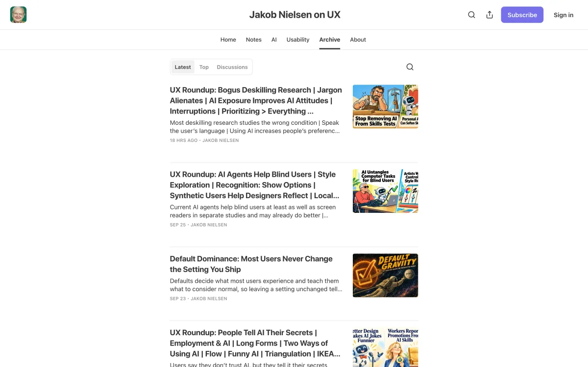
Jakob Nielsen’s own Substack, separate from the consultancy he co-founded, mixes short “UX Roundup” posts with longer essays. The tone is opinionated, the pace is high, and the focus in 2026 is heavily on AI and how it changes usability and design work.
- What it teaches: usability principles applied to new technology, strong opinions to test your own against.
- Publishes: several posts a week.
- Best for: designers who want a fast, provocative take on where UX is going.
- Watch out for: it’s a personal publication with strong views — read it as argument, not as neutral reference.
- Where: jakobnielsenphd.substack.com
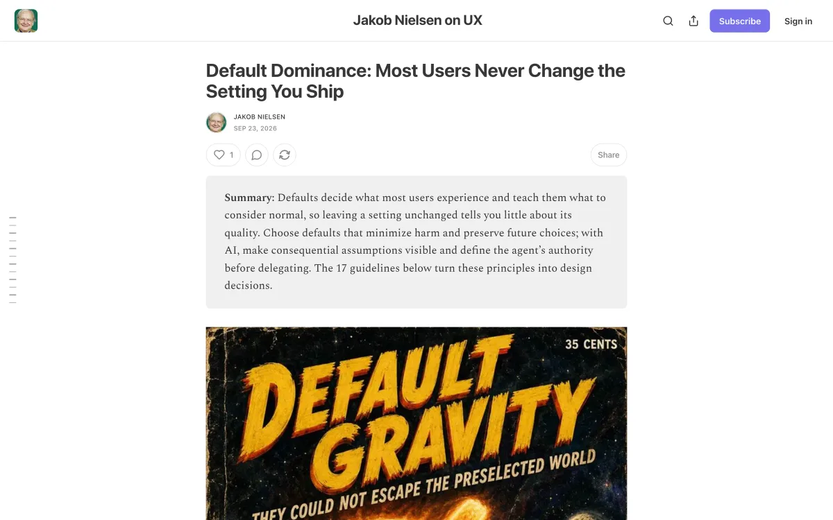
How to use it: skim the roundups for signals about where interaction design is moving, and read the longer essays when they touch your work. The piece on defaults is a good example: a reminder that the settings you ship are, for most users, the only settings that exist. Disagreeing with it is fine — having to articulate why is the useful part.
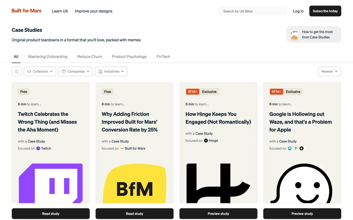
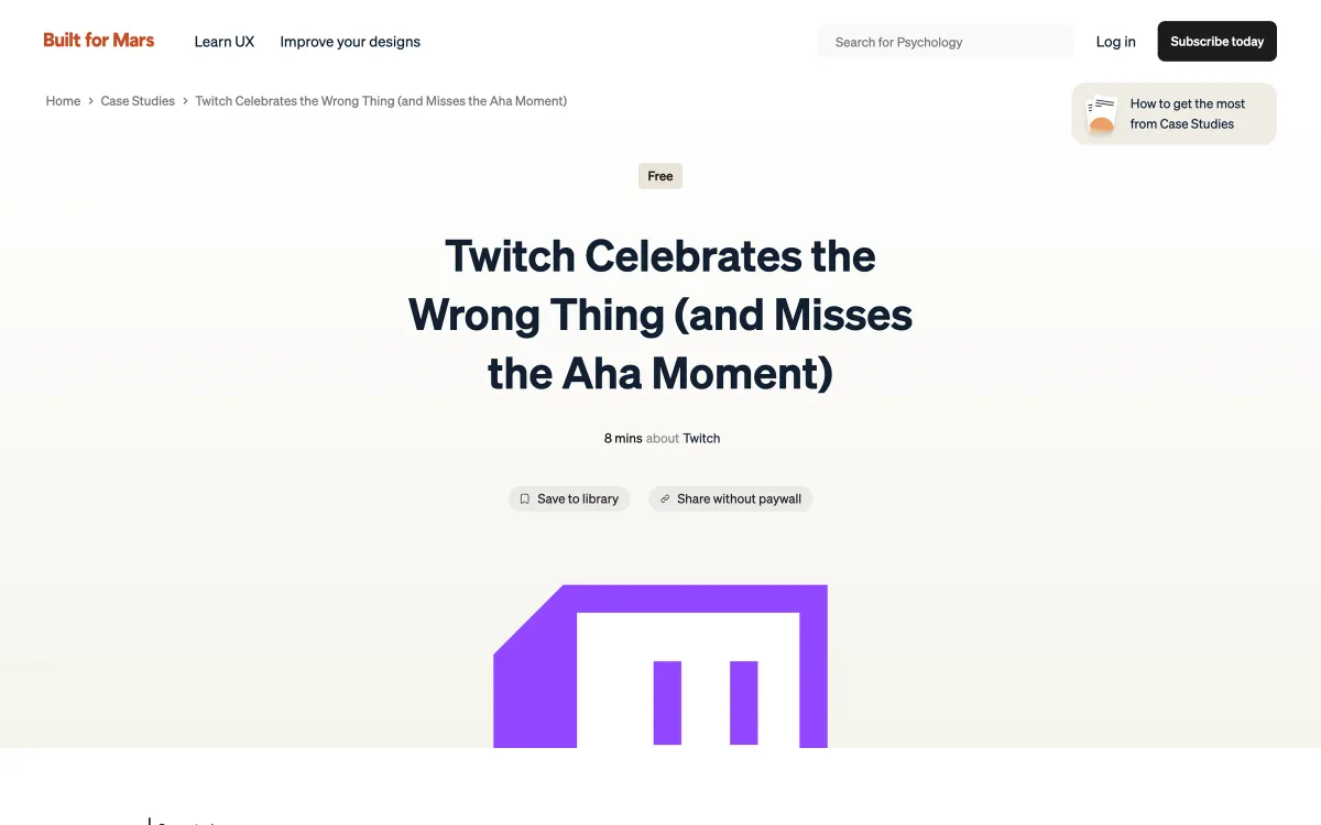
Built for Mars
Built for Mars publishes detailed UX case studies of real products — onboarding, conversion, retention — walking through each screen and scoring the decisions. Some studies are free; others are for paying members.
- What it teaches: how to critique a real product flow step by step.
- Publishes: new case studies every few weeks; the latest free study was published in early September 2026.
- Best for: learning to see friction, and preparing for design critiques or audits.
- Watch out for: case studies are one analyst’s reading of a product from outside; they can’t see the product team’s data or constraints.
- Where: builtformars.com
How to use it: pick a case study in your product’s category and walk through it with your team, then run the same critique on your own product. The format — screen by screen, with a clear verdict on each decision — is worth copying for internal audits. Remember that an outside teardown sees the interface, not the business reasons behind it.
Interface patterns and craft
These sources are closest to what most people mean by a “UI blog”: how to design specific components, flows and interactions well. The best of them don’t just show a solution; they list the states, edge cases and trade-offs, which is exactly the part that gets lost when a pattern is copied from a screenshot.
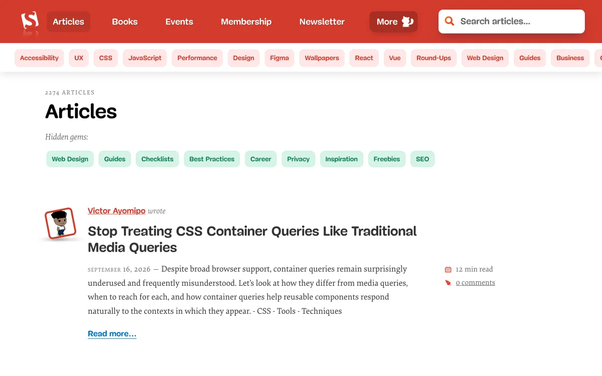
Smashing Magazine
One of the longest-running publications for web designers and developers. Articles cover UX, UI patterns, CSS, accessibility, design systems and research, usually in depth and often by practitioners.
- What it teaches: practical, long-form guidance on interface design and front-end implementation.
- Publishes: several articles a week.
- Best for: designers who work closely with front-end developers, and anyone who wants depth over hot takes.
- Watch out for: quality varies with the author; some articles are more opinion than evidence.
- Where: smashingmagazine.com
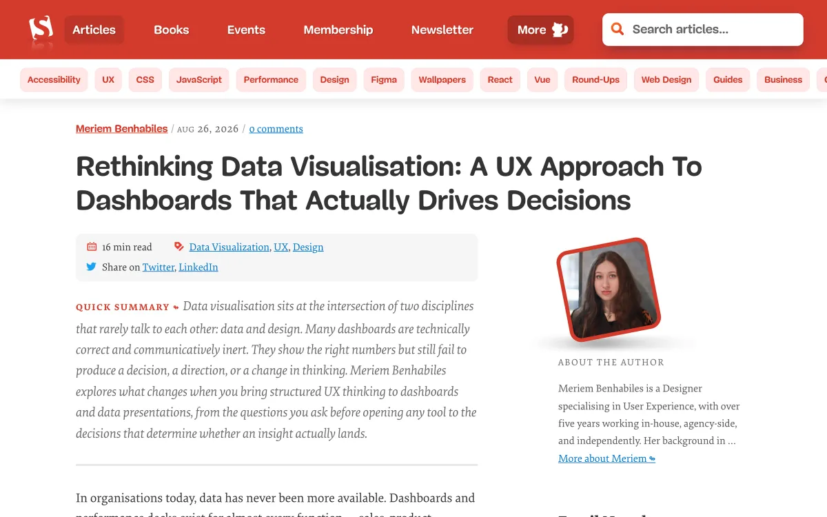
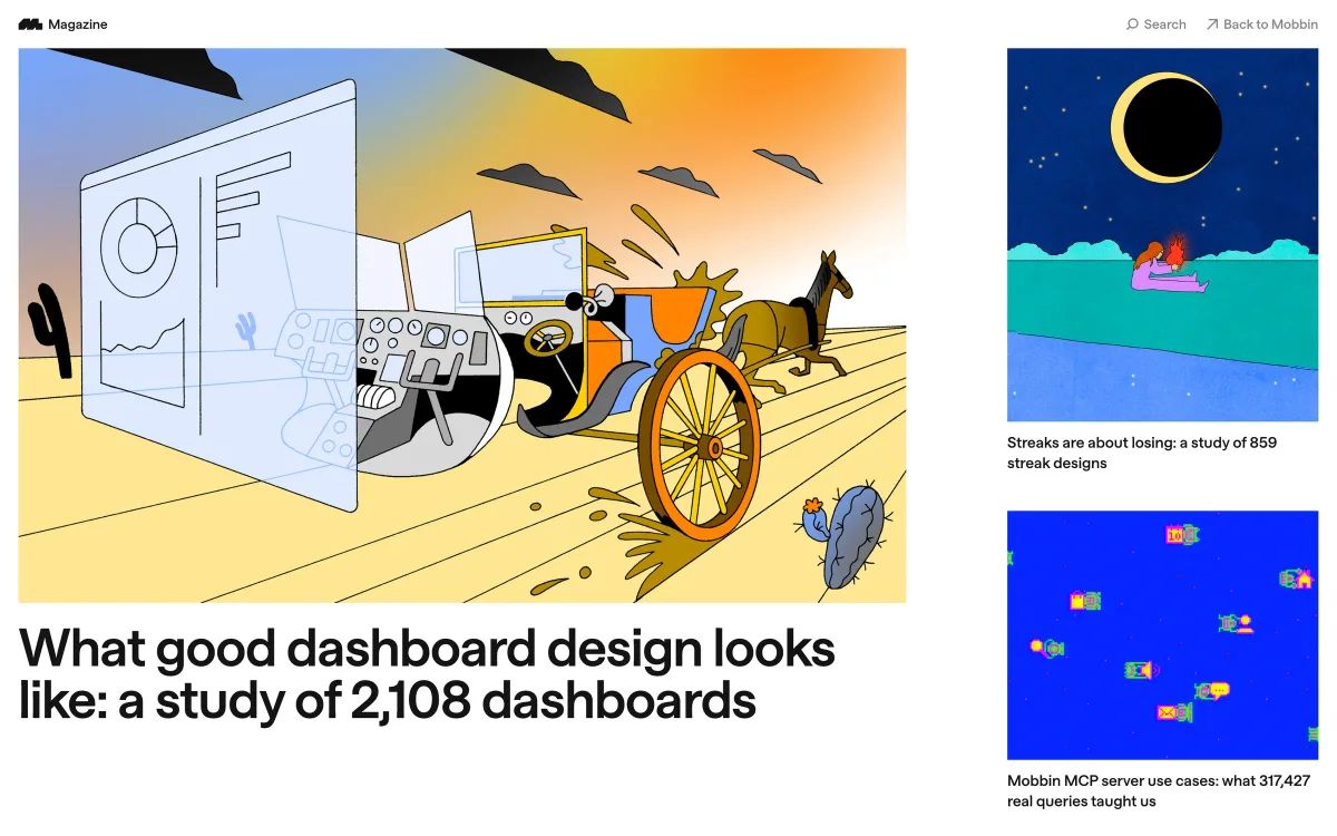
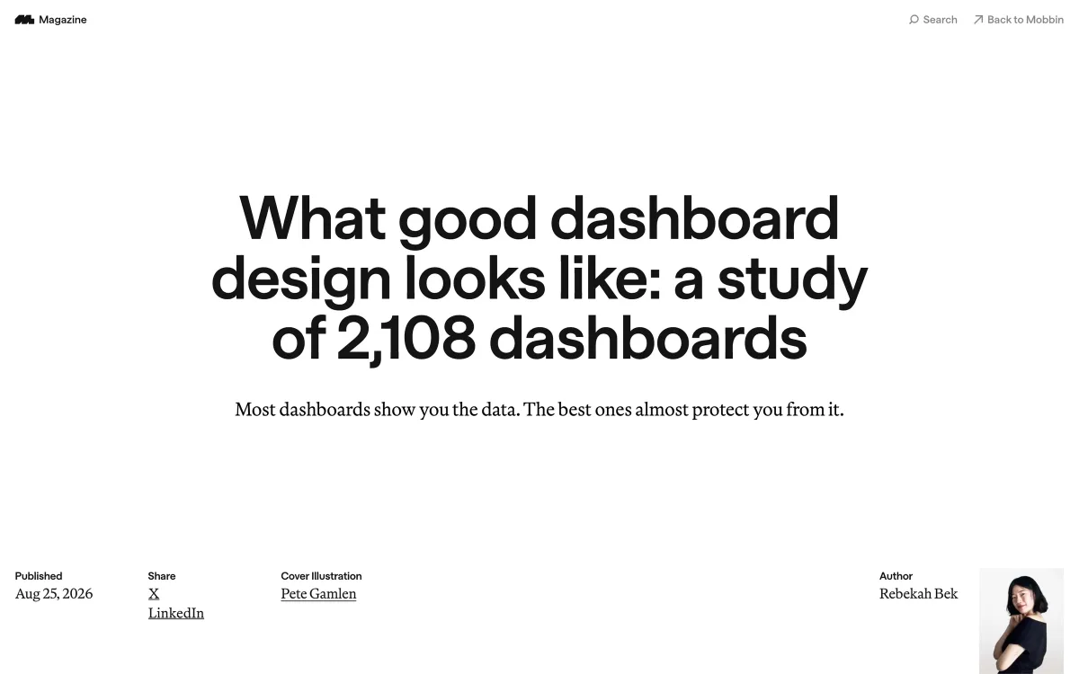
How to use it: follow the UX and design categories if you don’t write code, and add CSS if you do. The long-form articles are best read with a specific problem in mind — dashboards, forms, navigation — rather than as a daily feed. The dashboards article in the screenshot below is a good example of the publication at its most useful: a practical argument, with examples, for designing around decisions rather than data.
Smart Interface Design Patterns
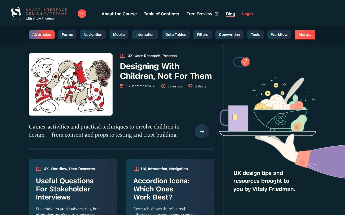
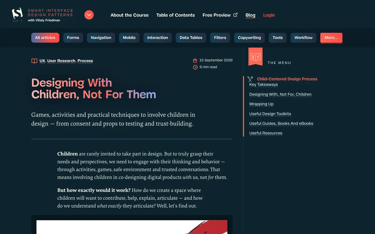
Vitaly Friedman’s publication — alongside his paid course of the same name — collects practical articles on specific interface patterns: forms, navigation, data tables, filters, accordions, onboarding. Articles often compare options and cite research.
- What it teaches: pattern-by-pattern guidance with trade-offs.
- Publishes: new articles most months; the latest was published on 16 September 2026.
- Best for: looking up how to design a specific component well.
- Watch out for: the free articles sit alongside a course promotion; the depth of the course is paid.
- Where: smart-interface-design-patterns.com/articles
How to use it: treat it as a reference shelf rather than a feed. When you’re about to design a data table, a filter panel or a complex form, open the relevant category and read what’s there first. The articles are good at listing the edge cases and states that are easy to forget.
LukeW
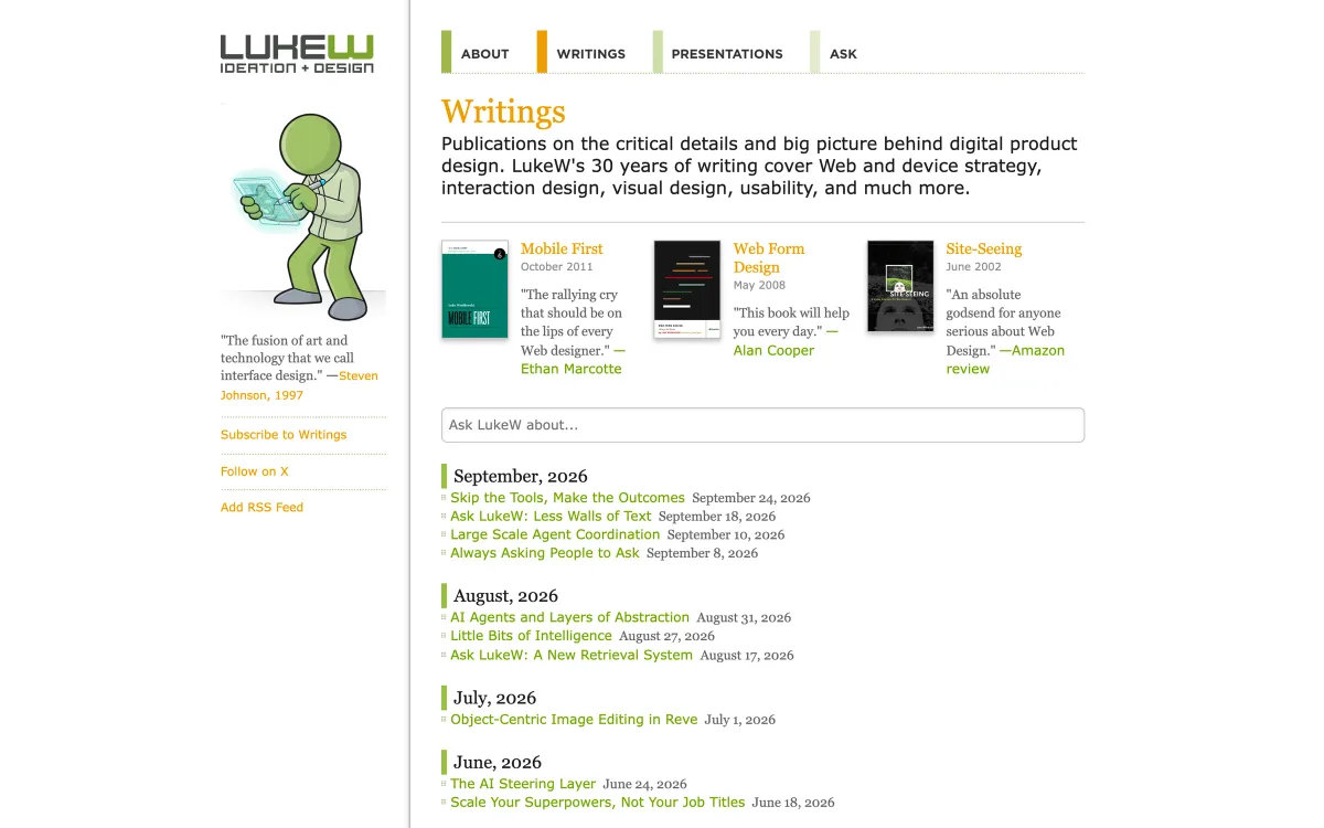
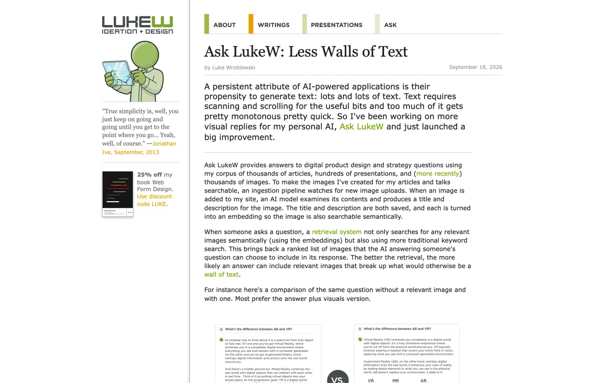
Luke Wroblewski — known for “Mobile First” and his work on forms — writes short, frequent posts on digital product design. In 2026 most of them explore how AI changes interfaces: agents, conversational UI and the limits of chat.
- What it teaches: product design thinking, with a focus on emerging interaction models.
- Publishes: several posts a month.
- Best for: designers working on AI features or new interaction paradigms.
- Watch out for: posts are short and exploratory; they point to ideas more than they provide recipes.
- Where: lukew.com/ff
How to use it: if your product is adding AI features, read his posts on conversational and agent interfaces before designing yet another chat box. They’re short, so they fit between tasks, and they often include before-and-after comparisons from his own experiments.
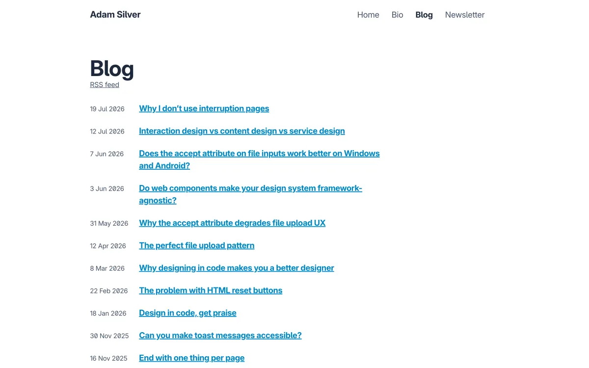
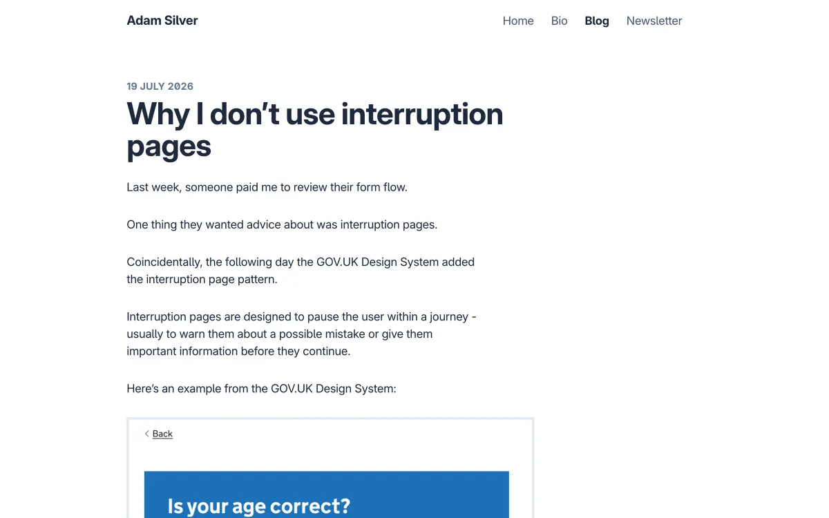
Adam Silver
Adam Silver, a London-based designer and the author of Form Design Patterns, writes about forms, interaction design and design systems — often with examples from public-sector services. Posts are short, concrete and frequently challenge popular patterns.
- What it teaches: form and interaction design, with practical reasoning.
- Publishes: roughly monthly; the latest post was in July 2026.
- Best for: anyone designing forms, transactional flows or accessible components.
- Watch out for: opinions are strong and specific; test them against your context.
- Where: adamsilver.io/blog
How to use it: read his posts when you’re designing a form or a transactional flow, and pay attention to the ones that argue against common patterns. Even when you end up disagreeing, you’ll have considered the failure modes he describes — which is more than most pattern libraries offer.
Mobbin Magazine
Mobbin, known for its large library of real app screens and flows, also publishes a magazine of data studies — analyses of hundreds or thousands of real interfaces for a single pattern, such as streaks or dashboards.
- What it teaches: how real products solve a pattern, at scale.
- Publishes: new studies most months; the latest was published in late September 2026.
- Best for: seeing the range of solutions before designing your own, and spotting conventions.
- Watch out for: what most products do isn’t proof that it works — prevalence is not evidence of usability.
- Where: mobbin.com/blog
How to use it: read the relevant study before designing a pattern, to see the range of existing solutions and the conventions users are likely to expect. Then decide, based on your own users and context, which convention to follow and where to deviate. A study of what thousands of products do tells you what’s familiar, not what’s right for you.
Design systems
Once interfaces grow beyond a few screens, the problems become systemic: consistency, reuse, governance. These sources cover that layer. If your product is already fighting inconsistency, our guide to design systems’ key elements and best practices is a practical next step. The sources below approach the topic from three angles: the thinking behind component-based design, the organisational work of running a system, and a public system built on research.
Brad Frost
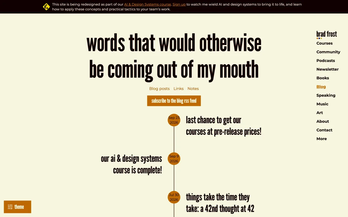
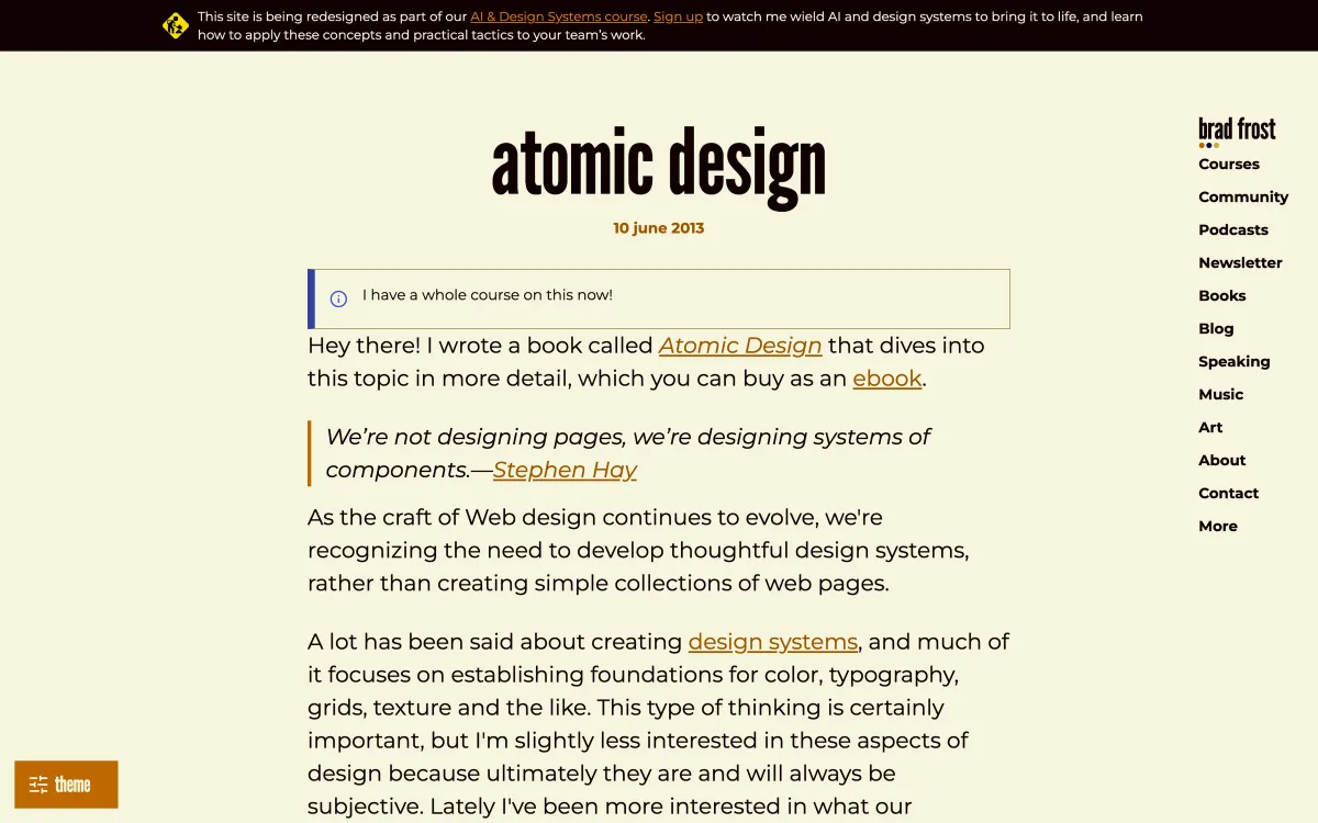
Brad Frost coined atomic design and has written about design systems for over a decade. His blog mixes longer posts, short link notes and, in 2026, a lot of material on AI and design systems.
- What it teaches: design-system thinking, components, and the relationship between design and code.
- Publishes: several posts and links a month.
- Best for: design-system teams and designers who want to understand the component-based way of working.
- Watch out for: recent posts promote his own courses alongside the free writing.
- Where: bradfrost.com/blog
How to use it: start with the atomic design post and the older writing on design systems if the concept is new to you, then follow the blog for current thinking on how design systems, code and AI tools fit together. The link notes are a quick way to discover other practitioners worth following.
zeroheight
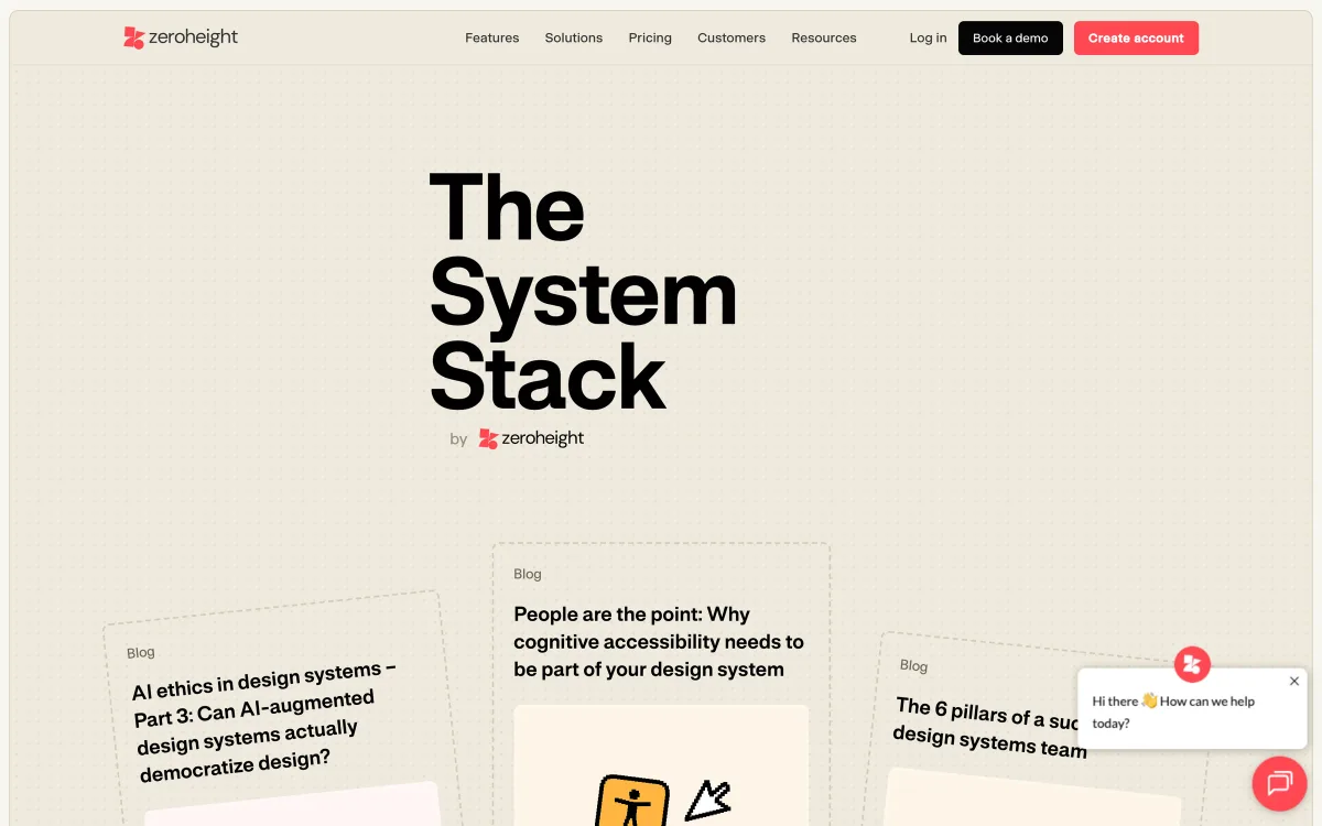
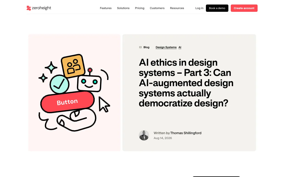
zeroheight makes design-system documentation software, and its blog covers design-system practice: governance, adoption, accessibility and the growing role of AI. It also publishes an annual report on the state of design systems.
- What it teaches: running and scaling a design system as a product.
- Publishes: several posts a month at its busiest; the latest we checked was from August 2026.
- Best for: design-system leads and teams struggling with adoption.
- Watch out for: it’s a vendor blog, so tool recommendations are not neutral.
- Where: zeroheight.com/blog
How to use it: read it when you’re dealing with the organisational side of a design system — getting teams to adopt it, deciding who owns what, measuring whether it’s working. Those are the problems that usually sink design systems, and they’re covered less often than components.
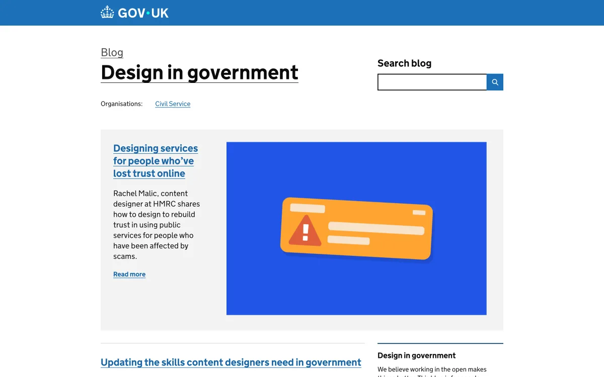
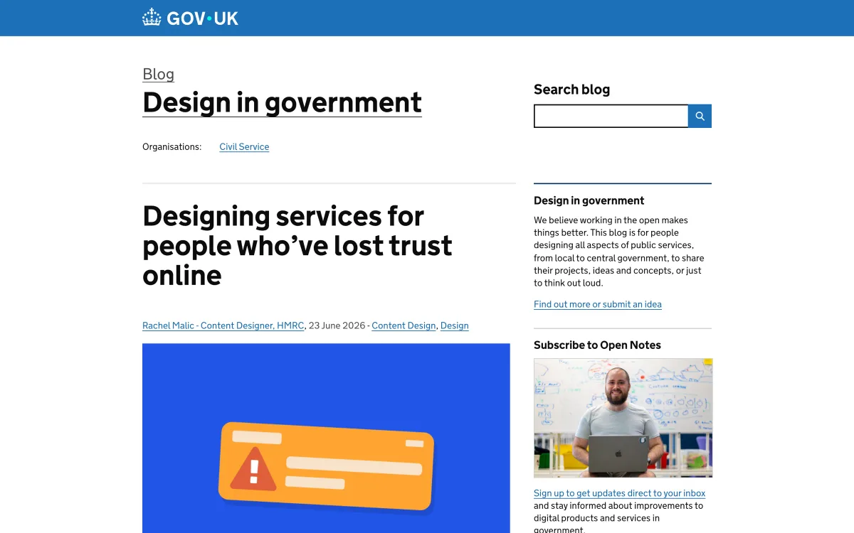
Design in Government (GOV.UK)
The UK Government Digital Service’s design blog, written by designers across government. It covers service design, content design, interaction design and the GOV.UK Design System — one of the most carefully researched public design systems.
- What it teaches: designing for everyone, including people with low digital confidence or trust.
- Publishes: every few weeks to months; the latest post was published in June 2026.
- Best for: anyone designing services that must work for all users, not just the tech-savvy.
- Watch out for: the public-sector context differs from commercial products — adapt, don’t copy.
- Where: designnotes.blog.gov.uk
How to use it: read it alongside the GOV.UK Design System itself, which documents patterns with the research behind them. Posts on designing for people with low trust or low digital confidence are useful for any product whose users are not the early adopters in your office.
UI engineering
Designers who understand what the browser can do design better interfaces and have better conversations with engineers. These two sources make front-end concepts approachable. You don’t need to write production code to benefit. Knowing roughly how layout, animation and positioning work in the browser changes which ideas you propose and how you describe them.
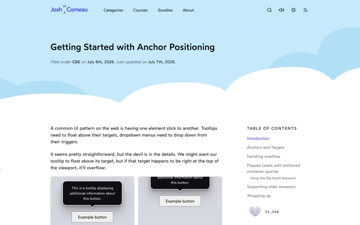
Josh W. Comeau
Josh Comeau writes interactive, in-depth tutorials on CSS, animation and React. Many posts include live demos you can play with, which makes abstract concepts tangible.
- What it teaches: modern CSS and interface animation, explained visually.
- Publishes: roughly monthly; the latest post was in July 2026.
- Best for: designers who want to understand layout, motion and what’s now possible natively in CSS.
- Watch out for: it’s developer-focused; designers will get the most from the concept posts rather than code detail.
- Where: joshwcomeau.com
How to use it: pick the tutorials on concepts you design with every day — layout, motion, popovers, scrolling — and play with the demos. You’ll come away able to describe interactions in a way developers can build, and more aware of what’s easy and what’s expensive.
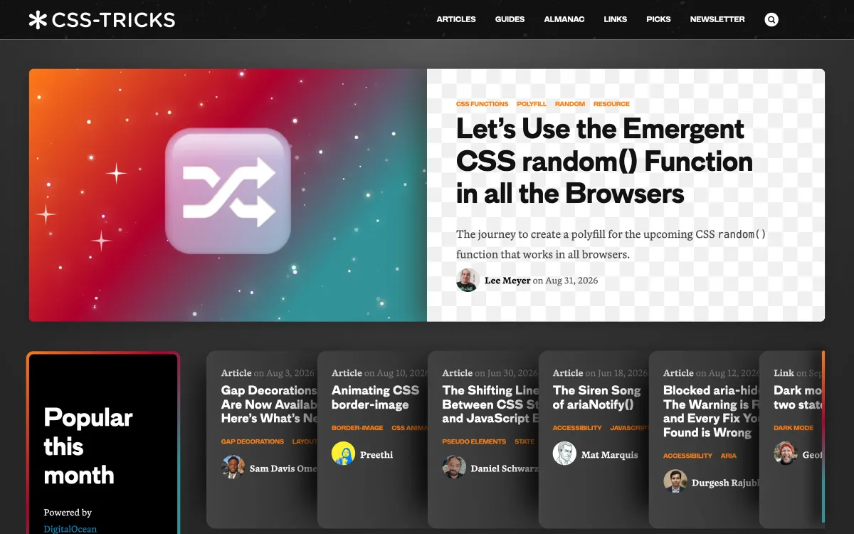
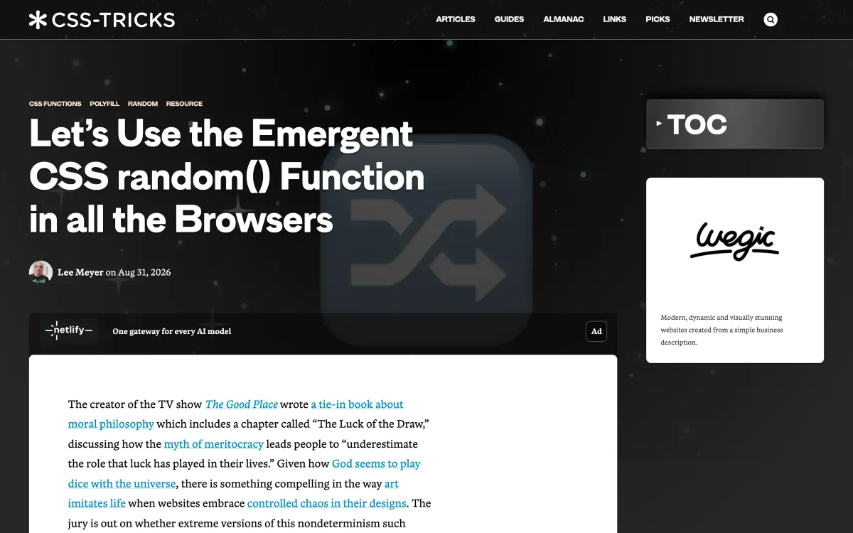
CSS-Tricks
A long-standing reference for front-end techniques, now part of DigitalOcean. Articles, guides and its CSS almanac cover new platform features and practical techniques.
- What it teaches: front-end techniques and new CSS features.
- Publishes: several posts a month; the latest we checked were from late August 2026.
- Best for: designers who prototype in code or want to know what’s newly possible.
- Watch out for: highly technical; less useful for designers who don’t touch code.
- Where: css-tricks.com
How to use it: follow it to know what the web platform can now do natively — features like anchor positioning, container queries and scroll-driven animations change which interactions are cheap to build. Share the relevant posts with your developers when you’re planning something ambitious.
Accessibility
Accessibility is often treated as a specialist topic. It shouldn’t be: most accessibility problems are created in design, through contrast, focus order, target size, labels and error handling, long before anyone writes code.
Deque
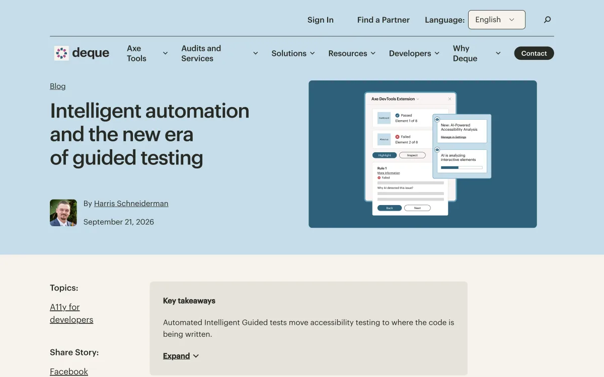
Deque builds accessibility testing tools, including the widely used axe engine, and its blog covers accessibility practice, standards, testing and legislation.
- What it teaches: accessibility in design, development and testing.
- Publishes: several posts a month; the latest was published on 21 September 2026.
- Best for: teams building accessibility into their process rather than checking it at the end.
- Watch out for: a vendor blog — posts about testing naturally lean towards its own tools.
- Where: deque.com/blog
How to use it: read the posts on accessible design and on shifting testing earlier in the process, and use them to build accessibility checks into design reviews rather than leaving them to a final audit. The posts on standards and legislation help when you need to explain requirements to stakeholders.
Platform guidance
Platform conventions are learned by users over years of daily use. Breaking them costs your users effort, so it’s worth knowing them well before deciding to.
Apple Design
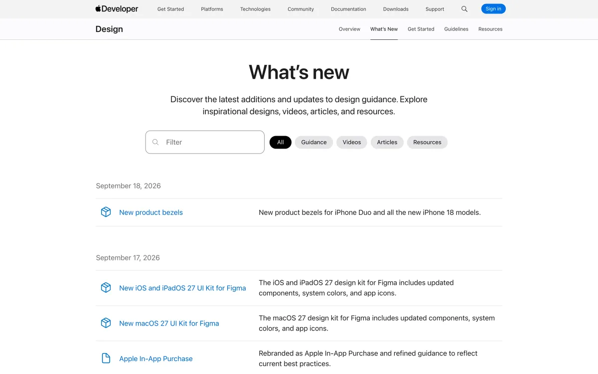
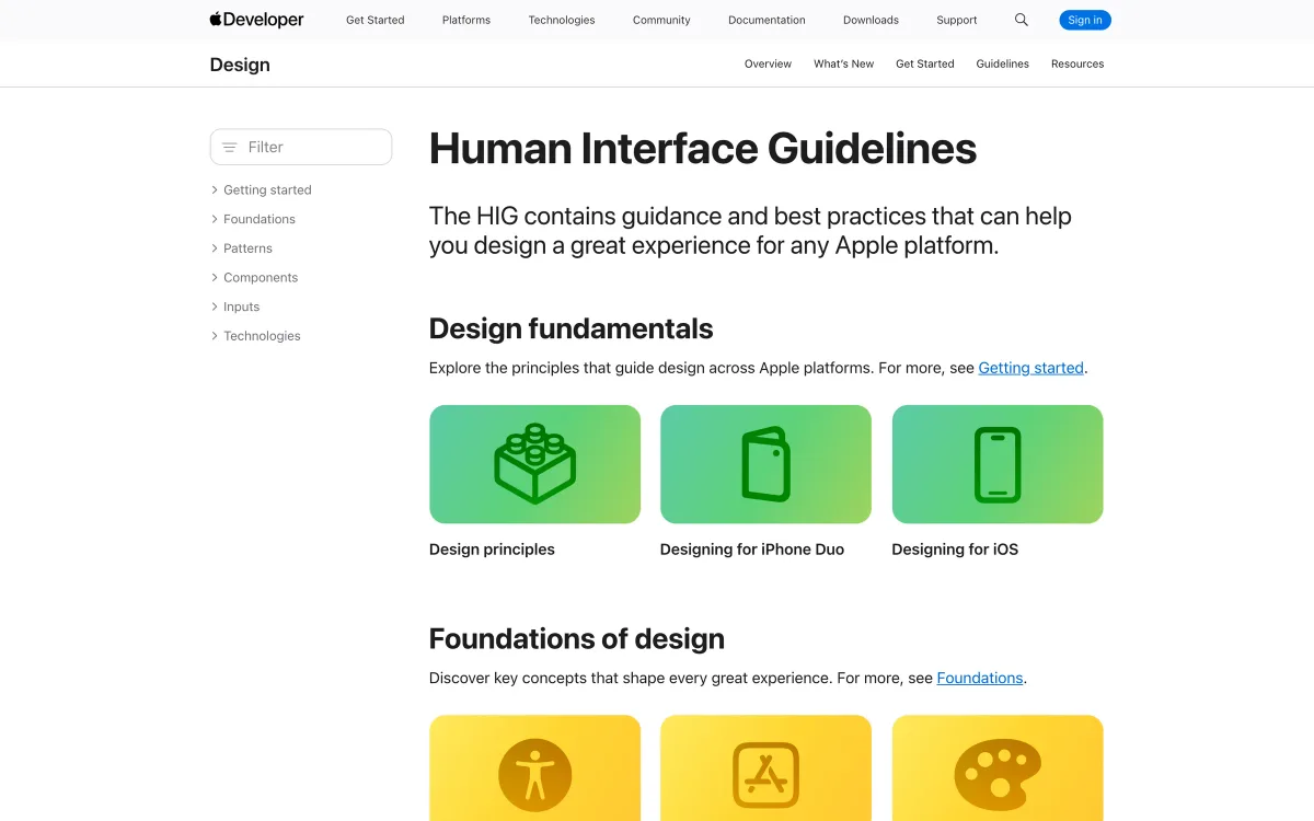
Apple’s design resources — the Human Interface Guidelines, design kits and a “What’s new” page — are not a blog in the usual sense, but the updates page is the most reliable way to follow changes that affect every iOS, iPadOS, macOS and watchOS interface.
- What it teaches: platform conventions users of Apple devices have learned.
- Publishes: updates whenever guidance, kits or resources change; the page listed updates from mid-September 2026.
- Best for: anyone designing for Apple platforms.
- Watch out for: it describes Apple’s platforms, not universal best practice. Android users expect Material conventions.
- Where: developer.apple.com/design
How to use it: check the “What’s new” page after each of Apple’s major platform announcements, and before designing any feature that touches system behaviour — notifications, widgets, permissions, navigation. For Android, follow Google’s Material Design guidance in the same way.
Industry thinking
Interface craft sits inside a wider profession that is changing quickly — especially around AI, team structure and the role of design in product decisions. These two sources track that conversation.
UX Collective
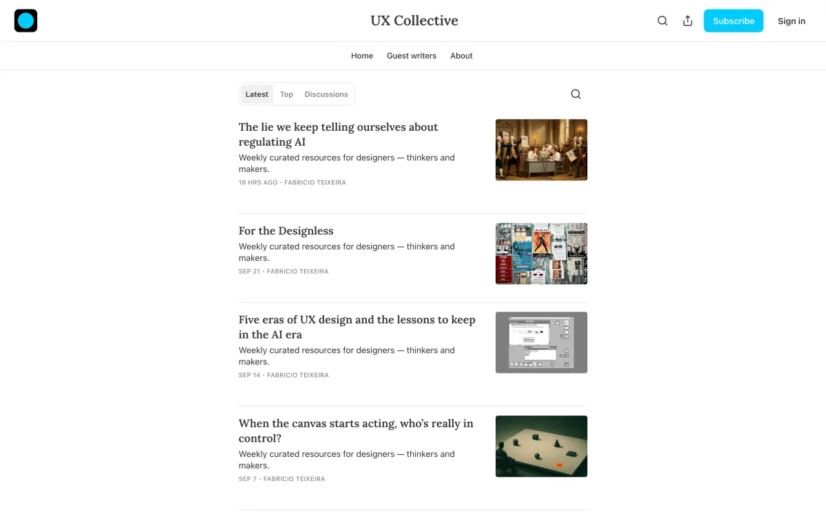
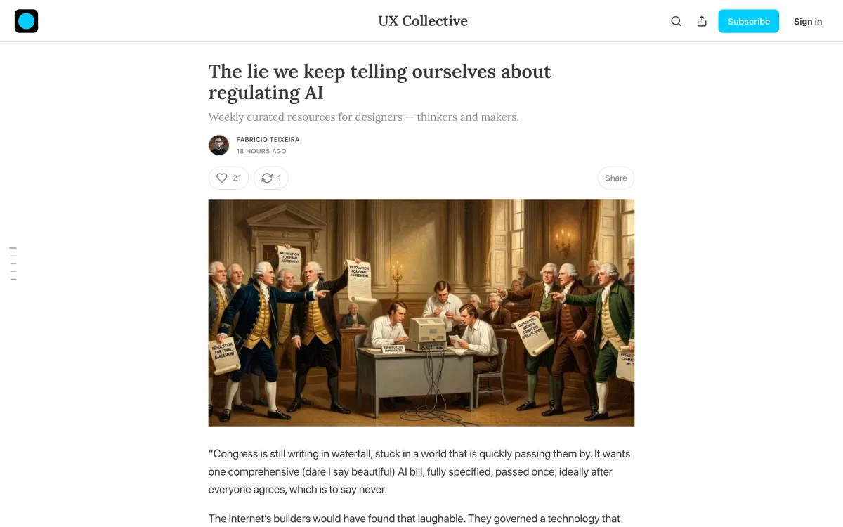
One of the largest design publications, running on Medium, plus a curated newsletter edited by Fabricio Teixeira. The publication covers everything from career advice to AI ethics; the newsletter is the higher-signal way to follow it.
- What it teaches: where the design profession is going, and the debates inside it.
- Publishes: the Medium publication publishes daily; the newsletter arrives weekly.
- Best for: staying aware of the conversation around design, beyond interface craft.
- Watch out for: quality on the open publication varies; start with the newsletter’s curation.
- Where: uxdesign.cc and newsletter.uxdesign.cc
How to use it: subscribe to the newsletter rather than the open publication. Each issue collects a handful of the week’s most discussed pieces with an editorial point of view, which makes it one of the cheapest ways to stay aware of the wider conversation.
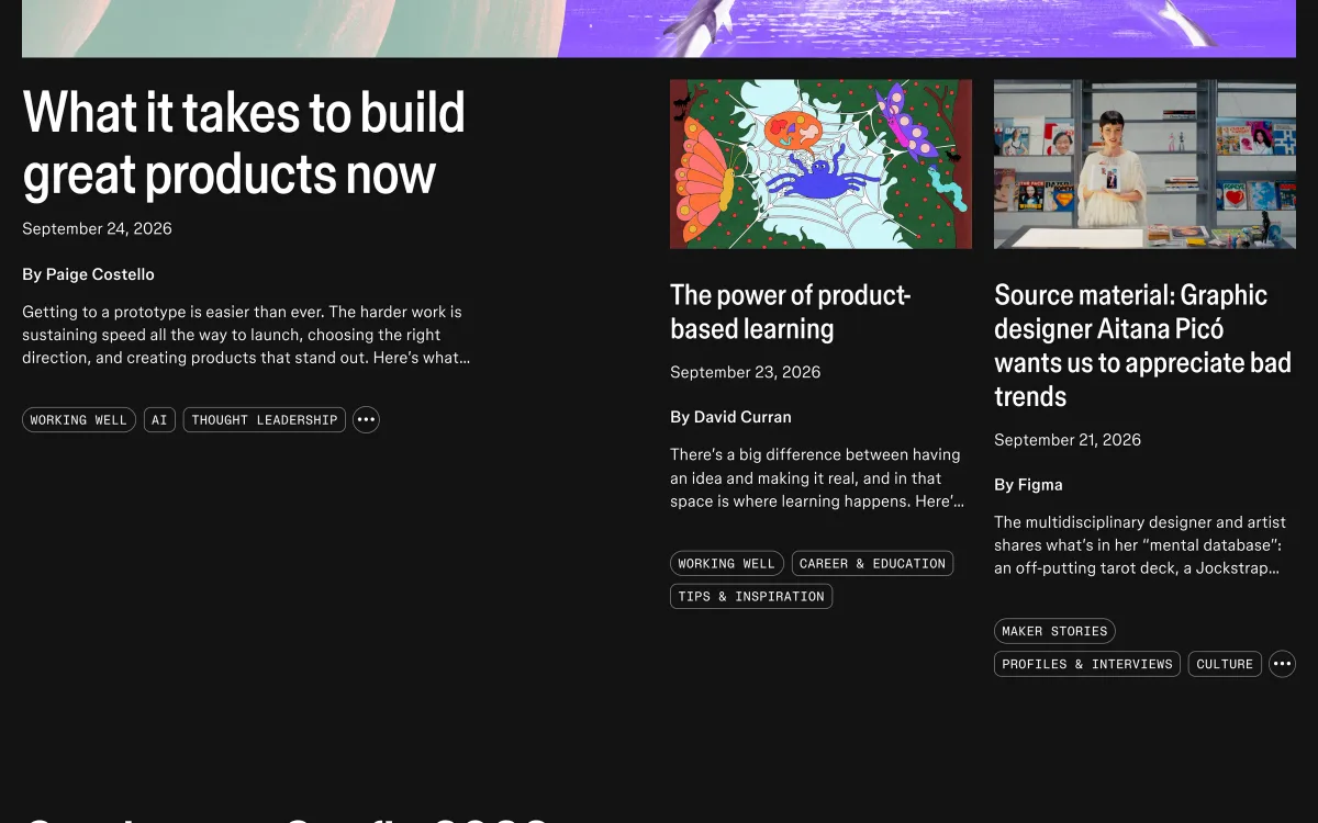
Figma’s blog
Figma’s editorial blog, branded Shortcut, publishes product-building essays, maker stories and features on how teams work — alongside product news.
- What it teaches: how product teams and designers work, and where tools are heading.
- Publishes: several posts a week.
- Best for: designers interested in team practice and the craft culture around the tool most of them use.
- Watch out for: it’s the toolmaker’s publication; product announcements sit next to editorial pieces.
- Where: figma.com/blog
How to use it: read the editorial pieces on how teams build products and skip the release notes unless you need them. The maker stories are a pleasant reminder that design is a craft with a culture, not just a job.

Curated inspiration
Inspiration has a place in a reading diet — as long as it’s not the whole diet.
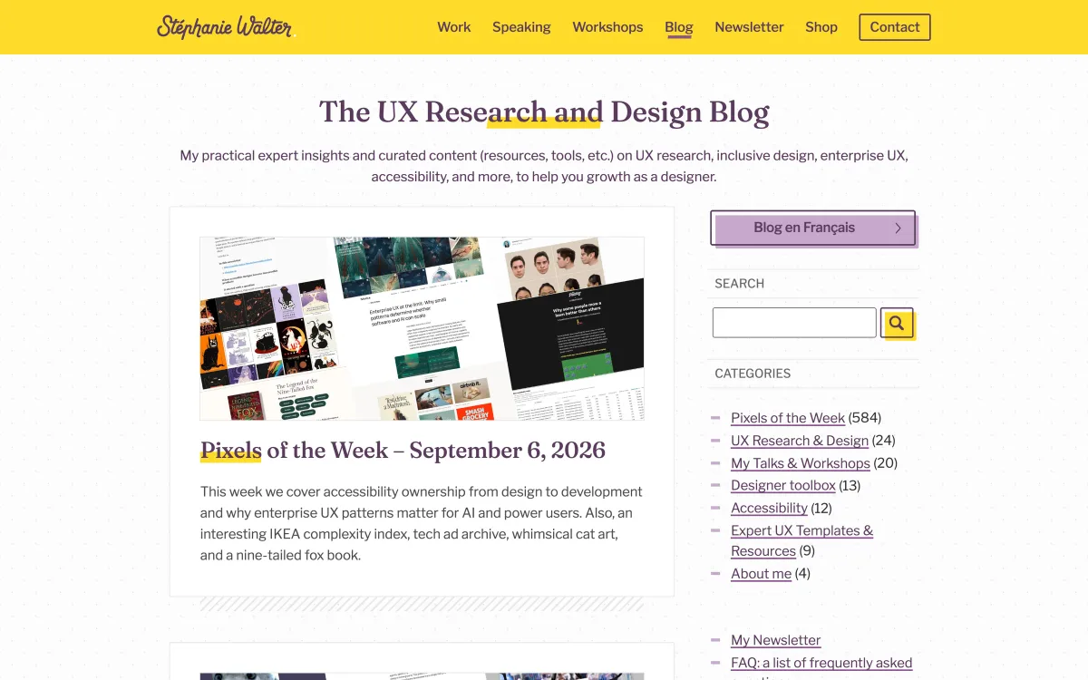
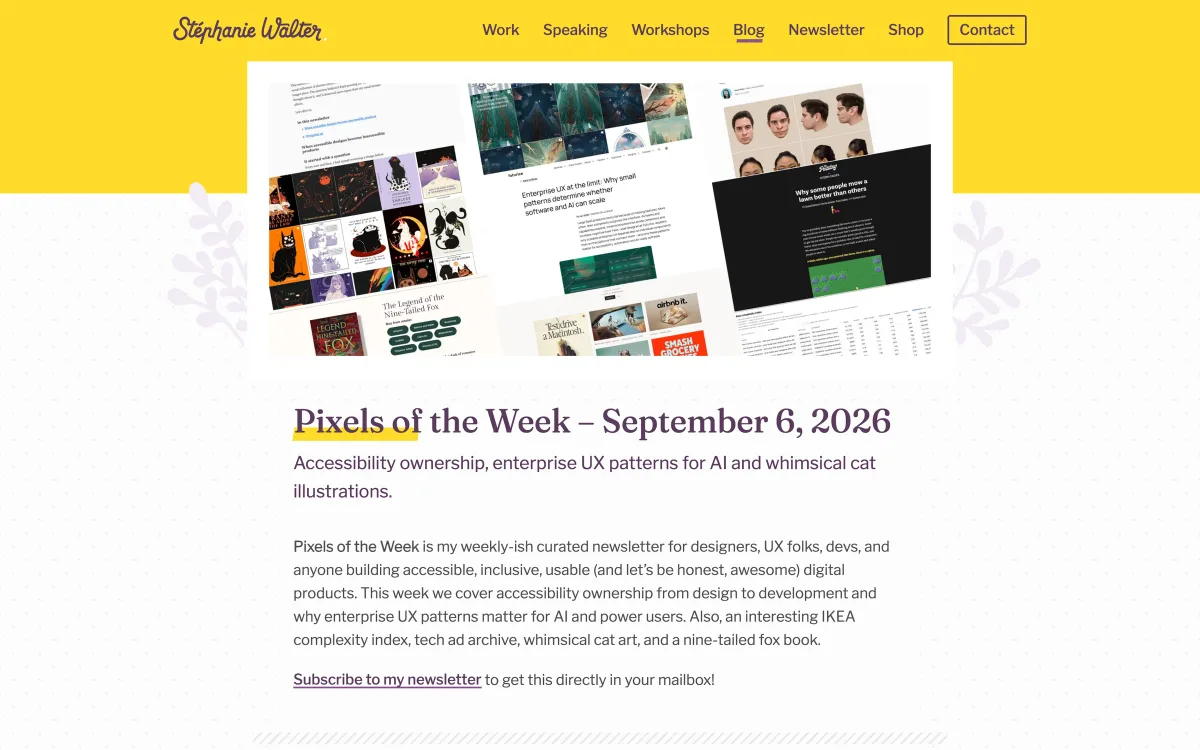
Stéphanie Walter — Pixels of the Week
Stéphanie Walter, a UX researcher and designer, publishes a curated collection of links — research, accessibility, design, tools and the occasional delight — along with her own articles on UX research and inclusive design.
- What it teaches: a well-curated cross-section of the field, filtered by a practitioner.
- Publishes: Pixels of the Week most weeks; the latest issue we checked was dated 6 September 2026.
- Best for: designers who want one trusted digest instead of twenty feeds.
- Watch out for: a link collection — the value depends on following through to the sources.
- Where: stephaniewalter.design/blog
How to use it: skim each issue and open the two or three links relevant to your current work. Over time, it’s also a good way to discover new practitioners and sources to add — or swap into — your own list.
Muzli
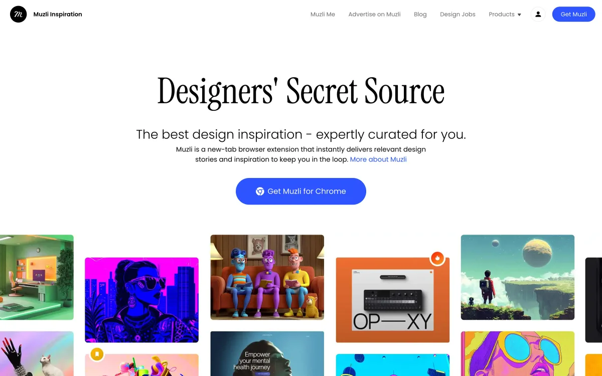
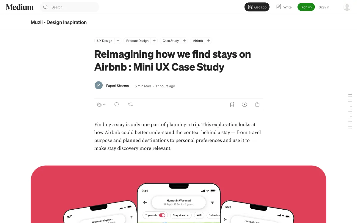
Muzli is a design inspiration hub and browser extension, with a Medium publication of articles and mini case studies. It’s the most visual source on this list.
- What it teaches: visual trends and what other designers are making.
- Publishes: daily, across the inspiration hub and the publication.
- Best for: art-direction research and keeping a visual pulse.
- Watch out for: inspiration without context — use it for mood and direction, not for deciding how your product should work.
- Where: muz.li and medium.muz.li
How to use it: open it when you’re exploring visual direction for a new product or campaign, and close it when you start deciding how things should work. Collect references with a note on why each one is relevant; a folder of unexplained screenshots is not a direction.
Where these sources disagree — and why that’s useful
Follow sources from different groups and you’ll notice they don’t always agree. That’s a feature. A pattern study may show that most products use a certain component; a research article may show that users struggle with it; a practitioner may argue against it altogether. Mobbin tells you what’s common. NN/g and Baymard tell you what tends to work in studies. Adam Silver tells you what he’d change and why. Muzli shows you what’s fashionable.
Each view is incomplete on its own. Prevalence isn’t proof of usability, research findings depend on the context they were studied in, a practitioner’s opinion reflects their projects, and fashion changes by the season. The skill is holding these views side by side and asking which conditions apply to your product. When the sources disagree about something you’re designing, that’s a strong signal to test it with your own users rather than picking the source you like best.
Vendor blogs deserve a specific note. Figma, zeroheight, Deque and Mobbin all sell products, and their blogs are good partly because they’re investing in the community. They’re also, naturally, not neutral about tools. Read their practice articles freely; read their tool comparisons with that in mind.
Reading AI coverage with a clear head
In 2026, a large share of what these sources publish is about AI: agents, conversational interfaces, AI-assisted design tools, and what all of it means for the profession. Some of it is excellent. Some of it is speculation dressed as analysis. A few habits help separate the two.
Look for articles grounded in something observable — a study, a shipped product, a real interface with its trade-offs — rather than predictions. Be wary of claims that a whole category of interface is dead; interfaces rarely die, they change where they’re used. Notice who benefits from the claim: a tool vendor, a course seller, a consultant. And apply the same critical questions as to any other article: what decision does it address, what’s the evidence, what context does it assume. The sources on this list that do this well — NN/g’s AI research, LukeW’s experiments with his own AI features — are worth more than a dozen confident forecasts.
Build a reading diet, not a feed
A designer who follows twenty inspiration accounts and no research sources is a magpie: very good at collecting shiny things, less good at knowing which ones are useful.

A healthier mix, as a recommendation: most of your reading from sources that explain decisions — research, patterns, systems — and a smaller share from inspiration. Add UI engineering if you work closely with developers, accessibility if you don’t yet know it well, and platform guidance for whatever platforms you ship on.
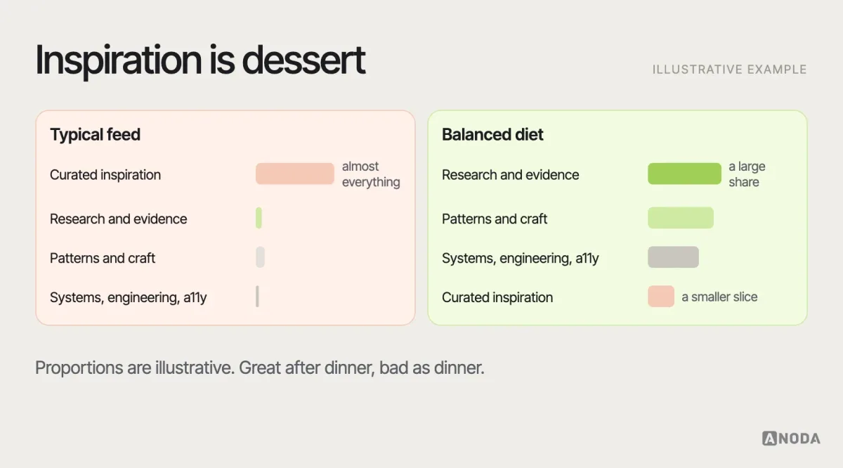
Keep the list small enough to actually read. Five to eight sources you read properly beat twenty you skim. An RSS reader or an email folder per category keeps them out of the endless scroll, where the most eye-catching item always wins over the most useful one.
Feeds, newsletters or social?
How you follow sources matters almost as much as which ones you follow. Social feeds optimise for what’s eye-catching, which rewards the most visual and most provocative items and buries the useful ones. RSS readers and email newsletters let you read on your own schedule, in the order you choose, without an algorithm deciding what matters. Most of the sources on this list offer at least one of the two. A simple setup — a reader with one folder per category, checked once or twice a week — turns a stream into a reading list.
Blogs, pattern libraries and guidelines
Blogs are only one kind of source. Pattern libraries such as Mobbin’s screen library, platform guidelines such as Apple’s Human Interface Guidelines and Google’s Material Design, and public design systems such as the GOV.UK Design System are references you consult when you need them, rather than read as they’re published. A healthy practice uses both: blogs to keep your judgement sharp and learn new ideas, references to check conventions and details when you’re designing something specific.
A thirty-minute weekly routine
Reading works best as a habit rather than a binge. One routine that fits into a busy week, as a suggestion:
- Ten minutes, Monday: skim the new items in your reader and the weekly digests; star anything relevant to current work and ignore the rest without guilt.
- Fifteen minutes, midweek: read one starred article properly, with the critical questions below in mind, and note one thing you’d apply or test.
- Five minutes, Friday: share that one thing with your team, with a line on why it matters to your product.
That’s a small investment, and over a year it adds up to around fifty articles actually read and applied — far more than most designers get from hours of scrolling.
References inform art direction — they don’t make decisions
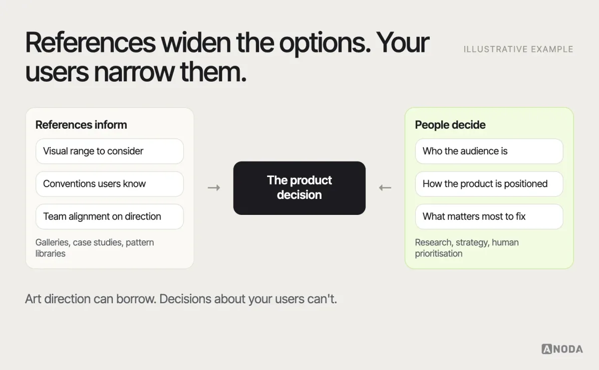
This is where we have a firm view. References, galleries and case studies are valuable for art direction: they widen the range of options you consider, show what’s conventional and help a team agree on a visual direction. They cannot tell you who your audience is, how your product should be positioned or what matters most to fix. Those are decisions about your users and your business, and they need research, strategy and human prioritisation.
We see the failure regularly: a product that looks like the latest Dribbble trend and doesn’t work for the people using it, or a redesign that copies a famous app’s patterns without the conditions that made them work there. The screens were well chosen. The decisions behind them were someone else’s.
How to read a UI article critically
Not everything published by a good source is right for your product. A few questions help you get value from any article on this list:
- What decision does it address? If you can’t name it, it’s inspiration, not guidance.
- What’s the evidence? Research, data, a real case — or the author’s preference?
- What context does it assume? E-commerce, enterprise, mobile, public sector, a particular audience?
- What are the trade-offs? Good articles say what a pattern costs, not just what it gains.
- What would you need to test? Turn the article into a question for your own users.
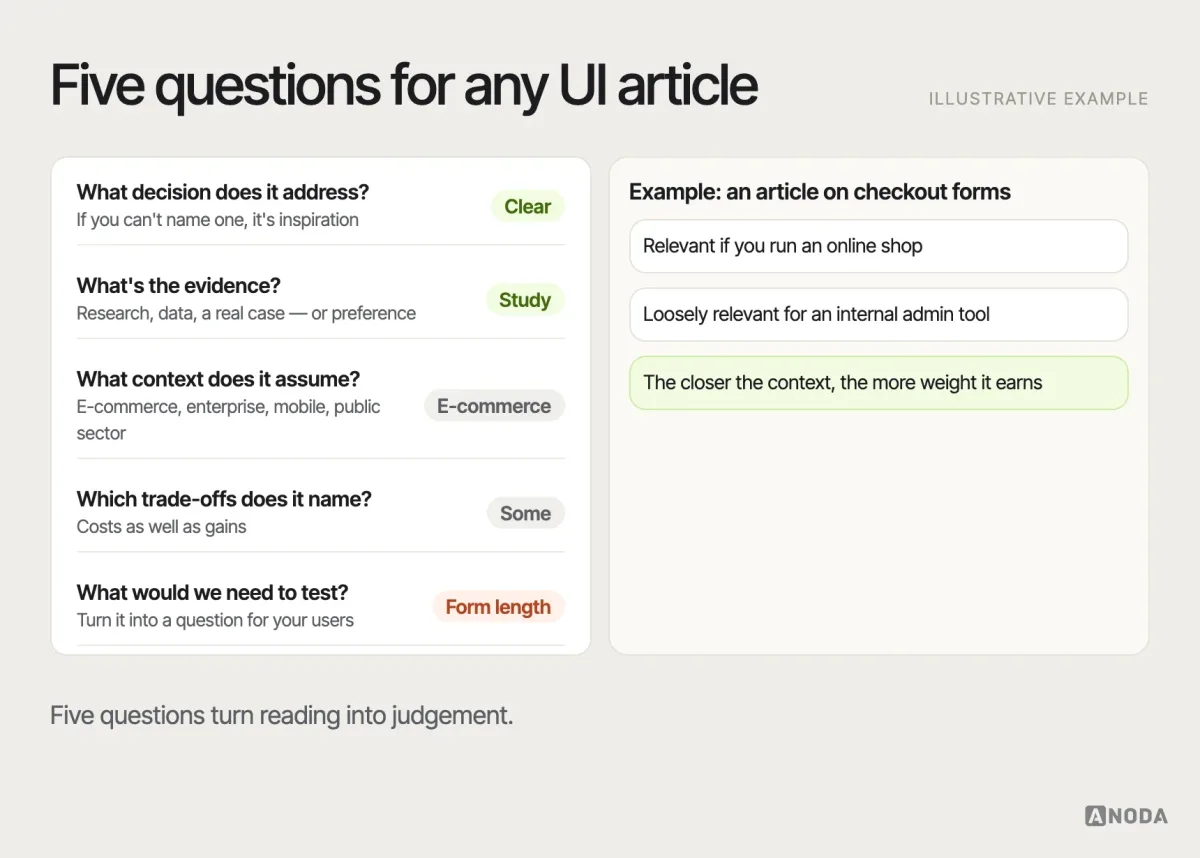
The same article can be exactly right for one product and wrong for another. Reading well means knowing which one you’re working on. It also means noticing when an article’s context matches yours closely. A study of checkout forms is directly relevant if you run an online shop and only loosely relevant if you design an internal admin tool; a post about public services applies strongly if your users include people with low digital confidence. The closer the match, the more weight the article deserves in your decision — and the less you need to test before acting on it.
Turn reading into team practice
Individual reading improves individual judgement. Shared reading improves a team’s. A few lightweight habits help:
- Share with context. When you post an article in a team channel, add one line on why it matters to your product. A link without a reason is noise.
- Run a short reading session. Once a month, pick one article relevant to current work, read it beforehand and spend half an hour discussing what applies and what doesn’t.
- Bring sources into critiques. When a design decision rests on a guideline or a study, cite it — and be ready to explain why it applies here.
- Record decisions, not bookmarks. When an article changes how you design something, write the decision into your design system or pattern documentation, with the source. That’s how reading becomes part of the product.
- Invite disagreement. If someone finds a source that argues the opposite, discuss it. Teams that only share articles that confirm their choices learn very little.
The goal is a team that makes better decisions together, not a longer list of links nobody opened.
Keep the list alive
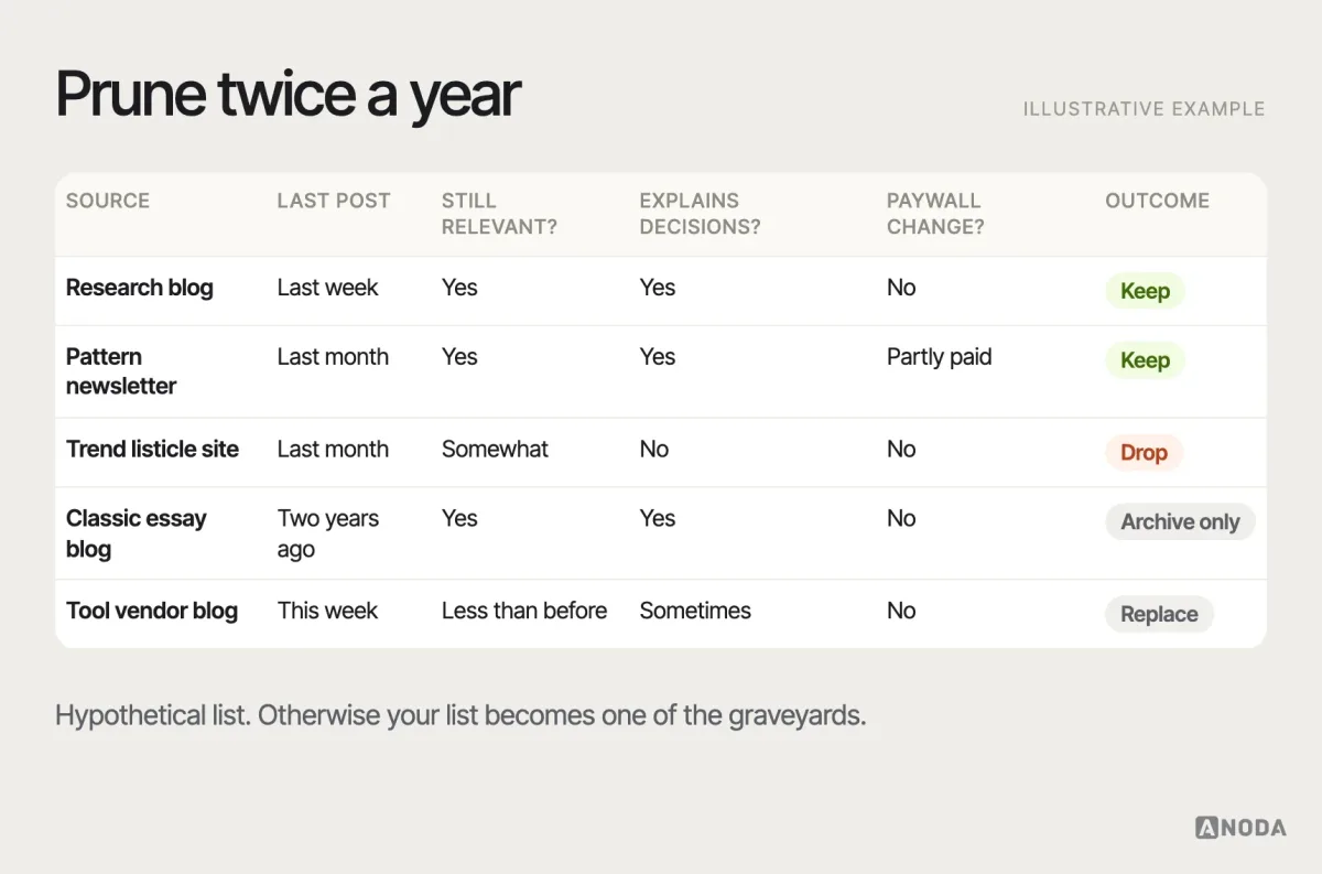
Resource lists decay. Blogs stop publishing, change focus, get acquired or go behind paywalls. Twice a year, prune your own list with the same checks we used: is it still active, still relevant, still explaining decisions? Replace what fails. The goal isn’t to follow the most sources; it’s to follow the right ones for the work you’re doing now.
The same applies to this article. Every source here was checked on 29 September 2026, and publishing schedules change. If you’re reading this much later, run the checks yourself: open each source, look at the date of the latest post and the kind of article it now publishes. It takes ten minutes, and it’s the difference between a reading list and a museum.
From a reference folder to a product your team can ship
A team can read every source here and still spend the next sprint rebuilding the same confusing form. The missing step is deciding which pattern fits the user’s task, how it behaves with real content and who keeps it consistent across the product. Copying the best-looking reference moves someone else’s assumptions into your backlog.
ANODA turns that exploration into a tested flow and reusable interface rules. In Qarma, our design connected an inspector’s mobile capture with the web report and corrective-action workflow, supported by release files and a UI kit. References informed the direction; the product’s work determined the structure. Explore Qarma’s product design and turn your references into a buildable product with ANODA.
When you need more than reading
Blogs help you improve your judgement. They don’t design your product. If your team needs an interface designed or improved — grounded in your users, positioning and constraints rather than the latest references — that’s our UI/UX design work.
UI/UX design
Need a product designed, not another reading list?
We turn your product requirements and user context into a coherent, usable interface — using references for direction and research for decisions.
If the real problem is that your product already looks and behaves differently from screen to screen, reusable patterns belong in a design system, not a bookmarks folder.

Design systems
Researching patterns because the product is inconsistent?
We build design systems that help the product and the team scale without fragmenting the experience — documented, owned and used.
For structured guidance after you’ve explored these sources, our guide to designing effective user interfaces is a good place to continue.
Follow fewer, read better
The best UI design blogs teach you to make better decisions, not just to recognise nicer screens. Verify that a source is alive, understand what it teaches, balance inspiration with research and systems thinking, and prune the dead or low-value entries before they turn your list into a museum. Then do the part no blog can do for you: take what you’ve learned back to your own users, test it in your own product, and write down what you decided and why. Reading sharpens judgement; only practice proves it.
Frequently asked questions
What are the best UI design blogs to follow in 2026?
Our shortlist, checked on 29 September 2026: Nielsen Norman Group, Baymard Institute, Jakob Nielsen on UX, Built for Mars, Smashing Magazine, Smart Interface Design Patterns, LukeW, Adam Silver, Mobbin Magazine, Brad Frost, zeroheight, Design in Government (GOV.UK), Josh W. Comeau, CSS-Tricks, Deque, Apple Design, UX Collective, Figma's blog, Stéphanie Walter's Pixels of the Week and Muzli.
How did you choose these UI blogs?
Each source had to have published within the four months before 29 September 2026, cover interface design or the research, systems and code behind it, explain decisions rather than only show screens, offer substantial free content and add something the others don't.
Which UI design blog should a beginner start with?
As a recommendation, start with Nielsen Norman Group for research-backed foundations, Smashing Magazine for practical depth, Smart Interface Design Patterns for component guidance and a curated digest such as Stéphanie Walter's Pixels of the Week to discover more sources.
Are inspiration sites like Muzli useful for UI designers?
Yes, for art direction — widening visual options and aligning a team on a direction. They can't tell you who your audience is, how your product should be positioned or what matters most to fix; those decisions need research and prioritisation.
How many design blogs should I follow?
Fewer than you think. Five to eight sources you read properly, across research, patterns, systems and a little inspiration, are more useful than twenty you skim. Review the list twice a year and remove sources that stopped publishing or stopped being useful.
Written by