In short
Subscriptions, freemium, ads, paid downloads and commissions are not interchangeable templates. The right model follows who pays, how often your value comes back, what each extra user costs and how much friction users will accept. A paywall cannot manufacture value, and tricky billing burns trust faster than copy can win it back. Here is how to choose, what each model does to the experience, and how to test it before it eats the roadmap.
In this article
- App monetization, revenue model, pricing and business model are not the same thing
- Six questions that choose the model for you
- Mobile app monetization models compared
- Where the model lives in the product
- How to validate a model before it eats the roadmap
- Metrics and warning signs after launch
- Why ANODA designs the whole value-to-payment journey
Mobile app monetization models are not a menu you order from once the app is built. Subscriptions, freemium, ads, paid downloads, commissions and hybrids each work only when they match how your product creates value and how often that value comes back. Pick the wrong one and no paywall redesign will save you, because a paywall cannot manufacture value. It can only charge for value the user has already felt.
Our product work exposes two familiar patterns: apps that make their value clear and apps that are sure the next paywall redesign will fix everything. The second kind usually picked its model from a competitor’s store page. “They have a subscription, so we’ll have a subscription.” The trial converts at a rate nobody says out loud, and the team spends two quarters redesigning the paywall. The paywall was never the problem. The thing behind it was.
Here is the arithmetic nobody puts on the pitch deck. Every user you acquire costs money. A user who meets a price before they meet the value leaves, and you paid for that exit. Repeat it a few thousand times and you have not tested a monetization model. You have paid handsomely to learn that people don’t buy what they haven’t seen.
ANODA connects the revenue logic to the experience that earns it: first value, paid offer, upgrade, renewal and recovery. We find the gap between what you promise and what users can actually do, then design the states that move them from trying the app to choosing the paid experience. You get one connected monetization journey instead of six screens owned by different teams.
App monetization, revenue model, pricing and business model are not the same thing
Teams use these four terms interchangeably, which is how a price change ends up presented as a new company strategy.
- Business model: how the whole company creates, delivers and captures value. Who the customer is, what you sell, how you reach them, what it costs. The app may be the entire business or one channel of it.
- Revenue model: where the money comes from. Users, advertisers, merchants, sponsors, an employer paying for its staff.
- Monetization model: the mechanism inside the product that collects it. A subscription, a one-off purchase, a commission on each booking, an ad slot.
- Pricing: the numbers and the packaging. How much, how often, which tiers, which trial.
Think of a football club. The business model is the club: players, stadium, fans. The revenue model is tickets, TV rights and shirts. Monetization is the turnstile, the season ticket and the shop till. Pricing is what a seat behind the goal costs. Change the price and you have changed one number. Change the turnstile and you have changed how every fan gets into the ground.
App monetization, in plain terms, is choosing the turnstile. The business model has to exist first. A clever billing screen on top of an unclear business is still an unclear business, now with a billing screen.
Six questions that choose the model for you
Most lists of app monetization methods describe the models and leave the choosing to you. The choosing is the hard part. We answer these six questions with a team before anyone opens a pricing spreadsheet.
Who pays? The user, an advertiser, a merchant on the other side of a deal, an employer, a sponsor. If the user is not the payer, you have two customers to satisfy.
How often does the value come back? Daily, weekly, once a quarter, once in a lifetime. Recurring value supports recurring payment. One-off value supports a one-off price. A wedding planner on a monthly subscription is asking couples to pay rent on a day that happens once.
What does each extra user cost you? If every active user burns servers, licences, support or AI calls, “free forever” is a promise with an invoice stapled to it. AI did not invent this problem. It just made it expensive again: every free chat with a language model has a bill, and you pay it.
How big can the audience get? Ads and micro-purchases need enormous volume. A specialist tool for veterinary clinics will never live on banner ads. It can live very well on a price that reflects what a clinic saves.
Where does the purchase decision happen? In the moment (a boost, a booking), after a trial, in a procurement meeting, or on a parent’s phone after the fifth polite request. The model has to meet the wallet where it actually is.
How much friction will users accept? Ads, locked features, trials, renewal reminders: every model charges some friction on top of the money. The only question is whether users think the product is worth it.
Answer honestly and most models rule themselves out. What is left is a short list, not a brainstorm.

Mobile app monetization models compared
Each model below comes with what has to be true, what it does to the experience and the first sign it is failing. There is no best model, only the one that fits your answers above.
Paid download: the cinema ticket
Pay once, before you get in. That is a cinema ticket: you pay before you have seen the film, so you only pay when the trailer, the genre and the reviews have already told you what you are getting. Paid downloads fit tools with an obvious job, well-known game franchises and professional utilities. The store page does all the selling.
The UX cost is up front: no trial, so screenshots carry the whole sale, and every buyer arrives with high expectations and no patience. Revenue also stops the moment new installs stop, because existing users have already paid everything they ever will. Your maintenance costs, sadly, did not get the memo. The warning sign: plenty of store page visits, few purchases, and reviews that start with “not what I expected”.
Subscription: the milk round
A subscription only makes sense when the value arrives again and again, like the milk round. Nobody pays the milkman every month for one bottle delivered in March. Fitness plans, language practice, cloud storage, budgeting and weekly work tools deliver value on repeat, so they can charge on repeat.
The UX cost is trust. You are asking for an ongoing commitment, so the price, the renewal date, the trial end and the way out have to be impossible to miss. The classic failure is a subscription wrapped around one-off value. Users pay for the one thing they needed and cancel, or forget, notice the charge three months later and ask their bank to reverse it. If cancellations cluster right after the first job is done, the value never recurred. It was a single purchase in a subscription costume.
If the subscription is the business, packaging, trials, seats and upgrade paths deserve their own design work. That is SaaS product design: shaping how customers receive value and how they pay for it as one system, not two departments.
Freemium: the free sample
Freemium is the cheese sample on a cocktail stick. It should taste exactly like the product, make you want more, and not be so big that it’s lunch. Make the free tier useless and nobody reaches the moment where paying makes sense. Make it too generous and nobody ever needs to.
The line between free and paid should follow usage, not spite: more projects, longer history, more teammates. Every locked feature is a small “no”, so place them carefully. The warning sign: lots of active free users, a flat upgrade rate, and upgrade prompts shown on screens where nobody was trying to do anything bigger. And remember there is no such thing as a free lunch, for you either. Free users cost support, servers and compute. Know what a free user costs before you decide how free they are.
In-app purchases: the bill at the restaurant
One-off purchases inside the app: consumables such as credits and boosts, permanent unlocks, or pieces of content. They fit when different users want different amounts at different moments, and the purchase sits right next to the need: a credit pack when the credits run out, a template just as you start building.
Done badly, it is a restaurant that charges separately for the fork, the napkin and the chair. Each charge is small. Together they feel like nickel-and-diming, and users start counting instead of enjoying. Can the user see what they get before paying, what they have left, and the price in real money rather than an invented currency built to blur it? When reviews talk about greed instead of features, the bill has become the meal.
Advertising: the wrapped bus
Advertising lets users pay with attention instead of money. It fits apps with a large audience, frequent sessions and natural pauses: news, casual games, everyday free utilities. A city bus wrapped in an advert still gets you to work. A bus that stops at every billboard so you can read it does not.
The UX cost is interruption plus tracking consent, and revenue per user is small, so it only works at scale. Warning signs: sessions getting shorter after an ad change, ratings that mention ads, and acquisition costs higher than what an average user earns you in ads. If ads are your main model, the detail on formats, frequency and placement is in our guide to mobile ad monetization mistakes.
Commission: the estate agent
Marketplaces, booking, delivery, payments and gig platforms take a cut of each transaction. It is the estate agent model: paid only when the house sells, so your income moves with your users’ success. That is its charm.
Its weakness is the estate agent’s weakness too. Once buyer and seller have met through you, they can swap phone numbers and do the next deal without you. The product has to earn its place in every transaction: payment protection, scheduling, reviews, disputes. Fees must be visible before the user commits, not discovered on the last screen. The warning sign: repeat pairs of users who keep messaging each other and stop transacting on the platform.
Affiliate and sponsorship: the tour guide
The app earns when it sends users to someone else’s product (affiliate) or when a brand pays to be associated with it (sponsorship). It fits content and recommendation apps whose users are already shopping: travel, gear, finance comparisons, recipes.
The risk is the tour guide paid by the souvenir shop. The tour is lovely until the tourists notice that every route ends at the same till. Once users suspect your recommendations are for sale, the recommendations are worthless, and so is the affiliate income. Label sponsored placements, keep a ranking logic you could explain to a user’s face, and never sell the top spot in an answer people trust.
Hybrid models: the festival with three stages
Most mature apps combine models: a free tier with ads, a subscription that removes them, purchases on top. That can be exactly right. Think of a festival with three stages: it works because each crowd finds its own band. Three bands on one stage at the same time is just noise.
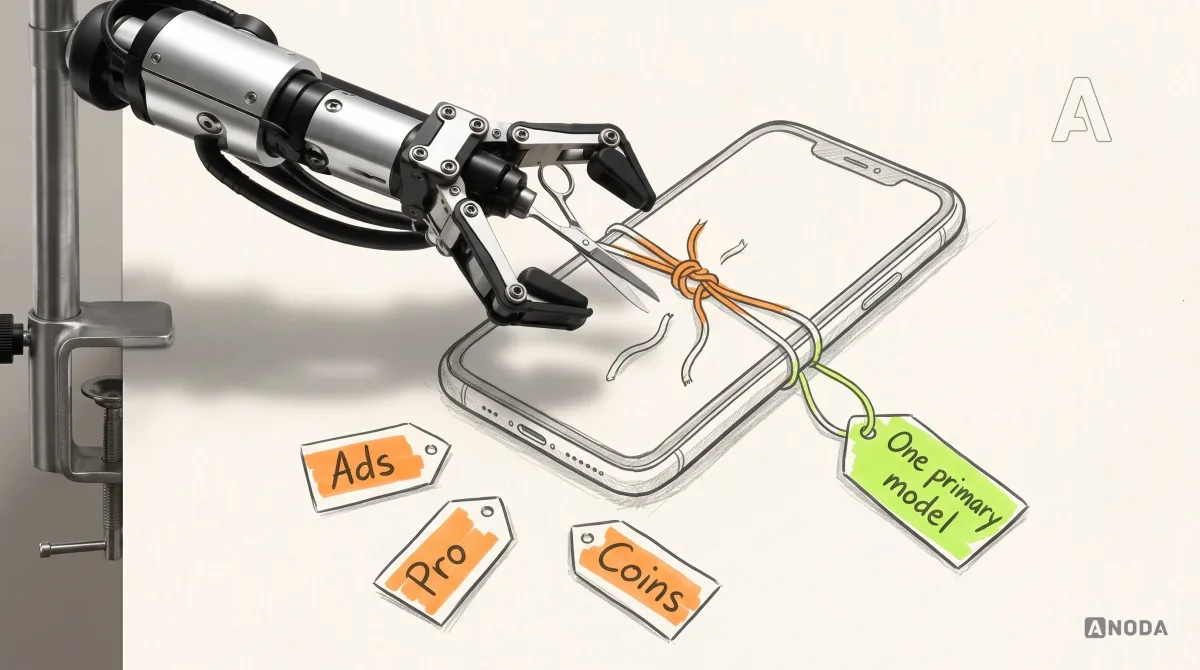
Hybrids work when each model serves a different, clearly defined group: ads for the casual majority who will never pay, a subscription for committed users, purchases for the occasional big need. They fail when all three hit the same user in the same session. And when they launch together, nobody can tell which one is making money and which one is quietly killing retention. Start with one primary model. Prove it. Then add a second one for a group the first doesn’t serve.
Where the model lives in the product
A monetization model is not a line in the business plan. It is a set of screens, and each can leak money. We find the same five leaks in almost every app we audit.
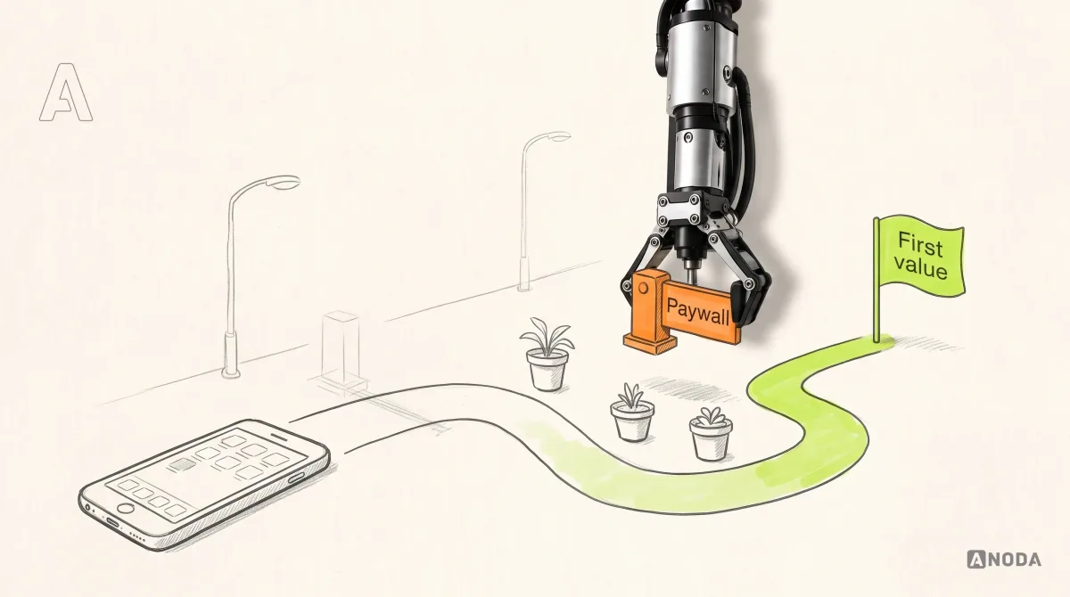
Onboarding. The first minutes exist to get the user to the value moment: the first plan built, the first document scanned. Every question, permission and price before that moment is paid for by users who leave, and you paid to bring them. If onboarding involves money, identity or card details, the trust bar is higher still. Our walkthrough of financial app onboarding steps covers how to earn that trust without scaring people off at the door.
The paywall. A paywall on the very first screen is a school charging for the textbook before the first lesson, when the pupil doesn’t yet know which subject it is. It works for famous brands. For everyone else, the paywall belongs where the user has just felt the value and wants more. Whatever the timing, the terms must be plain: the price, what the trial turns into, the date of the first charge and how to cancel.

The upgrade moment. The best upgrade prompt answers a request the user has just made: they hit the limit, tried to export, invited a teammate. The worst interrupts a screen where they wanted nothing bigger. One sells. The other trains users to close pop-ups unread.
Cancellation. The industry even has a name for the dark pattern here: the roach motel. Easy to get in, impossible to get out. It now has a price tag as well. In September 2025 the US Federal Trade Commission announced a $2.5 billion settlement with Amazon: a $1 billion civil penalty and $1.5 billion in refunds, over charges that it enrolled customers in Prime without consent and deliberately made cancelling hard. That is what a hard-to-find cancel button can end up costing. Dark patterns buy a few months of revenue and pay for them with your reputation. Design cancellation as plainly as sign-up: the current plan, the next charge, what happens to the user’s data, and honest alternatives such as switching plans, offered once rather than as a maze.

Recovery and retention. Failed payments, expired cards and lapsed subscribers are people who already said yes once. A clear “payment didn’t go through” message with one button to update the card wins some back. So does a lapsed state that keeps their data. Deleting the account on day one of a failed payment is killing the goose that lays the golden eggs because it was late with breakfast.
Activation Audit
Users install, look around and never pay?
We trace the path from first launch to the moment your product proves its worth, and show exactly where people drop off before they ever see a price worth paying.
How to validate a model before it eats the roadmap
A monetization model is a hypothesis with a price tag. Start with one clear offer at the moment users understand the value, then decide what the response means for the next release. Here is the order we recommend.
- Pick one primary hypothesis. “Busy freelancers will pay monthly so they never miss an invoice follow-up.” Not “freemium with optional ads and a premium tier we’ll figure out later”.
- Write down what must be true. The value recurs at least as often as you plan to charge. A defined group of users will pay for it. The revenue from a paying user covers what it cost to acquire them, the cost of serving them and the store’s cut. Check that cut for your region and programme at the time you model it: Apple’s rate depends on the programme you qualify for, and Google changed Play service fees for the US, UK and EEA from 30 June 2026, with different treatment of new and existing installs. And if there is a free tier, it has to be cheap enough to carry.
- Make the smallest credible offer. A real price, on a real screen, shown to real users at the value moment. A pricing page with a waitlist, a paid pilot, a manual invoice to the first ten customers. Surveys asking “would you pay for this?” measure politeness, not wallets.
- Decide success and failure before launch. Which number, by which date, and at what level you stop, change the offer or scale it.
- Keep pricing, renewal and cancellation explicit in every version of the test. Otherwise the number you get measures what users failed to notice, not what they chose.
The mistake we see most is building the whole billing machine first: three tiers, annual discounts, family plans, promo codes, all before anyone has paid a cent. That is drinking your own Kool-Aid at engineering rates. Two weeks and one honest price screen will tell you more than a quarter of billing infrastructure for a model nobody has proved.
Once the model holds, the product still has to carry it across every screen and state. That is the part we design in mobile app design projects: onboarding, paywall, upgrade, renewal, cancellation and recovery built as one flow around one revenue logic, with the measurement to see if it works.
Metrics and warning signs after launch
Counting downloads is counting seed packets. Nobody eats seed packets. After launch, the question is whether the model turns users into revenue without driving them out. These are the numbers we watch, in this order:
- Activation: the share of new users who reach the value moment, and how fast. If this is low, monetization is not your problem yet.
- Conversion: free to paid, or trial to paid, measured against users who reached the value moment rather than against every install.
- Renewal and retention: how many payers renew, and when the cancellations cluster.
- Revenue per user against acquisition cost: by channel, after the store’s cut and the cost of serving the user.
- Trust signals: refund requests, chargebacks, complaints, and reviews that mention billing, “scam” or “can’t cancel”.
And the warning signs, each with its usual cause:
| What you see | What it usually means |
|---|---|
| Trial conversion rising while renewals fall | Check whether the ongoing value and renewal terms match the trial promise |
| Cancellations cluster right after the first job is done | The value does not recur; the model is wrong |
| Upgrade prompts seen often and tapped rarely | The prompt appears at the wrong moment |
| Support tickets about charges nobody expected | The terms were unclear at the point of purchase |
| High free usage, flat upgrades | The free tier already covers the whole need |
| Ad revenue up, sessions and ratings down | The ads are eating the product that earns them |
Keep Goodhart’s law pinned above the dashboard: when a measure becomes a target, it stops being a good measure. Hide the cancel button and trial conversion looks wonderful for exactly one billing cycle. Then the refunds arrive, and the next cohort you pay to acquire reads the reviews first.
Why ANODA designs the whole value-to-payment journey
ANODA works on the decision the user is making, not just the price badge. In Wildcast, we connected advertiser, podcaster and admin portals around campaign requests, matching, offers, published-episode confirmation and payout settings. A marketplace earns its place by making that exchange clear for both sides.
Your paid app needs the same connected logic. We design the first useful result, the offer that follows it and the subscription or transaction states that keep customers confident. You get a monetization journey your team can build, with the missing decisions resolved before they become churn and support tickets.
Every month you run a model you never tested, you choose to keep paying for users who hit a price, shrug and leave. Choose one primary hypothesis. Write down what must be true for it to work. Test it with the smallest credible offer. Keep the price, the renewal and the way out in plain sight. Then, and only then, build the machine.

Mobile app design
A good revenue model still needs a product people will pay for.
We design the path from first launch to first value, the paywall, the upgrade and the way out around your model, and set up the numbers that show whether it works.
Written by