In this article
Two ANODA portfolio projects published in July 2021 are featured in Behance’s UI/UX category: a NeoBank interface design and an Airbnb design concept. The original project pages identify ANODA and the individual contributors, so readers can explore the work and its credits directly.
Great-looking screens are only the beginning
When a financial or travel product makes people hesitate, every unclear step stands between them and the action your business needs. Copying a familiar interface can give you the right appearance while leaving the wrong journey intact. ANODA designs the flow as well as the visual language, so the experience earns confidence and guides people forward. These two recognised projects show that combination in action.
NeoBank interface design
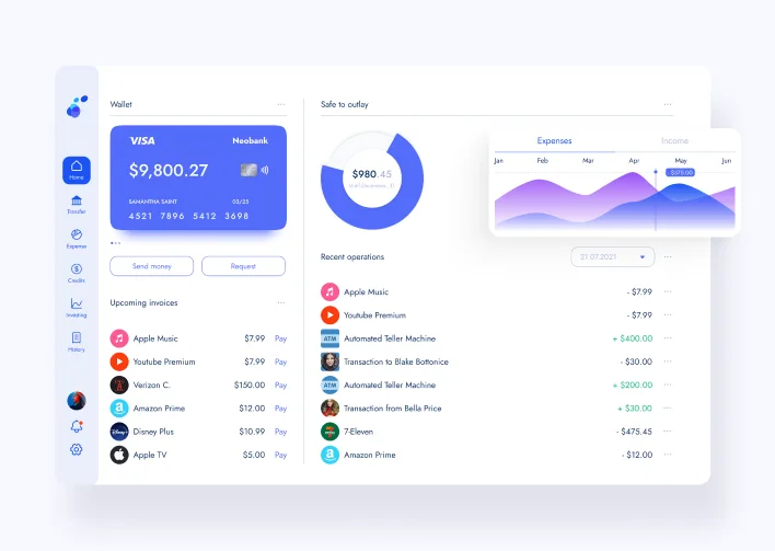
Mobile App Design for Neobank was published on July 20, 2021. Its Behance page carries the UI/UX feature designation.
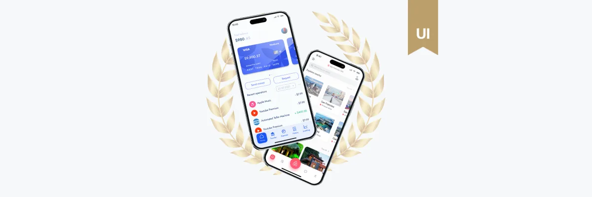
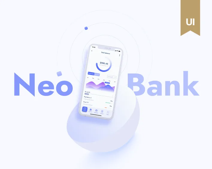
The interface shown here brings a card balance, payments, invoices and recent operations into one dashboard. A separate mobile presentation shows balance and spending information. The design brings essential money tasks into a clear, confident experience: customers can understand their balance, follow payments and navigate everyday decisions without getting lost in the interface.
Airbnb design concept
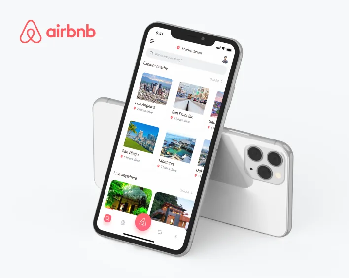
Mobile App Design for Airbnb was published on July 22, 2021 and is also featured in UI/UX on Behance.
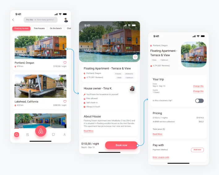
The concept uses destination cards and accommodation imagery in its browsing screen. Another sequence connects an accommodation list to property details and a booking summary. As a portfolio concept, it demonstrates how ANODA connects inspiration, property selection and booking into a purposeful journey.
Explore the projects
Behance’s UI/UX recognition celebrates the quality of these presentations. For ANODA, strong visual craft serves a bigger purpose: making complex decisions feel clear and helping people move toward the result they came for.
Explore ANODA’s case studies for more of that approach. Your product should make the next step feel obvious, not leave customers searching for it. Discuss your product design with ANODA.
Written by