In short
Users will find the bugs a team chooses not to test. Mobile app QA is several activities: design QA checks states, content, layout and accessibility; engineering tests check behaviour and resilience; exploratory testing finds what nobody wrote a case for; production monitoring catches what slipped through. None substitutes for the others. Define critical flows and failure states, automate repeatable checks, release in stages and give production signals an owner.
In this article
- What mobile app QA testing covers
- How ANODA closes the gap between design and release
- Who finds which bugs
- Why mobile QA is harder than web QA
- QA starts in design, not after the build
- Start with critical flows and acceptance criteria
- Design QA: the bugs engineers don’t see
- Engineering tests: behaviour and resilience
- Performance: slow is a bug too
- Test data: the accounts decide what you find
- Device and OS coverage: build a matrix, not a wish list
- Accessibility testing: part of QA, not an extra
- Interruptions, network and permissions: where mobile apps really break
- Exploratory testing: finding what nobody wrote a case for
- Security and privacy checks every release needs
- Regression testing: protect what already works
- Release: stage it, don’t bet everything on one build
- Production: the bugs only real users find
- How to tell whether QA is working
- Bug reports that get fixed
- Severity and priority: decide what to fix first
- QA in a small team without a QA department
- The QA mistakes that cost the most
- A mobile QA plan in eight steps
Every app ships with bugs. The only question is who finds them first: your team, before release, or your users, after it. Mobile app QA testing is how a team decides which bugs it will find itself, and users will find every one the team chose not to look for.
That choice is rarely made on purpose. Nobody says “let’s skip the offline state”. It just never makes it into a test plan, because the designer assumed engineering would handle it, engineering assumed QA would catch it, QA tested the flows in the ticket, and the ticket didn’t mention a train going into a tunnel. Then a one-star review mentions it, and everybody is surprised.
This guide is about closing those gaps. It covers what mobile QA includes, who finds which kind of bug, the mobile-specific failures web teams underestimate, how to release without betting the whole user base on one build, and how to keep finding bugs after launch, when the stakes are highest.
What mobile app QA testing covers
Mobile app QA testing is the work of checking that an app behaves correctly, looks right and holds up in real conditions, before and after release. In practice, that is several different disciplines:
- Functional testing. Does each feature do what it should? Does “Save” save, does “Pay” pay, does “Undo” undo?
- Design QA. Does the built product match the intended experience: the states, the copy, the spacing, the behaviour on different screens?
- Device and OS coverage. Does it work on the phones your users actually have, not only the ones on the team’s desks?
- Interruptions and network conditions. Does it survive a call, a notification, a switch to another app, a lost connection, a low battery?
- Performance. Does it start fast, scroll smoothly and stay within reasonable memory and battery use?
- Accessibility. Does it work with screen readers, large text, reduced motion and sufficient contrast?
- Security and privacy basics. Does it handle permissions, sessions and sensitive data as intended?
- Localisation. Do translated strings, dates, currencies and right-to-left layouts fit and make sense?
- Regression testing. Did the new release break anything that used to work?
- Production monitoring. What is failing for real users right now, and who is responding?
No single person or tool covers all of this. That is the central point of this guide.
How ANODA closes the gap between design and release
A late bug hunt cannot recover the weeks spent building a flow whose failure states were never decided. ANODA starts with the screens that carry the business: first use, payment, saved work and the return visit. We design loading, interrupted, empty and error states alongside the happy path, then check the built experience against those decisions. Engineers get concrete corrections with a screen, a state and an expected behaviour, rather than another round of subjective comments.
Our SEOSpace work shows that handoff in practice: Figma files, Loom walkthroughs and design QA of each release for its web app and Chrome extension. The product scope was web and extension; the useful discipline for a mobile release is making behaviour explicit before users have to discover it. See the SEOSpace handoff and bring your release-critical flow to ANODA.
Who finds which bugs
Different kinds of testing catch different kinds of bugs. Think of them as layers, each with its own mesh size. Each layer catches what the one before it let through, and each misses things the next one has to catch.
- Design QA catches experience defects: missing states, wrong copy, broken layouts on small screens, inaccessible contrast, text that doesn’t fit in German. Engineers often don’t see these because the feature “works”.
- Automated engineering tests catch behavioural defects: logic errors, broken integrations, regressions in code that used to work. They are fast, repeatable and blind to anything nobody wrote a test for.
- Exploratory and manual QA catches the unexpected: the combination of actions nobody anticipated, the edge case that falls between two tickets.
- Production monitoring catches what slipped through all of the above: crashes on a specific device, a payment provider timing out, a flow where people quietly give up.
- Users catch everything else, and they report it in the least convenient places: app store reviews, social media, or by simply leaving.
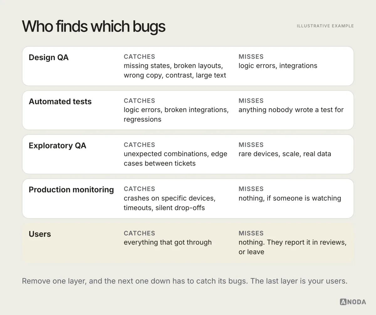
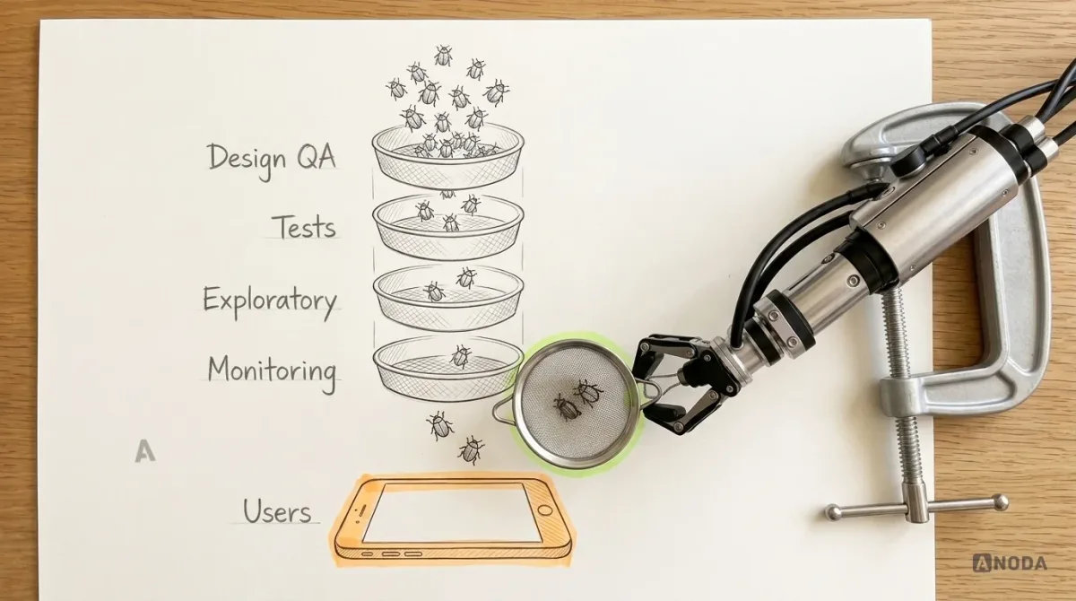
The failure pattern is almost always the same: one layer is treated as a substitute for another. “We have automated tests, so we don’t need manual QA.” “Design reviewed the mock-ups, so design QA is done.” “We’ll see problems in the analytics.” Each of these sentences removes a sieve, and the bugs that sieve would have caught go straight to users.
Why mobile QA is harder than web QA
Teams coming from web products tend to underestimate mobile testing. Some of the reasons are obvious, some less so.
Fragmentation. A web team tests a handful of browsers. A mobile team faces a wide range of devices, screen sizes, OS versions and manufacturer customisations, especially on Android. A layout that is fine on the team’s phones can break on a small screen or an older OS version.
Interruptions are the norm. Phones ring, notifications arrive, users switch apps, the OS kills background processes to save memory. An app has to survive being paused, resumed and restarted at any point in a flow.
Networks are unreliable. Users move between Wi-Fi, mobile data and no signal in the middle of a task. “Works on office Wi-Fi” is not a test result.
Permissions are the user’s choice. Camera, location, notifications, contacts: each can be denied, granted once or revoked later in settings. Every “no” is a state the app must handle.
Releases are slow to reverse. A web bug can be fixed and deployed in minutes. A mobile fix usually needs a new build, a store review and users updating the app, and some of them won’t for weeks. The bug stays in their pockets long after it’s fixed in the code.
That last point changes the economics of QA on mobile. A bug that would be a minor embarrassment on the web can live on thousands of devices for a long time on mobile. Finding it before release is worth much more.
QA starts in design, not after the build
The cheapest bug is the one that never gets built. Much of what later shows up as a QA finding was decided, or not decided, long before a line of code: a state nobody drew, a rule nobody wrote down, a flow nobody walked through with real data.
Bringing quality thinking into design changes what reaches testing:
- Review designs for testability. Can a tester tell, from the design and the ticket, what should happen in every state? If not, the design isn’t finished.
- Design the unhappy paths. Errors, empty states, offline, permission denied, slow responses. A designer who only draws the happy path hands the other paths to whoever builds the screen.
- Talk before the build. A short conversation between design, engineering and QA before a feature starts is often called “three amigos”. Each role asks the questions the others miss: how will we test this, what can go wrong, what does the user see then?
- Use real content in designs. Long names, big numbers, translated strings. A layout that only works with placeholder text is a bug waiting for real data.
This is not about making designers responsible for engineering defects. It is about making sure that when QA finds something, it is a genuine mistake, not a decision nobody made.
Start with critical flows and acceptance criteria
You cannot test everything with the same depth, and trying to is how teams end up testing nothing deeply. Start by naming the critical flows: the handful of journeys that, if broken, stop users getting value or stop the business earning.
For most apps, the list is short: sign-up and sign-in, the core task the app exists for, payment or subscription, and whatever brings users back, such as notifications or sync. Everything else matters, but these deserve the most coverage, the most automation and the first look after every release.
For each critical flow, write acceptance criteria that include the unhappy paths, not just the happy one. “User can reset password” is not an acceptance criterion. It is a wish. A useful set looks more like this:
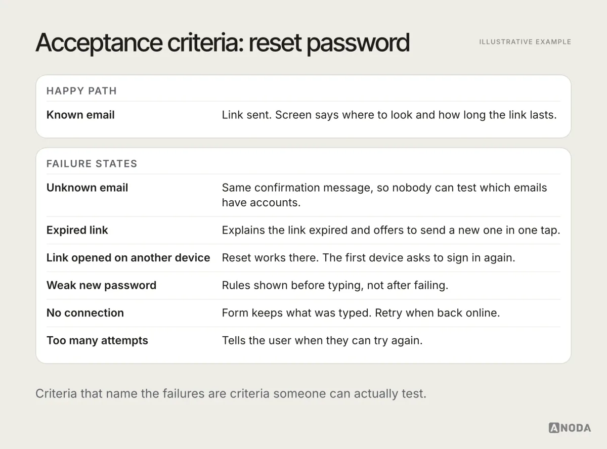
Writing criteria this way does two things. It gives QA something concrete to test against, and it forces the team to decide the behaviour before the build, rather than discovering in testing that nobody knew what should happen when the link expires.
Design QA: the bugs engineers don’t see
Design QA is the check that the built product matches the intended experience. It is not a second design review, and it is not pixel-pushing for its own sake. It exists because a large class of defects is invisible to functional testing: the feature technically works, but the experience is broken.
Typical design QA findings:
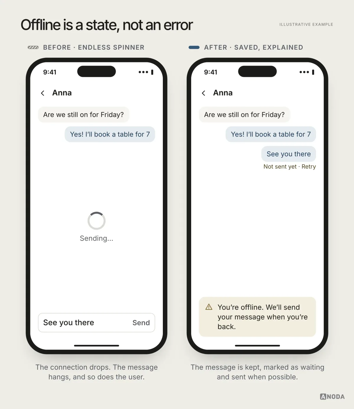
- Missing or wrong states. No empty state, a loading spinner that never ends, an error message that says “Error”.
- Content that doesn’t fit. Long names, long translations, large numbers, user-generated text that breaks the layout.
- Layout on real screens. Buttons pushed off screen on small phones, content hidden under the keyboard or the notch.
- System settings. Dark mode with unreadable text, large accessibility text that overlaps, reduced motion ignored.
- Accessibility. Missing labels for screen readers, touch targets too small, contrast too low, focus order that makes no sense.
- Copy. Placeholder text left in, inconsistent terms, instructions that don’t match the screen.
- Behaviour. Transitions, gestures and feedback that differ from the design intent in ways users will notice.
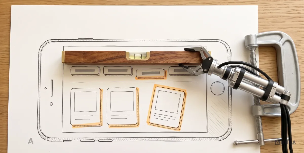
The best time to run design QA is on a real build, on real devices, with real content, before release. Not on the mock-up, which always looks right, and not after launch, when the fix competes with the next roadmap item.
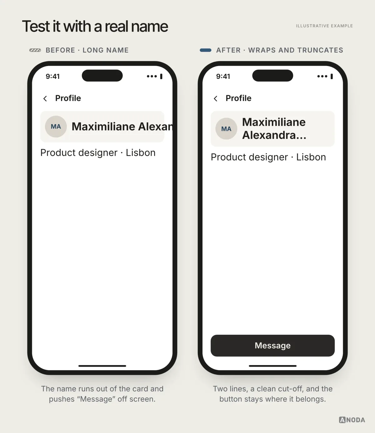
A practical way to run design QA is to go screen by screen through a checklist of states, rather than only following the happy path. For each screen, ask: what does it look like when there is nothing to show, when it is loading, when something failed, when there is no connection, when there is too much content, and when the user said no to a permission?
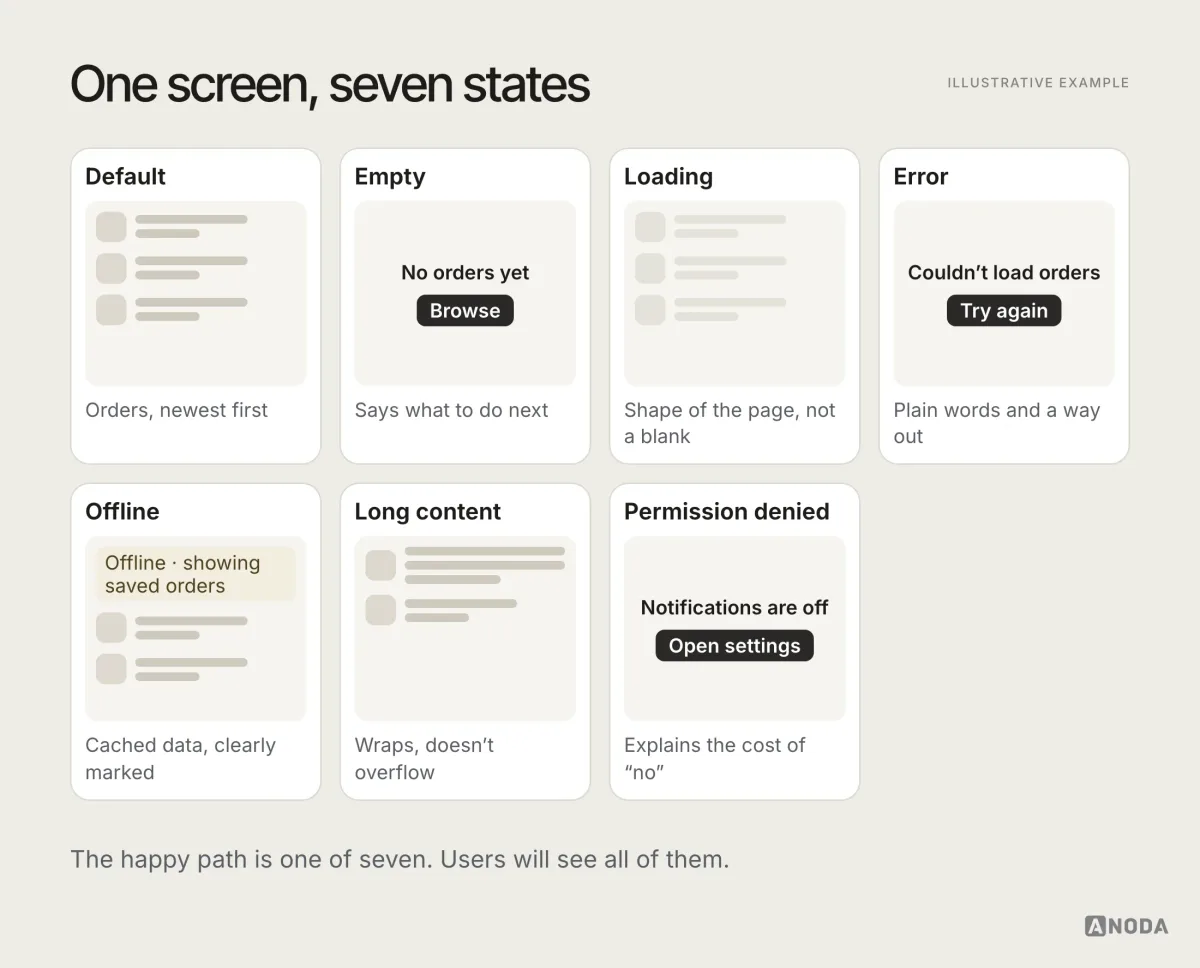
This is also where design and engineering have to work closely. Many design QA findings are not “the developer got it wrong”. They are “the design never specified it”. A state nobody designed is a state somebody will improvise under deadline pressure. Design QA catches it either way, but the fix is cheaper when the states were designed in the first place.
Localisation: the layout’s hardest exam
If the app ships in more than one language, every screen gets tested again in each of them, whether the team plans it or not. Translations run longer than English, sometimes much longer. Dates, times, currencies and number formats change. Right-to-left languages change reading order, alignment and directional controls; check which elements should mirror and which should keep their original meaning. And a translated string that made sense in a spreadsheet can make no sense on the screen where it appears.
Check at least: the longest language you support on the smallest screen, formats for dates and money in each market, right-to-left layouts if you support them, and a native speaker’s read of the critical flows. A button that says the wrong thing politely is still the wrong button.
Engineering tests: behaviour and resilience
Automated tests are the backbone of repeatable quality. They run on every change, they don’t get tired, and they catch regressions long before a human would notice. They are also only as good as the cases someone thought to write.
Most mobile teams use a mix of test types:
- Unit tests check small pieces of logic in isolation: a price calculation, a date formatter, a validation rule. Fast and cheap, run on every change.
- Integration tests check that parts work together: the app and the API, the database and the sync logic.
- UI tests drive the app through real screens, the way a user would. Slower and more fragile, so they are best reserved for critical flows.
- Contract tests check that the app and its backend still agree on the shape of the data, which matters when they are released separately.
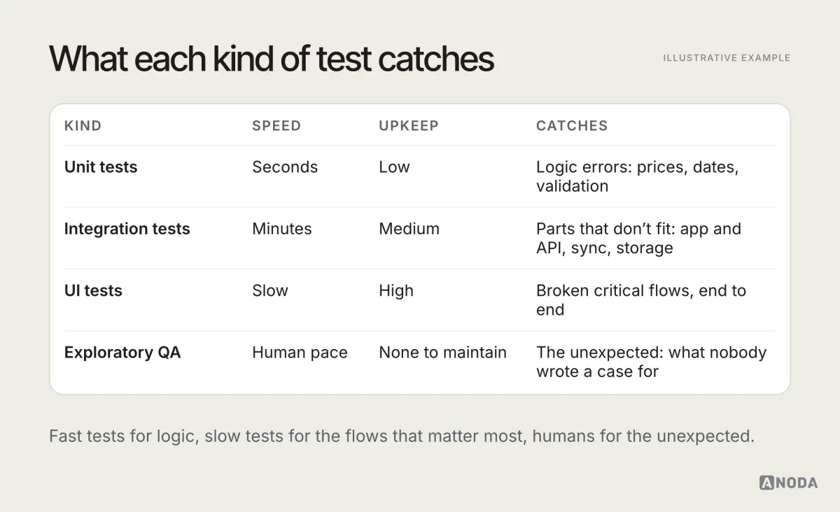
A common mistake is to automate the wrong things. Automating a flow that changes every sprint creates a test suite that breaks every sprint, and a team that learns to ignore red builds. Automate what is stable and critical: sign-in, payment, the core task, and the regressions that have bitten you before.
Resilience deserves its own attention. Engineering tests should cover what happens when the API is slow, returns an error, returns something unexpected, or doesn’t answer at all. These are the conditions real users meet every day, and they are the easiest to leave out of a test suite written on a fast office network.
Performance: slow is a bug too
Users don’t file a ticket saying “the list scrolls at a disappointing frame rate”. They just use the app less. Performance problems are bugs that rarely get reported and often get blamed on something else.
Test and track at least:
- Startup time, from tap to usable screen, cold and warm.
- Responsiveness of the core task: how long from tap to result.
- Scrolling and animation smoothness on long lists and heavy screens.
- Memory use, especially on lower-powered devices, where the OS is quicker to kill apps that use too much.
- Battery and data use, particularly for anything running in the background.
- App size, which affects whether people download the app at all on limited data or storage.
Measure on the lower-powered devices in your matrix, not on the latest flagship. Set thresholds for the numbers that matter most and check them before each release, so a slow build is caught the same way a broken one is.
Test data: the accounts decide what you find
A test is only as good as the data it runs on. A team that tests with three tidy accounts, each with a short name, a few items and a valid card, will find the bugs that tidy accounts have, which is not many.
Build a set of test accounts that look like your real users, including the awkward ones:
- A brand-new account with nothing in it, to see every empty state.
- A heavy user with years of history, thousands of items and long lists.
- Awkward content: very long names, emoji, special characters, very large and very small numbers.
- Edge cases in the business rules: an expired subscription, a card that declines, an account in a different country or currency.
- Different permission states: notifications off, location denied, camera never asked.
Keep these accounts maintained and documented, so anyone on the team can reproduce a bug with the same data. Never use real customer data for testing without the safeguards your privacy obligations require.
Device and OS coverage: build a matrix, not a wish list
“Test on all devices” is not a plan. It is a wish, and wishes don’t get scheduled. A device matrix turns it into a plan: a short, explicit list of devices and OS versions you test on, and why each one is there.
Build it from your own analytics, not from a generic top-ten list. A reasonable starting matrix usually includes:
- The most common devices and OS versions among your actual users.
- The smallest screen you support, where layouts break first.
- The largest screen you support, including tablets if you support them.
- The oldest OS version you support, where newer APIs are missing.
- At least one lower-powered device, where performance problems show up first.
- Devices with manufacturer customisations, on Android, where system behaviour can differ.
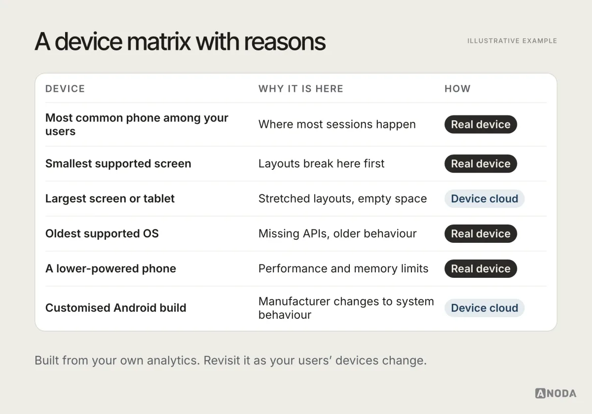
Test critical flows on real hardware in the matrix. Use emulators, simulators and cloud device labs for the long tail. Revisit the matrix regularly, because your users’ devices change, and so does the oldest OS version worth supporting.
Accessibility testing: part of QA, not an extra
Accessibility defects are defects. A button a screen reader can’t name, text that disappears at large sizes, a form that can’t be completed without precise gestures: each one locks some users out of the product entirely.
Automated checks catch part of it: missing labels, low contrast, touch targets that are too small. The rest needs a person:
- Use the screen reader. Go through critical flows with VoiceOver on iOS and TalkBack on Android. Listen to whether the order and labels make sense without looking.
- Turn up the text size. Check that layouts adapt and nothing important is cut off or overlapping.
- Check contrast in both themes, light and dark.
- Try reduced motion and make sure nothing essential depends on animation.
- Complete flows without gestures that need precision or multiple fingers, where alternatives should exist.
Build accessibility into acceptance criteria and design QA from the start. Retrofitting it after release is slower, more expensive, and usually only happens after a complaint.
Interruptions, network and permissions: where mobile apps really break
These are the failures that separate mobile QA from web QA. They are also the ones most often skipped, because they are awkward to test: you have to actually turn off the Wi-Fi, take the call, deny the permission.
Test these deliberately, especially in critical flows:
- Incoming call or notification in the middle of a form or a payment.
- Switching to another app and back, including after long enough for the OS to kill the app in the background.
- Losing connection mid-request, and getting it back.
- Slow or unstable network, not just “offline” and “online”.
- Low battery and battery-saver mode, which can restrict background work.
- Denied permissions, including permissions revoked later in system settings.
- Device rotation, if you support it, in the middle of a task.
- Storage almost full, for apps that download or cache content.
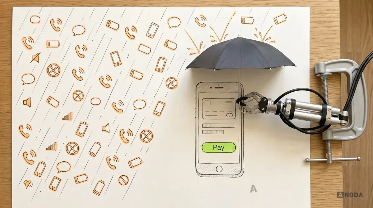
The expected behaviour should be designed, not improvised. What happens to a half-filled form when the app is killed? What does the user see when a payment request is sent but the answer never arrives? Does the app retry, warn, or silently fail? Each of these is a product decision, and each is a common source of real-world bugs when nobody made it.
Exploratory testing: finding what nobody wrote a case for
Test cases check what the team expected. Exploratory testing looks for what it didn’t. A skilled tester uses the product with a goal, a time box and a hunch, and follows the hunch wherever it leads: what if I do this twice, what if I go back here, what if I paste an emoji into this field?
To make exploratory testing more than aimless clicking:
- Give each session a charter. For example: “Explore the checkout with an expired card and a slow network for 45 minutes.”
- Time-box it. Short, focused sessions find more than an afternoon of wandering.
- Take notes as you go. What was tried, what happened, what looked odd.
- Rotate testers. Fresh eyes find different bugs. Designers and product managers make surprisingly good exploratory testers of flows they didn’t build.
Exploratory testing is where the most interesting bugs come from, precisely because nobody predicted them. It is also the first thing cut when a release is late, which is exactly backwards.
Security and privacy checks every release needs
Deep security testing is its own discipline and often needs specialists. But some checks belong in every mobile release, because they are easy to break by accident:
- Sessions. Signing out really signs out. Expired sessions ask to sign in again instead of failing silently.
- Sensitive data on screen. Account numbers, health data or messages are hidden where they should be, including in the app switcher preview.
- Permissions. The app asks only for what it needs, when it needs it, and works sensibly when refused.
- Logs and error messages. Nothing sensitive is written to logs or shown in error text.
- Links and deep links. They open the right screen, and only for users who should see it.
If your product handles money, health or personal data, plan for dedicated security testing as well. These release checks are a floor, not a ceiling.
Regression testing: protect what already works
Every change can break something that used to work. Regression testing checks that it didn’t. On mobile, where fixes take time to reach users, a regression in a critical flow is expensive.
Keep a regression suite focused on the critical flows and on bugs you have already fixed once. Automate as much of it as is stable. Run the rest manually before each release, using the device matrix. When a bug escapes to production, add a test for it, so the fixed behaviour stays covered in subsequent releases.
Release: stage it, don’t bet everything on one build
Even with good QA, some bugs only appear at scale, on devices you don’t have, with data you didn’t expect. The release process should assume this and limit the damage.
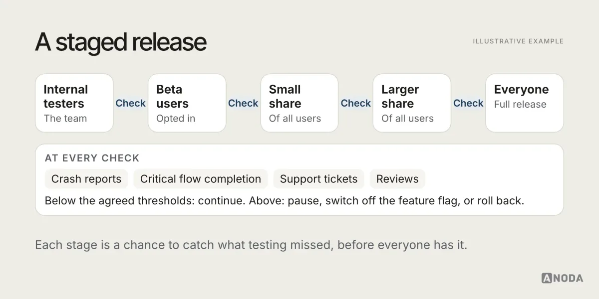
- Beta testing. Release to internal testers, then to a group of external beta users, before the public release.
- Staged rollout. Both major app stores offer ways to release an update gradually rather than to everyone at once. Check the current options in each store’s documentation before planning your release.
- Feature flags. Ship new features switched off, then turn them on for a share of users. If something breaks, switch it off without a new build.
- Release checkpoints. Before widening a rollout, check crash reports, key flow completion and support tickets against agreed thresholds.
- A rollback plan. Know in advance what you will do if a release goes wrong: pause the rollout, switch off a flag, ship a fix, or all three.
Production: the bugs only real users find
Once the app is live, your users become testers, whether you like it or not. The question is whether you are listening. Three sources tell you what is failing in production:
- Crash and error reporting. Which crashes, on which devices and OS versions, in which flows, and how often.
- Product analytics. Where people drop out of critical flows, which errors they hit, which screens they abandon. A flow that suddenly loses half its completions after a release is a bug report, even if nobody filed one.
- Support and reviews. What users say is broken, in their own words. Support tickets and app store reviews often describe bugs no dashboard shows.

The most common gap here is not tooling. Most teams have crash reporting and analytics. The gap is ownership. Crashes pile up in a dashboard nobody checks. Support tickets about a broken flow are answered one by one, politely, without anyone telling the product team there is a pattern. A monitoring tool without a response owner is a car alarm in a busy street: everyone hears it, nobody moves.
Name who watches each source, how often, and what they do when something crosses a threshold. That is the difference between monitoring and collecting.
How to tell whether QA is working
QA effort is easy to measure and hard to judge. Hours spent and test cases written say little about quality. A few signals say more:
- Escaped defects. How many bugs are found in production rather than before release, and how serious they are.
- Crash-free sessions or users, tracked per release, so a worse release is visible immediately.
- Time to detect. How long between a problem starting in production and someone noticing.
- Time to fix. How long between noticing and a fix reaching users.
- Flaky tests. How many automated tests fail intermittently. A suite nobody trusts is a suite nobody reads.
- Repeat bugs. How often a fixed bug comes back. Each one is a missing regression test.
Watch the trend, not the absolute number. The goal is not zero bugs, which no team achieves. The goal is fewer serious ones reaching users, and faster response when they do.
Bug reports that get fixed
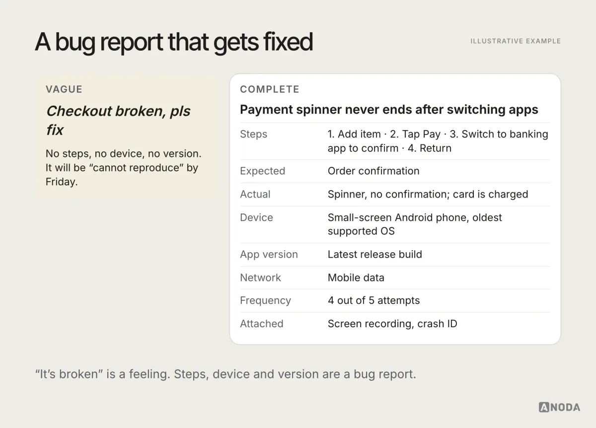
A bug that can’t be reproduced doesn’t get fixed. It gets moved to the next sprint, then the next, then closed as “cannot reproduce”. A good bug report saves more time than any test tool.
A useful mobile bug report includes:
- What happened, and what was expected instead.
- Steps to reproduce, starting from a known state.
- Device, OS version and app version.
- Network conditions and any relevant settings, such as dark mode or large text.
- Screenshots or a screen recording.
- How often it happens, and how many users it affects if known.
- Logs or crash IDs, if available.
Severity and priority: decide what to fix first
Not every bug deserves the same urgency. A crash in payment on the most common device is not the same as a misaligned icon on a rarely used settings screen. Triage separates the two:
- Severity is how badly the bug affects the user: does it block a critical flow, lose data, cost money, or merely look wrong?
- Reach is how many users it affects: every user, a device family, one rare configuration.
- Priority is the decision: fix now, fix in the next release, or accept for now.
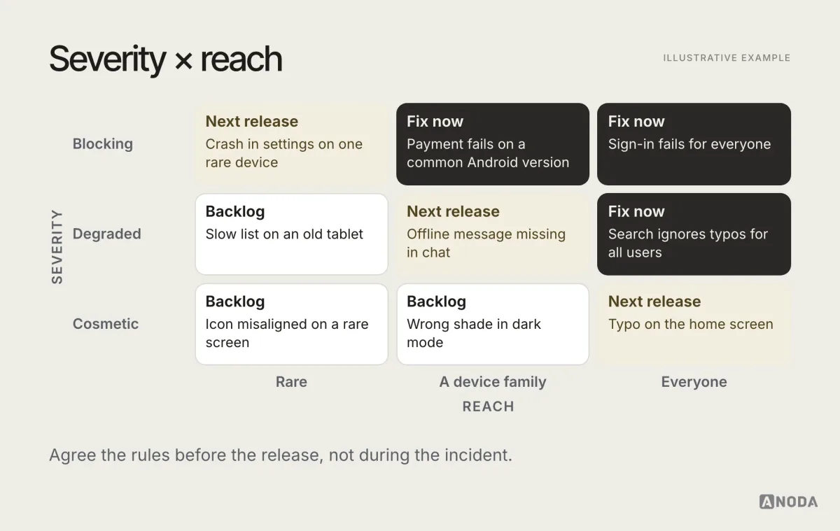
Agree the triage rules before the release, not during an incident. And make sure someone owns the decision. A bug with no owner has priority “someday”, which in practice means “when a user writes a review about it”.
QA in a small team without a QA department
Many mobile teams don’t have a dedicated QA specialist, especially early on. That doesn’t mean QA doesn’t happen. It means it happens by accident, which is worse. A few recommendations for small teams:
- Make quality someone’s job, even part-time. One person owns the test plan, the device matrix and the release checklist, even if everyone helps with testing.
- Test each other’s work. The person who built a feature is the worst person to test it: they know how it is supposed to work, so they use it that way.
- Keep a written release checklist. Critical flows, the interruption tests, the smallest screen, large text, offline. A checklist does not forget things at 11 p.m. before a release.
- Invest in automation for the critical flows early. It pays back quickly in a team where nobody has time for full manual regression.
- Bring in outside help for the gaps. Design QA, accessibility review or a device lab for a release can be scoped separately, without building a whole department.
- Read every review and support ticket. In a small team, users are your widest test coverage. Treat what they report as data, not noise.
A small team can ship reliable apps. What it cannot do is ship reliable apps while pretending QA is someone else’s problem, because in a small team there is nobody else.
The QA mistakes that cost the most
Most QA failures are not failures of effort. They are failures of scope and ownership:
- Testing only the happy path. The flow works perfectly, as long as nothing goes wrong. Something always goes wrong.
- Treating one layer as enough. Automated tests without exploratory QA, design review without design QA, analytics without anyone reading them.
- Testing on the team’s own phones. Recent, fast, on good Wi-Fi, with short names in the test accounts.
- Leaving QA to the end. When testing starts after the build is “done”, every finding is a delay, and the pressure is to ship anyway.
- No acceptance criteria for failure states. Nobody decided what should happen, so testers can’t tell whether what happens is a bug.
- Automating the unstable. A test suite that breaks every sprint teaches the team to ignore it.
- Nobody owns production. Crashes and complaints are visible, but nobody is responsible for acting on them.
Audit check
Take your most important flow and run it on the oldest supported device, on a slow network, with large text, while taking a call halfway through. Then check who would have noticed if it failed for real users last week.
Failure evidence
A state nobody designed. A spinner that never ends. A form that loses its data. A crash nobody has looked at. A support ticket pattern nobody escalated.
Correction pattern
Write acceptance criteria that include failure states, add the flow to the device matrix and regression suite, run design and exploratory QA on it, and name an owner for its production signals.

UI/UX design
Design the states before users find them.
We design the failure states, run design QA on real builds and devices, and, when it’s scoped, support implementation and production monitoring. We turn ambiguous behaviour into explicit states and concrete corrections, so design gaps are resolved before users meet them.
A mobile QA plan in eight steps
If you are setting up QA for a mobile app, or tightening a process that lets too much through, this is a practical order to work in. Treat it as a recommendation and adapt it to your team.
- Name the critical flows. The handful of journeys that must never break.
- Write acceptance criteria with failure states. For each critical flow, decide what should happen when things go wrong.
- Design the states. Empty, loading, error, offline, long content, permission denied. A state nobody designed will be improvised.
- Build a device matrix. From your own analytics, with a reason for every device.
- Automate the stable and critical. Unit and integration tests for logic, UI tests for the critical flows, a regression test for every escaped bug.
- Run design QA and exploratory QA on real builds, on real devices, with real content, before each release.
- Release in stages. Beta, staged rollout, feature flags, checkpoints and a rollback plan.
- Monitor production with an owner. Crashes, analytics and support, each watched by a named person with a clear response.
Define the critical flows and their failure states, automate the repeatable checks, run design and exploratory QA, and monitor production with a clear owner for the response. The bugs will still exist. You’ll just be the one who finds them. For more practical guides on building mobile products, browse the ANODA UX blog.
Frequently asked questions
What is mobile app QA testing?
Mobile app QA testing is the work of checking that an app behaves correctly, looks right and holds up in real conditions before and after release. It covers functional testing, design QA, device and OS coverage, interruptions, network conditions, performance, accessibility, regression testing and production monitoring.
Who is responsible for QA in a mobile app team?
Quality is a shared responsibility. Designers check states, content, layout and accessibility. Engineers test behaviour and resilience with automated tests. QA specialists run exploratory and regression testing. Analytics, crash reporting and support reveal what fails in production. Each needs a named owner, because none of them replaces the others.
What is the difference between design QA and functional testing?
Functional testing checks that the app does what it should: a button saves, a payment goes through, an error is handled. Design QA checks that the built product matches the intended experience: the right states, copy, spacing, behaviour on different screen sizes, dark mode, large text and accessibility. A feature can pass one and fail the other.
How many devices should you test a mobile app on?
There is no universal number. Build a device matrix from your own analytics: the most common devices and OS versions among your users, the smallest and largest screens you support, the oldest OS version you support, and at least one lower-powered device. Cover those on real hardware and use emulators or device clouds for the long tail.
Written by