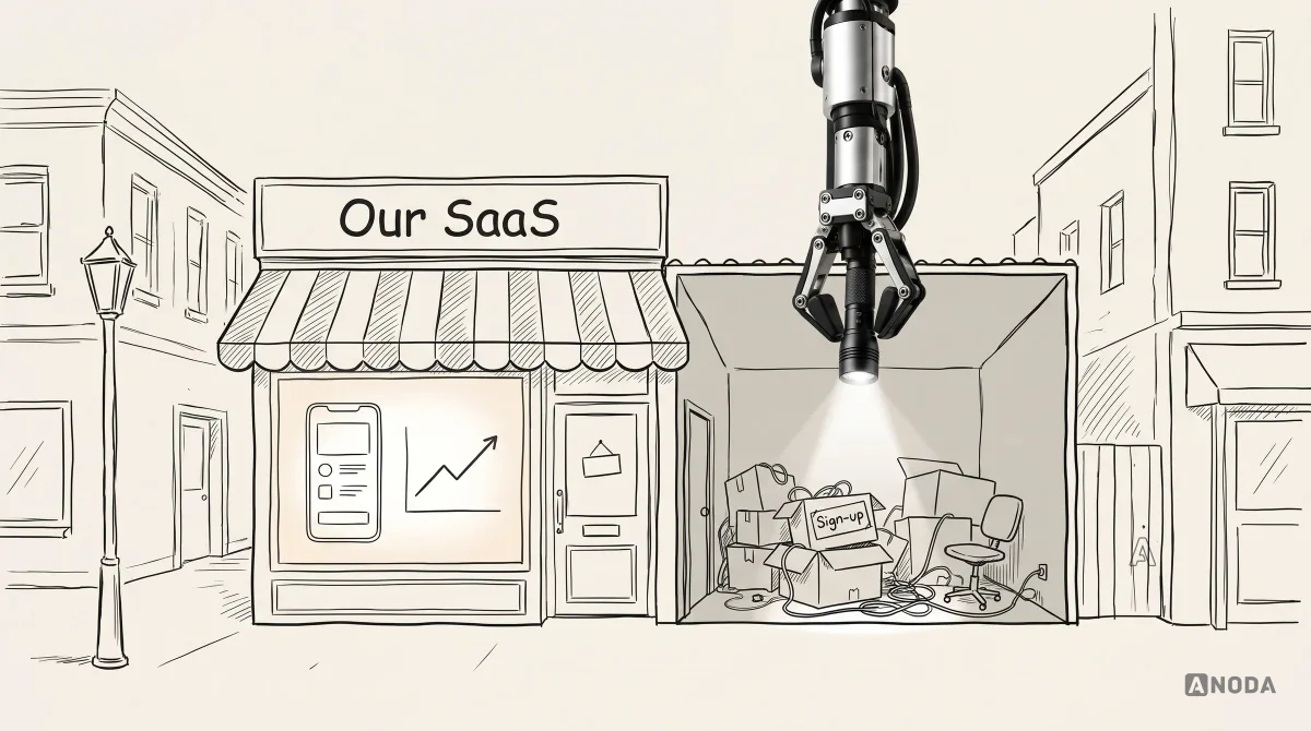
In short
A SaaS website is the first screen of your product, not a brochure next to it. Before you hire an agency, find out whether the problem is positioning, traffic, the site or the product, then brief for audiences, campaign landing pages, content, CMS and analytics. Here is how to prepare, what proof to ask for, how to compare proposals and why the promise and the product must be measured as one funnel.
In this article
- A SaaS website is the first screen of your product
- Diagnose where the problem really is before you hire anyone
- Specify what “clean” means before comparing estimates
- Copying Apple, Revolut or your competitor rents someone else’s memory
- Do your homework before you call an agency
- Your traffic sources decide how many pages you need
- Write a brief an agency can price honestly
- SEO, semantics and people have to live on the same page
- Evaluate AI-assisted work against the same brief
- How to evaluate a SaaS web design agency
- Specialist SaaS agency or general web agency?
- Compare proposals by what they leave out
- Decide who owns the content, the CMS and the analytics
- Measure the whole funnel, not just the website
- The promise and the product are one system
- Gaps to resolve before committing
- The decision rule
Choose a SaaS web design agency that asks how your product will be positioned, promoted, measured and run before it asks which websites you like. The right agency turns your audience, positioning, product truth and traffic sources into clear journeys and proof, and settles content, CMS, analytics, implementation and ownership before anyone opens a design tool. The wrong agency sends you a moodboard on day two. It will be gorgeous. It will also be the most expensive picture you ever bought.
When we design SaaS products and their websites, we repeatedly see the same pattern. A founder comes in with a finished product, a launch date and a request that fits in one sentence: “We need a website. Something clean. Like Apple.” Nobody has written down who the product is for, where the visitors will come from or what they should do once they arrive. The website gets built anyway. It looks great in the review call. Then the ad budget starts pouring visitors into it, and they leave.
That is money on fire twice over. You paid to design and build the site, and you are now paying, per click, for people who arrive, understand nothing and go. Every one of those visitors was a prospect somebody on your team had to earn. A website that loses them is not a brand asset. It is a very well-lit exit.
This guide is for founders, product leads and marketing heads about to hire an agency for a SaaS website: how to tell whether the website is the real problem, what to prepare, how to brief, how to judge proof and proposals, and what happens after launch.
A SaaS website is the first screen of your product
A SaaS website is not a brochure bolted to the side of the product. It is step one of the same journey that continues through sign-up, trial, onboarding, activation and paid use. The visitor who reads your hero line is the same person who will later stare at your empty dashboard. They do not experience two things. They experience one promise and then find out whether you keep it.
This is why the question “Which agency makes the prettiest SaaS websites?” leads people astray. Pretty is the easy part. The hard part is that the site has to:
- say clearly what the product does, for whom, and why it beats the spreadsheet they use today;
- send each kind of visitor to the page that answers their question, not to one home page that answers nobody’s;
- stay readable for people, search engines and AI assistants at the same time;
- hand the visitor to a sign-up and onboarding that keep the promise the site made;
- measure every step, so you can see where people drop and fix the right thing.
An agency that only does the first bullet is a studio that makes attractive pages. That is a real service, and sometimes it is enough. But if your problem is conversion, you need an agency that thinks in the whole list.
Diagnose where the problem really is before you hire anyone
Before you hire an agency to redesign the website, make sure the website is the thing that is broken. “Our site doesn’t convert” is a symptom, not a diagnosis. It can involve positioning, campaign fit, product workflows, distribution or other factors. A redesign may address some of these, depending on its scope.
It is like calling a plumber because the kitchen floor is wet. Sometimes it is the pipe. Sometimes the dishwasher door, the fridge or a teenager who can’t aim at a sink. A plumber who starts ripping out pipes without looking is not being decisive. He is billing you for his favourite solution.
| Observation | Questions to investigate |
|---|---|
| Visitors do not understand the offer | Message clarity, hierarchy, audience fit and supporting evidence |
| Campaign visitors leave | Campaign promise, landing relevance, page behavior and traffic quality |
| Accounts are created but setup stops | Expectations before sign-up, eligibility, setup tasks and recorded-event accuracy |
| Visits are low | Distribution, discoverability, indexing and measurement coverage |
Here are the four we check first:
- Positioning. Visitors do not understand what the product does or why it is different, even after reading the page. Investigate the message, information hierarchy and supporting evidence together. New visuals on a muddled message give you a muddled message in a nicer font.
- Campaign and landing page mismatch. The ads promise one thing, the page opens with something else. People click and bounce. This is a marketing and web problem together: the message, the audience and the page have to match.
- Product onboarding. People sign up and never set anything up. Investigate the expectations set before sign-up as well as setup friction, account eligibility and product behavior. A new homepage will send more people into the same hole.
- Distribution. Almost nobody visits. No design can rescue a site that nobody sees. That is a channel, SEO or budget problem, and it deserves its own plan.
Several causes can coexist. Prioritize against evidence, task impact and dependencies rather than assuming positioning is always the first fix. If setup stops after sign-up, assess both pre-sign-up expectations and product friction before selecting the next scope. If you cannot tell which of these is happening, you do not yet need a website redesign. You need a diagnosis, and a scoped Activation Audit can help investigate where the journey from first visit to first value actually breaks.
Specify what “clean” means before comparing estimates
The most common request we get for a SaaS website fits in five words: clean, like Apple, and cheap. It does not yet describe the audience, information priorities, exploration or review work needed.
Clean design is not the absence of work. It is the result of a great deal of work that was thrown away. To get to a page with one headline, one image and one button, a team has to decide what the business really is, which audience matters most, which three facts carry the sale and what can be deleted without losing the meaning. That means many concepts, many arguments and a lot of courage in the editing room. Less on the page can mean more work behind it. Budget for the thinking that makes simplicity convincing.

Think of a sculptor at work. The finished piece looks effortless: one smooth form, nothing extra. Around it, out of the photo, is a floor covered in chips of marble and a year of rejected versions. Ask a sculptor to skip the chips and you get a block of marble with a price tag.
The cheap version of “clean” is not clean. It is empty. White space around a vague headline, a stock gradient, three icons, a “Get started” button that starts nothing in particular. It looks minimal in a screenshot. To a buyer comparing five tools, it says “we have nothing to show you”.
Oksana Kovalchuk, ANODA’s founder, says it bluntly:
They want it super simple, clean, like Apple, and cheap. But the most expensive design in the world is clean. To decide what can be thrown out so that only the essence remains, you have to make a pile of concepts and try to throw absolutely everything away.
 Oksana KovalchukFounder & CEO, ANODA
That is why ANODA treats simplicity as a design achievement, not a shortcut around the thinking.
So if you want clean, budget for it. Ask the agency how it will get there: how many directions it will explore, how it will decide what to cut, who on your side will make the calls. Ask what the proposed schedule and price include: research inputs, visual exploration, content, implementation and review. A template may be suitable when its limitations fit the brief.
Copying Apple, Revolut or your competitor rents someone else’s memory
The second most common request is a copy. “Make it like Revolut.” “Make it like Apple.” “Here is our favourite competitor, take their site and change the colours.” We get a couple of these every month, and the conversation always goes the same way. It starts as “use it as a reference” and ends as “no, we want it exactly like theirs”.
Here is the problem. Everyone knows Apple’s site. Nobody knows yours. Looking like Apple does not give you Apple’s trust. It gives Apple a free ad.
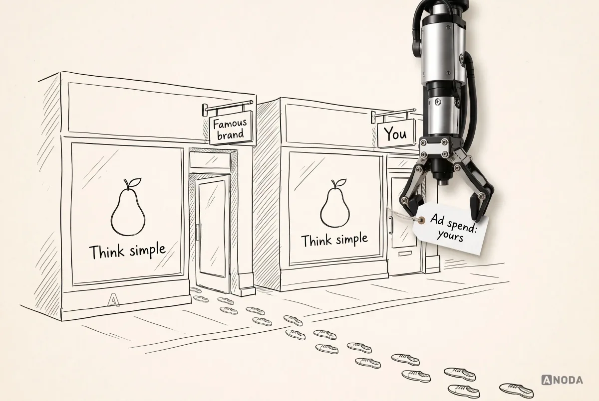
Picture the visitor a week later. Something reminds them they needed a tool like yours. They try to remember the site. What they remember is “the one that looked like Apple”. Not your name, not your promise. You paid to acquire that visitor, and you paid to make your brand forgettable at the same time. To get them back you will pay again, for remarketing, and hope they recognise you on the second try.
It is the Eiffel Tower in Las Vegas. The landmark is familiar. The memory belongs to someone else.
Imitation is the sincerest form of flattery. The flattered brand says thank you and takes your customers.
Copying a competitor’s narrative is the quieter version of the same mistake, and it is harder to spot because it feels safe. “They sell to the same audience, and it works for them.” Yes, and they got there first. When you repeat their message, you remind the buyer of them. When the need comes up, the buyer searches for the brand that owns that message, and it is not you. It is a cover band playing the original’s hits: the crowd enjoys the evening and buys the original band’s album on the way home.
None of this means ignoring the market. Study competitors hard, and learn the category conventions your buyers expect, like where pricing lives or how a free trial is explained. Then use the differences to decide what only you can say. A good agency will do this with you, and it is the difference between a site people remember and one they mistake for someone else’s.
Do your homework before you call an agency
Most failed website projects are lost before the agency is chosen. The client arrives with a product and a deadline, the agency asks about the audience, and it turns out nobody knows. The product was built for “SMBs” or “teams”, the positioning was borrowed from a competitor, and the only data is a sign-up count in the admin panel.
We see this constantly when we are asked to design a website for a product we did not build. We start with positioning, references and audience, and discover the product was built without anyone deciding who will buy it. That is not a design problem. It is a business problem that has been waiting quietly until someone asked the obvious question.
Before you contact an agency, gather the evidence. It does not have to be polished. It has to be honest.
- Target segments. Who pays, and who uses. They are often different people. A finance tool may be used by an accountant and approved by a CFO, and the site has to convince both.
- Buying roles. Who finds you, who evaluates, who signs, who can veto. Security and IT love to veto.
- The current funnel. Traffic by source, sign-up rate, trial starts, activation, paid conversion. Even rough numbers beat none.
- Product truth. What the product does today, not what the roadmap promises. Which features people actually use. Which screens you would be proud to show.
- Sales objections. What prospects ask on calls, what makes them hesitate, why lost deals were lost.
- Proof. Customers who will be named, numbers you can stand behind, reviews, security certifications, integrations.
- Analytics baseline. What is being measured now, where, and whether anyone trusts it.
- Technical constraints. Current stack, CMS, domains, integrations, legal or compliance rules.
- Content owners. Who will write, approve and update the words. “The agency will do it” is an answer only if you have agreed it and paid for it.
Product truth deserves special attention: distinguish released capabilities, beta features and proposed designs. The marketing screenshots show a product that exists only in Figma. The feature list includes three things still in beta. Then the visitor signs up and meets the real thing.
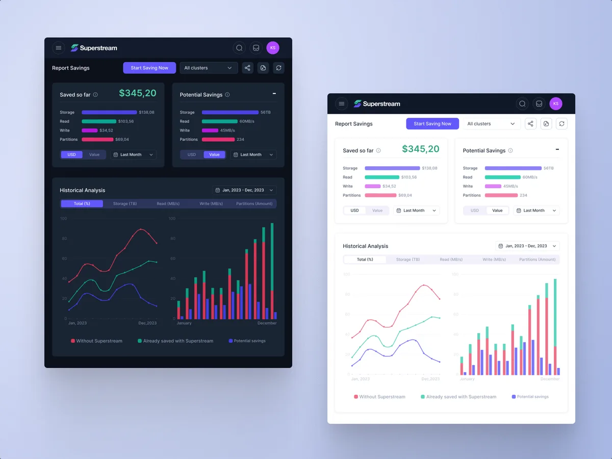
When we worked on Superstream, a Kafka cost-optimisation platform for DevOps teams, the work began with domain investigation and competitor research, then information architecture and user flows that unified the management views before any screen was drawn. That order is what lets a product explain itself: once the team knows exactly what the savings report shows and to whom, the promise on a landing page can point at something real. A site built on the product truth ages well. A site built on hopes ages at every release.
Audit check
Before outreach, write one page with your segments, buying roles, funnel numbers, product truth, top objections, proof and content owners.
Failure evidence
The team cannot agree who the primary buyer is. The funnel exists only as a sign-up count. Screenshots show features that have not shipped.
Correction pattern
Fill the gaps before the brief, or pay the agency to run discovery first, as a separate, priced phase.
Your traffic sources decide how many pages you need
Include traffic sources and planned campaigns in the brief. The number of pages, their structure and even their layout depend on where visitors will come from. You cannot design a SaaS website without knowing how you are going to promote it.
If search is the main channel, the site has to be understandable to search engines and to people at once, which is harder than it sounds (more on that below). For a mobile-led campaign, review the landing experience on the devices your audience uses. Choose the destination that fulfills the campaign promise and gets that audience to the next meaningful step.
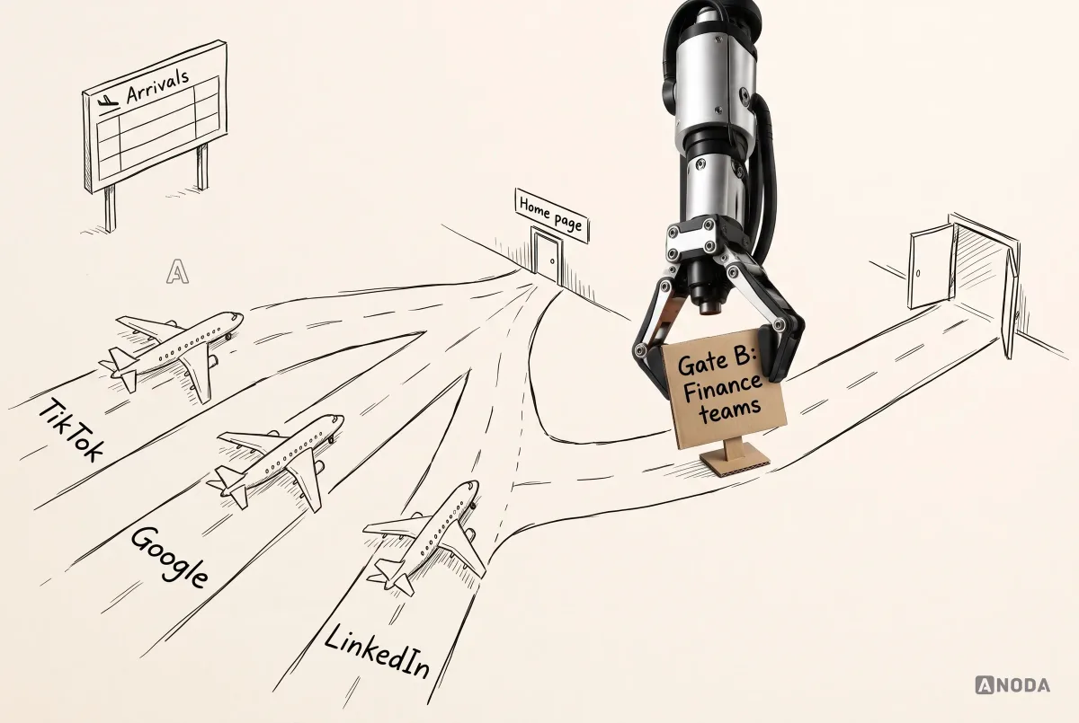
A landing page is exactly what the name says: the place where a specific stream of traffic lands. Different streams may need different destinations when their tasks or information needs differ. Imagine an airport where every flight, from every country, has to come through one small door. It does not matter how beautiful the door is. The queue is out onto the runway.
Choose the destination by the campaign’s audience and promise. A focused campaign often needs a dedicated landing page; a homepage can serve a broad brand campaign when it answers the visitor’s question. Distinct audiences may need distinct pages when their buying questions differ. A small-business owner on a phone wants to stop chasing receipts. A finance manager searching on a laptop wants month-end to stop eating a week. A CFO scrolling LinkedIn wants spend under control before the auditors arrive. These are illustrative audience hypotheses. Confirm their buying questions before deciding whether separate pages are useful.

The illustrated audiences, channel mappings, task claims and security labels are fictional assumptions, not validated buying behavior or a compliance statement. Replace them with supported product facts before using a similar page in a real campaign.
These pages are not three separate design projects. A good agency builds one system: a template and a set of blocks that already live on the home page, the product page and pricing. The landing pages reuse the blocks, and change the message, the proof and the call to action for each audience. That is how you get many landing pages without paying for many websites.
Oksana has a simple test for this:
If one page can run unchanged behind every campaign, the homework has not been done, and the chances those campaigns will work are a little below zero.
The lesson is to make the campaign promise and its destination work together. ANODA builds that message and page system around the buyer, not around one generic homepage.
So before you brief an agency, list your channels and campaigns, even the ones planned for next quarter. Ask each shortlisted agency how its page system will support them, and how quickly your team can launch a new landing page without calling the agency back.
SaaS product design
Not sure if it’s the site, the message or the product?
We separate positioning, journeys, product UX and website work before you commit to a redesign, so the money goes to the part that is actually broken.
Write a brief an agency can price honestly
A good brief is not a wish list. It is a document that lets an agency estimate the real work, tells it what it does not need to do, and makes the proposals you get back comparable. A vague brief gets you vague proposals, and vague proposals are where budgets go to grow.
Sending an agency “we need a modern, conversion-focused website” is like asking a tailor for “something nice” and refusing to be measured. You will get something. It will not fit. And you will pay for the alterations.
The fictional brief might name the target task, audience hypotheses, current product capabilities, proposed pages, content and analytics owners, implementation responsibilities and post-launch review. Review each legacy URL and decide whether it remains, redirects to an equivalent destination or is deliberately retired; keep useful destinations working and retire obsolete pages deliberately. Missing fields can become explicit discovery questions rather than guessed commitments.
A decision-ready brief covers:
- Business outcome. What should change, and how you will know. “More demo requests from finance teams at companies of 50–500 people” is a brief. “Better conversion” is a wish.
- Audiences and buying roles. Who the site is for, in order of priority, and who else must be convinced.
- Positioning and proof. What you want to be remembered for, and the evidence you can show. If positioning is not settled, say so and ask for it as a separate phase.
- Scope and page system. Home, product and feature pages, pricing, campaign landing pages, comparison pages, docs or help centre, legal pages. Name the ones you know and ask the agency to challenge the list.
- Content. Who writes, who approves, whether the agency is responsible for copy, and how many rounds of review.
- Research. What exists, what the agency is expected to do, and how many customers you can put in front of them.
- Traffic sources and campaigns. Channels, planned campaigns, the landing pages each will need.
- CMS. Which one, who will edit pages, what they must be able to change without a developer.
- SEO, semantics and accessibility. Keyword and page ownership, structured data, the accessibility standard you commit to.
- Analytics. The baseline you have, the events you need, the dashboards you want and who will read them.
- Integrations. Sign-up, trial, CRM, billing, chat, scheduling. Where the site ends and the product begins.
- Implementation and migration. Who builds, where it is hosted, what moves from the old site, which redirects are needed.
- Governance and post-launch ownership. Who owns the site after launch, who reviews performance, how often, and what counts as a change request.
You will not be able to fill every field on day one. That is fine. A blank field in the brief is a question you will ask every agency, and their answers will tell you more than their portfolio. A blank field nobody noticed is a surprise invoice in month four.
If the project includes a production build, especially a site that shares components, sign-up or accounts with the product, say it in the brief and make sure the agency can deliver it. We explain how design decisions connect to an explicit build scope and ownership model on our web app development page.
SEO, semantics and people have to live on the same page
A SaaS site that depends on search has a problem nobody enjoys solving. Search-oriented pages tend to carry a lot of text, because they need to answer real questions in depth. The visitor, meanwhile, wants to understand the product in seconds. Done badly, you get one of two failures: a wall of text that ranks and bores, or a beautiful page that nobody finds.
It is the school textbook written for the exam board: every required term is present, every box is ticked, and no child can learn anything from it. The opposite is the picture book with no words: lovely, and useless for the exam.
A good agency solves both at once. Long explanations get structure: clear headings, short sections, diagrams and infographics that do some of the explaining, comparison tables where buyers need them, and answers to the questions buyers actually type. The same page is also built for machines. That means semantic HTML, a sensible heading structure, structured data where it helps, fast loading, and content that remains understandable when extracted or summarized. That structure makes your product story easier to find, understand and use.
The basics are no longer optional. A production website should not ship with avoidable console errors, broken semantic markup or basic SEO faults. Missing titles, duplicate descriptions, broken canonical tags, images without alternative text, headings chosen for their font size: none of these is a creative decision. They are defects, and an agency should catch them before launch, not after the first audit.
Ask agencies how they stop two pages competing for the same search, how they design long pages so people actually read them, and how they check semantic and technical quality before launch. If the answer is “our developers handle SEO at the end”, expect to pay someone else to fix it at the end of the end.
Evaluate AI-assisted work against the same brief
Right now, a lot of founders tell us they have “vibe-coded” a site: prompted a coding assistant and got a working website in five minutes. A generated page still needs review for task fit, accuracy, accessibility and maintainability.
You are not the only clever one. There is a crowd of you. When we review new SaaS sites, the AI-generated ones are easy to spot: the same gradient hero, the same three feature cards, the same “Trusted by teams at” strip with no teams in it. Similar prompts and reusable patterns can produce similar-looking pages. Assess the actual output and its fit with the product rather than inferring quality from whether AI was used.
It is the same flat-pack bookcase in every rented flat in the city. Perfectly functional. Nobody has ever said, “Oh, I remember that bookcase.”
This is not an argument against AI. We use it every day, and so should your agency. It is an argument about what AI needs to be useful: art direction, a defined style, hard constraints and boundaries. Someone has to decide the typographic voice, the illustration language, the rules for layout and motion, the words the brand will and will not use. Then AI can produce variations quickly inside those rules. Without that direction, you get variations of everybody else’s website. ANODA gives the brand a clear voice before the tools start producing more of it.
Ask agencies how they use AI, and listen for the constraints. “We generate options inside our design system and art direction, then designers choose and refine” is a sensible answer. “We generate the site with AI, so it’s cheaper” still needs an explanation of scope, review and acceptance criteria.
How to evaluate a SaaS web design agency
A beautiful portfolio is a dangerous shortcut when choosing a SaaS web design agency. A portfolio shows you what a finished site looks like. It does not show how the agency got there, whether the site converted, or whether the client could maintain it a year later.
Evaluate the thinking, not only the pictures. These are the criteria we would use if we were hiring an agency ourselves:
- Relevant SaaS work. Products with trials, onboarding, pricing and a sign-up flow, not only marketing sites for physical products. Ask to see a site together with the product screens it leads into.
- Discovery quality. How they learn your audience, positioning and product truth before designing. What they will ask of your team, and in what order.
- Conversion reasoning. Why a page is structured the way it is, which question each section answers, what they expect a visitor to do next.
- Product understanding. Whether they can explain your product back to you, better than your own homepage does.
- Content capability. Who writes the words. Review the clarity and accuracy of copy alongside layout; neither can be judged from appearance alone.
- Design systems. Whether the site is built from reusable blocks your team can extend into new landing pages.
- Development and QA. Who builds it, how it is tested across browsers and devices, how accessibility and performance are checked.
- Measurement. Which events they will track, how dashboards will be set up, and how results will be reviewed.
- Team continuity. Who you meet in the pitch and who actually does the work. They are not always the same people.
- References. Clients you can call, especially ones whose projects went badly for a while and were rescued.
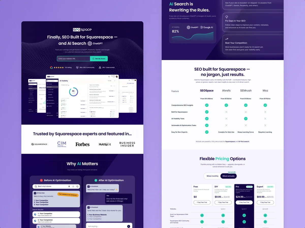
Proof to ask for is specific. Ask for one project walked through from brief to launch: what the client asked for, what the agency pushed back on, what changed, what they would do differently. Ask what they measured and what they saw. If they cannot share numbers, ask what they tracked and who reviewed it. For SEOSpace, an SEO tool for Squarespace sites, we designed the landing page, the Chrome extension and the web app on one component set, from a UX audit of the existing product through user flows and a design system to handoff and design QA. SEOSpace’s team implemented the product; this case demonstrates our design scope. The value of that kind of work is that the page promising “plain, actionable SEO” and the product delivering it speak the same visual and verbal language. When you look at proof, look for that continuity.
If you need a list of agencies to start from, our comparison of top SaaS web design agencies is a shortlist. Use this guide to decide between them.
Specialist SaaS agency or general web agency?
Not every SaaS website needs a specialist. The honest answer depends on how much of your problem lives beyond the marketing pages.
A general web agency is often a good fit when the product is simple to explain, the sales process is mostly self-serve, the site is a handful of pages, and the conversion path ends at a plain sign-up form. If you have strong positioning, clear copy and good analytics already, a skilled general studio can deliver a fine site. Our broader website design service covers exactly that kind of work.
Assess relevant SaaS capabilities when:
- the product is complex or technical, and explaining it is half the job;
- there are several audiences or buying roles to convince;
- the site hands off into a trial, onboarding or product that must keep the same promise;
- you plan several campaigns and need a landing page system, not one page;
- the website and the product share components, accounts or a design system;
- you need someone to measure and improve the whole journey after launch.
For a complex SaaS product, surface-level web design is not enough. ANODA brings the product and the website into the same conversation, so the promise, the interface and the journey fit together.
Compare proposals by what they leave out
When proposals come back, most teams compare the price and the portfolio. Compare the exclusions instead. A lower price may reflect narrower scope, different delivery assumptions or a different cost structure.
A builder’s quote that forgets to mention walls will always look competitive. You find out about the walls later.

The fictional comparison makes the hidden costs visible. An excluded responsibility still needs an owner, and a missing part of the plan does not become free just because it was left out of the quote.
Put the proposals side by side, line by line, against your brief:
- Discovery and positioning. Included, assumed to be done by you, or missing?
- Content. Who writes it? How many rounds? What happens if your team is late?
- Landing pages. How many are designed? Is there a template your team can use for the next ones?
- CMS setup and training. Which pages can your team edit without a developer?
- Analytics. Which events, which dashboards, who sets them up?
- Accessibility and technical QA. Which standard, how it is tested, who fixes what is found?
- Migration and redirects. What moves, what is retired, who maps the old URLs?
- Post-launch review. Is anything included after launch, or does the relationship end at go-live?
Then separate assumptions from commitments. “We assume content will be provided by the client” is not a small line. It is a transfer of risk. “Timeline assumes feedback within two working days” is fair, but it means you need someone who can give feedback in two days.
Finally, agree acceptance criteria before signing. What exactly does “done” mean? Pages delivered and reviewed, CMS tasks completed by your editors, agreed events received by the intended analytics account, findings from the specified accessibility review resolved or explicitly assigned, redirects tested against the URL map, and reproducible application errors addressed. Test the complete inquiry journey through to the destination that your sales team uses. Acceptance criteria turn “we think it’s finished” into a checklist both sides can tick.
Decide who owns the content, the CMS and the analytics
A website is not finished on launch day. It is born. And like everything that is born, somebody has to look after it.
Three responsibilities to assign explicitly:
- Content. Somebody has to write new landing pages, update pricing, add customer stories and remove the feature you sunset. If nobody owns content, the site goes stale in months, and the product moves on without it.
- The CMS. Somebody decides which parts of the site your team can change, how new pages are created from the existing blocks, and who approves changes before they go live. Without that, you get two outcomes: every change waits for a developer, or anyone can publish anything and the design system slowly dissolves.
- Analytics. Somebody decides what is measured, keeps the events working when pages change, and actually reads the dashboards. Analytics that nobody reads is a smoke detector with the battery removed.
Agree these owners in the brief, not after launch. If the agency will look after any of them, write it into the contract with a clear scope and review cadence. If your team will, make sure the agency hands over the documentation, training and access needed to do it.
Measure the whole funnel, not just the website
Building a website and bringing users to it are two completely different jobs. Launch creates a website. It does not create visitors, sign-ups or customers. The only way to know whether the site is doing its part is to measure it, and measure it far past the site itself.
For a scoped measurement setup, we define the conversion indicators, event names and dashboards alongside the journeys being designed. Name who implements tracking, who verifies that events arrive and who reviews the results. A demo request needs more than a button-click event: confirm that the request reaches the CRM or agreed destination, then connect it to qualification where access and the sales process allow.
The tool must fit the questions and the team’s access. PostHog can be part of this setup. The useful work is connecting the dashboard to the decisions your team needs to make. Agree the key steps, account identity, consent requirements and event definitions, then check real test journeys against the recorded events before using the dashboard to make decisions.
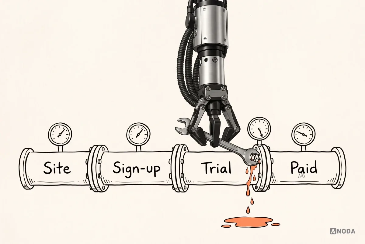
When it is in scope, the measurement can follow the whole journey: how people behave on the site, whether they sign up, whether they start a trial, what they do during it, and whether they pay. Connecting those steps in one funnel is what makes review useful. Without it, marketing blames the product, product blames the traffic, and everybody is partly right.
A fictional funnel can report 10,000 visitors, 1,200 sign-up starts, 780 accounts, 520 trials, 260 card connections and 104 payments. In this example, card connection marks activation and half the trials reach it. That is where the team should look next: what are users missing, why do they hesitate, and how can the journey make the next step easier? ANODA connects the promise on the website with the product experience so the sale does not fall apart after sign-up.
Use a funnel like the example above to choose the next investigation, with its definitions and observation window documented. A large drop between landing page and sign-up tells you where to investigate the campaign, message and page. A drop between trial and activation points toward setup and product workflows. Check event definitions, traffic quality and recordings before deciding which change to make. It is a doctor with a full set of test results instead of a patient describing a vague pain. You still need the doctor. You just stop guessing.
This is also why the agency relationship should not end at launch. Post-launch observation can reveal behavior missed before launch; agree the observation window and scope of any review. An agency that has designed the events and dashboards can review them with you, adjust landing pages, and tell you honestly when the next fix belongs in the product rather than on the website.
The promise and the product are one system
Two possible mismatches are useful to examine when reviewing a SaaS website and its product.
In the first, the product is polished and the website is a mess. Nobody put money into the site, so it looks like a side project: unclear message, inconsistent pages, screenshots from two versions ago. The team cannot understand why visitors do not convert. The answer is old and unfair: people judge a book by its cover. The product might be excellent. The visitor never gets far enough to find out.
In the second, the website is gorgeous and the product is not. The whole budget went into the site: beautiful marketing screenshots, smooth animations, a hero video. The visitor clicks “Start free trial”, and the sign-up is a mess, the onboarding is a wall of settings and the first screen is an empty table. The site made a promise. The product broke it in ninety seconds.
It is a restaurant with a stunning dining room and a kitchen nobody would eat from, or a brilliant kitchen hidden behind a boarded-up shop front. Either way, the customer leaves hungry, and tells their friends.
The fix is to treat the website and the product as one system. That means the agency, or agencies, working on them must share the positioning, the language, the visual system and the funnel data. The screenshots on the site must match the product. The hero promise should describe supported capabilities, with onboarding expectations and prerequisites made clear. And when the numbers show a drop, somebody must be responsible for deciding which side of the sign-up button the fix belongs on.
Gaps to resolve before committing
Check whether the proposal leaves consequential questions unresolved:
- Design before discovery. Visual concepts in the first proposal, before anyone has asked who your buyer is.
- “Just like Apple” accepted without a question. An agency that happily copies a famous brand will not help you become one.
- Unexamined campaign destinations. No explanation of how the selected pages fit each campaign’s audience, promise and task.
- No owner for content. Nobody can say who writes, approves and updates the words.
- No analytics baseline. No questions about what you measure now, and no plan for what to measure next.
- Vague outcomes. “A modern, engaging, conversion-optimised experience” with no way to check whether it happened.
- CMS as an afterthought. No discussion of what your team will be able to change.
- Unreviewed generated output. No process for checking product accuracy, task fit, accessibility and maintainability.
- A weak handoff. No documentation, no training, no acceptance criteria.
- Unassigned post-launch ownership. No agreement on who maintains the site or evaluates its behavior; that work can belong to your team or another partner.
Any one of these can be fixed with a direct conversation, and a good agency will welcome it. If several of these gaps remain after the conversation, walk away. A cheaper proposal is expensive when you have to rescue the project later.
The decision rule
Before you sign, ask the agency and yourself these questions in order. Prioritize unanswered questions by their effect on scope, risk and the next decision.
- Do we know whether the problem is positioning, traffic, the website or the product?
- Can we name our audiences, buying roles and the one thing we want each to remember?
- Do we know where traffic will come from, and which landing pages each campaign needs?
- Is the brief specific enough that three agencies would price the same work?
- Does the proposal commit to content, CMS, analytics, QA and migration, or assume them away?
- Do we know who owns the site, its content and its numbers after launch?
- Will the site and the product be measured as one funnel?
Choose the agency that asks how your SaaS will be positioned, promoted, measured and run before it talks about visual references. The website has to be distinctive enough to be remembered, flexible enough to carry different campaign messages, technically clean enough for search and accessibility, and measured across the whole funnel. A polished website cannot rescue a broken product, and a strong product cannot convert people through a collapsing website. The agency’s job is to make the promise and the product belong to the same system.

SaaS product design
Your website makes a promise. Your product has to keep it.
We work out your positioning, landing pages, product journeys and measurement as one system, so the site brings the right people in and the product keeps them.
Frequently asked questions
How do I choose a SaaS web design agency?
Choose the agency that asks about your audience, positioning, traffic sources, product and funnel before it shows visual concepts. Judge its thinking on one project walked through from brief to launch, compare proposals by what they exclude, and make sure it can measure the site together with sign-up and trial.
What should a SaaS website design brief include?
The business outcome, audiences and buying roles, positioning and proof, the page system including campaign landing pages, content ownership, research, traffic sources, CMS, SEO and accessibility, analytics, integrations, implementation and migration, and who owns the site after launch. Mark the gaps, so every agency answers the same questions.
What proof should I ask an agency to show?
One SaaS project from brief to launch: what the client asked for, what the agency challenged, what changed and what was measured afterwards. Ask to see the website next to the product screens it leads into, and call a reference whose project hit problems.
Who should own SaaS website content, CMS and analytics?
Name an owner for each in the brief. One arrangement is client content and approvals, agency CMS setup and training, and a named analytics owner with technical support. Confirm the responsibilities and access for your actual engagement. If the agency keeps any of these after launch, put the scope in the contract.
When is a specialist SaaS agency a better fit than a general web agency?
Choose a SaaS partner when your brief connects a technical product, several buying roles and the journey from website promise to first useful result. ANODA brings the website and product into the same design conversation, with positioning, role-specific flows and a shared visual system. Ask to see that continuity in the case and in the proposed deliverables.
Written by