In short
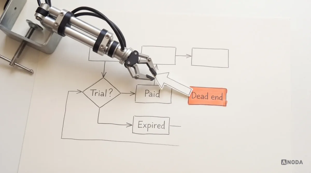
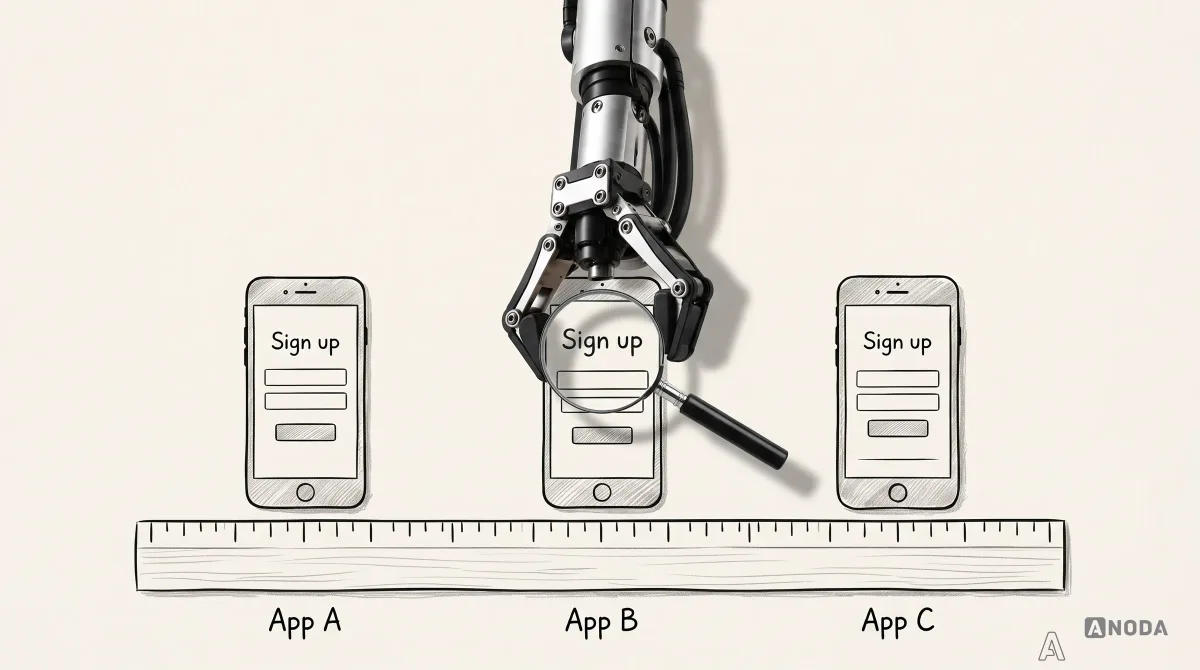
Most competitive analyses compare colours and sign-up forms, tick a feature matrix and hand the team a copy list. The ones that change a product compare positioning, onboarding, payment and the same core flow across three to five products, read the angry reviews, question every 'they did it badly' — and build the basic job before any killer feature.
In this article
- Make the comparison change your product
- What a UX competitive analysis is — and what it is not
- When competitive analysis is worth doing
- Choose three to five comparators, not twenty
- Start with positioning, not pixels
- Learn the category’s conventions before you reinvent them
- Compare the same flow, under the same conditions
- Collect evidence you can defend
- Read the complaints, not the compliments
- Be sceptical of “they did it badly”
- Turn observations into decisions
- A feature matrix is an input, not a roadmap
- Keep the MVP small, and move faster than the market
- Keep the ambition, check the physics
- Where to go from here
- The decision rule
A UX competitive analysis is a bounded look at how other products solve the same job for the same people — from how they are positioned and found to how users sign up, pay, repeat the core flow and get help — so your team can decide what to keep, what to challenge and what to build first. It is not a screenshot gallery, a colour comparison or a feature spreadsheet. If the output of your competitive analysis is a slide that says “they use blue too”, you have spent a sprint confirming the obvious.
We run competitive analysis on almost every product we design, and most of the ones clients bring to us fail the same way. Someone compared the sign-up forms, pasted the landing pages side by side, ticked a feature matrix and called it done. Then the team built the features the competitors had, in roughly the order the matrix listed them, and wondered why nobody switched.
That is scouting the other team by watching their warm-up. You learn what their kit looks like. You learn nothing about how they win.
Here is how to scope it, compare the same flow fairly, collect evidence you can defend and turn it into product decisions — including the decision to skip the feature everyone else has.
Make the comparison change your product
A competitor spreadsheet earns its place only when it changes what you will build and how you will sell it. Copying a rival’s menu adds their assumptions to your backlog; copying their feature list can make your product harder to explain. ANODA connects the comparison to a sharper proposition, a smaller first release and a journey that carries the promise through to the customer’s first useful result.
Our SEOSpace redesign shows that connection across a Chrome extension, web app and landing pages: plain-language positioning leads into onboarding, and an audit leads into tasks ordered by priority. The product and the pages selling it speak the same language. Your customer should understand why to choose you and what to do next.
Work with ANODA on your product’s direction. Bring the alternatives your customers compare you with and the decision your team cannot settle; we will turn the comparison into a focused product brief and a practical design direction.
What a UX competitive analysis is — and what it is not
A UX competitive analysis compares the experience other products deliver for a job your users need done. The unit of comparison is the job and the flow, not the screen.
Oksana Kovalchuk, ANODA’s founder, names the most common mistake without ceremony:
The most common mistake I see is comparing colours and sign-up forms and calling that a completed competitive analysis. You can compare products across as many dimensions as you like. The first thing to compare is branding, messaging and how they speak to their audience.
 Oksana KovalchukFounder & CEO, ANODA
Colours and forms are the easiest things to screenshot, which is exactly why they end up in the deck. They are also the least likely to explain why a competitor wins. People do not choose a product because its sign-up button is green. They choose it because the ad spoke to them, the landing page promised the right thing, onboarding got them to value quickly, the price made sense at the moment of paying, and support did not make them want to throw the laptop out of the window.
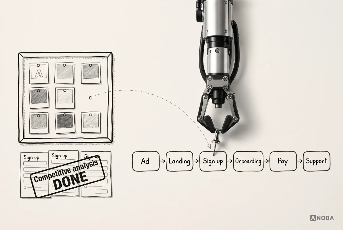
A useful analysis follows that whole chain: positioning, acquisition, onboarding, the payment decision, the repeated core flow, recovery and support. Everything else is decoration with a research label on it.
When competitive analysis is worth doing
Competitive analysis earns its cost at a few specific moments:
- Before a new product or MVP, to learn what users of the category already expect and where the gaps are.
- Before a redesign, to see whether the flows you plan to change are category conventions users have learned elsewhere.
- When a competitor is winning deals you should win, to find out whether it is the product, the positioning or the price.
- When a single flow underperforms — onboarding, checkout, upgrade — to see how others handle the same moment.
It is not worth doing as a ritual at the start of every project, or as a substitute for talking to your own users. It tells you what others ship. It cannot tell you why your users behave the way they do. For that you need UX research with real people, and pretending otherwise is the fastest way to build a product for a customer who does not exist.
Choose three to five comparators, not twenty
Twenty competitors in a spreadsheet produce twenty rows of noise. Pick three to five products, and pick them on purpose:
- Direct competitors solve the same job for the same audience. They are the ones your buyers compare you with.
- Indirect competitors solve the same job another way: a spreadsheet, an agency, a general-purpose tool the user already pays for.
- Analogous products solve a similar problem in a different market, and often show a better pattern than anyone in your category.
A useful set usually has two or three direct competitors, one indirect alternative and one analogous product. If the set does not include the thing your users do today instead of buying anything — the spreadsheet, the email thread, the manual workaround — you are missing your real competitor.
Start with positioning, not pixels
Before anyone opens a design tool, look at how each product sells itself: who it talks to, which problem it claims to solve, which words it uses, which objections it answers and how it prices. This is where UX, marketing and product leadership have to sit at the same table. Positioning changes the style, the tone, the onboarding and the first screen a user sees.
SEOSpace, an SEO tool we designed for Squarespace users, is a clean example of positioning turned into product. Heavyweight SEO suites speak to specialists. SEOSpace’s promise is “SEO, minus the jargon”: audits right inside the Squarespace editor through a Chrome extension, a web app for the deeper work, and a landing page that compares the product head-on with Ahrefs, SEMrush and Moz. Across more than 400 screens, the interface had to keep that promise in every label.
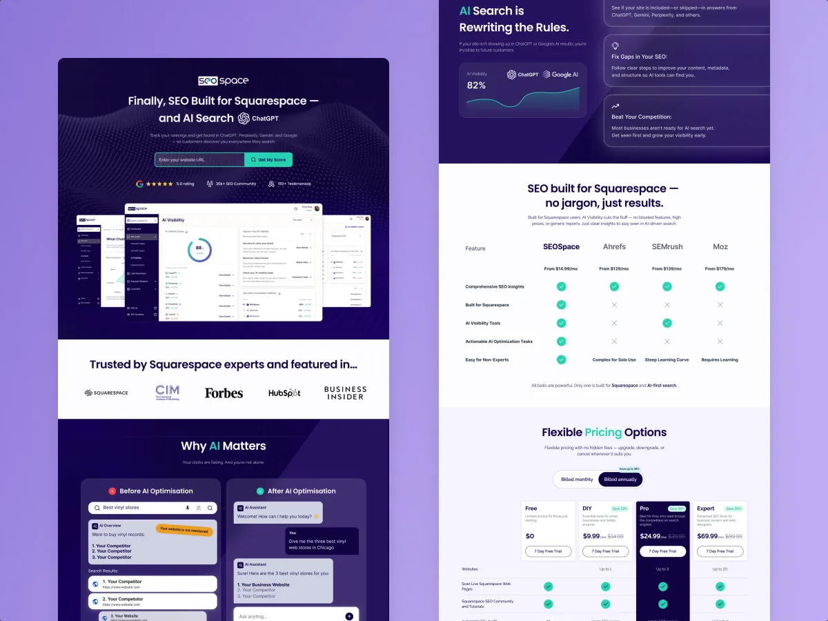
Read the full story in the SEOSpace case study.
Audit check
For each comparator, write down the audience it targets, the problem it claims to solve, the words it repeats and the price anchor it uses.
Failure evidence
The analysis starts with interface screenshots. Nobody from marketing or product has seen it.
Correction pattern
Compare positioning first, with marketing and product leadership in the room, and only then compare the flows that deliver on it.
Learn the category’s conventions before you reinvent them
Every category has habits users already know. In dating apps, people swipe. In analytics products, people expect to see their dashboards and compare periods. Almost everywhere, people expect to import and export a CSV. None of that needs inventing. Oksana’s line on it is short: don’t reinvent the wheel; show what you can actually do for the user.
In Fusion, ANODA designed a personality-led journey through profile setup, compatibility and chat, with the brand and developer handoff. For a dating product, use the comparison to decide which familiar interaction helps members reach a first conversation and which part makes your proposition distinctive.
A convention is a free lesson your users already took somewhere else. Breaking it forces them to take the lesson again, in your product, at your expense. Sometimes that is worth it. Usually it is a solution looking for a problem.
The trap on the other side is the saviour complex. A team studies the category, decides everyone is doing it wrong and arrives, in Oksana’s words, on a white horse to save all the users. The users reply: no, thank you, we are fine. The beautiful new interaction is now useful to nobody.
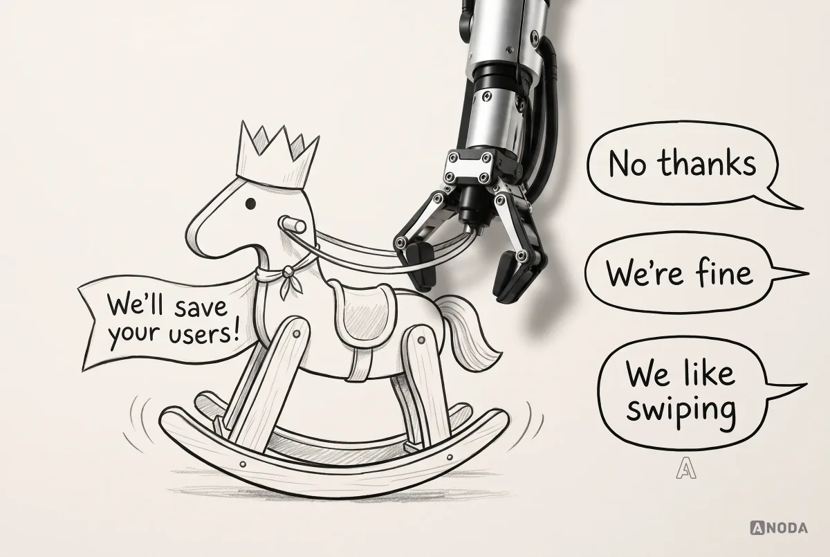
Keep conventions that reduce learning cost. Challenge them only where you have evidence that a better path exists — and then test it, rather than announce it.
Compare the same flow, under the same conditions
The heart of the method is simple and routinely skipped: pick one task and walk it through every product under the same conditions. Same starting point, same device, same account type, same goal.
Good candidate flows are the ones that decide whether a product lives: first-time sign-up to first value, the path to payment, the core repeated task, and recovery when something goes wrong. For each, record every screen, every question the product asks, every decision the user has to make and every point where you hesitated.

Hold the conditions constant or the comparison is worthless. A product walked through on a desktop with a paid account and another on a phone with a free trial are two different experiments, not one analysis. It is a taste test where one dish is served hot and the other has been in the fridge since Tuesday.
Collect evidence you can defend
Opinions about a competitor are cheap. Evidence is what lets the analysis survive the first meeting with a sceptical CTO. Rank what you collect by how much it can prove.

- The complete observable flow. Your own screenshots of every step, in order, with the conditions noted.
- Permitted demos and trials. In B2B especially, book the demos your buyers book and ask the questions your buyers ask. How is this configured? What happens when the import fails? Who on their side sets it up? This is the closest you can get to a competitor’s real product without being a customer.
- Public user feedback. What real users write on Reddit, G2, Capterra, Trustpilot, blogs and social media.
- Documentation and support. What the help centre explains, what it leaves out, and how quickly questions get a human answer.
- Marketing claims. Useful for positioning, useless as proof of how the product behaves.
Stay inside what is lawful and public: open pages, trials and demos you are permitted to use, published documentation and public reviews. Nothing in a sensible competitive analysis requires breaking terms of service or getting access you are not entitled to. If a method needs a fake identity or a password that is not yours, it is not research. It is a legal problem with a spreadsheet attached.
Read the complaints, not the compliments
Five-star reviews that read like a wedding toast tell you nothing. “This is the best software that ever happened to me” is either a very happy customer or a very cheap marketing budget. Oksana’s advice is to go where the pain is: negative sentiment, and how the company handles it.
Negative reviews point straight at unresolved problems.

Some complaints are purely technical. A 404, a crashing server, a page that loads forever: no amount of UX will fix those, and the right answer is to repair the code. But many complaints that look technical are UX problems in disguise.
“Support never answers” sounds like a staffing issue. Look closer: if users need a ticket at all, something was not understood or did not work. A user who lost data, cannot roll back a change or cannot find out how is facing a design failure. So is a help centre that does not answer the obvious question. Oksana goes further: documentation should be written and structured so that search and AI assistants can find the answer, instead of leaving the user waiting for an agent who sends a template.
Be sceptical of “they did it badly”
Once you have a list of what competitors did badly, look at it again through a different lens. An odd pattern may exist for a reason: a technical constraint, a feature that is genuinely hard to build, a regulation, or simply a convention users prefer. Oksana is explicit that the list of mistakes is a subjective first pass, not a conclusion.
This is the difference between critique and analysis. Critique says “their onboarding is too long”. Analysis asks why it is long — whether they are collecting data a regulator requires, whether the long version converts better for their audience, or whether nobody got round to fixing it. Only the last answer is an opportunity for you.
Turn observations into decisions
A competitive analysis that ends in a score out of ten has confused the thermometer with the diagnosis. The output should be a short list of decisions, each with the evidence behind it and an honest confidence level.

The worksheet above is the UX competitive analysis template we use. For each comparator and each flow step it records the evidence, the friction observed, whether the pattern is a category convention, why it might be that way, how confident you are, and what you decide: keep the convention, challenge it or test a hypothesis.
Two rules keep it honest:
- Say what you cannot know. Public interfaces do not tell you what competitors’ users think, how many convert or why they churn. Label observations as observed, reported or assumed, and never present an assumption as a finding.
- Every finding becomes a decision or a question. Either it changes something in your product, or it becomes a research question for your own users. If it does neither, delete it.
If the team has the findings but cannot agree what to do with them, that is a prioritisation problem, not a research problem — and it is exactly where UX consulting earns its fee. A structured way to organise the next decision helps too; our guide to UX design frameworks covers the options.

UX audit
Stop guessing where your product loses people to the competition.
We walk your product and your competitors through the same flows, mark where users stall, and hand you a prioritised list of fixes your team can build.
A feature matrix is an input, not a roadmap
Feature matrices are useful. They show where your product falls short on the basics. The mistake is treating the matrix as the plan and building everything the competitors have, in the order the columns happen to list it.
“Our competitor has this feature, so we need it too” is the sentence Oksana hears most often, and her verdict is blunt: a client who says it does not understand their product or its positioning. Every row in the matrix still has to go through grooming and prioritisation. Do we need this at all? Does it serve our audience? Should it change our priorities, or confirm them?

The classic failure is a product with a differentiator and no foundation. We once worked on a partly fintech product for invoices. It had a feature meant to set it apart from every competitor. It could not create an invoice. The reasoning was that users could create invoices anywhere. True — and then they would also do everything else there.

“Killer feature” is one of Oksana’s favourite expressions for exactly this reason: the feature the product supposedly cannot launch without usually turns out to be the least necessary one in the app. It is the tail wagging the dog. Build the basic job first. Treat the differentiator as a hypothesis until the thing users came to do works.
Keep the MVP small, and move faster than the market
For a zero-to-one product, Oksana’s rule is five or six core features and the foundation needed to make them work. Nothing more, because nothing exists yet and every extra feature needs its own share of that foundation.
Speed matters as much as scope. Her view is that an MVP that once took around three months now needs to be designed, built and tested in about six weeks, because ideas reach the market faster than ever. By the time a team finishes every review and ceremony, someone else — possibly a team with an AI model and a free weekend — may have shipped the same idea. ANODA uses that urgency to keep the first release focused and move the product into customers’ hands.
That is why competitive analysis for an MVP should include the go-to-market questions most teams leave for later: how competitors promote their product, which audience they target, where their traffic comes from, how users find out about them, and what makes users sign up and pay. You want those answers before anyone draws an interface, because they decide what the interface has to do.
Keep the ambition, check the physics
Founders arrive with a spark, and a good analysis should not put it out. But it also has to bring the idea back to earth when needed. Oksana calls it making the client touch grass.
Her favourite example from our startup years: a client who wanted friends to share phone charge wirelessly by tapping each other on a map. No competitive analysis can help with that one. The problem is not the interface. It is physics. The job of the analysis is to protect the ambition while checking that the concept and the technology can actually carry it.
Where to go from here
If the analysis shows your own product has flows that users struggle with, the next step is an expert review of your product, not more competitor screenshots — that is what a UX audit does. If it raised questions only your users can answer, plan UX research to test them. If it produced a defined design problem, it is time for UI/UX design work. And if you want to see how we turn research into delivery end to end, here is how we work.
The decision rule
Before you share a competitive analysis, check it against these questions:
- Did we compare positioning, acquisition, onboarding, payment, the core flow and support — or only screens?
- Did we pick three to five comparators on purpose, including what users do instead of buying anything?
- Did we walk the same flow under the same conditions in every product?
- Is every finding backed by lawful, recorded evidence, with its confidence stated?
- Did we look for the reason behind every “they did it badly”?
- Does every finding end in a decision or a research question?
- Did the basic job come before the differentiator?
Analyse competitors to understand the market and make a product decision, not to assemble a copy list. Compare the same flow, trace how users discover, understand, sign up for, pay for and recover inside each product, then dig into the negative reviews and the reasons behind apparently bad choices. Keep familiar conventions when they spare users a lesson; challenge them only when evidence shows a better path. Build the missing foundation before the differentiator, and treat every “killer feature” as a hypothesis until the product’s essential job works.

UX consulting
You have the analysis. Now decide what to build.
We turn competitor findings into a short, defensible list of product decisions — what to keep, what to challenge and what to test first.
Written by