In short
A UX glossary is only useful if it helps a mixed team use the same words for the same things. This A–Z reference defines over a hundred user experience terms — research methods, artefacts, interface concepts, accessibility, metrics, design systems and delivery — each with a plain definition, an example, and the term it's most often confused with. Use it to agree on language inside your team, and link each term to the decisions it affects.
In this article
A UX glossary is a reference of the terms product teams use to talk about user experience: research methods such as usability testing and user interviews, artefacts such as wireframes, prototypes and journey maps, interface concepts such as affordances and progressive disclosure, accessibility standards such as WCAG, metrics such as task success and NPS, and the systems that keep design consistent, such as design tokens and component libraries. The definitions below are practical: what each term means, a concrete example, and the term it’s most often confused with.
Put a founder, a product manager, a designer and a developer in one room and ask them what a “prototype” is. You’ll get four answers: a napkin sketch, a clickable Figma file, a coded demo, and “the first version we ship”. All four are used in the industry. None of them is wrong. The problem starts when the team plans a week of work around the word and each person pictures something different.
UX terminology overlaps, borrows from psychology, engineering and marketing, and changes as practice changes. A useful glossary gives your team a shared starting point: this is what we mean when we say it, this is how it differs from the thing next to it, and this is when we’d use it.

Words become expensive when “prototype” means a demo to one person and a release-ready product to another. Another terminology workshop will not fix a handoff that leaves the states and decisions undefined. ANODA connects the words to the work: one agreed journey, clear interaction states and a system the team can build.
How to use this glossary
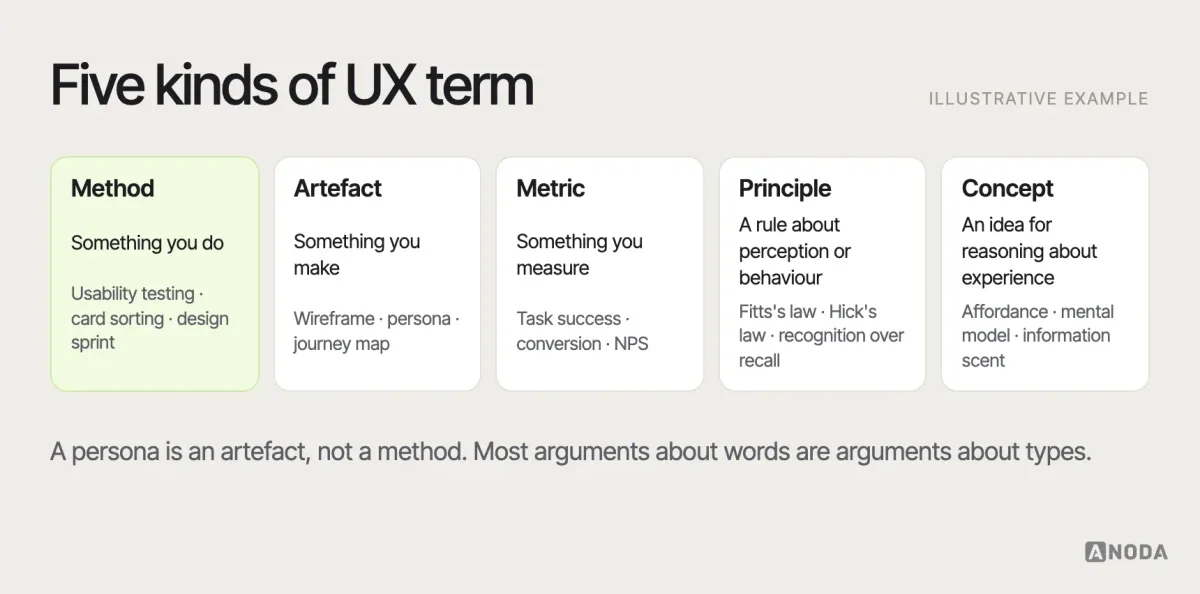
Each entry gives a plain-language definition, a short example from product work and, where it helps, the term it’s most often confused with. Entries are labelled by type, because much of the confusion in product teams comes from mixing up different kinds of thing:
- Method — something you do: usability testing, card sorting, a design sprint.
- Artefact — something you make: a wireframe, a persona, a journey map.
- Metric — something you measure: task success rate, conversion rate, NPS.
- Principle — a rule of thumb or law about how people perceive and behave: Fitts’s law, recognition over recall.
- Concept — an idea used to describe or reason about experience: affordance, mental model, information scent.
The terms teams confuse most — UX and UI, user flows and journeys, wireframes and prototypes, design systems and style guides — have their own entries and comparison visuals. Where a term relates to deeper guidance on our site, the entry links to it. The definitions reflect how the terms are most commonly used in product teams today; where a term has a clear origin — a standard, a researcher, a published model — the entry names it, so you can go to the source when precision matters. Where practice genuinely differs between teams, the entry says so rather than pretending there’s one right answer.
Jump to a letter: A · B · C · D · E · F · G · H · I · J · K · L · M · N · O · P · Q · R · S · T · U · V · W · Z
A
A/B testing
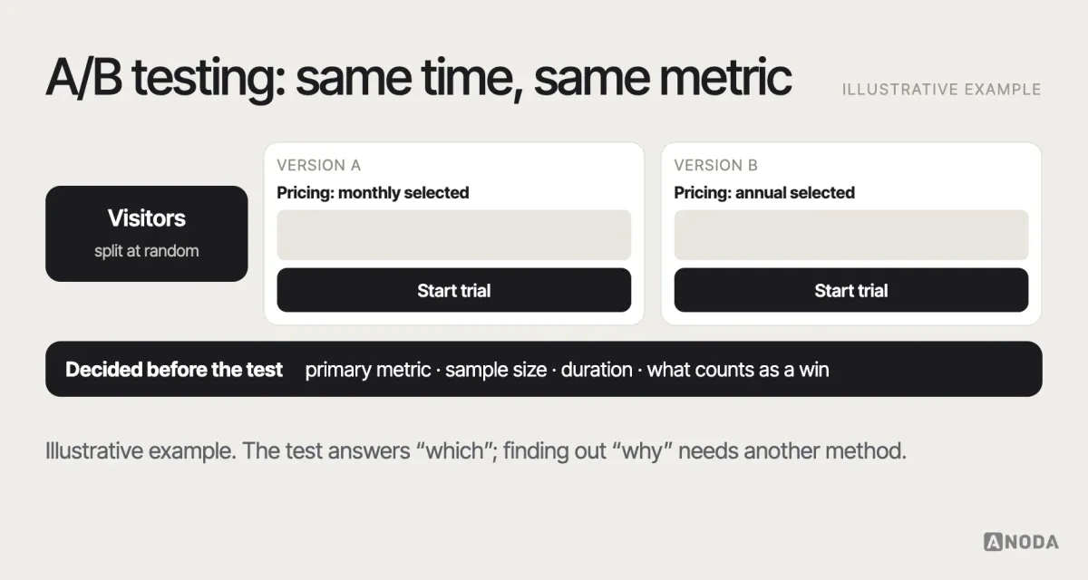
Method. Showing two or more versions of a page or feature to different groups of real users at the same time and comparing a predefined metric, such as sign-ups or completed purchases. Example: half of visitors see a pricing page with annual billing selected by default, half see monthly. A/B tests tell you which version performed better, not why; they need enough traffic to detect a difference and a metric chosen before the test starts. Not the same as a usability test, which observes a small number of people to understand problems.
Acceptance criteria
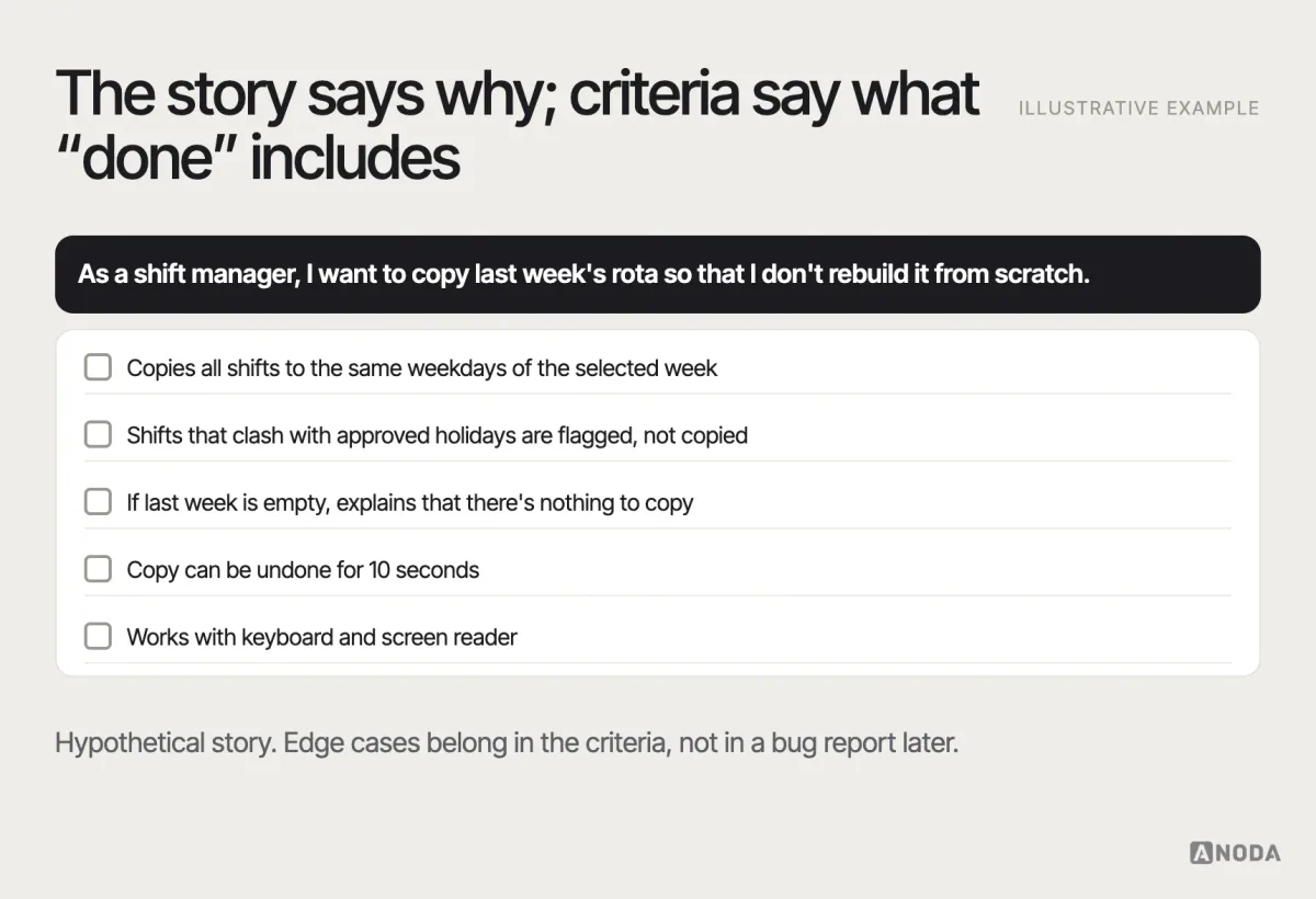
Artefact. The conditions a piece of work must meet to be considered done, usually written for each user story. Example: “The user can save a draft; drafts appear in the list with the date; an unsaved draft triggers a warning before leaving.” Good acceptance criteria include states and edge cases, not only the happy path.
Accessibility
Concept. The degree to which people with disabilities — visual, auditory, motor, cognitive — can perceive, understand, navigate and use a product. In digital products, it’s usually measured against the WCAG guidelines. Accessibility benefits everyone: captions help people in noisy places, good contrast helps people in sunlight. Not the same as usability, though the two overlap: a product can be usable for most people and still exclude some entirely.
Activation
Metric. The share of new users who reach a defined moment of first value — for example, creating a first project and inviting a colleague. A clear activation definition is one of the most useful product metrics, because it connects onboarding design to retention.
Adaptive design
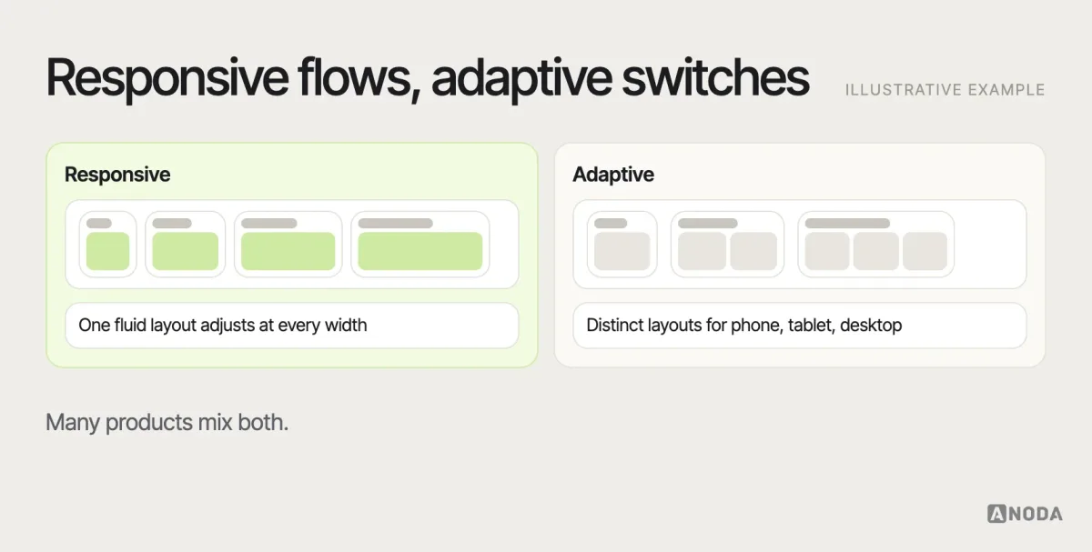
Concept. An approach where the interface switches between a set of distinct layouts designed for specific screen sizes or devices, rather than flowing continuously. Example: a site serving one layout for phones, another for tablets and another for desktops. Often contrasted with responsive design, which adjusts fluidly; in practice, many products combine the two.
Affinity mapping
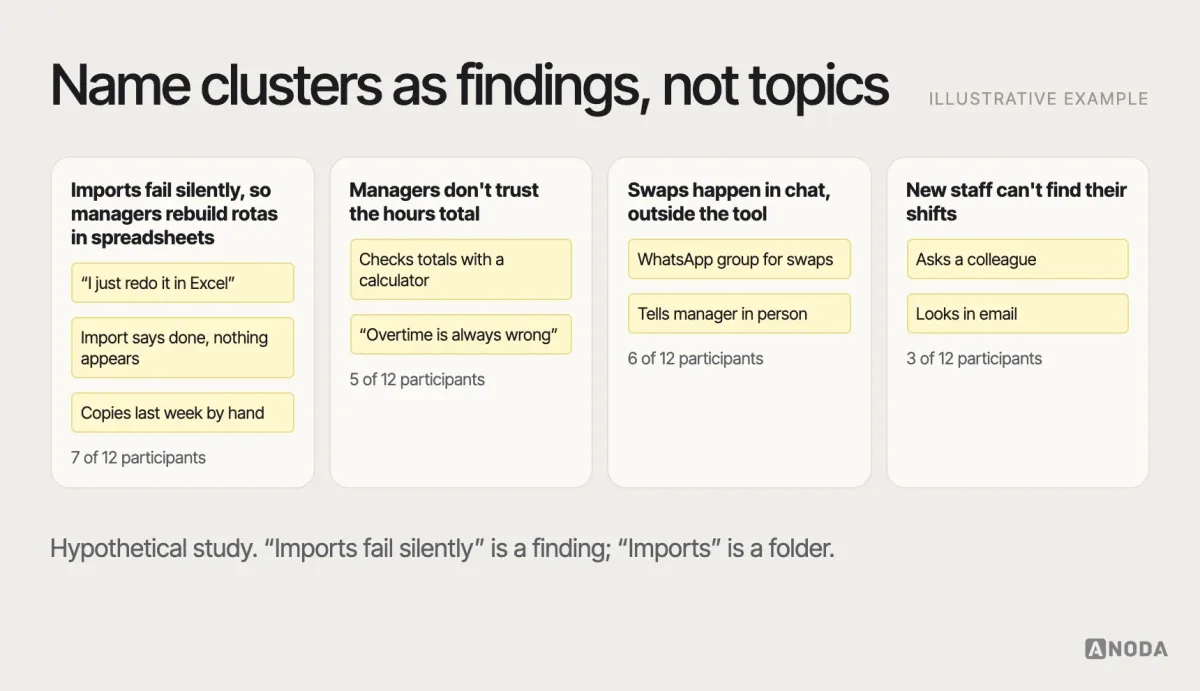
Method. Grouping research observations — usually written on notes — into clusters by similarity to find patterns. Also called affinity diagramming. Example: after twelve interviews, the team writes each observation on its own note and groups them into themes such as “imports fail silently” or “managers don’t trust the numbers”. The output is a set of themes, which then need interpreting as findings.
Affordance
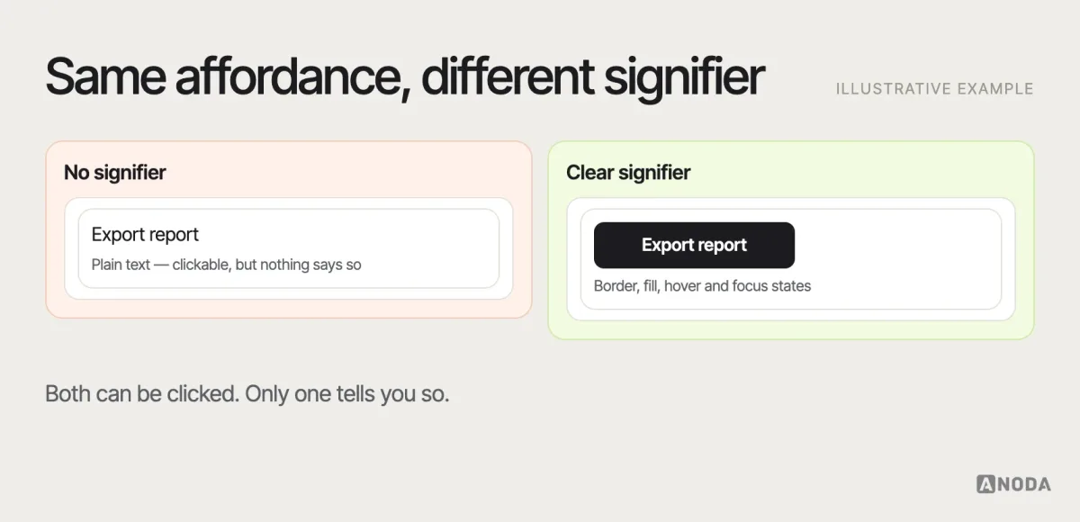
Concept. A possible action an object offers to a person — a button can be pressed, a handle can be pulled. The term comes from psychologist James Gibson and was brought into design by Don Norman. In interfaces, what matters is whether people perceive the action, which is where signifiers — visual cues such as a button’s shape or an underline — come in. Norman later emphasised that designers mostly design signifiers, not affordances.
Alt text
Artefact. A short text alternative for an image, read by screen readers and shown when the image fails to load. Good alt text describes what the image communicates in context, not just what it depicts; decorative images should have empty alt text so screen readers skip them.
Atomic design
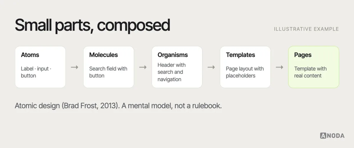
Concept. A method for building design systems, introduced by Brad Frost in 2013, that organises interface parts into five levels: atoms (basic elements such as a label or input), molecules (small groups such as a search field with a button), organisms (larger sections such as a header), templates and pages. It’s a way of thinking about composition, not a requirement for every design system.
B
Benchmarking
Method. Measuring a product’s usability or performance in a consistent way so it can be compared over time or against competitors. Example: running the same five tasks with similar participants every six months and tracking task success and time. Benchmarking is only meaningful when tasks, participants and metrics stay consistent.
Bounce rate
Metric. The share of sessions the analytics tool classifies as a bounce. In Google Analytics 4, it is the percentage of sessions that are not engaged; a single-page session can still count as engaged. A high bounce rate can mean a problem or simply that the page answered the question; it needs context before it means anything.
Breadcrumbs
Concept. A secondary navigation trail that shows the user’s location in a hierarchy and lets them move up levels, such as Home › Tools › Drills. Useful in deep, hierarchical content like catalogues and documentation; unnecessary in flat products with a few sections.
Breakpoint
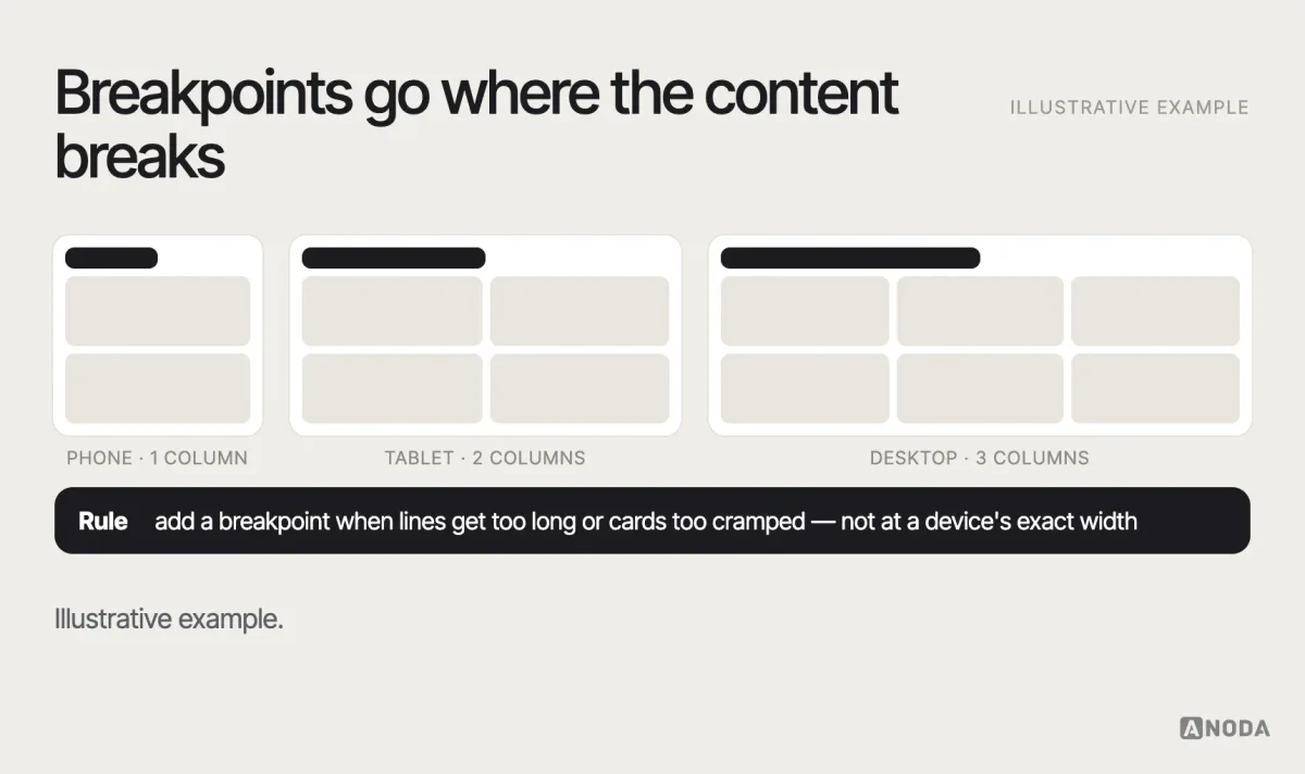
Concept. A screen width at which a responsive layout changes — for example, from one column to two. Good breakpoints are set where the content starts to break, not at the exact widths of particular devices.
C
Call to action (CTA)
Concept. An element — usually a button or link — that asks the user to take a specific next step, such as “Start free trial” or “Book a demo”. Clear CTAs name the action and its result; a page with five competing CTAs usually has none.
Card sorting
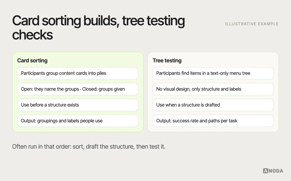
Method. A research method in which participants group content items into categories that make sense to them. In an open card sort, they name the groups; in a closed sort, they place cards into predefined categories. Used to design or check information architecture before building navigation. Not the same as tree testing, which tests whether people can find items in an existing structure.
Carousel
Concept. A component that shows one of several items at a time, with controls to move between them. Carousels save space but hide most of their content, and people often don’t advance them; important content shouldn’t depend on slide three.
Churn
Metric. The share of customers or users who stop using or paying for a product in a period. Churn is the mirror of retention; research into why people leave is often more revealing than research into why they stay.
Cognitive load
Concept. The mental effort needed to use an interface or complete a task. Unnecessary load comes from things like unclear labels, too many options at once, or having to remember information from a previous screen. Reducing it — through clear hierarchy, sensible defaults and progressive disclosure — is one of the main goals of interface design.
Cognitive walkthrough
Method. An expert review in which evaluators step through a task from the point of view of a new user, asking at each step whether the user would know what to do, see how to do it and understand the feedback. It’s particularly good at finding problems with learnability.
Component
Concept. A reusable interface element with defined properties, behaviour and states — a button, a date input, a modal. Components are the building blocks of a design system. A good component definition covers all states (default, hover, focus, disabled, error, loading), not only how it looks by default.
Component library
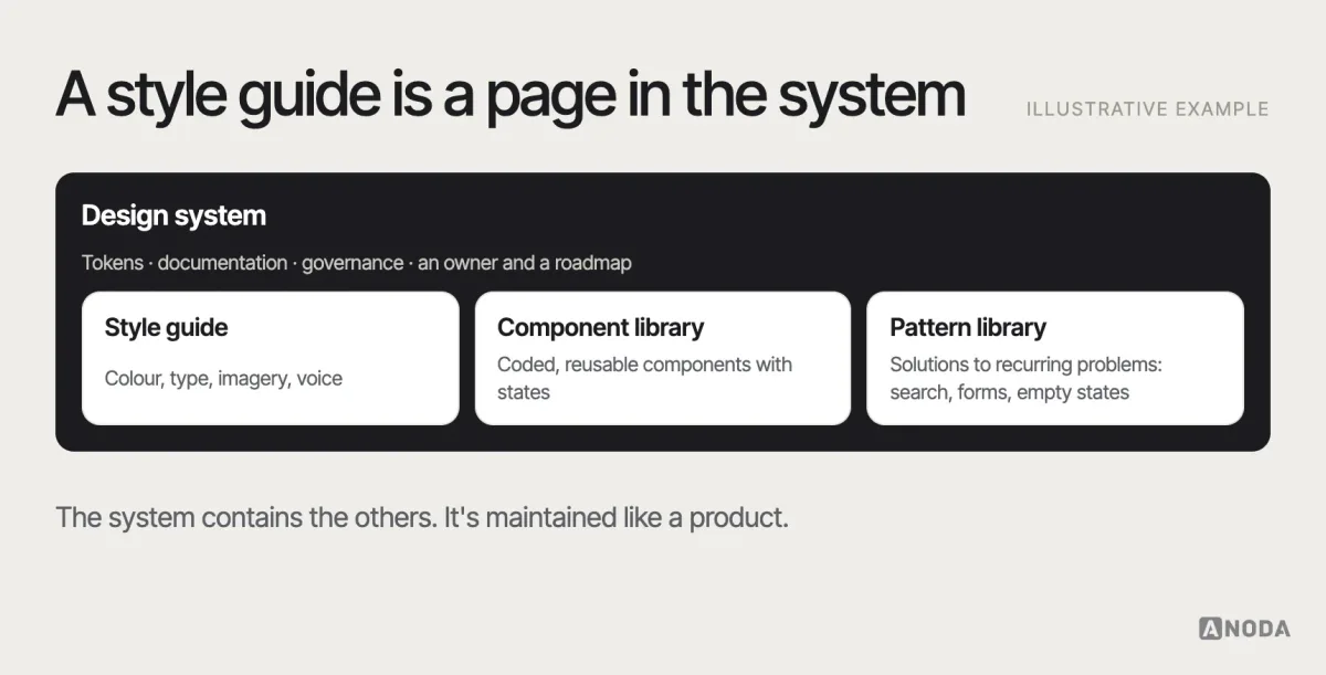
Artefact. A collection of reusable, coded (and usually designed) components that teams use to build interfaces. A component library is one part of a design system; on its own, without guidelines, tokens and governance, it’s a toolbox rather than a system.
Content design
Concept. Designing content — words, structure, format — based on user needs and evidence, so people can find, understand and act on information. Content design decides what content should exist and in what form, not only how it’s worded.
Contextual inquiry
Method. Observing and interviewing people in their own environment while they do the work you’re designing for — at their desk, in a warehouse, in a clinic. It reveals workarounds, interruptions and details people forget to mention in a normal interview.
Contrast ratio
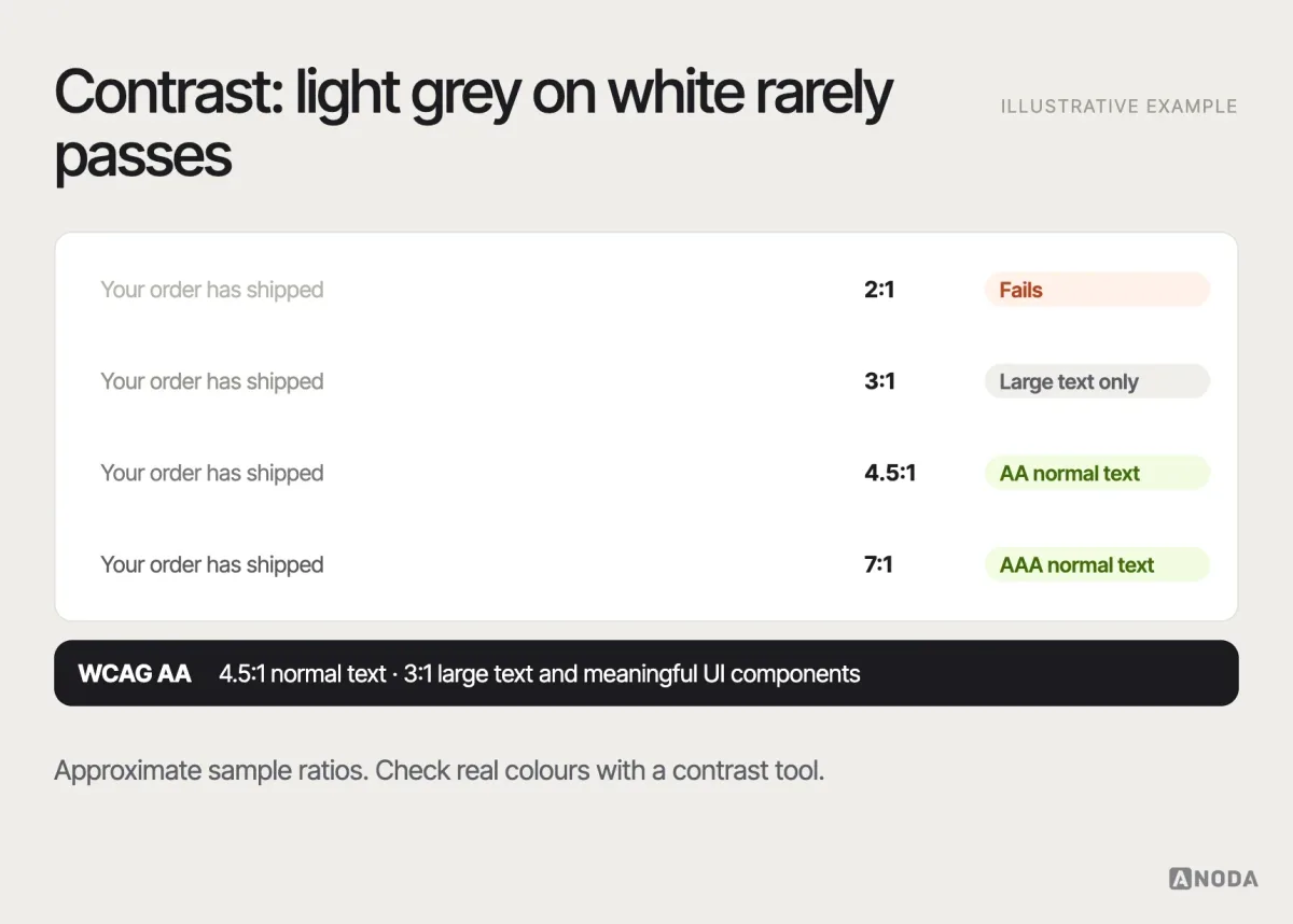
Metric. The difference in luminance between text (or an interface element) and its background, expressed as a ratio from 1:1 to 21:1. WCAG level AA requires at least 4.5:1 for normal text and 3:1 for large text and for meaningful interface components and graphics.
Conversational interface
Concept. An interface in which people interact through natural language — typing or speaking — rather than menus and forms, such as chat assistants and voice assistants. Conversational interfaces are flexible but hide what the system can do, so they need clear prompts, examples and recovery when the system misunderstands.
Conversion rate
Metric. The share of users who complete a defined action — a purchase, a sign-up, a booking — out of those who could have. Always specify the denominator: conversion from visit, from product page or from checkout start gives very different numbers.
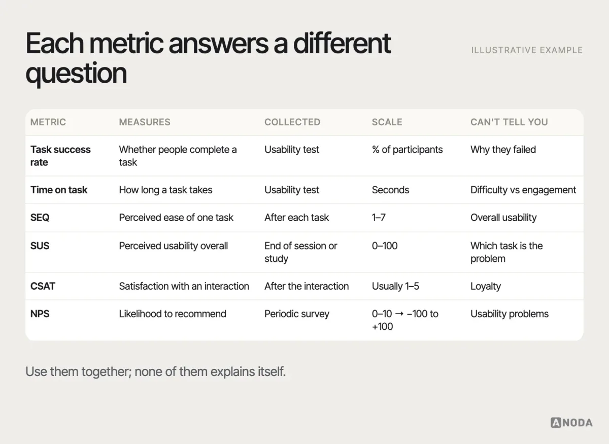
CSAT (customer satisfaction score)
Metric. A score based on asking customers how satisfied they were with a specific interaction or product, usually on a five-point scale, often reported as the share of satisfied responses. Good for measuring a specific moment, such as a support conversation; not the same as NPS, which asks about likelihood to recommend.
D
Dark pattern
Concept. An interface design that pushes users into choices they didn’t intend — pre-ticked add-ons, confirmshaming (“No thanks, I don’t like saving money”), subscriptions that are easy to start and hard to cancel. Also called deceptive design. The US Federal Trade Commission warns that deceptive patterns can violate consumer-protection law.
Deep link
Concept. A link that opens a specific screen or piece of content inside an app or website, rather than its home page — for example, a link in an email that opens a particular order. Deep links need a design for what happens when the user isn’t signed in or doesn’t have the app.
Design critique
Method. A structured session in which designers present work and colleagues give feedback against the goals and constraints of the project. A good critique is about whether the design solves the problem, not about personal taste.
Design debt
Concept. The accumulated inconsistency and compromise in a product’s design — five button styles, three date pickers, outdated flows — that makes future work slower and the experience less coherent. Like technical debt, some is inevitable; unmanaged, it compounds.
Design sprint
Method. A structured, time-boxed process — popularised by Google Ventures as a five-day format — in which a small team moves from a problem to a tested prototype: understand, sketch, decide, prototype, test. Useful for answering one important question quickly; not a substitute for ongoing research and design.
Design system
Artefact. The complete set of shared standards, reusable components, patterns, design tokens, documentation and governance that lets teams build consistent products at scale. It is broader than a style guide (visual rules) or a component library (reusable code). A design system is maintained like a product, with an owner and a roadmap. Our design systems work covers building and governing them.
Design tokens
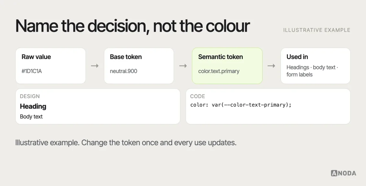
Artefact. Named values that store design decisions — colours, type sizes, spacing, radii, motion timings — in a format both design tools and code can use. Example: color.text.primary instead of a hex value repeated in hundreds of places. Change the token and every place that uses it updates.
DesignOps
Concept. The practice of organising how design work gets done at scale — tools, processes, hiring, rituals, budgets and collaboration with other functions — so designers can spend more time designing.
Diary study
Method. A research method in which participants record their experiences, actions or thoughts over days or weeks, usually through short prompts. Good for behaviour that unfolds over time — habits, onboarding, intermittent tasks — that a single session can’t capture.
Discovery
Method. The early phase of product work focused on understanding the problem, the users, the business context and the constraints before committing to a solution. Discovery usually combines research, stakeholder interviews, analysis of existing data and early concept testing.
Double Diamond
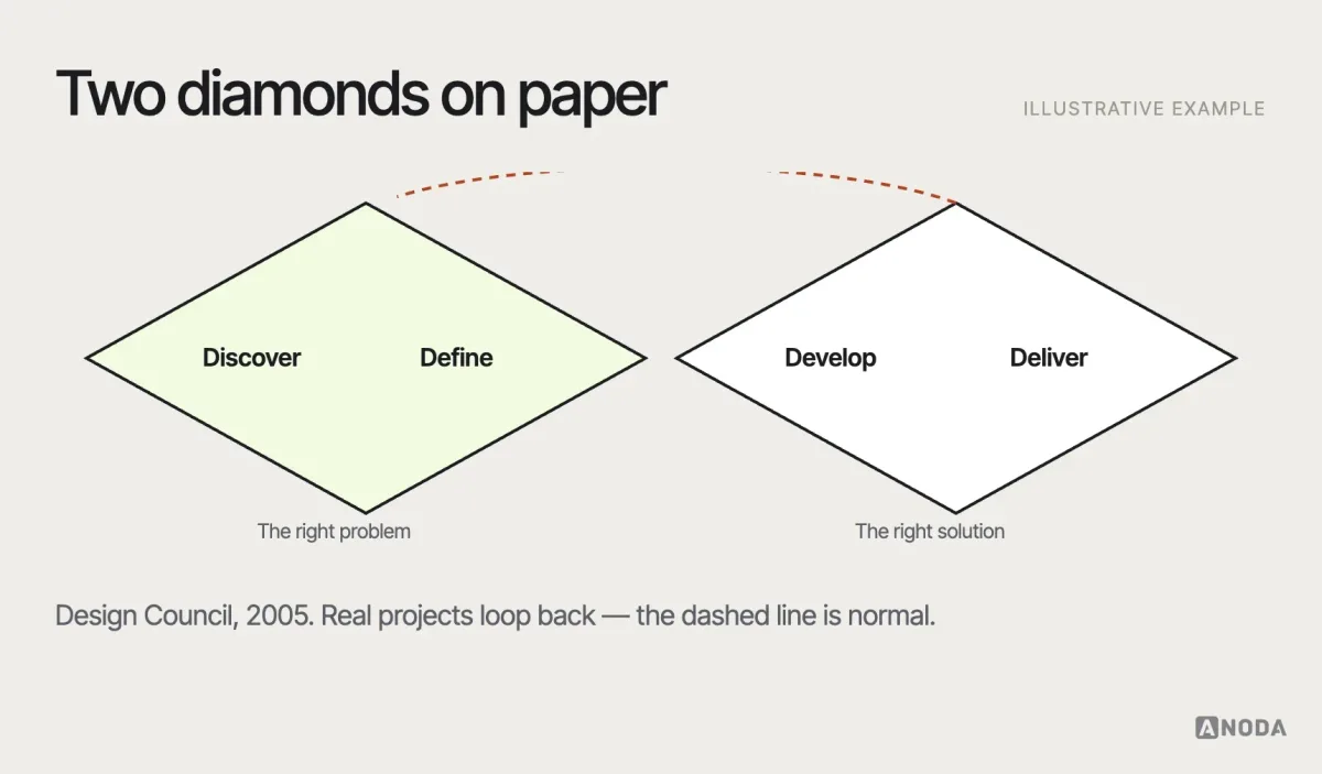
Concept. A design process model shared publicly by the UK Design Council from 2004, with two diamonds representing divergent and convergent thinking: discover and define the right problem, then develop and deliver the right solution. Useful as a reminder not to jump straight to solutions; real projects loop back more than the diagram suggests.
E
Edge case
Concept. A situation that occurs at the extremes of normal use — a very long name, zero results, a user with thousands of items, a lost connection mid-upload. Edge cases are where interfaces most often break, because design files usually show typical data.
Empathy map
Artefact. A simple canvas summarising what a type of user says, thinks, does and feels in a given situation, based on research. Useful for aligning a team quickly; weak if filled in from assumptions rather than evidence.
Empty state
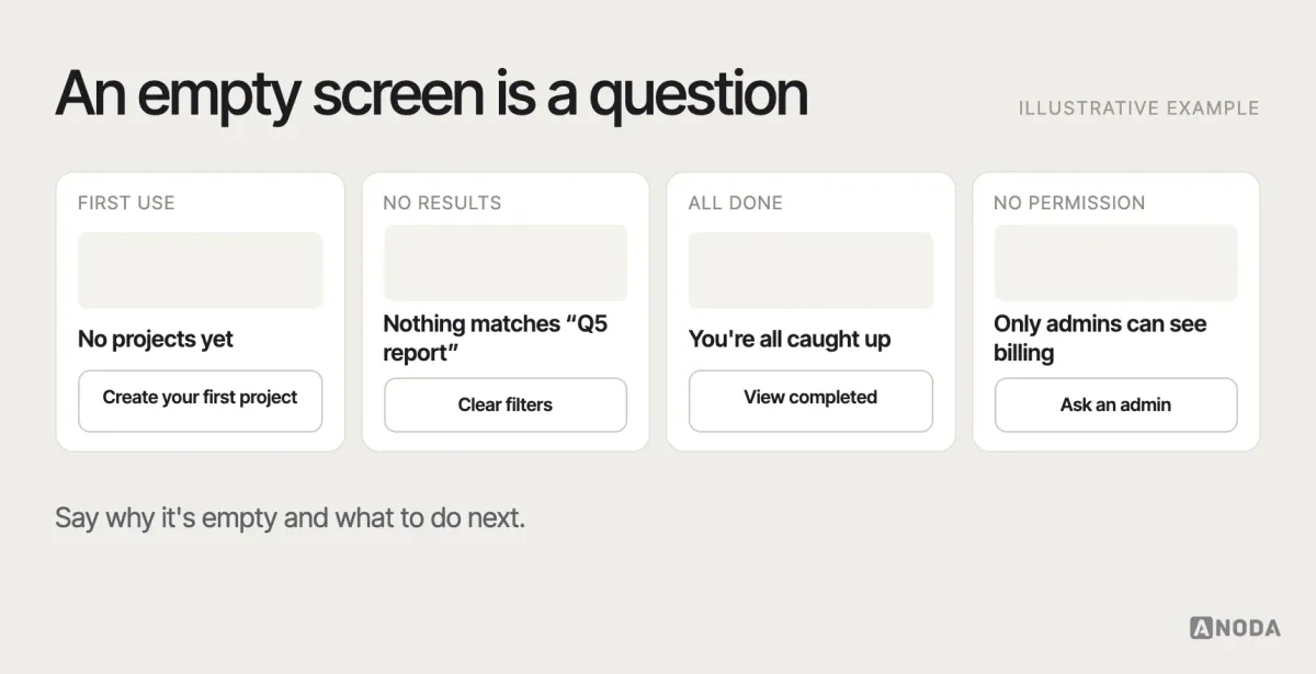
Concept. What an interface shows when there’s no content to display — a new account, no search results, a cleared inbox, no permission. A good empty state explains why it’s empty and what to do next, instead of showing a blank area. Sometimes called a zero state.
Error state
Concept. How an interface shows that something went wrong — an invalid field, a failed payment, a lost connection — and how the user can recover. Good error states say what happened in plain language, keep the user’s work and offer a way forward.
Eye tracking
Method. Research that measures where people look on a screen, using specialised cameras or software. It shows what attracts attention and what gets missed; it doesn’t show whether people understood what they looked at, so it’s usually combined with other methods.
F
F-pattern
Concept. A common way people scan text-heavy web pages, described in eye-tracking research by Nielsen Norman Group: a horizontal sweep across the top, a shorter one lower down, then a vertical scan down the left side. It’s a warning, not a goal — it happens when content gives people no better way to scan. Clear headings, front-loaded sentences and lists change it.
Findability
Concept. How easily users can locate content or features they know or assume exist. Findability depends on information architecture, labels, navigation and search working together. It’s typically measured through task success in tree testing or usability testing.
First-click testing
Method. A test that records where participants click first when given a task on a screen or prototype. The first click is a strong predictor of whether people will complete a navigation task, which makes this a quick way to check labels and layout.
Fitts’s law
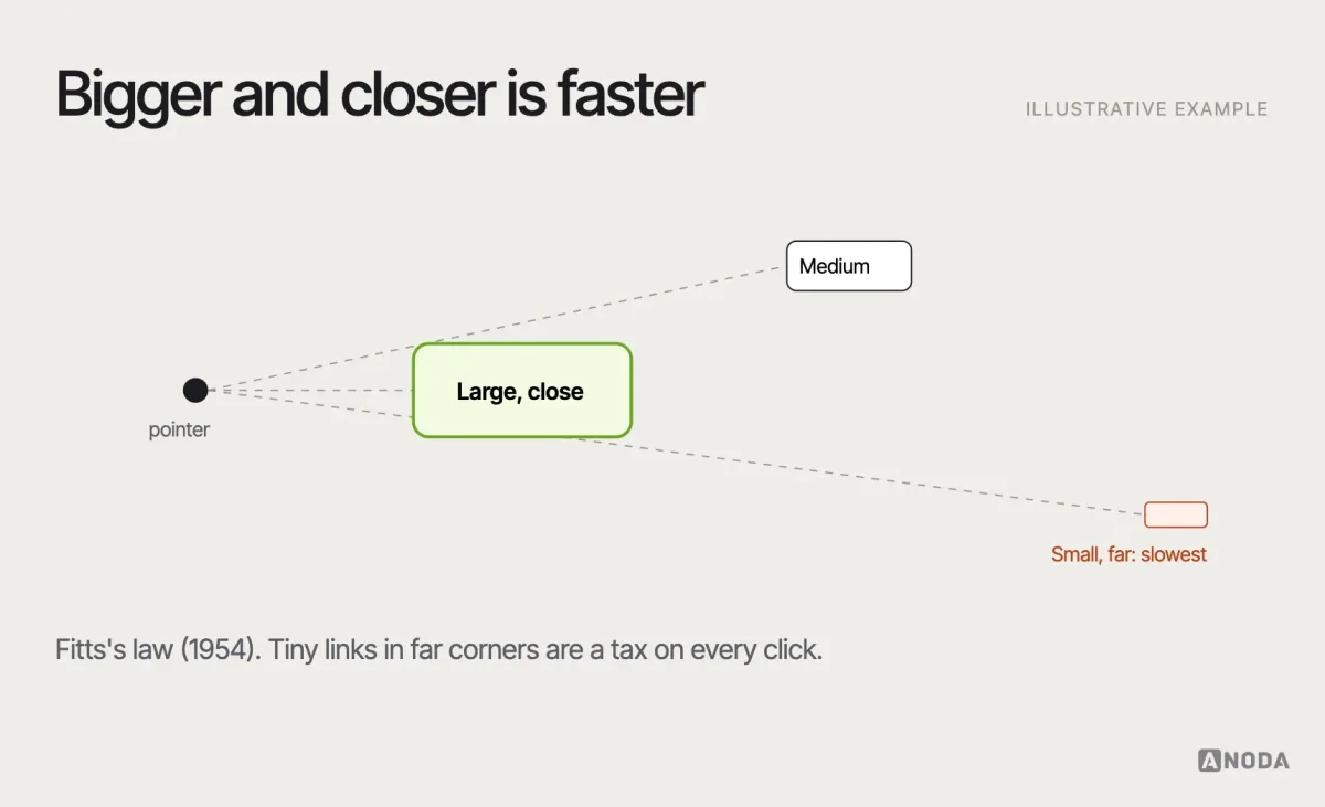
Principle. A model, described by psychologist Paul Fitts in 1954, stating that the time to reach a target depends on its distance and size: large, close targets are faster to hit than small, distant ones. It’s why primary buttons are generous, and why important actions shouldn’t be tiny links in a far corner.
Focus indicator
Concept. The visible outline or highlight showing which element currently has keyboard focus. It’s essential for anyone navigating by keyboard, and WCAG requires it to be visible. Removing default focus outlines without replacing them is one of the most common accessibility failures.
Friction
Concept. Anything that slows users down or makes a task harder — extra steps, unclear labels, required fields, waiting. Most friction should be removed; some is deliberate, such as a confirmation before deleting important data.
Funnel
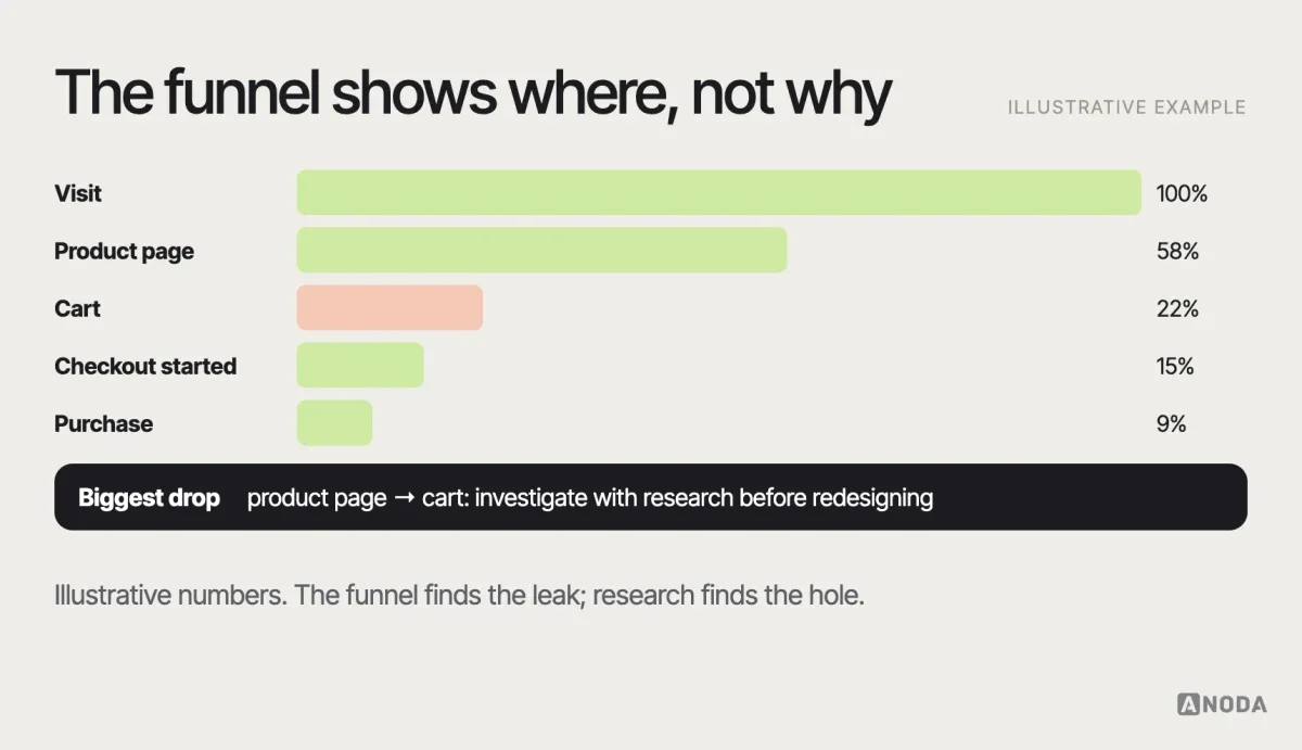
Concept. A sequence of steps users go through towards a goal — for example, visit, product page, cart, checkout, purchase — with the number of users at each step. Funnels show where people drop off; research explains why.
G
Gestalt principles
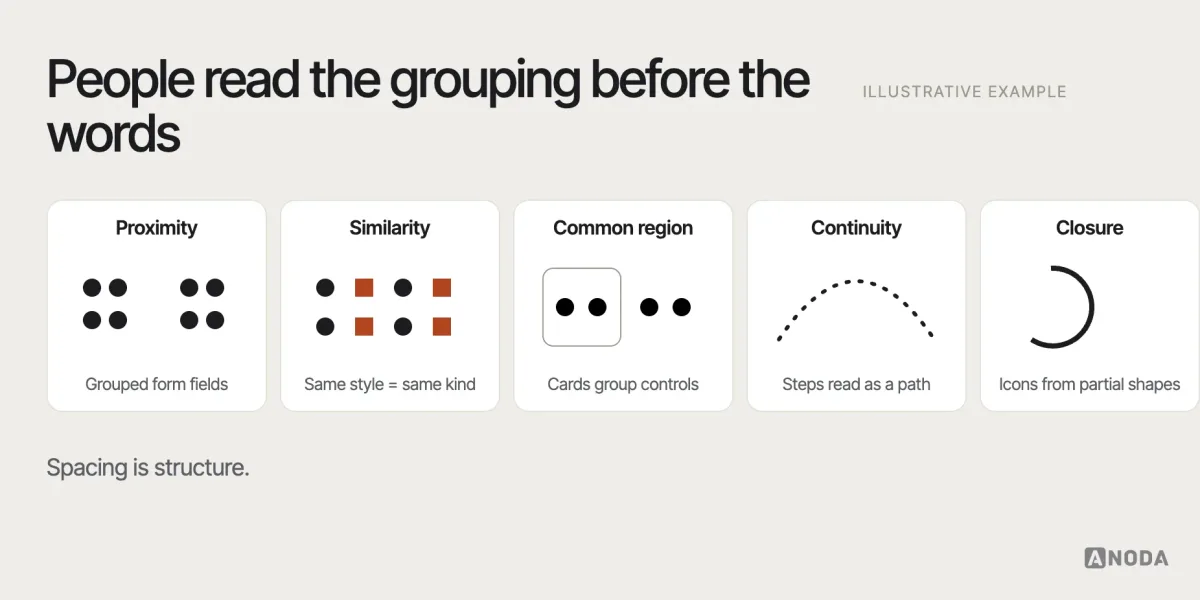
Principle. A set of principles from Gestalt psychology describing how people perceive visual elements as groups: proximity (things close together belong together), similarity, continuity, closure, common region and figure–ground. They explain why spacing and alignment communicate structure before a single word is read.
Grid
Concept. A system of columns, gutters and margins used to align elements consistently across a layout. Grids make interfaces predictable and help responsive layouts reflow in an orderly way.
Guerrilla testing
Method. Quick, informal usability testing with whoever is available — people in a café, colleagues from another team. It’s cheap and fast for catching obvious problems, but participants may not represent your users, so it shouldn’t carry high-stakes decisions.
H
Hamburger menu
Concept. A menu hidden behind an icon of three horizontal lines, common on mobile. It saves space but lowers the discoverability of whatever it hides, so it suits secondary navigation better than a product’s main destinations.
Handoff
Concept. The point where design work is passed to development, including specifications, assets, states, behaviour and edge cases. Good handoff is a conversation, not a file drop; the best teams involve developers well before it.
Heatmap
Artefact. A visualisation of where users click, move, scroll or look on a page, usually generated by analytics tools. Heatmaps show patterns of attention and interaction across many sessions, but not intent or understanding.
Heuristic evaluation
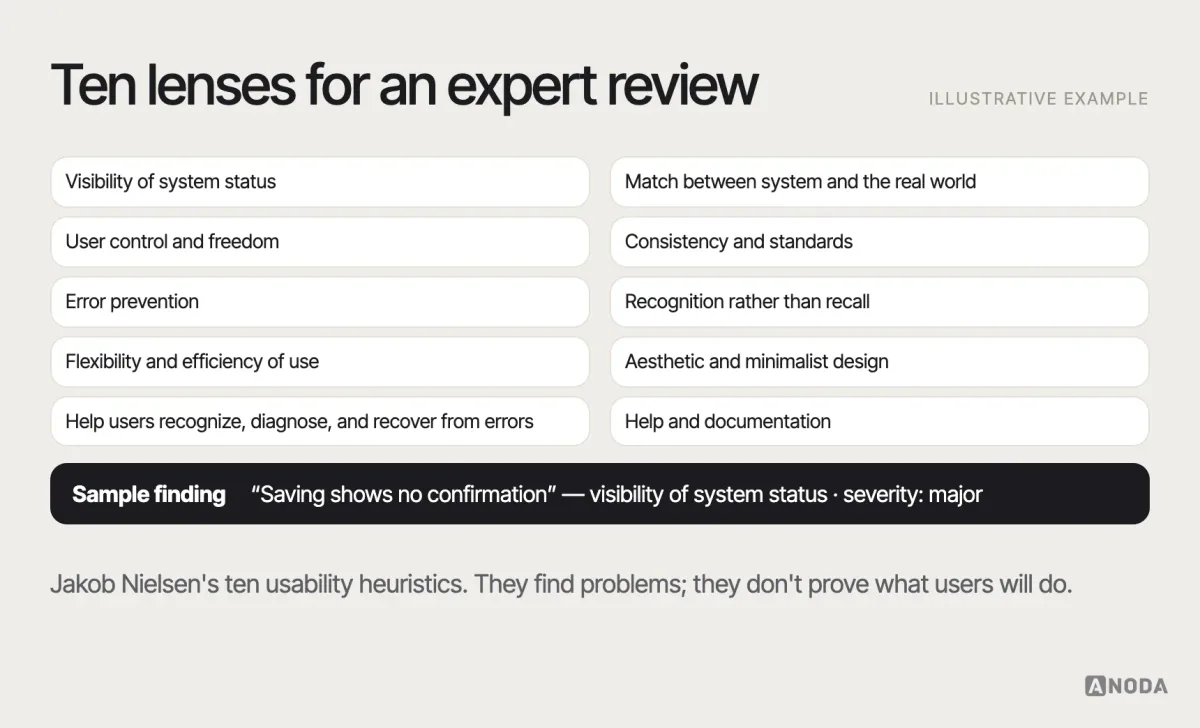
Method. An expert review of an interface against a set of usability principles, most commonly Jakob Nielsen’s ten usability heuristics — such as visibility of system status, match with the real world, and error prevention. It’s fast and inexpensive, and finds many problems, but it relies on the evaluators’ judgement and doesn’t replace testing with users.
Hick’s law
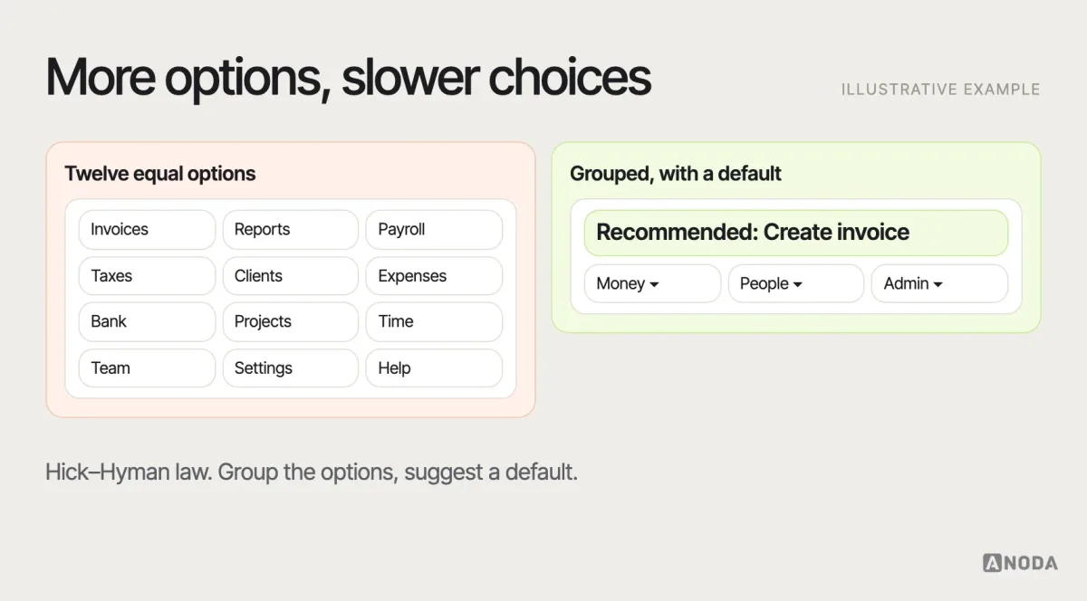
Principle. Also called the Hick–Hyman law, from research in the early 1950s: the time it takes to make a decision increases with the number and complexity of choices. In interfaces, it supports reducing options at each step, grouping choices and highlighting a sensible default — though it applies most clearly to simple choices, not to every menu.
High-fidelity
Concept. A design or prototype that closely resembles the final product in visual detail, content and interaction. High-fidelity work is good for testing detailed interactions and for stakeholder sign-off; it’s expensive to change, so it comes after the structure is settled.
Human-centred design
Concept. An approach to design that grounds decisions in an understanding of the people who will use the product, involves them throughout, and iterates based on evaluation. It’s described in the ISO 9241-210 standard for interactive systems.
I
Inclusive design
Concept. Designing for the full range of human diversity — ability, age, language, culture, situation — from the start, rather than adapting for “edge” users later. It overlaps with accessibility but is broader: it also considers temporary and situational limitations, such as a broken arm or a bright screen outdoors.
Infinite scroll
Concept. A pattern that loads more content automatically as the user scrolls, instead of using pages. It suits endless browsing feeds; it frustrates when people need to return to a position, reach the footer or sense how long the list is — where pagination or a “load more” button works better.
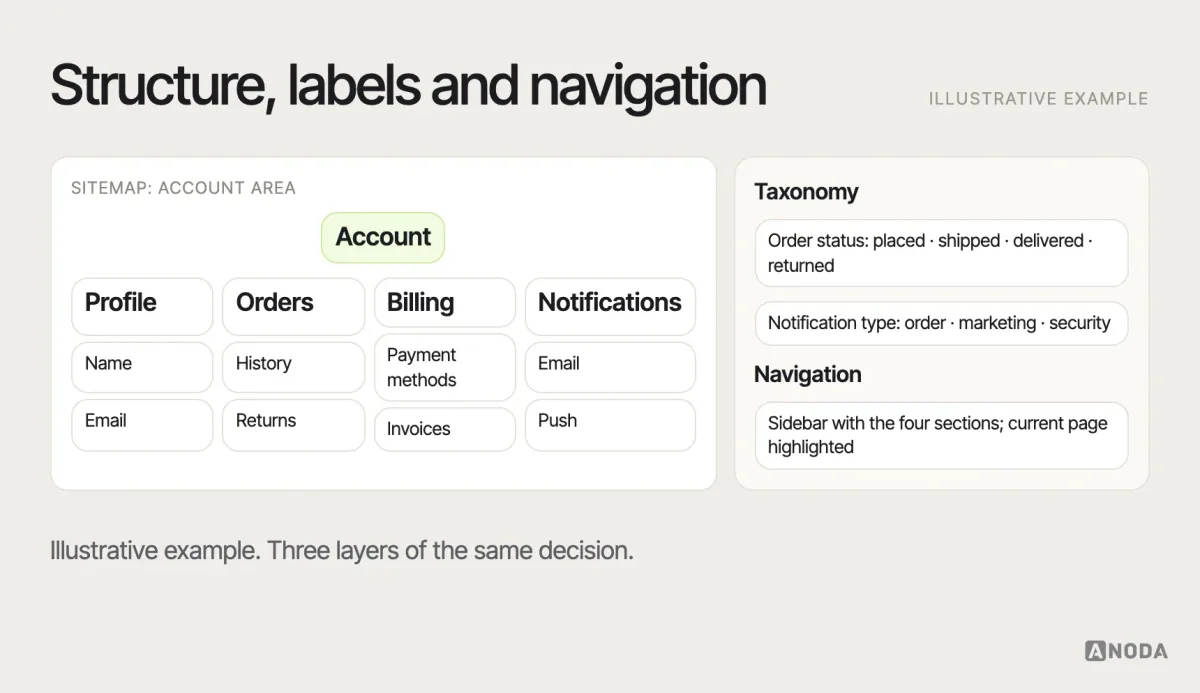
Information architecture (IA)
Concept. The structure, organisation and labelling of content and features so people can find and understand them. IA covers hierarchy, navigation, taxonomy and search. It’s usually shaped with card sorting and checked with tree testing. Our guide to information architecture goes deeper.
Information scent
Concept. The cues — link labels, headings, descriptions, images — that tell users whether a path is likely to lead to what they’re looking for. Strong scent keeps people moving confidently; weak scent causes hesitation, backtracking and abandonment.
Interaction cost
Concept. The sum of mental and physical effort a user must spend to accomplish a goal — reading, scrolling, clicking, remembering, waiting. Reducing interaction cost for frequent tasks is one of the most reliable ways to improve an interface.
Interaction design (IxD)
Concept. The design of how users and a product communicate through actions and responses — what can be done, how, and what happens next. It covers controls, feedback, transitions, states and behaviour over time.
Iteration
Method. Improving a design through repeated cycles of making, testing and refining. Iteration works when each cycle is informed by evidence; without it, it’s just repeated redesign.
J
Jakob’s law
Principle. Jakob Nielsen’s observation that users spend most of their time on other sites and apps, so they expect yours to work the same way. It’s an argument for following established conventions unless there’s a strong reason not to.
Jobs to be done (JTBD)
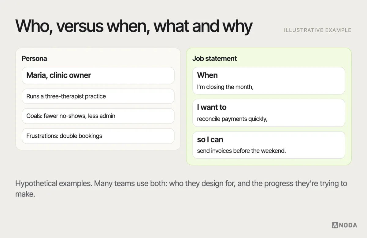
Concept. A framework for understanding the progress a person is trying to make in a particular situation — the “job” they “hire” a product to do. Popularised by Clayton Christensen, it focuses on circumstances and motivations rather than demographics. Often contrasted with personas, which describe types of users; many teams use both.
Journey map
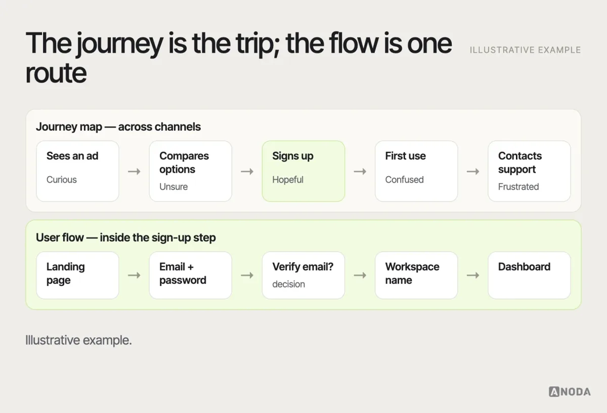
Artefact. A visualisation of a user’s experience over time as they try to achieve a goal, often across several channels — the steps, actions, thoughts, emotions and pain points at each stage. Not the same as a user flow, which maps the specific screens and decisions inside a product.
K
Keyboard navigation
Concept. Using an interface with the keyboard alone — moving between elements with Tab, activating them with Enter or Space, using arrow keys within components. It’s essential for many people with motor or visual impairments and for power users, and requires a logical focus order and a visible focus indicator.
KPI (key performance indicator)
Metric. A metric chosen to track progress towards a business or product goal, such as activation rate, retention or revenue per user. A good UX KPI connects a user behaviour to an outcome the business cares about.
L
Lean UX
Concept. An approach that brings lean and agile thinking into design: framing work as hypotheses, building the smallest thing that tests them, and learning quickly with the whole team, rather than producing heavy documentation up front.
Loading state
Concept. What the interface shows while it waits for data or an action to complete — a spinner, a progress bar, a skeleton screen, a disabled button with a label such as “Saving…”. The longer the wait, the more the user deserves to know what’s happening.
Localization
Concept. Adapting a product for a specific language, region or culture — not only translation, but date and number formats, currencies, text length, reading direction, imagery and legal requirements. Designs that assume short English labels often break when localized.
Low-fidelity
Concept. Rough, simplified design work — sketches, basic wireframes, paper prototypes — used to explore structure and ideas quickly before investing in detail. Low fidelity invites feedback on the concept rather than the colours.
M
Mental model
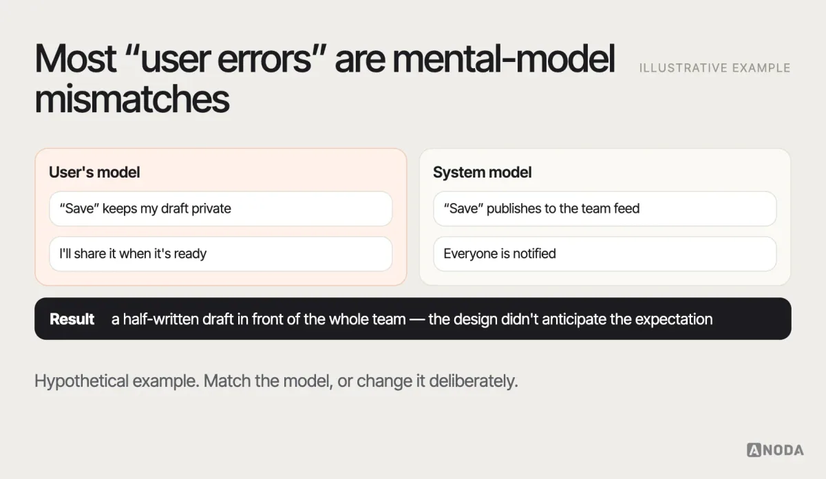
Concept. A person’s internal understanding of how something works, based on past experience. Users approach your product with mental models formed elsewhere; when the product works differently, errors follow. Research aims to understand those models; design aims to match them or change them deliberately.
Microcopy
Artefact. The small pieces of text in an interface — button labels, hints, error messages, empty-state text, tooltips. Microcopy often decides whether a task succeeds, which is why it belongs in design, not after it.
Microinteraction
Concept. A small, contained interaction built around a single task — toggling a setting, liking a post, showing a password. Good microinteractions give immediate, clear feedback; they’re where polish is most visible.
Mobile-first
Concept. An approach, popularised by Luke Wroblewski, in which designers start with the smallest screen and most essential content, then enhance for larger screens. It forces prioritisation early.
Mockup
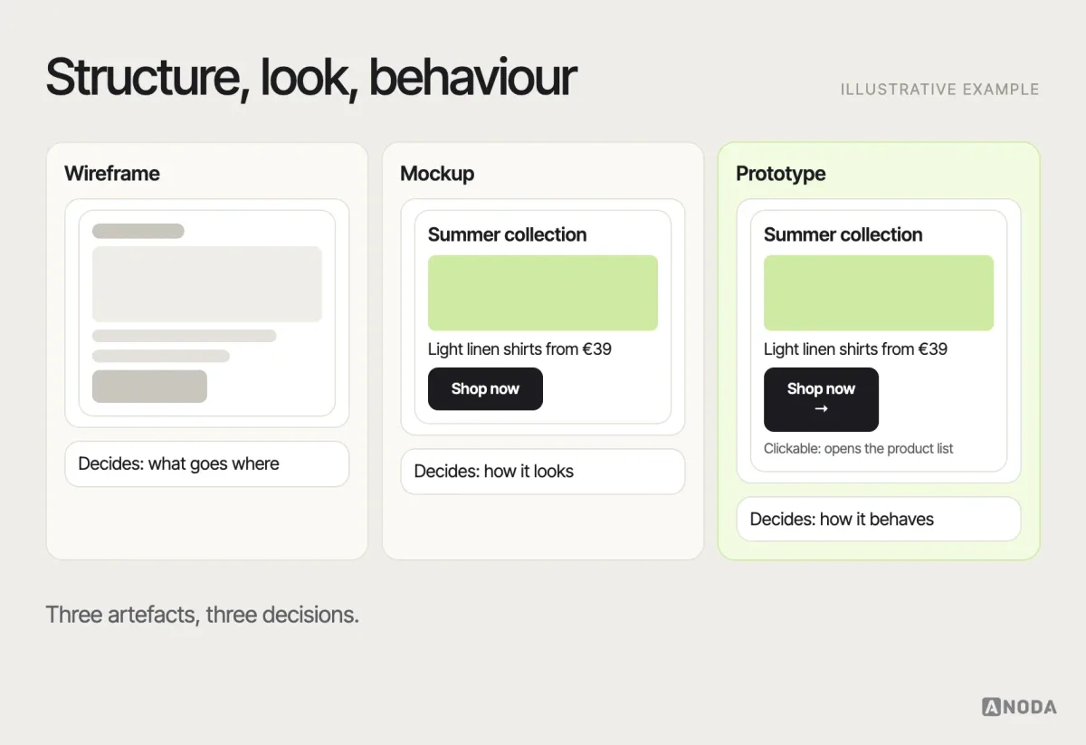
Artefact. A static, visually detailed representation of a screen showing how it will look — colour, typography, imagery — but not how it behaves. Sits between a wireframe (structure) and a prototype (interaction).
Modal
Concept. A dialog that appears on top of the page and blocks interaction with everything behind it until the user responds. Modals demand attention, which is right for decisions that must happen now and wrong for anything that could wait in the page itself.
Moderated testing
Method. Usability testing in which a facilitator guides the session, gives tasks and asks follow-up questions in person or remotely. It produces rich insight into why people struggle. Contrasted with unmoderated testing, where participants complete tasks alone and the session is recorded.
MVP (minimum viable product)
Concept. The smallest version of a product that can deliver value to early users and test the riskiest assumptions. “Viable” matters: an MVP should solve a real problem well enough that people use it, not just exist.
N
Navigation
Concept. The system of menus, links, tabs and controls people use to move through a product. Primary navigation shows the main destinations; secondary and contextual navigation help within a section. Good navigation answers three questions at all times: where am I, where can I go, how do I get back.
NPS (Net Promoter Score)
Metric. A loyalty metric introduced by Fred Reichheld of Bain & Company in 2003, based on one question: “How likely are you to recommend this product to a friend or colleague?” on a 0–10 scale. The score is the percentage of promoters (9–10) minus the percentage of detractors (0–6). Useful as a broad relationship signal; too far removed from specific interactions to diagnose usability problems.
O
Onboarding
Concept. The experience that helps new users reach the first moment of real value — sign-up, setup, first task, first result. Good onboarding is measured by whether people get value, not by whether they finish a tour.
Open and closed questions
Concept. Open questions let people answer in their own words (“Tell me about the last time you…”); closed questions offer fixed options (yes/no, a rating, multiple choice). Open questions reveal reasons and language; closed questions are easier to count and compare. Research usually needs both.
P
Pagination
Concept. Splitting long lists or search results into numbered pages with controls to move between them. It lets people return to a position, share a link to a page and sense how much content there is — the things infinite scroll makes hard.
Pain point
Concept. A specific problem users experience — a confusing step, a missing feature, a slow process — that causes frustration, extra effort or abandonment. Pain points are most useful when described with evidence and frequency, not as a list of complaints.
Pattern library
Artefact. A collection of documented solutions to recurring design problems — how to handle search, pagination, form validation, empty states — with guidance on when to use each. A pattern library documents solutions; a component library provides the building blocks those solutions are made from.
Persona
Artefact. A research-based description of a type of user — their goals, behaviours, context and frustrations — used to keep a team focused on real needs. Personas built from assumptions and stock photos are decoration; personas built from research are a decision tool.
Placeholder text
Concept. Hint text shown inside an empty input field that disappears as soon as the user starts typing. It should never replace a visible label: once it disappears, people lose the information, and it’s often too low in contrast to read.
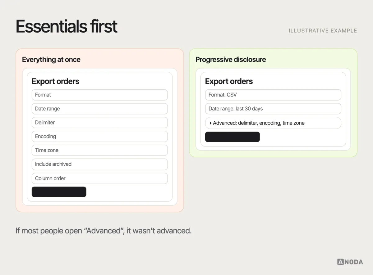
Progressive disclosure
Concept. Showing only the essential information and options first, and revealing more as the user needs it — “Advanced settings”, “Show more”, expandable sections. It reduces cognitive load for most users while keeping power features available.
Prototype
Artefact. An interactive model of a product used to test ideas before building them. Prototypes range from paper sketches to clickable design files to coded demos. The right fidelity depends on the question: flow and structure can be tested with low fidelity; detailed interactions need more.
Q
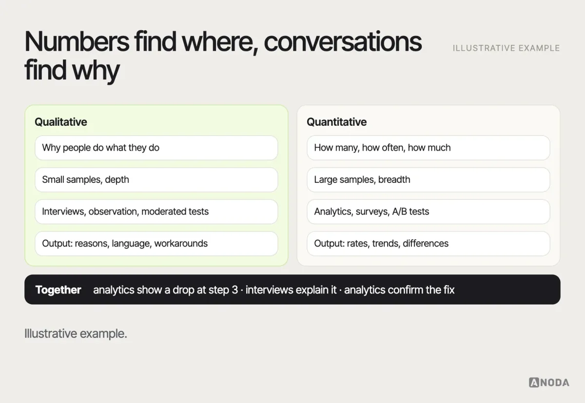
Qualitative research
Method. Research that collects non-numerical data — observations, words, behaviours — to understand why people do what they do. Interviews, contextual inquiry and moderated usability tests are qualitative. It explains; it doesn’t measure how common something is.
Quantitative research
Method. Research that collects numerical data to measure how many, how often or how much — analytics, surveys with closed questions, A/B tests, benchmark studies. It measures; it rarely explains. Strong decisions usually combine both.
R
Readability
Concept. How easily text can be read and understood — affected by sentence length, word choice, structure, typography, line length and contrast. Readability formulas give a rough estimate; testing with real readers gives a better one.
Recognition over recall
Principle. One of Jakob Nielsen’s usability heuristics: people find it easier to recognise options they can see than to remember them. It’s why menus beat commands for most users, and why interfaces should show recent items, suggestions and visible options.
Research repository
Artefact. A shared, searchable place where research findings, evidence and recordings are stored, tagged and linked to the decisions they informed. It prevents teams from running the same study twice and helps new people catch up quickly.
Responsive design
Concept. An approach in which a layout adapts fluidly to the screen size using flexible grids, images and breakpoints, so one design works across devices. Contrasted with adaptive design, which serves distinct fixed layouts for specific sizes.
Retention
Metric. The share of users who keep using a product over time, usually measured by cohort — for example, the percentage of users who signed up in March and were still active after 30 days. Retention is one of the clearest signals that a product delivers ongoing value.
S
Screen reader
Concept. Assistive software that reads interface content aloud or outputs it to a braille display, used mainly by people who are blind or have low vision. Common screen readers include VoiceOver on Apple devices, TalkBack on Android, and NVDA and JAWS on Windows. Designing for them means meaningful labels, a logical structure and correct semantics.
SEQ (Single Ease Question)
Metric. A single question asked immediately after a task — “Overall, how difficult or easy was this task?” — on a seven-point scale. It’s quick, comparable across tasks and useful for spotting which tasks feel hardest.
Service blueprint
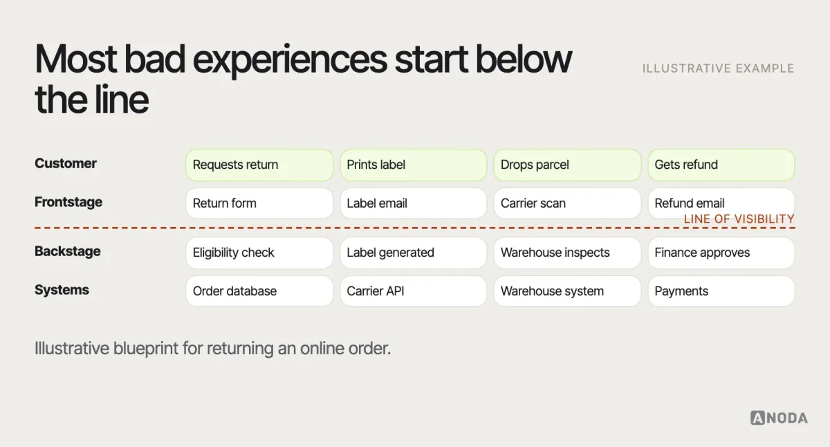
Artefact. A diagram that maps a service end to end, showing what the customer does alongside the frontstage actions of staff and systems, the backstage processes and the supporting systems. Introduced by G. Lynn Shostack in the 1980s, it’s used when the experience depends on operations, not only on the interface.
Severity rating
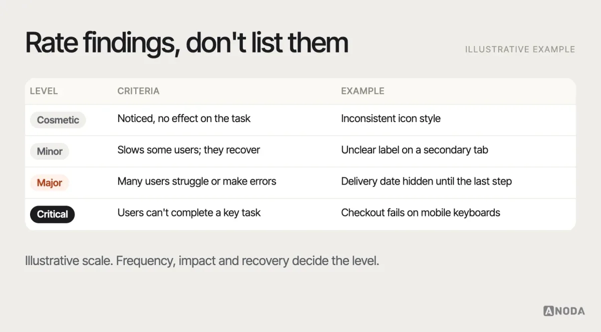
Metric. A judgement of how serious a usability problem is, typically based on how many users it affects, how badly it blocks their task and whether they can recover. Common scales run from cosmetic to critical. Severity helps teams prioritise fixes rather than treating every finding as equal.
Signifier
Concept. A perceivable cue that shows people what action is possible and where — a button’s raised shape, an underlined link, a drag handle, a label. The term was brought into interaction design by Don Norman to distinguish the visible cue from the underlying affordance.
Sitemap
Artefact. A diagram or list of all the pages or screens in a product and how they’re organised hierarchically. A design sitemap shows information architecture; an XML sitemap is a technical file for search engines — related names, different jobs.
Skeleton screen
Concept. A loading placeholder that shows the shape of the content — grey blocks where text and images will appear — before the data arrives. It makes waiting feel shorter and prevents layout jumps, when the final layout is predictable.
Stakeholder interview
Method. A conversation with people inside the organisation — leadership, sales, support, engineering — to understand business goals, constraints, assumptions and disagreements before research or design starts.
Style guide
Artefact. A document of visual and editorial rules — colours, typography, logo use, imagery, tone of voice. It’s an important part of a brand or design system, but it doesn’t include the coded components, patterns and governance a system needs.
Survey
Method. A structured set of questions sent to many people to measure attitudes, preferences or behaviours. Surveys are good at sizing what you already understand from qualitative research; they’re poor at discovering what you didn’t think to ask.
SUS (System Usability Scale)
Metric. A ten-item questionnaire, created by John Brooke in 1986, that produces a single usability score from 0 to 100. It’s quick, widely used and comparable across studies, though it measures perceived usability rather than task performance.
T
Task analysis
Method. Breaking down how users accomplish a goal into steps, decisions, tools and information needed. It reveals where a process is complex, where errors happen and which steps a design could remove.
Task flow
Artefact. A diagram of the steps a user takes to complete one specific task, usually without branches for different users or situations. Narrower than a user flow, which can include decisions, entry points and alternative paths.
Task success rate
Metric. The percentage of participants who complete a task correctly in a usability test or benchmark. It’s the most basic and most important usability metric; define “success” before testing so results are consistent.
Taxonomy
Artefact. A controlled system of categories and labels used to classify content — product categories, article topics, tags. A clear taxonomy makes navigation, filtering and search work; a messy one makes all three fail.
Think-aloud protocol
Method. Asking participants to say what they’re thinking as they use a product during a usability test — what they’re looking for, what they expect, what confuses them. It reveals reasoning that behaviour alone doesn’t, though it slightly slows people down.
Time on task
Metric. How long it takes a participant to complete a task. Useful for comparing designs or tracking improvement; ambiguous alone, because more time can mean difficulty or engagement.
Toggle
Concept. A switch control for turning a single setting on or off, with the change taking effect immediately. If the change needs a separate “Save” step, a checkbox is usually the clearer choice.
Tooltip
Concept. A small popup that appears on hover or focus to explain an element, usually an icon. Tooltips are for supplementary hints; essential information shouldn’t live only in a tooltip, because touch interactions cannot depend on hover and many users never discover it.
Touch target
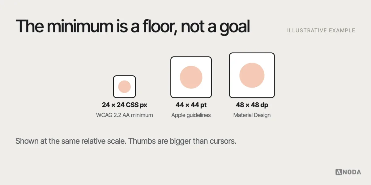
Concept. The area of an interface element that responds to a tap. Apple’s guidelines recommend at least 44 by 44 points; Google’s Material Design recommends at least 48 by 48 density-independent pixels; WCAG 2.2 sets a minimum of 24 by 24 CSS pixels at level AA, with exceptions.
Tree testing
Method. A test of an information architecture in which participants find items in a text-only version of the navigation tree, without visual design. It shows whether the structure and labels work on their own. Often paired with card sorting.
U
UI (user interface)
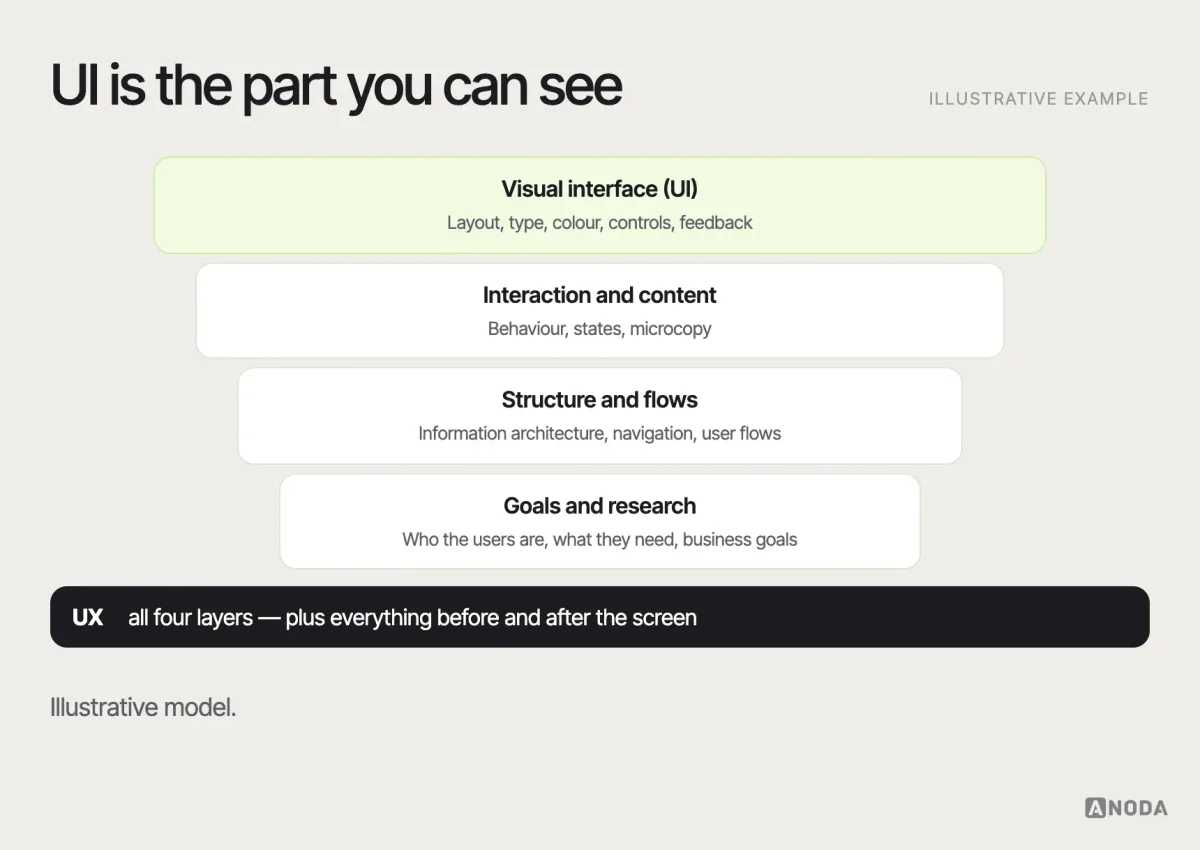
Concept. The visual and interactive layer people use to operate a product — screens, layouts, controls, typography, colour, icons and feedback. UI is part of UX: it’s where the experience becomes visible and tangible.
Unmoderated testing
Method. Usability testing in which participants complete tasks on their own, usually remotely, while software records their screen and sometimes their voice. It’s faster and scales to more participants, but you can’t ask follow-up questions, so tasks must be very clear.
Usability
Concept. How effectively, efficiently and satisfactorily specific users can achieve specific goals with a product in a specific context — the definition used in the ISO 9241-11 standard. Usability is measurable, through task success, errors, time and perceived ease.
Usability testing
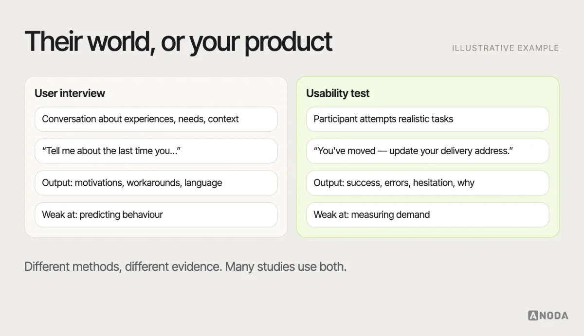
Method. Observing representative users as they attempt realistic tasks with a product or prototype, to find where they succeed, struggle or fail. It can be moderated or unmoderated, in person or remote. Not the same as a user interview, which asks about experiences rather than observing task performance. Our usability testing service plans, runs and analyses these studies.
User flow
Artefact. A diagram of the path a user takes through a product to reach a goal, including screens, decisions, entry points and alternative routes. Broader than a task flow; narrower than a journey map. Our guide to user flows covers how to map them.
User interview
Method. A one-to-one conversation with a user or potential user about their experiences, needs, behaviours and context. Interviews are best for understanding motivations and workarounds; they’re weak for predicting what people will do.
User research
Method. The broad practice of learning about users — their needs, behaviours, contexts and problems — through methods such as interviews, observation, surveys, analytics and testing, to inform product decisions. Our UX research work helps teams choose and run the right methods for the decision at hand.
User story
Artefact. A short description of a feature from the user’s perspective, commonly written as “As a [type of user], I want [goal] so that [reason].” User stories connect product requirements to user needs; they need acceptance criteria to be buildable.
UX (user experience)
Concept. The whole of a person’s experience with a product or service — whether they can find what they need, understand it, accomplish their goal and feel confident doing it — including everything before and after the interface. UX design shapes that experience through research, structure, interaction, content and interface decisions. Our UI/UX design work covers both layers together.
UX audit
Method. A structured review of an existing product’s experience against usability principles, accessibility standards, analytics and business goals, producing a prioritised list of problems and recommendations. It’s a good starting point when a team suspects many problems and needs to decide what to fix or test first.
UX writing
Concept. Writing the text people read while using a product — labels, buttons, instructions, error messages, notifications. Closely related to microcopy and content design, with a focus on helping users complete tasks.
V
Visual hierarchy
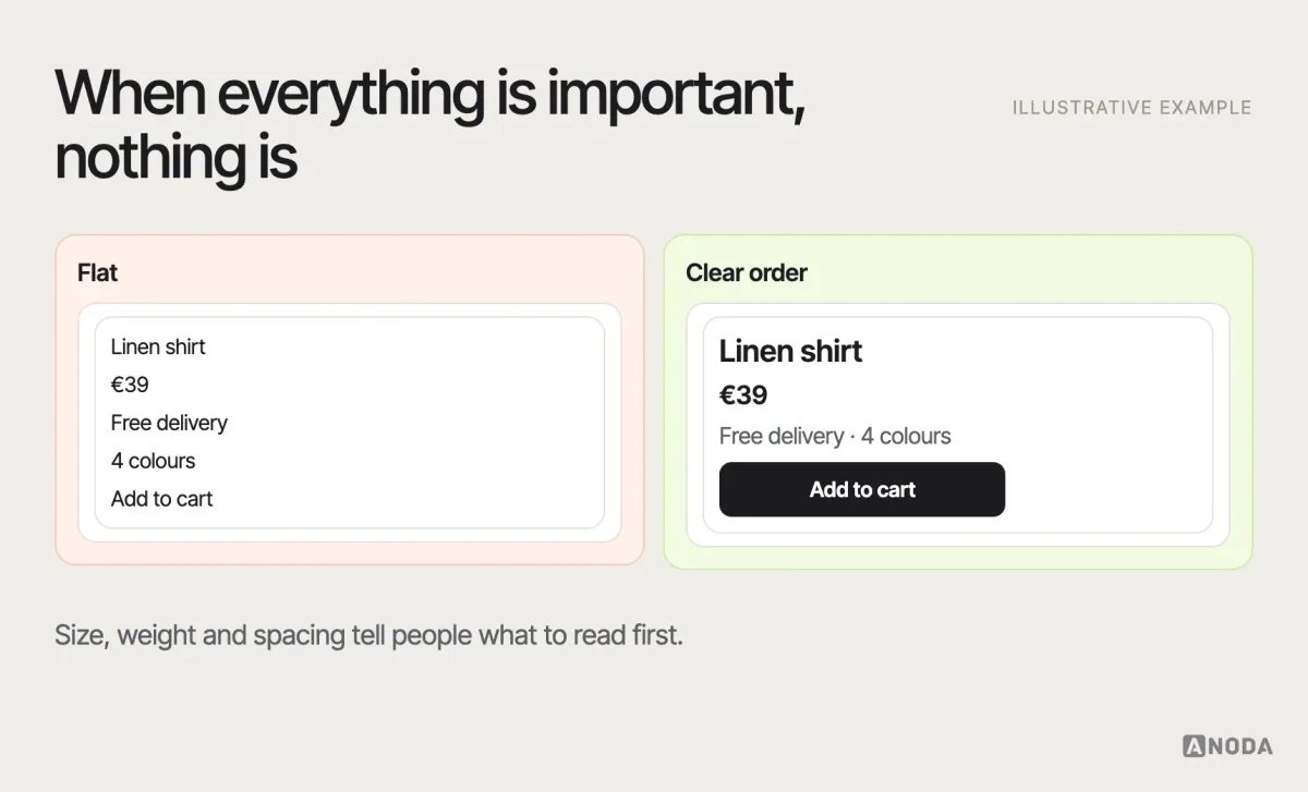
Concept. The arrangement of elements so their order of importance is clear — through size, weight, colour, contrast, spacing and position. A clear hierarchy tells people what to look at first, second and last.
Voice and tone
Concept. Voice is a product’s consistent personality in writing; tone is how that voice adapts to the situation — lighter in a welcome message, calmer and plainer in an error. Documented voice and tone keep microcopy consistent across teams.
W
Wayfinding
Concept. How people orient themselves and find their way through a space — physical or digital. In interfaces, wayfinding relies on navigation, clear page titles, location cues such as highlighted menu items and breadcrumbs, and consistent layout.
WCAG (Web Content Accessibility Guidelines)
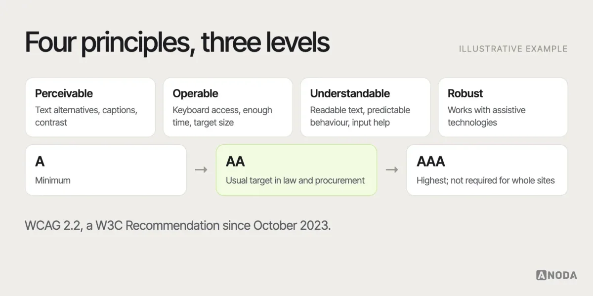
Concept. The international standard for digital accessibility, published by the W3C. WCAG 2.2, a W3C Recommendation since October 2023, organises requirements under four principles — perceivable, operable, understandable and robust — with three conformance levels: A, AA and AAA. Level AA is the most common target in laws and procurement.
Whitespace
Concept. The empty space between and around elements in a layout. Whitespace is not wasted space: it groups related items, separates unrelated ones and gives the eye a place to rest, which makes content easier to scan.
Wireframe
Artefact. A simplified, usually greyscale layout of a screen showing structure, content priority and functionality without visual design. Wireframes are for deciding what goes where; mockups show how it looks; prototypes show how it behaves.
Wizard
Concept. A step-by-step interface that guides users through a long or unfamiliar task one stage at a time, such as an application or setup. Wizards work for linear, one-off tasks; they frustrate when people need to jump between steps or edit later.
Z
Z-pattern
Concept. A scanning path on simple, sparse layouts — across the top, diagonally down, then across the bottom — often referenced when placing a logo, headline and call to action on landing pages. Like the F-pattern, it describes how people may scan when the layout gives them little else to go on; strong hierarchy matters more than the letter.
Keep your team’s language working
A glossary on a web page is a starting point. The language that matters is the one your team uses every day, and it drifts unless someone looks after it. A few habits help, as recommendations:
- Agree on the contested words first. Prototype, MVP, persona, done — the terms that cause the most misunderstandings in your team deserve a one-line definition everyone has seen.
- Separate methods, artefacts, metrics and outcomes. “We did personas” describes an artefact, not a finding. “Task success rose” is a metric, not an outcome for the business. Keeping the types apart makes plans and reports clearer.
- Link terms to decisions. A definition is more useful when it says what the team does with it: “We run a usability test before any change to checkout.”
- Keep the glossary where work happens. In the design system documentation, the product wiki or the onboarding pack for new hires — not in a forgotten document.
- Revisit technical and platform terms. Accessibility standards, platform guidelines and tools change. Check dates and versions before quoting a requirement.
Shared language won’t end every debate, and it shouldn’t. It makes the debates about the product instead of about the words.
UI/UX design
Know the vocabulary, need the product?
We turn product requirements and a shared language into a coherent experience and interface — research, structure, flows and UI, designed together.
How ANODA turns shared language into a coherent product
In MantisHub, our design work connected issue workflows, filters, notes and related actions with a coherent interface and UI kit for client development. The words and patterns describe the same product all the way through the flow and handoff. That is what your team gains from ANODA: decisions made concrete, fewer gaps left for engineering to interpret and an experience that stays consistent as features grow.
From definitions to decisions
A glossary makes it easier to talk about user experience. It doesn’t make the decisions. When the team is comparing research methods without evidence about users, UX research is the next step. When there’s a prototype or live product and the question is where people struggle, usability testing turns observed failures into prioritised changes.

Usability testing
Want to see where your users struggle?
We test the critical tasks in your product with representative users and turn what we observe into prioritised design changes.
Use the same words for the same things
UX terms overlap and evolve, and different teams use them differently. That’s normal. What costs time and money is a team that uses one word for three things without noticing. Use terms consistently inside the team, know which kind of thing each term names — a method, an artefact, a metric, a principle or a concept — link them to the decisions they affect, and check evolving technical and platform language before you rely on it.
Written by