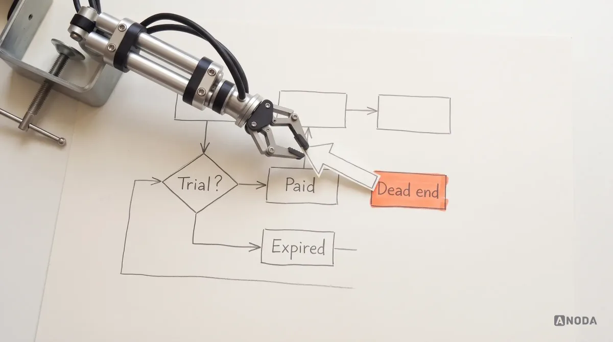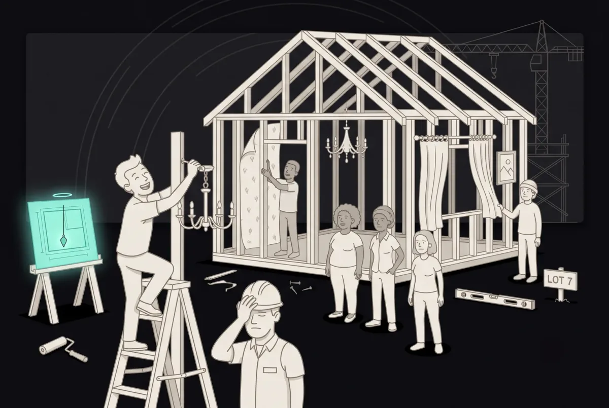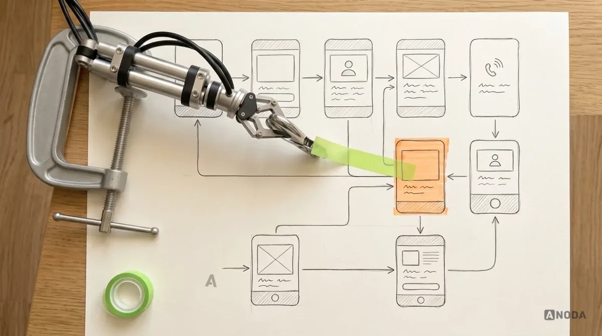
In short
A user flow maps how a person moves through a product to get one thing done: where they enter, what they see and decide at each step, what happens when something goes wrong, and where they end up. Drawing it before polished screens makes roles, states, branches and dead ends visible while they're cheap to fix. This guide explains what goes into a flow, the common types, how it differs from journey maps and sitemaps, worked examples and how to create one.
In this article
- What is a user flow, in plain terms
- What goes into a user flow
- Types of user flows
- User flow vs journey map vs sitemap vs wireframe
- User flow vs flowchart
- Why create a user flow before the screens
- The structural source of truth
- A worked example: password reset
- User flows and states
- A worked example: sign-up
- A worked example with roles: inviting a teammate
- A worked example with AI: generating a draft
- A worked example with money: a failed renewal
- User flows for mobile apps
- Reading a user flow: what to look for in a review
- The flows every product has
- How to create a user flow
- From flow to everything else
- Who creates the user flow
- Why a good flow looks a little ugly
- How detailed should a user flow be?
- When you need a user flow
- Common user flow mistakes
- Why ANODA maps the states between the screens
- User flows in a live product
- Keeping user flows alive
A user flow is a diagram of the path a person takes through a product to complete one task. It starts where they enter, shows every step, screen and decision along the way, includes what happens when things go wrong, and ends where they get what they came for, or give up. It shows how the product behaves, not how it looks.
That last sentence is the point most teams miss. A user flow is not a set of pretty screens joined by arrows. It is the logic underneath them: who can do what, in which order, under which conditions, and what the product does in response. Screens can be redrawn in an afternoon. Logic that was never mapped turns up later as a bug report, a support ticket, or a feature that works for the product manager and nobody else.
This guide covers the basics properly: what a user flow is, what goes into one, the main types, how it differs from the other diagrams people confuse it with, a few worked examples, and how to create your first flow. If you already know the basics and want the full mapping method, our user flow mapping guide goes deeper.
What is a user flow, in plain terms
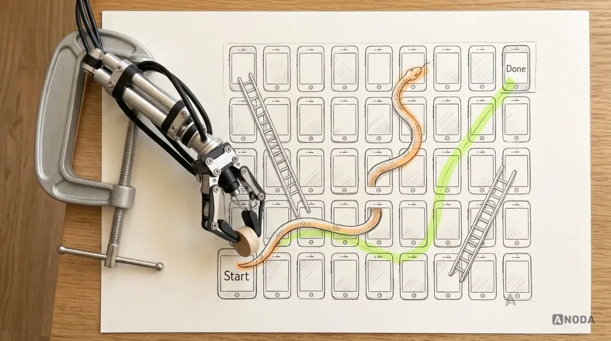
Remember Snakes and Ladders? The board shows every square, every ladder that skips you ahead and every snake that sends you back. You can see the whole game before you roll the dice. A user flow does the same for a task in your product: it shows every step, every shortcut and every slide back to the start, before anyone plays.
More formally, a user flow describes:
- The goal. One task a user wants to complete, such as signing up, paying an invoice or inviting a colleague.
- The entry points. Where users start: an ad, an email link, the home screen, a notification, a shared link.
- The steps. Each screen, form or action on the way.
- The decisions. Points where the path branches, because of what the user chooses or what the system knows.
- The system’s actions. Validation, loading, sending an email, checking a permission, charging a card.
- The unhappy paths. Errors, empty states, timeouts, rejections, and how the user recovers.
- The end states. Success, a saved draft, a dead end, an exit.
A flow is about one task. A product has many flows, and together they describe how the whole product behaves.
What goes into a user flow
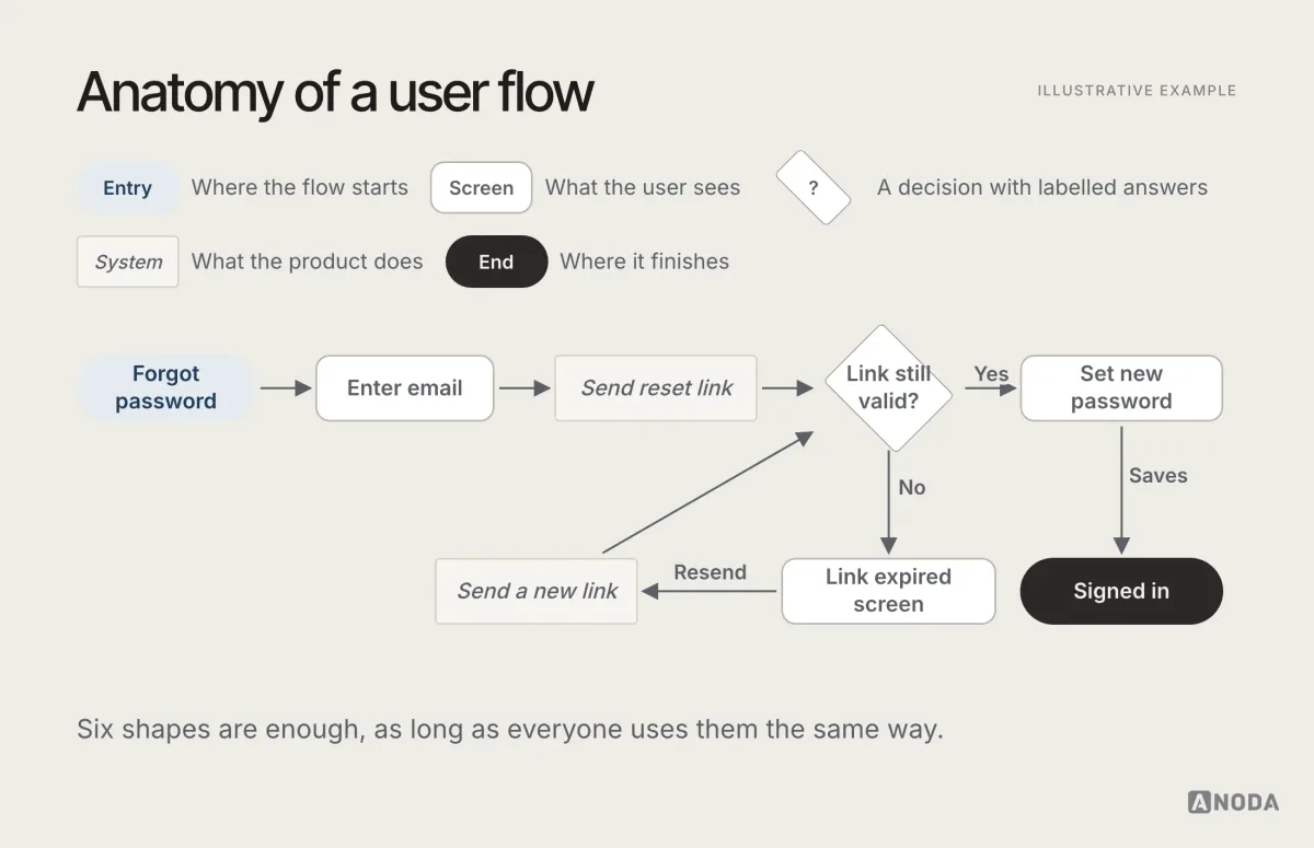
The building blocks are simple. Most teams use a small set of shapes, and the exact notation matters less than using it consistently.
- Entry point. Where the flow starts. Often a rounded shape or a labelled arrow coming in from outside.
- Screen or step. A rectangle for each screen, state or page the user sees.
- Decision. A diamond with a question: “Has an account?”, “Payment approved?”, “Is admin?”. Each outgoing arrow is labelled with an answer.
- System action. Something the product does without the user seeing a new screen: validation, an API call, an email sent. Often a different shape or colour.
- Arrow. The direction of movement, labelled with the action that causes it: “Taps Continue”, “Link expires”, “Card declined”.
- End state. Where the flow finishes, successfully or not.
A good flow also carries a few kinds of information that don’t have their own shape but change the path:
- Roles. An admin and a viewer may see different steps in the same flow.
- States. A document can be draft, in review or published. A subscription can be trial, active, past due or cancelled. The flow changes with the state.
- Rules. Validation, limits, required fields, what happens after three wrong passwords.
- Dependencies. Anything that relies on another system: a payment provider, an email service, an identity check.
Leave these out and the diagram looks tidy. It also stops being true.
Types of user flows
The term “user flow” is used for a few related diagrams. They serve different purposes, and it helps to know which one you are drawing.
Task flow. A single, linear task with no branches, usually drawn to agree on the basic steps. “Open app → choose product → add to basket → pay → confirmation”. Useful early on, and dangerously incomplete if it stays that way.
User flow. The task with its branches, decisions, errors and roles. This is what most people mean, and it’s what this guide is about.
Wireflow. A user flow where each step is a low-fidelity wireframe instead of a box. It shows structure and layout together, which makes it good for reviews with people who find abstract boxes hard to read.
Screen flow. The final screens joined by arrows, usually in a design tool. It’s useful for handover, but it tends to show only the paths someone designed screens for, which is exactly how missing states slip through.
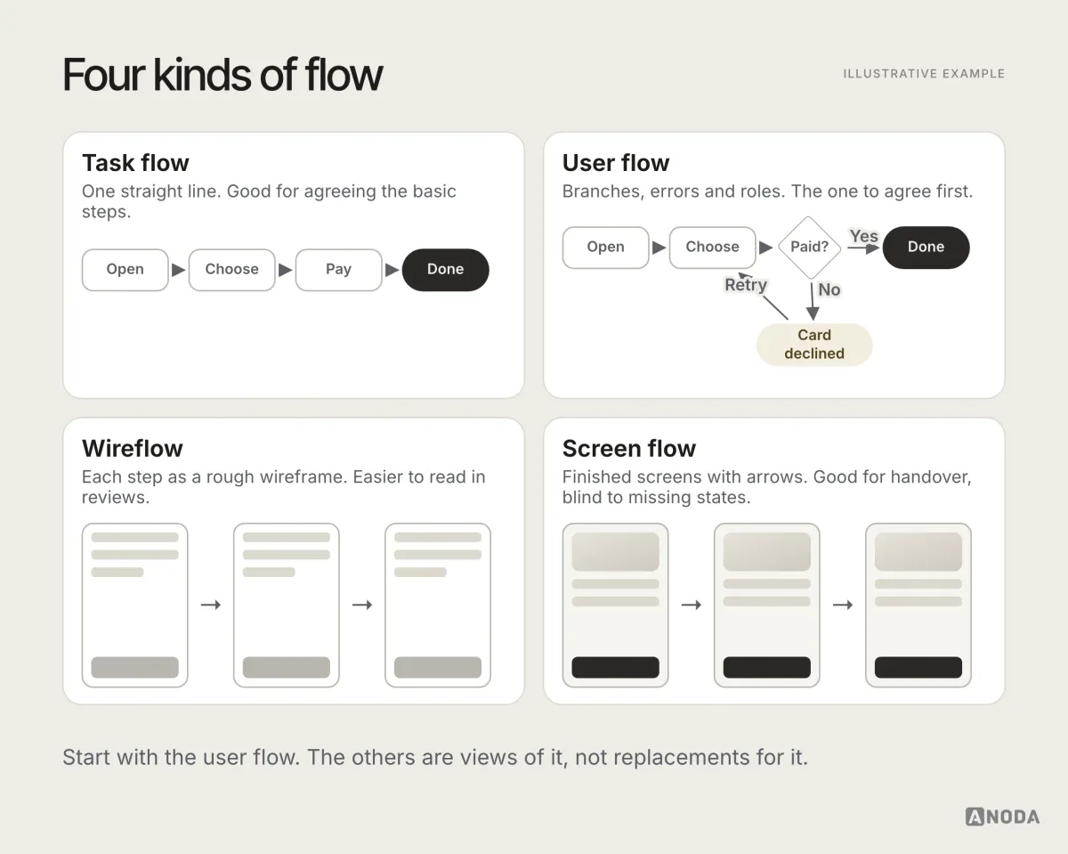
A practical rule: agree the user flow first, then draw wireframes or screens for its steps. Going the other way round, from finished screens to a flow, usually produces a diagram of the happy path with arrows added afterwards.
User flow vs journey map vs sitemap vs wireframe
These four get confused constantly, often in the same meeting. They answer different questions.
| Artefact | Answers |
|---|---|
| Journey map | The experience over time |
| Sitemap | What exists, and where |
| User flow | How one task gets done |
| Wireframe | What’s on one screen |
A journey map covers a person’s whole experience with a service, including things that happen outside your product: hearing about it, comparing options, calling support, renewing. It includes emotions and pain points. It helps decide what to build.
A sitemap shows what exists and how it’s organised: sections, pages, hierarchy. It says nothing about the order someone moves through them or what happens when something fails.
A user flow takes one task and maps how it works in detail. It helps decide how to build it.
A wireframe shows the layout of one screen. It says what’s on the screen, not how you got there or where you go next.
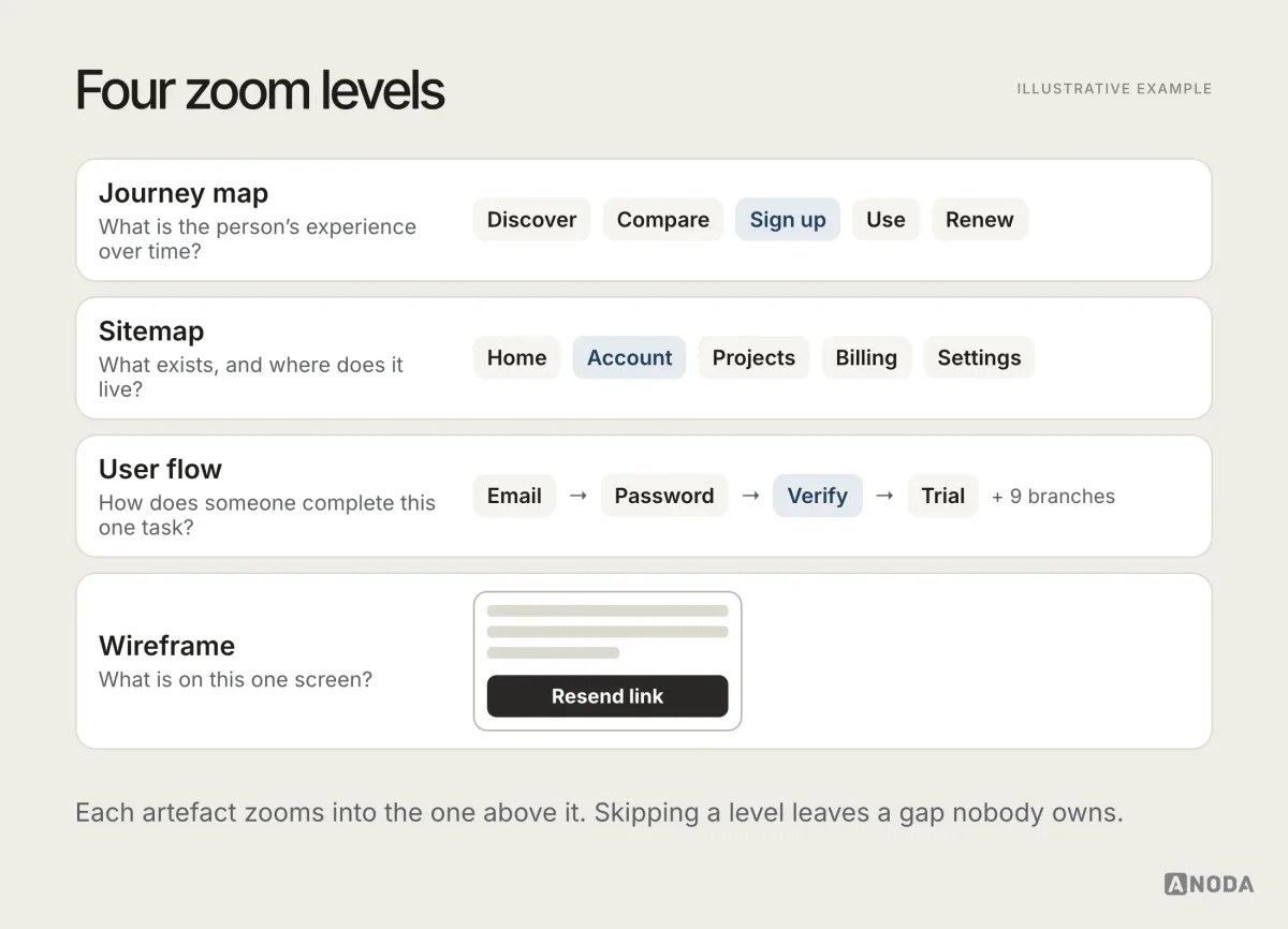
They work best together. The journey map tells you which moments matter. The sitemap tells you where things live. The user flow tells you how each important task works. The wireframes show what each step looks like. Skip the flow, and the wireframes end up inventing the logic on the fly.
User flow vs flowchart
A user flow is a kind of flowchart, and it borrows the same basic shapes. The difference is the point of view. A general flowchart can describe any process: how an invoice is approved, how a server handles a request, how a factory line works. A user flow is always told from the user’s side of the screen: what they see, what they decide, and what the product does in response.
That point of view matters. A system flowchart might say “retry payment three times”. A user flow adds what the customer sees during those retries, what message they get when all three fail, and where they can fix it. Both are useful. Engineering often needs the system diagram as well. But only the user flow tells you whether the experience makes sense.
Why create a user flow before the screens
Designing polished screens first feels productive. There is something to show, something to comment on, something that looks like progress. It is also the most expensive order to work in.
Here is why the flow comes first:
- It is cheap to change. Moving a box and an arrow takes seconds. Reworking a set of finished screens takes days, and reworking built features takes a release.
- It makes gaps visible. A missing error state is obvious in a flow, because an arrow has nowhere to go. In a set of screens, it is invisible, because nobody drew the screen.
- It focuses the conversation. People discuss polished screens by talking about colours and fonts. They discuss a flow by talking about logic and rules, which is the conversation you need first.
- It aligns the team. Product, design, engineering and QA can all read the same flow. It becomes the shared answer to “what happens if…?”
- It feeds everything downstream. Wireframes, specifications, test cases, analytics events and acceptance criteria can all be derived from a good flow.
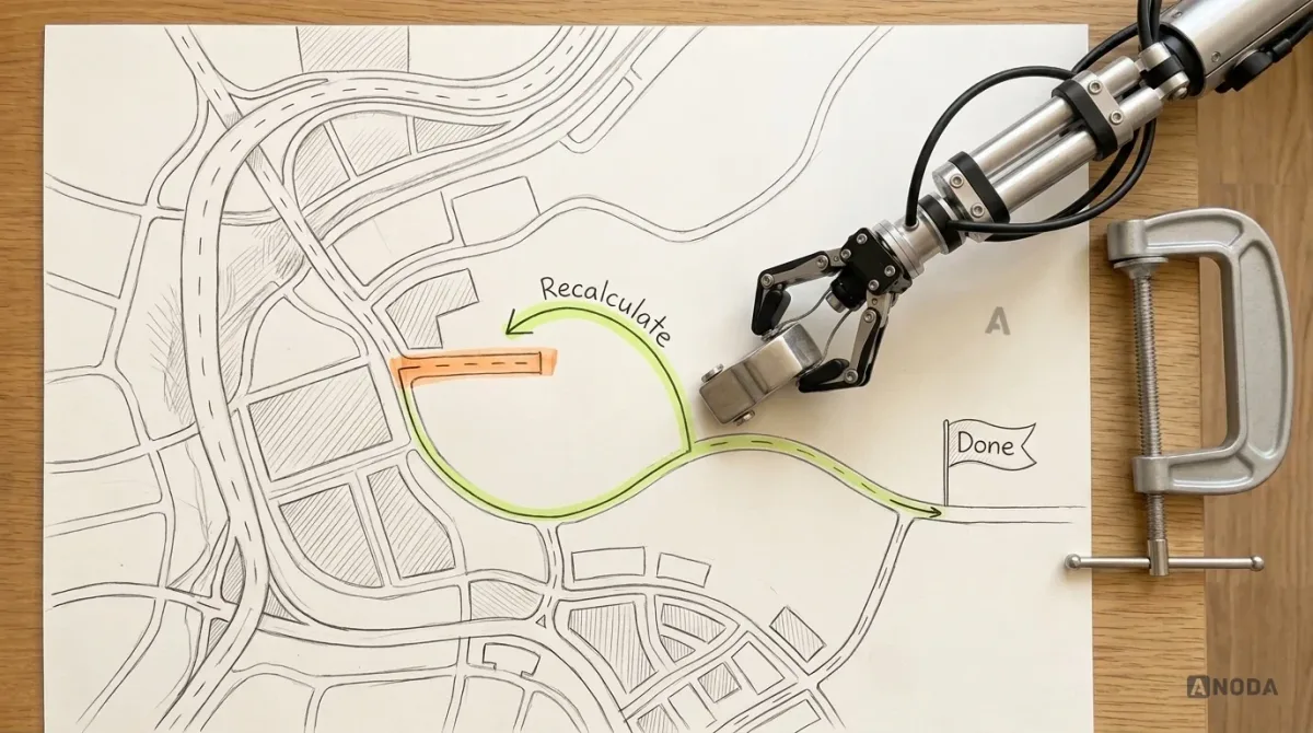
Think of a sat-nav. Before you set off, it has already worked out the route, the turns and what to do if you miss one. Nobody would ship a sat-nav that only knew the route when you drove perfectly. Yet teams regularly ship products whose designers only mapped the route for a user who never makes a mistake.
The structural source of truth
A user flow is more than a design artefact. On a healthy team, it is the structural source of truth that different people read for different reasons:
- Product managers check that the flow does what the business needs and respects the rules.
- Designers use it to decide which screens and states to design, and in what order.
- Engineers read it to understand the logic, the states and the edge cases before estimating.
- QA turns its branches into test cases.
- Analytics uses its steps to define funnel events.
- AI coding tools get a clearer brief. A flow that spells out roles, states and branches produces far more reliable generated code than a pile of screenshots and a chat history.
That last point is newer, and it matters more every month. When part of the implementation is generated, the flow is often the only place where the logic is written down unambiguously. Without it, each tool, and each person, fills the gaps differently.
A worked example: password reset
The anatomy diagram above uses password reset for a reason: it’s small, everyone knows it, and it still has more branches than most teams draw. The happy path is four steps: tap “Forgot password”, enter email, open the link, set a new password. The mapped flow adds the rest:
- Unknown email. Show the same confirmation as for a known one, so nobody can use the form to check who has an account.
- Email never arrives. A resend option, limited so it can’t be abused, and a hint to check spam.
- Link opened on another device. It should still work there.
- Link expired. A clear message and a one-tap way to get a new one, not a generic error page.
- New password rejected. Rules visible before typing, and a specific reason if it fails.
- Too many attempts. A cooling-off period, with a message saying when to try again.
- Success. Tell the user clearly to sign in through the normal mechanism after resetting the password, and apply the agreed session-invalidation policy.
Seven branches for a feature most people consider solved. Each one is a support ticket in a product that skipped it.
User flows and states
Many flows are really about objects changing state. An order is placed, paid, packed, shipped, delivered, returned. A document is drafted, submitted, approved, rejected, archived. A subscription is on trial, active, past due, paused or cancelled. Each state decides which actions are possible, who can take them, and what the user sees.
Most confusing product behaviour comes from states nobody listed. What does a customer see if they open an order that was cancelled by the warehouse? Can a document be edited while it’s in review? What happens to a paused subscription’s data? If the flow doesn’t answer, someone will answer it in code, differently in each place.
A simple way to handle this is to draw a small state diagram next to the flow for any object that changes over time. Each state gets a box. Each transition gets an arrow, labelled with who or what causes it. Then, in the user flow, every decision that depends on the state points back to that diagram.
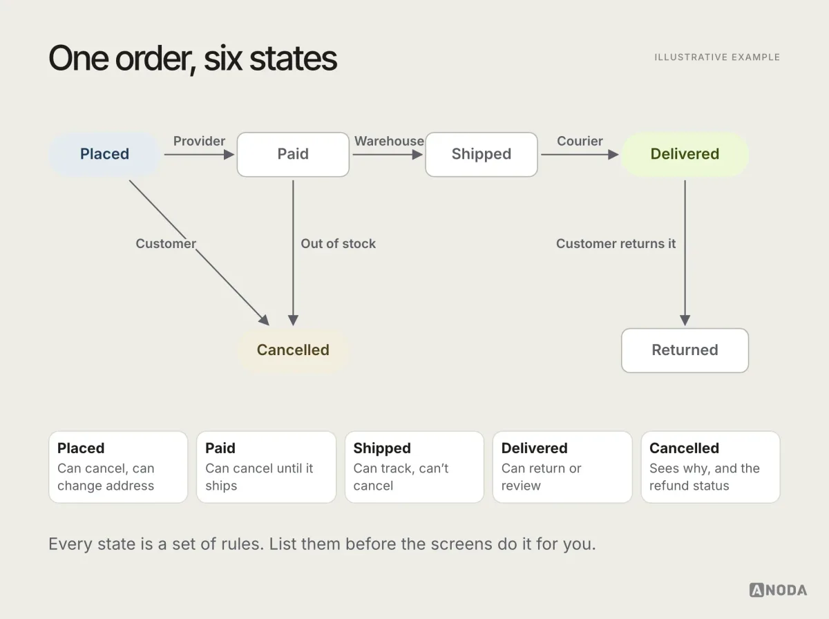
This takes an hour. It saves weeks of “but what if the order is already shipped?” arriving as bugs after launch.
A worked example: sign-up
Here is a sign-up flow for an illustrative subscription app, the kind of flow that looks trivial until you map it.
A task flow would say: “Enter email → set password → verify email → start trial”. Four steps. Now the user flow:
- Entry. From the pricing page, a “Start free trial” button, or an invitation link from a colleague.
- Email. User enters an email. The system checks whether it already has an account. If yes, the flow branches to sign-in instead of showing an error.
- Password or passkey. User sets a password or creates a passkey. Rules are shown before typing, not after failing.
- Verification. The system sends a verification email. What if it never arrives? A resend option, with a limit. What if the link is opened on another device? It still works. What if it’s opened after it expires? A new one can be requested in one tap.
- Invitation branch. If the user came from an invitation, they skip plan choice and join the inviter’s workspace with the role the inviter chose.
- Trial start. The account is created, the trial starts, and the user lands on the first useful screen, not an empty dashboard.
- End states. Active trial; joined workspace; abandoned at verification, with a reminder email later.
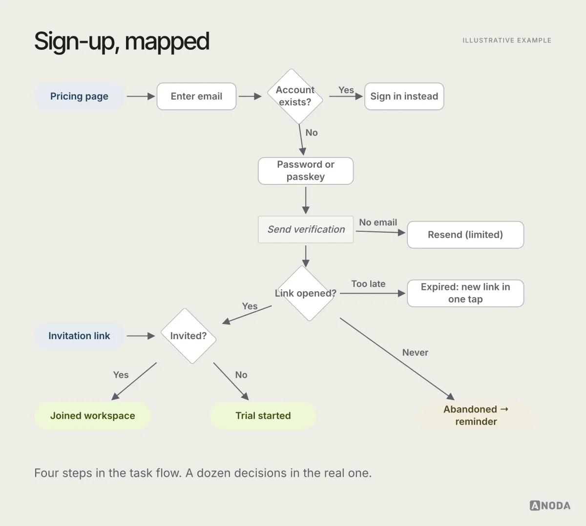
The difference between the four-step version and the mapped one is exactly the difference between “sign-up works” and “sign-up works for everyone who tries it”. Every branch above is a place where users get stuck in products that didn’t map it.
A worked example with roles: inviting a teammate
Roles are where flows get interesting, and where unmapped products break most often. Consider inviting a teammate to a workspace in an illustrative B2B product.
- Who can invite? Owners and admins. What does a member see if they try? A message explaining who can invite, and an option to ask an admin, rather than a missing button with no explanation.
- Which role can they give? An admin can invite members and viewers, but only an owner can invite another admin.
- What if the email already belongs to someone in another workspace? They get an invitation to join this one as well.
- What if the workspace is on a plan with a seat limit, and it’s full? The owner sees an upgrade path. The admin sees a message to ask the owner.
- What if the invitation isn’t accepted? It expires after a set time, and the inviter can resend or cancel it.
- What does the invited person see? A landing screen that says who invited them, to what, and with which role.
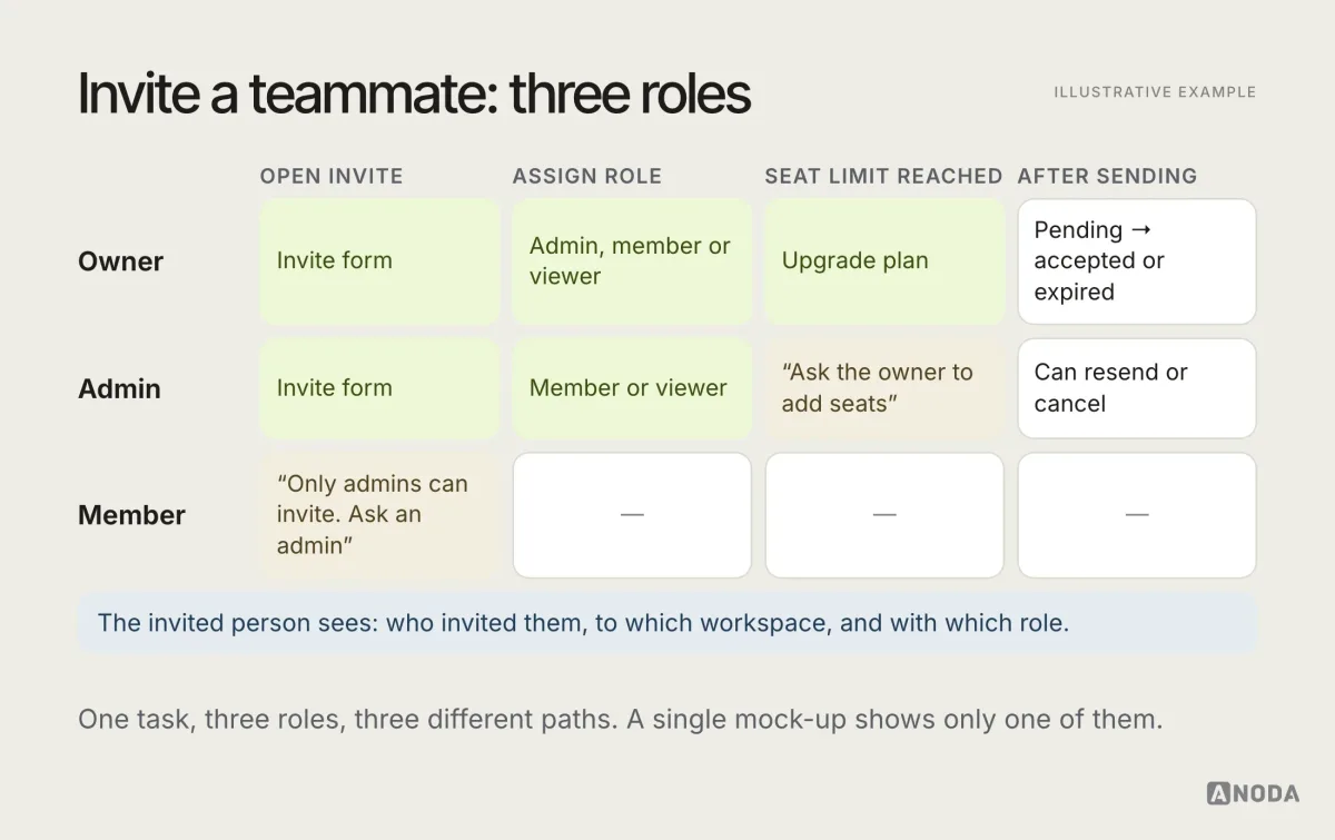
Notice how many of those answers are business decisions, not design decisions. Who can invite whom is a product rule. What happens at the seat limit is a pricing decision. A user flow forces those questions to be asked, and answered, before a designer draws a button that engineering then has to guess about.
A worked example with AI: generating a draft
AI features need flows more than most, because their behaviour is less predictable. Take an illustrative feature that drafts a reply to a customer message.
- Entry. The user opens a customer conversation and taps “Draft a reply”.
- Input. The system gathers context: the conversation, the customer’s order, the company’s tone guidelines. The flow should say what the AI can and cannot see.
- Generating. A loading state that says what’s happening and can be cancelled.
- Result. The draft appears in the reply box, clearly marked as a draft, never sent automatically.
- Review. The user edits, regenerates, or discards. Each choice is a branch, and each is worth tracking.
- Failure. The AI can’t produce a useful draft, or the service times out. The user gets a clear message and can write the reply themselves, with nothing lost.
- Limits. The user has used their monthly allowance. The flow says what they see, and whether an admin gets told.
- Send. The user sends the reply. The system records that it started as an AI draft, if the business needs to know.
Without a flow, AI features tend to be designed as a single magical moment: tap the button, get the perfect answer. The flow is where the team plans for the ordinary days, when the answer isn’t perfect.
A worked example with money: a failed renewal
Flows involving money deserve particular care, because every unmapped branch is either lost revenue or an angry customer. Take an illustrative subscription renewal where the card is declined.
- Renewal attempt. The system tries to charge the saved card on the renewal date.
- Declined. The payment provider declines the charge. The subscription moves to “past due”, not straight to “cancelled”.
- Retry. The system retries on a schedule the business decides, without spamming the customer.
- Notify. The account owner gets an email and an in-app message explaining what happened and how to fix it in one step. Other members of the account see a neutral notice, not billing details they can’t act on.
- Grace period. For a set number of days, the product keeps working, perhaps with a banner. The business decides how long, and what, if anything, is limited.
- Card updated. The owner updates the card, the charge succeeds, and the subscription returns to “active” with no data lost.
- Grace period ends. If nothing changes, the subscription moves to “cancelled” or a restricted mode. The customer can still export their data and reactivate later.
Every number in that flow, retry schedule, grace period, what gets restricted, is a business decision. The flow is where those decisions become visible and get made on purpose, instead of being set by whatever the billing tool does by default.
User flows for mobile apps
Mobile flows have a few extra branches that web flows often don’t, and they are the ones most often forgotten:
- More entry points. Push notifications, deep links from email or messages, home screen widgets, shared links, the app being opened fresh after an update. Each can drop the user into the middle of a flow, sometimes before they’ve signed in.
- Interruptions. A call, a switch to another app, the phone locking. The flow should say what happens to half-finished work when the user comes back, and when the app was closed by the system in the meantime.
- Permissions. Camera, location, notifications, contacts. Each permission request is a decision point with a “no” branch that needs somewhere sensible to go.
- Connectivity. Offline, slow, reconnecting. What can the user still do, what gets queued, and what they see.
- Platform differences. Back behaviour, system sheets and gestures differ between iOS and Android. The flow may be the same; the transitions may not be.
A mobile flow that ignores these works in the design review and fails on the bus.
Reading a user flow: what to look for in a review
A flow review is not a design critique. The questions are about logic, not style. When a flow is shared for review, walk it with these questions:
- Does every arrow end somewhere? Follow each branch to an end state. Any branch that stops is a future dead end.
- Can every step be reached? Look for boxes with no arrows coming in.
- Are all roles covered? Pick each role in turn and walk the flow as them.
- Are the errors realistic? Is there a branch for what actually goes wrong, such as timeouts, declines and duplicates, not just “invalid input”?
- Is the system’s behaviour explicit? When does validation happen? When is data saved? When is the customer charged?
- Are the end states clear to the user? After each end state, does the user know what happened and what to do next?
- Does it match the rules? Would the business, the legal team or the support team recognise the rules in it?
Reviewers who ask these questions find more problems in half an hour than a week of screen reviews would.
The flows every product has
Whatever the product, a handful of flows appear almost everywhere, and they are worth mapping properly first because they carry the most traffic and the most risk:
- Sign-up and sign-in, including invitations, passkeys or passwords, verification and account recovery.
- The core task, the one thing the product exists to do: send the payment, book the appointment, publish the post, run the report.
- Payment and subscription, including trials, upgrades, downgrades, failed payments and cancellation.
- Settings and permissions, especially anything that changes who can see or do what.
- Notifications and return visits, the flows that bring people back and drop them into the right place.
- Leaving, deleting data or an account, with clear consequences and the product’s applicable retention and deletion rules.
If these six are mapped, reviewed and kept current, most of the product’s behaviour is written down. Everything else can be mapped as it changes.
How to create a user flow
You don’t need special software, and you don’t need a perfect notation. You need a clear task, honest questions and a willingness to keep adding branches until the map matches reality. A practical order:
- Pick one task and one goal. “User pays an overdue invoice”, not “billing”.
- List who does it. Every role that can start, touch or be affected by the task.
- List the entry points. Every way users arrive: links, notifications, screens, other flows.
- Draw the happy path. The simplest successful route, step by step.
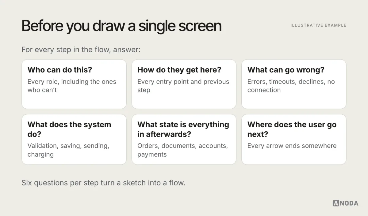
- Ask “what if?” at every step. What if the user cancels, goes back, loses connection, enters something invalid, lacks permission, comes back tomorrow?
- Add the system’s actions and states. Validation, loading, sending, charging, and what state each object is in afterwards.
- Mark every end state. Success, partial success, failure, abandonment. Make sure every arrow ends somewhere.
- Review it with product, engineering and QA. Each will find branches the others missed.
- Only then design the screens. One per step and state, including the unhappy ones.
- Keep it up to date. When the product changes, the flow changes first.
On tools: whiteboards and sticky notes are great for the first pass with the team. For a flow people will maintain, use a diagramming tool the whole team can open and comment on. Keep it next to the designs, not in a separate place nobody visits.
From flow to everything else
A good user flow is the start of several other deliverables, not a document that gets filed after the kick-off. Most of what a team needs to build a feature can be derived from it:
- Wireframes. One per step and per important state. Because the flow lists the states, the error and empty screens get designed instead of improvised.
- Acceptance criteria. Each branch becomes a criterion: “Given an expired link, when the user opens it, then they can request a new one in one tap”.
- Test cases. QA turns each path through the flow into a test, including the unhappy ones.
- Analytics events. Each step becomes a funnel event, so the team can see where people drop out.
- Support content. The error branches tell support which questions to expect and what the product says in each case.
- Implementation scope. Engineering can estimate from the flow, and the branches show where the complexity really is.
When all of these come from the same flow, they agree with each other. When they are written separately, from memory and meetings, they don’t, and the disagreements surface as bugs.
Who creates the user flow
Usually the product designer draws it, but it is not a solo job. The product manager brings the business rules and priorities. An engineer brings the system’s constraints and the states the data can be in. QA brings the questions nobody else thought to ask. Support, if you have them, bring the problems customers actually report.
The most useful flow sessions are short and practical: one task, the people who know the rules, a shared board, and a designer who keeps asking “and then what?” until every arrow ends somewhere.
Why a good flow looks a little ugly
A user flow should look like a working document, not a finished poster. Boxes, arrows, short labels, a few colours for roles or states. That plainness is deliberate. The moment a flow starts to look polished, people stop questioning its logic and start commenting on its layout, and a diagram nobody feels allowed to change stops being a working tool.
Keep the visual language minimal and consistent: one shape per kind of element, one colour per role or state, labels written the way the team talks. Put the effort into completeness, not decoration. A flow that is ugly and right is worth ten that are beautiful and missing the error branches.
How detailed should a user flow be?
Detailed enough that someone who wasn’t in the room could build the feature without asking “what happens if…?”. Not so detailed that every tooltip and animation gets a box.
A useful test is to walk through the flow with an engineer and a QA specialist. If they keep asking questions the flow doesn’t answer, it needs more detail. If they’re reading boxes that say “Button turns blue on hover”, it has too much.
Some teams keep two levels: a high-level flow that shows the main path and major branches on one page, and detailed sub-flows for complex parts such as payment, permissions or verification. That keeps the overview readable while still recording the logic that matters.
When you need a user flow
Not every change needs a full flow. Changing a label doesn’t. But these situations almost always do:
- A new feature with more than a couple of steps.
- Anything involving roles or permissions.
- Anything involving money: payments, subscriptions, refunds, trials.
- Anything with states that change over time: orders, documents, approvals, bookings.
- Anything depending on another system: payment providers, identity checks, integrations.
- A redesign, where the old logic has to be understood before it’s replaced.
- A live product with complaints about people getting stuck, where the flow shows where the dead ends are.
If engineering keeps asking “what should happen here?”, that is not a sign of a difficult engineer. It is a sign of a missing flow.
Common user flow mistakes
Most bad flows are not wrong. They’re incomplete in the same predictable ways:
- Only the happy path. The flow works perfectly for a user who never makes a mistake, never loses connection and never changes their mind.
- Screens instead of logic. Beautiful screens joined by arrows, with the decisions hidden between them.
- One role only. The flow is drawn for the person who uses the feature most, and breaks for everyone else.
- Arrows to nowhere. Branches that stop without an end state, which in the product become dead ends.
- Unreachable steps. Screens that exist in the design but that no arrow leads to.
- No system actions. The flow shows what users do, but not what the product does in response, so nobody knows when validation or charging happens.
- Drawn once, never updated. The flow describes the product as it was planned a year ago.
A choose-your-own-adventure book with a page that says “turn to page 94”, where page 94 doesn’t exist, is not a clever twist. It’s a printing error. A product with an arrow to nowhere is the same thing, except users pay for it.
Audit check
Take one important task in your product and map it from every entry point, for every role, including every error. Then compare the map with what the product actually does.
Failure evidence
Branches nobody can answer, roles that hit a missing button with no explanation, errors that lead nowhere, screens no arrow reaches, and behaviour that differs from what the team believed.
Correction pattern
Complete the flow with roles, states, rules and end states, fix the dead ends in the flow first, then design and build the missing screens from it.
UI/UX design
Map the logic before you polish the screens.
We build and maintain user flows that connect your business rules, permissions, wireframes and implementation scope, so product, design and engineering work from the same map.
Why ANODA maps the states between the screens
A new visual style cannot resolve who may approve, when a customer is charged or what happens after a failed action. ANODA connects the business rule, the user action and the visible state before engineering has to interpret the gap.
For Payyro, our design work separated customer, donor, vendor and administrator journeys, including bill funding, full funding, administrator verification and vendor payout as distinct steps. That distinction is the value of the flow: each person sees the right next action, and the handoff records what must happen between them. Bring us a workflow that gets stuck between roles; we turn it into a clear experience and buildable design foundation.
User flows in a live product
User flows aren’t only for new features. Mapping the flows of a product that already exists is one of the fastest ways to understand why people get stuck in it.
Walk through each important task the way a real user would, from every entry point, in every role, and draw what actually happens. Often the map reveals things nobody on the team knew: a path that loops back to the start, a permission error with no explanation, a state the product can reach but no screen handles, two different ways of doing the same thing that behave differently.
Compare that map with analytics. The step where the flow gets complicated is often the step where the funnel drops. The flow tells you why the number is bad. The number tells you which part of the flow to fix first.
A live-product flow also makes a practical backlog. Each dead end, contradiction or missing state becomes a ticket with a clear description, taken straight from the map. Instead of “users are confused by billing”, the team gets “members who open Billing see an empty page with no explanation”. The second one can be fixed by Friday.
Keeping user flows alive
A flow that isn’t updated becomes misleading, which is worse than no flow at all. A few habits keep flows useful:
- Change the flow before the screens. When a feature changes, update the flow first, then the designs and the tickets.
- Link flows to tickets and designs. Anyone opening a ticket should be one click from the flow it implements.
- Name an owner. Usually the product designer, with the product manager signing off on the rules.
- Review flows in design reviews, not only screens.
- Retire what’s gone. Archive flows for removed features so they don’t confuse new team members.
Map how every role enters, acts, branches, recovers and exits, and resolve the dead ends and state changes before investing in final screens. The flow is the cheapest place your product will ever be wrong. For a deeper method, read our user flow mapping guide, or browse the ANODA UX blog for more.
Frequently asked questions
What is a user flow?
A user flow is a diagram of the path a person takes through a product to complete a task: where they enter, each step and screen along the way, the decisions and branches, what happens when something goes wrong, and where they end up. It shows how the product behaves, not how it looks.
What is the difference between a user flow and a user journey map?
A user journey map describes a person's whole experience with a service over time, including emotions and touchpoints outside the product. A user flow zooms into one task inside the product and maps every step, decision and state. Journey maps help decide what to build; user flows help decide how it works.
What should a user flow include?
An entry point, the steps and screens, decision points and branches, system actions such as validation or loading, error and recovery paths, the roles and permissions that change the path, and the end states. A flow that only shows the happy path is a sketch, not a flow.
When should you create a user flow?
Before polished screens. A user flow is cheapest to change when it's boxes and arrows. Create one when designing a new feature, when a feature touches several roles or states, when engineering keeps asking what should happen next, and when auditing a live product for dead ends.
Written by