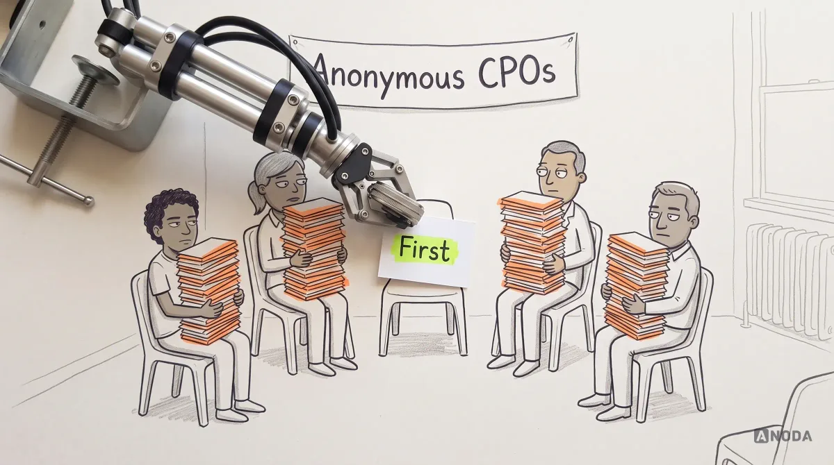
In short
Most teams call a sorted backlog a strategy, then wonder why the numbers stay flat. A product design strategy is the short set of choices that says which user problem you solve, what the experience must do, what you will not build and how you will judge the design. Here is the evidence it needs, how to rank problems and settle trade-offs, who owns which decision, how to test risky bets before paying for the build, and a practical framework to start with.
In this article
- What a product design strategy is, and what it is not
- A backlog is not a strategy, however well you sort it
- The evidence a product design strategy needs
- Choose one primary user and one job
- Experience principles that rule something out
- Strategic choices: what you will build, and what you won’t
- How to prioritise problems when the evidence disagrees
- The artifacts that carry the strategy
- Who owns and approves each decision
- Reduce the risk before you pay for the build
- How delivery teams use the strategy
- Measures and triggers that keep the strategy current
- Where product design strategies usually fail
- A practical framework to start with
A product design strategy is the short set of choices that says which user problem you will solve, what the experience has to do, what you will not build and how you will know the design paid off. It is not a feature list, not a roadmap and not a posher name for your design process. Most teams have all three of those and still no strategy. They have a backlog shaped by whoever spoke last, designers producing screens at speed and a quarterly review where everyone stares at flat numbers and agrees to “double down”.
In our work with product teams, the plot has not changed. Only the tools have. AI can now generate forty screens before lunch. It cannot tell you which three are worth building, or who the product is for. Skipping that decision is still the most expensive thing a product team does. You pay designers to draw the wrong thing, engineers to build it and marketing to bring people to it. Then you pay again for new users, because the first ones never reached value and left.
Hope is not a strategy. Neither is a backlog sorted by volume.
What a product design strategy is, and what it is not
A product design strategy is a coherent set of design choices and constraints that turns a business objective into a specific experience for a specific user. It answers five questions: which outcome matters, for whom, which problems we solve first, what the experience must do and refuse to do, and how we will judge success.
Search for the term and you get everything from vision statements to design-thinking diagrams, so draw the lines first. An airline’s strategy picks the routes: which cities, which passengers, business class or budget. The schedule says when the planes take off. The ground crew’s checklist says how to turn a plane around in forty minutes. Nobody at an airline confuses the three. Product teams do it every Monday.
| Term | The question it answers | Usual owner | How often it changes |
|---|---|---|---|
| Product strategy | Which market and customers, how we win and how we make money | CEO and product leadership | Yearly, or when the market moves |
| Product design strategy | Which user problems we solve, what experience we create, what we won’t build and how design success is judged | Product and design leads together | Quarterly, or when the evidence changes |
| UX strategy | How the experience stays consistent and usable across the whole product and its channels | Design leadership | Slowly |
| Roadmap | In what order, and roughly when, validated priorities ship | Product manager | Monthly |
| Product design process | How the team researches, designs, tests and hands over | Design team | Rarely |
Product strategy sits above this article: it decides the market, and the design strategy decides what that market’s users will actually experience. Execution sits below. Our guide to the product design process step by step covers how the work gets done once the choices exist, and the guide to building a UX roadmap covers how to sequence them. This is the part in between, the one both quietly assume somebody already did.

A quick test for any strategy document: swap your product’s name for a competitor’s. If every sentence is still true, you do not have a strategy. “We put users first and design intuitive experiences” fits every company on earth, including the ones going bust this quarter.
A backlog is not a strategy, however well you sort it
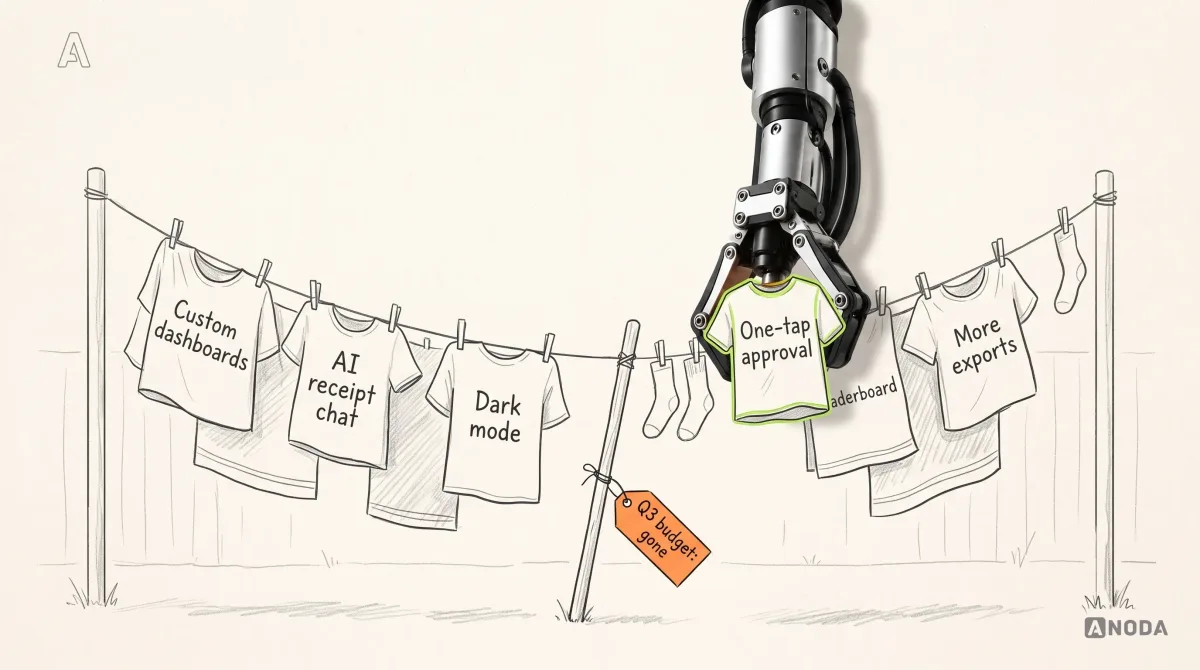
Most teams we meet do not lack ideas. They drown in them. Sales wants the feature the lost deal asked for. The biggest customer wants custom reports. The CEO saw an AI demo at a conference. Each request is reasonable on its own. Together they are a washing line everyone hung their laundry on: it sags into the mud, and the product manager is propping it up with a stick, hoping it holds until the release.
A backlog records what people asked for. A strategy decides what the product is for. When the second is missing, the first takes over, and whoever shouts loudest wins: the loudest customer, the most senior opinion, the shiniest demo.
The cost lands in three places. You pay to design and build features that do not move the outcome. You pay to maintain them forever, because nobody dares remove something a customer once asked for. And you pay for every acquired user who could not find the one thing they came for under everything somebody else asked for.
Every feature you do not say no to, you pay for twice: once to build it and then every sprint after that.
The evidence a product design strategy needs
A detective who arrests whoever shouts loudest in the interview room closes cases fast and convicts the wrong people. A strategy built on opinions works the same way: quick, confident and aimed at the wrong suspect.
Collect what you already know, and be honest about how well you know it. Seven kinds of evidence feed a product design strategy, and each feeds a different decision:
- User evidence. Interviews, observed tasks, support tickets, recordings, spreadsheet workarounds. Who struggles, with which job, how often.
- Market evidence. How competitors and substitutes solve the same job. What is table stakes and where you can differ.
- Business evidence. The objective, revenue model, conversion and churn by segment. Which outcome the design has to move.
- Brand evidence. What the company promises. It limits the tone and the kind of experience that would feel like yours.
- Technical evidence. Architecture, data quality, integrations, performance. What each choice will really cost.
- Operational evidence. Who supports, sells and onboards, and what a design does to their workload. It stops a “simple” feature that triples support calls.
- Product evidence. Analytics on the current product: where people drop, which features carry the usage and which carry only the maintenance bill.
Mark each source strong, weak or missing. Missing evidence is not a reason to stop. It is the list of things to test first. The mistake is giving a founder’s hunch and a pattern in thirty support tickets equal weight because both were said with conviction.

When the user column is mostly guesses and personas from three years ago, that is the gap UX research exists to fill: current interviews, observed tasks and behavioural data that replace “we think” with “we saw”. Research looks expensive right up until you price the alternative, a quarter of engineering spent on a user who only exists in the pitch deck.
UX research
Deciding direction on opinions and a two-year-old persona deck?
We interview and observe the people your product depends on, so every strategic choice rests on what users actually do, not what the loudest person in the meeting remembers.
Choose one primary user and one job
A product designed for “small businesses and enterprises, admins and end users, finance and operations” is one dog lead bought for a Great Dane and a chihuahua. One slips out of it. The other drags you down the street.
Choosing a primary user is not ignoring everyone else. It is deciding whose problem wins when two designs conflict, and they will conflict by Wednesday.
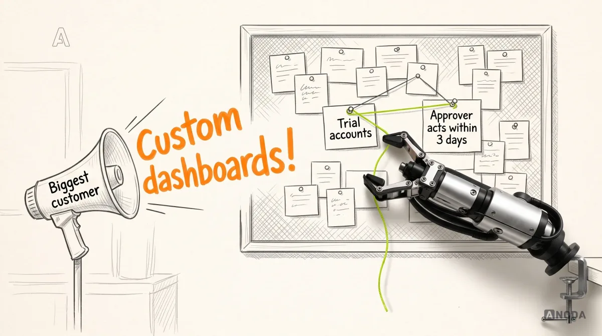
Here is an illustrative example we will use for the rest of this guide. Fernhill is a fictional spend-management product for companies of 50 to 500 people. Finance teams buy it. The objective is to raise trial-to-paid conversion. The backlog is full of finance requests: custom dashboards, more export formats, multi-currency cards. The evidence points elsewhere. Trials convert when department managers approve their team’s first expenses quickly, and stall when requests sit unapproved for a week. Finance signs the contract. The person who decides whether the trial works is a manager approving a taxi receipt on a phone between two meetings.
So Fernhill’s strategy names the approving manager as the primary user, with one job: approve a teammate’s expense in under a minute, confident it is within policy. Finance stays the buyer and keeps everything it needs. It just stops setting the order.
To define your own:
- Pick the person whose success moves the outcome, not the one who signs the invoice or shouts in the steering committee.
- Write the job in their words, with the situation. “Manage expenses” is a category. “Approve a receipt on my phone between meetings” is a job you can design for.
- Name the secondary users and the one thing each must not lose. Finance keeps policy control. Employees keep sight of when they will be reimbursed.
- Check it against the evidence map. If the choice rests on weak evidence, it goes to the top of the testing list.

Experience principles that rule something out
“We use fresh ingredients” is a slogan on a menu. “There is no freezer in this kitchen” is a principle. It decides the menu, the suppliers and what the chef says to a customer who orders asparagus in November.
Experience principles turn the strategy into design decisions nobody has to escalate. Most teams write them as virtues: simple, intuitive, delightful. Those reject nothing. Every designer already believes their work is all three, including the designer of your tax return.
A useful principle is a trade-off: we choose this over that, even when that is also good. It names what it rules out on the screen, so a designer, an engineer and a product manager reach the same answer without a meeting. For Fernhill:
- Decide in one tap over review in depth. Receipt, amount and policy check sit on one card. That rules out a desktop-style report squeezed onto a phone.
- Explain the rule, never just block. Every policy flag names the rule and the fix. That rules out red badges with no reason.
- Finance configures once; managers never configure. That rules out settings, filters and custom views in the manager’s app.
- Show before automating. Auto-approval only below a visible limit controlled by the authorised policy owner; managers can see the rule. That rules out silent automation finance discovers at month end.
Three to five principles is plenty. Ten is a wish list. If nobody can name a real design a principle would reject, delete it.

Strategic choices: what you will build, and what you won’t
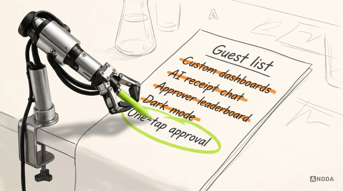
Anyone who has planned a wedding knows the guest list is the budget. Every name is a chair, a meal and a thank-you card. Backlogs work the same way, except nobody wants to be the one who uninvites the cousins.
The heart of a product design strategy is a short list of bets and a longer list of refusals. A bet is a problem you will solve, the experience you will create for it and the outcome you expect. A refusal is a request you are deliberately not pursuing, with the reason written down. Without the reason, the same “no” comes back to every planning meeting in a new outfit.
Split the list three ways:
- Now. Bets that serve the primary job and have enough evidence, or a test planned.
- Later, with a trigger. Good ideas that depend on something else first. The trigger is a measurable condition, not “when we have time”, because you never will.
- Not building. Requests that do not serve the chosen user or outcome, however loud the requester.
For Fernhill, custom dashboards go to “not building”: finance already exports to its own spreadsheets, and nothing links dashboards to conversion. The AI receipt chat goes there too. It demoed beautifully. Nobody in the research had ever wanted a conversation with a receipt. New technology, same old question: which user job does it do? If nobody can answer, the demo is the whole feature.

How to prioritise problems when the evidence disagrees
Anyone who passed a hard exam learned the trick in the first five minutes: read every question, then answer the ones worth the most marks that you can actually solve. The students who grind from question one run out of time with the big questions blank.
Prioritise problems, not features. A feature is one answer to a problem, and ranking answers first is how teams end up choosing between two solutions to something nobody has. Score each problem on impact on the outcome, strength of evidence, reach (how many target users hit it, how often), effort and dependencies, and risk if you are wrong.
High impact with strong evidence goes first. High impact with weak evidence gets tested before it gets built. Low impact with strong evidence is parked, however certain everyone is. Low impact with weak evidence gets a polite no.

The hard part is not the scoring. It is the arguments, because user evidence, business value, technical constraints and delivery risk rarely point the same way. Agree the tie-breaks before the fight:
- Users love it, the outcome does not move. It waits. Delight that does not pay still has a maintenance bill.
- The business wants it, users show no need. It earns a small test before it earns a sprint.
- Engineering says the design is expensive. Engineering names the constraint and the cost; the team chooses between changing the design, investing in the platform or changing the sequence. It never quietly ships a weaker design and calls the bet tested.
- The bet is too big to deliver safely. Cut a slice that still tests the core assumption and still completes a job.
- Still tied. The primary user’s job wins, then the cheaper, reversible option.
Capacity is part of the strategy. A team of six that commits to eleven bets has bitten off more than it can chew, and will deliver eleven half-features, each too weak to prove anything. A half-shipped bet is the worst of both worlds: you paid for it, and it cannot tell you whether it worked.
Sequence releases so each one finishes a job. Fernhill ships the approval card, the policy flag and the approver invite together, because an approval card nobody is invited to see proves nothing.
The artifacts that carry the strategy
Architects mark the load-bearing walls on the plan so that ten years later, the kitchen fitter does not knock one down to make room for an island. Strategy artifacts do the same job. They tell the next person which decisions hold the product up.
The rule for every artifact: it supports a decision, exposes a trade-off or defines how success will be judged. Otherwise, do not make it. A persona with a stock photo and a favourite coffee order is fan fiction.
- The strategy on one page. Outcome, primary user and job, evidence, principles, bets, exclusions, sequence, measures and owners. The thing people actually read.
- The evidence map. It decides which bets get tested first.
- The opportunity ranking. It decides what goes into the next release.
- Target flows for the primary job. The end-to-end path, failures included. It decides what the product does, not what every screen looks like.
- The decision log. What was decided, why, by whom, and what evidence would change it. It stops the team re-arguing settled questions.
- The measurement plan. Baselines, targets, review dates and triggers. It decides when a bet is working.
In this fictional example, the two thresholds serve different decisions: below 50% at the review date prompts reassessment of the current bet; reaching 70% and sustaining it for four weeks unlocks consideration of Slack approvals. A single week above 70% does not satisfy that dependency.

Who owns and approves each decision
Everybody in a shared flat owns the sink. That is exactly why nobody does the washing-up.
Most strategy fights are ownership fights in disguise. “We decide together” sounds collaborative. In practice the most senior person decides in the corridor after the meeting, and when the buck stops with everyone, it stops nowhere.
Give every recurring decision one owner, and name who is consulted and who is simply told. An example to adapt to your team’s actual authority and responsibilities:
- Business outcome and target: the CEO or founder.
- Primary user and job: the product lead, with design and research consulted.
- Experience principles and target flows: the design lead, with product and engineering consulted.
- Technical approach: the engineering lead, with design consulted early, so constraints arrive before the design is finished.
- What is in, later and out: the product lead, with everyone consulted and reasons logged.
- Continue, change or stop a bet: the product lead, against measures agreed before launch.
Agree, too, who signs off a change to the strategy itself. Otherwise it gets rewritten one exception at a time, by whoever has the most urgent customer this week.

Ownership gaps are paid for in meetings. Six senior people re-deciding the same question every two weeks is the most expensive meeting in the building, and it never appears on an invoice.
Reduce the risk before you pay for the build
Ice fishermen do not drive the truck onto the lake to find out whether the ice holds. They drill a hole and measure. Product teams drive the truck on all the time: two quarters of engineering to discover whether managers will actually approve expenses on a phone.
Every bet rests on assumptions that fail in four ways: users don’t want it (value), can’t use it (usability), you can’t build it at a sensible cost (feasibility), or it doesn’t pay (viability). Find the assumption that would kill the bet, and test it first with the cheapest method that gives a real answer:
- Interviews and observation for value: does the job exist, how often, what do people do today?
- Clickable prototypes with real content for usability: can the target user finish the job unaided?
- A manual version behind the scenes for value at small scale, before you automate anything.
- A technical spike for feasibility: can the data and integrations support the design?
Decide the pass signal before the test, in writing. For Fernhill’s riskiest assumption, that managers will approve from a notification without opening the web app, an illustrative pass signal could be a pre-agreed share of trial managers approving a real receipt within a minute, unaided; set the threshold from the task, risk and study design. Decide it afterwards and every result becomes a pass.
AI prototyping tools make drilling cheaper, which is genuinely useful. They do not tell you where to drill. A beautiful prototype of the wrong bet is still the wrong bet, only faster.
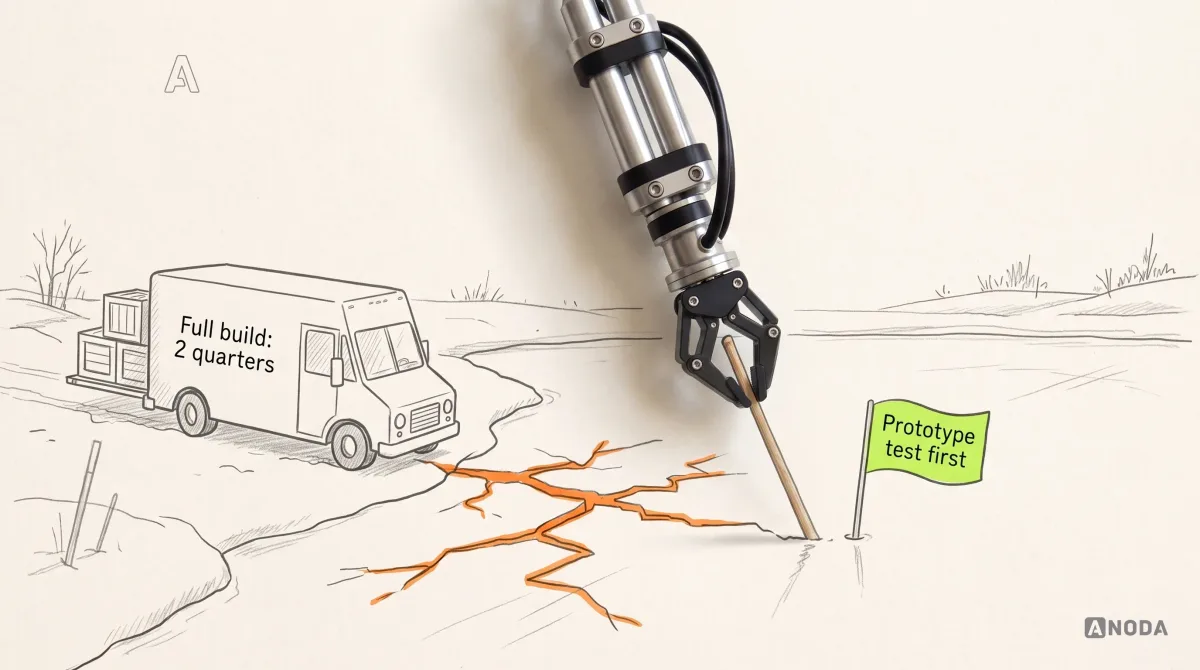
When the uncertainty is bigger than one bet, and nobody is sure the problem, the user or the direction is right, that is product discovery work: validating the problem, the user, the value and the riskiest assumptions before a delivery budget is committed.
Product discovery
Five ideas on the table and no evidence to pick one?
We test the problem, the user and the riskiest assumptions first, so your delivery budget goes to the bet that survived, not the one with the best slide.
How delivery teams use the strategy
A strategy that engineers never read is a game plan the coach kept in his pocket. The team still plays. It just plays whatever the loudest player shouts.
The strategy earns its keep in ordinary delivery moments, when someone has to decide quickly and nobody senior is in the room:
- Every epic names the bet it serves. A ticket that cannot name one goes back to the product lead.
- Designers turn principles into flows and states. This is where UI/UX design makes the choices concrete: the approval card, the policy flag, the empty state when nothing is waiting, the error when a receipt is unreadable.
- Design review checks against principles, not taste. “Can a manager decide in one tap?” ends the argument that “I don’t love the layout” starts.
- Scope cuts follow the strategy. When a sprint runs short, the bets and principles say what goes, before anyone negotiates by seniority.

Measures and triggers that keep the strategy current
A doctor who starts you on a new medication books the follow-up before you leave the surgery. Not because the prescription was wrong, but because bodies are not spreadsheets. A strategy needs the same appointment in the diary.
Attach three measures to every major bet, with a baseline and a target set before the build:
- An outcome measure the business cares about. For Fernhill, trial-to-paid conversion.
- A behaviour measure that moves earlier and shows whether the design works. For Fernhill, the share of expenses approved within 24 hours.
- A guardrail that must not get worse. For Fernhill, out-of-policy expenses approved and finance support tickets.
Then write the review triggers. A scheduled review, for example quarterly when it fits the decision cycle, can catch slow drift. Event triggers catch the rest: a measure misses its threshold at the review date, new evidence contradicts the user, job or a principle, the objective or target segment changes, a technical or regulatory constraint changes the cost of a bet, or a “later” item hits its condition.
When a trigger fires, the owners decide to keep, change or stop the bet, and log it with the evidence. Credit results carefully: if conversion moved in the same month as a pricing change and a new sales hire, design does not get all the applause, or all the blame.

Where product design strategies usually fail
A strategy written for the board meeting and never opened again is a New Year’s resolution: sincere in January, forgotten by March. The failure modes we see most often:
- A feature list with a vision statement on top. Page one says “empower teams”. The next twelve are the backlog with a new cover page.
- Written once, used never. It lives in a deck, not in tickets, reviews and planning.
- No “not building” list. Everything is “later”, which in practice means everything, eventually.
- Evidence borrowed from the pitch deck. The target user is someone the founder imagined in 2023 and nobody has interviewed since.
- Measures chosen after launch. That is betting on a horse after it has crossed the line.
- Shiny object syndrome. A competitor adds an AI assistant, and it jumps the queue without passing a single test above.
- Changed every sprint, or never. A strategy that changes weekly is a mood. One that never changes is a monument.
A practical framework to start with
Here is the order we use when we build a product design strategy with a client:
- Write the outcome. One objective, one measure, a baseline and a date.
- Map the evidence you have. Mark each source strong, weak or missing.
- Choose the primary user and the job. Name secondary users and what each must keep.
- Rank the problems. Decide what to build, test first, park and refuse.
- Write three to five principles that each rule out a real design.
- Make the choices: now, later with a trigger, not building, each with a reason.
- Test the riskiest assumption behind every major bet, with a pass signal agreed in advance.
- Sequence the releases so each completes a job within real capacity and dependencies.
- Attach a measure, a review date and an owner to every major bet.
- Put it on one page and make every epic name the bet it serves.
Sometimes the team is too close to its own backlog to do this honestly. Everyone has a favourite feature, and the loudest customer is also the biggest invoice. That is where ANODA’s UX consulting changes the conversation. We diagnose the real problem, challenge the backlog and turn your business objective into clear priorities and a direction the team can execute. Our product design team then makes that direction concrete in flows, interfaces and the handoff, instead of leaving you with another strategy deck nobody uses.
For SEOSpace, that connection ran from a finding-by-finding audit of the live product into onboarding, audit tasks ordered by priority, shared interface design and handoff to the client’s developers. Figma files, Loom walkthroughs and design QA carried the decisions into delivery. The strategy earned its place in the screens and the next useful action, not in another presentation.
Define the outcome, the evidence and the constraints. Rank the opportunities. Choose a release sequence that holds together. Then attach a measure and an owner to every major bet. Everything you do not decide, your backlog decides for you, and your backlog has never once sat in a meeting about revenue.

Product strategy
A full backlog and no idea which part of it pays?
We turn a crowded backlog into clear product choices and a path to value. ANODA connects strategy to the flows and design your team needs, so your next delivery budget goes to the right problem.
Written by