In short
A list of twenty usability testing questions is not a test plan. Good questions come last: start with the product decision and the research question, recruit the right participants, write realistic tasks, then choose screener, pre-test, task, probe, post-task and debrief questions that reveal behaviour without teaching the answer. Observe first, ask after, and turn what you saw into findings with severity, confidence and a next decision.
In this article
- Research questions, interview questions, tasks and probes
- Start from the decision, not the question list
- The structure of a session
- Screener questions: recruit the right people
- Pre-test questions: understand the context
- Task prompts: realistic goals, no hints
- In-task probes: observe first, ask after
- Post-task questions: measure difficulty and confidence
- Debrief questions: the end of the session
- Navigation testing: the questions that matter
- Moderated and unmoderated tests need different questions
- Pilot before you recruit
- How many participants?
- Make the questions work for every participant
- Questions to avoid
- From answers to findings to decisions
- A complete example
- What a list of questions can’t do
- Ask less, observe more
Usability testing questions fall into six groups: screener questions that find the right participants, pre-test questions that capture context, task prompts that give people a realistic goal, in-task probes that explore what you just observed, post-task questions that measure difficulty and confidence, and debrief questions that collect overall impressions. Which ones you ask depends on the product decision the test must inform. Write them last — after the decision, the research question, the participants and the tasks are clear — and phrase every one so it reveals the participant’s behaviour and mental model without teaching them the answer.
Every team that runs its first usability test goes looking for a list of questions. There are plenty online — twenty, fifty, a hundred. Teams copy one, run five sessions, and come back with a slide that says “users found the navigation intuitive (4.2 out of 5)”. Then the product launches and support tickets about the navigation start arriving.
The questions weren’t the problem. The test had no decision behind it, the tasks weren’t realistic, and half the questions asked people for opinions about an interface they’d just been shown how to use. Polite participants gave polite answers. The team heard what it hoped to hear.
In our usability-testing work, the pattern is consistent: the quality of a test is decided before the first question is written. This guide shows how to get there, then gives example questions for each stage — with a focused section on navigation — and what to avoid.
Research questions, interview questions, tasks and probes
Four kinds of “question” get mixed up in test planning, and mixing them up is where many tests go wrong.
- Research question: what the team needs to learn. “Can first-time users find and change their delivery address?” Translate this into task prompts rather than reading it as an unaided task.
- Interview question: something you ask the participant about their life, context or experience. “How do you usually manage deliveries when you’re away from home?”
- Task prompt: a realistic goal you give the participant to attempt. “You’ve just moved. Make sure your next order goes to your new flat.”
- Probe: a follow-up question about something the participant just did or said. “You paused on that page. What were you looking for?”
| Type | Purpose | Example |
|---|---|---|
| Research question | Define what the team needs to learn. | Can first-time users change their delivery address without help? |
| Interview question | Understand relevant experience. | Tell me about the last time you managed a delivery while away. |
| Task prompt | Give a goal to attempt without revealing the route. | You have moved. Make sure your next order reaches your new address. |
| Probe | Explore observed behaviour neutrally. | You paused on that page. What were you looking for? |
Reading a research question aloud can reveal the task or influence behaviour. If that happens, document the cue and interpret the affected observations accordingly.
A test plan connects them: the research question decides the tasks, the tasks produce behaviour, and probes and post-task questions help you understand it.
A reassuring test report is expensive when the live product tells a different story. You pay for recruitment and sessions, approve the wrong interface, then pay support and engineering to handle the confusion that a better study should have exposed. ANODA plans the test around the product decision, so the findings lead to a clear next action instead of another slide full of polite praise.
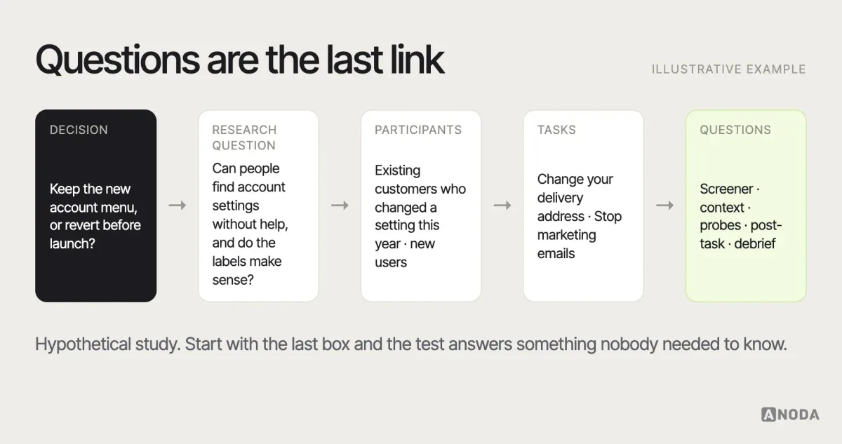
Start from the decision, not the question list
Before writing any question, work backwards:
- The product decision. What will you do differently depending on the result? “Keep the new account menu, or revert to the old one before launch.”
- The research question. What must you learn to make that decision? “Can people find account settings in the new menu without help, and do they understand the labels?”
- The participants. Who needs to succeed? “Existing customers who have changed a setting in the last year, and new users who haven’t.”
- The tasks. What realistic goals exercise the question? “Change your delivery address.” “Stop getting marketing emails.”
- The questions. Only now: what do you need to ask before, during and after those tasks to understand what happened?
If the team can’t name the decision, a usability test is probably premature — you may need broader research first. Our guide to UX research strategy covers how to pick the right method for the decision you face.
The structure of a session
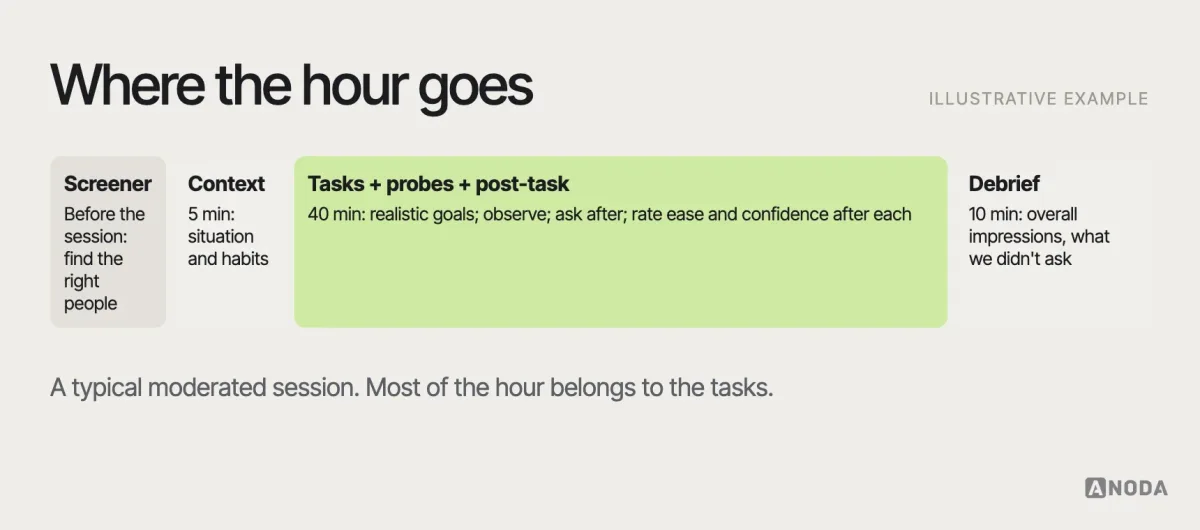
A typical moderated session moves through six stages, each with its own kind of question:
- Screener — before the session, to recruit the right people.
- Pre-test context — a few minutes at the start to understand the participant’s situation.
- Task prompts — the core of the session.
- In-task probes — sparing, and after the behaviour you want to understand.
- Post-task questions — straight after each task, to capture difficulty and confidence.
- Debrief — at the end, for overall impressions and anything you couldn’t ask earlier.
Screener questions: recruit the right people
Test with the wrong people and every answer is about someone else’s problem. Screener questions filter participants by behaviour and context — not by whether they say they’re a good fit.
Good screener questions ask about past behaviour and avoid revealing what you’re looking for:
- “Which of these have you done in the last three months?” (with your target activity among plausible alternatives)
- “How often do you order groceries online?” (with ranges)
- “Which of these services have you used?” (with your product and competitors among others)
- “What’s your role in choosing software for your team?”
Avoid questions that invite people to guess the right answer (“Are you comfortable with online banking?”), questions that can be answered with a simple yes by anyone who wants the incentive, and unnecessarily long screeners that can discourage relevant participants. Include a few people who represent edge cases your product must handle — new users, infrequent users, people using assistive technology — if the decision depends on them.
For a grocery-service study, ask which activities participants completed in a defined recent period, with grocery ordering among other options and a none option. Ask about ordering frequency and services used when these determine eligibility. Broad self-descriptions such as “tech-savvy” may not distinguish the experience needed for this study. Keep the screener neutral so participants answer about their experience rather than the answer they think you want.
Pre-test questions: understand the context
A few questions at the start help you interpret what you see later. Keep them short — this is not an interview study.
- “Tell me a little about how you use [type of product] today.”
- “When was the last time you [did the relevant activity]? Walk me through what happened.”
- “What do you use for that now?”
- “Is there anything about [activity] that tends to be frustrating?”
These questions also warm the participant up and remind them that you’re interested in their experience, not in testing them. Say so explicitly: “We’re testing the design, not you. If something is confusing, that’s exactly what we need to know.” Don’t mention that you designed what they’re about to see: people criticise more freely when they don’t feel they’re criticising the person sitting next to them. If a colleague who didn’t work on the design can moderate, even better.
Task prompts: realistic goals, no hints
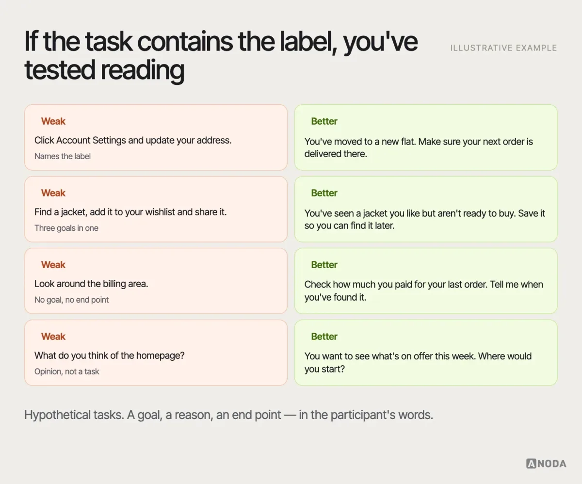
The task prompt is the most important “question” in a usability test, and the easiest to get wrong. A good prompt gives a realistic goal and a reason, in the participant’s language, without naming the interface elements they need to find.
- Weak: “Click on Account Settings and update your address.”
- Better: “You’ve moved to a new flat. Make sure your next order is delivered there.”
The weak version teaches the interface: it names the label, so that attempt cannot establish whether people would have found it without the cue. It also turns the task into an instruction to follow rather than a goal to achieve. The better version gives a scenario and lets the participant decide where to go.
Giving away the label in the task is like a treasure hunt whose first clue says exactly where the treasure is buried. Everyone finds it. Nobody learns anything.
More guidelines for task prompts:
- Use the participant’s words, not your product’s. If your menu says “Preferences”, don’t say “preferences” in the task.
- Give a reason and an end point. People need to know when they’re done.
- One goal per task. “Find a jacket and add it to your wishlist and share it” is three tasks.
- Make it realistic for this participant. Use their context from the pre-test questions where you can.
- Order tasks to avoid teaching. If one task reveals where things are, put the tasks that depend on discovery first.
In-task probes: observe first, ask after
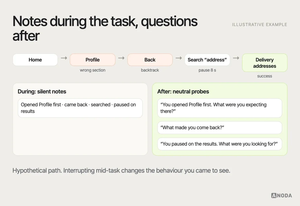
The hardest discipline in moderation is staying quiet. Interruptions can change behaviour: participants may pause, explain themselves or focus on the moderator. Let them work. Take notes on what they do — where they look, click, hesitate, backtrack or give up.
Probe after the behaviour you want to understand, and keep probes neutral and specific:
- “I noticed you went back to the home page. What were you thinking there?”
- “What did you expect to find behind that link?”
- “You paused on this page. What were you looking for?”
- “What would you do next if I weren’t here?”
- “Tell me more about that.”
Avoid probes that suggest an answer (“Was that label confusing?”), that ask people to explain things they didn’t do (“Why didn’t you use the search?” — they may not have seen it), or that come so early they interrupt the attempt. Many moderators hold most probes until the task is finished, then replay the moment: “Let’s go back to where you paused.”
The thinking-aloud technique — asking participants to say what they’re thinking as they work — can reveal expectations. Administration can influence behaviour and timing, so document the protocol before comparing performance. Remind them gently if they fall silent (“What are you thinking now?”), without steering.
Post-task questions: measure difficulty and confidence
Straight after each task, a few consistent questions give you comparable data across participants:
- “How easy or difficult was that task?” on a seven-point scale, from very difficult to very easy — often called the Single Ease Question. This measures perceived task ease; record task completion separately.
- “How confident are you that you completed it correctly?”
- “Was anything unexpected?”
- “Is this how you’d expect to do this?”
Keep scale wording and anchors consistent. A participant who failed a task but rated it “easy” has reported perceived ease, not successful completion. At the end of the session, the ten-item System Usability Scale measures perceived usability of the system. For comparisons over time or between designs, document the tasks, participant groups, study context and administration, and account for sample uncertainty. A standard questionnaire alone does not make unlike studies comparable.
In a hypothetical study, a participant can fail a task and still rate it 6 out of 7 for ease. Report both observations. Investigate whether they recognised the failure; its risk depends on the task and consequences, rather than the rating alone.
Debrief questions: the end of the session
The debrief is where opinions are finally welcome — as long as you treat them as opinions.
- “Overall, how would you describe that experience to a friend?”
- “What was the most frustrating part?”
- “Was there anything you expected to be able to do but couldn’t?”
- “If you could change one thing, what would it be?”
- “Is there anything we didn’t ask that you think we should know?”
The last question is surprisingly productive. Participants often save their most useful observation for the moment they feel the test is over. Allow time for a final comment before ending the session, and record only within the participant’s agreed consent.
One caution about debrief answers: they’re reconstructions. By the end of an hour, people remember the last task better than the first, and they tend to soften criticism of something they’ve just spent time with. Weigh what they say against what you saw them do.
Navigation testing: the questions that matter
Navigation testing can reveal expectations a team overlooks because it is familiar with the structure. A navigation-focused session looks at seven things:
- Labels: do people understand what each menu item means, in their own words?
- Findability: can they get to the right place for a realistic goal?
- Expectations: what do they expect to find behind a link before they click?
- Information scent: do the words and cues along the way reassure them they’re on the right path?
- Backtracking: where do they go back, and what made them turn around?
- Orientation: do they know where they are, and how they got there?
- Recovery: when they get lost, can they find their way back?
Treat hesitation, detours, scanning and backtracking as observations to interpret in context. They can reflect confusion, comparison or deliberate exploration. Keep label-comprehension questions separate from unaided task attempts so the prompt does not reveal the route.
Useful navigation tasks and probes, as examples:
- Task: “You want to see what you paid last month. Where would you go?”
- In a separate label-comprehension exercise: “What do you expect to find under ‘Billing’?”
- After a backtrack: “What made you come back from that page?”
- On arrival: “How would you describe where you are now?”
- After success: “If you needed this again next month, how would you get here?”
- After getting lost: “If you were stuck here at home, what would you do?”
Keep label-comprehension prompts separate from unaided findability tasks: naming “Billing” before a task teaches the label you are trying to test.
A missing “you are here” marker on a map is the physical version of poor orientation: every route might be right, but you can’t choose one if you don’t know where you’re standing.
When a moderated navigation task isn’t the right method
Moderated tasks are the right choice when you want to see navigation in the context of real goals and understand why people choose what they choose. Two other methods are often better for specific questions:
- Tree testing checks whether people can find items in a text-only version of your menu structure, without any visual design. Use it to evaluate a proposed or existing hierarchy and its labels. Its isolated text-only environment omits visual cues and interaction context from the full interface.
- Card sorting asks people to group and name content. Use it to explore how people expect content to be organised, whether creating a structure or reconsidering one. The resulting groupings inform design judgment; they do not prescribe a single correct menu.
| Method | Research question | Important limit |
|---|---|---|
| Card sorting | How do participants group and name content? | Groupings inform an architecture; they do not prescribe one. |
| Tree testing | Can participants find items in a proposed or existing hierarchy? | Text-only navigation omits visual cues and the full interface. |
| Moderated navigation tasks | What happens while participants attempt a goal in the interface? | Prompts and moderator intervention can influence behaviour. |
One possible sequence is card sorting to explore groupings, tree testing to evaluate a proposed hierarchy, then moderated tasks inside the real interface. Choose the methods needed for the research question; all three are not required for every study. If the structure itself is in question, our guide to information architecture is the place to start.
Moderated and unmoderated tests need different questions
Everything above assumes a moderator who can watch and ask follow-ups. In unmoderated remote tests, participants complete tasks alone while a tool records their screen and, sometimes, their voice. That changes how you write questions.
- Tasks must stand on their own. Nobody can clarify a confusing prompt, so pilot every task and make the end point explicit: “When you’ve found it, click ‘Done’.”
- Probes become written follow-ups. You can’t ask “What were you looking for when you paused?”, so add one or two open questions after each task: “Was anything confusing? What did you expect to see?”
- Use more closed questions, carefully. Ratings and multiple choice are easier to analyse at scale, but they only capture what you thought to ask.
- Watch the recordings. Answers in unmoderated tests are thinner; the behaviour on screen carries most of the evidence.
Unmoderated tests can reduce moderation time for suitable tasks, but recruitment, tool costs, prompt clarity and analysis still affect cost and duration. Moderated tests are better when you need to understand why something happens, or when the product and tasks are complex.
Pilot before you recruit
Run the whole session once with a colleague or a friendly participant who isn’t on the project. A pilot can reveal a task that gives away the answer, the prompt that two people read differently, the prototype link that breaks on step three and the debrief that runs ten minutes over. Fixing those before real sessions protects the one thing you can’t get back: time with representative participants.
How many participants?
It depends on the question and on how different your participant groups are. For finding the main usability problems in a flow, small rounds of testing — repeated after each round of fixes — are usually more productive than one large study. When the product serves clearly different groups, test with several people from each, because one group’s easy path can be another’s dead end. When you need to compare designs or report a success rate with confidence, you need larger numbers and often a different method, such as unmoderated testing or tree testing at scale.
Make the questions work for every participant
Write questions that are easy to understand when read aloud or by a screen reader, avoid jargon and idioms, and allow extra time for participants who use assistive technology or are less confident with digital products. If you’re testing with people who use screen readers or magnification, check beforehand that the prototype works with their setup — otherwise you’ll test the prototype’s limitations, not the design.
Questions to avoid
Most bad usability test questions fall into a few categories:
- Leading questions: “How easy was it to find the settings?” assumes it was easy. Ask “How easy or difficult was that?”
- Hypothetical questions: “Would you use this feature?” People are poor predictors of their own behaviour. Ask about past behaviour or observe.
- Asking people to explain behaviour they didn’t show: “Why didn’t you use search?” Maybe they never noticed it — which is the finding.
- Opinion instead of tasks: “What do you think of this page?” produces taste, not evidence of usability.
- Double-barrelled questions: “Was the menu clear and easy to use?” Two questions, one answer.
- Teaching inside the prompt: naming labels, pointing at elements, explaining the interface before the task.
- Interrupting too early: probing mid-task changes the behaviour you’re trying to observe.
- Treating praise as success: “This looks great!” from someone who failed the task is an opinion, not evidence of task completion.
Document prompts and assistance so the team can see which observations came from the user and which came from a cue.
And one more that isn’t a question: collecting answers without an analysis plan. Decide before the sessions how you’ll record observations and what would count as a problem, or you’ll end up with a folder of recordings nobody has time to watch.
Usability testing
Need evidence you can act on?
We plan, recruit, moderate and analyse usability tests around the decision you need to make, and turn what we observe into prioritised findings.
From answers to findings to decisions
A usability test produces notes, recordings, task outcomes, ratings and quotes. Analysis connects this evidence to the research question and documents its practical implications. In SEOSpace, an SEO tool for Squarespace users, ANODA combined user interviews and testing with competitor analysis, support tickets and a finding-by-finding review of the live product. Those inputs shaped onboarding, task priority and tools for beginners and agencies across the extension and web app. The case shows the resulting flows and screens; the participant sessions and grocery example below illustrate how to plan a separate test.
- Record observations, not interpretations. “P3 opened ‘Profile’, went back, then opened ‘Settings’” rather than “P3 was confused by the menu”.
- Group observations into patterns. The same behaviour across several participants, especially across different participant types, is a pattern. A single observation can still identify a consequential failure. Report its scope without treating it as a population frequency.
- Separate the observed problem from its explanation. Report where participants looked for billing and what they said. If their reason remains uncertain, record a hypothesis and the evidence needed to test it; a useful finding does not require a proven cause.
- Judge severity and confidence. How badly does it affect the task — blocks it, slows it, annoys? And how sure are you — one participant or most, consistent with other evidence or not?
- Name the next decision. Fix now, test a change, investigate further, or accept.
For example, participants opening Profile before finding email settings is an observed path. Their interpretation of the labels is a hypothesis to investigate with neutral probes. Record the impact and evidence, then choose a follow-up; a finding need not wait for a proven cause.
Participant language is one of the most useful outputs. The words people use when they look for something — “my payments”, “where I change my plan” — are candidate labels. Use that repeated wording to create clearer candidate labels and test them in the tasks people need to complete.
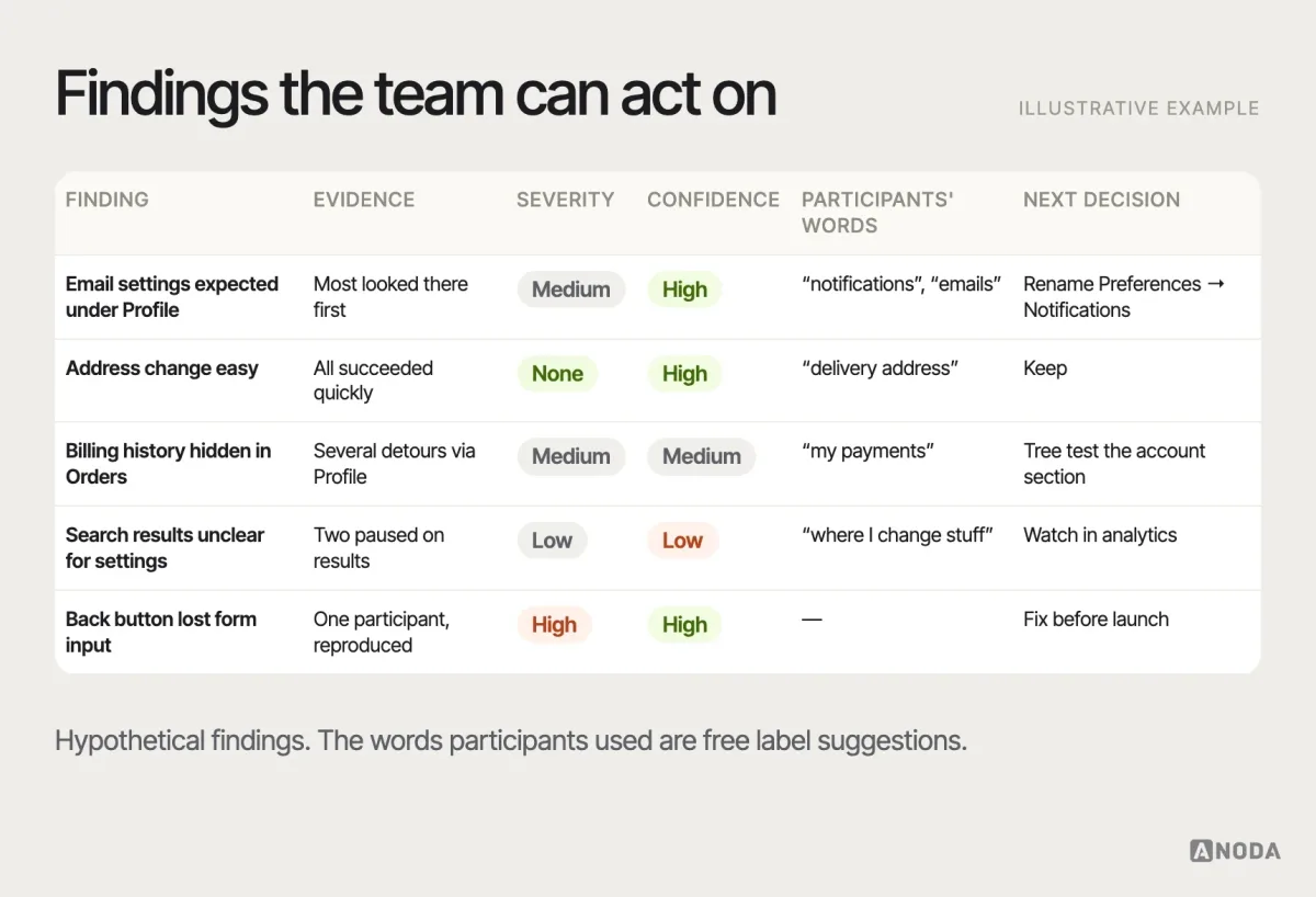
Separate individual anecdotes from patterns in the report, and say how confident you are. Use quotes to make a finding tangible, and act on a verified critical failure even when only one participant encounters it.
A complete example
Here is how the pieces fit in an illustrative example, not a specific client. An online grocery service is about to launch a redesigned account menu.
- Decision: launch the new menu, or keep the old one for now.
- Research question: can existing and new customers find common account tasks in the new menu, and do the labels make sense?
- Participants: six existing customers who changed an account setting in the last year, and four people who shop online for groceries but haven’t used this service.
- Tasks: “You’ve moved — make sure your next delivery goes to the new address.” “You’re getting too many emails from us — stop the promotional ones.” “Check what you paid for your last order.”
- Questions: a short screener about recent online grocery shopping; two context questions; the three tasks; neutral probes after each; ease and confidence after each task; a four-question debrief.
- Analysis plan: record path, success, time and hesitation for each task; note the words participants use; group by participant type.
The sessions show that people find the address change easily, but most look for email settings under “Profile” rather than “Preferences”, and several say “notifications” when describing what they want. The team proposes a new label, checks it in a tree test and in the interface, and considers the results alongside other launch criteria. Nobody in the team had predicted the problem — they all knew where email settings lived, because they had put them there. The example shows why testing with relevant participants can reveal expectations the team overlooked. Familiarity with the design can influence team members and existing users in different ways.
What a list of questions can’t do
It’s tempting to treat a question list as a test plan. It isn’t. A list can’t tell you which decision the test informs, who to recruit, which tasks matter or what counts as a problem. The questions in this guide are examples to adapt — the thinking that decides which ones to use is the actual work.
If you have many suspected problems and don’t know what to test first, a structured UX audit can prioritise them. If you’re still unsure who your users are or what they need, broader UX research may be the right starting point.

Usability testing
Stop approving interfaces your users cannot navigate.
Tell ANODA what you need to decide. We design the study, recruit representative participants and turn observed behaviour into clear navigation and design decisions, so your team knows what to fix before it pays for the next release.
Ask less, observe more
Usability testing questions are useful only inside a clear research objective, with representative participants and realistic tasks. Define the decision, screen by behaviour, write tasks that don’t teach, observe first, probe after, measure consistently and separate patterns from anecdotes. Do that, and the questions will do their job: revealing how people really understand your product.
Frequently asked questions
What questions should you ask in a usability test?
Questions come in six groups: screener questions to recruit the right participants, pre-test questions about context, task prompts with realistic goals, neutral probes after observed behaviour, post-task questions about ease and confidence, and debrief questions about the overall experience. Choose them after defining the product decision, research question, participants and tasks.
What is the difference between a task prompt and a question?
A task prompt gives the participant a realistic goal to attempt — for example, making sure the next delivery goes to a new address — without naming the interface elements. Questions such as probes and post-task ratings help you understand what happened during the attempt.
How do you avoid leading questions in usability testing?
Ask about past behaviour instead of hypotheticals, keep wording neutral ("How easy or difficult was that?"), avoid naming labels in task prompts, ask one thing at a time, and probe only after the participant has acted. Don't ask people to explain behaviour they didn't show.
What questions help test website navigation?
In a separate label-comprehension exercise, ask what participants expect behind a label. After an unaided task, ask why they turned back after a backtrack, how they'd describe where they are, and how they'd return to the same place later. Observe labels, findability, information scent, orientation and recovery.
When should you use tree testing instead of a usability test?
Use tree testing when you want to evaluate the menu structure and labels themselves, without visual design, across many participants. Use card sorting to explore content groupings, including when reconsidering an existing structure, and moderated usability tasks to see navigation inside the real interface. A text-only tree test cannot evaluate visual cues or the complete interface.
Written by