In short
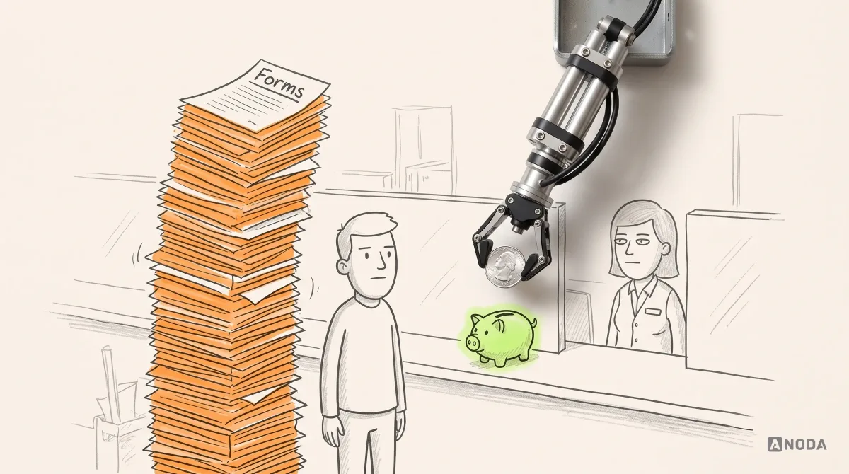
Most finance design ideas are showcase shots of money that never existed: round balances, one currency, no fees, nothing pending. Real accounts break them on day one, and the bill lands on customers you paid to acquire. How we pick finance UX patterns by the money decision on the screen, format amounts people can trust, keep charts honest, show the consequence before the button and keep it all consistent after launch.
In this article
- Why ANODA designs the amount and the next action together
- What UX finance actually means
- Why the inspiration shot dies in production
- Choose the pattern by the decision it supports
- Numbers are the interface
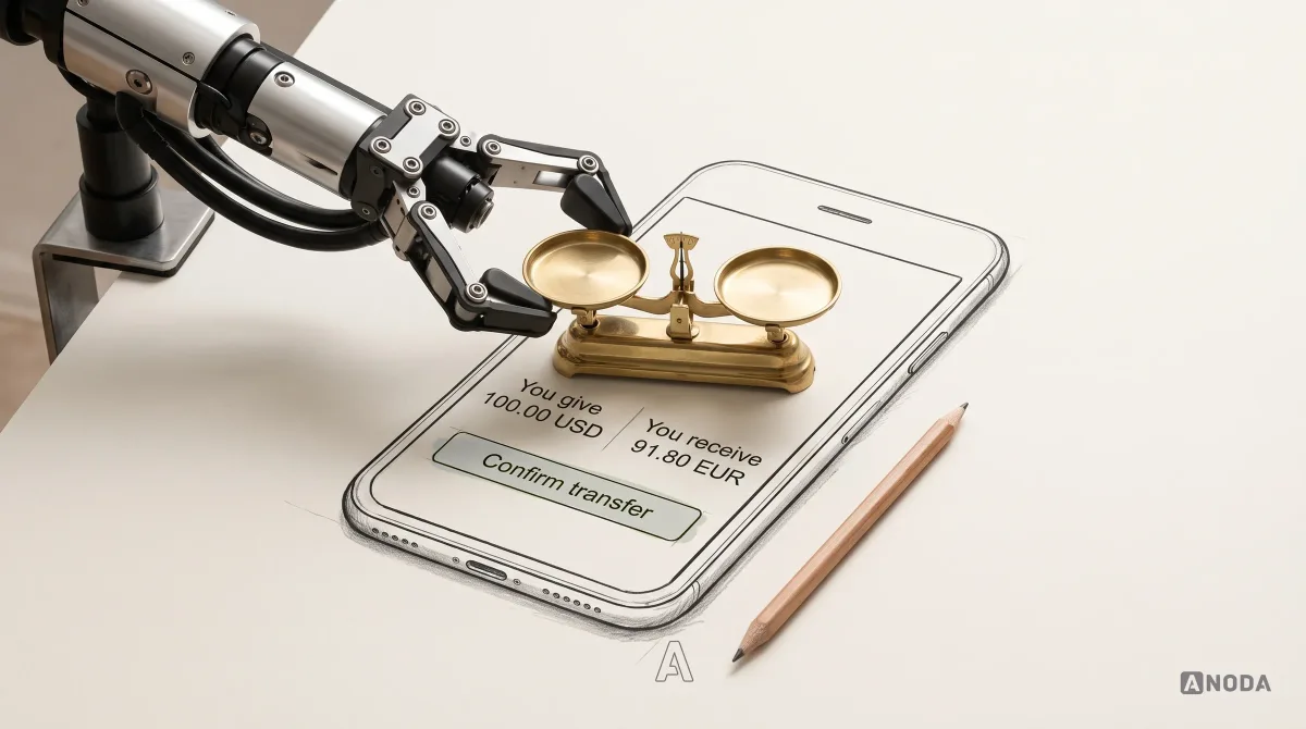
- Currency and locale are not formatting details
- Red and green are not a sign
- Percentages, charts and the truth about returns
- Show what’s known, what’s estimated and what’s stale
- Show the consequence before the commitment
- Density depends on who is reading
- Accessible numbers, read aloud
- Keep one money system, not twelve formatters
- How to choose your next finance design idea
UX finance is the design of how a product shows money so a person can decide what to do with it: what they have, what it costs, where it is and what happens when they press the button. Explicit amounts, fees, currencies, statuses and a real confirmation carry the design. The gradient is optional.
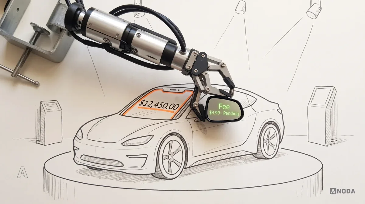
Search for finance design ideas and you get a gallery of glowing cards holding $12,450.00 of money that never existed: one currency, no fees, nothing pending, a green arrow pointing up forever. AI design tools now generate a hundred of these before lunch. Lovely. Useless the first time a real customer with a real overdraft opens the app.
At ANODA, we design financial products around the decisions people make with their money. The inspiration board is where many expensive mistakes start. A borrowed idea that hides a fee becomes a support ticket. A flattering chart becomes a complaint. Both land on a customer you already paid to acquire.
Why ANODA designs the amount and the next action together
A number can be perfectly formatted and still leave the customer unable to decide. Does this balance include pending money? Which currency will arrive? What will be left after the fee? A visual refresh that keeps those questions hidden turns the same uncertainty into a more expensive screen.
ANODA designs financial data around the decision it supports. We connect the amount to its currency, status, costs and consequence, then carry that language through the overview, review and receipt. Your team gets reusable money patterns that make the next action clear and stop each new feature inventing another formatter.
In Blackstar, our investment-app design separates the portfolio, transactions and analytics views while keeping funding and GHS/USD wallet choices in one navigation. It is a concrete example of organising money around the user’s task. See Blackstar’s investment-app design and design your financial experience with ANODA.
What UX finance actually means
Finance UX is data presentation with consequences: every screen answers a money question, and the design is the answer.
That gives you a filter for every design idea, including ours. Keep an idea only if it improves at least one of three things:
- Comprehension. People read the number faster and get it right.
- Trust. The number matches what they expected, or says why it doesn’t.
- Control. They can change, stop or undo something before it costs them.
An idea that improves none of them is decoration. Decoration is fine on a landing page. On a payment screen it is a liability with rounded corners.

Why the inspiration shot dies in production
A finance shot on a design showcase is a concept car at a motor show: gorgeous, no wing mirrors, no wipers, and it has never met rain. Real accounts are rain: seven-figure balances, negatives, zeros, three currencies, forty-character merchant names, a partial refund, a frozen card.

The fix is boring and cheap. Before anyone approves a visual direction, pour ugly data into it: the largest real balance, the longest name, a negative, a zero, a second currency, a pending item. If the idea survives, keep it. If it breaks, you just saved a quarter of engineering rebuilding it after launch. We run a similar filter on banking app design trends.
Choose the pattern by the decision it supports
Fashion picks patterns by what looks current. We pick them by the money decision on the screen: “can I afford this?” and “is my savings plan working?” need different presentations of the same balance.
| The person is deciding | Pattern that helps | It must show | It fails when |
|---|---|---|---|
| Can I afford this? | Balance after the payment | What is left, and what is still due before payday | Only today’s balance is shown |
| What did this cost me? | Itemised total | Amount, every fee, the rate, the final total | Fees appear on the next screen |
| Where is my money? | Status with a time | Current state, what happens next and when | “Processing”, no date |
| Is this working? | Money and percentage over a period | The gain in both, the base, the dates, fees taken | A big percentage on a tiny base |
| Should I sign? | Total cost of the commitment | Monthly figure, term, total repaid, APR | Only the monthly figure |
Payment states and transfer reviews are covered in our guide to banking app UX and security patterns.
Numbers are the interface
In a finance product, your digits matter more than your headings. Proportional figures in a left-aligned column are an exercise book where the digits wander across the page: even the teacher adds it up wrong. People compare amounts by scanning the column, and a wobbly column makes $1,111.11 look shorter than $888.88.

The rules are short:
- Tabular figures in every column of amounts, right-aligned.
- Consistent precision for each currency throughout a list. No 12.5 next to 12.50 for the same currency; use that currency’s minor units rather than forcing two decimals onto every currency.
- A real minus sign, not a hyphen, and brackets only if your audience are accountants.
- Cents at full size and contrast. Greyed-out decimals make $1,284.07 read as $1,284, right up until the customer checks the statement.

Currency and locale are not formatting details
“1.234” means one thousand two hundred and thirty-four in Germany and one point two three four in the US. “$” can mean US, Canadian or Australian dollars, among others. An amount without its locale is a shoe size without the country: a 9 fits nobody until you know whose 9.
Format amounts in the customer’s locale, not the designer’s. Show the currency code whenever more than one currency can appear on the screen.

Red and green are not a sign
Colouring gains green and losses red, and doing nothing else, is a medicine cabinet sorted by pill colour: fine until someone who can’t tell the colours apart reaches in at 3 a.m. The W3C’s WCAG 2.2 success criterion 1.4.1, Use of Color (Level A, checked on w3.org on 29 September 2026), is plain about it: colour must not be the only visual means of conveying information.
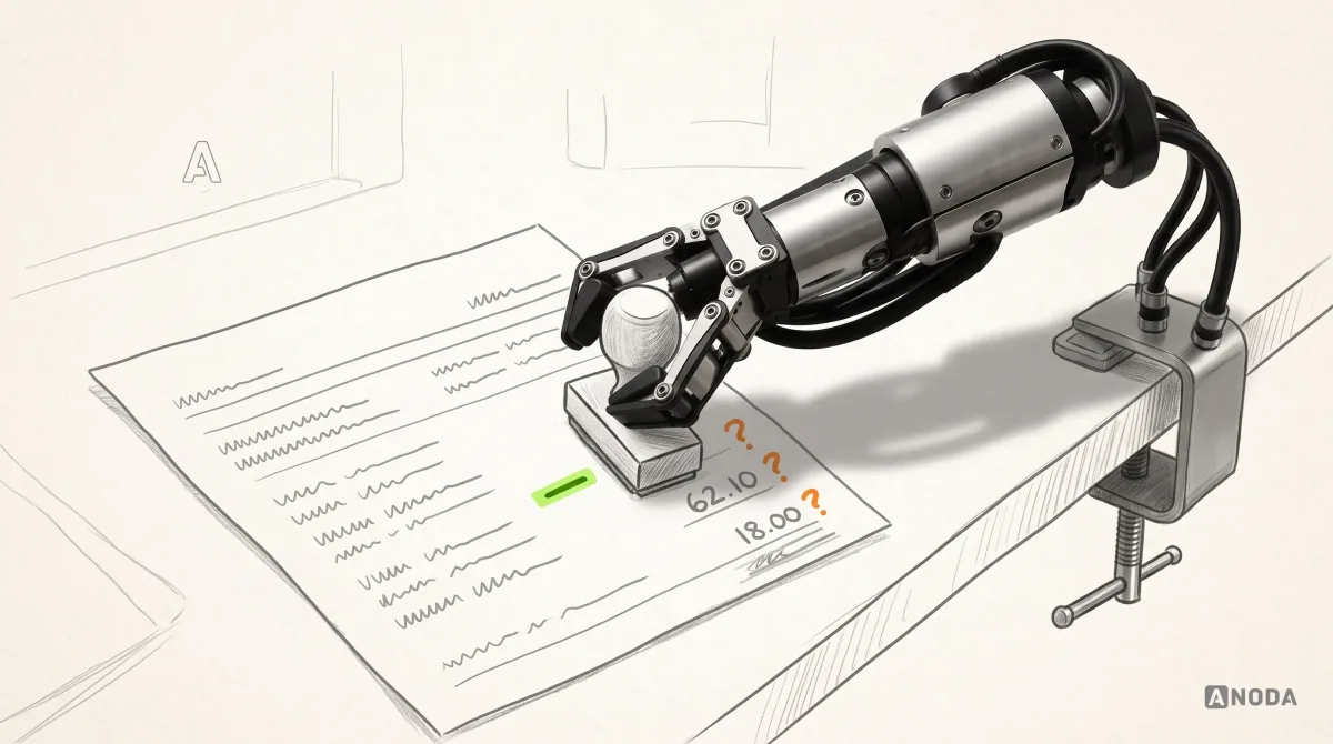
So a sign, a word or an arrow carries the meaning, and colour only backs it up. “−$62.10” and “Refund +$18.00” survive greyscale, sunlight and a cheap screen. Being in the red should never depend on seeing red.

Percentages, charts and the truth about returns
“+312%” sounds like a rocket. On a $15 position it is three extra tomatoes on your allotment. A percentage without its base flatters small numbers and hides big ones, and customers buy, sell and complain on it.

Show the gain in money and in percent together, with the base and the period. Then show it after fees. A return quoted before fees is a sprint time run with a gale at your back: technically fast, and nobody at the club is impressed.

Charts follow the same rule: the line people see is the line they believe. Actuals are solid. Projections are dashed, labelled “Estimate” and drawn as a range, because the future doesn’t come with two decimals. A picture is worth a thousand words; a flattering one is worth a thousand support tickets.

Show what’s known, what’s estimated and what’s stale
Even a stopped clock is right twice a day. A stale portfolio value is right once, at the moment it was fetched. A number with no time next to it claims to be current, and when it isn’t, the customer finds out at the worst moment, usually while selling.

Label every number that isn’t final: “As of” on a market value, “Estimate” on an order priced at the next open, “Final” on a fee that won’t change. Give known and guessed values different visual weight.

Show the consequence before the commitment
“Only $19 a week” is how sofas get sold and how loans get regretted. The weekly figure is the bait; the total is the bill. A lending screen that hides the term creates sticker shock months later, and sticker shock turns into complaints and a regulator reading your screens.
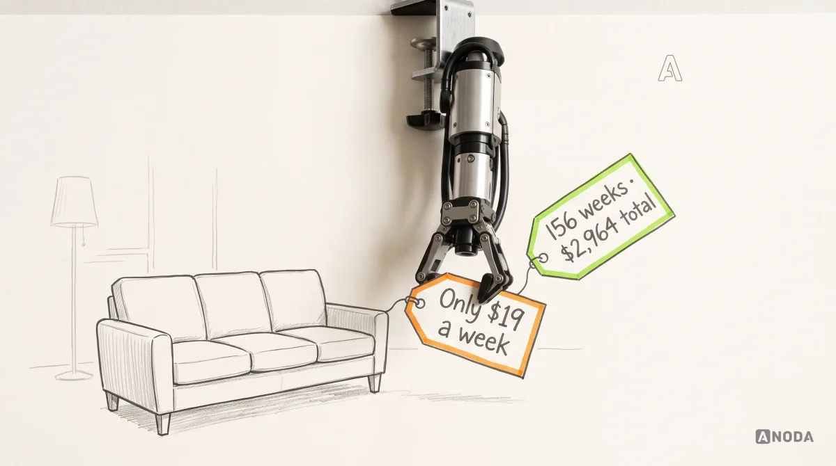
Every commitment screen needs its consequence in money: the total repaid, the cost of borrowing, the term, the APR and what happens if a payment is missed. Nobody should need to read the small print to find the biggest number on the page.

Everyday spending works the same way. “Can I afford this?” is answered by what’s left after this payment and the bills due before payday, not by the balance.

Product design for finance
Your screens show the price. Do they show the bill?
We map the money decisions in your product and design the amounts, fees, statuses and confirmations around them, with real data poured in from day one.
Density depends on who is reading
A beginner pianist needs the melody line. A conductor needs the full score. Give an accountant the consumer view and they export everything to a spreadsheet, the loudest way of saying your product is in the way. Give a first-time saver the pro view and they don’t come back.

Decide density per audience, not per trend; the amounts, fees and timestamps stay identical. Customers first meet those numbers during financial app onboarding, so the decision starts there.
Accessible numbers, read aloud
Read your statement to your gran over the phone. You would never say “dollar one point two K”. A screen reader might, and some skip a hyphen used as a minus, which quietly turns a debit into a credit. Give every amount an accessible label that says what a person would say: “Payment to Northgate Energy, minus 1,240 dollars, pending”.

Then zoom to 200%. If a column of amounts breaks mid-number or vanishes off the side, part of your audience can’t check their own money. Accessibility is the same comprehension test, run on more people.
Keep one money system, not twelve formatters
Plenty of finance products we audit format one amount several different ways, because every team wrote its own formatter. It’s a house where every room was wired by a different electrician: each socket works, no plug fits twice, and nobody wants to touch the fuse box. “$1.2K” on the home screen and “USD 1,240.00” on the statement look like two different numbers, because to them they are.
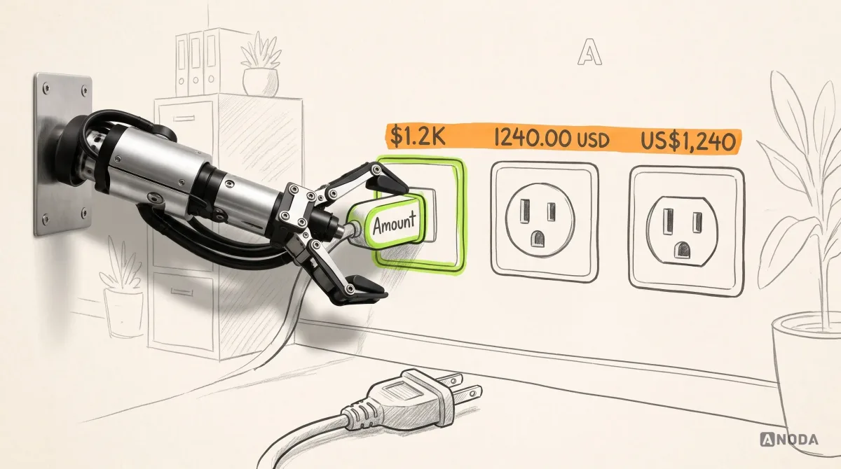
Build money as components with states: positive, negative, zero, pending, estimated, stale, loading and hidden. One formatter, one set of rules, tested with ugly data and kept in the design system. That is also how a product gets a look of its own without copying the neobank next door; the brand side is in our guide to fintech brand strategy.

Every money format you don’t decide, a developer decides at 6 p.m. on a Friday.
How to choose your next finance design idea
The order we work in:
- Name the money decision on the screen.
- Pick the pattern for that decision, not for the mood board.
- Pour in the ugliest real data you have.
- Check it in greyscale, at 200% zoom and with a screen reader.
- Show the consequence in money before the button.
- Put the pattern into the money system so it stays consistent after launch.
Inspiration is welcome at step six, not step one. Every number you leave vague, customers resolve for you, by calling support or moving their money. More fintech thinking lives on the ANODA UX blog.

Work with ANODA
Stop borrowing finance design ideas. Build the ones your numbers need.
Bring us the product, the money flows and the screens customers call about. You get patterns chosen by the decision they support, tested with real data and ready for your design system.
Written by