In short
A design language is what your product means and how it speaks; a design system is how that language is repeated in tokens, components and code. Here is what the language covers, from principles and hierarchy to colour, type, motion, words and states, and how to keep it consistent across screens and teams without making everything identical.
In this article
- Design language and design system: not the same thing
- Where a design language can reduce repeated work
- Start with principles that actually decide things
- Hierarchy: the same order of importance everywhere
- Colour that means something
- Type with a job to do
- Rhythm, space and density
- Icons from one family
- Motion that explains, not decorates
- Interaction rules
- Words are part of the language
- States speak the same language
- Consistent is not the same as identical
- Components are where the language becomes real
- A shared language across Moka’s different workflows
- Audit before you define
- Tokens carry the language into code
- Who changes the language, and how
- Scaling the language across teams and products
- One language, every touchpoint
- Accessibility is part of the language, not an add-on
- Document it so people use it
- Public design languages worth studying
- Common mistakes
- How we build design languages
- The decision rule
A design language system is two things working together. The design language is what your product means and how it speaks: its principles, hierarchy, colour meaning, type, icons, motion and words. The design system is how that language is repeated reliably, through tokens, components, patterns, code and rules for change. The language decides what the product says. The system makes sure it says it the same way on every screen, in every release, whichever team built it. Consistency is not identical screens. It is the same meaning, expressed the same way, wherever the user meets it.
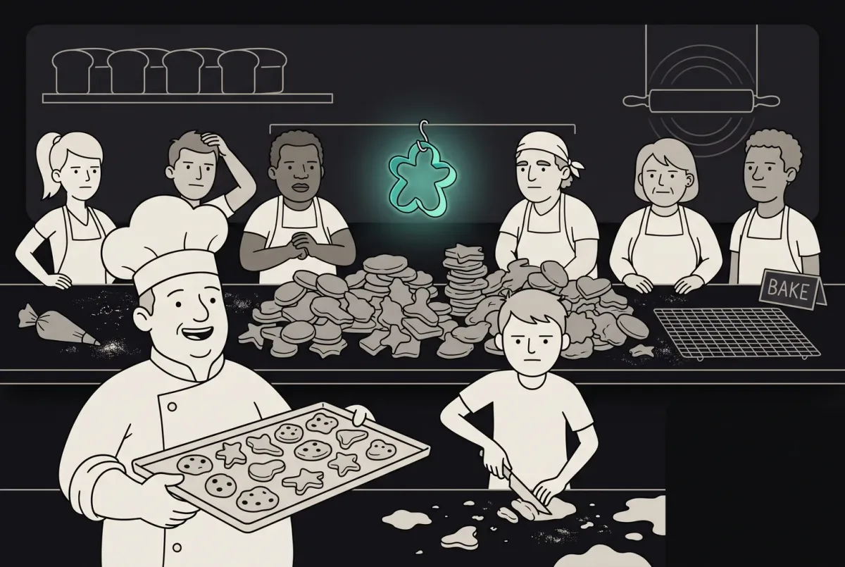
Most products don’t lack design. They lack a language. You can see it the moment you use them for more than five minutes. One screen says “Cancel booking”, another says “Remove trip”. Times are “9:40am” here and “09:40” there. Red means an error on one page and a promotion on the next. Every screen looks fine on its own. Together they sound like a group of people who have never met, taking turns to speak for the same company.
That costs more than looks. Users have to relearn the product on every screen. Support explains the same thing three ways. Designers argue about decisions that should have been made once. And every new feature adds another dialect. Nobody decided to build an inconsistent product. It happened one reasonable decision at a time, by people who each had a slightly different idea of what the product should sound like, and no shared language to check it against.
This guide explains what a design language is, how it differs from a design system, what it covers, and how to build one that stays consistent without making every screen identical.
Design language and design system: not the same thing
People use the two terms as if they were one. They are related, and the difference matters.
A design language is about meaning. It answers questions like: what matters most on a screen? What does this colour mean? How does the product sound when something goes wrong? How does movement help explain what happened? It is expressed through principles, hierarchy, colour, type, icons, motion, interaction and words.
A design system is about repetition. It takes the decisions of the language and turns them into things teams can reuse: tokens, components, patterns, code, documentation and a process for change.

A system without a language is a library of parts with no reason to be the way they are. A language without a system is a set of good intentions that drifts with every new designer and every deadline. You need both, and the language comes first.
Where a design language can reduce repeated work
It is tempting to treat a design language as polish, something to do once the product is “done”. In practice it is one of the cheapest ways to save money across the whole product.
Every decision the language makes once is a decision nobody has to make again. Designers stop debating the delay colour in every review. Developers stop guessing which date format to use. Support stops explaining why the same action has three names. New team members learn one set of rules instead of reverse-engineering twenty screens.
Users feel it too. A product that behaves and speaks the same way everywhere is faster to learn and easier to trust. People make fewer mistakes, need less help and are less likely to give up halfway through a task. None of that shows up as a line in a budget. All of it shows up in activation, support volume and how often people come back.
The opposite is expensive in the quietest possible way: nobody decides to be inconsistent, so nobody notices the cost until the product is already speaking in dialects.
Start with principles that actually decide things
Every design language starts with a few principles. Most teams write principles that are too vague to be useful: “simple”, “delightful”, “human”. Nobody disagrees with them, which is exactly the problem. A principle is only useful if it settles an argument.
Good principles come with decisions attached. For a ferry-booking app, three might be:
- Calm when things go wrong. So delay alerts use plain words and a next step, never red sirens and capital letters.
- Time first. So the departure time is the largest, clearest element on every screen that shows a sailing.
- One next step. So each screen has one primary action, and everything else is visibly secondary.

Start with a small set of principles the team can apply in reviews. Test your principles with a real disagreement. If two designers argue about whether the delay banner should be bright red, does a principle settle it? If not, rewrite the principle until it does.
Hierarchy: the same order of importance everywhere
Hierarchy defines what the user should notice first, second and third for a particular task. Reuse familiar patterns where tasks are comparable, and change emphasis when the user’s immediate need changes.
In the fictional ferry app, departure time can lead a ticket view, while an urgent cancellation notice may put the disruption and next action first. Document the reason for each hierarchy rather than requiring the same order on every screen.

Hierarchy is set through size, weight, colour, position and space. The language defines how each level looks, so a designer building a new screen doesn’t have to invent it.
Colour that means something
Define colour roles for brand expression, emphasis and status. Keep status meaning clear within its context, using labels and other cues alongside colour; colour should make the meaning clearer, never leave the user guessing.
A few rules keep colour honest:
- Give each meaningful colour one job. Status, action, emphasis, error.
- Never rely on colour alone. Pair it with an icon and words, so the meaning survives for people who don’t see colour well, and on bad screens in bright sunlight.
- Keep brand colour and status colour apart, so the brand never looks like a warning and a warning never looks like the brand.
- Check contrast for every colour pair the language allows.

Type with a job to do
Typography in a design language is a set of roles, not a list of sizes. Each role has a purpose: a display style for the one thing that matters most, titles, body text, captions, and often a numeric style for times, prices and figures that need to line up.

When type is defined by role, designers stop choosing sizes and start choosing meaning: “this is the display time”, “this is a caption”. The result looks consistent because it is consistent, not because someone checked every font size by hand.
Rhythm, space and density
Spacing is the least glamorous part of a design language and one of the most noticeable when it goes wrong. A consistent spacing scale gives the product a rhythm. Random spacing makes it feel cobbled together, even when users can’t say why.
A good language also decides how density works. The same component might need a comfortable version for occasional users and a compact version for people who scan long lists all day. Both come from the same spacing scale, so they still feel like the same product.

Icons from one family
Icons are a small alphabet. When they come from one family, with the same grid, stroke, corners and metaphors, they read quickly and look deliberate. When they are collected from five different sets, every screen looks like a ransom note.
Define the icon style, the sizes, and the metaphors: one icon for “ticket”, one for “delay”, one for “offline”. Then use them the same way everywhere. An icon that means two things means nothing.

Motion that explains, not decorates
Motion is part of the language too. Used well, it explains what happened: a ticket slides up when it’s purchased, a delay banner fades in without startling, a list reorders smoothly so people can follow what moved. Used badly, it slows everything down and makes people wait for animations they didn’t ask for.

Define a small set of motion rules: which durations, which easing, which kinds of change get motion and which don’t. Respect the device’s reduced-motion preference: remove nonessential spatial movement while keeping the state change and useful feedback clear. Use a static transition where appropriate and test the result.
Interaction rules
A design language also covers how the product behaves when people touch it. How big are targets? Is there always one primary action? Are gestures shortcuts, or the only way to do something? How quickly does the interface respond to a tap?
For the fictional Harbourline app, interaction rules could include a defined touch-target size, a primary action hierarchy, a visible alternative to swipe gestures and confirmation when alert settings change. Native platform points and web CSS pixels are different specifications. For web content, WCAG 2.2 target-size criteria distinguish the 24-by-24 CSS-pixel AA minimum from the 44-by-44 CSS-pixel enhanced AAA criterion, each with exceptions.
These rules matter alongside colour and type. If a gesture works on one list and changes meaning on the next, users may make errors or need to relearn it. Keep essential actions available through visible controls and check the behaviour with users.
Words are part of the language
The design language that covers every pixel and ignores the words is only half a language. Labels, buttons, errors and alerts are where the product actually talks to people, and the tone matters most when something goes wrong.
Compare three ways of telling someone their ferry is late. One panics. One sounds like a database. One tells them what happened, what it means for them and what to do next.

Define voice, situation-specific tone and vocabulary. Use consistent terms for the same entity or operation, while keeping distinct concepts such as a reservation and a journey distinguishable.
States speak the same language
Include empty, loading, error and success states in the language. Define what happened, why when known, and what the user can do next.
For each state, document what the product actually knows and what the user can do next. A loading message must not invent a completion time, offline capability or bank activity. If payment confirmation is unavailable, state that its status is unknown and provide a safe way to check before retrying; do not infer that no money was taken from a failed request alone. Match empty, error and success copy to verified system state.
When states follow one pattern, users recognise them instantly. When each team invents its own, a simple error becomes a small puzzle every time.
Consistent is not the same as identical
This is where many teams go wrong. They hear “consistency” and try to make every screen look the same. But a ticket on a phone, a printed boarding pass and a confirmation email can’t be identical. They have different sizes, different contexts, different jobs.
Consistency means family resemblance: the same hierarchy, the same colour meaning, the same type roles, the same words, adapted to each context. A good design language allows variation where the context demands it and keeps everything else fixed.

Components are where the language becomes real
Reusable components carry agreed conventions into product screens. Document visual emphasis separately from destructive risk, and choose action priority for the task; one primary action per screen is not a universal requirement.
Define visual emphasis separately from action risk. A quiet “Change sailing” link may still change a booking or incur a fee. Explain consequences and use confirmation or recovery appropriate to reversibility and impact. The fictional screen can prioritise “Show ticket”, while secondary and destructive actions remain identifiable and accessible.
Components can make agreed conventions easier to apply. Verify their states, labels, configuration and adoption in the consuming screens; make the agreed language the easy path for every team.
A shared language across Moka’s different workflows
In Moka’s AI academic assistant, ANODA designed student chat, educator dashboards and reporting as different workflows within one interface system. The case shows a shared UI library and an organised Figma and screen-map handoff. That is what your teams need as the product grows: distinct workflows that still speak one recognisable language.
Audit before you define
If your product already exists, don’t start by writing the language from scratch. Start by looking at what the product is already saying, in all its dialects. Put screens from different teams side by side and list the differences: button styles, date formats, words for the same action, colours used for different meanings.
In a fictional audit, compare labels, time formats and action emphasis across screens. First verify that “Remove trip” and “Cancel booking” really perform the same operation; removing an item from a view may differ from cancelling a reservation. Choose time formatting for the supported locales and user settings, and explain the consequences of cancellation separately from its visual emphasis.
The audit shows where the product contradicts itself, and it usually reveals that most decisions have already been made well somewhere in the product. The job is often to pick the best version and make it the rule, not to invent something new.
UI/UX design
Your product speaks in five dialects?
We uncover the contradictions costing your team time, define one clear product language, and build the reusable foundations that keep designers and developers moving together.
Tokens carry the language into code
Design tokens are where the language becomes something code can use. A principle like “time first” becomes a type token for display times, used by the sailing card component, used on every screen that shows a departure. A principle like “calm when things go wrong” becomes a status colour for delays, an icon, and a copy rule, all used by the delay banner.
Assign ownership for copy and localisation, and carry token updates into consuming interfaces. Review overrides, version adoption and rendered screens so the shared decision reaches the whole product.
Shared values carry the product language into code. Keep teams on the agreed component versions and review the resulting screens, so a single decision reaches the whole product.
Who changes the language, and how
A design language is not frozen. Products grow, brands evolve, new situations need new rules. What matters is that changes happen on purpose, not by accident.
A lightweight change process can start with checking existing guidance, documenting the unmet need and involving the affected design, content or engineering owners. Update the relevant artifacts, announce the change and check adoption. Keep the process proportionate to the change.

Without governance, a system built with care turns into a static library. Nobody owns it, nobody updates it, teams quietly work around it, and within a year the product speaks in dialects again.
Scaling the language across teams and products
A design language is easy to keep consistent when one designer works on one product. It gets harder with every team, product and year added. Scale is where most languages break, and it breaks in predictable ways.
New teams join and bring their own habits. A product is acquired and arrives with its own style. A deadline pushes someone to ship “just this once” with a custom component. Each exception is small and understandable. Together they turn one language into several.
What helps at scale:
- Shared foundations, local freedom. All products use the same tokens, principles and vocabulary. Each product can add components for its own needs, built from those foundations.
- A named owner for the language, separate from any single product team, with the time and authority to keep it coherent.
- Contribution, not just consumption. Product teams propose additions from real work, so the language grows from what teams need rather than what a central team imagines.
- Regular audits. A look across products every so often to catch drift before it becomes a new dialect.
- Exceptions on purpose. When a team genuinely needs to break a rule, it is recorded and reviewed, and either becomes a new rule or is removed later.
The goal is not control for its own sake. It is making sure that a customer moving between your products feels they are dealing with one company.
One language, every touchpoint
Users don’t only meet your product in the app. They see push notifications, emails, a website, printed documents, screens in physical places, support messages. A design language should cover all of them, adapted to each format.
| Touchpoint | Fictional delay message |
|---|---|
| App, website or email | Your 09:40 sailing is delayed by 20 minutes. New departure: 10:00. Your ticket remains valid. |
| Push notification | 09:40 sailing delayed. New departure: 10:00. Open the app for details. |
| Printed pass or port board | Original departure: 09:40. New departure: 10:00. Tickets remain valid. |
Keep the underlying facts consistent while adapting length and presentation to the channel. Ticket validity must come from verified operational information. A printed document needs an update or replacement process; a shared design language alone cannot keep it current.
Delay messages should agree on verified facts, while their wording and hierarchy can differ by channel and urgency. Review each touchpoint’s constraints and update mechanism.
Accessibility is part of the language, not an add-on
A design language decides how things look, behave and speak for everyone, so accessibility belongs inside it rather than in a separate checklist at the end.
That means contrast is checked when colours are defined, not when a screen fails an audit. Focus states are part of every interactive component’s look. Type roles have sizes that stay readable. Colour is never the only carrier of meaning. Motion respects people who have asked for less of it. Words are plain enough to be understood the first time.
Shared accessible components can reduce repeated defects, but each screen still needs checks for content, keyboard order, labels and complete task flows.
Document it so people use it
A design language that lives in a long PDF nobody opens is not a language. It is an archive. Useful documentation is short, visual and close to the work.
- Show the principle next to the decision it makes, with a real example from your product.
- Show do and don’t pairs for the mistakes people actually make.
- Keep the rules where designers and developers already work: in the design library, beside the components, and in the code documentation.
- Include the words: vocabulary, voice examples and message templates for common situations.
- Date the changes, so people know what is current.
If a new designer can build a screen that looks and sounds like the rest of the product without asking anyone, the documentation is doing its job.
Public design languages worth studying
Public references offer examples to examine rather than a specification to copy wholesale. Material Design’s motion guidance and Apple’s Human Interface Guidelines foundations are starting points for their respective ecosystems. Fluent 2’s design principles describe platform adaptation, focus, inclusion and a recognisable Microsoft identity. IBM’s 2x Grid connects layout structure, spatial units and typography, and points to Carbon for product-interface implementation. Study how each system connects principles to decisions, then build the language that fits your own product.
Read them for how they think, not for what they look like. Each was built for a specific set of products and users. Your product needs its own language, even if it borrows good ideas from theirs.
Common mistakes
The same problems appear again and again:
- Principles too vague to decide anything.
- Consistency confused with sameness, so every context is forced into one layout.
- Colour doing two jobs, or doing its job alone without icons and words.
- Words left out of the language entirely.
- States designed last, each by a different person.
- A language document that never reaches code, so it is admired and ignored.
- No owner and no process for change, so the language drifts back into dialects.
- Building a large system with no roadmap or implementation behind it, which becomes a static library nobody uses.
How we build design languages
When we work on a product’s design language, we start by auditing how the product actually looks, behaves and speaks across its screens and touchpoints, and where it contradicts itself. We define principles that make real decisions, set the hierarchy, colour meaning, type roles, icons, motion, interaction rules and voice, and consolidate the best existing decisions into one language. Then we define reusable tokens, components and patterns, test the design in representative product screens with real content and states, and agree on ownership and change guidance. A coded component library and implementation are scoped separately with frontend engineering.
The goal is a product that says the same thing the same way everywhere, without every screen looking the same. Our design systems service covers foundations, components, documentation and adoption planning. Frontend development is the separate path when the engagement includes coded components.
The decision rule
Before you start, answer these questions in order:
- Do we know what our product is saying today, in all its dialects?
- Do we have principles that settle real arguments?
- Is hierarchy appropriate to each task, with familiar patterns where contexts are comparable?
- Are colour roles clear in context, with status meaning supported by icons and words?
- Are type, spacing, icons and motion defined by role and purpose?
- Are words and states part of the language?
- Are contextual variations documented and shared conventions adopted?
- Is the language carried by tokens and components in code?
- Who owns it, and how does it change?
Define the product language, consolidate the decisions you’ve already made well, connect components to code, and set up governance for change. Consistency is not identical screens. It is one language, spoken everywhere.

UI/UX design
One product, one language.
We turn conflicting screens into one coherent product language, with the foundations, components and guidance your team needs to grow without redesigning the same decisions every release.
Written by