In short
A fintech brand is not a logo, a dark gradient or a Revolut lookalike. It is a promise about money that the product keeps or breaks on the fee screen, in verification, in the security alert and in the support chat. Here is the strategy framework we use, the trust constraints specific to fintech, what real fintech brands actually decided, and how to tell whether you need a rebrand or a product fix.
In this article
- Why ANODA connects fintech branding to the screens that handle money
- What a fintech brand strategy actually includes
- Why fintech brands carry a heavier trust burden
- Define who you serve and what they are afraid of
- Choose the category you want to be compared in
- Write a promise the product can prove
- Position against the real alternative, not against Revolut
- Put trust signals where the risk is felt
- Build an identity system that works inside the product
- Give the voice rules for bad news, not only for launch day
- Where the brand promise gets tested in the product
- Fintech branding examples: what the good ones actually decided
- How to test and govern brand consistency
- When a rebrand is actually needed
- Brand, product design or UX: where your problem belongs
A fintech brand strategy is not a logo, a dark gradient or a quiet attempt to look like Revolut. It is a set of decisions about who you serve, what they are afraid of, what you promise them and how the product proves it: on the landing page, in identity verification, on the fee screen, in the security alert and in the support chat. Nobody trusts a fintech because it looks bold. They trust it because every screen that touches their money behaves the way the brand said it would.
At ANODA, we connect financial-product design with the brand promise. The plot barely changes. A startup spends months on a name, a wordmark and a launch film. The film says “money, made simple”. Then a new customer tries to pay a supplier €2,400, finds the fee on the last screen, the arrival date nowhere, and a verification step that has said “Pending” since Tuesday. The ad budget walked that customer to the door. The product walked them back out, and you paid for both trips.
This guide is the order we work in: the strategy decisions, the trust constraints that are specific to fintech, identity and voice, and the places in the product where the promise gets tested. Then real fintech branding examples, read for the decision behind them rather than the colour palette, and a way to tell whether you need a rebrand, a product fix or both.
Why ANODA connects fintech branding to the screens that handle money
A new identity buys attention. Keeping the old verification dead end, unclear fee and inconsistent support voice spends that attention again. ANODA brings brand strategy and product design into the same conversation, so the positioning, visual rules and financial journeys reinforce one promise instead of asking customers to trust four different teams.
Blackstar returned to us after its mobile investment-app design for a responsive website and brand book extension. We carried the product’s language and visual system into that next engagement. See Blackstar’s app and website design and build your fintech brand with ANODA.
What a fintech brand strategy actually includes
A fintech brand strategy is the written answer to five questions. Everything visible, from the name to the error messages, is built on top of it:
- Audience. Who exactly, in what financial situation, afraid of what.
- Category. What you want to be compared with: a bank, a broker, a payment link, an accountant or a spreadsheet.
- Promise. The specific thing a customer can count on, phrased so the product can prove it.
- Positioning. Why you, against the alternative the customer actually uses today.
- Trust signals. Proof that you are regulated, maintained, safe and honest about cost, placed where the risk is felt.
Identity and voice express those decisions. Product behaviour keeps them or breaks them. Skip the first layer and the identity is decoration. Skip the third and the whole brand is all sizzle and no steak.

A fintech with a brilliant identity and no strategy is a pharmacy dressed as a nightclub. The neon is memorable, the queue is long, and nobody wants their prescription from the DJ. Attention is cheap in finance. Belief is what you are short of.
This is also why fintech branding cannot live only in the marketing team. “You always know what you pay” is written by marketing and then kept, or broken, by product, pricing, compliance and support. If none of them saw the strategy, each will improvise, and customers will meet four different companies under one logo.
Why fintech brands carry a heavier trust burden
A coffee brand can be playful and forgettable in the same breath; the worst outcome is a bad latte. A fintech asks people for their salary, their savings, their passport photo and their supplier payments. Every design choice gets read through one question: can I trust these people with my money?
Customers answer that question fast and with poor information. They cannot audit your capital or your security team, so they read proxies. Does it look maintained? Does it say who actually holds my money? Does it tell me what this costs before I commit? Does it explain what happens when something goes wrong? A product that looks abandoned, with an old copyright year, a blog that stopped two years ago and a help centre full of “coming soon”, reads like a hotel lobby with dead flowers and last year’s calendar behind the desk. Nobody hands over their passport at that reception.

Comprehension is the other half of the burden. In most products confusion costs a click. In finance it costs money, and customers know it. They need to understand how money moves, what it costs, when it arrives, which currency it lands in, where it sits while it waits, how the account is protected and, more and more often, what the AI feature can see and do. A brand that is vague on any of these does not look minimal. It looks like it is hiding something, and in finance looking like it is the same as doing it.
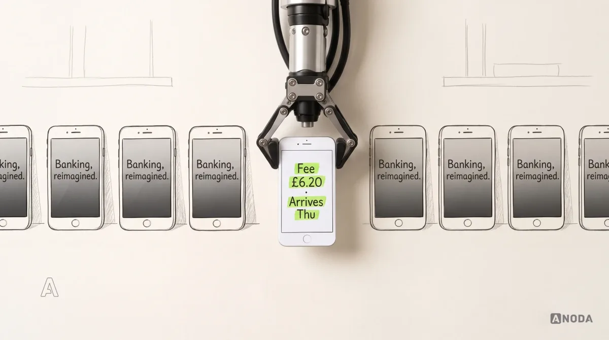
Then there is sameness. Browse a dozen fintech homepages and you get the same dark gradient, the same floating metal card, the same “Banking, reimagined”. Cover the logos and you cannot tell them apart.

In finance, a bold brand that confuses people is not brave. It is a support queue with a nice font.
Differentiation still matters. A forgettable fintech buys every customer at full price, and pays again when they drift to the next forgettable fintech. But bold only works when it does not cost safety or comprehension. The target is a brand the intended customer can remember and a product where every financial action is predictable.
Define who you serve and what they are afraid of
“Millennials”, “SMEs” and “the underbanked” are not audiences. They are census categories. A usable audience definition describes a financial situation, a job and a fear: a small design studio paying suppliers in euros that has already lost money in a bank’s exchange rate; a retiree moving savings who is terrified of scam calls; a first-time investor who does not know what a limit order is and would rather not ask.
The fear matters more than the demographics, because the fear decides what the brand must prove first. The studio wants the fee and the arrival date. The retiree wants to know who holds the money and how to reach a human. The first-time investor wants not to feel stupid. Same industry, three trust burdens, three different first screens.

Most brands do this backwards. They pick a personality (“bold, friendly, disruptive”) and then look for customers who happen to like it. It is printing the wedding invitations before deciding who you are marrying. The design is lovely; the guest list is a guess.
A brand aimed at everyone is paid for by everyone: ad spend spread across people who were never going to trust you, and a message too generic to convert the few who might.
Audit check
Write your primary audience as a financial situation plus the fear it brings, then list the three things that person must see before trusting you with money.
Failure evidence
The audience slide has age ranges and adjectives. Nobody on the team can name the fear.
Correction pattern
Choose one primary audience per product line, rank its fears and make the first screens answer them in that order.
Choose the category you want to be compared in
Customers file every new financial product next to something they already know. The category you claim decides who you are compared with, which rules you are judged by and what “trustworthy” means to the person holding the phone.
Call yourself a bank and people expect bank things: deposit protection, a phone number, a proper complaints process. Call yourself a “money app” and you are compared with the biggest money app they have. Call yourself “invoicing and payments for small studios” and your competitor becomes a spreadsheet and a reminder email, which is a far easier fight and a far clearer promise.
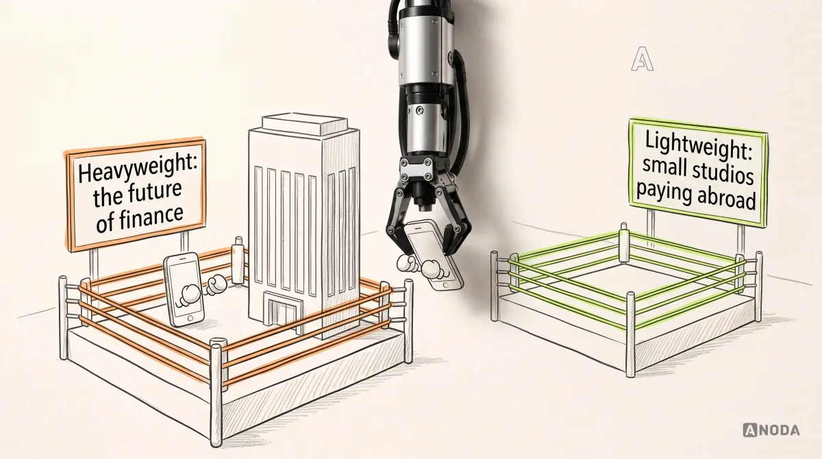
A category is a weight class. A lightweight who registers as a heavyweight gets judged against people twice his size and loses on points before the first bell. Plenty of fintechs do exactly that: a narrow, genuinely useful product described as “the future of finance”, measured against full-service banks and found thin.
The category also sets your compliance vocabulary. If you are not a bank, the brand cannot flirt with the word, and the disclosure must be as visible as the claim. Chime and Mercury, for example, both say on their homepages that they are financial technology companies rather than banks, and name the partner banks that provide the banking services. That line is not legal clutter. It is the category decision, written honestly.
The wrong category costs twice: in ads bidding against incumbents for their search terms, and in customers who arrive expecting a bank and leave when they find an app.
Audit check
Ask five target customers what your product is and what they would use instead. Compare their answer with the category on your homepage.
Failure evidence
Customers compare you with products you never considered competitors, or describe you with a word your legal team would not allow.
Correction pattern
Claim the narrowest category you can win and are licensed for, then make the disclosure part of the brand rather than the footer.
Write a promise the product can prove
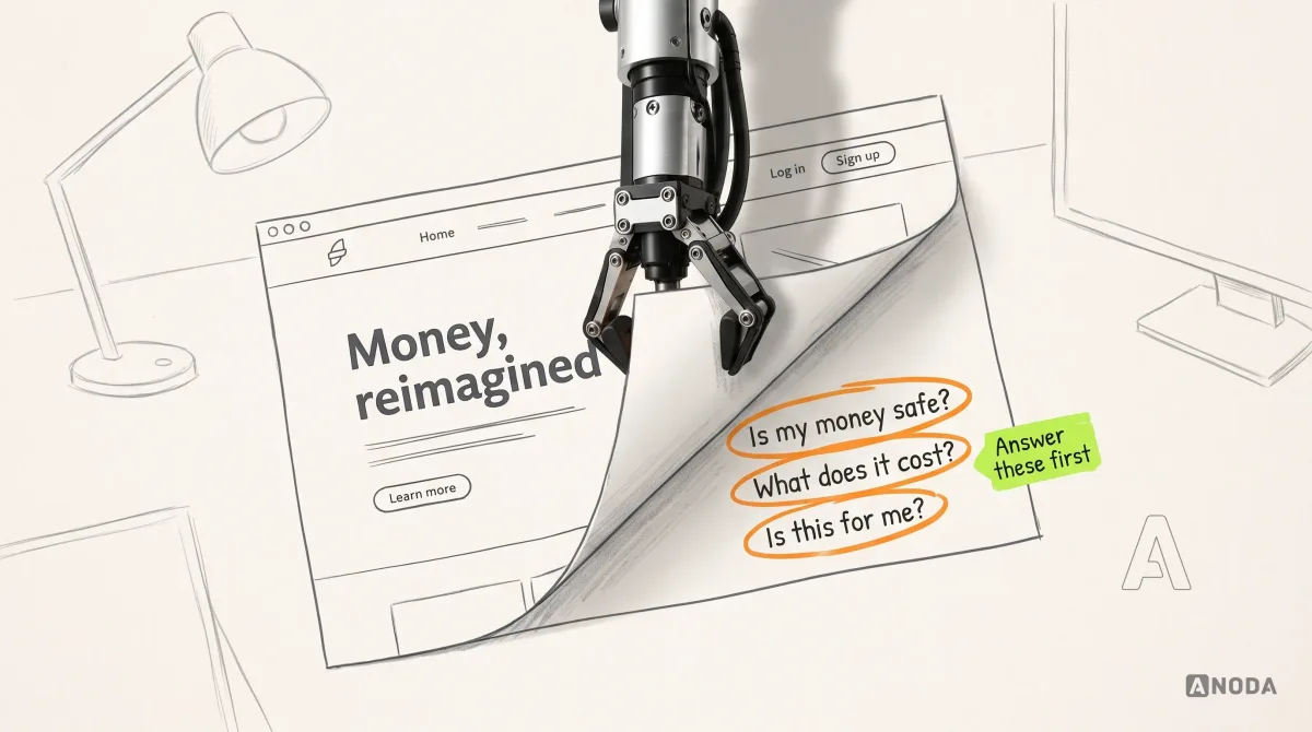
“Banking, reimagined” is estate-agent language. In a property listing, “full of potential” means the roof leaks. In fintech, “reimagined” means nobody decided what is different. A promise a customer can use is specific, checkable and kept by the product: you see the fee and the exchange rate before you send; the money arrives by the date we show; you can reach a person inside the app.
Put your money where your mouth is, literally. If the promise cannot be shown on a screen, it is not a promise yet. It is a mood.

The test is simple. Take the homepage promise and find the screen that proves it. If the brand says “no hidden fees”, where is the fee on the transfer review screen? If it says “instant”, what does the product say when a payment is held for checks? “Instant” is the favourite offender. Most payments may well be instant, right up to the one held for a compliance check, which the product then describes as “Processing” for three days. A promise with an exception needs the exception designed, in the same voice, before launch. When the promise and the screen disagree, customers believe the screen, and the brand pays for it in refunds, chargebacks and one-star reviews that quote your own headline back at you.
Audit check
Write every promise from your homepage, ads and app store listing in one column. Next to each, name the screen and state that proves it.
Failure evidence
Promises with no proving screen, or proving screens that say something different, such as “free” on the ad and a conversion margin in the rate.
Correction pattern
Rewrite each promise until a screen can prove it, or change the product until it can. Delete the rest.
Position against the real alternative, not against Revolut
Founders love a reference brand, and in fintech it is usually Revolut. The brief says “Revolut, but for X”, the designer delivers a dark interface with a metal card, and the product launches looking like a supermarket’s own-brand version of somebody else’s cereal: same box shape, same colours, lower shelf.
Imitation loses twice. It is not memorable, because the original already owns that memory. And it does not fit, because the customers you actually serve are not Revolut’s core customers, or they would already be using Revolut.
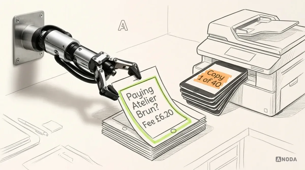
Positioning starts from what your customer does today. For a small studio paying suppliers abroad, the real alternative is not another neobank. It is the bank’s international payment form, a guessed exchange rate and an afternoon reconciling a spreadsheet. Beat that, visibly, and you have a position. Beat an app your customer has never considered and you have a pitch deck.

Differentiation is allowed to be bold. It just has to be bold about something the customer cares about. Wise, as we show below, built much of its brand on a screen most banks would rather you skipped.
Audit check
Fill in the positioning statement without naming a competitor brand: for whom, with what problem, what you are, what you do differently, unlike what, and what proves it.
Failure evidence
The statement only works with another company’s name in it. The “proof” line is an adjective.
Correction pattern
Replace the reference brand with the customer’s current workaround and find one proof point the product shows on screen.
Put trust signals where the risk is felt
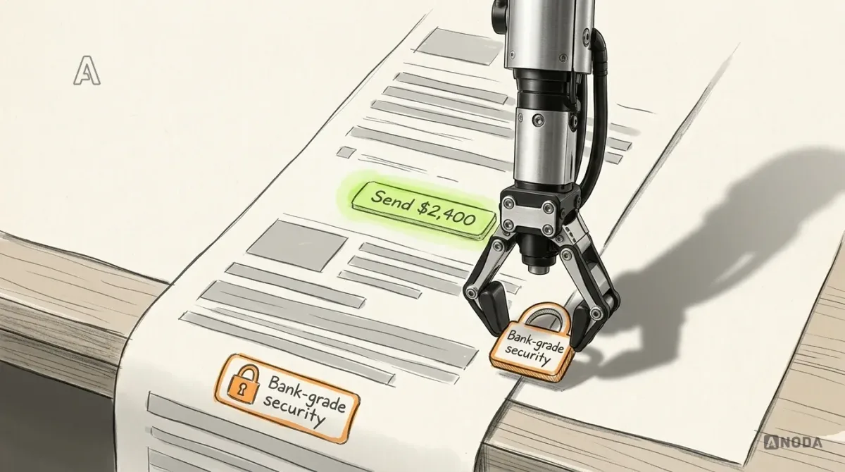
Most fintech sites keep their trust signals in the footer: a padlock, “bank-grade security”, a row of regulator names and partner logos. That is a lifeguard stationed in the car park. Technically on duty. Nowhere near the water.
Trust is needed at the moments of risk: before sending money, before uploading an ID, after a sign-in from a new device, when a payment is late, when a price changes. That is where the signals belong, written for the person living that moment.
- Before sending: who receives the money, whether the name matches, the fee, the rate, the arrival date and whether the payment can still be cancelled.
- Before verification: why you need the document, who sees it and how long the check usually takes.
- Around the balance: who holds the money and how it is protected, in one line with a link to the details.
- In every contact: what the company will never ask for, stated before a fraudster asks for it.

Generic claims backfire. “Bank-grade security” and “military-grade encryption” are exactly what a scam site says too. A specific, verifiable statement, such as the name of the partner bank, the protection scheme or the exact cancellation window, is harder to fake and easier to believe. Talk is cheap; a sort code, a scheme name and a deadline are not.
Every unanswered question at a moment of risk turns into an abandoned transfer or a support ticket, and a support ticket about a £6 fee costs more than the fee.
Audit check
List the five riskiest moments in your product and screenshot what the customer sees at each. Mark every trust signal present on those screens.
Failure evidence
All trust signals live on the homepage and in the footer. Risk screens show amounts and a button, nothing else.
Correction pattern
Move specific, verifiable signals to each risk moment and remove generic security adjectives that anyone could claim.
Build an identity system that works inside the product
Visual identity in fintech has two jobs, and most brand books only do the first: be recognisable in an ad, and work inside a financial interface where colour already means something. Red reads as loss or error. Green reads as money in or success. Amber reads as wait. If your brand colour is red and it sits on every button, amount and banner, customers cannot tell a brand moment from a failed payment. It is a hospital that painted every corridor emergency red because the colour tested well in the logo.

An identity system that survives the product defines, at minimum:
- brand colours and where they are allowed, kept separate from status colours that carry meaning;
- typography that keeps amounts legible: tabular figures, a real minus sign, currency codes that never wrap away from the number;
- icons and words for every money state, such as pending, held, returned or cancelled, so meaning never depends on colour alone;
- motion rules: what celebrates, what reassures and what never animates, because a declined payment is no moment for a bounce;
- imagery rules for serious states: fraud, debt, disputes, bereavement.
Before you strip out a banking convention to look different, apply Chesterton’s fence: find out why it was put there. The dull confirmation screen, the payment reference field and the sort code on the statement exist because someone lost money without them. Remove them for style and you rediscover the reason in your complaints inbox.
A brand book that ignores product states does not stay ignored. The product team fills the gaps screen by screen, at engineering rates, for years, and the brand drifts one pull request at a time. Our guide to building a cohesive brand system covers how to structure the rules so they reach the interface.
Audit check
Put your brand palette next to your product’s status colours and list every screen where they collide. Check amounts, minus signs and currency codes at the smallest size you ship.
Failure evidence
The brand colour doubles as an error or success colour. States are told apart by colour alone. Celebrations fire on financially risky actions.
Correction pattern
Split brand and status colours, give every money state an icon and a word, and write motion rules per level of financial risk.
Give the voice rules for bad news, not only for launch day
Most tone-of-voice guides are written for the homepage: warm, witty, a pun on the 404 page. Then the voice meets a declined card, a frozen account or a fraud case, and the brand either vanishes into legal boilerplate or, worse, stays cheerful. A surgeon who delivers bad news with a stand-up routine does not come across as friendly. He comes across as someone you would rather did not hold the scalpel.
The voice is tested at the worst moment, so write it for that moment first. Monzo’s published tone-of-voice guide is a useful reference: it asks writers to make the complex simple, leaves no room for unexplained financial jargon and treats a sensitive subject as a reason to be clearer and warmer, not more formal. Whatever your personality, the rules for bad news are the same. Say what happened, what it means for the money, what the customer can do now and when they will hear from you.

Vague error copy is paid for by the support team. Every “something went wrong” is a ticket, a call or a customer quietly deciding that the brand’s friendly tone was for sales only.
Audit check
Collect your ten most common bad-news messages: declines, failed verifications, holds, frozen accounts, fraud alerts. Read them aloud next to your homepage copy.
Failure evidence
The two sound like different companies. Messages contain codes, internal terms or no next step.
Correction pattern
Write voice rules for bad news first, rewrite each message with what happened, what it means for the money, the next action and the timing, and make support scripts match.
Where the brand promise gets tested in the product
The brand is written in marketing and audited by the product, one screen at a time. Customers do not remember your launch film when a payment is late. They remember what the app said.

Onboarding and identity verification
Identity checks are where fintechs lose the customers they paid the most to acquire. The customer arrives warm from an ad, photographs a passport and gets “Pending” with no time, no reason and no email. It is queueing at passport control with no sign saying how long, and no officer in the booth. People do not wait politely. They open the competitor’s app in the next tab.
Say why you need the document, who sees it, how long the check usually takes, what the customer can do meanwhile and how you will tell them the result. The legal requirement is the same for every regulated competitor. The way it feels is yours to design.

Security communication
Security messaging fails in two ways: silence and sirens. Silence leaves customers guessing whether that login was them. Sirens, in capitals and red, for every routine event, work like a weather service that issues storm warnings for drizzle. After the third, nobody takes shelter, including on the day it is a real storm.
Calm and specific wins: what happened, where, when, “Was this you?”, one clear action for “No”, and a reminder of what you will never ask for. That last line does more against scams than any padlock icon.

Pricing, fees and exchange rates
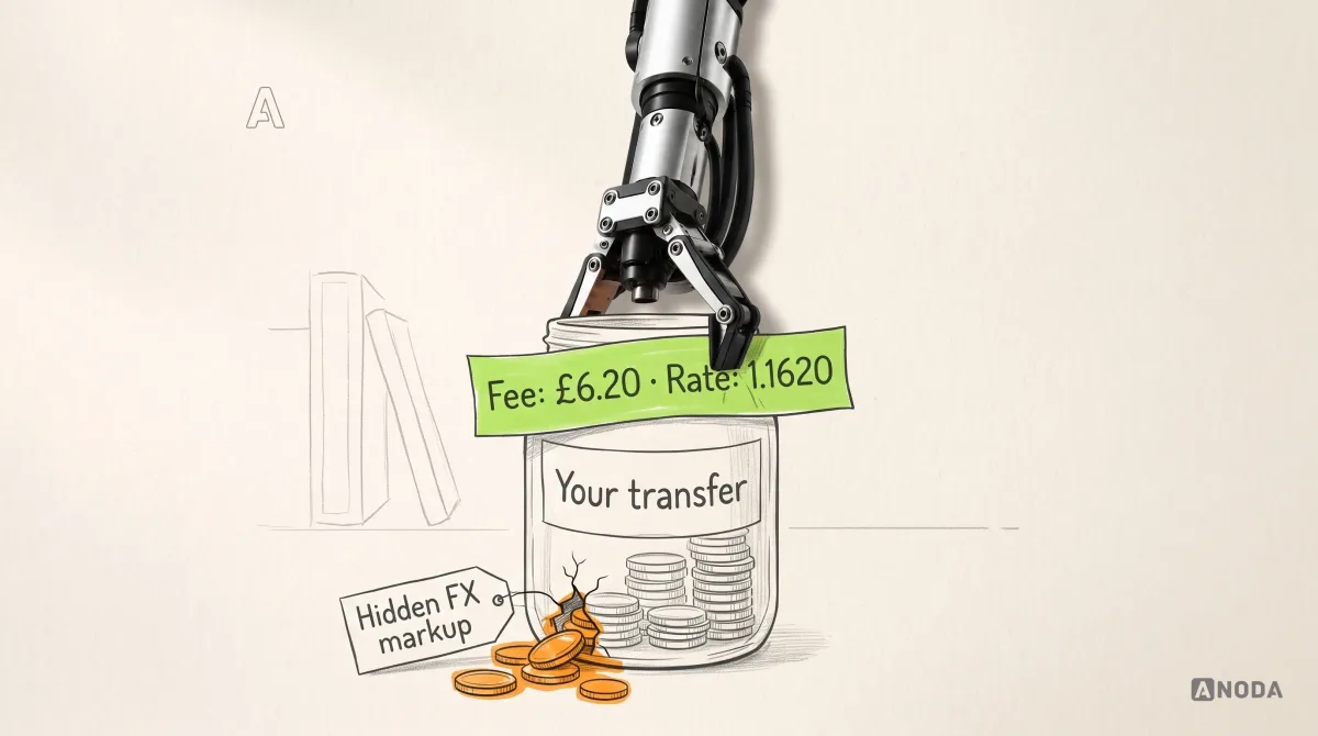
A fee revealed on the last screen is a minibar price list you only see at checkout. The ride may be fair; the customer will still feel robbed. In international payments the classic trick is a “free” transfer with the margin buried in the exchange rate, and customers have learned to smell it.
Show the fee, the rate, what the recipient gets and when, before the customer commits, and keep those numbers identical from the landing page calculator to the receipt.

Disclosures, price changes and AI use
Legal notices are brand touchpoints too, and usually the ugliest ones. A price change written as “amendments to Section 14.3(b)” tells the customer you hoped they would not read it. A plain summary on top, with what changes, when, what it costs them in their own terms and what they can do, keeps the legal text intact and the relationship too.

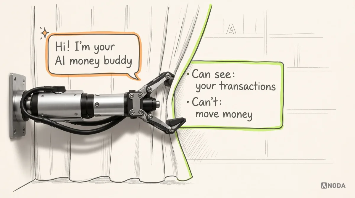
AI features raise the same trust question in a new suit. The technology is new; the customer’s question is not. Who can see my money, and who decides what happens to it? An assistant that introduces itself as “your AI money buddy” and says nothing about what it can see is a new flatmate who reads your post “to help”. Say what it is, what data it uses, what it cannot do, that it can be wrong about amounts, and how to reach a person. For an AI that touches money, those lines are the brand.

Errors and support
The support channel is the brand under the most pressure it will ever face. If “Talk to a person” is hidden behind three rounds of a bot saying “I didn’t understand that”, the brand’s warmth was for the sales funnel only. Make the human route findable, pass the conversation along so nobody repeats themselves, and write support macros in the same voice as the app.
A bot that loops is not a cost saving. It moves the cost from the support budget to the churn line, where nobody on the support team has to look at it. The customer who gave up on the chat does not file a complaint. They move their salary somewhere else and tell two friends why. We go deeper into these product moments in our guide to fintech user experience best practices.
Fintech product design
The brand promised clarity. Does the transfer screen agree?
We check onboarding, payments, security messages and support against the promise you make in ads, then design the screens that keep it.
Fintech branding examples: what the good ones actually decided
Galleries of fintech logos teach you what is fashionable. The useful question is what problem each brand decision solved and where the customer meets it. We checked each company’s public pages on 29 September 2026; brands change, so read these as decisions to learn from, not as permanent facts.
Wise: the fee is the brand
The audience problem: people sending money abroad often did not know what they paid, because the cost hid in the exchange rate while the transfer was advertised as free. Wise made that hidden cost the centre of its brand. Its pricing page still says it uses the mid-market rate with a small fee shown upfront, and contrasts that directly with providers that bury fees in the rate. When TransferWise renamed itself Wise in February 2021, the product had grown beyond transfers; the name changed, the promise did not.
Where the customer meets it: the calculator on the homepage, the transfer screens and a comparison with other providers. What to take: find the thing your category hides and make showing it your identity. That is differentiation nobody can copy with a colour palette.
Monzo: one ownable asset and a voice that holds under pressure
Monzo still calls its personal account the Hot Coral account on its homepage, and puts the FSCS protection mark beside it. One colour does the recognition work, and the protection signal sits next to the promise instead of in the footer. Its published tone-of-voice guide adds rules for plain language and for difficult subjects, which is exactly where most fintech voices collapse.
Where the customer meets it: the card in their wallet, the app, and the messages it sends on bad days. What to take: own one unmistakable asset rather than ten fashionable ones, and write voice rules that cover declines and fraud, not only launch copy.
Chime and Mercury: the disclosure is part of the promise
Chime states that it is a financial technology company, not a bank, with banking services provided by The Bancorp Bank, N.A. or Stride Bank, N.A. Mercury says it is a fintech company, not an FDIC-insured bank, with banking services through Choice Financial Group and Column N.A., and positions itself narrowly for startups, small businesses and scaling companies.
Where the customer meets it: on the homepage, next to the claims, not three clicks deep. What to take: say plainly what you are and who holds the money. A narrow audience plus an honest category is a stronger trust signal than any padlock.
Robinhood: when delight contradicts the stakes
Robinhood celebrated firsts, including a customer’s first trade, with a confetti animation. Under criticism that its app gamified trading, it announced on 31 March 2021 that it was replacing the confetti with new celebration visuals. Celebration had become part of a public argument about whether the product took customers’ risk seriously.
What to take: celebratory motion is a brand decision with financial consequences. Decide per action and per level of risk what deserves a celebration before launch, not after the headlines.
Revolut: a reference to study, not a template to copy
We are not going to list Revolut’s brand assets; you have seen them, and so has every investor you pitch. The lesson is in why the look works for them: it rides on a product breadth and a scale your startup does not have yet. Borrow the look without the substance and you get their silhouette with none of their reasons. Study how a brand’s promise matches its product. Copy nothing.

If you want to see how these ideas play out on marketing sites before defining your own direction, our roundup of fintech website design examples compares how brands express trust and difference on the web.
How to test and govern brand consistency
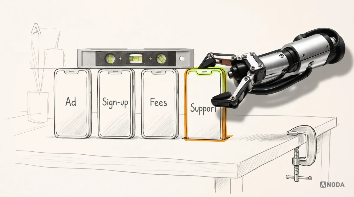
Five-second tests and preference surveys measure first impressions. That is judging a raincoat on a sunny day. A fintech brand is tested in the rain, not in the showroom: give target customers real tasks and watch. Send a payment. Pass verification. Find the fee. React to a security alert. Read a price change. Then ask what they expect to happen, what they believe it costs and whether they would trust it with next month’s rent. Compare the answers with your promise.
Governance is what keeps the brand consistent after the agency leaves. Without it, you get a burger franchise where every branch improvises the recipe: same sign over the door, a different meal inside. Fintech adds a twist: the branches are marketing, product, compliance and support, and each one writes to customers about money.

What to set up:
- a product-level brand owner who reviews every customer-facing string that mentions money, not only the marketing pages;
- a shared library of approved messages for declines, holds, verification, fraud and price changes, owned jointly by brand, product and compliance;
- a brand check in the release checklist: does this screen keep the promise, and does it use status colours and words correctly?
- a quarterly walk-through of the whole journey, from ad to support, with screenshots, by someone who did not build it;
- one number per promise: complaints about unexpected fees, support contacts per verification or abandoned transfers at the review screen.
Audit check
Take one promise and follow it from the ad through the app, the receipt, a support reply and a legal notice. Screenshot each.
Failure evidence
The promise changes wording, numbers or tone as it moves between teams. Nobody owns the strings in the middle.
Correction pattern
Name an owner per touchpoint, build a shared message library and add a brand check to every release that touches money.
When a rebrand is actually needed
A rebrand is justified when the strategy has changed, not when the team is bored. Real triggers:
- the audience or category has changed, as when a transfer company becomes a multi-product account;
- the name blocks growth, confuses the category or carries legal risk;
- a merger or acquisition leaves customers unsure who they are dealing with;
- the identity cannot work in the product: the brand colour collides with status colours, the type is illegible at amount sizes;
- trust damage is tied to the old identity itself, not to a product problem the new logo will inherit.
Weak reasons: a new executive, a competitor’s new look, an investor’s taste, and a conversion drop that is actually verification friction. A new sign over a door that still sticks gets you the same complaints under a better font. A leopard can’t change its spots, and a logo can’t change what your transfer screen does.
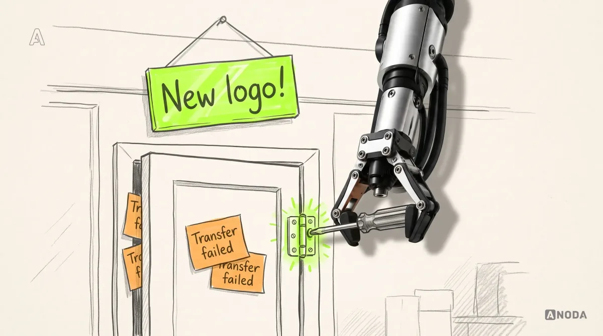
The costly version is the rebrand that ships while the product problem stays. You pay for the identity, the relaunch campaign and the new ads, and the same customers leave at the same screen. Every quarter you spend repainting instead of fixing the flow, you choose to keep paying twice for each customer who churns.
Brand, product design or UX: where your problem belongs
Before you commission anything, match the symptom to the work:
| What you observe | Where the problem sits | What to do |
|---|---|---|
| People cannot say who you are for or how you differ | Brand strategy and positioning | Define audience, category, promise and position, then the identity |
| Customers understand the promise, then abandon at verification, fees or security steps | Product and UX | Redesign the flows that break the promise |
| The brand looks fine in ads and falls apart in the app | Identity system and governance | Extend the brand into product states, voice rules and ownership |
| Few of the right people arrive at all | Acquisition and channels | Fix targeting and channels before touching the brand |
| Everything above at once | Brand and product together | Start with strategy, then audit the journey against it |
If the first or third row is yours, our branding services cover strategy, identity and the system that carries both into the product. If the second row is yours, start with the fintech product design work behind flows like verification, payments and disputes. And if you want proof before a conversation, browse our case studies.
A fintech brand earns its keep in two places at once: in the customer’s memory and in the customer’s transaction history. Be different in a way the people you serve will remember, then make every financial action predictable and every trust claim visible in the flow where they need it. The logo gets you noticed. The fee screen gets you believed.

Fintech branding
A brand your customers remember. A product that keeps its word.
We build fintech brand strategy and identity together with the product moments that prove it: verification, fees, security and support.
Written by