In short
A brand system is not a logo folder, a favourite colour or a PDF nobody opens. It is the shared language that lets marketing, product, sales and partners express one company's character without a designer in every room. Here is what belongs in it, how it differs from identity, guidelines and a design system, and the order we build it in: character, category audit, brand code, real-use checks, touchpoints, rules, perception tests and governance.
In this article
- What a brand system is, and what it is not
- Start with character, not with a colour somebody likes
- Audit the category before you join it
- Find the durable brand code
- Check every ingredient against real use
- Make the code work across touchpoints
- Give teams assets, permissions and prohibitions
- Test the perception you actually get
- Decide who owns the system and how it changes
- Where your brand system work belongs
A brand system is the shared language a company uses to express its character: who it is for, how it looks, how it sounds and how every team applies that in real work. It is not a logo, a favourite colour or a beautifully typeset PDF on a shared drive. A logo tells people which company this is. A brand system decides whether they remember it, trust it and can tell it apart from the competitor one scroll away.
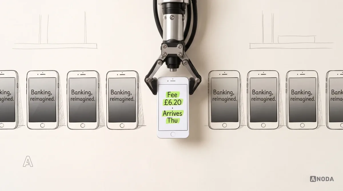
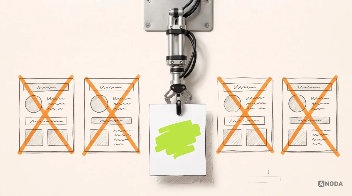
In our brand and product work, the most common brand we meet is a folder: logo_final_v3.png, a hex code copied from a deck and a font nobody paid to use on the website. The company believes it has a brand. It has a name on the doorbell and no idea how the house is run.
The bill arrives quietly. Marketing rebuilds the same assets every campaign, at agency rates. The product team invents its own buttons. A podcast host stretches your logo into a square. And the users you paid to reach remember “the blue one” and book your competitor.
ANODA builds the brand and its product expression together. We settle the character, turn it into visual and verbal rules, then make those rules usable in interfaces, campaigns and partner assets. The Glimix, ParaVista, Hike, EasyRent and Arize examples below show that continuity across real touchpoints. Your team gets a recognizable company to work from, rather than another logo folder to interpret.
What a brand system is, and what it is not
A brand system connects strategic character to verbal and visual language, reusable assets, touchpoint applications and governance, so different teams produce work that is recognisably one company without every asset looking identical.
It gets confused with five neighbours, and each confusion costs money:
- A logo is one identifier. Necessary, nowhere near enough.
- A visual identity is the set of visual expressions: logo, colours, type, imagery. It says how you look, not how you speak or decide.
- Brand guidelines document the rules. They describe the system; they do not run it.
- Brand architecture decides how a company’s brands relate: one master brand, endorsed sub-brands or separate names. The system respects it; it is not the system.
- A product design system turns interface components and behaviour into reusable code and design files. It should express the brand but cannot replace it: it knows how a button behaves, not why the company sounds the way it does.

A logo without a system is a signature with no handwriting behind it. People can check it matches. They cannot pick it out of a crowd.
Start with character, not with a colour somebody likes
Every brand has a character, chosen or not: calm, energetic, formal, cheeky, clinical. Users feel it in seconds. The question is whether you meant it.
People usually think branding means our logo and our website. It doesn’t. Branding is the visual language you use to talk to your users, and it has a soul: a character, even an age. Software on its own has no character. It’s buttons. Yet users will tell you straight away: this app is calm, and this one keeps me on edge.
 Oksana KovalchukFounder & CEO, ANODA
Character is built from small choices. Take direction, a reading Oksana uses a lot: lines rising diagonally from left to right tend to feel like energy and growth, lines falling away like a slowdown. Not a law of physics, just the kind of association that makes one landing page feel ambitious and another tired before anyone reads a word.
So the first decisions are not visual. Who exactly is this for? Which category will they compare you with? Which three or four character words must they feel, and which never? A cleaning app for busy parents and a cleaning platform for hospital facilities managers share a service and need opposite characters.
Then comes the founder’s favourite colour. Liking green is not a crime, and it can be a fine input. Choosing a brand because you like green is a school picking mustard uniforms because the head teacher likes mustard. Somebody has to check it against the audience, the category, contrast rules and the dozen jobs a colour does in a real interface.
Audit the category before you join it
After Facebook, social products spent the best part of a decade in blue. Crypto had its dark purple and navy years, then its dark green ones. Each wave made sense at first: familiar signals tell people which category they are in. By the thousand-and-first clone, your branding works against you.
Oksana’s favourite test is a very ordinary story. A blogger recommends your app on TikTok. Somebody watches with one eye, half asleep, and keeps two things: a rough sense of what you do, and a colour. Next week they need a cleaner, search, and see two results in the same blue. They click the one ranked higher, and if you are new to the market, that is not you. You paid for the awareness. Your competitor collected it.
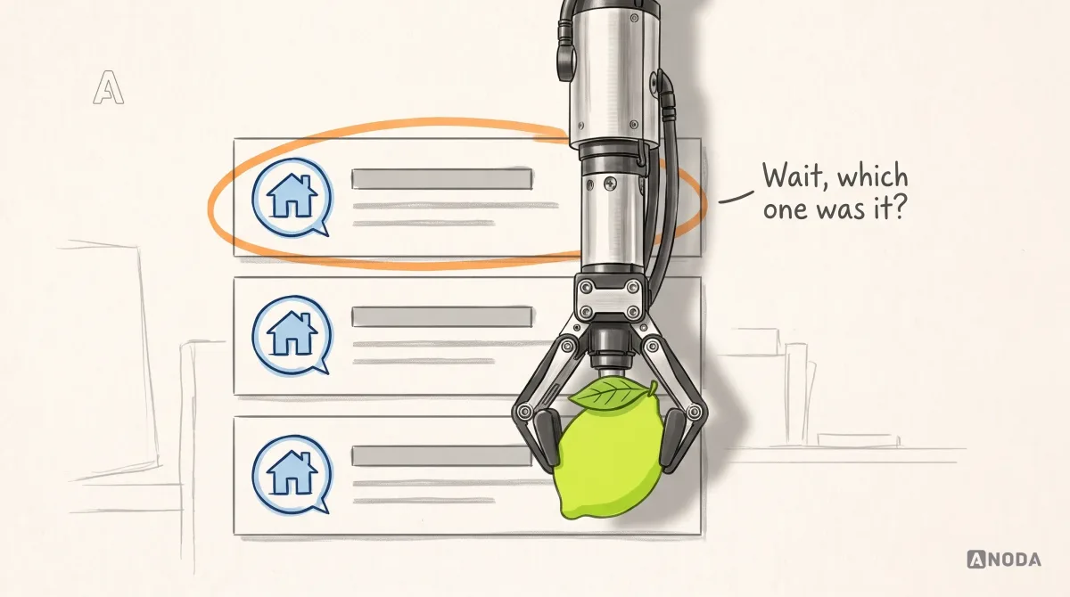
It is an airport car park where every car is a silver hatchback. You parked “near a silver car”. Good luck.
A category audit takes days, not a quarter:
- line up competitors’ homepages, app screens, ads and posts with the logos covered, and list the colours, shapes, imagery and phrases they share;
- mark which shared signals are useful (people must recognise the category) and which are just habit;
- collect what people already remember about you, from tickets, reviews and sales calls, before you throw any of it away;
- decide where you will deliberately differ.
Find the durable brand code
The brand code is what makes you recognisable with the logo cropped out: colour roles, typography, shape and direction, imagery, motion and tone of voice. Some of it lasts decades. Some is flavour of the month, and should be treated that way.
Distinctive assets do the heavy lifting in memory: a mascot, an illustration direction nobody else uses, a shape language, a way of writing headlines. The fastest way to lose them is to borrow whatever everyone uses this year. Oksana has a long-running feud with the flat 2D people with enormous legs that once filled every startup website. Not because the style is evil: when everyone uses it, it identifies nobody. A small budget is no excuse. Even a bought illustration pack can be redrawn and recoloured until it looks like yours. Building your identity on a trend is getting a tattoo of this year’s meme.

The test for each ingredient: would a user recognise us by this alone? If only next to the logo, it is decoration, not code.
Check every ingredient against real use
A brand code that looks stunning on a slide and breaks the first time it meets a button, a licence or a children’s app is a mood board, not a system. Four checks catch most of the damage.
Colour roles and contrast. A brand colour has to work as a background, as text and as a button, and each role has its own rules. WCAG 2.2 text contrast calls for at least 4.5:1 for normal text and 3:1 for large text, with exceptions including logotypes and inactive controls. For an active button, check its label as text; separately check the visual information needed to identify the control or its state at 3:1 against adjacent colors. A brand swatch can stay in the logo without automatically becoming a readable button background.
We live this one. ANODA’s brand colour is orange, and Oksana is blunt about it: a UX agency that sells accessibility work shipping a button that fails a contrast check would be a fine irony. So the exact logo swatch does not automatically become a button with any text on it. The combinations get tested: which text colour, which shade, where the pure brand colour is allowed.

Typography and licences. One weight of one typeface is not a type system: real touchpoints need headings, body text, numbers, captions and interface labels. And fonts are licensed property. A logo in a paid typeface nobody paid for goes unnoticed until the font goes on the website. Then you pay, or get a very unpleasant letter. Licences differ by foundry, family, weight, medium and traffic, so check exactly what yours covers. It is building an extension on your neighbour’s land: nobody minds until the day you want to sell.
Imagery and motion. Stock photos, icon sets and illustration packs have licences too, and animation has to behave when someone has switched motion off in their device settings.
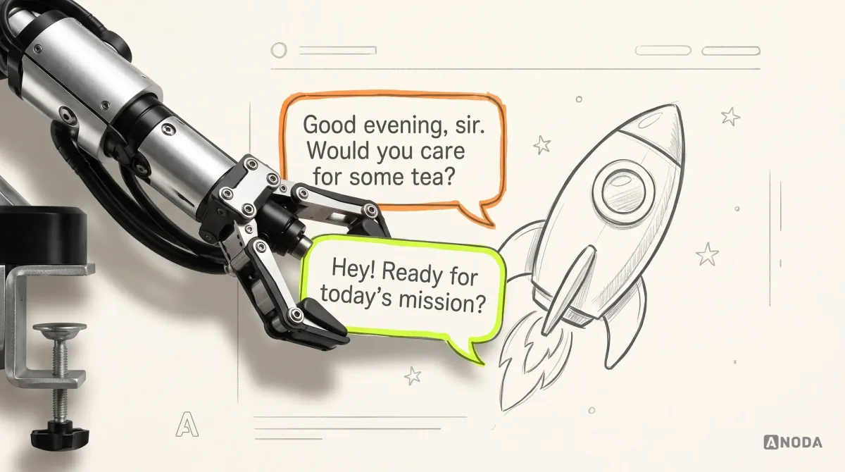
Tone of voice. Horses for courses. A children’s app that greets users with “Good evening, sir, may I offer you some tea?” is not elegant. It is lost. Visual and verbal character must describe the same company: a playful palette with legal-department copy reads like a costume.
Make the code work across touchpoints
Cohesive branding does not mean everything looks the same. It means everything is obviously from the same company. A sales deck, a push notification and a billboard have different jobs; the system says what stays fixed and what may flex.

The website is usually the first real stress test, because it carries character, content and conversion at once. If you are redesigning it, our website design team builds pages from the brand system instead of around it.
The product is harder. Brand rules have to become interface decisions: colour roles become tokens, the type scale becomes text styles, character shows up in empty states and error messages. A product design system is where that translation lives, as components, tokens and documented behaviour. The brand system owns character and code; the design system owns how a button, a form and a table behave. Disconnect them and product teams guess, and the brand drifts one release at a time.
Brand to product
Your brand book stops at the marketing site?
We translate brand rules into tokens, components and governance your product team can actually ship with.
Give teams assets, permissions and prohibitions
This is where most brand systems quietly die: designed, approved, celebrated, then handed to people whose job is something else.
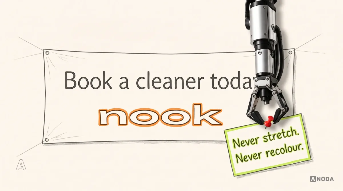
If you just hand your marketers the logo and say “there you go, two files”, you’ll find your logo squashed. Their job is to produce more layouts and get the traffic running. Whether your company ends up unrecognisable, cheap-looking or simply wrong is not their field. They’ll do it, and you never said it was forbidden. It’s the same with AI: if you didn’t say what must not be touched, now you sit and clean it up.
Oksana KovalchukFounder & CEO, ANODAA logo file with no rules is a car key handed over without saying which car it opens. People will improvise, and your brand will pay for every guess.
People who apply the brand without a designer at their elbow need:
- production-ready assets: logo packs for light and dark backgrounds, templates for decks, posts, ads and documents, approved imagery;
- permissions: what may change, with examples: layout, crop, supporting colours, copy length;
- prohibitions: what must never change, with examples of it going wrong: stretching, recolouring, logos on busy photos, the wrong tone;
- approved words: the company description in three lengths, bios, product names and how to spell them;
- an easy public door: a press page where agencies, journalists and podcast producers download approved material instead of screenshotting your homepage.

A good brand PDF helps, especially on your website. Alone, it governs nothing. It is a speed-limit sign propped in a garage: technically present, practically unseen.
Make the asset library usable without the designer
Keep approved masters separate from export-ready assets and archived work. A simple structure is brand/core, brand/product, brand/campaigns, brand/sales and brand/archive. Name each export by asset, variant, language, size and release, such as logo-primary-dark-en-r03.svg or event-banner-landscape-en-r03.pdf. Add the intended background, owner, license and source link beside the asset, rather than asking a partner to infer them from a filename.
The library needs three states: draft, approved and deprecated. A deprecated asset points to its replacement and says when remaining uses should migrate. Restrict editing of masters; let teams duplicate approved templates into campaign work. Keep a small change note listing what changed, who must act and which old exports are no longer valid. Update the press/download page when the approved pack changes.
Onboard people with their actual first task: make a sales slide, a social post and an error message using the system. Review the examples together. Questions that recur become missing examples in the guide, not reasons to ask every new employee to memorize the brand PDF.
Identity carried into real product touchpoints
Glimix carries its new logo, app icon, color and type rules into app stores, a landing page and a pitch deck. ParaVista connects the hospitality marketplace’s identity with its mobile-first web product. Hike spans an orthotics app, an HR-facing surface and an exhibition booth. Positioning and audience choices belong in brand strategy; their visual/verbal expression and usable asset rules belong in branding.
EasyRent shows logo exploration and a visual direction carried into the rental experience, supplier tools and the landing page. The same type, color and components stay recognizable across those surfaces while customers and suppliers each get the interface their work needs.
Arize carries a shared visual system across its responsive product website, WooCommerce store and investor deck. Product options, cart rows and presentation slides use the same type and color rules while serving different jobs: choosing limbwear, completing a purchase and explaining the business.
Test the perception you actually get
What you intend and what users perceive are different things, and you only learn the gap by asking. Brand character is like your own perfume: everyone else notices it before you do, and not always the way you meant.
You do not need a research lab. Show target users your key touchpoints next to two or three competitors, ask them to pick fitting words from a list mixing your intended words with their opposites, and ask a day later what they remember. If “calm” came back as “clinical” and your name came back as a competitor’s, you learned something cheaply that would otherwise be expensive.

Test the words too. A tone that reads as friendly in a workshop can read as flippant in a failed-payment message.
Decide who owns the system and how it changes
Without governance, a brand system is a football club where every player brings his own kit. Everyone is technically on the team. Nobody in the stands can tell.
Governance is not a brand police force. It is a few decisions made once, in writing:
| Decision | Owner | Contributes | Signs off |
|---|---|---|---|
| Character, code and core rules | Brand owner | Founders, marketing, product design | Leadership |
| New templates and assets | Marketing or brand designer | Any team that needs one | Brand owner |
| Product tokens and components | Design system owner | Product designers, engineers | Brand owner for brand-level changes |
| Changes to the core code | Brand owner | Anyone, via a written request | Leadership |
Adoption is measurable. Count how much new material starts from official templates, how many off-brand assets a quarterly sweep of ads, decks and product screens finds, how long a partner waits for an approved logo, and which questions the brand owner keeps answering: those are gaps in the rules. A guide nobody can find doesn’t exist, so put the system where people already work.
Change is part of the job, just not all of it at once. ANODA’s logo was made early in the company’s history, in one evening, by three people with two bottles of beer, and it has not changed by a pixel; the most we have played with is how red or how light the orange of the letter A is. Oksana does not think it looks dated. The website changes style roughly every three years. That is not a schedule to copy. It is the difference between a durable identifier and its applications.
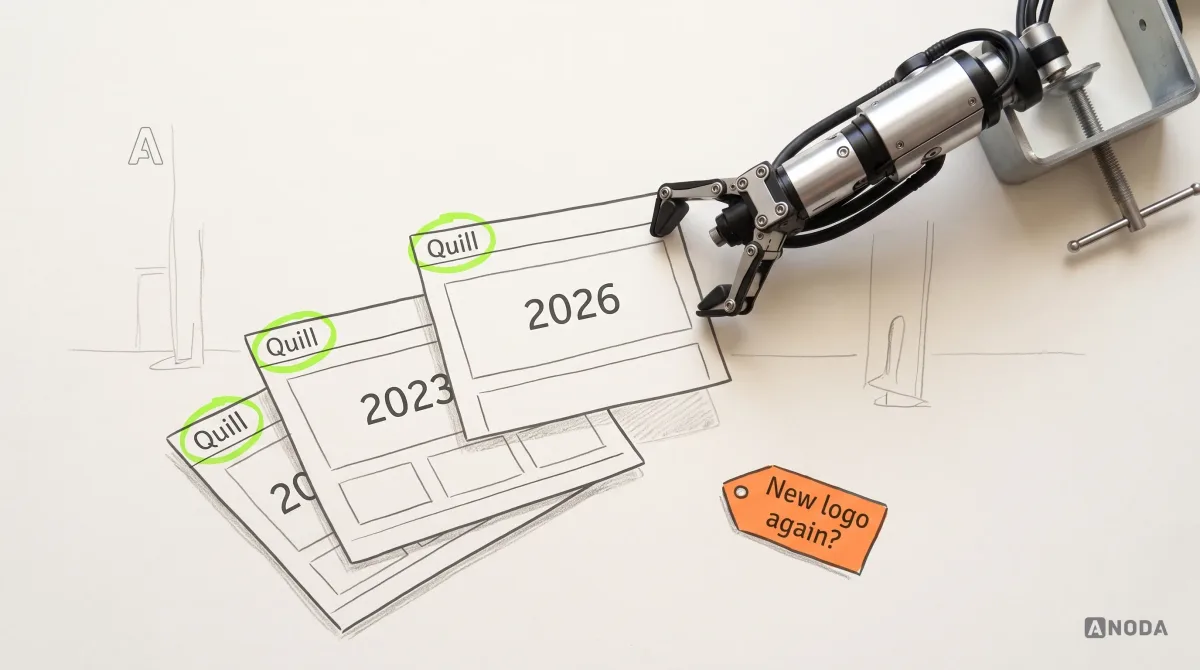
Refresh what no longer serves the audience, the medium or the business. Keep what people recognise. A logo redesign on a fixed calendar is paying twice for the same recognition.
Where your brand system work belongs
If the audience, positioning and promise are still undecided, our brand strategy services settle those choices before the visual identity is designed.
If the brand itself is unclear, inconsistent or built on a favourite colour, start with the foundation: our branding services define the character, the code and the rules to use them. If the brand is fine but the product drifts from it, the gap is in the design system. If a website redesign is coming, build it on the system rather than hoping the system emerges from it. In financial services, our guide to fintech brand strategy picks up where this one stops. More on brand and product decisions lives in the ANODA UX blog.
Build a brand DNA, not a logo folder. Decide what character you express and to whom, study the category without copying it, test what people perceive, and give every team the assets and the rules. Then change the applications when you must, and leave the recognition you already paid for alone.
Branding
One company. Not six teams’ versions of it.
Tell us about your brand, your teams and the touchpoints where it falls apart. We build the character, the code and the rules that keep it together.
Frequently asked questions
What is a brand system?
The connected rules, reusable assets and ownership that let teams express one brand across product, marketing, sales and partner touchpoints.
How is it different from visual identity?
Visual identity defines the logo, type, colors and imagery. The system adds verbal rules, application examples, templates and the process for keeping them usable and current.
How does it relate to a product design system?
The brand system owns character and expression; the product design system turns that into interface tokens, components and behavior. Shared rules connect the two.
What belongs in an asset library?
Approved masters and exports, templates, variants, licenses, owners and use notes. Separate draft and deprecated assets, and point obsolete files to their replacements.
Who approves brand changes?
Name a brand owner for rules and assets, a product-system owner for interface components and a leadership approver for core changes. Record exceptions and tell affected teams what must migrate.
How can teams check adoption?
Review real campaigns, sales material and product states. Track use of approved templates, repeated questions, off-brand exceptions and time needed to find correct assets.
Written by