In short
A component library needs a defined product scope rather than parts for every possible future flow. Components earn their cost when they cover what the product actually repeats, with relevant states, content rules, accessibility guidance and an owner. Here is what goes inside a component, what to standardise first, how Figma and code drift apart, and the governance that stops a library turning into a museum.
In this article
- What counts as a design system component
- Screens laid out in Figma are not a design system
- The anatomy of a production-ready component
- Scope the system for the product you can define
- Audit what has already drifted
- Which components to standardise first
- Assemble real screens before you call it finished
- Keep Figma components and code components in step
- Governance: how components are added, changed and retired
- How component libraries fail
- Diagnose which problem you actually have
- A component library shaped by a real product: Fusion
- The order we build it in
- Stop paying for the same interface decision again
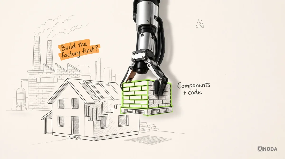
Design system components are the reusable parts of an interface — buttons, fields, dropdowns, panels, cards, navigation — each with defined variants, states, content rules, accessibility guidance and an owner. For an implemented library, document the coded counterpart and verify its behaviour. The library is not the goal. The goal is a product that repeats its decisions instead of re-arguing them on every screen. And here is the part nobody puts in the pitch deck: the most expensive design system is the one built for a product that doesn’t exist yet.
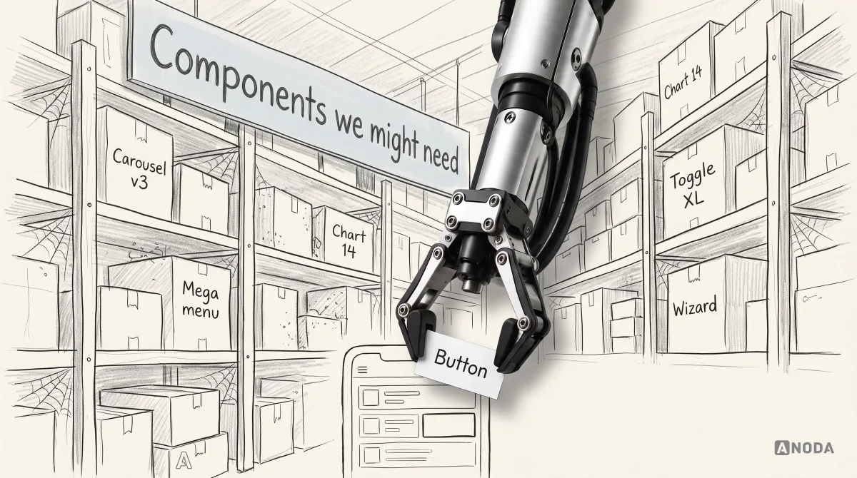
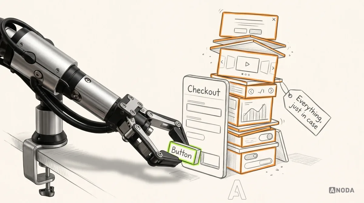
“Make it bigger, so we never have to rebuild it.” Consider a team with a modest app and a handful of flows that asks for a design system with everything in it: charts, dashboards, every flavour of button, white-labelling just in case. We ask what they plan to build in the next three months, or the next year. The answer is some version of “we don’t know yet, but make it cover everything”.
Component libraries die of two things: bloat or neglect. Here’s what belongs inside a component, what to standardise first, and how to keep the whole thing honest after launch.
What counts as a design system component
A design system component is a reusable interface part with a defined purpose, supported variants and states, content rules, documentation and an owner. Design libraries and implemented libraries have different deliverables; when code is in scope, document and verify the mapping between them.
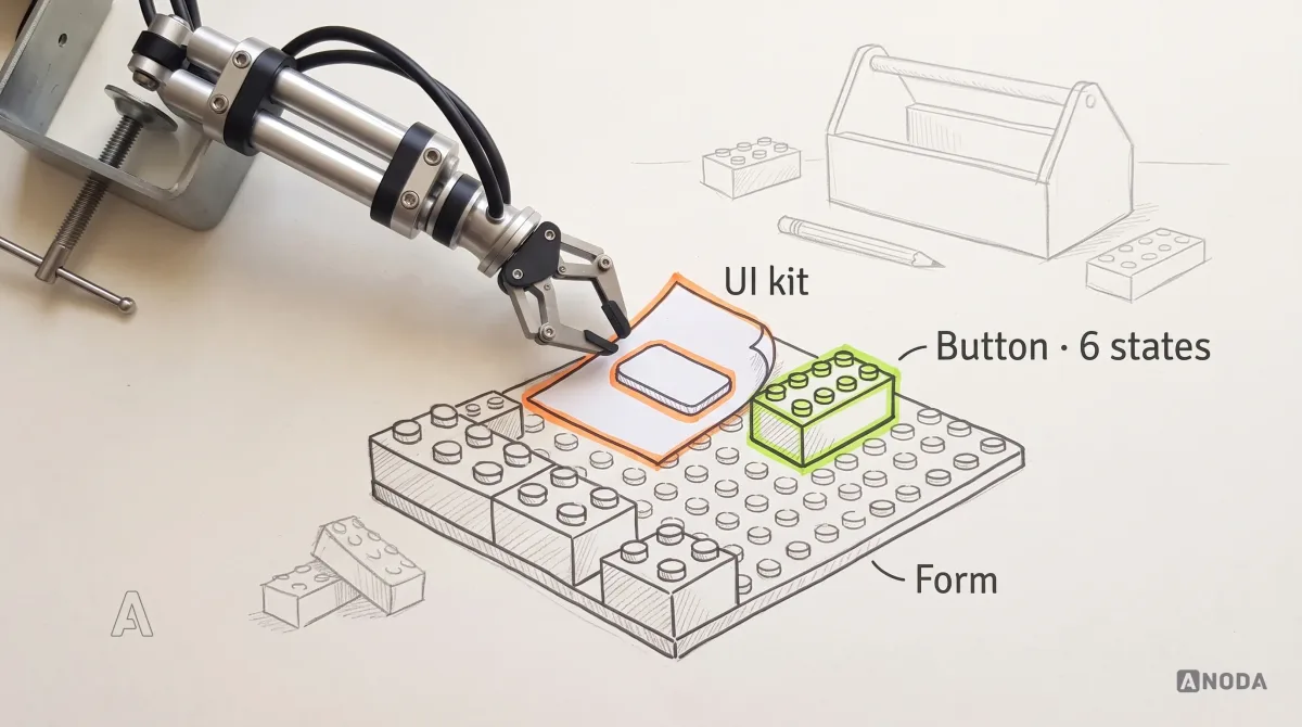
Think of toy bricks. Tokens are the plastic and the colours. Components are the moulded bricks that click together. Patterns are the instructions for building the fire station. A template is the baseplate with the station’s outline printed on it. The design system is the whole box, plus the rules about which bricks exist and who is allowed to mould new ones.
| Term | What it is | Example |
|---|---|---|
| Design token | A named value for one decision | color.primary, space.3, radius.control |
| Style | Published visual values in a design tool | Text styles, colour styles |
| UI kit asset | A drawing of a part, usually with no behaviour or code | A button copied from a community file |
| Component | A reusable part with supported variants, states, rules and an owner | Button, text field, select, panel |
| Pattern | Components combined to solve a recurring task | Filtering a list, confirming a destructive action |
| Template | A page layout with slots for content | A list-and-detail screen |
| Design system | Foundations, components, patterns, guidance and the governance that keeps them true | The whole box, plus the rulebook |

A folder of reusable assets does not explain how to combine them into a usable task flow. Isolated components with no rules for combining them are a toolbox without a plan: every tool works, and nobody agrees what’s being built. If you need the business case for a system before zooming into its parts, start with our guide to design system elements, benefits and best practices.
Screens laid out in Figma are not a design system
The most common thing we find in a product that “already has a design system” is a very large Figma file full of frames. No components. No spacing logic. No Auto Layout. Every screen was drawn, duplicated and nudged by hand. It looks tidy in a presentation and behaves like a Western town on a film lot: every saloon has a front, and there’s nothing behind the door.
It’s 2026 — working without components? Apparently that’s normal. Teams come to us all the time with a design where everything is just frames. No components, no spacing, no Auto Layout, nothing at all, on a big product. And a product manager with very honest, very sad eyes says: “It doesn’t scale.” Of course it doesn’t — you don’t have a design system. Screens laid out in Figma do not mean you have a design system.
 Oksana KovalchukFounder & CEO, ANODA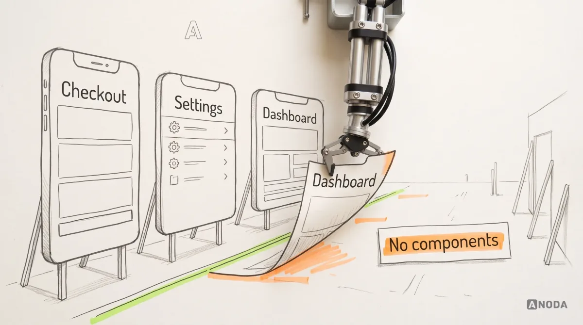
Without shared instances or update rules, a change can require repeated edits. A new brand colour, a longer label, one more field: somebody edits every frame by hand, misses a few, and engineering builds from whichever version they found first. You’re paying designers to do the job of a find-and-replace that was never set up, and paying engineers to guess which of three buttons is the real one.

Audit check
Open five core screens and inspect the primary action, the main input and the page header on each. Are they instances of one component, or drawings?
Failure evidence
Detached instances, repeated manual drawings and unexplained spacing differences. Layer names alone do not establish a defect.
Correction pattern
Confirm which parts should be shared, then introduce suitable components and layout rules. Preserve intentional differences and verify consuming screens.
The anatomy of a production-ready component
A button in a UI kit is a rectangle with a word in it. A button in a working system answers a dozen questions before anyone asks them. This is what we check when we review one:
- Purpose. The job it does, and when to use something else.
- Variants. Deliberate differences: primary, secondary, danger; medium and large.
- States. Default, hover, focus, pressed, disabled, loading, and error where it applies.
- Content rules. Label length, casing, icons, what happens when the text doubles in translation.
- Behaviour. Keyboard and touch, and what a second click does while the first is still loading.
- Responsiveness. How it stretches, wraps or stacks on smaller screens.
- Accessibility. Contrast, visible focus, target size, the name a screen reader announces.
- Tokens. The named values it uses, with documented consuming values and overrides to check after a change.
- Code mapping. The coded component and the props that match each design property.
- Tests. Visual and behavioural checks that catch a regression before users do.
- Documentation. Usage guidance where people actually look.
- Owner and change history. Who approves changes, and what changed in which version.

A component with only a default state leaves behaviour unspecified. Document the states needed by the actual task and agree how design and engineering handle them. Every missing state becomes a decision someone has to invent later. Specify it once instead of paying your team to improvise it on every screen.
| Fictional operation | Idle label | In-progress label |
|---|---|---|
| Save visit | Save visit | Saving visit… |
| Reschedule job | Reschedule | Rescheduling… |
| Cancel job | Cancel job | Cancelling job… |
Define default, hover where supported, focus, pressed, disabled and in-progress behaviour for the relevant controls. Keep progress copy specific to the operation and verified state. Do not announce completion before confirmation; provide an appropriate recovery path when the outcome is unknown.
Inputs need explicit decisions about persistent labels, hints, validation and recovery. An unclear label or useless error turns a simple form into a support conversation. Write the rules before your customers have to ask.

For a form field, document the persistent label, hint, required or optional status, error message and recovery action. Define when validation runs, whether entered data survives a failed submission, and how focus moves to an error. Disabled and read-only are different states: explain what the customer can change and why. Test those decisions inside a complete form, including keyboard navigation and screen-reader announcements.
Build accessibility requirements into components and verify their use in complete screens. WCAG 2.2 level AA requires text contrast of at least 4.5:1 for normal text and 3:1 for large text, with defined exceptions. Its pointer-target criterion requires at least 24 by 24 CSS pixels or an applicable exception, including sufficient spacing. Shared fixes can reach screens that consume the updated component, but labels, keyboard order, content, configuration and complete task flows still need checks.
| Review area | Component guidance | Screen-level verification |
|---|---|---|
| Labels | Provide a persistent visible label and accessible name. | Verify that the actual field has the intended label and association. |
| Focus | Define and implement visible focus states. | Walk the complete screen with a keyboard and check order, visibility and obstruction. |
| Contrast | Use suitable values for applicable text and control states. | Check rendered colours and backgrounds in each relevant state. |
| Targets | Define usable controls for the supported input methods. | Check actual dimensions, spacing and applicable exceptions. |
Make the shared component the reliable default, then check overrides and composition on the screens that use it.
Audit check
Pick your three most used components and try to find every state, content rule, code counterpart and owner for each.
Failure evidence
Only default states in the library, loading and error states that exist in code but not in design, nobody able to say who approves a change.
Correction pattern
Write the missing states and rules into the component itself, then test them on a real screen, not a component preview.
Scope the system for the product you can define
Define the scope before estimating a component library. The first question isn’t “how big should the library be?” It’s “what will this product actually do in the next three months and the next year?”
Imagine you go to a tailor and say: I have two suits and three shirts, make me a wardrobe. He asks which country you’ll live in, what climate, what lifestyle — in some places men don’t wear shorts. And you say: I don’t know, make it for every occasion. Now picture the size of that wardrobe. Everything from Hawaiian shirts to formal suits to tuxedos. It’s an absurd request. A design system “to grow into” is exactly the same.
Oksana KovalchukFounder & CEO, ANODAA speculative system is a jack of all trades and master of none: piles of components for flows nobody has specified, each needing documentation, updates and tests forever. Then the product grows in a direction nobody predicted, and half the wardrobe doesn’t fit anyway.
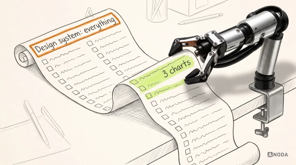
Turn the request into named tasks, deliverables and maintenance needs. A hypothetical team may discover that three chart types and consistent forms cover its current scope. Consider how much speculative scope the team can maintain:
Building a design system to grow into is silly. You can argue with me all you like — it’s silly. If you don’t need the money, you can just transfer it to us. We love money, and we’ll happily give your product five stars. But it’s a completely pointless exercise.
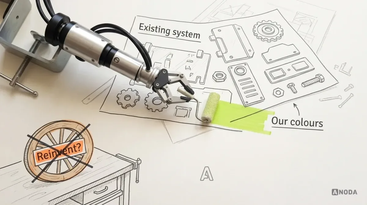
Oksana KovalchukFounder & CEO, ANODAIf the roadmap is uncertain, evaluate an existing system before commissioning a broad custom library. Compare current task coverage, licence terms, platform support, implementation fit and maintenance needs. Material Design and Carbon are references to investigate, not automatic fits for every product. Our round-up of design system examples provides starting points for that comparison.

Audit what has already drifted
A live product has interface conventions, whether or not they form a maintained design system. Inventory repeated controls and compare dimensions, states and implementations. Some variations serve different tasks or platforms; investigate before consolidating them.
It’s a school where every classroom clock shows a slightly different time. Nobody is badly wrong, and the whole school is late. It’s a dripping tap: each inconsistency too small to prioritise, together a product that feels built by strangers.

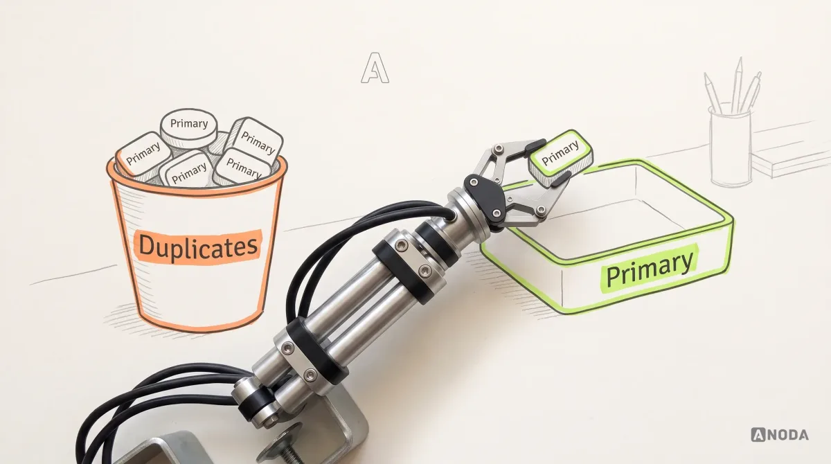
An audit has two halves. The interface half: an inventory of every repeated part across the core screens, with its variants, missing states and odd behaviours. The structural half: how the Figma file is built — real components or drawings, Auto Layout or hand-placed frames, detached instances, hard-coded values — and how many implementations of “the same” component live in code. The output is not a slide of screenshots. It’s a list of what to merge, what to fix and what to delete. Bringing this kind of mess back into order is the part of the job we enjoy most.
Audit check
Inventory one component across every core screen: size, radius, states, label style, and whether it’s a real instance in design and one implementation in code.
Failure evidence
Several implementations, differing state coverage or unexplained design-to-code mappings. Check task and platform needs before classifying them as defects.
Correction pattern
Compare behaviour and supported tasks, agree which variants should remain, and migrate consuming screens before removing redundant implementations.
Which components to standardise first
Don’t start with the prettiest component, or the one on a competitor’s showcase site. Start with what the product repeats, weighted by what hurts when it goes wrong. A corner shop stocks bread and milk before saffron.
Assess how often each candidate appears and what happens when it fails. Buttons, fields and date controls can all be priorities, but their order depends on actual tasks, observed defects and consequences. Record the evidence behind the choice rather than assigning priority from the component category.
Prioritise components using evidence from the product:
- Frequency in supported tasks and the number of consuming screens.
- Consequences of incorrect behaviour, including lost data, payment confusion or blocked access.
- Accessibility defects and recovery difficulties.
- Effort to consolidate implementations and maintain the shared version.
A rarely used payment status indicator may need urgent correction. An onboarding carousel or promotional banner may also carry important information or introduce interaction barriers. Do not classify either as harmless from its component name; assess the actual content, behaviour and task.
A practical starting point is the primitives current flows use, such as buttons, selects and text fields, then repeated composites such as cards or filter panels. Assemble representative screens early so task-level problems can change component priorities. Terms such as atoms, molecules and organisms are optional; the sequence should fit the product rather than impose a universal build order.

The components of a design system fall into familiar families: actions, inputs, selection, navigation, feedback, data display, containers and overlays. The useful question isn’t “which of these do mature systems have?” (coverage varies by system). It’s “which do our flows need now?” A family without a real flow next to it waits.

Assemble real screens before you call it finished
A component library can pass every review in isolation and still fall apart on the first real screen. It’s a wedding seating plan: every guest is delightful on their own, and then you put the exes at table four.
Even if the client doesn’t ask for it, we still assemble a few test screens and run accessibility checks on them, and check that everything composes properly. In the design system it can all look logical and correct, and then you put it together and go: oops, that came out awkward.
Oksana KovalchukFounder & CEO, ANODAThe card that looked perfect with “Jane Doe” breaks on a customer whose legal name runs to five words. The filter panel designed for three filters meets eleven. Two buttons that sat side by side wrap on a narrow phone, and the destructive action lands where “Save” used to be.

So we build representative screens from the library — the busiest list, the longest form, the smallest phone — with real data lengths, and check them: keyboard order through the whole screen, visible focus, contrast in every state, what a screen reader announces. Identify whether the failure belongs to the component or its composition on the screen. Correct the shared component when the issue repeats; fix the layout or flow when the component is being used incorrectly. Check other consuming screens for the same issue.
After correcting a shared card, check consuming screens with representative content, relevant states and supported input methods. Confirm that they use the updated version and have no conflicting overrides. Keyboard focus should reach meaningful interactive controls in a logical order; a noninteractive card does not need a focus stop merely because it is a card. Record actual contrast and assistive-technology checks rather than treating a diagram as a passed test.

Sometimes the assembled screen reveals that the problem was never the component. The flow is confusing, the steps are in the wrong order, the screen tries to do three jobs. Standardising that just makes the confusion consistent. Fix it as product UX and interface design first, and only then turn it into reusable parts.
UI/UX design
Is the button the problem, or the flow it sits in?
If your components keep “failing” on real screens, the product logic underneath may be unfinished. We fix the flows first, then turn them into parts worth reusing.
Keep Figma components and code components in step
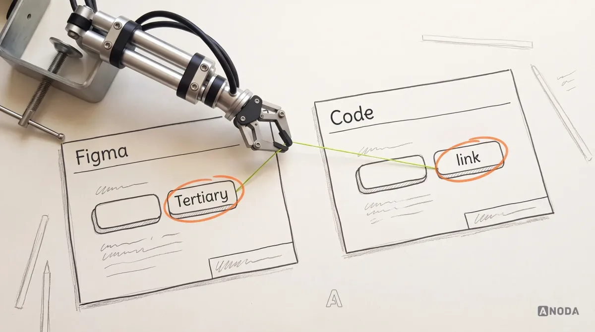
The Figma library and the coded component library start life as twins and drift apart like the plans filed with the council and the house the builder actually built. Three bedrooms on paper; a conservatory nobody mentioned and a staircase in a different place on site.
Design and code can drift when changes are made on one side without updating the other: a new danger variant, a renamed property, a loading state or a hard-coded radius. Compare the actual libraries and record the mismatches before another release spreads them.

Maintain a property-by-property mapping between design and code, including deliberate naming differences. Where shared token generation fits the toolchain, verify transformations and consuming versions. Agree which design and engineering checks each change needs, then inspect representative screens before declaring parity.

Governance: how components are added, changed and retired
A design system is a tool, not a legal code carved in stone. It has to accept legitimate new needs and refuse duplicates, and both of those need a rule, not a mood.
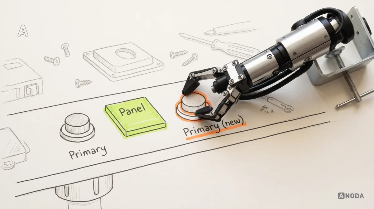
A design system has to be flexible. It’s a tool; it shouldn’t lock you into some unbreakable set of rules. Everything depends on context. If the system has no panels and we need panels, obviously we add them. But if there’s already a primary button and we’re making another one, that’s not a great idea.
Oksana KovalchukFounder & CEO, ANODAA second primary button is a second captain on the pitch: both mean well, and the team stops knowing whom to listen to. A side panel the scheduling flow genuinely needs is a new player the squad was missing. Governance is how you tell the two apart.

Workable governance covers six things:
- Contribution. Anyone can propose a component, with the product flow that needs it and why an existing one can’t be extended.
- Review. Named design and engineering owners check duplication, states, accessibility and naming. Not a committee: a camel is a horse designed by a committee.
- Exceptions. A documented one-off with an expiry date, not a quiet fork.
- Versioning. A changelog, version numbers and breaking changes announced before they land.
- Deprecation. A replacement, a removal date and a list of screens still affected.
- Adoption and feedback. Which teams use which version, where instances are detached, and what consuming teams say is missing.

A component is a family recipe that every cook has adjusted a little. Is it still grandma’s soup? If the recipe card shows each change and why, yes. If it doesn’t, you have a different dish under the same name, and nobody can tell whether their screens will still taste right.
How component libraries fail
We see the same failure modes in almost every design system component library we audit:
- Unclear design-to-code handoff. Design assets without an agreed implementation mapping can leave engineers to resolve behaviour and states independently.
- Undocumented states. The default is beautiful; everything else is improvised in production.
- Components detached from real workflows. Designed for a preview page, broken on the busiest screen.
- Duplicated variants. “Button”, “Button 2”, “Button-new” and “Primary FINAL”, each used by somebody.
- Inaccessible defaults. One low-contrast colour in a component, copied onto every screen that uses it.
- Rigid rules. A system without a way to evaluate legitimate new needs can encourage untracked local variants. It’s a school uniform policy that bans coats in winter: pupils wear their own anyway, and now there’s no uniform at all.
- Low adoption. A library nobody uses is a first-aid kit locked in the manager’s office: expensive, present and useless when it’s needed.


Diagnose which problem you actually have
A request for more components can reflect several problems: a missing part or pattern, unsuitable foundations, poor documentation, low adoption or a confusing task flow. Inspect the actual libraries and screens before choosing the response.
Investigate several possible causes before adding a component. Repeated custom work may indicate a missing component, but it can also reflect poor discoverability, unsuitable behaviour or incompatible implementation. Differences in colour or spacing may come from token values, overrides or version adoption. Check the library, consuming code, documentation and actual task before choosing the correction.
Choose the correction after checking the cause. A new or revised component may be part of the solution, but it does not replace task design, documentation, adoption or maintenance work.
A component library shaped by a real product: Fusion
In our Fusion dating-app design, compatibility had to be visible on the discovery card while personality badges remained consistent across the experience. We designed the new mobile app in light and dark, with a component library for those repeated elements, then handed off a documented type scale, components and interaction states.
The product was also planning additional matching modes. The design task was to leave room for those modes while keeping the current onboarding and compatibility flow coherent. We handed the client a reusable design library and interaction states ready for engineering. Agree ownership of the implementation alongside the design handoff so the system remains useful after delivery.
The order we build it in
When the product and its near-term roadmap are clear enough to design for, this is the sequence we follow when we build and govern a design system with a product team:
- Clarify the product and a credible roadmap. Flows that exist, flows that are planned, and wishes.
- Audit the interface and the Figma structure. Duplicates, missing states, drawings posing as components.
- Decide whether to adopt, adapt or custom-build. Compare task coverage, implementation fit, licensing and maintenance capacity.
- Prioritise repeated and high-impact primitives. What repeats, and what hurts when inconsistent.
- Compose them into patterns and representative screens. With real data.
- Test accessibility, states and flexibility. On assembled screens, not previews.
- Document how additions are approved and duplicates prevented.
- Evolve the system as verified product needs appear.
For the full build process, step by step, see our guide on how to build a design system.
Build the system for the product you can define, not for every product you might imagine. Standardise what the product genuinely repeats, prove the parts work together on real screens, and leave room for the next legitimate need without letting a second primary button sneak in. A set of neatly arranged Figma screens without components, constraints and governing logic is not a design system. It’s a very expensive photo album.

Design systems
Seven primary buttons and a Figma file nobody trusts?
We audit the existing library, consolidate repeated components and test the design on representative screens. A coded component library and implementation parity are scoped separately with frontend engineering.
Stop paying for the same interface decision again
A bigger library does not solve a product full of conflicting buttons, missing states and screens engineers have to interpret. It gives you more parts to maintain while the same confusion keeps spreading. ANODA audits what your product repeats, fixes the shared decisions and builds components around actual flows. The Fusion project shows that approach in compatibility cards, personality badges and a documented design handoff. Build a useful component system with ANODA so your next screen starts from decisions worth repeating.
Written by