In short
Most "best UI" lists are galleries of hero screenshots, and screenshots hide what makes an interface work: states, recovery, accessibility, speed and consistency. We read 12 real products, from Wise and Airbnb to GitHub and GOV.UK, through one task-first lens: the decision behind each, what it costs and what you can safely borrow. Then the order we use to copy a rule without copying the costume.
In this article
- What makes a user interface design example worth copying
- Hierarchy and content: examples that answer “what will this cost me?”
- Navigation that grows with the user
- Feedback, states and recovery: examples that forgive people
- Accessibility, errors and performance: GOV.UK designs for the worst day
- Collaboration and consistency: examples that hold up across people and screens
- From website to product: Stripe’s docs run real requests
- What a screenshot of good UI can’t prove
- How to borrow from a UI example without copying the costume
- Borrow the decision, then make it yours
The best user interface design examples are not the prettiest screenshots on a mood board. They are products where someone decided what the user is trying to do, what they must see first, what happens when they get it wrong, and what the screen does on a bad connection, a small phone or a Monday morning. Almost none of that shows up in a screenshot. Which is exactly why teams keep copying the wrong half.
Our experience untangling products assembled from other companies’ screenshots shows the same expensive pattern. The plot never changes. Someone admires a competitor’s checkout, the team rebuilds the look, and conversion stays flat, because that checkout ran on decisions nobody could see: the pricing rule, the error handling, the saved state. The paint came across. The plumbing stayed at the other company. The ad budget that brought users to your version is spent either way.
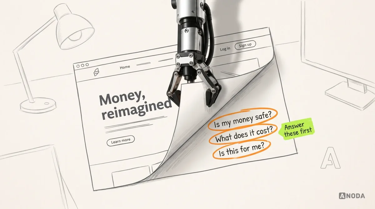
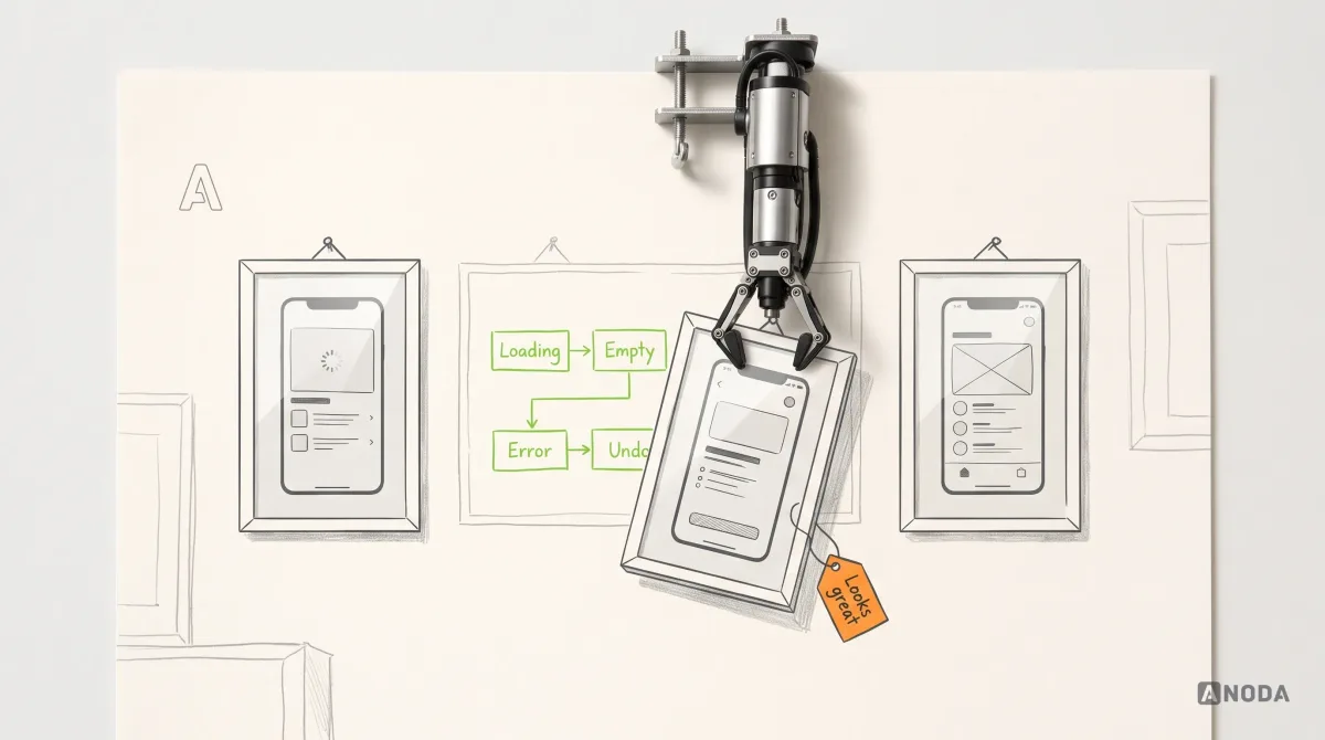
A hero screenshot is a show home. Staged furniture, a bowl of lemons, every light switched on, and nobody has checked whether the taps run. It shows the one state in which nothing went wrong, on a designer’s big monitor, with perfect data. All that glitters is not gold, and all that renders on Dribbble is not a product.
So here are 12 good UI design examples from real products, each read through the same task-first lens: what job the screen serves, which decision makes it work, what it costs and what you can safely borrow. The patterns are redrawn as schematics with fictional brands, because the lesson is the decision, not the pixels. Product details were checked against each company’s own documentation on 29 September 2026; The examples below explain the decisions behind those documented behaviours.
What makes a user interface design example worth copying
An effective interface lets a specific person finish a specific task with the fewest wrong turns, and tells them the truth about what happened. Colour, type and illustration are brand decisions on top. They matter. They’re just not why anyone completes a task.
That gives a lens you can run on any example, yours or a competitor’s:
- Task. Who is this screen for, and what are they trying to finish?
- Hierarchy. Is the thing that decides the task the most visible thing on the screen?
- Labels and content. Do the words say what will actually happen, in the user’s language?
- Feedback and states. What does the user see while loading, when empty, after success and after failure?
- Error prevention and recovery. Can a mistake be stopped, and if not, undone?
- Accessibility. Does it work with a keyboard, a screen reader, large text and weaker eyesight?
- Responsive behaviour. Does the task survive a phone, a tablet and a split screen?
- Performance. Does it still work on a slow network, or when a script fails to load?
- System consistency. Does the same thing look and behave the same way on every screen?

Look where the “no” answers pile up. A screenshot can’t prove states, recovery, keyboard access, speed or consistency across two hundred screens, which is awkward, because that is where users leave. For the principles explained one by one, our guide to designing effective user interfaces covers them. Here we look at how real products apply them.
Hierarchy and content: examples that answer “what will this cost me?”
Price is where interface design meets the P&L most bluntly. A user who can’t tell what they’ll pay either leaves, or pays and then fights you about it. The second one also costs a support agent.
Wise puts what arrives next to what you send
Wise builds its money-transfer pricing around a single promise, stated on its own pricing page: you will always know what you are paying for and what your recipient will get. It pairs that with an upfront fee and the mid-market exchange rate, with nothing hidden in the rate.
The interface lesson is the hierarchy that follows. The sender types one number, but the one they care about is the one that lands on the other side. So it belongs right next to the input, with the fee and the rate shown as the reason for the difference. It is the difference between a restaurant bill that lists the service charge and the one where you discover it on the card machine, with the waiter watching.

The trade-off is brutal: itemised pricing invites comparison. It only works if your fee survives it. If it doesn’t, the interface is not your first problem.
Borrow: the outcome amount beside the input, and every deduction named. Leave: Wise’s brand, flags and colour. They are Wise’s, and they don’t do the work.
Airbnb switched to showing the total price, fees included
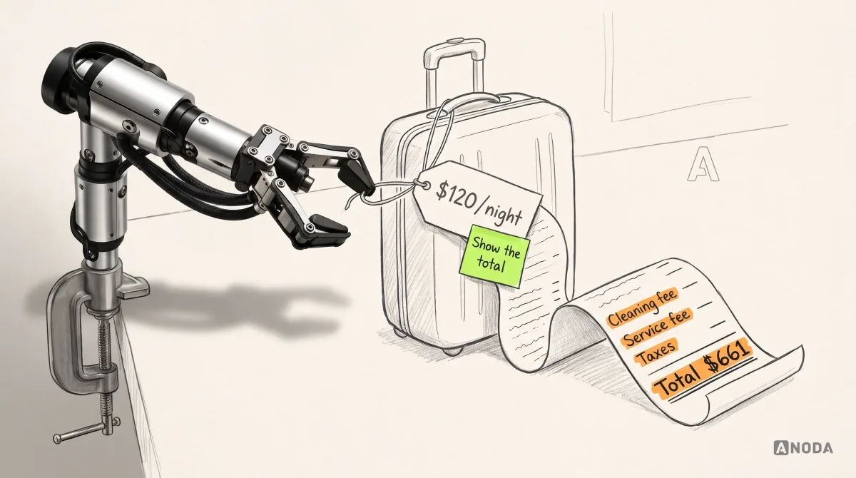
In April 2025 Airbnb made total price display the standard for guests worldwide: the total cost of a stay, including all fees before taxes, shown when people browse listings in search results, with the full price always shown before checkout. In some countries taxes are included too. It wasn’t a weekend experiment: Airbnb first launched it in 2019 in parts of Europe, Australia, Canada and Korea, then ran an optional toggle for two years, used by nearly 17 million guests, before making it the default.
The old pattern is the budget airline fare: nineteen pounds to fly, plus the seat, the bag and the privilege of printing your own boarding pass. The guest compares nightly rates, picks one and meets sticker shock at checkout. The fee didn’t disappear. It just moved to the most expensive moment to surprise someone.

The trade-off is why most marketplaces don’t do it: a total looks bigger than a nightly rate, so the honest listing looks pricier next to a competitor still showing the small number. That makes it a product decision, not a design tweak. Somebody senior has to accept a worse-looking search page in exchange for fewer abandoned checkouts and refund fights.
Borrow: the number the user will actually pay, shown where they compare, with the breakdown one tap away. Leave: the layout of the listing card. That part is brand.
Google Flights organises the screen around the decision
Most flight searches ask one question: which day is cheapest? Google Flights answers it where people pick the date. Its help pages describe clicking Dates to find which travel dates have the best fares, and a price graph that shows fare trends by week or month for flexible trips. It also offers price insights in plain phrases such as “Prices are less than usual”, and price tracking that emails you when a fare changes.
The decision here isn’t “which flight”, it’s “which day”, so the interface reorganises around the variable the user is actually juggling. It’s the unit price on a supermarket shelf tag: the shop did the division so you don’t stand in the aisle with a calculator.

The trade-off is density: a calendar full of prices needs a different layout on a phone, not a squeezed one. And the insights choose their words carefully. “Less than usual” is an observation, not a promise, and that restraint is part of the design.
Borrow: put the comparison inside the control where the decision is made. Leave: prediction language you can’t back with data.
Navigation that grows with the user
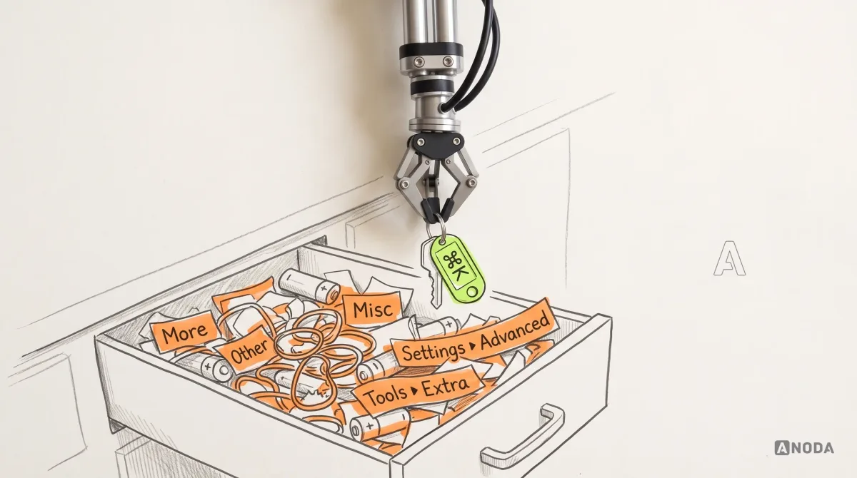
Every product starts with a clean menu. Two years later it’s a junk drawer: every tool the team ever built is in there, with the batteries, the rubber bands and a key that opens nothing. Users hunt, give up and file a ticket asking where the feature went.
Linear’s command menu acts on whatever you selected
In Linear, the issue tracker, you select one or several issues and press Cmd K (Ctrl K on Windows and Linux) to open a command menu and pick an action. Or you right-click the selection and get a contextual menu with the same kind of actions. The docs describe both paths side by side.
That pairing is the decision worth stealing. The keyboard path serves people who live in the product eight hours a day, often your most valuable seats. The visible path serves everyone else, so the fast route never becomes the only route. And because the menu acts on the selection, it offers actions that make sense for those issues, not the whole drawer.

The trade-off: a command menu is invisible to anyone who doesn’t know the shortcut. Bolt Cmd K onto a product people open twice a month and it’s a party trick.
Borrow: one action, several routes, filtered by what the user has selected. Leave: the keyboard-first assumption, if your users aren’t at a keyboard every day.
Notion’s slash menu keeps the page empty until you ask
Notion’s editor doesn’t greet you with a toolbar of forty buttons. Its help centre explains that typing “/” brings up a menu of block types, and that you can keep typing to filter: “/heading”, “/bullet”, or actions such as “/duplicate” and even colours like “/red”. Frequently and recently used blocks sit at the top.
The decision is progressive disclosure inside the content. The blank page stays blank. Tools appear at the cursor when you want one, and the ones you use most float up. A new user needs one trick; an experienced one never leaves the keyboard.

And the trade-off is right there in Notion’s own FAQ: you can’t switch the menu off by default, you press Esc when it pops up. Anyone who types slashes for a living, in dates, paths or “and/or”, meets a menu they didn’t ask for. Every shortcut is somebody else’s speed bump.
Borrow: tools that appear where the work is, sorted by use. Leave: a trigger character your users type for other reasons.
Feedback, states and recovery: examples that forgive people
Designers draw the success screen. Users live in the other states: half-finished, loading, failed, regretted. These products designed those states on purpose.
Slack keeps the message you didn’t send
Slack’s help centre says it plainly: if you start writing a message and don’t send it, it is saved automatically as a draft. On desktop you find it under “Drafts & sent” at the top of the sidebar. On mobile it’s at the top of the Home tab, where you can tap and hold a draft to edit, schedule, send or delete it.
Two decisions sit in that feature. One is a state most teams never design: typed but not sent. The other is responsive behaviour done properly: the same job lives where each device’s navigation puts it, instead of a desktop sidebar squeezed onto a phone.

Nobody thanks you for a message that survived. They just never write the angry ticket. Now look at your own long forms: onboarding, settings, the listing editor. Every one that drops input when the user switches tabs is throwing away sign-ups you paid to acquire.
Borrow: save anything a user typed, and put it back where they will look. Leave: a drafts inbox, if your product has one form and three fields.
Gmail gives you a few seconds to take it back
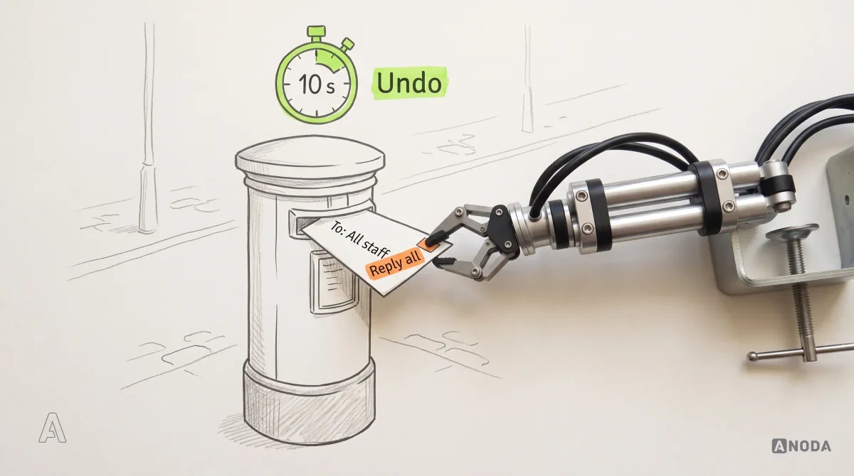
Gmail’s Undo Send lets you choose a send cancellation period of 5, 10, 20 or 30 seconds. After you press Send, the message waits for that long, and an Undo link gives you the chance to change your mind.
The decision: for an action people take dozens of times a day, recovery beats confirmation. An “Are you sure?” on every email would be clicked through within a week. The delay costs seconds and saves the career-limiting reply-all. It’s the false-start rule in a sprint: the gun has fired, but the race doesn’t count yet, and the runner can still be called back.

The trade-off is honesty in the backend. Undo works because the system really holds the message. A fake undo that hides an item already gone is worse than none.
Borrow: undo for frequent, reversible actions, backed by a system that actually waits. Leave: the idea that undo can replace confirmation everywhere.
GitHub makes you type the name before it deletes a repository
Deleting a repository on GitHub is deliberately slow. The option lives in a “Danger Zone” at the bottom of the settings. You click “I want to delete this repository”, read the warnings, click “I have read and understand these effects”, and then type the repository’s name before the final button works. The docs are blunt about why: deletion removes team permissions, and deleting a private repository also deletes its forks. Some repositories can be restored within 90 days, subject to fork-network restrictions; restoration does not restore team permissions. The interface makes the consequences clear before the destructive action.
Friction here is proportional to damage. It’s the surgeon marking the correct knee with a pen before the operation: nobody doubts the surgeon, but everybody has read about the wrong knee. Typing the name catches the classic mistake, deleting the right thing in the wrong tab. Belt and braces, and for once nobody minds.

The trade-off: ceremony works because it’s rare. Put the same ritual on archiving a draft and users will learn to type names on autopilot, and the protection is gone exactly where it was needed.
Borrow: match friction to consequence, and describe the consequence in words. Leave: the full ritual for anything that can be undone.
UX audit
Can’t tell whether the problem is the look, the structure or the behaviour?
We go through your product state by state, find where users stall or leave, and tell you which fixes pay back first.
Accessibility, errors and performance: GOV.UK designs for the worst day
The GOV.UK Design System puts every error at the top and links to it
GOV.UK services are used by everyone, including people on old phones, people with screen readers and people who’d rather be anywhere else. When a form has a validation error, even a single one, an error summary appears at the top of the main content, above the page heading. Every error in it links to the field that caused it, the summary receives keyboard focus when the page loads, and its wording matches the message next to the field.
That one component does accessibility, content and error recovery at once. A screen reader user hears what went wrong first instead of discovering it field by field. A sighted user gets a list and a link. It’s a referee who blows the whistle, names the foul and points at the spot, instead of shouting “no!” from the stand.

The same system recommends one question per page, because it helps users understand what they’re being asked and focus on it, while admitting that research can favour grouping, for example in internal services where users switch tasks quickly.
Performance gets the same treatment. The GOV.UK Service Manual, last updated in September 2024, tells teams to make each page work with HTML first and only then add CSS and JavaScript, because the JavaScript layer is not fault-tolerant. Scripts fail because of network errors, ad blockers, corporate firewalls and mobile networks that modify content. A form that only works when every script loads is an umbrella that only opens when it isn’t raining: it fails on the train, with one bar of signal, exactly when the user is trying to pay a fine before the deadline.

The trade-off: more pages, and a style that’s plain on purpose. Brand teams hate it. It’s right for a service used once a year under pressure, wrong for a tool experts use every hour.
Borrow: errors summarised, linked and focused, and forms that work before the scripts arrive. Leave: the one-question pattern for dense expert workflows.
Collaboration and consistency: examples that hold up across people and screens
Figma shows who is in the file and lets you follow them
In a shared Figma file you can see who else is there, and you can ask to be followed. The help centre describes “Spotlight me”: everyone viewing the file is notified that you’d like them to follow you, and they have a few seconds to click “Not now” before they are shown your view. You see how many people are following, your avatar gets a dashed border, and followers leave by clicking “Stop following”.
This is system status for other people. Without presence, collaboration is herding cats in the dark: you can hear them, you just can’t tell where they are. With it, “who is looking at this and where” is on screen before anyone asks.

The trade-off is control. Spotlight pulls people into someone else’s view, so “Not now” and “Stop following” are what make it polite rather than hostile. And twenty cursors on one frame are noise, not status.
Borrow: show who else is here and what they’re doing, and always offer a way out. Leave: real-time presence in a product where people rarely work at the same time.
Shopify’s Polaris makes other companies’ apps feel like the admin
Shopify merchants use apps built by outside developers, inside the Shopify admin. Polaris is how that doesn’t turn into a patchwork. Shopify describes its web components as a library for displaying data, getting input from merchants and triggering actions, built so apps “look and feel native to the Shopify admin”.
It’s an orchestra where even the guest musicians get the same score. The merchant doesn’t care who built the screen. They care that a button, a banner and an error behave the same way everywhere, so nothing needs to be learned twice. Nobody builds their own version, and nobody ships a slightly different one either.
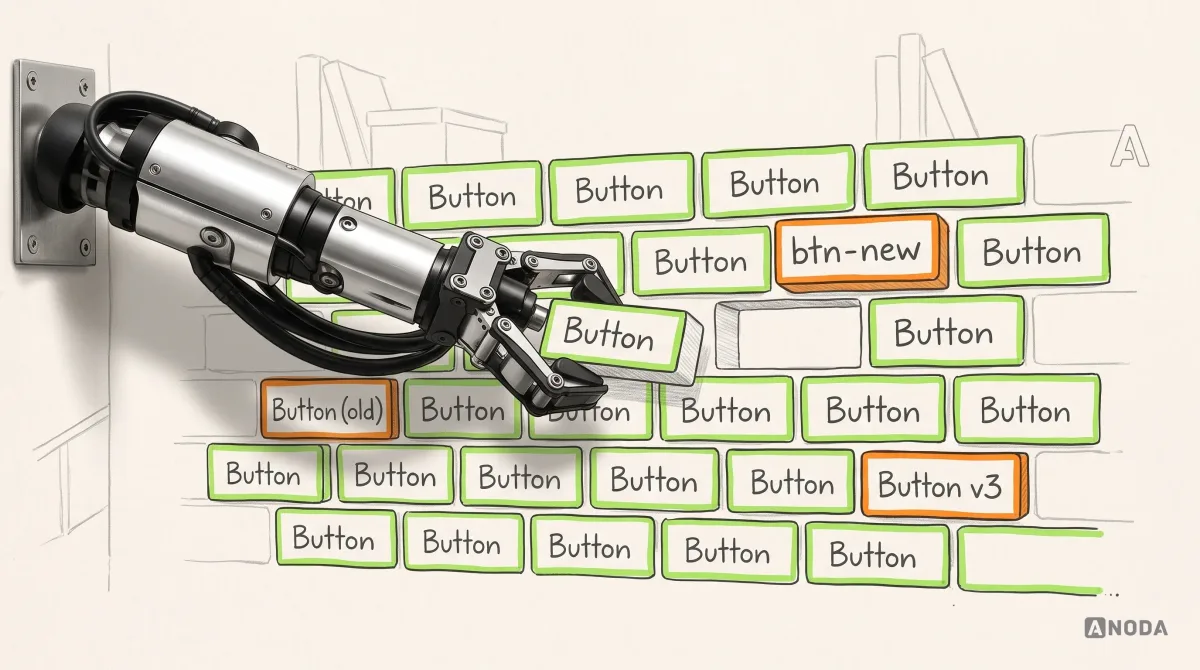
The honest part is what consistency costs over time. Shopify began rolling out a new admin design to merchants on 15 September 2026. Its developer changelog says admin and App Home UI extensions match the new design automatically, but Polaris 2.0 for embedded app interfaces is an explicit opt-in: apps on the older script don’t move by themselves, and Built for Shopify apps have until 1 May 2027 to switch. Consistency is not declared once. It is maintained, and it has a deadline.

If your product has several teams or several platforms, this is where design systems stop being a style guide and become the thing that keeps design and code saying the same thing.
Borrow: shared components with names, rules and an upgrade path. Leave: the idea that a component library is finished the day it ships.
From website to product: Stripe’s docs run real requests
Stripe lets developers make API calls inside the documentation
Most website interfaces end with a button that says “Book a demo”, and the handoff into the product is a cliff. Stripe’s documentation doesn’t end there. Its getting-started guide lets you run commands in the Stripe Shell directly on the docs site, for example creating a test customer. The shell runs only in a sandbox, so nothing moves real money.
Normally, reading about an API and calling it happen in two places, with a sign-up, a dashboard and an API key in between. Stripe puts the first success on the page where the reader is already convinced. It’s a chemistry lesson where the lab bench is in the textbook: you don’t read about the reaction, you watch it fizz.
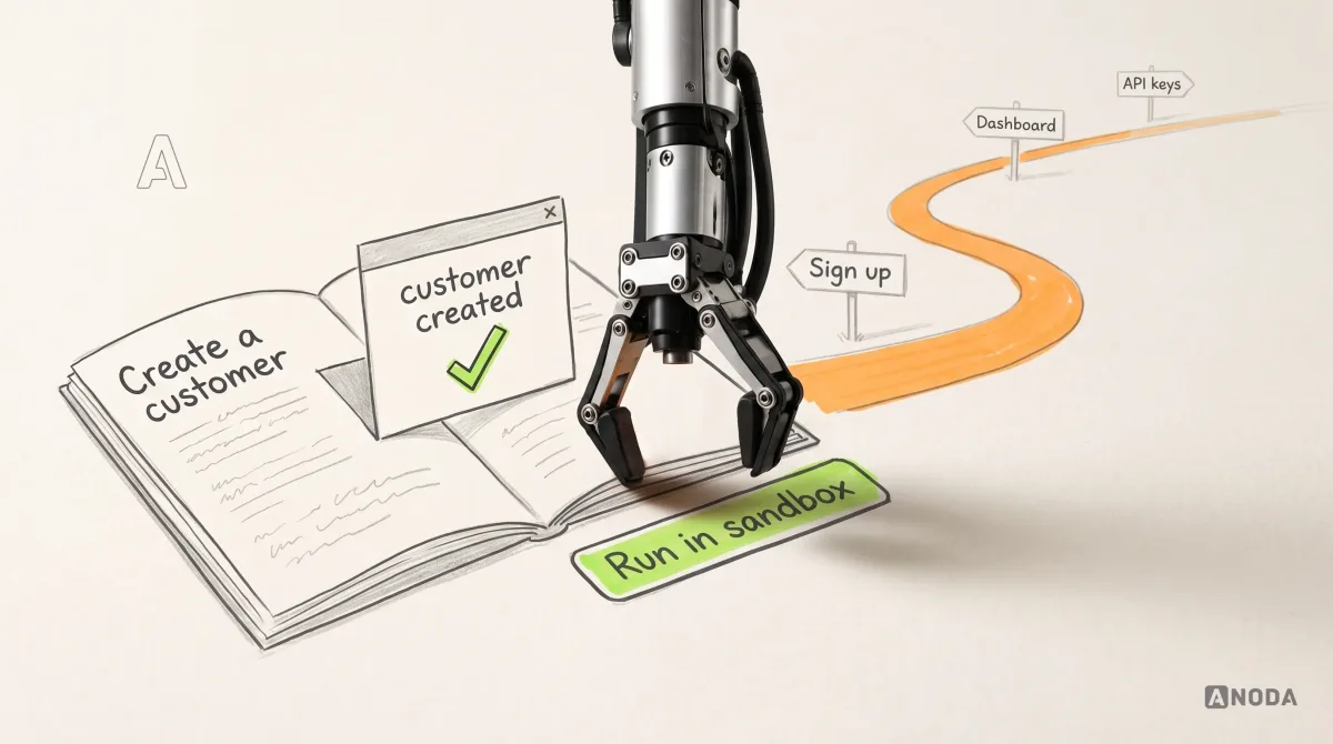
This is where marketing budgets leak most quietly. You paid for the click, the page did its job, and then the visitor meets a sign-up form and an empty dashboard. Every step between “this looks right” and the first result is a step where paid traffic walks out.
The trade-off: a sandbox on the page works because Stripe’s audience wants to write code first. A buyer who needs sign-off from finance doesn’t need a terminal. They need a clear next step and a real person.
Borrow: move the first success as close to the persuasion as your audience allows. Leave: the terminal, unless your users actually open one.
What a screenshot of good UI can’t prove
Every example above looks fine in a screenshot. None works because of it. The proof of the pudding is in the eating:
- States. Empty, loading, failed, half-finished, undone. A gallery shows the one state where everything went right.
- Behaviour over time. What happens after the click, ten seconds later, or the next time the user comes back.
- Access. Keyboard order, focus, screen reader announcements and text at 200% don’t photograph.
- Speed and failure. A screenshot never has a slow network or a script that didn’t load.
- Consistency. One polished screen says nothing about the other two hundred.
- Fit. Whether it works for the people it was built for says nothing about whether it works for yours.
That last one is expensive. An example is evidence that a decision worked for one company’s users, pricing and engineering. You don’t have their data, audience or backend. You have their pixels.
How to borrow from a UI example without copying the costume
Copying an interface without its rules is a cargo cult: build a perfect runway out of bamboo and wait for planes that were never about the runway. Now with a Figma licence.
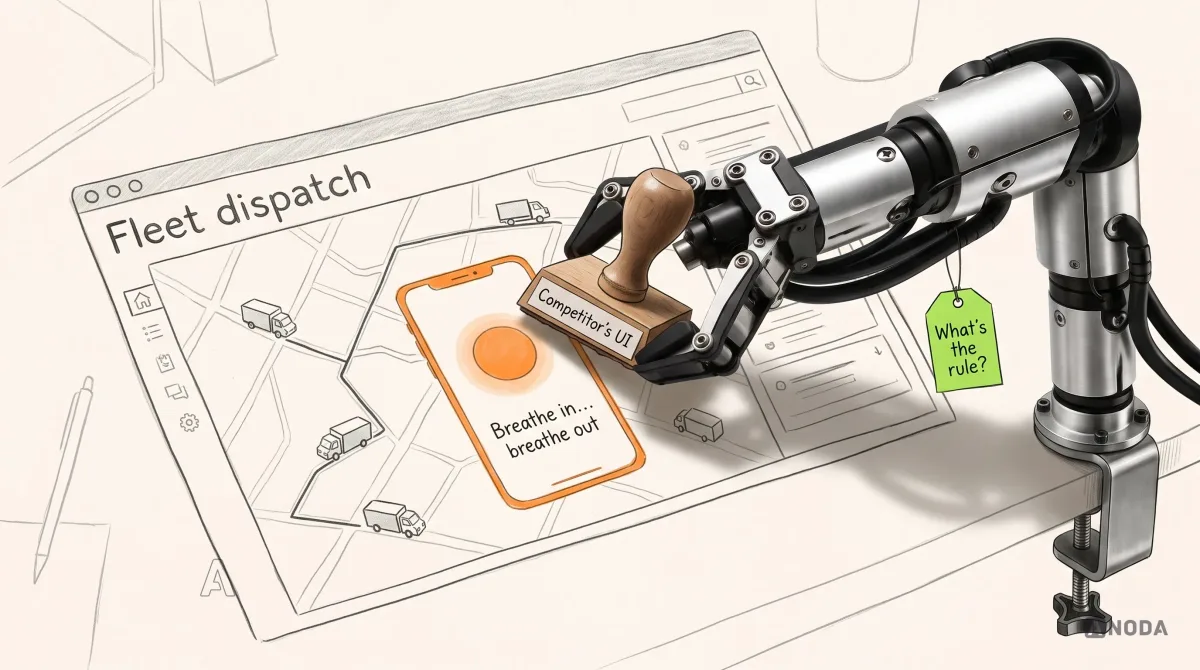
This is the order we work in when a client brings us a folder of examples:
- Name the task. What job does the example screen serve, for whom? What is your user’s job at the same point? If the jobs differ, stop here.
- Write the rule in one sentence. “Show the amount that arrives next to the amount sent.” “Make undo cheaper than confirmation.” If you can’t write it, you’re copying a look.
- Find the constraint behind it. The rule works because of something else: upfront pricing you’re willing to show, a backend that really holds the message, an action that truly can’t be reversed.
- Check you have the constraint. No honest pricing, no total price display. No backend delay, no undo.
- Draw every state. Empty, loading, error, success, undone, on a phone and with a keyboard only.
- Test it with your users on their task. Measure whether they finish, not whether they like it.
Nothing on this list involves choosing a colour. That comes later, and it’s the easy part.
Borrow the decision, then make it yours
Good interface examples are systems, not hero screenshots. Wise’s hierarchy, Gmail’s undo and GitHub’s typed confirmation work because of decisions about price, backend and risk that sit behind the pixels. Extract the rule and the constraint behind each example, then decide whether it serves your audience and your product’s job. If it does, design it in your own brand, with all of its states. If it doesn’t, leave it in the gallery, however good it looks.
ANODA brings the interaction, content and state design into one product direction. In Xcoins, that meant designing the crypto-buying journey around the amount, payment method, wallet and confirmation, across desktop and mobile layouts. The useful lesson is a clear path through a money decision, not a borrowed fintech colour palette. Your team gets an interface direction and the states needed to carry it through implementation, so expensive gaps stop reappearing as development questions.
That separation is most of what we do in UI design: pulling the transferable interaction principles out of the examples a team loves, leaving the other company’s surface behind, and turning what’s left into a product direction that is actually yours.
For a design-led marketing site, borrowing the interaction rule is only the beginning: it must become a reusable page, a useful CMS collection and a connected form. Our Framer development service builds those parts around your approved design and publishing tasks, so the next campaign page keeps the same clear journey without another copied frame.
UI design
Loved someone else’s interface? Let’s work out why, then build yours.
We take the examples your team keeps screenshotting, pull out the rules that fit your users and your product, and design the whole interface around them, states and all.
Written by