In this article
- Replace decorative dashboards with a route into work
- Adapt responsive interfaces to roles and tasks
- Put AI inside a workflow with review and recovery
- Build reusable components around actual states
- Use feedback to answer a question
- Decide what goes into the next release
- Why ANODA starts with the work, not the trend
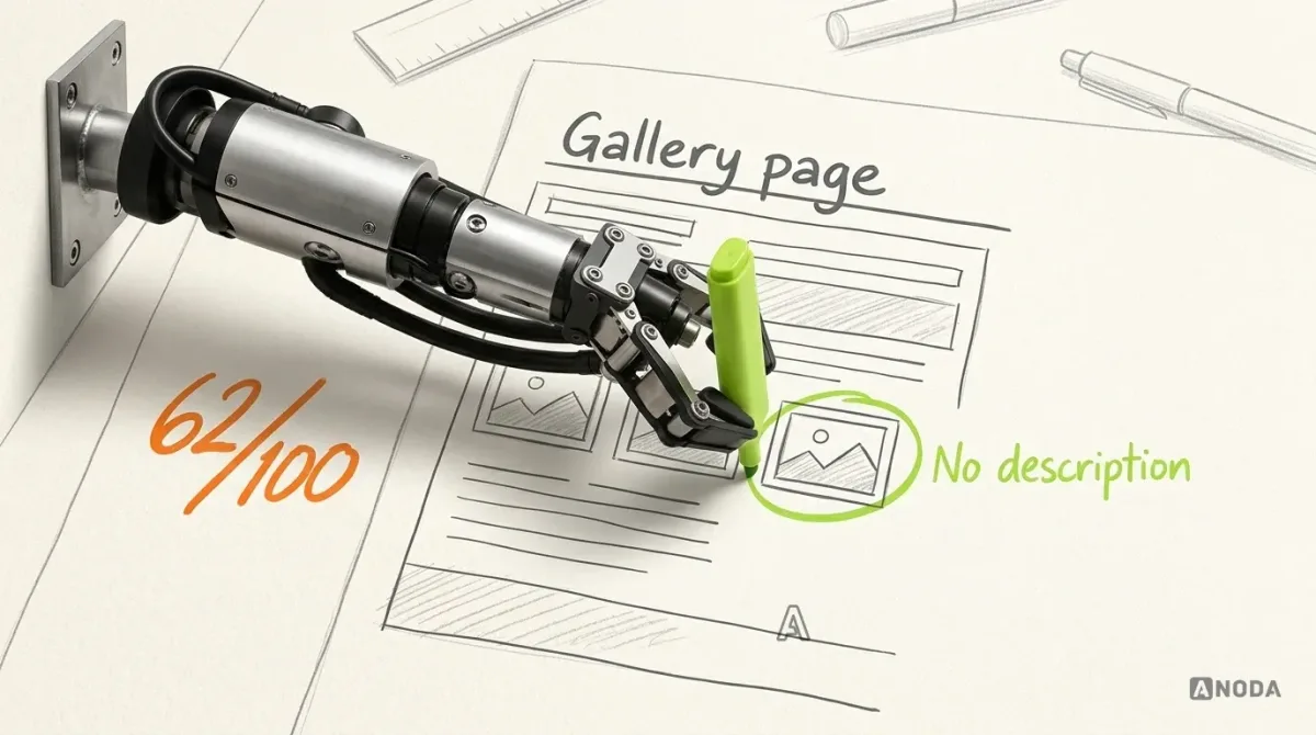
Your web app can look current and still lose customers in the same broken workflows. A fashionable dashboard does not help a loan officer find the next borrower, a manager approve time off or a student complete enrollment. Every confusing step adds support work, slows decisions and gives users another reason to leave. The web app design trends worth adopting make those tasks clearer, faster and easier to finish.
This guide is a decision framework for adopting design patterns, rather than a popularity ranking. For a walkthrough of specific interface patterns, read our web app design examples. For the complete design process, use our modern web app design guide.
01Replace decorative dashboards with a route into work
A dashboard should help someone decide what needs attention and reach the relevant record. A chart that looks impressive but has no clear meaning, period or next action adds work instead of removing it.
For each dashboard block, write down:
- who uses it and what decision it supports;
- where its data comes from and when it was updated;
- how the number is calculated;
- which record, queue or action follows from it;
- what appears when data is missing, loading or outside the user’s access.
In Sail’s mortgage CRM, the design connects officer work with borrowers, loans and their progress. The useful design question is which item needs the officer’s next action, rather than how many charts fit above the fold.
Acceptance check: give a reviewer a realistic record set and ask them to find the next item requiring action, explain why it is there and open the relevant record. Our dashboard design service develops that connection between overview and work.
02Adapt responsive interfaces to roles and tasks
Responsive web app design requires more than shrinking a desktop table. A manager reviewing a team, a member updating a profile and an administrator changing settings may use the same underlying records through different views.
Remote Leverage is an HRIS design for Talent, Business Manager and Remote Leverage Manager work. Administrative roles were outside the delivered scope, and the client owned development and integrations. It is a useful starting point for discussing which actions each role needs, how those actions are grouped and which information must stay visible while someone makes a decision.
Keep record names, status meanings and access rules consistent across devices. Adapt the visible columns, detail layout and action placement to the job. Do not remove an essential task merely because it is difficult to fit into a narrow layout.
Acceptance check: complete the same essential task on the agreed desktop and mobile layouts. Check long names, empty records, errors and interrupted input. The native-app-to-web expansion guide explains how to preserve task continuity across surfaces.
03Put AI inside a workflow with review and recovery
An AI feature needs a defined job. “Add a chat box” does not specify the input, the output or what the user should do with the result.
Before designing it, answer four questions:
- What information can the feature use?
- Is the output a suggestion, a draft or an action that changes records?
- What must the user review before applying it?
- How can the user correct, reject or recover from the result?
AispireMe provides an education-product context for discussing AI alongside enrollment and role-specific workflows. Our research, role-specific flows, prototypes and interface system make AI part of a coherent product experience, instead of another disconnected chat box.
For a generated student message, show the proposed text and recipient before sending. For a recommendation, make its relevant basis visible. For an action that changes a record, show the affected record and provide the appropriate confirmation or recovery path.
Acceptance check: test a correct result, an incomplete input and a wrong result. Ask users what will happen before they apply the output. Our guide to AI feature UX mistakes develops these checks further.
04Build reusable components around actual states
A consistent visual style is useful, but a component system also needs behavior. A form field has focus, validation and disabled states. A table has sorting, loading, empty and permission states. A save action needs success, failure and recovery.
Start with repeated work rather than a catalogue of attractive components. List the forms, tables, filters and record-detail patterns used in the product. Define their labels, interaction, keyboard behavior and states, then apply them to real screens.
SEOSpace connects an SEO web app, a Chrome extension and marketing pages through shared design work. ANODA designed and handed off these surfaces; the SEOSpace team implemented them. The lesson is continuity of language and interaction across different spaces, with layouts adapted to their purpose.
Acceptance check: use the same component in two realistic workflows, including error and empty states. If each screen needs a different undocumented exception, the component’s scope needs revision. See our design system components guide.
05Use feedback to answer a question
Useful feedback tells users whether an action happened, whether more work is needed and what they can do next. Animation is one possible expression of that feedback, not its purpose.
For a slow save, show that the action is processing and prevent accidental duplicate submission. For a failed save, keep the entered data and explain the next step. For a successful bulk action, identify what changed and which items could not be processed.
Avoid making a transient toast the only place essential information appears. A person may miss it while looking at a different part of the screen. Keep the resulting status visible on the affected record where appropriate.
Acceptance check: interrupt a request, repeat an action and submit incomplete data. The user should be able to tell what happened without guessing or starting the task again. Our web app design examples show feedback, recovery and workflow patterns in context.
Decide what goes into the next release
Use one small decision list for every proposed trend:
| Decision | What to record |
|---|---|
| User task | The action and role being improved |
| Current difficulty | The confusing, slow or error-prone step |
| Proposed pattern | The interface change and where it appears |
| Required states | Loading, empty, error, access and recovery |
| Dependencies | Data, permissions, components and implementation |
| Acceptance | A realistic task that demonstrates the change |
Keep a change when it solves the named problem and passes that check. Revise it when the idea is useful but fails in a real state. Drop it when its main benefit is looking current.
Why ANODA starts with the work, not the trend
A new visual style cannot fix a workflow nobody understands. ANODA finds the point where your product makes people stop, guess or call support, then redesigns the complete journey around the business task. Sail, Remote Leverage, AispireMe and SEOSpace show that approach across CRM, HR, education and SEO products: role-specific work, clear states and a connected design handoff.
Our SaaS product design service turns those decisions into a product that feels coherent and moves users toward value. If your app already exists, a UX audit identifies where the redesign should begin.

SaaS product design
Which part of your web app should change next?
Stop paying for interface changes that leave the real bottleneck untouched. ANODA connects the user’s task, business priority and complete interface states into one clear product experience your engineers can build.
Frequently asked questions
Which web app design trends should we adopt?
Choose a pattern when it improves a named task, works for the relevant roles and devices, and has a clear acceptance check. Visual novelty alone is not a reason to change a working workflow.
Should a desktop web app have the same layout on mobile?
Keep the same records and permissions, but adapt navigation, density and actions to the tasks people perform on each device.
How should AI appear in a business web app?
Make its proposed action clear, show relevant inputs or sources, allow review before consequential changes and provide a way to correct or recover.
Written by