In short
Every CRM has people, companies, deals, messages, tasks and permissions. That part is table stakes, and copying it gives you an expensive generic tool your team routes around with spreadsheets. CRM system design is about the workflows, relationships and decisions that make your operation different. Here is the process: roles, data model, states, the few screens that carry the work, automation that knows its limits, and a rollout that proves adoption.
In this article
- Four layers that are not interchangeable
- Decide what the CRM is for before copying anyone
- Start with roles and the work they repeat
- Model the records, relationships and states
- Design the few screens that carry the work
- Dashboards that support decisions
- Make data confidence visible
- Handle errors, conflicts and recovery
- Automation that knows its limits
- Mobile and cross-team handoffs
- The CRM design mistakes we keep finding
- Prototype, test, roll out and measure
- An illustrative example
- What to take away
CRM system design is the work of turning how a company sells, serves and manages customers into a product people can learn, trust and use every day. It covers four layers: the CRM strategy (which customers and processes the system serves), the data model (records, relationships, statuses and permissions), the UX (roles, workflows, navigation, states and recovery) and the UI (the screens, components and visual hierarchy that make all of it readable).
Every CRM shares the same foundations: people, companies, deals, communication, tasks and permissions. That is table stakes. Copy Pipedrive’s pipeline, HubSpot’s record page and Attio’s flexible objects, and you get an expensive generic tool — one your sales team politely ignores while running the real business on sticky notes and a spreadsheet called “pipeline_FINAL_v3”.
Differentiation lives elsewhere: in the workflows, the automation, the relationships between records, the pricing model and the audience the CRM is built for. We have designed CRMs and internal operations tools for 15 years, and the failures are remarkably consistent. The database is fine. The dashboard is pretty. Nobody uses it for the work that matters.
The cost of that is rarely on anyone’s dashboard. Deals slip because the next step lived in someone’s head. Forecasts are guessed, because half the pipeline was never updated. New account managers spend their first month reconstructing relationships from old email threads. Operations staff spend days a month cleaning duplicates and chasing missing fields. And the licence or the custom build keeps costing money whether anyone opens it or not.
Four layers that are not interchangeable
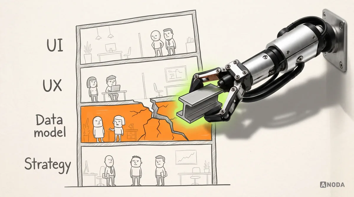
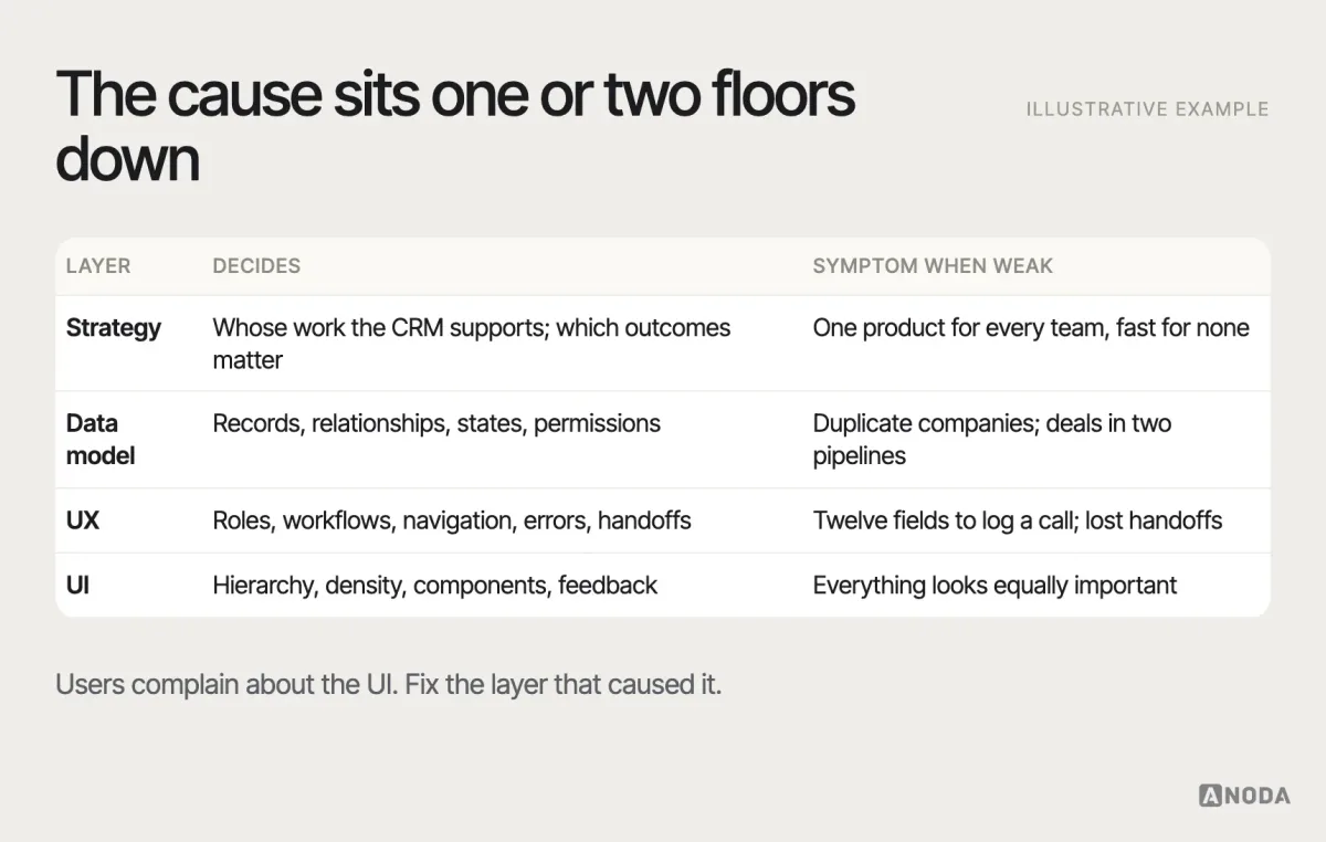
CRM strategy, CRM data model, CRM UX and CRM UI get used as synonyms. They are not, and a weak decision in one layer shows up as friction in all the others.
- Strategy decides whose work the CRM supports and which outcomes matter. Skip it, and the product tries to serve everyone and serves nobody well.
- The data model decides what a customer, an account or a deal is, how records relate and which states they pass through. Get it wrong, and every screen fights the data.
- UX decides how each role moves through its work: navigation, search, record pages, bulk actions, errors, handoffs.
- UI decides whether it can all be read at a glance: hierarchy, density, components, feedback.
Here is how the layers leak into each other. Strategy never decided whether the CRM tracks companies or individual buyers, so the data model allows both, so the UX has two ways to log the same meeting, so the UI shows two half-empty timelines, and the team concludes the interface is “confusing”. It is. The fix is two floors down. Redesigning the screens without touching the model is repainting a building with a cracked foundation — it photographs well until the next storm.
Decide what the CRM is for before copying anyone
Before a single field is designed, answer the strategy questions in writing. Which customers does this business serve, and how do they buy — a single decision-maker in a week, or a committee over six months? Which teams touch the customer, in what order? What does the company need to see that it cannot see today: a believable forecast, renewal risk, a clean handoff to delivery? What is the pricing and sales model — seats, usage, projects, subscriptions — and which records does that model depend on?
These answers decide the product. A CRM for a high-volume inside-sales team needs speed: keyboard shortcuts, quick logging, queues. A CRM for enterprise account management needs relationship depth: org charts, stakeholders, long histories, shared plans. A CRM for a services business needs the bridge between the deal and the delivery project. Build the average of all three and you get a tool that is slow for the first team, shallow for the second and disconnected for the third.
This is also where you decide what the CRM will not do. Marketing automation, billing, support ticketing and project management can live inside the CRM or next to it; each choice has consequences for the data model and the interface. Decide on purpose, not by feature creep.
Start with roles and the work they repeat
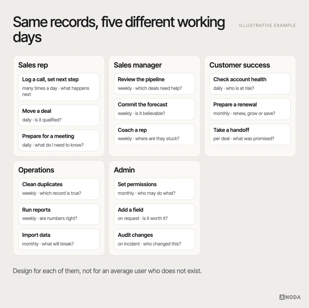
A CRM is used by different people doing different jobs on the same records. A sales rep logs calls and moves deals. A manager reviews the pipeline and coaches. Customer success tracks health and renewals. Operations cleans data and runs reports. An admin sets permissions and fields. Research each role separately: what they do daily, what decisions they make, what they check twice because they do not trust the system.
Use more than interviews. Shadow people for part of a working day — you will see the tabs they keep open, the spreadsheet they check before trusting the pipeline, the note they paste into every email. Review the current tools and their workarounds: exported reports that get re-sorted by hand, custom fields nobody fills in, and the unofficial spreadsheets, which are the most honest research artefacts in the building. Talk to the people who receive the CRM’s output too — finance for the forecast, delivery for the handoff — because they pay for its mistakes.
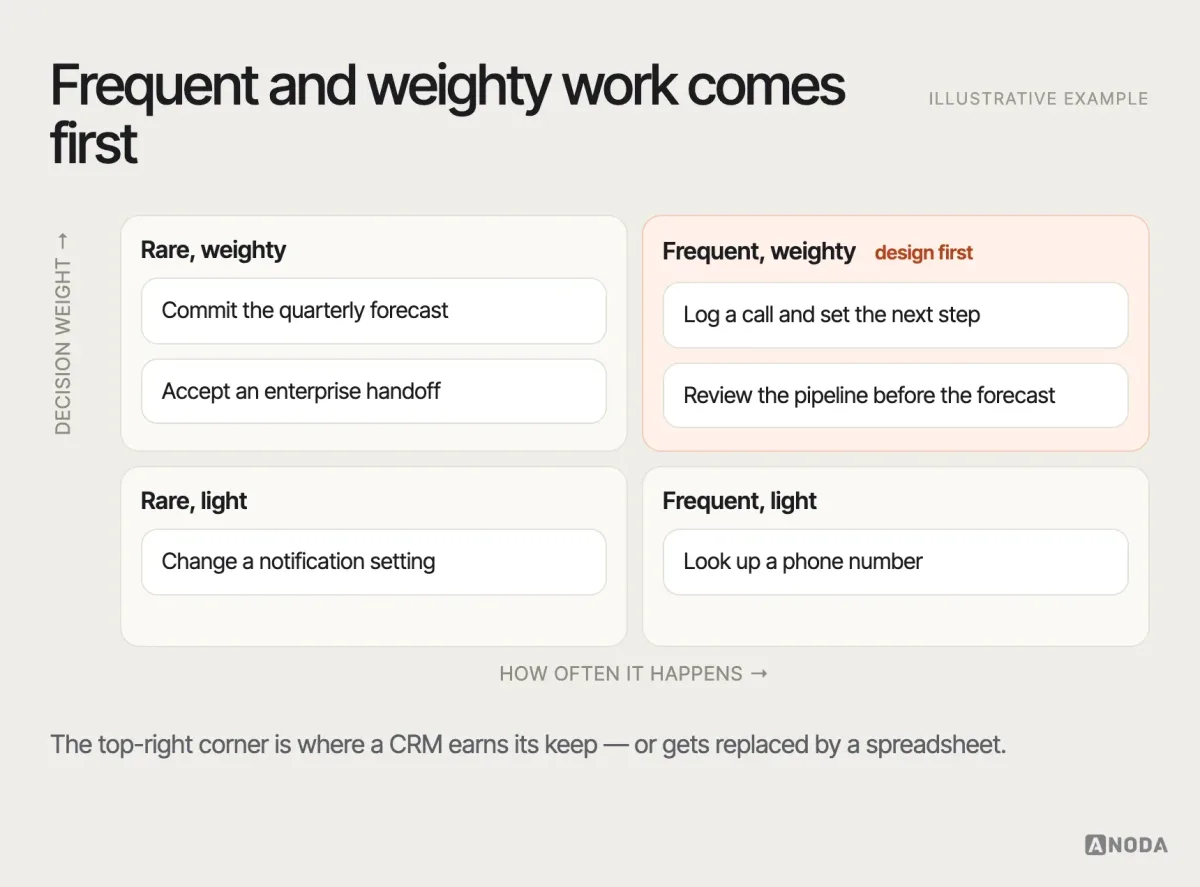
Then rank the workflows. Frequency matters, but so does weight: the moments where someone makes or verifies a decision — qualifying a lead, committing a forecast, handing an account to onboarding — deserve more design attention than a report opened once a quarter.
Watch for the shadow system. If reps keep their real pipeline in a spreadsheet, the CRM has already failed a job. Find out which one.
Model the records, relationships and states
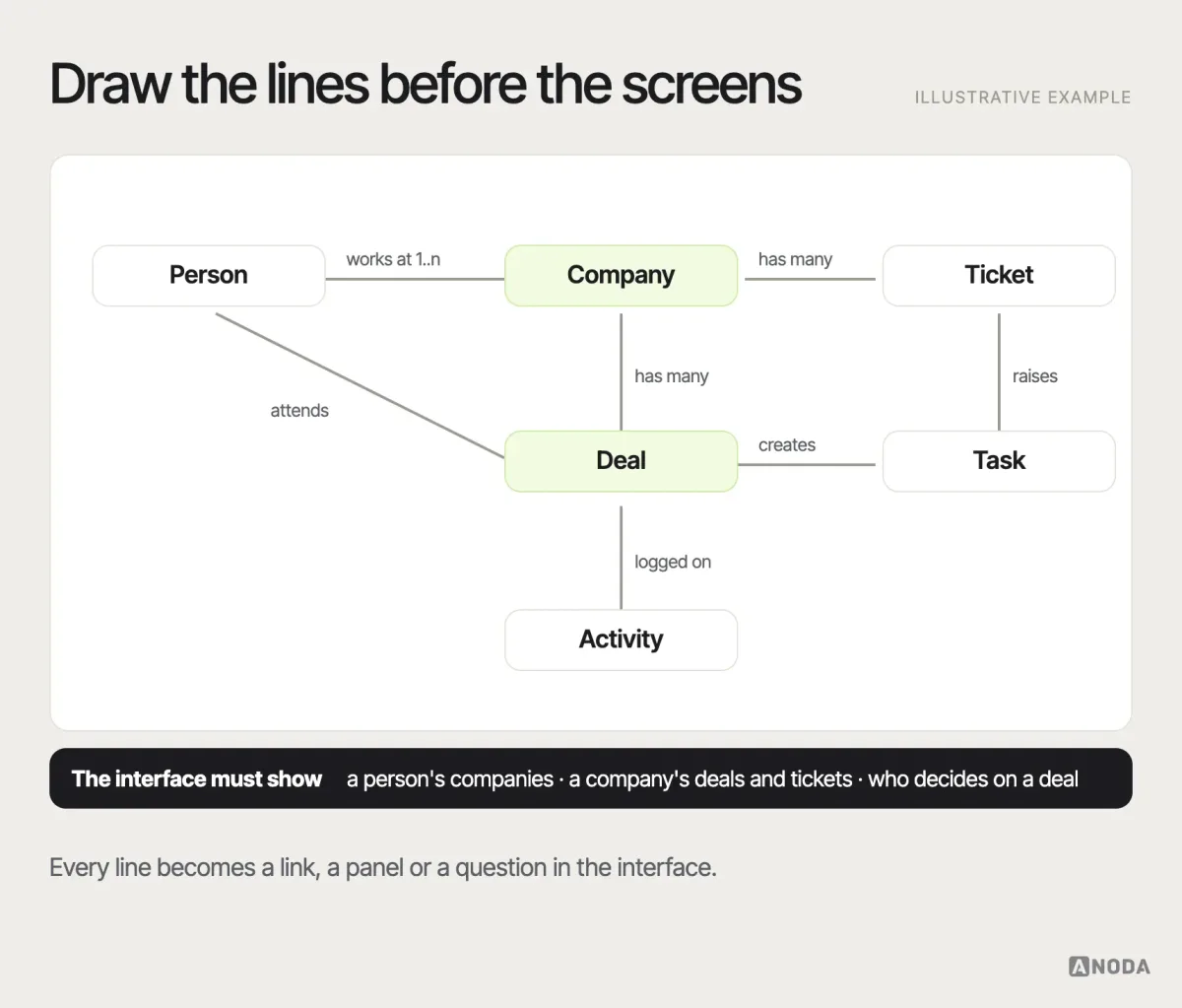
The data model is invisible to users and decides almost everything they feel. Define the entities — people, companies, deals, activities, tasks, tickets, whatever your operation actually tracks — and, more importantly, the relationships: one person at several companies, one company with several deals, one deal with several decision-makers.
Then define the states and what moves a record between them. A deal stage should have entry and exit criteria, not just a name. “Proposal sent” means something only if everyone agrees what must be true before a deal gets there.
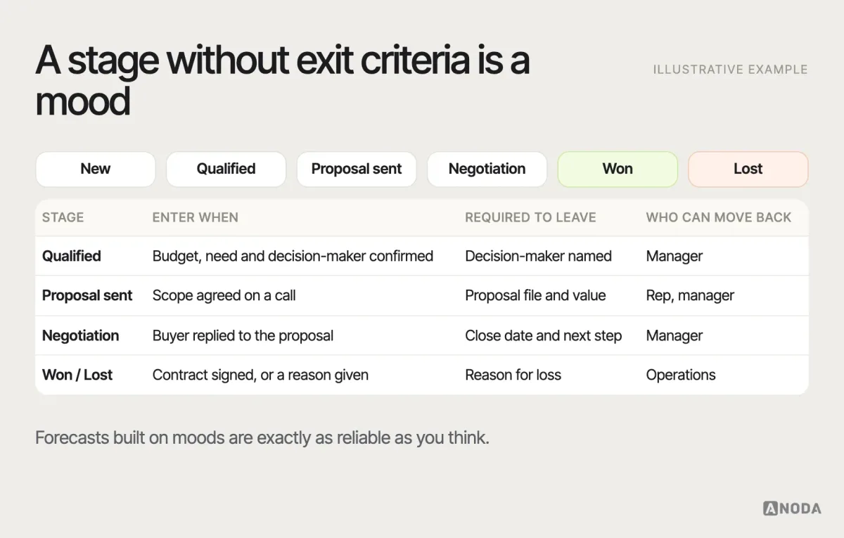
Be strict with custom fields. Every field someone asks for becomes a column to fill, a filter to maintain and a reason for incomplete records. Ask what decision the field supports and who will keep it accurate. Required fields should be the few that the next step genuinely depends on — a stage exit criterion, a close date, an owner — not a form that punishes reps for logging a call.
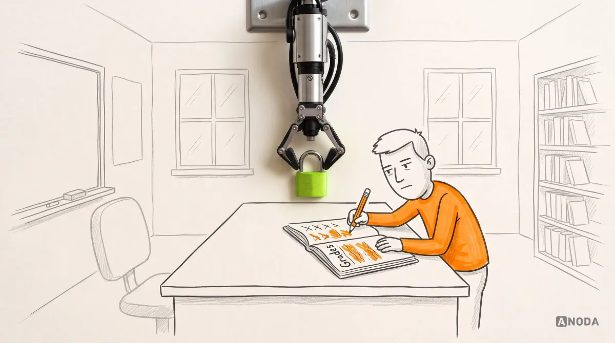
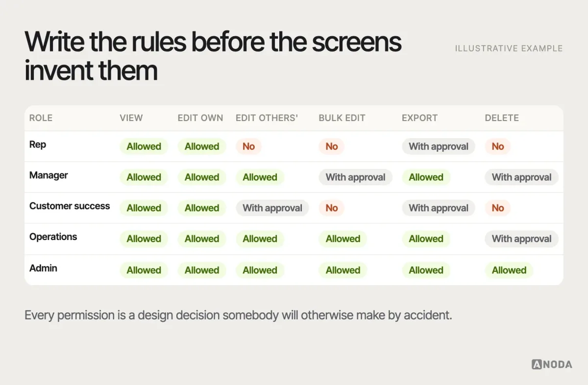
Permissions belong here too. Who can see which records, edit which fields, export what, delete anything? A CRM where everyone can change everything is a classroom where any student can edit the grade book.
Design the few screens that carry the work
Most CRM work happens in a handful of places. Get these right before anything else.
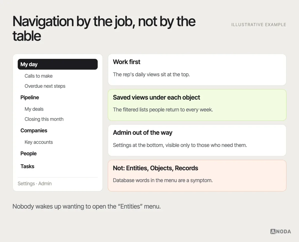
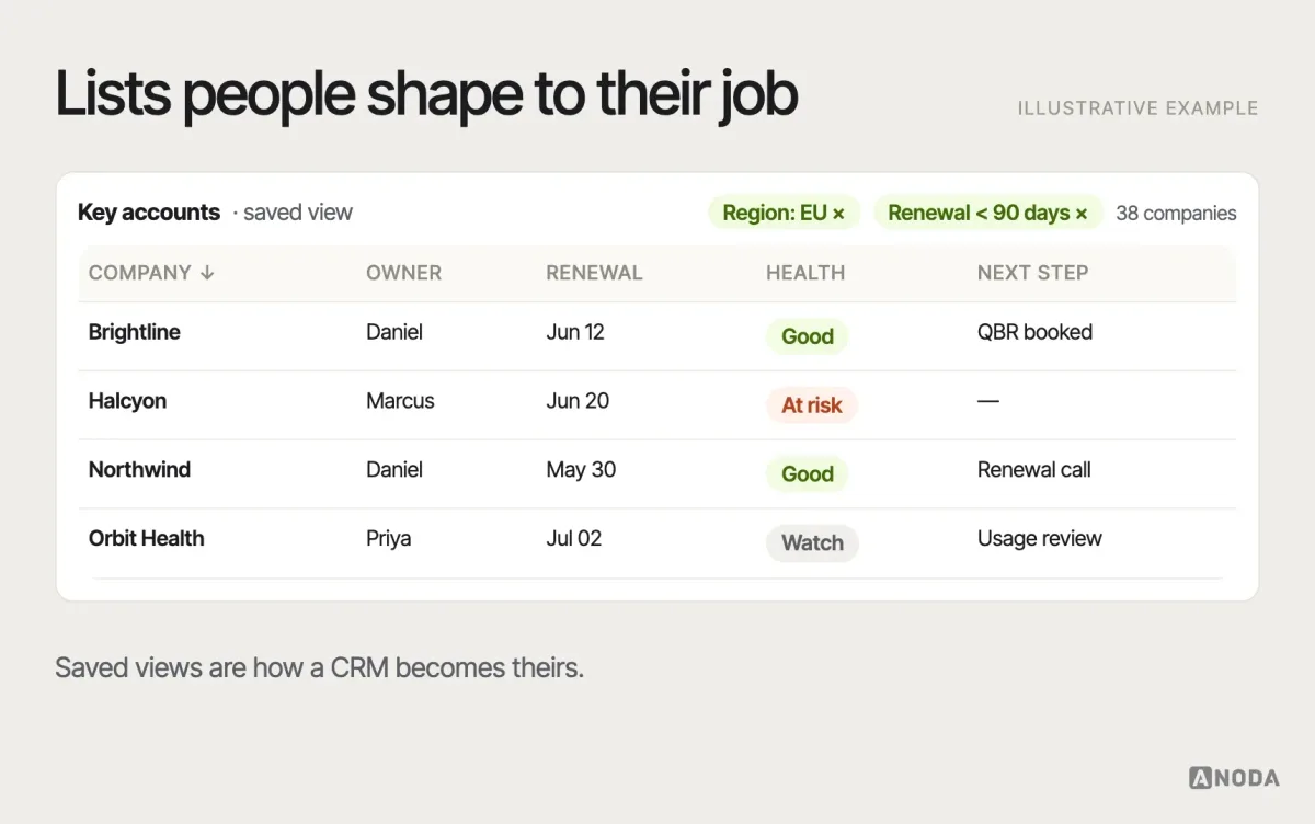
Navigation should follow the objects and views people use, not the database tables. Put the rep’s daily views first, keep admin settings out of the way, and let people save the filtered lists they return to.
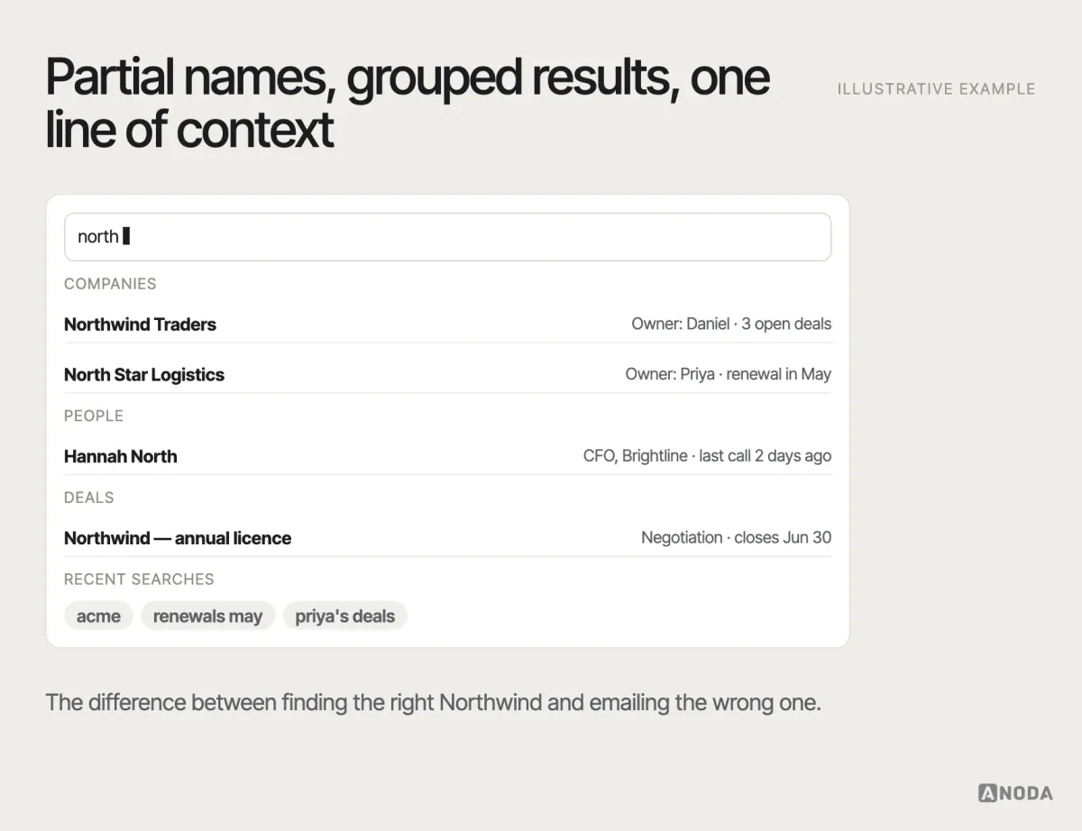
Search is how experienced users actually move. It must find people, companies and deals from partial names, emails and domains, group results by type and show enough context to pick the right one. Recent items and recent searches save more clicks than any clever menu. Let people filter inside the results, open a record without losing the search, and reach search from anywhere with one shortcut. For power users, search is the navigation.
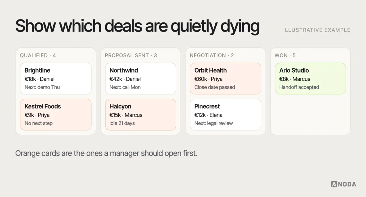
The pipeline shows deals by stage and makes the ones that need attention impossible to miss: stale deals, missing next steps, close dates in the past. Moving a deal between stages should check the exit criteria you defined, and ask only for what is missing — not reopen a full form. Managers need the same board with different defaults: grouped by owner, filtered to deals that changed this week, sorted by risk rather than value.
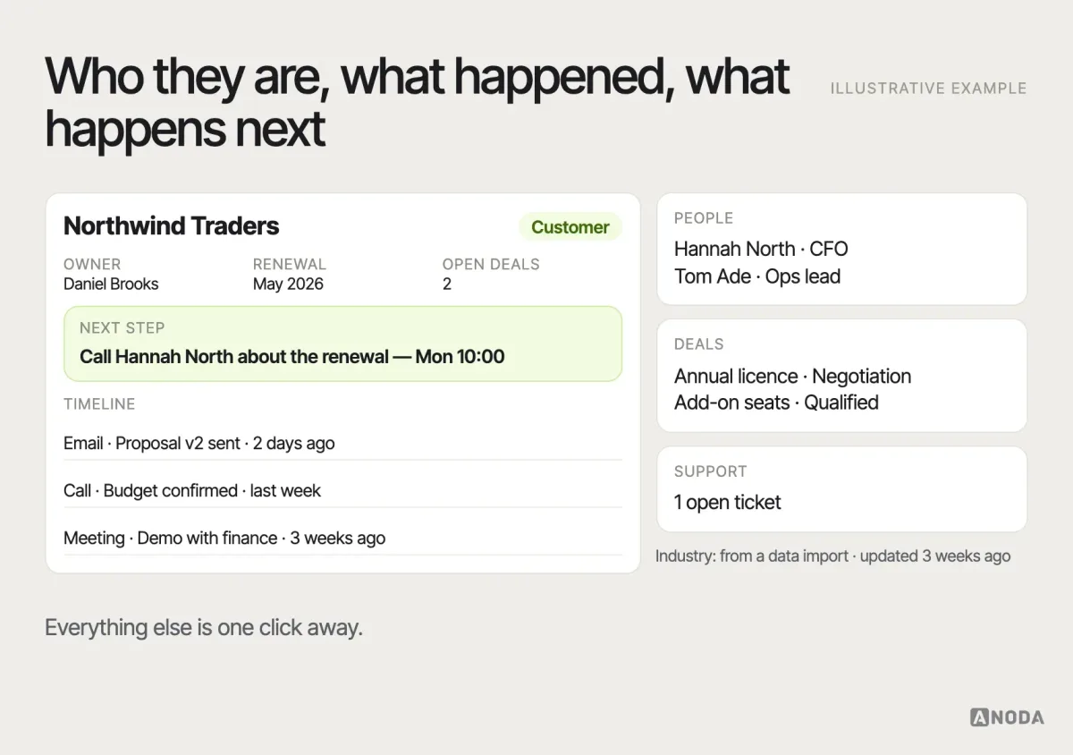
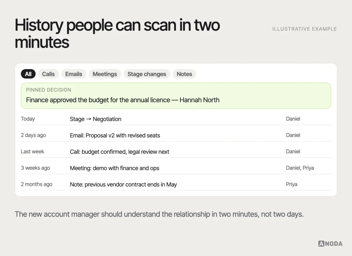
The record page is where decisions happen. Key facts at the top, the next step visible, the activity history readable, related records one click away. Decide which facts deserve the top of the page by asking what each role checks before a call or a meeting: owner, stage, value, renewal date, open issues. Keep editing inline and quick for the fields people change often, and protect the fields that feed forecasts and billing with a confirmation or a permission. The record page is also where relationships become visible — who the decision-makers are, which other deals the company has, what support is dealing with right now.
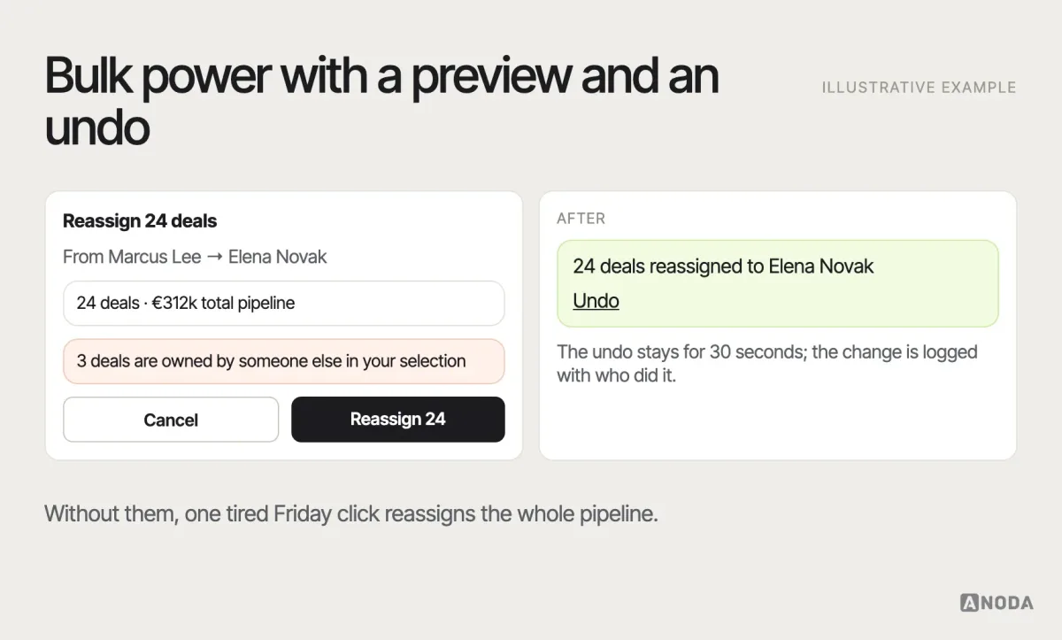
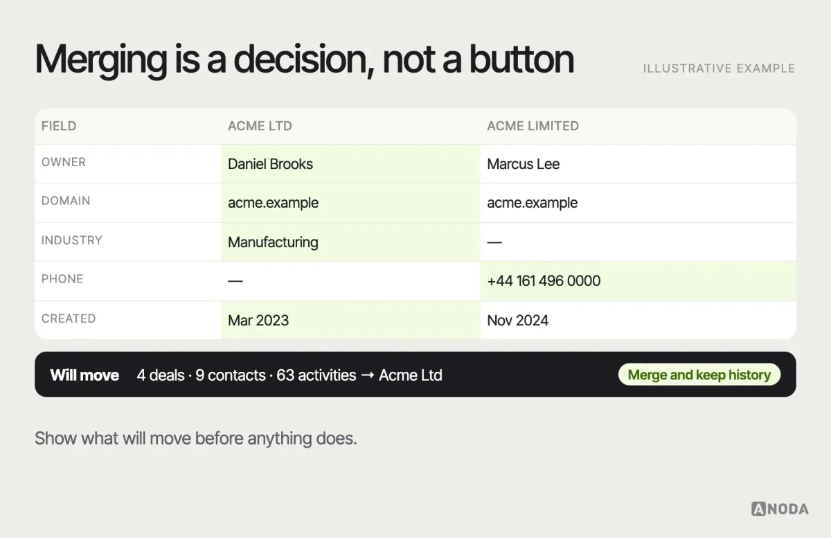
Lists and bulk actions are where operations and managers live: saved filters, chosen columns, and bulk edits with a clear preview and an undo. Bulk actions should respect permissions, say exactly how many records will change, and warn when a selection includes records the user does not own. Imports and exports belong in the same family: map columns visibly, flag the rows that will fail before they fail, and keep a record of who exported what.
A word on density. CRM users are professionals who spend hours a day in the product, so the interface can be denser than a consumer app — but only if the hierarchy is sharp. Tables need clear alignment, readable numbers and sensible defaults for columns. Frequent actions deserve keyboard shortcuts. Status needs colour and text, so it survives colour blindness and bad monitors. Dense is fine; noisy is not.
Dashboards that support decisions
Dashboards are where CRM projects most often turn into decoration. A manager needs to know which deals need coaching this week, whether the forecast is believable and where the pipeline is thin — not forty charts of everything the database can count.
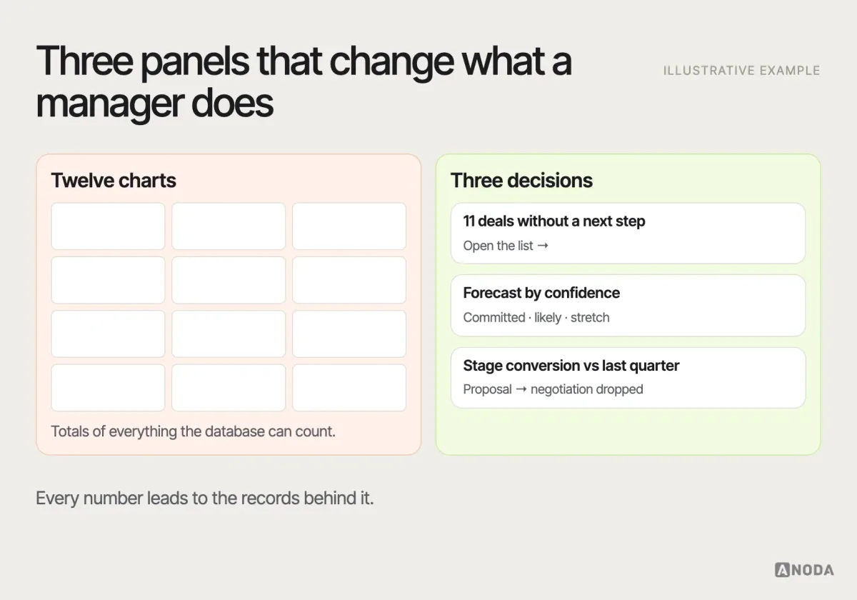
Our guide to dashboard UI design covers the craft. In a CRM, one rule matters most: every number on a dashboard should lead to the records behind it. A manager who sees “eleven deals without a next step” must be one click away from those eleven deals and able to act on them there. Give each role its own default dashboard instead of one shared wall of charts, and review the panels every quarter: if nobody has clicked a chart in months, it is furniture.
Make data confidence visible
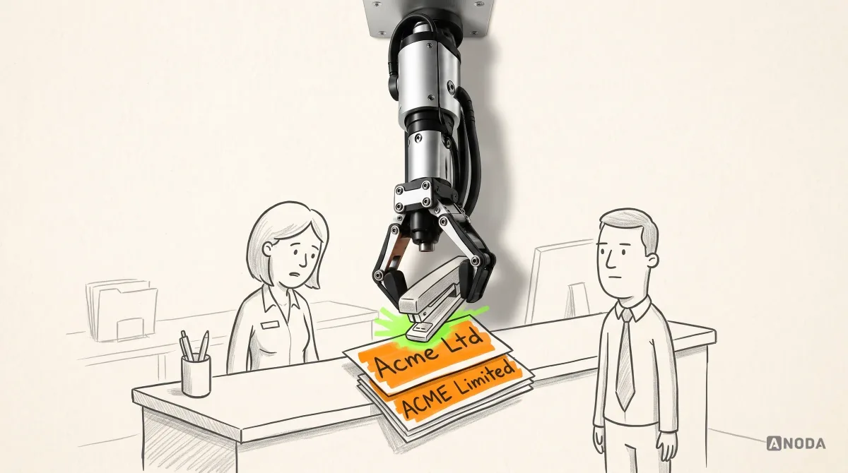
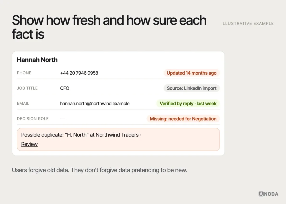
People stop trusting a CRM the day it shows them something wrong. Design for data confidence: show when a field was last updated and from which source, flag incomplete or conflicting records, and make duplicates easy to spot and merge. Duplicates are the classic trust killer — two receptionists, two badges, one confused visitor.
Handle errors, conflicts and recovery
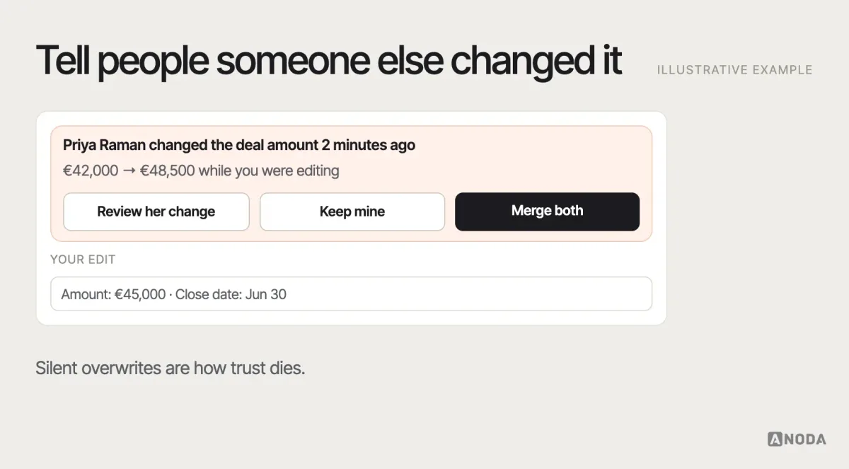
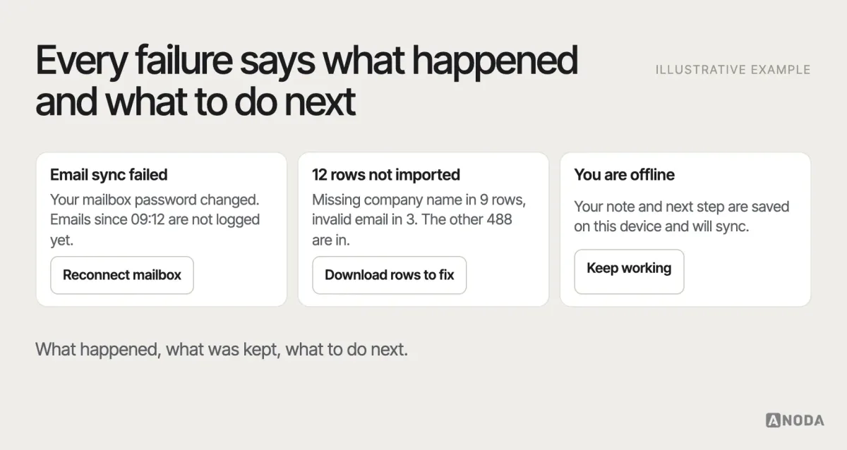
CRMs are multi-user and connected to other systems, so things will go wrong: two people editing the same record, a sync that fails, an import with bad rows. Design these states as carefully as the happy path. The principle is the same everywhere: say what happened, keep what the user did, and offer a next step. Never discard a half-written note because a token expired, never let two people silently overwrite each other, and never leave an import error as a line in a log nobody reads.
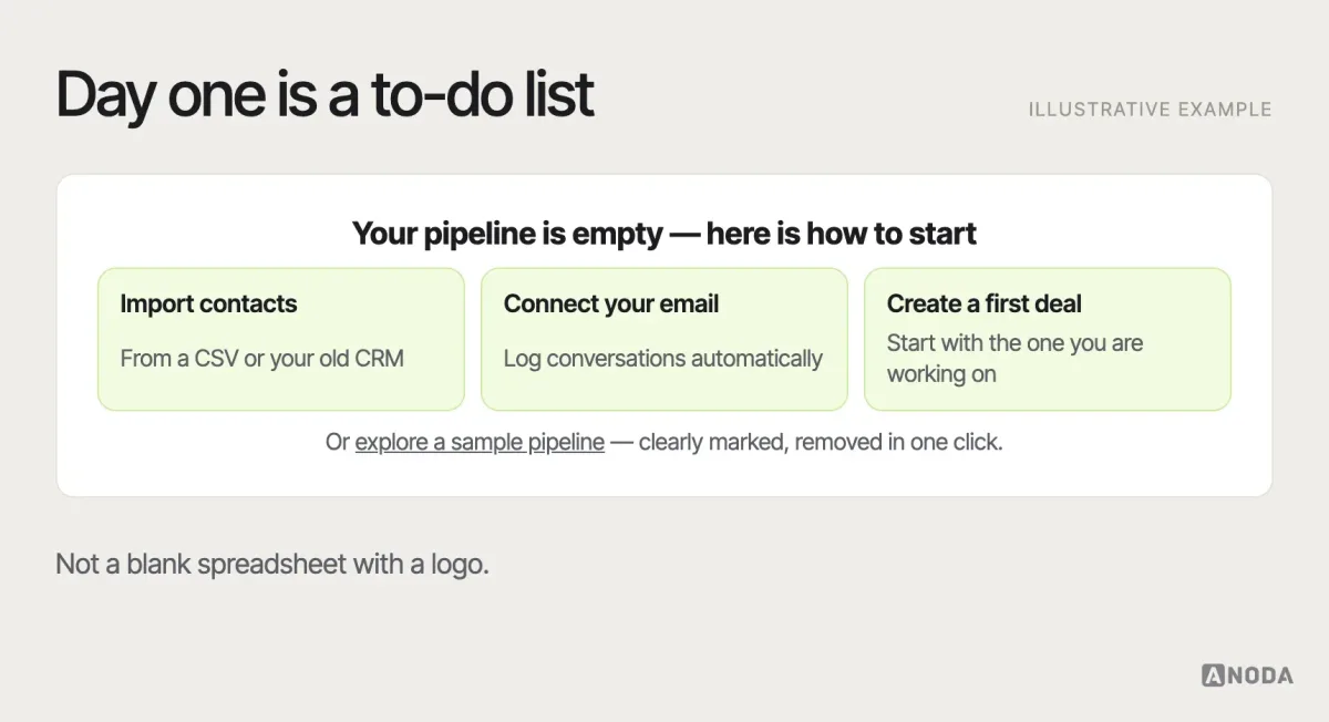
Empty states matter too. The first day in a new CRM should guide people to import contacts, connect email or create a first deal — not greet them with a blank grid. Sample data helps people learn the structure, as long as it is clearly marked and easy to remove.
Automation that knows its limits
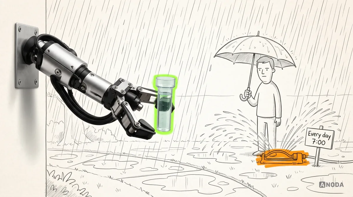
Automation is where CRMs promise the most and hurt the most. Assigning leads, creating tasks, sending follow-ups and updating stages save hours — until a rule fires in a context nobody considered. A sprinkler on a timer waters the lawn in a thunderstorm.
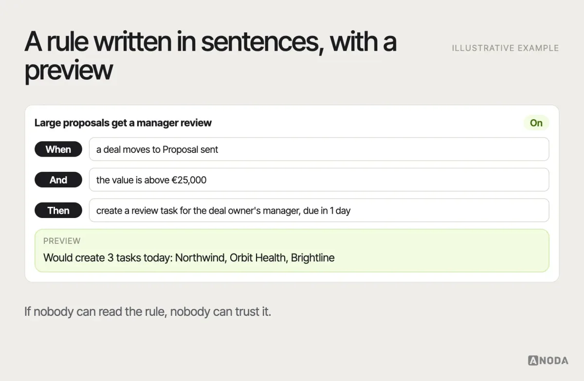
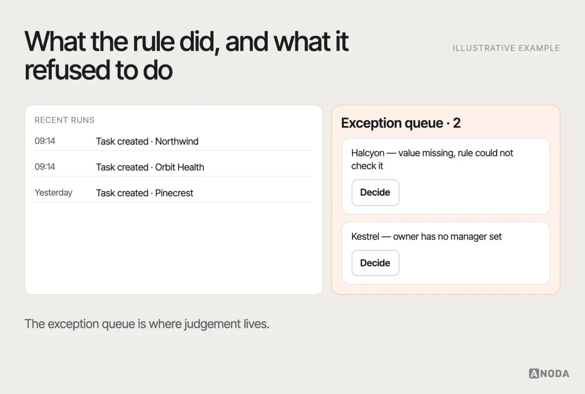
Design rules people can read: trigger, conditions, action, a preview of which records it would affect, and a log of what it did. Send exceptions to a queue a person reviews, instead of letting the rule guess. Add AI suggestions only once the basic data is trustworthy and each suggestion shows what it is based on.
AI features follow the same logic, only with higher stakes. Summarising a long account history, drafting a follow-up or suggesting the next best action can genuinely save time — if the underlying data is complete and the user can see why the suggestion was made. On top of stale fields and duplicates, AI simply produces confident mistakes faster. Treat every AI output in a CRM as a draft a person approves, keep it attributable, and never let it change forecast-critical fields on its own.
Mobile and cross-team handoffs
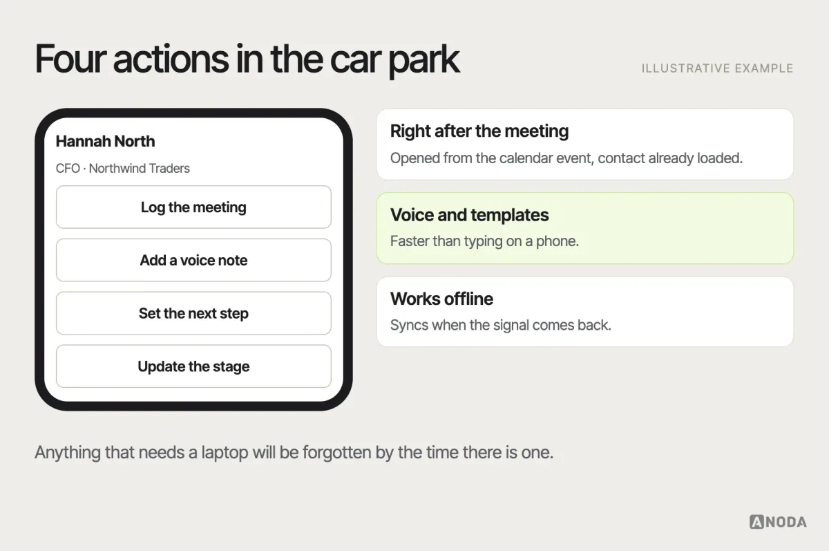
Field sales and account managers need the CRM between meetings, on a phone: log a call, add a note, set the next step, find a contact. Design those few actions for one thumb, not the whole desktop product. Voice notes, quick templates and offline capture matter more on mobile than full record editing. The rest can wait for the laptop.
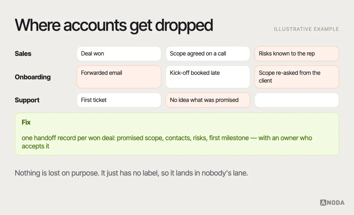
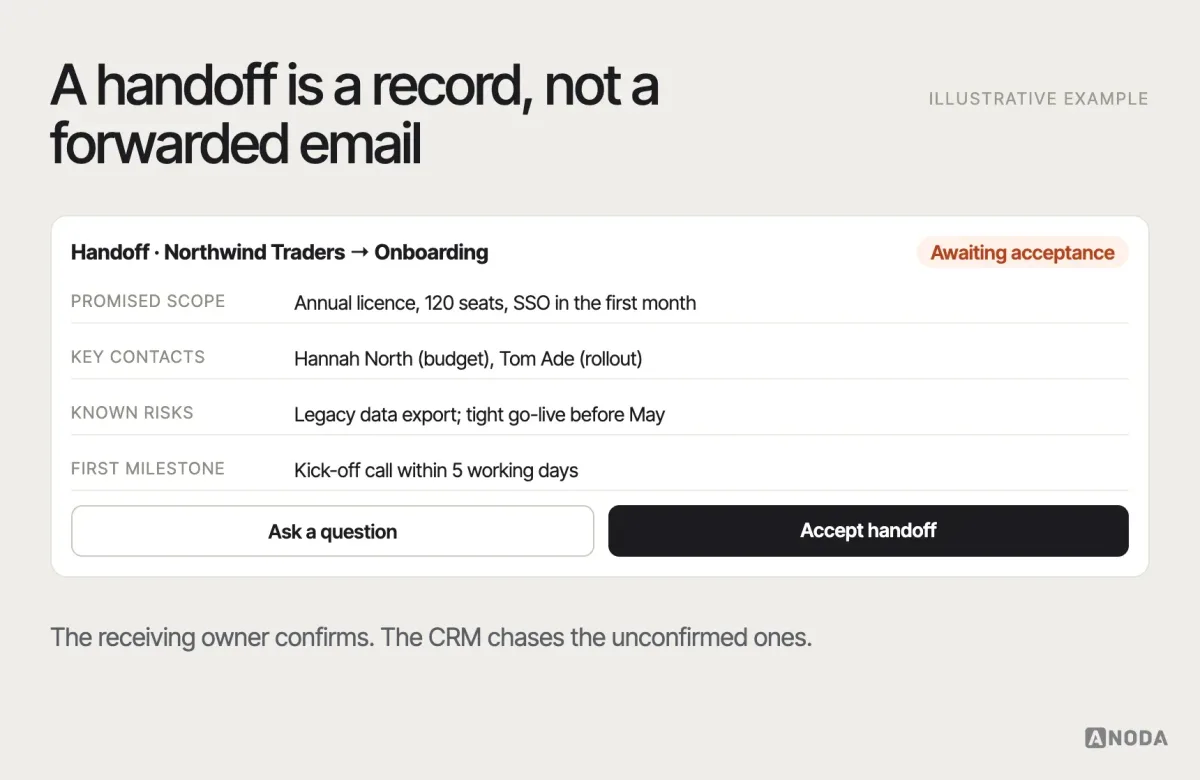
Handoffs between teams are where accounts get dropped: sales closes, onboarding starts, support inherits. Each handoff needs an explicit record: what was promised, who the key people are, what the risks are, and who now owns the customer. The receiving team should confirm acceptance, and the CRM should show unaccepted handoffs to the people who can chase them. A parcel with no label travels between three departments and nobody opens it.
CRM audit
Already have a CRM your team works around?
We audit the current experience, find the failures behind the spreadsheets and turn them into a prioritised improvement plan.
The CRM design mistakes we keep finding
Different companies, different CRMs, the same list:
- Cloning a vendor. The product copies a well-known CRM’s feature set, and the company’s actual advantage is nowhere in it.
- Designing tables before relationships. The data model is an afterthought, so the interface cannot show who belongs to what.
- One interface for every role. Reps, managers and operations get the same screens and each fights them differently.
- Forms instead of workflows. Logging a call means filling in twelve fields, so nobody logs calls.
- Dashboards as decoration. Many charts, no decisions, no path from a number to the records behind it.
- Automation without brakes. Rules nobody can read, no preview, no log, no exception queue.
- No plan for bad data. Duplicates, stale fields and failed syncs are left to “cleanup later”.
- Big-bang rollout. Everyone switches on Monday, the old spreadsheet quietly survives, and adoption never recovers.
Each of these is cheaper to prevent in design than to fix in production.
Prototype, test, roll out and measure
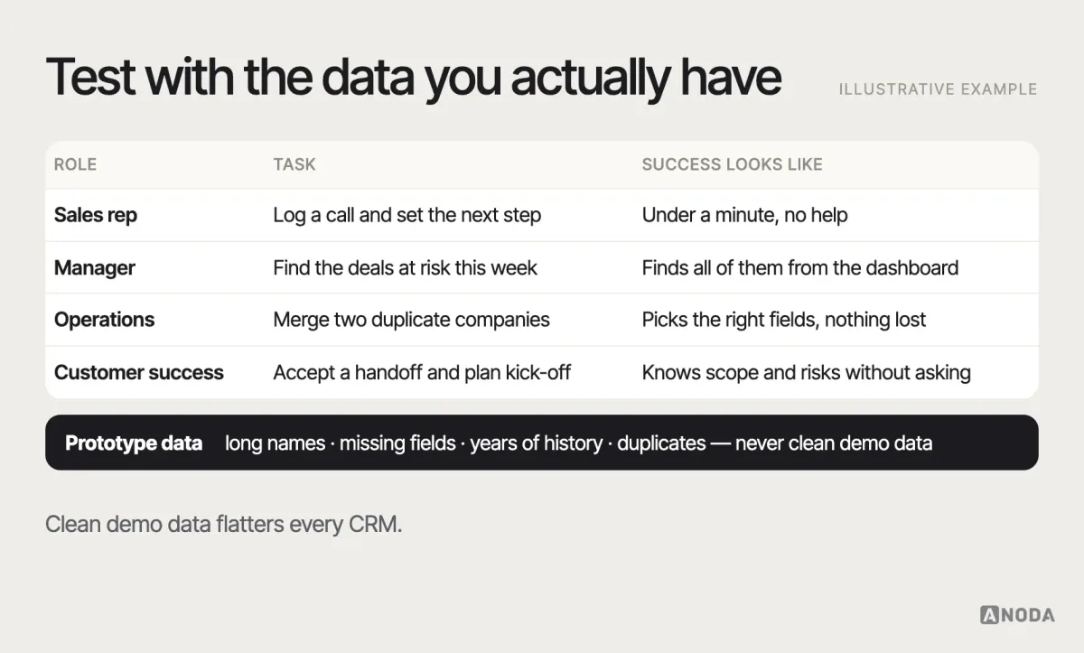
Prototype the core paths with realistic data — messy names, long histories, missing fields — and test with representative users from each role. A CRM that looks clean with ten sample deals can collapse with ten thousand real ones.
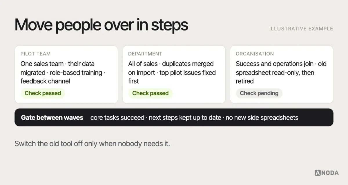
Roll out in phases: a pilot team, then a department, then the organisation, with data migration and training planned for each step and the old tools retired only when the new paths work. Migration is design work too: which historical records move, how duplicates are merged on the way in, which old fields are dropped and how users will find the history they relied on. Training should be built around the role’s real workflows, not a tour of every menu. Keep a visible channel for feedback during the pilot and fix the top issues before the next wave — the first team’s experience becomes the story everyone else hears. For custom builds, CRM development should start once these paths are validated, not before.
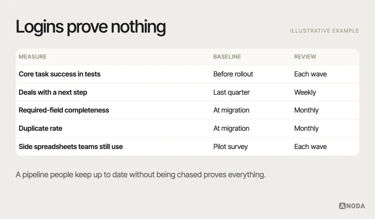
Then measure adoption by behaviour, not logins: task success on the core workflows, the share of deals with a next step, data completeness, time spent searching, and whether the shadow spreadsheets disappear. Set a baseline before the rollout — how long common tasks take, how complete the data is, how many side spreadsheets exist — so the change can be shown, not claimed. Pair the numbers with regular conversations with each role: adoption problems usually show up in what people say weeks before they show up in the data.
An illustrative example
Here is how the process plays out on a typical engagement — an illustrative example, not a specific client. A B2B services company sells multi-month projects. Its sales team uses a popular off-the-shelf CRM; delivery runs in a separate project tool; leadership cannot tell which signed deals are at risk before the project starts.
Research shows the real gap is the handoff: promised scope, key contacts and risks live in the salesperson’s email and never reach the delivery lead. The data model gains an explicit link between the won deal and the delivery project, and a handoff record with an owner and an acceptance step. The pipeline gets exit criteria for “proposal sent” and “verbal yes”, so forecasts stop including wishful deals. Managers get a dashboard with three panels: deals without a next step, forecast by confidence, and handoffs awaiting acceptance.
Nothing in that list is exotic. It is simply specific to how this company makes money — which is exactly what a generic CRM could not give it.
What to take away
CRM foundations repeat. Your advantage does not come from reproducing them; it comes from the workflows, relationships and decisions that are specific to your operation. The process is not complicated: decide what the CRM is for, research the roles, model the data and states, design the few screens that carry the work, make confidence and failure visible, automate carefully, and roll out in steps while measuring behaviour. What makes it hard is the discipline to do it in that order when everyone is asking for screens. If a CRM project needs broader product design beyond the CRM itself, that is where end-to-end UI/UX design comes in.
Model the entities and roles, choose the few workflows that prove your unique value, and make relationships, search, history and states explicit. Everything else is decoration — and your team already has a spreadsheet for that.

CRM design
Building a CRM your team will actually use?
We map your domain, roles and workflows, model the data and permissions, and design a CRM interface that scales — while keeping the first release bounded.
Written by