In short
Everyone wants beautiful screens. Almost nobody wants the block diagram that decides what those screens do, for whom and when. That diagram is where roles, states, validation, trials and purchases get settled while a change costs an arrow, not a redesign or a rewrite. How we map user flows, what they catch, and why AI coding makes them more necessary, not less.
In this article
- What a user flow is, and what it isn’t
- Why teams skip it, and what that costs
- High-fidelity screens start the wrong argument
- How to draw it so people can read it
- What goes into a user flow map
- What a change costs at each stage
- A source of truth for people and for AI
- Estimating the impact of a new feature
- For a first release, the flow is the scope
- Signs your product needs a flow now
- Common user-flow mistakes
- User flows in a UX audit of a live product
- Who owns the flow
- How to map a user flow
- When the task crosses a map and the field
- A real decision branch: Sail lead routing
- When a form hands work to another role
- Acceptance checks before wireframes
- How long it takes, and why it’s worth it
User flow mapping is the least glamorous stage of product design and the most expensive one to skip. It is a block diagram, not a screen. Nobody frames it for the investor deck. And it is the place where a team decides, before paying for it, how the product actually works: who can do what, in which state, with which rules, and what happens when they pay, fail or change their mind.
Every client we have worked with has been tempted to skip user-flow work. The logic is understandable: a big grey diagram looks like overhead, screens look like progress. Then the screens get built on logic nobody agreed on, and the questions arrive during development, after the contract, after the estimate, at the most expensive moment possible.
This guide covers what a user flow is and isn’t, what goes into one, what it catches, what a change costs at each stage, how flows become the source of truth for people and AI, and how we map them.
What a user flow is, and what it isn’t
A user flow is a diagram of the steps, decisions and states a person moves through to complete a job in a product, including who they are, what the system does in between and where each path ends. It is the product’s logic drawn as boxes and arrows, the machine underneath the interface.
It is easy to confuse with four neighbours, and each confusion costs something:
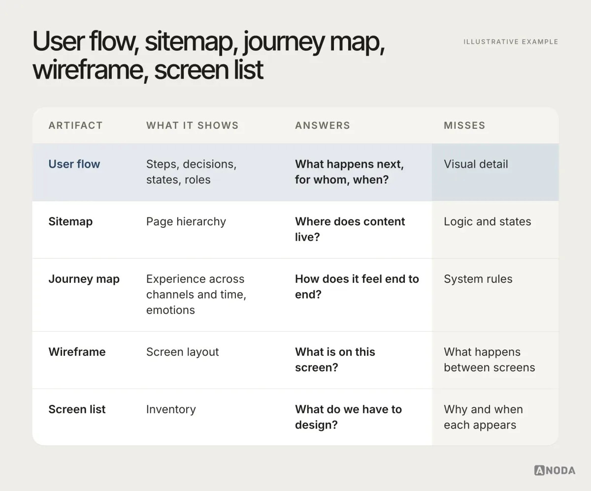
- A sitemap shows where content lives. It says nothing about what happens when someone clicks.
- A journey map shows the experience across channels and time, including how it feels. It describes the customer, not the system rules.
- A wireframe shows one screen’s layout. It is silent about what happens between screens.
- A screen list is an inventory of what to design. It doesn’t say why or when each screen appears.
- A user flow shows the steps, decisions, states and roles. It misses visual detail, on purpose.
A flow doesn’t replace wireframes, UI or technical documentation. It comes before them and tells them what they are for.
Flows also come at different levels of detail, and choosing the wrong one is a common way to waste the exercise:
- A task flow follows one person through one job, start to finish, with the decisions on the way. It is the right tool for a single feature or a first pass.
- A system flow adds roles, entity states, backend responses and plan rules. It is what a real product needs before design, and what most of this guide is about.
- A wireflow puts rough screen sketches on the boxes. It is useful once the logic is settled, to check that the screens can carry it, and harmful before, because it drags the conversation back to layout.
Start with task flows to agree on the jobs, grow them into a system flow, and only then add screens.
User flow versus journey map, in practice
The two are often mixed up because both have arrows. A journey map follows a customer across time and channels: the ad they saw, the sales call, the onboarding email, the first login, the support chat. It records what they think and feel at each point. It is the right tool when the problem is the whole relationship, such as why trial users never talk to sales or why customers churn after renewal.
A user flow zooms into the product and records the system’s rules at every step. It is the right tool when the problem is inside the product: what happens after “Submit”, who can approve, why a paying customer still sees an upgrade prompt.
Choose the starting point from the question you need to answer. A journey map helps locate friction across the customer relationship; a user flow traces the product decisions and states behind a specific task. Use both when the problem crosses those boundaries. A journey map with no flows behind it is a nice poster. A flow with no journey around it can be perfectly logical and still solve the wrong problem.
Why teams skip it, and what that costs
The usual objection is honest: “Why do we need this big, unclear diagram? We need beautiful screens.” A diagram doesn’t look like a product. Screens do. So teams jump straight to screens and assume the logic will sort itself out.
Oksana Kovalchuk, ANODA’s founder, has a picture for what happens next:
Every client tries to skip it. But we’re decorating a collapsing wall. The wall is wooden and full of termites, and we’re painting a corner of it in this season’s trendy colour. The user flow is the logic — the functions, how they connect, the states, the entities. It’s the deepest work with the backend. It’s the machine inside the software.
 Oksana KovalchukFounder & CEO, ANODA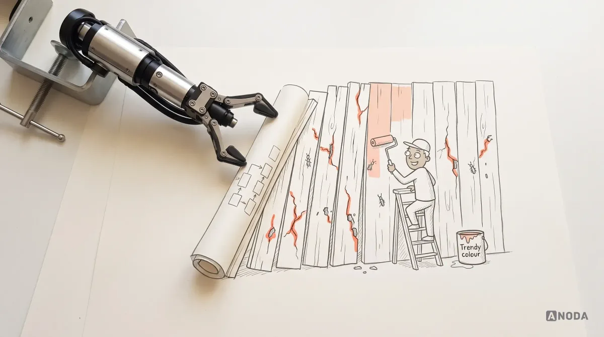
The screens can be excellent and the product still incoherent. A role sees an action it can’t perform. A state has no way out. The same rule works one way here and another way there. Nobody notices in a design review, because design reviews look at screens one at a time. Users notice on day one, because they move between them.
High-fidelity screens start the wrong argument
There is a second, quieter cost of skipping the flow: polished screens change what people talk about.
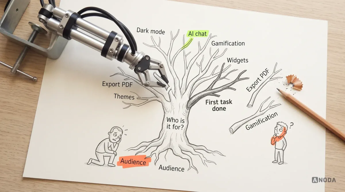
Show a client a block diagram and the conversation is about logic: what happens if the invitation expires, who can approve a report, what the user sees after the trial ends. Show them near-final UI instead and the conversation turns to the colour of the buttons, the picture on the login screen, the placeholder text and the animation. The logic questions never get asked, because everything looks finished. It is a case of not seeing the wood for the trees, except the trees have gradients.
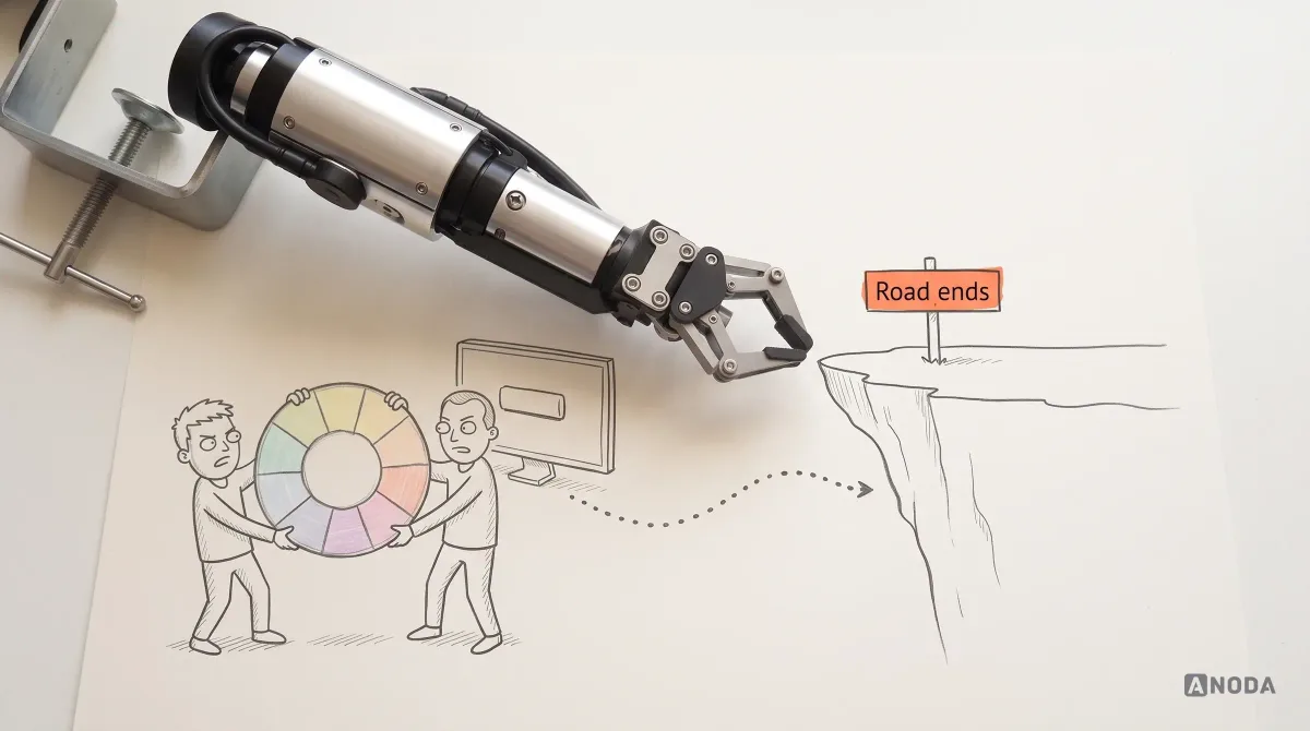
We have been in those meetings. The agency asks how the user will actually complete the task; the answer is “let’s move the buttons first”. But a product rarely fails to activate its users because a button is the wrong colour. There are exceptions, when the UI really is a mess, and those get fixed too. Most of the time, the problem sits a level below: in the logic the screens were drawn on top of.
How to draw it so people can read it
Notation doesn’t need to be clever. It needs to be consistent, so that anyone can read any flow in the product without a legend on every page. The conventions we use:
- Rectangles for steps, named with a verb and an object: “Submit report”, not “Report page”.
- Diamonds for decisions, phrased as a question with labelled answers on the arrows: “Invite team?” — “Yes”, “No”.
- Rounded shapes for start and end points, so every path visibly begins and finishes somewhere.
- Swimlanes by role when several people take part, so the handovers between technician, dispatcher and owner are visible at a glance.
- State labels on entities, written the same way everywhere: “Draft”, “Submitted”, “Approved”.
- A distinct style for problems: dead ends, unreachable screens and open questions stand out, so reviewers can find them without reading every box.
The tool matters much less than the discipline. FigJam, Miro, Whimsical or a whiteboard photo all work, as long as the flow lives somewhere the whole team can find and update it, and not in one designer’s local file.
What goes into a user flow map
A useful flow is more than a line of screens connected by arrows. It records the things that make the product behave differently for different people at different moments. Here is a small one, before we take it apart:
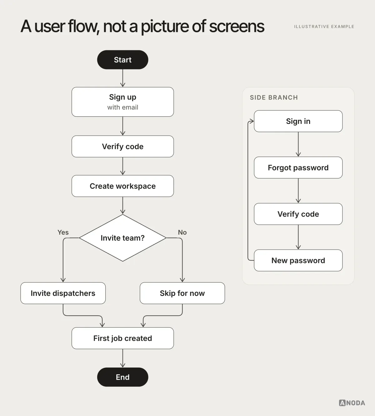
Even this simple map already answers questions a screen list never raises: where does the reset path rejoin the main flow, what happens if someone skips inviting their team, where does verification appear twice. The rest of this section covers what a real product flow needs on top.
Roles and permissions
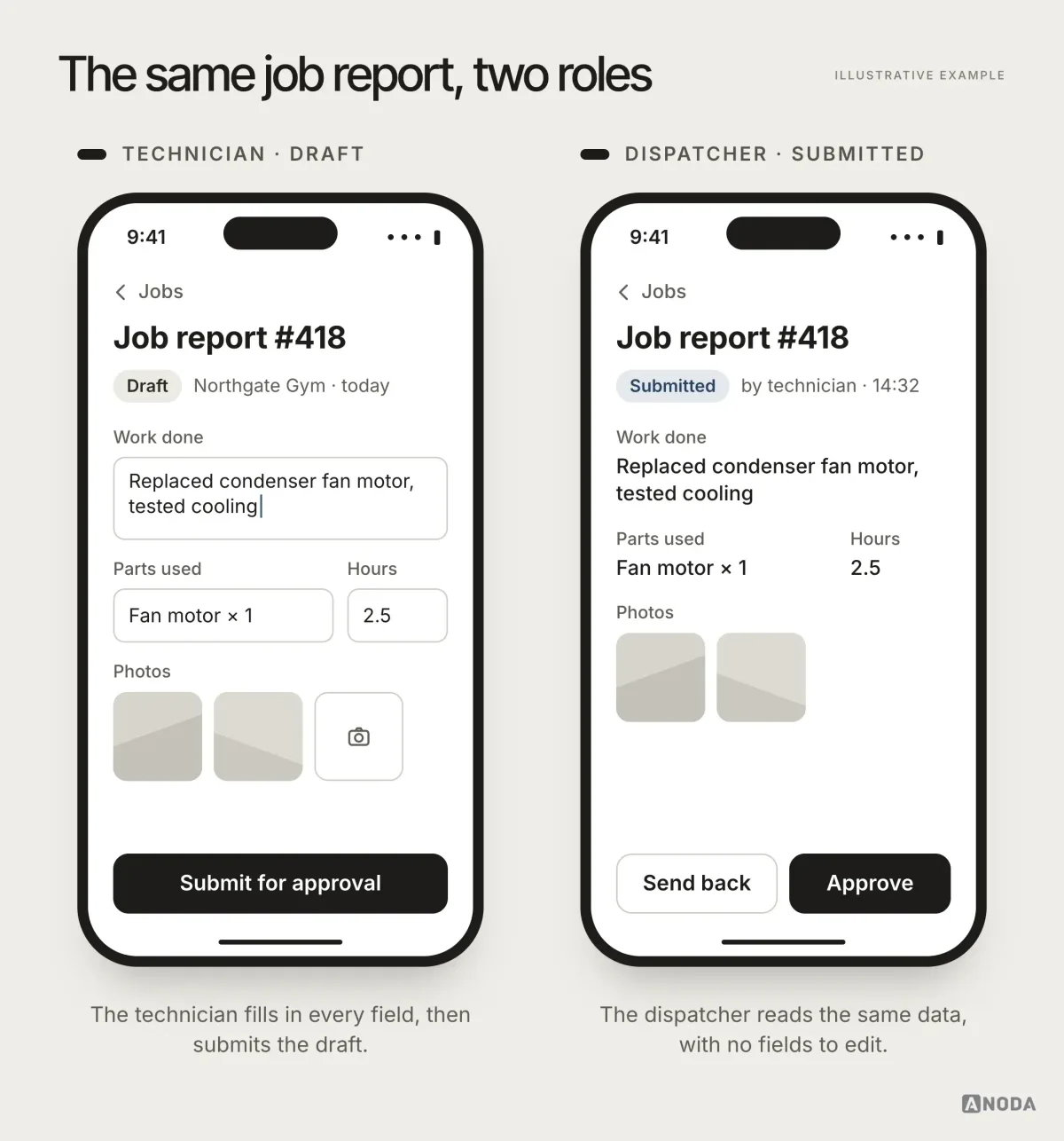
The same object means different things to different people. A job report is something a technician fills in, a dispatcher approves and an owner invoices. Each role sees different fields, different actions and sometimes a different screen altogether.
It is a theatre: the actor, the stagehand and the audience look at the same stage from three sides, and each needs different doors. A flow that ignores roles designs for one side and locks the others out, or worse, lets everyone through every door.
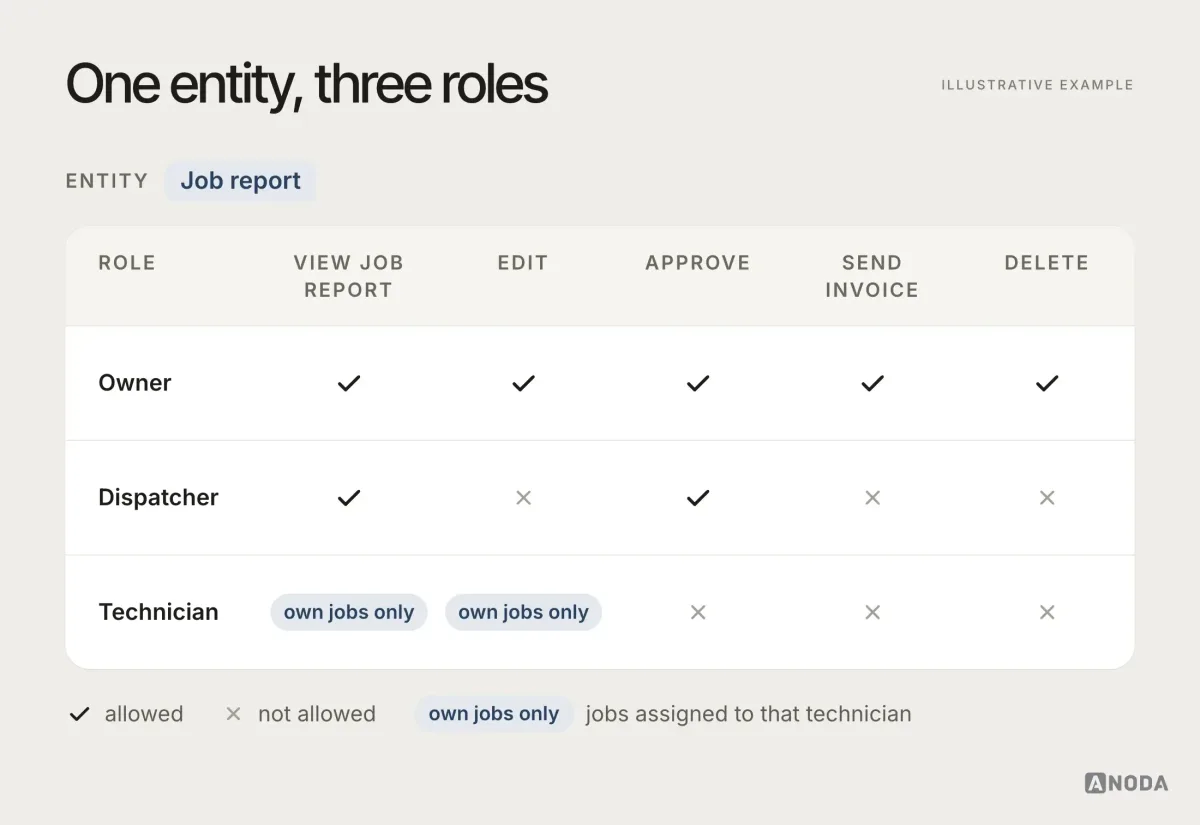
Write the role matrix down next to the flow, then mark on the flow where the path splits by role. Developers will implement exactly what they see. If the matrix doesn’t exist, they will implement whatever the last screen they looked at implied.
Roles also change over time. People get promoted, leave, share accounts, act on behalf of someone else. Decide in the flow what happens to a technician’s open drafts when they are removed from a team, what an owner sees when they switch into a dispatcher’s view, and who inherits approvals when the approver goes on holiday. Those questions sound like edge cases until the first customer asks them in a support ticket, usually with the word “urgent” in the subject line.
Entities and their states
Entities are the things the product manages: jobs, reports, invoices, users, subscriptions. Each has a life of its own, and the interface should change with it. A library book can be on the shelf, borrowed, overdue or lost, and each state changes what the librarian can do with it. Your entities are the same.
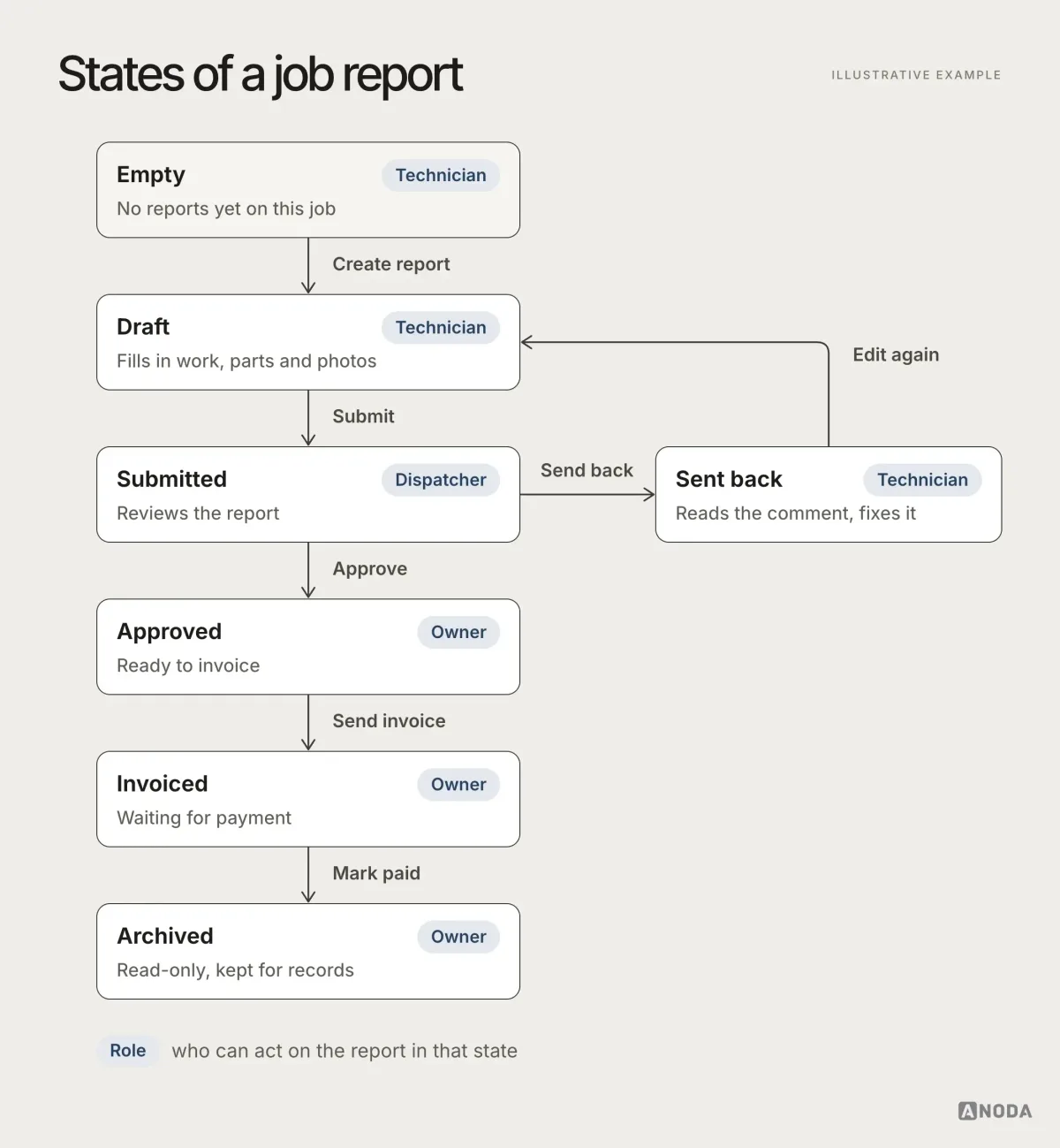
Map every state an entity can be in, how it moves between them and who can move it. The states you forget don’t disappear. They turn up in production as records stuck in a limbo nobody can edit, approve or delete.
Transitions matter as much as states. Can an approved report go back to draft? Who is notified when it’s sent back? What happens to an invoice if the report behind it is reopened? Each arrow on the state diagram is a rule, and each rule needs an owner who agreed to it. When the arrows are missing, developers add their own, and the product quietly starts following rules nobody chose.
Empty and populated states
Every list, dashboard and inbox has at least two lives: before there is data and after. Most design files only show the second, because it looks better in a presentation. New users only see the first.
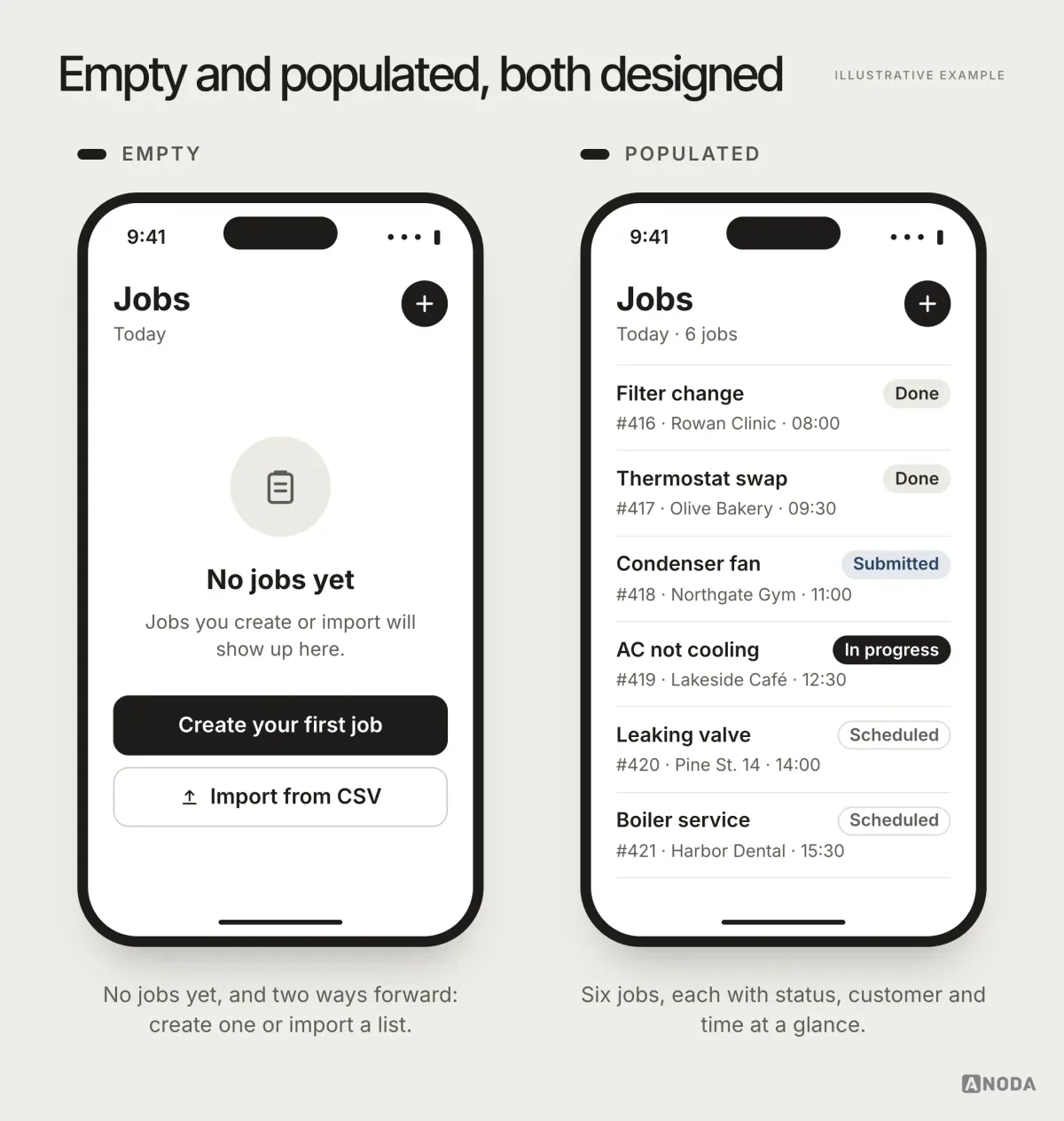
An empty classroom on the first day still has a timetable on the door. The empty state should say what goes here, why it’s empty and what to do first. In the flow, mark it as a state with its own exits, not as an afterthought the developer invents at midnight.
Validation rules
Validation looks like a detail and behaves like a system. The rules for a field — format, length, when it’s checked, what the error says — should be the same wherever that field appears. When they aren’t, users learn one rule and get punished by another.
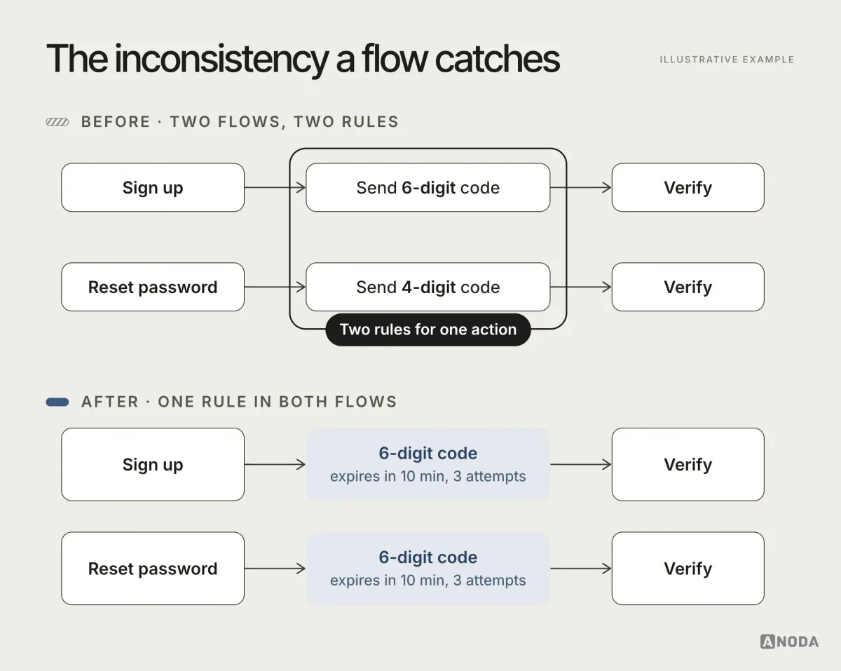
Oksana’s favourite example is small and very common: sign-up sends a six-digit code, password reset expects four digits. Nobody decided that. Two people designed two flows on two different days.
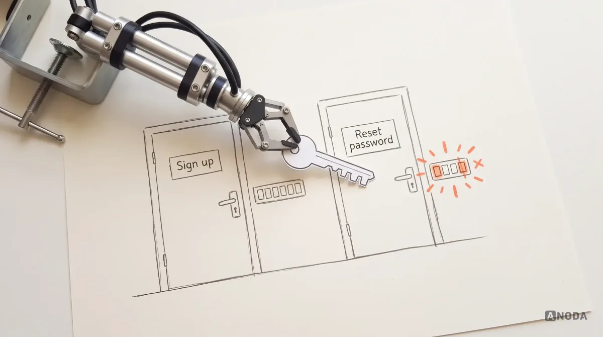
You don’t need to draw a hundred screens for every role to discover that sign-up sends a six-digit code and password reset expects four. It looks like a small mistake. Developers will build exactly what was drawn. They won’t ask. They want to write code in peace.
Oksana KovalchukFounder & CEO, ANODAOn a flow diagram, both paths sit next to each other, and the mismatch is visible in minutes. Across a hundred high-fidelity screens spread over several design files, it survives until a user emails support.
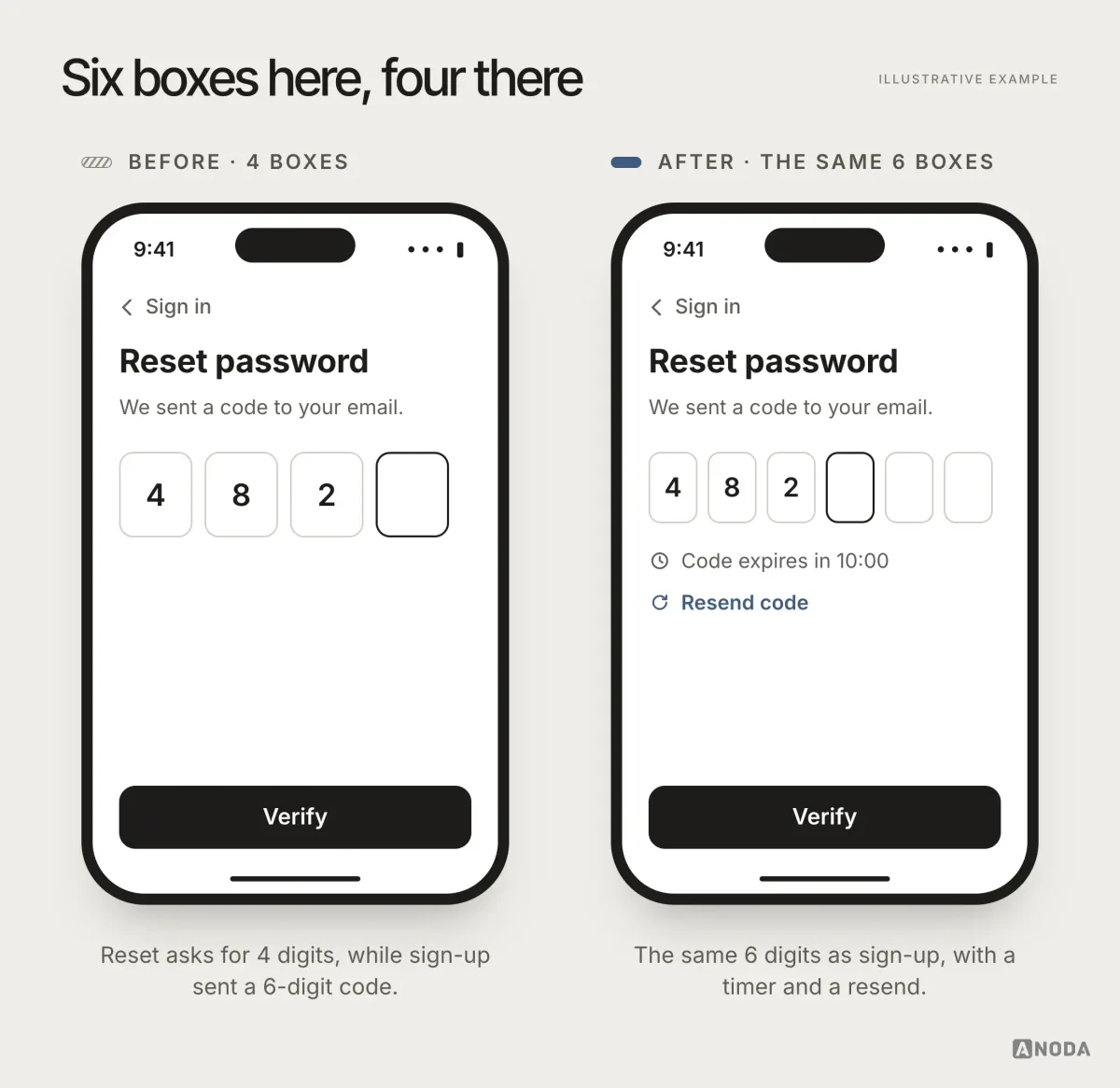
Error messages belong to the same system. If a wrong code says “Invalid code” in one flow, “Something went wrong” in another and “Code expired, request a new one” in a third, users can’t learn what to do. Write each error once, with its recovery step, and reuse it everywhere the rule applies.
Collect validation rules in one place, attach them to the flow where each rule applies, and review them together. Measure twice, cut once is old advice because it keeps being right.
Backend-dependent branches
A lot of product logic depends on answers the interface doesn’t control: the payment went through or didn’t, the file finished processing or failed, the invitation is still valid or expired, the server is slow. Each answer is a branch, and each branch needs a place to go.
A flow that shows only the happy path hands every other outcome to the developer to improvise. Map the branches the backend can return at each step: success, failure, timeout, partial result, “still processing”. Then decide what the user sees in each. This is where the flow stops being a UX artefact and becomes an agreement between design and engineering about how the system behaves.
A few examples from almost every product we map. A payment can be authorised but not yet captured: is the order confirmed or pending, and what does the user see? An import can succeed for most rows and fail for some: do we keep the good rows and list the bad ones, or reject the whole file? A long export can finish after the user has left the page: where does the result go? None of these answers is technically hard. All of them are product decisions, and a developer left to make them alone will reasonably choose whatever is quickest to build.
Purchase, trial and entitlement branches
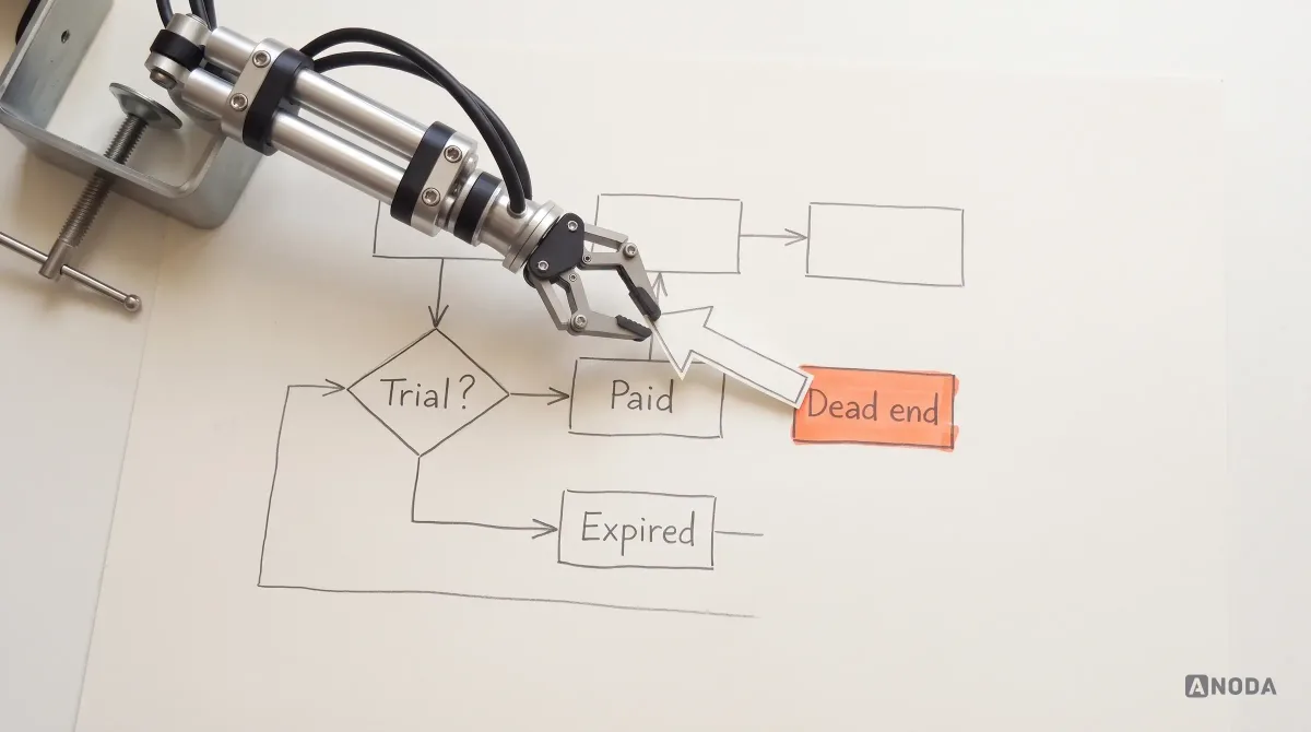
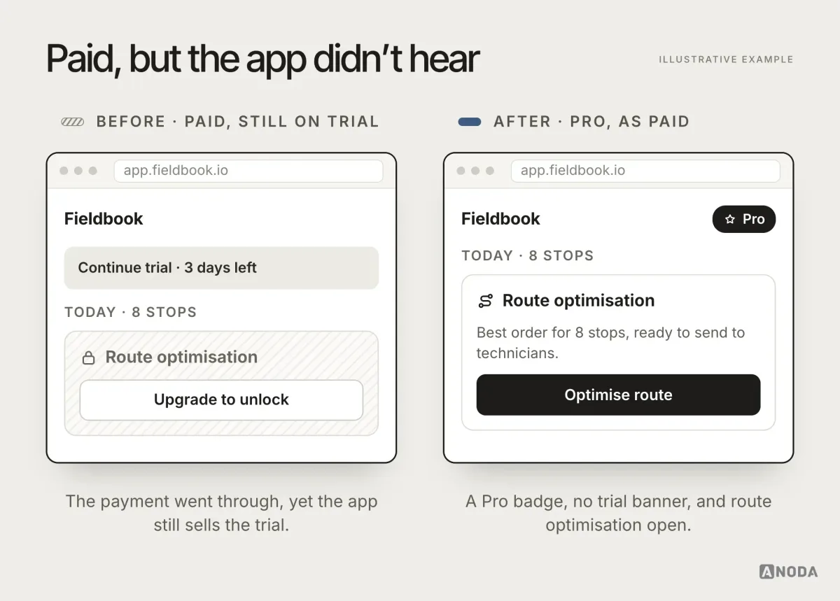
Money changes the interface, and it is where inconsistencies hurt most. Did the user buy, start a trial, let it expire, downgrade? Each answer changes what they see: whether “Buy” appears, whether a trial banner shows, which features are open.
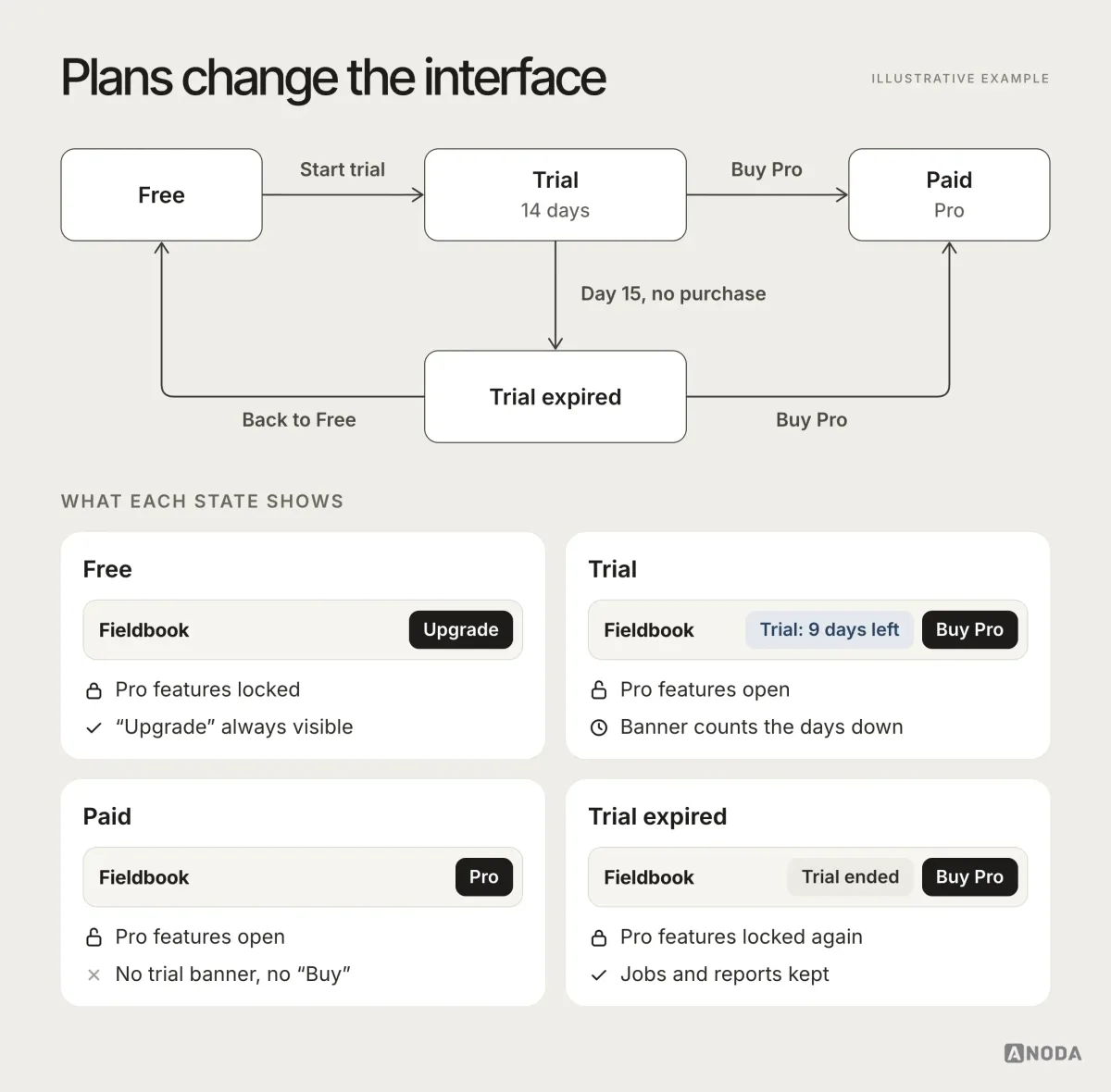
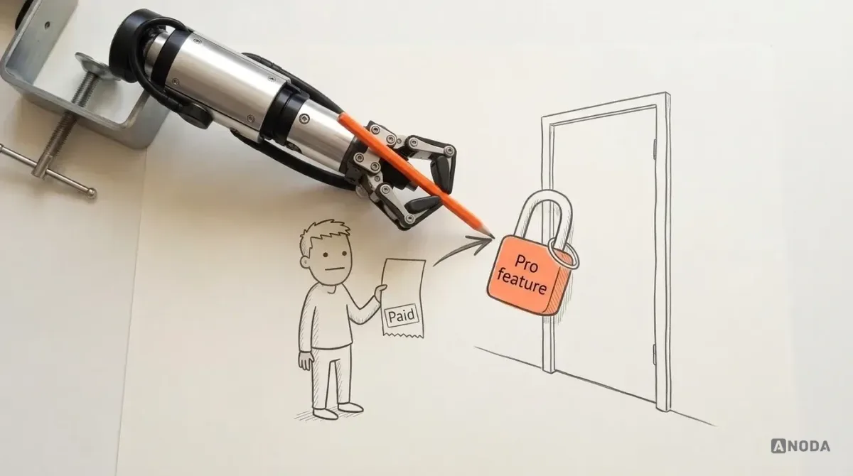
When these branches aren’t mapped, they surface in UI and development as bugs with a revenue attached. The “Buy” button covers the main action on a small screen. It doesn’t fit at all. The “Continue trial” banner stays visible after someone has paid, and the reviews start. Worst of all, a user pays for a feature and it stays locked. A cinema that sells you a ticket and won’t open the door gets its money back and a bad review, in that order.
The tricky branches are rarely “free” and “paid”. They are the transitions: a trial that ends mid-task, a card that fails at renewal, a downgrade that leaves the account with more projects than the new plan allows, a refund, a grace period. Decide for each one what the user keeps, what gets locked, what they are told and when. If the flow doesn’t say, the billing system will decide, and billing systems are not known for their tact.
A checkout at a counter needs its own complete flow: change the basket, apply an authorised discount, choose payment, handle a pending or failed response, and recover without charging twice. In Cabinit’s tablet-first installation workspace, we designed a different operational task around large touch targets, clear status and role-specific task completion. That is a useful interaction discipline to carry into a checkout, with the retail rules mapped for the actual job. Our POS design connects the cashier’s touch workflow, supervisor permissions and payment states before anyone polishes the terminal screens, so a busy shift does not become a chain of improvised workarounds.
Navigation and reachability
Navigation is only correct if every part of the product can be reached, and left, by the people who need it. You cannot prove that from a pile of screens. You can prove it from a flow.
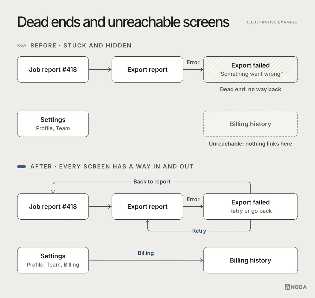
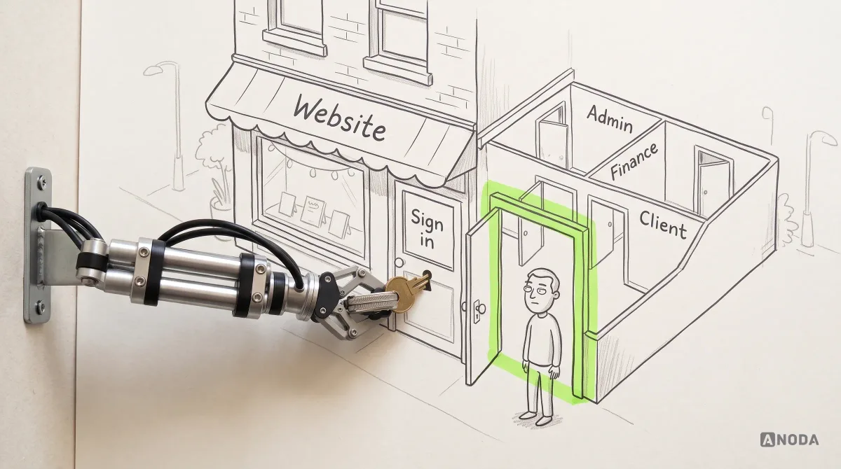
A building with a room no corridor leads to is not a design choice. It’s a surveying mistake. Look for two things on every flow: dead ends, where a state has no exit, and orphans, where a screen has no way in. Then look for blocking actions: steps that stop the user with no alternative, such as a mandatory field they can’t fill or a permission they can’t request.
Navigation design itself starts here. The menu, tabs and shortcuts should come from the flow — from which jobs are frequent, which areas each role needs and which states people return to — not from a list of screens sorted by whoever built them. A map makes reachability review systematic: follow each role through its permitted entries, transitions and exits. Use those agreed paths to check implemented links and permissions before release.
UX audit
Live product, logic nobody can explain any more?
We map the flows your product actually runs on and find the dead ends, broken branches and rules that contradict each other.
What a change costs at each stage
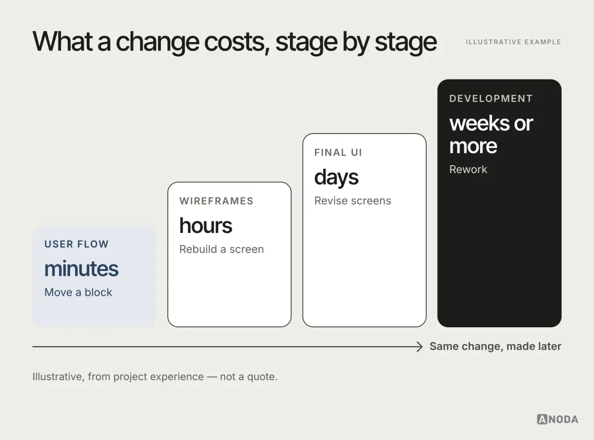
Every product decision gets changed at some point. The only question is where. The cost of that change climbs steeply with each stage the decision has already passed through.
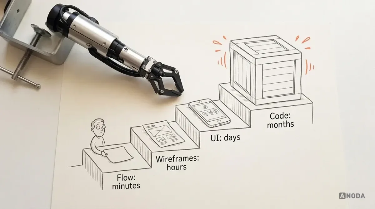
On a flow, changing a decision means moving a block, deleting one, adding another and redrawing the arrows: minutes. In wireframes, rebuilding the affected screen takes an hour or two. In final UI, revising the screens and their variants can take days. In development, the same change can take weeks or months when it touches several services, migrations and release dependencies; even a smaller correction needs implementation and testing.
Take the code-length mismatch from earlier. On the flow, fixing it means changing one label: a minute. Found in wireframes, it means updating two screens and their error states. Found in final UI, it means revising every variant that shows a code field, in every theme and size. Found in development, it means changing two services, their tests, the emails that send the codes and the support article that explained the old behaviour. Found by users, it adds reviews, refunds and a hotfix on a Friday evening.
It is moving a wall on the architect’s drawing versus moving it after the concrete is poured. Same wall. Very different invoice. This is why uncertainty should be allowed to grow during flow work. Uncomfortable “what happens if…?” questions are cheap on a diagram and ruinous in a sprint. If the flow estimate slips from one week to two, that is good news compared with a development estimate slipping from three months to a year, which is where these questions otherwise surface.
AI coding tools have made the last stage faster, but they haven’t changed the shape of the curve. Code generated quickly on top of undecided logic is still undecided logic, now in more files. The cheapest change is still the one made on the diagram, before anything downstream depends on it.
A source of truth for people and for AI
Products have outgrown single design files. A serious product today lives in many of them: one per flow, a separate design system, a separate prototype, sometimes twenty files in total. Nobody opens all of them, and nobody keeps all of them in sync. The moment one flow changes, some screenshots somewhere are out of date, and the team loses its shared answer to “how does this actually work?”
A flow diagram is small enough to maintain and complete enough to answer that question. Product managers, marketers, support and developers can read it without searching twenty files. It shows the real scope of the product in one place. An orchestra where every musician plays from a different edition of the score doesn’t need a better conductor. It needs one score.
AI raised the stakes. Coding agents can generate screens and code fast, but they need context and hard boundaries: what the states are, which rules apply, which role sees what. Without a clear flow, an agent guesses. When it notices an inconsistency, it “fixes” it by picking a side, and the next agent picks the other one.
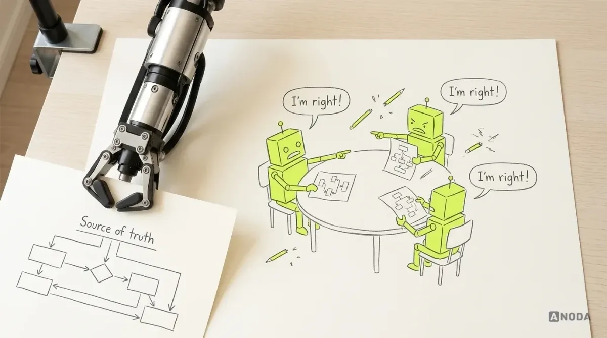
AI needs hard boundaries to work within. If nothing is the source of truth, how do you decide who is right? Everyone is right and everyone is wrong at the same time. Without a clear user flow, AI won’t assemble the screen properly — you’ll burn your tokens on the first pass through Figma, and it will fix one inconsistency by creating three more.
Oksana KovalchukFounder & CEO, ANODAIt is a game of broken telephone played at machine speed. A flow that is easy for people and AI to read, kept up to date and treated as the authority, is the cheapest way we know to stop it. When the diagram and the code disagree, the team knows which one to fix.
In practice, giving a flow to an AI agent means giving it more than a picture. We pair the diagram with plain structured text: the role matrix, each entity’s states and allowed transitions, the validation rules, and the plan and entitlement table. Agents read those precisely, can check their output against them, and stop inventing rules to fill the gaps. The same documents answer a new developer’s questions in their first week, which is not a coincidence. We make the same argument about human prioritisation in our guide to UI/UX design principles: AI can build what you describe; it can’t decide what should be described.
Estimating the impact of a new feature
Clients often arrive with a finished design and a request: estimate development, or add a couple of features to what’s there. “A couple of features” is where the flow earns its money a second time.
Adding a bathroom upstairs is not one room. It is plumbing through three floors, a new drain and a ceiling someone has to repaint. A new feature is the same: it touches flows, states, screens and navigation well beyond the obvious one.
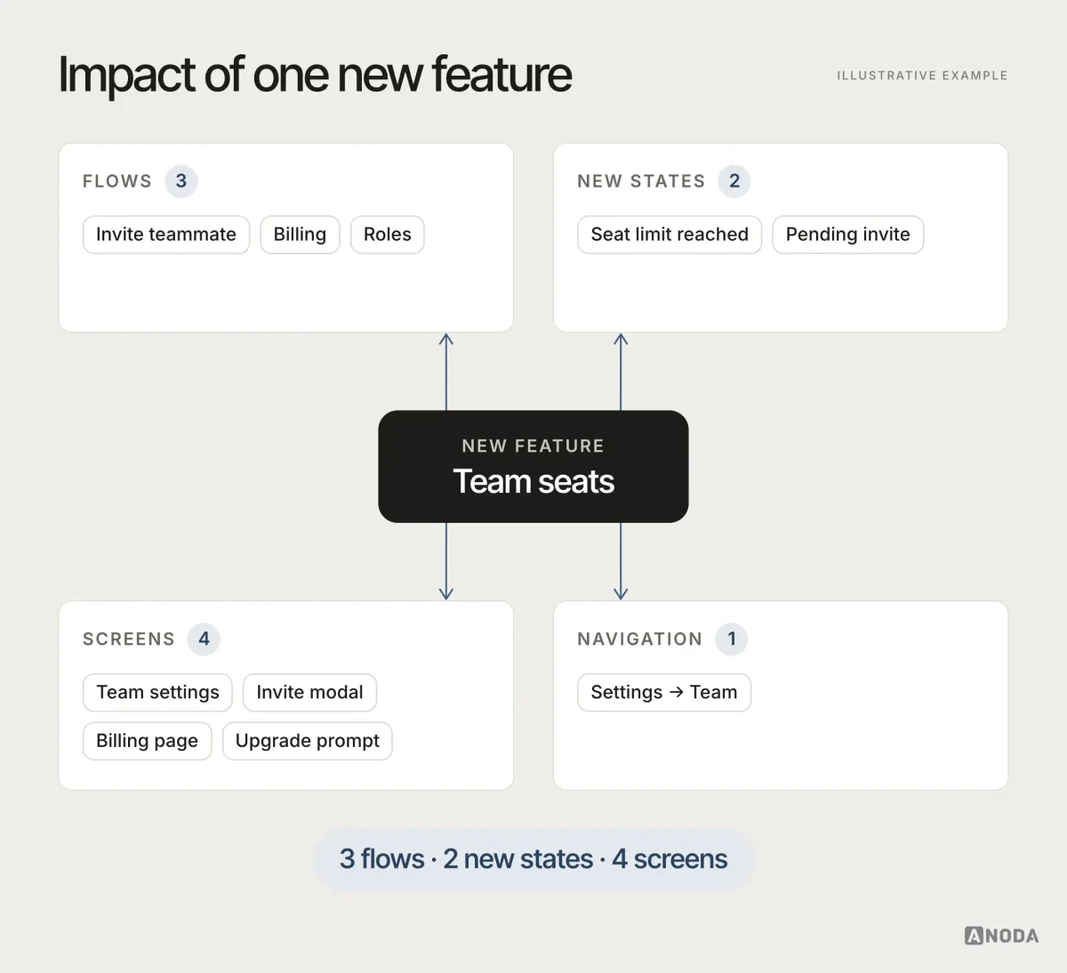
With a flow, you can trace the feature through every place it touches and produce a list before anyone estimates: which flows change, which states are new, which screens need revising, how navigation shifts. Without one, the estimate covers the screen everyone was looking at, and the rest arrives as “unexpected complexity” in week six.
The same applies when a startup arrives with a complete design and asks for a development estimate. The screens may be beautiful and still leave the logic open: what happens when an invitation expires, what a downgraded account keeps, which role can undo an approval. We map the flow from the existing design before estimating. It usually takes a few days, and it turns the estimate from a guess into a list, with the open questions written down for the client to answer before the contract is signed rather than after.
For a first release, the flow is the scope
A founder can buy fewer screens and still pay for a sprawling first release if nobody has decided which branches belong in it. Removing the admin or the confirmation screen may make the estimate smaller while leaving the customer’s task unfinished. The flow lets you cut capabilities without cutting the result people came for.
In AispireMe’s desktop MVP, ANODA mapped students, parents, counsellors and organisations into connected journeys. The enrollment path carries a family from program details and the total to its application and a visible request confirmation. The screen map, prototype and UI kit give engineering one agreed route to implement.
Our MVP design service turns that map into a bounded first-release scope: the critical task, supporting roles, required states and the work that can wait. You get a useful first product to build, rather than a cheap-looking estimate with expensive decisions hidden inside it.
Signs your product needs a flow now
Not every team realises the flow is missing. The symptoms look like other problems. If several of these sound familiar, the logic underneath your product has never been written down:
- Design reviews keep circling back to the same “but what happens if…?” questions without settling them.
- Developers ask the same clarifying questions every sprint, and the answers depend on who they ask.
- Support explains workarounds for behaviour nobody on the team can justify.
- A “small” feature estimate doubles once work starts, because it touches areas nobody listed.
- Different parts of the product handle the same rule differently: codes, formats, permissions, error messages.
- Paying customers report seeing trial prompts or locked features.
- AI coding tools keep producing code that contradicts earlier decisions.
Each of these is expensive on its own. Together they are the sound of a team rebuilding its product’s logic one ticket at a time, and paying development rates to do it.
Common user-flow mistakes
Teams that do draw flows often draw them in ways that miss the point. These are the mistakes we see most in products that come to us for an audit.
- Only the happy path. The flow shows success from start to finish and nothing else. Every failure, timeout and “no” answer is left to development.
- Flows per screen instead of per job. Boxes named after screens (“Dashboard”, “Settings”) instead of steps in a task. The result is a sitemap with arrows, which answers none of the logic questions.
- All roles on one line. One path for everyone, with notes like “admin only” scattered in margins. Nobody can see where the experiences actually diverge.
- Too much or too little detail. A flow that records every tap is unreadable; one that stops at “user completes onboarding” hides the decisions inside. Aim for one box per decision or state change.
- Screenshots glued together. A flow built from exported screens looks thorough and goes out of date the first time a screen changes. Keep the flow abstract enough to survive redesigns.
- Drawn once, never updated. The flow was right in March. By June it describes a different product, and nobody trusts it, so nobody opens it.
- No owner. Design thinks product owns it, product thinks design owns it, engineering never saw it. A document everyone could update and nobody does is not a source of truth.
Each of these turns the flow back into decoration: a diagram that exists so a checklist can say it exists.
User flows in a UX audit of a live product
Flows are not only for new products. When we audit a live one, one of the first things we do is reconstruct the flows it actually runs on, from the product itself rather than the original documentation, which rarely matches.
That reconstruction is usually where the biggest findings come from. Two ways to invite a teammate that behave differently. A trial state that nobody on the current team designed. A settings page reachable only from an email that stopped being sent a year ago. Laying analytics over the reconstructed flow then shows where people actually drop off, and whether the drop is a design problem, a logic problem or a pricing one.
The reconstructed map also settles arguments. Instead of debating whether “users are confused by the dashboard”, the team can point to the exact branch where a role sees an action it can’t complete. The fix list becomes specific, and so does the budget.
Who owns the flow
A flow needs one owner, usually the product designer or the product manager, and a small group of people who must agree to changes: product, design and engineering at minimum, with support and marketing consulted for the flows they touch.
Ownership matters because the flow’s value depends on it staying true. The rule we use is simple: every change to the product’s behaviour starts as a change to the flow, and the flow’s owner approves it. Screens and tickets follow from it, not the other way around. For agencies and in-house teams alike, this also settles who answers questions. When a developer asks “what should happen here?”, the answer is either on the flow or it becomes a decision the owner adds to the flow. It never lives only in a chat thread that nobody will find in three months.
It sounds like process. In practice it is ten minutes per change, and it saves the hours a team would otherwise spend working out which of three versions of the truth is current.
How to map a user flow
This is the order we work in. Each step leaves something the next one needs, and the whole thing takes days for most products and a few weeks for complex ones.
- List roles and entities. Who uses the product, and what are the things they work with? Output: a role list and an entity list.
- Map the main job per role. The happy path from trigger to outcome for each role’s most important task. Output: one flow per core job.
- Add entity states. Every state each entity can be in, who moves it and how. Output: state diagrams linked to the flows.
- Add decisions and backend branches. Every point where the path splits: user choices, permission checks, system responses. Output: branches with a destination for each.
- Attach validation and error rules. One rule per field type, shared across flows, with the recovery path for each error. Output: a validation list tied to the flow.
- Map plans and entitlements. Free, trial, paid, expired, downgraded, and what each changes. Output: entitlement branches with interface notes.
- Check navigation and reachability. Every area reachable, every state exitable, no blocking actions. Output: a reachability check with dead ends and orphans fixed.
- Review with product and engineering. Walk the flow together and ask “what happens if…?” at every box. Output: decisions logged, open questions assigned.
- Keep it current. Every change to the product starts as a change to the flow. Output: a map the team still trusts in six months.
Steps 4 and 8 are the ones teams rush, and they are where the uncomfortable questions live. A stitch in time saves nine; a question on the diagram saves a sprint.
For how this fits the wider shape of a web product — roles, permissions, states and recoverable flows across the interface — see our guide to modern web app design.
When the task crosses a map and the field
A map full of accurate points can still leave the worker wondering where to go next. Designing another layer selector does not resolve the handoff between the plan made in the office and the task completed outdoors. Map that handoff as a flow: which plan is active, which point comes next, what happens off the route or without a connection, and how the worker resumes.
In VineView, ANODA mapped the desktop sampling-plan journey and its mobile route before drawing the final interface. The desktop lets a grower review the path and change its start and end; the phone carries the plan into the rows with the next vine, the next turn, progress and specific off-route, offline, pause and exit states. We designed those flows, screens, components and handoff; VineView owned the imagery and route calculations.
Our geospatial and map interface design connects spatial data to that complete job. Bring us the map your team works around; ANODA turns its layers, points and field states into a clear path people can follow and engineers can build.
A real decision branch: Sail lead routing
In Sail’s mortgage CRM case, routing is more than a button labelled “Assign”. The interface defines criteria, identifies the receiving officer and provides a simulation result. A success path needs to show who would receive the lead. A failure path needs to explain the unmet rule or unavailable capacity so the operator can change a rule or choose another action.
Map those paths before polishing the rule editor: what data is required, what qualifies as a match, what happens when no officer qualifies, and how a changed rule is checked. Sail makes this logic concrete through routing criteria, receiving-officer selection and a simulation result in the interface. The same method informs CRM design and the implementation agreement with CRM development.
When a form hands work to another role
In Remote Leverage’s HRIQ, ANODA mapped onboarding, documents, time, payments and offboarding for Talent, Business Managers and Remote Leverage Managers. A contractor’s submitted document and a manager’s review need different actions on the same record. That is why the role model, status and next step are agreed before the screens.
For an HRTech product, bring us the lifecycle where candidates or contractors wait without knowing who acts next. For an insurance quote, bring the conditional questions, returned price and route into purchase. ANODA maps each branch and its recovery with the people who own the rules, so engineering gets the complete task rather than an attractive form with missing logic.
Acceptance checks before wireframes
A user flow is ready for wireframes when it passes a short list of checks. We run these on every product before any screen is drawn, and on every audit of a live product.
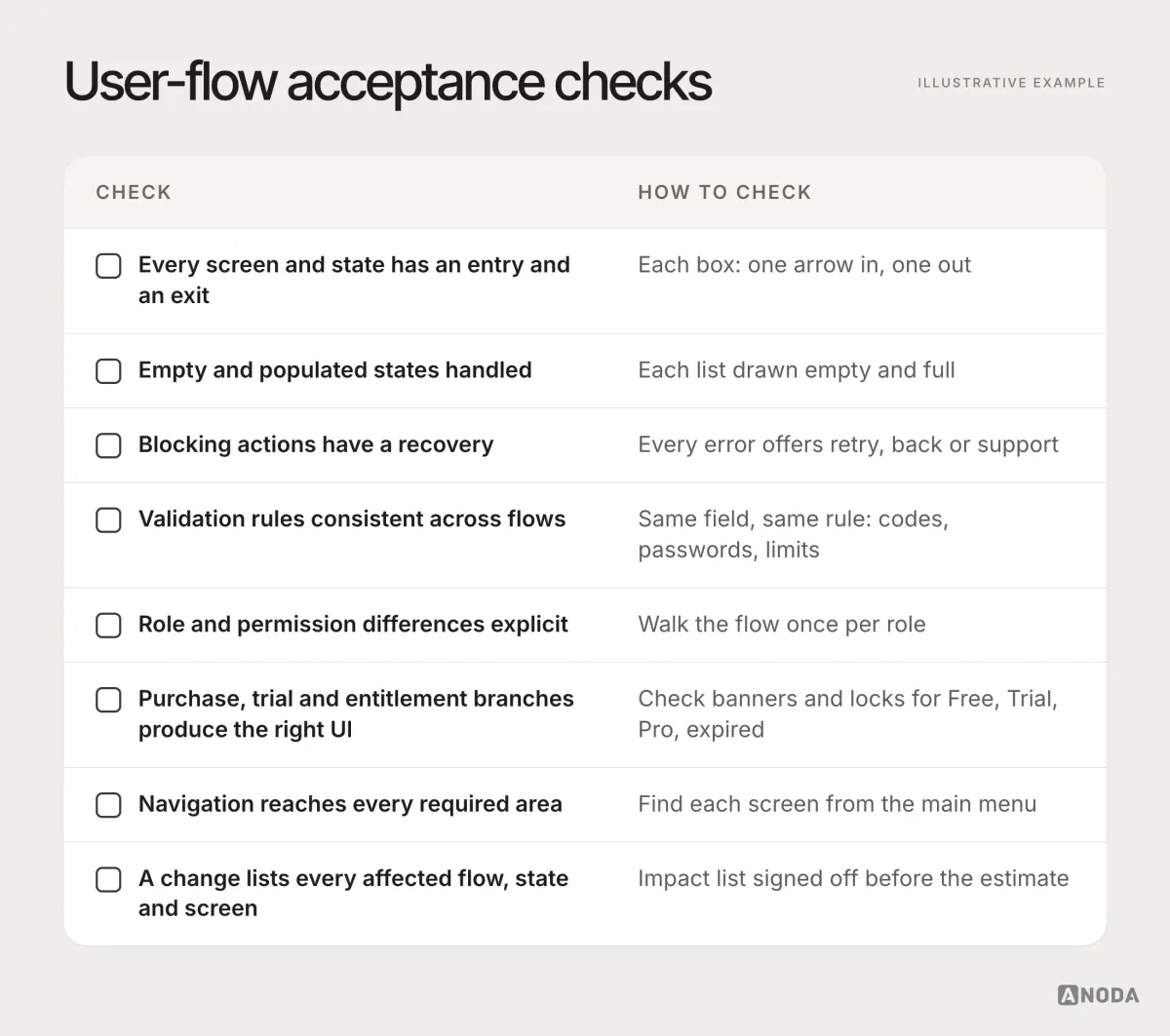
- Every important screen and state has a valid entry and exit.
- Empty and populated states are both handled.
- Blocking actions have a recovery.
- Validation rules are consistent across flows.
- Role and permission differences are explicit.
- Purchase, trial and entitlement branches produce the correct interface.
- Navigation reaches every required area.
- A proposed change identifies every affected flow, state and screen.
If any of these fail, fix the flow first. Moving to wireframes with a failing check doesn’t make the problem smaller. It makes it prettier.
How long it takes, and why it’s worth it
A user flow doesn’t take an unreasonable amount of time. For most products it is days. For complex ones with many roles, plans and integrations, it can be a few weeks. During that time the team asks the uncomfortable questions early, instead of after the development contract is signed and the deadline announced.
Skipping it saves something like forty design hours on a typical project. Oksana compares that to finishing an expensive renovation and then economising on the matches. The money you save is real. So is what you buy with it: a product whose logic nobody agreed on, whose screens disagree with each other and whose development estimate is fiction from the first sprint.
The time also pays back after launch. Every future feature starts from a map instead of from archaeology across old design files. New team members learn the product from the flow in a day instead of reverse-engineering it over a month. Support can answer “why does this happen?” by looking at a branch instead of opening a ticket with engineering. None of that shows up in the first project’s budget. All of it shows up in every project after.
Skip the flow, and you have signed up for an inconsistent product. You just haven’t seen the invoice yet.
Approve the flow before wireframes, before final UI, before the development estimate and before any AI agent writes a line. That is where a change costs an arrow. Everywhere after, it costs screens, sprints and trust.
UI/UX design
Screens are the easy part. The logic underneath is the job.
We map your roles, states, rules and branches into one flow your team, your developers and your AI tools can all build from — before a single screen is final.
Frequently asked questions
What belongs in a user flow?
Define the task, entry conditions, roles, decisions, system states, outcomes and recovery paths. Make exceptions visible rather than documenting only the happy path.
How is a user flow different from a screen flow?
A screen flow connects interface views. A user flow explains the work and decision logic, including states and rules that may not have their own screen.
How does a user flow guide development?
It gives design and engineering one agreed map of roles, navigation, validation and recovery. Use that map to design the screens, estimate the work and check the implemented task.
Written by