In short
A web app starts where the website ends: at the sign-in button. Behind it the product uses people's own data, so design means deciding roles, what each role sees, complete flows and what happens when a state is empty, broken or interrupted. Most web apps we audit skip those decisions and polish the dashboard instead, while paid-for users leave. Here are the principles, and the order we apply them in.
In this article
- What makes a web app different from a website
- Start with jobs and complete flows, not screens
- Roles, permissions and one entity seen by different people
- Information architecture and hierarchy: fewer choices, clearer ones
- Design the states nobody demos
- The AI dashboard that explains nothing
- Sign-up is not your marketing survey
- Forms that survive real life
- Consistency, accessibility and responsive behaviour work as one system
- A design system keeps the product from becoming random cards
- Prototype and test the flows before anyone builds them
- Hand off a product, not a set of pretty screens
- Web app design principles, in the order we apply them
Web app design principles start where the website ends: at the sign-in button. Behind it the product knows who you are, uses your data and lets you change it, so the design job stops being “make it look modern” and becomes a set of decisions — which roles exist, what each role may see and change, which complete flows the product supports, and what happens when a state is empty, broken or interrupted. Skip those decisions and no gradient on earth will save the dashboard.
Our experience designing and rescuing web apps shows that “modern” has never been the real problem. The problem is a product that lets people in and then leaves them standing in the hallway: no idea what the thing does, where to start or how to get back when something breaks. Your marketing team paid to bring them to that hallway. Most of them turn around.
ANODA finds the missing connection between the promise on your website and the work inside the app. We map the roles, complete journeys and failure states together, then carry those decisions into one design system and an implementation-ready handoff. That is how we turn a polished collection of screens into a product people can start, use and return to without a support tour.
What makes a web app different from a website
A marketing website explains the offer. A web app lets people complete tasks with product data. The moment a product sits behind sign-in or sign-up, it starts using that person’s data, adapting to them and letting them act on it: create a project, approve an invoice, move money, invite a colleague. It can live inside a bigger website — a customer portal behind the “Log in” link counts — but task flows and access rules also matter before login: guest checkout and public submission forms can be part of the application.
Think of a shop. The window display is the website: arranged for passers-by, identical for everyone, judged in three seconds. Behind the counter is the stockroom, the till, the accounts and the staff rota, and each person who works there is allowed into different parts of it. Nobody designs a stockroom by choosing a nicer font for the price tags.
That is why web app design principles look so different from website best practices. A website is judged on whether people understand the offer. A web app is judged on whether people finish their work, every day, without calling support. Visual polish matters — but it comes last, the way wallpaper comes after the walls are up.
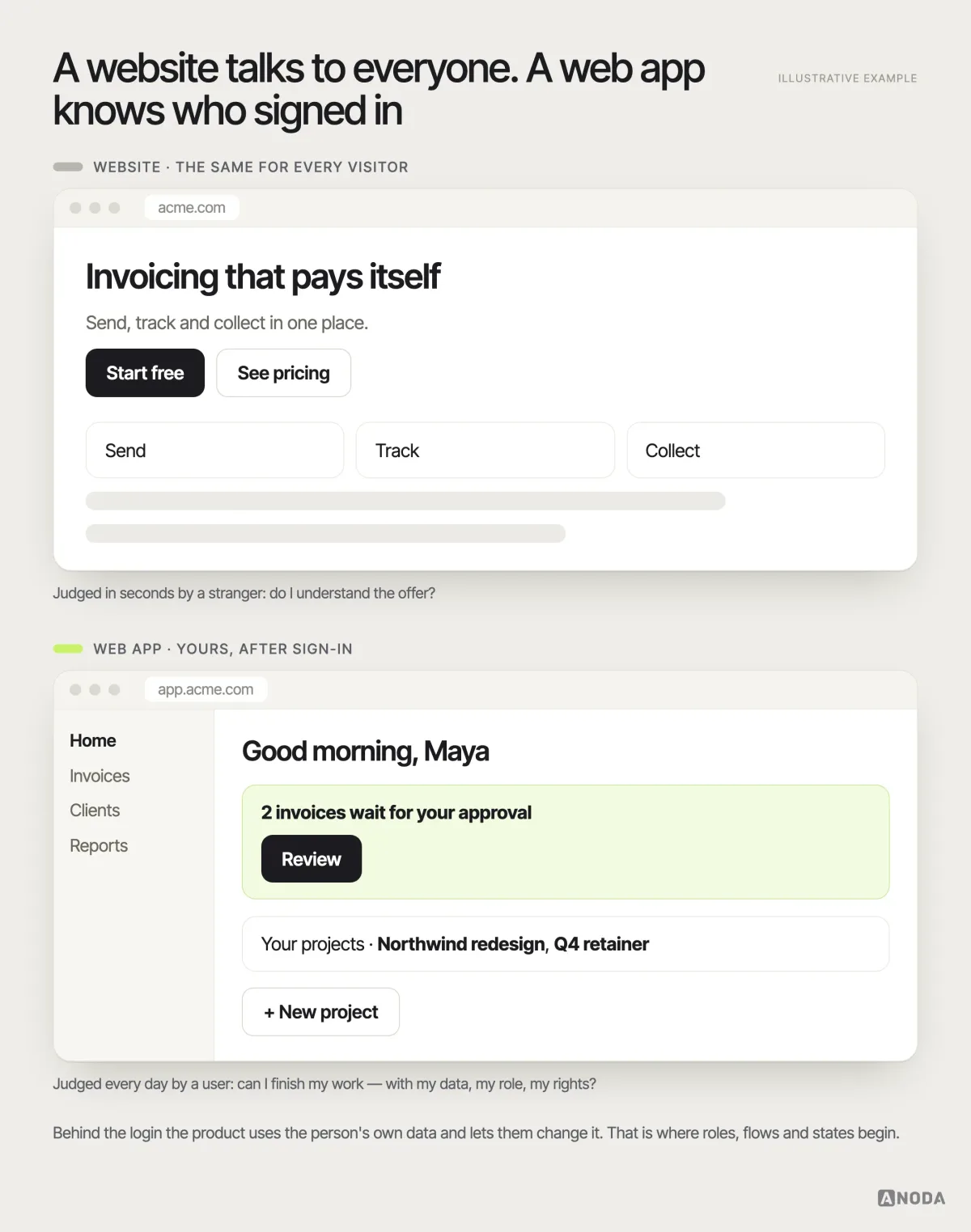
Plenty of products are both at once: a marketing site that sells, and an app behind the login that has to deliver what the site promised. The two are usually designed by different teams on different timelines, and the seam between them — the sign-up, the first screen after it — is exactly where the product quietly loses the people the site worked so hard to win.
The practical consequence: before anyone opens a design tool, the team has to answer questions a website never asks. What personal data does the product use? What can the user do with it? Which roles exist? What does each role see, and what can it change? Which complete flows must work end to end, and how does each one recover when it fails? Every hour of UI polish spent before those answers exist is an hour you will pay for twice.
Start with jobs and complete flows, not screens
Most web apps are designed screen by screen, because screens are what stakeholders can see in a review. A dashboard gets approved on Monday, a settings page on Wednesday, and nobody notices that there is no way to get from sign-up to the first useful result without a support ticket.
It is a road trip where every leg is planned, the car is packed, the playlist is perfect — and nobody booked the ferry. The route looks finished on paper right up to the moment you reach the water. Users do not write in about the missing crossing. They turn the car around and ask for a refund.
A flow is the unit that matters: a trigger, a starting state, the decisions along the way, the outcome the user came for, and every branch where it can go wrong. “Create an invoice” is not a screen. It is a customer who does not exist yet, a tax rule that differs by country, a draft someone else must approve, a send that can bounce and a payment that may never arrive.
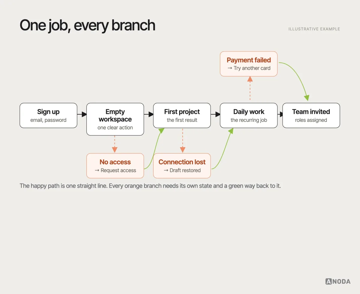
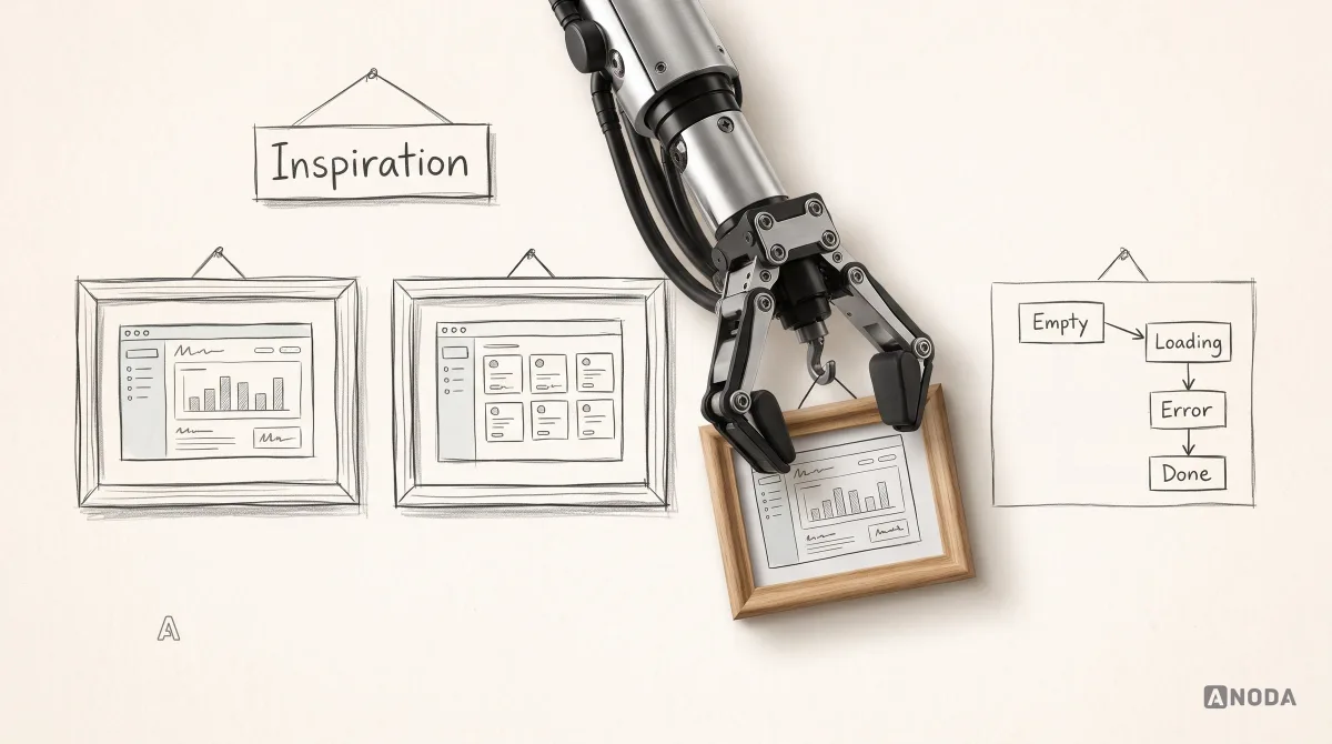
Map the jobs first, in the order users meet them: getting in, reaching a first result, doing the recurring work, sharing it with others, fixing mistakes. For each job, write the complete flow — including the empty start, the failure and the way back — before designing a single screen. This is also where you find the jobs that do not deserve a screen at all, which is the cheapest design decision you will ever make.
Audit check
Pick the three jobs your product exists for and walk each one from sign-up to a finished result, noting every point where you needed help, guessed or gave up.
Failure evidence
Screens that exist but connect to nothing. Support tickets that begin with “how do I…”. A first session that ends before the first real action.
Correction pattern
Write each job as a complete flow with its branches, fix the missing steps first, and only then redesign individual screens.
Roles, permissions and one entity seen by different people
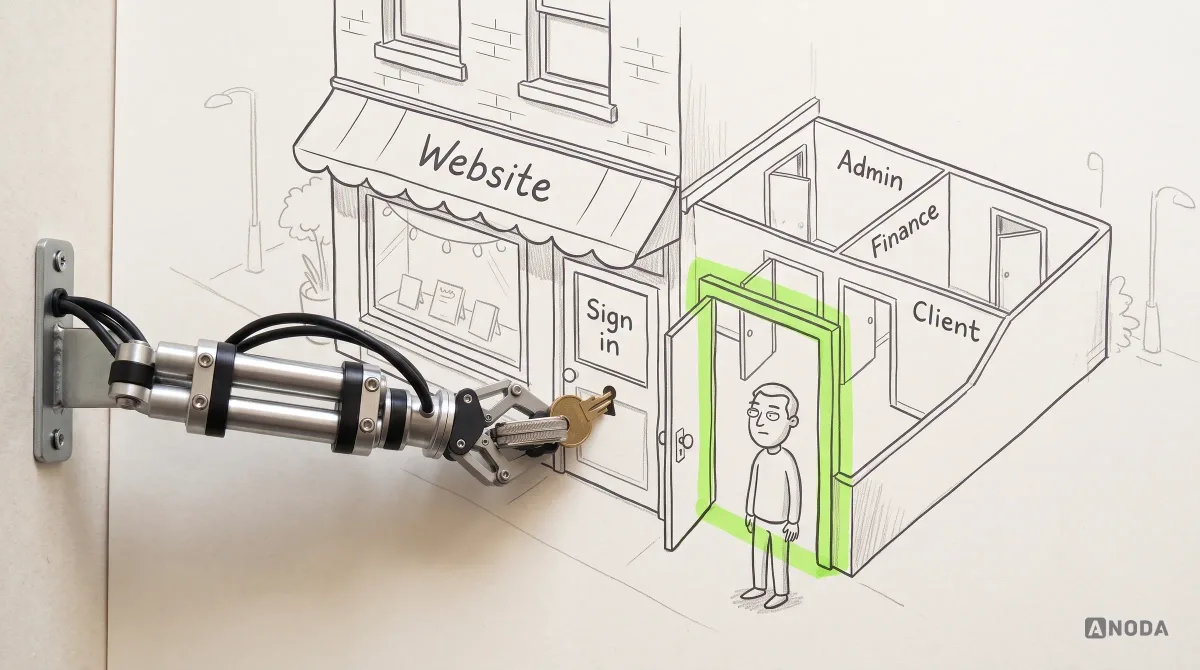
The moment a second type of user logs in, the product needs a map of who can see what. Owners, admins, finance, managers, contributors, clients, guests — each needs a different slice of the same data, and most products decide this in a hurry, somewhere between the database migration and the release notes.
A hotel solves this without drama. A guest’s key card opens one room. The cleaner’s card opens every room on one floor, but not the safe. The manager’s card opens everything and leaves a record of each door it opened. Nobody is shown a room they cannot enter, and nobody is told “access denied” at a door they were never meant to see.
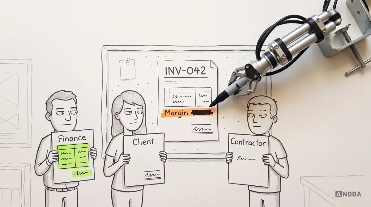
The hard part is not the permission table. It is the same entity looking different to different people. One invoice is a to-do for the accountant, an approval for the finance lead, a bill with a due date for the client and a single line of work for the contractor. Show them all the same screen and you have leaked the margin to the client and drowned the contractor in numbers that are none of their business.
Oksana Kovalchuk, ANODA’s founder, sets the order of work plainly:
An app begins after the user presses sign in or sign up. It can be any information hidden behind a login — something that already adapts to me, uses my data and lets me do something with it. That is where we have to define clearly which roles exist, who can see what, the access rules, and how the same entity is shown to different roles.
 Oksana KovalchukFounder & CEO, ANODA
Write it down as a matrix before designing a single view. For every core entity, list the roles and what each can see, create, change, approve and delete:
| Invoice | See | Create | Change | Approve | Delete |
|---|---|---|---|---|---|
| Accountant | All fields | Yes | Drafts only | No | Drafts only |
| Finance lead | All fields | Yes | Yes | Yes | Yes |
| Client | Total, items, due date | No | No | No; payment is a separate action | No |
| Contractor | Their own line | No | No | No | No |
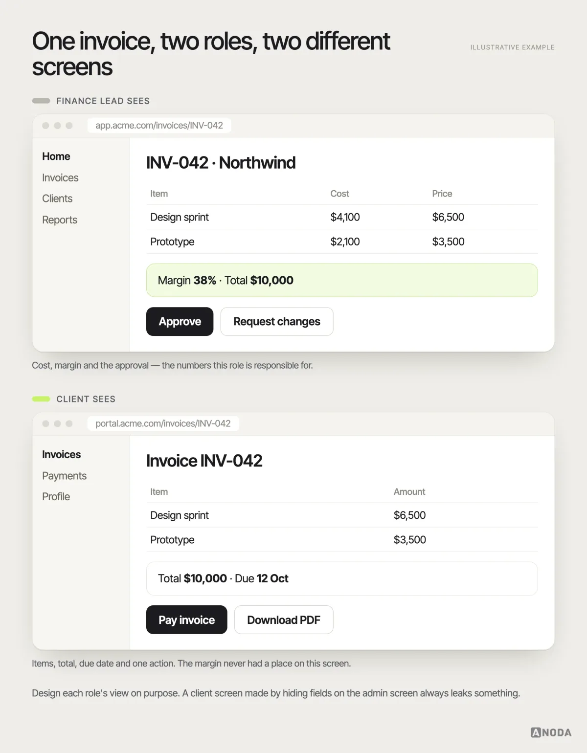
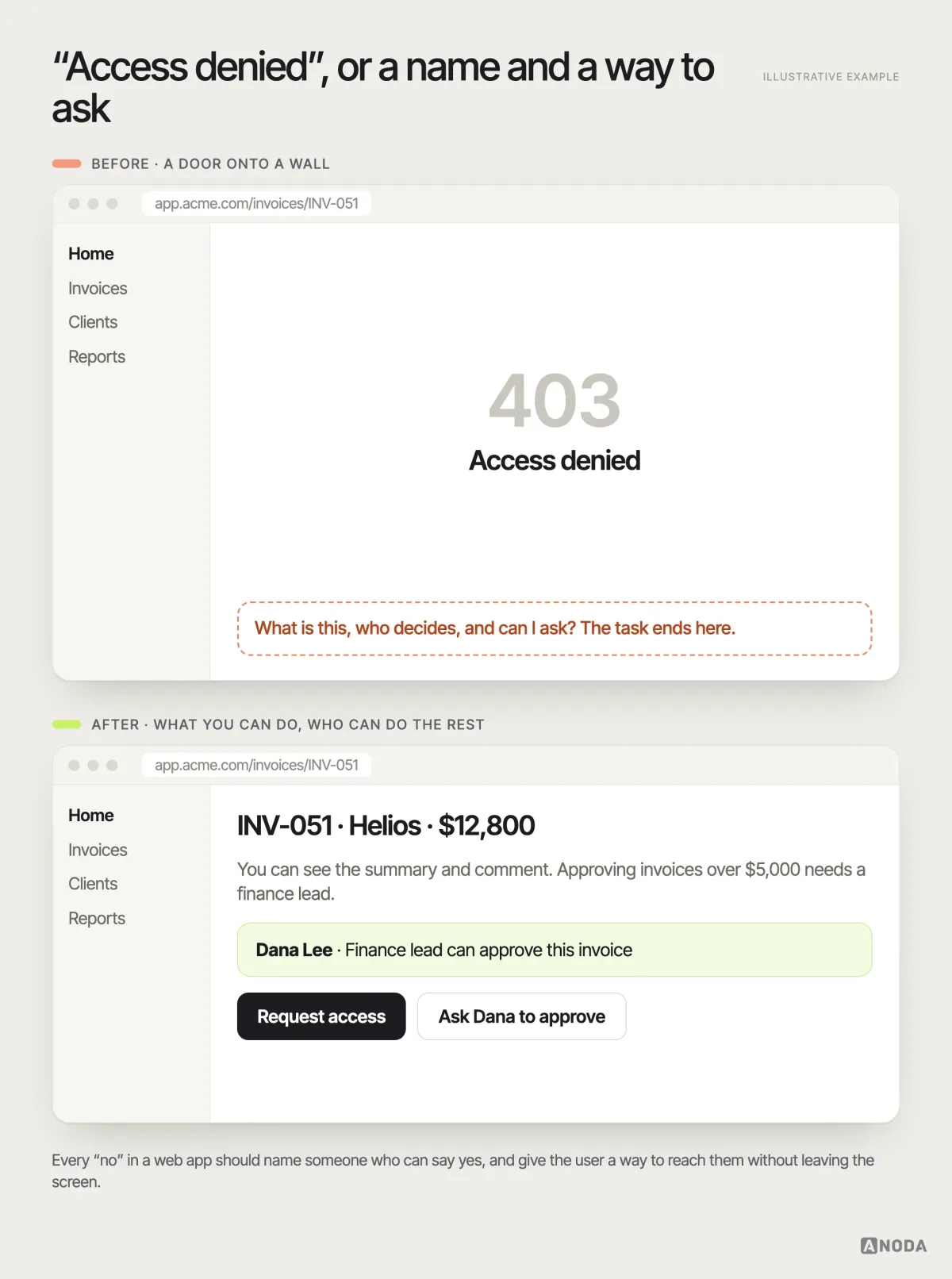
Then design each role’s view around its work. Shared components can support different views, but simply hiding parts of an admin screen often leaves empty columns, unexplained disabled buttons and irrelevant filters. Enforce permissions on the server for both reading and changing records; hiding a field or action in the interface does not prevent access to its data. Where a role genuinely cannot do something it will look for, say who can: “Only finance can approve invoices over $5,000 — ask Dana” beats a greyed-out button every time.
We did exactly this on Payyro, a platform where donors pay struggling families’ overdue bills straight to the landlord or utility company. One help request, four roles looking at it: the customer asking for help in a hard moment, the donor paying from a phone, the vendor managing dozens of requests and a Super Admin keeping every request honest. The donor journey includes guest checkout, and the Super Admin sends the payout to the vendor once a bill is fully funded. Each journey was mapped per role before the views were designed, and the seams where one role hands the request to the next got the most attention — because that is where the money moves, and where confusion would cost real people real bills.
Audit check
Log in as every role on the same record and list what each sees, what each can change and what each is told when it cannot.
Failure evidence
Disabled buttons with no explanation. Sensitive fields visible to roles that should never see them. Support asked to “just give them admin”.
Correction pattern
Build a role-by-entity matrix, design each role’s view on purpose, and turn every “no” into a named person or next step.
Information architecture and hierarchy: fewer choices, clearer ones
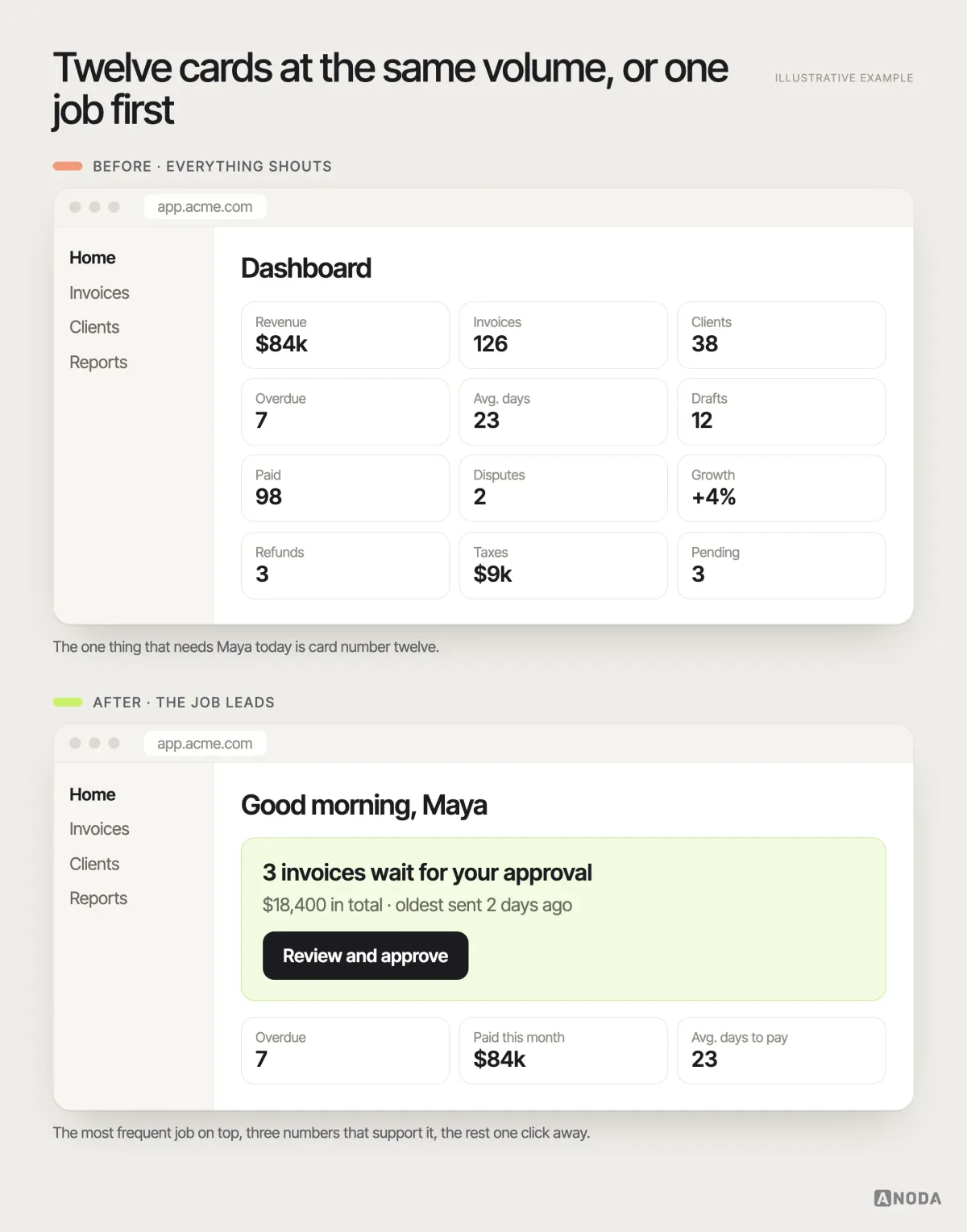
Web apps accumulate features the way a family accumulates remote controls, until someone owns a remote with sixty buttons and one that matters. Every team adds its own card to the dashboard, every card gets the same weight, and the user is left to work out which of the twelve equally shouting boxes is the reason they logged in.
Information architecture decides where things live; hierarchy decides what the user sees first. Both come from the jobs you mapped earlier. The most frequent job gets the most prominent place. Rare, dangerous or administrative tasks go one level down, where people who need them can find them and everyone else does not trip over them.
Three rules we apply on every web app we structure:
- Name things the way users do. If customers say “orders” and your menu says “transactions”, every click costs a second of translation, multiplied by every user, every day.
- Group by job, not by database table. “Getting paid” is a place in the product. “Payments”, “Invoices” and “Reminders” as three separate menu items are your schema showing through.
- One primary action per screen. Secondary actions exist, but they look secondary. If everything is a big button, nothing is.
This is also the moment to kill features. A clear hierarchy exposes the ones nobody uses, and every feature removed is one less thing to design, document, test and explain to the next new hire. That is not minimalism for its own sake. It is cold arithmetic.
MantisHub: keep dense work usable
Our MantisHub redesign focused on selected issue-tracking workflows: lists, filters, issue pages and notes. Saved, custom and active filters needed to remain visible alongside search, reset, dates, columns and bulk actions. Public and private issues and notes also needed clear visibility cues for each role.
The design decision was to improve hierarchy while preserving the information density users depended on. We mapped routes such as opening, editing, relating, monitoring and resolving an issue before restructuring the views. For a working web app, check a redesign against those complete routes, including the active filter and permission state; a cleaner default screen alone does not establish that the daily task still works.
Design the states nobody demos
Demos show the product full of perfect data: every chart populated, every avatar present, every request instant. Real users meet a different product. It is empty on day one, slow on bad Wi-Fi, locked when permissions are wrong and broken at the worst possible moment. These states are not edge cases. For a new user, the empty state is the product.
The most common failure is not a missing state. It is a missing flow. Oksana has watched it in audit after audit:
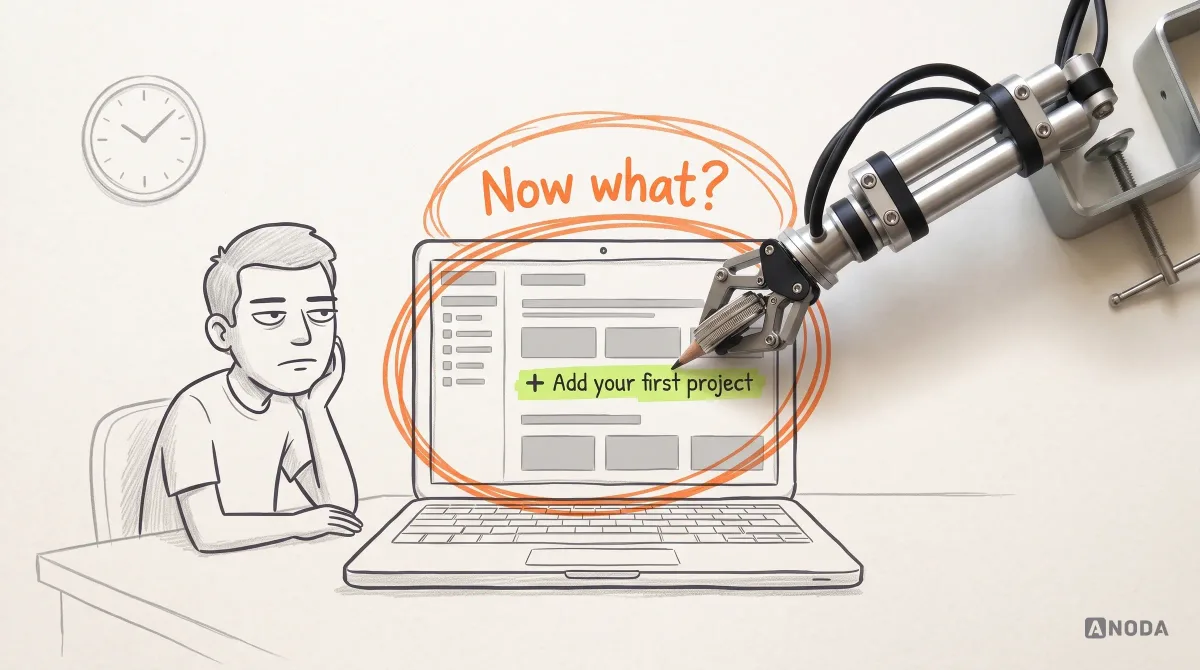
Sometimes an entire flow is missing, including the empty state. It seems like nothing — fine, we forgot it, we will show a skeleton. But the user has no button for adding data. The user does not have one clear action that makes the next step happen. It is simply pointless.
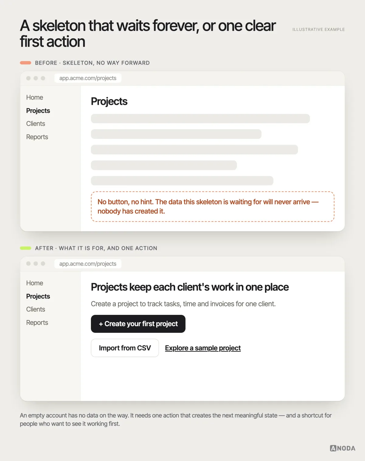
Oksana KovalchukFounder & CEO, ANODAA skeleton with no action is a vending machine that lights up and hums and has no buttons. Everything suggests something is about to happen, and nothing ever will. A skeleton is a loading pattern — it says “your data is on its way”. On an empty account there is no data on its way, so it is a polite lie.
A useful empty state does three things: it says what this place is for, it offers one clear action that creates the next meaningful state, and it offers a shortcut for people who want to see the product working first — sample data, an import, a template.
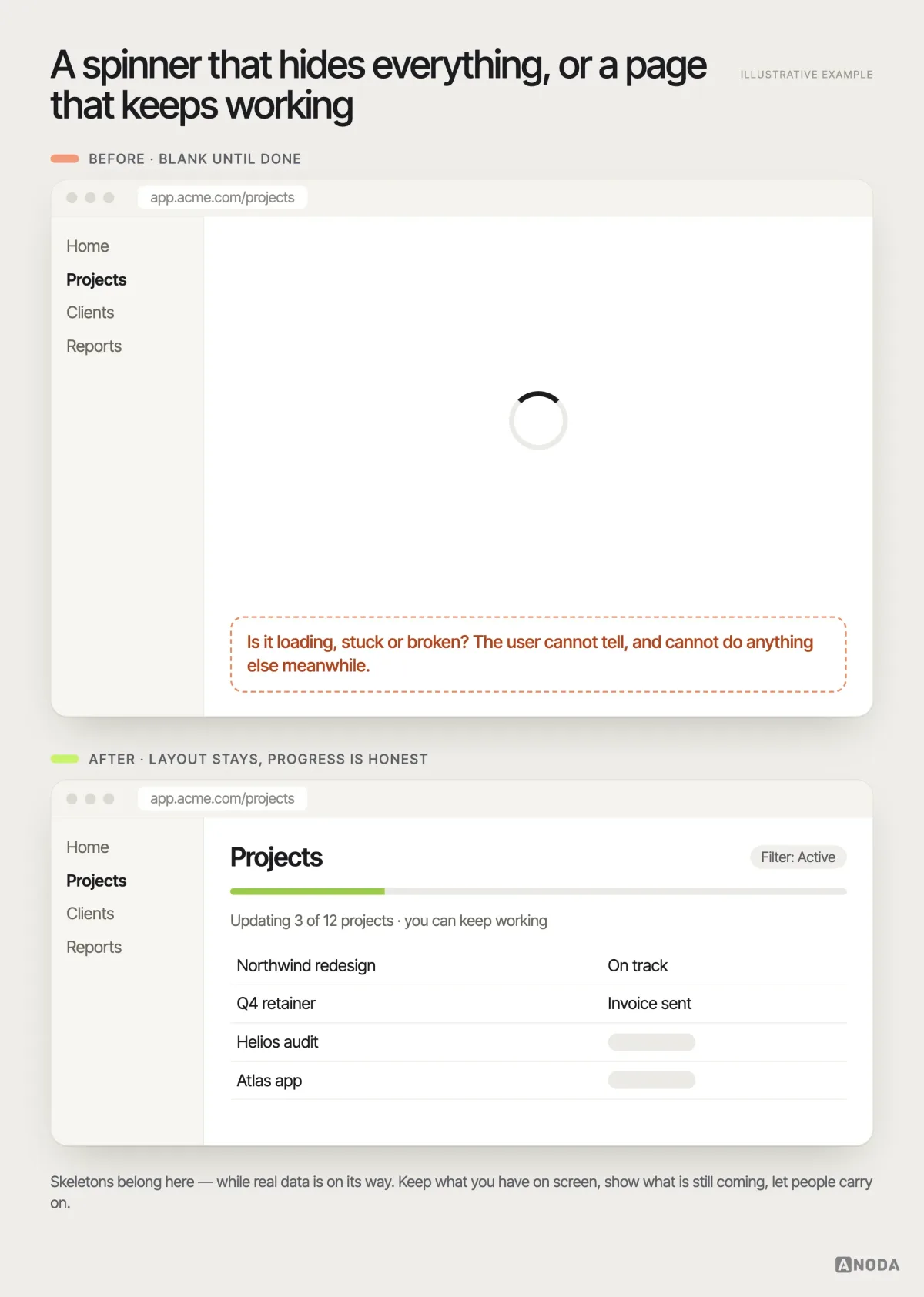
The same discipline applies to every other state users hit:
- Loading. Keep the layout in place, show real progress for long jobs and let people keep working elsewhere. A blank page with a spinner is a kettle with no light: you cannot tell whether it is heating or broken, so you stand there watching it.
- Errors. Say what failed, keep what the user typed and offer the next step. “Something went wrong” is a check-engine light with no manual: you know it is bad, you do not know what, and you do not know whether to keep driving. Most people pull over — in your case, into a trial of the competitor.
- No access. Show what the user can do, who can grant the rest and a way to ask. A bare “403” is a door that opens onto a brick wall.
- Offline and slow. Tell people what is saved, what is waiting and what will happen when the connection returns.
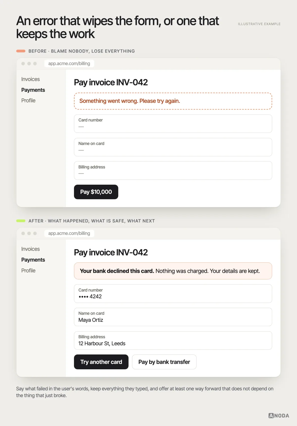
For payment forms, retain non-sensitive order details and use the payment provider’s supported field recovery. Do not store card security codes to make retries convenient. Show a decline reason only when the provider supplies it, and offer alternative payment methods only when the product supports them.
A good error state answers three questions in the user’s language: what happened, is my work safe, and what can I do now. If the honest answer to the second question is “no”, that is not an error message problem. It is the form continuity problem further down this guide, arriving early.
Audit check
Create a fresh account for each role and use the product with no data, on a throttled connection, with a failing request and without permission for one key action.
Failure evidence
Skeletons on empty accounts. Generic error messages. Dead-end permission pages. Users writing to support to find out whether their work was saved.
Correction pattern
Design every state as part of its flow: one clear action when empty, honest progress when loading, a specific recovery when broken, a person to ask when locked.
The AI dashboard that explains nothing
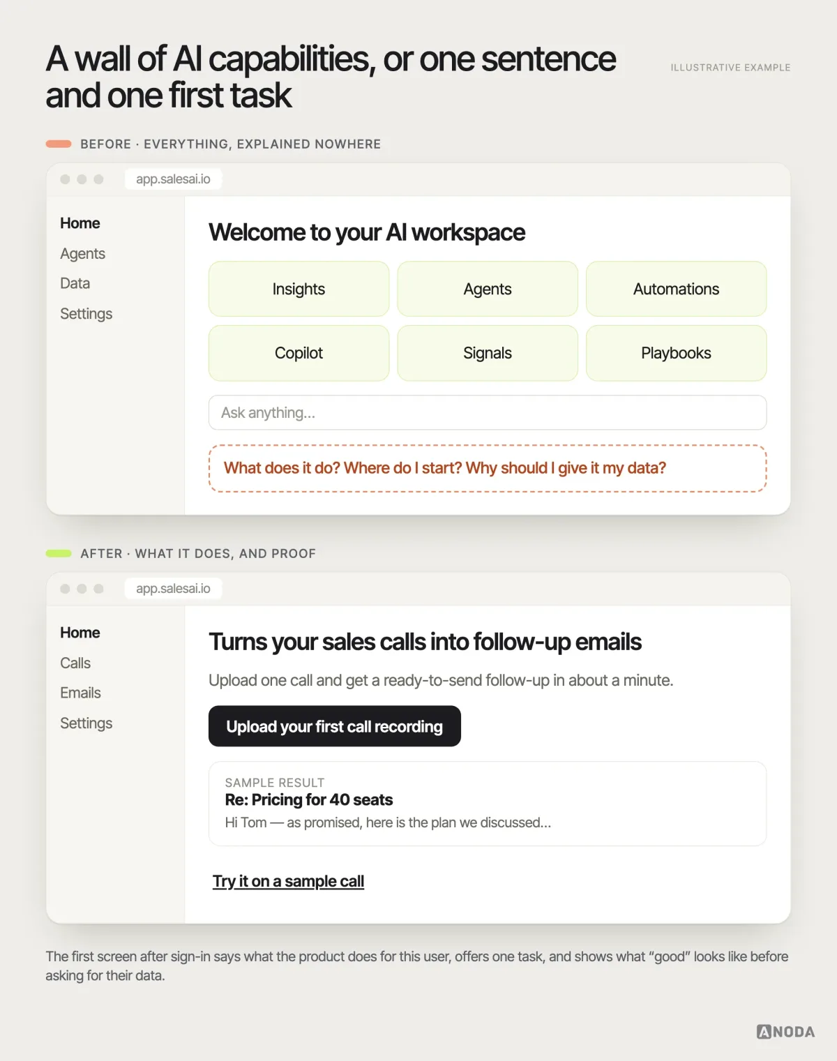
Everything above has a very fashionable new victim. A wave of AI products now ships a signed-in experience that is all capability and no explanation: a dashboard of glowing cards, a prompt box, a sidebar of agents, and not one sentence about what the product is for or where a normal person should begin. Oksana sees it everywhere right now: you enter the application and it is completely unclear where to begin or what it is even about.
It is a museum with no signs and no floor plan. Every room is impressive. Nobody tells you where the famous painting is, so you wander through three galleries of pottery, find the gift shop and leave. AI filled the rooms. It did not change the fact that visitors need a map.
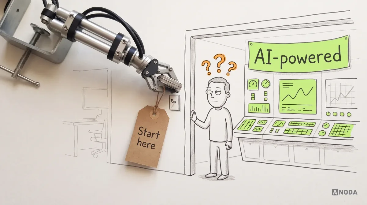
The fix is old-fashioned product design, which is precisely why so many AI teams skip it. The first screen after sign-in says in one sentence what the product does for this user, offers one first task built from what the product already knows about them, and shows a finished example so people can see what “good” looks like before they invest their own data.
If your AI dashboard needs a webinar to explain, that is not a training problem. That is the elephant in the room, and it is billing you for compute.
Sign-up is not your marketing survey
The sign-up form is where web apps most often choose their own convenience over the user’s, and it is expensive in the most literal way: every person who abandons it is someone you already paid to acquire.
The most disgusting case is when you try to sign up and eighteen marketing questions begin: who are you, tell us about yourself, where did you hear about us. That is marketers trying to shift their work onto the user.
Oksana KovalchukFounder & CEO, ANODAIt is a bouncer who asks for your CV before letting you into the bar. You came for a drink. By question six you are across the street, drinking at the place that just let you in. Company size, job title, “how did you hear about us” and the budget dropdown are all useful to someone. None of them are useful to the person trying to see whether your product works.
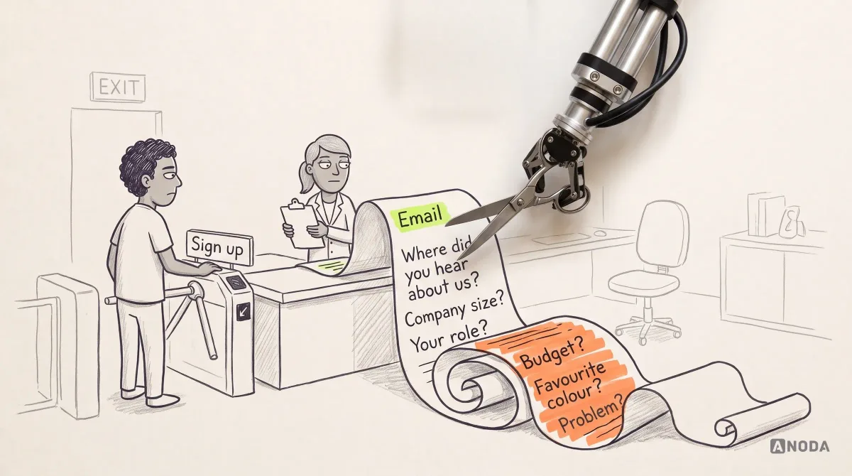
The rule we apply: ask only what the product needs to deliver its first result, and ask everything else at the moment it improves something the user can see. The workspace name can wait until there is a workspace. The team size can wait until they invite a team. Attribution questions can be optional and asked later. Analytics can miss referrals, word of mouth and activity across devices; that gap does not justify blocking the first useful task with a marketing questionnaire.
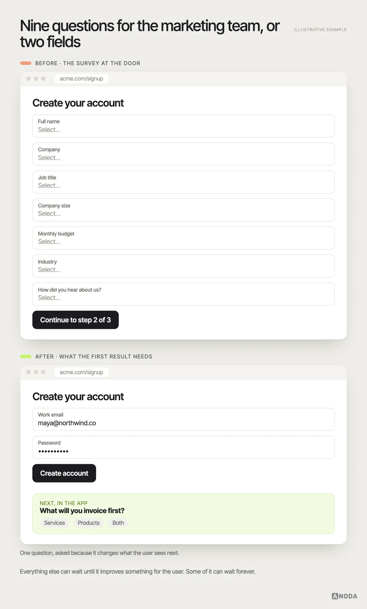
The juice is not worth the squeeze: the five extra data points you collect at sign-up cost you the users who would have given you all of them, happily, three weeks later.
Forms that survive real life
Web apps are full of long forms: onboarding a customer, filling in a tax profile, writing a proposal, configuring an integration. Designers test them on a fast connection, in one sitting, with no one calling. Users fill them in on a train, between meetings, with three tabs open and a laptop battery at four percent.
The internet drops. The page reloads. Someone closes the wrong tab, comes back an hour later, and the form reloads empty. As Oksana puts it, that is goodbye to the data — and the user either throws the laptop out of the window or closes your application forever. The second option is cheaper for them and far more expensive for you.
Losing someone’s form is a teacher wiping the board while half the class is still copying it down. Nobody blames the board. Everybody remembers the teacher. And in software nobody gets detention — they get a competitor.
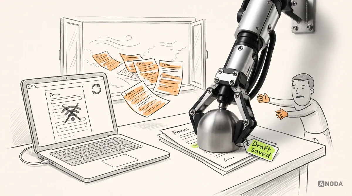
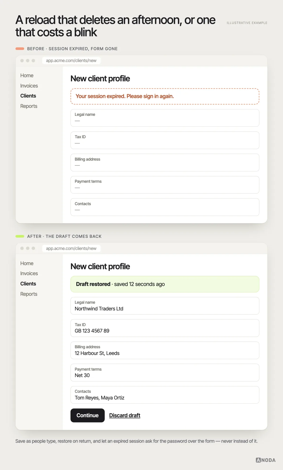
Continuity is a design requirement, not an engineering nice-to-have:
- Save as people go. Define which fields may be retained, where and for how long. Show “Saved” only after storage confirms it; distinguish saving, saved and failed states.
- Restore on return. Bring back a retained draft with Continue and Discard actions. Cross-device recovery needs account-linked storage; a browser-only draft cannot provide it. Handle concurrent edits explicitly.
- Survive session expiry. Preserve permitted draft data, ask the user to sign in again and recheck access before restoring it. Sensitive fields may need to be entered again.
- Split long forms by meaning. Group related questions and show progress. Save completed sections when supported, and tell users which changes remain unsaved.
- Validate kindly. Check fields as they are finished, explain what is wrong in plain words and never wipe valid input because one field failed.

Usability testing
Your web app works in the demo. Find out whether it works for users.
We put real users through your critical journeys — sign-up, first result, the daily job — and show you exactly where they stall, guess or give up, in order of what it costs you.
Consistency, accessibility and responsive behaviour work as one system
These three are usually handled by three different people at three different times, which is why they so often fight each other. They are one system: the same rules that make the product predictable also make it usable with a keyboard, readable at 200 percent zoom and workable in a narrow browser window.
Consistency is a promise that the same thing always behaves the same way. The same “Save” in the same place, the same confirmation for the same risk, the same pattern for filtering every list. Break it and users stop trusting their own muscle memory — it is a football match where each half of the pitch plays by different rules. Players do not get creative. They slow down and argue with the referee, and in your product the referee is support.
Accessibility is not a compliance tick box for the last sprint. Web apps are used all day, by people with tired eyes, broken wrists, screen readers, old monitors and bright offices. Visible focus, real labels, logical tab order, contrast that survives sunlight and targets that are not sized for a mouse on its best day make the product faster for everyone, and they are far cheaper to design in than to retrofit.
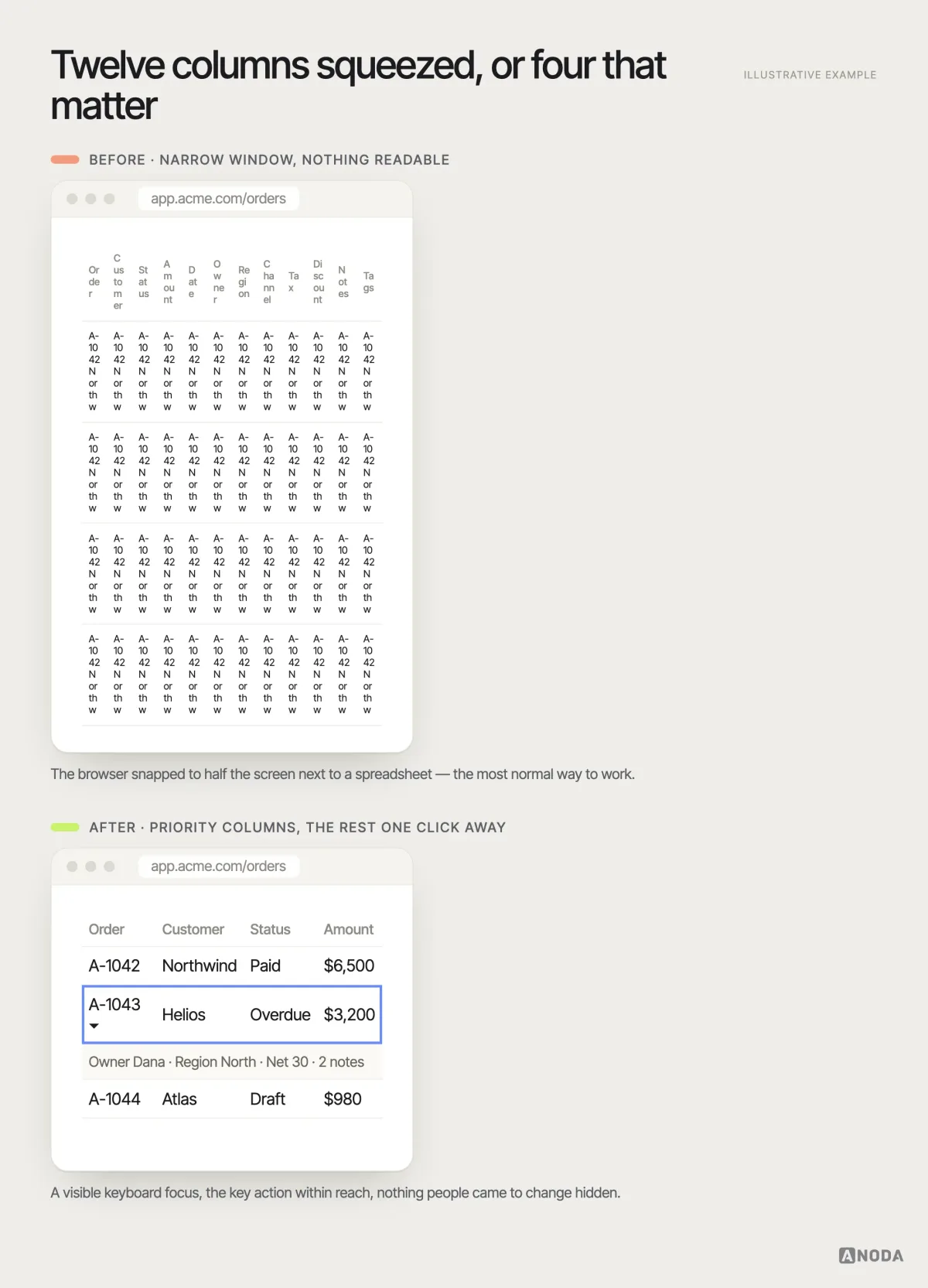
Responsive behaviour in a web app rarely means “looks fine on a phone”. It means the product still works when someone snaps the browser to half the screen next to a spreadsheet, on a 13-inch laptop, zoomed in. Tables are the usual victim: twelve columns squeezed into ribbons of text. Decide which columns matter most, let the rest collapse into a detail row, keep the key action reachable and never hide the thing people came to change.
Perceived performance ties it together. A product that responds instantly to a click — even if the server is still working — feels faster than one that is technically quicker but freezes. Preserved layouts and honest progress reduce uncertainty while the server works. Use optimistic updates for reversible changes with clear recovery; payments and other consequential actions need a confirmed outcome before the interface calls them complete.
A design system keeps the product from becoming random cards
Every web app eventually reaches the point where the same thing has been designed five times. Three “Save” buttons in three styles. Four date pickers. Tables that sort differently in each module. Each decision was reasonable locally, made by a different person on a different deadline. Together they are what Oksana calls “a collection of random cards”, which is why her rule has no exceptions: a design system is always necessary.
Try playing poker with cards from five different decks. Every card is a perfectly good card. Nobody can tell which ones belong together, somebody accuses somebody of cheating and the game never actually starts. Users experience an inconsistent product the same way: every screen is fine, and the product as a whole feels untrustworthy.
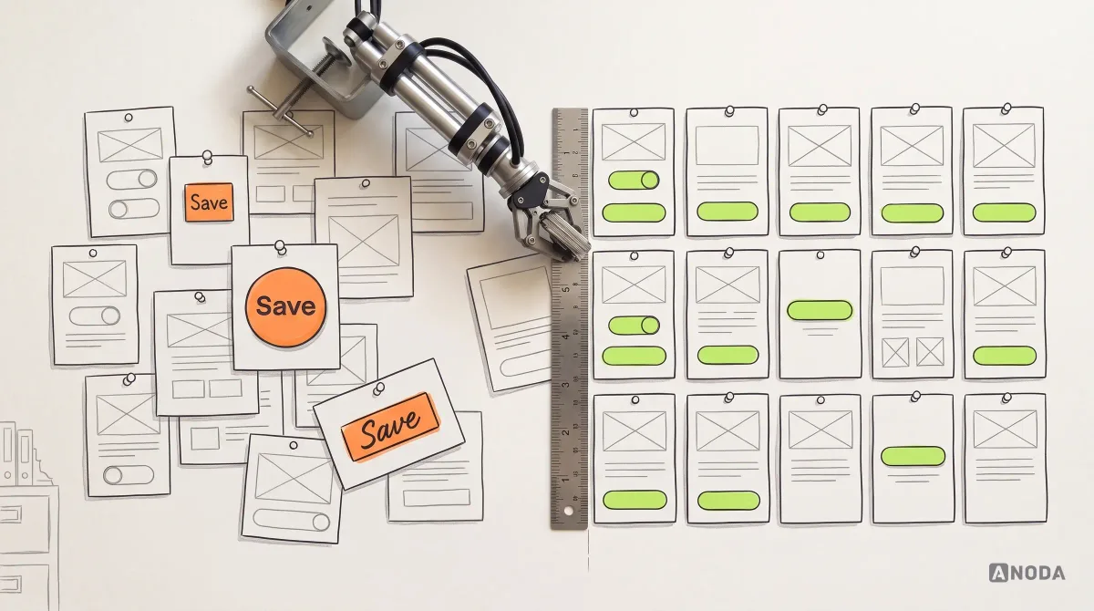
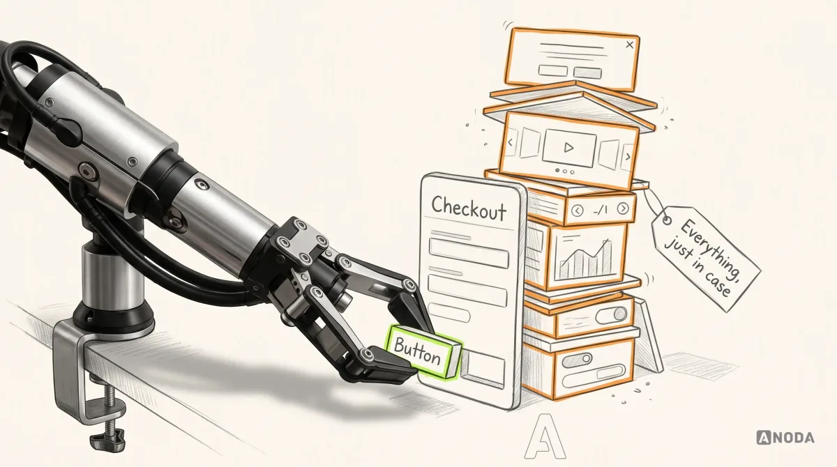
A design system for a web app is not a Figma file of pretty components. It is the shared rules of the product: tokens for colour, type and spacing; components with every state defined — default, hover, focus, disabled, loading, error; patterns for the jobs that repeat — filtering a list, editing a record, confirming a risky action, handling an empty state; and the written reasons behind each one, so the next designer does not reinvent it.
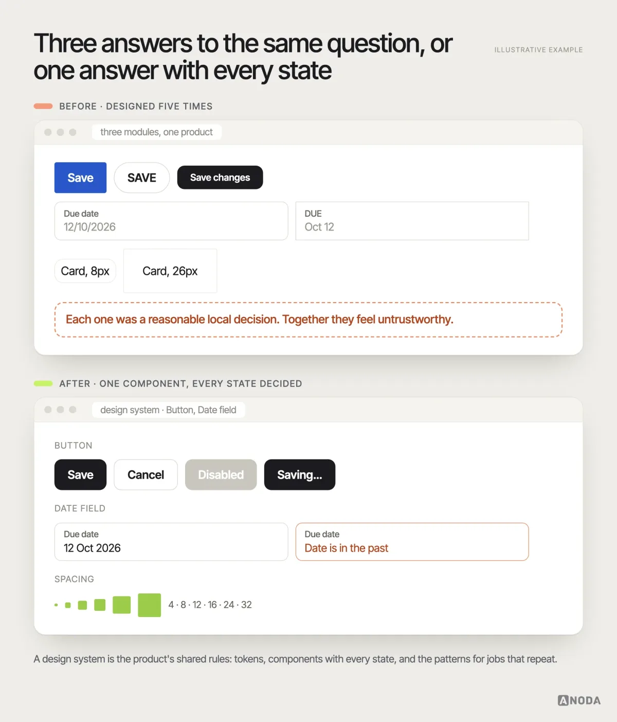
Start small and start early: the components your core jobs use, with their states, before the second module is designed. It is cheaper to agree on one table now than to reconcile five tables in a year, while your engineers maintain all five. When the product and team are big enough that consistency no longer survives on goodwill, a dedicated design systems effort stops being a luxury and becomes the thing that keeps delivery speed from collapsing. Our guide to building a design system covers the practical first steps.
Prototype and test the flows before anyone builds them
Everything above is a hypothesis until real users go through it. The expensive way to find out is to build the product and read the churn report. The cheap way is to put a clickable prototype of the critical flows in front of five or six target users and watch.
It is a fire drill. A school that only discovers on the day of a real fire that one exit is locked and nobody knows where to gather has not saved time by skipping the drill. It has bet the building on a guess. A usability session is a drill for your flows: you find the locked exit while it still costs a design change, not a quarter of rework.
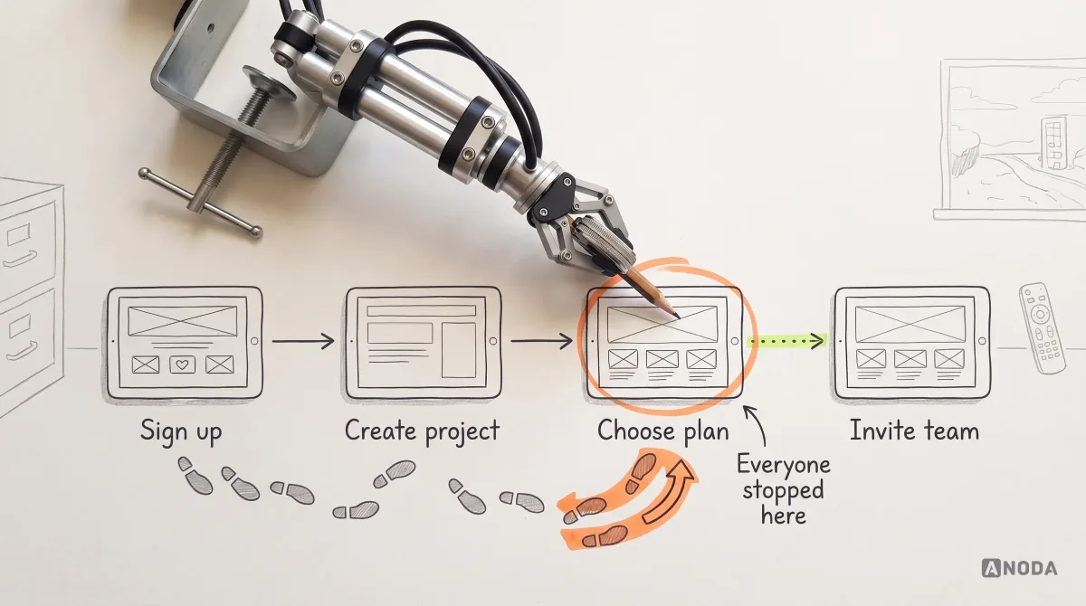
Test tasks, not screens. Give people a job — “invite your accountant and let them approve this invoice” — and watch where they hesitate, what they expect to happen and what they say out loud when it does not. Test with each key role, not just the admin. Test the empty start and the failure, not only the happy path. And test early enough that the findings can still change the plan; a usability report that arrives the week before launch is closing the stable door after the horse has bolted.
In the live product, measure the same things: how many new users reach their first real result, how long it takes, where they drop, how often they recover from errors without support. Those numbers tell you whether the design works. Time on page alone cannot tell you whether someone completed a task, studied useful information or got stuck; interpret it alongside the task outcome. If you want a second pair of eyes on the flows before they reach production, usability testing is the fastest way to replace opinions with evidence.
Hand off a product, not a set of pretty screens
The last design principle is the one that decides whether all the others survive contact with engineering. Developers do not build what the designer imagined. They build what was handed over. If the handoff contains the happy path, the product will contain the happy path, and everything else will be improvised on a Thursday afternoon by someone who was never in the design review.
A handoff without states is a recipe with no quantities. “Flour, eggs, sugar, bake” is technically a recipe. Every cook will make something different, and none of it will be the cake in the photo.
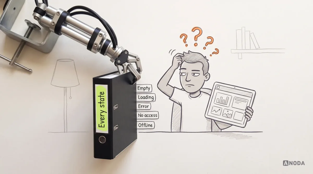
A useful web app handoff includes:
- Flows, not just frames. Each job as a sequence, with its branches and recovery paths, so developers see how screens connect.
- The role-by-entity matrix. What each role sees and can do on each core entity, agreed with product and engineering.
- Every state of every screen. Empty, loading, partial, error, no access, offline, too much data.
- Components from the design system, referenced by name, with their states, not redrawn per screen.
- Content and rules. Real copy for messages and errors, validation rules, limits and formats.
- Acceptance criteria. How the team will know a flow is done: which states exist, which roles were checked, which tests were passed.
In Superstream, ANODA connected Kafka clusters, optimizations and users in one responsive platform, with light and dark states, a UI kit, numbered screen maps and a clickable prototype for handoff. That is what our web app design service delivers: the product logic your engineers can build, instead of another folder of screens they have to interpret.
This is also where design and development stop being two separate projects. When the product experience is defined this way, web app development becomes a build against clear decisions rather than a negotiation about what the designer meant. Too many cooks spoil the broth; one written recipe keeps them cooking the same dish.
Web app design principles, in the order we apply them
Every principle in this guide follows from one idea: a web app is a signed-in, role-aware system that has to keep working when real life happens to it. Here is the order we apply them in, on new products and on rescues alike:
- Define what begins after sign-in. The personal data the product uses, what users can do with it, and the jobs they come for.
- Map roles and permissions. Who can see, create, change, approve and delete each core entity, and how that entity looks to each role.
- Write complete flows. Every core job from start to finished result, including the empty start, the failures and the way back.
- Set the hierarchy. The most frequent job leads, one primary action per screen, names users actually use.
- Design every state. An empty state with one clear action, honest loading, specific errors, access requests instead of dead ends.
- Remove friction before value. Sign-up asks only what the first result needs; everything else waits until it helps the user.
- Protect the user’s work. Drafts that save, restore and survive reloads, closed tabs and expired sessions.
- Build the design system early. Shared components and patterns with every state defined, so the product never becomes random cards.
- Test the flows with real users, per role, before they are built — then measure first results in the live product.
- Hand off the whole product. Flows, matrix, states, components, content and acceptance criteria.
If you want to see what these principles look like in finished products, our round-up of good web app design examples shows them in the wild.
A shared interface only starts saving engineering time when its components, state and API behaviour are implemented together. If your backend is already owned, our React development service builds that web interface around the approved workflows. If public pages and signed-in routes need different rendering and data access, our Next.js development service connects those journeys in one maintainable release.
Design the signed-in product as a complete, role-aware and recoverable system. If a user can get into your app but cannot tell what it is, where to begin or how to recover when something breaks, a polished dashboard is not modern web app design. It is a very expensive shop window with the stockroom locked.

Web app design
Get the flows, roles and states right before your team writes the code.
We map who does what in your product, design every state users will actually hit and hand your engineers a system, not a stack of screens — for a new web app or the one you already have.
Written by