In short
A push notification is a message your server asks Apple, Google or a browser to deliver to someone's screen. The pipe is the easy part. The hard part is that every send spends permission you get once and rarely get back. How push works on iOS, Android and the web, where messages quietly die, and the design decisions that decide whether people keep notifications on or switch them off for good.
In this article
- What is a push notification
- How push notifications work, step by step
- iOS, Android and web push: same idea, three rulebooks
- Push notification delivery: sent is not seen
- Permission is the product, not a pop-up
- Timing and frequency: the dose makes the poison
- Deep links: a tap should land on the task
- What the lock screen should never say
- Preference control and an easy way out
- Measure trust, not opens
- The decision rule before you send anything
A push notification is a short message your server hands to Apple, Google or a browser maker, which delivers it to a phone or a computer and shows it even when your app is closed. That is the plumbing, and the plumbing works. What breaks is the thing on top of it: permission. Every push spends a little of the user’s trust, and once they switch notifications off, most platforms never let you ask again.
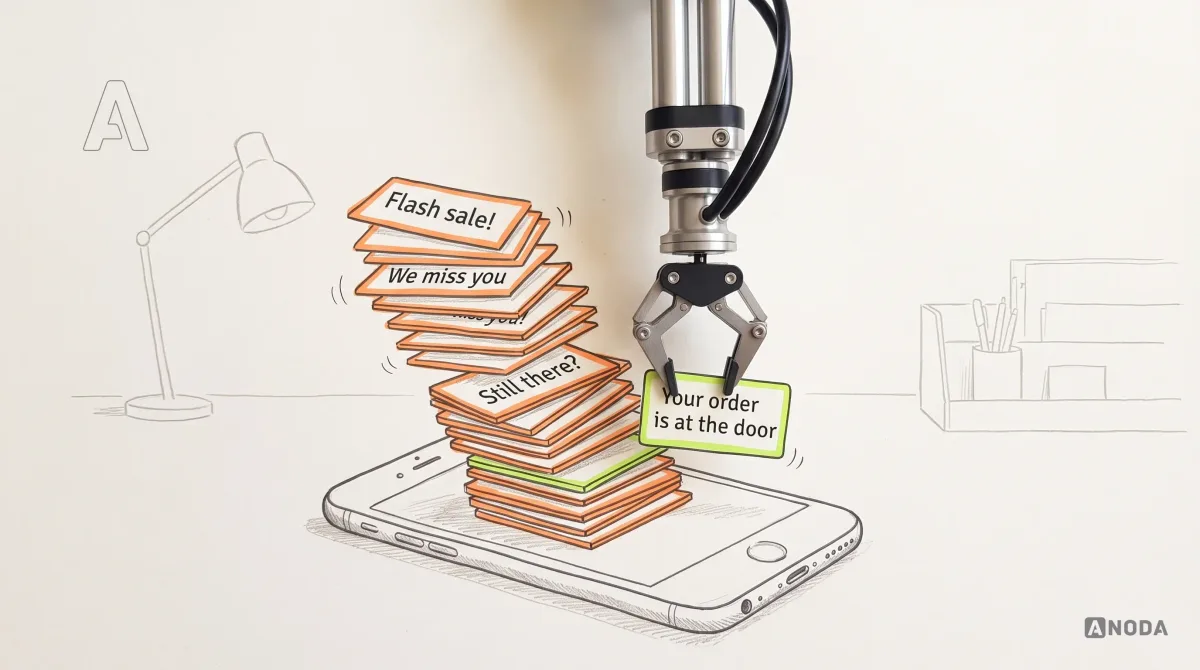
Most teams treat push as a free retention channel. Somebody in marketing sees a big “subscribers” number, a calendar fills with “We miss you!” and “Flash sale!”, and for a few weeks the open-rate chart looks healthy. Then the opt-outs start. Quietly, because nobody reports a notification they turned off. They just stop hearing from you.
There is no such thing as a free channel. You paid to acquire every one of those users, with ads, sales calls and store listings. The permission they gave you is the cheapest way you will ever have to bring them back. Spam it, and you kill the goose that lays the golden eggs, then pay the ad networks to buy the same people back.
In our mobile product work, push is the feature teams think is simplest and get wrong most often. So here is how it actually works, where messages die on the way, and the decisions that separate a notification people keep on from one they block for good.
What is a push notification
A push notification is a message sent from a server to a specific app on a specific device, delivered by the platform’s push service and shown by the operating system: on the lock screen, as a banner, in the notification list, as a badge or a sound. The user does not need the app open. That is the whole point, and the whole danger.
It helps to separate push from its neighbours, because teams mix them up and then argue about “notifications” for an hour without noticing they mean four different things.
| Channel | Who shows it | Needs the app open | Needs permission |
|---|---|---|---|
| Push notification | The operating system or browser, via Apple’s, Google’s or the browser’s push service | No | Yes, from the user |
| Local notification | The operating system, scheduled by the app itself on the device | No | Yes, the same permission |
| In-app message | Your app, inside its own screens | Yes | No |
| SMS or email | The phone’s messaging app or the inbox | No | A phone number or address, plus consent for marketing |
A push notification is also small. It is a postcard, not a parcel. On Apple’s service the payload is capped at 4 KB, 5 KB for voice calls, and Firebase Cloud Messaging allows 4,096 bytes (both as of September 2026, from Apple’s and Firebase’s developer documentation). A well-designed notification carries the change and an address inside the app. The app fetches everything else when the user taps.

Look at what those few lines have to do. Say who is talking and about what. Tell the user what changed. Give them enough to decide without opening anything. Offer a button that finishes the job. And know exactly which screen to open if they tap. Five of those decisions are product design. Only one is copywriting, and it is the one everyone argues about.
How push notifications work, step by step
Here is how push notifications work on every modern platform, stripped of the vendor names. Your server never talks to the user’s phone directly. It cannot. Phones change networks, sleep, sit behind firewalls and go offline in lifts. So Apple, Google and each browser maker run a push service that keeps one connection open to each device and carries messages for every app on it.
Think of it as the postal service. You write the letter. The postal service knows the roads. The device token is the address. Without a correct address, the best letter in the world goes nowhere.
- The user allows notifications. The app asks the operating system to show the permission prompt, or on iOS starts with quiet trial delivery.
- The app registers with the push service and gets a device token: an address for this app on this device.
- The app sends the token to your server, which stores it against the user’s account.
- Something worth saying happens. An order is picked up, a payment fails, a colleague mentions the user.
- Your server builds the payload (title, body, the deep link, a category) and sends it with the token to Apple’s or Google’s push service. Apple’s documentation (as of 2026) requires HTTP/2 and TLS 1.2 or later, with a signed token or a certificate proving the message is really from you.
- The push service routes it to the device, or holds it if the phone is offline.
- The operating system decides how loudly to show it, based on the user’s permission, settings, Focus mode and your category.
- The user taps, and the app opens the screen the payload points to.

Notice where the design decisions sit. Steps 2, 3, 5 and 6 are engineering. Step 1 is a trust decision. Step 4 is a product decision. Step 7 is the user’s verdict on all your previous sends. Step 8 decides whether the whole trip was worth making. The pipe in the middle is the only part that works reliably without anyone thinking about it, and it is the part teams spend the most meetings on.
iOS, Android and web push: same idea, three rulebooks
The chain above holds everywhere. The rules around it do not, and the differences shape the experience more than any copy does.
On iOS, notifications go through the Apple Push Notification service. Ordinary alerts require authorization; provisional authorization can deliver quietly as described below. Apple’s own documentation (as of 2026) is blunt about the prompt: the first time your app asks, the system shows it and records the answer, and later requests do not prompt again. One knock on the door. After a “Don’t Allow”, the only way back is the user digging through Settings, which nobody does for an app that annoyed them. Apple also offers provisional authorisation, which delivers notifications quietly to Notification Center, without sound or banner, so people can judge them before deciding. And since iOS 15 there are four interruption levels, from passive (no sound, no screen wake) to time-sensitive and critical, with time-sensitive alerts subject to user controls and critical alerts requiring an entitlement to override Focus and the mute switch.
On Android, Firebase Cloud Messaging carries the messages on most devices. Since Android 13, notifications are off by default for new installs, and the app has to ask for the permission itself. Android’s documentation (as of 2026) says that if a user denies a permission more than once, the system treats it as permanent and stops showing the dialog. Since Android 8.0, apps must also sort notifications into channels, one per type, and once a channel exists, only the user can change how loud it is. Users can see how many notifications a day your app sends. That number is not flattering for most apps.
On the web, the browser asks for permission, returns a push subscription, and a service worker receives the message even when the tab is closed. Each browser maker runs its own push service, and the payload is encrypted so that service cannot read it. If the user clicks Block, Google’s web.dev guide (as of 2026) notes that the site cannot ask again. On iPhone and iPad, web push arrived with iOS 16.4, and only for web apps added to the Home Screen, with the request made after a direct tap, according to WebKit.

The pattern across all three is the same, and it is the thesis of this article. Every platform has spent the last few years handing more control to the user and taking more away from the app. Apple, Google and the browser makers did not do this out of spite. They did it because apps treated the lock screen like a free billboard.
It is the tragedy of the commons, played out on 6 inches of glass. Every app that spams makes every other app’s notifications easier to ignore, so the platforms fence the field and the users mute the herd. Your well-behaved app pays for your competitors’ manners.
Audit check
List every platform you ship to and write down, for each, when you ask for permission, what the user sees first, and what happens after a “no”.
Failure evidence
The same prompt fires at first launch on every platform. Nobody on the team knows the app’s opt-in rate by platform.
Correction pattern
Design the permission moment per platform: in context on Android and iOS, after a tap on the web, and with provisional delivery on iOS where a trial makes sense.
Push notification delivery: sent is not seen
Push notification delivery is best-effort, and the platforms say so in writing. The dashboard number called “sent” is the number of letters you dropped in the postbox. It says nothing about how many landed, and less about how many were read.
Here is where messages die on the way.
Dead addresses. Device tokens change. Apple’s documentation (as of 2026) says it issues a new token when a user restores a device from a backup, installs the app on a new device or reinstalls the operating system. When a token stops working, Apple returns an “Unregistered” error with HTTP status 410, and Firebase returns “UNREGISTERED”. Firebase’s guidance is to refresh tokens about monthly and prune stale ones, and it treats an Android registration inactive for 270 days as expired. A server that ignores those errors keeps mailing a house the family moved out of years ago, then reports the letters as “sent”.
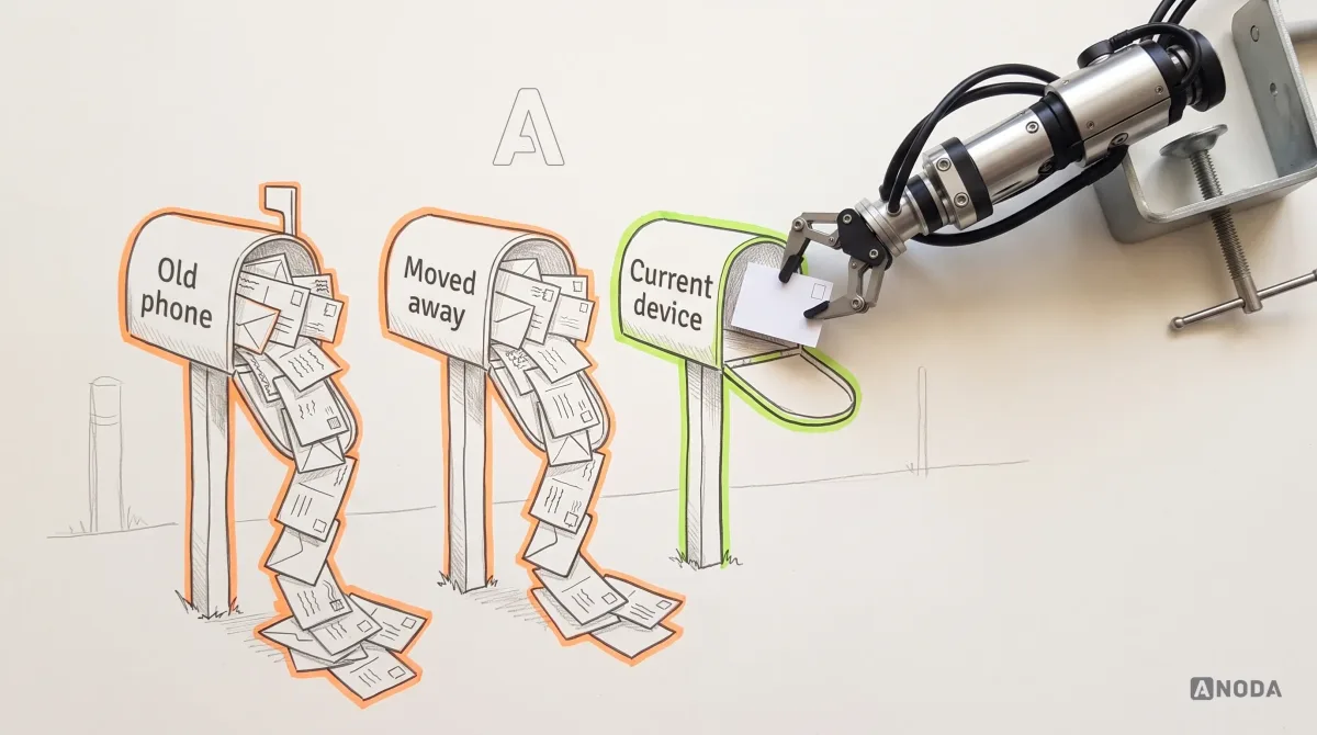
Offline phones. If a device is off the network, the push service holds messages, but not all of them. According to Apple’s and Firebase’s documentation (as of 2026), Apple stores only one notification per app for a device, up to 30 days, and in most cases it keeps the latest one. Firebase keeps messages for up to 28 days by default, and a newer message with the same collapse key replaces an older one. Five messages sent to a phone on a long-haul flight become one. If they were five different things, four of them are gone.
Hidden on arrival. Delivered is not displayed. Notifications can be switched off, the category muted, Focus mode on, or the message folded into Apple’s Scheduled Summary for later. On Android, Firebase deprioritises high-priority messages that do not produce a visible notification, judging by 7 days of behaviour, so even your “urgent” flag has to be earned.
Ignored. Displayed is not seen. Your message lands in a stack with every other app that decided 7 p.m. was a great time to say hello.

An airline’s departures board saying “departed” is not the same as your suitcase on the carousel. Treat “sent” the same way. The numbers that tell you anything live further down: displayed, tapped, and above all, whether the user finished the thing the notification was about.
Audit check
Ask engineering what happens to a token after a 410 or “UNREGISTERED” response, and ask product which metric the push report ends on.
Failure evidence
The token table only grows. The report ends at “sent” or “opened”.
Correction pattern
Prune dead tokens on every error, refresh them on app start, and track each notification through to the task it was meant to trigger.
Permission is the product, not a pop-up
This is where most of the money leaks, and it happens in the first minute.
The classic pattern: the app launches for the first time and, before the user has seen a single screen, the system prompt asks whether this app may send notifications. The user has no idea what you would send. They know from experience what most apps send. They tap “Don’t Allow”. On iOS, that was your one knock on the door.
It is a school trip permission slip that says “Destination: to be confirmed. Return time: whenever.” No parent signs that. A slip that says “Science museum, Thursday, back by 3” gets signed before the bell. Users behave exactly like parents: they sign for something specific.
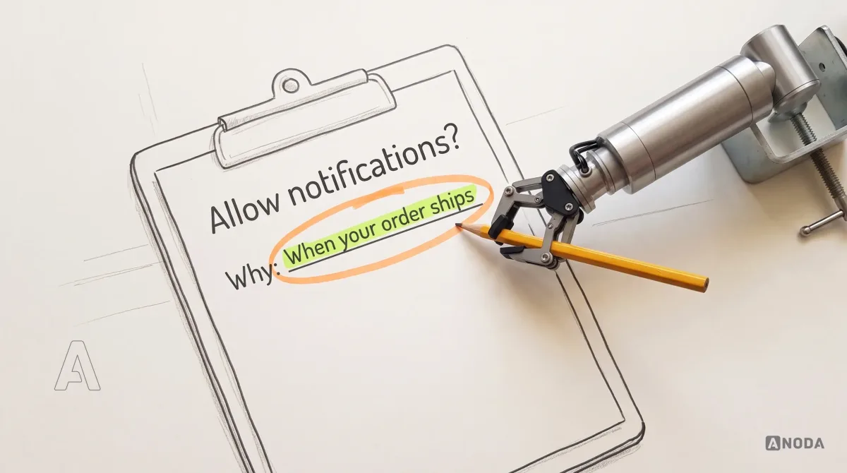
Apple’s own guidance (as of 2026) says the same thing in developer language: ask in a context that shows why the app needs permission, for example after someone schedules their first task in a task app, rather than at first launch. Android’s guidance is identical in spirit, and suggests triggering the request from a user action such as tapping a bell or placing a food order.
So design the permission moment like a screen, because it is one.
- Find the moment of obvious value. The first order placed, the first document shared, the first appointment booked. The user has just done something that will change while they are away. That is when “want to know when…?” makes sense.
- Ask in your own interface first. A short in-app explanation with the concrete benefit and your limits (“one message when the courier is close, no offers unless you ask”). Only when the user taps yes do you trigger the system prompt. A “Not now” costs you nothing. A system “Don’t Allow” costs you the channel.
- Use quiet delivery where it fits. On iOS, provisional authorisation lets the first notifications prove themselves before you ask for the loud version.
- Make the product work without push. Apple’s App Review Guidelines (as of 2026) say push must not be required for an app to function. Design the fallback on purpose: in-app status, email, a banner on next open.

Every user who refuses at first launch is a user you paid to acquire and can now reach only when they choose to open the app. Out of permission, out of mind. The reactivation campaign you will need later runs on paid ads, and you will be buying back someone you already bought once.
Mobile product design
Your permission prompt fires before anyone knows why they would say yes.
We find the moment your notifications earn their keep, design the ask around it, and make the product work for people who say no.
Timing and frequency: the dose makes the poison
Once you have permission, the temptation is to use it. Every team with a target wants a slot: marketing wants the weekly sale, growth wants the re-engagement nudge, product wants the feature announcement. Nobody owns the total. The user gets all of it.
The dose makes the poison. One useful message a week is a service. Five a day of promotional crap is the boy who cried wolf, and you know how that story ends. When the courier really is at the door, nobody is listening anymore.
Frequency is only half the problem. Timing is the other half. A marketing blast scheduled for 9 a.m. in the office’s time zone lands at 3 a.m. somewhere else. It is the neighbour who starts drilling at 7 on a Sunday morning: whatever he is building, you now hate it.

The fix is boring and it works:
- Trigger on events, not on dates. Something the user did, or something that changed for them: a shipment, a reply, a price drop on the item they saved. A campaign calendar is not an event.
- Match loudness to urgency. Use the platform’s levels honestly. A courier ten minutes away is time-sensitive. A new range of oat drinks is not. Abuse the loud levels and the user learns to mute you entirely.
- Respect local time and quiet hours. Send in the user’s time zone, hold non-urgent messages overnight, and let people set their own quiet hours.
- Cap the total, across teams. One owner, one budget of interruptions per user per week, and a queue that drops the least useful message when the budget is spent.
We see this in almost every app we audit: nobody can say how many notifications a single user received last week, because each team only counts its own. Add them up once. The number is usually the explanation for the opt-out rate.
Audit check
Pick three real users and list every push they received in the last 30 days, with the time it arrived in their time zone and the reason it was sent.
Failure evidence
Messages with no user event behind them, sends outside waking hours, and several teams writing to the same person in one day.
Correction pattern
Move to event triggers, set a cross-team frequency cap with one owner, and deliver non-urgent messages in the user’s daytime.
Deep links: a tap should land on the task
The user tapped. You did the hardest thing in mobile: you got someone to open your app on purpose. Now watch what most apps do with that moment. The classic screw-up: they open the home screen.
It is a builders’ merchant who was paid to deliver bricks to the third-floor scaffold and dumps the pallet at the site gate. Technically delivered. Now somebody has to carry every brick up by hand, and half of them never get there.
A deep link is the address inside your app that the notification points to: this order, this message thread, this invoice, this approval. The payload carries it, the app opens it, and the user lands in front of the one decision the notification was about.

Design the landing screen with the notification, not after it.
For a connected product, the destination also has to explain the device’s current state. In Clearwater, ANODA designed the cold-plunge app’s setup, bath controls and session journey. That is the product context a reminder has to return to. Bring us the alert that gets opened but leaves someone guessing: our IoT app design connects the message, the device state and the next useful action, including a lost connection or an interrupted session.
- Every notification type has a destination written into its spec, and the destination shows the change the notification announced.
- The screen works from a cold start. The app may have been closed for days. It has to load the right account, the right object and the right state, not a spinner followed by the home feed.
- Sign-in does not eat the destination. If the session expired, the user signs in and then lands where the tap was going, not on the dashboard.
- Stale links fail gracefully. The order was already delivered, the offer expired, the thread was deleted. Say so on that screen and offer the next step.
- Actions on the notification itself handle the simplest decisions without opening the app at all: approve, reply, snooze.
A notification that opens the wrong screen trains the user that tapping is a waste of time. The next one gets swiped away unread.
The same trigger-to-action design matters when a marketing team configures the rule behind a message. In Concussion Media, ANODA designed the rule creation wizard, rule board and history: the condition, the action and what happened stay visible together. Our marketing-automation design connects those controls to the customer journey, including the relevant destination, preferences and recovery states. Bring us the automation people cannot explain after it runs; we design a flow operators can understand and customers can act on.
What the lock screen should never say
The lock screen is a noticeboard in a corridor. The boss, the kids, the colleague who borrowed your phone for a photo and the stranger on the train can all read it. Write for all of them.
Apple’s App Review Guidelines (as of 2026) say push should not be used to send sensitive personal or confidential information. Take that further than the review minimum. A grocery app that lists the basket on the lock screen will one day announce a pregnancy test to a room full of people. A bank that puts the full balance there shows it to anyone at the table. A health app that names the appointment type has broken its user’s privacy before they have unlocked the phone.

The rule we use: the notification says what changed and what the user can do about it, and keeps the details behind the unlock. “Your payment needs your attention” rather than the amount, the merchant and the reason. “New message from your clinic” rather than the diagnosis. The user loses nothing, because the tap takes them straight to the details.
Preference control and an easy way out
Now the part most apps get wrong on purpose. The settings screen has one switch labelled “Push notifications”. Behind it: order updates, offers, news, recommendations and whatever the growth team added last month.
That is a house with one circuit breaker. The kettle trips it, and the fridge, the heating and the burglar alarm go off with it. A user who wants the sales to stop has to give up the delivery updates too. Plenty of them do, and now you have lost the useful channel along with the noise.
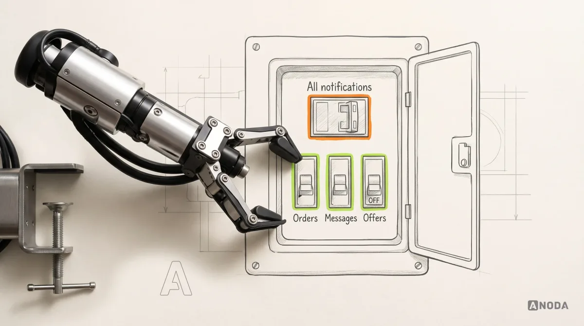
Granular control is not generosity. It is how you keep the channel alive. Give each kind of message its own in-app preference and enforce it when deciding what to send. Match Android preferences to notification channels where appropriate. On iOS, notification categories define actions and presentation options; topic opt-outs belong in your app rather than being treated as separate system switches.
- Separate service from marketing. Order status, security alerts and messages from real people are one family. Sales, news and “you might like” are another. Never bundle them under one switch.
- Say what each switch sends and how often. “Weekly deals: at most one a week, on Fridays” is a promise the user can hold you to.
- Offer timing controls, such as quiet hours and a digest, before the user reaches for the off switch.
- Make leaving easy. Apple requires an in-app way to opt out of promotional pushes and explicit consent before sending them (App Review Guidelines, as of 2026). A user who can turn off offers in two taps keeps the delivery updates. A user who has to hunt for the setting turns off everything in the system settings, where you cannot win them back.

A user who can mute your offers keeps your delivery updates. A user who can’t mutes you.
Measure trust, not opens
Open rate is the push metric everyone reports, and on its own it is the least useful one. It is counting shots and never checking the scoreboard. A clickbait title can lift opens while the opt-out rate climbs behind it, and the quarterly report will call it a win.
The numbers that tell you whether push is earning its keep:
- Opt-in rate by platform and by moment of asking. It tells you whether your permission design works.
- Disable and mute rate after each notification type. The fastest signal that a message is noise. Watch it per category, not in total.
- Task completion after a tap. Did the user approve the swap, reply to the message, pay the invoice? That is the reason the notification exists.
- Delivery health. Dead tokens pruned, error rates by platform, messages lost to collapse or expiry.
- Uninstalls and support complaints after a campaign. The expensive end of the spectrum, and the one nobody links back to the push calendar.
We have never seen a retention problem fixed by sending more notifications. We have seen plenty made worse. If the product does not give people a reason to come back, push only reminds them faster that they left. For the wider picture of why users return, see our guide to mobile app engagement strategies.
Audit check
Put the opt-out rate and the task completion rate for each notification type next to its open rate.
Failure evidence
Types with healthy opens and rising opt-outs. Types nobody can link to a finished task.
Correction pattern
Retire or rewrite the types that cost more trust than they return, and make task completion the success metric for every notification.
The decision rule before you send anything
Every mistake above comes from the same place: the notification was written before anyone decided why it should exist. So decide first. Write one spec card per notification type before a single line of copy. It forces the conversations teams otherwise have in production, in front of users.

Send a notification only when you can answer all of these, in order:
- What does the user gain from knowing this now? If the answer is “we want them back in the app”, that is your gain, not theirs.
- What event triggers it? Something that happened to this user, not a date on the marketing calendar.
- Did they agree to this kind of message, in a moment that explained it?
- Where does the tap land? The exact screen with the exact task, working from a cold start.
- Is it safe to show to anyone who glances at the phone?
- Can the user turn off this type alone, without losing the rest?
- What happens if push is off? The product still works, and the user still finds out.
- When do we stop sending it? The signal that tells you it has become noise.
If any answer is missing, it is not a notification yet. It is an interruption with a logo on it.
That is the whole article in one decision: push is a permission and a trust relationship, not a free retention channel. The platforms will deliver whatever you send. Whether people keep listening depends on timing, frequency, where the tap lands, what the lock screen shows, and how easily they can say “less of this, please”. Get those right and push is the cheapest channel you own. Get them wrong and it is the most expensive one, because you pay for it twice: once in trust, and again in ads to buy the users back. For the rest of the product around the notification, the ANODA UX blog has more field notes. And if the journey itself needs rebuilding, that is what our UI/UX design service does: notification journeys, permission moments and preference screens included.

Work with ANODA
Stop spending permission you can’t earn back.
Bring us your notification list, your opt-in numbers and the screens behind each tap. We turn it into a notification journey your team can build: what to send, when to ask, where each tap lands and how people control it.
Written by