
Cold-plunge app design, a habit worth keeping
Clearwater’s SnowCap app helps people keep a cold-plunge habit, with or without the hardware.We designed it, from device setup to challenges.
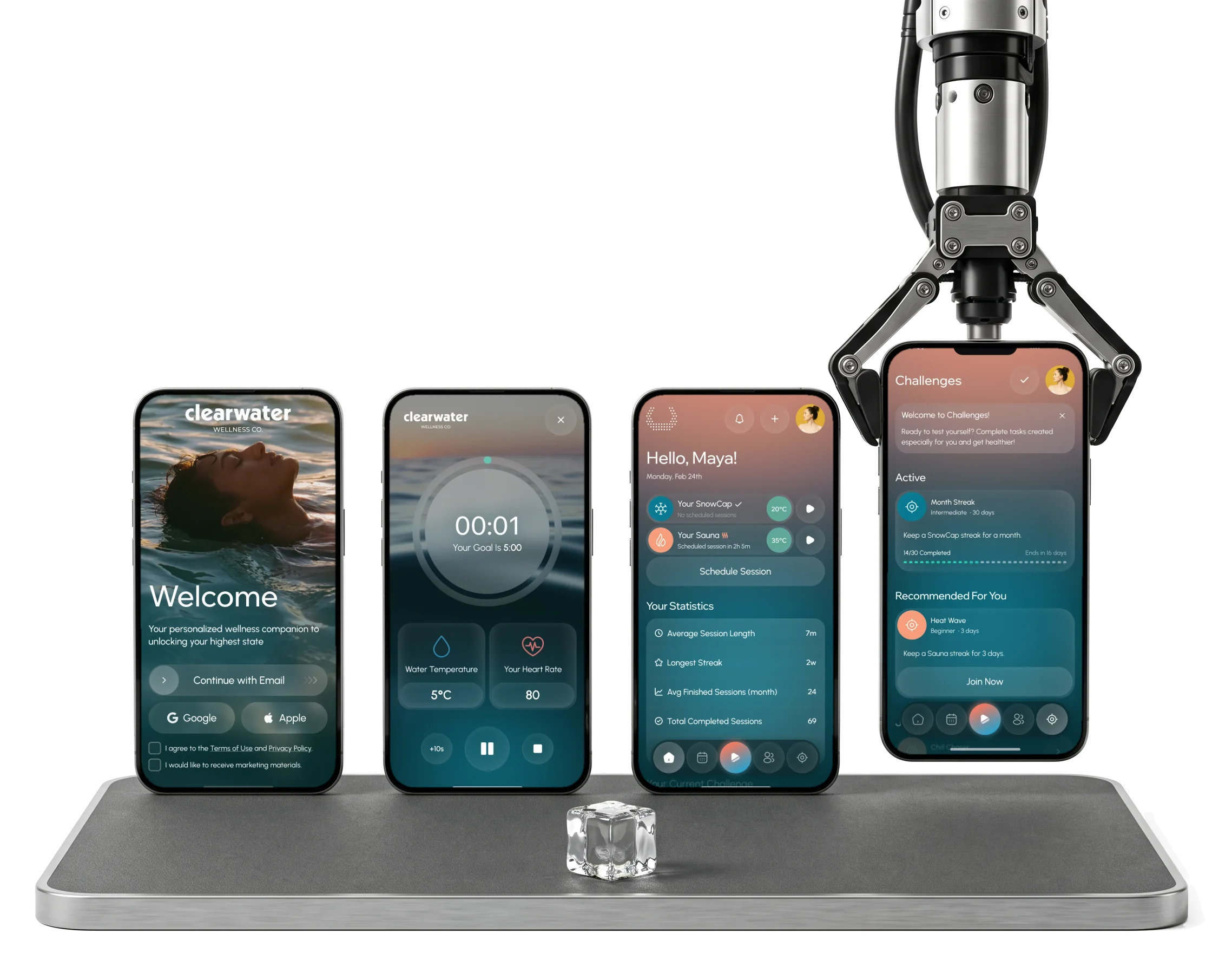
- Device
- control setup, Bluetooth, Wi-Fi, sessions, sharing and updates
- Crews
- and challenges schedules, streaks and public stats
- 306
- screens for iOS, Android and tablet, in one design
Project summary
We designed Clearwater’s mobile app to make cold-plunge practice useful before someone owns a SnowCap device. Research and mapped flows connect guided sessions with schedules, challenges and crews, then add device pairing, control and sharing to the same routine. Clickable prototypes covered iOS, Android and tablet; Clearwater’s team owned the hardware and app implementation.
What a cold-plunge habit asks of an app
The practice before the device, the device itself, then what keeps someone going:
-
Start
- Welcome and sign-up
- Quick tour
- Choose a product
-
Set up
- Installation steps
- Wi-Fi and Bluetooth
- Pairing
-
Plunge
- Cooling to target
- Timer and goal
- Heart rate
-
Keep going
- Schedules
- History and streaks
- Challenges
-
Together
- Crews
- Public stats
- Sharing
-
Own it
- My products
- Shared access
- Software updates
- Wellness and Hardware
- A calm, visual product that still says plainly what the device is doing and what went wrong.
- Without SnowCap and With SnowCap
- A full practice for people without the device, and the device shown as its deeper version, not an advert.
- Motivation and Noise
- A community tied to the practice itself, not another feed to scroll.
Home, in the order a morning plunge needs it
- Found
- Home had to serve someone with two devices, someone with none, and someone about to step into cold water, without turning into a control panel.
- Decided
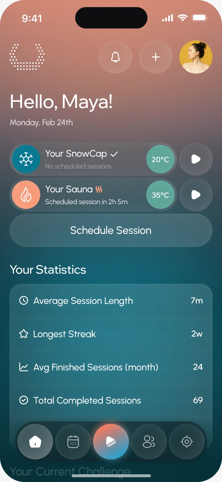
- One order down the screen: a greeting and the date, each device with its temperature and a start button, scheduling, then the person’s own numbers. Everything else sits in the tab bar.
- For the user
- Standing next to the plunge, the person sees the water temperature and starts a session from the first screen.
-
Whose day
A greeting and the date, so a session lands in the right place in the history.
-
The devices
Each device with its schedule, water temperature and a start button.
-
The next step
Scheduling the next session, one tap from home.
-
The numbers
Session length, the longest streak and finished sessions, in words, not a chart.
-
Everywhere else
Home, schedule, a session, community and challenges, with the session in the middle.
How the work progressed
From competitor research to a clickable prototype and a numbered screen map, one question closed at a time.
-
Discovery
6 hrs
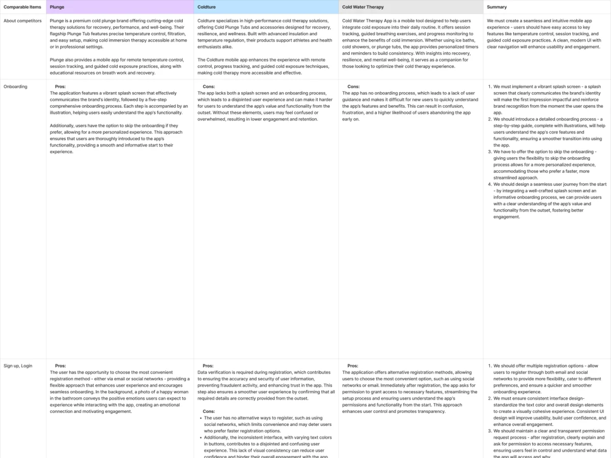
What cold-plunge apps already did, and where they lost people at the start
Artifact Competitor research on Plunge, Coldture and a cold-therapy app, and the information architecture
-
User Flow
54 hrs
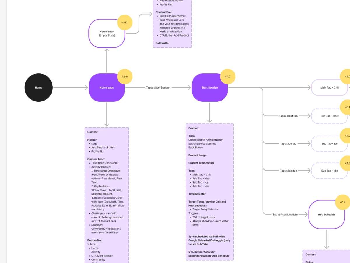
Every path from the welcome screen to a finished session, including the ones where the device isn’t there
Artifact User flows for onboarding, setup, sessions, schedules, community and profile
-
Wireframes
103 hrs
What each screen holds, before colour and photography
Artifact Black-and-white wireframes for every flow
-
UI & Design System
149 hrs
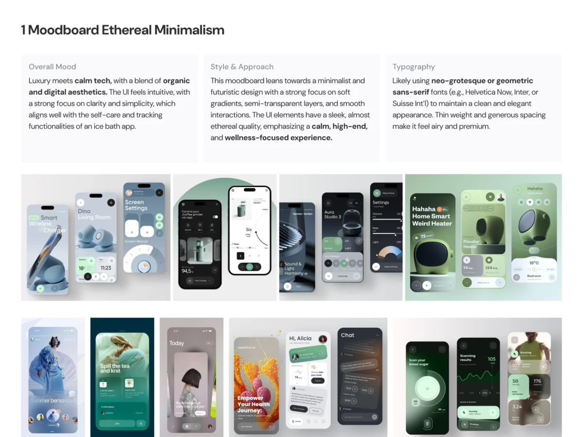
A look that feels like wellness rather than a remote control
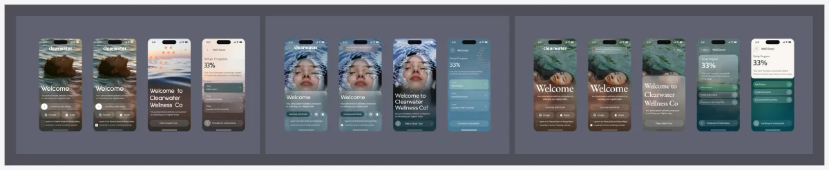
Artifact Moodboards, three styles for the key screens, the final UI and a UI kit
-
Adaptives
71 hrs
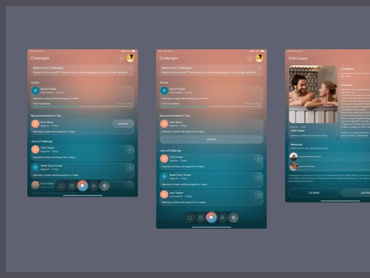
The same product on a tablet by the plunge
Artifact Tablet versions of the flows
-
Animation
11 hrs
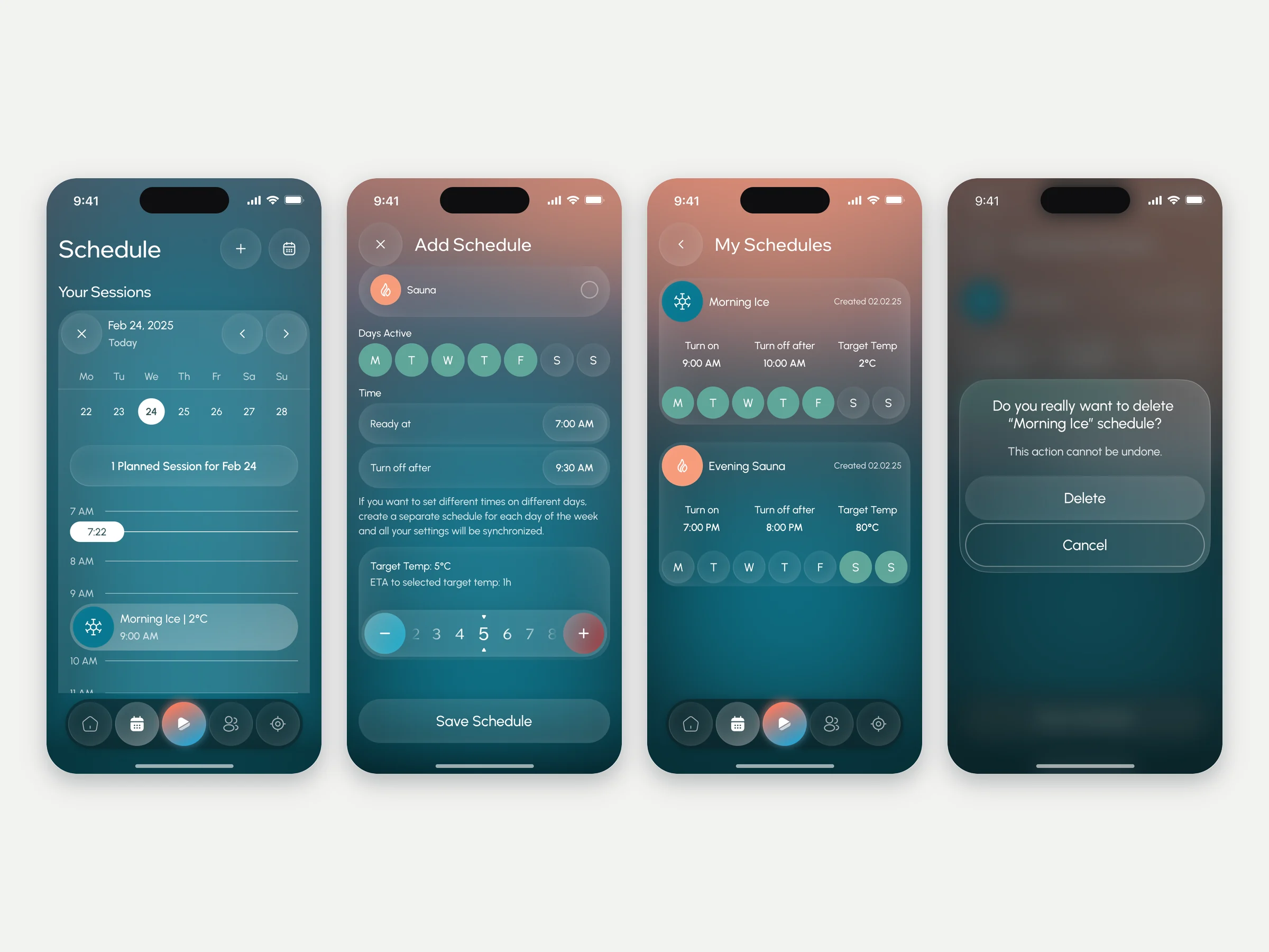
How the schedule and calendar move, so the app feels calm in motion too
Artifact Motion for the schedule and calendar screens
-
Delivery
22 hrs
What the client’s developers needed to build it without guessing
Artifact A clickable prototype, a numbered screen map and a Zeplin export
Every path mapped before it was drawn
- Found
- A session depends on the water: too warm and it has to wait; a device has to be found before anything else works.
- Decided
- Each flow was mapped end to end with its branches first: what happens when the water isn’t ready, when the name is too short, when Bluetooth is off. Then one tab bar for the whole app.
-
Starting a session
From home to a saved session: the check that the water has reached its temperature, standby while it hasn’t, the timer, the session and its summary, with a heart-rate device on the side.
Open the full map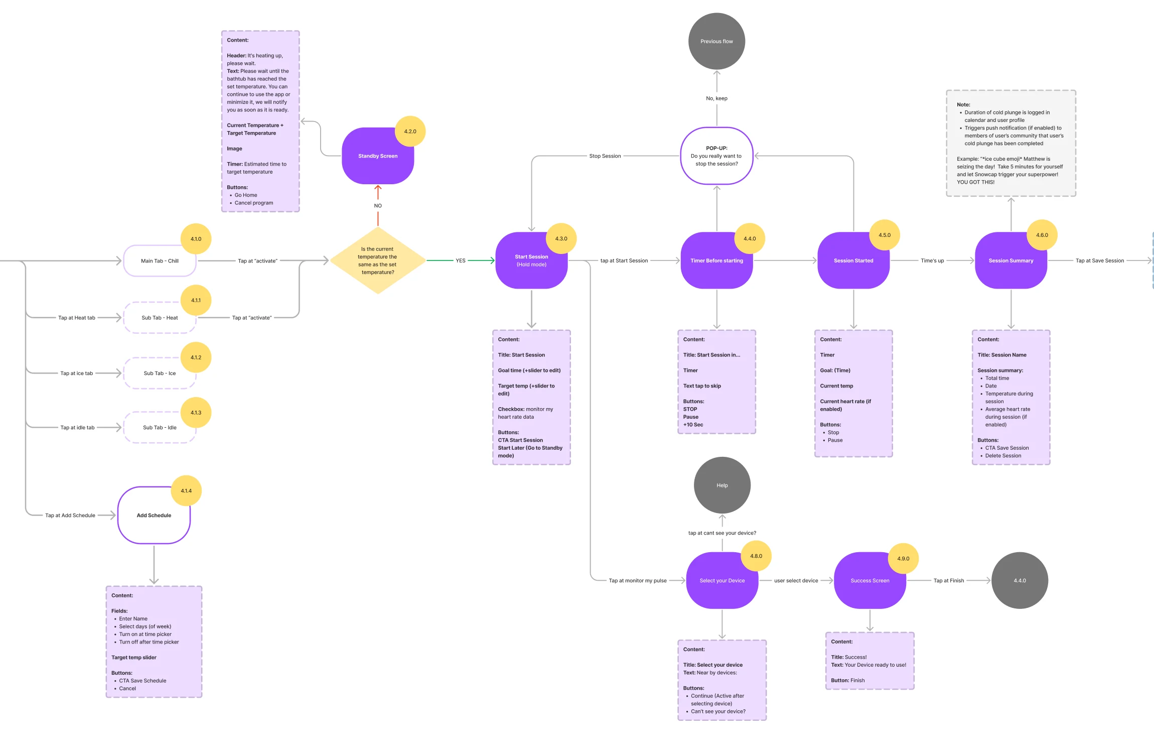
-
Adding the first product
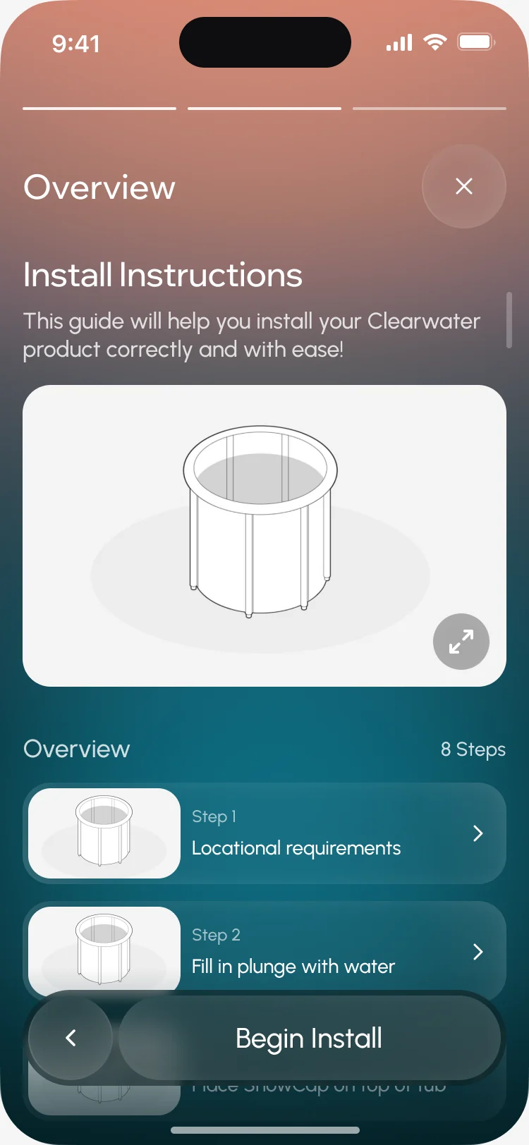
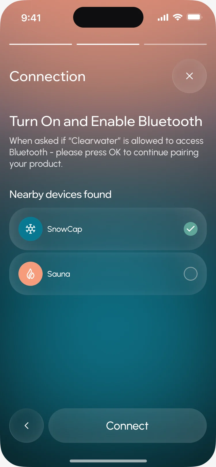
Naming the device with its three error states, installation step by step, Wi-Fi, then Bluetooth, and what to do if the device can’t be found.
Open the full map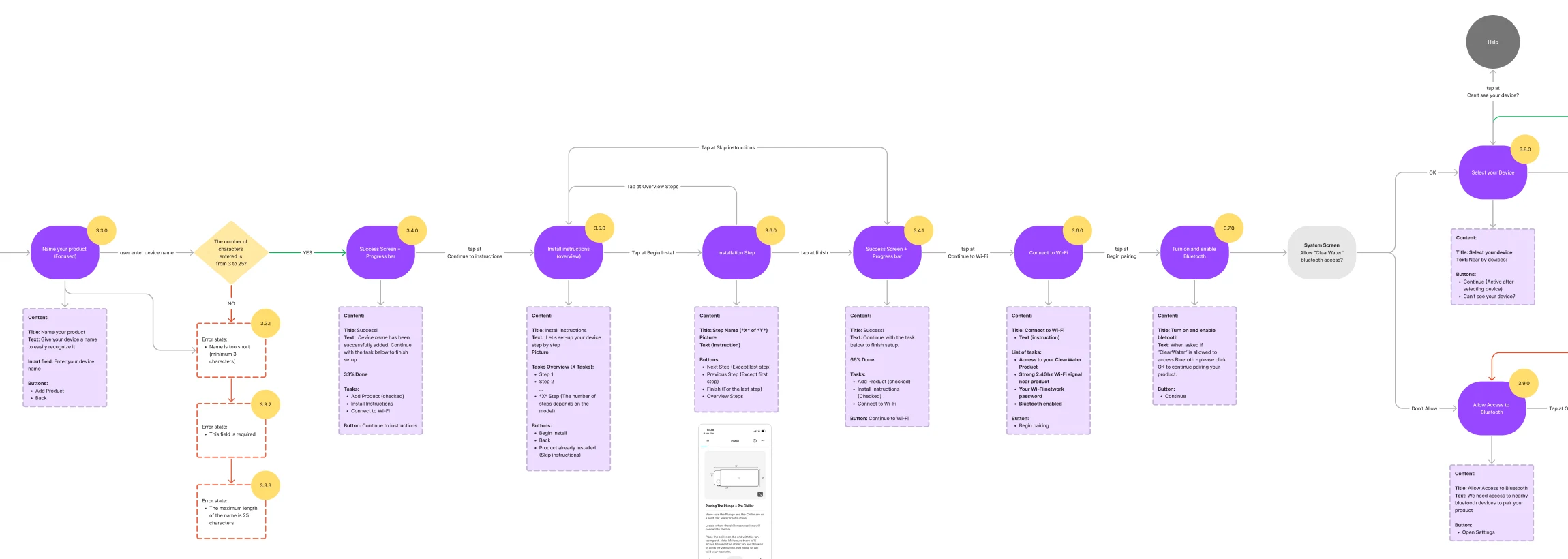
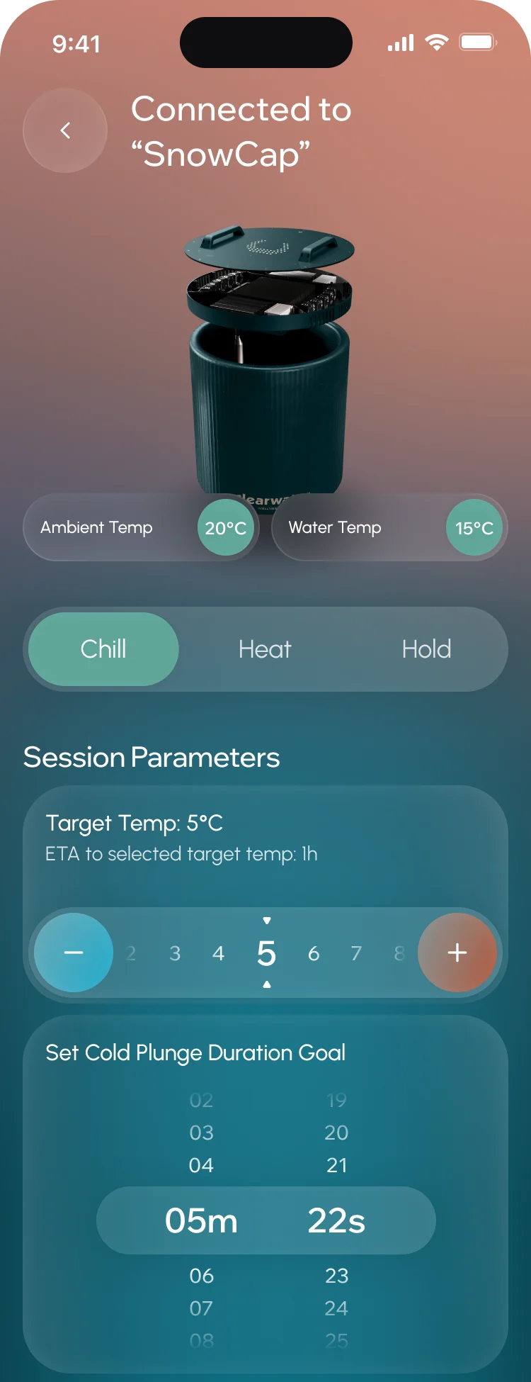
Seven jobs the app does
The practice first, then the device, then what keeps people at it and the device over the years.
A wellness product, not a remote
- Found
- The first screens decide whether the app reads as a hardware manual or as something worth opening every morning.
- Decided
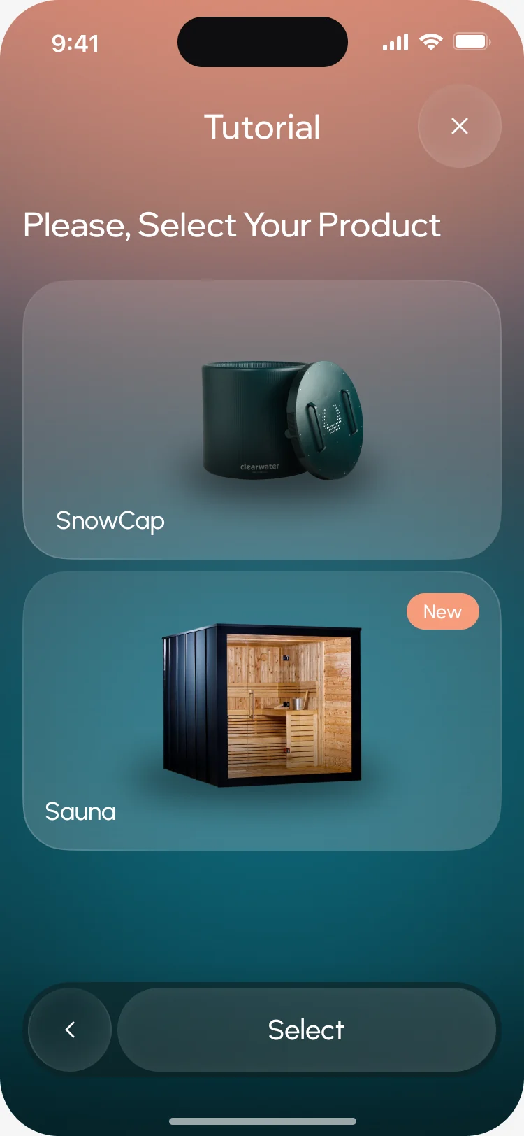
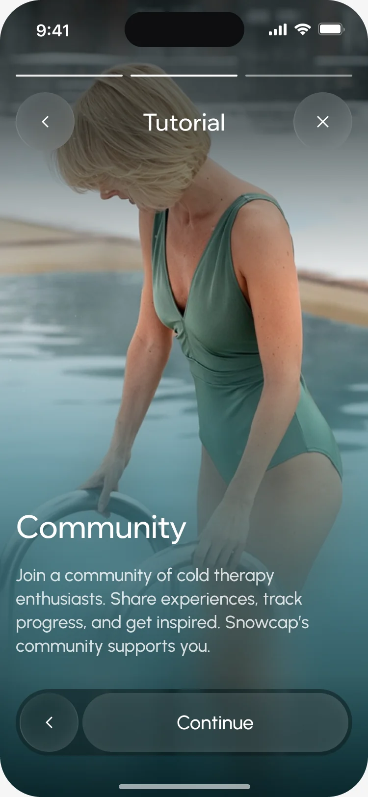
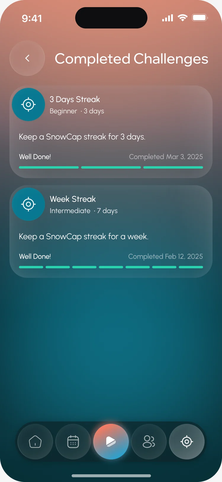
- A calm welcome into a wellness path, a short tour, a product choice that includes the sauna, and the community and challenges shown before any setup.
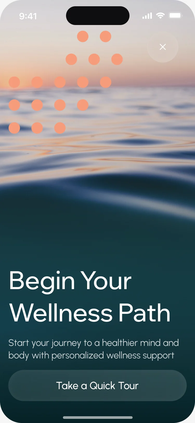
Useful before the device arrives
- Found
- Someone who doesn’t own SnowCap yet has to get something real from the app, or they won’t be there when they’re ready to buy.
- Decided
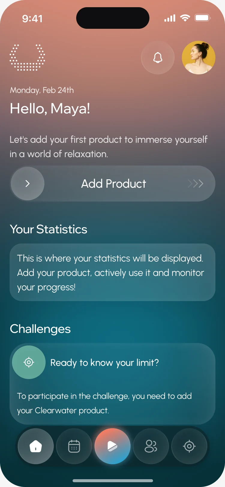
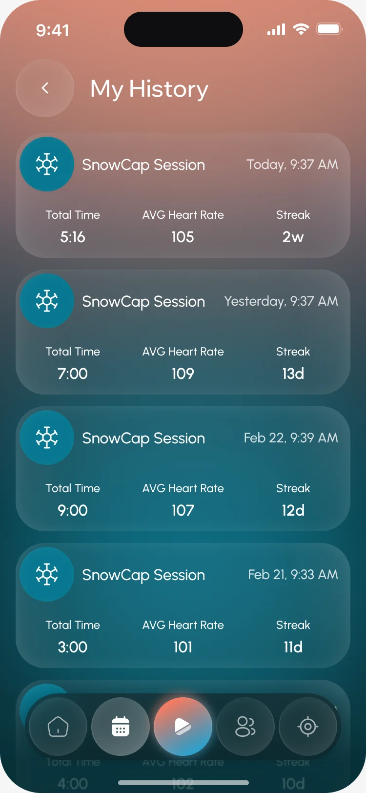
- A home that invites adding a product without blocking anything, a session timer that works on its own, and a history that fills up from the first plunge.
Setting up hardware without the jargon
- Found
- Pairing a device means Wi-Fi, Bluetooth and permissions, and a person who gets stuck at step two returns the device, not the app.
- Decided
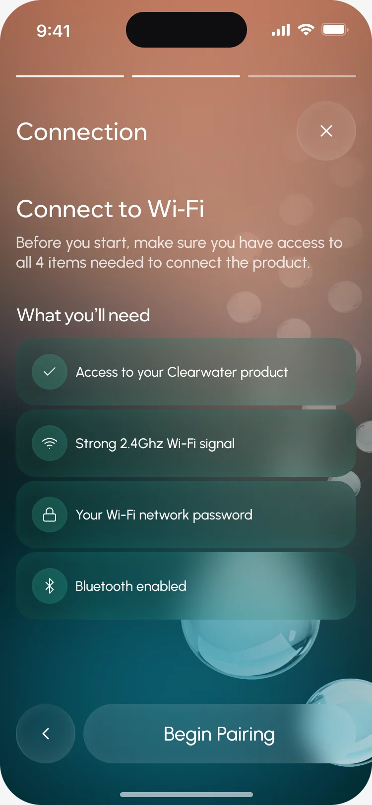
- One product choice, an illustrated installation guide in steps, a checklist of what Wi-Fi pairing needs, and a list of devices found nearby.

Running a session in cold water
- Found
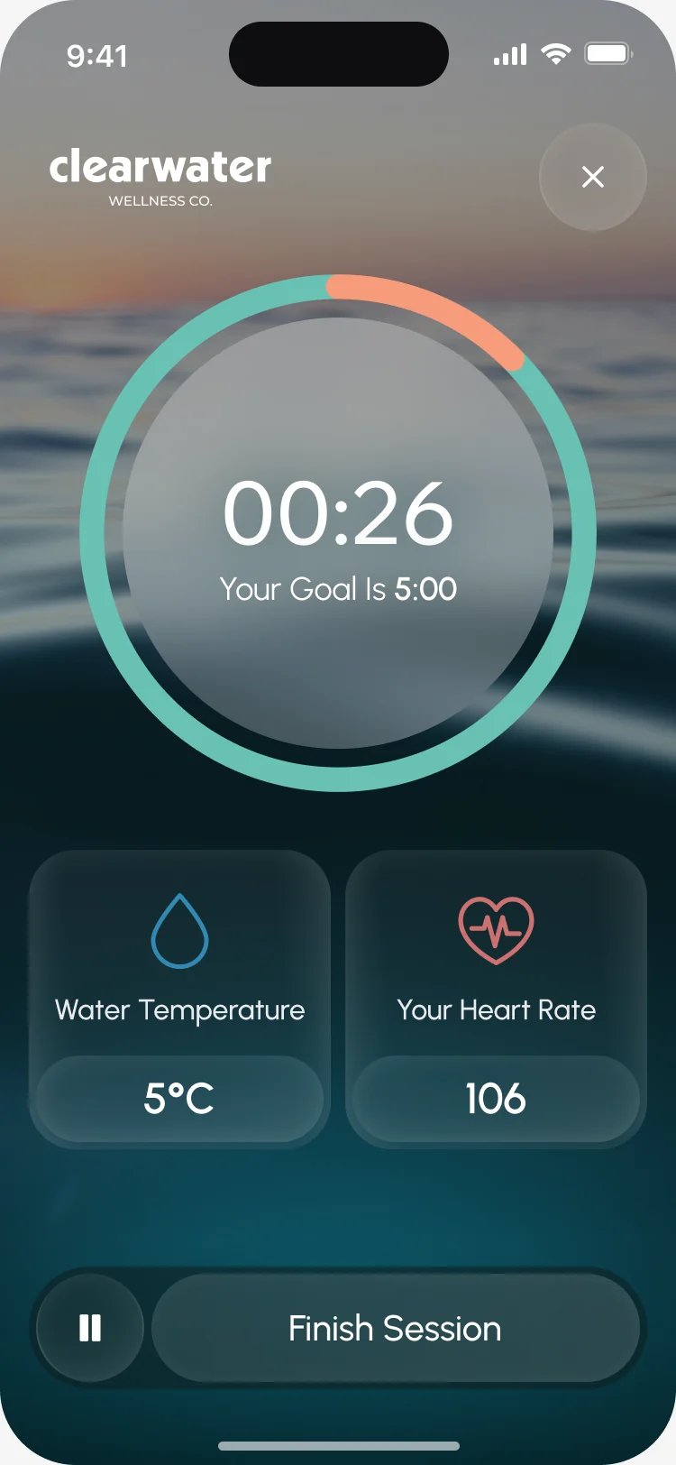
- Wet hands, cold water, a clock running: the person needs the time, the temperature and a way to stop, and nothing else.
- Decided
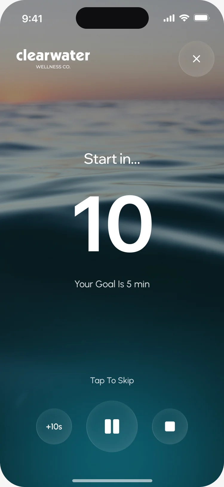
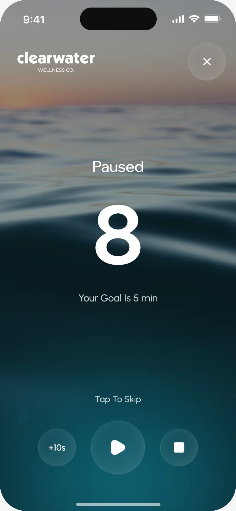
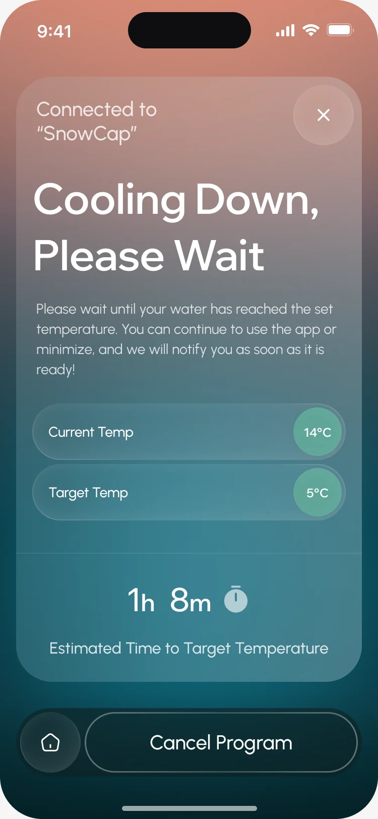
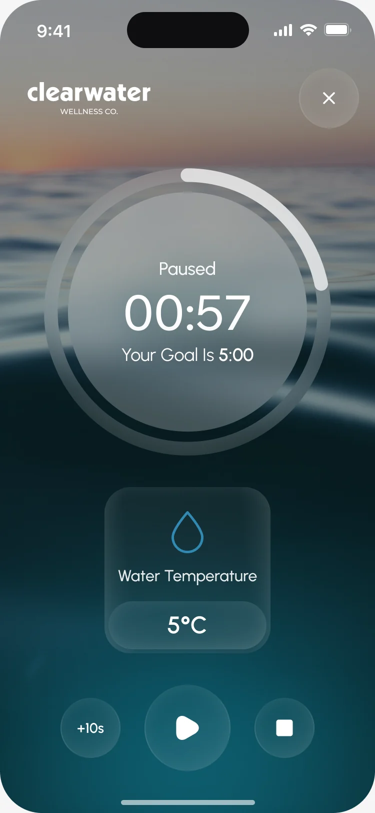
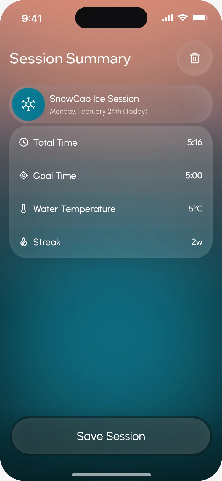
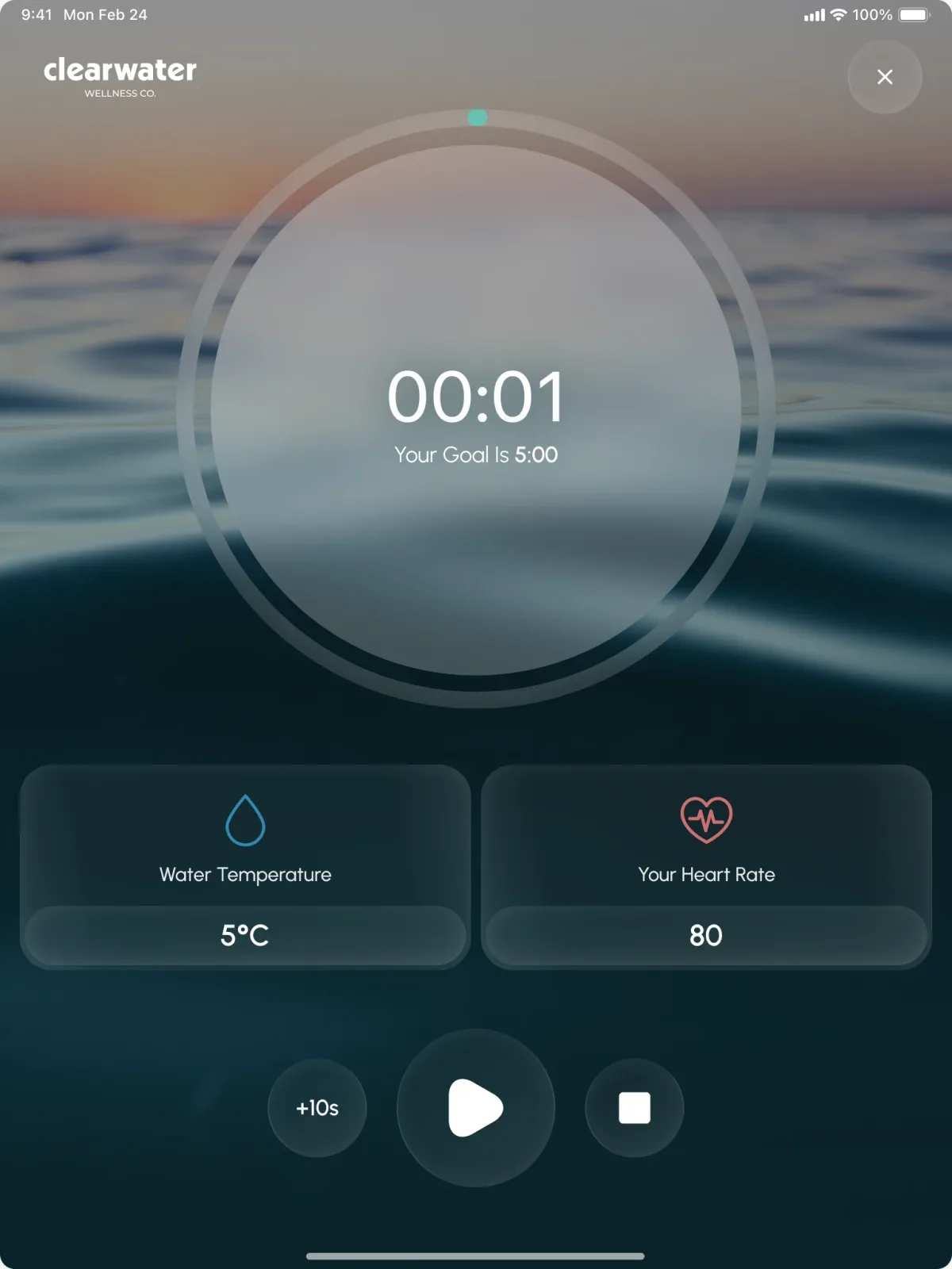
- A wait screen while the water cools, a large timer against the goal with temperature and heart rate beneath, pause and overtime states, and a summary to save.
Coming back to something uncomfortable
- Found
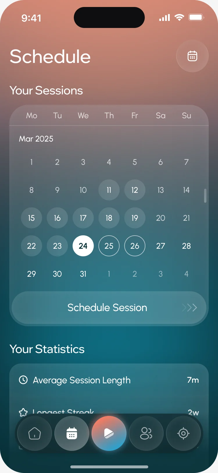
- Motivation fades after the first few plunges, and a habit people dread needs a plan and a reason more than willpower.
- Decided
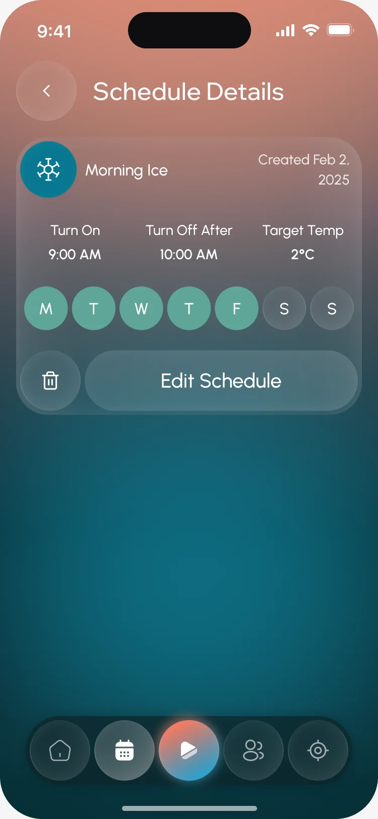
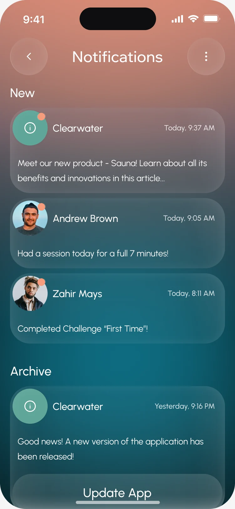
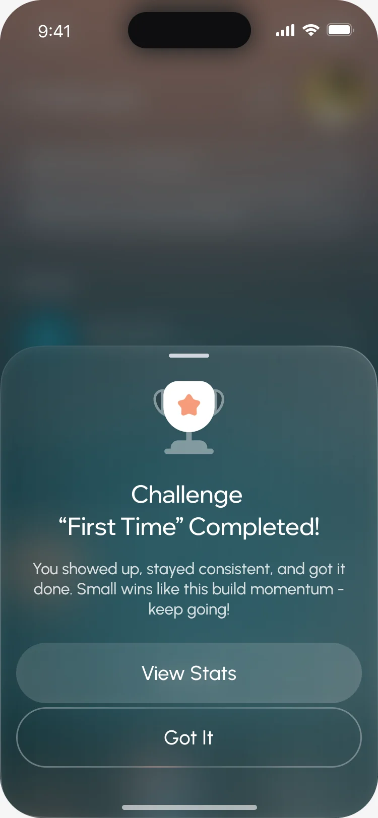
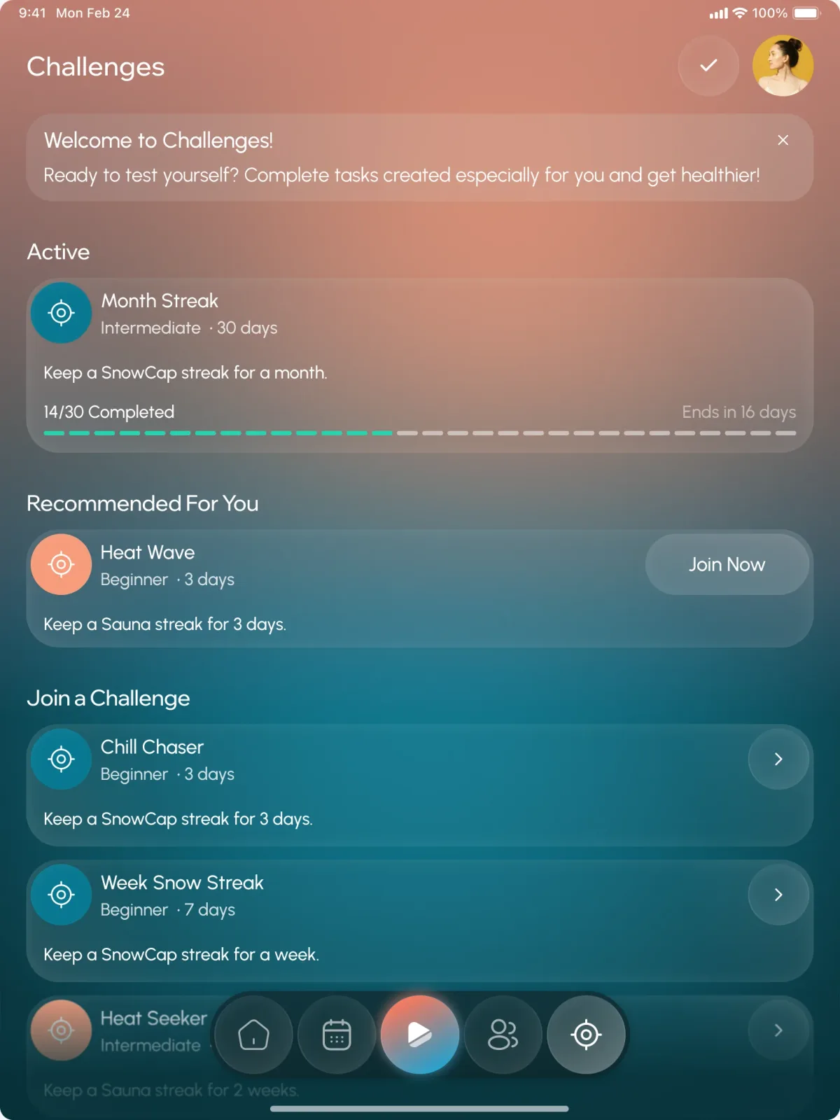
- A calendar of sessions, schedules that turn the device on by day and time, notifications from the crew, and challenges that mark the moment a streak is kept.
A community about the practice
- Found
- A social feed can motivate or just add noise; people doing something hard want to see others doing it too, not another timeline.
- Decided
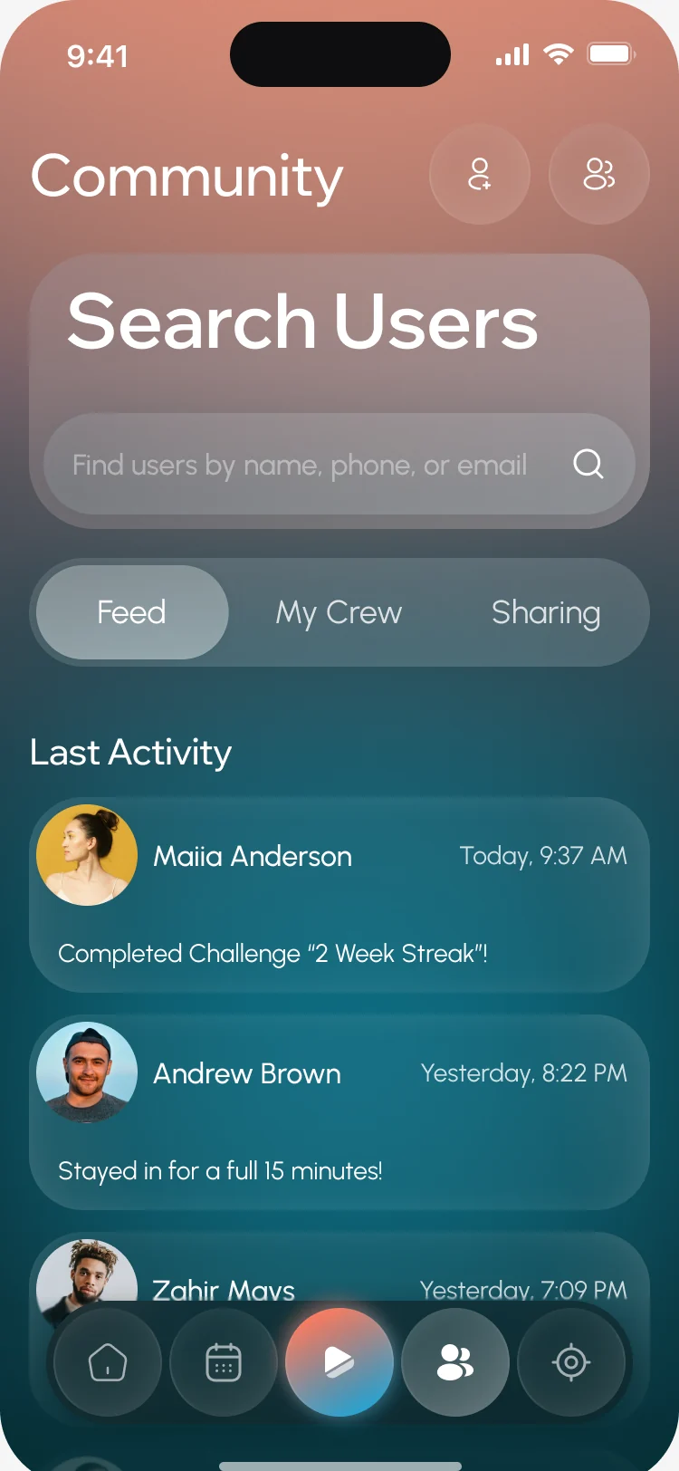
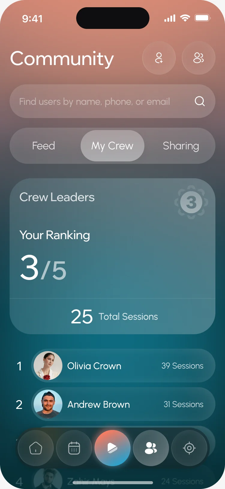
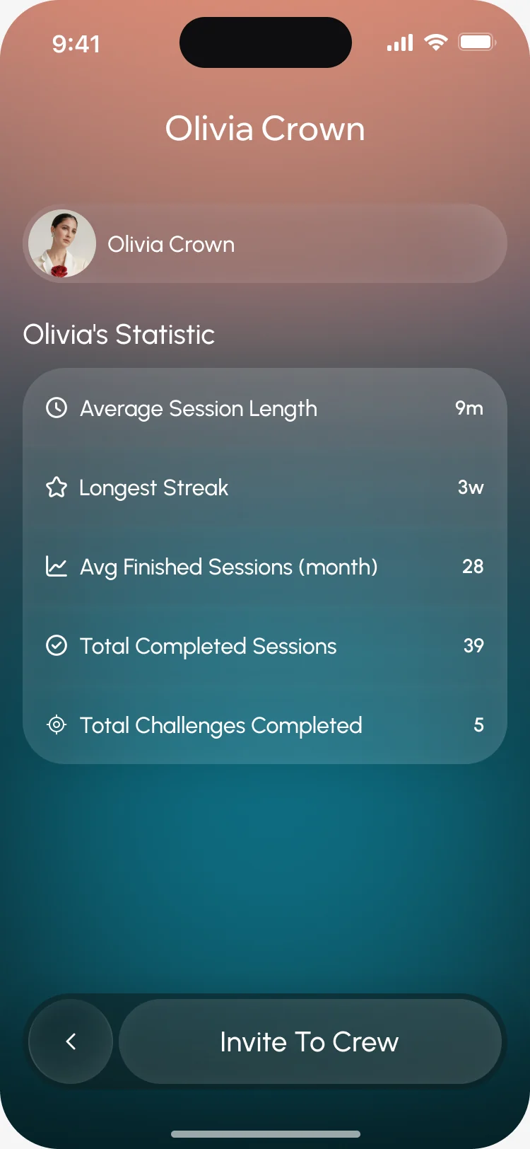
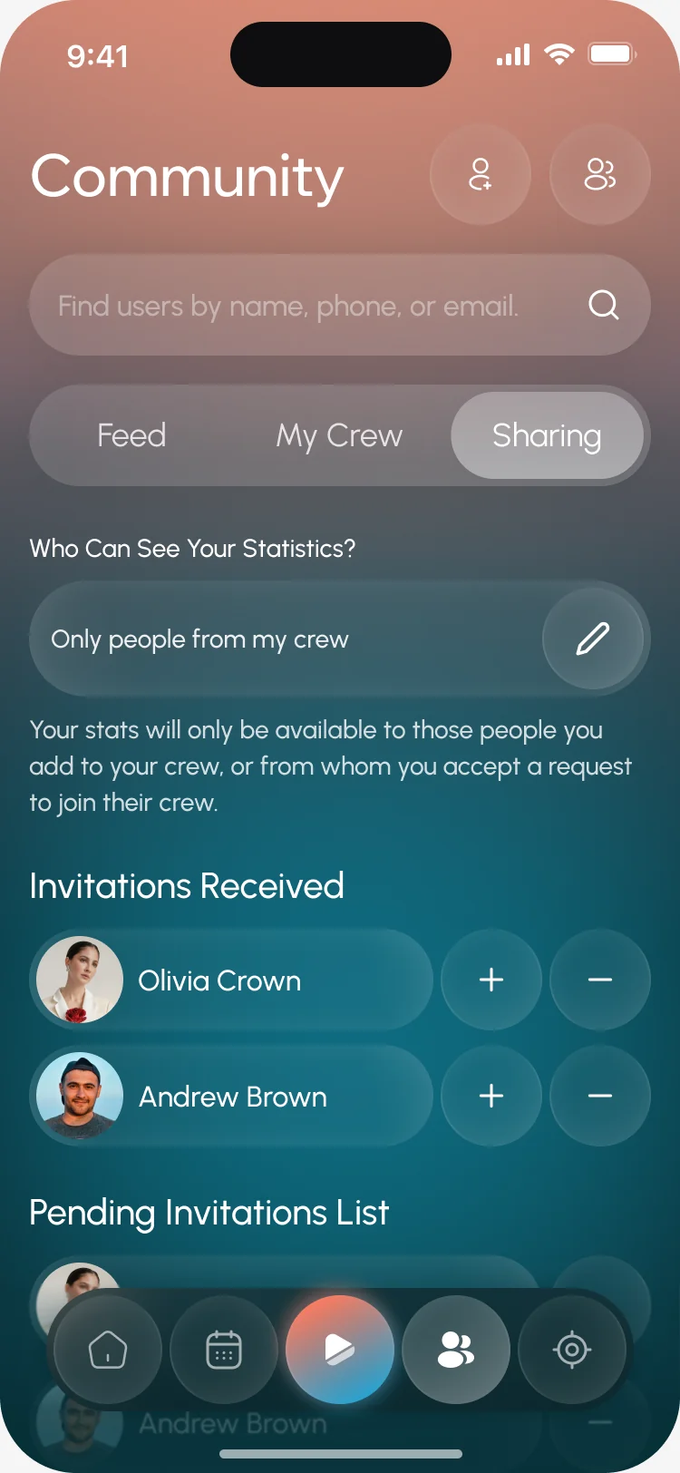
- People search, a feed of sessions and challenges, a crew ranked by sessions, public stats, and a sharing setting for who sees your numbers.
Owning the device for years
- Found
- A device lives in a home: someone else uses it, it needs updates, and an update can fail halfway.
- Decided
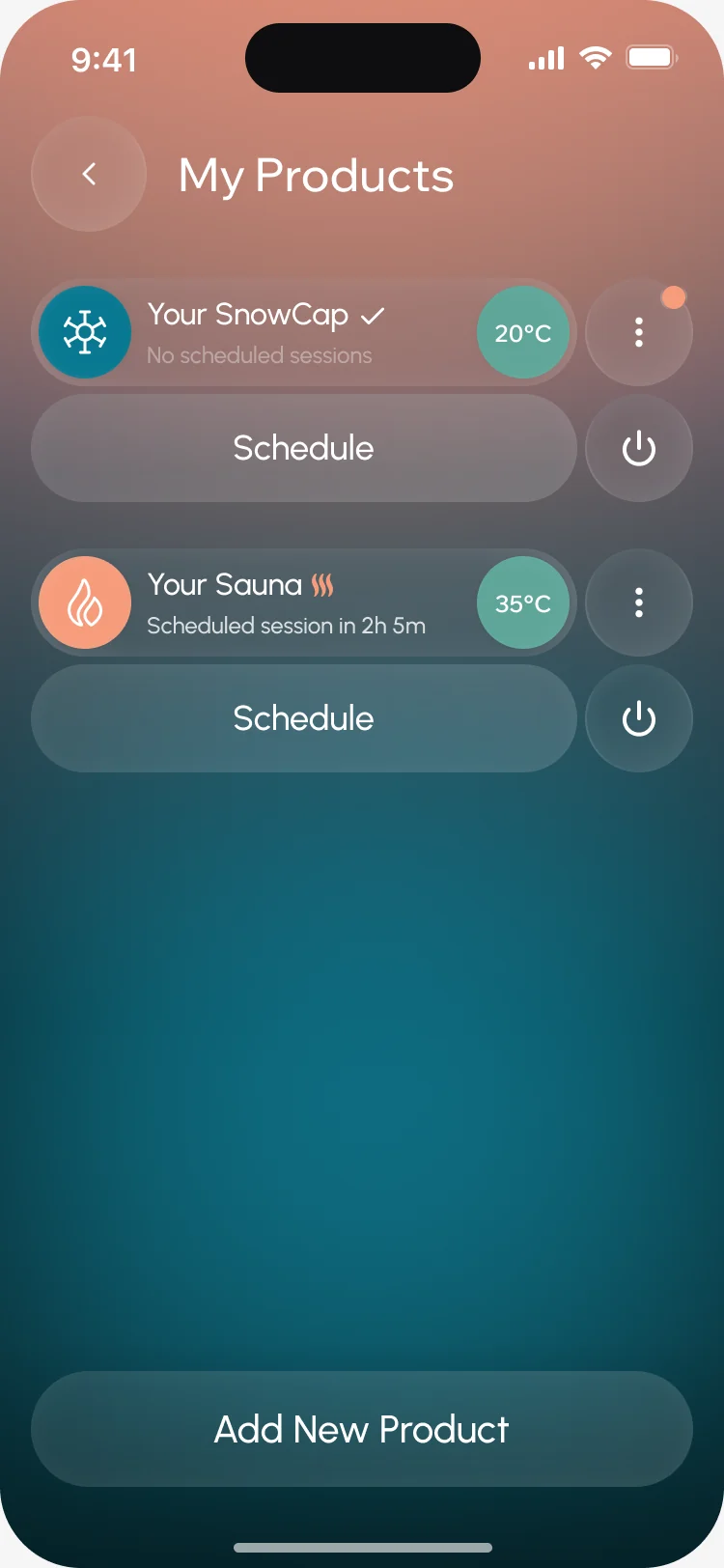
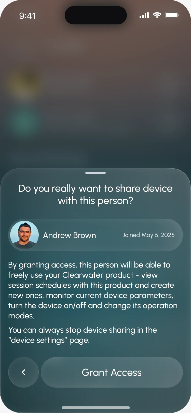
- A list of owned products with their state and power, access shared with a named person, and software updates with what to do before, during and after a failure. We designed the update flows; the firmware was the client’s.
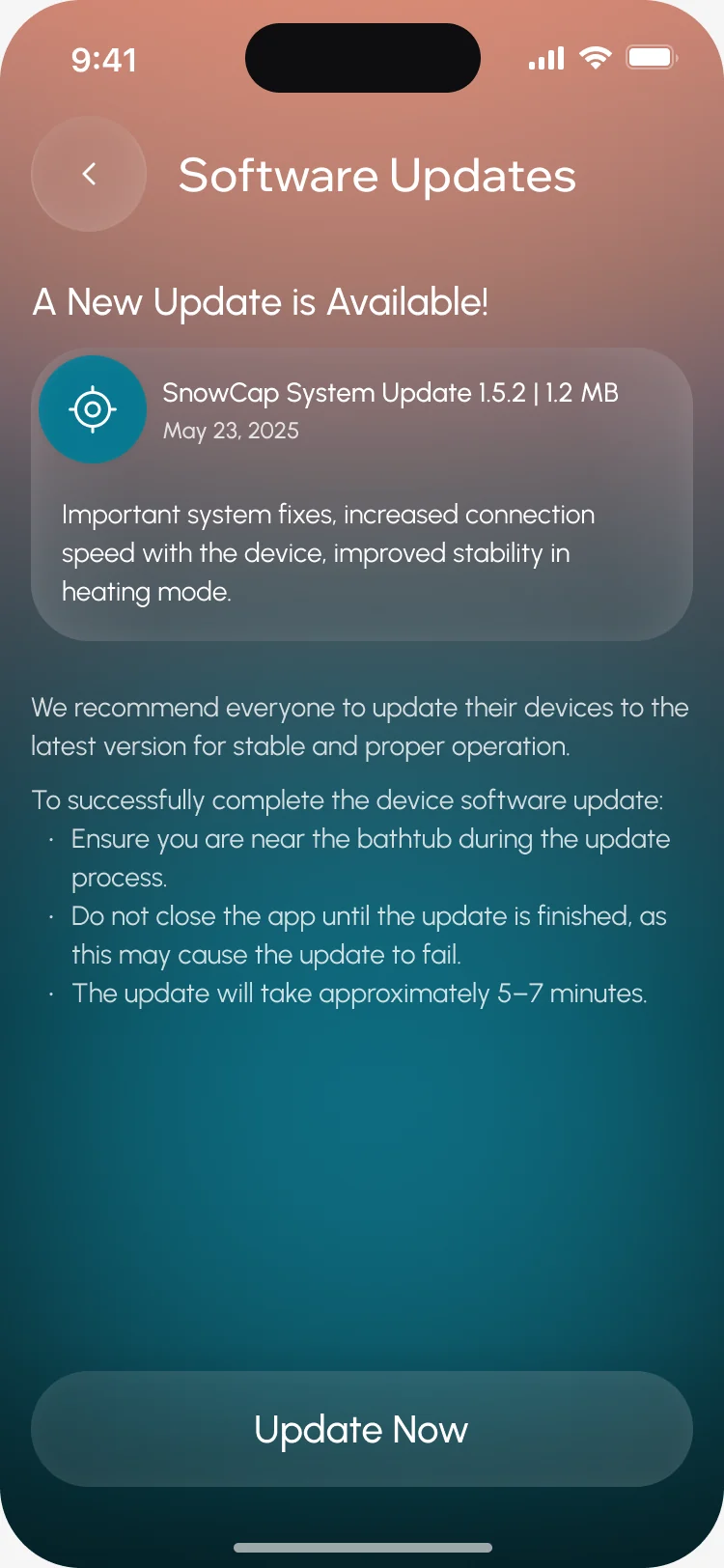
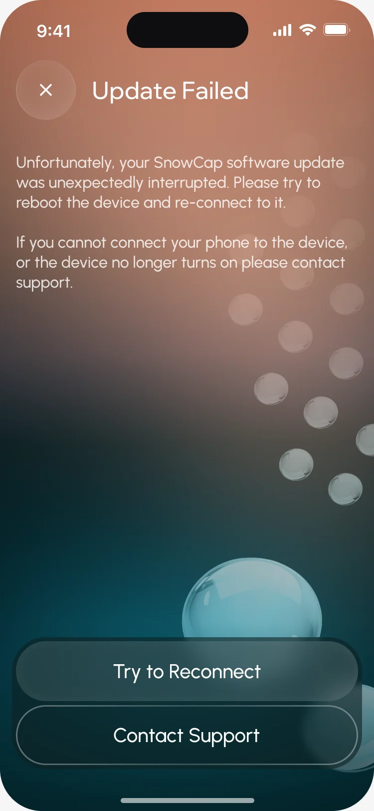
One calm system for a device and a habit
- Found
- Device states, stats and social screens could easily look like three different apps, and error screens are where a hardware product loses trust.
- Decided
- One set of glass cards, buttons and dialogs over the same water gradient, and a system screen for every moment that goes wrong.
Your numbers and a crew member’s read the same
The same statistics card on home and on someone’s public profile.
-
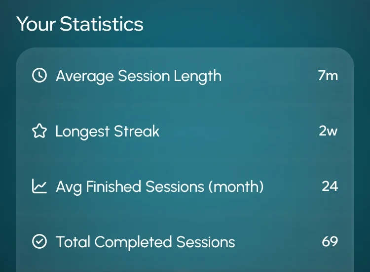
Home: Your own statistics. -
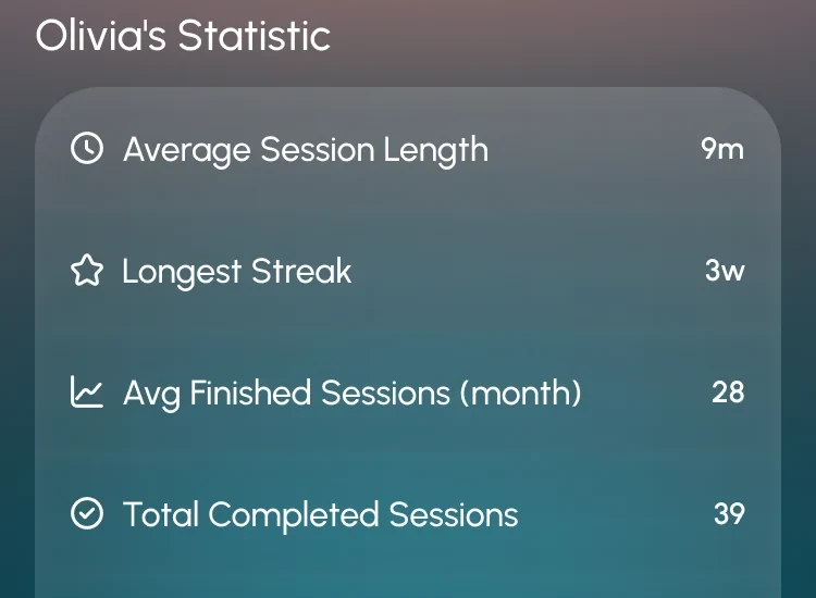
Public profile: The same card on a crew member’s profile.
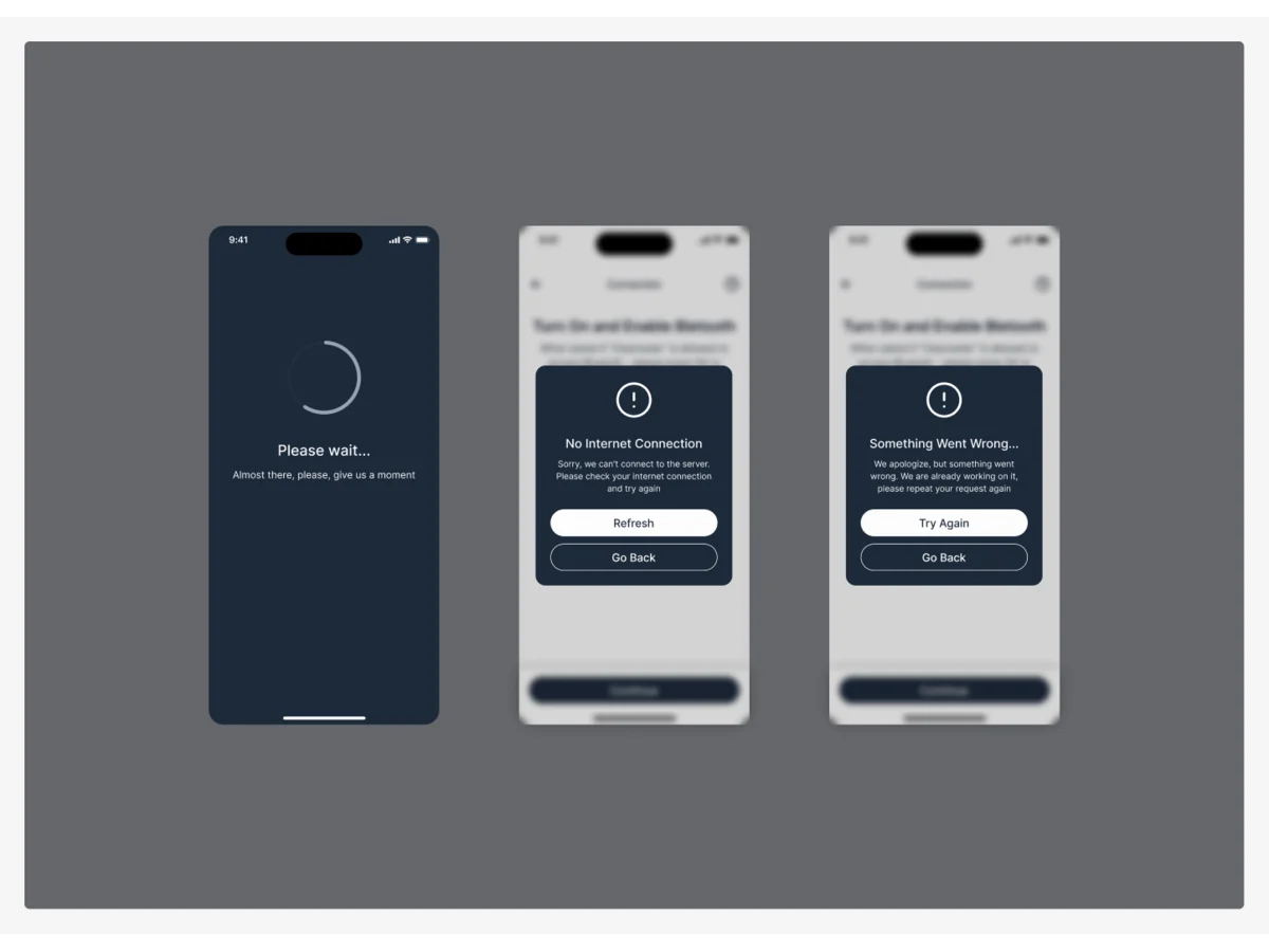
Drawn for the moments that go wrong
No connection, a server error, no device found: each says what happened and what to do next.
-
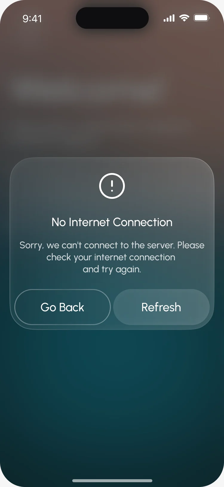
No internet -
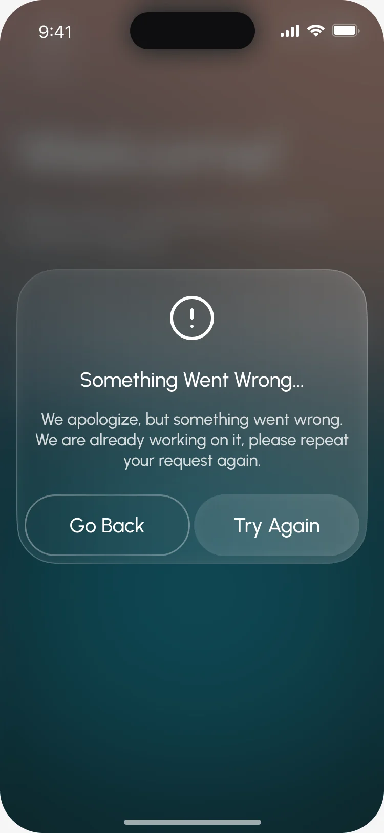
Something went wrong -
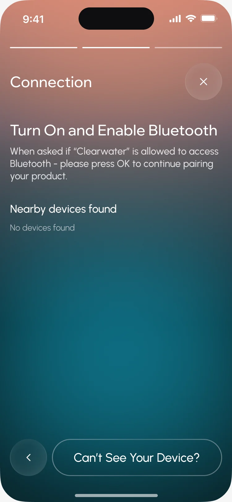
No device found
The same product on a tablet
- Kept
- The order of every screen, the cards, the timer and the tab bar with the session in the middle.
- Changed
- Wider cards with actions beside them rather than below, two statistics tiles side by side in a session, and more of each list in view.
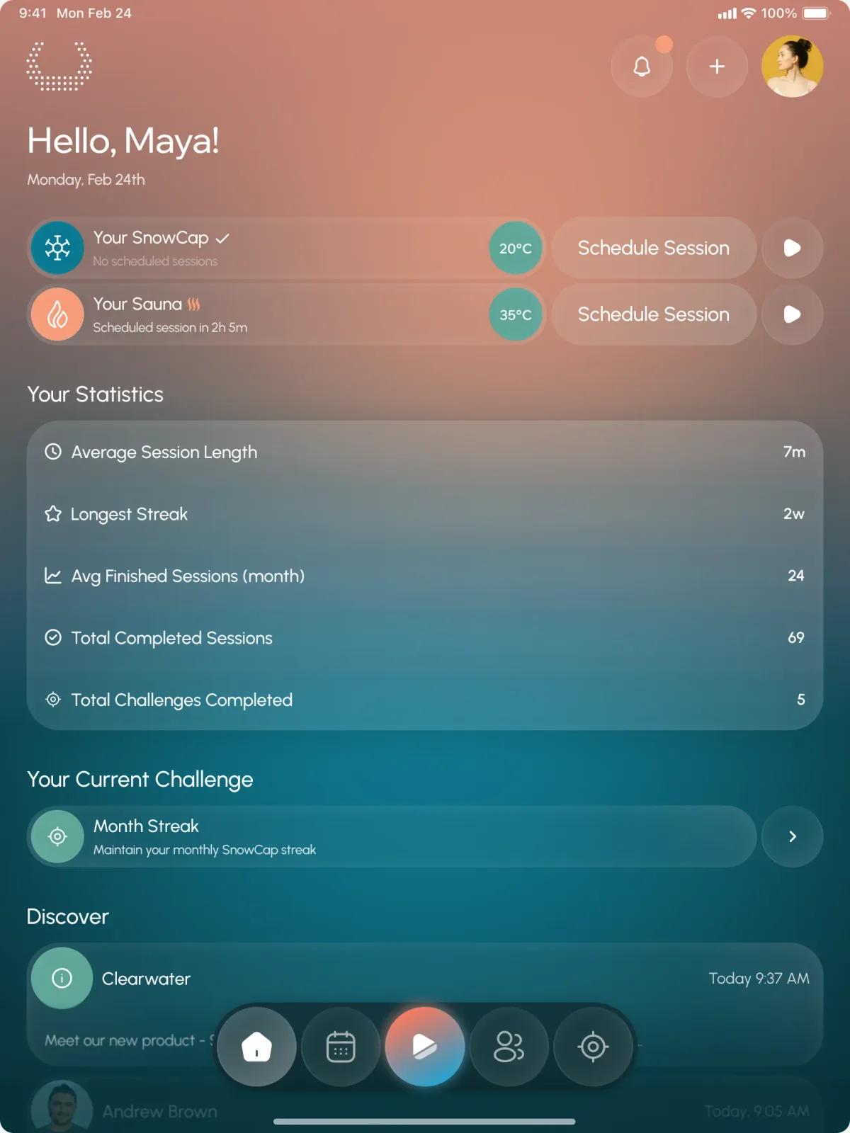
What the developers received
The client’s team built the app from a numbered map, a UI kit and a clickable prototype, delivered flow by flow.
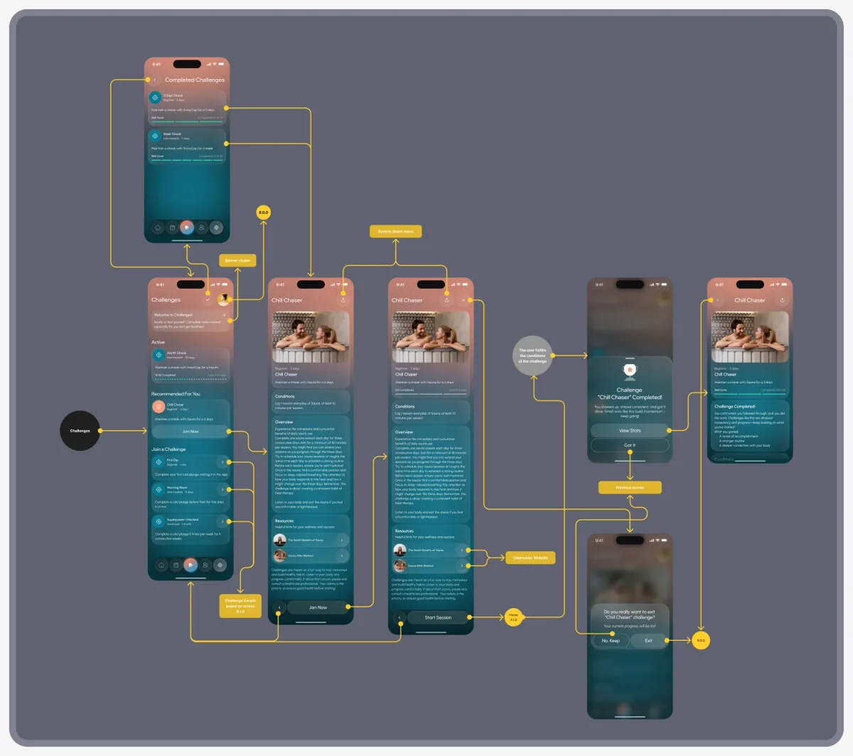
- Screen map
- Every screen numbered and linked, with notes on each transition.
- Clickable prototype
- The main flows, from sign-up to a saved session.
- UI kit
- Styles, components and icons behind every screen.
- Zeplin export
- Specs and assets for iOS and Android.
- Motion
- Micro-interactions for the schedule and calendar.
Flows in the handoff
- Moodboard and three UI style directions
- Wireframes
- App UI: sessions, device setup, challenges and community
- Tablet versions of the flows
- Screen map: every screen numbered and linked
- Clickable prototype: from sign-up to a saved session
Where the product ended up
One design for the whole relationship with SnowCap: a practice people can start without the device, setup and sessions a non-technical person can run, schedules, challenges and crews that give them a reason to come back, and sharing and updates for the years after.
- screens and states for phone and tablet
- 306
- experts on the team
- 4
- client rating
- 5.0★
In the client's words
We came to ANODA with an idea: a visually appealing, easy-to-use app that would help us build a community around our healthcare products. They understood that the experience needed to give people a reason to stay engaged beyond using a connected device. We appreciated how they considered our customers’ needs alongside our vision for the business, helping us turn that initial idea into a clear product direction. Their design brought together the simplicity we wanted and a visual identity we were excited to build on.
Selling a device people use once and forget?
In Clearwater, the app gives people a practice before they own the hardware and a reason to come back after. Show us your device, and we’ll show you where its app can keep people.
More work like this
Three more consumer apps built around a habit, a community or a complex flow.
-
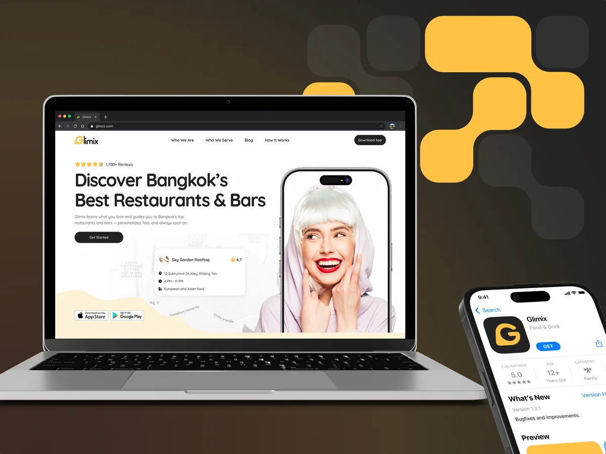
FoodTech · SaaS
Glimix
Redesigned a two-sided hospitality app for diners and venue owners, with an AI assistant, a new brand and the landing page.
- 200+ Screens designed
- 5 Experts on the pod
-
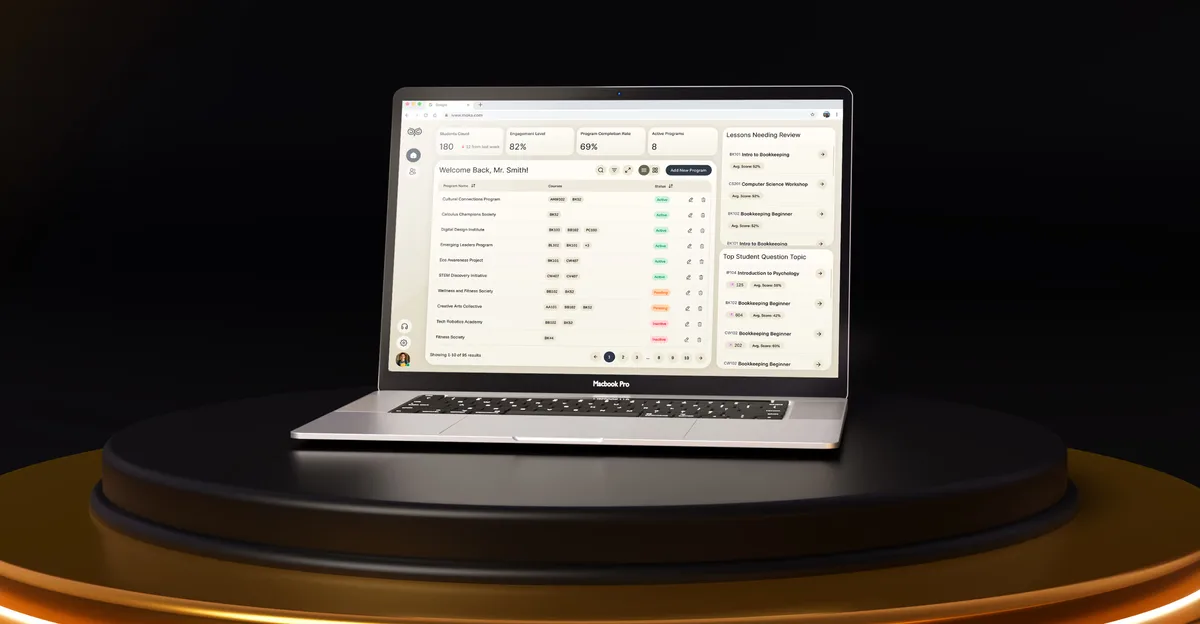
EdTech · SaaS
Moka
Designed an AI study assistant for students and the web tools their instructors and schools run it from.
- 200+ Screens designed
- 4 Experts on the team
-
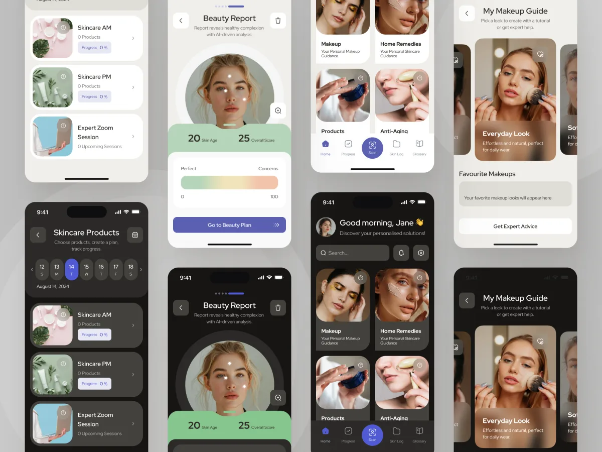
Beauty · Wellness · Mobile app
Forever Beauty
Audited and redesigned a live AI and AR beauty app screen by screen, inside the backend that was already running.
- AR Live-camera makeup steps
- 3 Visual styles explored