
AI beauty app, showing where products go
Forever Beauty is a consumer AI and AR app for skincare and makeup.We audited the live app, then redesigned it under a new brand.
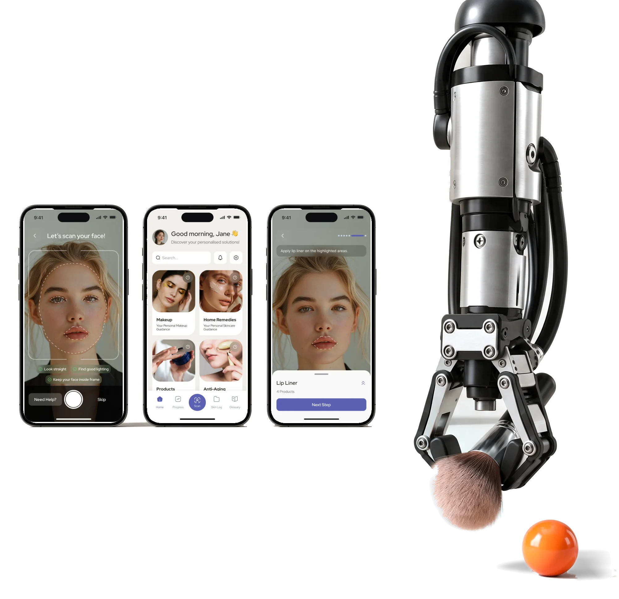
- AR
- makeup steps each shows on the face where the product goes
- Scan
- to plan a scan, a beauty report and a way back to it later
- 3
- directions tried on the same screens before one was chosen
Project summary
We carried a UX audit of Forever Beauty’s live mobile app into a complete UI redesign for iOS and Android. Research connected onboarding, face-scan reports, editable plans and live-camera makeup instructions into one routine. Light and dark modes, a new brand and a shared kit gave the client’s developers a coherent experience to build.
What the app asks of a person, in order
From the first login to a finished look, one path with a supporting cast of shortcuts:
-
Start
- Welcome and log in
- Password recovery
- Sign-up and verification
-
Get set up
- Beauty goals
- Time per day
- Reminders and a guide
-
Scan
- Photo capture
- Analysis
- Beauty report
-
Understand
- Details and history
- Statistics over time
- Rescan
-
Plan
- Personalisation
- Skincare plans
- Product recommendations
-
Apply
- Makeup guide
- Live-camera steps
- After-makeup help
-
Keep going
- Notes and skin log
- Membership
- Expert help
- First scan and Tenth scan
- The first one is walked through step by step; later ones have to stay quick.
- Personalised and Not personalised
- Every guide works for someone who shared their details and for someone who skipped them.
- The camera and The instructions
- A live picture and the words that explain it share one small screen.
Home, in the order a beauty routine needs it
- Found
- Home had to send a new user to a scan and a returning user to a plan, with the four kinds of help within reach and no second menu competing with the first.
- Decided
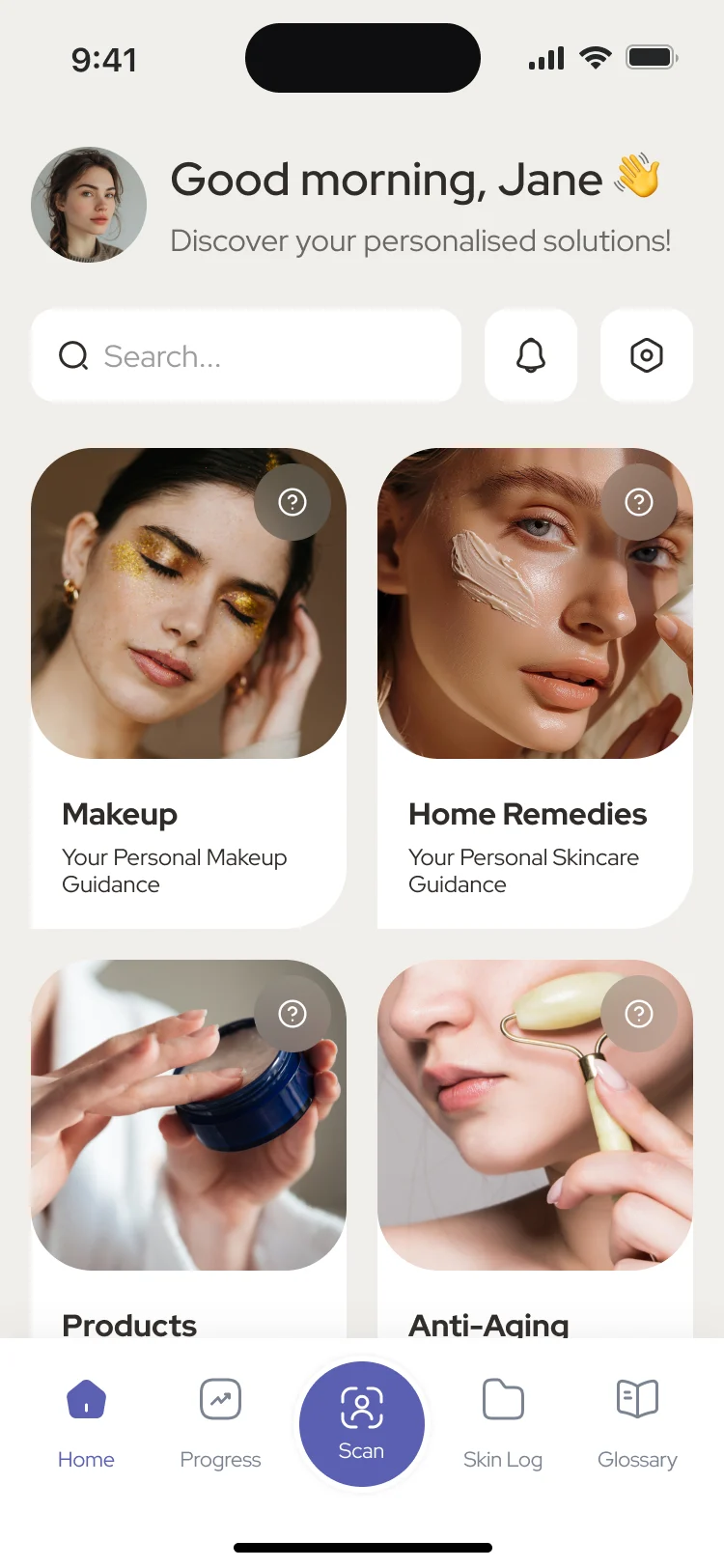
One order down the screen: a greeting, search, four large cards for the four kinds of help, and a tab bar with the scan button in the middle. Personal details and the upgrade sit below, out of the way.
Our UI/UX principles guide sets the customer-task priorities; Product redesign carries them into the existing interface. A new visual style earns its place when people can finish.
- For the user
- The home design puts the four areas of help and the scan entry point together so a person can choose their next task.
-
Who and when
A greeting and a line about what the app can do today.
-
Search
A question about a product or a remedy starts from the first screen.
-
Four ways in
Makeup, Home Remedies, Products and Anti-Aging, each with a photograph and one line.
-
Everywhere else
Home, progress, scan, skin log and glossary, with the scan in the middle.
How the work progressed
From an audit of the live app to a UI kit, one question closed at a time.
-
UX audit
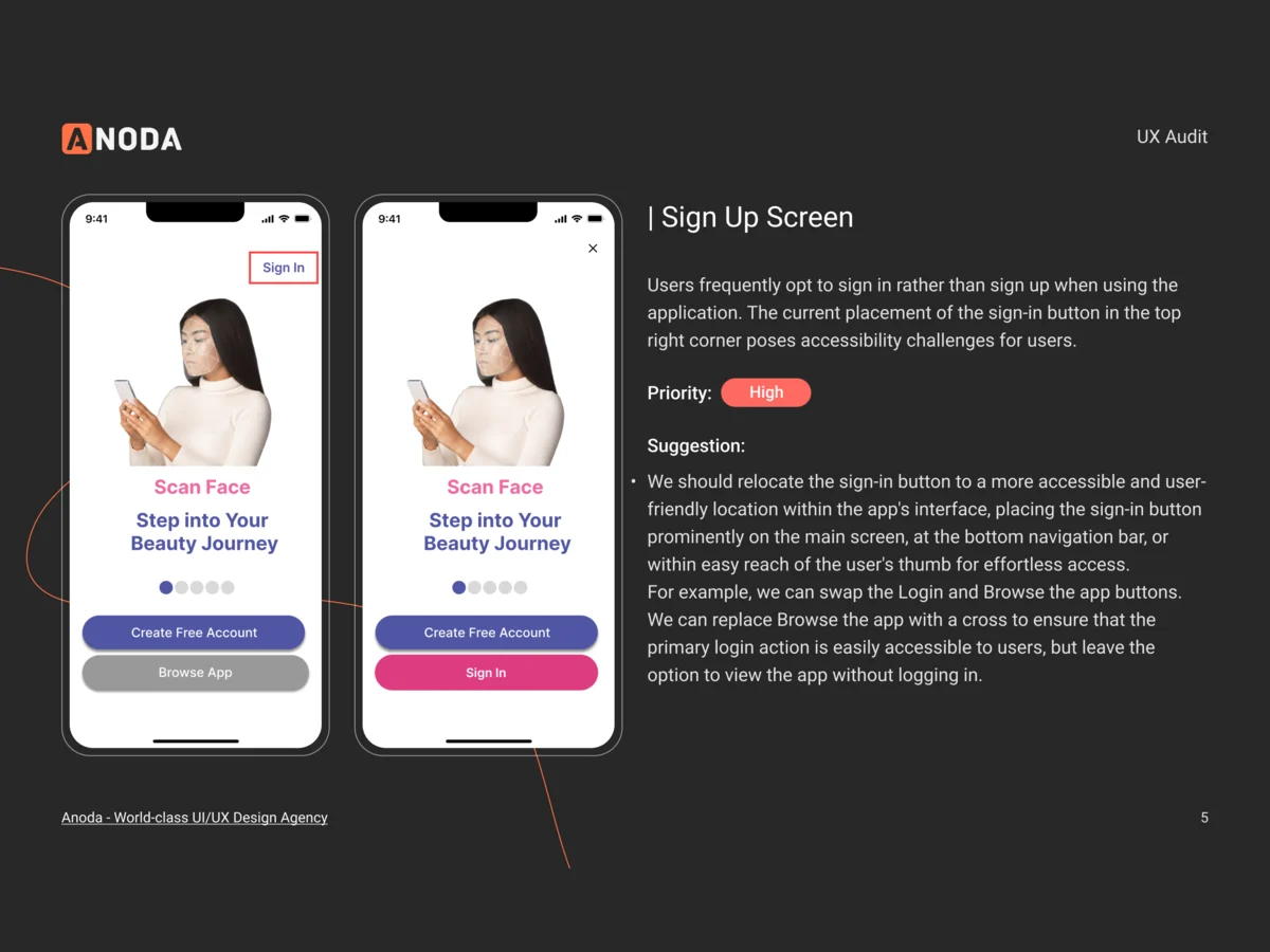
Where the live app confused people, ranked by how much it hurt
Artifact A screen-by-screen audit with a priority and a suggested fix for each finding
-
Competitor research
What other beauty and skincare apps already did before the redesign started
Artifact Competitor research
-
Information architecture
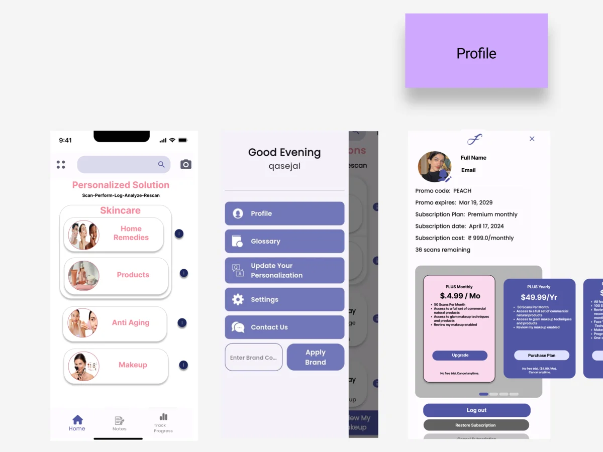
How the menu, the home cards and the personalisation should be grouped
Artifact Information architecture and user flows in FigJam
-
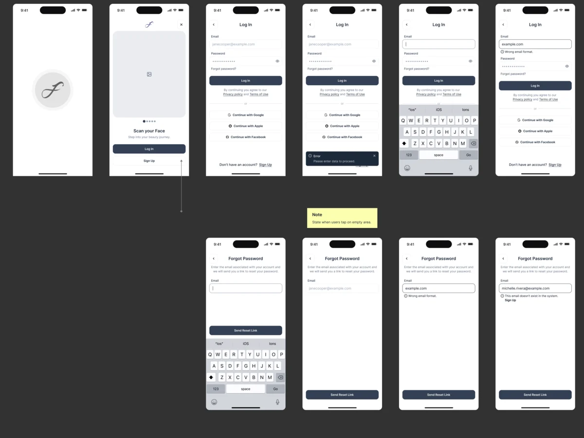
Wireframes
What each screen holds, before colour and photography
Artifact Black-and-white wireframes for every flow, with notes in the file
-
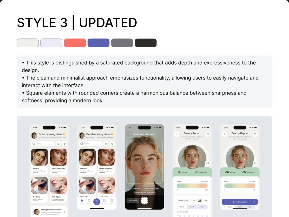
Visual directions
Which look the product should have, decided on real screens
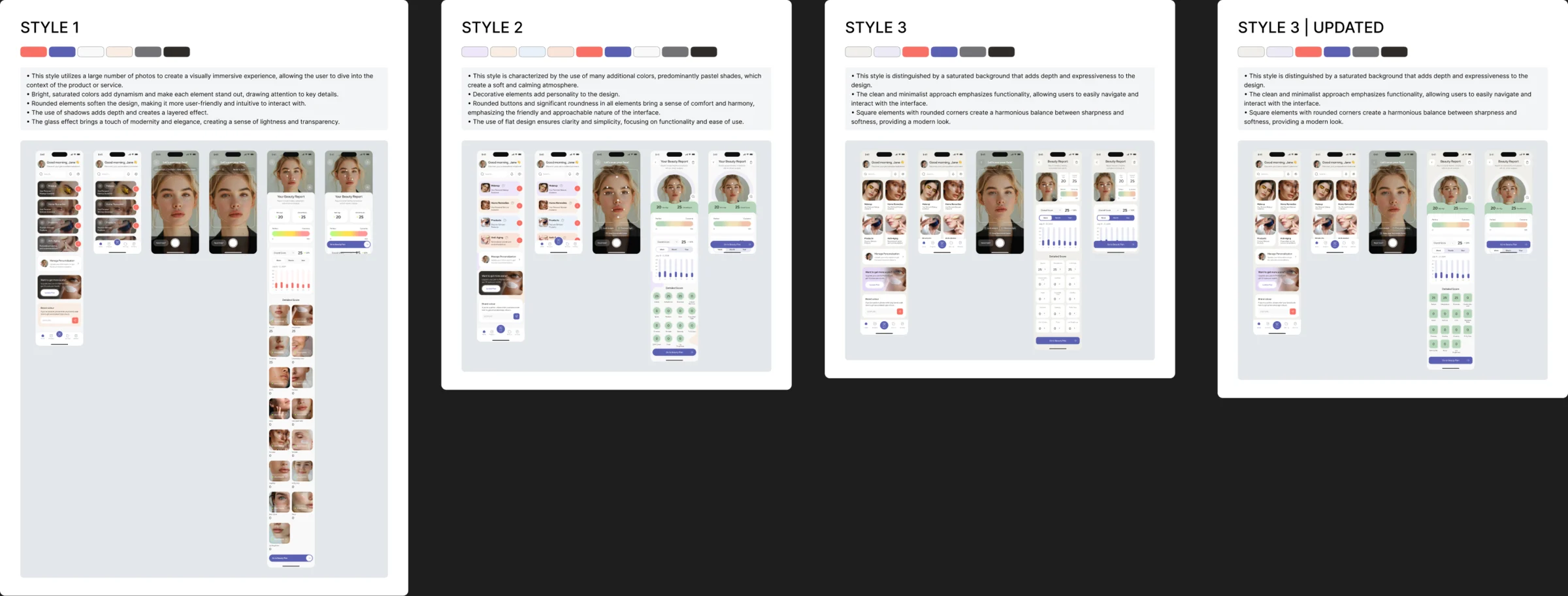
Artifact Moodboards, colour directions and three styles of the key screens
-
Brand and logo
A mark that works from the splash screen to the store listing
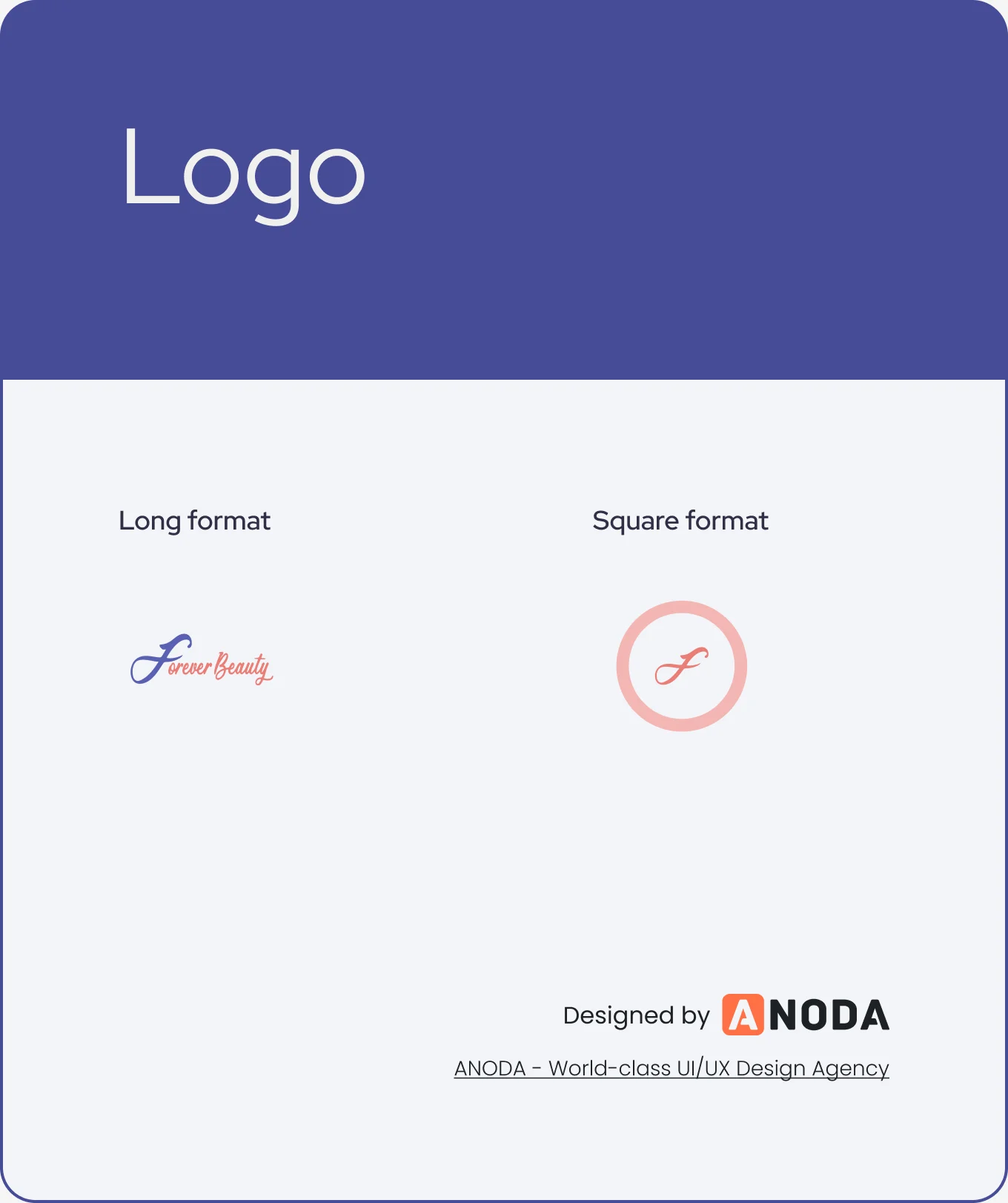
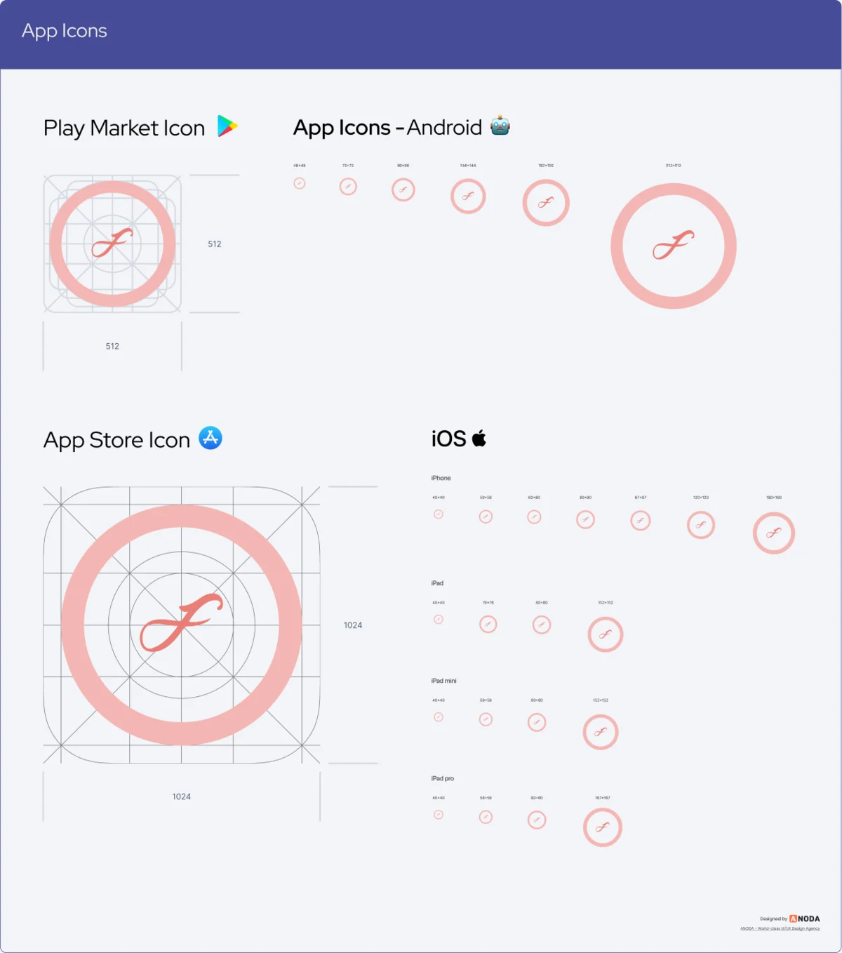
Artifact A logo in long and square formats, and the app icons
-
UI and design system
A calm, photographic interface for scanning, plans and makeup steps
Artifact The full mobile UI, a UI kit and reusable components

-
Delivery
What the client’s developers needed to build it without guessing
Artifact Client, work, audit and UI kit files in Figma
Every path mapped before it was drawn
- Found
- A scan has to be taken, checked and read; a sign-up has to reach it in a few steps; each of them needs a way back when the picture or the input is wrong.
- Decided
- Each flow was wireframed end to end with its branches first: the rescan, the errors, the bad result. Then one tab bar for the whole app.
-
Scanning and reading the report
From home through the scan, its analysis and the beauty report, then into the details, the history by week, month and year, and a rescan.
Open the full map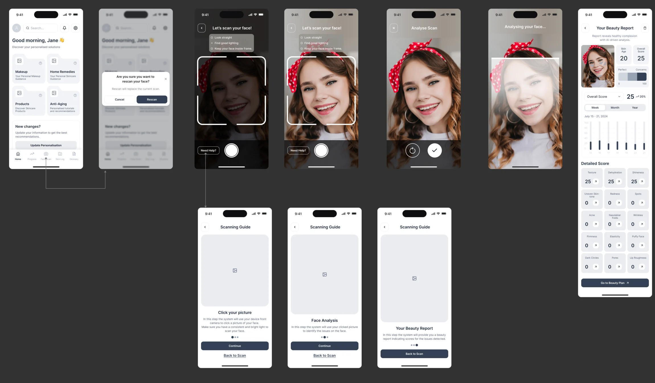
-
From sign-up to the first scan
Sign-up and its errors, verification, the account questions, then the first scan and a reminder for the next one.
Open the full map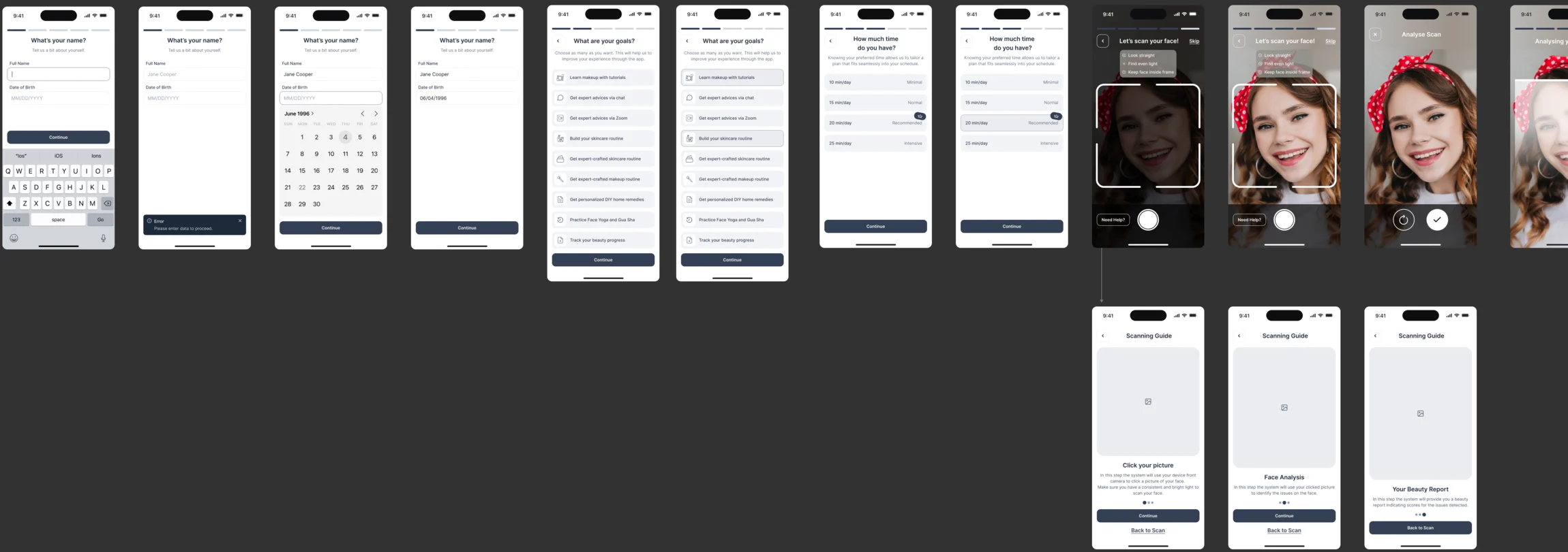
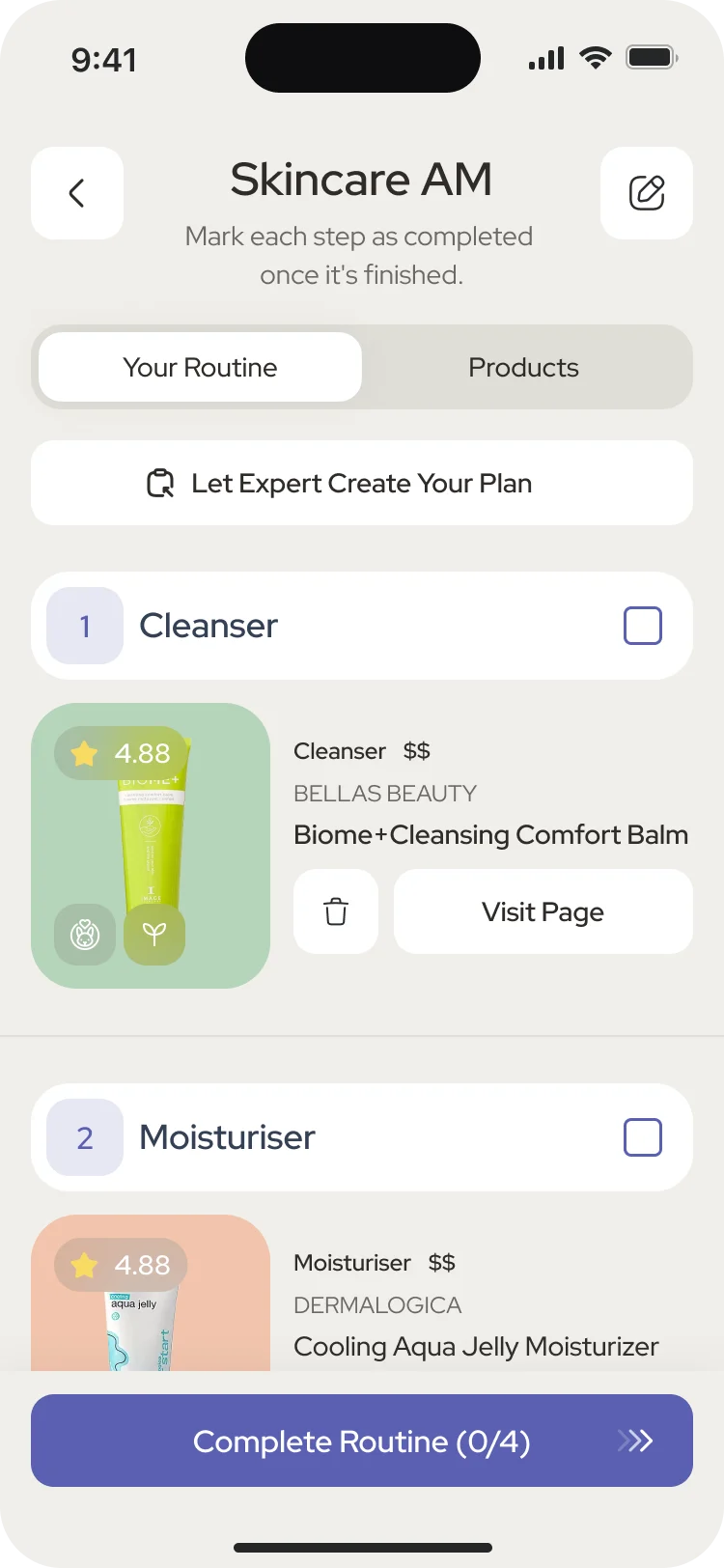
Nine jobs designed for the app
The makeup steps first, then the scan behind them, the plan, the details it runs on, the log that keeps it all, the membership, and the way in.
Our 2025 UX trends review follows the AR camera task through permission, readable instructions and recovery when the picture cannot be used.
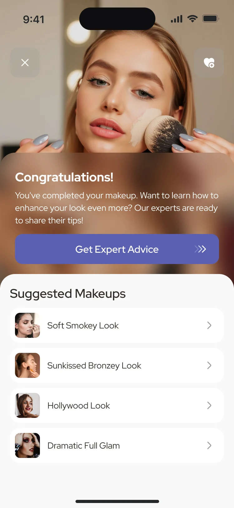
Makeup steps on the live camera
- Found
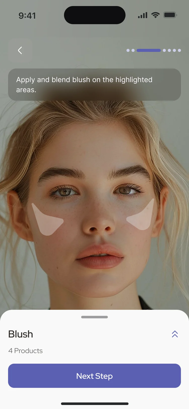
- Written makeup steps are easy to misread; the person needs to see where a product goes on their own face while they are doing it.
- Decided
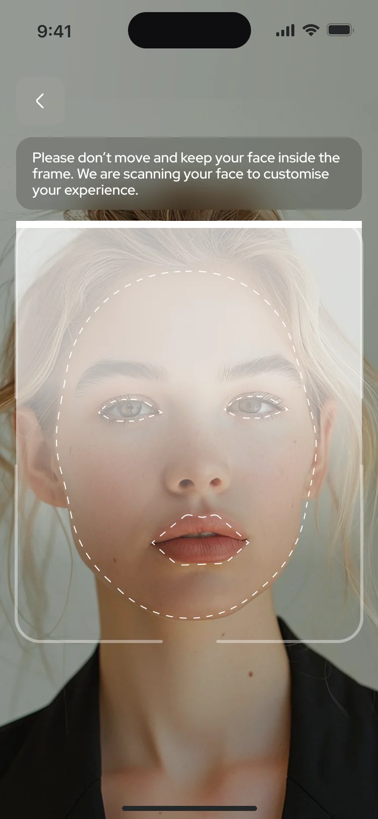
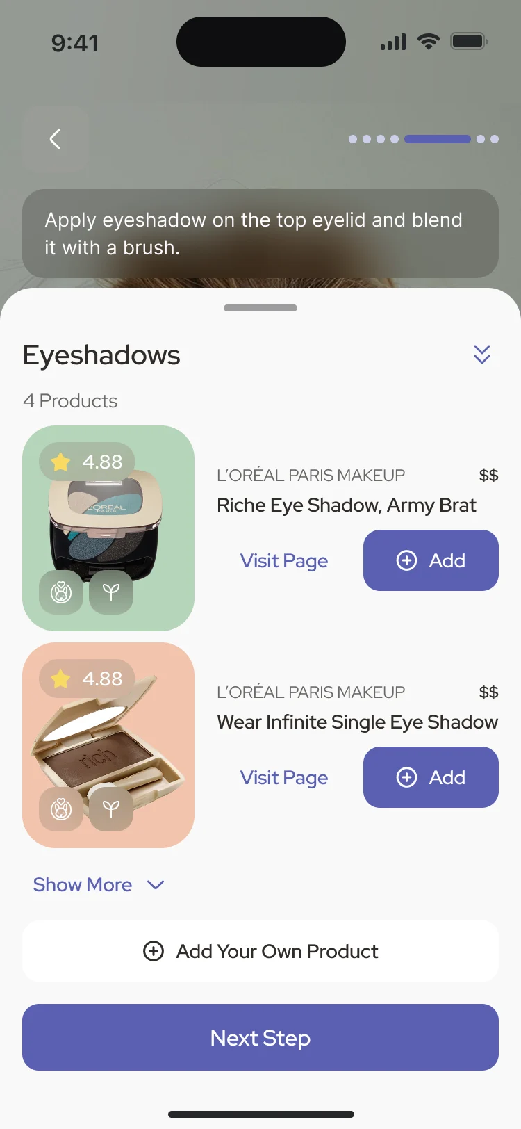
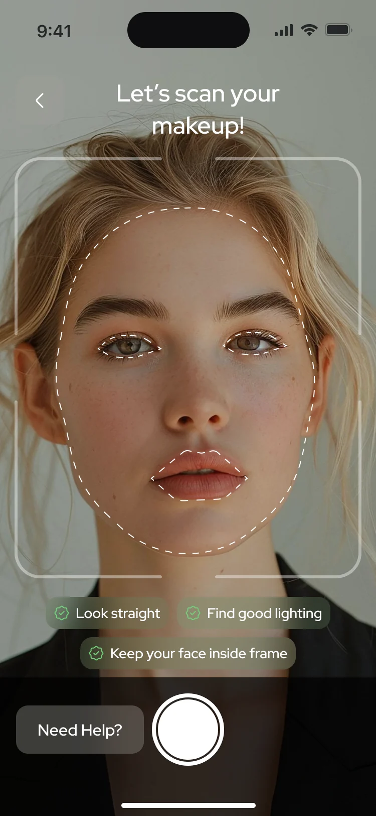
- Each step is drawn over the camera view: the areas to cover are highlighted on the face, the products for the step wait in a sheet below, and one button moves on, up to a finish that offers expert advice.
A scan that ends in a report
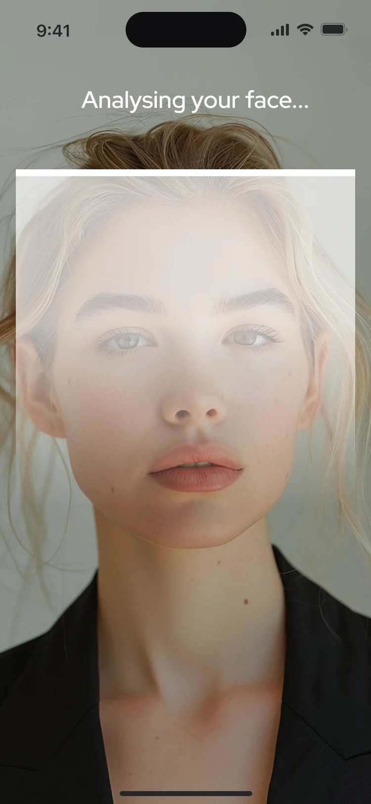
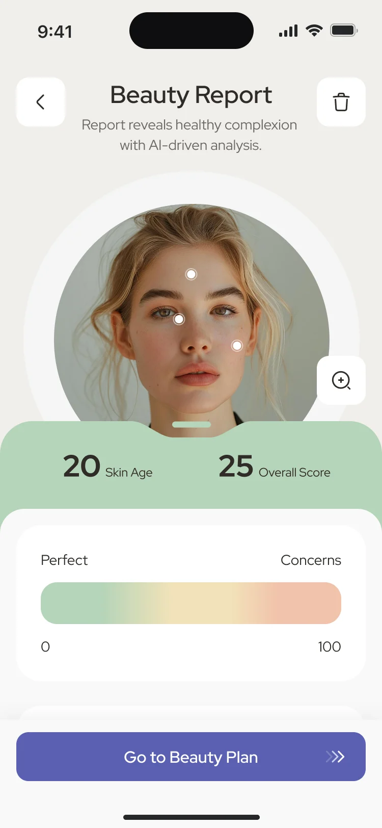
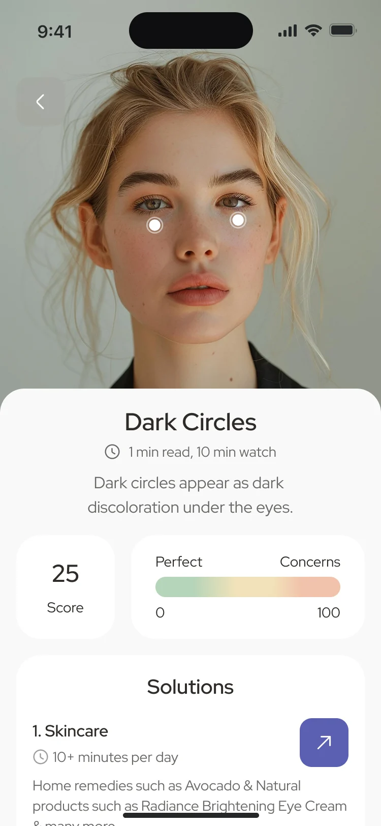
- Found
- A face scan is a lot to ask at the start; the result has to be worth it and readable in one look.
- Decided
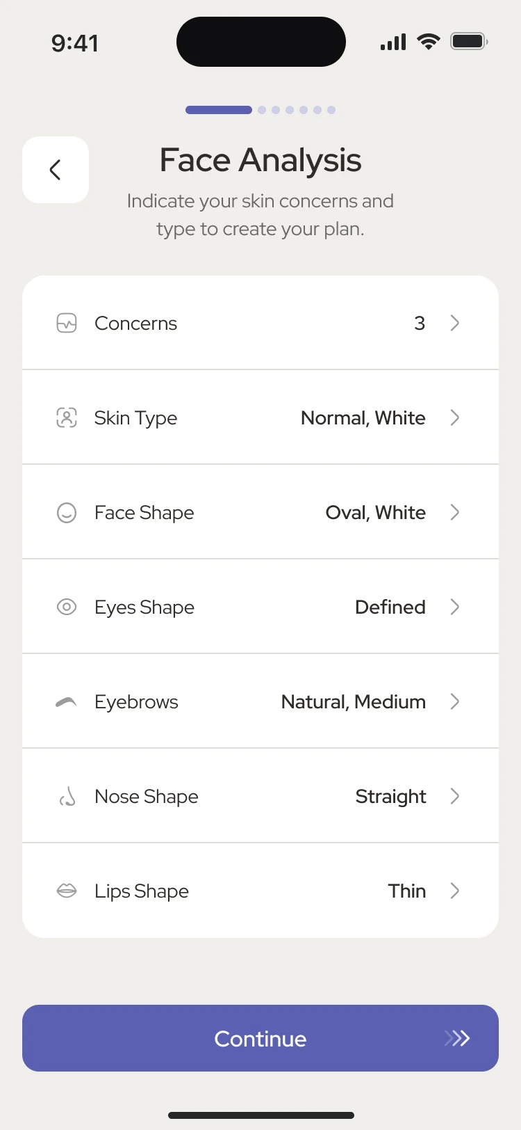
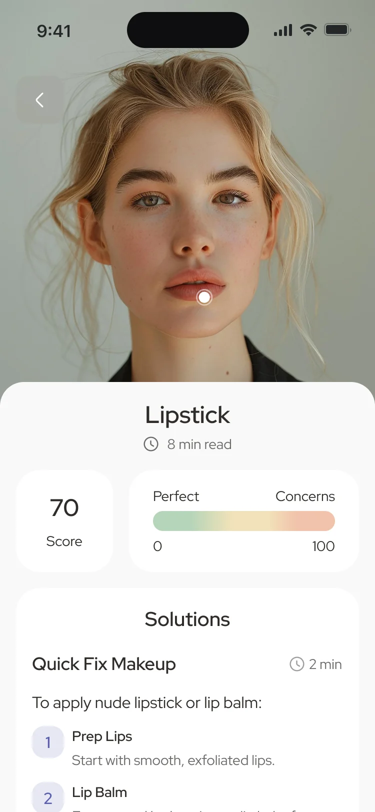
- A guided scan, an analysis state, then a report: two headline scores, a range bar, the history by week, month and year, and every measure listed, each opening into what it means and what to do.
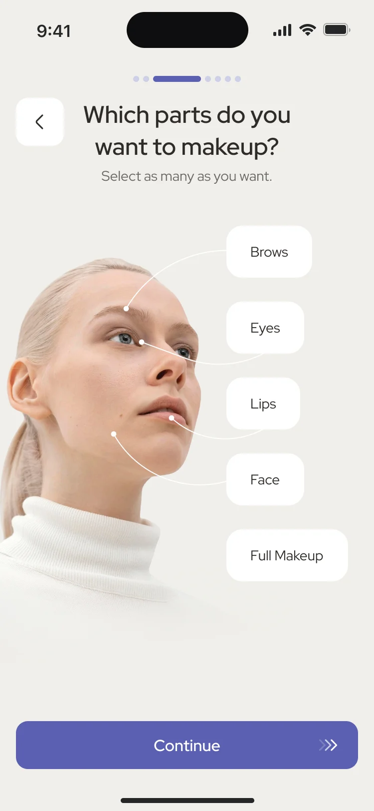
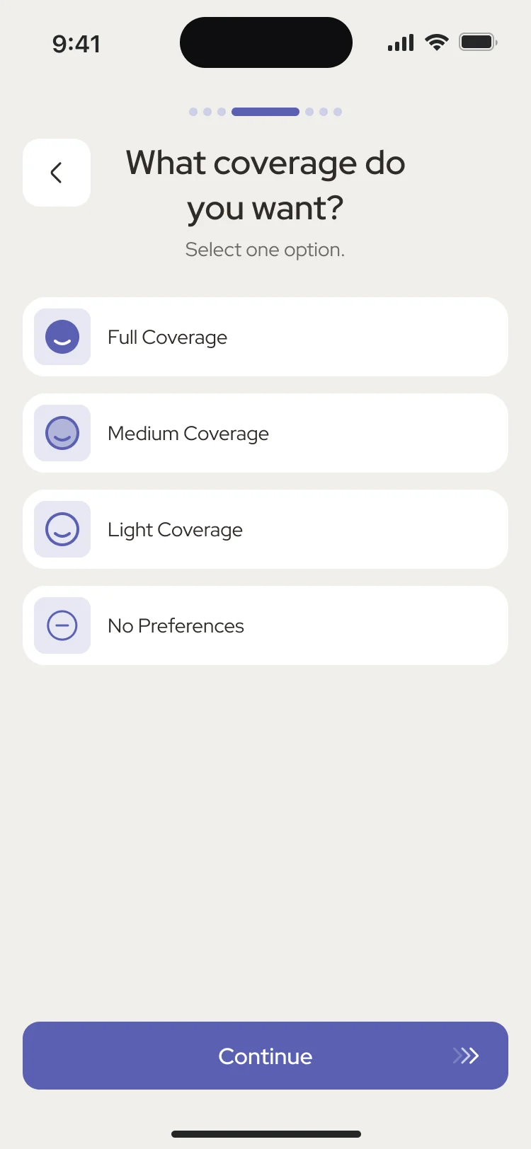
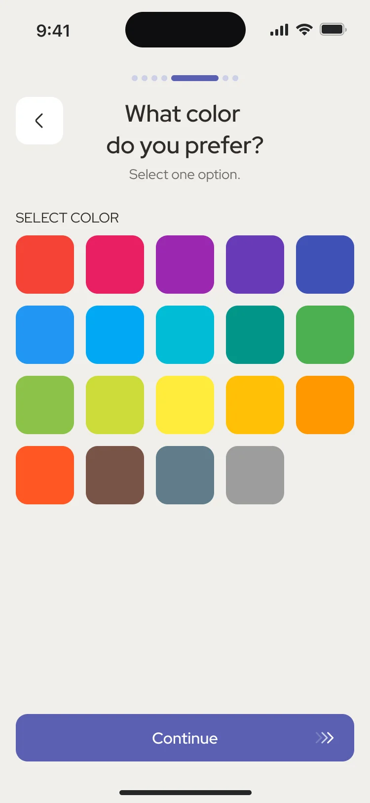
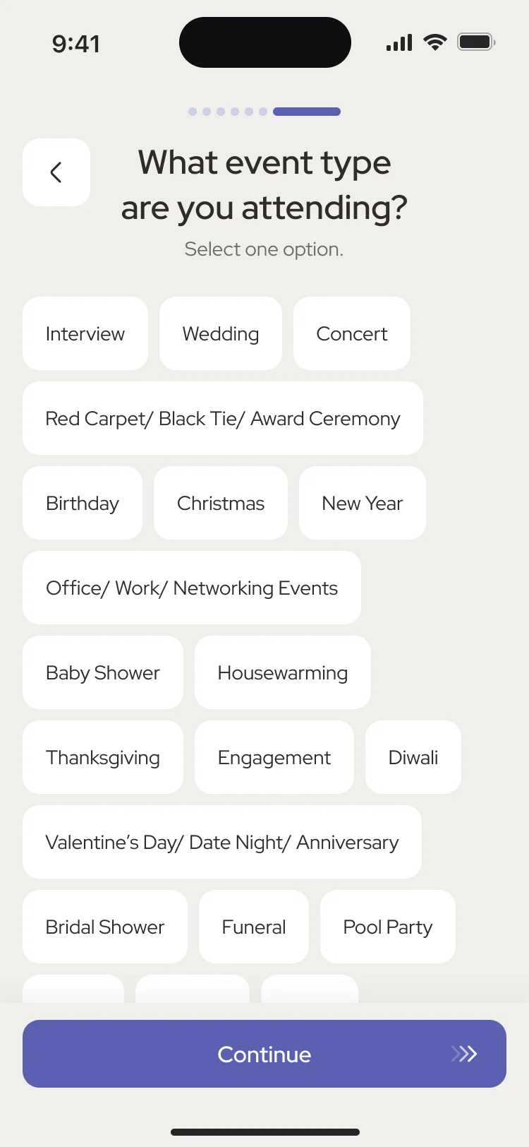
A makeup plan built from a few taps
- Found
- Makeup advice depends on the parts of the face, the coverage, the colours and the occasion; asking for all of it in one form creates a risk of overload and abandonment.
- Decided
- One question per screen, with Continue at the bottom, so the guide that follows fits the person and the day.
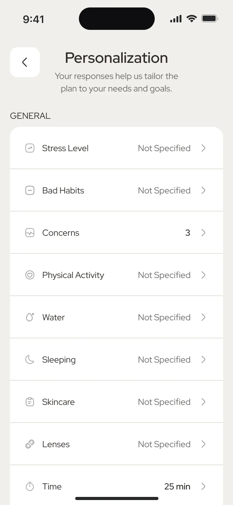
Personalisation that stays editable
- Found
- Personal details drive every plan, but nobody wants to repeat onboarding to change one of them.
- Decided
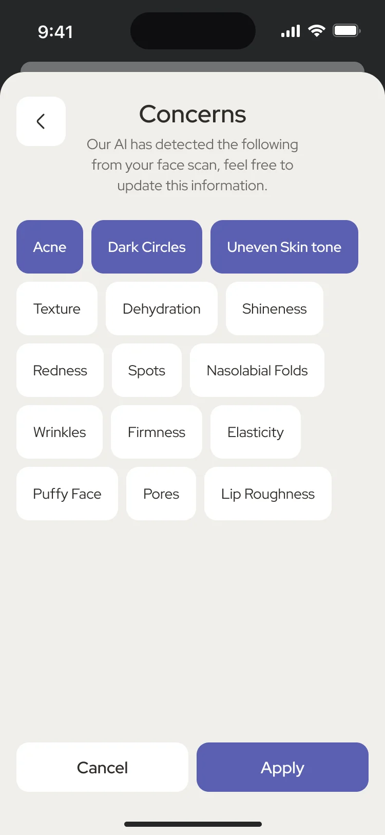
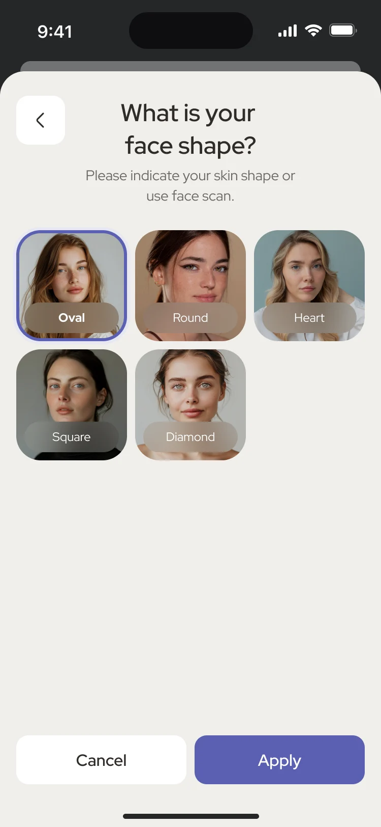
- One list of everything the app knows, grouped as general, makeup and environment. Each row opens a single question, and the concerns arrive pre-filled from the scan.
Products, and an expert when you want one
- Found
- Recommendations are only useful if people can keep the products they own and ask for help without leaving the app.
- Decided
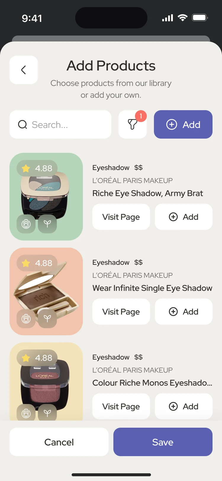
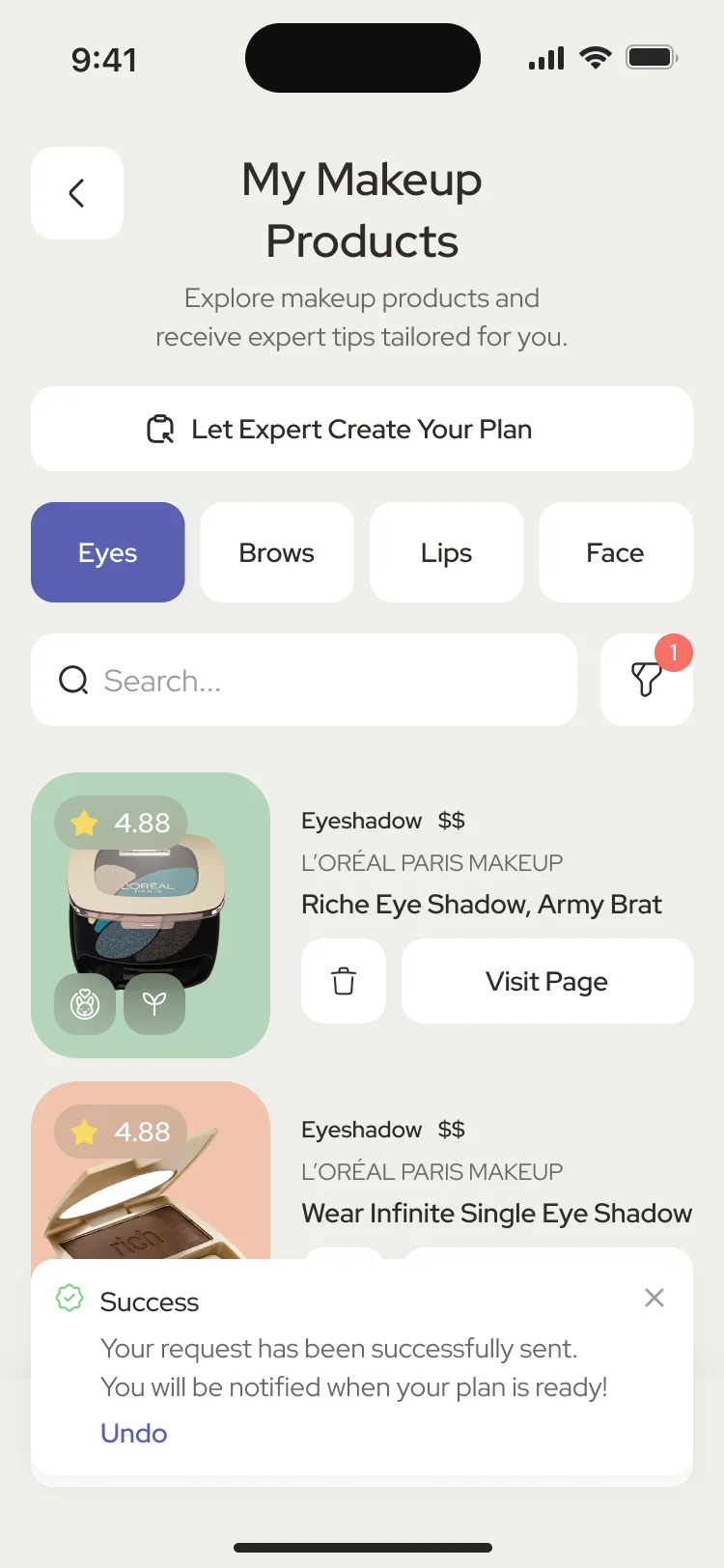
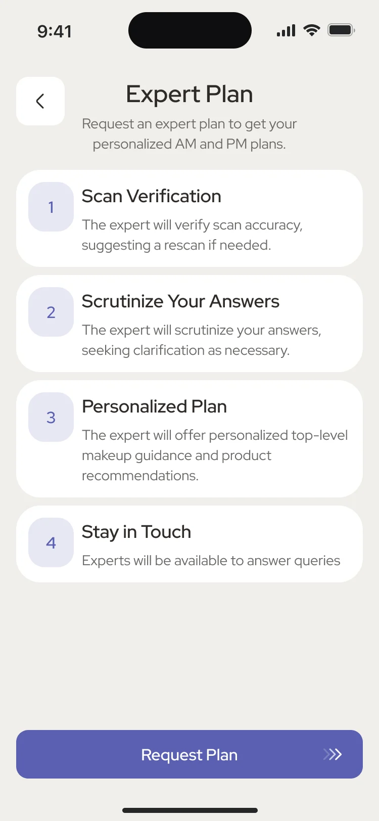
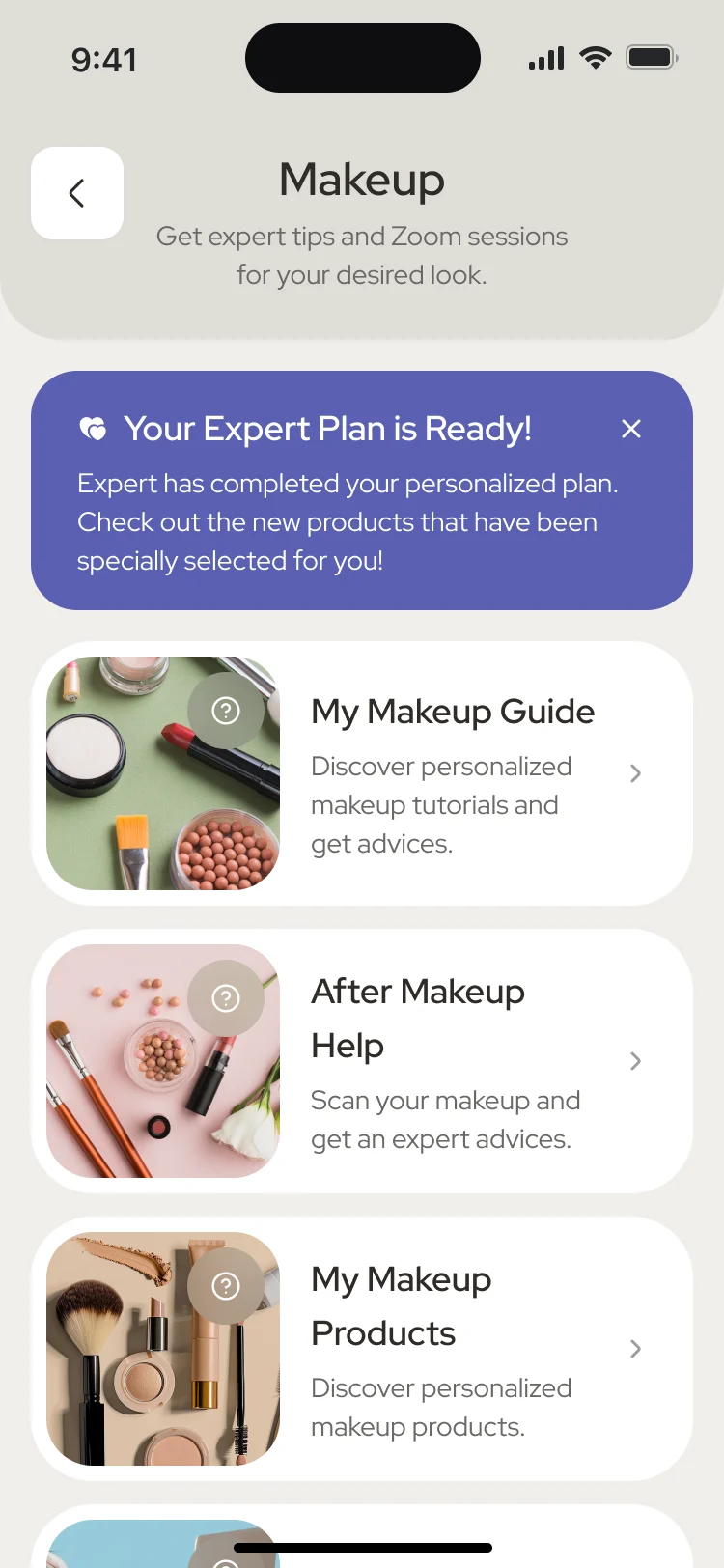
- A library to add products from, a personal list by area, and a request for an expert-made plan with its steps explained, then a home that says when the plan is ready.
Help after the makeup is on
- Found
- A person can finish a look and still not know what is off; asking for help has to be as easy as taking a photo.
- Decided
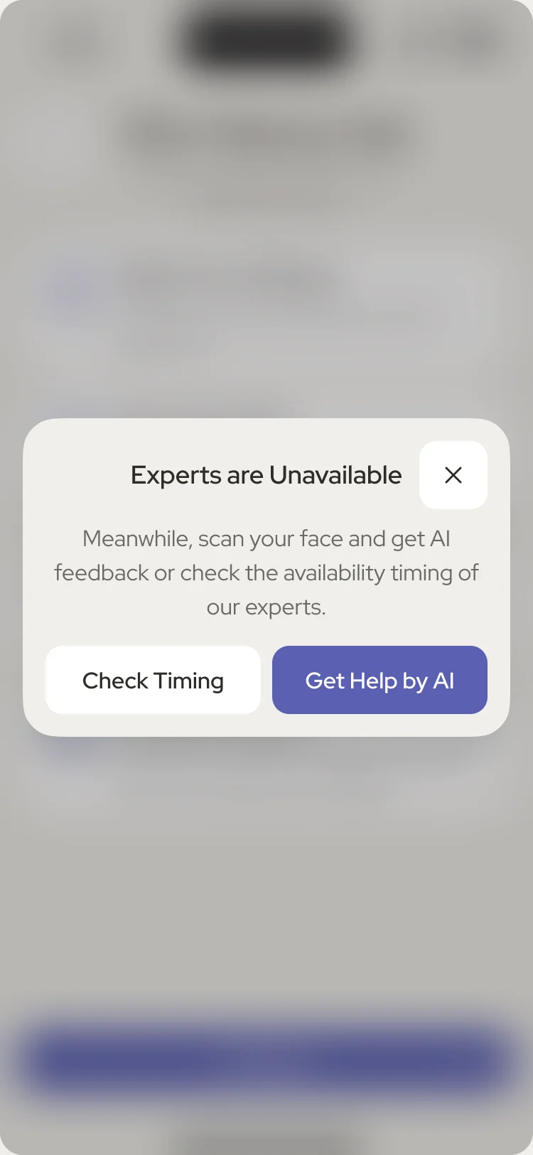
- After Makeup Help explains its four steps, says plainly when experts are unavailable, and offers an AI scan of the makeup in the meantime.
A skin log that keeps the routine together
- Found
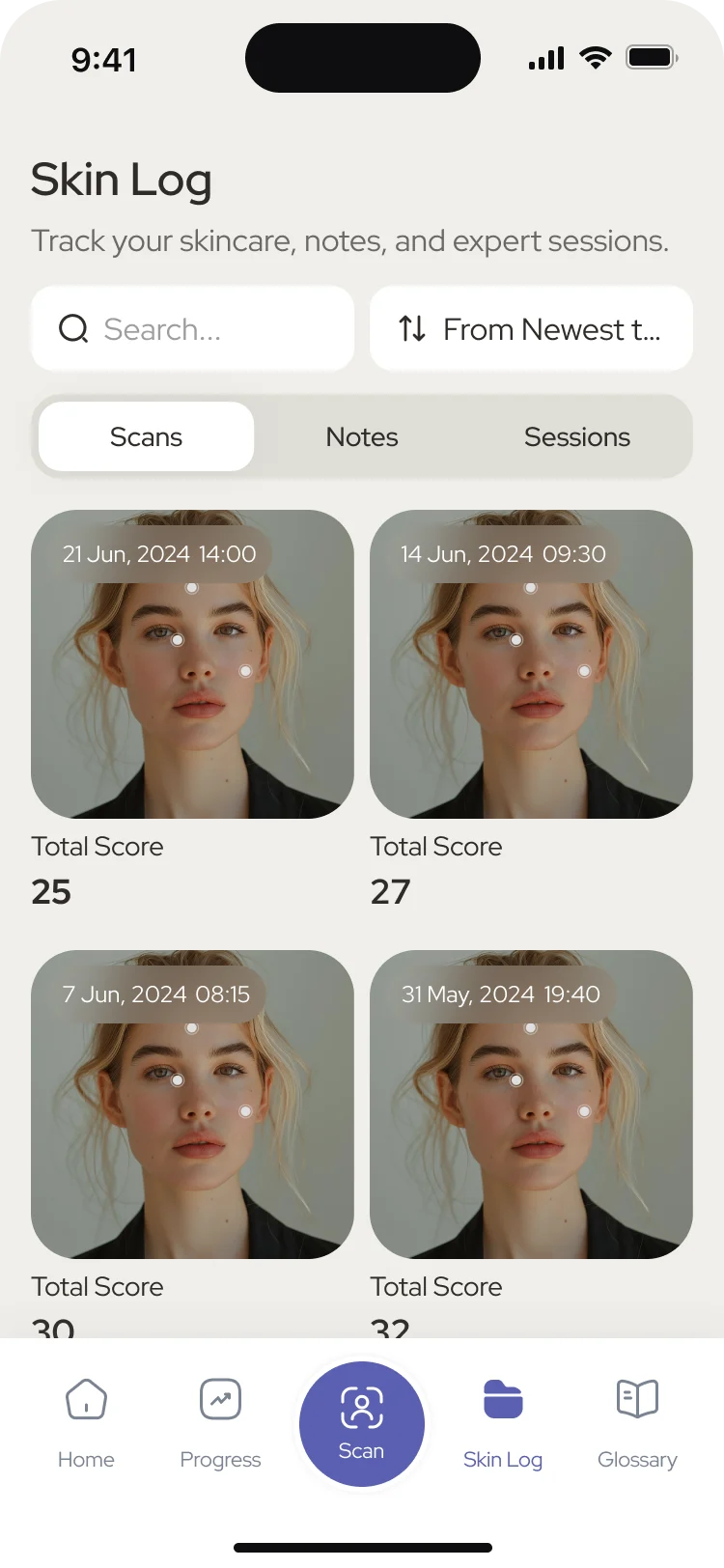
- Scans, observations and answers from an expert end up in different places, and a routine is hard to keep when its history is scattered.
- Decided
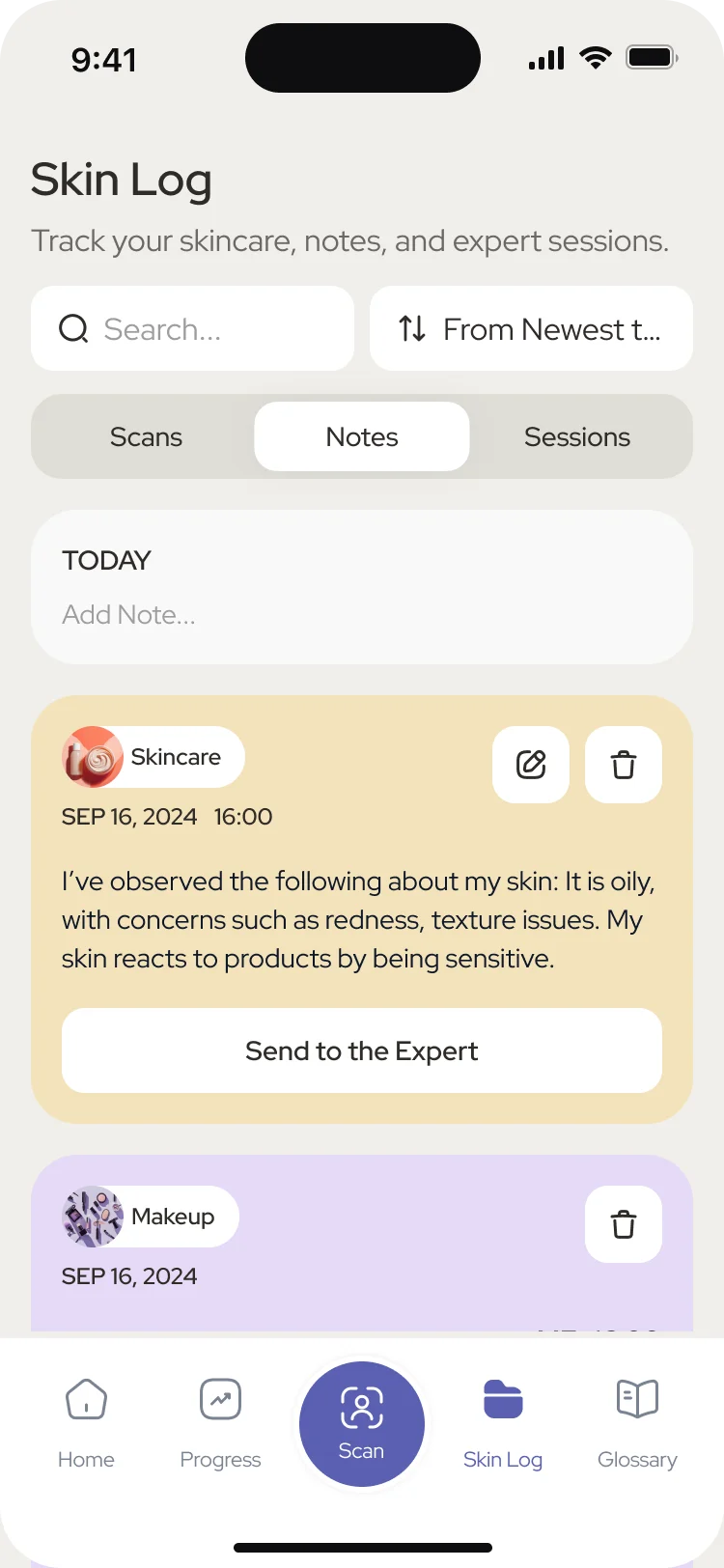
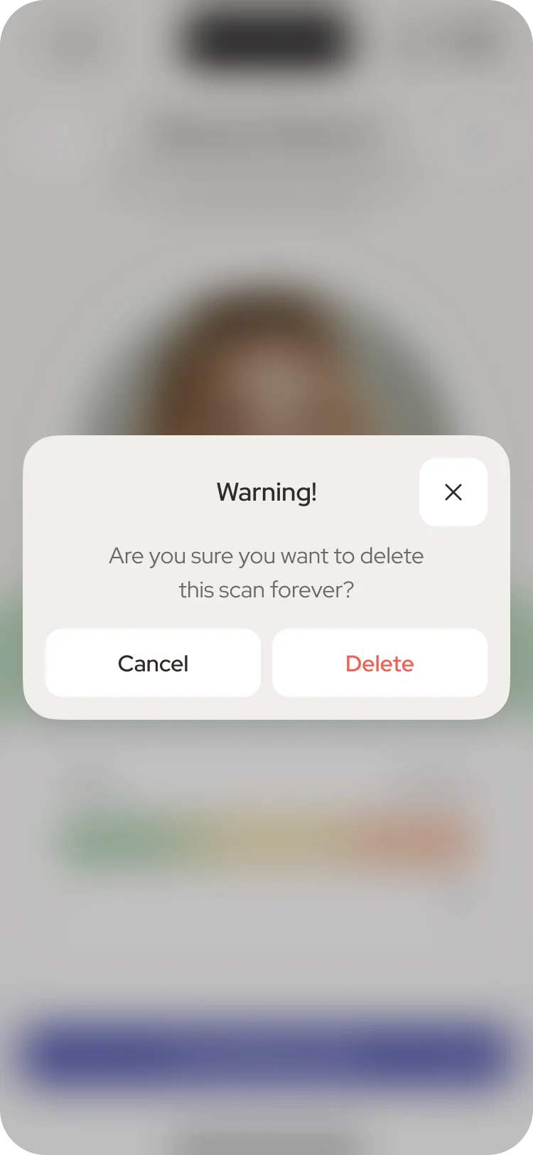
- One Skin Log tab with scans, notes and sessions side by side: every scan with its date and total score, notes sorted by category and sent to an expert from the same card, and a clear warning before a scan is deleted for good.
Two memberships, told apart at a glance
- Found
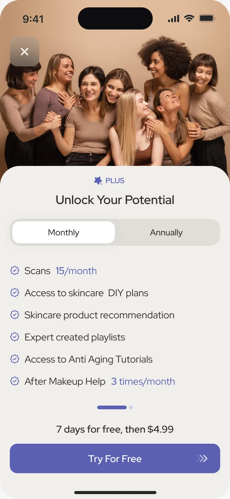
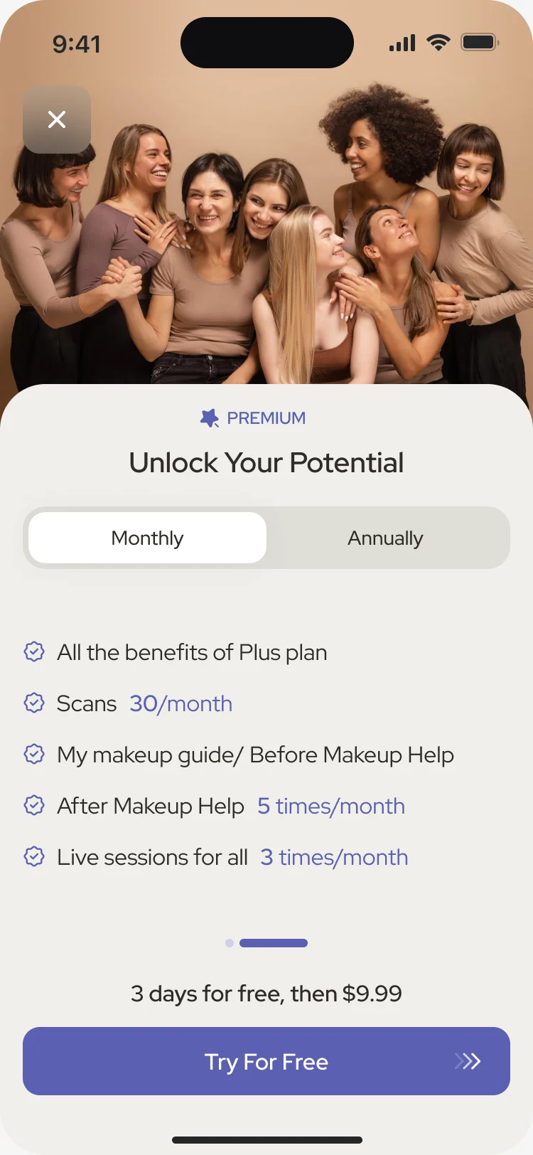
- Two paid plans that differ in how many scans and expert sessions they include are easy to mix up on a small screen.
- Decided
- One screen per plan, switched by a swipe: what the plan includes, with the monthly limits set in the accent colour, the monthly or annual switch, and the free trial and the price after it stated above the button.
Getting in, and getting started
- Found
- Sign-up asks for a face and a routine before it has given anything back; extra questions add effort before the person sees the value.
- Decided
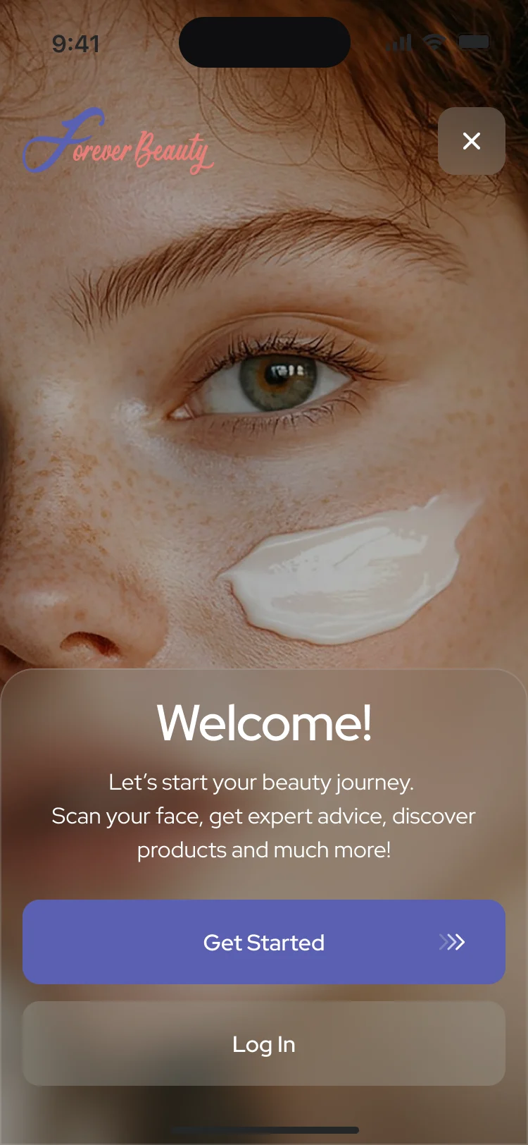
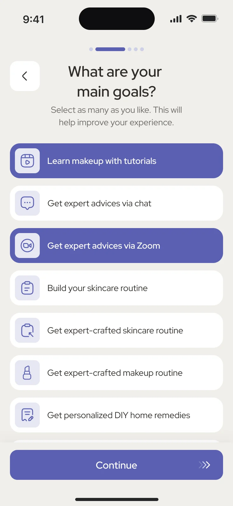
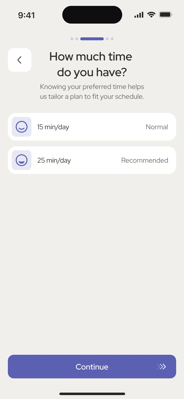
- A welcome that says what the app does, then short screens for goals and daily time, each with its own error and a way back.
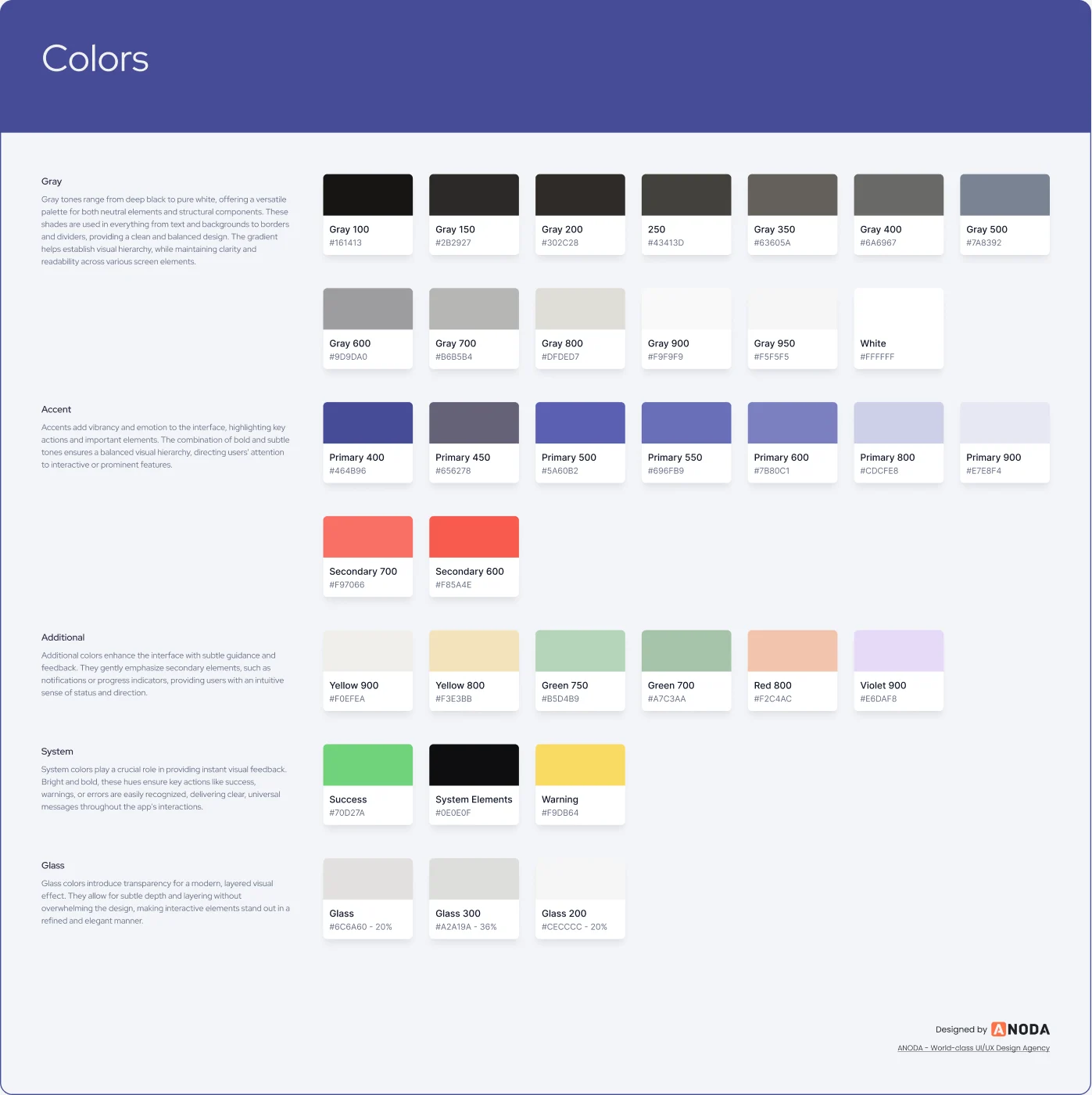
A mark, three styles and a palette to design with
- Found
- The product had to read as one brand from the splash screen to the last card, and the direction had to be chosen on real screens, not on a moodboard.
- Decided
- We drew the logo in a long and a square format, tried three visual styles on the same key screens, and carried the third into the product, with its colours and app icons in the kit.
One score card, and a screen for every bad moment
- Found
- A scan, a makeup report and a search that finds nothing each had to look like the same app, and error screens are where a consumer product loses trust.
- Decided
One score card for skin and for makeup, one look for the states around them, and a system screen for the moments that go wrong.
Our accessibility guide shows why readable controls and clear steps belong in the redesign from the start.
The same score card for skin and for makeup
The skin report and the makeup report share one card: two scores, a range bar and the detail below.
-
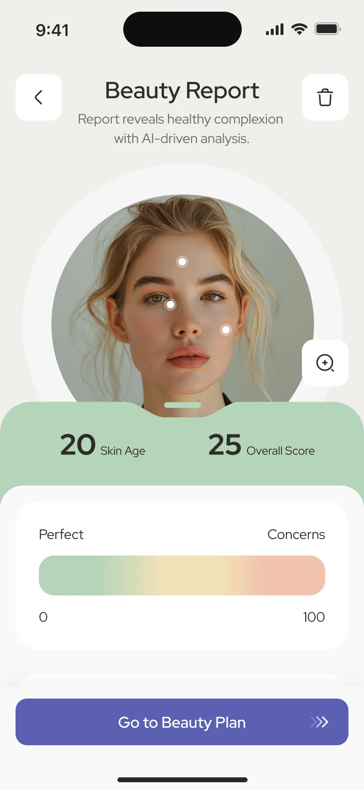
Beauty report: The face scan’s result. -
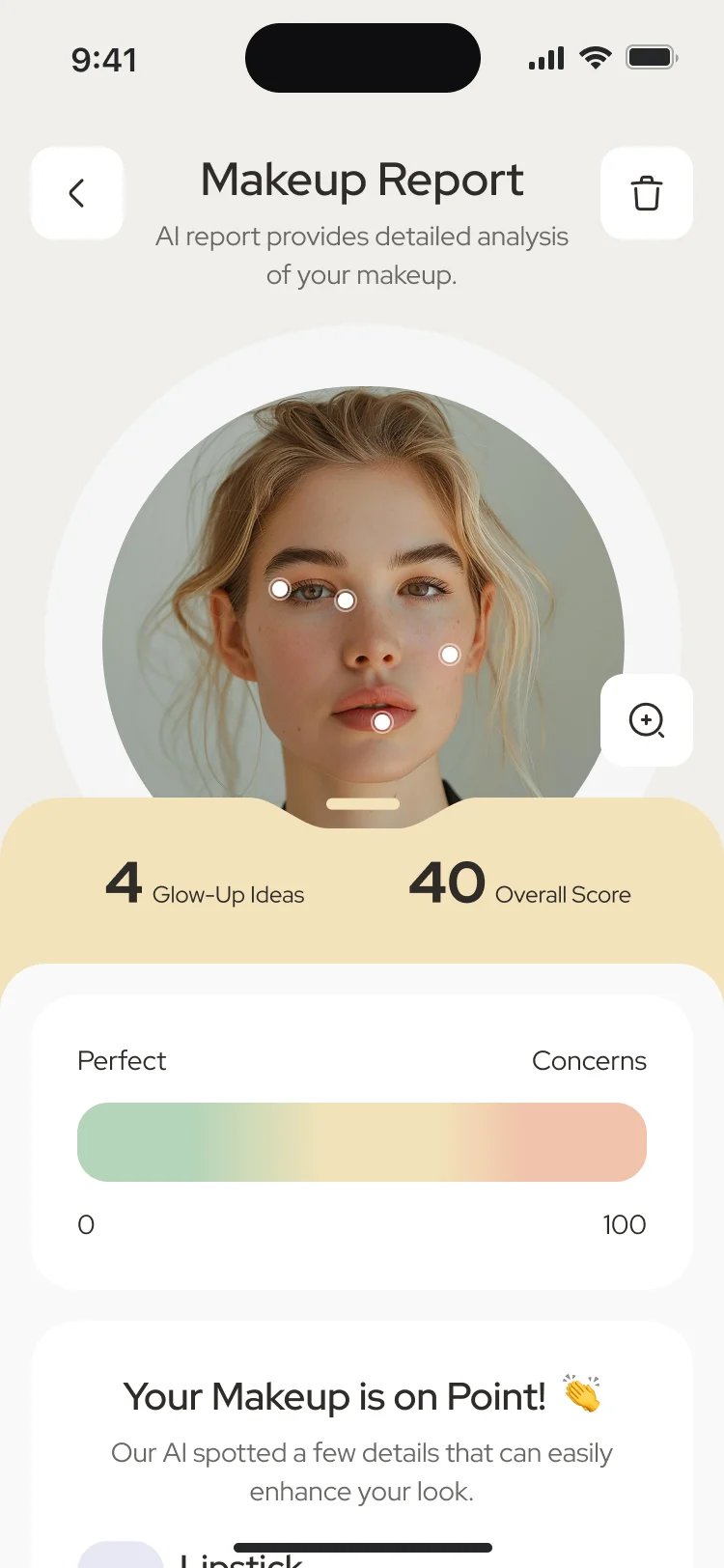
Makeup report: The makeup scan’s result.
Drawn for the moments that go wrong
Nothing found, a failed sign-in and a scan that can’t be used each say what happened and what to do next.
-
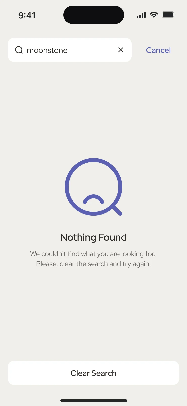
Nothing found -
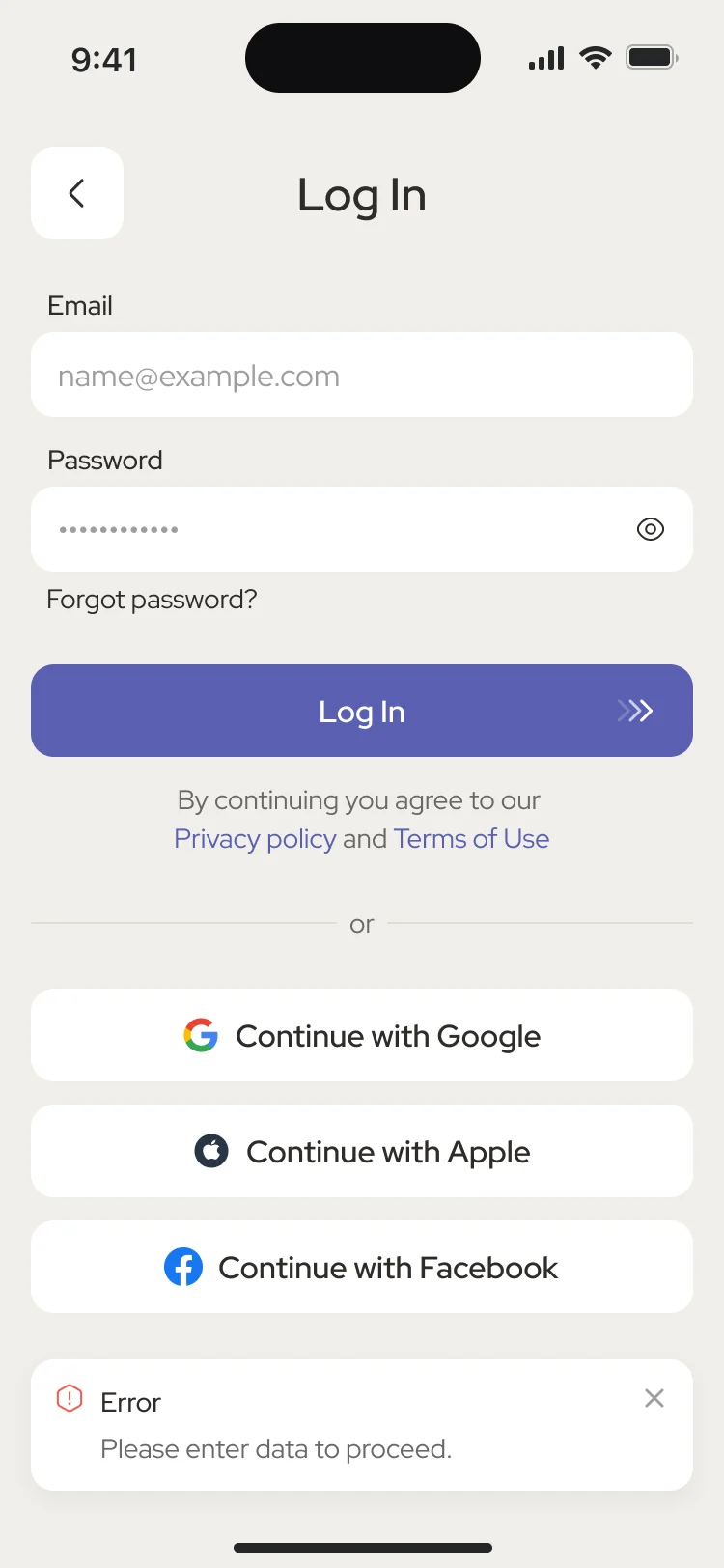
Sign-in error -
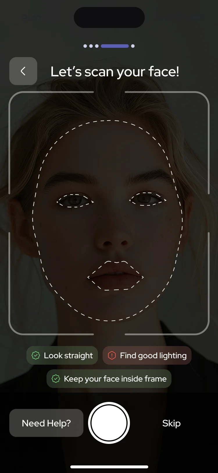
Scan error
Where the product ended up
One design for the whole routine: a way in that asks little, a face scan that ends in a readable report, personalised plans that stay editable, and makeup steps drawn on the live camera, from the first sign-up to help after the makeup is on.
Delivered for iOS and Android as client, work, audit and UI kit files; building the app and its AI and AR stayed with the client’s team.
- live-camera makeup steps, designed
- AR
- visual styles explored, one chosen
- 3
- one cross-platform design
- iOS + Android
In the client's words
Our product had become outdated, and we knew it needed a substantial rethink. ANODA started with a thorough UX audit that helped us understand where users were struggling, which parts of the experience needed the most attention, and what to prioritise. They then turned those findings into a redesign that felt like a huge step forward—modern, intuitive and visually polished. We appreciated how they challenged what wasn’t working while respecting the technical constraints of the existing product. The transformation went well beyond appearance; it gave us a clearer, more cohesive product and a direction we were excited to move forward with.

What does your scan do when the picture is bad?
In Forever Beauty, a scan taken in poor light is flagged on the screen itself with what to fix, and the flows were drawn with the rescan and the bad result in them. Show us your scan flow, and we’ll show you where it strands people.
More work like this
Three more consumer apps with a habit, an assistant or a live-product redesign inside.
-

FoodTech · SaaS
Glimix
Redesigned a two-sided hospitality app for diners and venue owners, with an AI assistant, a new brand and the landing page.
- 200+ Screens designed
- 5 Experts on the pod
-
Wellness · Healthcare
Clearwater Wellness Co.
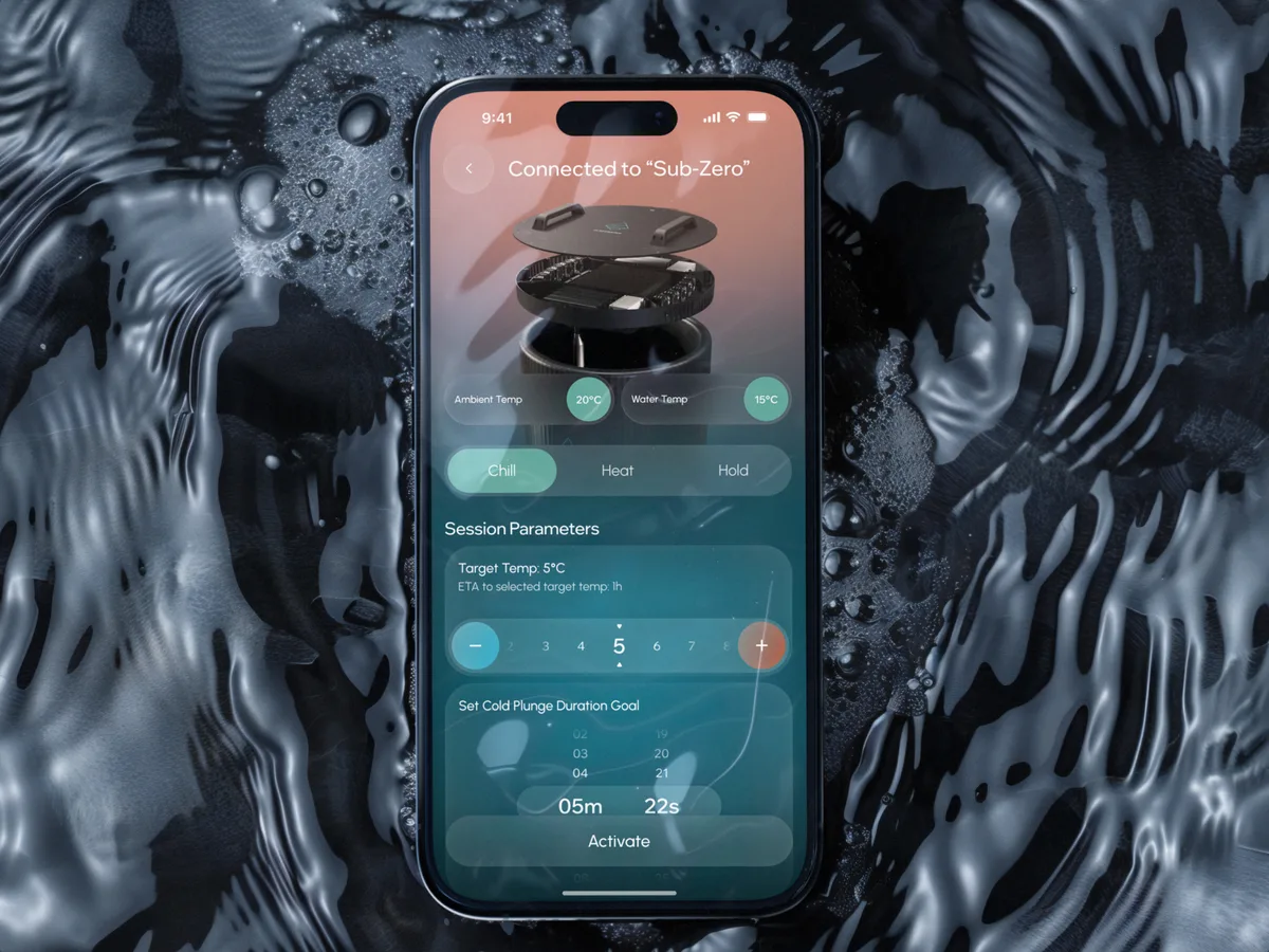
Designed a connected cold-plunge app and the habit and community product around it, from device setup to crews and challenges.
- 306 Screens designed
- 4 Experts on the team
-

EdTech · SaaS
Moka
Designed an AI study assistant for students and the web tools their instructors and schools run it from.
- 200+ Screens designed
- 4 Experts on the team
What we brought to Forever Beauty
The product
The work
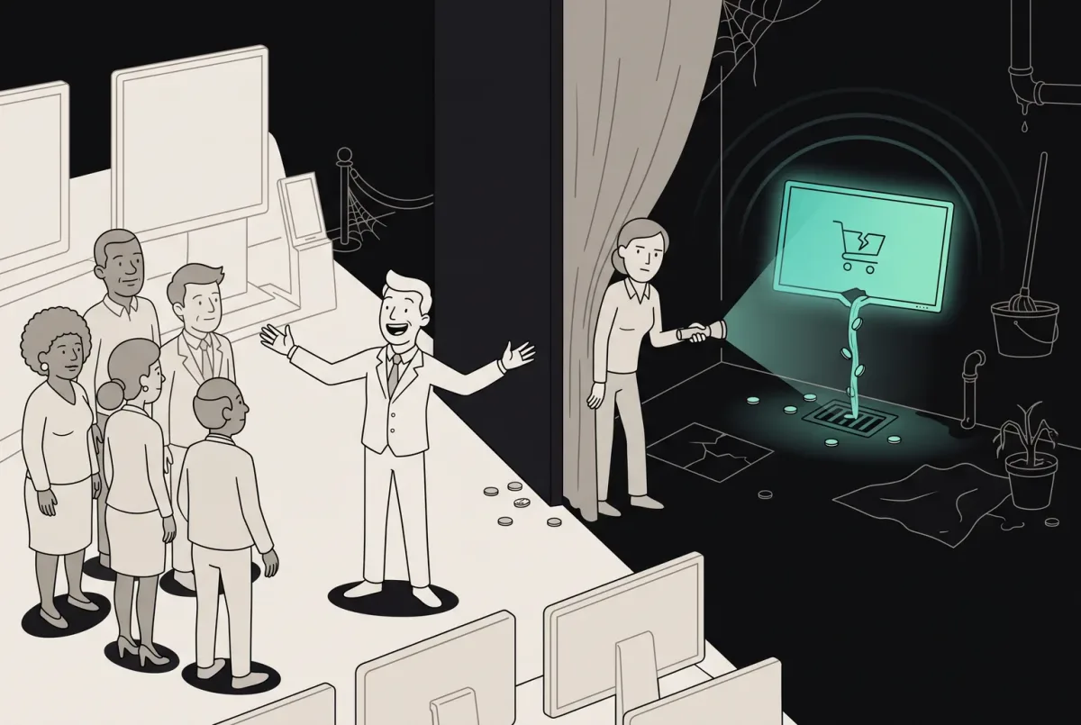
Your Product Is Leaking Money on 11 Screens You Forgot Existed
Your product leaks revenue on overlooked screens. Find the 11 neglected journeys and see how ANODA fixes the gaps your roadmap keeps missing.