In this article
- Real cases: the states around the main action
- A landing page — yes, even for your beta
- Transactional emails
- UX analytics — not business analytics
- A recurring UX audit you actually do
- A/B test hypotheses (not just A/B tests)
- Empty states, error states, edge cases
- The first 60 seconds after signup
- The pricing page
- Settings, account, and profile pages
- The cancellation flow
- UI/UX QA of the implemented design
- What this list adds up to
- In conclusion — a note for CMOs and Product Managers
- Work with ANODA
In this article, you will learn which 11 product screens most teams never design properly — and how each one is quietly affecting the metrics your CFO actually tracks.
Most product teams obsess over the same five screens. The dashboard. The main feature. The signup form. The home page hero. The pricing comparison.
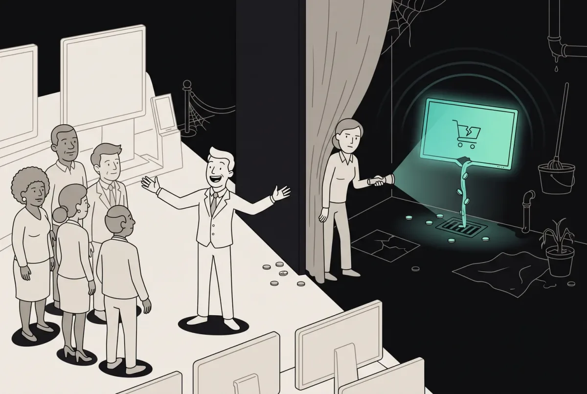
Meanwhile, half a dozen surfaces nobody designed are quietly killing conversion, retention, and trust. The work was done — somebody had to make decisions about these screens. The work just wasn’t designed. It was hacked together by an engineer at 11pm using whatever the framework gave them by default.
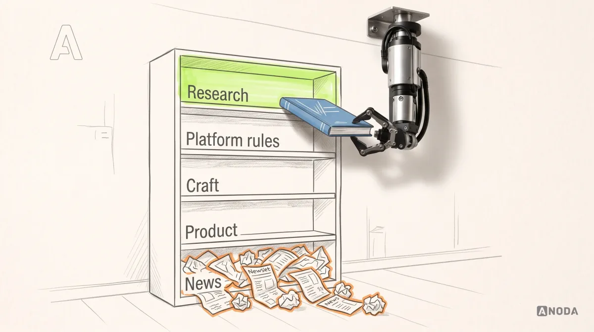
Here are the eleven things almost every team forgets about. Every neglected surface keeps charging you in lost users, support explanations and work your team has to reopen.

Everyone optimizes the dashboard. Nobody fixes the journey.
Real cases: the states around the main action
In Ark Mortgage, the borrower’s task list names the document or signature needed next and provides a route back from an upload error. In easyStorage, the booking journey includes personal or business details, the agreement, payment and confirmation. These are the screens around the purchase or application that a UX audit should cover. For bookings with time slots and returns, EasyRent shows hourly and daily selection, add-ons, cart totals and the return-and-damage workflow; our booking app design page explains the wider scope.
Sailo separates inquiry, hold, acceptance and paid booking, shows charges payable now or at the boat, and states the refund before cancellation. YP Club shows application and waitlist states, an event booking through to its QR ticket and a failed renewal with a way back. Those are concrete review surfaces for booking app design and community platform design, alongside the main search or home screen.
DAP: compare the live product with the promised journey
In DAP, discovery compared the live networking app with the client’s information architecture and brief. The gaps became a flow-by-flow redesign covering onboarding, qualification, plans, matching, calendar, chat, notifications and settings. Empty states and plan-gating were settled on the flow map before the UI pass. An audit should ask where the journey stops, including screens the architecture promises but the product does not yet provide.
Forever Beauty: reconcile shipped screens before redesigning them
Forever Beauty arrived with a live app whose shipped screens no longer matched the design files. The audit rebuilt a single picture of the product and reviewed navigation, instructions and unfinished journeys around sign-up, face scanning, reports and personalised plans. The redesign also had to accommodate the AI and AR as they already worked. Start with the actual product state, then connect each finding to a priority and a proposed correction.
ParaVista: review the transaction from every role
For ParaVistaStays, the audit covered guests, creators, hosts and admins. Listing, filters, property details, sign-up, chat, booking, comparison and profile were reviewed screen by screen, with priorities and suggested fixes. A creator’s stay adds dates, content deliverables and usage rights to the transaction. Reviewing only the guest’s booking screen would miss the host’s offer, the creator’s acceptance and the team’s approval work.
01A landing page — yes, even for your beta
You’d be amazed how many founders ship a product without a single page explaining what it is.
“We’ll do marketing later” is the polite version. The real version is: anyone who hears about your product Googles it within ten seconds, lands on a 404 or a half-finished webflow draft, and never thinks about you again. You lost the user before they ever touched the product.
For a publicly discovered product, the landing page connects interest to the next step. A closed beta can use an invitation page; an internal tool can use its access or onboarding screen. Wherever people enter, answer three questions clearly: what is this, who is it for, what do I do next.
Cost of forgetting: every word-of-mouth lead you got but didn’t convert.
02Transactional emails
Password resets. Order confirmations. “Your appointment is booked.” “Your file is ready.” “Welcome — here’s how to get started.”
Nobody designs these. The dev team copy-pastes the platform’s default template, the marketing team only thinks about campaigns, and the product team assumes “someone owns this.” So your most important emails — the ones with the highest open rates of any email you’ll ever send — go out looking like a Mailgun debug page.
Transactional emails arrive when someone is trying to finish a task: reset access, confirm an order or collect a file. They reach people at the exact moment your product must keep its promise. Review the subject, sender, links and recovery path as part of the product.
What good looks like: branded header, clear next step, mobile-first layout, scannable on a 4-inch screen, and tone consistent with the rest of your product. Not a wall of legal disclaimers in Times New Roman.
03UX analytics — not business analytics
Your business dashboard tells you the conversion rate dropped 12% last month. Great. Why?
Most teams can’t answer that question because they only track outcomes, not the breadcrumbs. Revenue, signups, MRR, churn — all measured. The 47 micro-decisions a user makes between landing and conversion? Black box.
Choose instrumentation from the questions you need to answer. For a purchase journey, record the important steps, validation failures and completion; compare the funnel by source and device where the volume supports it. Use recordings or heatmaps to investigate a specific interaction problem, with sensitive fields excluded. Assign an owner to event definitions and check that the data arrives correctly before relying on a report.
The day your conversion drops is not the day to start instrumenting. By then it’s too late — you have no historical baseline to compare against.
04A recurring UX audit you actually do
Drift is invisible day-to-day. You ship a feature. Six months later, three more features have been bolted onto the same flow. None of the changes felt big at the time. Together they turned a clean onboarding into a maze.
Schedule a review around meaningful product changes and the pace of releases; a quarterly checkpoint can be a useful starting point. Walk through the core flows, capture the states and record where a task stalls. Include someone unfamiliar with the product, then turn findings into a prioritised list with an owner and a proposed correction.
You will be embarrassed by what you find. That’s the point. Better to be embarrassed by an internal audit than by a churn spike you can’t explain.
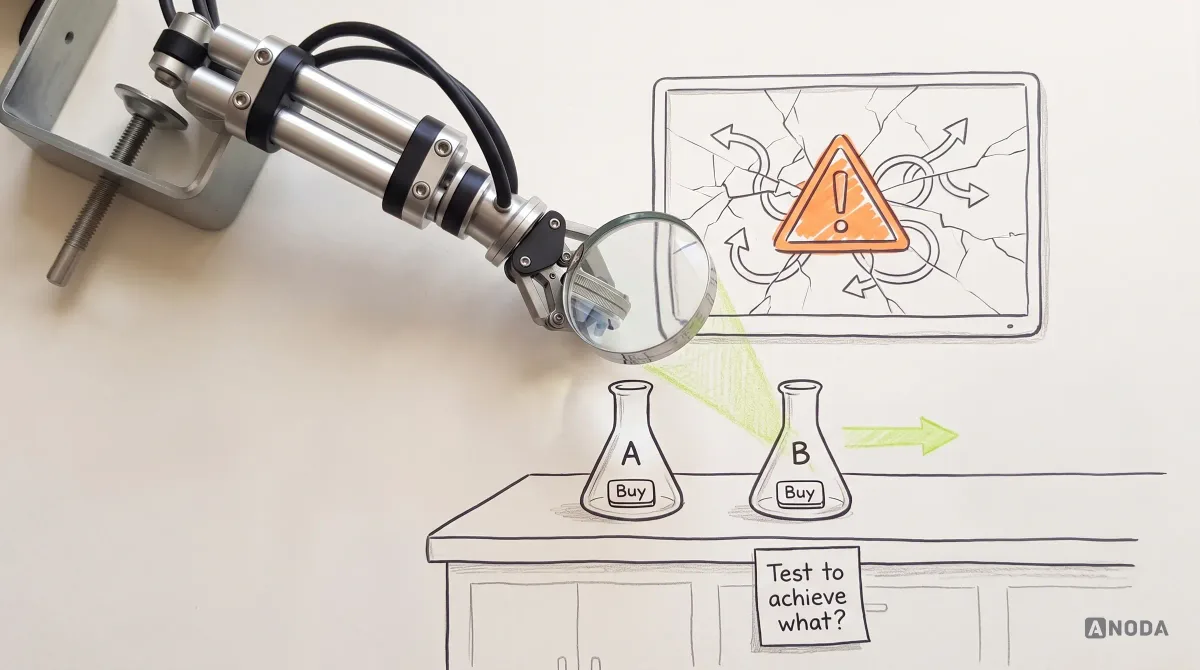
05A/B test hypotheses (not just A/B tests)
The number of A/B tests teams run with no hypothesis is genuinely impressive. “Let’s test red vs blue.” “Let’s see if a longer headline works.” “Try moving the button up.” Tests get run, results come back, nobody learns anything that compounds.
A real hypothesis looks like this: “We believe users hesitate on the pricing page because they can’t tell which plan fits them. If true, replacing the feature comparison table with a ‘recommended for you’ picker should improve plan-page conversion by 15%+. We’ll measure with checkout starts per visitor.”
Now you can win or lose meaningfully. You learn something about your users either way. The next test compounds on this one. Without a hypothesis, you’re just decorating dashboards.
06Empty states, error states, edge cases
Designers design with mock data. Beautiful mock data. Twenty perfectly named items, no nulls, no overflows, no failures.
Then a real user signs up and sees a screen with nothing on it. Or hits a form field that fails validation. Or watches an upload time out. None of those states were designed. The user is now reading a raw API error message that says “Error 422: unprocessable entity” and forming an opinion of your product.
Check which states the screen actually needs: populated, loading, empty, partial, error and permission-restricted are useful starting points. Each applicable state needs an explanation and a next step. Leaving those states to defaults abandons users precisely when they need help.
Empty states in particular are an underrated growth lever. A well-designed empty state explains what this screen will look like when used, what the user should do first, and what value they’ll get. It’s onboarding hiding inside the product.
When we designed ClearWater — a wellness app for cold-plunge and sauna devices — empty and error states weren’t an afterthought. The “Add Product” wizard was built with error-tolerant screens and real-time progress tracking from day one, because we knew first-time hardware setup is exactly where users rage-quit. Every state was designed: what you see before setup, what you see mid-error, what you see when it works. See how we did it →
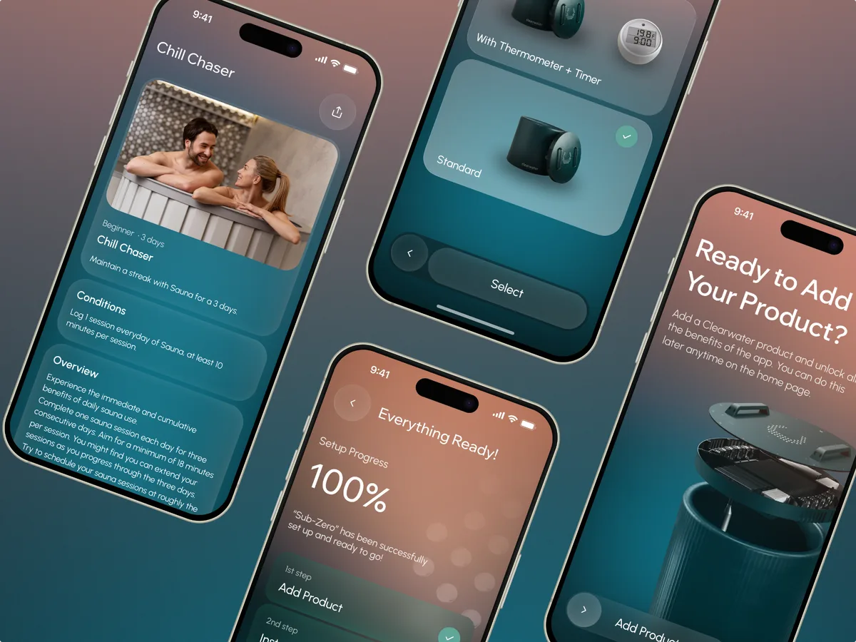
The Clearwater screens show product selection, setup guidance and completion.
07The first 60 seconds after signup
Signup is not the goal. Activation is. The gap between “user created an account” and “user reached the first valuable moment” is where most products silently die.
Most teams don’t design this gap. They drop the new user into the main interface and hope they figure it out. Some sprinkle a few tooltips. Almost nobody designs the first-run experience as a flow with a deliberate destination — what’s the single “aha” moment, and how fast can we get there?
Early friction can prevent a new user from reaching the value they signed up for. Identify where the first-use journey stalls, then prioritise the steps that block that value.
What good looks like: a clear “aha” defined upfront, a path to it that takes 2 minutes or less, a “skip for now” option, progressive disclosure of advanced features, and zero requirement to set up data the user doesn’t have yet.
08The pricing page
The pricing page is where buyers compare scope, cost and fit. Audit it as part of the purchase journey rather than treating it as a table of competitor features.
Usually it’s thrown together by marketing in a templated three-column comparison, with feature lists that copy whatever competitors did, and “Contact us” for enterprise. No social proof per tier. No FAQ. No “which plan is right for me” helper. No friction-removing trust signals. Just three columns and a hope.
This is malpractice. Pricing pages are where you justify cost, signal who you’re for, demonstrate scale, and remove the last objections. They should be designed with the same rigor as your homepage hero — probably more.
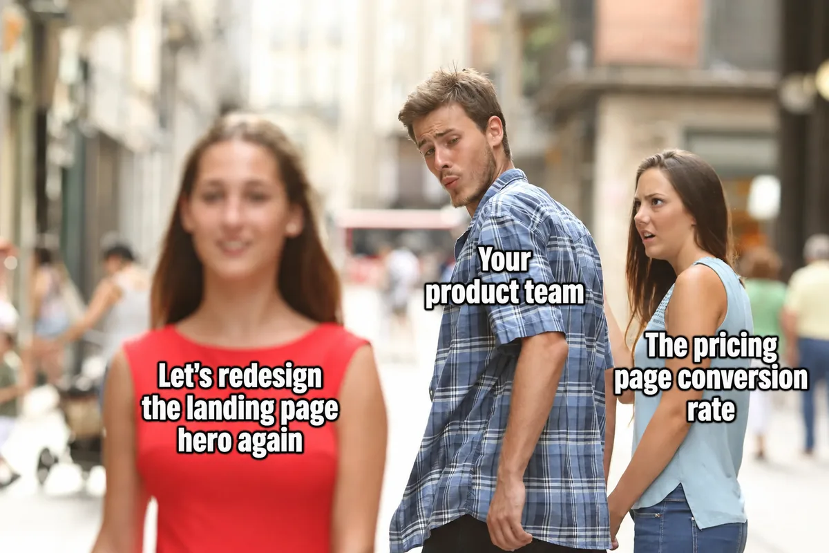
A reminder to review the purchase journey alongside the landing-page hero.
09Settings, account, and profile pages
After launch, the settings page is one of the most-visited pages in your entire product. Power users live there. Edge cases live there. The screens where users update billing, change notification preferences, manage their team, set their integrations.
Almost nobody designs it. It gets shipped as raw form fields in alphabetical order and never gets touched again. Until support tickets start rolling in about how nobody can find the “delete account” button or how changing the email address requires three steps and a confirmation dialog from 2009.
Settings pages are not glamorous. They are also where your power users — the ones who renew, the ones who refer, the ones who upgrade — spend a meaningful percentage of their time. Treating them as utility-grade work tells your most valuable users that you’ve stopped caring about them.
10The cancellation flow
This is the contrarian one. Most teams either ignore the cancellation flow entirely or — worse — design it as a dark pattern: hidden behind seven clicks, gated by support tickets, padded with guilt-trippy “are you sure?” screens.
Both approaches are mistakes. Here’s why a well-designed cancellation flow is one of the highest-ROI screens in your product:
- A clear pause option can serve customers whose need is temporary, when the product and billing model support it.
- A single honest “why are you leaving?” question generates more useful product feedback than any survey you’ll ever run.
- A graceful exit preserves trust and makes a future return straightforward. Explain what happens to access, billing and saved data.
- A respectful cancellation flow is the single strongest brand signal you can send to the rest of your users — they watch how you treat people on the way out and form their own renewal decisions accordingly.
A cancellation metric can hide frustration when leaving is difficult. Check completion, support contacts and customer feedback alongside retention.
11UI/UX QA of the implemented design
The design users receive is the one that ships. Close the loop with a senior designer reviewing the implementation before your customers find the gaps.
What ships is the engineer’s interpretation of the design — rendered in a framework with constraints the designer didn’t know about, on browsers the designer didn’t test, at viewport sizes nobody mocked up, with real data shapes nobody anticipated. Padding drifts by 4 pixels. Hover states get skipped because nobody specified them. The corner radius is 6px instead of 8. The font weight is slightly off. The error state has the wrong tone of red. The mobile breakpoint at 768px looks weird because the design only had specs for 375 and 1440. The loading spinner is the framework’s default, not the brand’s. The animation that was supposed to be 200ms ease-out is 0ms jump-cut.
Each individual drift is small. The accumulated effect is a product that looks like it was assembled by people who didn’t talk to each other — because, structurally, that’s exactly what happened.
The fix is a step almost nobody includes in the process: a senior designer reviews every implemented screen before it ships. Not “looks roughly right” sign-off from a PM at standup. An actual side-by-side audit against the design spec, with every state, every breakpoint, every interactive element, on real browsers with real data. If a button’s hover state was never built, you find out before users do. If the empty state ships as a blank screen instead of the designed empty state, you catch it.
The process has to close the loop: the team that designed the journey reviews how it was built, and engineering resolves the gaps before release. ANODA brings senior design judgment to the states, devices and interactions a quick “looks good” review misses.
In Superstream, the case records 3,000+ screens designed across a Kafka-management product, with responsive tablet layouts, a design system, prototypes and a numbered screen map. At that scale, implementation review needs to cover the repeated patterns as well as the individual journey: navigation, data states, comparisons and actions.
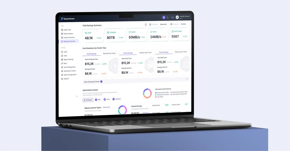
The Superstream design shows a savings overview and breakdown by cluster.
What this list adds up to
These eleven surfaces provide a practical audit checklist. Some corrections are copy or layout changes; others depend on billing, permissions, integrations or the underlying workflow. Scope the fix after reviewing the actual problem.
But every one of them sits in the gap between engineering ships a working screen and design ships a deliberate experience. And every one of them affects a metric your CMO and your PM are accountable for: activation, conversion, retention, churn, NPS, support cost.
Start with a complete journey rather than a favourite screen: arriving, signing up, reaching value, paying, changing settings and leaving. Prioritise the points where the task fails, the state is unclear or support has to intervene. That gives the team a concrete correction list to work through.
In conclusion — a note for CMOs and Product Managers
Your roadmap is full. I know. Every quarter there are more features to ship than time to ship them, and the things on this list are not features. They are the surfaces between features — the unglamorous middle that determines whether everything else you built actually works as a product.
The teams that get this right don’t add it to the roadmap. They make it part of the design process from day one. Every new feature ships with its empty state, its error state, its onboarding moment, its transactional email, and its analytics instrumented. Resolving those requirements during the build avoids reopening decisions after users have already encountered the gap.
If you’re staring at a roadmap that doesn’t account for any of this, that’s not a planning problem. That’s a process problem. And it’s solvable.
Work with ANODA
We’re a UI/UX design and development agency for SaaS, Fintech, and AI products. Since 2013, we’ve helped companies stop losing users on the screens nobody else was designing.
Half our work isn’t features. It’s the empty states, the transactional emails, the onboarding flows, the settings pages, the cancellation experiences — the unglamorous surfaces that move metrics quietly. We use AI to accelerate the work, but the judgment is human, the research is real, and every decision is one a senior designer is willing to stake their name on.
— The ANODA team · UI/UX Design & Development · Designing the screens nobody else remembers, since 2013
Stop paying to replace users lost on screens your roadmap forgot. Discuss a UX audit with ANODA and get a prioritized plan for the journeys, states and implementation gaps draining your product.
Frequently asked questions
Why do forgotten screens hurt conversion and retention more than core features?
Because they sit in the gap between "engineering ships a working screen" and "design ships a deliberate experience." Each one affects activation, conversion, retention, or trust — just quietly, without triggering a roadmap alert.
Why are transactional emails more important than marketing emails?
They support a task the user is already trying to complete, such as a password reset or order confirmation. Review the next step, link destination, sender, readability and recovery path as part of the product.
What's the difference between UX analytics and business analytics?
Business analytics describes outcomes such as conversion and revenue. UX analytics helps investigate the steps and interaction problems behind those outcomes. Define the question, relevant events and baseline, then use funnel analysis or targeted observation to test an explanation.
What does a well-designed empty state actually do?
It explains what the screen looks like when used, tells the user what to do first, and shows what value they'll get. It's onboarding hidden inside the product — and one of the most underrated activation levers you have.
What's wrong with running A/B tests without a hypothesis?
You can win or lose but learn nothing that compounds. A real hypothesis specifies what you believe, why, what change should prove it, and how you'll measure it. Without that, you're decorating dashboards.
Why should a team design the cancellation flow carefully instead of hiding it?
Make cancellation understandable and easy to complete. Explain billing, access and data consequences, and offer a pause only when it fits the customer need and product model.
How many states does every product screen actually have?
The applicable states depend on the screen. Check populated, loading, empty, partial, error and permission-restricted states, then specify the explanation and next step for each that applies.
What is UI/UX QA and why does it matter after design handoff?
It's a senior designer reviewing every implemented screen against the spec before it ships — checking every state, breakpoint, and interactive element on real browsers with real data. Without it, implementation drift accumulates silently across every screen.
Why is the first 60 seconds after signup the highest-leverage design surface in a product?
The first-use journey connects account creation to the value the user came for. Review the steps, prerequisites and recovery paths that block that moment; prioritise them using the actual product journey.
When is a landing page necessary, even for a beta or internal tool?
A publicly discovered product needs a clear entry page. A closed beta can explain the product in its invitation flow; an internal tool can do so in its access or onboarding screen. The entry should explain who it serves and what to do next.
Written by