
Business networking app for meeting people nearby
DAP shows professionals the people nearby worth knowing, and gets them to a meeting.We redesigned the live iOS and Android app, flow by flow.
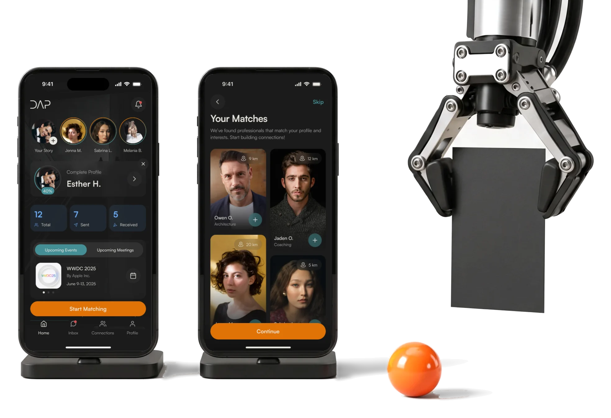
- 89
- screens across the redesigned product, in dark mode
- 10
- flows from sign-up to a booked meeting, handed over one by one
- 2
- account types professionals and companies with their employees
Project summary
DAP is a business proximity network: it shows the professionals and companies around you, suggests who is worth meeting and gets you from a profile to a meeting. The app was already live, but its screens and flows lagged behind the idea. We redesigned the mobile product from its information architecture to the final UI and extended the client’s design and Untitled UI into a design system .
How the work ran
- When
- April to June 2025.
- Our part
- Information architecture, user flows, wireframes, UI, the design system and UI kit, screen maps, a clickable prototype and every state, delivered flow by flow.
- Not ours
- The logo and app icon, the AI behind matching, building the app and releasing it to the stores.
- Now
- Every final flow was approved by the client; DAP is on the App Store and Google Play.
From a stranger nearby to a meeting
One loop the app has to close, end to end:
-
Join
- Person or company
- Field and sub-areas
- Location access
-
Discover
- People nearby
- Distance
- Saved filters
-
Match
- AI Auto-Match
- Profile views
- Notifications
-
Connect
- Requests
- Connections
- Chat
-
Meet
- Calendar
- New meeting
- Follow-up
- Free and Paid
- Plans and add-ons shown where they matter, without walling off the core loop.
- Person and Company
- Two kinds of account and profile, and never a doubt about which one you are in.
- Suggest and Decide
- The app proposes matches; the member still judges the profile before connecting.
Home, in the order a networker needs it
- Found
- Home had to show a member’s network, nudge them to finish their profile and point to the next meeting, without turning into a social feed.
- Decided
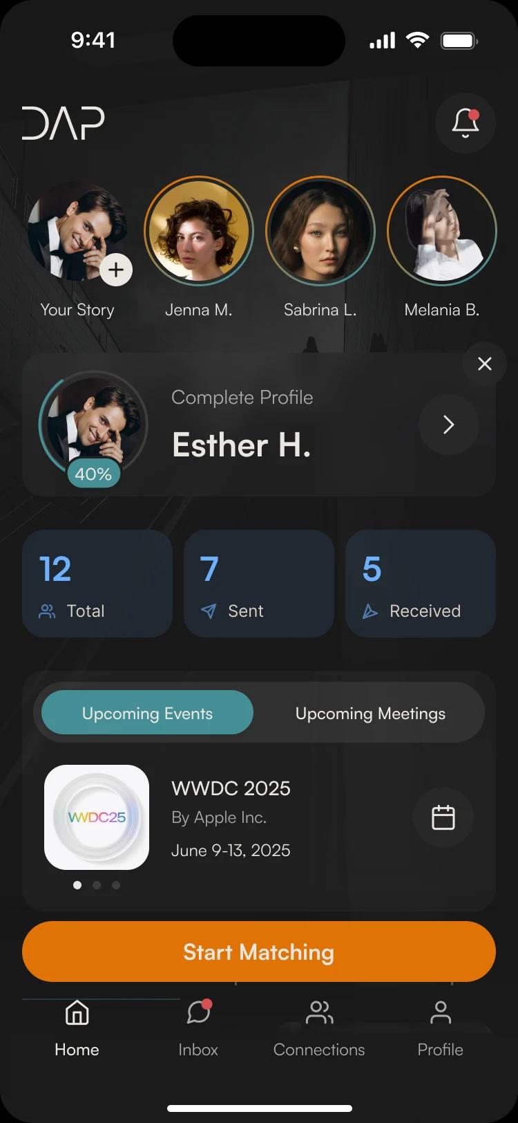
- One order down the screen: stories from connections, the profile’s progress, connection counts, upcoming events and meetings, and one orange button to start matching.
- For the user
- A member sees who’s active, what’s next in the calendar and how to find someone new, all on the first screen.
-
Who’s around
Stories from connections, and your own to add.
-
Your profile
How complete it is, and one tap to finish it.
-
Your network
Connections in total, sent and received.
-
What’s next
Upcoming events and meetings, a tab apart.
-
Find someone new
Start Matching above the tab bar.
How the work progressed
April to June 2025, one flow at a time, so the developer always had the next part to build.
-
Discovery
What the live app, the client’s earlier draft and their notes already covered, and what was missing
Artifact A review of the existing app and draft, and the list of flows to redesign
-
User Flow
Every path from sign-up to a booked meeting, for a person and for a company
Artifact Information architecture and user flows for calendar, connections, chat, notifications, profile and settings
-
Wireframes
What each screen holds and every state it can be in, before colour
Artifact Wireframes for every flow, approved flow by flow
-
UI & Design System
A dark look that fits the existing brand, and one set of parts for every flow
Artifact Two style directions, the final UI and a design system built on the client’s design and Untitled UI
-
Delivery
What the developer needed to build each flow without waiting
Artifact Screen maps, a clickable prototype and the UI kit, handed over flow by flow
Every flow mapped before it was drawn
- Found
- The live app had screens but no map: nobody had written down what happens after a tap, for a meeting, a connection or a message.
- Decided
- Each area got its own flow first, with its branches and the questions for the client pinned where they came up; the wireframes followed the approved flow.
-
The calendar
Meetings and events as two views of one calendar, each card opening its details, and a new meeting form that asks for different things online and offline.
Open the full map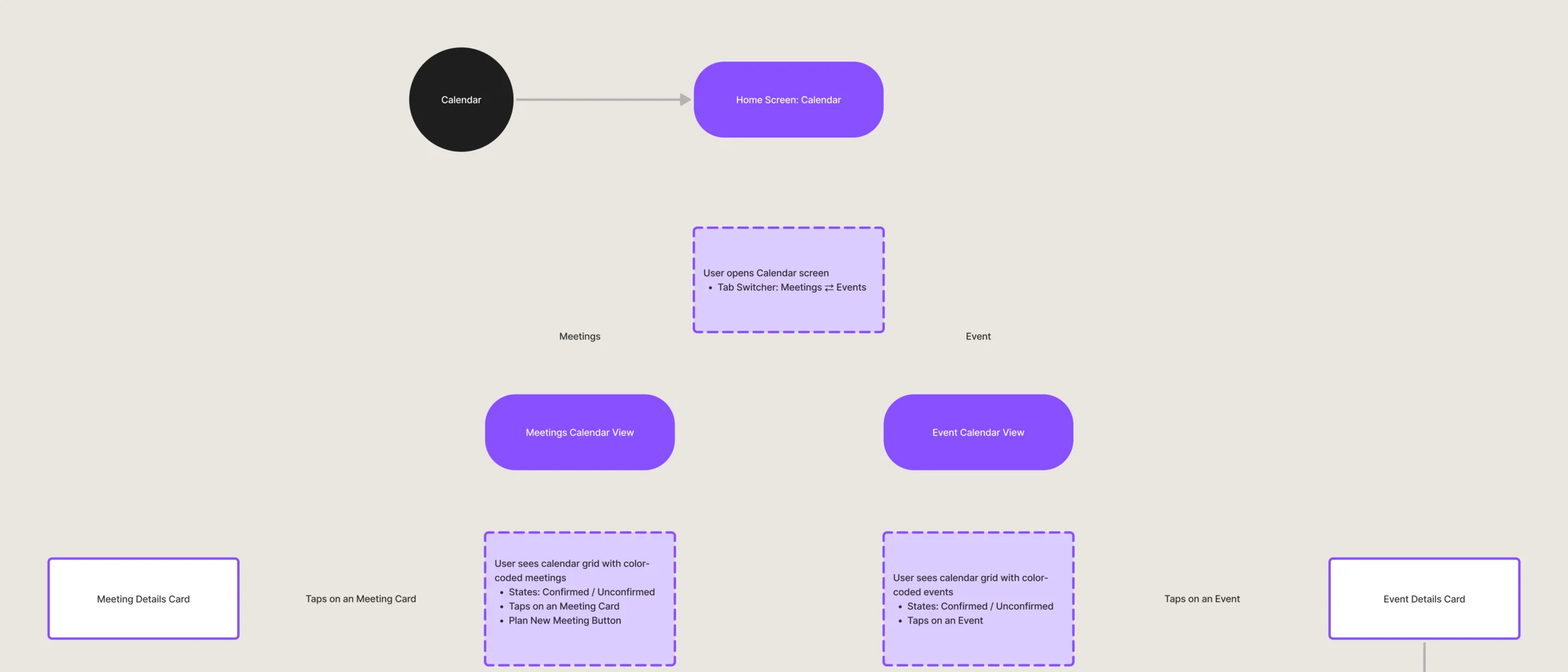
Six jobs, from a match to a meeting
Matching first, because it’s why people open DAP; then everything that turns a match into a meeting, and the plans that pay for it.
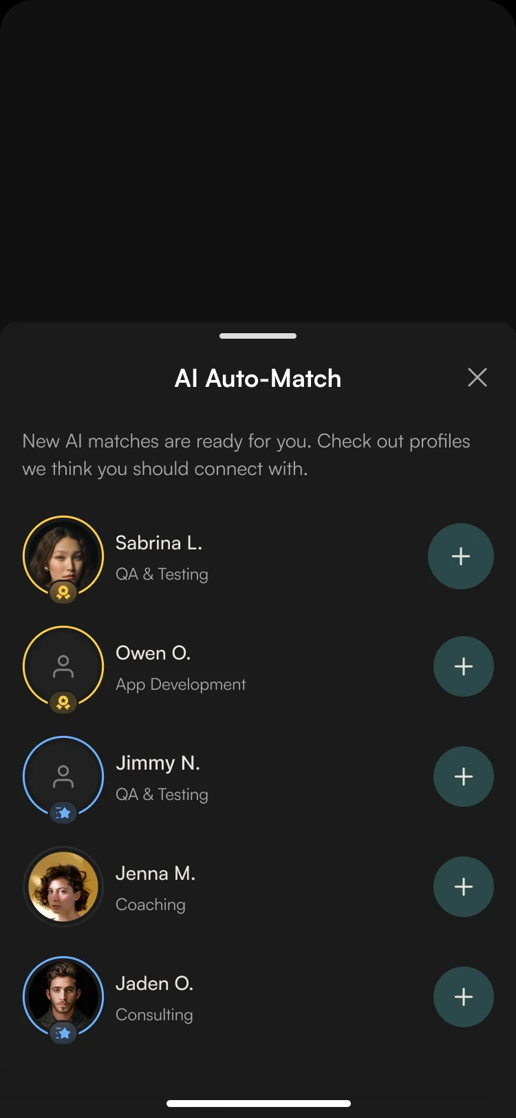
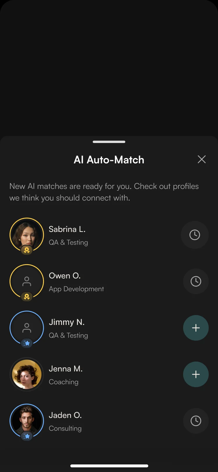
AI Auto-Match
- Found
- A list of everyone nearby is noise; members need to be told who is worth their time.
- Decided
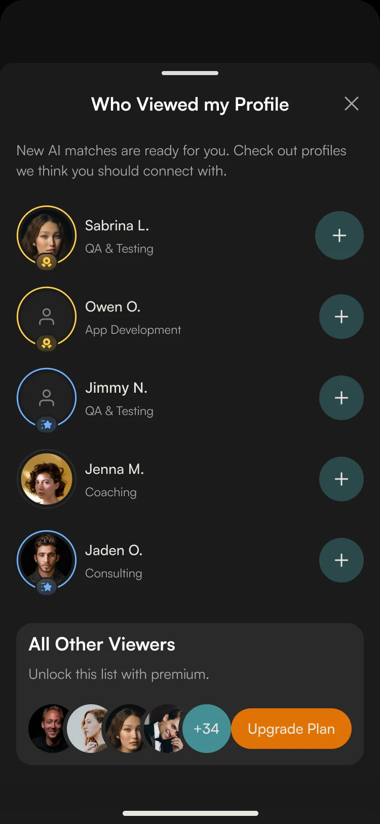
- Matches arrive as a short list with each person’s field and one button to connect; a sent request turns into a pending mark, and a list of who viewed your profile adds warm leads, with the full list in the paid plan.
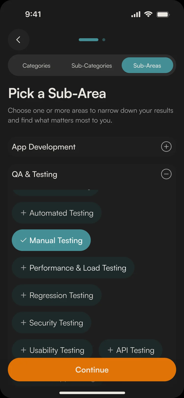
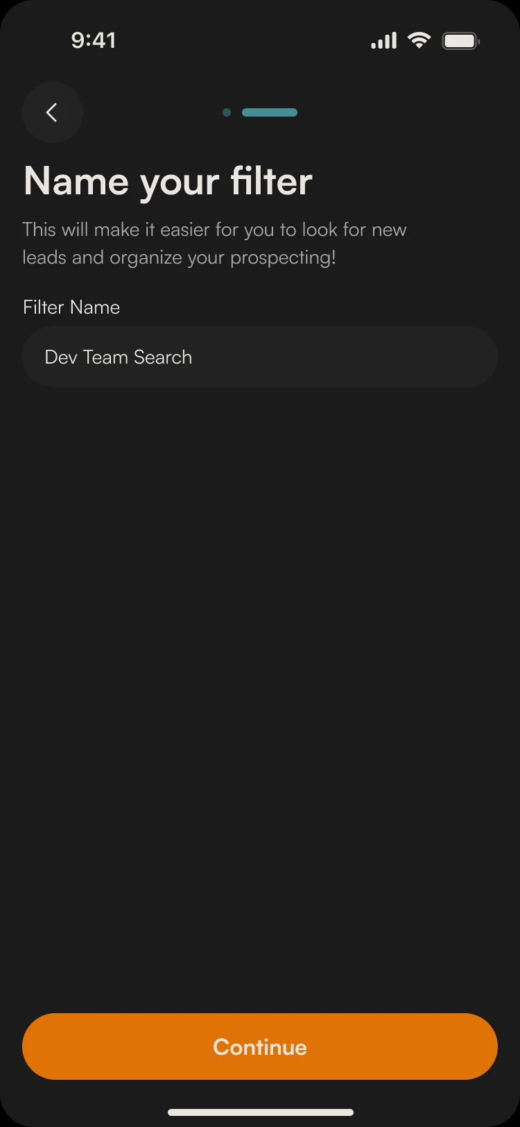
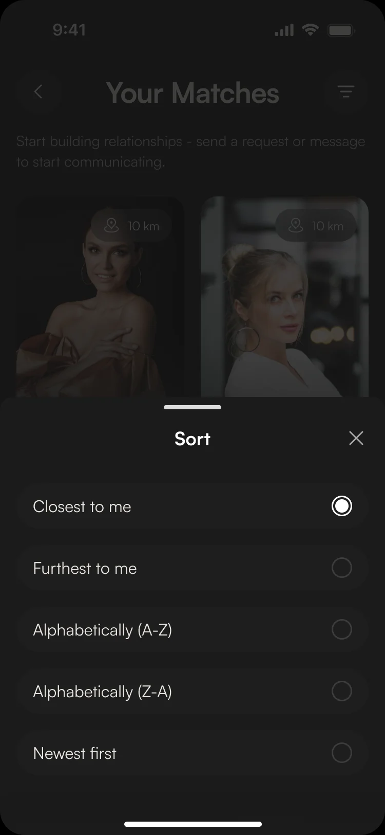
Search by distance and field
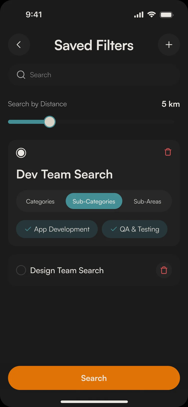
- Found
- Professionals look for a partner, a client or a hire, not for whoever posted last.
- Decided
- Search by distance, then category, sub-category and sub-area; a search can be named and saved, and the results sort by distance or name.
Two kinds of account
- Found
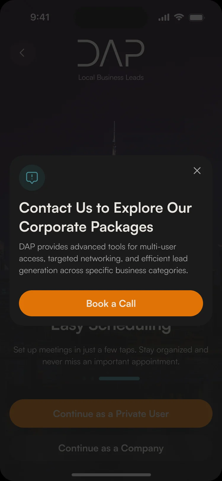
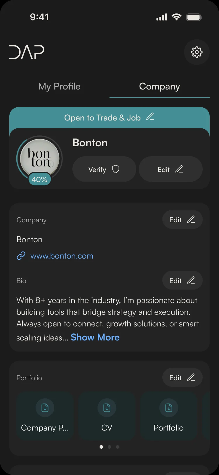
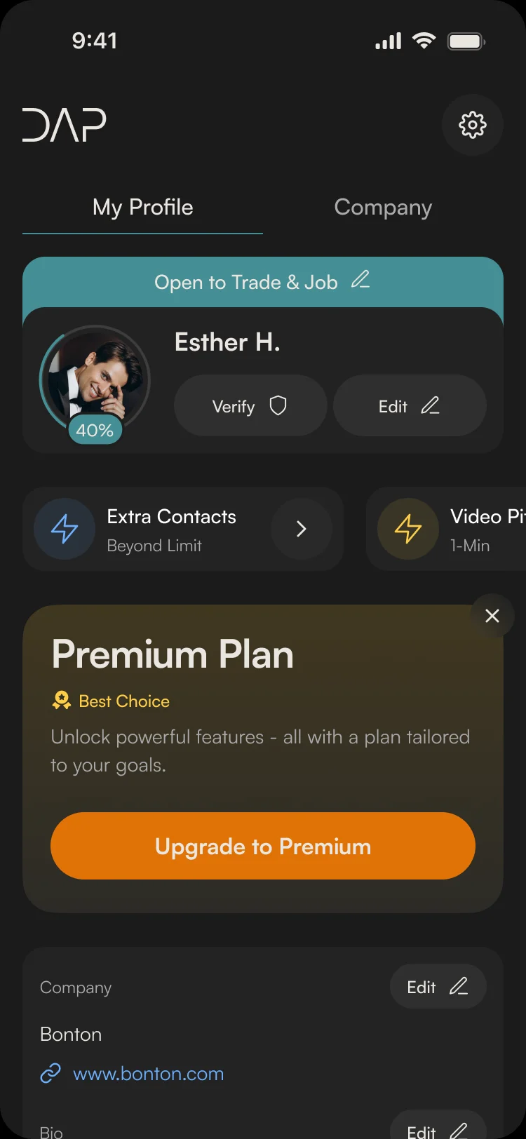
- A consultant and a company both join, and a company brings its own people.
- Decided
- Company accounts start with a call to set up a corporate package; a company profile has its own details, bio and portfolio, and a person’s profile shows their plan, add-ons and what they’re open to.
Connections and chat
- Found
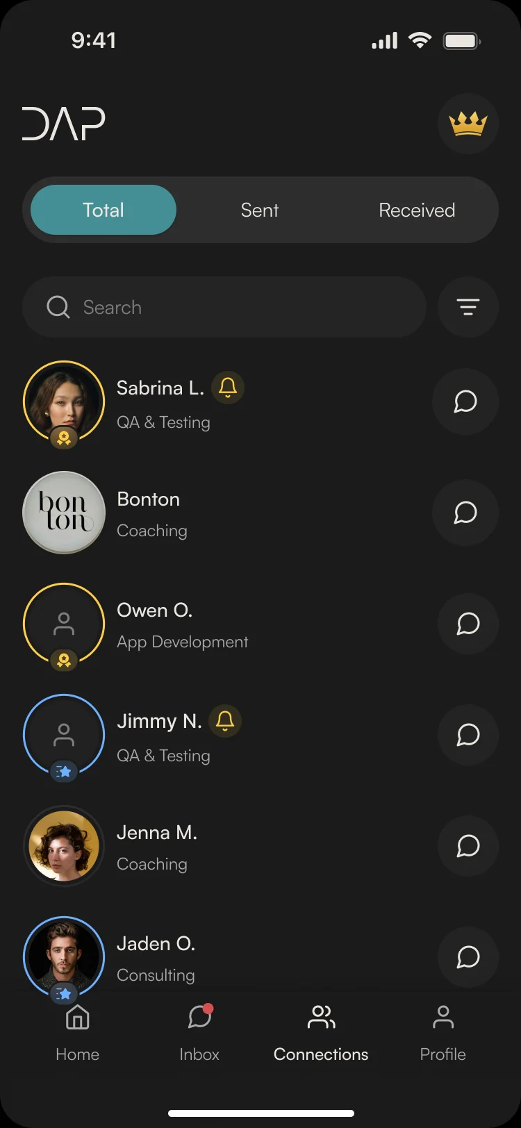
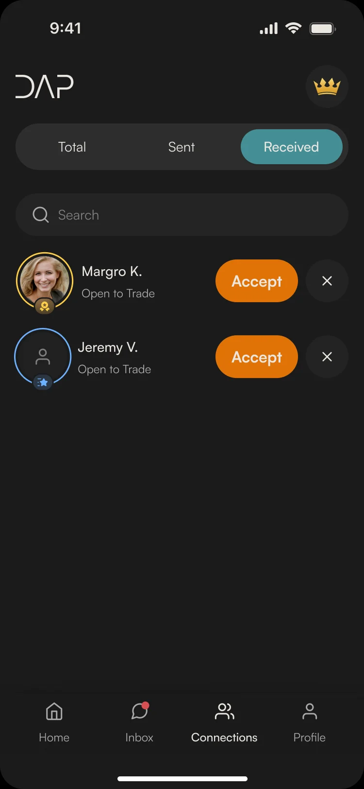
- A match is worth nothing until someone says hello.
- Decided
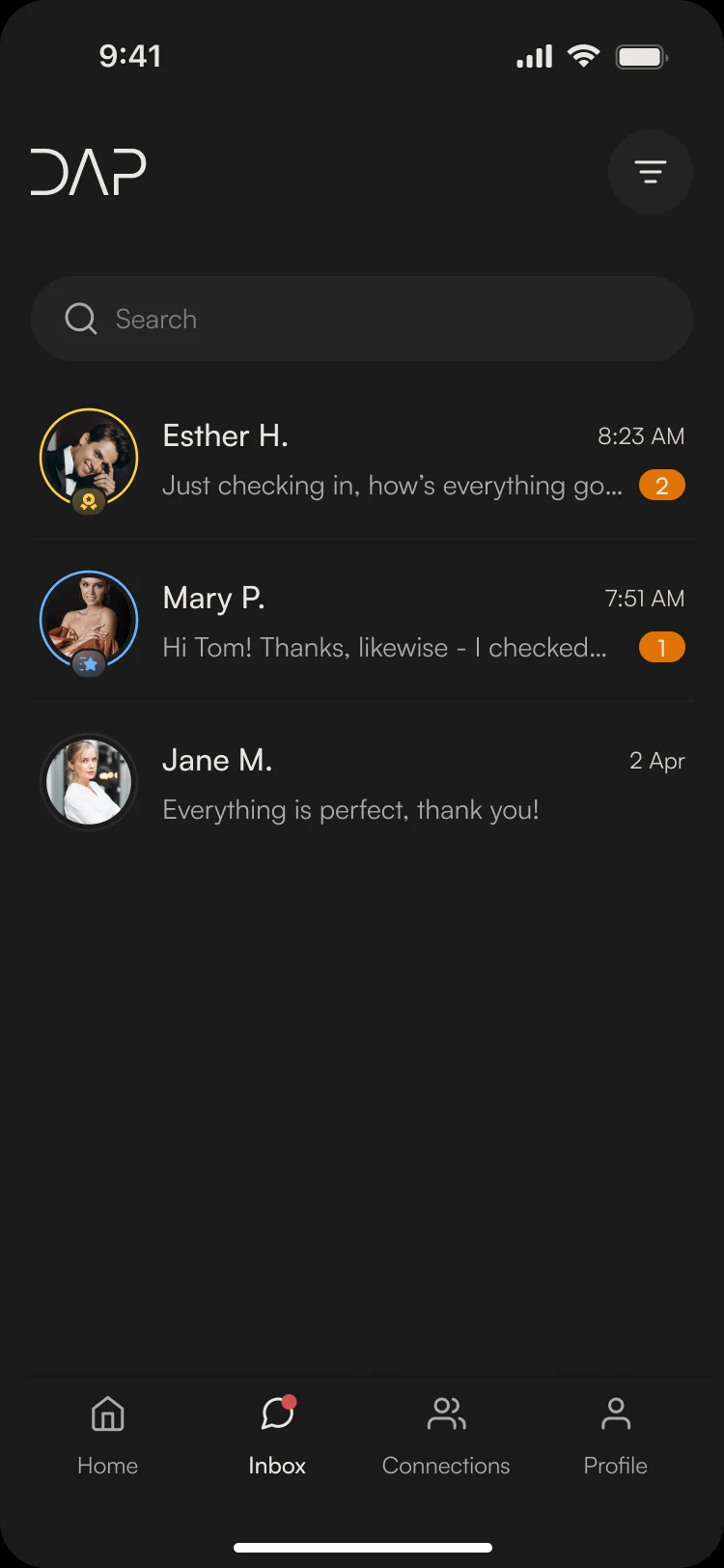
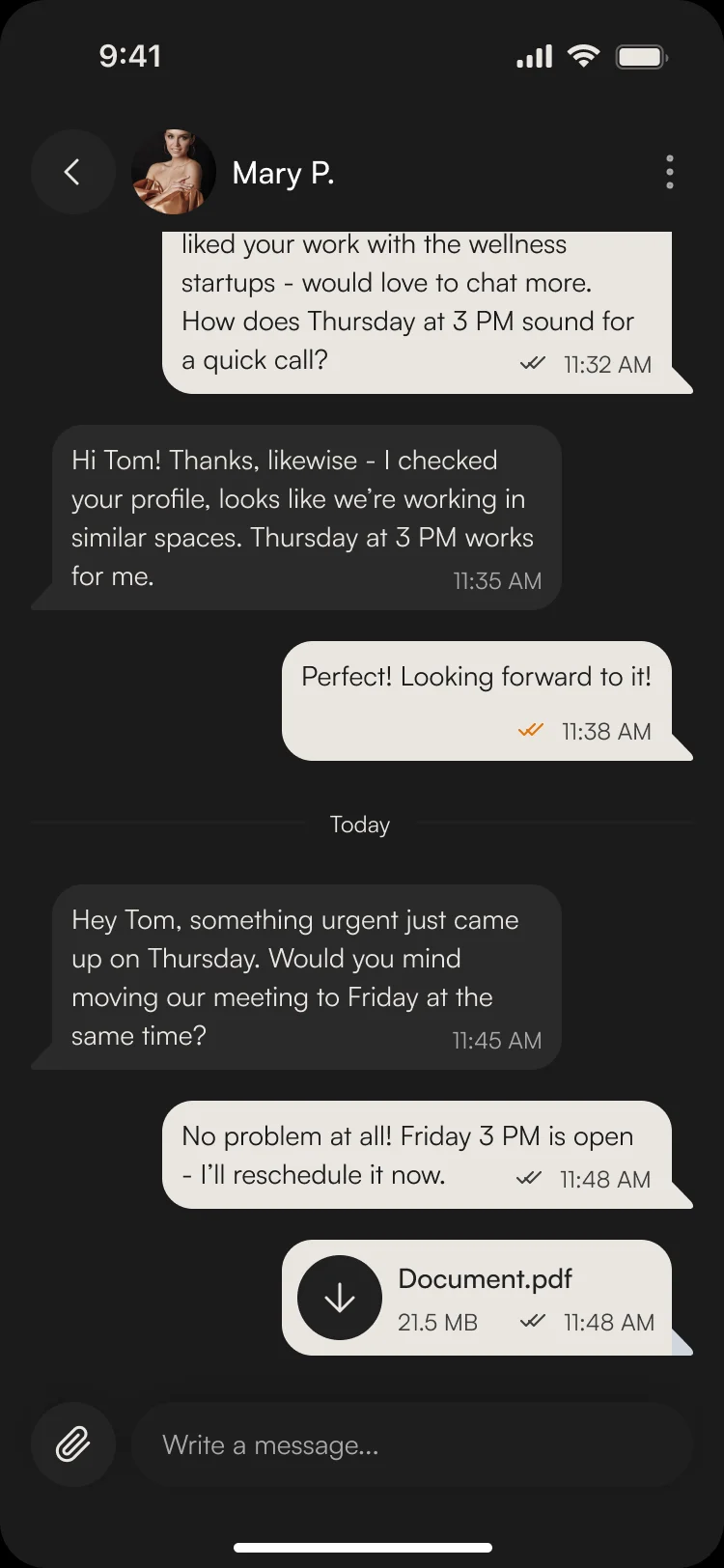
- Connections split into total, sent and received, with requests accepted in place; chats sort by unread and carry files, and every chat and person can be reported.
From a chat to a meeting
- Found
- Networking ends in a calendar, and a follow-up is the step most people forget.
- Decided
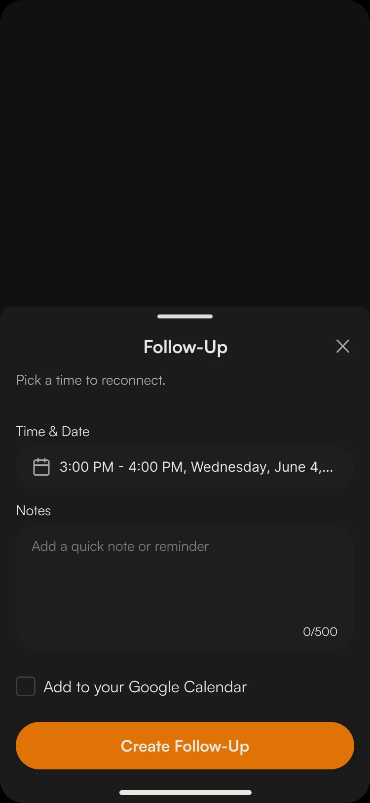
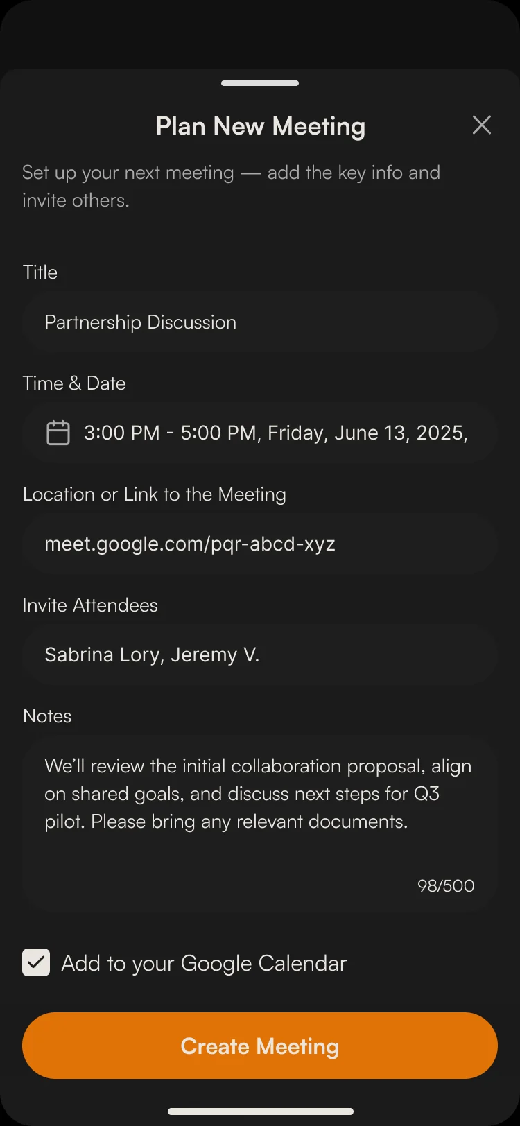
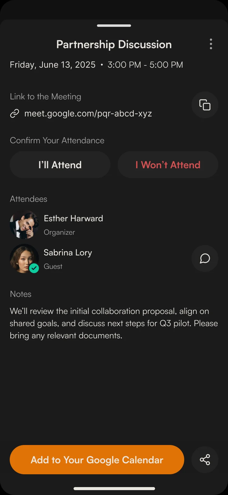
- A new meeting takes a title, time, link and attendees; a follow-up is a lighter form with a date and a note; both can go to Google Calendar, and the details card asks each guest to confirm.
Plans without a wall
- Found
- Paid tiers and add-ons have to be visible without blocking the loop that makes the app worth paying for.
- Decided
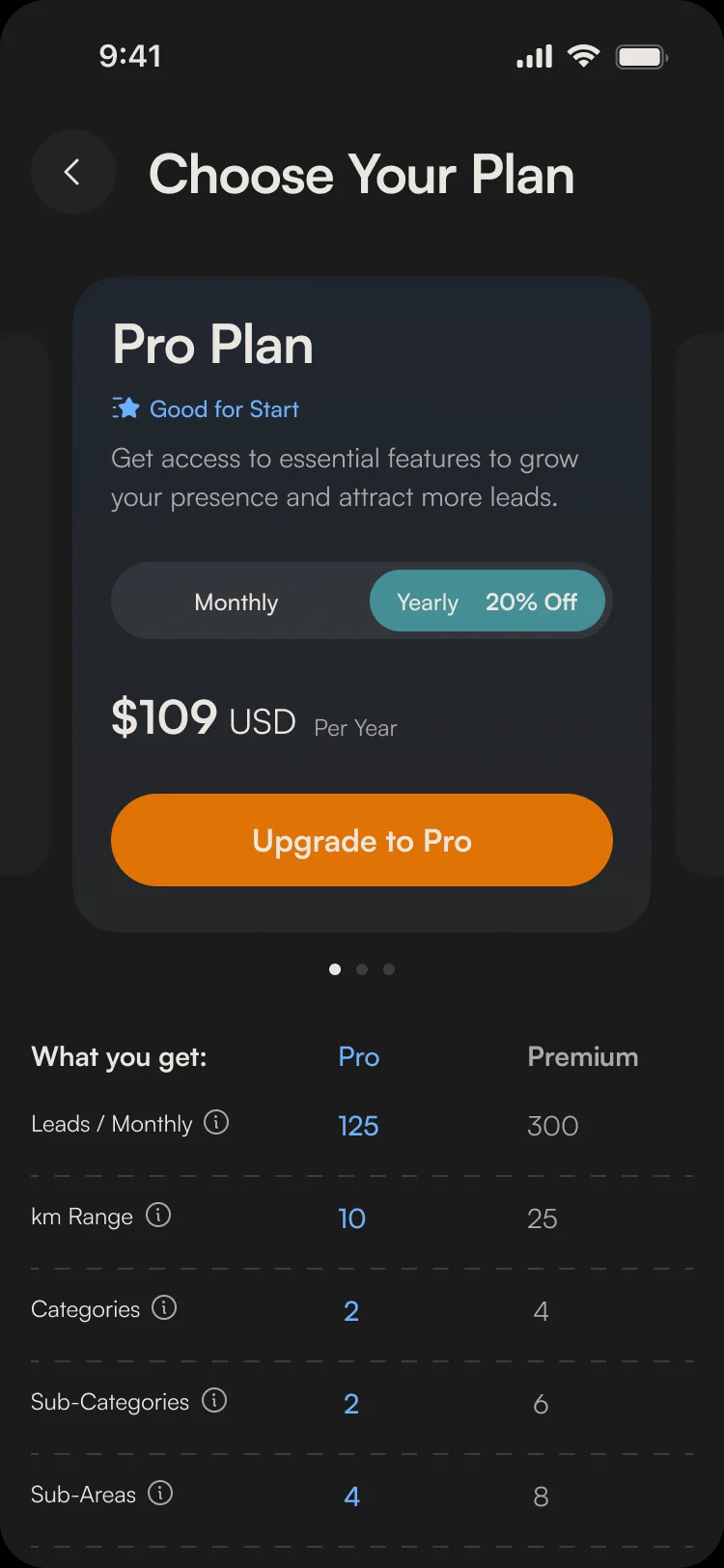
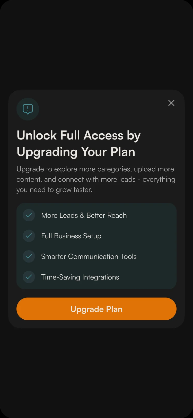
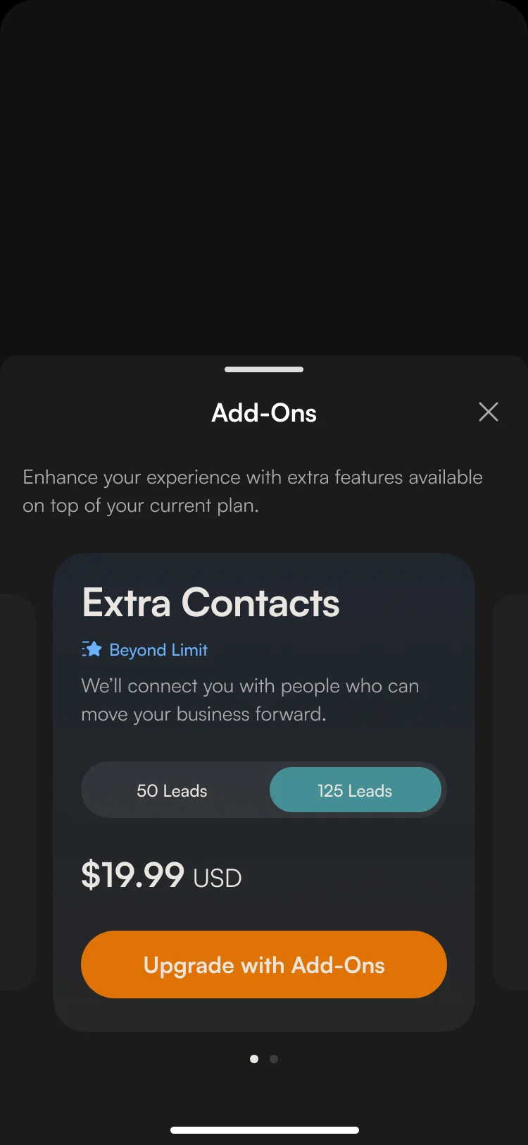
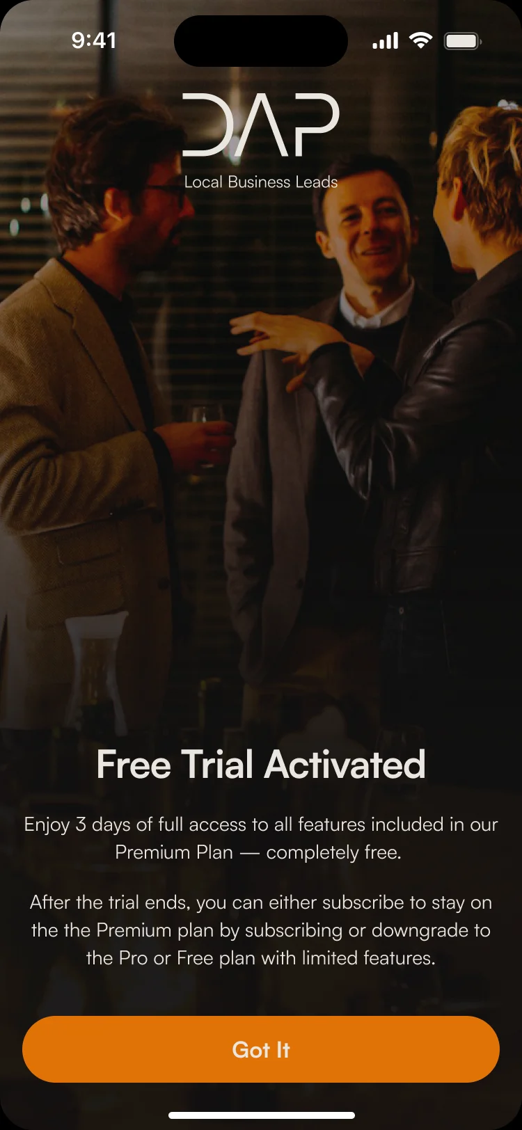
- Plans compare side by side on one screen, an upgrade prompt appears only when a free member reaches a limit, add-ons sell one extra at a time, and a trial says plainly what happens when it ends.
One dark system for every flow
- Found
- Ten flows designed one after another could easily drift into ten looks, and a dark interface shows every inconsistency.
- Decided
- The client’s design and Untitled UI became one dark kit: the same rows, toggles, sheets and buttons in every flow, and a drawn state for each field and each empty list.
The same settings wherever you meet them
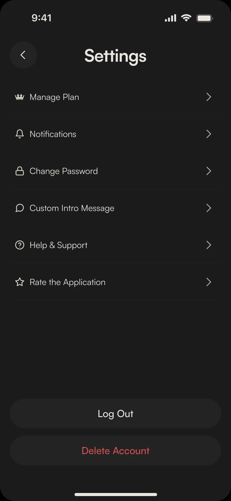
Notification settings as a sheet from the notifications list and as a page in Settings: the same rows, the same toggles.
-
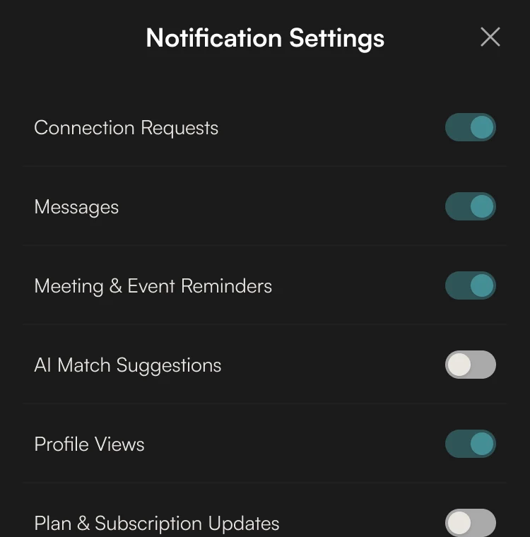
From notifications: A sheet over the list. -
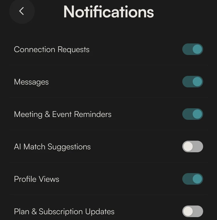
From Settings: The same list as a page.
Drawn for the moments that go wrong
A missing permission, a form sent empty, an inbox with nothing yet: each says what happened and what to do.
-
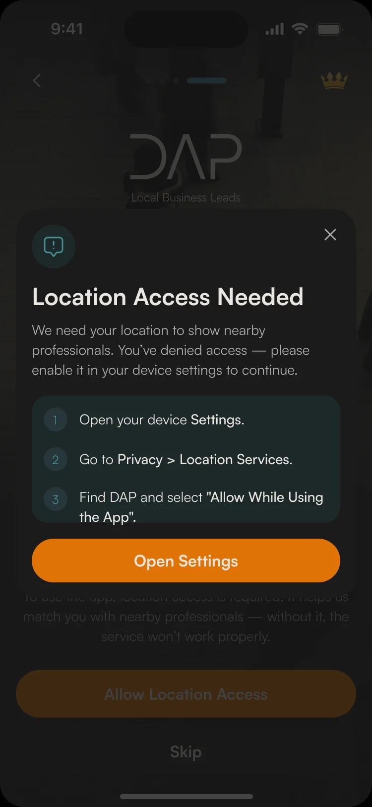
Location turned off -
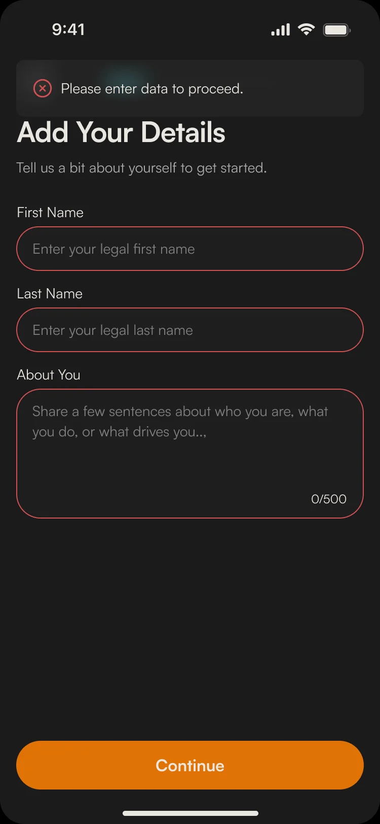
Required fields empty -
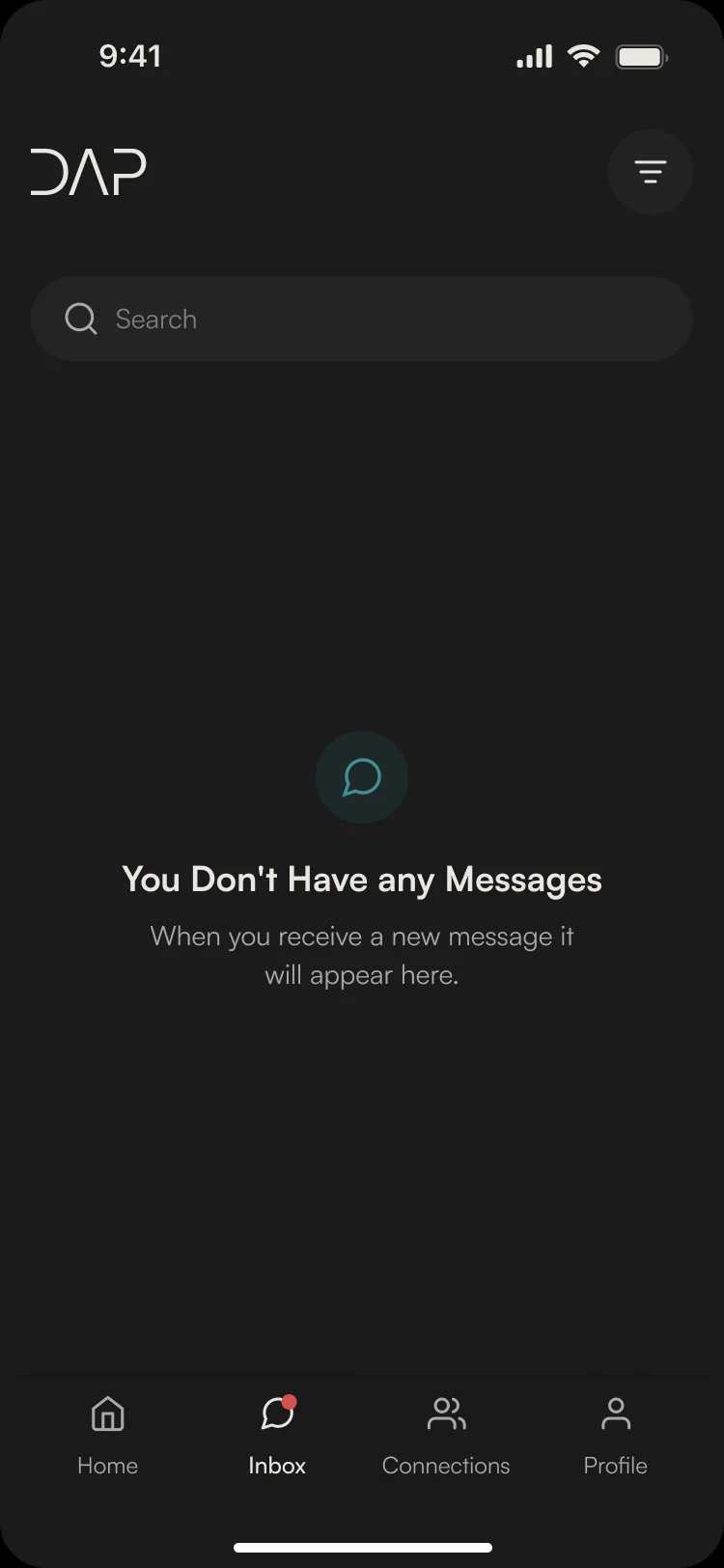
No messages yet
Where the product is now
A redesigned DAP in one dark design system. Every final flow was approved by the client and handed to their developer with screen maps, a clickable prototype and the kit.
DAP built the app and runs it on iOS and Android.
- screens
- 89
- flows handed over one by one
- 10
- people on our team
- 3
In the client's words
ANODA kept our users’ needs at the centre of the design, making navigation feel natural from discovering relevant people to starting a conversation and scheduling a meeting. We appreciated their attention to the small points of friction that can interrupt that journey. They also made the pricing pages clearer, helping users understand the differences between plans and choose the right option. The result was a seamless design that made the product easier to find your way around and its value easier to understand.
Does your app get people from a match to a meeting?
In DAP, a match sits one tap from a request, then a chat, a follow-up and a slot in the calendar, and the plans that pay for it stay out of that path. Show us your product, and we’ll show you where people drop out between finding someone and meeting them.
More work like this
Three more apps people open every day, designed or redesigned around one core loop.
-
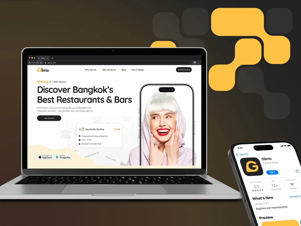
FoodTech · SaaS
Glimix
Redesigned a two-sided hospitality app for diners and venue owners, with an AI assistant, a new brand and the landing page.
- 200+ Screens designed
- 5 Experts on the pod
-
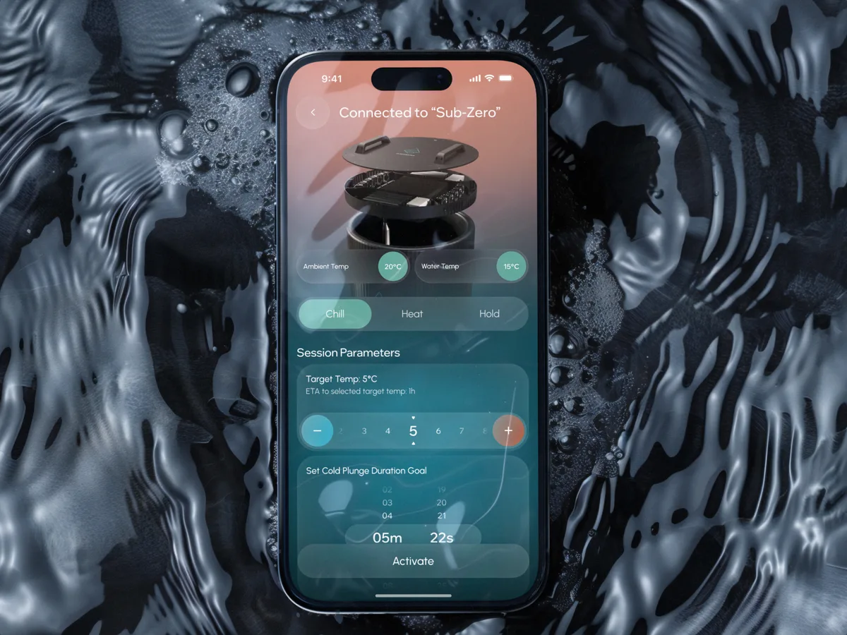
Wellness · Healthcare
Clearwater Wellness Co.
Designed a connected cold-plunge app with the schedules, challenges and crews that keep people coming back.
- 306 Screens designed
- 4 Experts on the team
-
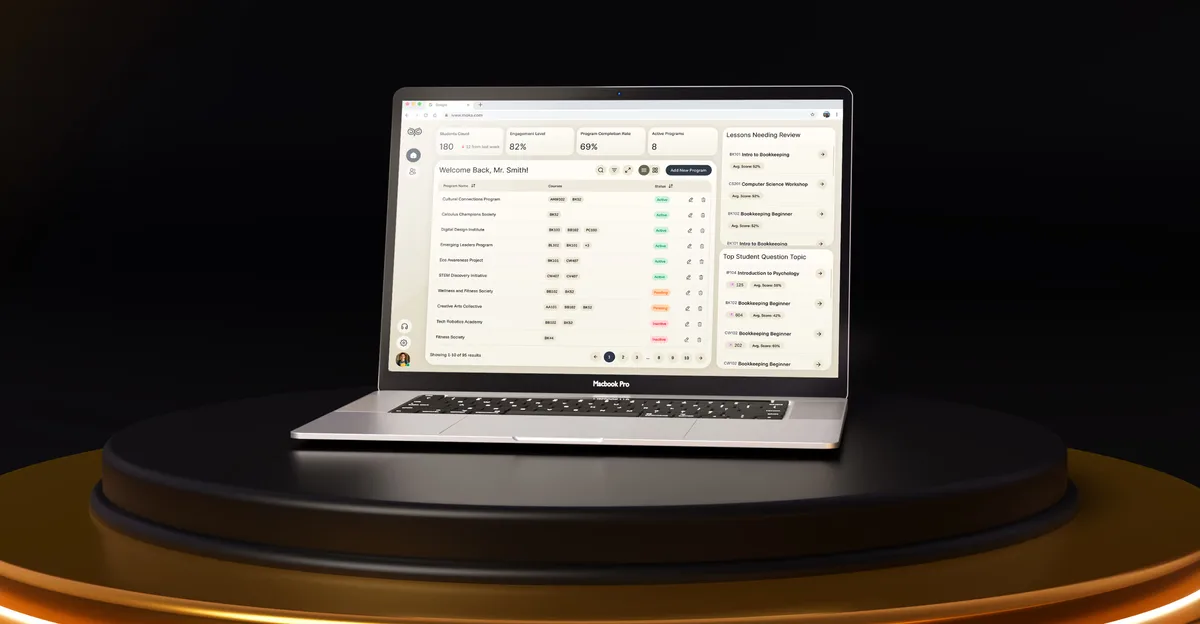
EdTech · SaaS
Moka
Designed an AI study assistant for students and the web tools their instructors and schools run it from.
- 200+ Screens designed
- 4 Experts on the team