In short
Most teams that ask for an A/B test do not need one yet: the product is inconsistent, the feature is confusing, or there are too few users to trust any result. When the question is precise and the stakes are real, experiments are the best tool there is. Here is how to tell the difference, and how to plan, run and read a test that deserves the name.
In this article
- What A/B testing in UX is — and what it is not
- Why “we need an A/B test” is so often the wrong request
- “A/B test to achieve what?” — where it earns its keep
- Is your product ready for an A/B test?
- When usability testing, interviews or analytics answer better
- Qualitative research and experiments are partners, not rivals
- Write a hypothesis that can be wrong
- Choose primary, secondary and guardrail metrics
- Sample size and duration: plan them before you start
- Build every variant as if it will ship
- Assign variants cleanly — or roll out in stages
- Testing AI features: measure the task, not the answer
- Monitor data quality while the test runs
- The validity threats that turn “significant” into fiction
- Read the results as a product decision, not a scoreboard
- After the test: win, loss or inconclusive
- The experiment brief: one page before any variant is built
A/B testing in UX design means showing two or more versions of a real product flow to randomly split groups of real users and measuring which one changes a specific behaviour. It is worth doing only when the team knows exactly what it wants to learn, has enough users in every segment to trust the answer, and is prepared to build, ship and support every version as a real production flow. If any of those three is missing, an A/B test is not a method. It is an expensive way to feel scientific.
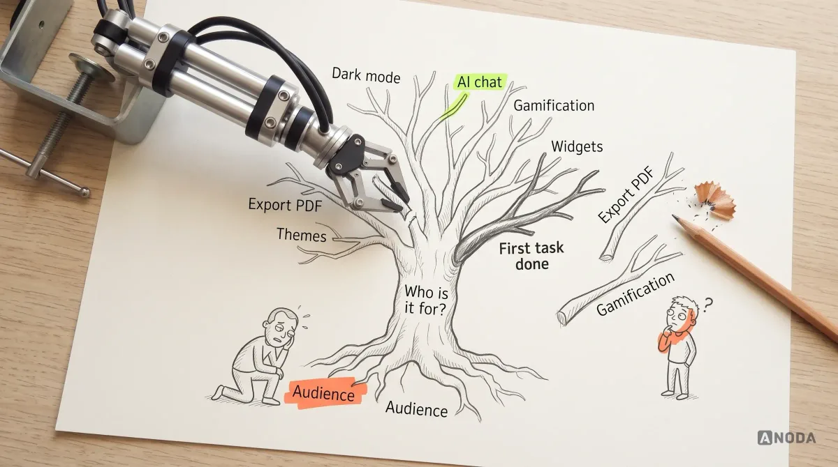
We hear the request every month: “We need to do A/B testing.” On a website, on a SaaS dashboard, on an AI feature nobody uses. Then we open the product and find the real problem sitting in plain sight: the software is inconsistent, the feature makes no sense even to people who build AI products for a living, and no split test on earth is going to fix that. It will just measure, with great precision, which of two confusing screens confuses slightly fewer people.
That is the lens for this guide. Our work designing and fixing products makes A/B testing a tool we use and respect — for the right question, at the right scale, with the right person reading the results. Here is when that is, how to run the test properly, and what to do when the answer is not the one you hoped for.
What A/B testing in UX is — and what it is not
In an A/B test, eligible users are randomly assigned to a control (the current experience) or one or more variants, and the team compares a pre-agreed metric between the groups. Because assignment is random, the groups are alike on average, so a difference that is large enough and consistent enough can reasonably be attributed to the change rather than to luck or to who happened to show up. That is the whole trick, and it is a good one.
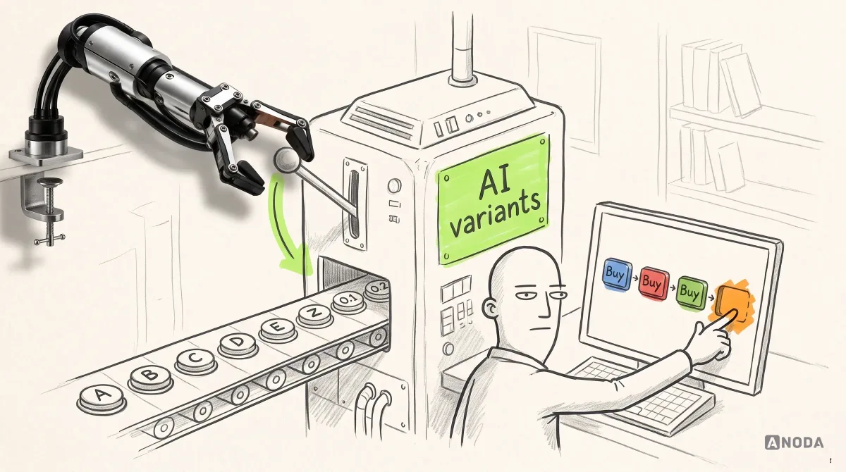
The name misleads people in two ways. First, “A/B” does not mean two versions. It can be A/B/C/D, and with enough enthusiasm it can run through to Z and then start again at 0.1, 0.2 and 0.3. Every extra variant needs more traffic, more implementation and more careful analysis, so the label is not the point. Second, “test” makes it sound like a research activity you run on the side. It is not. It is a product release with measurement attached. Every variant is a real flow real customers use, with real consequences.
What it is not:
- Not a diagnosis. An A/B test tells you that one version performed differently. It does not tell you why, and it cannot tell you what the right design would have been if neither variant was good.
- Not a usability test. Watching six people struggle with a prototype is a different method answering a different question. Both are useful; neither replaces the other.
- Not a substitute for a coherent product. If the underlying flow is broken, testing two versions of the broken flow gives you a winner of a race nobody should have entered.
- Not proof by default. A result is only as trustworthy as the allocation, the instrumentation, the sample and the analysis behind it. Skip any of them and “statistically significant” becomes a very confident guess.
Why “we need an A/B test” is so often the wrong request
When a team asks us for an A/B test, we ask to see the product first. More often than not, the request is a symptom. Conversion is flat, activation is poor or an AI feature is ignored, and experimentation sounds like the responsible, data-driven response. It feels like doing something rigorous without having to admit that nobody knows what is wrong.
Then we walk the flow and the picture changes. The same action is called three different things in three places. Settings live in two menus. An AI assistant offers a dozen capabilities with no hint of which one matters, and even we — people who use and design complex technical products every day — cannot tell what it is for. In a product like that, any test you run is a test of the inconsistency. Variant A confuses 61% of users, variant B confuses 58%, and a very serious dashboard declares B the winner.
It is a restaurant owner who hires a statistician to find out whether customers prefer round plates or square ones, while the kitchen sends out cold food. The plates will produce a result. It will even be significant, if you wait long enough. It will not bring anyone back.
The honest sequence is less glamorous. Audit the product for consistency and comprehension. Fix the obvious problems — the ones any experienced designer can see without a single data point — because testing an obvious fix is paying to confirm what you already know. Research the non-obvious ones until you understand the mechanism. Only then does an experiment have something worth measuring. If you cannot say which problem a variant solves, the test is not ready, however good the tooling.
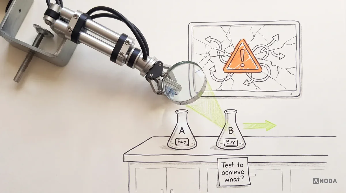
“A/B test to achieve what?” — where it earns its keep
The first question is not how to run the test. It is why. Oksana Kovalchuk, ANODA’s founder, asks every team the same thing before anyone opens an experimentation tool:
First, we need to understand why we want to run the A/B test. To achieve what? “We want to test conversion, or a message for a particular audience” — that sounds reasonable. “We want to find out whether yellow or green is the better brand colour for our SaaS” — that game is not worth the candle.
 Oksana KovalchukFounder & CEO, ANODA
A/B testing shines where behaviour is genuinely hard to predict, the stakes are real and the product can measure the outcome. In our work that usually means:
- Long forms and onboarding. Fintech KYC, account opening, insurance quotes, B2B briefs — flows with many steps, many fields and many reasons to quit. The interaction of order, wording, grouping and requirements is too complex to call from experience alone.
- Conversion points with money on them. Plan selection, checkout, trial-to-paid, upgrade prompts, where a few points of difference add up fast.
- Audience-specific messaging. Which explanation of the product works for which segment, when the segments behave differently for reasons nobody fully understands yet.
Even with our experience recognising product patterns, these are the places we would rather measure than guess. As Oksana puts it, behaviour there is a mixture of so many factors that there are mathematically too many combinations to reason through — and AI does not change that. Ask it for the “optimal” KYC flow and you tend to get something so overloaded or strange that it proves the point: someone still has to decide what matters. That is also why a well-run experiment is useful beyond its winner. It reveals the priorities your users actually have, which is the conversation we keep coming back to in our guide to UI/UX design principles and best practices and in our breakdown of AI UX design mistakes.
Where it rarely earns its keep: brand colours, icon styles, the exact shade of a button, and any feature so confusing that both variants will fail for the same reason. Testing a colour on a product whose checkout is broken is debating the font on the fire exit sign while the exits are locked. You can measure the font. People still cannot get out.
Is your product ready for an A/B test?
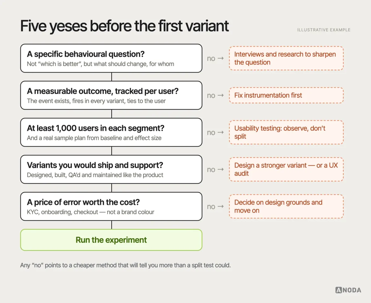
Most failed experiments were doomed before the first user saw them. Run through these checks before anyone writes a line of variant code.
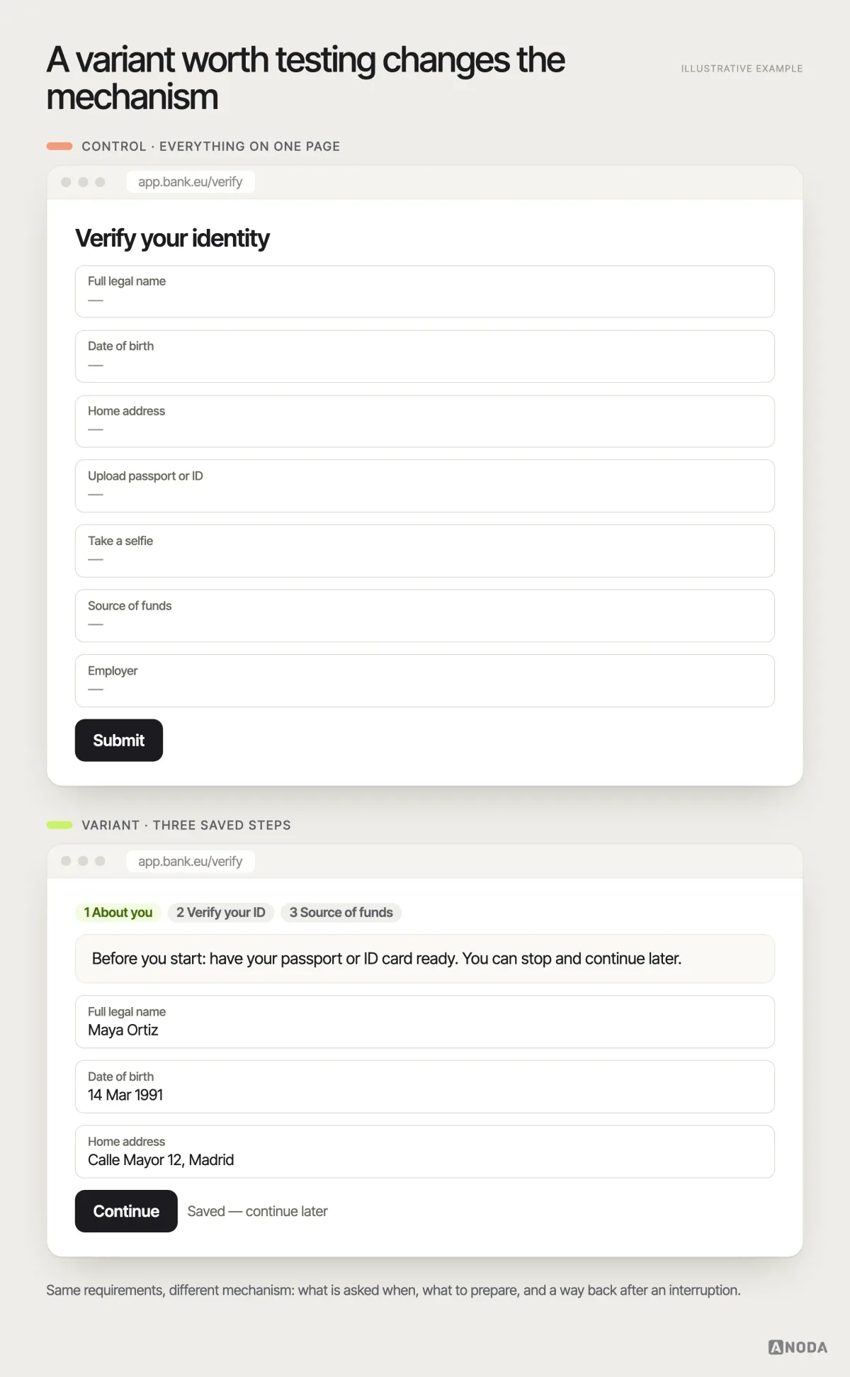
A specific behavioural question. “Will splitting identity verification into three saved steps increase completed verifications for new EU customers?” is a question. “Let’s see which onboarding performs better” is a wish.
A meaningful, measurable outcome. The behaviour you want to change must be tracked reliably, per user, in both variants, and it must matter to the business. If the event you care about is not instrumented yet, the first project is instrumentation, not an experiment. Check what “tracked” really means, too: events that fire client-side only, drop when ad blockers are on, or cannot be tied back to the assigned user will quietly bias the result. A week spent auditing the analytics before the test is cheaper than a quarter spent believing a result the data could never support.
Enough users in every segment. This is where most teams fool themselves. Oksana’s rule of thumb from years of watching results fall apart:
For A/B testing, I believe the sample should be at least one thousand people in each segment. With fewer, the result is completely random. And if your application does not have something like five thousand people we can divide into groups, A/B testing is probably not the tool.
Oksana KovalchukFounder & CEO, ANODATreat that as a floor for sanity, not a statistical formula. The real sample you need depends on your baseline rate, the smallest effect worth detecting and how much risk of a false answer you can accept, and it is usually larger than a thousand. We come back to the maths below. But if you cannot clear even the floor in a reasonable time, stop here and use a different method.
Variants you would be happy to ship. Every variant must be designed, built, QA-tested, localised, supported and — if it wins — maintained. Experimentation platforms split traffic; they do not write, test or support your code.
A price of error worth paying for. An experiment costs design time, engineering time, analysis time and some user goodwill. It makes sense when a wrong decision would cost more than that. Changing the KYC flow of a regulated product clears that bar easily. Picking between two illustrations for an empty state usually does not.
When usability testing, interviews or analytics answer better
A/B testing is one method in a toolbox, and it answers one kind of question: at scale, which of these specific versions changes this behaviour? Most product questions are a different kind.
| The question you actually have | Method that answers it | What an A/B test would add |
|---|---|---|
| Why do users stall on this screen? | Usability testing, session review | Nothing — it cannot explain behaviour |
| What do users need that we do not offer? | Interviews, support-ticket analysis | Nothing — it only compares what exists |
| Where in the funnel do people drop? | Product analytics | Nothing until you have a fix to compare |
| Is the product coherent enough to test? | UX audit | Nothing — it would test the incoherence |
| Which of two credible flows performs better at scale? | A/B test | This is its job |
| Is a risky change safe to roll out widely? | Staged rollout with monitoring | Similar logic, lower exposure |
If your product does not have the traffic, the instrumentation or even a clear idea of why users struggle, observation beats experimentation every time. Six well-recruited users working through the flow while you watch will surface the friction worth fixing, and turn it into hypotheses sharp enough to test later. That is exactly what usability testing is for, and it is almost always the step before a good A/B test, not an alternative to it.

Usability testing
Not enough traffic for a split test? You have enough for the truth.
We watch representative users go through your critical flows, find where and why they stall, and turn it into design changes — and into hypotheses worth testing once you have the scale.
Qualitative research and experiments are partners, not rivals
Teams love to argue about whether qualitative or quantitative evidence “wins”. It is the wrong fight. They answer different questions and they are strongest in sequence.
Qualitative research — interviews, usability sessions, recordings, support tickets — tells you why. It finds the confusion, the missing information, the moment trust breaks. It generates hypotheses. What it cannot do is tell you how big an effect will be across ten thousand users, because a handful of people is not a population.
Oksana is blunt about the trap on that side: with small samples it is very easy to slip into an individual case. Some users are extremely convincing in their feedback, and the team has to know what it can extrapolate to a larger group and what will remain one person’s private problem. That is the point where you have to look at the numbers.
Experiments tell you how much and for whom, and they are blind to why. A thermometer tells you there is a fever; it does not tell you whether it is flu or food poisoning. The healthy loop looks like this: research finds a problem and proposes a mechanism, the team designs a change that addresses that mechanism, an experiment measures whether the change moves behaviour at scale, and research again explains the result — especially when it surprises everyone. If you need a partner to plan that whole sequence rather than one isolated test, that is what a UX research engagement is built around.
Write a hypothesis that can be wrong
A hypothesis is not “variant B will perform better”. That cannot be wrong in any useful way, and a statement that cannot be wrong teaches you nothing when it happens to come true.
It is a school science fair where a kid mixes three random liquids and reports, with total confidence, that “something fizzed”. True. Useless. A good project starts with a question, predicts an answer and says what would prove it wrong.
A usable UX hypothesis has four parts:
- The change — exactly what differs between control and variant.
- The audience — who is eligible and in which segment.
- The mechanism — why you expect the change to affect behaviour, grounded in evidence you already have.
- The predicted effect and its limit — which metric moves, in which direction, by at least how much to matter, and what must not get worse.
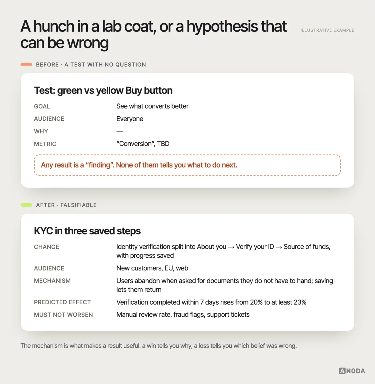
The mechanism is the part teams skip, and it is the part that makes the result useful. If the three-step KYC wins, the mechanism tells you why, so you can apply the same idea elsewhere. If it loses, the mechanism tells you which belief was wrong. Without it, a win is luck you cannot repeat and a loss is a shrug.
Choose primary, secondary and guardrail metrics
Pick one primary metric before the test starts: the single measure that decides the outcome. Then secondary metrics that help explain it, and guardrail metrics that must not get worse whatever happens to the primary one.
- Primary: the behaviour the hypothesis predicts will change. Completed verifications within seven days. Trial-to-paid conversion within 14 days. One metric, written down in advance.
- Secondary: signals that explain the primary result. Step-by-step completion, time to complete, error rate per field, share of users who save and return.
- Guardrails: the things you refuse to damage. Support tickets, refunds, cancellations, fraud flags, page performance — and, critically, the behaviour of existing users.
Optimising a primary metric without guardrails is speeding up a delivery van by removing the brakes. Deliveries are faster for a week. Then you get a very expensive week.
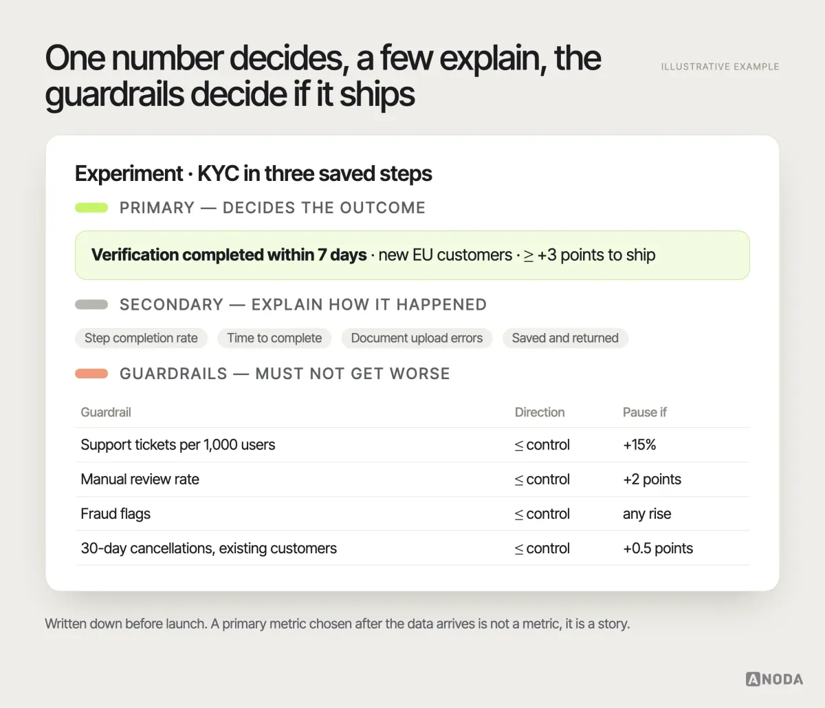
For UX experiments specifically, prefer metrics that describe a finished task over metrics that describe attention. “Completed verification”, “created a first project”, “invited a colleague”, “paid invoice” say that something useful happened. “Clicked”, “viewed” and “time on page” say that something happened — which in a confusing product may simply mean people were lost for longer. When you do use engagement metrics, pair them with a completion metric so a rise in clicks cannot be mistaken for a rise in success.
Define every metric precisely before launch: the event, the time window, the denominator and how repeated actions are counted. “Conversion” means five different things in five different meetings; in a test it has to mean exactly one.
Guardrails matter even more in UX than in marketing, because users are not a fresh audience every time. They have habits.
Sample size and duration: plan them before you start
Sample size is where good intentions go to die. The number of users you need depends on four things: your baseline rate, the smallest effect worth detecting, how often you are willing to be fooled by noise (significance level) and how likely you want to be to detect a real effect of that size (power). None of them can be picked after you see the data.
A worked, illustrative example. Say 20% of new EU customers currently complete identity verification within a week. You would only bother rolling out the new flow if it lifted that to at least 23%. With the conventional 5% significance level and 80% power, a standard two-proportion calculation asks for roughly 2,950 users per variant. If about 400 eligible new customers arrive each day and you split them evenly, that is around 15 days of traffic — and since behaviour differs between weekdays and weekends, you round up to three full weeks.
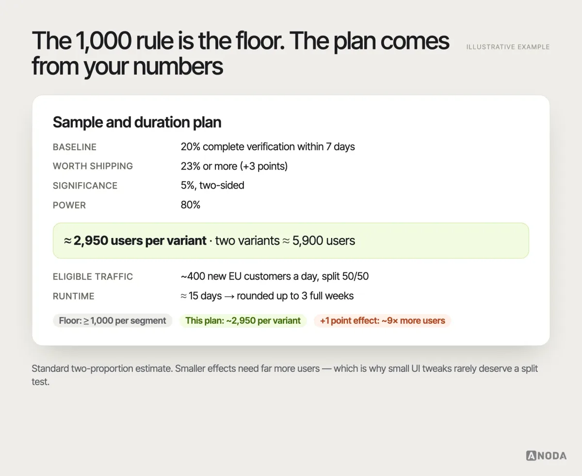
Notice what that example does to Oksana’s floor: a thousand per segment was necessary, and still not enough for an effect this size. Smaller effects need far more users; if you want to detect a one-point change, the requirement grows roughly ninefold. That is the honest reason many products should not A/B test small UI tweaks at all: at their traffic, the answer would take months and still be noise.
The plan is per segment, not per product. If the decision depends on how new users and existing customers respond, or on how the change works in two regions or on mobile and desktop separately, each of those groups needs enough users on its own to produce a trustworthy answer. Five thousand users split into five segments of a thousand is a very different experiment from five thousand users in one group — which is exactly why Oksana ties her rule to segments rather than to the product’s total traffic. Decide which segments matter to the decision before launch, size the test for the smallest of them, and do not slice further afterwards.
Duration has its own rules. Run whole weekly cycles. Avoid launching during a campaign, a holiday or a pricing change that will distort behaviour, unless that period is what you want to learn about. Measuring a strategy in one unusual fortnight is judging a beach café by its takings in the one week it snowed.
Build every variant as if it will ship
Here is the part the experimentation-platform demos leave out. An A/B test is not a switch you flip in a dashboard. Oksana puts it simply:
A/B testing is technically complex. Services can split users into groups, but the experiment still has to be implemented. In practice you have to keep two equivalent flows in the product, test both of them and bring both to production.
Oksana KovalchukFounder & CEO, ANODATwo variants means two designs, two builds, two rounds of QA, two sets of analytics events, two sets of help articles and two flows your support team must understand. It is like building two bridges to find out which one people prefer to cross. Both need foundations. Both must hold weight on day one. Nobody gets to test a bridge made of cardboard.
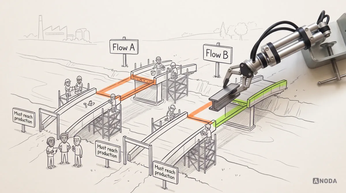
That cost is also the best filter for what deserves testing. If you would not be proud to ship a variant to everyone, it has no business in the experiment. The most common failure we see is exactly that: tests where every version is obviously weak, so the “winner” is simply the least bad option — close but no cigar, forever.
What makes a variant worth testing? Four things, in our experience:
- It changes the mechanism, not the decoration. Different steps, a different order, different information at the moment of doubt, a different default. Colour and copy tweaks rarely move behaviour enough to detect at normal traffic.
- It is one meaningful difference. If variant B changes the layout, the copy, the order and the pricing display at once, a win tells you that something in the bundle helped and nothing about what. Bundle changes deliberately, when you are comparing two complete approaches, and accept that you will learn less about each part.
- It is designed to the same standard as the control. A rough variant against a polished control measures polish.
- It is big enough to matter. A difference too small to detect with your traffic is a difference too small to test. Either make the change bolder or choose another method.
AI has made this worse. Generating variants used to cost enough that teams had to think: we can afford two or three, so let’s weigh them carefully before we bother our users. Now a model produces thirty alternatives before lunch, and some teams, especially in marketing-driven products, run two or three tests a month because nothing stops them.
They forget that the tests are for users. User experience is something already established — people have muscle memory that this button is in this corner and is this colour. So the buy button goes from blue to red, then red to green, then green to gold. Fine, but can we afford to annoy our users?
Oksana KovalchukFounder & CEO, ANODAMoving a button every month is moving the cutlery drawer in someone’s kitchen every week. Nobody gets faster at cooking. They just start swearing at the drawer. Throwing spaghetti at the wall is not an experimentation strategy, however cheap the spaghetti has become.
Assign variants cleanly — or roll out in stages
Random assignment is what makes the comparison fair, so protect it:
- Assign at the right unit. Usually the user or the account, not the session. A person who sees variant A on Monday and B on Tuesday contaminates both.
- Keep assignment stable. The same user sees the same variant across devices, sessions and reloads.
- Define eligibility before launch. Who can enter the test — new users only, one region, one plan — and when they enter it. Changing it midway breaks the comparison.
- Watch for overlapping experiments. Two tests touching the same flow at the same time can interact, and then neither result means what you think it means.
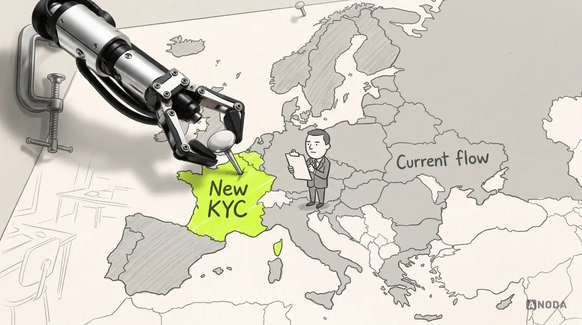
For high-risk changes, a full 50/50 split may not be the right first move at all. Fintech clients regularly come to us with the same sentence: “We need to update KYC, but we are afraid it will get worse — we tried before and it went badly.” For them we often recommend a bounded experiment: the new flow goes to one region, one segment or a small share of traffic first, with the same metrics and guardrails, and exposure grows only while the numbers hold.
Whatever the exposure, agree a stopping rule for harm before launch. Not “we will stop when it looks good” — that is peeking — but “we will pause the variant if verification failures, support tickets or manual review rates cross this threshold”. Guardrails you monitor daily are how you protect users while you wait for the primary metric to mature; they are not an excuse to read the primary metric early. Name the person who can press pause, and make sure they can do it without a deployment.
Call it an A/B test, a hypothesis test, a staged rollout or simply an experiment — as Oksana says, the essence does not change. It is how a hospital trials a new procedure on one ward before the whole building: same rigour, far less exposure, and a clear rule for stopping.
Testing AI features: measure the task, not the answer
AI features are where the “let’s A/B test it” reflex is strongest right now, and where it goes wrong most expensively. Teams compare two prompts, two models or two assistant layouts, see a change in “messages sent” and call it a result.
The questions from earlier apply twice over. First, is the feature coherent enough to test? If users cannot tell what the assistant is for, no variant of its prompt will fix that — the problem is in the product decision, not the wording. Second, what is the task? An AI experiment should measure whether people complete the job the feature exists for: a report produced and sent, a ticket resolved without escalation, a draft accepted with light edits. Output quality scores and message counts are secondary at best; a chattier assistant generates more messages precisely because it is less useful.
AI output also varies from run to run, so the same variant can behave differently for two users with identical requests. That noise makes small effects even harder to detect and pushes the sample requirement up again. Add guardrails that matter specifically for AI: correction rate, reversal of automated actions, escalations to a human, and complaints about wrong or unsafe output. A variant that raises completion while doubling the number of automated actions users have to undo is not an improvement; it is a cleanup bill with a delay.
Monitor data quality while the test runs
Before you look at a single result, check that the experiment is running the way you think it is. Most broken tests are broken in boring ways.
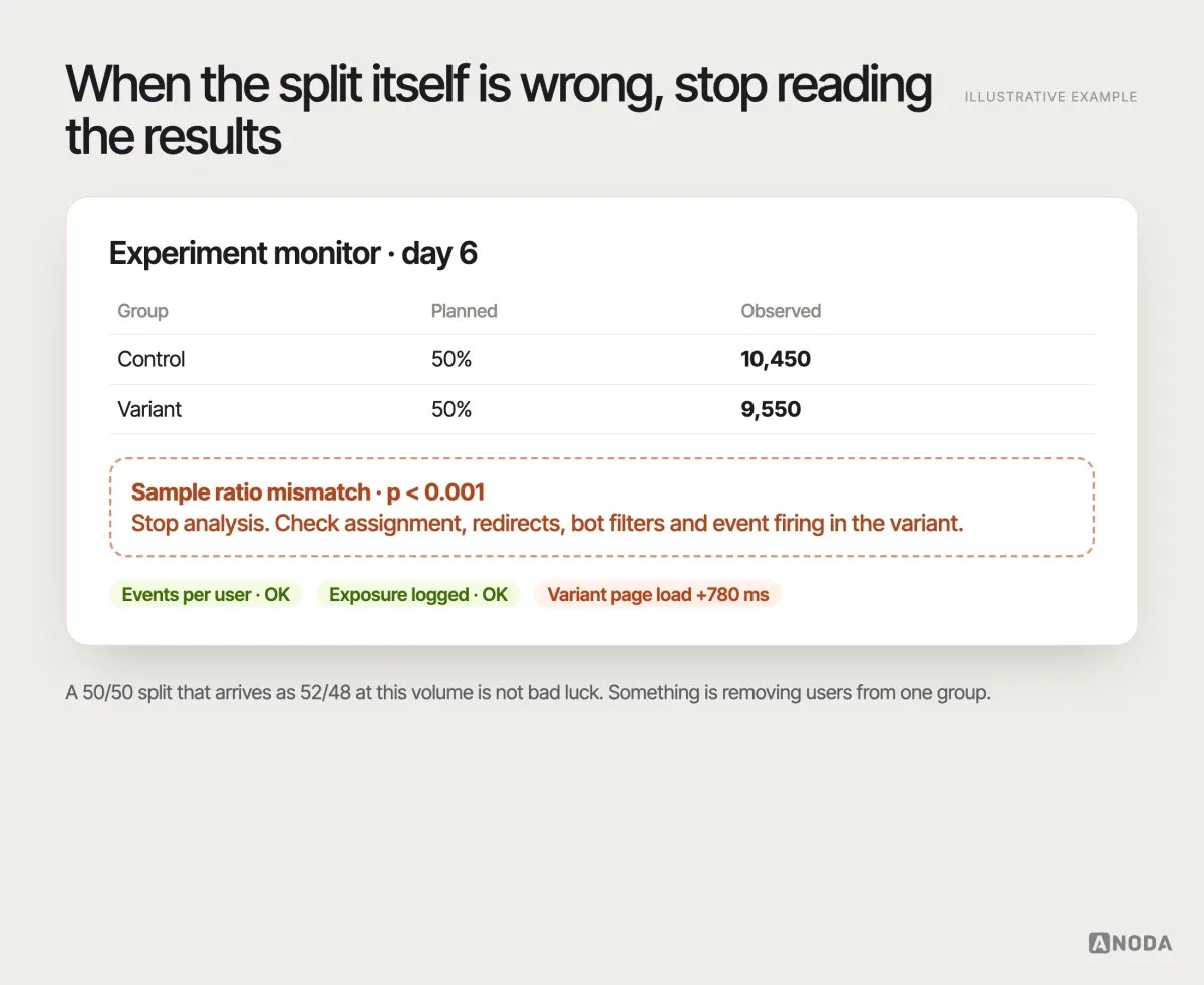
- Sample ratio mismatch (SRM). If you split traffic 50/50, the groups should be close to 50/50. If you expected 10,000 users per variant and got 10,450 and 9,550, a simple chi-square test says that gap is extremely unlikely by chance. Something is filtering users out of one group — a redirect, a bug, a bot filter, a slow page. Stop and fix it; the results are not valid. It is a casino coin that lands heads far too often: you check the coin before you celebrate the streak.
- Instrumentation errors. Events firing twice, not at all, or only in one variant. QA the analytics in both variants before launch, then again on day one.
- Exposure errors. Users assigned but never actually shown the variant, or shown it before they were eligible.
- Performance differences. If variant B loads 800 milliseconds slower, you may be measuring speed, not design.
The validity threats that turn “significant” into fiction
A test can be perfectly implemented and still produce a confident wrong answer. These are the traps we see most often.
Selection bias. The groups are only comparable if nothing but chance decides who lands in which. Letting users opt into a “try the new version” link, sending the variant only to customers who log in on a certain day, or excluding people after assignment because they “did not really use it” all quietly change who is in each group. Then the difference you measure is partly the difference between the people, not the designs. Assign randomly, assign first, and analyse everyone you assigned.
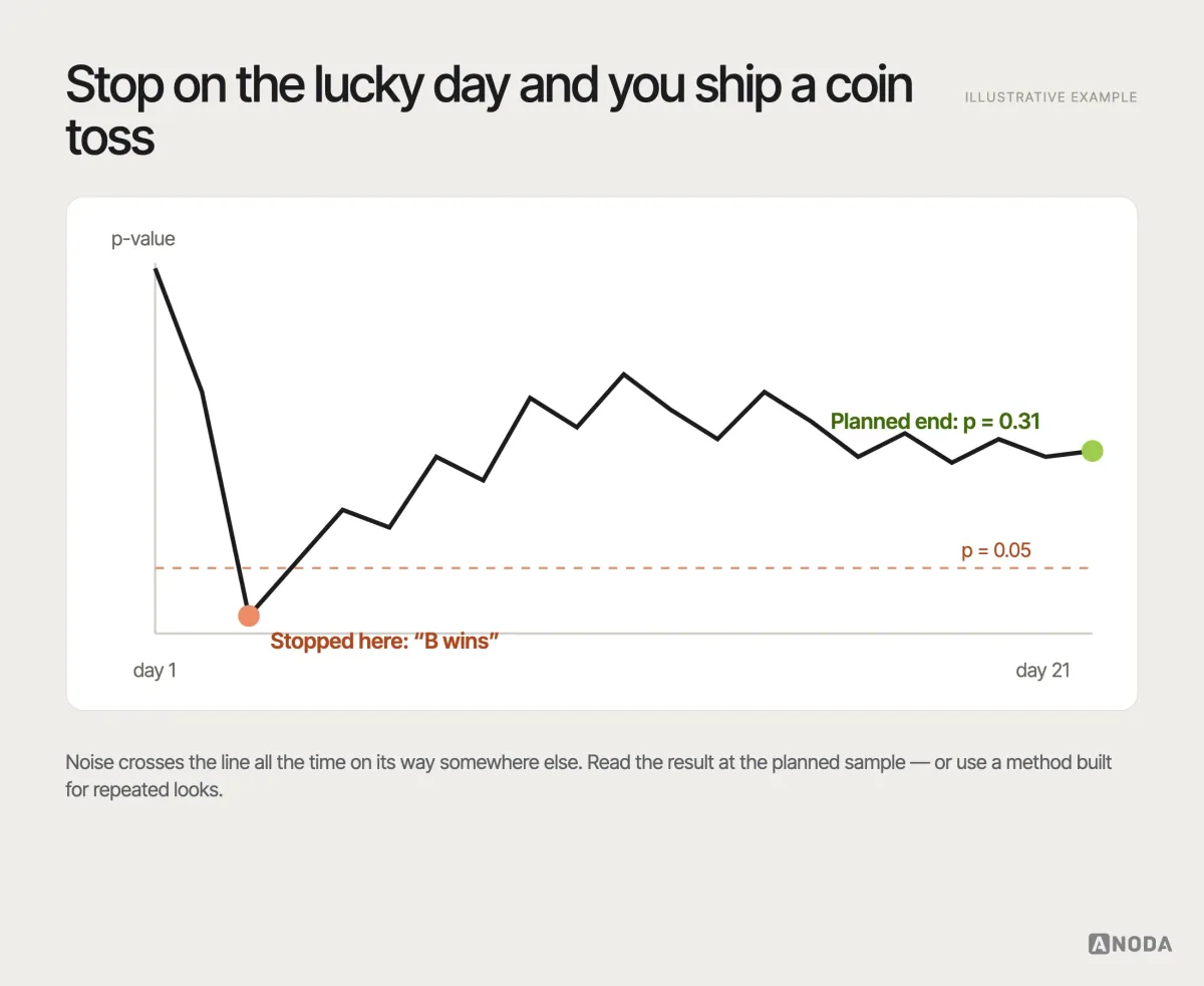
Peeking and stopping early. Checking results every day and stopping the moment the p-value dips below 0.05 dramatically increases false positives. Random noise crosses that line all the time on its way somewhere else. It is taking a cake out of the oven every five minutes to see if it is done: you will catch it looking perfect at some point, and it will still be raw inside. Don’t count your chickens before the planned sample has hatched — or use a sequential method designed for repeated looks.
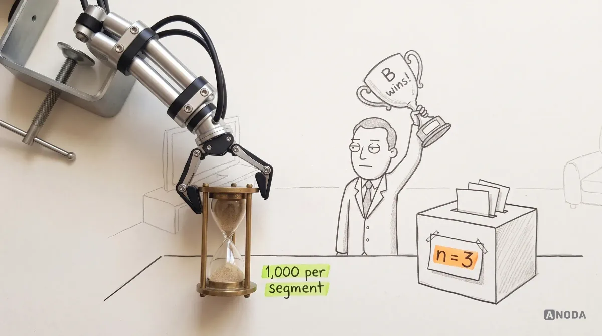
Underpowered tests. Too few users for the effect you care about means most real improvements look like noise, and the few “wins” you do see are more likely to be flukes that exaggerate the effect. Oksana’s thousand-per-segment floor exists precisely because anything below it tends to produce a random winner. Trying to call an election from your family’s dinner table is not a poll; it is a very loud opinion.
Novelty and learned behaviour. Existing users react to change itself. Some click the new thing because it is new — a toy on Christmas morning that is forgotten by Boxing Day. Others slow down because their muscle memory now points at the wrong place. Both effects fade, so short tests on established users mislead in either direction. Look at new and existing users separately, and at how the effect changes over the weeks of the test.
Seasonality and outside events. Campaigns, holidays, outages, a competitor’s price cut. Run whole cycles, note what happened in the calendar and be suspicious of results that line up with it.
Multiple comparisons and segment fishing. Test twenty metrics or slice the audience twenty ways and one of them will look significant by pure chance. It is the Texas sharpshooter: fire at the barn, then paint the target around the tightest cluster of holes. Decide the primary metric and the segments of interest in advance; treat anything else as a new hypothesis for a new test.
Metrics that move without improving anything. Clicks on a bigger button go up; completed purchases do not. Time on page rises because people are lost. If the metric moved and the user outcome did not, the product did not improve.
Read the results as a product decision, not a scoreboard
When the test ends as planned and the data is clean, analyse exactly what you said you would: the primary metric, with its confidence interval, not just a p-value. The interval tells you the plausible size of the effect, which matters more for the decision than whether it crossed a threshold. Then read the secondary metrics to understand how it happened, and the guardrails to see what it cost.
Keep statistical significance and practical significance apart. A huge product can detect a 0.2-point improvement with confidence; that does not mean the improvement pays for the variant’s maintenance. A small product can see a large, exciting difference with an interval so wide it could just as easily be zero. The decision question is always the same: is the plausible range of the effect large enough, and reliable enough, to justify the cost and risk of rolling it out? Write down that threshold before the test — it is the “minimum effect worth shipping” from your sample plan — and hold yourself to it afterwards.
Then look at the relationship everyone forgets: new users versus the people who already pay you.
You must not look only at how new users enjoy the new interface. Look at the relationship with existing users. If new users are delighted while existing users cancel their subscriptions, you cannot call the A/B test a success.
Oksana KovalchukFounder & CEO, ANODA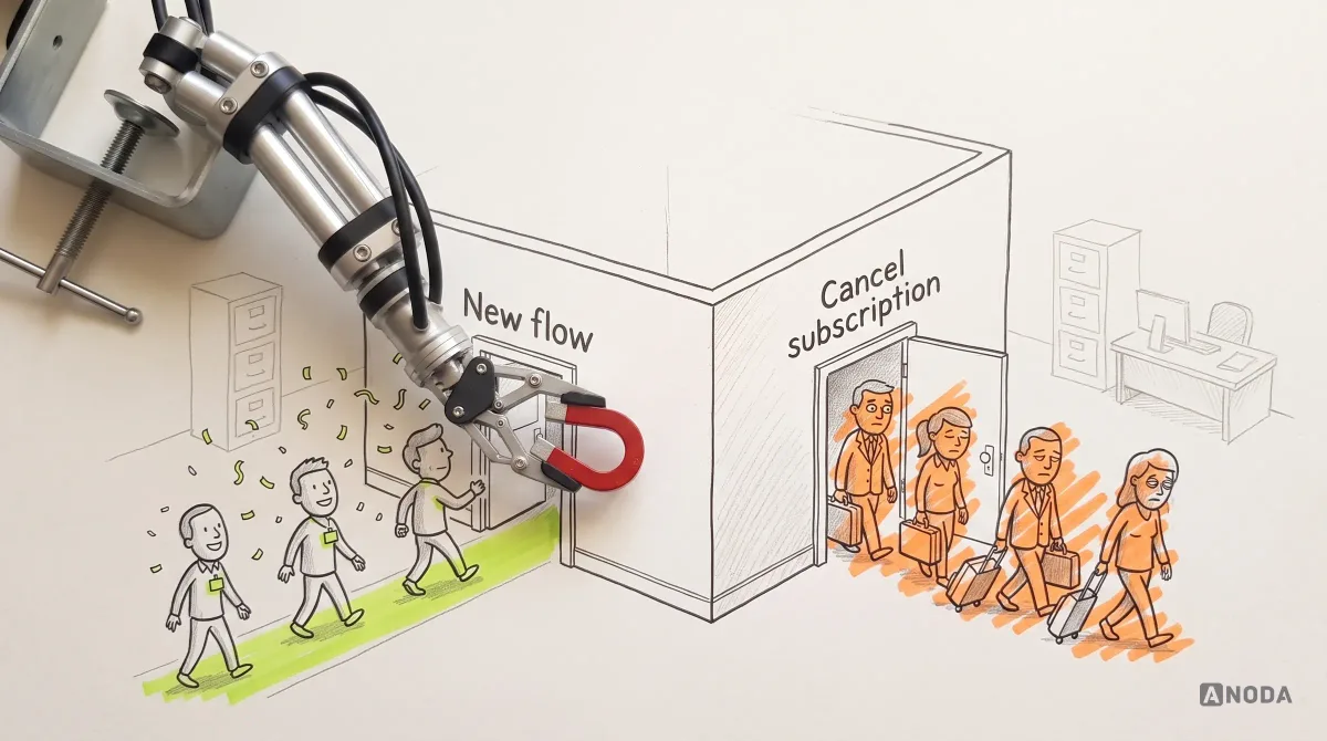
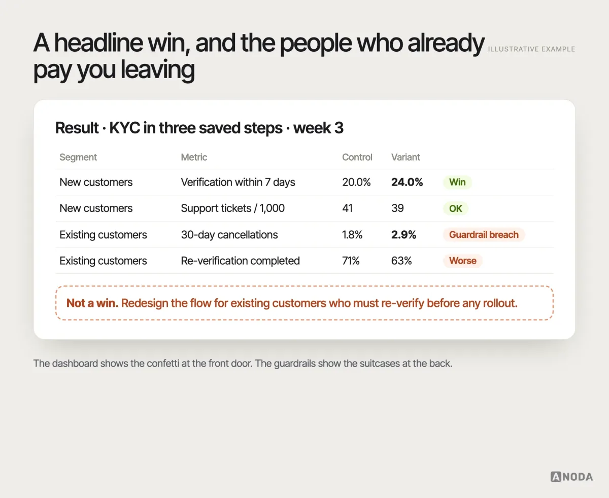
This is the part no platform and no model does for you. Interpreting an experiment means understanding the product, the audience, the marketing and the way the product is sold, and weighing a gain here against a loss there. A dashboard can tell you variant B won. It cannot tell you that B won by hiding the plan comparison that your largest customers rely on, or that the “losing” variant lost only because its copy was wrong. That judgement needs an experienced UX researcher with deep product context, not a summary written by an AI.
After the test: win, loss or inconclusive
Decide what you will do for each outcome before the test starts, then follow it. Otherwise teams quietly reinterpret results until they match what they wanted.
A clear win within the guardrails. Roll out, ideally in stages, and keep measuring for a few weeks — novelty fades and the real effect is often smaller than the test estimate. Remove the losing variant from the codebase so you are not supporting two flows forever. Document the mechanism you confirmed so the next design decision starts from it.
A clear loss. Keep the control, and treat the result as valuable. You just learned that your mechanism was wrong or incomplete, which is precisely the kind of knowledge qualitative research can now dig into: why did users not respond the way you expected?
Inconclusive. This is the most common result, and it is not a failure. It usually means the effect, if any, is smaller than what you designed the test to detect. Do not rerun the same test hoping for a different answer, and do not ship the variant “because it trended up”. Decide on other grounds — cost, simplicity, consistency with the rest of the product — or go back to research for a stronger hypothesis. Kicking the can down the road with test after test on the same idea is how experimentation programmes lose their credibility.
Whatever the outcome, record it. A short entry in a shared experiment log — the brief, the dates, the result with its interval, the guardrails, the decision and what you learned about the mechanism — turns one test into institutional memory. Without it, the same idea gets tested again in eighteen months by someone who never heard of the first attempt, and the organisation pays twice for an answer it already had.
A win that exposes a bigger problem. Sometimes the experiment shows that a better step inside a broken flow still leaves most users stuck. That is a signal to stop optimising pieces and redesign the journey as a whole — the kind of work a UI/UX design engagement exists for, where the experiment’s learning becomes the brief for a coherent product rather than one more patch.
The experiment brief: one page before any variant is built
Everything above fits on one page, and that page should exist before a designer opens a file or an engineer opens a branch. Measure twice, cut once: the brief is the measuring.
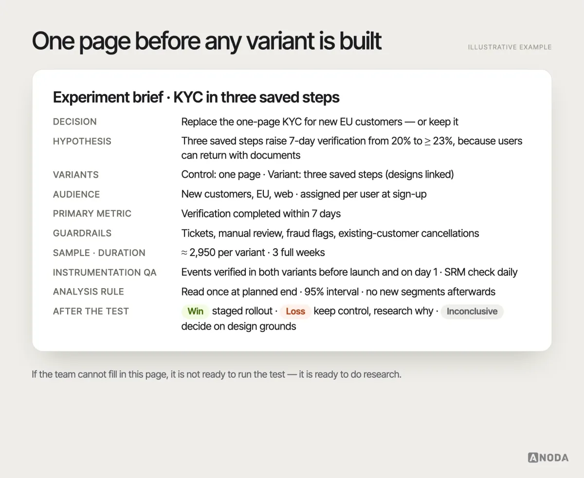
Each experiment brief we write answers the same questions:
- Decision. What will we do differently depending on the result?
- Hypothesis. The change, the audience, the mechanism and the predicted effect.
- Variants. Exactly what differs, with designs for every version — each one we would be willing to ship.
- Audience and eligibility. Who enters the test, when, in which segments, and at which unit of assignment.
- Primary metric. One, with its definition and time window.
- Secondary metrics and guardrails. What explains the result and what must not get worse, including existing-user behaviour.
- Sample and duration plan. Baseline, minimum effect worth detecting, significance, power, users per variant and whole weeks of runtime.
- Instrumentation QA. Events verified in every variant before launch and on day one; SRM check scheduled.
- Analysis rule. How and when results will be read, and how peeking is handled.
- Post-test action. What happens after a win, a loss and an inconclusive result — and who decides.
Ask “an A/B test to achieve what?” before anyone builds a variant. Use experiments for a defined hypothesis, enough users in every segment and a decision with a real price of error; use audits, analytics, interviews and usability testing while the problem itself is still unknown. Ship only variants you are prepared to support, protect the habits of the people who already pay you, and read conversion, retention and cancellation together. An A/B test can show you your users’ priorities. It cannot choose yours for you.

UX research
Know what you want to learn before you split your traffic.
ANODA connects diagnosis, variant design and interpretation in one product engagement. We find the friction behind the number, design flows worth shipping and help your team choose improvements that strengthen conversion without sacrificing the customers who already pay you.
Written by