
Self-storage booking website, map pin to booked unit
easyStorage Netherlands lets people find a storage location and book a unit.We designed and built its website and redesigned the inherited booking app.
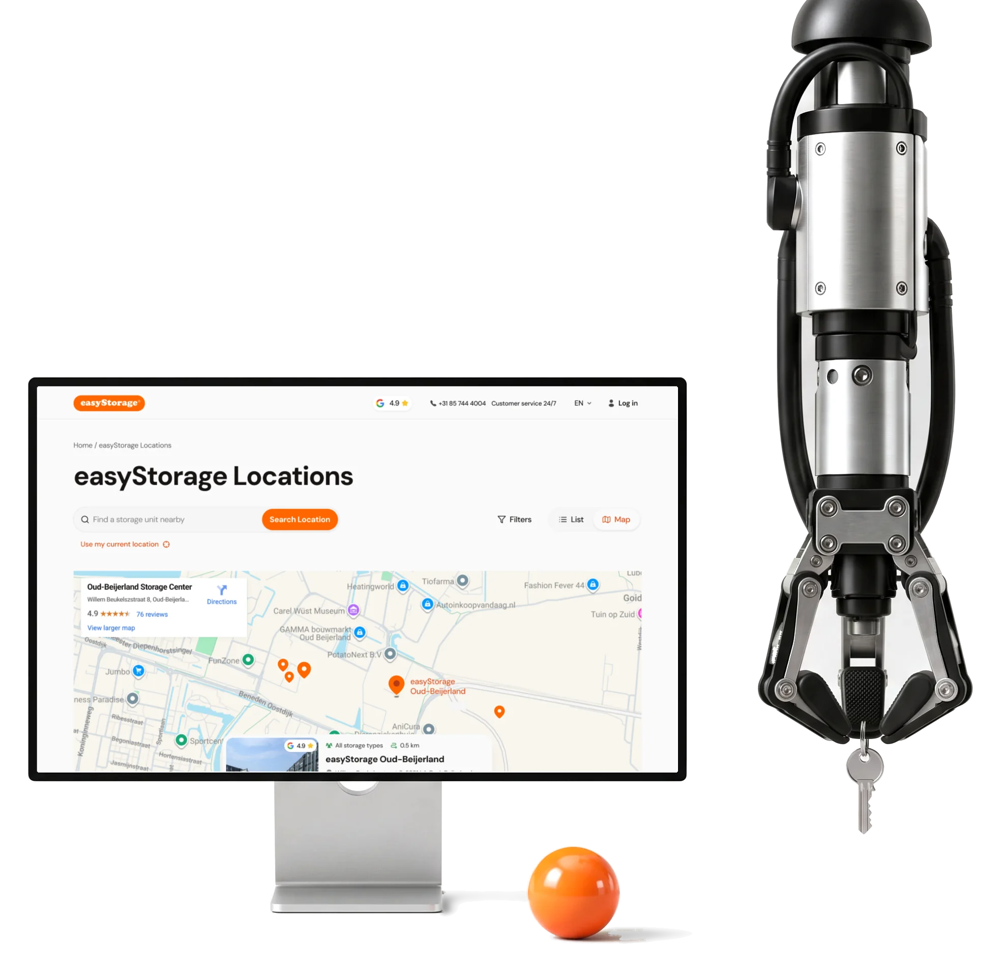
- 300+
- screens for the website and booking app, at every screen size
- 8
- experts design and engineering, alongside the client’s teams
Project summary
We designed and built easyStorage Netherlands’ Webflow website , then redesigned its booking app and took over the inherited code. Location choice, unit availability, pricing, agreements and payment follow one journey across desktop and mobile. Our ongoing work connects design, refactoring, integrations, testing and releases with the client’s other teams as the storage service grows.
How the work runs
- Other teams
- The client’s marketing and brand team, a user-testing and monitoring team, the Storeganise and Zendesk integration work, and Unwired Logic as implementation partner.
- Our part
- Research, flows and design; the Webflow site; the booking app’s frontend, backend helpers and integrations; QA and releases.
- The start
- A handoff from the previous team: we reviewed the booking app’s code, refactored it and fixed its security and stability issues before adding more.
- Now
- Ongoing: the site and the booking app keep changing, with staged releases.
What a storage booking actually depends on
One chain, from a search to the key:
-
Location
- Map
- Nearest
- Opening hours
-
Unit
- Size in m²
- Availability
- Price
-
Offer
- Promotions
- Promo code
- VAT
-
Customer
- Personal
- Business
- Account
-
Move-in
- Start date
- Agreement
- Terms
-
Handoff
- Mollie payment
- Storeganise
- Zendesk
- Choice and Commitment
- Enough options to find the right unit, few enough to book one.
- Inherited app and New design
- Redesigning a demo app without breaking what already worked.
- Marketing speed and Engineering load
- New pages without a developer, bookings that stay stable.
One step that holds the whole storage decision
- Found
- A unit only makes sense next to its location, its size, its price and whether it’s free, and the inherited demo spread these over separate views.
- Decided
- One step: the progress on top, the chosen location with a way to change it, size filters, then each unit as a row with its price per month, how many are left and a promotion when there is one.
- For the user
- A customer compares units at one location and sees at once which ones they can actually book.
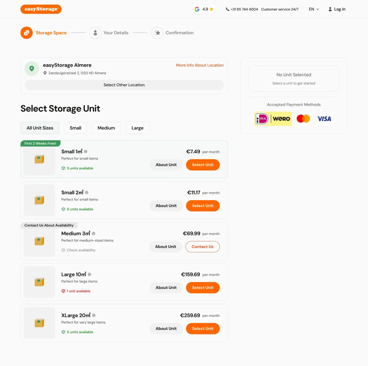
-
Where you are
Storage space, your details, confirmation.
-
Which location
The address, more about it, and another location in one click; the summary and payment methods on the right.
-
Which size
All sizes, or small, medium and large.
-
Which unit
Price per month, units left, promotions, and Contact Us where nothing is free.
How the work progressed
1,200+ hours so far: the website first, then the booking app we took over, and both still moving.
-
Discovery
How competitors sell storage online, and what a customer needs to know before choosing a unit
Artifact Competitor research
-
User Flow
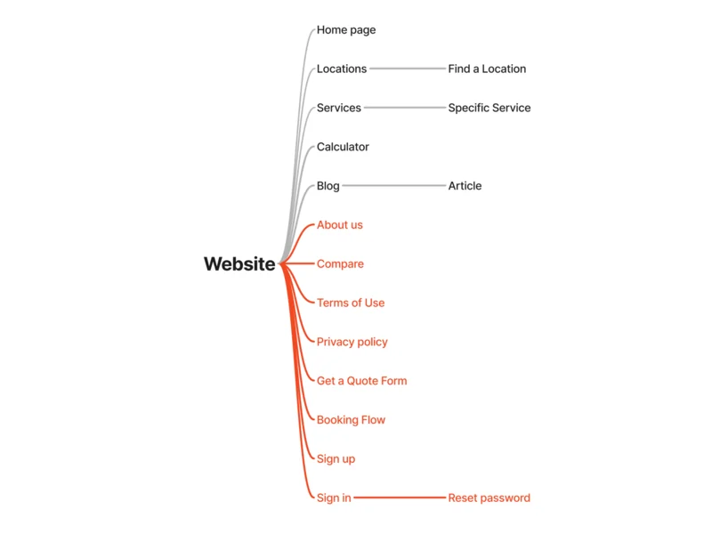
Every booking step and its rules, from choosing a unit to a signed contract
Artifact Sitemap and booking flows, revised as the rules changed
-
Wireframes
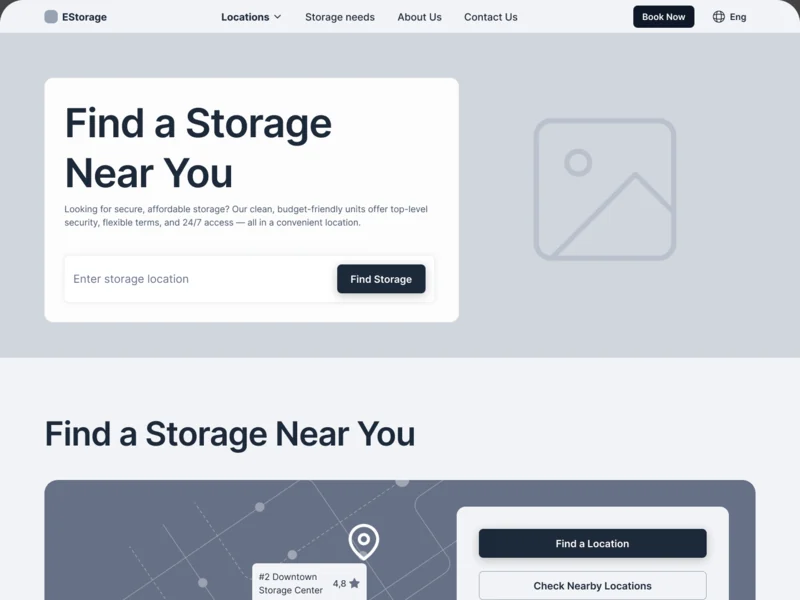
Where search, the map and the results sit before any styling
Artifact Desktop wireframes for the website
-
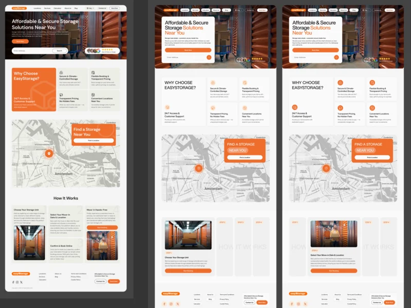
UI & Design System
One look for the site and the booking app, with states for promotions and sold-out units
Artifact Style directions, the final UI and a UI kit
-
Delivery
What the other teams need from design, and when
For wider application scope, our web app development service connects roles and systems; the enterprise software guide explains those workflow decisions. The easyStorage engagement remains ongoing.
Artifact Prototypes and specs shared with the implementation and testing teams
-
Development
A Webflow site the marketing team edits, and a booking app refactored before it grew
The inherited booking app needed refactoring and integrations. Our frontend development, React development and Next.js development services carry approved flows into a working interface.
Artifact Webflow build, React and Next.js frontend, backend helpers and integrations
-
Adaptives
The same search and booking on a tablet and a phone
Artifact Tablet and mobile layouts for the site and the booking steps
From looking around to booking, without dead ends
- Found
- People arrive wanting different things: the nearest location, a size that fits, or a price, and each way in had to end at a booking.
- Decided
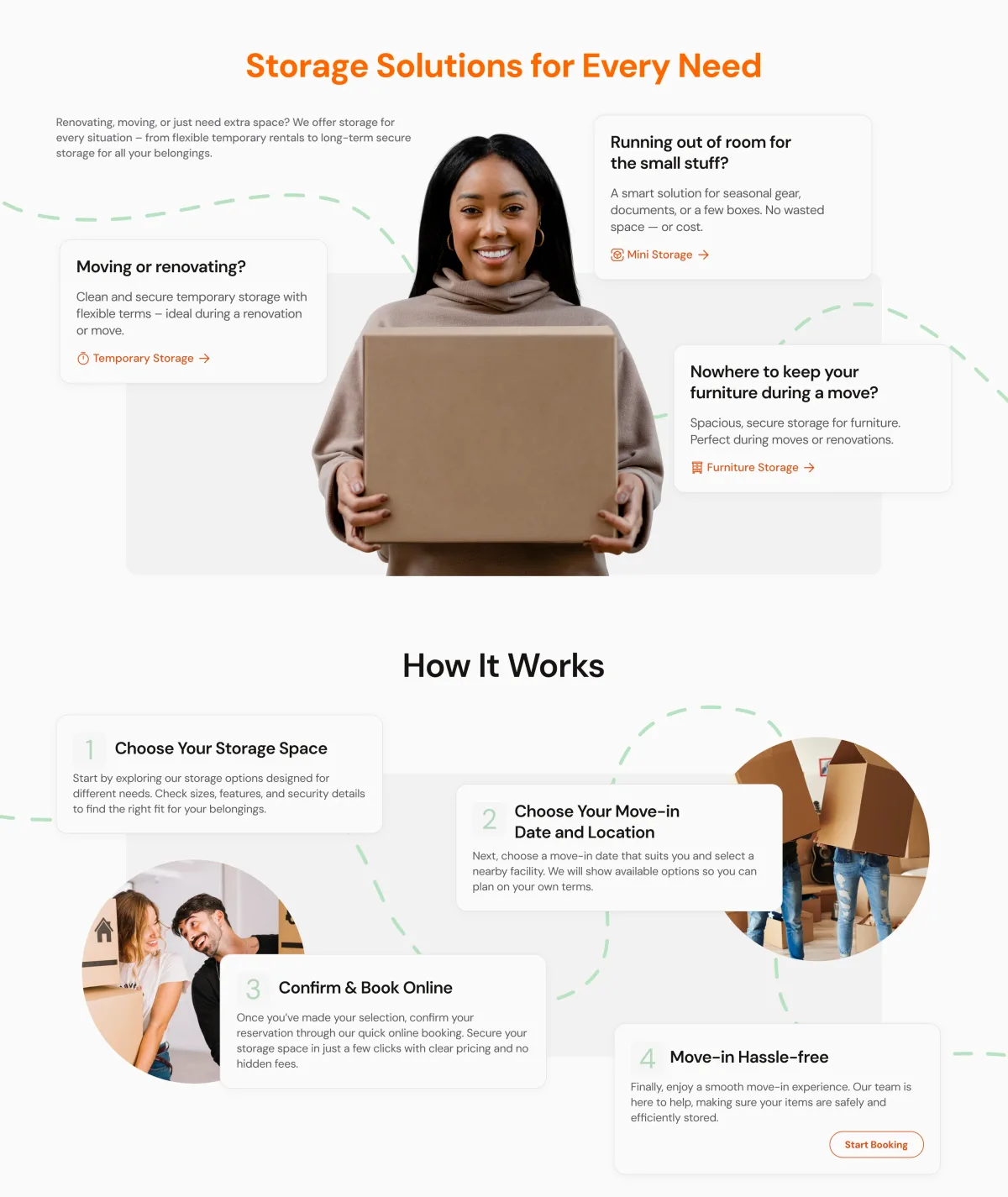
- Every path was mapped end to end, with competitors’ sites as the benchmark: search leads to locations, a location to its units, a unit to the booking steps.
-
Finding a location
From the search in the hero to the location list with its filters and states, then a location page or straight to booking.
Open the full map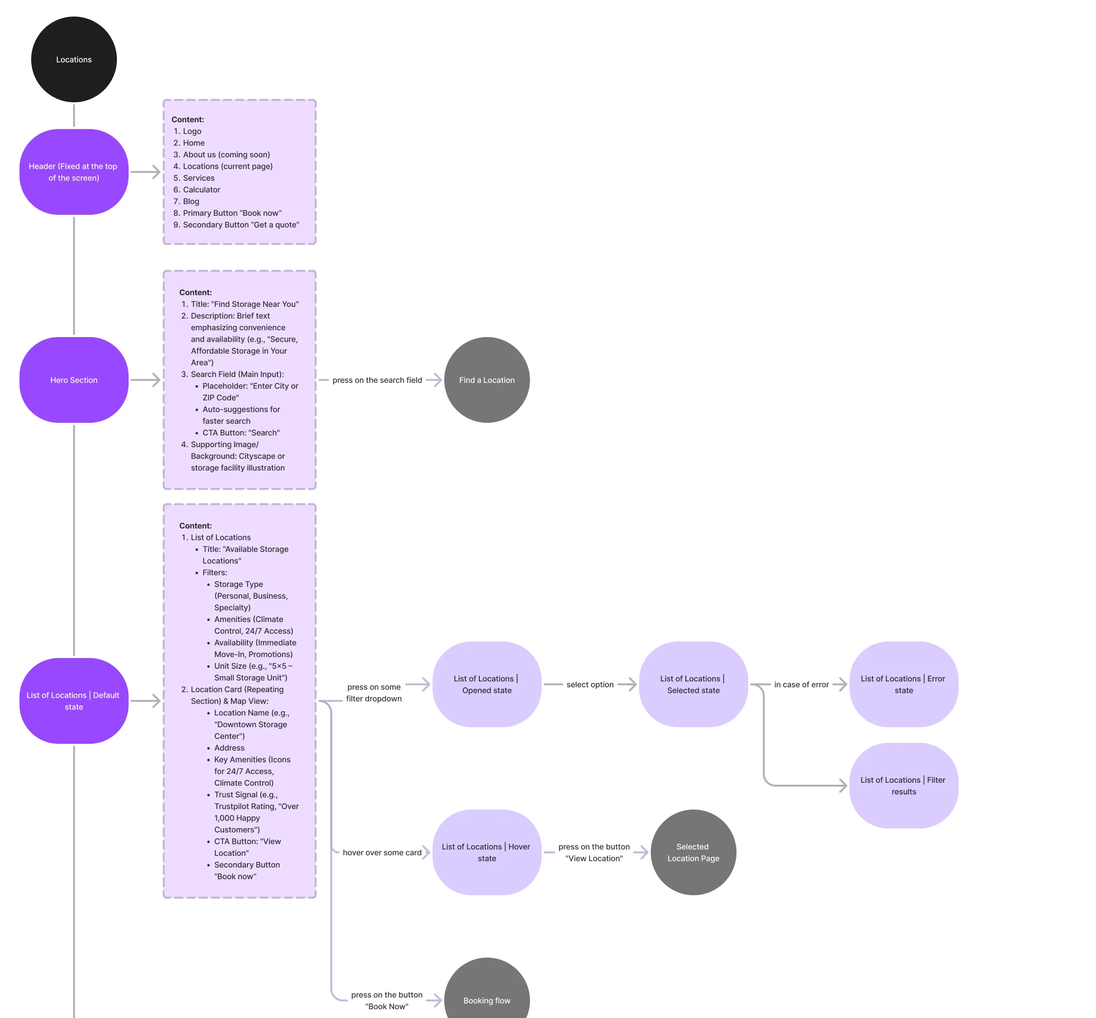
-
Booking a unit
Choose a unit, see it selected, enter personal or business details, then the rest of checkout.
Open the full map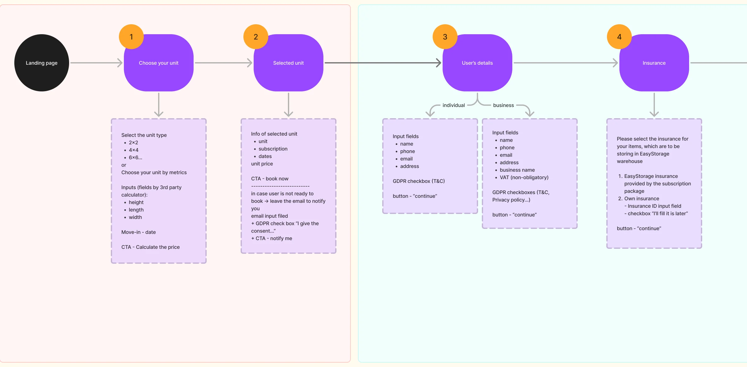
-
How others do it
Storage companies’ homepages and booking flows, compared side by side.
Open the full map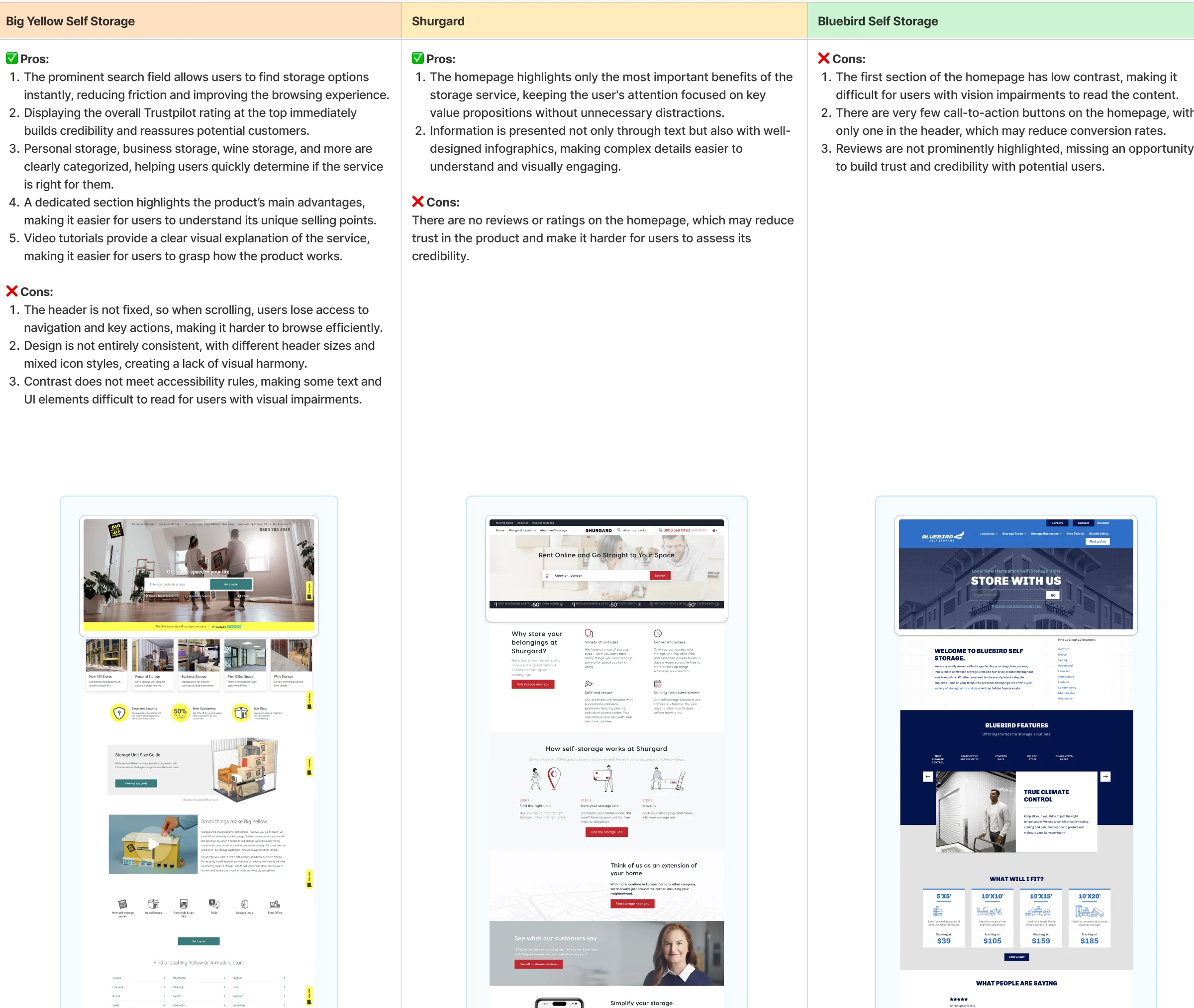
Six jobs, from a location page to the key
The website first, where people pick a place and a size. Then the booking steps, where the business rules live.
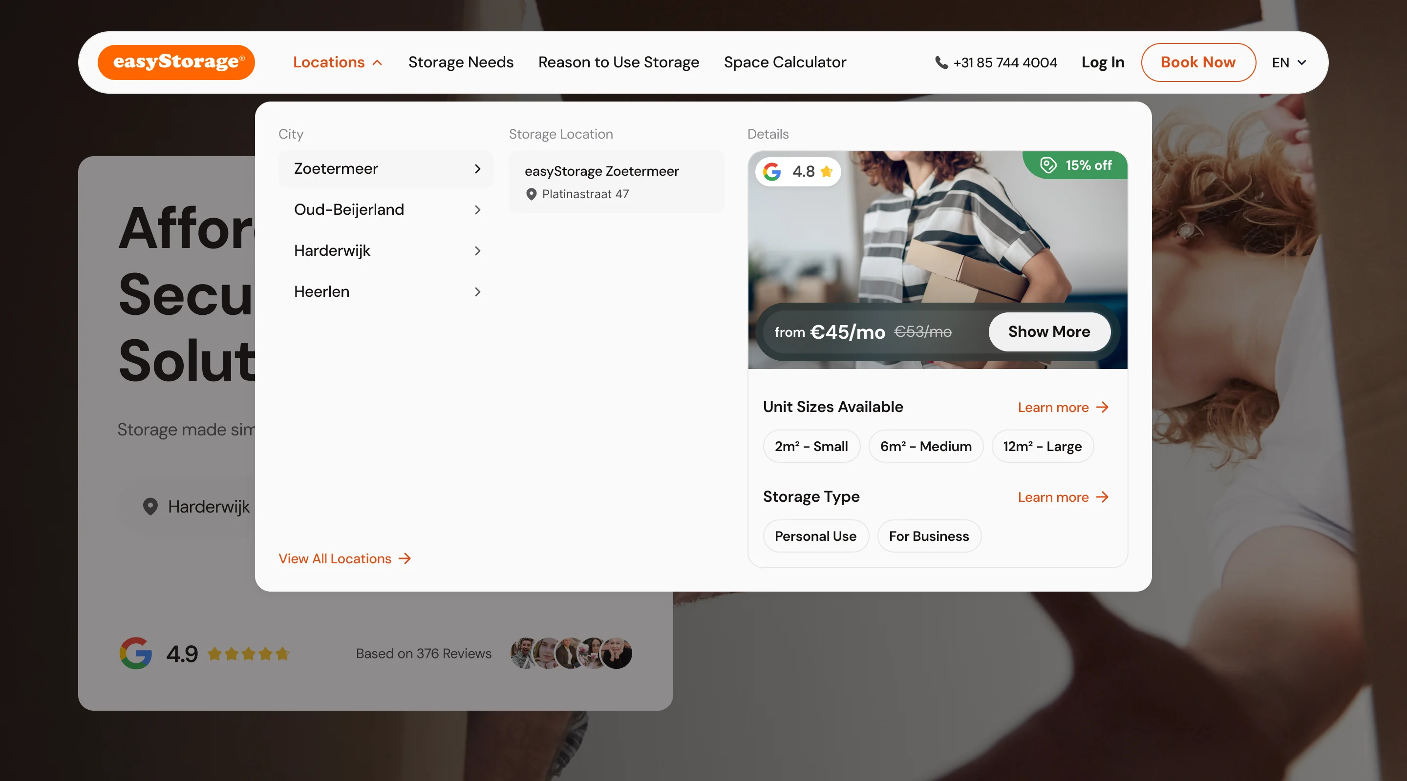
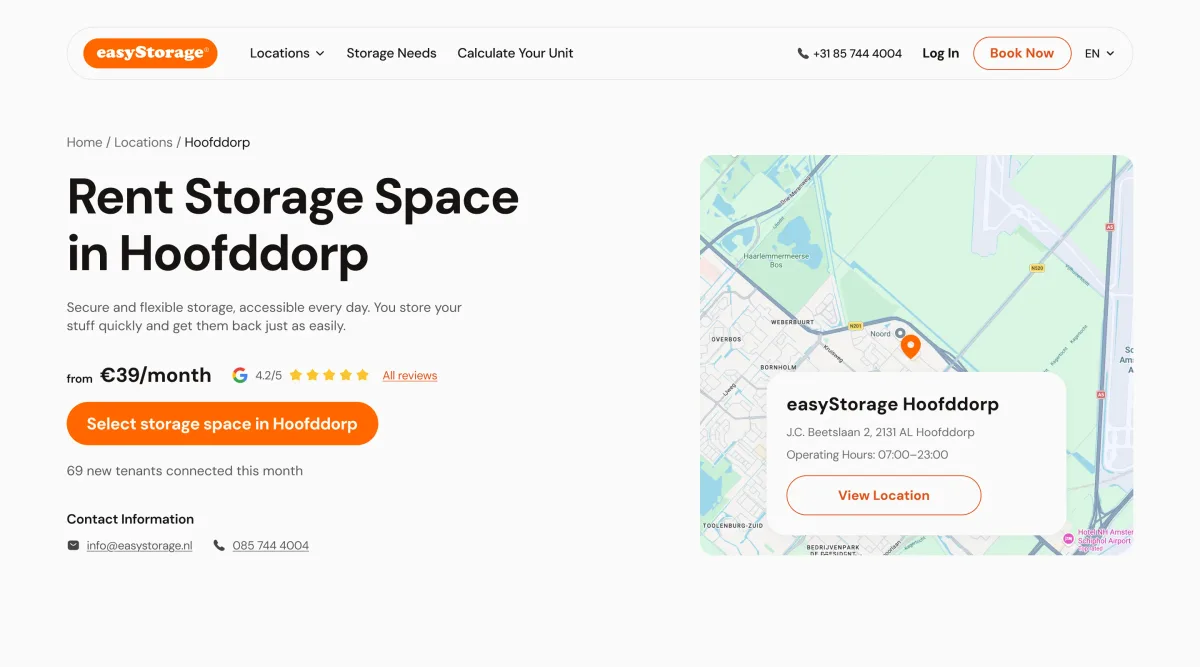
A page for every location
- Found
- Storage is local: people want the place near them, its hours and what fits in a unit, and the marketing team needed to add locations without a developer.
- Decided
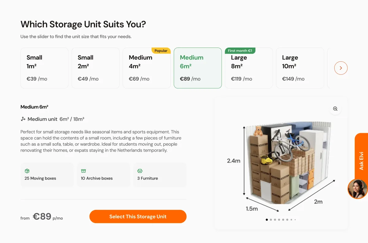
- One location template in Webflow: the address on a map, the price from, then a size picker that shows what fits, with promotions on the tiles.
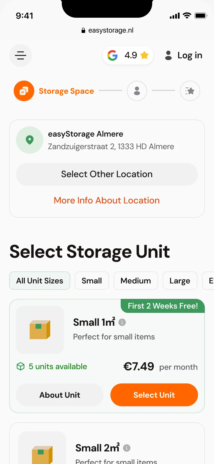
Choosing a unit on the phone
- Found
- Booking has to work on a phone, where a table of units doesn’t fit.
- Decided
-
Units as cards one under another: size, price per month, units left, a promotion badge and both actions on the card.
Our ecommerce design connects discovery and checkout; the ecommerce UX guide covers product choice, changing prices and recovery.
Personal or business
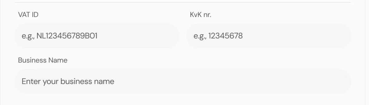
- Found
- A business renting storage needs an invoice with its VAT and chamber of commerce numbers; a person shouldn’t see those fields at all.
- Decided
- One details step with an account type switch: business adds its own fields, and the selected unit and total stay in view on the right.
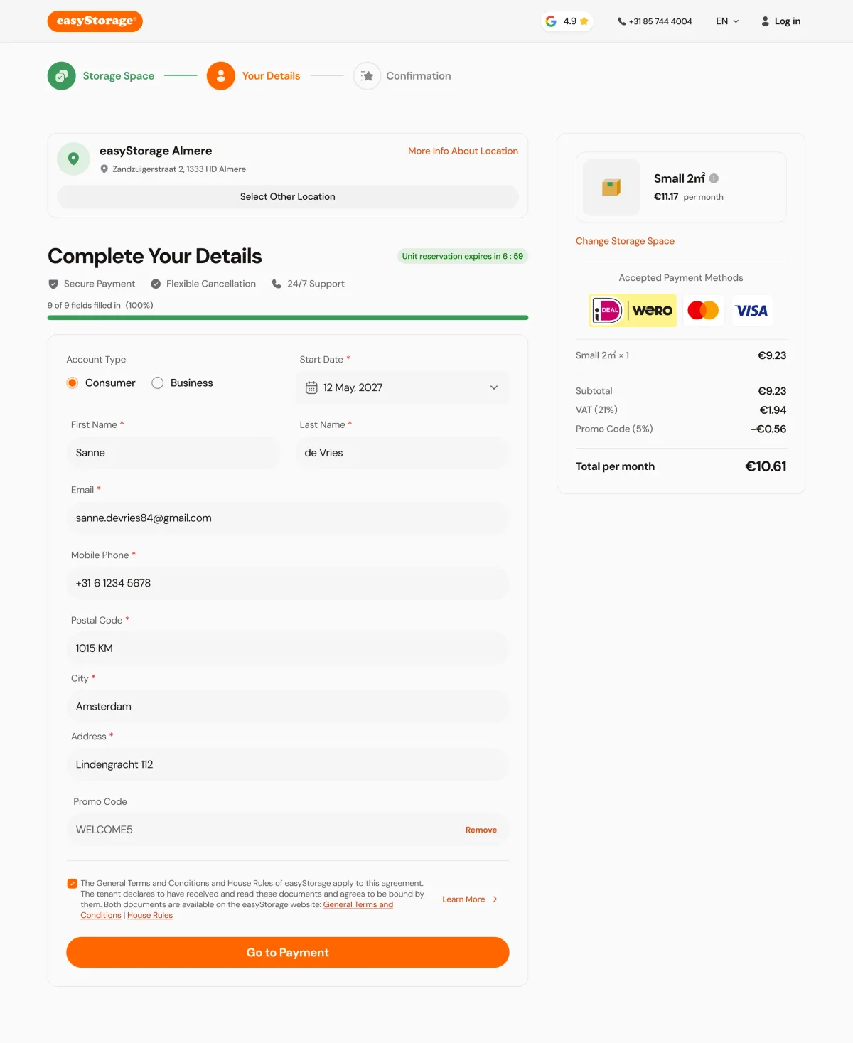
A move-in date and a promotion
- Found
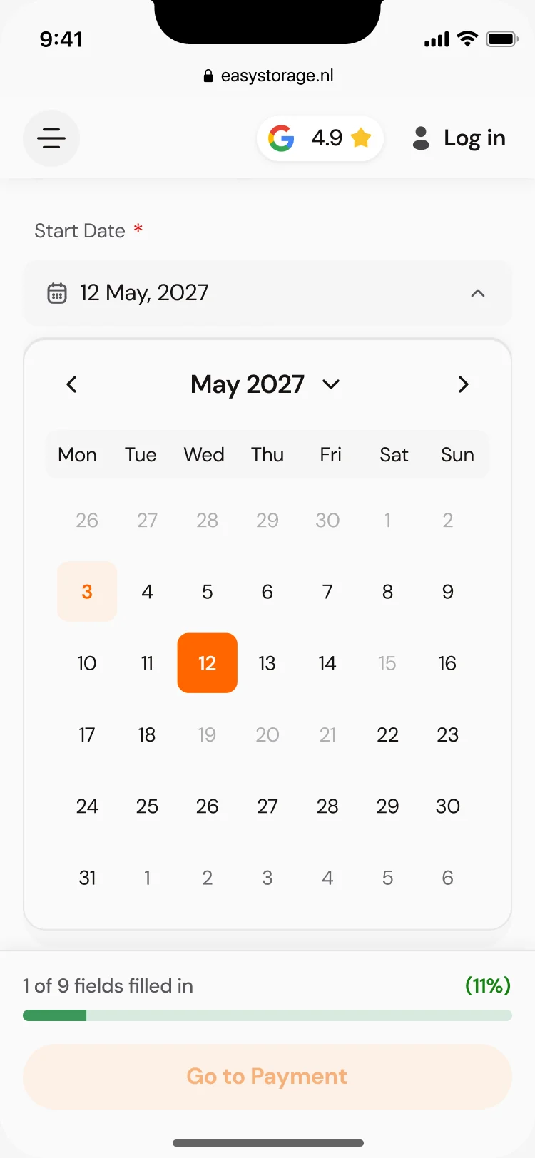
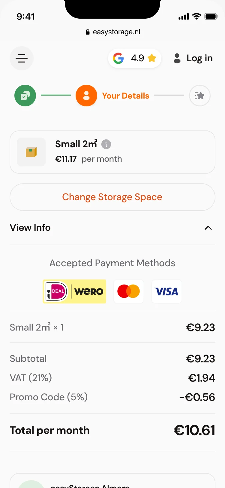
- A start date and a promo code both change what a customer pays, and a surprise at payment makes people leave.
- Decided
- The calendar and the promo code inside the details step, and the summary recalculated at once: subtotal, VAT, the discount and the total per month.
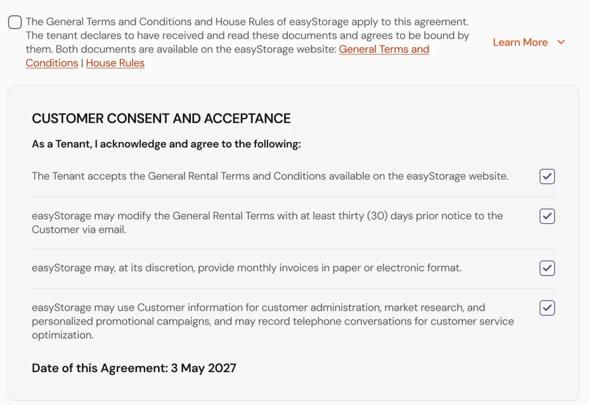
The agreement, before payment
- Found
- A storage contract has terms a customer must accept, and burying them in a link invites disputes later.
- Decided
- The consent statements laid out one by one inside the step, each with its own checkbox, and the agreement date shown, before the step opens payment with Mollie.
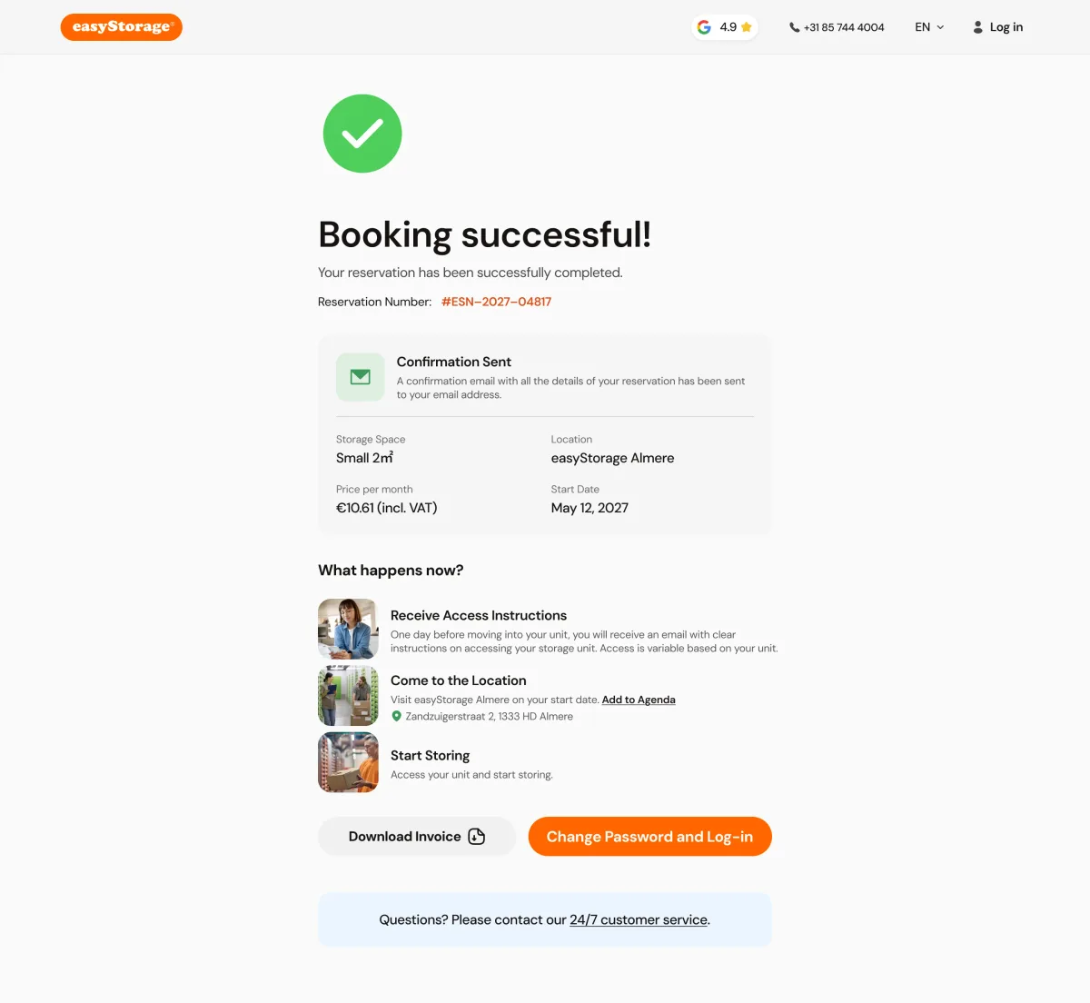
Booked, and what happens next
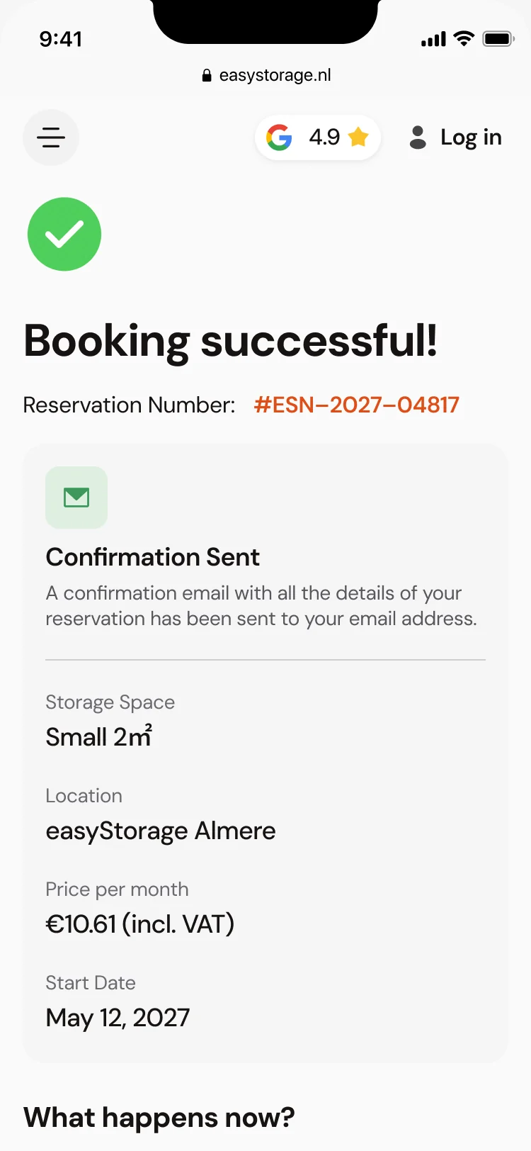
- Found
- After paying, people want proof and to know how they get in; without it they call support.
- Decided
- A confirmation with the reservation number and details, three steps from access instructions to storing, the invoice and account actions, and a way to reach support.
One kit for the website and the booking app
- Found
- The site in Webflow and the booking app in React are separate builds, and without shared parts they would drift into two brands.
- Decided
- One UI kit both builds follow, with every state the business rules need: selected, promoted, most chosen and not available.
The same unit card on a desk and a phone
One card from the kit: a row on desktop, a stacked card on a phone, with the same promotion, stock and actions.
-
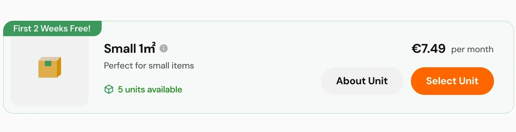
Desktop: A row in the unit list. -
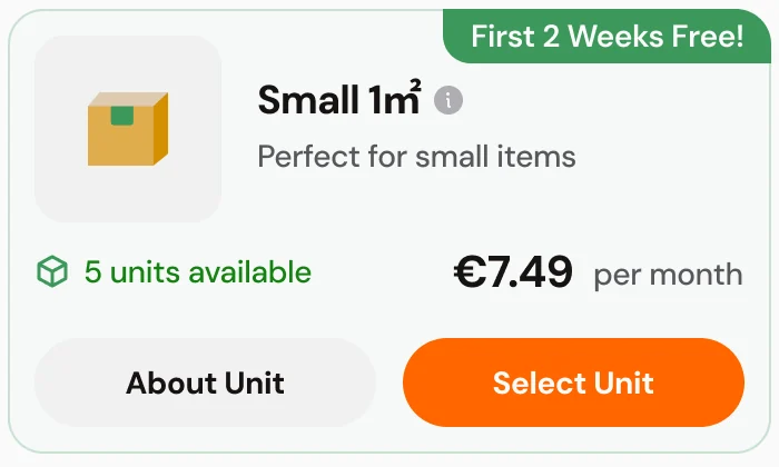
Phone: The same unit, stacked.
Drawn for every rule a unit can have
Default, selected, most chosen, a promotion, and not available, on desktop and on a phone.
-
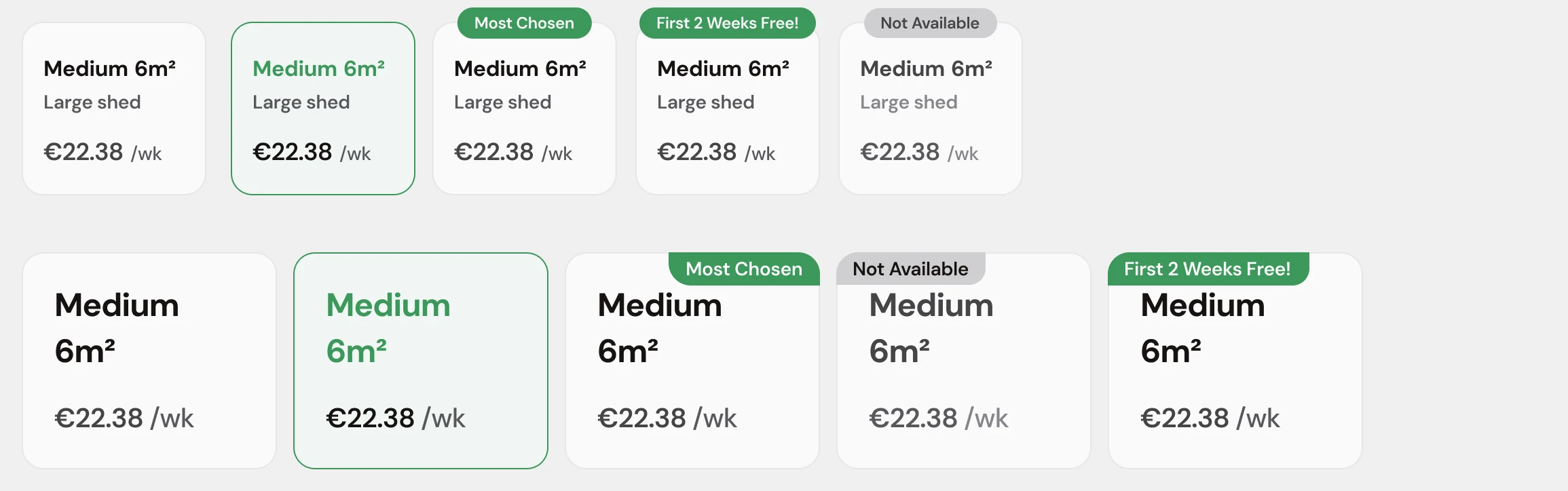
Unit size tile
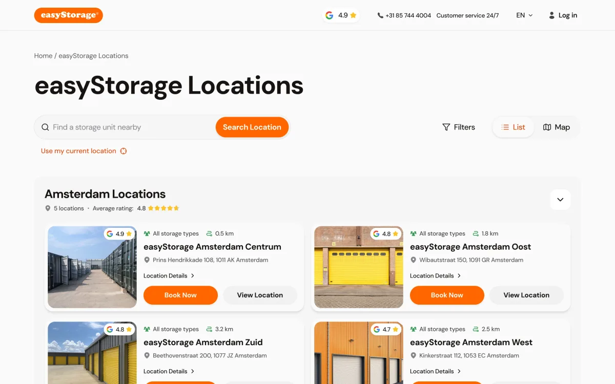
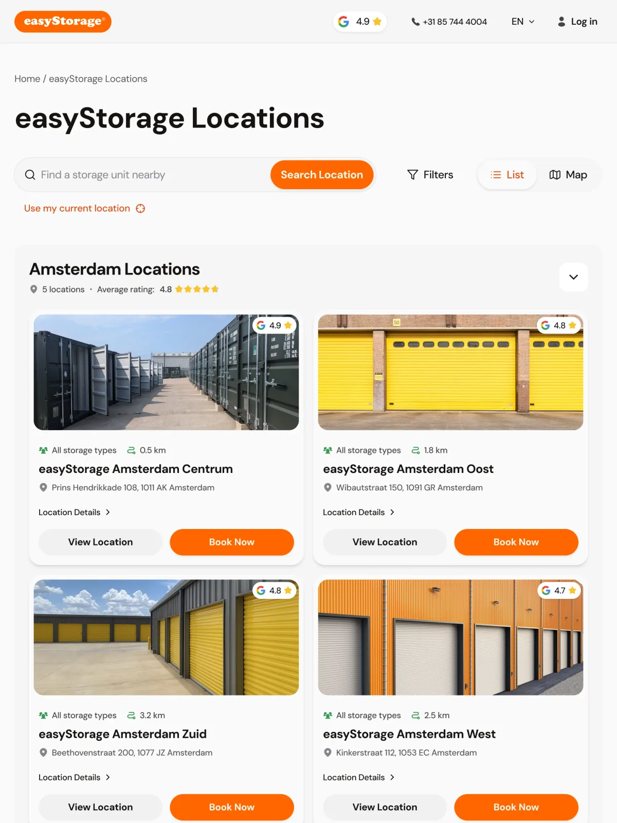
The same search on a desk and on the go
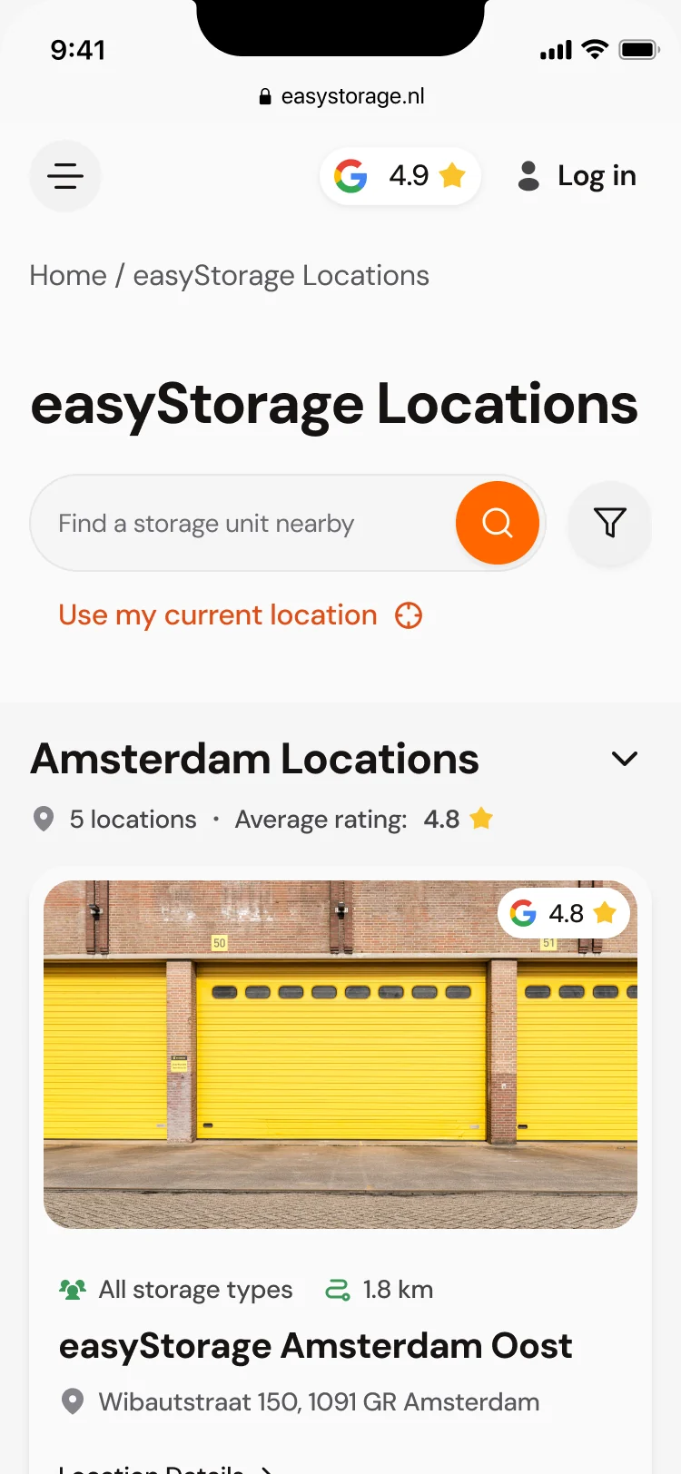
- Kept
- The search, the list and map switch, and every location card with its rating, distance and both buttons.
- Changed
Two cards to a row on a tablet, one on a phone; the filters fold into an icon beside the search.
Our responsive design guide explains the mobile decisions that keep location choice and booking clear across breakpoints.
A website the marketing team runs, and a booking app that ships
- Found
- The client’s marketing team needed to publish pages on their own, and the booking app had to keep working while Storeganise, Mollie and Zendesk each did their part.
- Decided
The site built in Webflow from the kit, so new pages and locations need no developer; the booking app refactored, integrated, tested and released in stages with the other teams.
Our website design connects the public site to the booking product. Planning a website redesign? Our redesign strategy starts from that complete customer journey.
-
Webflow site
The website built and managed, with Dutch and English versions from the client’s content.
-
Booking app
The inherited code reviewed and refactored, security and stability fixed, the frontend in React and Next.js, backend helpers.
-
Integrations
Storeganise reservations, Mollie payments and Zendesk support, joined into one booking.
-
QA and releases
Design and manual QA, staging reviews, and AWS and Vercel rollouts to Production.
Where the product is now
A Webflow website the marketing team extends on its own, a location page for each site, and a booking app redesigned and refactored from an inherited demo: location, unit, personal or business details, date, promotion, agreement, payment and confirmation in one flow, on desktop, tablet and phone.
Design, integrations, testing and releases were coordinated with the client’s other teams along the way, and the work goes on.
- screens across the website and the booking app
- 300+
- experts on the team
- 8
In the client's words
The website design brings the storage offer and booking steps into a more consistent experience. We appreciated the attention to how someone moves from understanding the service to choosing an option, with the account-related screens considered as part of that journey.

Don’t want to referee your vendors?
At easyStorage we took over an inherited app and worked out design, integrations, testing and releases with the other teams instead of leaving it to the client. Tell us where your product is stuck.
More work like this
Three more products with bookings, real business rules, or many teams.
-
Marketplace design · Water sports
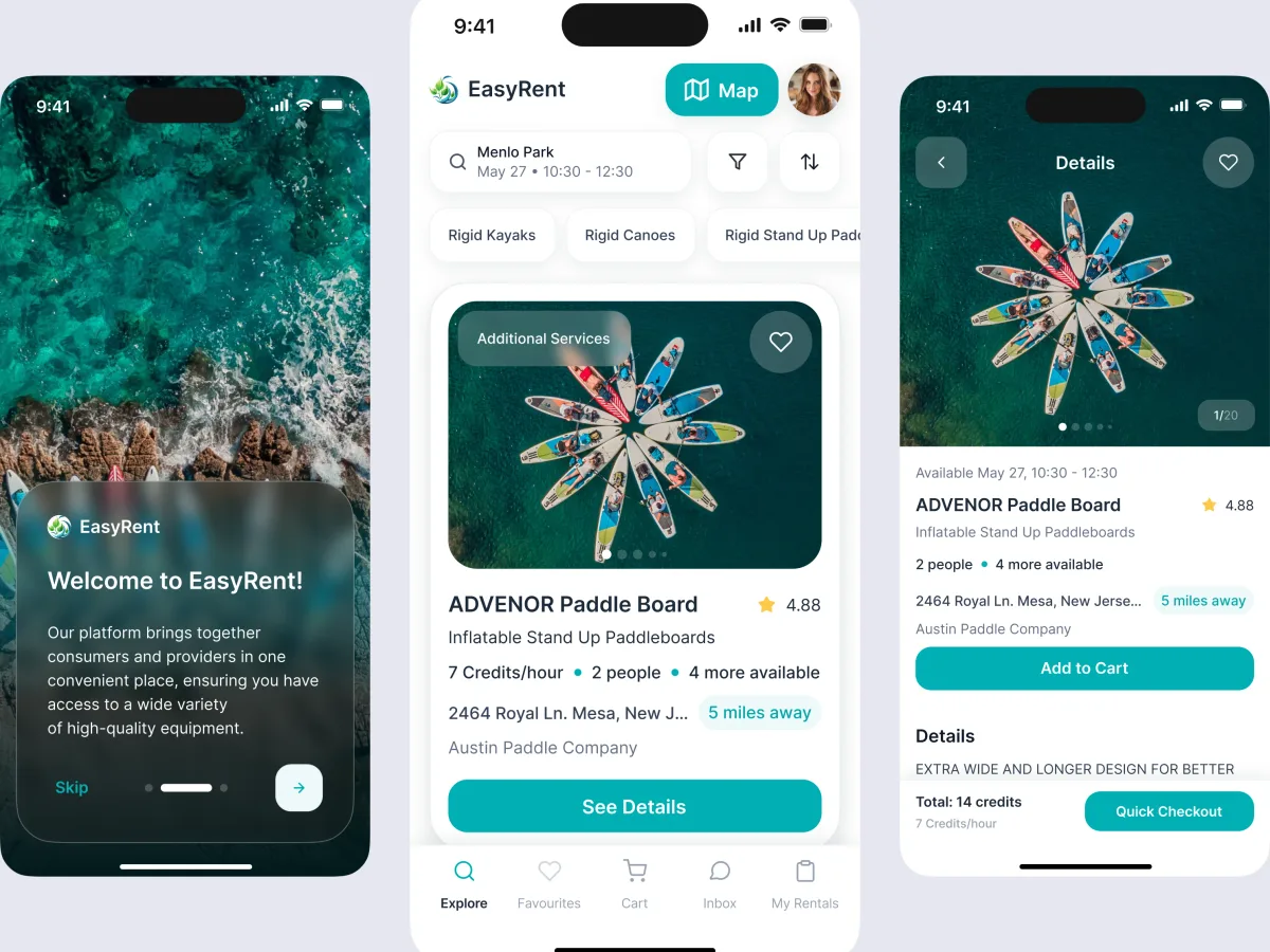
EasyRent
Designed a rental marketplace around the people booking equipment, the suppliers offering it and the team managing it.
- 3 User roles — renters, suppliers and administrators
- Mobile + web Consumer journeys and marketplace management
-
Wellness · Healthcare
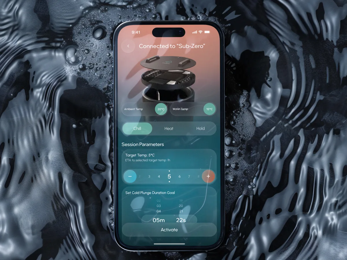
Clearwater Wellness Co.
Designed a cold-plunge wellness app from scratch: bath control, session tracking and a community around the ritual.
- 306 Screens designed
- 4 Experts on the team
-
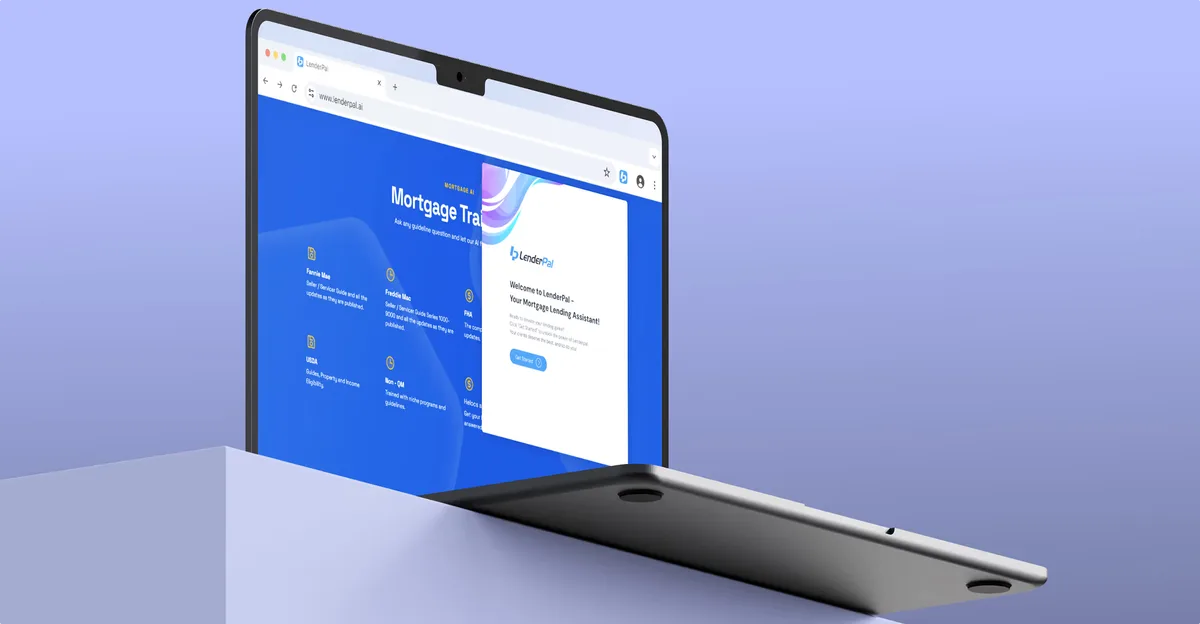
Chrome extension · Real Estate
LenderPal
Fitted a full mortgage workflow for real-estate agents into a Chrome extension.
- 150+ Screens designed
- 4 Experts on the pod
What we brought to easyStorage
The product

Your Product Is Leaking Money on 11 Screens You Forgot Existed
Your product leaks revenue on overlooked screens. Find the 11 neglected journeys and see how ANODA fixes the gaps your roadmap keeps missing.