In short
Enterprise software rarely fails loudly. People climb in through the window instead: spreadsheets, chat approvals, retyped numbers, and you pay for every hour of it. Buyer approval, admin success and user adoption are three different signals. Here is how to research specialised work, model roles, data and exceptions, simplify the critical path without hiding control, rank workflows by cost and risk, and prove the redesign paid off.
In this article
- ANODA designs the work behind the interface
- A role model in an existing training product
- What makes enterprise UX different from consumer UX
- Buyers, admins and end users are three customers with three scoreboards
- Research the work, not the opinions about the work
- Model roles, permissions, data, exceptions and cross-system flows
- Reduce complexity without hiding necessary control
- Design for where the work happens and for the bad day
- Design the admin console, not just the front end
- Keep patterns consistent where it helps, and vary them on purpose
- Accessibility is a buying requirement and a speed feature
- Governance: who decides, who changes, who says no
- Prioritise workflows by criticality, frequency, role, error cost and change risk
- Decide what kind of problem you actually have
- Measure adoption, task success, errors, time-on-task and support burden
- Evolve large interfaces without breaking muscle memory
- Where to start
Enterprise UX design is the design of work and decisions inside complex software: who does what, with which data, under which permissions, and what happens when the case doesn’t fit the form. It is not the art of making a dense screen look calm in a quarterly review. Enterprise software can be dense without being chaotic. It cannot be chaotic without being expensive.
Most enterprise software technically works. That’s the problem. It works the way an office with a jammed front door works: nobody leaves, because there is nowhere else to go. They climb in through the window. The window is a spreadsheet called “approvals_REAL.xlsx”, a chat channel where invoices go to be explained, and one person in finance who “just knows” how matching works.
You paid for the licences. Then you pay again, every month, for the training days, the support tickets, the rework and the hours people spend doing the system’s job by hand. In our work fixing complex products, the plot is familiar: the money leaks through workflows nobody ever watched being done.
ANODA designs the work behind the interface
A cleaner dashboard will not repair a role conflict, a missing recovery path or a handoff that sends people back to email. ANODA connects research, role models, workflows and shared components, then plans a redesign around the constraints your engineers and operations team actually face. The aim is straightforward: less manual coordination, clearer decisions and software people can rely on to finish their work. These projects show how that approach changes with the task.
A role model in an existing training product
Combat Sales had five roles: Superadmin, company admin, Trainer, Reviewer and Student. ANODA redesigned selected workflows around those responsibilities, from company context and dashboards to recorded practice review and course approval, while keeping the familiar visual language. That is why enterprise UX design starts with the job and permissions of each role. A training product can also need LMS design without turning every screen into the same generic dashboard.
When a company’s training, recorded practice and approval queues live in separate tools, managers keep reconstructing who is ready and what still needs review. Our sales-enablement design connects that work across company, trainer, reviewer and learner views. ANODA makes the next practice, review and approval clear within the same company context, so training can progress without another round of messages.
HRIQ: one contractor, different rights
For Remote Leverage’s HRIQ platform, we separated Talent, Business Manager and Remote Leverage Manager workflows around the same contractor. A client manager needs visibility into documents, time and payments without inheriting the operations team’s editing rights. We made the information architecture and role model the basis for the screens, then mapped onboarding, documents, time, payments and offboarding. ANODA delivered the design and handoff to the client’s React and Tailwind team; identity, signing, payout and time-tracking integrations were outside our implementation scope.
For a B2B product, your customer’s team and your operations team need one reliable record with different rights. Bring us the handoff where a client manager has to ask someone else what happened: ANODA maps the shared lifecycle, each role’s next action and the exceptions, then designs the screens that carry that work.
This is where enterprise UX design starts: permissions and context before a shared table layout. The system and handoff were aligned to the client’s React and Tailwind implementation.
Nexus: control over an agent’s work
Nexus’s agentic AI interface makes supervision part of the workflow: people configure agents through conversation, watch browser tasks, stop or take over the work, and control which data it may use through Nexus Vault. ANODA designed the Agent Builder, Computer Use and data-access flows and handed the design to engineering. For an enterprise product, access controls need to remain legible at the moment a task requests data or an action, rather than existing only in an admin settings page.
Moka: different roles, one design language
Moka’s learning-platform design separates the student’s mobile study assistant from web tools for instructors, curriculum developers and school administrators. The shared design system connects chat, dashboards, reports and administration across 200+ designed screens. The useful enterprise pattern is shared components with role-specific priorities, rather than one screen containing every role’s work. The case documents design and developer handoff. When your staff work in a browser, our web app design service turns those role priorities into complete forms, tables, permissions and recovery states, then gives engineering a connected prototype and reusable system. You stop paying for each team to rediscover how the product should work.
Payyro: a request changes hands before money moves
Payyro’s four-role platform connects customers asking for help, donors, vendors and a Super Admin. Its designed flows cover request creation and verification, guest donation checkout, vendor management and moderation. A fully funded bill then needs the Super Admin’s payout action to the vendor; payment and approval are distinct states. Map that handoff explicitly so each role can see what is complete and whose action is next. The case records a first release on Webflow and Wized and describes the redesigned second version as in development. The case describes the second version at its documented in-development stage.
Qarma: capture on the factory floor, review at headquarters
Qarma’s quality-inspection product connects a mobile inspector app with a web workspace for quality teams. Inspectors work with category-specific checklists, defects and photographs; quality teams plan inspections, review reports and follow corrective actions. The same inspection context must remain understandable when it moves from the phone to a denser management view.
ANODA designed the information architecture, web and mobile interfaces, style guide and UI kit, followed by the marketing site. Development was outside the engagement. For a comparable workflow, define which inspection, checklist item and defect a capture belongs to, then preserve that relationship in the report and follow-up screens. The implementation team owns offline synchronization and its recovery behavior.
An inspection result only becomes usable compliance work when the evidence, responsible person and approval stay together. Our compliance software design maps findings, exceptions, review and corrective actions into one traceable journey. Bring us the report your reviewers still chase through email; ANODA designs the record, evidence and next decision together so the team can move a finding toward resolution.
What makes enterprise UX different from consumer UX
Enterprise UX is user experience design for software that organisations buy to run their work: procurement, finance, HR, claims, logistics, compliance, internal operations. Consumer UX often has a more direct path between choosing, paying and using; buyers and users can still differ. If the app annoys them, they delete it, and the churn chart tells you by Friday. Enterprise software breaks every part of that sentence:
- Someone else buys it. A CFO or CIO signs a multi-year contract after a demo. The people who will live in it were, at best, on one call.
- Use is compulsory. Required use can hide dissatisfaction before replacement or renewal. It shows up as workarounds, errors, late approvals and tickets.
- Roles shape every screen. The same record means different work to a requester, an approver, a clerk and an auditor, and some of them must never do each other’s jobs.
- Data has relationships and history. A request becomes an order, a receipt, an invoice and a payment, each with its own owner and often its own system.
- Exceptions are the job. The happy path is what people do in their sleep. The mismatched invoice is where the day goes.
- Change is organisational. A new screen means retraining hundreds of people who have deadlines this week.
A consumer app is a shop on the high street: if the door sticks, people go next door. An enterprise app is the only door into the office. People don’t go next door. They climb in through the window, and the window keeps no audit trail.
That window is where the money goes. Every workaround is paid time, every retyped number is a future mismatch, and every “I’ll just do it in Excel” is data your reporting will never see. Nobody files a complaint about it. The software simply costs twice what the invoice says.

So enterprise UX is judged by different qualities: accuracy, speed on repeated tasks, recoverability and trust in what the screen says. This guide covers whose work you design for, which work comes first, how the screen survives the places and the bad days it meets, and how you prove it paid off.
Buyers, admins and end users are three customers with three scoreboards
Every enterprise product serves at least three customers, and they judge it at different moments, on different evidence:
- The buyer judges at the demo and the renewal: price, risk, security review, integrations, the roadmap slide.
- The admin judges during rollout and every time the organisation changes: can I set up roles, approval rules and fields without a ticket to the vendor?
- The end user judges every working day: can I finish this task, correctly, without asking anyone?
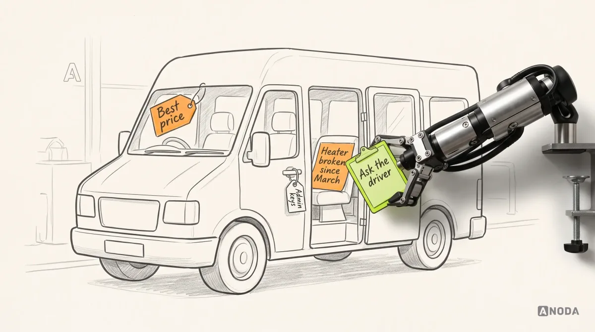
It’s a school minibus. The governors approved it from the brochure because the price was right. The caretaker judges it by whether the keys, the logbook and the insurance paperwork make sense. The PE teacher drives it every Tuesday with twelve kids in the back and a heater that’s been broken since March. All three are right. Only one of them is late for the match.
These are three separate signals, and teams keep reading one as proof of the others. A signed contract proves the demo worked. A finished configuration proves the admin survived rollout. Neither proves anyone is doing the work faster, making fewer mistakes, or doing it inside the product at all. Plenty of platforms we audit have a delighted buyer, an exhausted admin and end users who log in once a month to export a CSV.

You can lead a horse to water. You can also buy it 400 seats. Neither makes it drink.
Design for all three, in the right proportion. Buyers need evidence they can take to a steering committee. Admins need configuration they can understand, test and undo. End users need the critical path of their job to be quick and hard to get wrong. When the three conflict, and they will, usually about the home screen, the end user’s work wins on the workflows that carry the money. That’s where the licence pays for itself or doesn’t. Give the buyer a view built from the same data, and give the admin tools that don’t need your engineers.
A practical test: take the three most requested changes on your backlog and write down whose scoreboard each one moves. If all three move the buyer’s, you’re decorating the showroom while the workshop floods.
Research the work, not the opinions about the work
Enterprise workflows are specialised. A procurement buyer, an accounts payable clerk and a site manager each carry years of unwritten rules: which supplier always invoices late, which field lies, which approver you phone rather than email. None of it is in the requirements document. Most of it isn’t in the user’s own description of the job either.
Ask a good mechanic how they find a fault and you’ll hear “I just listen to it”. True, and useless as a specification. Stand next to them for an hour and you’ll see the twelve things they check without noticing they’re checking. Interviews tell you what people think they do. Observation tells you what they do.
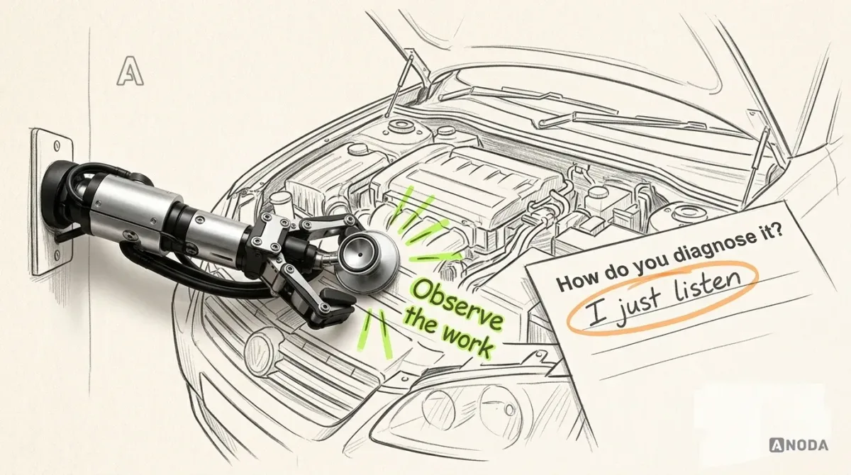
The methods we combine, and what each is good for:
- Contextual observation. Observing representative work in its real context with agreed access and data handling. This reveals the detours a requirements document leaves out.
- Artefact collection. The spreadsheets, sticky notes, email templates and printed cheat sheets people keep next to the system. Each one is a feature request nobody filed.
- Ticket mining. Support tickets grouped by workflow and cause, not by product area.
- Analytics and logs. Where tasks stall, loop back or get abandoned, and what gets exported.
- Admin and stakeholder interviews. Policy, compliance and integration constraints: the rules users are working around.


Watch the gap between what people say and what they do. A requester will tell you the form is “fine”, then spend six minutes finding a cost code in last month’s email. That isn’t lying. It’s habit, and habit is invisible to the person who has it.

Plan the sessions around the work, not the calendar. Book the week of month-end close if that’s when the pain peaks, sit with the night shift if that’s who fixes the exceptions, and ask people to use their real queue, not a demo account. A tidy lab session with clean test data is a cookery exam with the ingredients pre-weighed: everyone passes, and nobody learns who can actually cook.
Research the roles that carry the volume and the risk. Five sessions with the finance team tell you nothing about the site managers who raise most of the requests. If your picture of the work is built from stakeholder opinions and a wish list, that’s the gap our UX research for enterprise products closes.
Audit check
For one critical workflow, list every tool, file and person involved outside the product, from observation, not from the process document.
Failure evidence
Personal trackers, printed lists, email templates, and one colleague everybody asks. Tasks that start in the product and finish somewhere else.
Correction pattern
Turn each artefact into a requirement with an owner. The spreadsheet column that tracks “really approved?” is a missing status, not a user habit to train away.
Enterprise UX research
Opinions are free. The workarounds are costing you.
We observe the roles that do the work, collect what sits next to the system and show you where the hours go before anyone prioritises a change.
Model roles, permissions, data, exceptions and cross-system flows
Before any screen comes the model. Enterprise products fail in the model far more often than in the pixels, and a wrong model can’t be fixed with layout.
Roles and permissions
A hospital ward works because the roles are clear: the doctor prescribes, the pharmacist dispenses, the nurse administers. Same patient, three permissions, and nobody gets to do all three alone. Procurement runs on the same logic. The person who raises a request shouldn’t approve it, and the person who approves it shouldn’t pay it. That’s segregation of duties, and it is a design problem as much as a policy.
Model permissions as roles, actions and conditions such as amount, cost centre and region. Then design what people see when they hit a boundary. A missing button is a mystery. A disabled button with a reason and a route is a process. The mystery costs a phone call, a chat message and twenty minutes of two salaries. The process costs nothing, because the next step is on the screen.


Design the temporary cases as well: approvers on holiday, acting managers, an auditor who needs time-limited read access to the authorised records. If delegation isn’t in the product, it happens by sharing passwords. Then the audit log says the director approved 60 requests from a beach, and technically he did.
Audit check
For each role, try the five actions it performs most and the three it must never perform, including while someone is on leave.
Failure evidence
Buttons that vanish without explanation. Shared logins for cover. Approvals done by the one person whose account “has the rights”.
Correction pattern
Write the permission model as roles, actions and conditions, explain every boundary on screen with a next step, and design delegation and temporary access as first-class flows.

Data relationships
One purchase becomes a request, an order, a goods receipt, an invoice and a payment, each with its own number and owner. People don’t think in tables. They think “where’s my fencing?” Show the chain on every record, so nobody has to rebuild it from five searches. Relationships also carry the logic that screens forget: payment, receipt, cancellation and price changes must follow the applicable agreement and its approval rules. When the model knows these links, the interface can warn before the mistake instead of reporting it after.


Exceptions
Designing only the happy path is building a motorway with no hard shoulder. It flows beautifully until the first breakdown, and then everyone behind it stops. In enterprise work, exceptions are where the hours go: an invoice that doesn’t match the order, a supplier who isn’t set up yet, a budget that ran out mid-month.
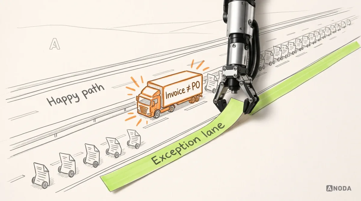
List exceptions by frequency and cost. Give each a named state, an owner and a way to resolve it inside the product, not in an email thread with nine people copied. The email thread is where exceptions go to age. Every day an invoice sits in one, you edge closer to a late-payment fee, a supplier who puts you on stop, or an early-payment discount you’ll never see.

Cross-system workflows
Most enterprise work crosses systems: the ERP, HR, a supplier portal, email. When the product shows only its own slice, people become the integration. The industry calls it swivel-chair integration: a person retyping data from one screen into another. It’s copy and paste with a pension plan.


Show where each piece of data comes from, when it last synced and what to do when a sync fails. The source of truth should be a fact on the screen, not a rumour in the office.
Audit check
Follow one real record from request to payment across every system it touches, and note each place a person retypes, copies or checks a value by hand.
Failure evidence
The same number keyed in twice. Statuses that disagree between systems. A “sync” that is really someone’s Monday morning.
Correction pattern
Show the whole chain on each record, label every field with its source and freshness, and design the failure states of each integration before launch.
A worksheet for one operation
Use the same invoice to connect the model to a task someone can complete. The example below is illustrative: the amounts, tolerance, permissions and release conditions are fictional client rules, not accounting guidance or evidence of an implemented integration.
| Worksheet field | Filled example: resolve the hold on INV-88412 |
|---|---|
| Operation and trigger | Accounts payable sees a price mismatch and an ERP sync failure on the same invoice. |
| Linked record | Keep PR-2291, PO-10457, GR-5530, INV-88412 and PAY-7719 visible. A linked payment record does not mean payment has occurred. |
| Acting role | The accounts payable clerk documents the mismatch; the authorised procurement owner decides the disputed charge; the integration owner handles the sync failure. |
| Permitted action and condition | The clerk can request a decision, not approve the charge. In this example, the $850 difference between the $18,400 order and $19,250 invoice exceeds the client’s 2% tolerance. |
| Completion state | Show the recorded price decision and current ERP state separately. The invoice can proceed to the next authorised step only when both holds are resolved under the client’s rules. |
| Exception owner | Route the disputed delivery charge to the procurement owner and the failed connection to the integration owner, with each outstanding action visible. |
| Preserved data and recovery | Keep the invoice, attachments and decision history. Label the last good ERP data as 10:12, the failed attempt as 10:42 and the scheduled retry as 11:00; confirm its result before calling the data current. |
| Prototype acceptance check | Ask the clerk to identify both holds, find each owner and explain what can happen next. Successful sync must not clear an unresolved price exception, and approval of the charge must not imply that a payment was sent. |
Copy the eight fields into your own worksheet, leave the example values out, and complete them for one recurring operation. The business owner defines the approval policy; the interface makes the applicable decision and next action understandable; engineering implements and verifies the permissions, integration and recovery behaviour. Our ERP and internal tools design work connects those responsibilities before screens are handed over.
Reduce complexity without hiding necessary control
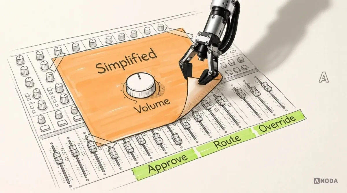
“Make it simple” is the most expensive sentence in enterprise design, because it usually means “make it look simple”. A recording studio’s mixing desk has dozens of faders, and nobody asks the engineer to swap it for one volume knob. It works because the faders are grouped, labelled and do the same thing every day.
Simplify the critical path, not the product:
- Remove decisions the system can make. Take defaults from the catalogue, the contract, the requester’s cost centre and their last order.
- Hide what’s rare, never what’s frequent. Progressive disclosure is for the once-a-quarter field, not the override approvers use daily.
- Keep expert control visible. Overrides, bulk actions, saved views and keyboard paths stay. They’re how experienced people stay fast.
- Explain automation. Every automatic routing or block says why, in plain words, and who can change it.


Simplicity is a budget, not a style. Every field you remove from the critical path is time back on every request, forever. Every control you bury behind “Advanced” is a trip someone takes a hundred times a week.
Complexity doesn’t disappear when you hide it. It just moves to someone else’s desk.
Complexity doesn’t disappear when you hide it. It moves into training, into support and into the one colleague everybody interrupts. That colleague is on your payroll too.
Audit check
Count the fields, decisions and screens on the critical path of your most frequent task, then mark which answers the system already knows.
Failure evidence
Requesters typing data that lives in the catalogue or the contract. Overrides that experienced users reach through menus every day. Automatic routing nobody can explain.
Correction pattern
Prefill what the system knows, move rare fields out of the path, bring frequent controls into it, and make every automated decision explain itself.
Design for where the work happens and for the bad day
The same product serves a dispatcher on two monitors, a technician in a plant room with one bar of signal and a warehouse clerk holding a scanner. Approving all three from an office desk is testing a roof in a drought. Tap targets fine with a mouse become a lottery in gloves, and a form that saves only when online throws away twenty minutes of notes.
- Field and mobile: one job per screen, big targets, work saved on the device and sent when the signal returns, with a visible count of what’s waiting.
- Scanners and shared devices: scan first, type only when the scan fails.
- Every action: say what happened, to how many records and how to recover where the action is reversible. Silence after a click is where duplicate orders come from.
Then protect the bad day. Nobody climbs scaffolding without a harness, yet enterprise apps let one person change 4,000 records behind a single “Are you sure?”. Give bulk actions a preview, reversible actions an undo, drafts that survive a timeout, conflicts that show both versions, and a log a supervisor can read.
Design the admin console, not just the front end
Admins set up approval rules, roles, fields and integrations. Most products give them a settings page like the fuse box in a rented flat: no labels, and flipping the wrong switch turns off the freezer. So every rule change becomes a vendor ticket, a consultant day or a very nervous Friday afternoon.
Admin UX deserves the same rigour as the front end: rules in readable language, a way to test a rule against real cases before it goes live, a preview of what a change touches, and a log of who changed what. Add roles and permissions an admin can compare side by side, fields they can retire after checking report dependencies, and integrations that report their own health. A product whose admins need a consultant for every reorganisation is a product that bills you for its own confusion.


A buyer renews when rollout was painless. The admin is the one who decides whether it was. And when the admin can’t change a rule safely, the organisation stops changing its rules, which is how a company ends up running this year’s business on the approval chain of three reorganisations ago.
Keep patterns consistent where it helps, and vary them on purpose
Consistency is cheap to understand and expensive to fake. When every module handles tables, filters, statuses and approvals the same way, people carry their skill from one screen to the next. That’s the case for an enterprise design system. It also has a limit: specialised work sometimes needs a different tool.
Every outfield player wears the same boots and the same shirt. The goalkeeper gets gloves. Nobody calls that inconsistent. It’s a deliberate variant for a job nobody else on the pitch does.
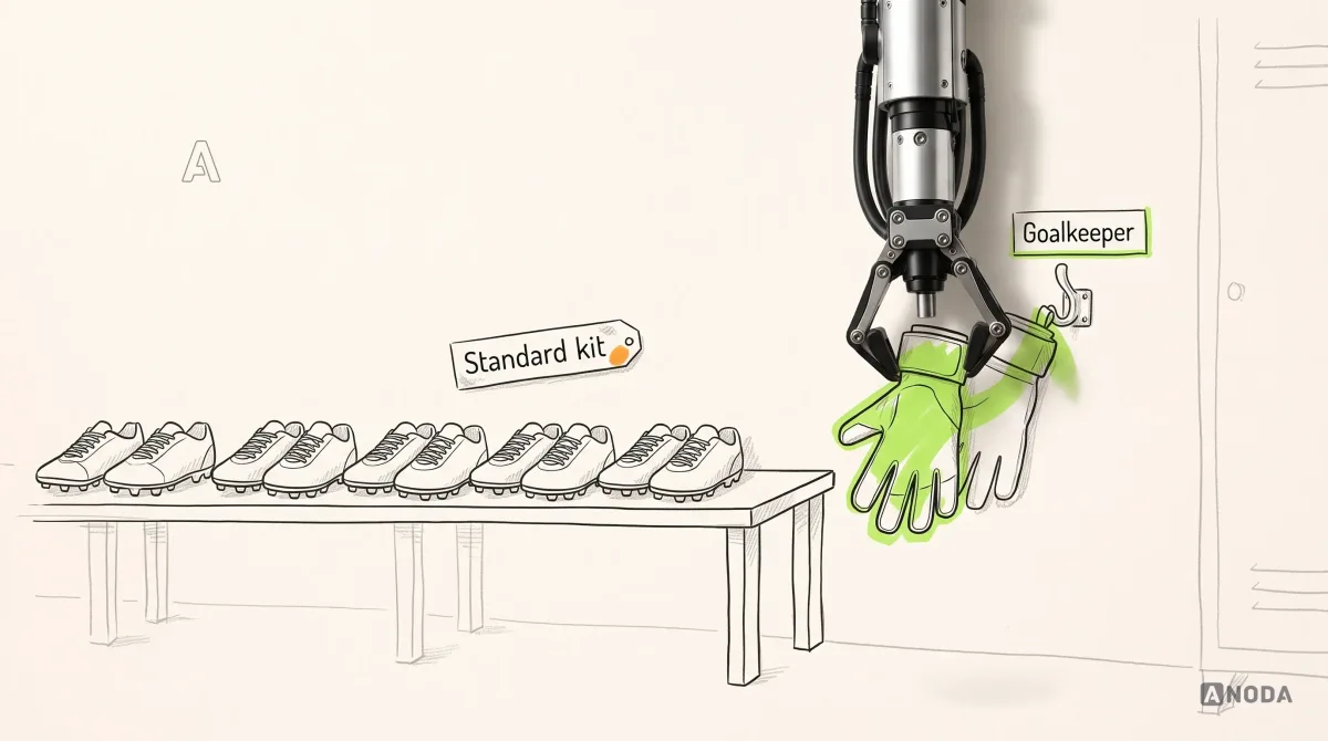
Our rule: standardise behaviour that repeats across roles, such as tables, forms, statuses, permission messages and confirmations. Vary deliberately when a role’s work is measurably different in volume, speed, device or risk, and record the variant in the system so the next team reuses it instead of building its own.
The failure runs both ways. Force the accounts payable team, who match hundreds of invoices a day, into the same comfortable table the occasional approver uses, and you’ve paid for consistency with their afternoons. Let every team build its own table, and you pay three times for the build, then again every time someone moves between modules and has to relearn how filters work.


If you’re staring at seven date pickers across four products, our design systems for multi-product teams start with the inventory and the rules, then the components.
Design systems
One way to do each thing, and a proper way to make exceptions.
We build shared patterns and governance for enterprise product families, without flattening the specialised screens your experts depend on.
Accessibility is a buying requirement and a speed feature
In enterprise software, accessibility shows up twice: on the procurement checklist and in the daily work. Covered US federal ICT procurement follows the Revised Section 508 Standards, which incorporate WCAG 2.0 Level A and AA with defined scope and exceptions. Many large organisations write similar requirements into their own tenders. Fail that check, and your beautiful demo never reaches the shortlist.
The daily side matters even more. Keyboard access is how power users go fast. Visible focus, text on statuses and tables that survive zoom are how people read a dense screen at 5 p.m. on a laptop. Testing an interface only on a designer’s big monitor is judging a fire escape in daylight with the lifts working.
WCAG 2.2, first published as a W3C Recommendation on 5 October 2023 and updated on 12 December 2024, includes criteria that hit dense enterprise screens directly. Criterion 2.4.11, Focus Not Obscured (Minimum), says a focused component must not be entirely hidden by author-created content, such as a sticky footer. Criterion 2.5.8, Target Size (Minimum), sets pointer targets at 24 by 24 CSS pixels, with exceptions. And 1.4.1, Use of Color, still rules out status by colour alone.
None of that is exotic. It’s the difference between an approvals queue a clerk can clear from the keyboard and one that demands a mouse trip for every row.


Governance: who decides, who changes, who says no
Without governance, every team makes a locally sensible exception, and the shared system slowly degrades. It’s the tragedy of the commons, played out in components: nobody broke it, everybody bent it a little.
Good governance is planning permission. Anyone can propose an extension, and someone checks it doesn’t block the neighbour’s light before the concrete goes in. For enterprise UX that means an owner for each shared pattern, a contribution route, a review that asks “does an existing pattern already do this?”, release notes users can read, and a change calendar that respects month-end.
Governance also has to say no, politely and with a reason. “Use the existing filter panel, and here is how to extend it” is a governance win. A review board that only ever says yes is a doorman who waves everyone in, and a board that only says no gets routed around by the first team with a deadline.


Prioritise workflows by criticality, frequency, role, error cost and change risk
You can’t redesign everything at once, and you shouldn’t try. A vet on a farm doesn’t treat the loudest animal first. The goat yelling on top of the crate is the executive whose dashboard is “missing a chart”. The cow with the limp, quietly standing by the milk churn, is invoice matching. Only one of them pays the farm’s bills.
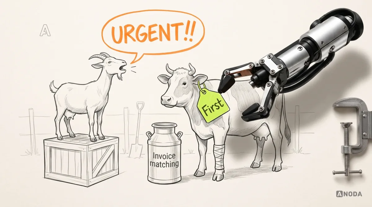
Score each workflow on five criteria:
- Business criticality. What breaks, money, compliance or customers, if this workflow fails or slows down?
- Usage frequency. How often it runs, and across how many people.
- User role. Who does it, and how scarce, expensive or overloaded they are.
- Error cost. What one mistake costs downstream: rework, late-payment penalties, audit findings.
- Change risk. How much retraining, data migration and integration work a change triggers.

The arithmetic changes the conversation. Illustrative numbers: if 40 clerks each match 60 invoices a day and a better exception flow saves two minutes on one invoice in five, that’s 16 hours of paid time a day. The executive’s missing chart saves one person ten minutes a month. Both requests are sincere. Only one belongs at the top of the list.
High criticality, high frequency and high error cost: start there. High change risk isn’t a reason to skip a workflow. It’s a reason to phase it. Put the riskiest change behind the workflow that proves the approach, so the organisation has already seen one phase land before you touch the screen everyone uses.
Decide what kind of problem you actually have
Not every enterprise UX problem is a redesign. Replacing the software because people pick the wrong cost code is refitting the whole shop because the price labels are wrong. Match the symptom to the fix:
- Workflow redesign. The steps themselves are wrong: handoffs loop, approvals duplicate, work waits on people who add nothing.
- Information architecture. People can’t find things, because navigation mirrors your org chart instead of their work.
- Interaction changes. The steps are right, but each one is slow or error-prone: no bulk actions, no defaults, no keyboard.
- Content. Labels, field names and error messages nobody outside the vendor understands.
- System integration. People retype data between systems, and statuses disagree.
- Onboarding. New or occasional users fail where experienced ones don’t.
- Organisational support. The policy is the problem, not the product: an approval threshold set years ago that sends every $200 purchase to a director.


Diagnose first. The cheapest fix is often a label. The most expensive is redesigning a screen to work around a policy nobody is allowed to question. Most platforms we audit have three or four of these problem types tangled in one workflow. Untangle them, fix each with the cheapest tool that works, and the “we need a new system” conversation often goes quiet on its own.
Measure adoption, task success, errors, time-on-task and support burden
Judging a restaurant kitchen by the plates that leave the pass is how you end up serving fast food nobody eats. Count the plates that come back.
Measure the three customers separately, and measure the work:
- Adoption. Licensed seats against people completing core tasks in the product each week, per role. Not logins.
- Task success. The share of tasks completed correctly without help, per workflow.
- Error rate. Rework, returns, reversals and corrections after submission.
- Time-on-task. Trained users, real work, measured on the critical path.
- Support burden. Tickets, how-to questions and training requests per workflow.


Take the baseline before you change anything, and validate critical tasks with the real roles before release. Our usability testing of critical enterprise tasks does exactly that: real tasks, the intended roles, evidence instead of opinions. Every number you don’t collect, you choose to guess.
Collect them from where the work leaves traces: task completion from the product’s own events, errors from validated correction and defect records, time from event pairs on the critical path, support burden from tickets tagged by workflow. Add a short observed session each quarter, because numbers tell you where it hurts and people tell you why.
Audit check
For your three most critical workflows, write down today’s adoption, task success, error rate, time-on-task and tickets per 100 tasks, per role.
Failure evidence
Only logins and licence counts are known. Success is reported as “positive feedback from stakeholders”.
Correction pattern
Instrument the critical path, set a baseline over a normal month, and review the numbers with the roles, not just with the buyer.
Evolve large interfaces without breaking muscle memory
Expert users are fast because they don’t have to think. Their hands know where Approve is. Move it, and a fast team becomes a slow one overnight, and the loudest complaints come from your best people.
It’s swapping the brake and the clutch in every van of the fleet overnight. Everybody can still drive. That’s exactly the problem.
Old habits die hard, which is good news: habits are where your throughput lives. So:
- Change the workflows that matter one at a time, not the whole product in one big bang.
- Keep shortcuts, positions and names stable, or map the old ones to the new ones.
- Tell people what moved and why, inside the product, at the moment they look for it.
- Where data and integration compatibility allow, run old and new side by side with a defined fallback and a way to report problems.
This is also why big-bang redesigns of enterprise platforms go so badly. Everything moves on the same Monday, throughput drops, the loudest users escalate, and the rollout gets frozen halfway, leaving two interfaces to maintain. Incremental change looks slower on the roadmap and is faster in the real world.
Where to start
Observe the work. Put a price on the friction that costs money. Simplify the critical path. Keep expert control where experts can reach it. Evolve the interface without breaking the hands that use it.
That’s also the order we work in: audit the system, map the roles and flows, build the design system, and phase the redesign against the constraints you actually have, from month-end close to the integration nobody wants to touch. Our enterprise UX design practice starts with one critical workflow, observed and costed. Not because the rest doesn’t matter, but because one workflow fixed and measured buys you the trust, and the budget, for the next.
When the approved workflows need to become a working product, our web app development service connects roles, business rules, APIs and recovery across the whole application. For a customer-record and pipeline system, CRM development builds the data model, permissions, integrations and rehearsed migration around the team’s real work. Bring the flow that still depends on a spreadsheet; ANODA will connect the interface and implementation that replace it.
Dense is fine. Chaotic is a line item.

Enterprise UX design
Your platform works. Your people are working around it.
Bring us the workflow that eats the most hours. We’ll watch it being done, cost the friction and hand you a phased redesign your engineers and your admins can live with.
Written by