In short
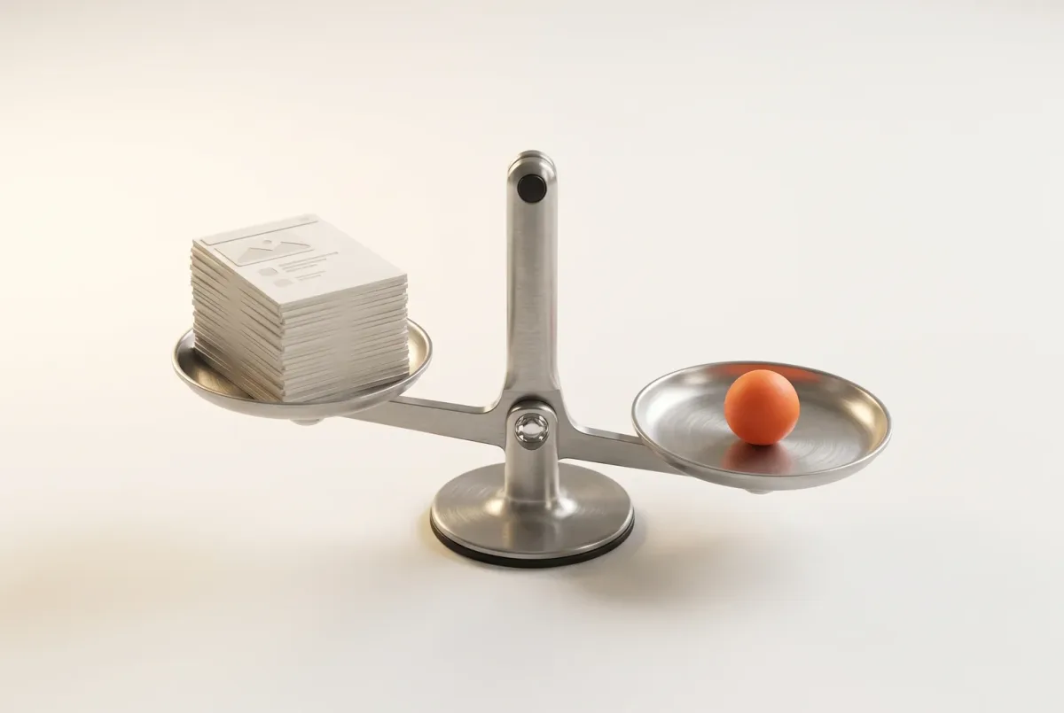
A website redesign is not a visual reset. Treated as one, it wipes out search traffic you never paid for, conversion paths that already work and the habits of customers who knew where everything was. Here is how we plan one instead: find the layer that is actually failing, baseline the numbers, decide what to keep, fix, remove or migrate, design with real content, protect every URL and treat launch day as the day measurement starts.
In this article
- Find what is actually broken before you redesign anything
- Redesign, refresh or leave it alone
- Baseline the numbers before anyone opens a design tool
- Audit the site you already have: evidence, not taste
- Keep, fix, remove, migrate: the map that saves the budget
- Sequence the work: journeys, structure, content, then pixels
- Test the journeys that pay the bills before you build
- Protect URLs and redirects, or buy your own traffic back
- Release in slices when the site is tied to a product
- Launch is when the measuring starts
- Where ANODA fits
- The decision rule
A website redesign strategy is a plan for changing what doesn’t work without wrecking what does. Most redesigns skip the second half. The team is bored of the old look, an agency pitches a bold concept, and six months later the site is gorgeous, organic traffic has fallen off a cliff and nobody can explain where the demo requests went.
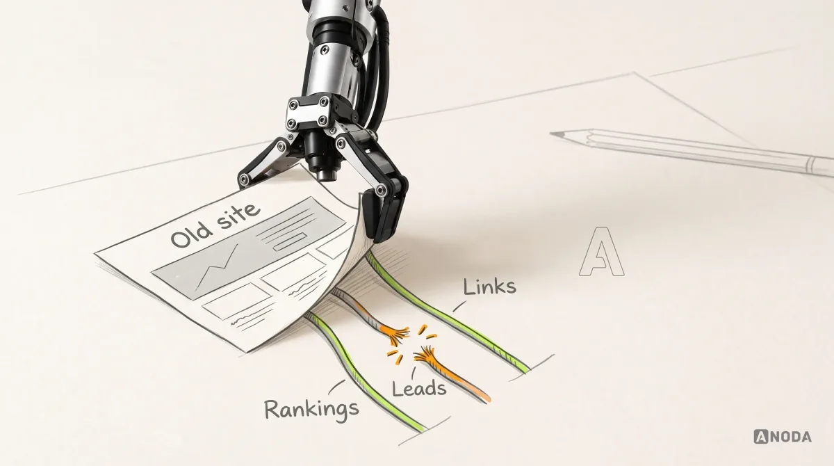
A redesign becomes risky when the website is treated as a paint job. It is a machine with moving parts nobody listed: pages Google already trusts, paths that quietly turn strangers into leads, links partners have pointed at you for years, and customers whose hands know where the login button lives. Rip it all out for a fresher look and you throw the baby out with the bathwater. Then you pay an ad platform to buy back the traffic you used to get for free.
The order we work in is simple. Evidence first, pixels last, and launch day treated as the start of measurement, not the wrap party.
Find what is actually broken before you redesign anything
“The website isn’t working” is a symptom, not a diagnosis. Before anyone signs a redesign contract, find where the failure lives. Inspect six connected layers and define which of them the engagement will change.
- Positioning. The site says clearly what you do, and it is the wrong thing for the buyers you want. A new layout will deliver the wrong message more elegantly.
- Traffic quality. The visitors arriving are not your buyers. No redesign helps when you are fishing in a pond where your fish don’t live.
- Content. The pages exist but don’t answer what buyers ask before they talk to sales: price range, integrations, security, time to go live.
- Technical implementation. Slow pages, broken forms, tracking that stopped firing two releases ago. That is engineering work, not a design brief.
- Product experience. The site converts fine. The trial or onboarding loses people after sign-up. A shiny new homepage just pours more paid-for users into the same leaky product.
- The website’s UX. Navigation, journeys, page structure, forms. This is the interaction layer; its scope connects to content, positioning and implementation where the evidence requires it.
Commissioning a full redesign for a positioning problem is prescribing new glasses for a toothache. The frames may be lovely. The tooth still hurts, and now you have paid the optician as well.
| Layer | Check first | Include in the redesign scope when… |
|---|---|---|
| Positioning | Buyer interviews, message comprehension and lost-deal notes | The audience or offer needs a clearer explanation. |
| Traffic quality | Qualified outcomes by channel and campaign | Landing pages need to match the intended audience and promise; acquisition decisions have their own owner. |
| Content | Sales questions, page inventory and missing proof | Buyers cannot find the information needed to decide. |
| Technical implementation | Form delivery, tracking, performance and errors | Implementation defects block the important journeys. |
| Product experience | The path from sign-up to first useful task | The website and product handoff need to change together. |
| Website UX | Navigation, forms and observed task completion | Structure and interaction prevent people from reaching the next step. |
Assign the responsible people to each affected layer and agree one connected scope before design starts.
Diagnosis is cheap next to the alternative: six months of design and development aimed at the wrong layer, the same leak running the whole time, plus the new ones the redesign opens.
Audit check
For every complaint about the site, write down the evidence and which layer it points to: positioning, traffic, content, technical, product or website UX.
Failure evidence
The redesign brief is a list of adjectives, “modern”, “clean”, “premium”, and not one metric. Nobody has looked at conversion by traffic source.
Correction pattern
Fix the layer the evidence points to, and redesign only the part of the site where the failure actually lives.
Redesign, refresh or leave it alone
Not every tired website needs a redesign. Some need a refresh, some a focused interface update, a few a genuinely new site, and some need everyone to keep their hands off while the real problem gets fixed elsewhere.
- Refresh when the structure and journeys work and the problem is dated visuals, inconsistent components or a new brand. Same pages, same URLs, better clothes.
- Focused UI redesign when the structure is sound but the interface fights the user: crowded pages, clumsy forms, a component library held together with tape. That calls for a UI redesign that modernises the interaction layer, without pretending every layer needs replacing.
- Full redesign when the journeys themselves are broken, the information architecture no longer matches what you sell, or the business now sells to a different buyer. Structure, content, UX and URLs all move at once.
- New website when nothing is worth migrating: a new company, a product line with its own audience, or a site so small and so wrong that preserving it costs more than starting clean. Then you are comparing a redesign with a new website design engagement, and the maths changes.

The expensive mistake is picking the biggest option because it feels decisive. That is buying a new car because you are sick of the seat covers: the one with the full service history goes to the scrapyard, and you drive off in a stranger with no history at all.
Complex products deserve extra suspicion. When the website is tangled up with sign-up, pricing, a customer portal and documentation, a big-bang redesign changes everything at once and teaches you nothing about which change helped and which one hurt.
Baseline the numbers before anyone opens a design tool
If you don’t record where you started, you can’t prove the redesign helped, and you won’t notice when it hurt. A redesign without a baseline is a school report with one column: a grade in June and no idea whether the pupil improved or just had a good day.
Baseline what the business actually pays for, not what looks good in a screenshot:
- Leads and sales by source. Demo requests, sign-ups and purchases, split by organic, paid, referral and direct.
- Conversion by journey. Visitors who reach pricing and then ask for a demo. Visitors who start the sign-up form and finish it.
- Organic entry pages. The URLs that bring search traffic and leads today. These are the pages a redesign is most likely to break.
- Product activation, if the site feeds a product. A redesign that doubles sign-ups and halves activation has only moved the leak downstream.
- Speed, accessibility and errors. Current performance, accessibility issues and form failures, so you can tell a new regression from an inherited one.
Then pick the one business metric the redesign exists to move and write down its current value and period. Add guardrails: the numbers that must not fall while you chase it. “More qualified demo requests from organic search, without losing the organic sessions our top pages already earn” is a goal. “A modern, premium look” is a mood board with a budget.

Beauty is in the eye of the beholder, and the beholder signing off a redesign is rarely the customer. The baseline is what stops that sign-off from turning into a vote on taste.
Audit the site you already have: evidence, not taste
Your current site is the most honest research asset you own: years of real visitors, searches and drop-offs. Bin it unread and you will pay a research budget to rediscover what it was telling you for free.
A proper UX audit of the current website covers seven layers, each with its own evidence:
- Analytics. Where visitors come from, which journeys convert, where people leave. Check the tracking first. Half-broken events are how teams talk themselves into the wrong redesign.
- User research. What buyers are trying to decide and what stops them: recent buyers, lost deals, sales call notes, support questions, session recordings. If the team has none of it, commission UX research into users, tasks and decision journeys before the design brief, not after launch.
- Content. Which pages answer real questions, which are duplicates, which are out of date, and which nobody has opened in a year.
- SEO. Pages that rank and bring leads, pages with backlinks, internal links, structured data, and every URL that exists, including the ones nobody remembers.
- Accessibility. Keyboard access, contrast, form labels, headings and assistive-technology tasks. Agree the applicable WCAG version and conformance target with the responsible owner, then test actual workflows; a visual review alone is insufficient.
- Performance. Google’s web.dev guidance counts a page as good when Largest Contentful Paint is within 2.5 seconds, Interaction to Next Paint is 200 milliseconds or less and Cumulative Layout Shift is 0.1 or less, measured at the 75th percentile of page loads. Know where you stand before a heavier design makes it worse.
- Technical debt. The CMS, templates, plugins, forms and integrations. Some redesigns are really a platform problem wearing a design costume.

The output that matters is not a 90-page PDF. It is a decision for every page and journey.
Audit check
Pull the top organic entry pages, the best-converting journeys and the biggest drop-off points from the last twelve months, and confirm the tracking behind each number still fires.
Failure evidence
The brief never mentions which pages bring leads today. Nobody has checked whether the analytics events work.
Correction pattern
Repair the tracking, audit all seven layers and tie each finding to a specific page and journey.
Keep, fix, remove, migrate: the map that saves the budget
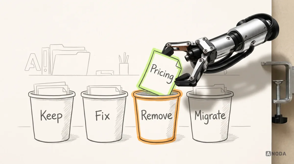
Every page, journey and asset on the current site gets one of four decisions:
- Keep what works: pages that rank, journeys that convert, content buyers use. Keep the URL as well.
- Fix what works badly: a page with traffic and no conversions, a form with one painful step, a pricing page that hides the price.
- Remove obsolete or redundant material after checking its purpose, traffic, links and required support or policy role. Redirect when a relevant replacement exists; otherwise choose an intentional removal response. Do not redirect an unrelated page to the homepage merely to avoid a 404.
- Migrate what has to move: content going to a new structure, template or URL, with its redirect decided before launch, not the morning after.
It is packing for a house move. Boxes get labelled keep, repair, charity shop and tip. Losing the old toaster is not the disaster. The disaster is the box with the passports going to the charity shop because it looked scruffy.
G. K. Chesterton described a fence across a road: before you tear it down, find out why someone put it up. Websites are full of these fences. The odd FAQ block on the pricing page, the ugly comparison table, the “talk to an engineer” link in the footer. Someone added each one because buyers kept asking. Remove it because it spoils the new layout, and you may have just removed the reason a whole segment converts.

The map turns a fight about taste into decisions with owners, and it sets the scope honestly. If most pages come out as keep or fix, you are not commissioning a full rebuild, and nobody should sell you one.
UX audit
Not sure what your current site is still doing right?
We audit the website and the funnel behind it, then hand you a keep, fix, remove and migrate map with the evidence for every call, before anyone spends a penny on new designs.
Sequence the work: journeys, structure, content, then pixels
Redesigns go wrong in a predictable order: someone designs a stunning homepage first, and everything else gets squeezed in to match. The sequence that works runs the other way, each step handing something concrete to the next.
- Journeys. The few paths that pay the bills: from a search result to a demo request, from pricing to sign-up, from a returning customer to their login. Map their entry points, questions and exits.
- Information architecture. Navigation and page structure built around those journeys, in the words buyers use.
- Content. Real headlines, real copy, real prices and real proof, drafted before any layout.
- Wireframes. Page structure with the real content inside, to check each journey holds together.
- Prototype and test. Clickable versions of the critical journeys, in front of real buyers.
- Visual design. Now the look. It finally has something real to dress.
- Build. With every state, form error and redirect specified.
It is the same logic as the UX design process from problem to validated product, applied to a site that already has traffic to lose.

Information architecture is where most company sites give themselves away. The menu mirrors the org chart: Solutions, Platform, Company, Resources. It is an underground map drawn by the departments that dug each tunnel. Passengers don’t care who built the line. They want to know which stop gets them home. Build the menu around what visitors came to decide: what it does for someone like them, what it costs, whether it works with their tools and how to start.

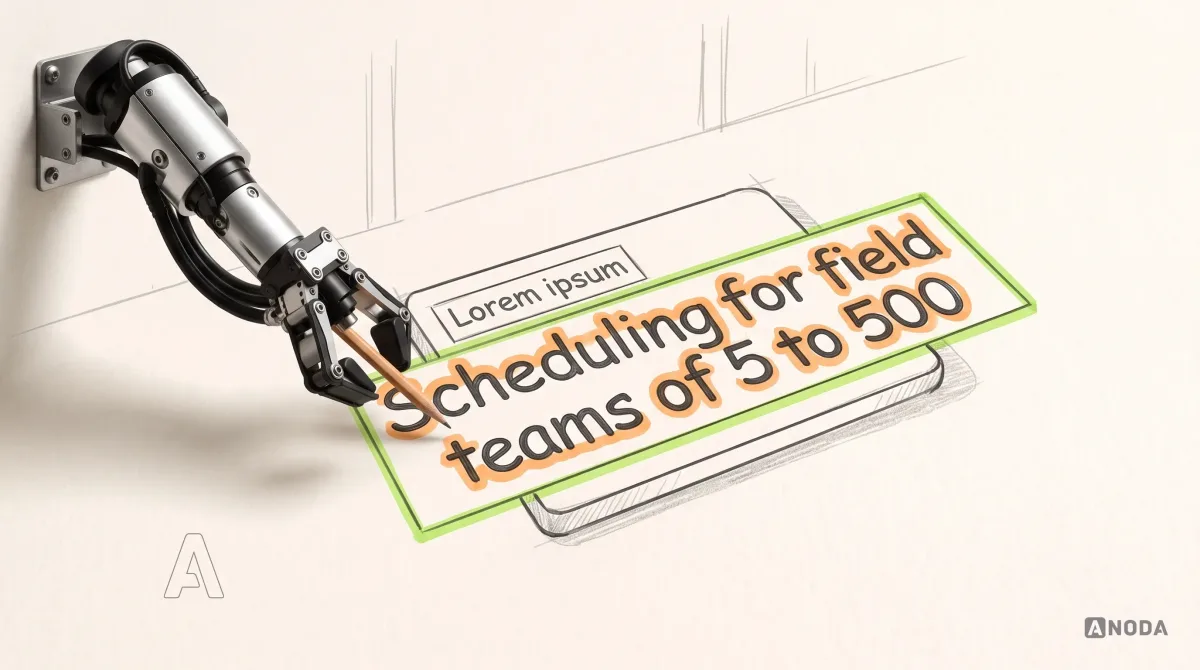
Then content. Designing with lorem ipsum is laying the table for a dinner nobody has cooked. The plates look beautiful until the real food arrives: the product name is three words longer than the placeholder, the price needs a footnote, the customer quote runs to six lines. Every one of those surprises becomes a layout compromise during the build, which is the most expensive place to make it.
Test the journeys that pay the bills before you build
Testing a redesign means putting the critical journeys in front of people from the target audience and watching them try to get something done: find the price, work out whether it fits, request a demo, sign up. Ask them to do the job, not to rate the colours.
No football manager debuts a brand-new formation in the cup final. You try it in a friendly, where losing costs nothing. The prototype is your friendly. Production is the final, with real ad spend and a real sales pipeline on the pitch.
Then gate it. Two approvals keep a redesign honest:
- Design to build. Critical journeys tested and the worst problems fixed. The keep, fix, remove and migrate map signed off. Launch-page content final. Every old URL has a decision. Analytics events specified next to the screens they measure.
- Build to launch. Redirects tested on staging. Forms, tracking and CRM integrations checked end to end. Accessibility and speed at or better than the baseline. A written rollback plan. One named person watching the numbers in week one.

Approval comes from the people who own the outcomes: marketing for leads, sales for lead quality, SEO for organic traffic, engineering for the build. Not just whoever has the strongest opinion about the hero image. Once the designs pass, frontend development that builds them to production standard is where the gates either hold or quietly leak.
Protect URLs and redirects, or buy your own traffic back
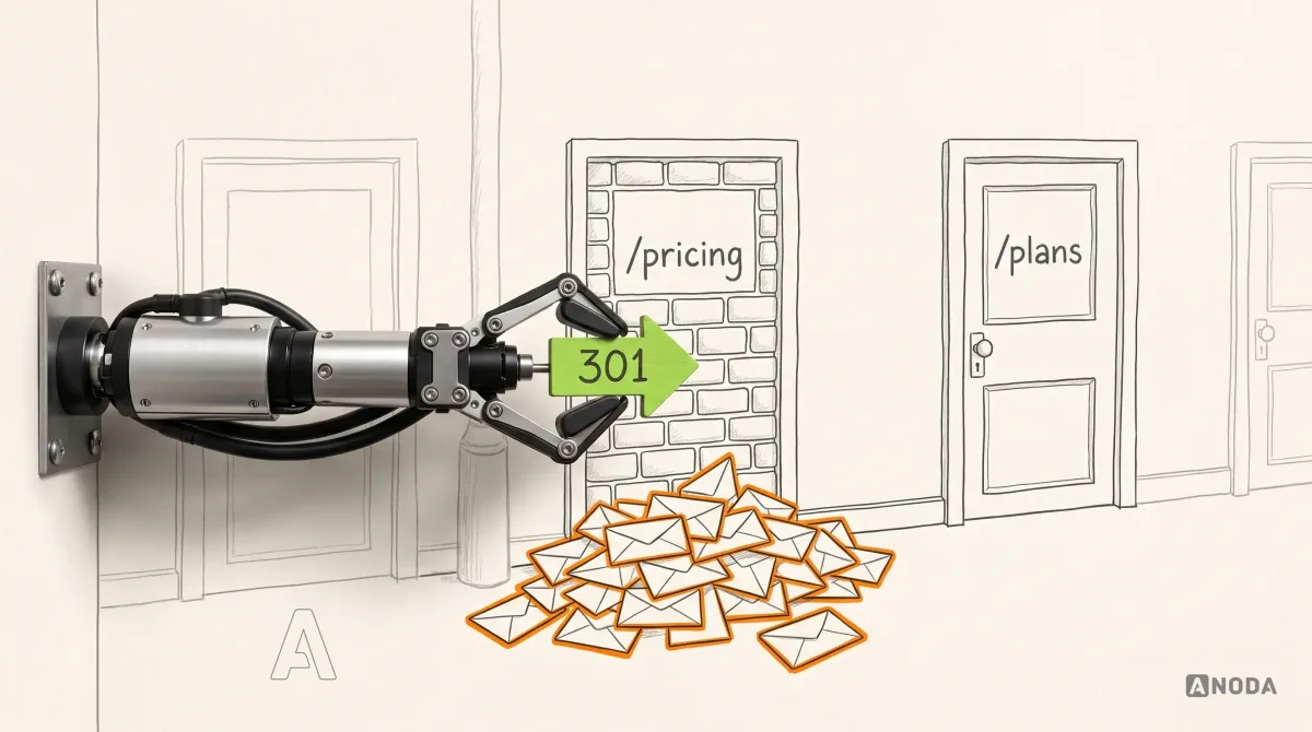
Broken URLs sink more redesigns than any design decision. The new site ships with a tidy new URL structure. The old URLs, the ones Google ranked, partners linked to and customers bookmarked, now return a 404 or dump everyone on the homepage.
Picture the council renumbering every house on a street overnight without telling the post office. The houses are all still there. The post goes nowhere.
Organic search is the one channel you don’t pay for per click. Break it, and the “cheaper” redesign starts charging interest: marketing replaces free visits with paid ones, month after month, until rankings recover, if they recover.
The fix is dull and non-negotiable:
- Crawl the current site and export every URL, not just the ones in the menu. Add URLs from analytics, search data and backlink reports.
- Give each old URL an explicit outcome: keep it, redirect to a relevant replacement, or intentionally remove it when no equivalent remains. Map page to page where the intent is preserved, not everything to the homepage.
- Use permanent server-side redirects. Google Search Central’s guidance on site moves recommends permanent redirects such as 301 or 308, kept in place for as long as possible and generally for at least a year.
- Avoid chains. Old URL to new URL in one hop.
- Point internal links, canonical tags, sitemaps and structured data at the new URLs, so the site doesn’t lean on its own redirects.
- Keep the titles, headings and substance of ranking pages close to the original unless the audit says otherwise.

The same guidance warns that search visibility may fluctuate for a while as Google recrawls a moved site. Plan for it. Launch outside your busiest season, tell sales what to expect, and don’t read two bad weeks as a verdict. Read the trend.
Release in slices when the site is tied to a product
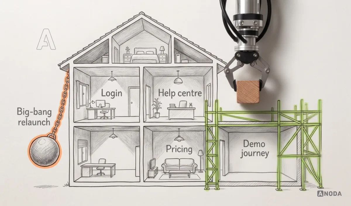
The big-bang relaunch makes a great announcement and changes every variable at once, so nobody can tell afterwards what worked. For a simple marketing site, one release is often fine. For a complex product, where the website hands visitors to sign-up, pricing, onboarding and a customer portal, we usually change it in slices. Renovate one room at a time while the family still lives in the house. The kitchen works while the bathroom is being done, and if the new bathroom leaks, you know exactly which job caused it.
Slices also protect the customers you already have. Existing users navigate by habit. Move the login, rename the plans and restructure the help centre on the same Monday, and support fills up with people who used to find everything with their eyes shut. It is the supermarket that rearranges every aisle overnight: the regulars wander around looking for the milk, and a few of them start shopping elsewhere. A new broom sweeps clean, but the old broom knows the corners. Keep the corners customers rely on until the evidence says the new layout serves them better.
Each slice gets a scope, a metric, a baseline and a way back. Release the pricing-to-demo journey, measure it against the baseline, keep it or roll it back, then take the next slice. Nobody bets the quarter’s pipeline on a single launch day.
Launch is when the measuring starts
The proof of the pudding is in the eating, and a redesign gets eaten after launch. A hospital doesn’t discharge a patient from the operating table because the surgery went well. The recovery ward is where you find out whether it worked.
Every day at first, check:
- 404s and redirect errors, fixed as they appear.
- Forms, tracking events and integrations, which are always the first things to break silently.
- Organic entry pages and indexing in Google Search Console.
A broken form nobody notices for a fortnight is two weeks of paid clicks delivered to a dead end.
Then compare against the baseline, on the same periods and the same source mix:
- The business metric the redesign exists to move.
- The guardrails: organic sessions, conversion on the journeys you kept, activation after sign-up.
- Speed and accessibility against the pre-launch numbers.

Read the result alongside acquisition mix, seasonality and offer changes. Keep the improvements that bring qualified leads, investigate the journeys that still lose them and use the baseline to decide the next change.
Separate interface release from data rollback
Write what can be reversed and what cannot. Reverting a template does not remove leads already delivered to a CRM, undo account creation or reverse a database change. Keep forms and integrations compatible during a phased release, preserve submitted customer data and verify recovery with the engineering owner. Name the person who may pause the release and the evidence that triggers that decision.
Blackstar is a useful scope example: after ANODA redesigned its investment app, the client returned for a responsive website and brand-book extension. ANODA designed the site and handed it off; the client owned code, hosting and operation. The website extended the app’s visual system and explained the investment product through responsive layouts.
A website migration engagement handles the move when URLs, content or platform change. A WordPress move needs WordPress migration decisions about content, plugins and integrations; choosing WordPress development, Webflow development or Astro development follows editorial needs and technical constraints, rather than replacing the redesign evidence. These are conditional implementation choices, not a requirement to change platform.
When the design already works but the platform blocks the next release, choose the move around its actual dependencies. Our Framer migration service rebuilds collections, motion and publishing tasks as maintainable templates in the destination stack. Our Webflow migration service separates reusable exports from CMS pages, forms and integrations that need rebuilding. ANODA protects useful URLs and working actions through a rehearsed switch, so your team can run the new site without rebuilding the same campaign page again.
Where ANODA fits
We audit the website together with the product funnel behind it, because the leak is often on the far side of the sign-up button. Then we write a recovery plan and deliver the design, development and analytics to carry it out. That connected approach turns a redesign into a better sales journey: the right message, a clear next step and the working product behind it.
- Your site underperforms and a redesign is coming. Start with an evidence-led website redesign and migration that keeps what works and rebuilds what doesn’t.
- You know something is wrong but can’t defend a scope. Start with the audit and the map.
- The structure works and the interface is the problem. A focused UI redesign beats pretending you need a new site.
The decision rule
Before you sign off a website redesign, answer these in order, and stop at the first one without a clear answer:
- Do we know which layer is failing: positioning, traffic, content, technical, product or the website itself?
- Have we recorded the baseline for the metric we want to move and for the ones that must not fall?
- Does every page and URL have a keep, fix, remove or migrate decision?
- Have the critical journeys been tested with real content and real buyers?
- Does every old URL have a tested outcome: preserved, redirected to a relevant match or intentionally removed?
- Is someone named to measure the result against the baseline after launch?
Everything you don’t decide before launch, you pay for after it. Usually twice: once in lost leads, and again in the ad budget that buys them back.

Website redesign
Keep what already earns. Rebuild what doesn’t.
Bring us the current site, the analytics and the numbers you need to move. We plan and deliver the redesign around the journeys, content and URLs that already work, and measure it after launch.
Frequently asked questions
How do you know when a website needs a redesign?
Confirm that user journeys, information architecture or content no longer support the actual business and audience. Check tracking, traffic quality and technical failures first; a tired visual style alone may call for a refresh.
What should a website redesign strategy include?
Include the problem, current baselines, page and journey inventory, research findings, keep/fix/remove/migrate decisions, tested critical flows, implementation acceptance, URL outcomes, release owners and rollback.
How do you redesign without losing SEO traffic?
Preserve valuable URLs and intent where possible, map relevant replacements directly, update internal references and verify canonicals, sitemap, indexing controls and redirects before launch. A move can still involve recrawl fluctuations.
Which existing pages and journeys should be preserved?
Preserve pages and paths that answer important buyer questions, bring qualified traffic or leads, serve existing customers or fulfill support and policy needs. Low traffic alone is not a reason to remove required material.
Should a redesign launch all at once?
A simple site may launch together; a product-connected site can benefit from slices. Each slice needs compatible interfaces and data, a baseline, named owners and a tested way to pause or revert.
How do you measure whether a redesign worked?
Compare qualified outcomes and guardrails against equivalent periods and source mixes, verify instrumentation and inspect seasonality, offer and campaign changes. Use those comparisons to identify the next change and keep improving the journeys that bring qualified leads.
Written by