In short
Your store is not losing sales because of a button colour. It loses them wherever a shopper stops being sure: they cannot find the product, cannot tell whether it fits, meet a cost they did not expect, or hit a form that punishes them for trying. Here is how to find the exact leak, fix the expensive ones first, and prove the fix worked instead of guessing.
In this article
- What ecommerce UX actually covers
- Why ecommerce UX shows up on the P&L
- Conversion problems are rarely one button
- Diagnose before you redesign: find where the money leaks
- Prioritise by shopper harm and business value
- Landing pages: keep the promise that brought them in
- Product discovery: navigation, categories and search
- Product pages that answer the buying questions
- Recommendations and personalisation, without the creepiness
- Trust and cost transparency
- Cart and checkout: protect the shopper’s progress
- Mobile ecommerce UX is the default, not the version
- Accessibility is part of conversion
- After the purchase: where repeat revenue is made or lost
- B2B ecommerce is a different job
- Turn priority fixes into the next growth decision
- Measure the whole journey, not one number
- The ecommerce UX mistakes we keep finding
- An illustrative example: the cart that was not the problem
- Ecommerce UX best practices, by stage
- Why ANODA can fix the journey behind the storefront
Ecommerce UX is everything a shopper goes through between “I might need this” and “it arrived, and I would buy here again”: finding the product, understanding it, trusting the price and the shop, paying without a fight and getting what was promised. Ecommerce UX best practices are the patterns that remove doubt and effort from each of those steps — but only the ones that fit your audience, your catalogue and your business model actually make money.
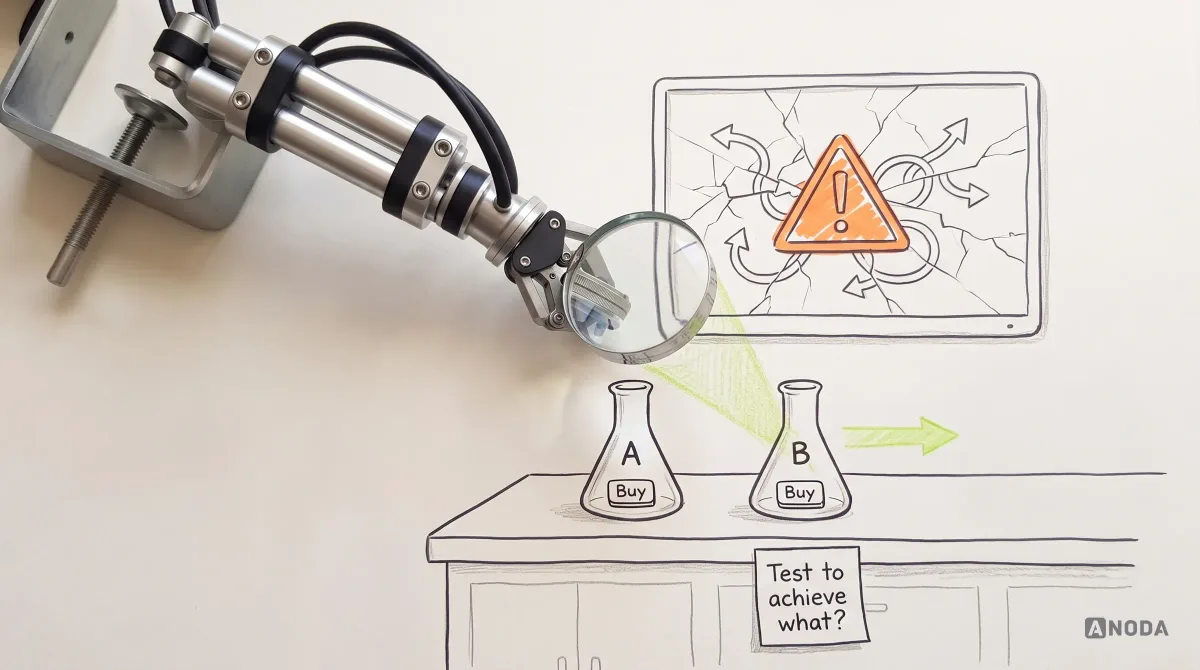
Every week someone somewhere A/B tests the colour of an “Add to cart” button and calls it conversion optimisation. Meanwhile the store’s search returns nothing for the product’s most common name, delivery costs appear on the fourth step of checkout, and the mobile product page hides the size guide under a tab nobody opens. The button turns green. The money keeps walking out.
It is repainting the shopfront while the till is broken. The paint is lovely. Nobody can pay.
Our work fixing products keeps revealing the same expensive mismatch: the team is certain the problem is visual while shoppers are struggling to finish the journey. In ecommerce the pattern is brutally consistent: sales are lost wherever the shopper stops being sure. Sure they found the right thing. Sure it fits. Sure what it will cost. Sure the shop will deliver. Every doubt you leave in the journey is a small tax on conversion, and you already paid for the traffic that meets it.
What ecommerce UX actually covers
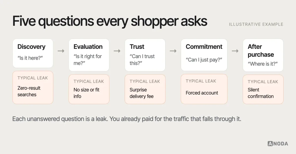
Ecommerce UX is not the look of the store. It is the shopper’s whole decision, broken into the moments where it can fail.
- Discovery. Can people find the right category or product from where they land, including from search and from a phone?
- Evaluation. Can they tell whether this product is the right one — size, fit, compatibility, quality, what is in the box?
- Trust. Do they believe the price, the shop, the delivery promise and the returns policy?
- Commitment. Can they add to cart, review the order and pay without surprises, forced detours or lost progress?
- After the purchase. Do they know what happens next, can they track it, return it and come back to buy again?
Ecommerce UI is the visual layer on top: typography, colour, imagery, components. It matters, because clarity and credibility are partly visual. But a beautiful product page that does not say whether the jacket runs small is still a page that sends people to the returns desk or to a competitor who did say it.
Ecommerce UX also overlaps with conversion rate optimisation, and the two are often confused. CRO usually means running experiments on a live store to lift a metric. UX work decides what is worth experimenting on in the first place: which problem shoppers really have, which flow causes it and what a better one looks like. CRO without UX research tends to test small cosmetic variations because nobody knows what the big problem is. UX without measurement tends to ship redesigns nobody can prove worked. You need both, in that order: understand, then change, then prove.
Why ecommerce UX shows up on the P&L
Ecommerce UX is one of the few design disciplines where the bill arrives itemised. Every shopper who lands on the store was paid for — through ads, marketplace fees, affiliate commissions, SEO work or the brand spend that made them search for you. When that shopper leaves without buying, the acquisition cost is not refunded. You simply have to pay it again for the next one.
The costs do not stop at lost orders. Unclear product pages generate returns, and every return is a sale you paid to acquire, ship, process and reverse. Vague delivery information generates “where is my order?” contacts, and every contact is a cost per order that eats into margin. A checkout that works on desktop and fights people on mobile quietly shifts your conversion toward the most expensive traffic. And a first purchase that felt like hard work makes the second one less likely — which matters, because the second order is where ecommerce margins usually live.
That is why “improve the UX” is the wrong brief. The right one names the money: which step loses the most revenue, which problem inflates returns or support, which segment converts worst relative to what it costs to acquire. Design is how you fix those. Money is how you choose which one to fix first.
Conversion problems are rarely one button
The industry loves single-element fixes because they are easy to sell and easy to test. Change the CTA copy, add urgency, move the reviews up. Sometimes they help. Mostly they are the juice that isn’t worth the squeeze, because the real loss is spread across the journey.
A shopper who abandons at payment might have decided to leave three screens earlier, when the delivery date looked vague. A shopper who bounces from a product page might have landed there from a search that returned the wrong product. A shopper who never returns might have had a perfectly smooth checkout and a silent week afterwards, wondering whether the order went through. Conversion is a chain. Polishing one link does nothing for the one that snaps.
ANODA turns the best-practice list into a plan for your store: the audience, catalogue, price point and purchase journey decide which fix comes first. Fashion shoppers need fit and delivery confidence; industrial buyers need compatibility and fast repeat ordering. That is why we follow the purchase task instead of applying the same template to both.
Diagnose before you redesign: find where the money leaks
Before anyone opens a design tool, find the leak. A redesign aimed at “the whole store” spends the budget evenly across the places that work and the places that bleed. A diagnosis spends it where the money is going.
Start with the funnel. Most analytics setups can show how many sessions move from landing to product view, product view to add to cart, cart to checkout, and checkout to purchase — by device, traffic source and category. You are looking for the step with the steepest drop relative to what it should be, and for differences between segments: a checkout that converts on desktop and collapses on mobile is telling you something very specific.
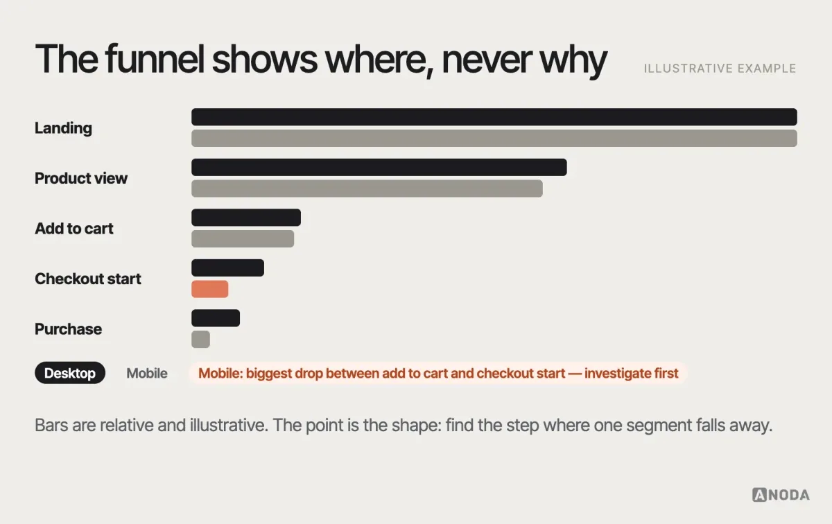
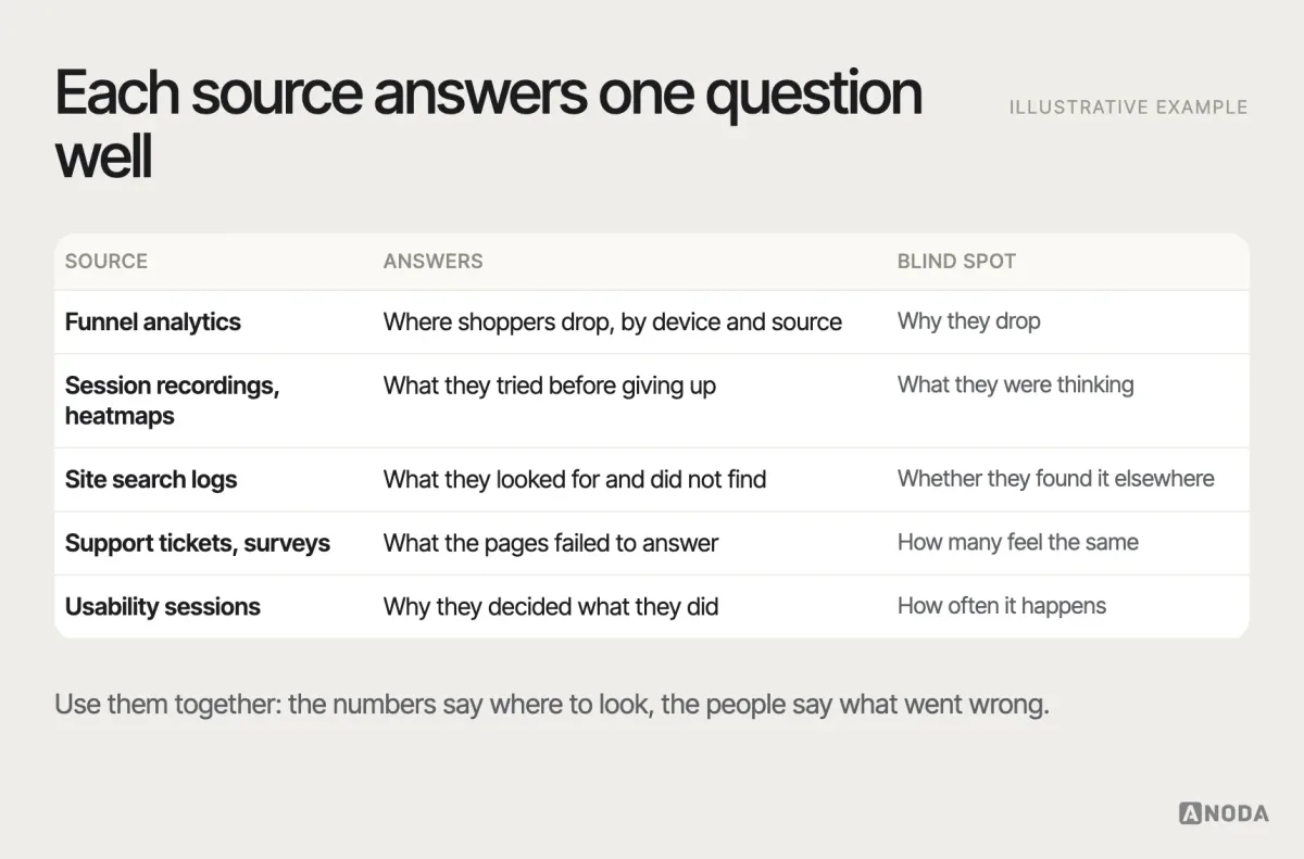
The funnel shows where. It never shows why. For that you need evidence closer to the shopper:
- Session recordings and heatmaps show what people tried before giving up: rage clicks on an unclickable image, endless scrolling past the size guide, a form field filled in three times.
- Site search logs show what people typed and got nothing for. They are one of the most underused research sources in ecommerce, and they come for free.
- Customer service tickets and chat logs show the questions the product page failed to answer, in the customer’s own words.
- On-site surveys and exit questions — one question, at the right moment — show what stopped people when they were about to leave.
- Usability sessions with a handful of target shoppers show the reasoning behind the behaviour: why the delivery message was not trusted, why the filter was ignored.
A structured expert review is a useful complement, especially early. An experienced ecommerce UX designer walking the key journeys on several devices — as a new visitor, a returning customer and a shopper with a specific need — will find a large share of the obvious failures in days. It does not replace evidence from real shoppers, because experts are not your customers, but it tells you where to point the research and which problems are too obvious to need it.
When the evidence is thin or the hypotheses compete, UX research on the purchase journey replaces internal opinions with a map of what actually blocks your customers. It is almost always cheaper than the redesign it prevents.
Prioritise by shopper harm and business value
A diagnosis produces a long list. The mistake is fixing it top to bottom, or starting with whatever the most senior person noticed on their own phone last night. Rank the problems instead.
For each problem, ask four questions. How many shoppers hit it? How badly does it hurt them — mild irritation, or a blocked purchase? How much revenue flows through that step? How hard is the fix? A broken promo-code field that blocks one percent of checkouts can outrank a clumsy mega menu that annoys everyone a little. A missing delivery date on the product page can outrank both.
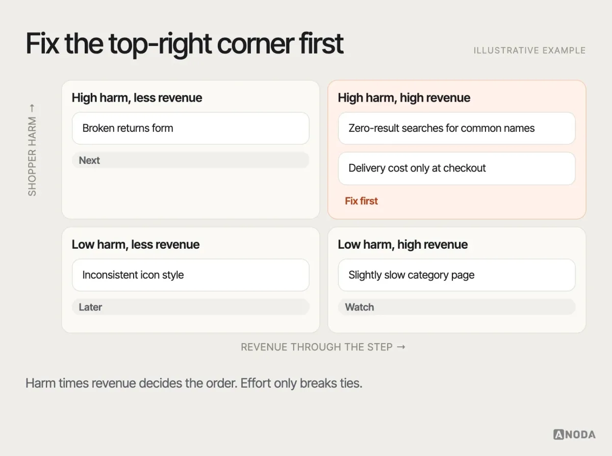
This is also where low-hanging fruit becomes visible. In most stores we audit, a handful of cheap fixes — a clearer delivery message, a search synonym list, a guest checkout option, an error message that says what went wrong — sit right next to the expensive problems in the high-value corner. Ship those first. They pay for the harder work and they build the team’s trust in the process.
Landing pages: keep the promise that brought them in
A surprising share of ecommerce traffic never sees the home page. It lands on a product, a category or a campaign page from an ad, a search result or a social post. The first job of that page is to confirm the promise the shopper clicked on. An ad for “waterproof hiking boots under 150” that lands on a generic footwear category is a bait and switch, even if nobody meant it that way. The shopper has to start searching again, and a fair share won’t bother.
Match the landing page to the source: the product or the pre-filtered category the ad talked about, the offer visible without scrolling, and an obvious next step. Then look at the home page for what it really is — a router for returning customers and brand-curious visitors, not the place where most decisions happen. Many stores spend their design budget polishing a home page hero that a minority of buyers ever see, while the category pages that carry most of the paid traffic are left to the platform’s default template.
Product discovery: navigation, categories and search
A shopper who cannot find the product cannot buy it, and no product page brilliance will save a visit that never reaches it. Discovery has three parts, and most stores are weak in at least one.
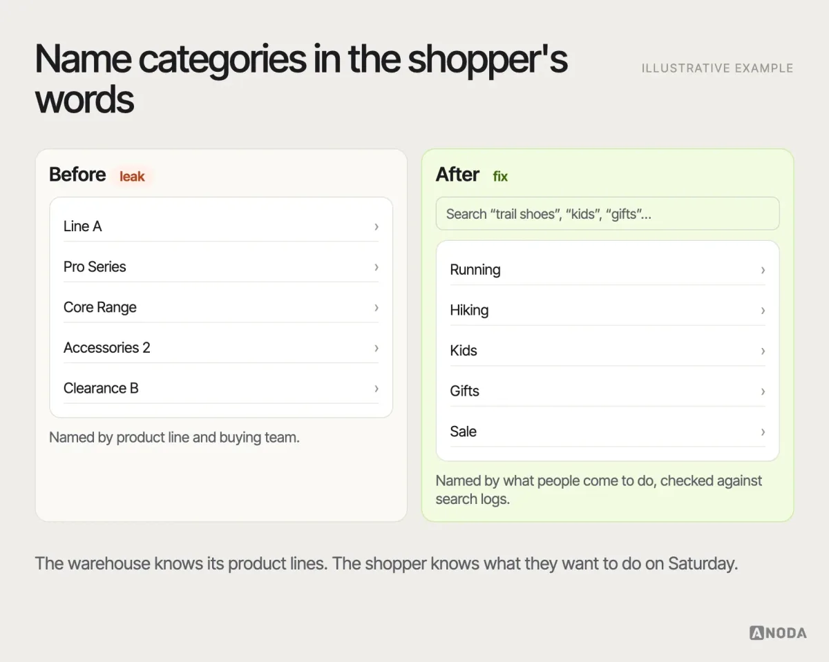
Navigation and categories should follow how shoppers think, not how the warehouse or the buying team organises stock. Shoppers look for “running shoes”, “gifts under 50” or “for a small kitchen”; the catalogue may be sorted by brand, supplier or internal product line. When the two disagree, people wander. Check the category names against your search logs and support tickets: the words shoppers type are the words your navigation should use.
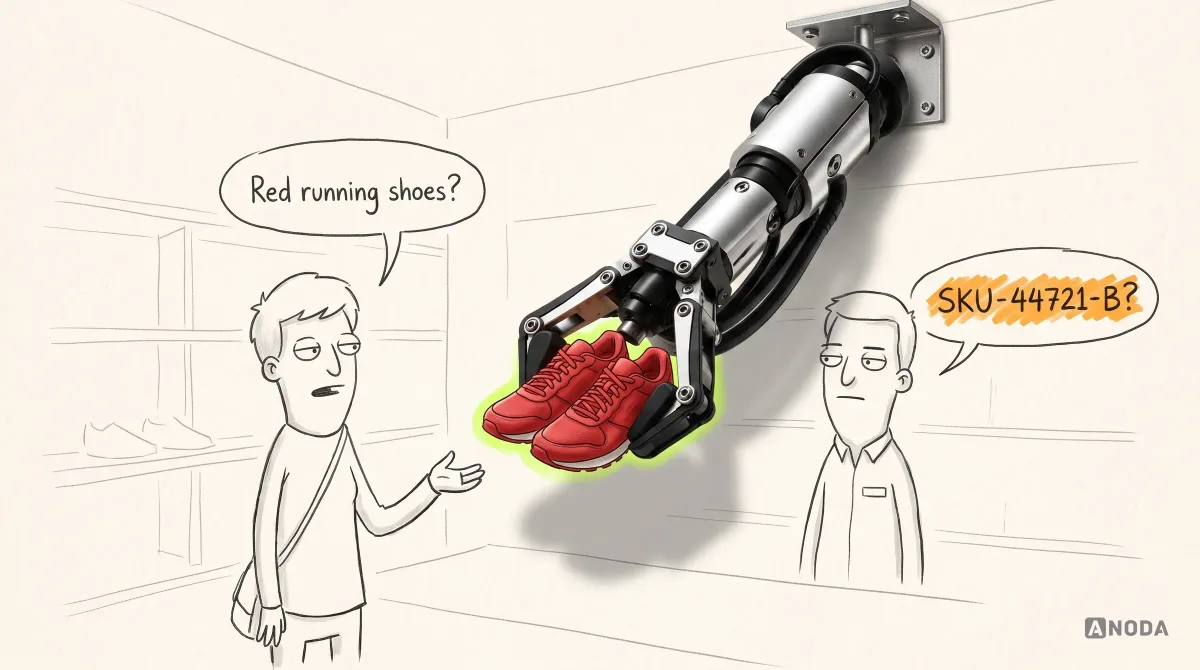
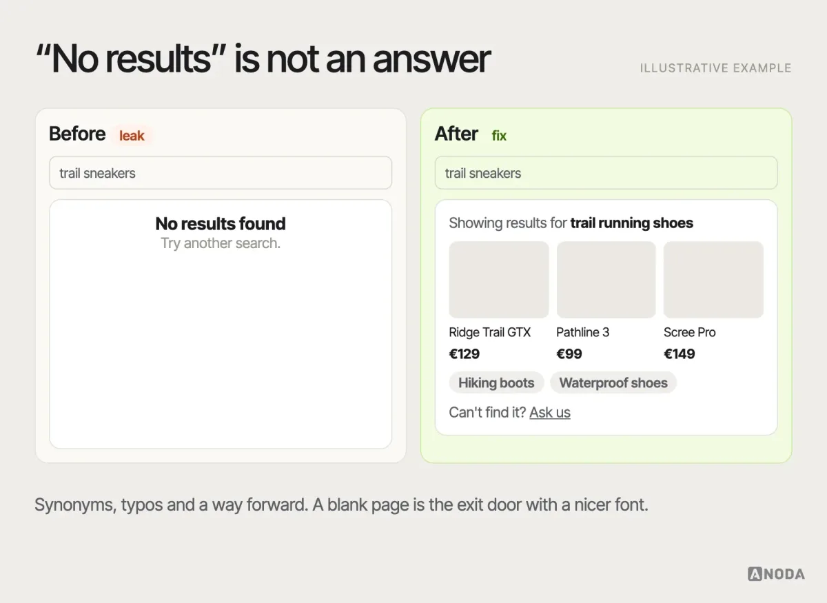
Search is where the most motivated shoppers go, and where many stores quietly fail them. The common failures are predictable: no results for synonyms, plurals or typos; no results for the product’s everyday name when the catalogue uses a technical one; a zero-results page that ends the visit instead of offering categories, suggestions or popular products. A search that only understands internal codes is a shop assistant who answers every question with a stock number.
Category and listing pages are where most comparison happens, and the product card is their unit. A good card answers the first-cut questions without a click: a clear image, the name in shopper language, the price including any discount logic that is easy to read, the key differentiating attribute (size range, capacity, colour count), rating where it is meaningful, and availability. Everything else belongs on the product page. Cards that are all image and no information force shoppers to open ten tabs to compare three products — and on a phone, tabs are where purchases go to die.
Pagination, “load more” and infinite scroll each have trade-offs. Infinite scroll feels effortless until someone wants to come back to the product they saw earlier, reach the footer, or share the list. “Load more” with a remembered position is often a sensible middle. Whatever you choose, returning from a product page should put the shopper back where they were in the list, with their filters intact. Losing position is a small thing that makes comparing feel like work.
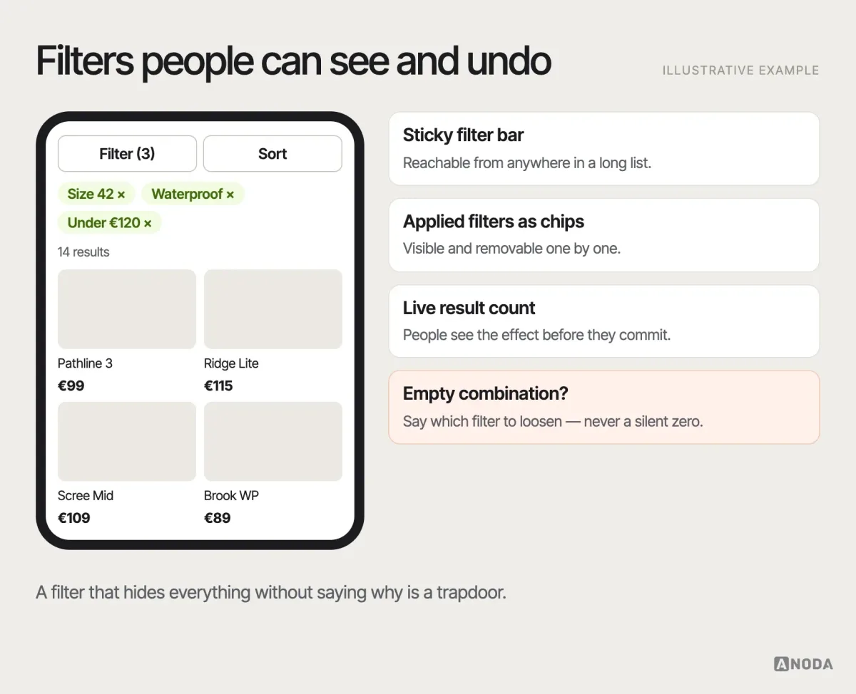
Filters and sorting turn a long category page into a short list. The filters must match the attributes people actually decide on — size, fit, material, compatibility, delivery time — not just the fields the catalogue happens to have. Show which filters are applied, let people remove them one by one, and never let a combination of filters land on an empty page without saying which filter to loosen. On mobile, filters need to be reachable without scrolling back to the top of a long list.
Product pages that answer the buying questions
The product page is where the decision happens, and it has one job: answer every question a shopper needs answered before they are willing to pay. Beautiful photography is part of that job. It is not the whole job.
The questions vary by category, but the pattern is stable:
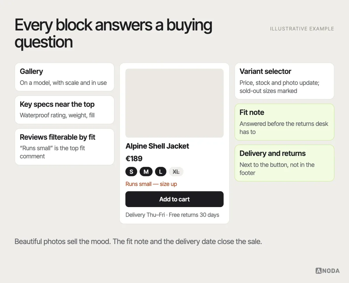
- What exactly is it? Enough images to see the product from every angle that matters, including in use and at a scale people can judge. Video where movement or texture matters.
- Will it work for me? Size guides, fit notes, dimensions, compatibility, materials, care, what is in the box. For technical products, the specifications people actually compare on — near the top, not in a PDF.
- Which variant? Clear variant selection with the price, stock and image updating when a colour or size changes, and unavailable options visibly marked instead of silently failing.
- What will it cost me, all in? Price, delivery cost or at least an estimate, taxes where relevant, and any extra fees.
- When will it arrive, and what if it doesn’t fit? A concrete delivery estimate and the returns policy in plain words, next to the add-to-cart button, not in the footer.
- Do other people like it? Reviews with enough detail to be useful — ideally searchable or filterable by the concern that matters, such as fit or durability.
The expensive failure here is not ugliness. It is ambiguity. A shopper unsure about the size either leaves or buys two sizes and returns one — and a return is a sale you paid to acquire, ship, process and refund. Answering the question on the page is the cheapest customer service you will ever run.
Usability testing
Not sure why shoppers leave the product page?
Watch five of your real customers try to choose and buy. You will know which question the page fails to answer before you pay for a redesign.
Recommendations and personalisation, without the creepiness
Recommendations can help shoppers discover the right product or complete an outfit, a kit or a set. They can also turn a product page into a flea market. The test is simple: does the recommendation answer a question the shopper has at this moment? “Frequently bought with” on a camera — memory cards, a spare battery — answers a real question. Six unrelated bestsellers under a sofa do not.
Personalisation follows the same rule. Remembering a shopper’s size, recently viewed products and past orders saves them effort, and they notice. Showing them the exact product they looked at on another site, everywhere, for weeks, is the retail equivalent of a salesperson following you around the shopping centre. Use what you know to shorten the path, not to prove that you know it.
Trust and cost transparency
Online, the shopper cannot touch the product or look the seller in the eye. Every signal of trust has to be designed: who you are, how to reach you, what the returns policy really says, how payment is protected, and — most of all — what the order will actually cost.
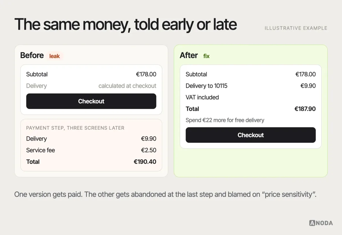
Hidden costs are the classic conversion killer, and they keep killing because they look good on the product page. A low price with delivery, service and payment fees revealed at the last step is a restaurant that adds a table fee when the bill arrives. The customer pays once. They do not come back, and they tell their friends about the bill, not the food.
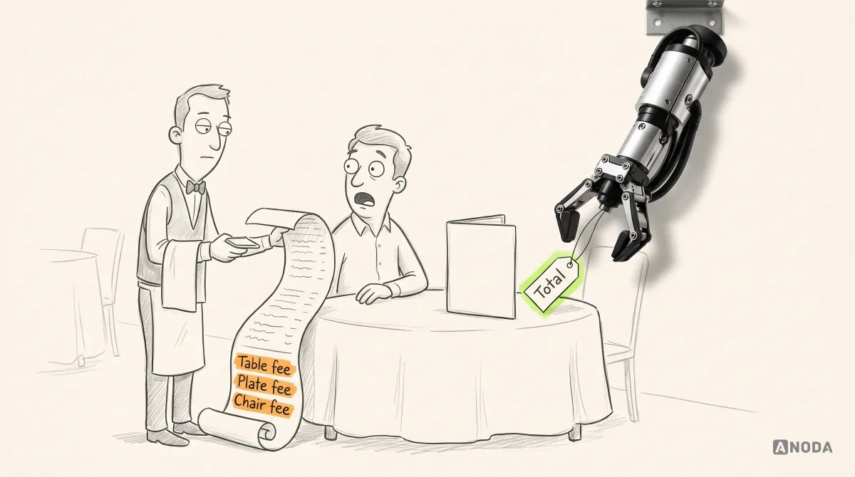
Show the full cost as early as you can. A delivery estimate on the product page, a running total in the cart, free-delivery thresholds stated plainly, and no new fees after the shopper has committed their card details. If a cost depends on the address, say so and let people check it before checkout.
Other trust signals matter in proportion to how much the shopper risks. A small, known brand selling cheap goods needs less reassurance than an unfamiliar store selling expensive ones. Real contact details, clear policies, recognisable payment options, honest stock information and reviews that include the critical ones all do more than a wall of badges. Fake urgency — countdown timers that reset, “only 2 left” that never changes — does the opposite once people notice, and people notice.
Cart and checkout: protect the shopper’s progress
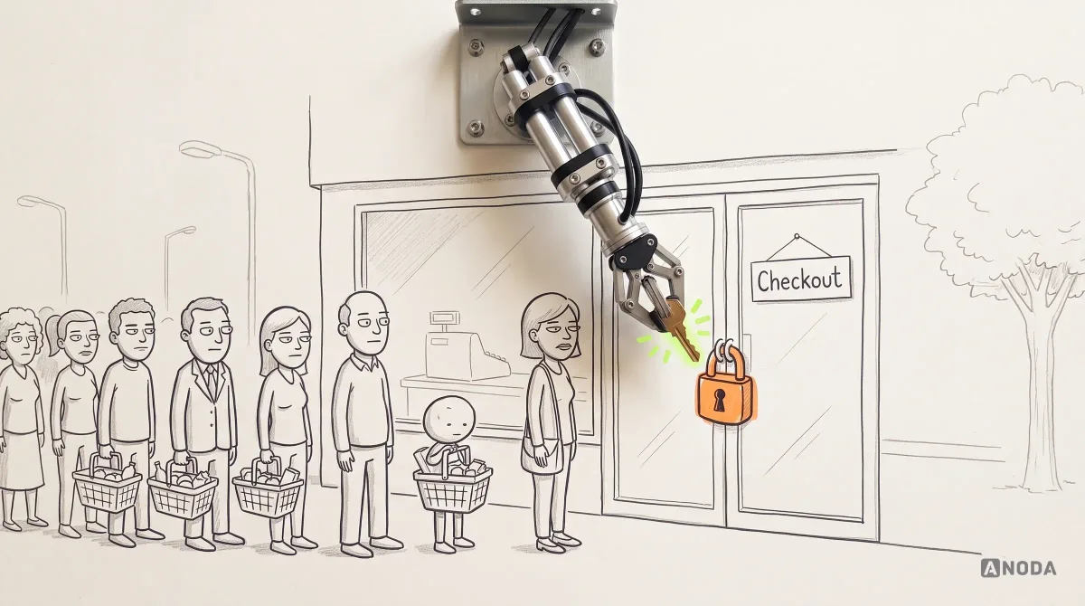
By the time someone reaches checkout, you have already won the hard part: they want the product. Checkout UX has one job — to not lose them now. Yet this is where many stores throw up the most barriers, as if the purchase were a privilege to be earned.
The cart is a review screen, not a sales pitch. Shoppers use it to check what they are buying, change quantities and variants, see the total, and sometimes to park products while they think. Make editing easy without losing the cart, show images and variants clearly enough to catch mistakes, keep the full cost visible, and let people save items for later instead of forcing a delete. Cross-sells in the cart should be rare and relevant; a cart that looks like a second shop is a distraction at the moment you most need focus.
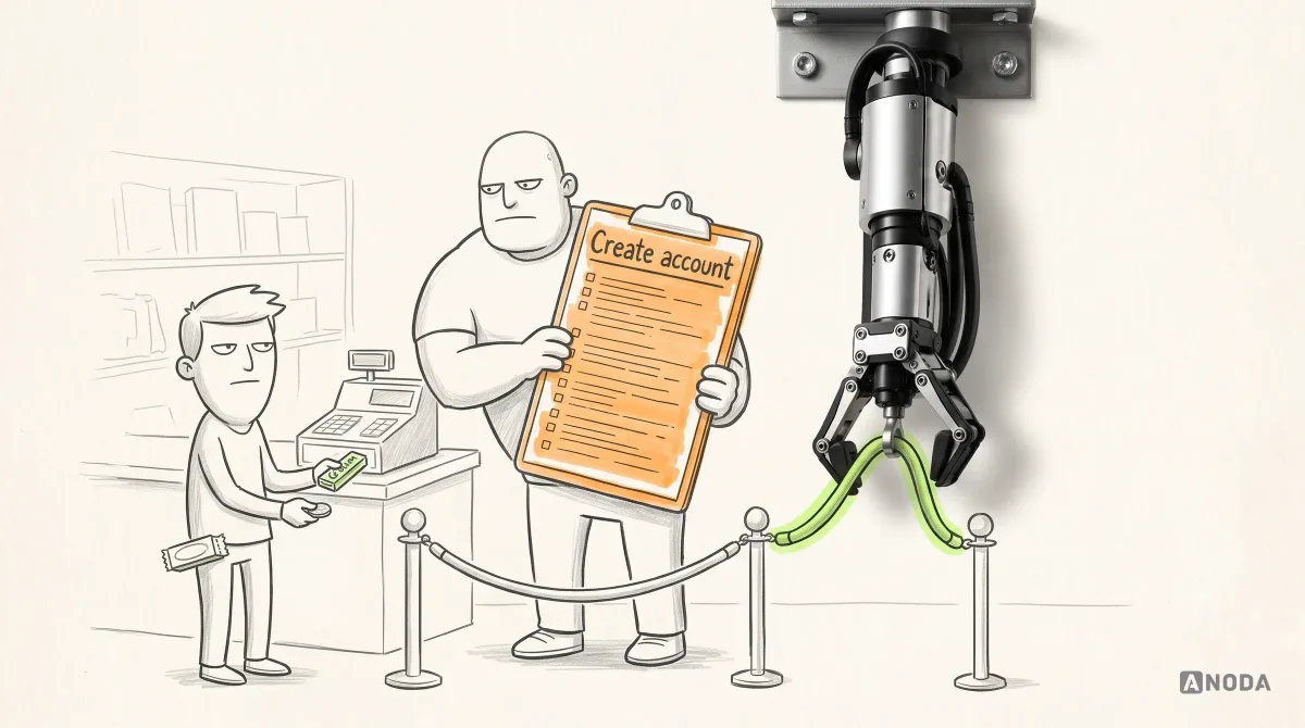
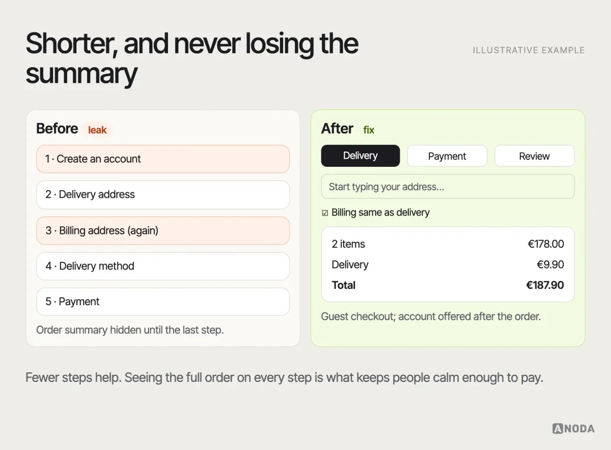
Let people buy as guests. Forcing account creation before payment is a bouncer demanding your life story before you can pay for a pack of gum. Offer an account after the purchase, when the shopper has a reason to want one — order tracking, faster reorders — and pre-fill it from the order.
Ask for less. Every field should earn its place. Use address lookup where it is reliable, combine fields where you can, set sensible defaults, and use the right keyboard on mobile for numbers, emails and postcodes. The same billing and delivery address should be one checkbox, checked by default.
Show where they are and what is left. A short, clear sequence — delivery, payment, review — with the order summary visible throughout, and the ability to change the cart without starting over.
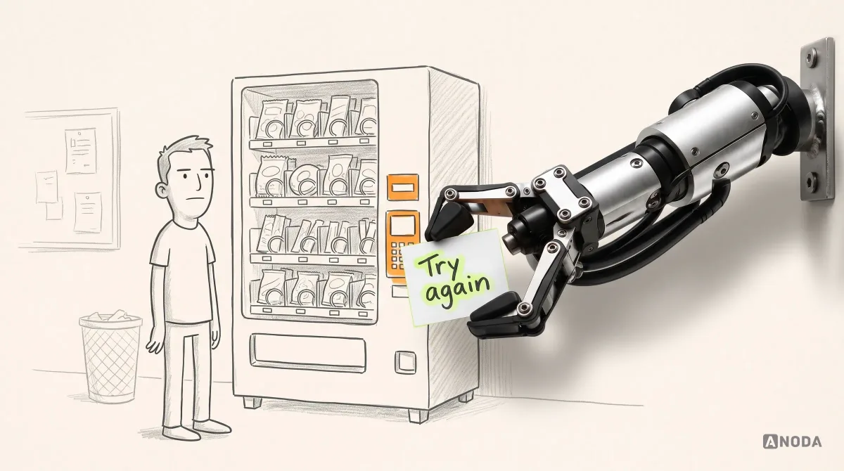
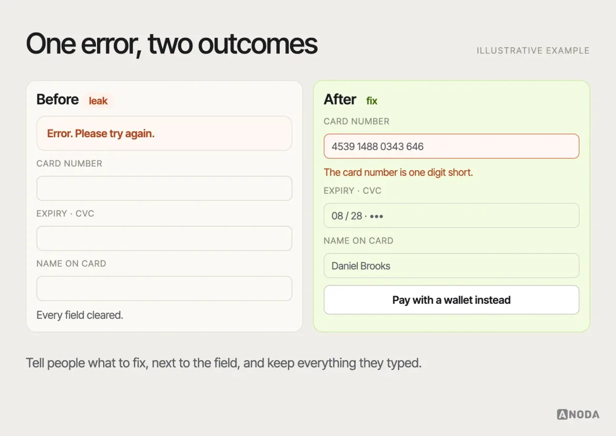
Make errors helpful and progress safe. Inline validation that says what is wrong and how to fix it, next to the field, as the shopper goes. Never clear a filled form because one field failed. Never lose the cart because a session timed out or a payment was declined — offer another payment method instead. A payment error that ends the session is a vending machine that eats the coin and says nothing.
Offer the payment methods your audience expects. Card, the digital wallets common on your shoppers’ devices, and the local methods that matter in your markets. Which ones those are depends on your audience and markets, so check them against your own customers rather than a global list. The promo-code field deserves a thought too: a prominent empty box sends shoppers off to search for codes in another tab, and some never come back.
Mobile ecommerce UX is the default, not the version
For many stores, most visits come from phones, and the mobile journey is often the one that converts worst. Treating mobile as a shrunk desktop is the most common reason. On a phone, the shopper has less screen, less patience, a thumb instead of a mouse and a train to catch.
The practical rules follow from that. Put the decision-critical information — price, variant, delivery estimate, add to cart — within reach without hunting, and keep the add-to-cart action available as people scroll a long product page. Make tap targets big enough for real thumbs. Keep filters and sorting reachable from a long list. Use native inputs and wallets where they reduce typing. Test on real mid-range phones on real mobile networks, not on the designer’s newest model on office Wi-Fi.
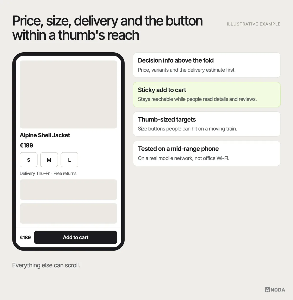
Performance belongs here too, because on mobile slow is broken. Heavy images, scripts from a dozen marketing tools and pop-ups that load after the page shifts the button under the shopper’s thumb all cost sales that no analytics dashboard attributes to “speed”. If you want the deeper responsive-design side of this, our guide to mobile responsive design best practices covers it.
Accessibility is part of conversion
An accessible store is simply a store more people can buy from. Sufficient contrast, labelled form fields, error messages that do not rely on colour alone, full keyboard access through checkout, alt text on product images that describes what matters, and focus that does not get lost in pop-ups and drawers. These are not extras for a small audience. They help older shoppers, people on bright screens in the sun, people with a baby in one arm — and people using assistive technology, who are customers with money like everyone else. Our accessibility in UX design guide goes into the practice in detail; in ecommerce the rule of thumb is simple: if the checkout cannot be completed with a keyboard, part of your market cannot pay you.
After the purchase: where repeat revenue is made or lost
Most ecommerce UX work stops at the confirmation page. That is where the cheapest revenue starts: the second order from a customer you have already paid to acquire.
The post-purchase journey needs the same care as checkout. A clear confirmation with what was ordered, what it cost, when it will arrive and what happens next. Proactive updates when the order ships and if it is delayed — silence after payment is the fastest way to turn a buyer into a support ticket. Tracking that works without logging in. A returns process that is findable, understandable and not designed as a punishment. And a reason to come back: easy reordering, relevant recommendations, an account that remembers sizes and addresses.
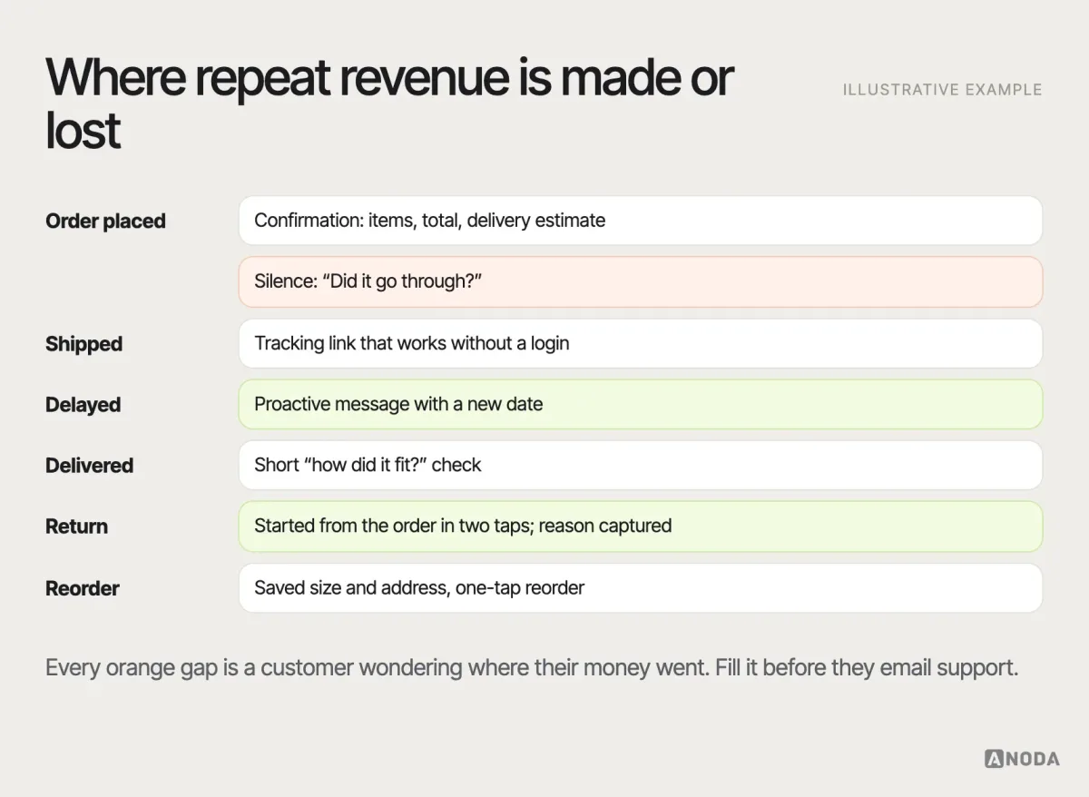
Returns deserve a special mention. A hostile returns process does not reduce returns much; it reduces second orders. A clear one — with the reasons captured in a way the team actually reads — also tells you which product pages are misleading people about size, colour or quality. That is research data you are currently paying to throw away.
B2B ecommerce is a different job
Everything above applies to B2B stores, but the shopper’s job is different, and so are the priorities. A procurement manager or a technician ordering spare parts is not browsing; they know what they need and want to order it fast and correctly. They buy in quantity, often reorder the same items, need account-specific prices and payment terms, and sometimes need approval from someone else before the order goes through.
For B2B, the highest-value UX work is usually in quick order by part number or list upload, reorder from past orders, clear account pricing and availability, saved carts and lists shared across a team, quote requests where prices are negotiated, and approval flows that do not strand an order in someone’s inbox. Search that understands part numbers — and the everyday names technicians use for them — matters more here than beautiful lifestyle photography. A B2B store that makes a repeat order take ten minutes is not a store. It is a reason to phone the sales rep instead.
Turn priority fixes into the next growth decision
Choose the purchase step you are improving and the outcome before you ship: more shoppers reaching checkout, fewer payment failures or fewer fit-related returns. Compare devices and traffic sources, and keep promotions visible in the analysis so your team can decide which fix to extend.
Use A/B testing when the store has enough traffic to compare versions. For a smaller store, watch target shoppers complete the purchase through usability testing, correct the barriers and track the same funnel stages after release. Either way, ANODA connects the design change to a business decision: keep improving the flow that earns the next order.
Measure the whole journey, not one number
Overall conversion rate is a useful headline and a terrible diagnostic. It blends every device, traffic source, category and customer type into one number that moves for reasons that have nothing to do with UX. Measure each stage of the journey instead, so that when something changes you know where.
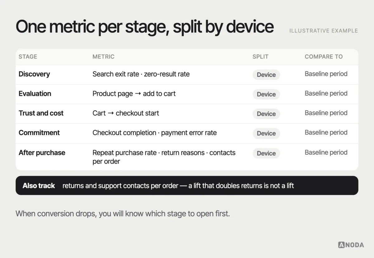
Split every stage metric by device and by new versus returning shoppers. Keep a baseline before any change. Pair the numbers with the qualitative sources — support themes, search logs, return reasons — so the team sees not just that a stage got worse but what shoppers are saying about it. And measure the business outcomes that UX affects beyond the first order: returns, support contacts per order, repeat purchases. A change that lifts conversion and doubles returns has not made you money.
The ecommerce UX mistakes we keep finding
Different stores, different catalogues, the same short list of self-inflicted wounds. If you recognise several of these, you have your first sprint.
- Designing for the home page while the money lands elsewhere. Paid and search traffic lands on product and category pages that still run the platform’s default template.
- A search that only speaks catalogue. Internal names, no synonyms, no typo tolerance, and a zero-results page with nowhere to go.
- Product pages that sell the mood and skip the facts. Beautiful photography, no size guidance, no delivery estimate, specifications buried in a tab.
- The late-reveal price. Delivery, fees and taxes discovered at the last step, then written off as “price-sensitive shoppers”.
- A checkout built for the company, not the customer. Forced accounts, duplicate address entry, marketing consent tangled with terms, a payment error that clears the form.
- Mobile tested on the best phone in the office. Tiny targets, the add-to-cart button three screens down, pop-ups that cover the only thing people came for.
- Silence after payment. No shipping update, no delay message, tracking locked behind a login nobody created.
- Tests that prove whatever the team hoped. Before-and-after comparisons across a sale week, stopped the day the graph looked good.
None of these needs a new platform or a year-long redesign. Most need evidence, a decision and a sprint. The expensive part is usually the months spent not looking. When the fixes stop being local — the same problems repeating across the catalogue, the account area and the apps — that is a product-wide job for UI/UX design, not another round of patches.
An illustrative example: the cart that was not the problem
Here is how the diagnose–prioritise–test sequence plays out on a typical store — an illustrative example, not a specific client. A mid-sized apparel store sees cart abandonment above its own historical level and asks for a checkout redesign.
The funnel shows the drop is concentrated on mobile, between cart and checkout start — before anyone sees the checkout at all. Session recordings show shoppers opening the cart, scrolling, and leaving. Support tickets are full of one question: “How much is delivery?” The cart shows a subtotal and a line reading “Delivery calculated at checkout”. Nobody wants to start a four-step process to find out a price.
The priority is obvious once the evidence is on the table: show the estimated delivery cost in the cart and on the product page, state the free-delivery threshold, and let people check their postcode before checkout. The fix is small. It is tested against the old cart on mobile traffic with a hypothesis written in advance — cart-to-checkout rate should rise, with no change in average order value — and measured through comparable weeks. The checkout redesign everyone asked for can wait until the data says it is the next leak, not the first.
That is the whole commercial argument for doing ecommerce UX properly. The expensive project is not always the right one. The right one is the leak that loses the most money, fixed in the cheapest way that works, and proven before the next one starts.
Ecommerce UX best practices, by stage
Use this as a starting checklist, then test every item against your own shoppers:
- Discovery: category names in the shopper’s words; search that handles synonyms, plurals and typos; useful zero-results pages; filters on the attributes people decide on, visible and removable.
- Evaluation: images that show scale and use; size, fit and compatibility answered on the page; variants that update price and stock; specifications people compare on near the top; honest, detailed reviews.
- Trust: full cost visible early; delivery estimate and returns policy next to the add-to-cart button; real contact details; no fake urgency.
- Commitment: guest checkout; minimal fields with address lookup; order summary always visible; inline errors that keep progress; payment methods your audience expects.
- Mobile: decision-critical information and the add-to-cart action within reach; thumb-sized targets; fast pages on real devices and networks.
- After the purchase: clear confirmation; proactive shipping and delay updates; tracking without login; a returns flow that is easy to find and use; easy reordering.
- Always: diagnose before redesigning, prioritise by shopper harm and revenue, write the hypothesis before testing, and measure every stage by device.
Why ANODA can fix the journey behind the storefront
For Arize, ANODA researched, designed and built a WordPress and WooCommerce store, connecting the product story to colour, size and pack selection, cart and checkout. We know the gap between a persuasive product page and the purchasing flow that actually has to work.
Blackdove connects canvas configuration and subscription choice in its Shopify storefront with the art and display controls in its web and mobile apps. ANODA designed all three surfaces on one system and built the storefront. For easyStorage Netherlands, we designed and built the Webflow site and took over the booking application behind location search, unit choice and checkout. Both show why the buying decision needs to survive the handoff into the ongoing service. For a booking product, bring us the step between choosing availability and securing the booking. ANODA connects the choice, price, checkout and confirmation so customers know what they have reserved and what happens next.
That is the advantage we bring to your store: product understanding, interface decisions and the complete buying journey considered together. You get prioritised conversion fixes and clear flows your team can ship, with the questions that create abandoned orders and support contacts answered where shoppers need them.
Follow the money and the funnel. Remove uncertainty, make costs and next steps explicit, protect progress, optimise the mobile task, and measure the complete journey instead of polishing isolated screens. The store that does this does not need to shout “limited time only”. It just needs to stop losing the customers it already paid for.

Ecommerce UX
Paying for traffic that never reaches the till?
ANODA finds the leaks that cost your store the most, redesigns the priority buying flows and sets out how to track the improved journey. Turn more of the traffic you already paid for into confident purchases.
Written by