
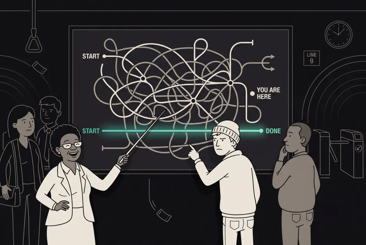
How to Optimize User Flow for Seamless and Effective UX Design
Improve user flow with ANODA UX Agency. Discover principles, tools, and strategies to design seamless, intuitive UX. Start improving your user experience today!
Design the journeys a hire passes through — the application, the shortlist, the interview, the offer and the first weeks — so candidates, managers and your operations team each know what happens next.

Candidates, managers and operations on one hiring process, each with the view they need.
Tools a company's own staff use to run it.
HRTech & Recruitment Design
Journeys shared by candidates, contractors and managers.
Not included
The candidate's, the manager's and the recruiter's side of the same process.
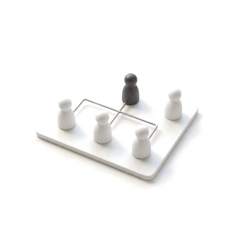
Who applies, screens, decides and approves, and where work passes between them.
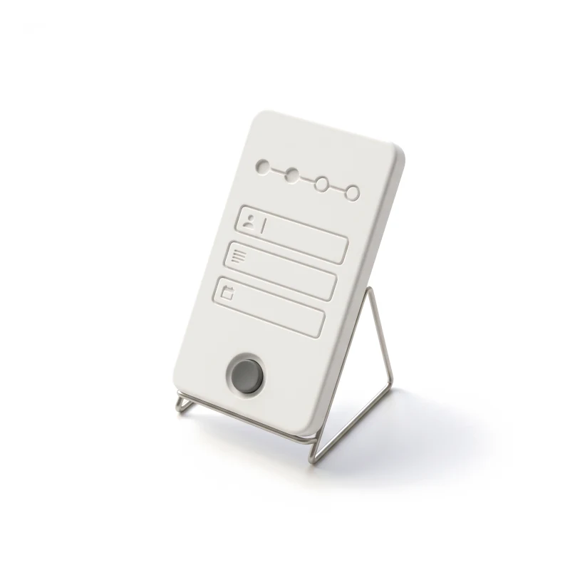
From the job page to the offer, with saved drafts, status updates and a clear no.
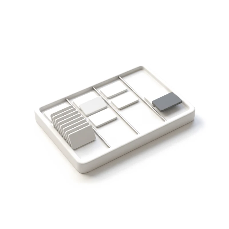
Pipelines, shortlists, interview slots and feedback, without chasing anyone.
Documents, timesheets, approvals and payment status, as people see them.
You receive
Hiring stalls where one person waits on another, and the candidate is usually the one left guessing. Each of these moments is drawn for the candidate, the manager and the team running the process, with the message each of them sees.
It fits when several people act on the same hire and each of them needs a different view.
Candidates, recruiters, hiring or client managers and admins act on the same record.
Applications stop halfway, managers sit on shortlists, or contractors ask where their pay is.
The ATS, HR system or payroll provider is known, so the design can show what each one holds.
A product owner can settle trade-offs between what recruiters want and what candidates will do.
A different starting point

Tell us who applies, who decides and where the process stalls. We'll reply with the service we'd suggest and what it would ask of your recruiters.
A hiring product is taken on through whichever service suits where it stands, on the terms of that service's proposal.
Tell us who uses the product, which stage stalls, and which systems sit behind it.
Message received.
Within 15 minutes, we’ll email you initial feedback and follow-up questions.
Improve user flow with ANODA UX Agency. Discover principles, tools, and strategies to design seamless, intuitive UX. Start improving your user experience today!
The right partner designs for more than one side of a hire. A good candidate screen means little if the manager's shortlist behind it is slow. Ask to see a full flow with its unhappy paths: a half-finished application, a cancelled interview, a rejection, a missing document. Find out which roles they covered, how they settled who sees what, how much of the design reached production, and which of their designers would be on your project. A short test helps too: give them one real stage of your process and ask how they would design the moment a candidate is waiting and nobody has replied.
A role and workflow map, the candidate journey, the recruiter and manager workspace, onboarding and pay views, each status a candidate can be in, a prototype and the UI. Budget and schedule move with the number of roles and hiring stages, the platforms, whether candidates already use the product, and how many systems feed it. We have no fixed package: the first proposal we send sets the scope, and dates follow once access and dependencies are clear.
Candidates and contractors; recruiters and sourcers; hiring managers, or client managers on a staffing platform; HR and operations admins; and support. The workflows run from job pages and applications through screening, shortlists, interview scheduling, feedback and offers, into onboarding, documents, timesheets and approvals. Talent management UX — reviews, goals and skills — is designed the same way: who acts, what they see and what happens when someone does not. The mix differs by product. An applicant tracking tool lives on pipelines and bulk actions; a staffing or contractor platform adds client managers, placements, timesheets and pay status; an onboarding or talent tool is used for months by the same employee, so it has to stay clear on the tenth visit as well as the first.
A new hiring product, or a new module inside one, goes through UI/UX & Product Design. Web App Design when recruiters and managers work in the browser, and Mobile App Design when candidates apply or contractors log time on a phone. If candidates drop out of a live product at a step nobody can find, a UX Audit comes first. Organisation-wide approvals belong to B2B Product Design, and tools only your own staff use to ERP & Internal Tools Design.
As constraints your team gives us, never as advice we give. We design who can see a candidate's profile, how consent and deletion requests appear, and what a contractor sees about a timesheet or a payment. The rules behind them — employment law, data retention, tax — stay with your legal team and your payroll provider. The design shows the payment status; the payroll engine calculates the pay. Nothing we design certifies that your hiring or pay process is lawful; that judgement belongs to your employment lawyers.
A staging product with a login for candidate, recruiter, manager and admin, your hiring or onboarding stages as they really run, and any evidence you hold: drop-off data, recruiter complaints, support questions. Add one person who can make the product calls, plus time with engineering and with whoever owns the ATS, HR and payroll systems, so their limits are on the table before we design around them.
Yes. It has not been published as case studies yet, so those clients stay unnamed here; on a call we can show how we handled similar roles and workflows. Our published cases show the same kind of product: several roles sharing one process, dense tables, statuses and permissions, designed for web and mobile. When you look at them, look for how each case handled the people who wait on someone else — that is where recruitment products succeed or fail. We never move a figure from one of those cases onto this page, because a result from one product says nothing certain about yours.
Yes. Most HRTech work starts from a product already in use and systems that are already chosen. We design inside your files and design system, around the data your ATS and HR tools actually return, next to your designers and engineers, and every file is handed over. Where recruiters already rely on shortcuts, saved searches or a column order, we keep them and change what around them causes the friction, so the people who use the product all day are not slowed down by the redesign.