
A mortgage CRM redesign, without starting over
Sail is the CRM Ark Mortgage’s loan officers work in all day.We redesigned it inside the system already built, for desktop and mobile web.
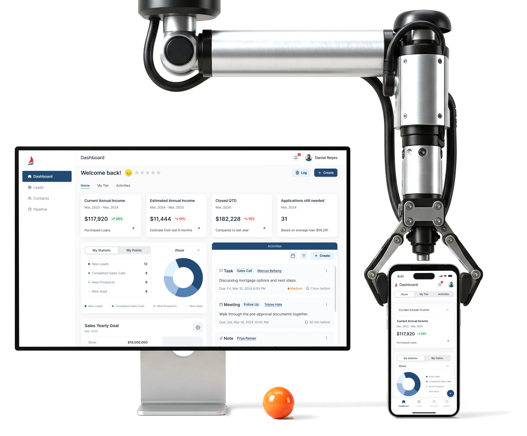
- Existing
- system a redesign that had to fit what was already built
- 2
- platforms desktop web and a mobile adaptive of the same product
- Wireframes
- to UI kit structure, wireframes and final desktop and mobile UI
Project summary
We redesigned Sail’s existing mortgage-agent CRM around the loan officer’s working day: leads, applications, pricing, documents and routing. Information architecture and UX and UI connect each record to its owner and next action, across desktop and responsive mobile web. A UI kit and new feature designs extended Ark Mortgage’s existing system for its own developers.
What a loan officer passes through
One chain, from a name on a list to a loan being worked:
Our enterprise software design guide connects related records, roles and exceptions so a borrower, a loan and a routing rule stay part of the same officer’s work.
-
Leads
- Partners and contacts
- Table and kanban
- Unqualified and converted
-
Pipeline
- Scenario to closed loans
- Commission
- Bulk actions
-
Loan
- Details and borrowers
- The long application
- Activities
-
Pricing
- Scenario search
- Product results
- Rate lock and changes
-
Documents
- Upload and categories
- Unassigned files
- Who can open one
-
Team
- Lead routing rules
- Employee capacity
- Notifications
- Everything on one screen and Nothing misread
- Dense tables and record grids that still say whose loan it is and what state it is in.
- A long form and A short day
- The application split into sections an agent can jump between, one borrower or two at a time.
- New features and The system already running
- Routing, staff and notifications added without contradicting the ownership rules the CRM already had.
One loan, read top to bottom
- Found
- An agent who opens a loan needs the borrower, the figures and the last thing said about it. A screen that hides one of them sends them to call the wrong person or work from an old number.
- Decided
A strip on top with the borrower, LTV, DTI, amount and dates. Below it the loan record in one grid, then borrowers, qualifications and the property in one column, the activity feed beside it, and pre-approvals last.
Our CRM system design guide uses Sail to show how the record, pipeline stage, owner and next action fit together before the interface is drawn.
- For the user
- An agent sees whose loan it is, the figures that decide it and what happened last before touching anything.
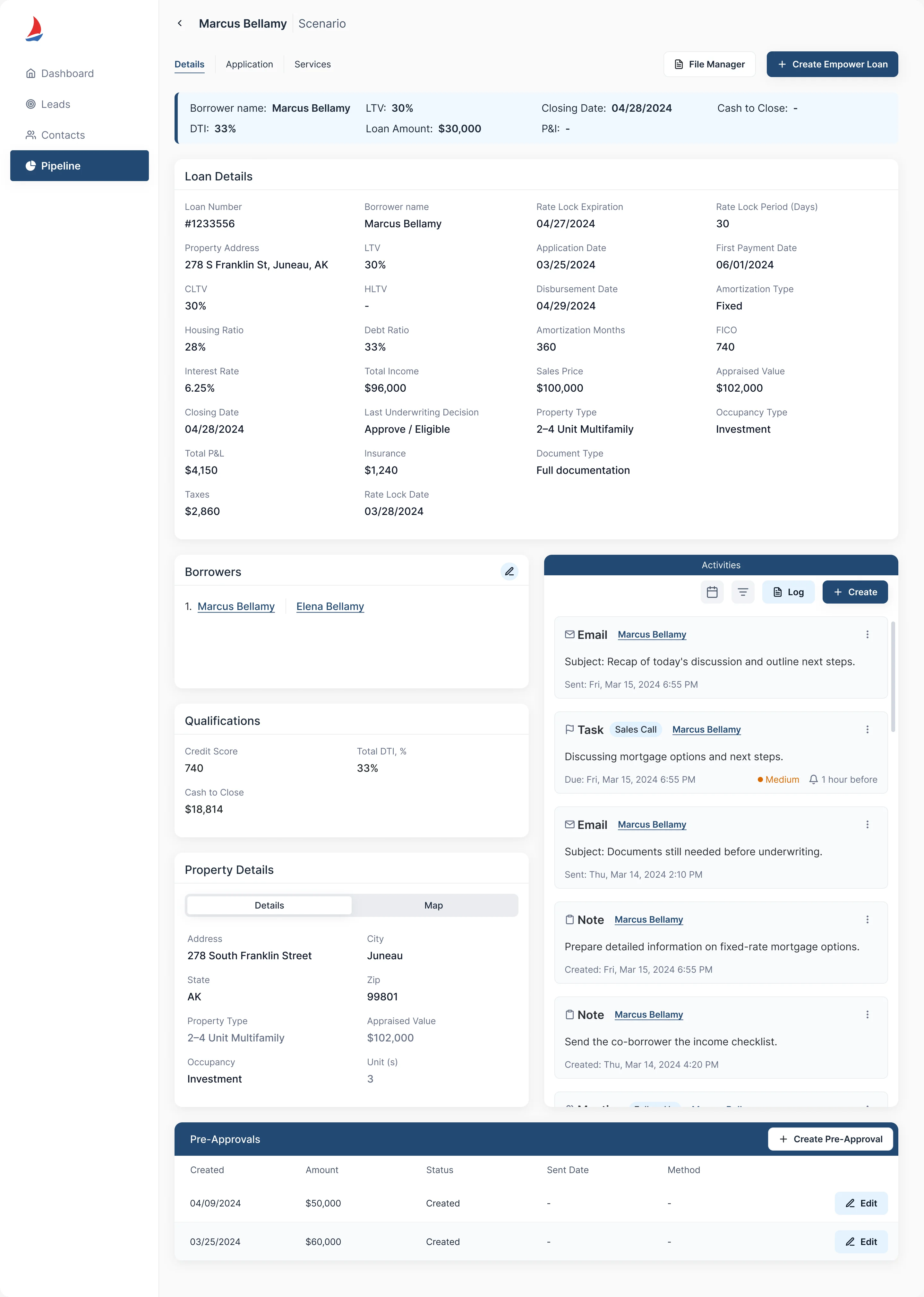
-
Whose loan, and the figures
Borrower, LTV, DTI, amount and dates in one strip.
-
The loan record
Every loan field in one grid, in a fixed order.
-
The people, the property, the history
Borrowers, qualifications and property in one column; emails, tasks, notes and meetings beside it, newest first.
-
Pre-approvals
Created, amount, status and method, with Edit at the row.
How the work progressed
From the structure of a CRM already in use to final screens, a phone version and a kit, extended as later scopes were added.
-
Information architecture
How leads, pipeline, loans, pricing, documents and the team’s tools connect, for the first scope and for the scopes that came after it
Artifact Information architecture for the initial and the later additional scopes
-
Wireframes
Where a stage, a figure and an action sit on the pipeline, the lead and the loan, before any styling
Artifact Desktop web wireframes
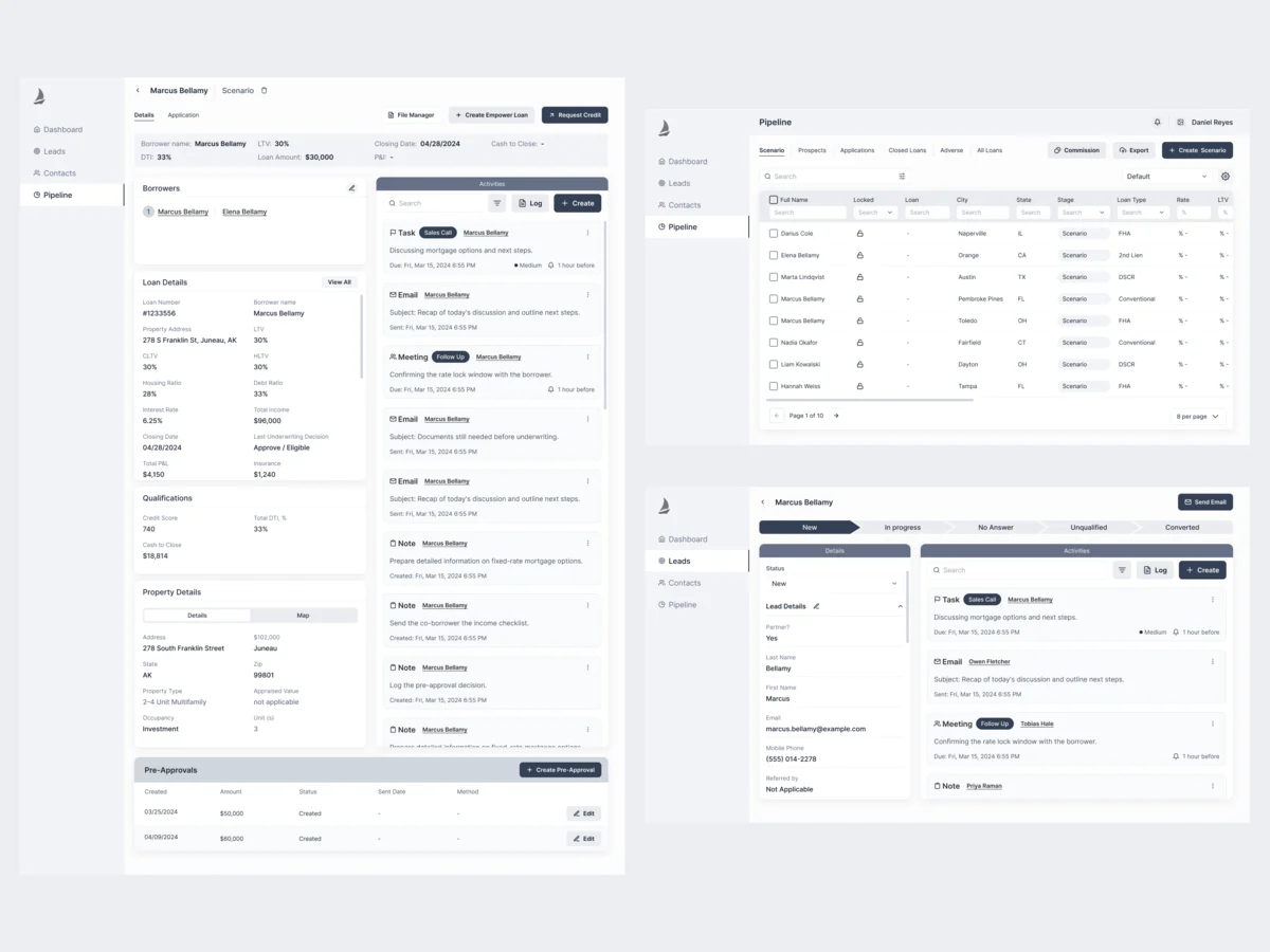
-
Desktop UI
Dense borrower, loan, pricing and status data made scannable, without changing how agents already think about the product
Artifact High-fidelity desktop screens across the initial and the later scopes
-
Mobile adaptive
Which parts of the pricing, product-result and application workflows a phone keeps, and how their dependencies stay visible
Artifact Responsive and mobile adaptive screens of the web product
-
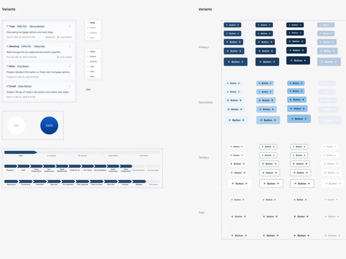
UI Kit
One set of inputs, buttons, stage bars and cards for every screen, within the implemented system
Artifact A UI kit of reusable patterns
From a name on a list to a loan being worked
- Found
- A CRM is a set of jobs joined by hand-offs: a lead becomes a loan, a rule sends a lead to a person, a file lands on a loan. Each hand-off is where a wrong state can slip in.
- Decided
- Each hand-off drawn as a run of screens before the final UI, and a menu that keeps the whole product one tap away on a desktop and on a phone.
-
A lead becomes a loan
The kanban of leads by status, one lead with its details and activities, then the dialog that ties a converted lead to a loan.
Open the full map
-
A rule sends leads to a person
The rule’s criteria, a multi-choice of loan purposes, and the rule ready to save with its loan officer.
Open the full map
-
A file lands on a loan
The upload dialog, the file with its category chosen, and a new folder created as it uploads.
Open the full map
Six jobs a loan officer needs done
In the order a day meets them.
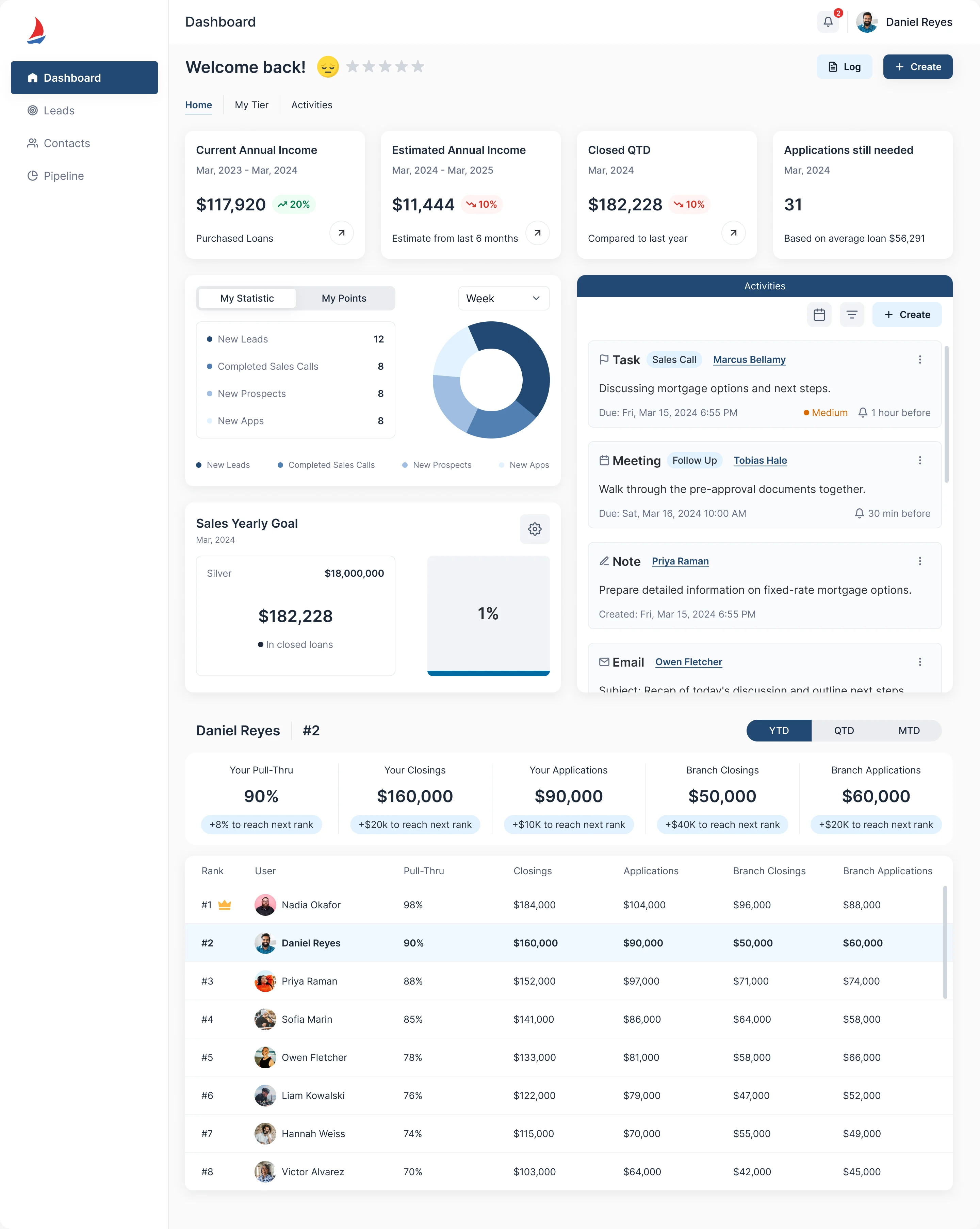
Starting the day
- Found
- A dashboard that shows income, closings and rank in one place is only useful if the numbers can be read against each other.
- Decided
- Income and closing figures across the top, the officer’s statistics and yearly goal beside their activities, then their own row of pull-through, closings and applications above the ranking.
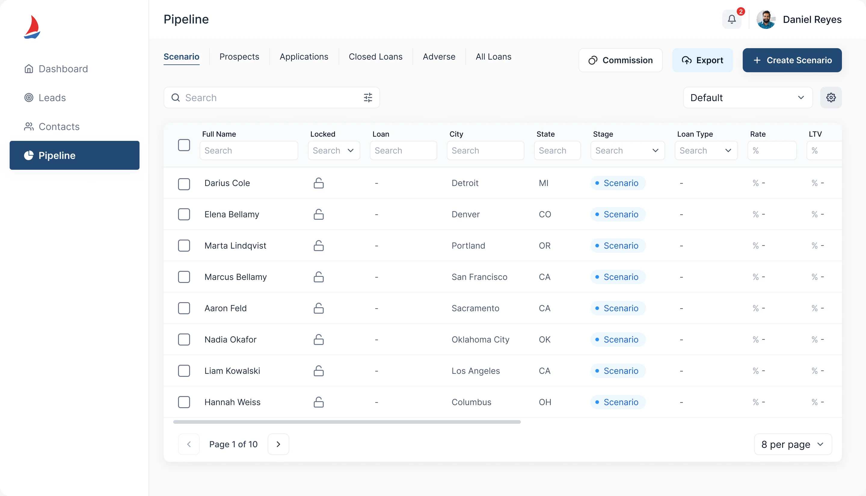
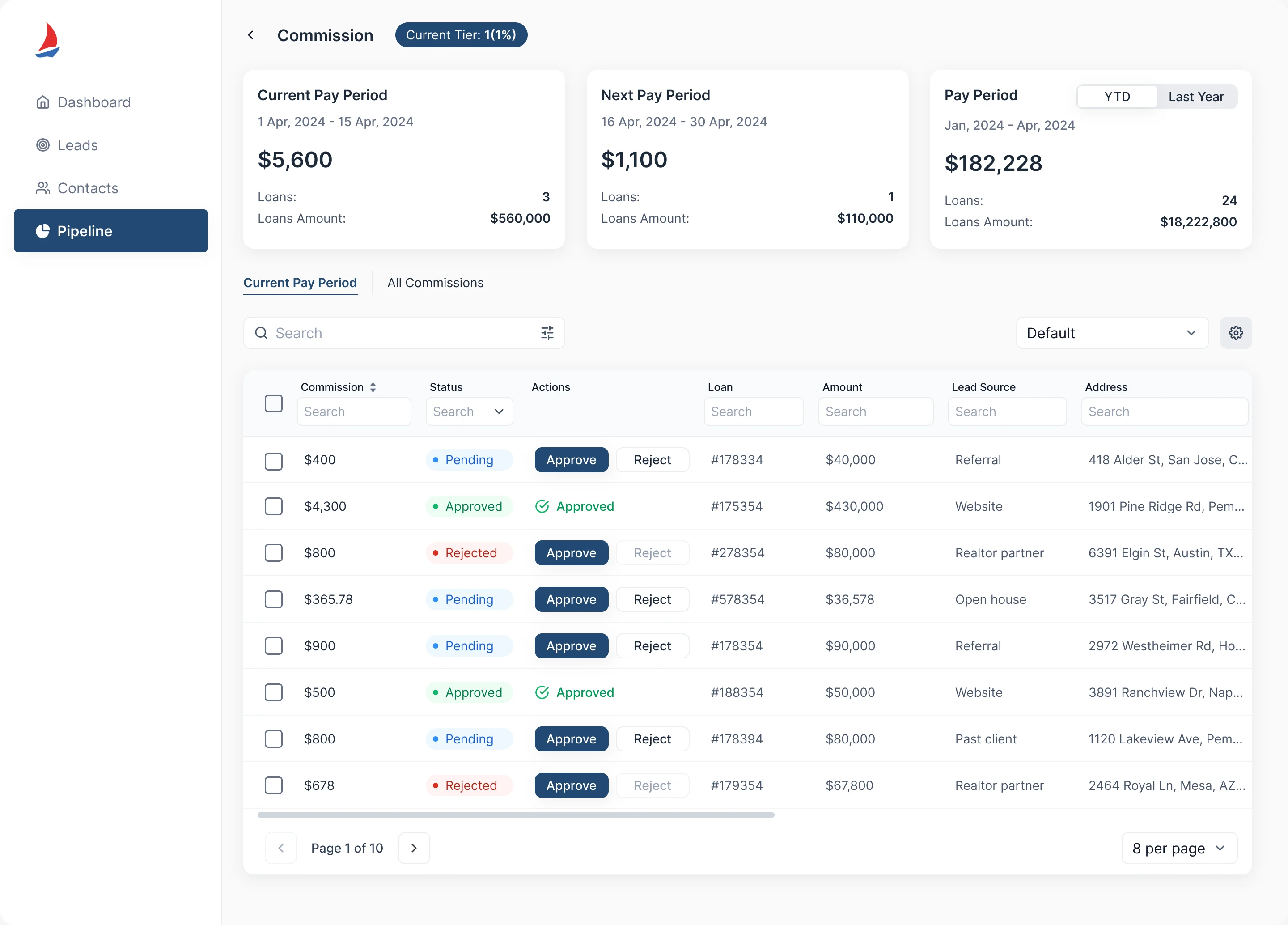
Knowing where every loan stands
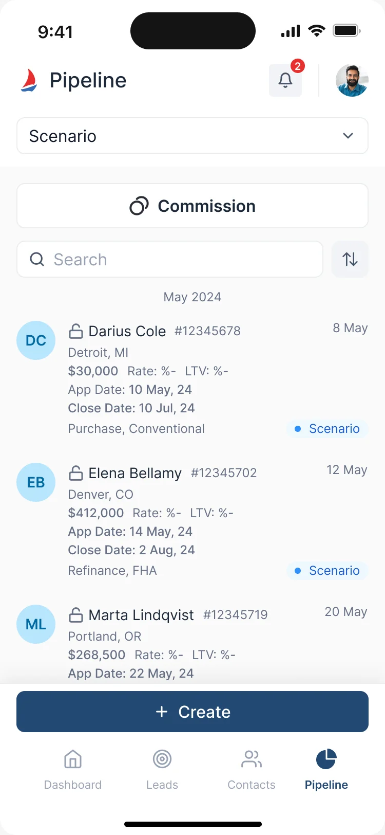
- Found
- A cleaner CRM can still misstate a loan. An agent who reads the wrong stage calls the wrong borrower, or approves the wrong commission.
- Decided
- The pipeline split into Scenario, Prospects, Applications, Closed Loans, Adverse and All Loans, each row with its stage as a badge. Commission on its own screen with Pending, Approved and Rejected in a column of their own, next to the action that changes them.
Filling a long application
- Found
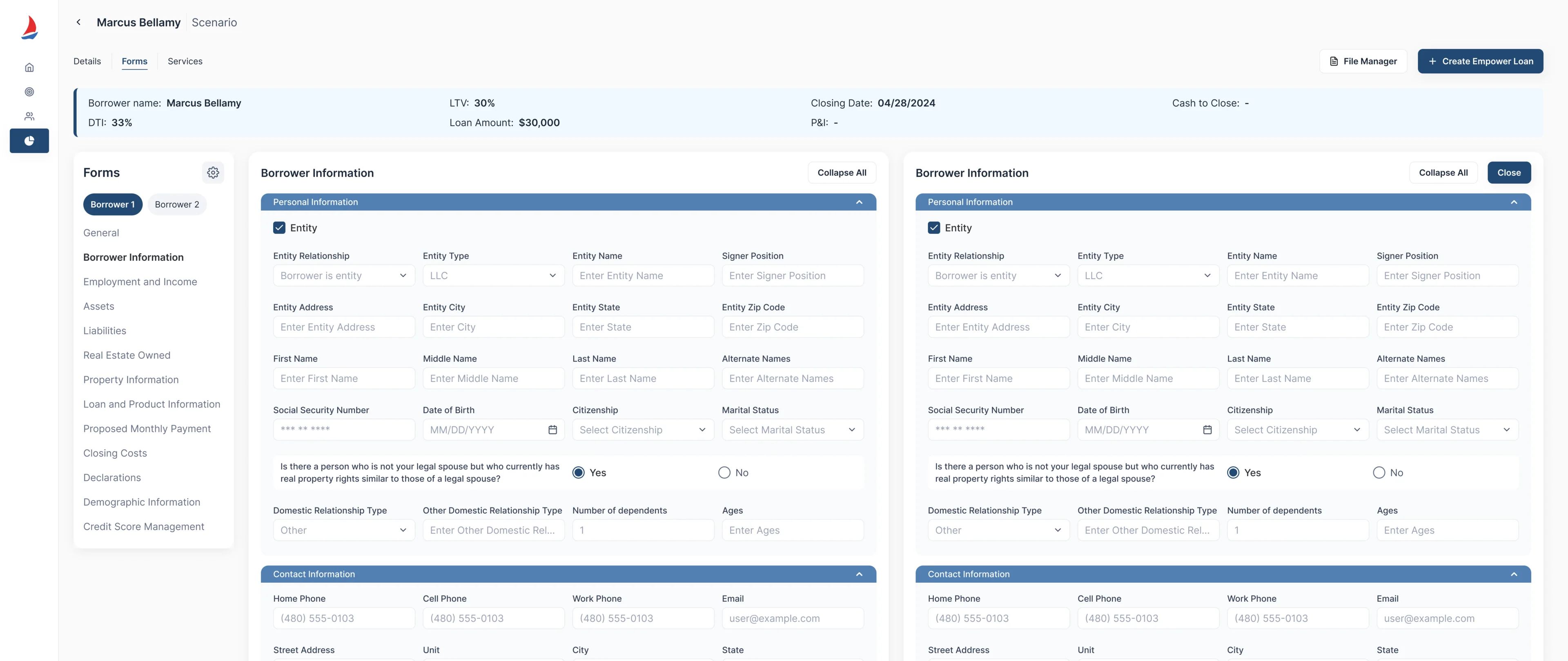
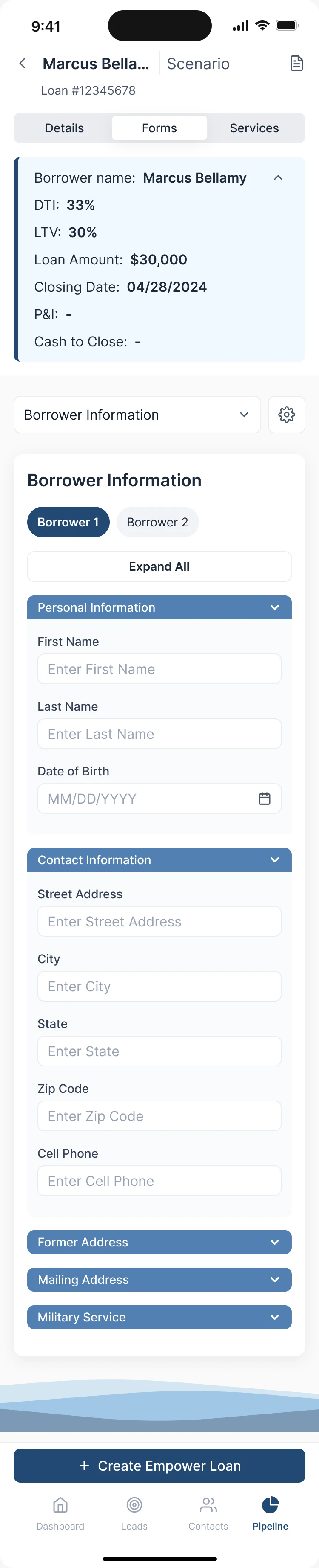
- A mortgage application runs to dozens of fields across many sections. On a small screen a long form can hide a required field or a co-borrower and still look finished.
- Decided
- Sections listed beside the form so an agent can jump between them, one borrower or two side by side, and collapse or expand a whole section. On the phone the same sections sit behind a picker and an Expand All.

Comparing prices without guessing
- Found
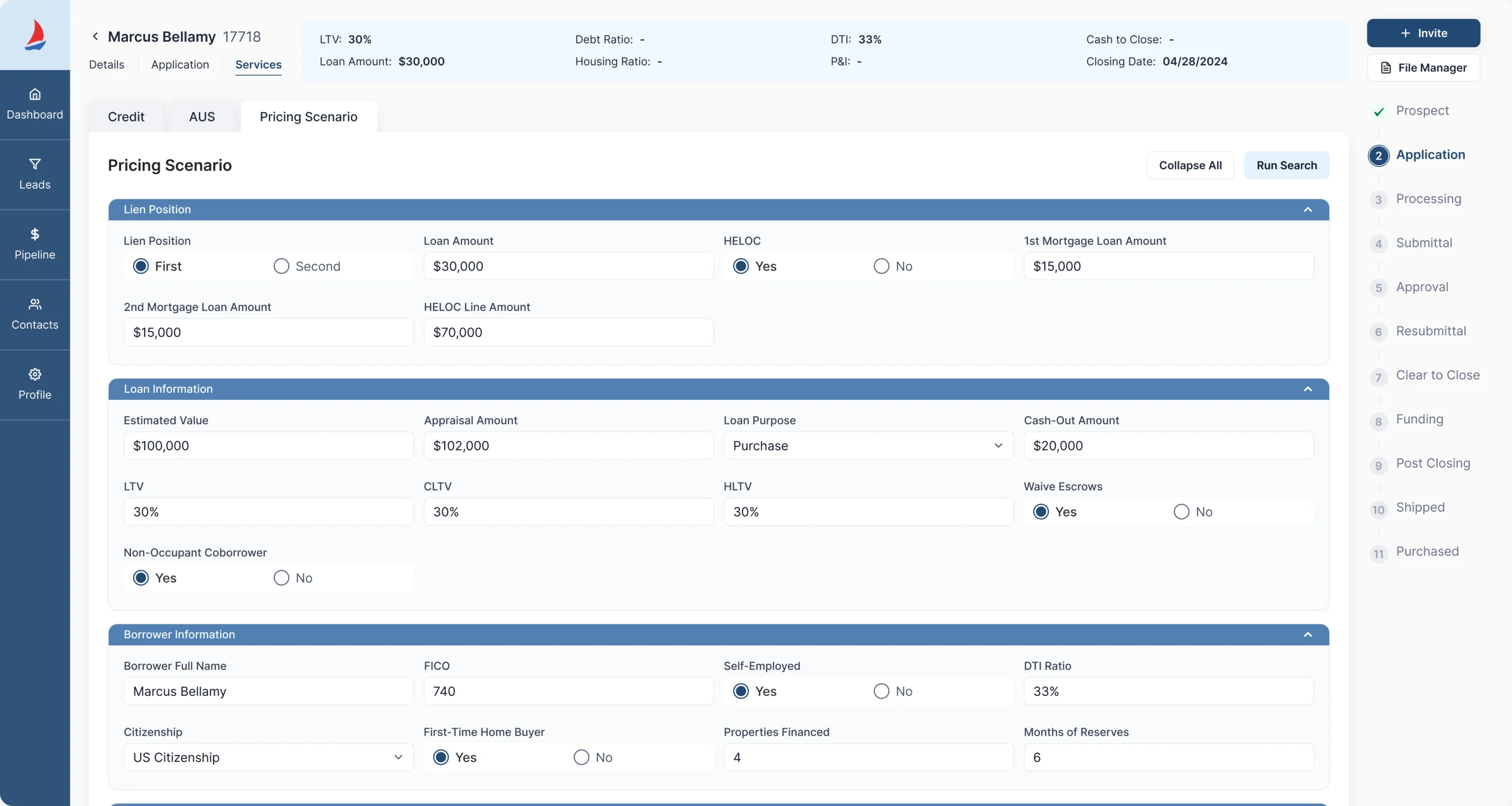
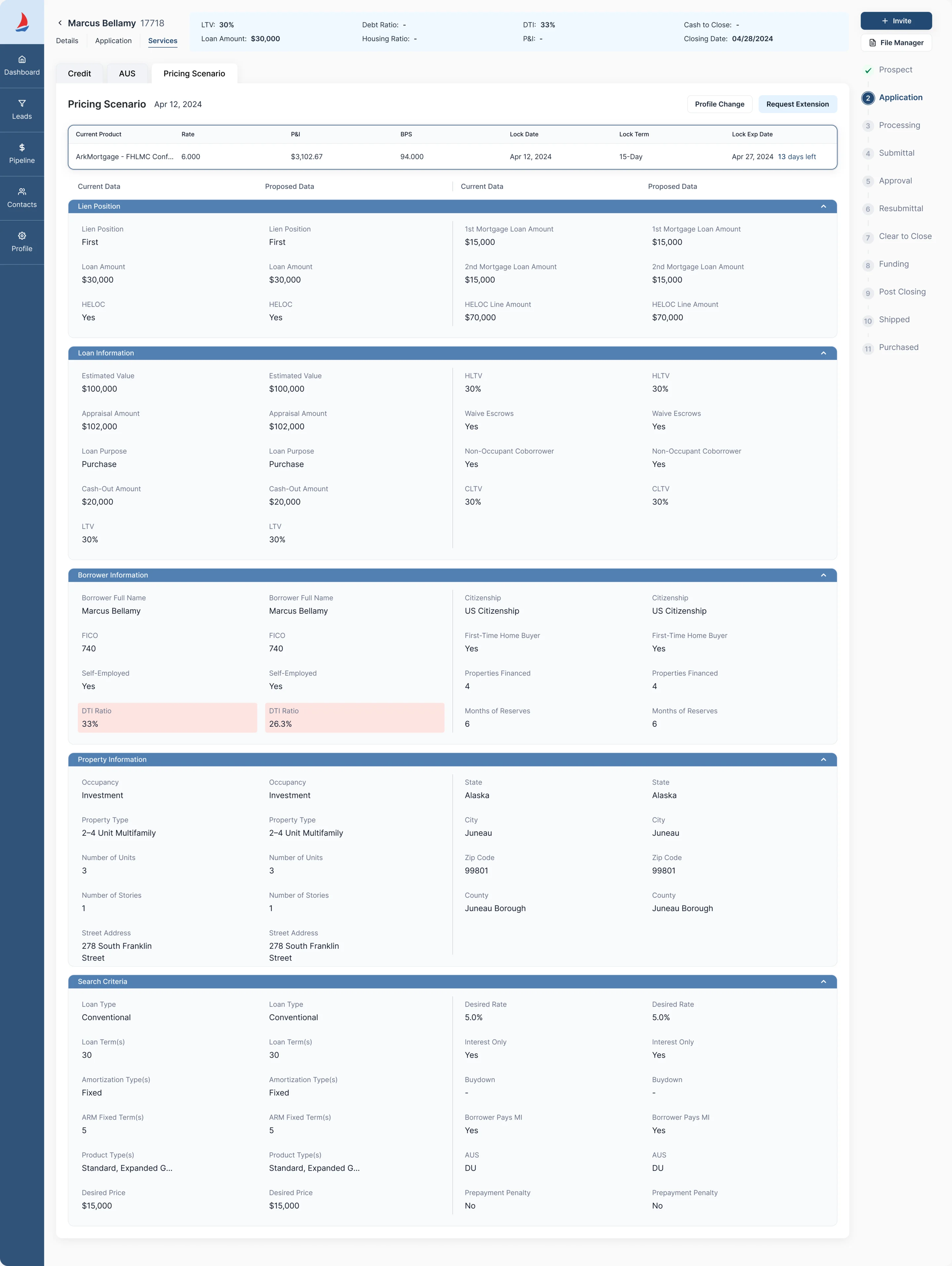
- Two pricing options can look alike while their assumptions differ, and an agent who reads them as equal presents the wrong one.
- Decided
- A scenario built in collapsible sections, results with each product’s eligibility and its rate grid, and a locked scenario shown as current data beside proposed data with the changed field marked. An extended lock keeps the old term in view, struck through beside the new one.

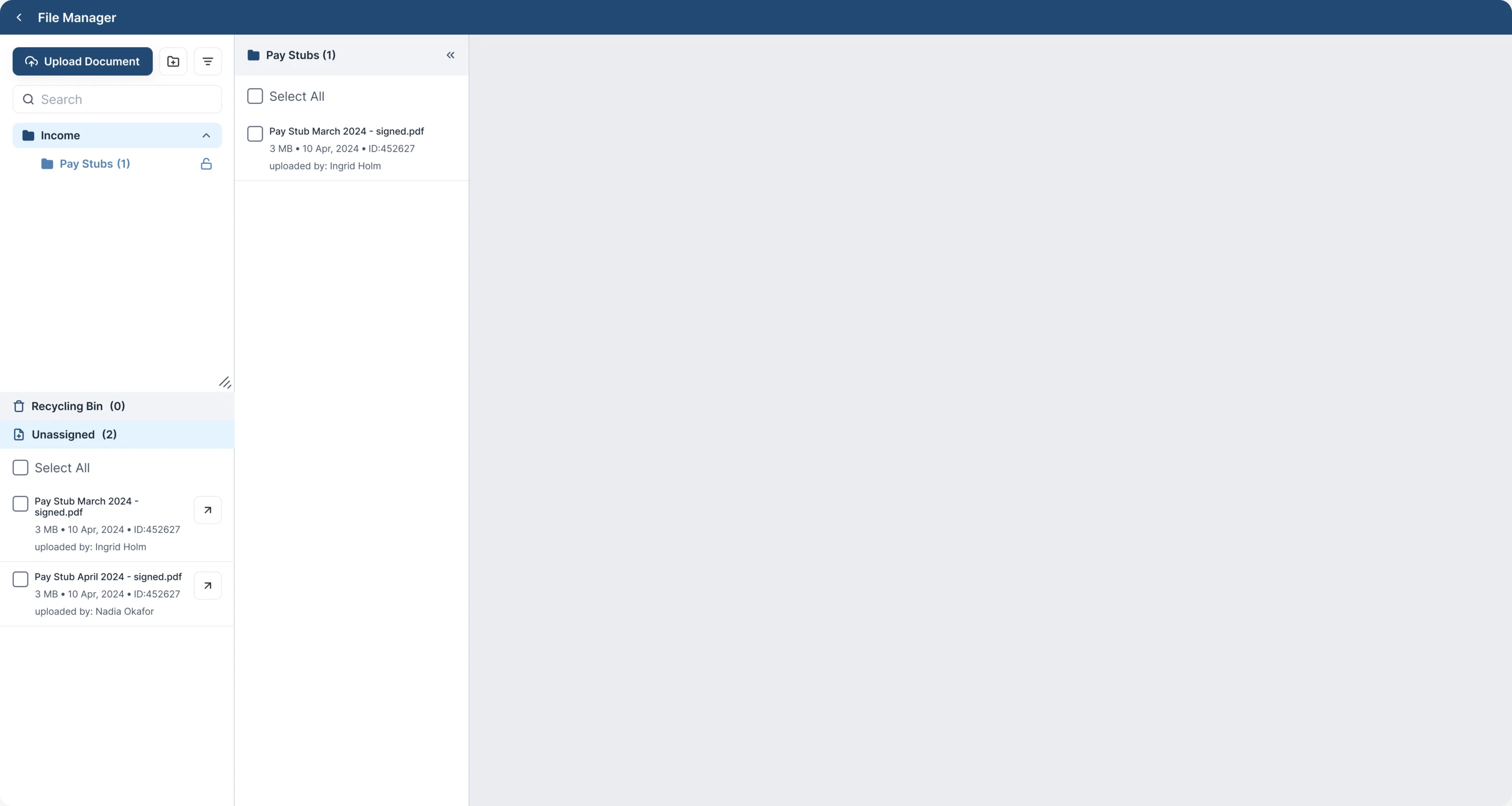
Keeping documents in order
- Found
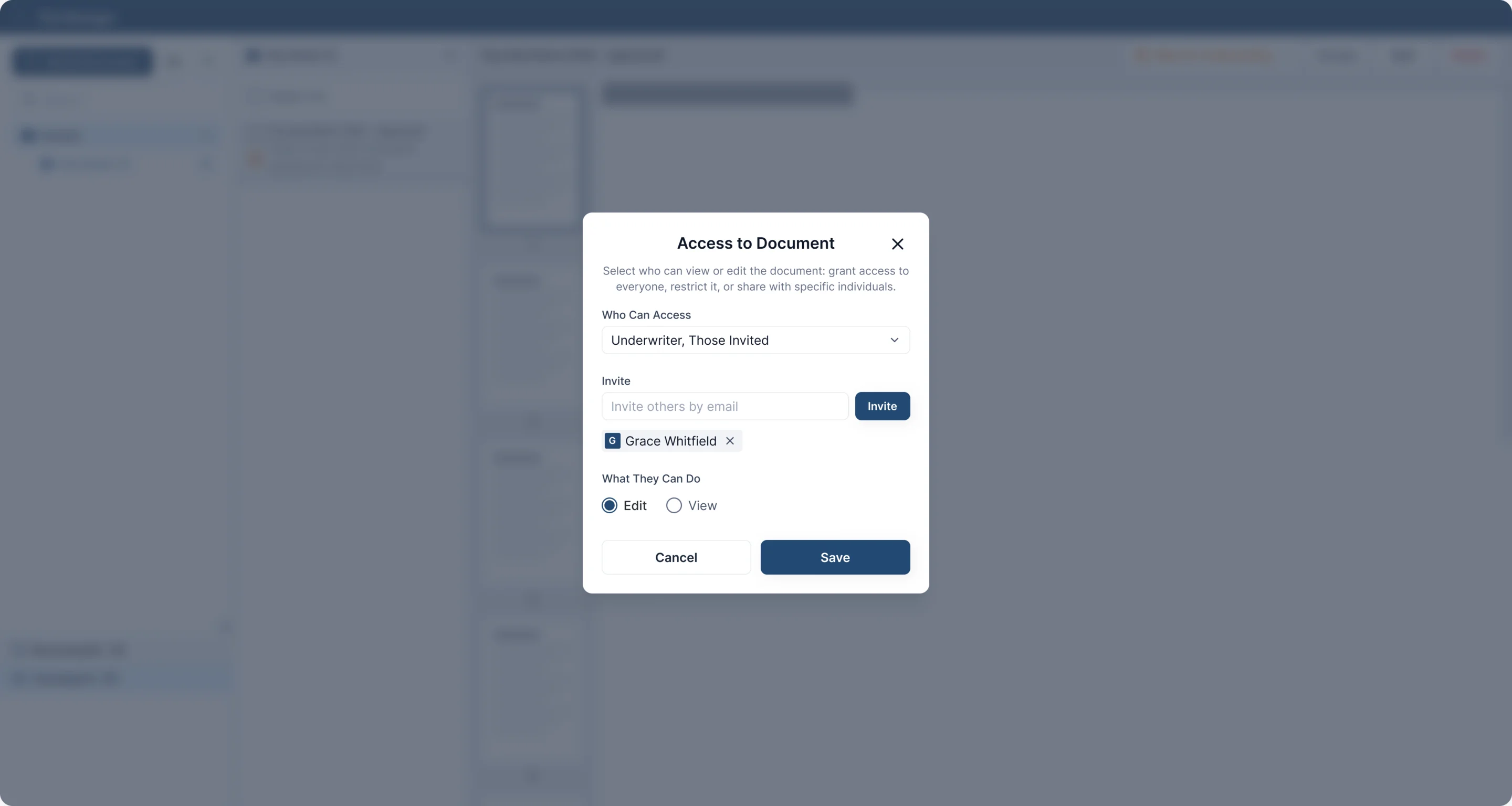
- A file manager can look tidy and still leave out who uploaded a document, whether it is filed, and who may open it.
- Decided
- Each file listed with its size, date, ID and uploader; files not yet on a loan kept in their own Unassigned list; and access set per document: who can open it, who is invited, and whether they can edit or only view.
Setting the team’s rules
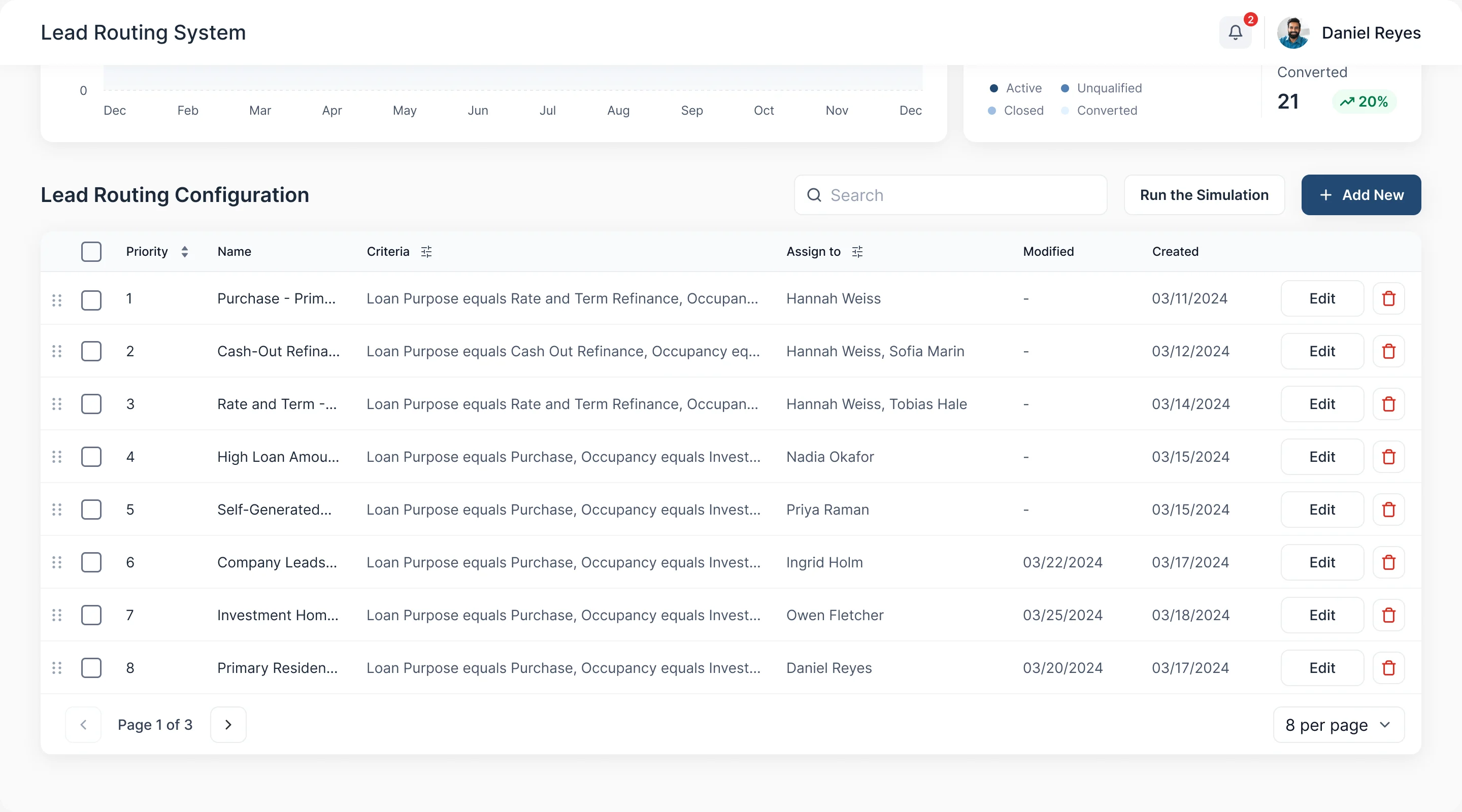
- Found
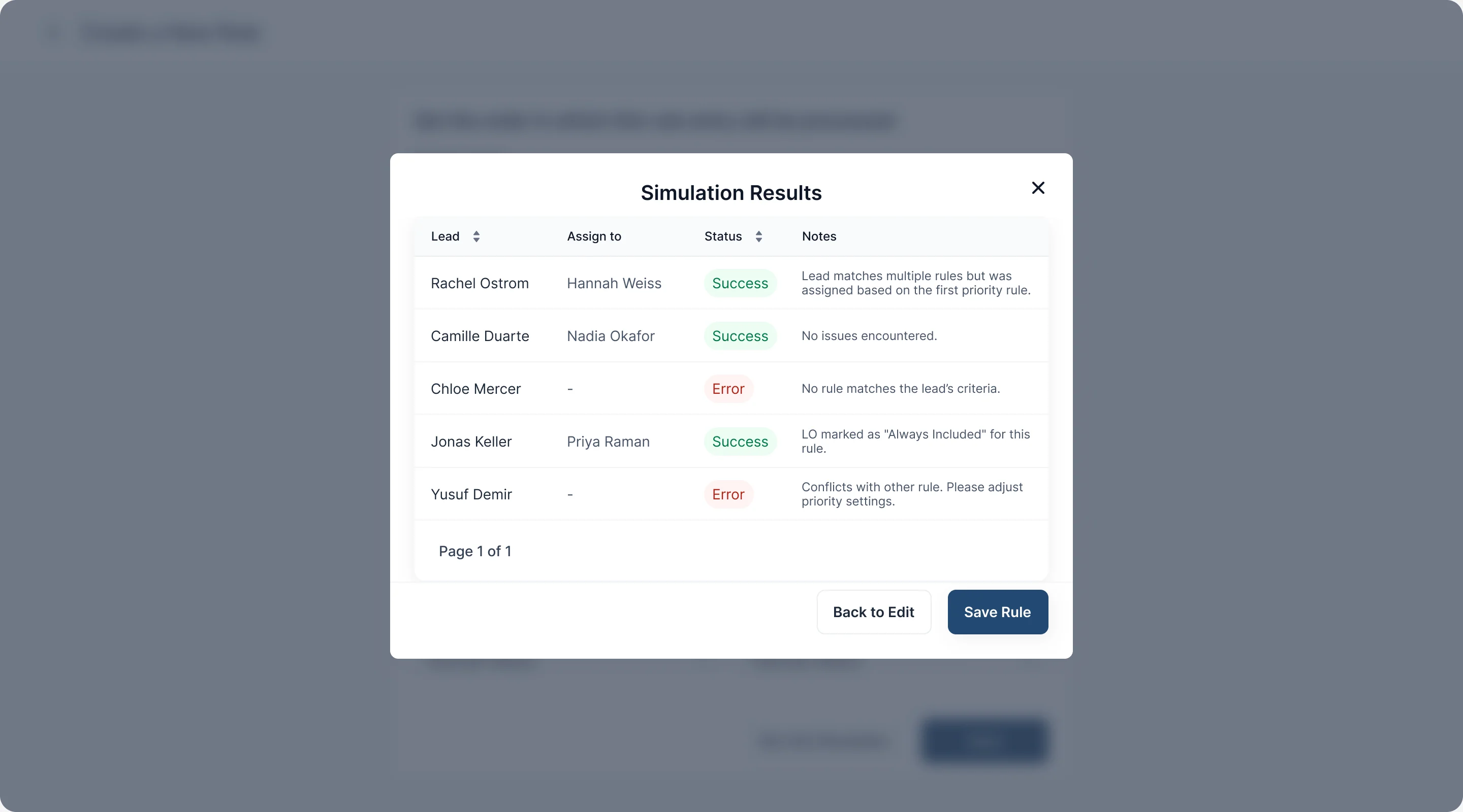
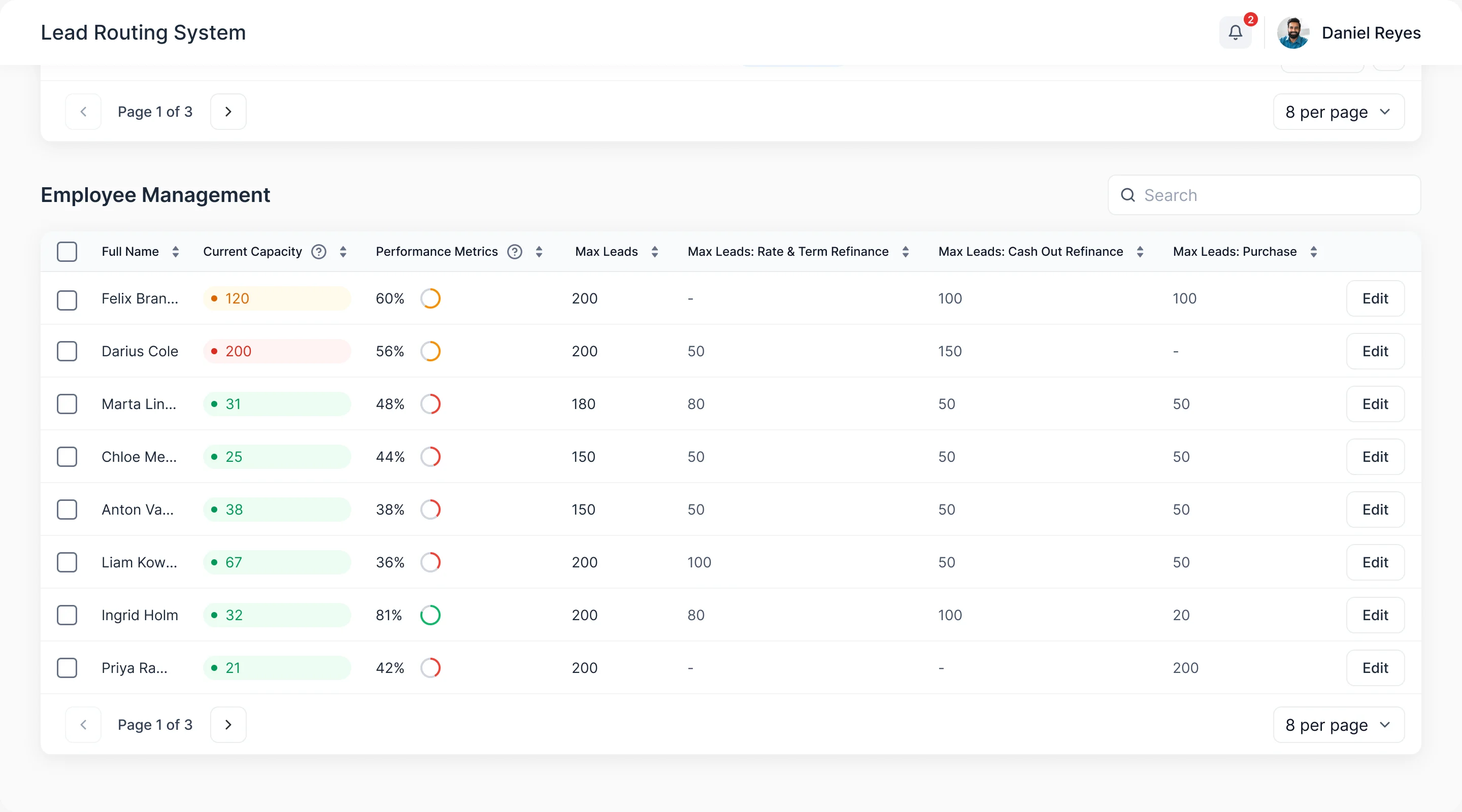
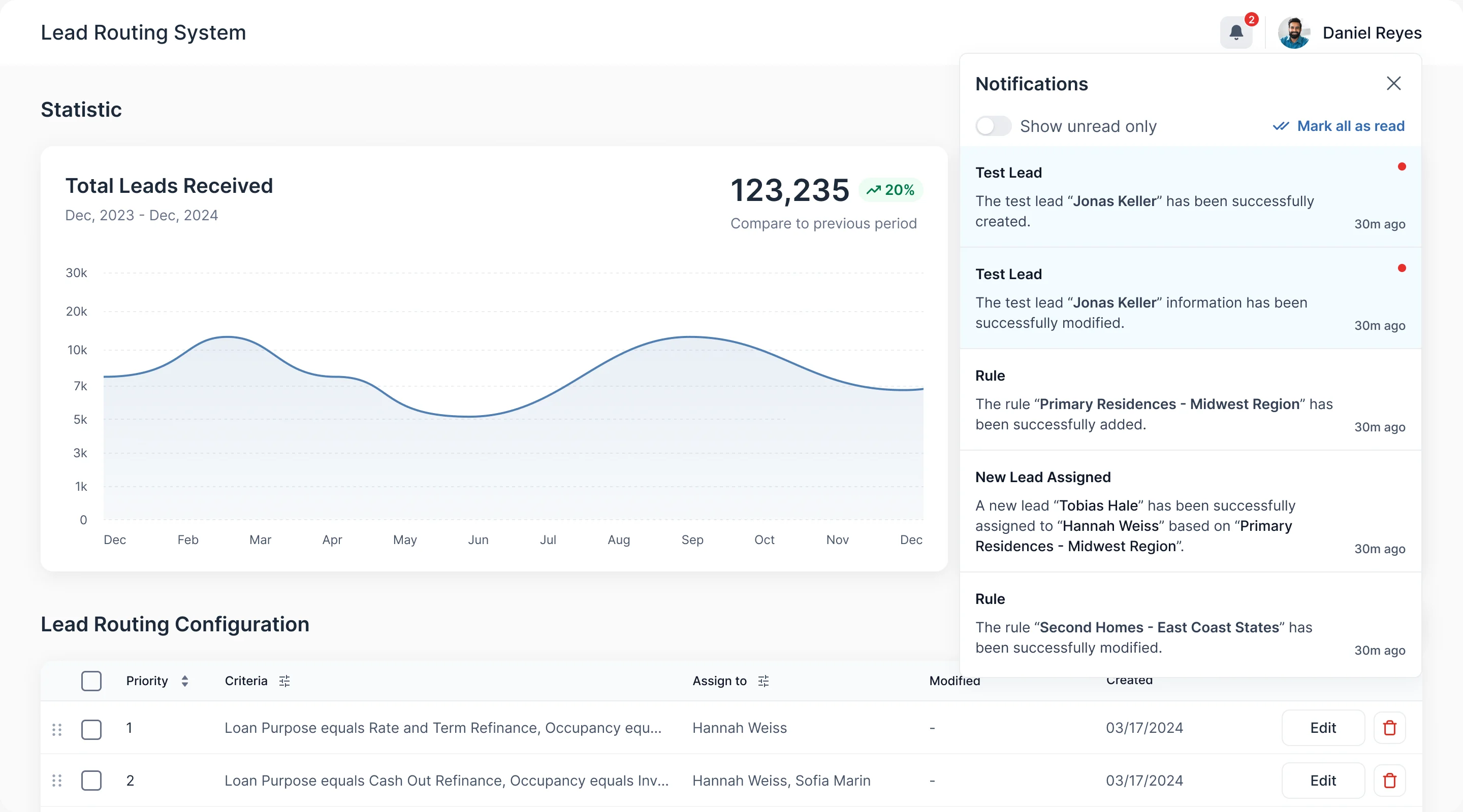
- Lead routing, staff and notifications are new, and they have to agree with how the team already owns leads. A rule that conflicts with another should say so before it is saved.
- Decided
- Rules listed by priority with their criteria and who gets the leads, a simulation that runs test leads through a rule and reports Success or Error with the reason, employee capacity beside each loan officer’s limits, and notifications for every change.
One kit under every screen
- Found
- A CRM this size repeats the same few things: a stage, a button, a field. Drawn one screen at a time they drift apart, and inside a system already built the drift is expensive.
- Decided
- A UI kit of inputs, buttons, tabs, tooltips, cards and stage bars, drawn to what the implemented system could take, and used across the desktop screens and the phone.
One stage bar, three journeys
The same bar tells a lead, a prospect and an application where they are.
-

Lead status: New, In progress, No Answer, Unqualified, Converted. -

Prospect: From Prospect through Sales Presentation to Close and Lost. -

Application: From Application to Shipped and Purchased.
One button, four states
Default, hover, pressed and disabled, left to right, in three weights.
-

Primary -

Secondary -

Tertiary
Product results, on a desktop and on a phone
- Kept
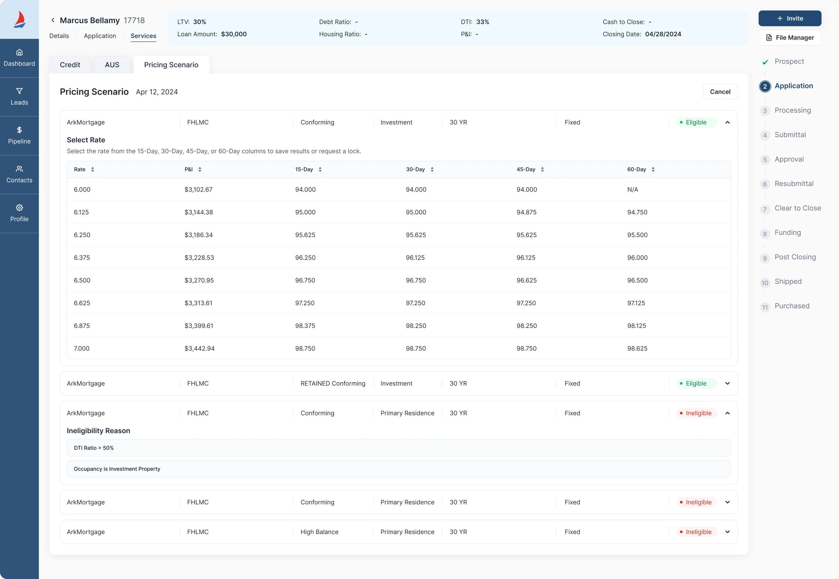
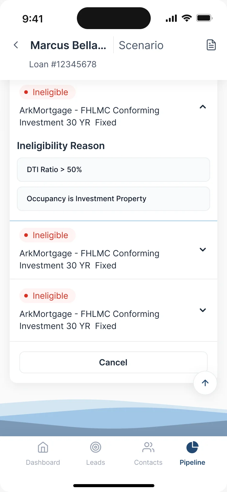
- The results themselves: each product with its eligibility, the rate grid for an eligible one, and the reasons an ineligible one was ruled out.
- Changed
On the desktop the results share a wide table with the loan’s stages beside it; on the phone each product is a full-width row that opens into its reasons, with the tab bar below.
Web app design carries that working model into responsive tables, forms and recovery, with the handoff your engineers need.
Where Sail ended up
A loan officer’s day, from a new lead to a filed document and a routing rule, designed to read the same way on a desktop and on a phone, on one UI kit.
We designed it; building it, connecting it to data and running it belong to Ark Mortgage’s own system and team.
- one product, on a desktop and on a phone
- Desktop + mobile web
- leads, pipeline, applications, pricing and documents
- Lead to loan
- lead routing, staff capacity and notifications
- Team tools
- reusable patterns for the whole product
- UI kit

Can your agents tell a loan’s true state at a glance?
Stage, price, document, owner: we redesigned Sail so each reads at a glance, on a desktop or a phone. Bring us the screen your agents distrust, and we’ll show what to fix first.
More work like this
Three more products where money and dense data had to stay readable.
-

Chrome extension · Real Estate
LenderPal
Fit real-estate lending workflows, a calculator and comparable sales into a Chrome extension.
- 150+ Screens designed
- 4 Experts on the pod
-
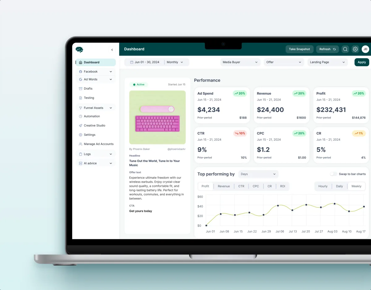
MarTech · Ads analytics · Web SaaS
Concussion Media
Redesigned an existing analytics product around the dense numbers its users act on.
- 400+ Screens and states
- 11 Modules designed and approved by the client
-
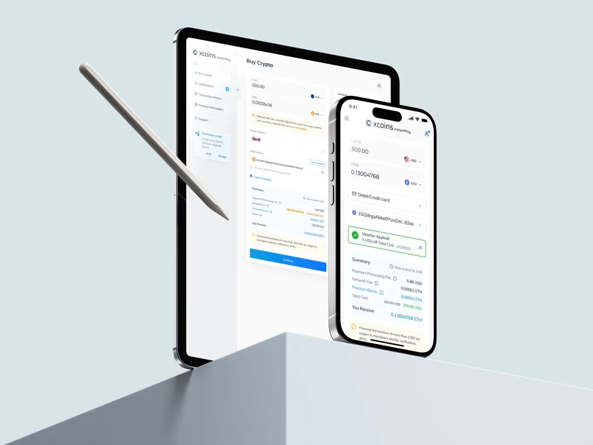
Crypto · FinTech · Web + Mobile
Xcoins
Redesigned a crypto buy journey so the rate, fees and limits are in view before anyone pays.
What we brought to Sail
The product

How to Design SaaS UX Around Workflows, Roles and Activation
Stop losing SaaS users after sign-up. See how ANODA connects onboarding, roles, data states and workflows into a product users understand and keep using.
Designing a CRM Around Ownership, Pipeline and Next Actions
Build a CRM your team uses. Learn how ANODA connects records, ownership, pipelines and next actions instead of copying a vendor template.

Web App Design Trends: Choose Changes That Improve the Work
Evaluate web app design trends through real workflows: task-focused dashboards, responsive roles, AI controls, reusable components and useful feedback.