
Crypto purchase, the whole price in view
Xcoins lets people buy cryptocurrency on web and mobile.We redesigned its quote-to-payment journey so rate, fees, limits and amount received sit in plain view.

- Quote
- to payment one buy journey, from the amount to the result
- 2
- platforms web and mobile share one quote-to-payment logic
- System
- and handoff UI kit, screen maps and a prototype for developers
Project summary
Xcoins is a cryptocurrency-purchase product for everyday buyers, first-timers and returning ones. We reviewed its existing buy experience and did a redesign of the journey from quote to payment for responsive web and mobile: information architecture, flows, wireframes, the UI, a full design system and a handoff of screen maps, a clickable prototype and a UI kit.
What a buyer passes through
One chain, from the amount to the result:
-
Quote
- Asset and amount
- Rate lock
- Amount received
-
Limits
- Daily and monthly
- Account category
- Verification
-
Payment
- Method and its fee
- Voucher
- Wallet address
-
Review
- Fee breakdown
- Terms
- Confirm
-
Result
- Processing
- Success
- Declined or expired
- Few steps and Nothing hidden
- Every fee visible before the button, without making the path longer.
- Many payment methods and A first purchase
- The choice is there, and it does not crowd the amount.
- Web and Mobile
- The same order of quote, payment and confirmation on both.
One screen, read in the order money moves
- Found
- Amount, payment, wallet, fees and limits all ask for the first look, and a buyer who cannot find the total does not press Continue.
- Decided
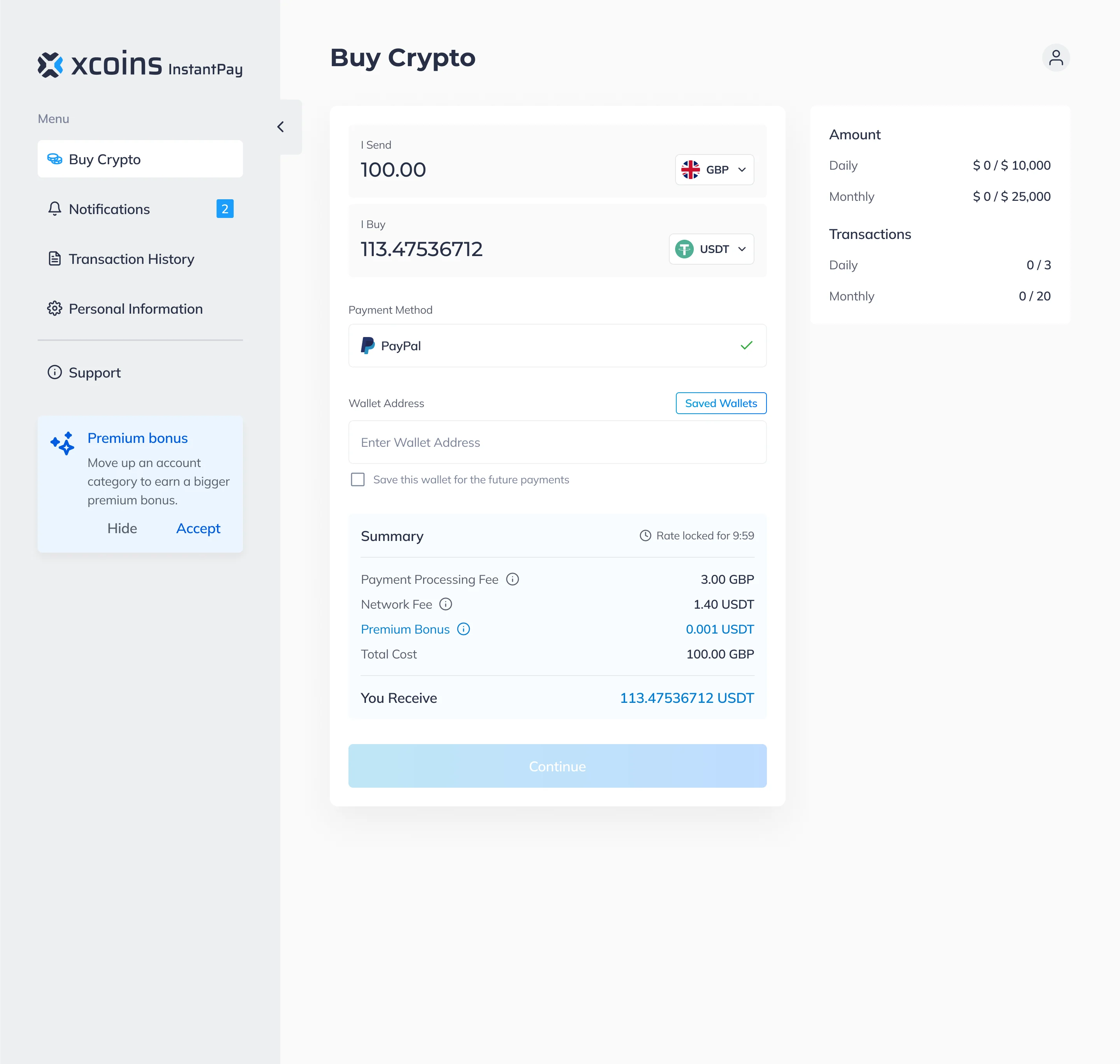
- The form top to bottom in the order of the decision: what you send and buy, how you pay, where it goes, then a summary that ends on what you receive. The limits stay beside it, out of the way.
- For the user
- A first-time buyer sees what they will receive, and what it costs, before they press Continue.
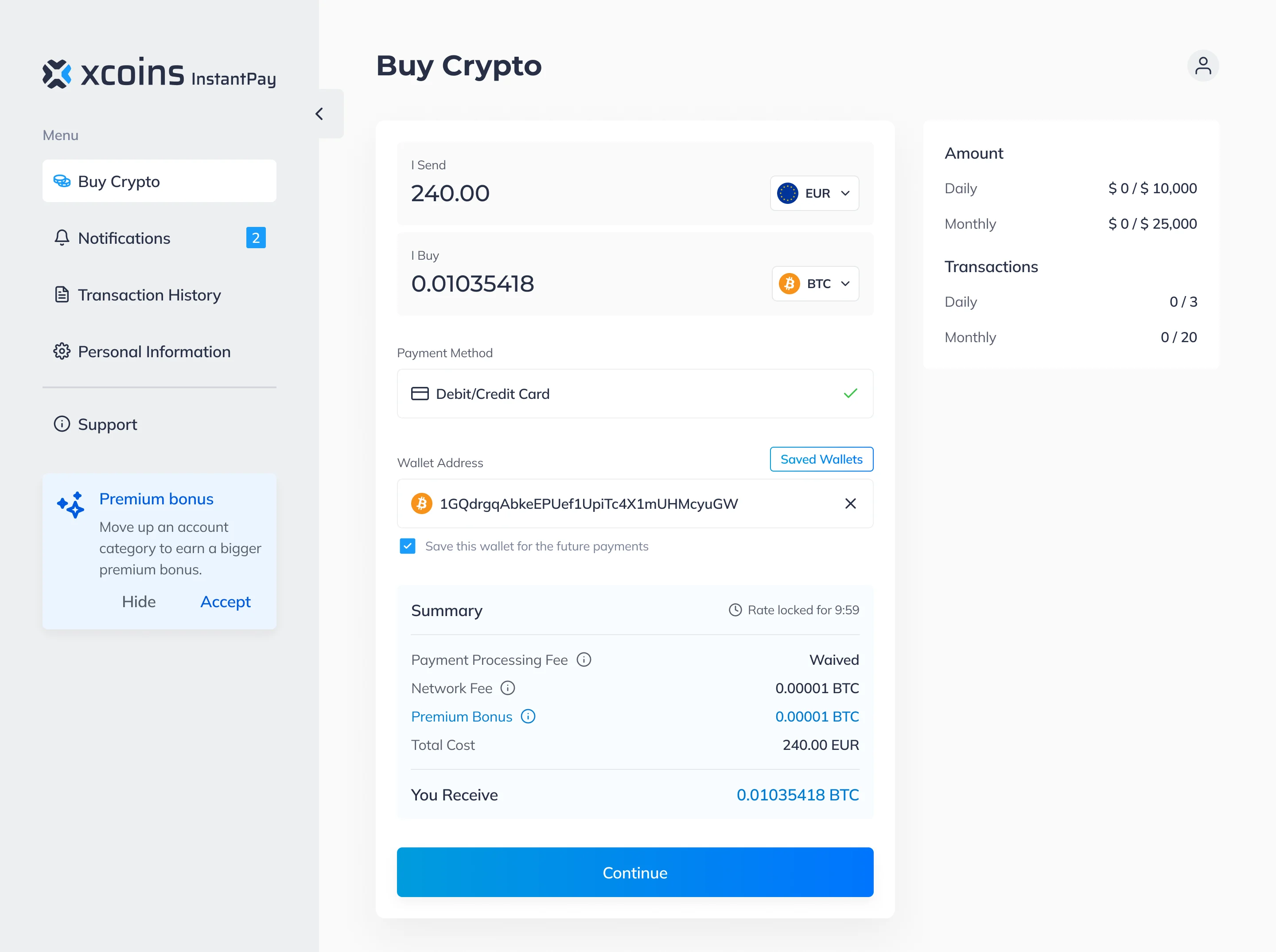
-
What you send and buy
Two amounts in one block, each with its currency.
-
How you pay
The chosen method, confirmed with a tick.
-
Where it goes
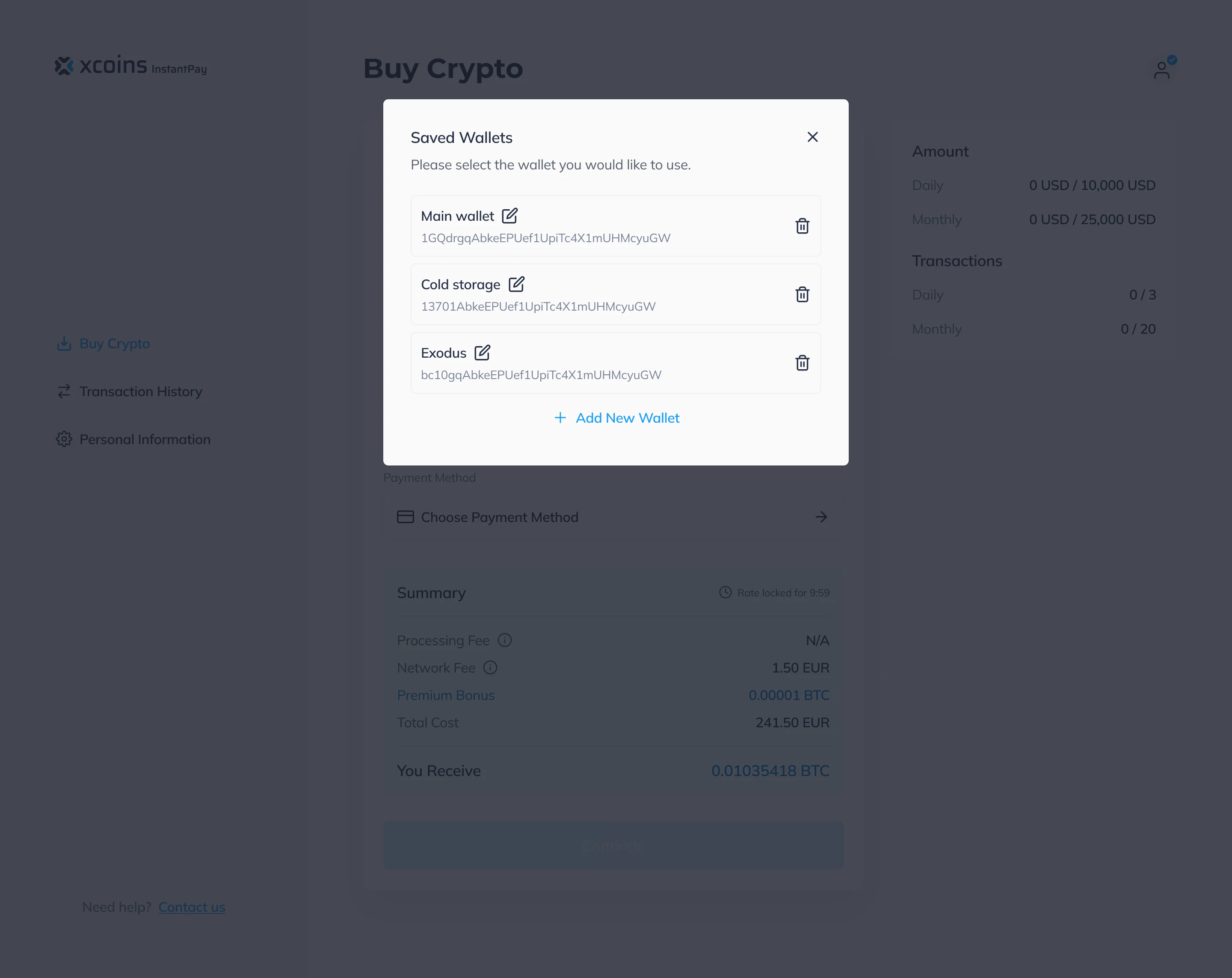
The wallet address, with saved wallets one click away.
-
What it costs
Rate lock, every fee, the total, and the amount received last.
-
Continue
One action, active only when the purchase can go through.
How the work progressed
From the buy flow as it was to a journey and a system Xcoins’ developers could build from.
-
Discovery
What the existing buy experience showed a buyer, and what it left out
Artifact A review of the existing purchase experience
-
User Flow
How amount, payment, wallet, voucher, verification and the result connect, and what happens when a limit is hit or a rate runs out
Artifact Information architecture, web and mobile user flows and screen maps
-
Wireframes
Where fees, limits and payment choices sit, before any colour or styling
Artifact Wireframes across the purchase journey
-
UI & Design system
One set of components for inputs, summaries, states and dialogs, on web and mobile
Artifact Final web and mobile UI, a full design system and a UI kit
-
Delivery
What developers needed to build the journey
Artifact Screen maps, a clickable prototype, the design system and its component library
From the amount to the result
- Found
- A buy is a short chain of decisions, and every one has states of its own: an empty form, a rejected address, a rate that runs out.
- Decided
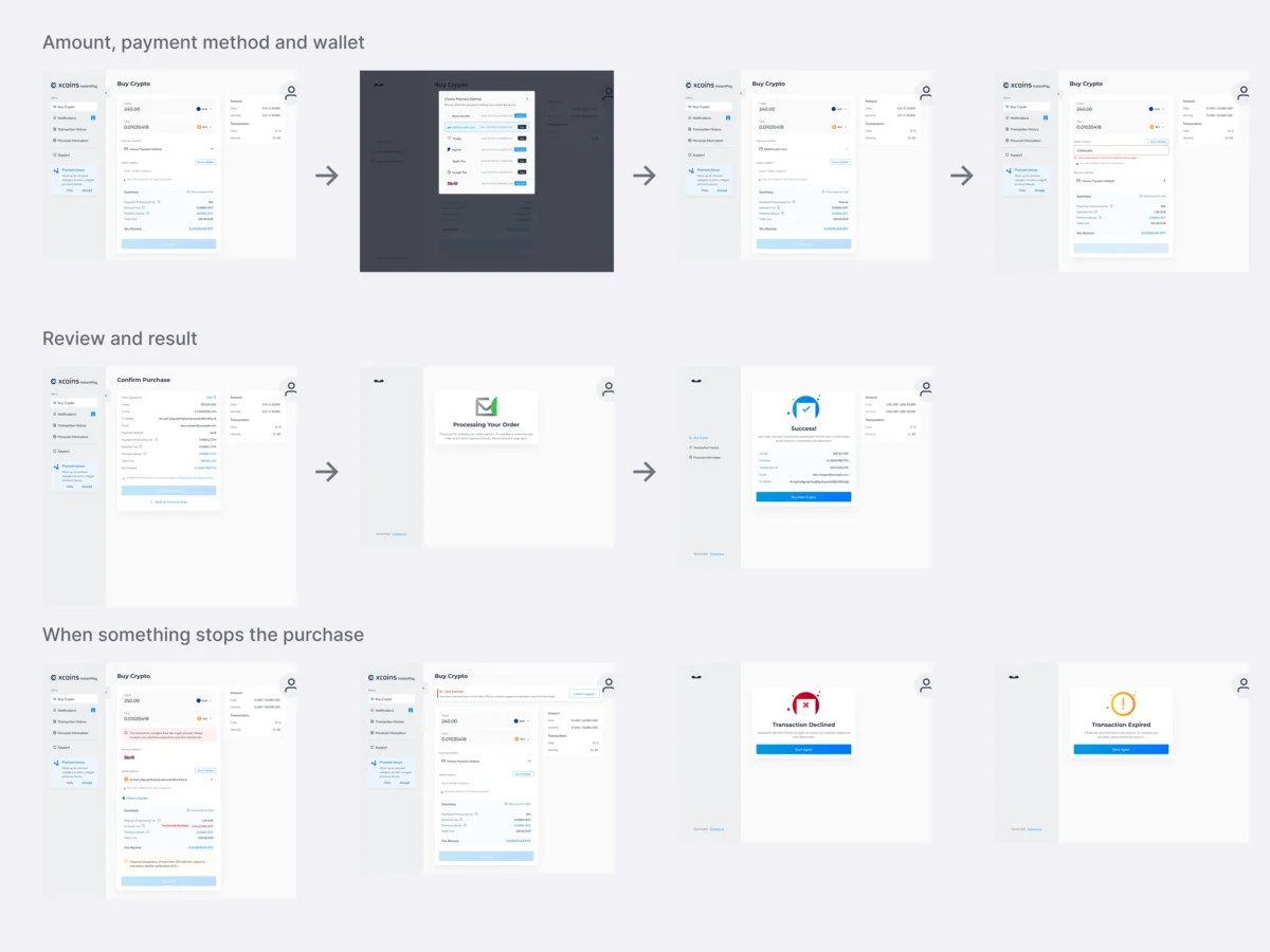
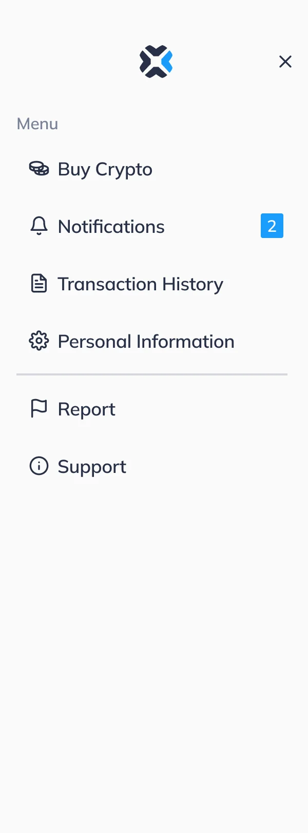
- Every step drawn with its states before the UI, as three runs of screens, and a menu that keeps the rest of the account within reach without leaving the journey.
-
Amount and payment
The empty form, the list of payment methods, then the chosen method with its fee in the summary.
Open the full map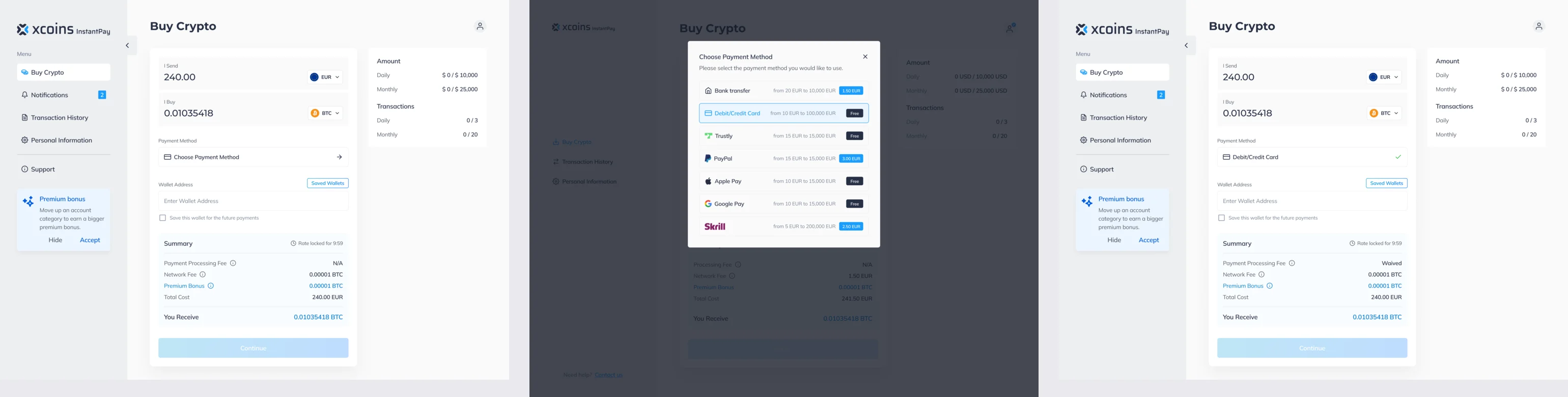
-
Wallet address
A required field, an address that does not check out, and a destination tag where a coin needs one.
Open the full map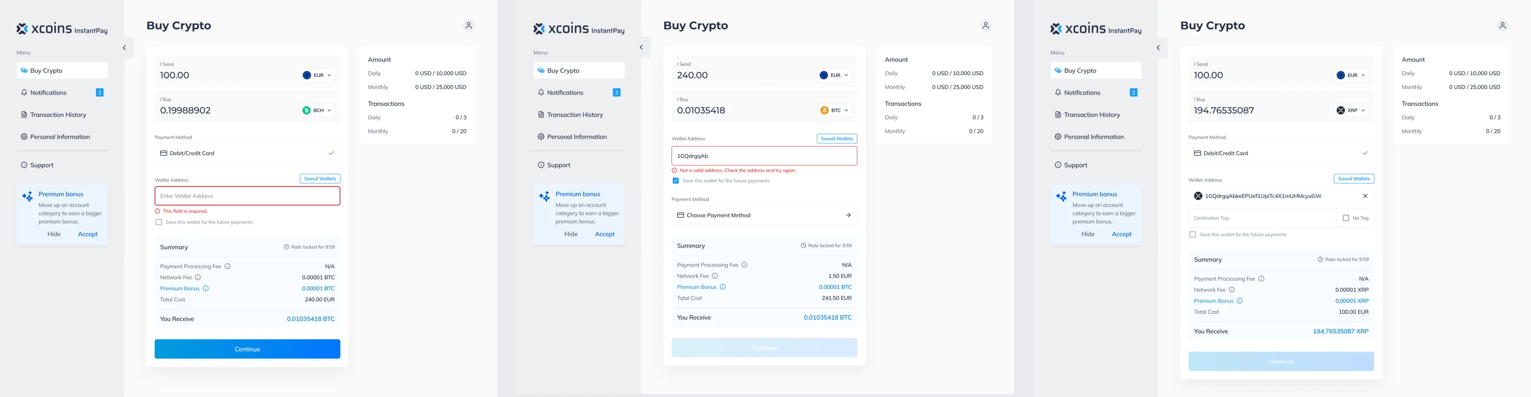
-
Confirm and result
The whole price on one page, a wait, then a confirmation with the transaction.
Open the full map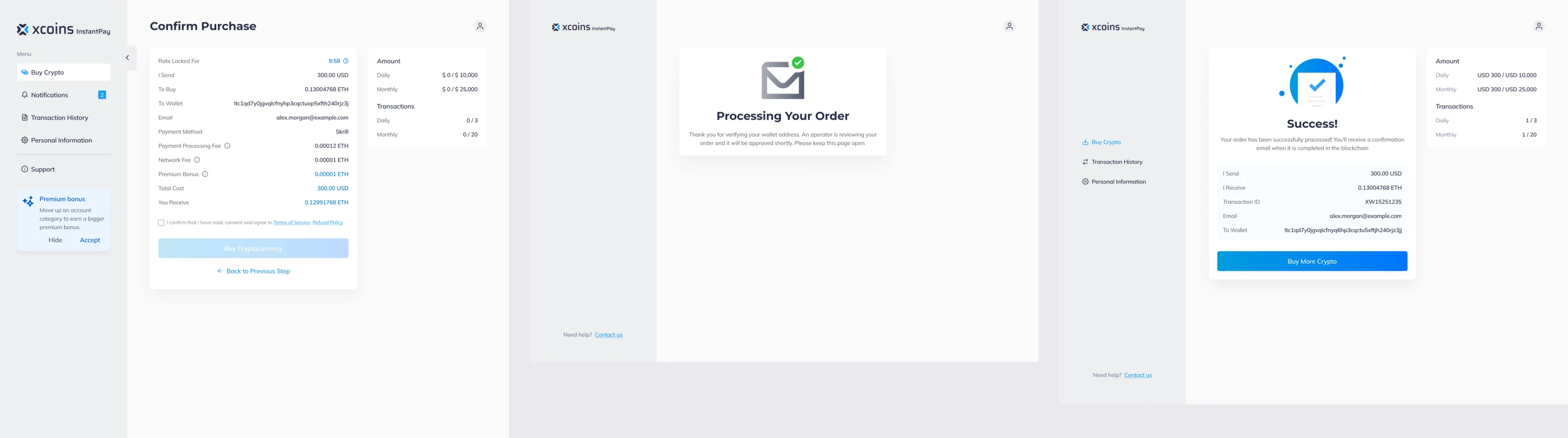
Six jobs a buyer needs done
In the order a purchase meets them.
Seeing the price before paying
- Found
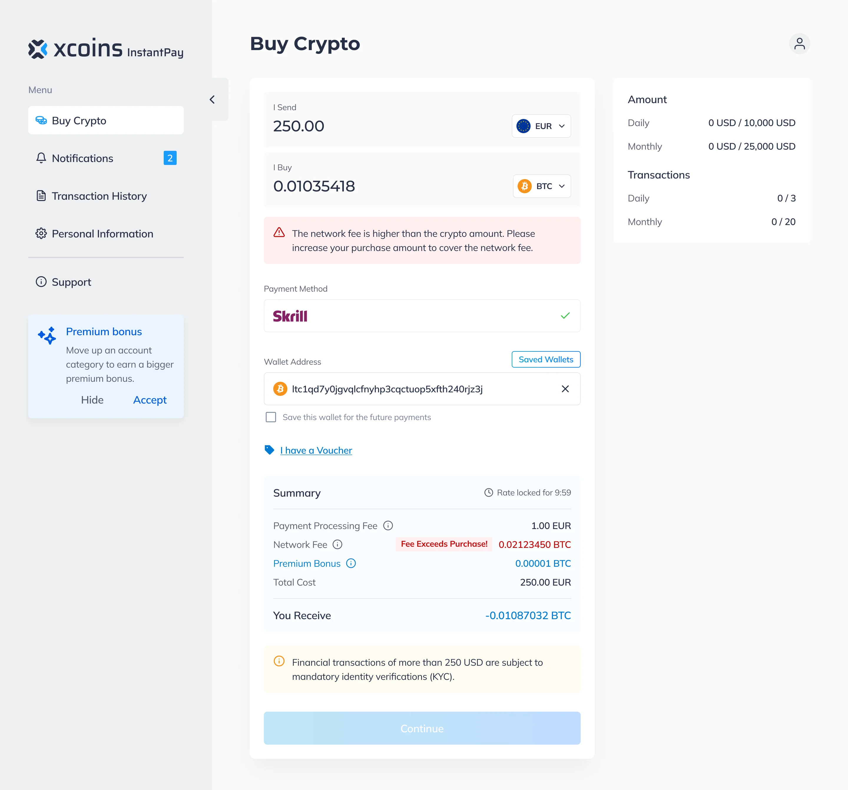
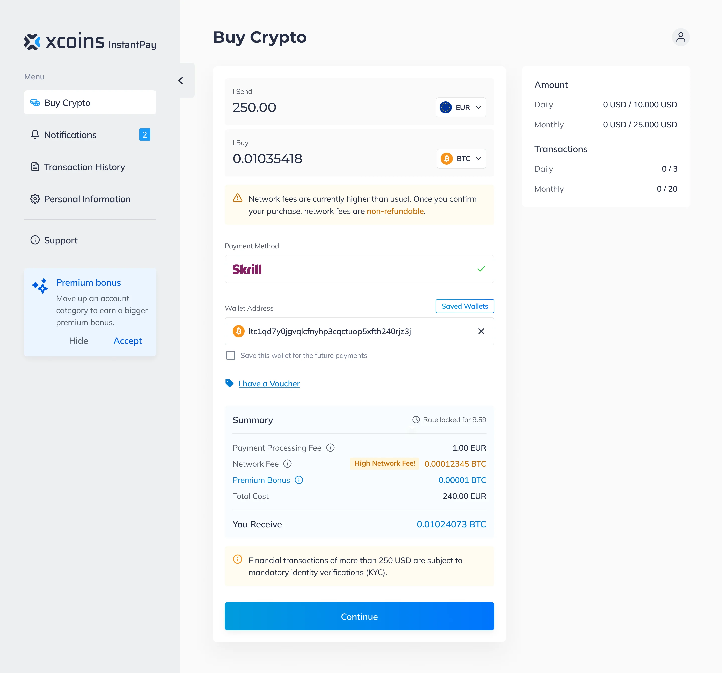
- Fees that appear after the button cost a buyer’s trust, and a network fee can even be larger than the purchase.
- Decided
- Every charge in the summary, each explained in place, and the two bad cases handled on the form: a fee larger than the purchase stops Continue, and a high network fee is flagged as non-refundable once confirmed.
Limits and verification
- Found
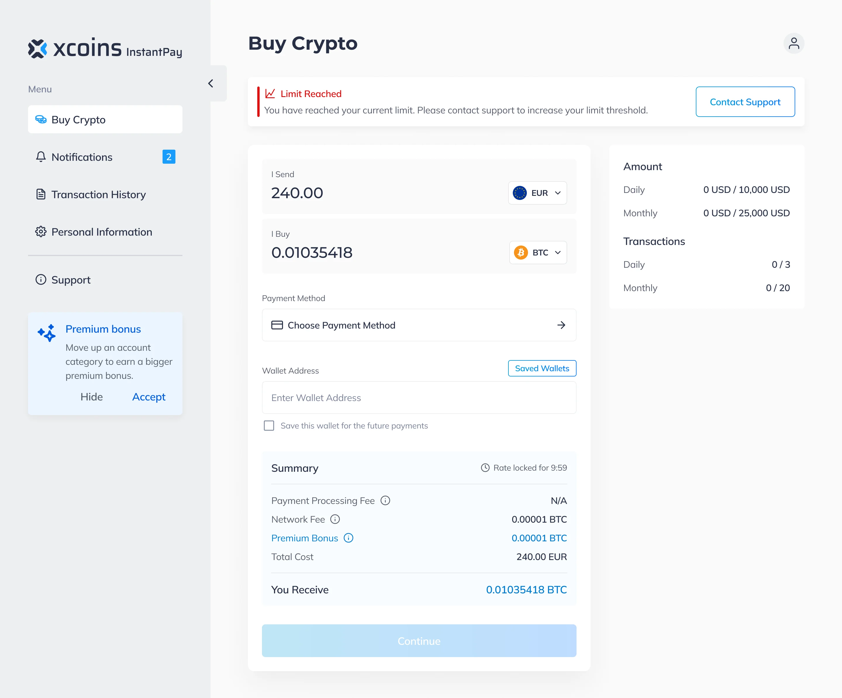
- A limit or a verification request arrives in the middle of a purchase, and unexplained it reads as a refusal.
- Decided
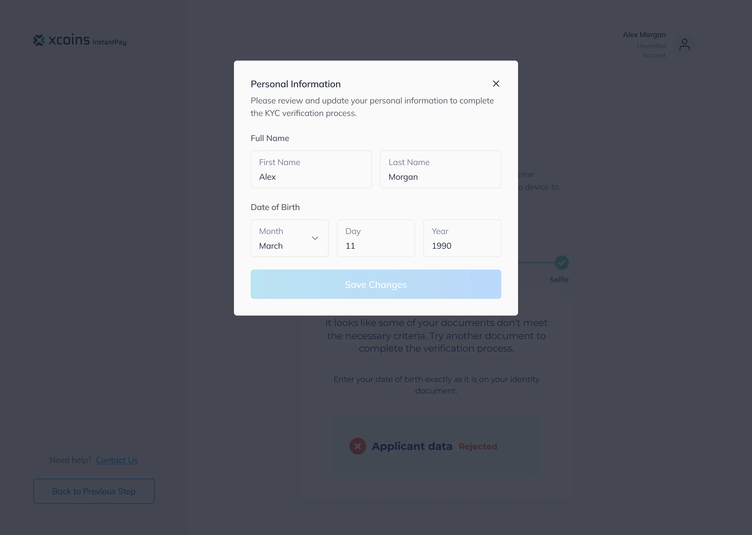
- A reached limit named above the form, with support one click away, and verification framed as a step of the purchase: what was rejected, and which details to correct.
Choosing how to pay
- Found
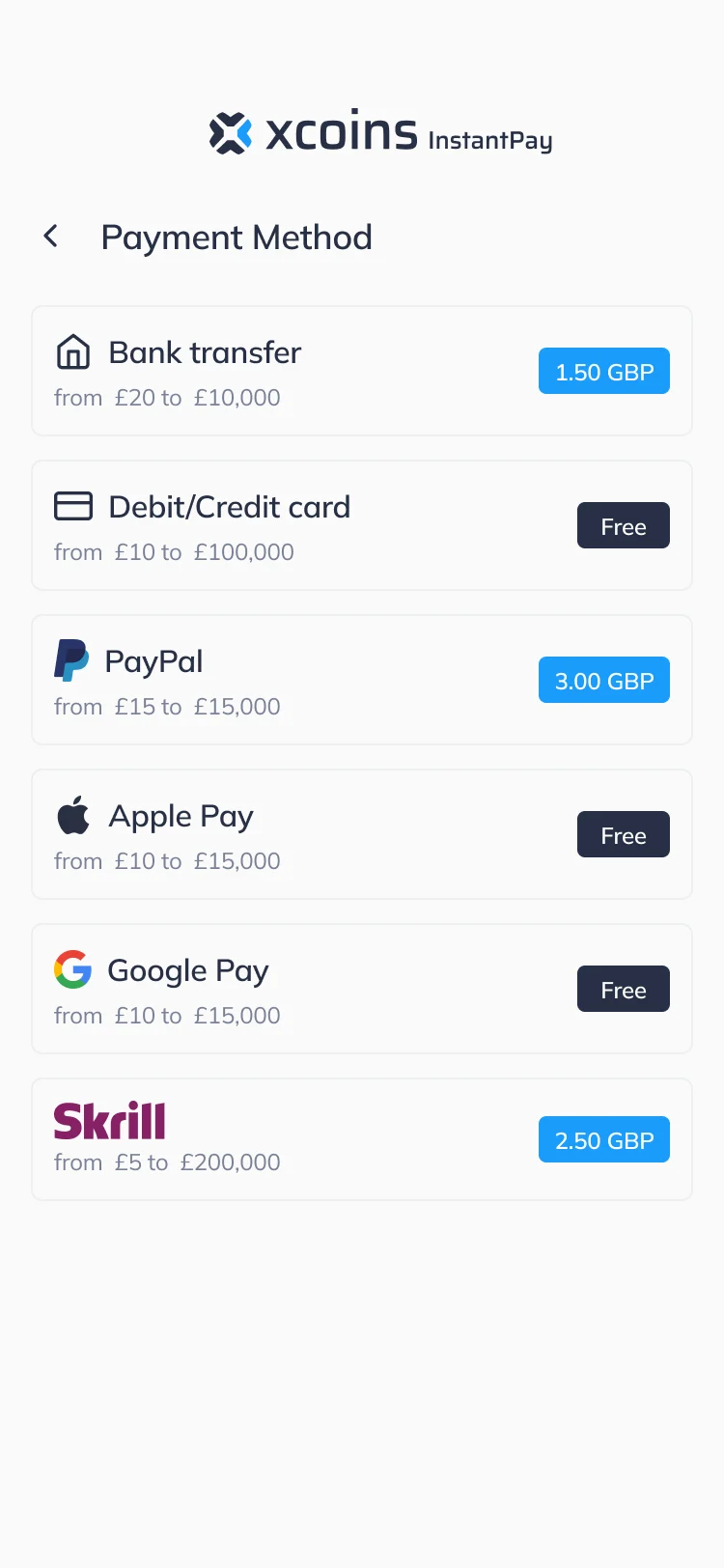
- Six payment methods with different fees and ranges can swamp a first-time buyer.
- Decided
- One list: each method with its range and its fee as a badge, the chosen one carried into the summary. The same list on web and on the phone.
Applying a voucher
- Found
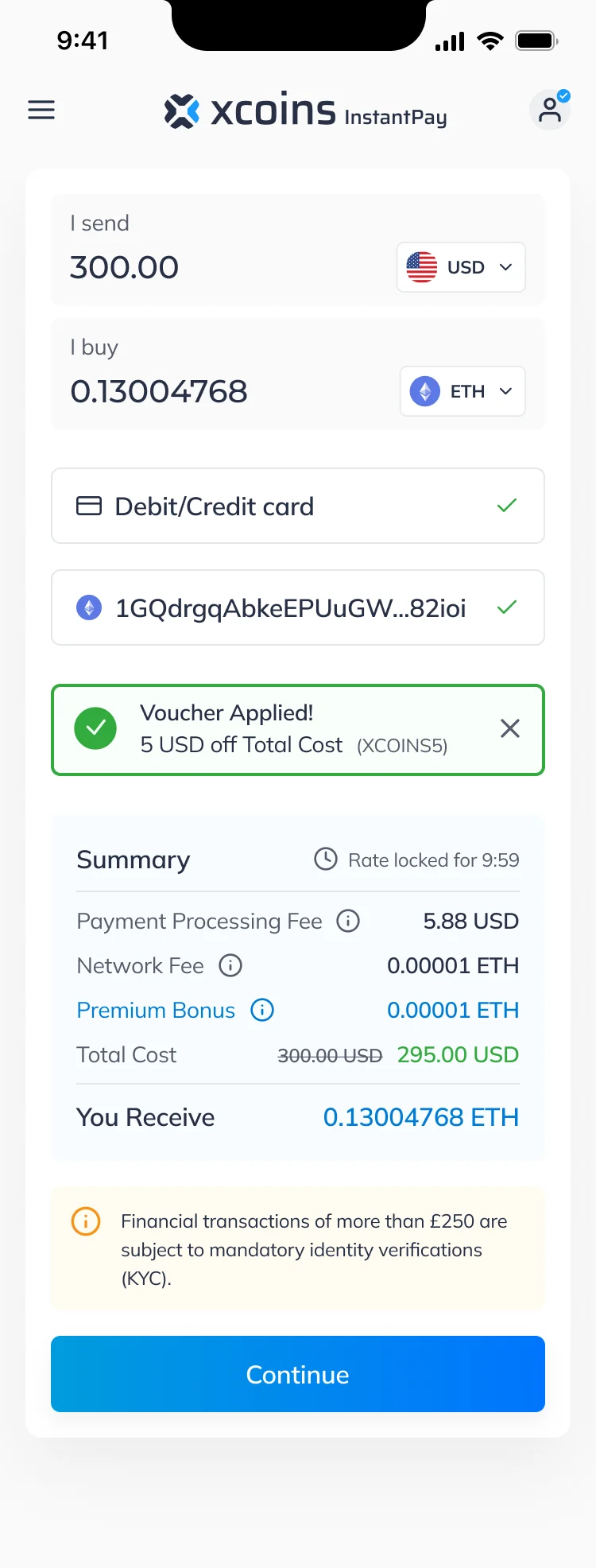
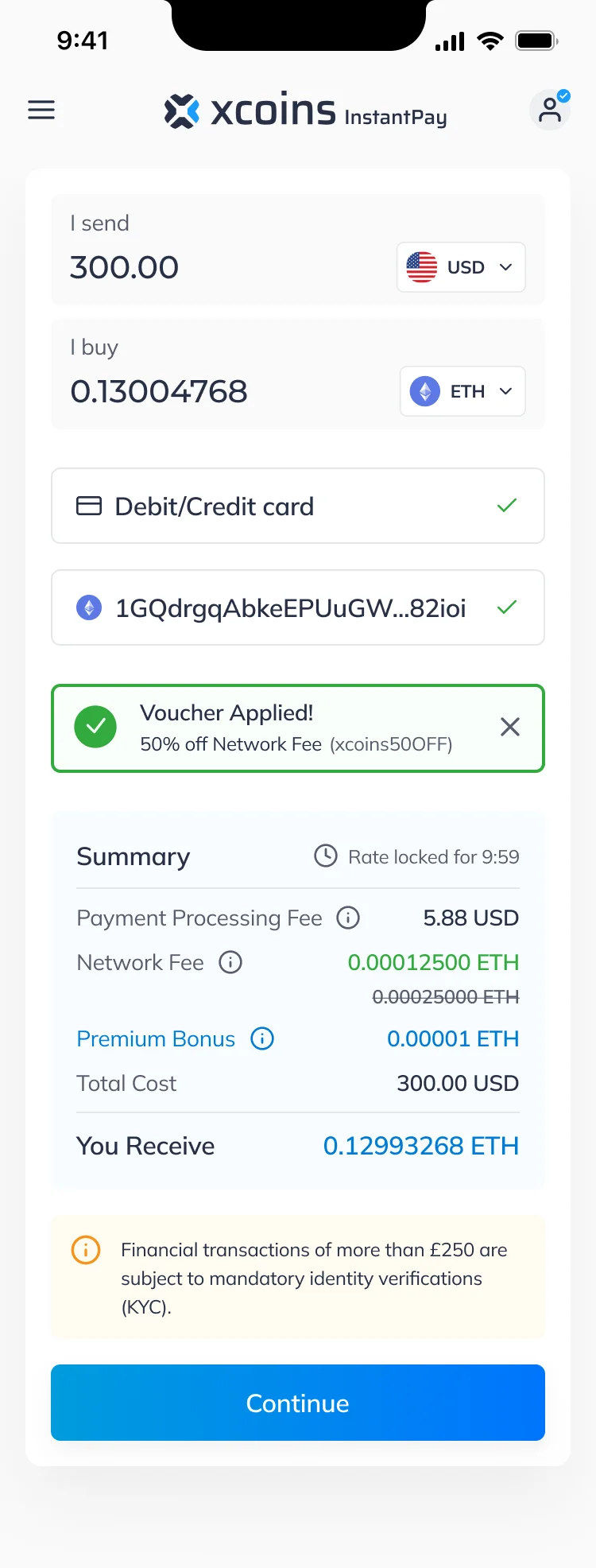
- A discount code changes the total, and the buyer has to see exactly what it changed.
- Decided
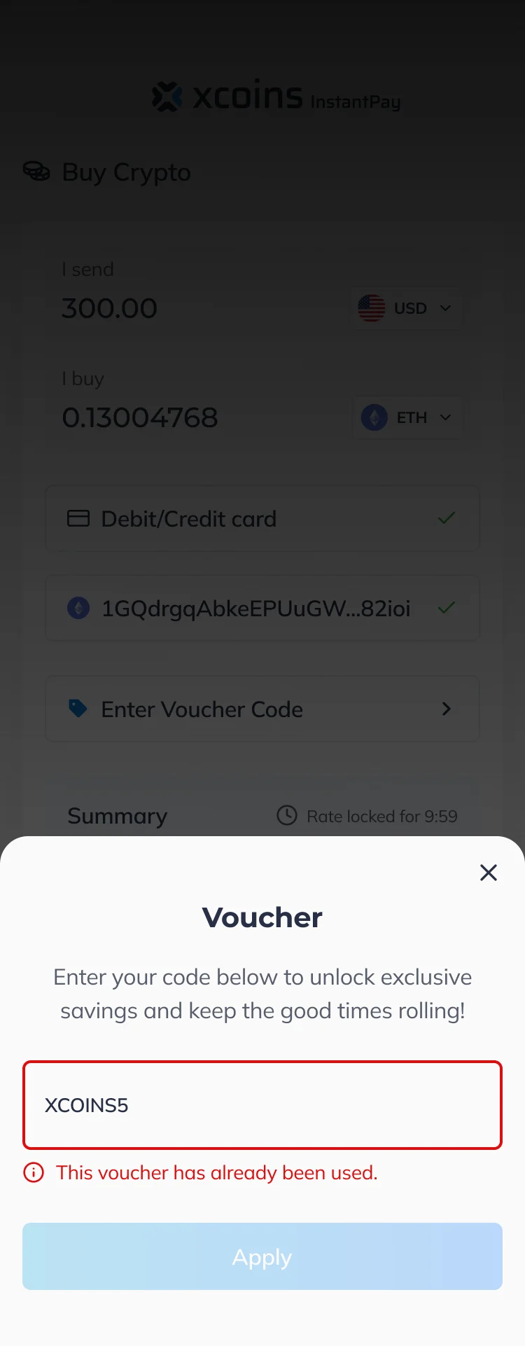
- A voucher confirmed in a bar that says what it took off, the old figure struck through beside the new one, and every failure explained under the field.
Knowing your account category
- Found
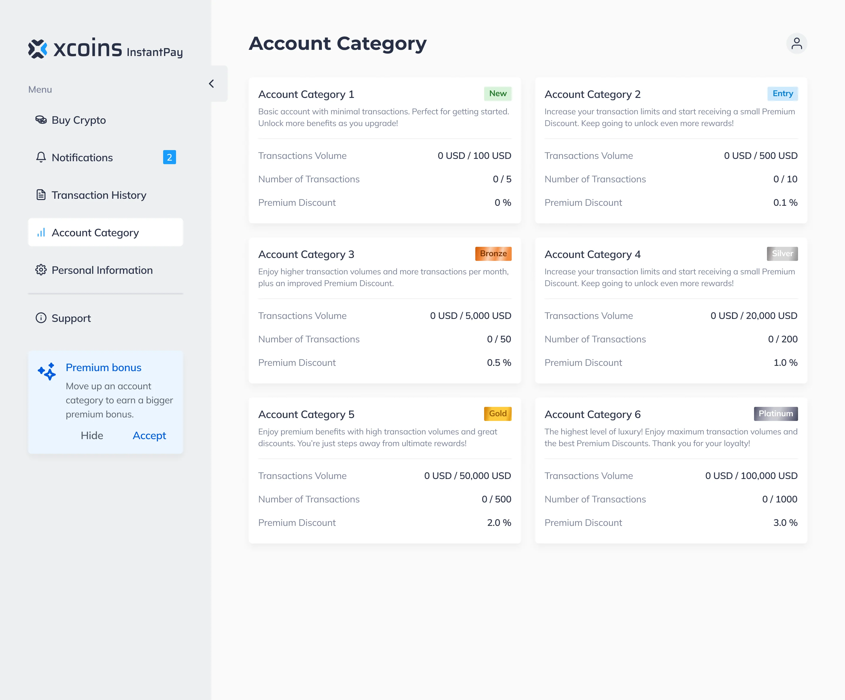
- Volume tiers and their premium discounts are hard to take in as a list of rules.
- Decided
- The six categories side by side, each with its transaction volume, its number of transactions and its premium discount, so a buyer sees where they stand and what the next step gives.
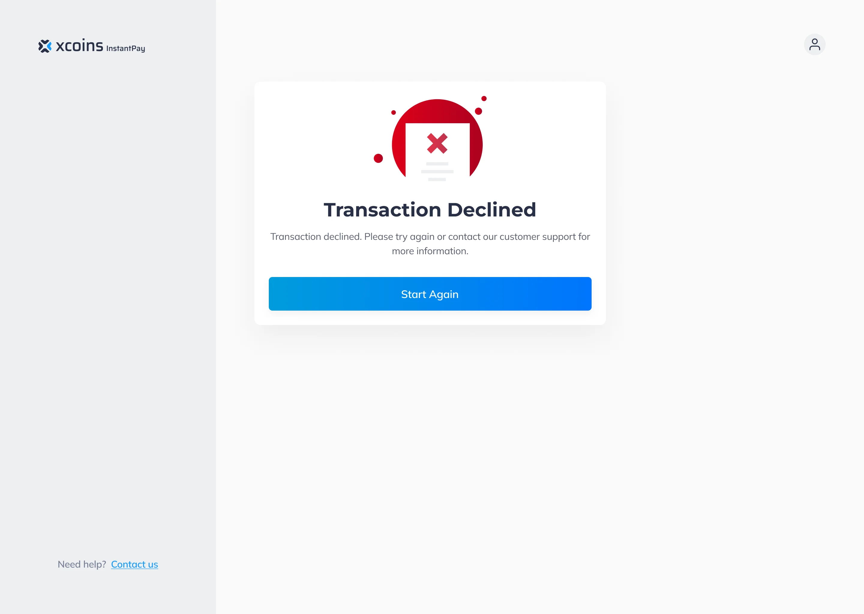
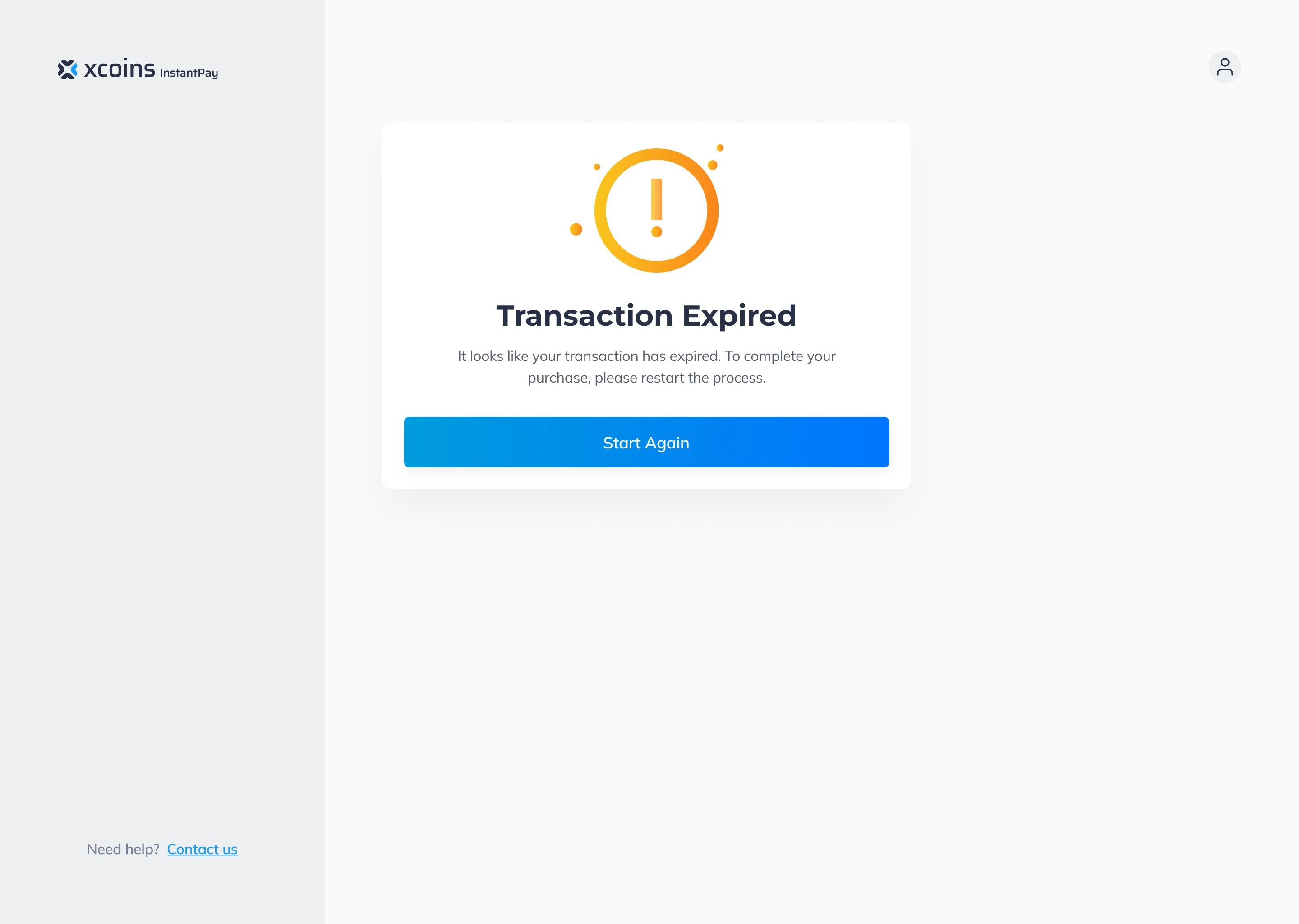
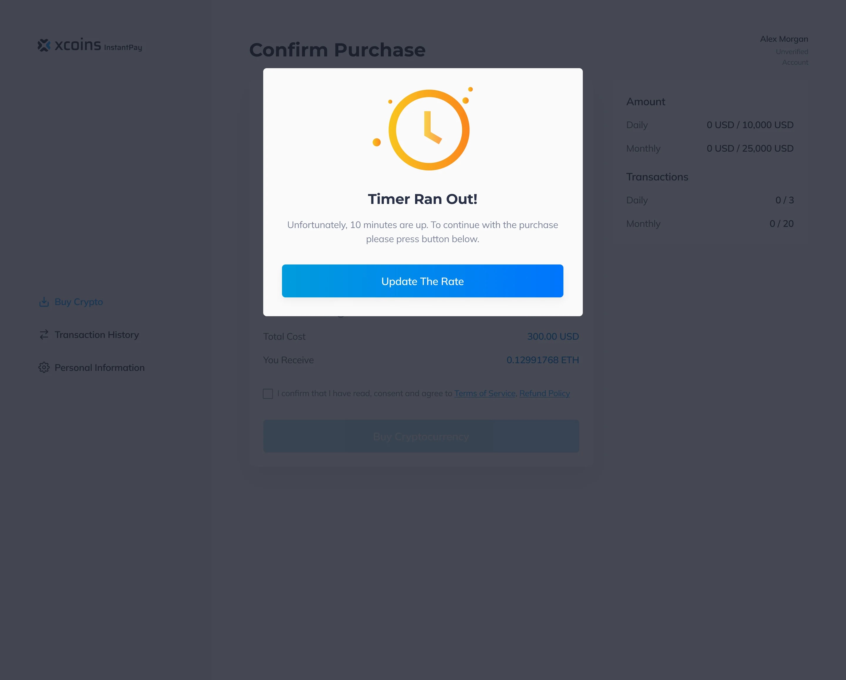
Every way a purchase can end
- Found
- Declined, expired and out of time are the moments a buyer trusts a product least.
- Decided
- Each outcome on its own screen with one clear action: start again, or update the rate.
One design system under web and mobile
- Found
- Fees, limits, payment methods and their states repeat on every step, and drawn one at a time they drift apart.
- Decided
- A full design system and UI kit: inputs, summary rows, badges, tooltips and dialogs with the states each one can be in, shared by web and mobile and handed over with the screen maps and a clickable prototype.
A tooltip on every number
Each fee and bonus in the summary explains itself in place.
-
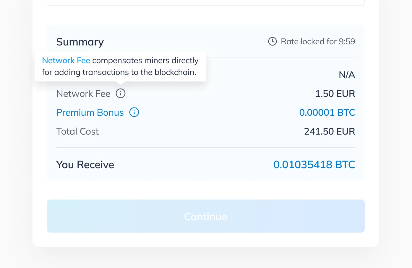
Network fee: What the fee pays for, next to the line it explains. -
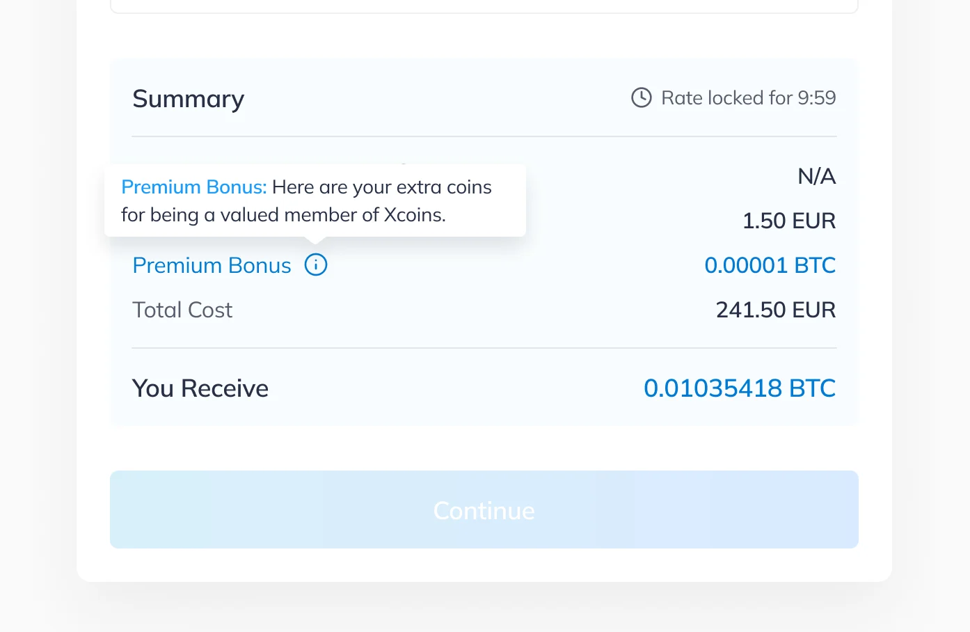
Premium bonus: Why the bonus is there, in the buyer’s terms.
One payment list, two states
The same dialog at rest and with a method chosen.
-
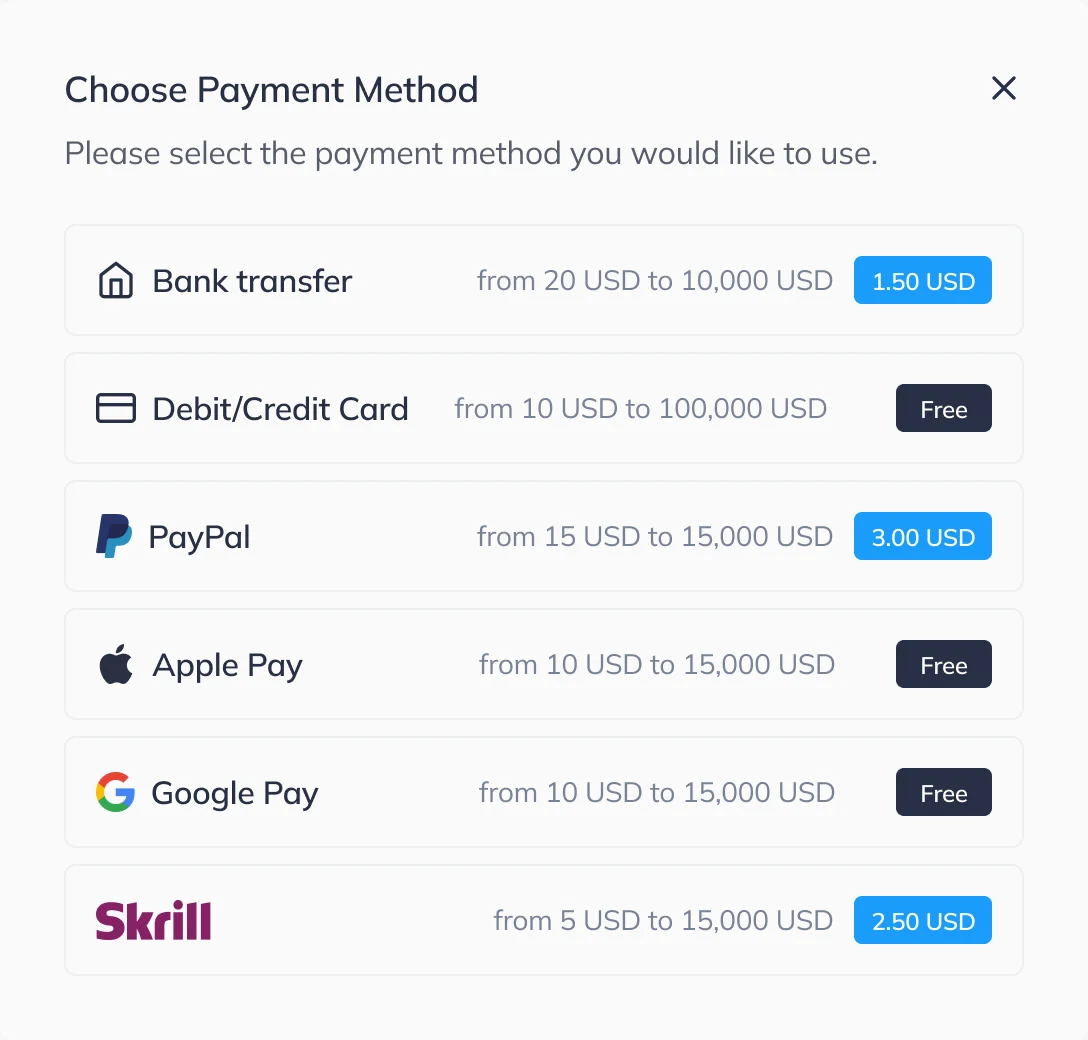
At rest -
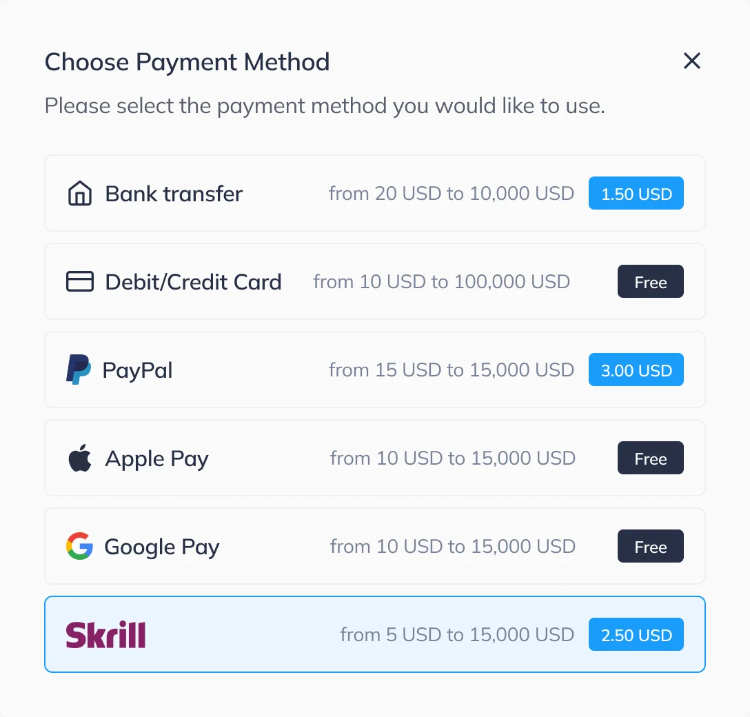
Selected
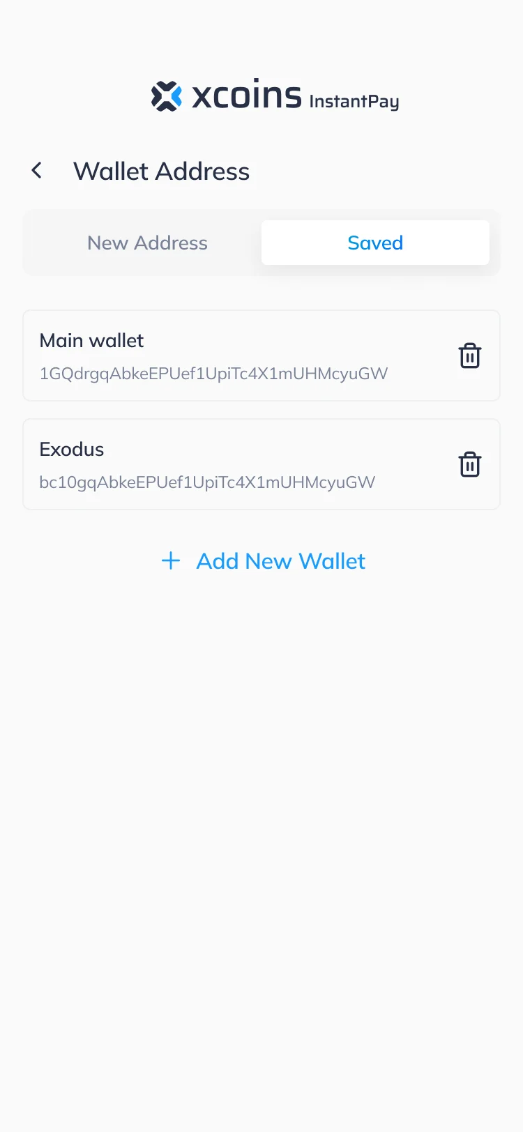
The same wallet list on web and on the phone
- Kept
- The list itself: saved addresses by name, a way to remove one, and Add New Wallet at the end.
- Changed
- On web the list opens as a dialog over the buy form; on the phone it is its own screen, with New Address and Saved as two tabs.
Where the journey ended up
Xcoins’ buy journey redesigned and handed off in full: quote, limits, payment, wallet, review and every result, on web and on mobile, with a design system, a UI kit, screen maps and a clickable prototype.
We designed it; development, integrations and launch were not part of our scope, and how each state behaves in production is Xcoins’ own.
- the same quote-to-payment logic
- Web + mobile
- the journey we designed: quote to result
- Buying
- design system and UI kit, with a clickable prototype
- System
- screen maps and components for developers
- Handoff
In the client's words
The design work gives the purchase journey a consistent structure across the proposed web and mobile screens. We appreciated the attention to what information appears at each step, so the team can review the experience before implementation.

Can your buyer see the whole price before they pay?
Rate, service fee, network fee, limits and the amount received: we designed Xcoins so all of it is readable before the button. Bring us your quote-to-payment flow, and we’ll show what a first-time buyer cannot find.
More work like this
Three more products where money and dense data had to stay readable.
-
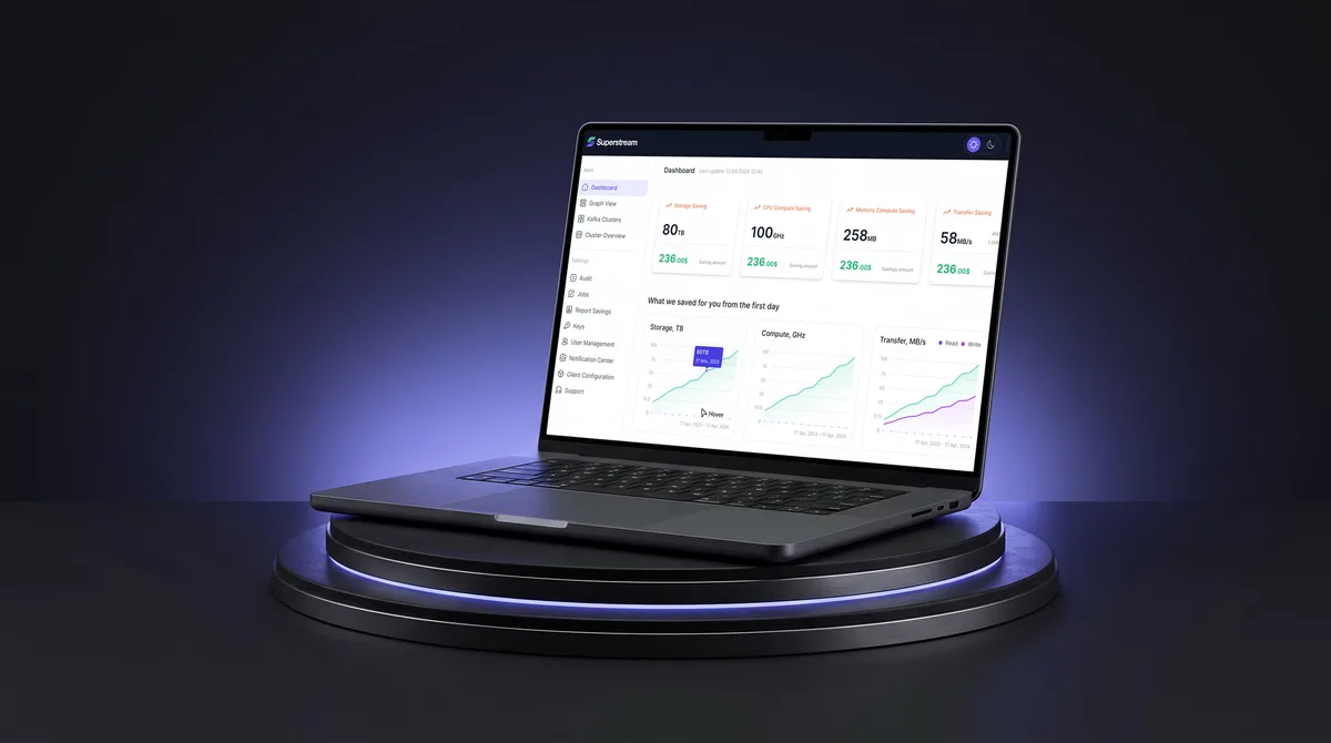
AI Hi-Tech · SaaS
Superstream
Made a Kafka management platform’s technical data readable for DevOps teams, with a design system and handoff.
- 3000+ Screens designed
- 1500h+ Design hours
-
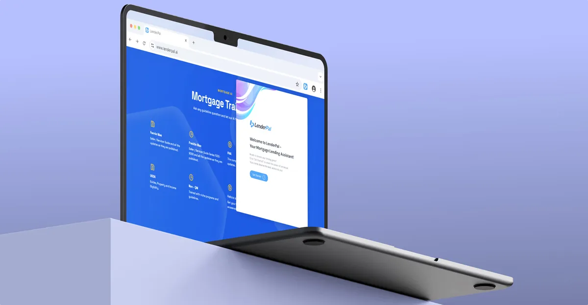
Chrome extension · Real Estate
LenderPal
Fit real-estate lending workflows, a calculator and comparable sales into a Chrome extension.
- 150+ Screens designed
- 4 Experts on the pod
-
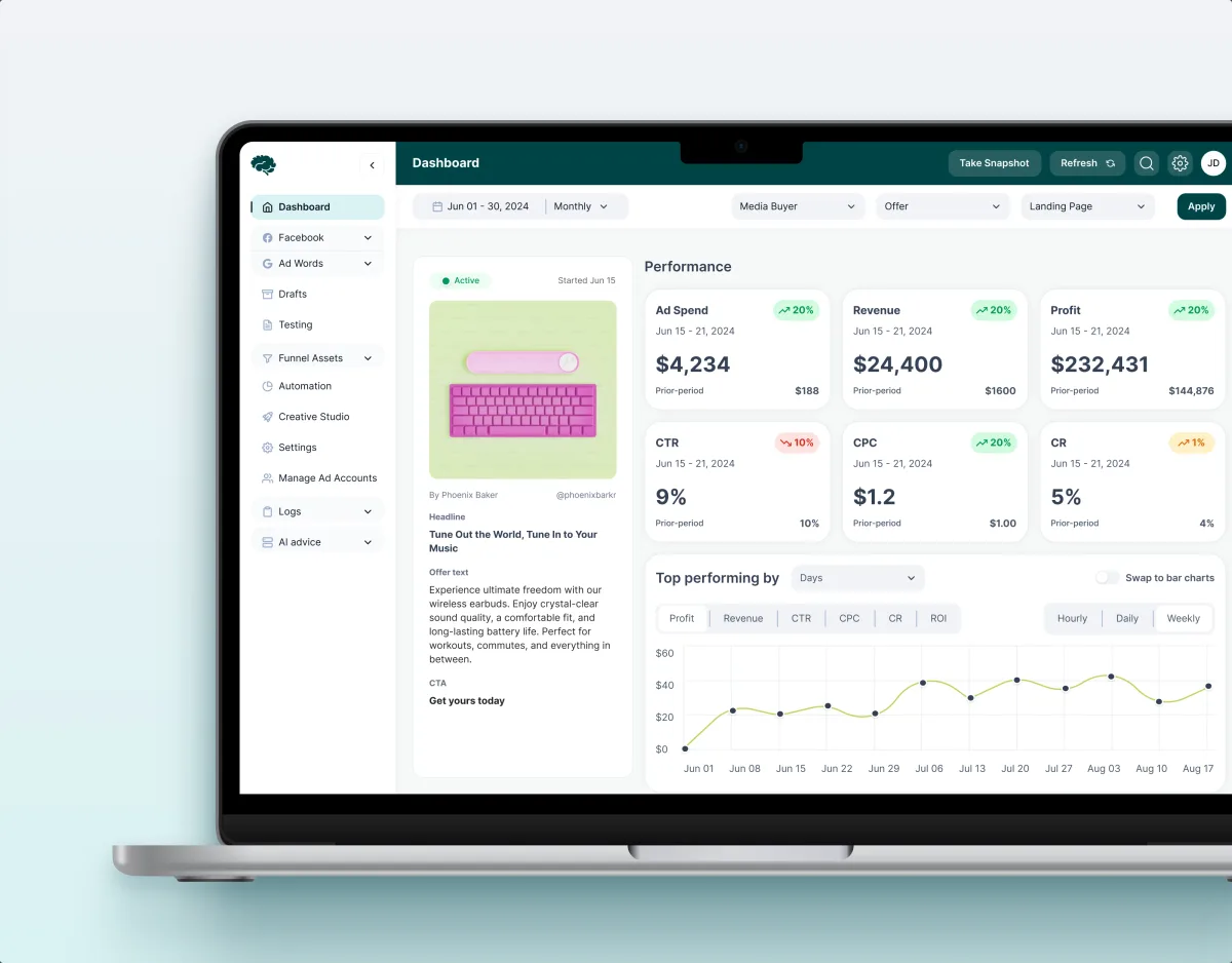
MarTech · Ads analytics · Web SaaS
Concussion Media
Redesigned an existing analytics product around the dense numbers its users act on.
- 400+ Screens and states
- 11 Modules designed and approved by the client