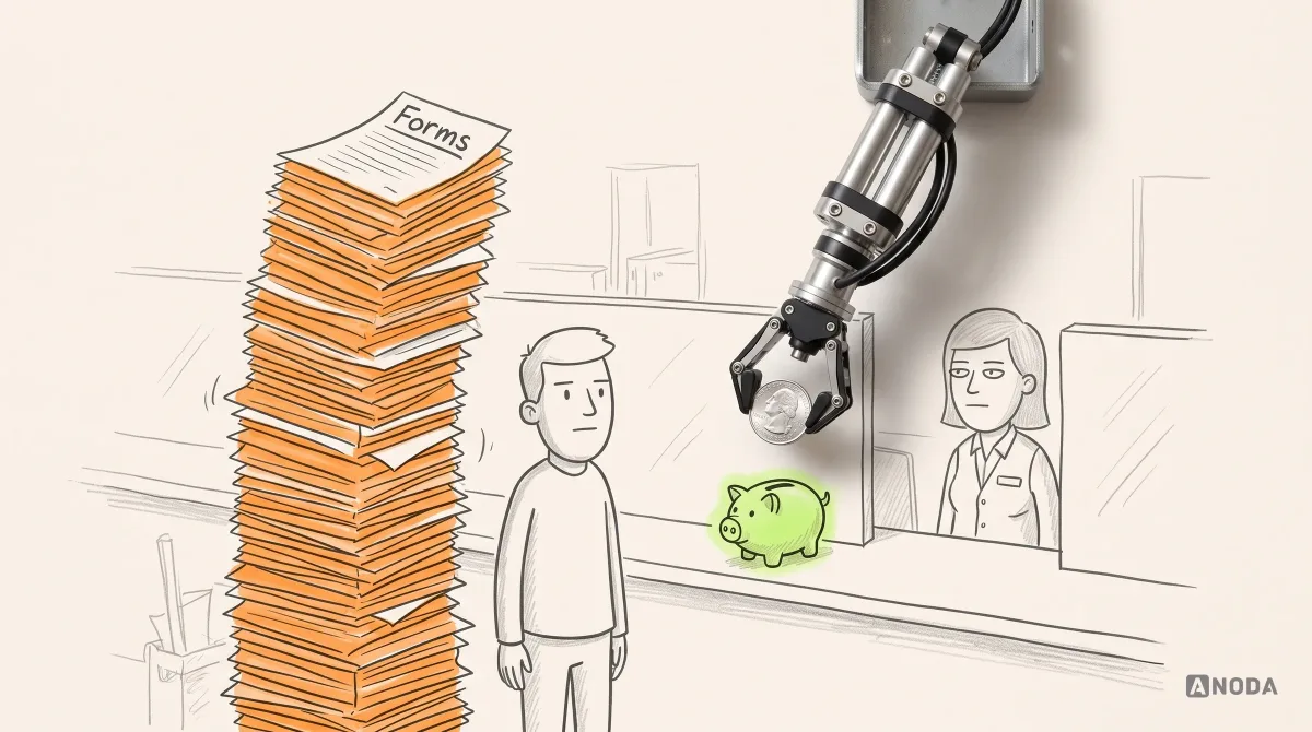
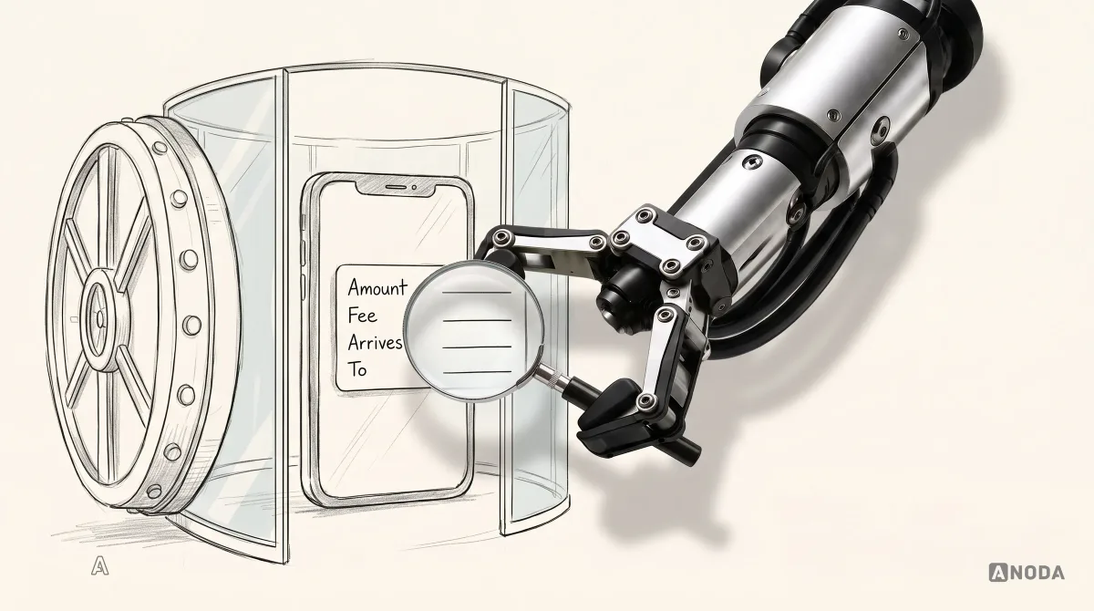
In short
Fintech UX makes money understandable: users see the amount, fee, rate, recipient, timing and status before anything moves, necessary checks are explained rather than removed, and every failure has a humane way back. Here is how to handle onboarding, verification, sign-in, consent, payments, errors, dashboards, accessibility, AI and testing in products people trust with their money.
In this article
- Why fintech is different
- What fintech UX covers
- Onboarding and identity checks
- Sign-in that fits the risk
- Consent and data permissions
- Showing money clearly
- Payments: review before money moves
- Lending and credit: the true cost, up front
- Fees, plans and subscriptions
- Errors and recovery
- Support, disputes and complaints
- Notifications that help
- Dashboards and data density
- Business accounts: roles and approvals
- Education in context
- Designing for people under financial stress
- Multi-currency and cross-border
- Accessibility
- One message, every channel
- Personalisation and AI
- Save progress everywhere it matters
- Research and testing the risky flows
- Measuring confidence
- Trust signals that work, and ones that don’t
- Common fintech UX mistakes
- Four financial interfaces, four different jobs
- How we approach fintech UX
- The decision rule
- Fintech UX release checklist
Fintech UX is the design of financial products so people can understand what is happening to their money, decide with confidence and recover when something goes wrong. It is not about removing every step. It is about removing confusion while keeping the protective friction that stops mistakes and fraud, and explaining that friction so it feels like care rather than bureaucracy. Before any money moves, the user should see the amount, fee, currency, recipient, timing, exchange rate and what happens next. Everything else in this guide follows from that.
Financial products are not ordinary apps with a pound sign added. A confusing note-taking app costs you a few minutes. A confusing payment screen can cost you rent money, send it to the wrong person, or make you think it vanished. People feel that difference. They arrive more cautious, read more carefully, abandon faster and remember longer. Trust, as the saying goes, arrives on foot and leaves on horseback.
We have designed financial products for years, and the failures we see are rarely about visual design. They are about hidden consequences: a fee that appears only after sending, a transfer that says “processing” for three days with no explanation, a verification step that asks for a document without saying why, an error that reads “code 51”. Each one leaks users the business paid to acquire, and each one teaches customers to keep their real money somewhere else. The cost doesn’t show up as one big failure. It shows up as lower deposits, fewer repeat payments, more support tickets and customers who keep your app for one small job while their salary lands somewhere they trust more.
This guide covers what makes fintech UX different, and how to handle the moments that matter most: onboarding and identity checks, sign-in, consent, showing money, payments, errors and recovery, dashboards, education, accessibility, consistency across channels, AI, and how to test and measure it all. For a deeper look at security and trust in banking interfaces specifically, see our guide to banking app UX and security.
ANODA goes beyond a reassuring colour palette: we connect the quote, the commitment, the transaction state and recovery into one journey. Xcoins, Blackstar and Payyro show that work across purchases, investing and multi-role funding. The result is a product that earns trust where it matters—when people decide to commit their money—and gives support fewer mysteries to explain.
Why fintech is different
Three things set financial products apart.
The stakes are real. Mistakes cost money, sometimes irreversibly. A payment sent to the wrong account may not come back. That changes how people behave: they hesitate, double-check and look for reassurance. Design has to support that caution rather than rush past it.
The rules are real. Identity checks, strong customer authentication, disclosures, consent for data sharing, complaints processes: many steps exist because regulation requires them. Design can’t remove them. It can make them understandable, quick and humane.
The trust is fragile. Users are rightly suspicious of anything that feels unclear about money. A single surprise, a hidden fee or an unexplained delay, can undo months of good experience.
The mistake teams make is treating all friction as bad. In fintech, some friction protects the user. The skill is telling the two apart.

Remove the friction that exists because of poor design: asking for information you already have, jargon, dead ends, surprise costs. Keep the friction that protects people: identity checks, confirming a new payee, reviewing a large payment, stronger sign-in for sensitive actions. Then explain it, briefly, at the moment it happens.
What fintech UX covers
“Fintech” is a wide label, and the UX challenges differ by product type, even though the principles are shared.
- Banking and current accounts: everyday balances, cards, payments, statements. The challenge is clarity at high frequency: people check these apps many times a week and need the answer in seconds.
- Payments and transfers: domestic and international money movement, often with currency conversion. The challenge is transparency about cost, timing and status.
- Lending and credit: loans, credit cards, buy-now-pay-later. The challenge is making the true cost and the obligations unmistakable, and doing affordability checks without humiliating people.
- Investing and trading: portfolios, orders, market data. The challenge is presenting risk honestly and resisting design that encourages impulsive decisions.
- Insurance: quotes, policies, claims. The challenge is making cover and exclusions understandable before people need them.
- Business finance: invoicing, expenses, payroll, accounting. The challenge is density, roles and approvals.
- Crypto and digital assets: wallets, transfers, custody. The challenge is irreversible actions, unfamiliar concepts and high emotional stakes.
Each of these has its own rules and risks. The rest of this guide focuses on the patterns they share: making consequences explicit, handling verification and security well, and recovering gracefully when things go wrong.
Onboarding and identity checks
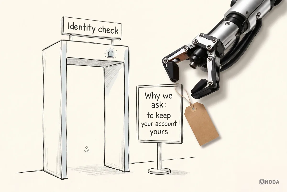
Onboarding is where most fintech products lose the most people, and where the most money is spent to acquire them. Identity verification, often called KYC (“know your customer”), is legally required for many products and it is also the step users find most intrusive.
Good onboarding does a few things well:
- Shows the whole path. A clear progress indicator with named steps, so people know how much is left.
- Explains each request. A single line on why you need an address or an ID document turns an intrusion into something reasonable.
- Saves progress. Life interrupts. People who can finish later often do. People who have to start again often don’t.
- Asks only for what is needed now. Information that can wait until later should wait.

Document and selfie capture deserve special care, because they fail often and for boring reasons: blur, glare, cropping, bad light. Live guidance that tells people exactly what’s wrong and how to fix it prevents repeated failures and the frustration that follows.

Then handle the waiting. Verification is sometimes instant and sometimes not. Every possible outcome needs a clear state: checking, needs more information, verified, and failed. The failed state matters most. “We couldn’t verify you” with nothing else is a dead end. A reason, a next step and a way to reach a person keeps a legitimate customer from walking away.

From verified to first use
Verification is not the finish line. The real goal of onboarding is the first meaningful action: the first deposit, the first payment, the first card used. Many products celebrate a completed sign-up and then leave the user on an empty home screen with a zero balance and no idea what to do next.
Guide people to that first action. Show how to add money, what the fastest method is, and when it will arrive. If a card is on its way, say when and what they can do in the meantime. The time from sign-up to first real use is one of the best signs of whether people trust the product enough to use it with real money.
Sign-in that fits the risk
Security in fintech should be proportionate. Asking for a one-time code to check a balance trains users to hate security. Allowing a large transfer to a new payee with only a password invites fraud.
A useful approach is to match the level of authentication to the risk of the action. Viewing a balance might need only a fingerprint or face recognition. Adding a new payee might add a one-time code. A large transfer might add an explicit confirmation. Changing the phone number linked to the account might add a waiting period and a notice to the old contact details.

Always design the fallback. Biometrics fail, phones get replaced, codes don’t arrive. A secure product that locks out its legitimate users isn’t secure. It is just unusable, and it generates support calls that cost more than the fraud it prevented.
Passkeys and device-bound credentials are making strong sign-in much easier for users, because there is nothing to remember or type. Where your platforms support them, they are worth offering, with a clear explanation the first time and a recovery path for a lost device.
Security should be understandable, not theatrical. Padlock icons, “bank-grade security” badges and dramatic warnings don’t protect anyone. Clear explanations of what is protected and how, at the moments it matters, do.
Consent and data permissions
Many fintech products connect to other accounts, read transaction data or share information with partners. Users need to understand what they are agreeing to, and legally, in many markets, they must.
Good consent screens answer four questions plainly:
- What will you see? Balances, transactions, account details.
- What won’t you see or do? Passwords, the ability to move money.
- For how long? And what happens when it expires.
- How do I stop it? Where to revoke access, in one step.

A consent screen written by lawyers for lawyers gets a reflexive “Agree”. A consent screen written for people gets an informed one, and informed consent is the only kind worth having when trust is the product.
Showing money clearly
How money is displayed seems trivial until it goes wrong. Then it is the whole problem.
- Separate available from pending. A balance that includes money that hasn’t arrived, or excludes money that is about to leave, causes overdrafts and panic.
- Make direction obvious. Money in and money out should be clear through signs and words, not only through colour.
- Show the currency whenever more than one is involved, and use consistent formatting.
- Label pending transactions so people know which ones might still change.
- Keep precision consistent. If a figure is rounded, say so, and never round where it changes the answer.

Payments: review before money moves
The moment before a payment is sent is the most important screen in most fintech products. It is the last chance to catch a mistake. A good review screen shows everything that will happen, in the order people check it:
- The amount they send.
- The fee, in their currency.
- The amount converted, if currency changes.
- The exchange rate.
- The amount the recipient receives.
- When it will arrive.
- Who it goes to, with enough detail to spot an error.

It is the cashier who counts your change out loud in front of you. It takes three seconds longer, and you never have to wonder afterwards.
The button should say what it does: “Send £250.00”, not “Confirm”. And editing should be one tap away, so people who notice a mistake can fix it without starting over.
Status you can follow
After sending, people want to know where their money is. “Processing” with no detail is how support queues fill up. A status timeline showing each step, sent, converted, on its way, arrived, with times, answers the question before it is asked.

When a payment fails or is returned, say why in plain words, and say where the money is now. “Your £250.00 is back in your account” is the sentence that stops panic.
Exchange rates and fees
International payments are where hidden costs hide best. Some providers show a “no fee” message while applying a worse exchange rate. Users increasingly know this, and they compare. Be explicit: the rate you apply, a reference rate for comparison, the fee, and the total cost. If the rate is locked for a period, say for how long.
| Illustrative cost comparison | Amount |
|---|---|
| Amount converted after the fee | £248.80 |
| Applied rate | 1 GBP = 1.1720 EUR |
| Reference rate | 1 GBP = 1.1780 EUR |
| Recipient receives | €291.59 |
| Difference from the reference conversion | €1.49 |
Show the reference rate and fee in their labelled currencies; explain how your total-cost comparison is calculated.
It is the restaurant bill with a mystery service charge. The meal might have been lovely. The charge is what people remember.
Lending and credit: the true cost, up front
Credit products carry the highest stakes for users and the strictest expectations from regulators. The UX principle is simple and often ignored: people must understand what they are agreeing to before they agree.
- Show the total cost, not only the monthly payment. A small monthly figure over a long term can hide a large total.
- Show the rate clearly, with a plain explanation of what it means.
- Show what happens if a payment is missed, including fees and effects on credit.
- Make affordability questions respectful. They are necessary; they don’t need to feel like an interrogation.
- Avoid pressure. Countdown timers, pre-ticked boxes and “most people choose the longest term” nudges erode trust and, in many markets, invite regulatory attention.
Measure whether people understand the commitment and can make an informed decision. Compare cost-comprehension checks, completion, complaints and cancellations for defined groups and periods. Defaults also depend on underwriting, affordability and later circumstances; a clearer interface alone does not establish a reduction in them.
When reviewed terms differ from the quote
In an illustrative fixed-instalment loan journey, a borrower saves an application after seeing an initial quote. The review returns different terms. Show what changed before asking the borrower to accept the current offer; saved progress does not lock in the earlier rate. Keep the earlier quote visible for comparison, labelled as historical, while making the current terms and their source unmistakable.
| Term to compare | Earlier indicative quote | Current reviewed offer |
|---|---|---|
| Amount borrowed | Previously quoted principal | Current principal; flag any change |
| Rate | Quoted rate with its type and period | Current rate using the same labels; show APR separately where applicable |
| Repayment term | Quoted duration and number of instalments | Current duration and number of instalments |
| Monthly payment | Earlier scheduled payment | Current scheduled payment, including any different final instalment |
| Fees and total payable | Quoted fees and total | Current fees and total based on the reviewed repayment schedule |
| Source and validity | Quote source and time shown; historical status | Current offer source, issue time and actual validity conditions |
This is a comparison template, not a priced offer. The client’s financial and compliance owners define the calculations, offer validity, required disclosures, consent and legal wording for the product and market. If numerical examples are used, make the principal, fees and repayment assumptions explicit and reconcile the schedule with the total. Do not label a nominal interest rate as APR or invent a universal expiry countdown.
If current terms are unavailable or have expired, preserve the application, explain what must be refreshed and offer the applicable next step: request updated terms or contact the lender. A successful refresh still requires the borrower to review the current financial commitment before acceptance. For document capture, review and resubmission, see our financial app onboarding guide.
Fees, plans and subscriptions
Many fintech products charge through plans and subscriptions: a free tier, a paid tier, fees for certain transactions. Confusion here produces some of the angriest reviews in the category.
Make the cost of each plan and each fee visible before people need it, not only in a pricing page they read once. Show fees at the moment they apply. Warn before a free allowance runs out. Make it easy to see what plan you are on and what it includes, and easy to change or cancel. People forgive a fee they understood. They rarely forgive one they discovered.
Errors and recovery
Things will go wrong: declined cards, failed payments, blocked accounts, timeouts. What matters is what happens next.
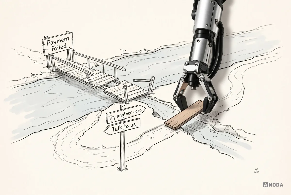
A good fintech error message says what happened, whether it was the user’s action or something else, and what they can do now. “Transaction failed (code 51)” is a message for engineers. “Not enough money in your account. Top up or use another card.” is a message for people.

Fraud alerts deserve particular care. A suspicious transaction is stressful for the user whether or not it is fraud. Calm language, a clear question, and two obvious answers work far better than sirens and capital letters, which people learn to ignore or which frighten them into mistakes.

Every failure path should end in a way forward: retry, an alternative, or a human. In finance, “contact support” must lead to someone who can actually help, not a form that disappears.
Support, disputes and complaints
Sooner or later, some users will need help with a transaction they don’t recognise, a payment that went wrong or a charge they want to dispute. How the product handles these moments shapes trust more than any feature.
- Make help findable from the transaction itself. “Something wrong with this payment?” on the transaction detail beats a help centre three levels deep.
- Explain the process and timeline. Disputes and chargebacks take time; saying how long and what happens at each stage prevents repeated contacts.
- Show the status of an open case, just like a payment status.
- Offer a real person for anything involving lost money, fraud or locked accounts.
- Close the loop with a clear outcome and, where relevant, an explanation.
In regulated markets, complaints handling has formal requirements. Good design doesn’t replace them; it makes them work for people rather than against them.
Notifications that help
Financial notifications can be genuinely useful: money received, payment sent, a bill due, unusual activity, a low balance. They can also become noise that people switch off, including the alerts that matter.
Send notifications that carry information people want, at the moment it is useful, with enough detail to act without opening the app when possible: “£250.00 arrived from Marta Silva” rather than “You have a new notification”. Let people choose which kinds they receive, and never use security alerts for marketing. The day someone ignores a real fraud alert because the last five were promotions is the day the product failed them.
Dashboards and data density
Financial dashboards serve very different people. Some want a balance and the next bill. Others want spending by category, scheduled payments and investment performance on one screen. One layout rarely suits both.

Offer a clear default for most users, and a way to see more for those who want it. Don’t make the choice for them permanently: someone who wants the simple view most days may still need the detailed one at tax time or when something looks wrong. A dashboard that remembers the preference and makes switching obvious serves both moods of the same person. Put what people check most, balance, upcoming payments, recent activity, at the top. Let detail be one tap away rather than on the first screen.
Charts, especially for investments, need honesty. Show the period clearly and let users change it. Start axes sensibly so small changes don’t look like crashes or rockets. Show values and changes in both money and percentages. And say plainly that past performance doesn’t predict future results, because it is true and because in many markets it is required.

Business accounts: roles and approvals
Financial products for businesses add a layer that consumer apps don’t have: several people acting on the same money. An owner, a finance manager, an accountant and employees with cards all need different access and different limits.
Good business fintech UX makes that structure visible. Who can see balances, who can create payments, who must approve payments above a threshold, who can issue or freeze cards. Approval flows need clear states: waiting for whom, since when, and what happens if they don’t respond. Every action should leave a readable record of who did what and when, because in business finance, “who approved this?” is a question someone will eventually ask.
The failure mode is either too loose, where anyone can send anything, or too tight, where every payment waits two days for someone on holiday. Design the delegation, the limits and the escalation path deliberately, and test them with the people who actually do the work.
Education in context
Financial products are full of terms people half-understand: APR, AER, pending, cleared, chargeback, mid-market rate. Long help centres rarely get read. Short explanations exactly where the term appears do.

It is a pharmacist explaining the dose as they hand you the box, not a leaflet you’ll read after something goes wrong. One sentence, in plain words, at the moment of need.
Designing for people under financial stress
Many users open a financial app when something is wrong: money is tight, a payment bounced, a bill is overdue, they suspect fraud. Stress narrows attention and makes people more likely to misread, panic or give up. Some users are in vulnerable circumstances: illness, bereavement, debt, limited literacy or limited digital experience. In several markets, regulators expect financial firms to treat these customers with particular care.
Design can help a great deal:
- Use calm, plain language, especially in errors, overdue notices and debt-related messages.
- Put the most important information first: what happened, what it means, what to do.
- Offer options, not only warnings. “You can move your payment date” is more useful than “Payment overdue”.
- Make human help easy to reach, and let people choose how: chat, phone, callback.
- Avoid shaming. Red capital letters and threatening tones don’t make people pay faster; they make them stop opening the app.
A product that treats people well on their worst financial day earns a kind of loyalty no marketing can buy.
Multi-currency and cross-border
Products that move money across borders or hold several currencies add their own layer of confusion. Which currency is this balance in? When is the rate fixed? Why did the recipient get less than expected? Are there fees on the receiving side?
Make the currency visible wherever a figure appears. Show conversions both ways when people are deciding, and fix the rate for a stated time when they commit. Explain differences between what was sent and what arrived, including fees charged by other banks when you know about them. Format numbers and dates for the user’s locale, but never let formatting make an amount ambiguous: the difference between a comma and a full stop can be a factor of a thousand.
Accessibility
Financial products must work for everyone, including people using screen readers, larger text, voice control or keyboard navigation, and people with cognitive or visual impairments. In many markets it is also a legal expectation for financial services.
Money has its own accessibility challenges:
- Amounts must be read correctly by screen readers, including signs, currencies and pending status.
- Text must scale without cutting off balances or buttons.
- Contrast must be sufficient for figures and status labels.
- Meaning must not rely on colour alone: red and green for out and in need words or signs too.
- Time limits on sessions and codes should be generous or extendable where security allows.

One message, every channel
People meet a financial product in many places: the app, the website, push notifications, emails, text messages, statements, support conversations. The same event should be described the same way everywhere. If the app says “arrived” and the email says “completed” and the statement says “settled”, users wonder whether those are three different things.

Consistency across channels is a trust signal. It tells people there is one system behind the product and one version of the truth about their money.
Personalisation and AI
AI is appearing in fintech everywhere: spending insights, budgeting suggestions, categorisation, chat assistants, fraud detection. It can genuinely help. It also raises questions users care about: what data is being used, who is responsible for the advice, and can it act on my money?
Clear boundaries help:
- Label AI output as AI, so people know what they are reading.
- Say what data it used, in plain words.
- Explain why a suggestion appeared, one tap away.
- Keep humans in control of money. AI can suggest; the user confirms every payment.
- Don’t let AI obscure accountability. If advice is regulated, it needs to be treated as such.

Save progress everywhere it matters
Financial tasks get interrupted: an application needs a document the user doesn’t have to hand, a transfer needs a detail from someone else. Products that throw away progress lose customers at exactly the point they were most committed.

Save applications, drafts and setup steps automatically, and make it easy to continue: a clear “continue where you left off” with what is done and what remains.
Research and testing the risky flows
Fintech teams often polish the interface and test the easy screens. The flows that need testing most are the ones where money and trust are most at risk: first payments, international transfers, identity verification, card freezing, disputes. Test those with representative users, including people who are not confident with money or technology.

A simple way to prioritise: look at how much money is at risk in each flow, how often users do it and how often support hears about it. The flows that score highest on all three are where research and usability testing pay back fastest. When you don’t yet know why users hesitate or abandon, start with UX research into how they make financial decisions and what makes them trust, or distrust, a product.
Research methods that fit money
Financial research has its own challenges. People are reluctant to show their real accounts, and behaviour in a test with fake money is not the same as behaviour with real money. A few approaches help:
- Interviews about recent real decisions: the last time they sent money abroad, applied for credit or disputed a charge, and what made them hesitate.
- Tasks with realistic but safe data: prototypes with plausible balances and payees, so people behave naturally without exposing their own information.
- Diary studies for products used over weeks, like budgeting or saving, where confidence builds or erodes over time.
- Session recordings and funnel data from the live product, handled with strict privacy controls and masking of personal and financial details.
- Support and complaints analysis, which often reveals the exact wording and moments that confuse people.
Treat research participants’ financial information with the same care as customers’ data, because it is the same kind of data.
Measuring confidence
Useful fintech experience metrics go beyond conversion. They show whether people understand and trust what they are doing:
- Onboarding completion by step, to see exactly where people give up.
- Verification drop-off and retry rates.
- Time to first transaction, a proxy for how quickly people trust the product with real money.
- Abandonment on payment review screens, which can signal confusion about fees or rates.
- Support contacts per thousand payments, by topic.
- Recovery after failures: how often people complete a task after an error.

Track them before and after changes, and read them alongside what users say. Numbers show where confidence drops; research explains why.
Trust signals that work, and ones that don’t
Fintech products often reach for visual trust symbols: padlocks, shields, “secure” badges, regulator logos in the footer, dark blue colours. Some of these have a place. None of them builds trust on their own.
What actually builds trust is behaviour: showing costs up front, keeping promises about timing, explaining delays before people ask, making it easy to reach a person, and handling mistakes gracefully. Users judge a financial product by what happens when something goes wrong, not by the icons on the login screen. A product that behaves predictably and honestly earns trust without saying “trusted” anywhere.
Common fintech UX mistakes
- Hiding fees or rates until after the action.
- “Processing” with no detail and no timeline.
- Error codes instead of explanations.
- Security that is either theatrical or absent, instead of proportionate.
- Consent screens written for lawyers.
- Losing progress in long applications.
- Dead ends in verification failures and support.
- Colour-only meaning for money in and out.
- Inconsistent wording between the app, emails and statements.
- Dark patterns in credit, subscriptions or cancellations.
- Polishing the easy screens and never testing the risky flows.
Four financial interfaces, four different jobs
The best fintech UI design principles become useful when they explain a particular financial task. A first-time crypto buyer needs to understand the price and recover from a rejected payment. A mortgage professional needs to compare property data and explain the assumptions behind a calculation. A new investor needs to understand who controls the investment decisions and where their deposit will go. Putting all three in the same generic financial dashboard would hide the decisions that matter.
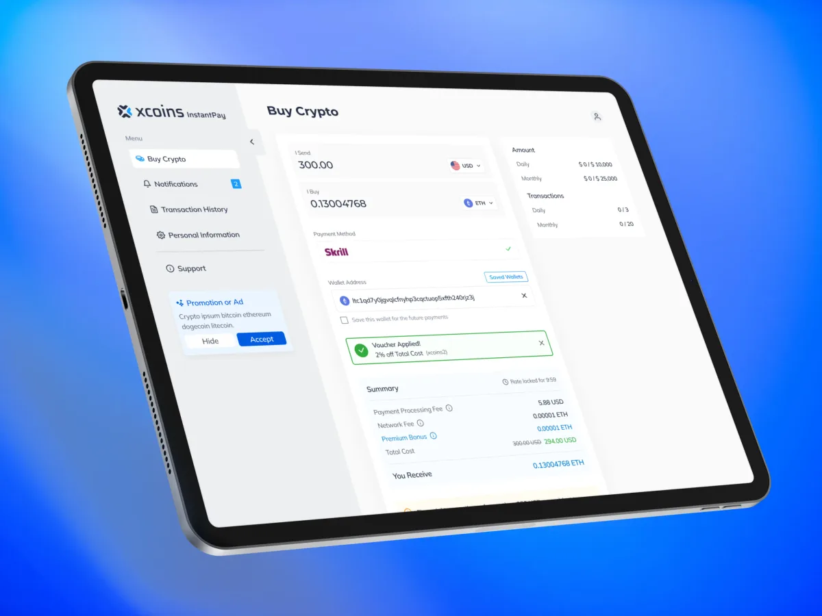
In Xcoins, ANODA redesigned the purchase journey from quote to payment for responsive web and mobile. Amount sent, crypto received, processing and network fees, payment-method limits and voucher effects are available before confirmation. A network fee greater than the purchase amount disables continuation; expired rates and declined payments have their own next steps. Saved wallets and destination tags help returning buyers without removing the final check. ANODA made the purchase decision readable from the quote through confirmation, with the fees and recovery steps in the same flow. If a crypto purchase product loses buyers at the rate, verification or payment step, bring us that journey: we connect the commitment, its costs and the next safe action before another visual refresh.
In LenderPal, the audience is loan officers, processors, underwriters and branch managers. The Chrome extension keeps the selected property connected to an icon rail while users review property data, comparable sales, fees, rates and insurance quotes. The calculator keeps its inputs visible with principal, interest and amortization results, including a PDF option. Missing data and empty filter results have explicit states instead of a blank or misleading zero. ANODA designed the extension and handed it to the client’s developers.
These cases support different commercial services: payment app design for the quote-to-confirmation task, and fintech product design for financial workflows and specialist data. The bank app UI guide goes deeper into consumer banking screens and transaction states.
Blackstar: make the investing model and payment state clear
In the Blackstar investment app redesign, new investors choose between Active Invest and Auto Invest on one sheet that explains who controls the decisions. A portfolio starts from a goal; the first deposit names that goal and the investing model. The wallet separates cash by goal, while markets and portfolio analytics use the same interface language.
Financial states need equally clear words. A payment still awaiting bank confirmation has its own screen, with Keep Waiting and Check Later; an empty market result offers Update Filters. These are practical parts of investment platform design, alongside the information hierarchy, not decorative additions after the balance screen.
Payyro: distinguish the donation from the vendor payout
Payyro’s bill-funding platform connects customers requesting help, donors, vendors and a Super Admin. Donors fund a specific overdue bill through guest checkout; vendors manage requests and bank-account setup, while the admin verifies requests and sends the payout to the vendor once the bill is fully funded.
The UX task is to distinguish these events: a donation was received, the bill reached its funding target, the request was verified, and the vendor payout was sent. A successful donor payment does not by itself mean the vendor has been paid. Give each role the status and next action relevant to its part of the workflow. ANODA released the first version on Webflow and Wized; the redesigned second version is in development.
How we approach fintech UX
When we work on financial products, we start with the flows where money and trust are most at risk. We audit onboarding, verification, payments, errors, recovery, accessibility and the way the product explains itself, and look for hidden consequences, unexplained friction and dead ends. We design for clarity at the moments that matter, keep and explain the friction that protects people, and test the riskiest flows with real users. We connect those decisions with your compliance and security requirements, so your users understand the commitment, can complete the task and have a clear way back when something fails.
If that is what your product needs, our fintech work covers everything from a single critical journey to the whole product. For broader interface and experience design, see our UI/UX design services.
The decision rule
Before you release or redesign a financial flow, check these in order:
- Does the user see the amount, fee, currency, recipient, timing, rate and status before and after money moves?
- Is every necessary step explained, and every unnecessary one removed?
- Does every failure lead to a clear next step and, where needed, a person?
- Is progress saved wherever people might be interrupted?
- Are unfamiliar terms explained where they appear?
- Does it work with screen readers, larger text and without colour?
- Is the wording consistent across the app, notifications, emails and statements?
- Is AI labelled, explained and kept away from moving money on its own?
- Have the riskiest flows been tested with real users?
Most of this is not expensive. It is a matter of deciding, flow by flow, what the user needs to see before they act, and refusing to hide it. Make every consequential action explicit, save progress, explain unfamiliar terms, and give people a humane way back when something goes wrong. In fintech, clarity isn’t a nice extra. It is the product.

Fintech product design
Make the moments that move money feel safe.
We audit and redesign onboarding, payments, errors and recovery so users understand what happens to their money and trust you with more of it.
Fintech UX release checklist
Review the complete money or credit task with product, operations, security and compliance owners. A customer must be able to identify the amount, fee, currency, recipient, timing, limits and irreversible consequence before confirming. Operations must be able to distinguish pending, failed, reversed and disputed transactions and follow the same reference through support.
Test identity checks, access recovery, changed bank details and scam warnings with representative users. Confirm that a failure preserves safe work, explains whether money moved and offers a next action. Check keyboard and screen-reader use, readable amounts and negative balances, local number formats and large text. Compare completion and support demand with mistaken transfers, repeated attempts and complaints; a faster funnel is useful only when people also understand the commitment.
Frequently asked questions
What should a fintech transaction review show?
Show the amount, currency, recipient, fees, rate, delivery timing, limits and irreversible consequences before confirmation. Recalculate visibly when an input or rate changes; do not hide the final price behind the confirm button.
How should fintech products explain a failed payment?
Say whether money moved, identify the relevant payment and explain the next safe action. Distinguish a declined payment, an expired quote, a pending result and a reversed transaction so customers do not retry blindly.
Can UX design replace financial security controls?
No. UX makes authentication, verification, risk checks and recovery understandable. Security and compliance owners define and verify the actual controls; product and design teams make their purpose and consequences clear.
Which flows should fintech UX research test first?
Start with high-stakes tasks: onboarding and identity, account access, payment review, failed or interrupted transfers, credit cost comprehension and disputes. Include customer, support and operations perspectives and check both completion and understanding.
Written by