
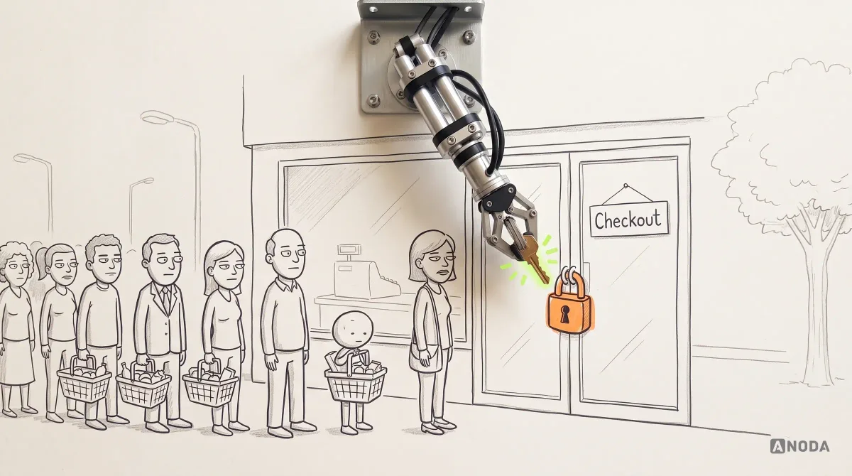
Ecommerce UX Best Practices for Higher Conversion
Improve ecommerce UX across product discovery, navigation, mobile, product pages and checkout. Learn what to fix, test and measure for conversion.
Design the screens staff use a hundred times a shift — finding a product, building an order, taking payment, handling a return — and the manager's tools behind them.

A checkout staff can run without thinking, even when something goes wrong.
Money moving between payers and recipients, online.
POS Software Design
The counter: orders, staff and the till, at speed.
Not included
What the cashier touches, what the supervisor approves and what the manager closes.
Cashiers, supervisors and managers, and what each can do, override or approve.
Search, basket, discounts, split payment and the receipt, in as few taps as the sale allows.
Refunds, voids, price overrides and the approvals behind them.
Shift close, cash-up, reports and the catalogue, on a tablet or the web.
You receive
POS software UX design is judged at the counter: a long queue, a busy hand, a customer who changes their mind. Every screen is drawn for these moments.
It fits when staff serve people in person and the software sits between them.
Staff serve a queue, and every extra tap is felt at the counter.
Cashiers, supervisors and managers log in to the same till with different rights.
Paper notes, manager cards and memorised shortcuts fill the gaps.
Screen sizes, card readers, printers and scanners are chosen or shortlisted.
A different starting point
Tell us what you sell, on which devices, and where the queue slows down. We will come back with a useful scope and a realistic next step.
POS work starts through the service that fits your stage, and its proposal sets the terms.
Tell us what staff sell, on which hardware, and which tasks need a manager today.
Message received.
Within 15 minutes, we’ll email you initial feedback and follow-up questions.
Improve ecommerce UX across product discovery, navigation, mobile, product pages and checkout. Learn what to fix, test and measure for conversion.
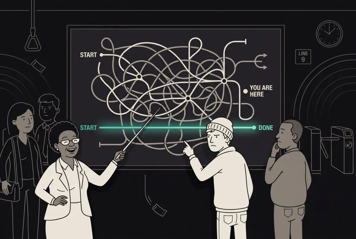
Improve user flow with ANODA UX Agency. Discover principles, tools, and strategies to design seamless, intuitive UX. Start improving your user experience today!
One that designs from the counter out. Before any layout, it should watch real shifts, count the taps in the most common sale and list what goes wrong on a busy day. Ask to see touch layouts with their states — a declined card, a network drop, an override — not only a tidy basket. Ask whether it was designed for glare, a queue and one free hand, not only for a desk. Ask how the design was tested with staff, and what changed after they tried it.
Search works by name, code, barcode and a grid of favourites, and forgives typos. The basket stays in view, the most common payment is one tap, and splitting a bill does not mean starting again. When a cashier needs an override, a supervisor approves it on the same device without logging the cashier out. When something fails, the screen says what happened and offers the next step: retry the reader, take cash, void the last item or reprint the receipt. Large targets and strong contrast matter as much as the flow: a till is used at arm's length, in glare, often with one hand.
Cashiers, supervisors and store managers, owners who look across locations, and the back-office staff who keep the catalogue. The workflows are opening a shift, selling, discounts and modifiers, split payments, holding and recalling an order, returns and exchanges, price overrides, cash drops, closing the shift, the catalogue and reports. Kitchen screens and customer-facing displays belong in the scope when they show the same order. Hospitality adds tables, courses and tips; service businesses add appointments and deposits taken at the counter.
UI/UX & Product Design for a new POS; a UX Audit when a live one slows staff down; UI Redesign when the flows hold up and the interface has aged. Web App Design covers the back office, Mobile App Design handhelds and phone tills, and Design Systems the components shared across devices. Online payments belong to Payment Product Design, and stock and purchasing to ERP & Internal Tools.
With the flows, not after them. Each screen is drawn for a dropped network, a silent card reader, a declined card, a search with no match, a changed order, a split payment, a return without a receipt and a shift that does not balance. Sales made offline are queued and shown as such until they sync, and conflicts get their own screen. A permission matrix sets out what each role can do alone and what needs approval, and every void, reprint and override leaves a record the manager can check at shift close. Terminal and certification rules belong to your payment and hardware partners; we design to them.
Access to the current POS or a demo unit with a login for each role, a chance to watch real shifts, your discount, return, override and cash-up rules, a product owner who can decide, and contact with engineering and the hardware you use or plan to. An hour behind the counter at the busiest time tells us more than any spreadsheet. If you sell in several countries, tell us about tax, currency and receipt rules early; they change more screens than people expect.
Not yet as a published case. The closest published work is Cabinit, a tablet-first platform that estimators, site managers and installation teams use through the working day, and Qarma, a mobile app for inspectors on factory floors. Both are tools people use standing up, in a hurry and many times a day; neither is a POS, and we do not present them as one.
Yes. Most POS work starts from software staff already know by heart, so changes are planned with the shortcuts they rely on in mind. Your designers and engineers work with us in your own files, and receive the touch components with every state they need. When a new version rolls out, we plan what changes for staff in the first week, so the queue does not pay for the redesign.