In short
An MVP is the smallest product that can teach you whether your idea works. In UX terms: one explicit hypothesis, one primary user and one primary journey designed end to end, with onboarding, the core flow, states, trust and measurement. Not a big backlog with fewer pixels. This guide covers how an MVP differs from a prototype or beta, what to test, how to scope, what quality can't be cut, the design process and how to decide what comes next.
In this article
- What MVP means in UX
- MVP vs prototype, proof of concept, beta and first release
- Types of MVP experiments
- Start with one hypothesis
- Signs you’re building a first release, not an MVP
- Choose the primary user
- Map the primary journey end to end
- Scope: five or six capabilities, not fifty
- What “minimum” means for different products
- A real MVP design: AispireMe
- Principles for MVP UX design
- The minimum quality you can’t remove
- The MVP UX design process, step by step
- Onboarding: get to value in the first session
- The core flow, complete
- Design the value moment
- Trust signals
- Words matter more when there’s less product
- Accessibility at MVP stage
- Pricing and payment in an MVP
- Instrument the core job
- Evidence thresholds: continue, change or stop
- Gathering feedback that you can act on
- Iterate in short cycles
- Handing the MVP design to the build
- Keeping stakeholders aligned
- Who needs to be involved
- Brand at the MVP stage
- AI makes building faster, not scope smarter
- A worked example: from hypothesis to decision
- Speed and quality are not opposites
- Questions founders ask
- After the MVP: from experiment to product
- The MVP UX mistakes that waste a first release
- A one-page MVP brief
MVP UX design is designing the smallest complete experience that lets real users get your product’s core value, so you can learn whether the idea works. Small, because every extra feature delays the lesson. Complete, because a broken or confusing experience teaches you nothing except that people don’t like broken, confusing things.
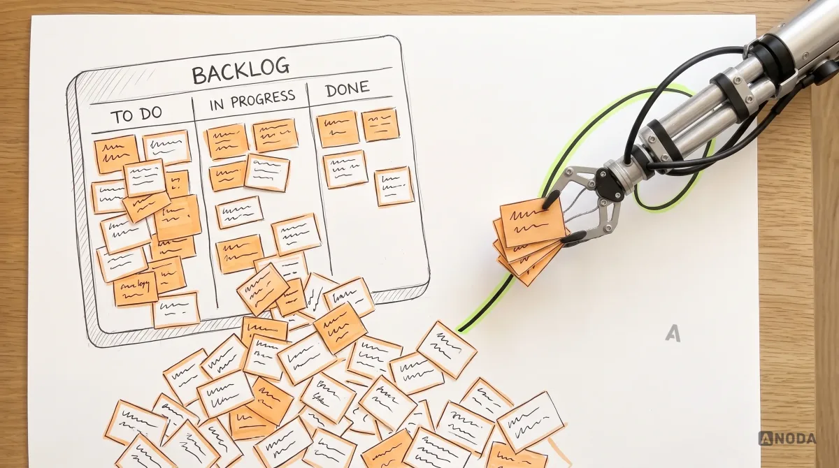
Most failed MVPs don’t fail because they were too small. They fail because they were a big product with the corners cut off: fifteen features, each half-finished, no onboarding, no empty states, no way to tell whether anyone got value. Users bounce, the team can’t tell whether the idea was wrong or the product was just hard to use, and the next six months are spent adding more half-finished features in the hope that one of them sticks.
ANODA keeps the first release focused without cutting the steps that make it valuable. We connect the hypothesis to a complete user journey, the supporting roles and a buildable design, so your budget buys a useful first product instead of a smaller version of the entire backlog.
This guide is about designing an MVP that can actually teach you something. It covers what an MVP is, what it isn’t, how to choose what to test, how to scope, which quality you can’t remove, the design process step by step, how to measure, and how to decide what to do next.
What MVP means in UX
In product terms, a minimum viable product is the smallest version of a product that can be released to real users to test a core assumption. In UX terms, the important word is not “minimum”. It’s “viable”. Viable means a real user can arrive, understand what the product is for, complete the core job, and get the value, without someone from the team sitting next to them explaining.
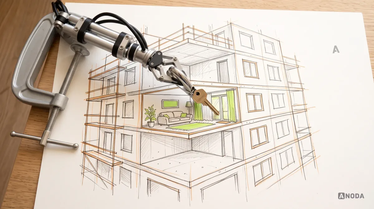
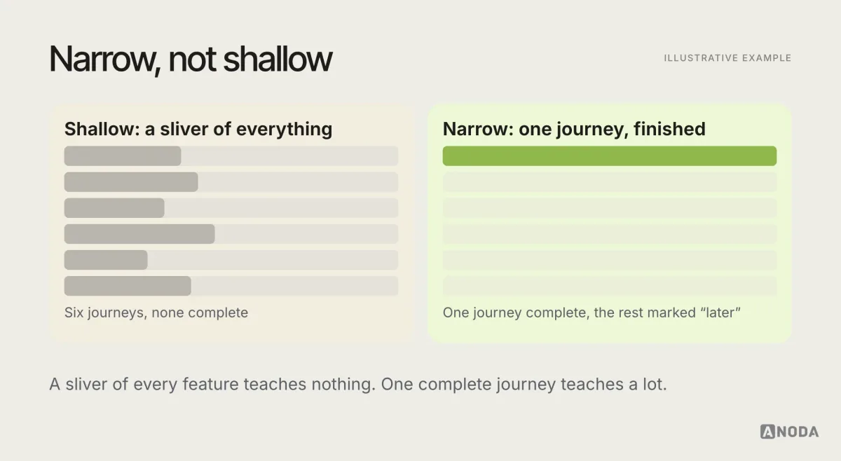
That changes what “small” means. A small MVP is narrow, not shallow. It does one job for one kind of user, and it does that job properly. Think of a show flat in a building still under construction. Only one apartment is finished, but it’s finished completely: you can walk in, open the taps, sit on the sofa and decide whether you’d live there. Nobody decides to buy from a floor of bare concrete with a sign saying “imagine the kitchen here”.
MVP vs prototype, proof of concept, beta and first release
Teams use “MVP” for several different things. Mixing them up leads to the wrong expectations and the wrong design effort.
| Artefact | Answers | Used by |
|---|---|---|
| Proof of concept | Can this be built at all? | The team |
| Prototype | Do people understand and want this? | Testers |
| MVP | Do real users get value from it? | Early real users |
| Beta | Is it ready for more people? | A wider group |
| First full release | Can it grow? | The market |
A proof of concept tests technical feasibility. It rarely has a user interface worth the name. A prototype simulates the experience to test comprehension and desirability, and it can be clickable but fake. An MVP is a working product in real use, which is the only way to observe real behaviour. A beta extends a product that works to more users to find problems at scale. A first full release is the product the business intends to grow.
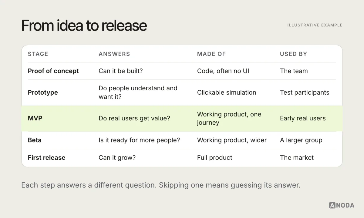
The practical point: you can test a lot with prototypes before you build anything. An MVP should only be built to answer questions a prototype can’t, such as whether people actually come back, pay, or complete the job with their own data.
Types of MVP experiments
Not every MVP has to be fully built software. The right format depends on what you need to learn and how much you can fake without changing the answer.
- Concierge MVP. You deliver the service manually to a few customers, often through email, calls or spreadsheets. Good for learning what customers actually need before designing any interface.
- Wizard of Oz MVP. Users see a real interface, but a person does the work behind it. Good for testing whether users want the result before investing in automation.
- Single-feature MVP. One capability, built properly, that delivers the core value. Good for testing whether the value holds up in real use.
- Piecemeal MVP. The product is assembled from existing tools, such as forms, payment links and no-code builders, joined by a thin custom layer. Good for testing the whole journey cheaply.
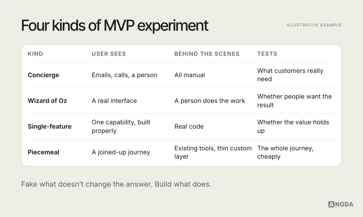
Each has UX work in it. Even a concierge MVP has a journey: how customers find you, what they’re asked, what they receive and how they come back. Designing that journey deliberately makes the learning much cleaner.
Start with one hypothesis
Every MVP should exist to test one explicit hypothesis. Not a vision, not a feature list: a statement that could turn out to be false.
A useful format:
We believe that [this user] has [this problem] and will [do this behaviour] if we give them [this solution]. We’ll know we’re right when [this signal] reaches [this threshold].
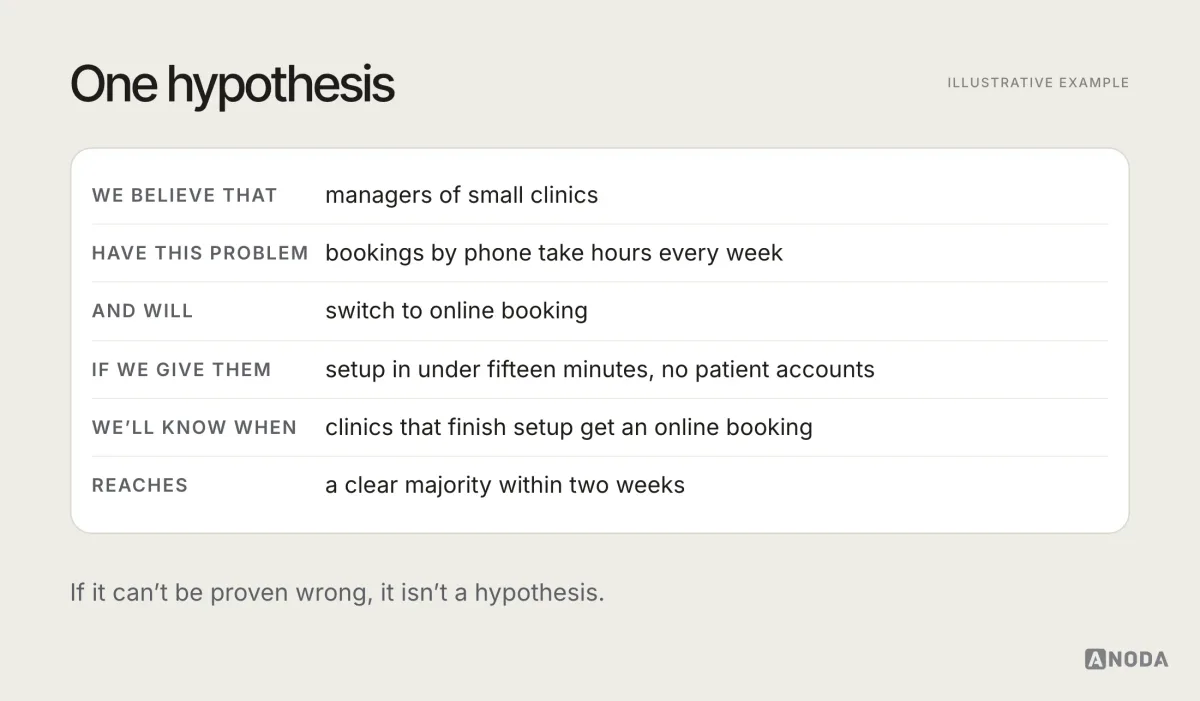
Writing the hypothesis down does three things. It tells designers what the experience has to make possible. It tells the team what to measure. And it makes the post-launch decision honest, because the threshold was agreed before anyone got attached to the result.
If the team can’t agree on one hypothesis, that is the first finding. UX research is often the fastest way to choose between competing ideas before any design effort goes into them.
Signs you’re building a first release, not an MVP
It’s easy to drift from an experiment into a full product without noticing. A few warning signs:
- The feature list keeps growing and nobody can say which item tests the hypothesis.
- Several user types are “primary”. Admins, end users, partners and managers all get their own flows.
- Launch keeps moving because “it isn’t ready yet” for reasons unrelated to the core journey.
- Settings and customisation appear before anyone has used the basic product.
- Nobody has written down what result would make the team stop.
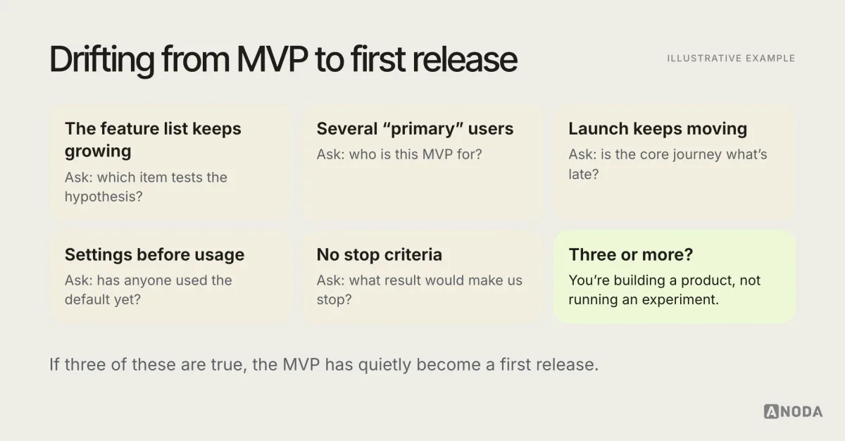
None of these are disasters on their own. Together, they usually mean the MVP has turned into a first release that will take months longer and teach less.
Choose the primary user
An MVP designed for everyone is designed for no one. Pick one primary user: the person whose problem is sharpest, who is easiest to reach, and whose behaviour will prove or disprove the hypothesis.
Describe them by their situation and job, not by demographics: what they’re trying to get done, what they use today, what makes the current way painful, and what would make them switch.
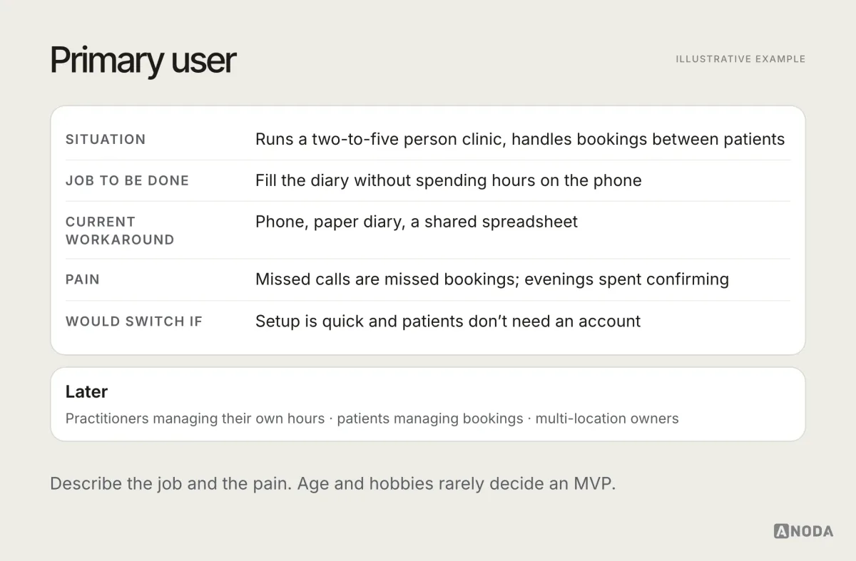
Secondary users still exist. Write them down, and write down that they are not the MVP’s audience. That single line prevents a lot of scope creep later.
Map the primary journey end to end
Once you know who and what, map the one journey the MVP must support, from the moment the user first hears about the product to the moment they get the value, and ideally the moment they come back.
A primary journey usually includes:
- Arrival: where the user comes from and what they expect.
- First understanding: what the product is and why it’s for them.
- Setup: the minimum needed before they can do anything useful.
- The core job: the task that delivers the value.
- The value moment: the point where the user sees the result.
- Return: what brings them back.
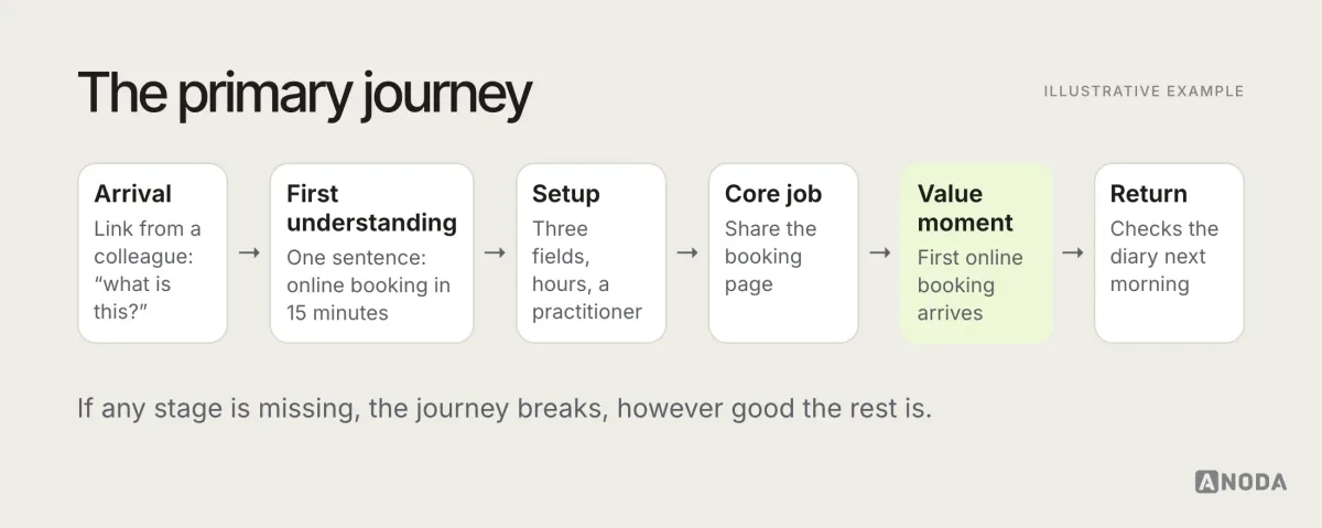
Every stage needs to exist in the MVP. They can be simple. They can’t be missing. A brilliant core feature behind a confusing sign-up is invisible, and a smooth sign-up that leads to an empty screen teaches users that there’s nothing here.
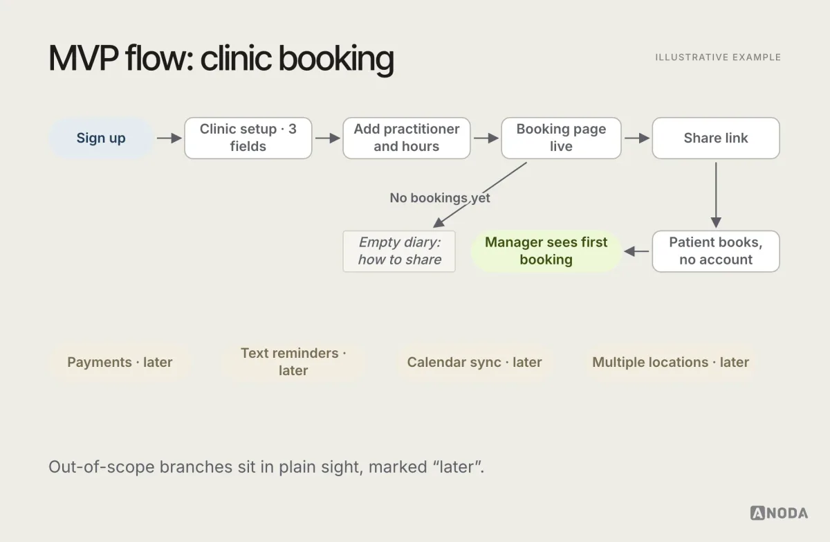
Then map the user flow for that journey in detail: every step, decision, error and state. Our guide to what a user flow is explains how. For an MVP, the flow is also the scope document: anything not on it isn’t in the release.
Scope: five or six capabilities, not fifty
With the hypothesis, the user and the journey defined, scope becomes a much easier conversation. For each proposed feature, ask: does the primary user need this to complete the primary journey and get the value? If not, it waits.
In practice, a handful of capabilities, often five or six, is usually enough to test a value proposition. That isn’t a rule, but it’s a useful alarm: if your MVP list has twenty items, you’re probably building a first release, not an experiment.
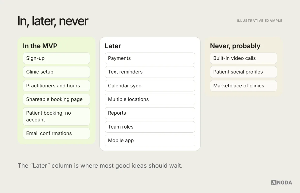
Write the exclusions down as clearly as the inclusions. “Not in the MVP: team accounts, integrations, custom reports, mobile app.” A written list of exclusions ends arguments quickly, and it becomes the roadmap for later phases once the evidence arrives.
Some useful ways to cut:
- Manual behind the scenes. Do by hand what you’ll automate later, if users won’t notice the difference.
- One platform first. Web or mobile, based on where the primary user works.
- One path, not every variation. Support the most common case properly; handle rare ones by contacting support.
- Defaults instead of settings. Choose sensible defaults; add options when users ask for them.
MVP design
Have an idea you can explain in two sentences?
We turn it into a scoped primary journey and a testable MVP design, with the hypothesis, the exclusions and the later phases written down.
What “minimum” means for different products
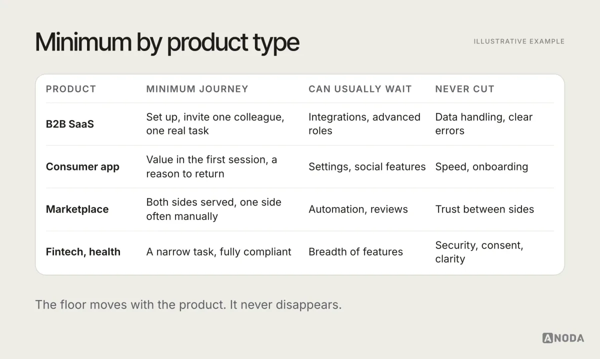
The quality floor is similar everywhere, but what counts as the minimum complete journey differs by product type.
B2B SaaS. Someone has to set up the account, invite at least one colleague if the product is collaborative, and complete one real piece of work with their own data. Integrations can often wait if data can be imported simply.
Consumer app. The first session has to deliver something useful or enjoyable quickly, without a long setup. Retention matters more than sign-ups, so the return trigger is part of the minimum.
Marketplace. Both sides have to be served, which makes marketplaces the hardest MVPs to scope. Often one side is served manually at first, so the team can focus the experience on the side that is harder to win.
Fintech and health. Trust, compliance and data handling are part of the minimum from day one. The scope is narrower, and the quality floor is higher.
A real MVP design: AispireMe
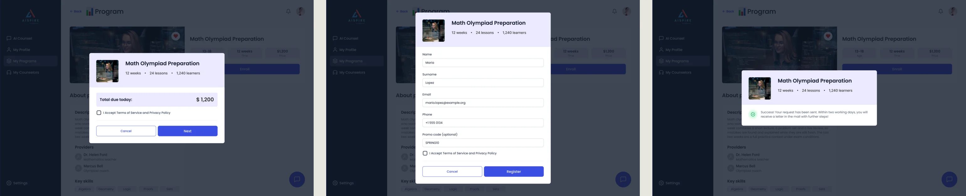
AispireMe shows what a complete design scope can contain even when the first version is bounded. ANODA designed the desktop web MVP for students, parents, counsellors and organisations: education and competitor research, role-based flows, screen maps, wireframes, UX/UI, a clickable prototype and a UI kit. The later design scopes include payment and subscription settings.
The useful example is the enrollment path. A family sees the program’s age, length and price, reviews the total, fills the application and receives a visible confirmation that the request was sent. The connected roles and the task’s outcome remain part of one product. The screen map, prototype and UI kit give the engineering team a connected flow to implement and test.
A multi-role product can have one primary learning question while still needing another person’s step to complete the value. In a marketplace, Wildcast’s campaign exchange illustrates the same dependency: an advertiser’s request needs a podcast offer and delivery path. Do not remove the other side of the task merely because it is a secondary audience. Use MVP design to define that scope and marketplace design when the exchange itself is the central UX problem.
Principles for MVP UX design
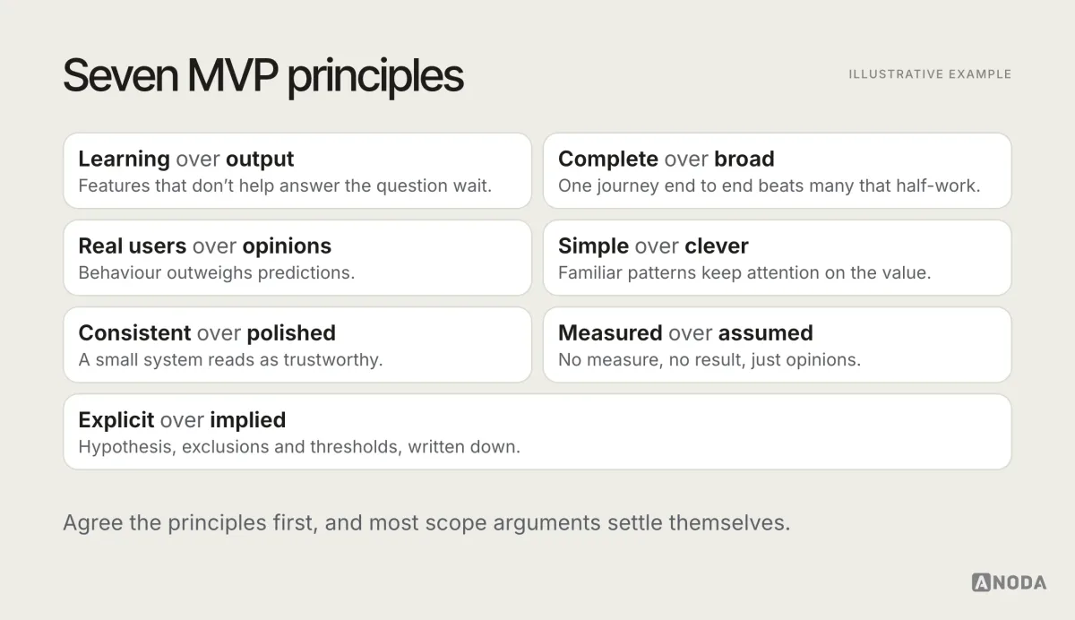
Most good MVP decisions follow from a handful of principles. They’re worth agreeing as a team before the scope conversation starts, because they settle most arguments in advance.
- Learning over output. The MVP’s job is to answer a question. Features that don’t help answer it wait.
- Complete over broad. One journey that works end to end beats many that half-work.
- Real users over opinions. What people do with the product outweighs what stakeholders predict.
- Simple over clever. Familiar patterns let users focus on the value, not on learning the interface.
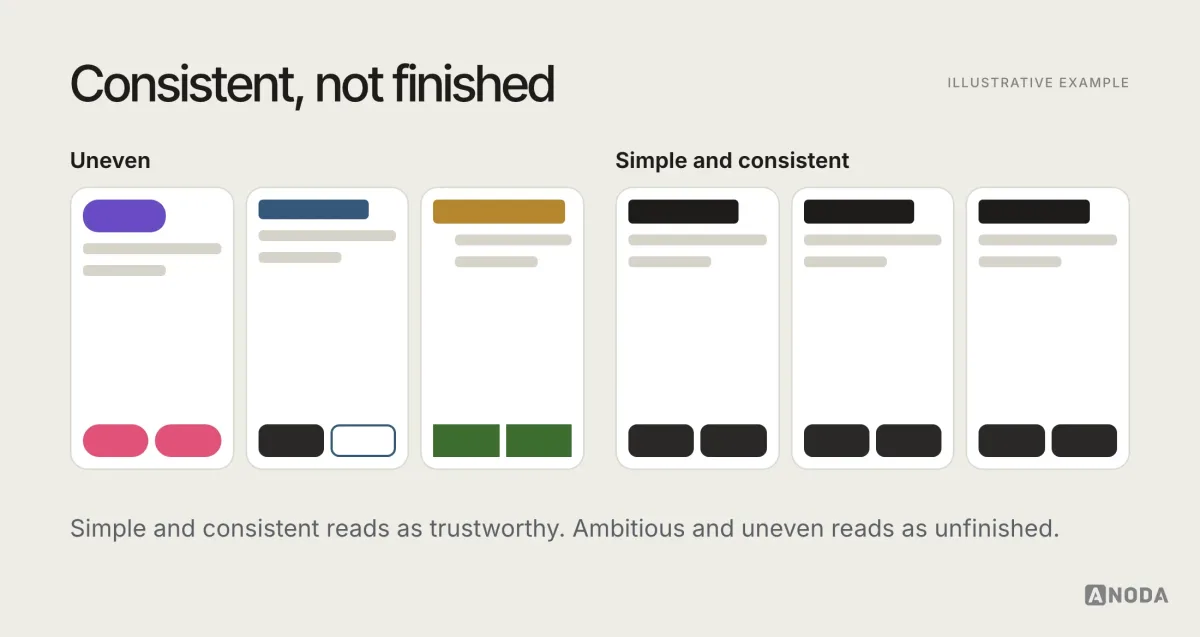
- Consistent over polished. A small, consistent system reads as trustworthy. Uneven polish reads as unfinished.
- Measured over assumed. If the core job isn’t measured, the result is a matter of opinion.
- Explicit over implied. Hypothesis, exclusions and thresholds are written down, not remembered.
The minimum quality you can’t remove
Cutting scope is healthy. Cutting quality from what remains is not. Some things are part of “viable”, and removing them turns the MVP into an experiment that measures the wrong thing.
The floor usually includes:
- Onboarding that reaches value quickly. Users should get to the value moment in the first session.
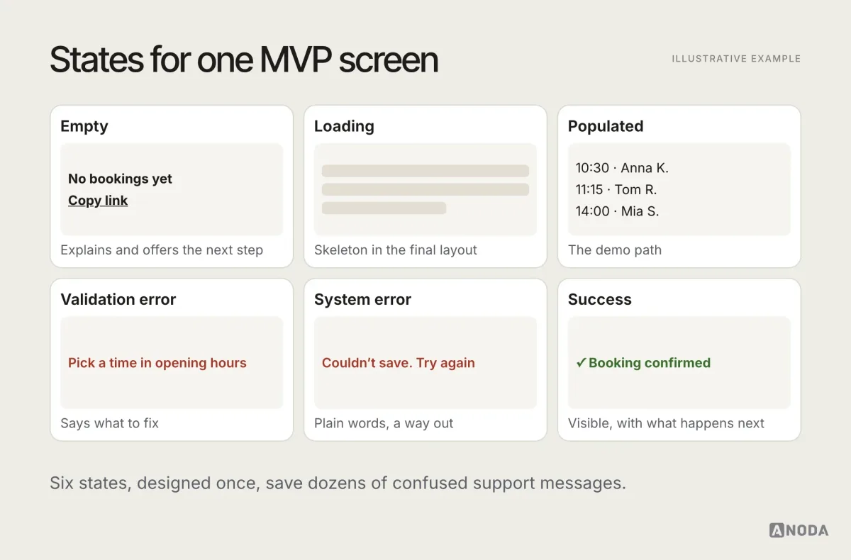
- A complete core flow, including errors, empty states and loading.
- Clear language. Labels and messages a new user understands without help.
- Trust signals appropriate to the product: who you are, how data is handled, how to get help.
- Basic accessibility: readable contrast, usable text sizes, keyboard and screen reader basics.
- Measurement of the core job, so the MVP can actually answer its question.
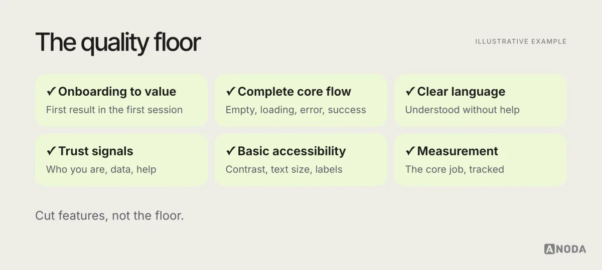
Polish is optional. Visual refinement, animations, delightful details, extensive settings: all of those can wait. The floor can’t, because without it you can’t tell whether users rejected the idea or just the rough edges.
The MVP UX design process, step by step
An MVP design process is a learning loop, not a production line. A practical sequence:
- Frame: hypothesis, primary user, primary journey, evidence thresholds.
- Research: just enough to confirm the problem and the job.
- Map: the user flow for the primary journey, with states and roles.
- Prototype: the journey at the lowest fidelity that tests the question.
- Test: with five or so people from the primary audience.
- Design: the screens and states, using a small, consistent component set.
- Build: with the flow as the scope document.
- Instrument: the events that measure the core job.
- Launch: to a small, reachable group of real users.
- Learn and decide: continue, change or stop.
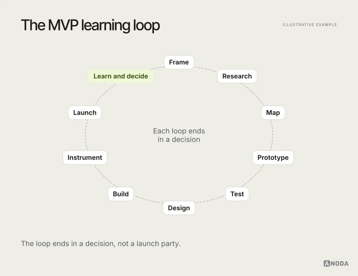
The steps overlap in practice, and some take hours rather than weeks. The order matters more than the duration: decide what you’re testing before you design, and design the flow before the screens.
Research: just enough
MVP research is not a six-month study. It’s the smallest amount of evidence that confirms the problem is real, the primary user has it, and they’d change their behaviour to solve it.
Useful methods at this stage:
- Problem interviews with people from the primary audience: how they do the job today, what it costs them, what they’ve tried.
- Observation of the current workaround, if possible.
- Existing data: support tickets, sales calls, search queries, competitor reviews.
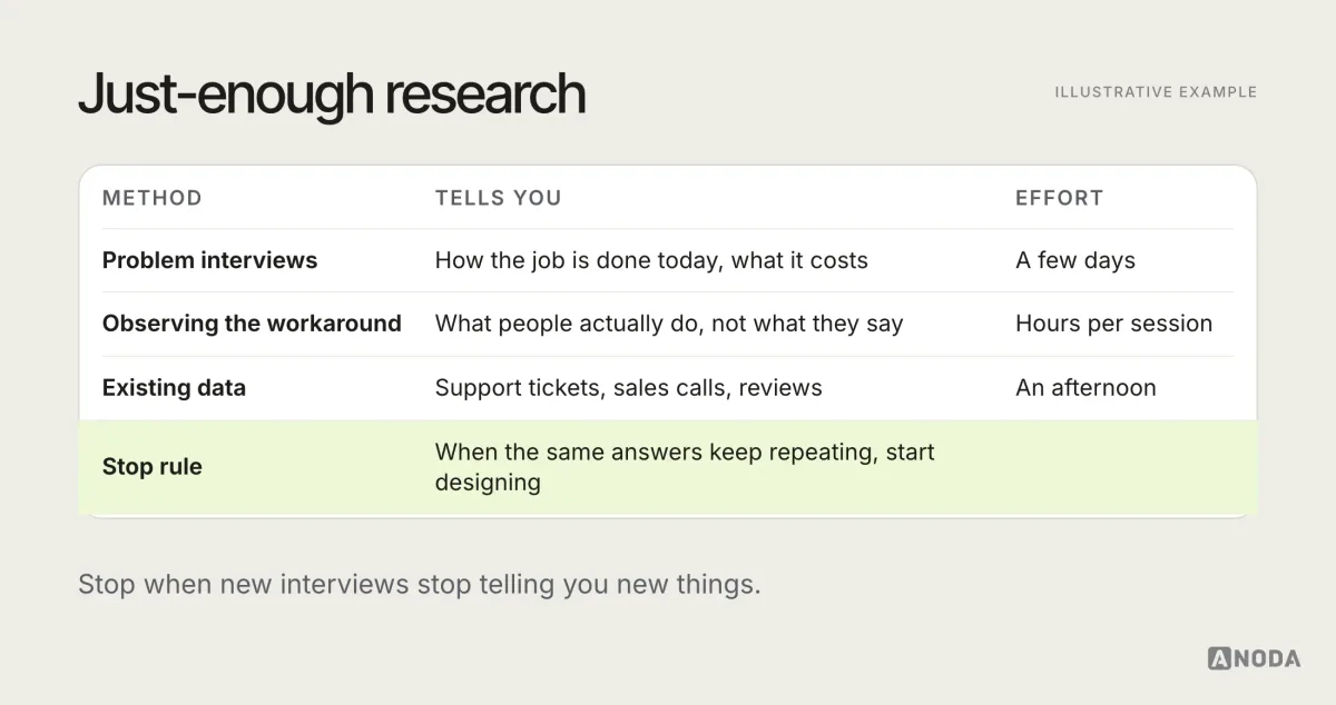
A good stop rule: when interviews keep repeating the same problems in the same words, you have enough to design. When they keep surprising you, the hypothesis probably needs rewriting before anything is built.
It also helps to decide early what you won’t research. At MVP stage, deep studies unrelated to the first learning question can wait. Pricing and secondary-role research belong now when payment or another person’s action is essential to the hypothesis. Research for later expansion can follow once the MVP shows the core idea works.
Flows before screens
Map the primary journey as a user flow before designing screens: every step, every decision, every error and empty state. For an MVP, the flow does double duty. It’s the design blueprint, and it’s the scope boundary: if it’s not in the flow, it’s not in the release.
Prototype at the right fidelity
Choose fidelity by the question you’re asking. Paper sketches and wireframes answer “does the flow make sense?”. Clickable mid-fidelity prototypes answer “can people complete the task?”. High fidelity is only needed when visual trust or brand perception is part of the hypothesis.
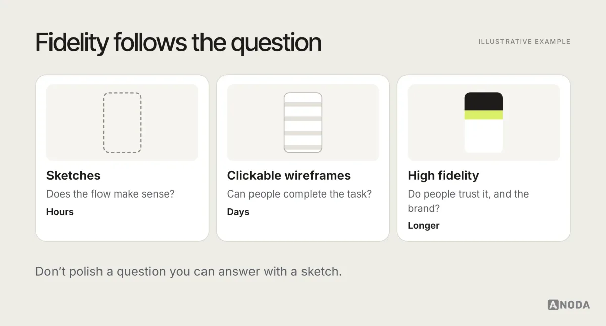
AI tools make high-fidelity prototypes fast to produce, which is a trap as much as a help. A polished prototype invites feedback on colours and fonts. A rough one keeps the conversation on whether the flow works.
Test with the primary audience
A small round with relevant participants can reveal important usability problems in the core task. Recruit for the roles and situations the flow must support, fix what you find and repeat when material questions remain. Watch what they do, not what they say they’d do.
A simple test plan for an MVP:
- One realistic scenario matching the primary journey.
- Three to five tasks, from first understanding to the value moment.
- What to watch: where people hesitate, misread, go back or give up.
- What to ask afterwards: what they expected, what they’d use it for, what would stop them.
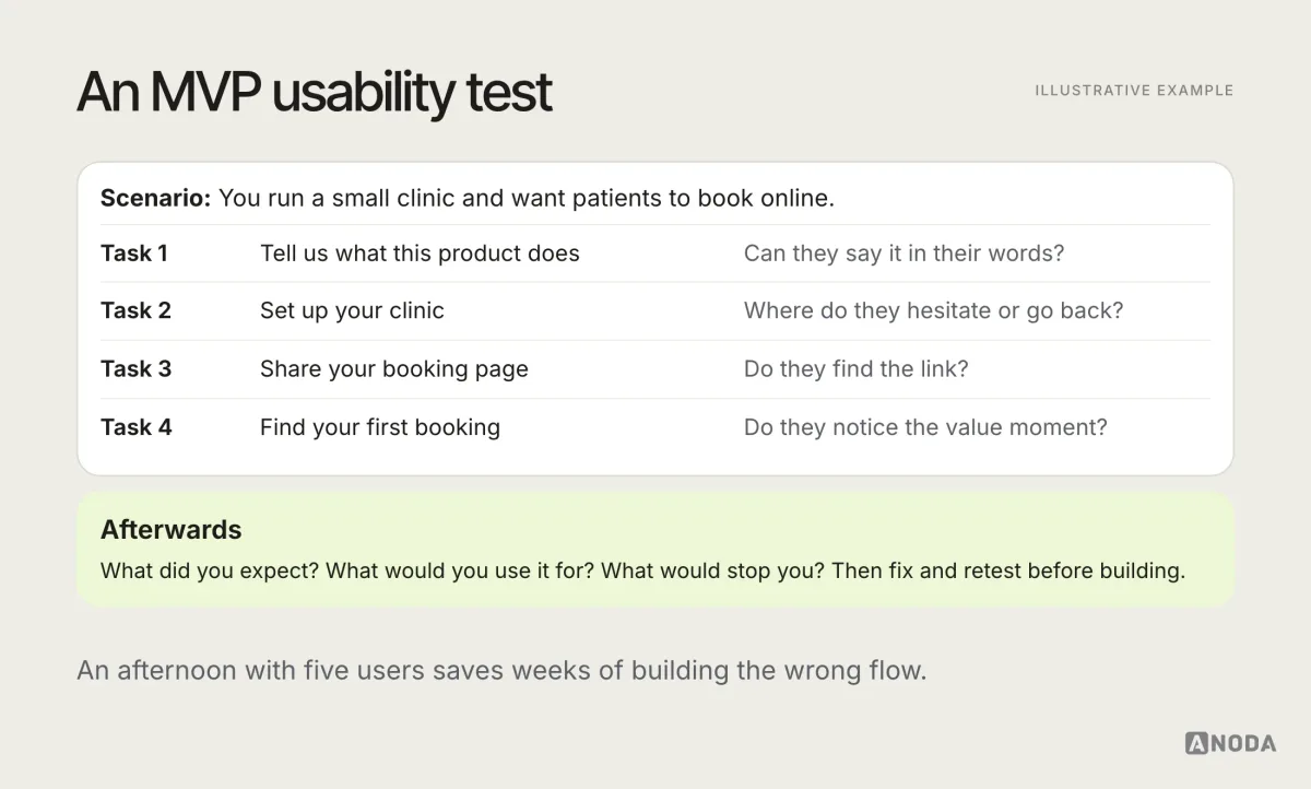
Fix what you learn, and retest if the changes are significant. It’s much cheaper to change a prototype than a built product.
Design with a small, consistent system
MVP screens should be designed from a small, consistent set of components: a type scale, a colour palette with accessible contrast, buttons, fields, lists, cards, dialogs and the states for each. That’s enough for most MVPs, and it makes design and build faster and more consistent.
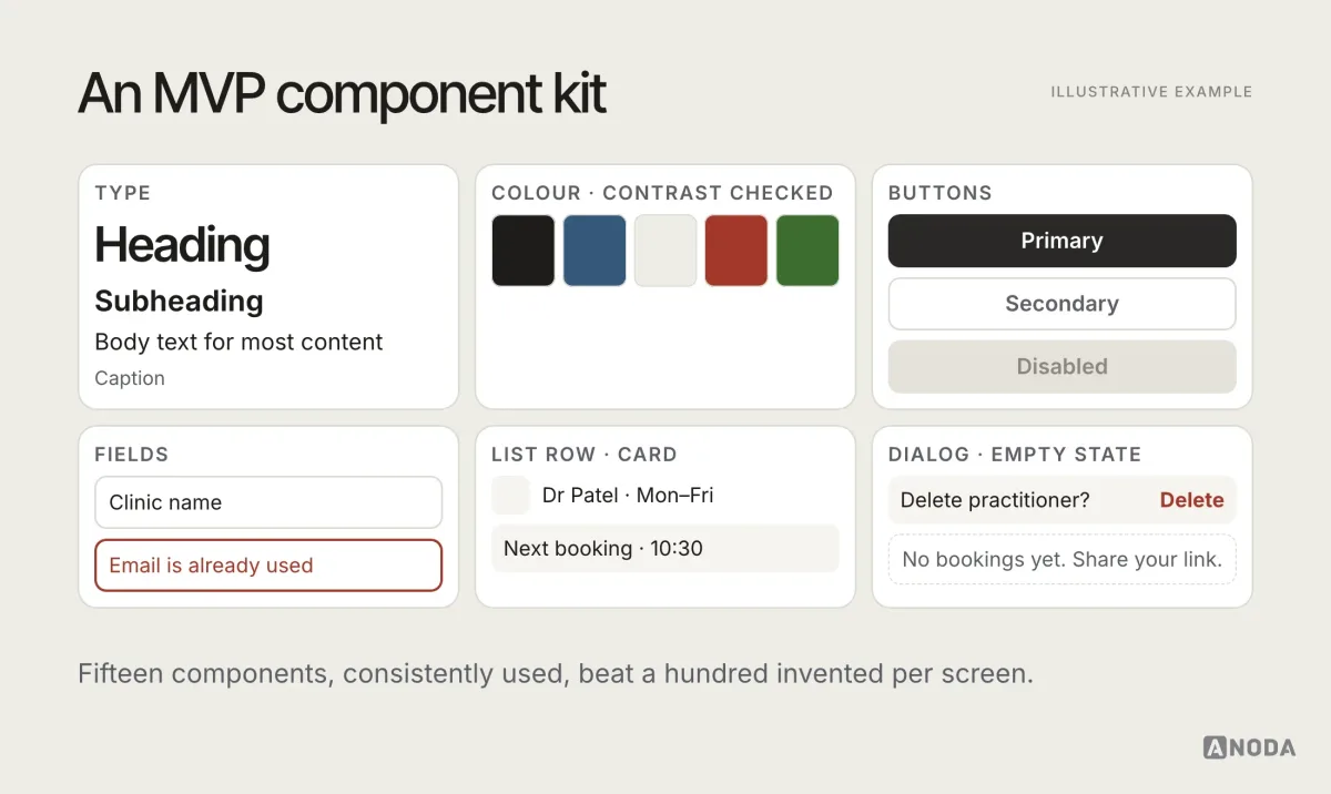
Brand matters at MVP stage too, but consistency matters more than finish. A simple, consistent visual identity builds more trust than an ambitious one applied unevenly.
Onboarding: get to value in the first session
Onboarding is where most MVPs lose people. The team knows the product so well that setup feels obvious. New users don’t, and they leave before they see the value.
For an MVP, onboarding should do three things: explain the product in one sentence, ask only for what’s needed to deliver the first result, and get the user to that result in the first session.
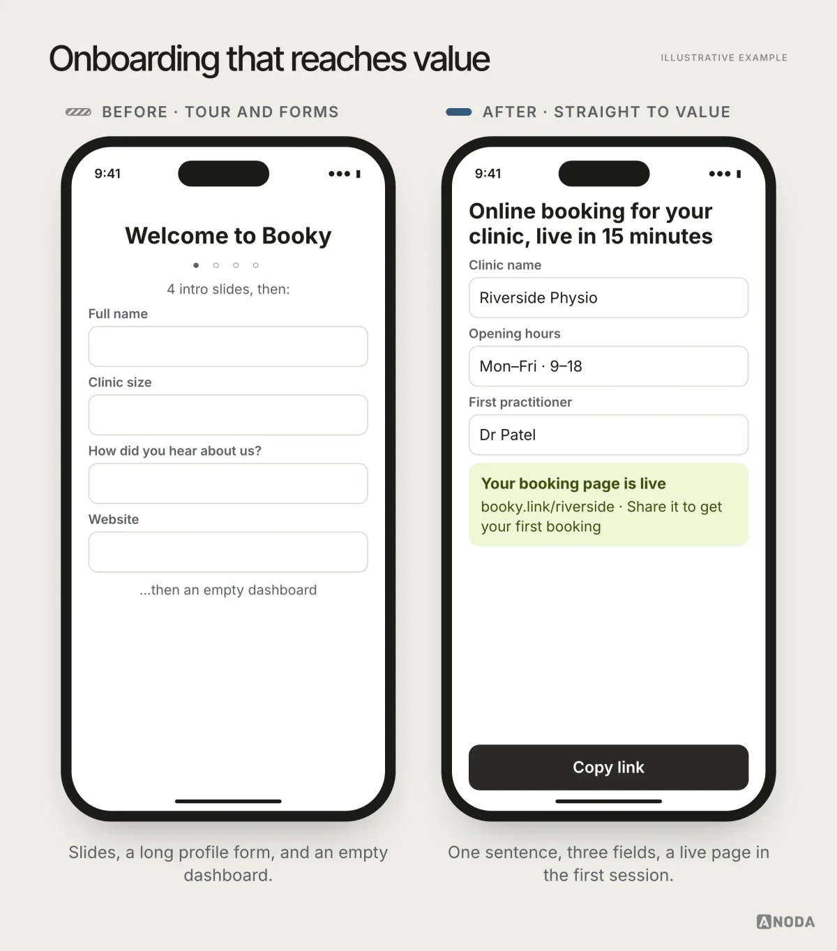
Useful techniques: sample data so the product isn’t empty, a guided first task instead of a tour, and deferring optional setup until the user has a reason to do it.
Watch the first sessions of real users closely. Where they pause, what they skip, which field they abandon: onboarding problems show up in the first days, and they’re among the cheapest to fix. Every improvement here multiplies, because every later signal depends on users getting through the door.
The core flow, complete
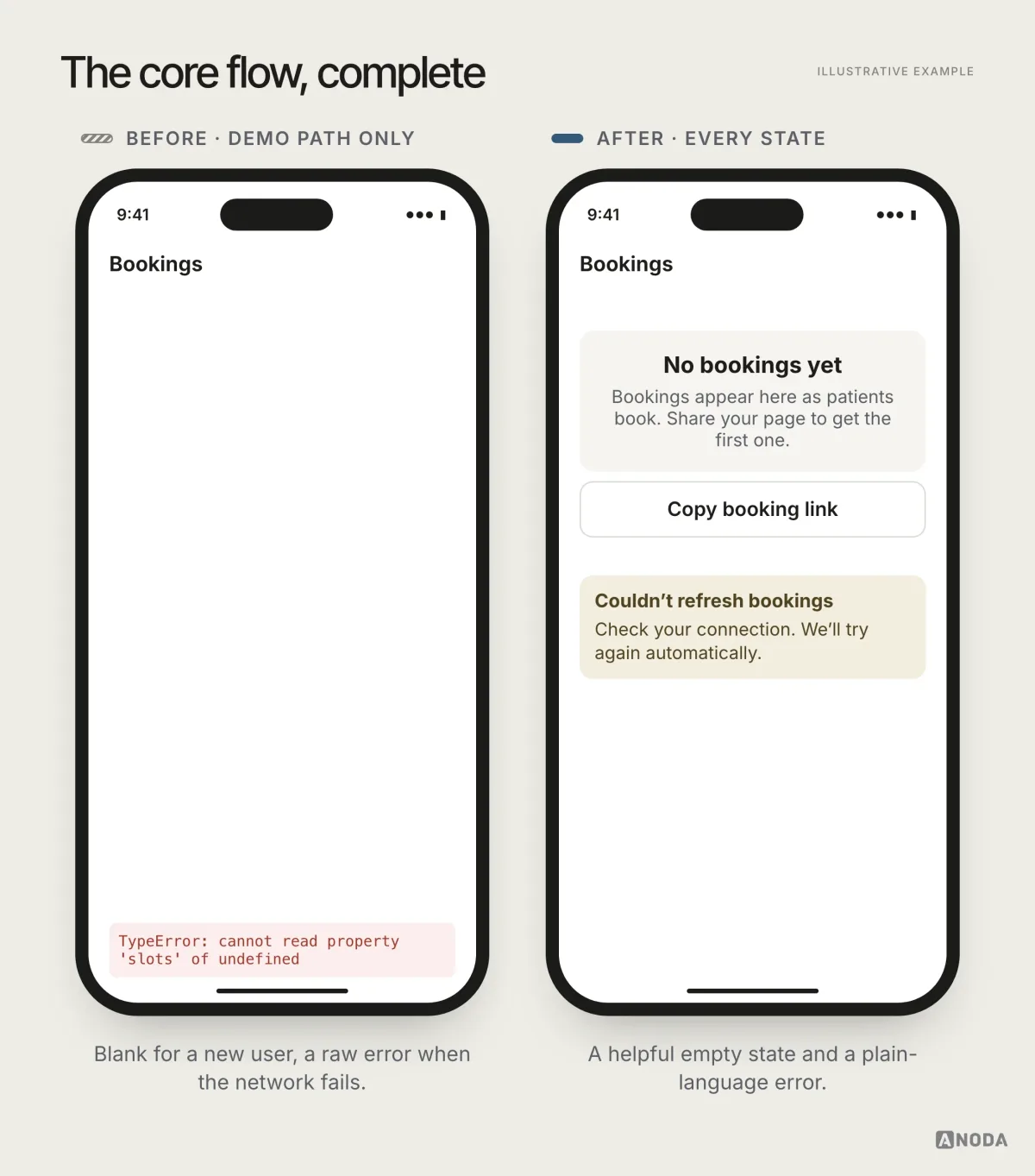
The core flow is the job the MVP exists to do. It needs to work in every state, not just the demo path. That includes what happens when there’s no data yet, when something fails, when the user makes a mistake, and when the task takes longer than expected.
Design the value moment
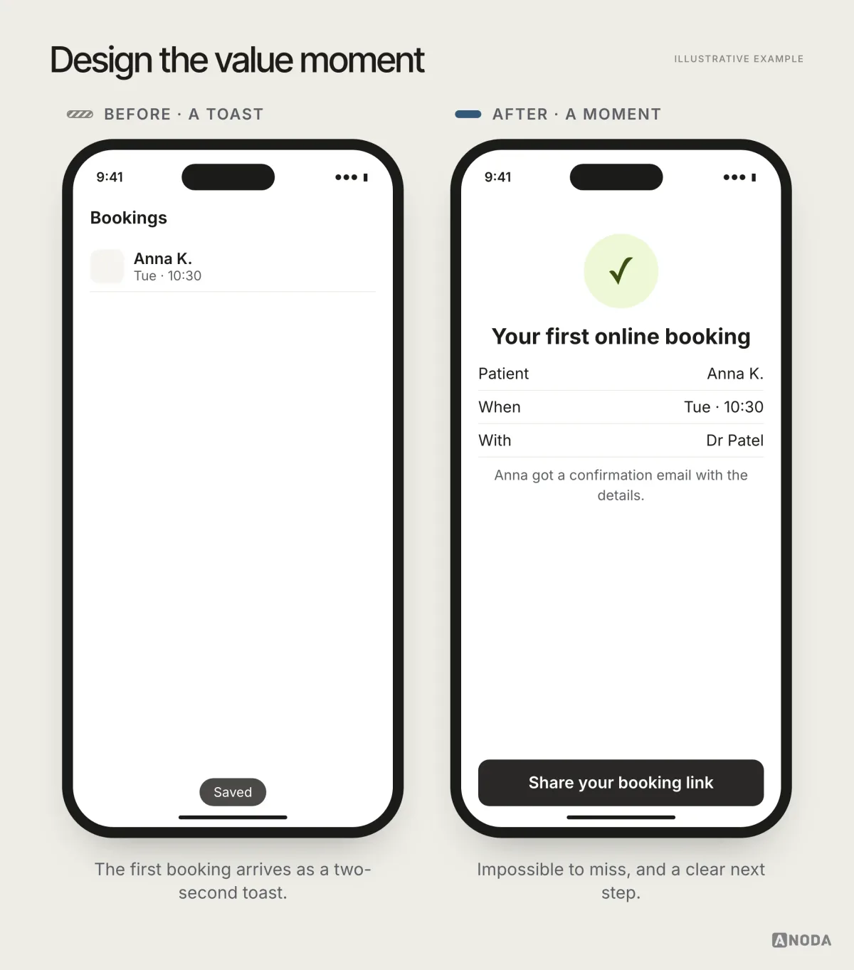
The value moment is the point where users see what the product does for them: the first report, the first booking, the first saved hour. Everything before it is cost. Everything after it depends on it.
Design it deliberately. Make it visible, make it specific to the user’s own data where possible, and make the next step obvious. “Your first booking is confirmed. Share your booking link to get more” is a value moment with a path forward. A silent success toast that disappears in two seconds is a wasted one.
Trust signals
Early users are taking a risk on an unknown product. Small signals make that risk feel smaller: a clear explanation of what the product does, who is behind it, how their data is used, how to get help, and what happens if they leave.
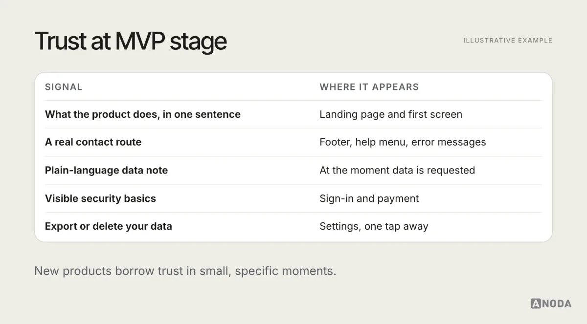
For products handling money, health or personal data, trust is not optional polish. It’s part of whether the MVP can test anything at all.
Words matter more when there’s less product
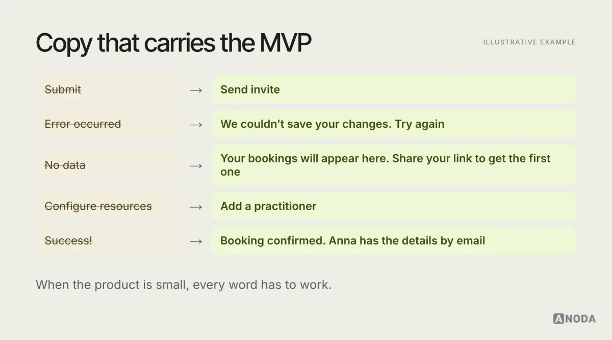
With fewer features and little brand recognition, the words in the interface carry a lot of weight. They explain what the product does, what to do next and what went wrong. In an MVP, unclear copy is often the difference between a user who gets the value and one who gives up.
A few principles: name things the way the primary user names them, write buttons as actions (“Send invite”, not “Submit”), explain errors in plain language with a way forward, and use empty states to tell people what will appear there and how to make it happen.
Accessibility at MVP stage
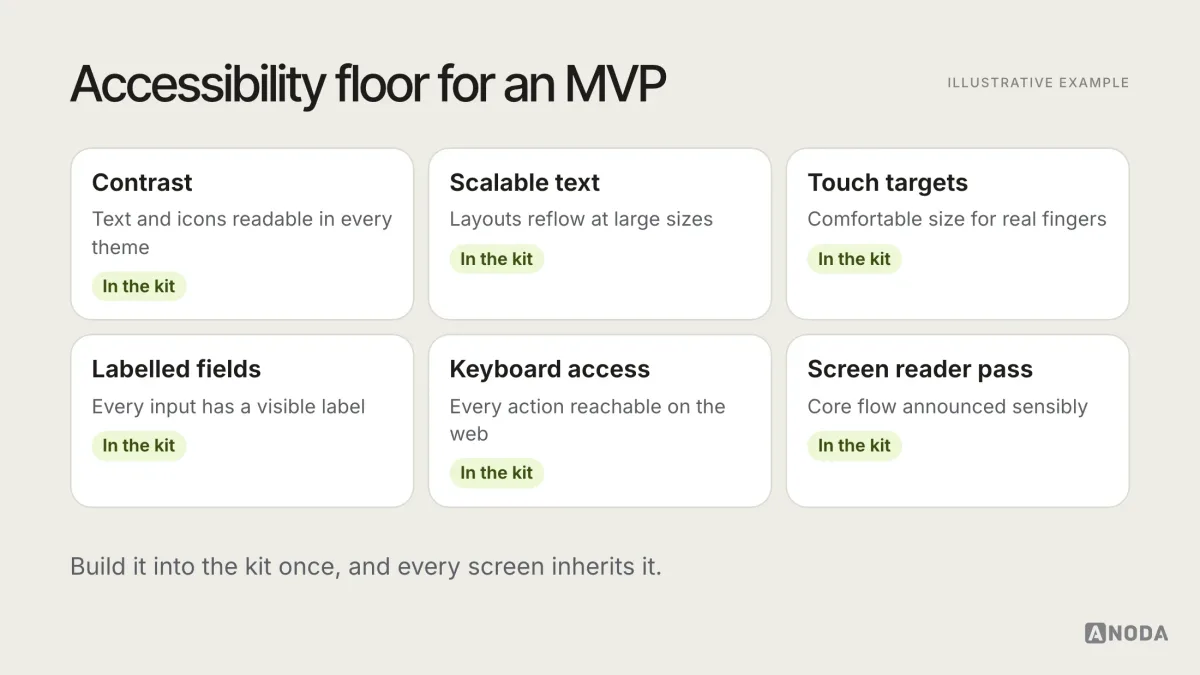
Accessibility is often postponed as “polish for later”. That’s a mistake for two reasons. Retrofitting is much more expensive than building it in. And an inaccessible MVP excludes some of the users whose behaviour you’re trying to measure.
Set the accessibility review scope from the audience, product risk and required tasks. The core experience needs the basics, done consistently: readable contrast, text that scales, touch targets of a reasonable size, labels on form fields, keyboard access on the web, and a quick screen reader pass through the core flow.
Pricing and payment in an MVP
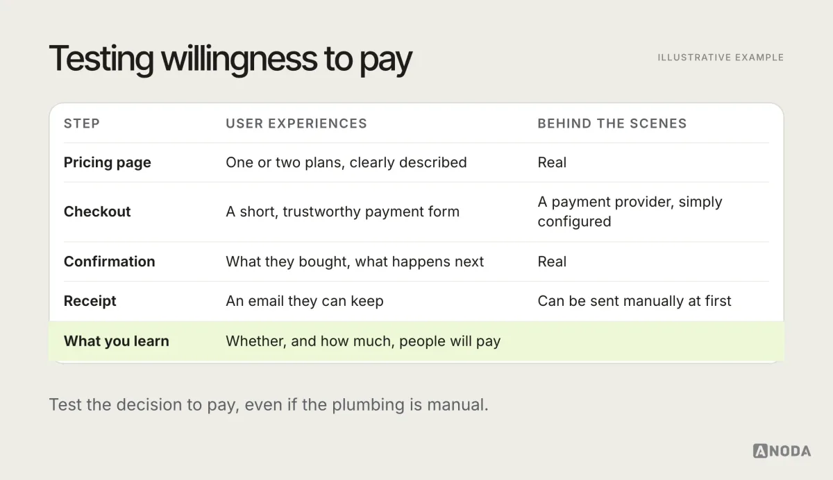
If willingness to pay is part of the hypothesis, the MVP needs to test it, and that has UX consequences. A pricing page, a checkout and a receipt are part of the primary journey, even if the payment is processed manually behind the scenes at first.
Keep it simple: one or two plans, clear about what’s included, with a payment flow that works and inspires trust. Avoid designing an elaborate pricing structure before you know what customers value. The goal at MVP stage is to learn whether and how much people will pay, not to optimise revenue.
Instrument the core job
An MVP that isn’t measured is a launch, not an experiment. Before release, decide which events tell you whether users complete the core job, and make sure they’re tracked.
A minimal event map follows the primary journey:
- Arrived and signed up.
- Completed setup.
- Started the core task and completed it.
- Reached the value moment.
- Returned within the expected period.
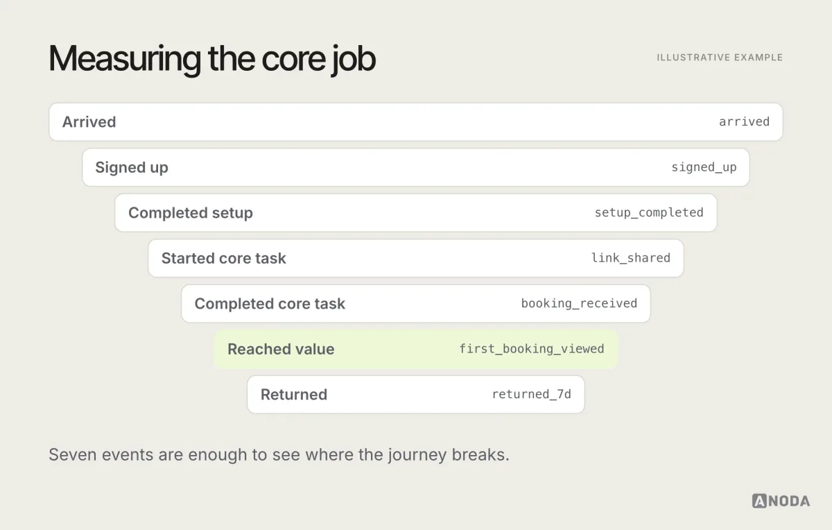
Combine the numbers with qualitative signals: short interviews with early users, session recordings where appropriate and consented to, support messages and in-product feedback. The numbers tell you where people drop. The conversations tell you why.
Just as important is what not to measure, or at least not to obsess over. Page views, total sign-ups and time in app can all go up while the MVP is failing: people can arrive, sign up and wander around without ever getting the value. Vanity numbers make good investor updates and bad decisions. Keep the dashboard focused on the core job and the return visit.
Evidence thresholds: continue, change or stop
The most important decision about an MVP is made before it launches: what result will make you continue, what will make you change direction, and what will make you stop.
For each key signal, set a threshold in advance. For example, for an illustrative product:
- Continue if a clear majority of users who complete setup also complete the core job, and a meaningful share come back unprompted.
- Change if users complete setup but not the core job, or complete the job but don’t return: the idea may be right and the experience wrong, or the other way round.
- Stop if users don’t complete setup even after the onboarding has been fixed, and interviews show the problem isn’t painful enough.
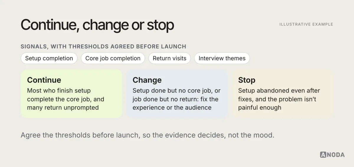
The exact thresholds depend on the product, the audience and the business model. What matters is that they’re written down before launch, so nobody moves the goalposts once the results arrive.
A final note on thresholds: they’re a decision tool, not a verdict on the team. An MVP that ends in “stop” has done its job well if it got there quickly and cheaply. The expensive failure is the one that never produces a clear answer, because nothing was measured, the goalposts moved, or the product was too broad to tell what worked. Treat a clear negative result as money saved, not effort wasted.
Gathering feedback that you can act on
Early users are an MVP’s most valuable resource. Make it easy for them to tell you things, and make sure what they say reaches the people deciding.
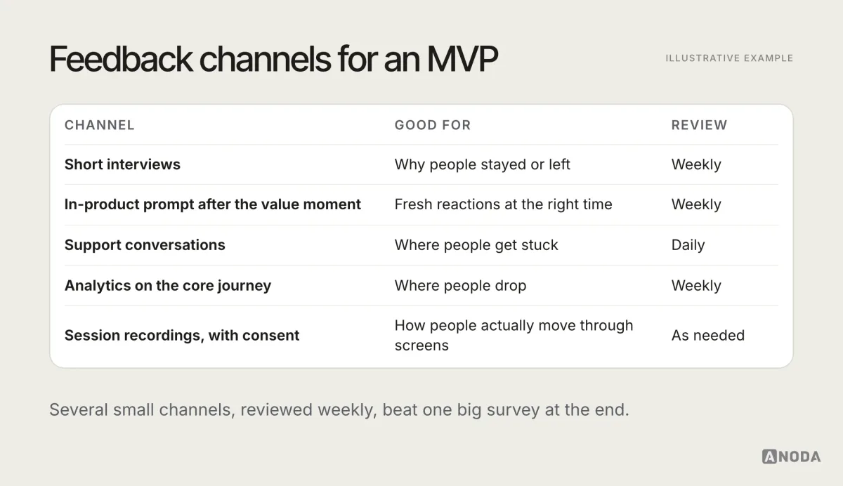
A few practices that help:
- Ask at the right moment. Right after the value moment, not on the first screen.
- Talk to people who left, not only to those who stayed.
- Tag and group feedback by journey stage, so patterns become visible.
- Close the loop with users when you act on what they told you. Early users become advocates when they see their feedback matter.
Keep an eye on who is giving feedback, too. Early users who love the product are encouraging, but they are often the most tolerant of rough edges. The users who struggled, gave up or never came back hold the most useful information about what stops the product from working for everyone else. A short, polite message asking a churned user what happened often gets a surprisingly honest answer.
Iterate in short cycles
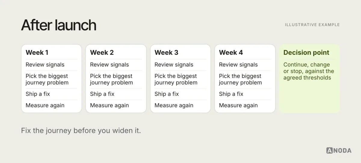
After launch, work in short cycles: look at the signals, pick the biggest problem in the primary journey, fix it, measure again. Resist the urge to add features before the core journey works. A new feature on top of a broken journey only adds a new place for users to get lost.
If the MVP is live and producing behaviour you can’t explain, a focused UX audit of the primary journey is often the fastest way to see where and why people struggle.
Handing the MVP design to the build
The handoff from design to engineering is where MVP scope tends to grow or shrink by accident. A clean handoff includes the flow as the scope document, every state for every screen, the component kit, the events to instrument and the written exclusions.
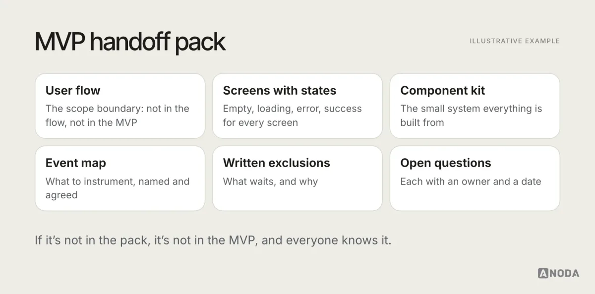
Walk engineering through it in person. Questions asked at the handoff cost minutes. The same questions asked in the middle of the build cost days, and the answers are usually improvised under deadline pressure.
Make build dependencies explicit before estimating the MVP
For each dependency needed by the core journey, record the owner, test access, required data and failure behavior. Use a short register:
| Dependency | Decision needed before estimation | Recovery to include |
|---|---|---|
| Platforms and device capabilities | Which platforms are required for the first task, and which device functions must work? | State what remains possible when a device permission is denied or a capability is unavailable. |
| Roles and permissions | Who can create, approve, change or view the core record? | Include an unauthorized action and the route to the right responsible person. |
| External integration | Who provides the API, access, test environment and response contract? | Specify timeout, rejected response, retry and the manual fallback where one is allowed. |
| Existing data | Which records are required, who owns them and how will they be checked? | Handle missing or conflicting records without silently overwriting history. |
| Learning event | Which completed action will show that the first release answered its hypothesis? | Define failed and abandoned attempts as well as successful completion. |
Keep each dependency connected to the actual MVP flow. Do not include another integration merely because it is available; resolve what the first release needs to learn and support.
Keeping stakeholders aligned
MVPs attract opinions: investors, advisers, early customers and team members all have ideas about what should be in the first version. Most of them are reasonable. Most of them should still wait.
The one-page brief and the written exclusions are the best tools here. When someone proposes a new feature, the question is simple: does it help test the hypothesis for the primary user? If yes, something else probably comes out. If no, it goes on the “later” list, visibly, with a note on what evidence would bring it forward. People accept “not yet, and here’s when” far more easily than “no”.
Share progress in terms of the hypothesis, too. “Seven of the first ten clinics finished setup, three got a booking” is a more useful update than “we shipped twelve screens”.
Reach the first users and leave room for iteration
Plan distribution while the first release is being scoped. Name the audience, the promise, the channel that reaches them and the first useful action. A silent launch cannot test whether the idea is valuable if the intended users never find it. A waitlist tests interest in a promise; the working MVP tests the delivered task.
Reserve time and budget after launch for operation, user conversations and a meaningful correction. Scope the build from what remains, rather than spending the entire budget on the first version and leaving no capacity to act on its answer. Keep a release boundary with inclusions, exclusions, acceptance checks and a named decision owner. New scope changes that boundary through an explicit decision.
Product discovery resolves audience, alternatives and open assumptions before the build. Once the flow and dependencies are agreed, MVP development carries them into implementation without turning the release into an untested platform.
Who needs to be involved
An MVP is a team effort, and small teams mean each role covers more ground. Typically:
- A product lead (often a founder) owns the hypothesis, the scope and the decision.
- A product designer owns the journey, the flows, the prototype and the experience quality.
- Engineers own feasibility, the build and the instrumentation.
- Early users are part of the team in all but name.
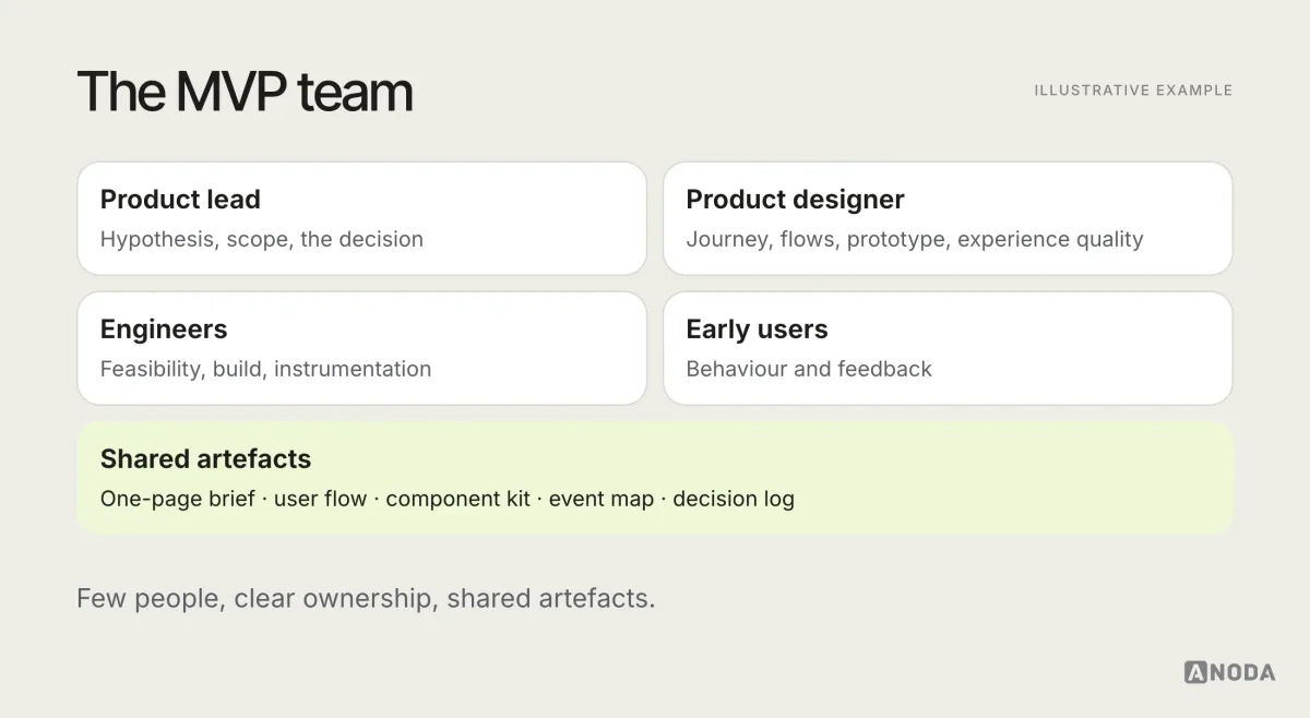
The most important collaboration habit is showing engineering the flow before the screens are polished. A ten-minute feasibility conversation early can save a week of rework later, and sometimes reveals a simpler way to deliver the same value.
Small teams also need to protect focus time. An MVP team that spends half its week in meetings about future features is not learning from the current one. A weekly review of the signals, a clear owner for each decision and a short list of what’s being worked on now are usually enough structure for a team of this size.
Brand at the MVP stage
An MVP doesn’t need a finished brand. It does need to look intentional and consistent, because early users judge trustworthiness quickly. A simple logo, a clear typographic choice, a small palette with good contrast and a consistent tone of voice are enough.
AI makes building faster, not scope smarter
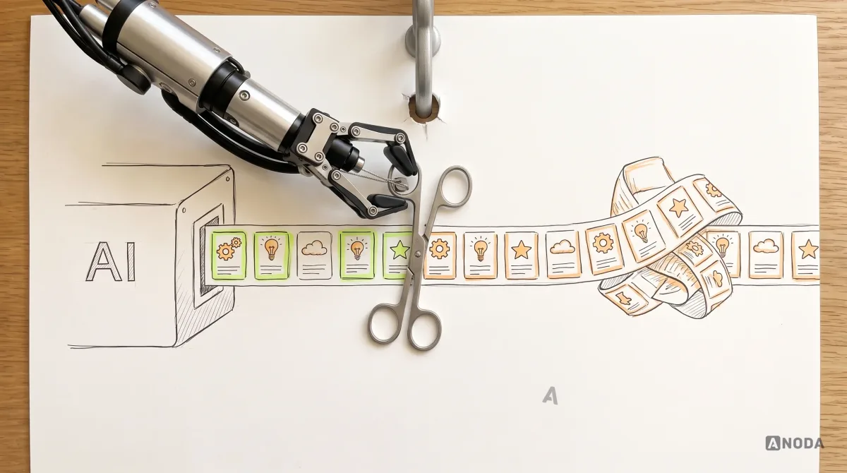
AI tools can now generate screens, components and working code quickly. That’s a real advantage for MVPs: prototypes and first builds take less time. It also removes a natural brake. When building felt expensive, teams were forced to choose. When it feels cheap, it’s tempting to build everything.
That’s the trap. An MVP’s value comes from what it can teach you, and every extra feature makes the lesson harder to read. Faster production doesn’t change which hypothesis you’re testing, which user you’re serving or which journey needs to work. It just lets you get to the answer sooner, if you keep the scope bounded.
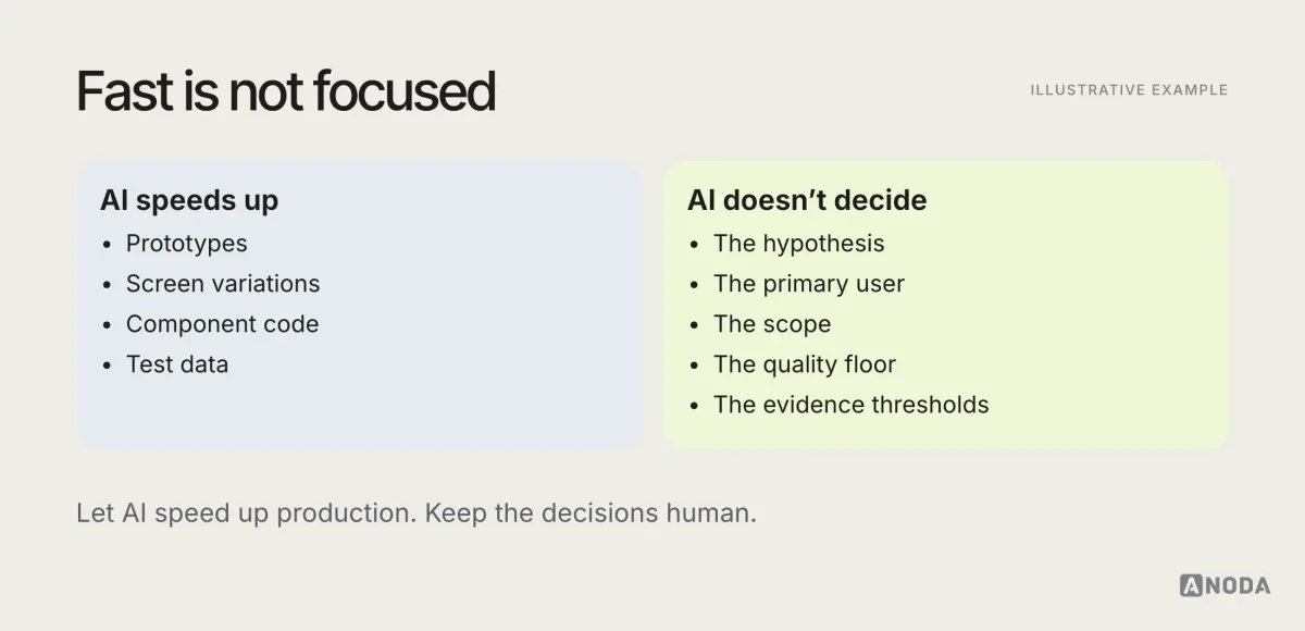
Generated interfaces also tend to skip the same things: empty states, error states, accessibility and clear copy. Those are exactly the parts of the quality floor an MVP can’t drop.

MVP development
Scope agreed? Let’s build it without losing the lesson.
We take validated MVP scope into a working product, with the primary journey complete, the core job instrumented and the iteration plan ready.
A worked example: from hypothesis to decision
To tie the steps together, here is an illustrative MVP for a booking tool for small clinics, the example used in several diagrams above.
The hypothesis. Managers of small clinics who take bookings by phone will switch to online booking if setting it up takes under fifteen minutes and patients can book without creating an account. The team agrees that the idea is supported if a clear majority of clinics that finish setup receive at least one online booking in their first two weeks.
The primary user. The clinic manager, not the practitioners or the patients. Patients are a secondary audience in the scope, but their booking task is essential to complete the manager’s value and must be designed and checked.
The scope. Sign-up, clinic setup with three essential fields, adding practitioners and their hours, a shareable booking page, a patient booking flow without an account, and email confirmations. Out: payments, reminders by text message, calendar integrations, multiple locations, reports.
The quality floor. A guided setup that reaches a live booking page in the first session, an empty state that explains how to get the first booking, clear errors on the booking page, a plain-language note about patient data, and basic accessibility on the patient flow.
The measurement. Events for sign-up, setup complete, booking page shared, first booking received and return visit, plus short calls with the first clinics.
The decision. After the agreed period, the team looks at the thresholds. If clinics finish setup but don’t get bookings, the problem might be sharing the link, not the idea. That’s a “change” result, and the next cycle focuses on sharing, not on adding payments.
The example is simple on purpose. Real MVPs are messier, but the structure holds: one hypothesis, one user, one journey, a written scope, a quality floor, a measurement plan and a decision rule.
Speed and quality are not opposites
Founders often frame the MVP as a trade-off: move fast or build it properly. In UX terms, that trade-off is mostly false. The fastest way to learn is a narrow product that works, because users can actually use it and the results mean something.
What slows MVPs down is not quality on the primary journey. It’s scope: extra features, extra user types, extra platforms, extra settings. Cut those, and there is usually time to make the core journey solid. Keep them, and neither speed nor quality survives.
Questions founders ask
Can we skip research and just build? You can, and sometimes the idea is clear enough. But a few problem interviews take days, not weeks, and they often change which journey the MVP should focus on.
Should the MVP be mobile or web? Wherever the primary user does the job. For many B2B products that’s the web; for many consumer products it’s mobile. Building both at MVP stage doubles the work before you know if the idea holds.
How long should we run the MVP before deciding? Long enough for users to complete the core job and have a reason to return, which depends on how often the job happens. A daily task needs weeks; a monthly one needs longer. Decide the period in advance.
What if the results are mixed? They usually are. That’s why the thresholds matter, and why qualitative signals help: they tell you whether the problem is the idea, the audience or the experience.
After the MVP: from experiment to product
A successful MVP is the start, not the finish. Once the evidence supports continuing, the work changes character. The product needs to serve more users, more cases and more of the journey, and the quality floor rises with it.
A sensible sequence after a positive result:
- Stabilise the primary journey. Fix the issues early users hit most often.
- Widen carefully. Add the “later” items in the order the evidence suggests.
- Invest in the system. Grow the component kit into a design system as the product grows.
- Raise the floor. Deeper accessibility, performance, security and support.
- Keep testing. Each new capability gets its own hypothesis and measure.
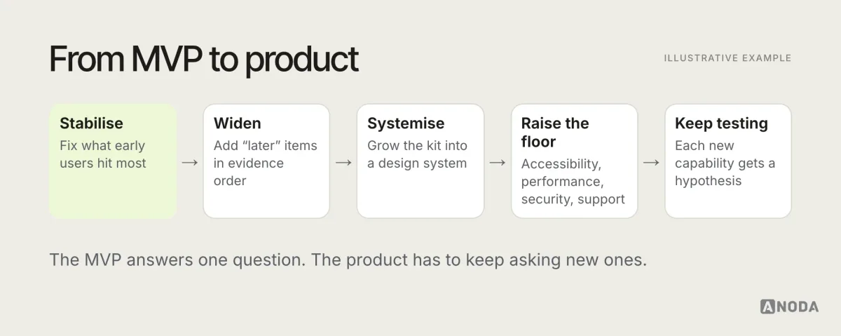
If the evidence says change, go back to the hypothesis and the primary user, not straight to the feature list. If it says stop, that’s a result too: the MVP did its job by saving you from building the full product.
The MVP UX mistakes that waste a first release
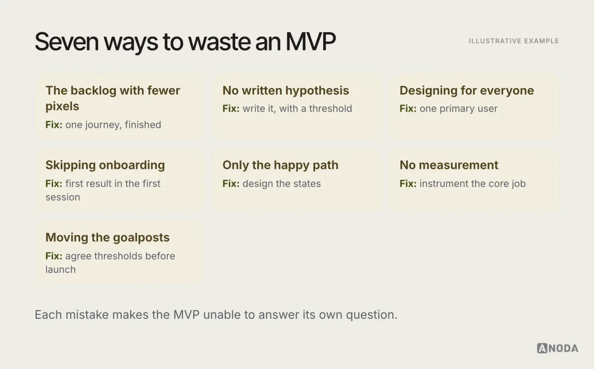
- The backlog with fewer pixels. Many features, none complete. Fix: one journey, finished.
- No written hypothesis. The MVP can’t prove anything, so every result looks like success. Fix: write it, with a threshold.
- Designing for everyone. The experience fits no one well. Fix: one primary user.
- Skipping onboarding. Users never reach the value. Fix: get to the first result in the first session.
- Only the happy path. Real users meet empty, error and loading states first. Fix: design the states.
- Launching without measurement. The team can’t tell what happened. Fix: instrument the core job.
- Moving the goalposts. Results are reinterpreted to justify continuing. Fix: agree thresholds before launch.
Audit check
Write your MVP’s hypothesis, primary user and primary journey on one page. Then walk the journey as a new user, from arrival to the value moment, and check what you’d measure at each step.
Failure evidence
No threshold in the hypothesis, several “primary” users, a stage of the journey that doesn’t exist yet, screens without empty or error states, and no event that shows whether the core job was completed.
Correction pattern
Narrow to one hypothesis and one user, complete every stage of the journey, design the states, instrument the core job and agree continue, change and stop thresholds before launch.
A one-page MVP brief
Before design starts, it helps to put everything on one page. If it doesn’t fit, the MVP is probably too big.
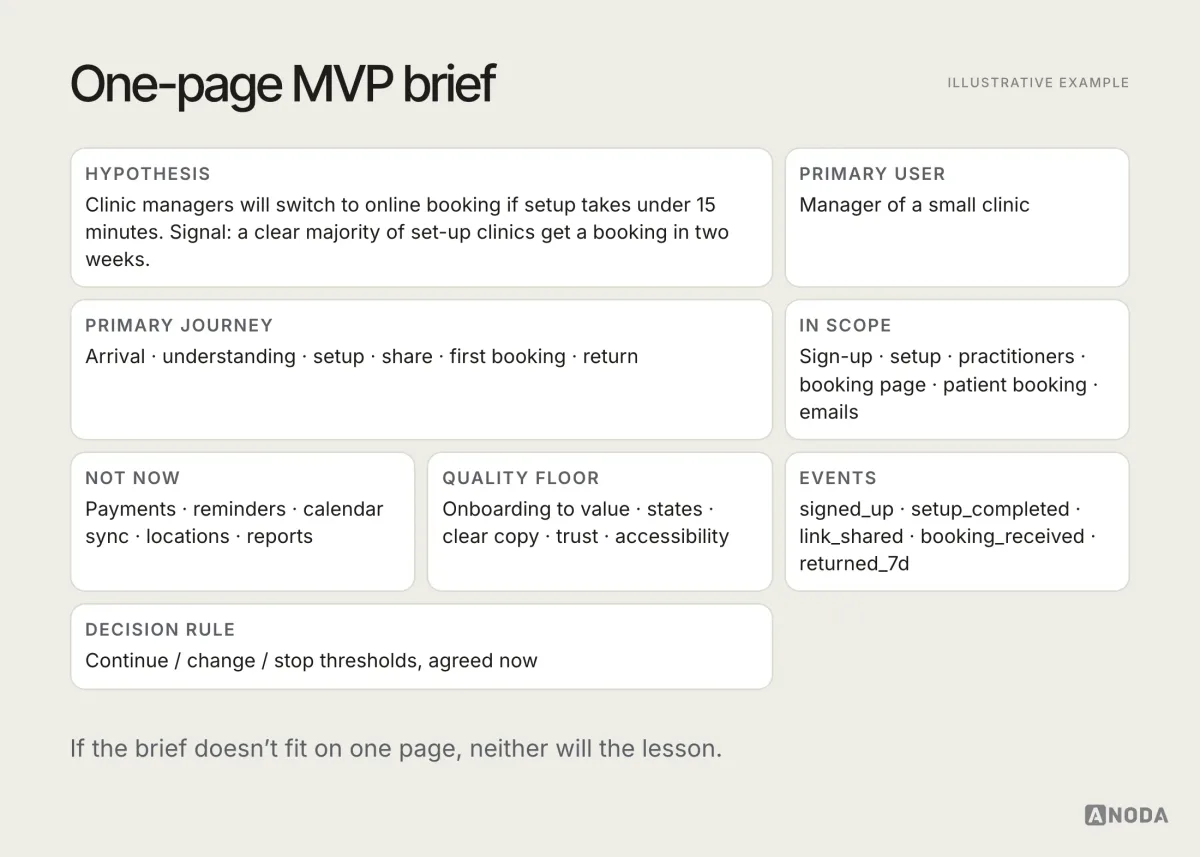
Bound the release, validate the user flow, make the value visible quickly and measure whether users complete the core job. That’s what makes an MVP worth building: not how little it contains, but how much it can teach you. For more on designing products that work, browse the ANODA UX blog.
Frequently asked questions
What is MVP UX design?
MVP UX design is designing the smallest complete experience that lets real users get the product's core value, so the team can learn whether the idea works. It focuses on one hypothesis, one primary user and one primary journey, designed end to end with onboarding, states and measurement, rather than a large backlog with fewer screens.
How is an MVP different from a prototype?
A prototype simulates the experience to test ideas with users before building. An MVP is a working product that real users use in real conditions, so the team can measure actual behaviour. Prototypes answer 'do people understand this?'; an MVP answers 'do people use this, and does it deliver value?'.
How many features should an MVP have?
As few as it takes to deliver the core value end to end. In practice, a handful of capabilities, often five or six, is usually enough to test a value proposition. Everything that doesn't serve the primary journey or the hypothesis should wait, and the exclusions should be written down.
How do you know if an MVP worked?
Decide before launch which signals will support continuing, changing or stopping: for example, how many users complete the core job, how many come back, and what they say. Then measure those signals and make the decision the evidence supports, rather than moving the goalposts after launch.
Written by